Transcripts
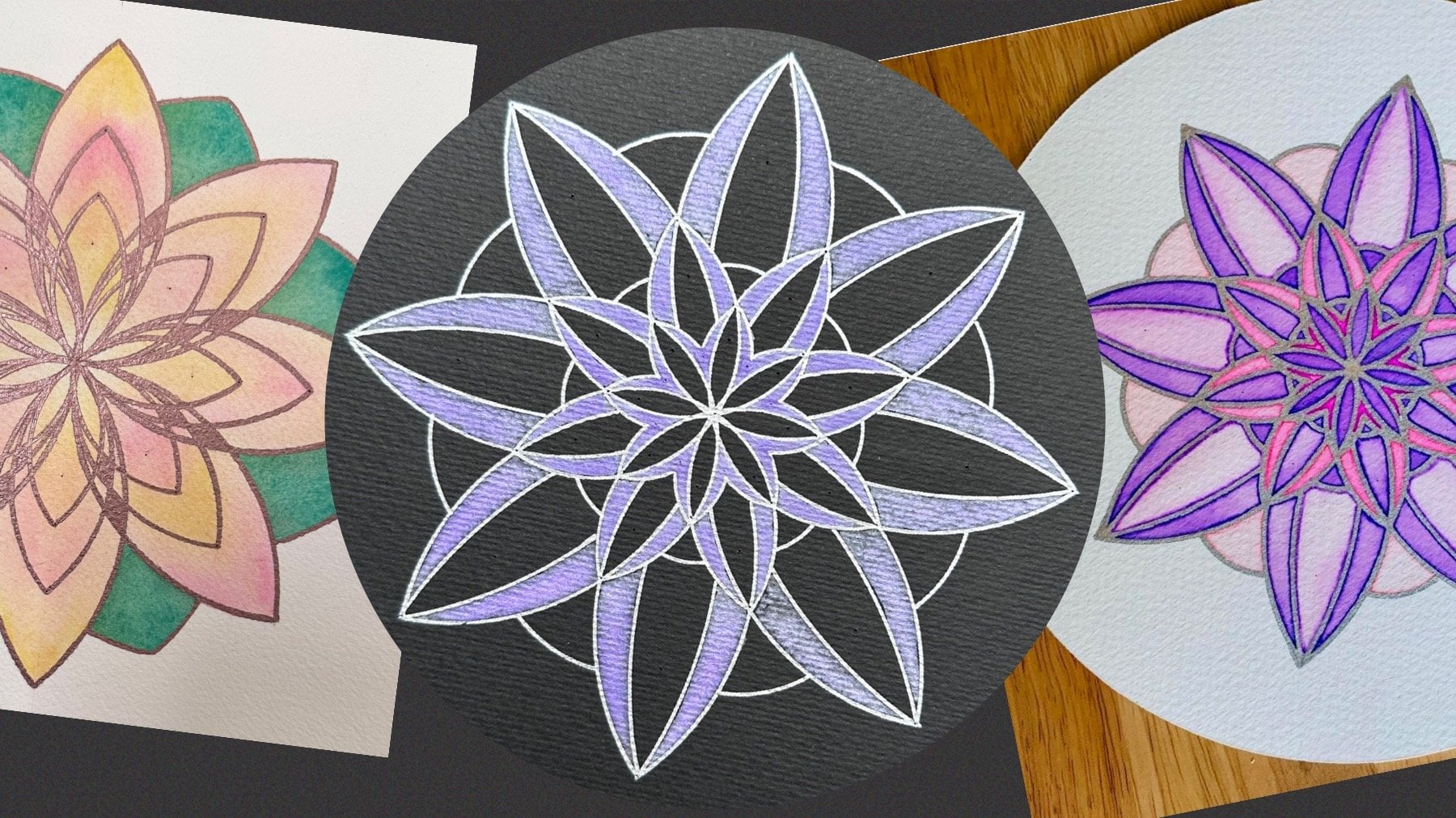
1. Introduction: Hexagons are
everywhere around us. They form naturally
in honeycombs and snowflakes. In crystals like the graphite in your pencil. In rock formations such as
the Giant's Causeway, and even in space on
Saturn's hexagonal cloud. Regular hexagons
tessellate a surface without gaps and overlaps. Their aesthetically
pleasing symmetry is often an inspiration
in architecture, design, and of course, fine art. Hi, I'm Diana, a mathematics teacher
and a geometric artist. In this class, I invite
you to join me on a two-week geometric journey to create your own
tessellation sketchbook. I will teach you
how to construct a basic hexagonal grid using a compass and how to split
it in a variety of shapes. Then you will learn
how to transfer and replicate each tile
with tracing paper. I will demonstrate numerous
coloring techniques with media such as watercolors,
pencils and markers. I will discuss a wide
range of layout contours, shaping fills and
shading effects. Each day we will tessellate a new pattern culminating
with a recursive rosette. This class is suitable
as a starting point into geometric art or as a deeper exploration for
accomplished creatives, or if you simply wish to engage in a regular mindful
art practice. By the end of this course, you will better understand how geometric structures
are related, and you will develop your
visualization skills to create more of your
own future designs. This project offers
something for everyone to create a unique geometric
art sketchbook.
2. Materials: We're going to
discuss the materials you will need to
complete your project. Ideally, you will
have a sketch book. If you're planning on using watercolor or any other paint, watercolor pad is ideal. I'm going to use this one. It's a square shape one, which is eight by 8 " or
just over 20 centimeters. You could use this one
or any other shape, it doesn't have to be square, it could be circle or rectangle, or it could be just separate sheets that you will keep together in the end. If you're not
planning on painting, then you could just use any
sketch pad for this project. You will also need some paper to construct the single tile on. Ideally, we will
construct it once, and then we will trace
different shapes each day, so you don't need
to do it every day. However, if you'd like to vary the size or practice each day, there's no harm in
doing it separately. I like to use slightly thicker
paper to construct on, but you can just use
normal printing paper. Once we have constructed a tile, every day we're going
to use tracing paper to be able to transfer our
design into our sketchbook. I really like using
slightly thicker paper because it's more sturdy,
it doesn't crinkle, it doesn't damage when you use a thin pencil or even
a compass on it. I quite like this one. It is 90 grams/square meter. I do like using
thinner tracing paper, not for transferring, but for outlining and
deciding on my shapes and colors and patterns by using
the templates I've provided. I've provided two
different templates, and you can decide which size is better on the sketch
pad that you have. This one can fit eight radius
lengths on the design, whereas this one
is six of those. Now, using the thinner paper, I quite often like to use a highlighter and then
sketch on top to see what shapes I'd like to pick out
for
00:02:14.960 --> 00:02:20.280
my overall cutout and any
color combinations or sizing. That's a really useful way of doing that before you commit your final design onto
your precious sketch pad. To construct the
underlying grid, we're going to need a ruler and a pencil to draw
the original line. A compass, which we're going to need to construct this circle
in which the hexagon lies. If your compass has
a pen attachment, you're going to need
another pen or pencil. If your compass already has a lead in it, that's
perfectly fine. You won't need anything else. Once the circle is constructed, we will need to pick
out certain lines, again with the
ruler and a pencil. You might consider
using a darker, more permanent fine liner to
outline the grid so that it stands out a bit more
once we cover it with tracing paper
ready to transfer. For coloring our patterns, you can use
absolutely everything you want or you have at home, or you can just use that opportunity to
explore different media. I'm going to use different
variety of watercolor paint on a few of the days with different brushes with
fine ones, wet on wet. I like to use a
pipette to control the amount of water I'm
putting into the color, and you will need something to hold your clean water and
perhaps to mix the colors. You could also opt for
watercolor pencils. They are fantastic
alternative to watercolor. They give a nice
control when shading, we can blend
different colors and accentuate the pigment by using a water brush
and just dropping water on top if or
where you like it. Of course, you can use a
variety of highlighters, fine liners, gel pens, metallics, and vary the infills and the outline of the shapes, and that's what we'll explore each day.
3. The Underlying Grid: Before we can construct
our underlying grid, we need to decide on the sizing
that we're going to use. How far are we going
to open the compass. That will depend both on the size of your
sketchbook and also on how many
repetitions you would like in your completed designs. I have printed two
possible options from the template I've
included in the resources. Although this one seems
a bit more complete, I'm actually going to go for the slightly smaller one where there's not too
many repetitions. It allows for
different outlines, and also my paper
is fairly small. I wouldn't want to
work on a tiny, tiny scale, so I will
go for this one. This one is where you can fit six radius lengths
in the design, and this one is eight. Whatever the size
of your paper is, you want to be able to divide, but by either six or eight, I'm going to go with
six, you want to probably leave a little bit
of space on the outside. My paper is 20.3, if I go for three
centimeter radius, I have six of those, it
gives me 18 centimeters leaving just over a
centimeter on either side, and I'm really happy with that. Note as well that
this vertical line is actually longer
than the horizontal because this doesn't
quite go as far out as the full diagonal. This is the shorter diagonal
from the midpoints. However, since I'm working
on a square paper, I want to make sure I can fit the longest part and
some days I will rotate the design so that it looks like this rather
than like this. A good way of sizing
is if you are able to print on the size
paper that you have, then you will be able
to measure how big this template comes out
on your particular paper, but I'm aware that
not all printers can print any kind of paper. I don't think I
can print out this. I'm going to go with a
three centimeter radius, and I know that I can replicate
the radius six times, which gives me seven
complete hexagonal tiles with some around it, and each day, I'm going to vary the shape I'm using
depending on the tile. My favorite compass
has a pen attachment. It is the Staedtlar mass comfort, and it means that I can
change the medium that I'm using to accentuate any
curves in any of my designs. Now, today we're only
constructing a very simple tile. If you're a complete
beginner with using a compass, that's
absolutely fine. If you want to find
out more about different compasses and
how to use them and do some exercises and practice and understanding better
how to use compasses, you can go to my other course on constructing an interlocking
hearts geometric Mandala, which I did for Valentine's Day. However, this is much simpler as it only really
contains one simple circle. Firstly, you want to
make sure that when you start out with the
compass fairly closed, that the point,
the sharp point of the compass and the end of the pencil let
are fairly aligned. They will get further
apart once you open it. Now, as I'm right handed, I like to flip my
ruler upside down. The centimeter scale is on the bottom and it
increases to the left. That means that I can put
my point on zero and then see how far to open
going in this way as I'm holding the compass
with my dominant hand. I want to go up to three, so I'm going to use this
wheel to slightly open it. It was actually fairly accurate. Yeah, I'm happy with that. Really all I need to do now
to make any circle is to hold my compass as far
down as possible on the point and put all the weight and pressure
that I can on there, and then move my hand holding the handle and just
gently touching the other side of
the compass and just turning by twisting
this between my fingers. It is a very good idea If you are still
not very confident to do the same thing while
turning the paper in the opposite direction
to where you are going. There you go. That just helps
you complete your circle. That's all that we
need to be able to do with our compass. I'm going to flip my paper
and start the construction. Firstly, we're going to
need a straight line. In this case, we
don't really need to measure where on the page
it is or how long it is. It needs to fit the circle
that we're going to draw. So this will be enough. This is plenty more
than 3 centimeters. Now I've opened the compass
to the correct width. I'm just somewhere
in the middle, going to draw a full circle. Now, by doing this, I've now
created two intersections. These intersections tell
me where I can go next. Now, without changing
the width of my compass, I can put the point on one
of the new intersections. Let's go with the bottom one. I'm not going to
do a full circle, but I'm just going
to mark a mark on the left crossing the circle and a mark on the right
crossing the circle. This is you can imagine a part
of a full circle that I'm not drawing because I don't
want to overload the grid. All I need is to know
where the new circle, the invisible circle
crosses the original one. I need to do the same
thing from the other side. I'm going to rotate my paper. Put the pin on the other
intersection, and again, mark to the left and to the right imagining as if that's a full circle crossing
through the middle. Now I have six intersections
and they're equally spaced because they're all equal to the radius
that we've just used, meaning now we can construct a regular hexagon with six equal sides and
six equal angles. Now I'm going to join each two intersections
starting on my left. I want to do this vertical side. You want to take your time here because we're
constructing this once, and the more accurate this is, the more accurately
will transfer. Inevitably, some of the accuracy will get lost in
the transferring, but the overall repetition and symmetry of the
design will remain, and that's really what
we're looking for. One more line here,
and I'd like to rotate my paper so I can see what
I'm doing on this side. So actually
constructing a hexagon is much simpler than
constructing a square, which isn't necessarily
what you might think. That's because of the equal
distances inside and outside, which is not the case for the
diagonals inside squares. Two more lines and our
hexagon is complete. The size of this
hexagon is going to be the outer edge of all the different tiles that we're going to
be doing each day. The only thing that
will vary is what we're picking out on the
inside to decorate. Now we need to make a
few more lines inside. Before we are able to choose
different lines each day. As we already have this line, this is one of the three longer
diagonals of the hexagon. That's the diameter
of the circle. That's two full radiuses
going through the center. We now need to do the same thing through the other two diagonals. To opposing corners and
going through the middle. You should be able to feel how your pencil is going
through that bump, which I just did,
on the other side. That is three diagonals, which now split the hexagon into six equilateral triangles. All these lengths are equal. If we replicated all
of these further out, this is called an
isometric grid from Greek, it means equal measures. From each point to the next,
it's an equal measure. We are now ready to connect with a straight
line, every other point, not every adjacent point, but skip one, go to the next, skip one, go to the next. What that's going to do is create a large
equilateral triangle. Then we want to do another one starting from the
other three points. There will be two triangles
overlapping each other. However, I'm going to draw
that by using parallel lines. I'm going to draw a
line from here to here. If you visualize this rhombus, I want to split it in half. One, and do the same here. Now we're going to
do the same thing from these two
corners going down. If you visualize
these two rhombuses, we're going to
split them in half. What that is doing,
it is cutting that line in half at an
exactly 90 degree angle. Because the diagonals
of a rhombus are perpendicular. Now you can see there's two
more to do from that side. There are two rhombuses
that we want to split down. That really created two equilateral
triangles overlapping. What that does as well is where the two triangles cross in
each point where they cross. This is actually the middle of this line and that
entire part here. This is what we're
going to do now, and this is the last part
of the construction is to connect this hexagon that
we created in the middle. We're essentially connecting the opposing corners of that, but we're going to extend it to the end of
the bigger tile. Nothing goes beyond
the bigger hexagon. We're connecting
these two points which should go through the middle. This one and this one.
If this is too fast, you can slow it down, pause it, and print the step by
step instructions. I'm going to start from
the edge of the tile, which is basically
going to be a halfway. It's the midpoint of that line. Again, it is at the right angle, so this is the midpoints. We repeat on this side. If you visualize this rectangle, we're going in through here, here, and here, which are the two corners of that
hexagon in the middle. And extend to the edges
of the bigger tile. Finally, the horizontal one, you don't have to
turn your paper the way I do. I like it this way. I'd like to see it
from that perspective. The final line in the
construction, here we have it. Each day we're going to pick
only some of the lines and make completely different
looking tessellations and tiles. Okay.
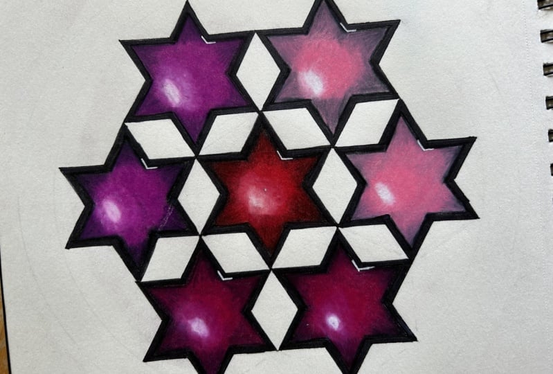
4. Day 1: Concave Dodecagons - Transferring: For day one, we're
going to start with one of the simplest
possible shapes from this. Each day we're going to make it slightly more complicated. We're going to need
tracing paper. Of course, we don't want
to waste the full page. I'm going to split this into four and that can be
used for four days. The easiest way to
split this is by holding a ruler down
roughly in the middle. And in a fast sweep,
just tear it. There you go. Then we'll do the same thing with half
of it and make a quarter. This is going to be
roughly big enough. Okay. Now we can
cover the design, and I'm going to use a bit
of masking tape to secure the tile onto the piece
of paper that I have. Now, because I'm using
the nice thick paper, it doesn't move easily,
it doesn't wobble. I'm only using masking
tape on two of the edges. I don't feel like
I need any here. All we're going to
trace out today the outer edges of the two
triangles that we overlapped. If we use the full
two triangles, that would be a hexagram, but I'm going to avoid
the inner hexagon, just using the outline, meaning that we'll make a
dodecagon - 12 sided shape. I'm going to do a line here and I'm going to only go to
this point and stop. Then go over the middle
third and then do the end. I'm going to repeat this on
this line, which is parallel. And again. Now, here you might consider changing your
pencil to one with a softer lead as it
transfers more easily. I could have done that as well. From the other edges, just the first third, then skip middle third
and do the final one and the parallel line. Repeat and finally,
the two horizontals, which I'm going to
turn the paper. Since these look like stars, I want to start free and easy before I get
complex and detailed, what better way to start
than with a galaxy? Because these look like stars. That means we're going
to have a go at a wet on wet galaxy design. This is it. Now, what we're going to do as well to make the
transferring easier, we're going to also trace
the outside of the hexagon, but I'm going to do
it in a dashed line. That is just for
placing the tile so it matches well and joins well as I lay it down
in the sketchbook. It's just for guides rather
than part of the design. On some days, the outer edge
will be part of the design. But for this one, I only
want to use the stars, which means when we
multiply the shape, several times and we put the
stars next to each other. There will be these rhombuses will form in between the stars. It's really interesting
that when we trace just one shape, we're not only
transferring that shape. We're also creating
the negative shapes. These are the shapes that aren't actually explicitly drawn. Now, I need to
decide whereabouts on the page to
start transferring. For this, I'm going to need to find the center of my page. When I measure it, it comes
up a bit more to 20.2. I'm going to mark 10.1 on
both sides vertically. And then I'm going to align this and again mark
10.1 in the middle. It would be useful to
draw a very faint line. It will be helpful to know where on your tile the middle is, so you can go back to the design and just
mark where that is. Of course, you want to
flip it now so that the pencil lead is going to
make contact with the paper. The reason why this line was helpful is when you
align your middle, you also want It will be difficult to judge
otherwise the orientation. You want the line to
coincide with these edges. That's a pretty good way
of aligning the paper. I'm going to reuse
that masking tape. I'm not using new pieces. They're the same ones I used before and I'm not really
pushing it down too hard. I don't want to risk damaging
the paper underneath. Now, the most logical
way is to go over with a ruler and a pencil
and press to transfer. However, there's a really
quick and easy way of transferring, which you might wonder
why I've got this spoon. With the spoon, you just rub off on top of your
paper and you can move it and repeat a
few times and it's just the quickest easiest
way of transferring. Make sure when you transfer, you also transfer these lines just so that when we move
the paper around afterwards, we know where to go next. There's the first tile. Now we're going to repeat that same tile at the
corners at the edges, the other six edges
of the previous tile. I decided to emphasize
the rhombus shapes on the edges just to make those
stars stand out in between. Now I'm going to go over the
design with a fine liner, waterproof one, and then I can rub off any of the
other lines I don't want, and then you will
be ready to paint.
5. Day 1: Painting - Star Galaxy: We're now ready to start
painting our galaxy. And to preserve each page, each day, I'm going to
use a plastic pocket, especially if we're
going to paint to put on the page afterwards so
that doesn't get damaged, especially when we're going to be playing around
with wet on we. I'm going to put
that underneath. Don't feel like I need to
secure it necessarily. I should be fine. But it will help feel a bit more confident
with playing around. I do want to keep all
the pages together rather than tearing them off. Now, I decided I want
a circular outline. So I'm going to
use the compass to just very faintly outline this and I want my rhombuses
to fit in in all directions. These ones are longer. See how far this goes. I'm just going to
make a faint circle, just as a guide where I
want to paint within. And then I'm going to put some water into
the chosen colors. Now I'm doing a
galaxy and I'm going to experiment and
change as I go along. But the main colors I
want are deep blue. Violet, which is
the dark purple, might want some light blue, might want some black
here and there, and possibly a couple of
blue and white metallics, possibly a normal white as well, a tiny bit of yellow gold well. And I will play around
as I go. This one. I will leave the colors
to mix up in here. I want to emphasize the circle, so I'm going to use my
compass with a brush, which is a really fun technique, and I'm going to secure
the brush sideways. I'm going to ensure
the brush doesn't come out of the circle
that I just drew. It will gently sweep
across like this. Now, I'm going to just
put water on the edges, so I know none of the water and paint will bleed
beyond those edges. I'm just going to use my usual. This might not have been
enough water or maybe it is. Now I'm going to do the rest just by painting
it with water essentially. Hopefully, yours glistens so you can see whereabouts
you've put the water. If not, just put a bit
more color in the water, it will go dark anyway. Just so you know whereabouts
you've put water already. Repeat those edges because they should have the
richest color really. And it's starting to dry
in parts, but that's okay. Okay. And now, I'm going to use. I'm actually going
to use the same brush for the outer edges. So do the same thing again. Just check that it doesn't
come out of the page. Slightly different
now that it's wet. Now just dip in whichever color, I'm going to start with purple and go lightly
around some of it. Then let the water take care of
it. That's really nice. I'm going to try and create
that elsewhere also. Okay. Now I'm going to do the
other part in my deep blue. That's it. Now I
can mix any colors. I'll use a tiny bit
of black to join in. Now this black is obviously
not enough water in there. That's okay. Let the
water take care of it. Allow the water to take the
pigment wherever it likes. Okay. Mm. That might bleed
out a little bit. I'm going to use a
little bit of paper. So make sure that
doesn't bleed out. It's a little bit. That's okay. That can be saved
with the paper. Now with this brush, I'm going to add a bit
more color here and there. I'm wondering if
I perhaps need a bit more water just create
this as you go along, I love how the black
and purple mixed up. Okay. Blue again. Now the water here has become quite dark
in my cup, but that's okay. I didn't want that
harsh line here, I'm trying to create edges where we don't
want any sharp edges, although there's no
reason why they're wrong. Just looks a little bit more mysterious when you blend out. I feel like it
needs a little bit of light blue in the middle. A bit more blue. There are some darker black patches, I think, around here. That was really nice so I can emphasize part of the stars, if
that's what you wish. I'm going quite random. I like to see what
the water does. Okay. Things combined.
That's wonderful here. Now, this is looking
a bit like a puddle, so I don't really want that. That's better. Put some more blue. I'm going to use
silvery shimmery blue. It's up to you how
dark you want to go, whether you want
it to be very dark everywhere or a bit less moody. It's up to you how you see it. I like the fact that
it's unpredictable. I like that I don't know exactly how
it's going to turn out. That's one of my favorite
things about it really. I feel like a few
naturally whiter spaces, but they will benefit
from a bit of a shine. I emphasize that path. Between the other colors. Yeah, I think that's
working well. Okay. Well, soak up a little bit more here. The shimmery gold,
the shimmery, silver, actually I feel is
taking care of any of the edges that we don't actually want
them to be too harsh. I feel that's doing
a good job of that. I really like that white. Beautiful. Now, we're
covering some of the lines underneath,
which is fine. We will have to use our understanding of where
the lines are underneath. Okay. That's nice. Okay. I'll do the same
with the light blue, but I feel like it needs some
darkness as well, contrast. So a blue area. This is such a
therapeutic process. There's
quite a bit of that. Hopefully it dries ok. Okay. Okay. Where would we be Without some gold? I do like the silver
on this design most, so I am going to
take a bit of paper. And a bit more on
the other side. I didn't want to take off some
of the intensity of the black. And let it dry. The painting is now
dry and looking beautiful, shimmery,
dark, amazing. We need to finish
the final touches. Now the most
important thing is to emphasize the geometry that
we constructed underneath. I'm going to do this by using
a gold wet paint marker. It's one of those that you
have to shake a lot and press down and this makes
fantastic outlines. Now I'm going to use a ruler. Now you may have
noticed the ruler is slightly thick on one side, you need to flip it
because this way, when you put it on the paper, the corner isn't actually
touching the paper, which means when
you glide the pen, it's not going to rub off any gold on the
sides of the paper. Now we're going to outline
just the same way as with the black marker underneath
earlier with the fine line. The easiest way to do it is to go along with all
the parallel lines. I'm going to tilt that slightly and start outlining
right to left, so I don't overlap and
smudge any of my gold. You could go with silver or
purple or blue or just black. It doesn't have to be shiny. But I want to emphasize
the stars in gold. The gold outline is done. There are a few inaccuracies, so I'm going to use
a few different pens to put the final
finishing touches. They're going to
help me disguise some of the mistakes
and add a bit of bling and glitter here and there
and emphasize those stars.
6. Day 2: Vertical Rhombuses - Transferring: For day two, we're
going to trace out some rhombuses
arranged vertically. So take your quarter piece of the tracing paper
that we cut out yesterday and secure it
with some masking tape. I'm only doing top and bottom. Nice and flat so we can
see the grid underneath. Now all I'm going to trace
is the diagonal lines that go top right to bottom left and the diagonal lines that go top
left to bottom right. But I'm not going
to trace any of the horizontals or
the other diagonals. So that shape, and I'm going to go from top to bottom without interruptions. That shape will
transfer really nicely. Remember not to go
beyond the tile. So from the edge of the tile to the next
edge through the middle. There will be three
parallel lines, and the same on the other side. It will look a little
bit like a cage. But once we transfer it, we can pick a different outline, different way of
decorating it completely. Now, just for guide, again, we're going to trace out with a dotted line the outside
of the hexagonal tile. But that will not be
a part of the design. It will just help us place the design when transferring
it in the correct places. And notice how all the rhombuses
are arranged vertically, and when we transfer them, all of them will be in
the same orientation. On a different day, we're going to use different rhombses in a different orientation
and you will have a completely different look, especially when we emphasize
different parts of it by coloring it
in a different way. That is the tile done. Now, I need to find
the center of my page, but because I used the compass
on the previous page, I can see already
where the center is. If you can't see
where your center is, measure halfway down the
side - 20.2 centimeters, so I will mark halfway at 10.1, the same on the other
side vertically 10.1. Then I will draw a faint line going horizontally through
the two points I found. The line is already there. Now, remember we
need to know where the center of the tile is, which we can see from where
these two lines cross. Remember that we need
to flip the paper so that the pencil lead is in
contact with the paper. And align the center point
with the center underneath, and these two intersections ideally need to lie on
the horizontal line. That will give the
orientation we need to be as
straight as possible. Once you've done that, use your masking tape
to secure the tile, and then we're going to use
the spoon to rub this off. Remember, we need to trace
the outline as well. These came out quite faint, so I'm going to
repeat those with a pencil and ruler before I decide on which decoration. I'm going to use
a permanent one. I'm just going to go and repeat these lines
with a pencil. Now, I decided on my outline, I'm going to go over this
with a permanent waterproof fairly faint thin
blue fine liner because I'm going to decorate
the majority of it in blue, so then I can delete any of the other pencil lines
that I don't want.
7. Day 2: Colouring - Golf Jumper: I think this turned out
a really cool outline. And it reminded me a bit of
those golf jumper patterns. And so I used the
tracing paper and the template to decide on colors and combinations.
I came up with this. We're going to do blue and possibly a bit
of pink inspired. It will look like a golf jumper - a completely different
look just for fun. Again, I'm going to use water color pencils because
these are quite small spaces. I want to not worry
too much about control this early on in
the two week challenge. So I will add some water, not as much as yesterday. However, just to be sure, I'm going to use
my plastic pocket again on the page after. Then I'm going to start. Filling in the rhombuses. Okay. I'm really happy with that. It looks really cool. Perhaps I should have
left these blanks, so that's an entire
zigzag white line, but I felt maybe it's
a bit too much white, and even though now some
colors next to each other, that are similar, I made a
slightly different shading. Also, we're going to outline at the end so everything's
going to pop anyway. Now, I'm going to
use a water brush to gently go on top and make
these colors come alive. Be careful not to put too much
water. It's better to add. If too much of the pigment
comes off and you're no longer happy with how
strong the color is, we could just go over it
with a pencil on top. I'm just going to gently go over the color and
see what happens. Thank you. We're ready for the final step, which we're going to outline. I'm really happy
with how this dried, but I feel it will make it pop even more with an extra outline. You could use the
same waterproof liner or a different liner. You could use a coloring
pencil if it's sharp enough. I'm going to use
a metallic blue, so hopefully this will pop. I'm a little bit tempted to
make it look a bit 3D. But golf jumpers are 2D
flat, so I think I won't. I think the outline will be enough to make it
really stand out. I really like how
the water dried. You will see that it's not
quite the same texture as watercolor paint, but I do quite like the texture and I'm
leaving it as it is. Day 2 complete.
8. Day 3: Equilateral Triangles - Transferring: We are going to trace
some new lines today. Now I have one half left
of my tracing paper, and we're going to
split it in half. I'm just using that
to roughly find the half of it that
vertical line, and I'm going to use the
ruler to split it in half. That is the third quarter, and I'm going to
overlap the basic grid. Just as before secure it
with some masking tape. If you need to use some mask and take on
the side, that's fine. For me, I feel like
I don't need to. Now, today for day three, we're going to trace the
diagonal parallel lines that we did yesterday, but we're also going to
do the horizontal lines. So essentially, the rhombuses we created
yesterday are going to get cut in half to make
equilateral triangles. I'm going to start
with these three. Remember to repeat the lines
as much as you feel you need to in order for them
to transfer well enough onto the sketchbook. I got three just
similar to yesterday. Going this way. Three,
going the other way. And make sure the center is nice and clear and well
aligned because we're going to use that to place it in the middle of the
page when we transfer. That's one in this direction. Okay. And finally, these
three going across. I'm going to rotate
this. It's easier for me to see that way. Just align your corners nicely, and that now goes through these four points,
one in the middle. Again, I'm working just within the boundaries of
the hexagonal tile. I'm not going all the way out
where the full circle is. These are the lines inside, as you can see that creates a multitude of
equilateral triangles. This is essentially
an isometric grid, meaning that all the distances
between each corner, each line is the same length from Greek meaning
equal lengths. As before, I'm going to trace out the outline of the
hexagon in a dashed line. I can use the tile
to replicate it several times in a
particular shape. Now, as you can
see, these shapes are considerably smaller
than what we've done so far, and this is going to help me decide and determine
how to decorate it. I'm going to go with
some infills by hand because there will be
so many of these triangles. I'm going to use
fine liners for this. This is now ready to transfer. We're going to start by finding
the center of the page. I've got 20.2 centimeters
on the left hand side, I'm going to mark 10.1, and I'm going to repeat
on the other side. 20.2 half of that 10.1, and now I'm going to draw a faint line again
20.2 faint line. Don't have to go to
the edges as long as we know where the
middle is 10.1 again. Okay. Now we know how to align
the piece of tracing paper. We need to make a
decision whether you want to transfer it
this way or this way. I'm going to go this way
with the corner pointing up and I will align
this as before. I want to align the center with the center of the
hexagon in the middle, and of course, the straight line needs to lie on top of
the line behind it. I need to flip
this because I can see the pencil is on this side, so I need it on this
side, just like that. And I'm going to secure it very gently using the same piece
of masking tape as before, because I'll take this off
and repeat a few times. Now, I played around with the tracing paper and a
few different outlines. I will see once I've replicated this six
times around the center, I will use my spoon, my
trusted spoon and I will start rubbing this
down until it all comes up. Now, I've chosen
my final outline. So it goes in
slightly further in than the six hexagon
surrounding it. It will look a bit more like
flowery pointed snowflake. Since there are so
many of the triangles, I don't mind going
a little smaller. And I will outline with a fine liner before I can
delete the marks of the pencil.
9. Day 3: Colouring - Zentangle Triangles: Our triangles are now
ready to decorate. There's so many and I really wanted to try
some Zentangle style infills so that it's a nice meditative process rather than feeling overwhelmed
that there's so many. So I was thinking how to color it, I played around
with the template, which again, I
encourage you to do. I did quite a few
different outlines, a smaller bigger one, the bigger one, I
thought was too big. As you can see, I ended
up with this one. I also planned my colors. I used an app to actually color it and
see what it looks like. I'm going to use
four related colors in a way that vertically, two of them alternate,
two of the same colors, and then skip a column
and the same two, but in reverse order. So if you have two
of these here, let's say, the purple ones, here you have two orange. The in between is the same with two alternate colors -
two pinks, two reds. I'm going to go for two solid
and two sparkly colors. For each of them, I will
do a different infill. For example, I have decided I'm just going to put this here so I don't mess up the order. I have decided this is going to be my color on
the outside and here. The top two here will be that. I have decided two, my first in field to be
five parallel lines, roughly equally spaced and
parallel to this diagonal. One to three, four, five, roughly equally spaced. Obviously, this is by hand. It is supposed to be
a relaxed process. Then I will color in every
other ribbon that I created, I will fill it in, like this. This is exactly the
color I wanted, but I fear that my pen
is running out a bit, so I have to be very slow
and patient with it. So in here as well. That will be two ribbons, alternating with white, and
then the corner itself, which would be like a
small mini triangle. This is what I'm going to do for the triangles that are pointing
upwards of that color. Now, you see that in
the alternating rows, they're pointing downwards. Now the ones that are pointing downwards like the one
here in the middle. I will do the same, but I will go in the
direction of, again, the left hand side of my
triangle, so one, two, three, four, five,
one, two, three, four, five, this time though, I will color in not every second one,
but every first one. So I will color in the out here. That creates a nice shape
here in the corner where the two vertex touches essentially of the two
triangles, and I will do that for the rest of these. These are actually really a
nice size to do infills. I thought they would be
much smaller, they're not, which is good
because it makes it meaningful to fill them in without too much
of the repetition. I think that's enough
of a repetition. Of course, you can do
a different outline. The whole point of this
is to give you an idea, but for you to do it
however you see it, I don't think there
are any solid rules about how you doing infills. I just wanted it to be
in this color scheme. So I will do that for
the rest of that color and then we'll be back to do
some of the other infills. Okay. This color is done. This is given it a bit more of a structure now,
which is quite nice. I'm going to go next with red. I'm just going to do a
few different squiggles. Let me see where my reds are. They're just before the
purple ones I've done. I'm just going to go with a few curved lines like this from each corner and
then meet them in the middle. But I'm not going to
color in any of it. And the next one is here. I'm going to repeat this
therapeutic process. I really like it.
I do feel like it needs to pop against the
other color that we did. I am going to actually fill in a few of the gaps just
to make the color more interesting. The pink is now finished. It was such a beautiful
shimmery color. I decided that they were going to be dots
in one direction, but I was going to color the negative space in
the opposite direction. There's some balance
of white and pink. And finally, for
the final color, I'm going in with a
ready orange sparkle. I'm just going to make
a triangular spiral, going from the outer edge
inwards, just like this. Color in the middle. And then I'll do the ones that are
pointing upwards first, then I'll rotate the
paper to do the rest. Day 3 complete.
10. Day 4: Concave Kites - Transferring: Welcome to day four.
Today, we're going to use our last quarter
of the first piece of the tracing paper
that we started with. I'm going to cover the
grid with masking tape. We're going to trace a slightly
different pattern today, of course, different
every day, but today, we're going to
alternate the shapes as we go around rather than
having six identical ones. We're going to have three
identical ones that alternate, they're all going to be kites. We're going to trace first the three long diameters
of the circle. These are the long diameters, the long diagonals
of the hexagon. Start with two opposing vertices
going through the middle. This one first, and
then the other two that connect the opposing
vertices. This one. Go across and this one going that way. We're splitting the
original hexagon into six equal and
equilateral triangles. Now we're not stopping there. What we're going to do
now in the bottom left, we're going to trace
these two lines from the corner to the middle. And from the middle
to the other corner, following the lines
underneath as a guide. We've created a kite that
is pointing inward, so this is called a concave kite. We're going to do this
on every other shape. We're going to repeat
this on the top, from the one corner to the
middle following the line below and from that middle to the top corner
on the other side. In many languages,
this is known as a deltoid because it looks like the Greek letter Delta here. This is the last kite
we're going to trace going this way to the
middle and from the middle. This is how we started. We have the vertical line and every other
shape is that type. Now, as usual, we're
going to trace out the outline of the
hexagonal tile. This is going to
help us multiply it and transfer it and replicate
it onto our sketch book. But the symmetry is going to be slightly different
because we've now chosen shapes that alternate. One more. Now, in between the kites, you can see that
there's the triangles, but we're not finishing
them off with a solid line, which means that once we
repeat this shape and move it, let's say here, one of those concave kites are going to get attached to one
of these triangles. What that is going to create this shape is going
to come out here. Every alternating shape is also going to be a kite
pointing outwards. We're going to alternate six kites, three pointing inwards, three pointing outwards,
concave, convex, concave, convex, and so on. It's going to create this
nice little diverse pattern. That's different. We're going to now transfer
this into sketchbook. Okay. Just as before, we're going to find the
half point of our page. I'm measuring vertically
on the left hand side. I'm using the same
size as before, of course, same sketchbook, 20.2 centimeters half is 10.1 and the same for
me on the other side. Yours might be different. And a light horizontal
line through the middle. Through those two
points as a guide. And mark your middle again. To me, as square
shape is also 10.1. And we're going to trace it
slightly differently today. Now, you remember we started
off tracing it this way. However, we're going to rotate
it 90 degrees clockwise. The vertical line,
the vertical axis that we traced is
now going to be the horizontal and we can align it through the middle of
the line we just drew. That way, the line of
symmetry is now vertical because the two halves on
either side are the same. Of course, we're going
to flip it over. Okay. I'm going to start with my two pointing
upwards and one down. Of course, you can go this way, but this is how I
visualize it and with the center in the middle point
and this line guiding us. I'll put this in here. Then I'll show you
roughly the outline that I've been thinking about. We've had a circle, a rhomboid type and a
spiky one yesterday. Today, I was thinking that this can make almost a
triangular shape, which is why I've rotated this. I will try and create
this outline here. Then the convex kites, I imagine those as
petals of a flower and the other ones as leaves. I imagine something like that. I'm going to trace this
a few times first, and then I will repeat that six times around it and
then delete the lines that I don't want because
I can't really tell otherwise how much
of it to repeat. I'll take my spoon. I'm going to rub
off on top. Okay. Now, the next one, I'm going to go here just
by gliding this this way. By doing this, I
mentioned this earlier, we're now creating this kite
here pointing outwards, and now this needs
to be aligned with this horizontal line and that should be a straight
line just like that. I'm going to just rotate
this around the whole thing. Okay, so this is the
outline I'm visualizing making kind of this
triangular shape. So I'm going to repeat
the lines I want to keep and delete some
of the other ones.
11. Day 4: Colouring - Green Fingers: The pattern is now
ready to color in. I will just in case, I'm going to put my plastic
protector on the page after. Because even though
that's thick paper, we just never know how
the pigment will go. I'm going to use
for today's design, some blendle alcohol markers. I see this as
petals of a flower, which I'm going to
go with these purply light purple colors. Then the other ones will be my green leaves of the flower. I'm going to start with the
purple and I'm just going to outline with my darkest
color on the outside. I'm going to start with
It doesn't really matter, but I'll start with
this one in the middle. And just outline
the edges for now. I'm trying to go quite pastel
and not too intense yet, and of course, I can
repeat this a bit later. This is still looking quite patchy for now, but that's okay. Then I'm going to
go with this color. The next it's a slightly
different shade, but light to go into the middle. Okay. And to just repeat
the edges here. Do you like how they're
blending and it might not look like
they're blending just yet, but they will once I go
over the last color. With the last light is color, I'm going to go over
the entire petal. I'm actually going to go
with a thicker outline that will help it blend. Just be careful not to
come out too much out. Yeah it's too small
a space for that. I'm going to repeat a few times. Until I feel the blend
is nice and sufficient. I do like that slight
contrast of the shading. It's just a different shade of a similar color.
I do like that. Contrast. Then again, I'll
repeat with a light shade. I might add a tiny bit of
pale blue in the middle. Yeah, I'm happy with that.
I'm going to repeat this on all these petals now
that have the same shape, and they're pointing in
all three directions down and sideways going up. Now we're going to
do the same for the other leaves with the green. I'm going to go around the edge. I'll start at the top with
the right green that I have, looks like a good
color for leaves, grass, that kind of thing. This one has a bit more
of an area into it. Then I'm going to go
around with this green. And I'll just try and patch
up some gaps here. I like the one color
is a bit cooler, there's a bit of a blue tinge to it compared to the other one. I'm going to repeat this for the rest of the green leaves. Okay. The final step will be
to outline and cover up those lines with green sparkly
pen just to complete it. Nice and carefully,
so it doesn't smudge the outline is done now. It's really nice shimmery green. However, when I was
using the ruler, I did catch a bit of the
ink and it smudged a bit. I'm going to show you
how I'll try and fix it. Hopefully, it's nice
and dry by now and I'm just going to use one
of the paler purples, but just going to gently go, might not work since that's a metallic color and it
doesn't cover the metallic. I could go over with
purple inside the purples, but I'm happy with how it is. The other thing that
happens quite often to me, especially with these outlinings it splashes out on the outside. I'm going to try and use a white gel pen,
not a sparkly one, just a normal white
gel pen to cover up the white almost as if I'm
using Tipp-ex or erasing liquid. I'll wait for this to
dry and see if it needs another layer and
see how it works. The liquid of the white gel pen actually smudged that even more. So I'm just using a
lightly damped tissue and gently wiping off there's
less pigment left. And there's a little
bit more here. But now, I'll try with
the white gel pen again. And just dabbing it gently so that the actual pigment
goes on top of the surface. And now I'll wait
for it to dry again. It's drying there and there. I'll leave it like
this, by the time it's completely dry, hopefully won't be as shiny
and that's all that complete.
12. Day 5: Concave Hexagons - Transferring: Hi, it is day five, and we're going to start a
new piece of tracing paper, which we can cut in four pieces and use
for four more days. Using the ruler, one piece, and then cut the
other one in half again. You just tear it. Today we're going to
trace some hexagons. Similar to yesterday, they're
going to be going inwards, they're going to be concave, they're going to
create a nice shape. They will look a bit like flowers again
but different type. We're going to trace
partial diagonals now. I'm going to start
with this one here. We're going to trace the
top and the lower third, but skip the middle third. So just like this to this point, skip here and this point again. It similarly to day one, but there'll be a bit
more detail into it. Then we'll do the same on
the parallel diagonal line. Then we're going to
go in this direction. Again, just outline the
first and third part of the line and it's parallel. The ones closer to the vertex, but not the ones in the middle. Finally, the horizontal lines. Again just the
outer part of them. Just to join what we
already have there. Okay. We're going to add
one more detail, and this is to split the
inside into three equal parts. I'm going to align this
horizontally inside the star, from the center,
I'm only going to highlight the left
hand side of this. Then here, I'm going to do the top half of this line
on the inside of the star. And in this diagonal, just a lower part. Now we have three of
the same hexagon. They have equal size
but not the same angle, so they're not quite regular, and they're concave just
like the kites yesterday. And as usual, we're going to
trace the outline with a dashed. line, and this will help
us when transferring this. I see this as some kind of flower different from yesterday. It's quite nice and
symmetrical and pointy, we will just transfer that. I think overall, it will have
a flowery outline as well. Of course, remember, these are just one possibilities
of infinitely many. I am seeing it a certain way
and sharing that with you, but I encourage you to do a variety of mine or
even something totally different until you get that feel for all the different shapes that you can create. This is now ready
to be transferred. Okay. This is the
page for day five. You could see from the
alcohol inks yesterday. You could see some
on the other side, where nothing else had gone through the
page. That's okay. And I'll find the center of the page 20 point 2/2. 10.1 on the 10.1 on the right. A align through those two
points in the middle. Marking at 10.1
and in the center. Here is the design. I'm just going to turn it over so that the
pencil lead is on it. We could see the
center of the tile, which should go here, and this part of the line should lie on the line behind
it just like that. I'm going to secure that. As usual, using the spoon,
I'll rub this down. I'm going to repeat
this six times around the original tile. I'm now going to outline the
edges of the flowery shape. The hexagons mainly is what
I'm going to emphasize, and then it will be
ready for painting.
13. Day 5: Painting - Red Roses: The outline is done. You could see I've gone over a little bit too long in
a few of the corners. We'll try and fix that at the end. Let's see how it looks. Once it's been decorated. We're ready to paint
our red flowers. Petals. I've got a few
different shades of red. I will probably be using the carmine mainly
with a bit of eres, and then I'll see if I want to highlight some other shades. I will start with a pale color and see if
I need some layering. I'm going to wet the
petal I'm working on and then apply the red. I'm not trying to
make it too wet. Just enough for it to
glimmer so I can see where my paint is going to go. I'm going to go with
a fairly small brush and I'm starting with my Cari. I'm going to first go
over the edges slowly. Then once I've seen how the
water distributes the red. I'll decide where to go next. I'll do this with most of them. I realize this might dry, but it's just the first layer. We can just take it slowly and change the look of
each petal as we go along. The basic color is now dry. It's quite patchy and pale
and that's how I wanted it. If you prefer it more solid, you can go over with
more solid paint, but I want to make a
few very fine details. I'm going to actually going to remove the red paint
I've already used. I'm going to go with a slightly
different shade and make some fine thin lines each petal. And then if they
come out too strong, we can then use a little
bit of water to blend. Let's see. So mixes
a bit more water. That's a pretty color. It is giving some contrast
from the other red. Okay. I'm going to repeat this
on the rest of the petals. I decided to outline the petals with this sparkly
red paint by hand. This turned out beautiful. I don't know if you can see
the she well on camera. But it looks really nice. If you want to add more detail with pens or anything
on top, that's fine. I considered giving it a
bit of a three D. Look, I don't really want to
paint anything in between. I want the flowers
to be the focus. I've decided to stop to me. This is just finished. It covered most of the black and any of the perfections
of the black outline. There's just this bit here where I went a bit
too far at the start, so I'm going to use my white gel pen to just
dab a little bit on top. In the hope that I cover it up. And let it dry. If you need a second
layer, I'll do it. But to me, that is
day five finished.
14. Day 6: Rotated Rhombuses - Transferring: It is day six. We're going to
trace some rhombuses today. I'm going to use some of the tracing paper
leftover from yesterday. Okay. And just secure
it in two places. Here's the original grid. We did some rumbses in day two, which were always
oriented vertically. Today, we're going to
trace some rhombuses that will be oriented in
different directions. I'm going to follow
the diagonal lines starting with this one. I'm only going to highlight the top and bottom part of
the line and skip the middle. Again, that's from the outline of that star we did on day one. Just going to take
this repeat this. Actually, I'm going to go with a slightly softer pencil
because it transfers better. Yeah, I'll go with this one. The first and third
third of that diagonal. Then parallel to
this, we're going to do the inside half of that line. So these two segments
inside the smaller hexagon, but not the outer ones. From here to here
through the middle. And then just on this side, on the third line, just the two thirds
pointing outwards. I feel like I want
to repeat this one, don't know why this
one is coming out. Okay. This is my softer lead and it's much
easier to transfer, so I'm going to stick with that. I'm going to do the same thing following the diagonals going
in the other direction. On the outside line, I only want the outer two
segments, but not the middle. Then in the middle, I only want the inner two segments that connect the smaller hexagon
inside through the middle, on the outside, a symmetry, so the outside will be
just as the other part, the two edges, the two
segments on the outside. And I will do the same
with the horizontals, but I prefer to see it this way. I will connect just the
outer two segments. So essentially, we're completing the same star outline
as we did on day one. Through the middle, just
inner two segments. And then the outside,
just the two, here and here. There we have it. Similar to day one,
we've got the star, but we have split it into six equal roombses that point out in
different directions. On day two, all the roombses
we're pointing out this way, going down, but
this is different. Now, as usual, we're going
to outline the tile. The one downside of me using a slightly softer pencil lead
is that it was much more, but we always delete
the pencil marks, so that's not a problem. It's actually easier to transfer it this way and to
see it on camera. As always, we're going to
find the halfway point. This is how it was
when we traced it. However, we're going to rotate
this 90 degrees clockwise, so the middle needs
to lie on the middle. We could have traded
line as well, but I didn't want
to overload this. We have these two points to align with the
horizontal line behind, and that's what we're going
to use. Here we have it. Now, I don't know if you've already seen my thinking here. But this is now when we
replicate it this way, when we repeat this,
this is going to complete what looks like a cube. I don't know if you ever
realize that a cube is just a hexagon split into three equal rhombuses all point
in a different direction, and it mimics the
three dimensions of three different faces. This will become clearer
when we replicate it. But I think going up looks
more like stairs going up. We're definitely going
three D off the first tile. Here's the first tile then. I'm going to do one above one below before I decide
how to go sideways. So make sure that
rhombus is complete. These two lines look
like they are straight, continuous lines, and of course, that dash line should overlap the one at the bottom
of the first tile. As I'm seeing this in cubes, I'm going to want to have
that top completed as well. I'm just going to trace
the lower two segments here just to complete
that top cube. Making sure this is aligned.
You can see the cubes. Now I'm going to go
sideways and just expand that and make it look
like steps of pyramids. I don't know how wide I'm
going to get to here, but I'm going to do this one by one to see how
far it comes out. I want to add one
layer at each new row. Okay. I've outlined
the one side. I will stop that here. I have one, two,
three, four, five, six rows of cubes. I will try and replicate the
same thing on this side. Now, what you might find
easier is to just cover the entire page
with the full tile and then pick out the shape. But I already played around with it with the template
that you can download and I already drew and decided how to do it by doing the full page,
and then I picked out. I think that looks good
in terms of The shape, it really lends itself
to these steps, those pyramid looking steps. I'm just going to repeat the same thing on
the other side. Now I know how I
need to go because I'll just repeat what's on
that side on this side. I can see that there
are three full tiles, three full width of the tile at the bottom with just some parts missing and then
it gets smaller. As usual, I'm going
to outline this with some waterproof thin fine liner and then delete the
lines I don't want, but I'm going to stick with
one, two, three, four, five, six rows of those cubes.
15. Day 6: Colouring - Climbing Cubes: The cube pyramid is
now ready to color. To achieve this classic
three dimensional cube. Let's look at just one
hexagon at the top. We've got one hexagon split into three rhombuses
that is one cube. The three rhombuses represent
the three dimensions. The top rhombus is really the face that flat surface
that is facing upwards. Now, I like to visualize the
sun coming out of the top, but not directly from the top. Top left northwest. To me, that means that
the very top layer, the top face facing upwards, will be the one that
will be the lightest. I'd like to go with
some bright colors because it reminds
me of the sunlight. All of the rhombuses
that are oriented that way will represent the
surface pointing upwards. We're going to color
those in the same color. Now, you could use
three different shades of the same color and using your lightest shade or three
different colors together. That's completely up to you. You don't even have to make it three dimensional, of course, but I think we haven't done that and it really lends
itself to that look. Then the side on the rumbus
that is actually pointing to the left is where I visualize is the face
on the side of the cube, the left hand side of the cube, and that side will
have some light, but not as much as the top. That will be the
second darker color. The second darkest color, either the second
darkest view of the same color or
just a darker color. Then finally, the
third dimension, these are the rhombuses that are from our view if we were looking at it from
this direction. This is really if
you're going upstairs, this is the face, the surface that is facing
you as you're going up. The sun isn't going to go there, is not going to
catch the lights, these should be
the darkest ones, the ones pointing
in that direction. The easiest way to do
the coloring would be to color one color going
in the same direction. Now, I'm going to color one cube completely to turn the hexagon
into looking like a cube. Then I'm going to just color in all the rhombuses that are
parallel in the same color. I have chosen to work
with highlighters. I'm hoping they're
not going to go through the paper the way
my alcohol markers would, but the markers would
work beautifully. You could use
pencils, even paint. I just want to use
the highlighters, and I'm going to
do the top where the sunlight is coming
from in this yellow. Enjoying this nice,
bright neon look as well, and they blend quite well. They're not the kind
of highlighters that leave marks as you repeat. That's a really good medium
for today, in my opinion. This is going to be my
top nice bright sunny. Now, I have used
waterproof outliner. However, I still will
be careful not to catch too much of the black. I think in the end, I will
decide whether or not to give it a different perhaps a glittery outline
or something else, as I'm going with bright sunny
golden colors, we'll see. To me, my second
color will go here. I feel like this is
lighter than that, even though they're
just different. But I'm choosing to go
with the orange this way. Of course, you might
choose to just now, if I keep repeating the yellow, it's not going to go darker, I couldn't really achieve this
look with just the yellow. But perhaps with another
one with another color, you could I've gone
over a bit there. You could potentially
layer this to go darker. I'm not sure in my
case that I can. You could then for the last one, maybe maybe go orange
on the last one and then the yellow could
go over the orange one to blend and create
that middle shade. However, I'm just going
to go with a third color, and that's going to be pink for me because to me, you know, high lighter colors are quite
standard variety of colors, and I want you to be able
to use whatever you have. But usually we get
not red, sorry. Usually we get green and blue. I don't think green and
blue goes with these two for that kind
of sunny color. I'm going to continue with All the yellows going this way. All the rhombuses
that point that way, and I'm going to do this
with all the three colors. The three dimensional
look is now complete with three
different colors. The lines aren't perfect, so I don't want to
leave them black. I've decided to go with a copper sharpie or bronze because just to bring that light
from the sunshine. If you want to give it an
even deeper three D look, you could consider maybe
highlighting the middle, at least the top
tiles, the top faces, as if the light is shining in
the middle of that surface, possibly with white pencil, a blender marker,
anything like that. I'm leaving it as it is because I like the bright neon look. It's different to
every other day and I enjoy the different look. My sharpie is very deep
and even if I flip over my ruler to avoid touching
the surface of the paper, this is still going to smudge. I have to have a really big
thick ruler for this to work, which I don't have right now. I'm going to do the
outlining by hand. It might be less accurate
than what we have here, but it will tidy up the edges. I'm going to go very slowly and carefully doing
these parallel lines. This time, I'm going this
way rather than that way, so I don't smudge
anything with my hand. Okay. Okay. I definitely helped straighten some
of the edges and some of the splashing out
of the highlighters as they're quite thick
when you use them. I think it was more opaque
than I expected it. It's not a sparkly, but it certainly gave it
that complete look, it's almost like a wire along
the edges of these cubes, and I think it goes really
well with the neon colors. If you need to give it some
more shading, that's fine. But I think we had to make a choice as well
between doing it by hand and taking off slightly that crisp geometry
versus smudging it. I didn't want to risk smudging it and I think that's fine. Most of the corners where
the outline from previously, most of those got fixed, but I can see here. I've gone a little
bit too far out. I need to make sure my
pen is working right. And I can try and rescue that just a
little bit of white gel. I do have other white pens. You need to try and see
which one works for you. I have a white paint pen, which is the silver and
gold, which are great, but the white one, I
never find opaque enough, I just always comes out see through and doesn't
cover anything I want, so I don't really use it. I'll try to t this. Just here, I can see a
bit of the black outline. From before and any other
tiny little smudges that I'm not even necessarily from that. You don't
have to do this. I don't do it for
every single piece of work I make is just this helps. Now, see if I've
gone a little bit too wide as well
like I have here, I can just very faintly
and gently, correct that. Once that's dry, just gives you that nice final uniform feel. That's it. Pyramid of three D
cubes for base six is done.
16. Day 7: Isosceles Triangles - Transferring: Hello, today seven.
For today's design, we're going to go a
little bit more detailed. As we go along and choose more lines that we
haven't used before. The shape begins very
similarly to yesterday's when we started off with the outlining of the star and
then making the rhombusis. But then we will add
something to that. I'm going to start on this
diagonal bottom right. Just like yesterday,
I'm going to highlight just the outer two
segments of this length. Then in the middle, I'm going to go over the inner
two segments only. They're the ones that connect the inner two vertices
of the small hexagon. And then on the other side
repeats from this diagonal, where I've got the
two outer segments. Then we're going to repeat
the same on the diagonal is going from top to top
left to bottom right, just the outer two segments. Then the middle two segments. And the outer two again
on the third line. And you can see that star shape shaping up on the outside, and then repeat the
same one more time in the three directions
that we started from the inner edge
and outer edge again. And I went over the
middle by mistake. Just as I was about to
tell you that we've just created the same
six rhombuses as we did in sitting inside this star shape and they're all pointing out
in different directions. Now, the extra detail we're
going to add today are another three diagonals
and they're the ones that go through the long
diameter of the circle. Going vertically from edge to edge through the middle down. Doing the same on
the side diagonal, top left to bottom right
through the middle and one more time in the third full length diameter
that we have on the grid. You will see now that from the six rhombuses that
we're already there, We created we half them each. Now we've created 12
isosceles triangles, length of the
triangles are equal, and the third one is longer, and they repeat all in
different orientations. Now I'll trace the outline. In this design, we want a
solid line because we want it to be exclusively made
out of those triangles. As I complete this shape for the first time
with a solid line, which will be part of the
actual finished design, you'll see now that
we're actually adding six more isosceles triangles that are the same as all the other ones on the inside that we
created initially. In each hexagon, we
have 18 triangles, and you could see
them as groups of three triangles together making that large equilateral triangle. The six groups of those triples. I have found halfway of my page and have that
initial horizontal line, and I'm ready to flip my
tracing paper and align it. The center of the
shape will go on top of the center of the page and the back line there will help me align the
full tile this way. You can flip it the
other way if you like. Whatever you do, that length will be longer than this length, because this doesn't quite go to the edges of the circle
that was originally there. So it's up to you whether you want longer length to
go vertical Actually, I have come with my longer
length length being vertical, and that was the
same orientation as when we did it initially. I'm going to transfer
the first tile here, then I'm going to
transfer to either side. I think this will be
three four lengths, will be my width. Then I'm going to go up
and down and then decide where to stop the top and
bottom because as we said, three times this way might not quite fit this
way or it will leave a lot less space up top and
bottom since it's higher. I'm going to do almost three by three and then see what goes in between
and at the end, decide on an overall shape. I do feel like I want to see some right angles because
I see some angles here. We haven't really had
a rectangular shape. I'm hoping for one like this because that
also lends itself well to doing an abstract background with some detailed outlining. Okay, I like this outline, three full of the shorter
length tiles going across. Not quite three going up. They would fit, but this looks a little bit
closer to a square, and even though it will leave a few unfinished
triangles on the edges. I think I like
that look. I'm now going to go over with the ruler, so to make sure
that all the lines are nice and straight
and parallel. I'm going to go straight in with the waterproof fine liner because I can see the
lines quite well. You might want to go over
with a pencil before, but I can see them quite well. Once I've done
that, I will delete it underneath the pencil
marks underneath.
17. Day 7: Painting - Burning Lava: Oculus triangles
are ready to paint. For this section,
I'm going to use some orange abstract
background paint. I'm visualizing something
like burning lava like fiery. I'll probably have a
bit of black as well. As usual, as I see
it as I go along. I also have some sea salt. The big crystals are going to help us
create some texture, and then possibly a toothpick
or something sharp, which will help us guide
the paint in certain ways. Let's not forget to protect
the page afterwards. We will definitely need that. Very importantly, the masking
tape mine is really wide. I shouldn't have really
got one that's too wide, but I'm going to frame
the page in the hope that none of the
paint goes below. And beyond this border
that we've created, it never quite
perfectly works for me. It's always spills out
a bit, but that's okay. I'm sure we'll find the way to discuss and see how we can possibly fix it
if it needs fixing. There are a few different
ways to do that. I usually find that for me, the issue is at the joints of the different pieces
of the masking tape. Even though I go end to end, to do the vertical sides gently aligned
before you commit. Once it's stuck it's stuck, even though so this is usually
where I find water can go. So I advise you to go over that edge where it
overlaps to emphasize that. If there's a small gap there, the water will find its
way out going down. Also here where the
overlapping piece goes on top of the other
because otherwise it could find its way there. Also be very careful
not to attach to something else that
might tear off at the end. Putting water in all of them. I want just a few
different shades, possibly some metallic as well. I'm pretty sure I will want some black patches here and
there just for contrast. I'm going to start at the
edges at the corners across, that's a good base color. You could always add
more water after. This is what I'm
planning on doing. I'd rather add the water after. I already feel like
adding a different color. Try this more Bj opera orange
as bright or earthy color. At this point, I don't mind
whether it's uniform or not. I don't mind whether it's differs in
intensity or not because of the other textures and
layers that I'm hoping to add. Okay. Okay. I quite like the edges to be
crisp and intense in color and then on the
inside, it can vary. Again, I don't really mind. Now, I don't want
any visible marks. I've got a little bit of fluffy, which I can remove with
my tissue. That's good. Now, I'm going to dab
a few bits just to create a bit of texture with water with quite a watery brush, different one more point. I'm going to go with
some bright orange. This is a neon orange color. Okay. But I also want
it to be to drip. I want it to be Water
enough to spread. I'll do this in a few
different places. It's better to actually have
fewer bigger blobs, I find. Of course, we can create
even more texture. As it's still damp, but
not evenly not throughout. I'm now going to put some salt and usually people use
salt in different ways, but a common way is to just leave the
salt to do this thing. I like to do a few additional I like the
big crystals for this. I also like small table salt, but for other we're
using it in other ways. I'm going to let this just for a few moments to
stick to the page because I'm not only
hoping for the salt to absorb the paint
from where it's landed. One thing I really enjoy about using salt is where
there are clusters. I enjoy putting new extra
color in between and seeing where the paint goes
because the paint is now restricted by the blobs, the crystals of the salt. They might move a little bit as you put the paint down
and you might think, that's just gone on top of it. Well, yes, but also underneath. Where the paint is underneath, it will create more of
a contrast between. Okay. What's already underneath, see how the background
is getting lighter now. But the new blobs of
paint that we put down will be more contrasting than if we let it
just sit as it was. I like that it creates almost
another layer altogether. Another thing I
really like is if you leave the salt crystals, especially this size
for a long time, they will glue to the
paper as it dries. Of course, we can scrape them
afterwards. That's fine. But it does leave that
sheen from the crystal. It's almost like a metallic a metallic splash of paint
once you've done that, so I do enjoy that. Now, I'm going to add, I like that the neon is definitely working through and creating a bit of contrast, even though it's such a
similar looking color. Now, I'm now going to
go over with the black. It doesn't have to be black, but I like that burnt effect. I want it to be quite watery. I don't want to make
the water blacks. I'm just going to drop some
water on the brush itself. Now I'm going to very carefully. Put some black here and there. If you feel like there's
an imperfection somewhere, that may be a good place
to put your black. Notice the more water
there is on your brush, the more the black is
willing to travel. Here is where I feel that using a toothpick can be
a really interesting way. Now you can use it
even without this. But I enjoy seeing how it can guide the paint might not even need it because this is what I was talking about before, the paint can only
go through some of You don't want this to
be too structured either. You don't want it to
look like an octopus. Well, unless you do, but in this design, I
don't think I would. I quite like this, which
is less structured. I don't want to overdo this, but that's what I was
saying that it can be a nice way of just
letting the pain travel. If it goes to structured
and you don't like it, just put another blob
of water on top, which is what I'm
going to do now. I'm going to actually
just put the blob on top of the brush, and then go in other
places where I think. This isn't really spreading. For this one, I'm going to
go back to my toothpick. Because the background
is dried here, it's not spreading as much. Now I'm going to
clean up the brush and do that with this color. If you feel like
some of the black is too much or not spreading
quite the way you want it, then that's a good place
to put some more lobs. But this is how I like it. This of course, as usual, it's a bit unpredictable,
but I like that. Okay. And if you feel the intensity
of the color is too much, then you can also
use tissue to die to help with that and I'm definitely
going to do that here. Yeah, and even once
more because that just is just like a
black cloud there. Okay. It's pretty good. Okay. Okay. And this could be repeated
as many times you like and with as many
different colors. I quite like this. It's actually
transferring quite well. Of still some salt. I'm going to put some
of it back in here. Okay. Now, I'm going to
add some metallic, I think copper gold,
anything like that will go. Um and I'm going to
go on the edges of the black because that should create some decent
looking contrast. Now it's a too if you want to go on the side where there's hardly any color or more
color and moisture. Of course, the amount
of moisture is going to change the way
the paint is moving. Where it's drier and there's
less pigment, it stays, but it's like here
is traveling more. I think that is beautiful color. Do you like seeing how the
gold just runs into the black? That is a very nice. The black is quite
thick somewhere too. That's what I like to see. That's useful for skies
and all sorts of things, but also in my opinion,
nice abstract. Designs like this one.
What I'm going to do is go in with a thicker
gold pen first, and then I will go on
either side of that with my fairly thin black outline. Okay. The outlining is now done. Make sure to wipe your ruler. I like me, you used
the edge of a ruler. Okay, I've completed the
outlining with the black marker. I did it by hand
towards the end. There was a lot
to do. I like how it's emphasized the
structure of the geometry. That is the first
week of our project. Okay.
18. Day 8: Right Triangles - Transferring: Hello to week two A eight. Today, we're going to trace every single line that we've already
drawn on the grid. It's got more and more detailed as the first week has gone on. Yesterday's Isles triangles
will get split in half and it will create twice
as many right triangles, which are much,
much smaller now. It'll be more of a detailed one. After we trace that,
we're going to decorate it accordingly because
it's a very small scale. I'm going to trace
first those diagonals. One, two, three, from one end to the other
without any interruptions. Then the vertical lines. And the outside is going
to be part of the design, so we can have a solid line because they're part of
the little triangles. Then the middle.
And the other side. The diagonal. Now I'm going
to turn the page this way and repeat My page is ready for transferring
and aligning the tile. But before that, I've
used the smaller template as I have been doing to try
a few different things. Since it's so small, I'm going to go for
coloring only every tile or doing two separate colors in the same fashion
as a chessboard. That means every shape, even though they're not square, Only touches another
corner of a colored shape, but not an edge. They don't share an edge. There are no two adjacent
shapes that are the same color. I'm thinking either red and
white or red and black. I'll see how it looks.
I'll do the red first and decide
whether I need more. It's very detailed. I
was trying this shape, it was too big, and then I
came up with this shape. This is what I'm aiming
for the smaller one. Let me just align it better. You can see the a full tile in the middle and
then less than half on the other six sides. So this is what I'm going
to do and then outline it. I ended up adding
just a few more lines around the edges
than I anticipated, but it's still that kind of
look that I was imagining. It is now ready to decorate. Okay.
19. Day 8: Colouring - Chess Board: As I mentioned earlier, I was visualizing a
chessboard effect where every other shape is colored
and the neighboring shapes, they don't share the same
edge of the same color. I'm going to use
this to help me and I'm going to start
with a red marker. Like this. I was thinking in
which way to go, what systematic way I
can start to color in. There's not really
defined columns. They're all in
different directions. I'm going to start with
the middle hexagon, the smallest one in the
middle and start from this. I'm going to just focus my
attention on this hexagon, which is split into
these 12 triangles. I'm going to start in the top right of this that's
such a nice vibrant color. Top right of this hexagle I'm going to go in
wise direction. Skip one and go to the next one. So all the ones that have the longest side
opposite the right angle, pointing on the right
down at the moment. No. This layer is now also done, and now I'm going to continue with each pair on the outside. I'm just going to continue
rotating layer by layer to ensure that I don't get
it wrong or out of sync. The coloring is done. You can
see at the very last minute my concentration lapsed and I went from here to here
and it's a mistake. I'm trying a different
white pen than the gel pen to see
if I can fix this. I mean, most of them are
solid white, not solid. I'll let it dry and
then see if I can do another layer of it. In the meantime, the
other imperfection is this line here because I originally did a shorter line, then I extended it and it
didn't align very well. I'm going to check
if I can disguise the black mark inside this red triangle
with a fine liner, which is the same color. Now it doesn't cover it. I almost emphasizes it. In which case, I
do like it white. I'm not going to
color in these black, but I also do like
the black outline. I think it gives contrast
between the two. If the red had worked
here I might have covered all the different layers in red. But I will probably
just go over this with a slightly thicker liner on top of the lines
that already exist. So this is dried and not
covered up completely my red. I'm going to try the
pen I usually use, but that might just move around the paint from
below now. I'm not sure. Yeah, it's just It's just removing the paint that
came from this pen. I try another layer. More of a generous one, see
if it can create a solid. More of a solid kind of look. I mean, when it's
wet, it looks okay. I'm not sure how we will drive. I'll try this a few times. We'll wait for it to
dry and then I'll just repeat the black lines
just to tidy up. Okay. I've gone over the
black line in there. I'll just zoom in. Okay. With the red just
to try and cover that up, and I am going to do a
few white imperfections. The spin is better
than any other one. I've used for corrections. I do feel like I have to repeat a couple of
times, but actually, that is now the original mistake and it's actually much better. As long as you make sure
the previous layer dries, otherwise the next layer just moves the paint
below it and it just exposes the imperfection. Okay, so in the white part, I'm going to try
and disguise this. That's certainly helping
to be very careful. This is a bit thicker
so harder to control. Thin pen line, this
will be perfect. I'm going to wait for it to dry and do
another layer of the white and I'm actually
not going to repeat the black lines because they're quite consistent as they are. If I repeat them, I risk not aligning them as perfectly and doubling up just
like I did there. I don't particularly
want to go with too thick of an outline because actually I want
the shapes to pop and not the frame like
we did yesterday, the frame was more of a focus,
so that it's different. I'll be back once this is dry, then we'll see whether it
needs any more work doing. The paint is dry the
white paint marker. I think it looks really good. The red there is almost covered up that
double black line. The white there has
worked really well. I will just join in
this little black is missing just to give that crisp edge of
the two triangles. I've tied up most of the edges. I'm actually really capful with this and I will
leave it as it is. That's the eight complete.
20. Day 9: Rectangles - Transferring: For the nine, we're going to
trace out some rectangles, but we are going to rotate the construction
grid 90 degrees such that the longer width of the
hexagon is now horizontal. Go to cover this with
tracing paper and there are some hidden rectangles
there that we can trace out in a
triangular arrangement. If I start with
this diagonal here, I'm going to trace that from
this corner to this corner. Now, if you see this
one length further in both at the top and at the bottom of the
line we just did. Now we can draw another
parallel line to the original, which is the same length, going from this vertex to
this vertex, just like this. And we're going to
do the same but pointing towards the left. From this point, we're going to connect it with
this vertex here, just like this, which is now
parallel to this outer edge. Okay. And on the bottom, we'll just connect
those two vertices. It will make a large
equinatural triangle, which is one sixth
of the area of the four hexagon and it's
parallel outer ridge as well. Okay. Now we're going to
complete the rectangles by drawing the two
shorter sides on each. This is one of them then and another one to
parallel shorter sides, just following the
grid underneath. That's a third of the
four line underneath, and finally one here. Essentially, we have
three rectangles and they are creating some
negative space in between. One type of triangle, the equilateral triangles
in the middle. But also on the outer edges, it's now making some
smaller isocles triangles. We're going to complete
the hexagon by just outlining the outer ridges
that we haven't done yet. But in a solid line
because they will be actually part of
the final design. The idea is that once
we replicate this tile, at the end of every rectangle, there's going to be a small
triangle attached like this, and at the end of
every triangle, there's going to be one
rectangle like this. We don't really want two
rectangles back to back, that will just create
another rectangle. This creates more of a movement and more
different shapes. Three rotated rectangles with
triangular negative shapes. We finally need to
trace just mark where the center of this shape
is to help us trace it. Now that we've
found the center of the page and drawn
the first line, we can trace it. You have an option whether
to do this way or this way. I feel like I prefer the
triangle pointing upwards, overlap the center
to that point, and these two vertices
should lie on the line at the back
behind this shape. That will be my
first shape I trace. And then I will
surround that by six more before I decide
on my final shape.
21. Day 9: Painting - Patio Paving: The outline is the and
this is ready to paint. To me, this reminds me of a
driveway or paving patio, and these are the paving slabs. This is what I'd
like to emphasize. For the rectangles, I want to go with very pale mixed colors. I'm going with my slightly
less intense water color set. I'm going to go with a
few different pinks, a light blue and purple. I could add more, but for now, this is what
I'm going to do. I'm going to pre mix them this time because I want to be able to directly match
them and mix them up. I feel like the
pigment here will take a little bit
longer to release. I will prep four of
these with some water. I want it to be pale, but visible enough like the
mixtures visible enough, so there's the first color. And we won't need that much to cover this
amount of space anyway, so perhaps that's
enough of this color. To just go for the other pink. Perhaps I should have
started with this one. They might not be the
colors you associate with paving or the floor, but it's not exact. It's just an inspiration. I have a vision in my
head, how it should look. And because they probably
some of the largest shapes we will have created
during this project, I feel that blending a couple of colors would just
be a nice thing to do. Night blue. That's a very nice
shade of blue. You said does have a nice
variety of colors this more. Finally, a little bit of purple, not too harsh, not too dark. These aren't going to
be quite watery anyway. You can test the shades
and decide whether or not they are the right
intensity for you. But I'm happy with it. I know I can just add more water or more paint if I have to. So I'm just going to go
ahead and start creating. Okay. So I'm going to
just randomly go with one color in a
different rectangle, and I'm sticking
to the rectangles. And notice on the edges, there's four of them I. So I'm roughly placing some
colors here and there. I want the pink to
be my main color. I'll just do a little
bit of blending later on different shades. I don't mind whether
they blend in or whether they end up being a gradient. So I'm going to
start blending now. Just gradually and just
make sure it doesn't. Just add a bit of water
as and when you need to. I like this brush because it goes well with the
right angle, the edges. Now let's blend and in the end, we can always add
more color if we feel like there's not enough
of certain shades. I made a mistake
here with the line. It was a bit too at one point. All of this will get
re outlined for sure. At the end to tidy up the
edges to give it a little bit of definition in the edges and a little bit of sparkle. Yes. This one felt like it was getting a
bit dry than the rest, so that's why I
jumped over here. There's no rules. You can
do it however you like. You could take a smaller
brush. It's flushed. You could take a
smaller brush and be much more precise
at the edges. But I want to do
the main background before I worry about
the final touches. Okay, I'll let it dry, and then I'll be back to
paint the rest in silvery. Okay. This is now dried. It may not be the colors you
associate with this, but it's how I visualized it, but I really like how it dried. Now I'm going to go
with a finer brush for all the shapes in between, and I'm using a silvery gray, and I feel like this will
be ideal in between. Need a little bit more here. I'm using the pink water.
It doesn't matter. That could be now as pale
or as dark as you like it. For me, although I associate the rectangles
with the pavement. More than yellow shapes. I wanted the color that I
associate with that in between. These will look a bit like stone or something I imagine on
the floor looks this color. I'm doing both types of
triangles in this color. I do see a little shimmer. I don't know if you
could see it and I don't know whether it
will dry with shimmer. We could always add some
silver, white shine, but I actually don't need it
to be overly Overly shiny. There's no need for it
to be overly shiny. But I do want it
to also be not too evenly painted because I want that kind of
stone slab effect. This is now completely dry and the texture is exactly how I
wanted it and visualized it. It's how I imagine and
see actual pavement. They're not completely
flat on top, so the color isn't
exactly uniform. You could notice how some of the angles and edges
aren't perfectly colored. All I would do now with a very
fine brush like this one, just dip it in the
water and very lightly. Notice here, there's absolutely
no pigment and here. Just very gently. Don't even worry about which
colors in which shape. You could start from
the one you are, but see now this corner is pink. I wouldn't want to
do too much of this because I don't want to
get rid of the texture, but I'm literally
just filling in gaps. This is ready to
outline completely dry. Now I want to give it shading
with a mid gray color. Again, I like to imagine that the sun is coming from above. That means that all the edges that are facing down
that are going this way. The light will be
blocked by that. Underneath that, there
will be a shadow. So all the lines that are going in this direction
parallel to this edge. I will give them a
dark line underneath. So I want to go
parallel this line. It's these three lines
of the first ones. So I'm going with my
lighter gray because I can I can layer that. Okay. Now let's see
where the next line is. It's those three. This one. This one. This one. Now, we will go with
these diagonals. Again, in the same direction, but it's slightly
more tilted, so here. G here. Basically, the left hand side of
the big triangles. Where is the next here? If you just focus
on the triangles, you'll find them easily. Then those three This is the whole thing finished,
Day nine complete.
22. Day 10: Reflected Pentagons - Transferring: Hello, it is day ten
today double digits. Today, we're going to find some hidden pentagons
in our grid. The first thing we're
going to trace is the small hexagon in the
center of the bigger one. Go around these mid points. This one third, this one third, I'm going in parallel lines. This middle one third. And it's parallel.
From this point to this, and the horizontals. This line and this line. Then we're going to go with
the shorter diagonals. This is not from the vertices
of the bigger hexagon, but from the midpoints of the edges of the
outside hexagon. We're going to go from tracing that line
from edge to edge, but we're only going to outline the parts that are
outside that hexagon. So these two segments and
the same on these two sides. They're starting
from the vertices of the small hexagon up to the midpoint of the edges of the larger hexagons
and across as well. Here we've already created six pentagons
surrounding the hexagon. Now we need to also split the hexagon inside
into pentagons. There will be reflecting
the three here. This one, this one and this one. If you visualize how this
one is pointing this way, now it'll be pointing
this way, going inwards. From the center of
the small hexagon, we're only going to go up to the middle of the top
edge and stop there. Then do the same
in this direction. Okay. And in the third direction. Inside the small hexagon, there are three pentagons. Then inside the big hexagon, there are six surrounding
the three in the middle. Nine. As usual, I'm going
to outline the edges. The edges are part
of the pentagons, therefore, we want
to solid line. We've got the centering already and we've got the edges that are showing us where to align it once we found the middle of
the page of the sketchbook. This is ready to transfer. I found the center of
the page and I looked at the template and I
wanted to see how else I can arrange
those pentagons. At first, I was going
to do this rosette, the green one,
which is quite big. Then I thought, it
must be a way to actually have a pentagon
since we're doing pentagons. I'm going to outline I try two different sizes
and I'm going to go for the bigger size here. But as usual, it's easier to just put the middle
tile surround it with six more and then we'll outline what we want to
keep, delete what's outside. This is now ready
to do. The middle of the three lines will
go in the center of the page and the two
horizontal segments need to lie on the
horizontal line behind it. And I'm going to transfer
the seven times. This is the final shape
and it's ready to paint.
23. Day 10: Painting - Marbled Mosaic: For the painting session, I have decided to go with a few different greens
and I'm going to paint each individual pentagon with
a variety of green shades. Some are more
different than others. I will include a
little bit of shimmery yellow and light blue, turquoise color, and I
will pre mix them in here. As the shapes are a
bit more faded today, I have zoomed in a bit. The way I will paint this today, I will paint inside each shape, but avoiding smudging
the pencil, therefore, leaving some space
between the paper, the white space, and
each of these edges. I'm going to paint each of
these individually by blending any combination of these for
each individual pentagon. Once it's dry, we're going to rub off all the pencil marks and it will leave this naturally looking white space in between, which it won't be as perfect
as using masking fluid, but I purposely want
this technique today. I wanted to look almost
like a man made mosaic, which won't be perfect anyway. Sometimes they'll
be a few rounded off edges that aren't perfect. If they really aren't
great at the end, we can rescue it by either
outlining each tile with green or using our white pen
to touch up the corners. Let's start. I'm going to start
from left to right, and I'm going to start
with this color. Now, on some of the edges, we had to cut off some
of some of the shapes. On the edges, one
before pentagons, but the idea is
exactly the same. Then using a different
color to the other edges. Then depending on how
intense you want the color, you could just blend it with some water or just with paints
do the neighboring one. It's up to you how much
space you want to leave. Okay. The blue is now blending
really well with the green. And so if you want a bit more intensity of
some of the color. You can. I want all these same colors in a variety of ways
that are blended in. I'm going to go to the one
below using a different one. You might want to do a gradient, but I'm looking for something the neighboring colors
aren't exactly the same. Neither in the shade
nor in the intensity. I just want a variety. We will get the opportunity
to do a gradient of one color in a different Dsign? It's nice how even on the
brush as you go over the page. It's nice to put it change color even when you
just draw a single edge. It and straighten this. Again, as I said, the corners, the vertices of these pentagons won't be as defined as if we outline the Another
technique is to outline lines on either side
of the construction lines. But I want it. This way. Like I said, we can
tide it up in the end. I want it to look a little bit more random and
cobbled than let's say the paving stones from yesterday. Let's see
how that will go. If you want to add intensity, can go back to the paints. You could go a one size
smaller I'm using one, but definitely could go
with a zero as well. I just think that this
kind of size that we're using right now is
perfect for this technique. I like a variety of ways. There you go. Some can be very pale if you like. And some can be darker. You could start from
the middle as well, go dark and do most layers going lighter to the
side or the other way around starting more defined at the outside and
going in between. With this one, I'm not
doing that on purpose. But it is definitely
a nice thing to do. That will be a mistake here and we'll fix that at the
end once it's dry. Inside the pentagons, if a mistake happens
with the color, I would suggest fixing it with a wet brush
or in some water. But if we've gone outside and we don't want
any pigment there, don't touch it
until it's all dry. And then at the end, we will use a bit of
white to fix that. Okay. And I'll
continue to do this. Until I've finished. This one so far is probably my favorite. Completely dry and raised. I raised the outside
lines as well. I want the definition to
come from just the tiles. It wouldn't make sense to me
to have the gaps in between, but to border around not to say that it
wouldn't look nice. This design, I choose not to. I will try to fix a few
mistakes with my white gel pen. This could also be done
with white paint or a white paint marker
or acrylic marker. The first mistake that
happened was here, and I Okay. Think that's fine. Some of the other edges
could be perfected, but I don't want to do
too much of this because I want the natural
texture of the paper. In a couple of different places, the paint managed to blend as they touched
while it was still wet. As much as that actually
creates beautiful effects, it's not what I
wanted for this one, and not for most of them. I feel like I've missed a few. Okay, so there's a little
bit here that can be fixed. I'm not going to be
too precious about it, but I will just
separate these two. Otherwise, you could go forever now and try and be
a perfectionist. Like I said, if and when I
do want more straight edges, I tend to outline with a pencil on the inside of the
construction line, and then that makes it easier for me to keep
to a certain shape. This I want it to be
a bit more free hand. The shadings I really like, that's not particularly
working well. You could I'll try it with
a slightly thicker pen. But I don't really want
to go over everywhere. Yeah. I'm not going to do
any more than that. White pencil might work quite
well actually instead of paint markers, white pencil. This really thin line here. I'll stop because I
like the look of this. It could be another
opportunity to do just white lines entirely, which is just a different look. There is another thing you
could do if you want it to similar to when we tied it up the edges in the
rectangles yesterday, you could take a brush and
either in a little bit of pigment or water and I'll
go over the edges of these. I don't want to. I
think it's beautiful. It's what I wanted with
the colors that I wanted. To me, that is ten
complete. Okay.
24. Day 11: Convex Kites - Transferring: Welcome to day 11. We are going to make
some kites today. Initially, the tracing
begins very similar to yesterday when we
made the pentagons. We're going to start
with tracing out the small inner hexagon from the points making the
smaller middle line segments around the center. And then similar to yesterday, at each corner of
our small hexagon, we're going to extend the little line segments
on the outer edges. I wasn't being very
accurate here. Okay. On this side to this
pair of line segments. We're starting to shape
yesterday's pentagons. The third one is here. Yes yesterday, we divided the middle hexagon into
three further pentagons. The difference today
is in the big hexagon, we're going to join
opposite corners all the way through the
middle, just like this. Here's one way.
Here's another way and the third way goes this way. What that's done now is divided each of the pentagons
into two halves, which are kites, but it's done the same
thing in the middle. Six in the middle,
12 on the outside. As usual, we're going
to trace the outside of the tile because this is
part of the edges of each. The final two parallel lines to complete the outer hexagon. By now, you will see that the
possibilities are endless. Because the tile
itself is hexagonal, it will tile perfectly. But what you do inside, there are so many choices. I might want to tie up a bit. The tile is now
ready to transfer. My page is ready
in the sketchbook, I found my center
and my horizontal. Now we need to decide what
outline we'd like to do, what contour or layout. As usual, I've looked around the template with my thinner
piece of tracing paper, and I've come up with
several different ones. I was considering this orange
one, that's really spiky. The pink one lends itself quite easily because it
makes those hexagons pop. But then I was
thinking, I want to I'm making a it made out of kit
that would look amazing, and just looked at the
lines and it is possible to trace it, which is great. This is the central tile here in orange that
I've repeated on top, meaning that we
would need the usual six around that or parts of the six around that plus a
little bit on the top there. That's fine. I want
to go with this. The only thing I've
noticed is since the kite is even shape vertically, that the top part only
includes two radius lengths. Whereas the bottom
part is three. If I align the central tile, the first tile in the
middle like I normally do, then it wouldn't be in
the middle of the page. We really need 2.5 radius lengths to be in
the middle of that. I just need to remember to align using this
point, not this point. In other words, instead of aligning with the
usual mid center, I need to go halfway
down that. That's okay. Instead of doing this, let me just flip that. Instead of doing this, I just
need to just shift that up, translate it to use
the correct word. That is now my midpoint and
these two line segments and these two corners should align with the horizontal
line behind it. Now we're ready to
transfer as usual. I will surround this
by six other tiles, and then a little bit
extra on the bottom, and then we will look to find
where those kite lines are. The transferring is done.
This is now ready to outline. This is the middle
and I had one, 2.5 full length of the
radius going up, one, 2.5. If you look at it as two
small hexagons and a half. I've put little points there
to remind me that part here, half of this is equal to
the sides on the top, one full length, another
and a half at the top. Then these will just join in, so I'll start from where
I've drawn my points. It follows on these lines that are already
partially there. From here to here and
again on this side. I feel like this line can
be straightened out a bit. Then these two are a
bit easier to see. I quite often find
it helpful to put tiny dots on the ends
of the line segment that I'm looking to emphasize because it can be grids
can be busy drawings, and it helps you just pick
out the bit that you want. Here we go. This is our ready
to start decorating soon. Now I'm going to delete
all of that stuff. I'm going to re outline
just this and the inner with my
waterproof fine line. The shape is now ready to paint, perfect it with
the same amount of space on top and bottom
because we lifted it.
25. Day 11: Painting - Flying Kite: This is now ready to paint. What I'd like to do is
to create a gradient of one color that goes from darker to lighter
inside the kite. To protect the edges, I'm going to use
some masking tape. Now, I want to go with purple. It's my favorite color. We haven't used it
in a little while, but I will mix up a couple
of different shades, but I also can vary the
amount of water that I'm putting in. No. I think that will be
enough now to get started this and I'm going to start horizontally top
to bottom. Here we go. I'm going to add some
more water here without adding pigment. More even. Okay. I want to blend this out. As the paper underneath is dry, this will need a bit
more blending if not. Now I'm going to
do the very bottom with the biggest amount
of water possible. It's very pale, and
I'm going to work this upwards now pushing
the pigment away. You could even use a little bit of tissue on the bottom to out some of the pigment. I'm going to add more the top. This is quite a fast technique
because you are doing a large surface
area quite quickly. And you can layer
it depending on how depending on how
intense you want it. Okay. Repeat a few times until
you're happy with how smooth it is and how intense. With the dry brush, I'm
just going to go like this because I don't want to
see these horizontal lines. That will also help define
the ends if they aren't already and still have that
intense color at the top. Okay. Like I said, if you wanted to dab
some across the bottom, but I think that's actually
exactly what I was hoping. This gradient here
I'm quite happy with. Here, the dark part of it isn't quite as dark as I
imagine this color would be. I'm just going to add
some at the very top. As it's drying as
the rest is drying, hopefully that pigment and the
top will stick a bit more. Yeah, that's what
I was looking for. At the top. The paint is now dry and ready to peel, going to carefully lift
off the masking tape. In the opposite order to
to how I laid it down. Slightly at an angle. Pushing the surface might help. That protected the
page quite well. So this. That's a
good darkness of good definition. All right. This is the finished product. It's a bit patch in places. That's probably not my
most pigmented paint, I didn't use my paints that
are usually more intense. Maybe that would have
been a better choice. You could go with a very slightly damp tissue
over it or again, another layer of paint with the brush if you want
to, I'm happy with it. My general idea was for it
to go from light to dark. Now, for the actual lines, I will go over with
it some gold pen. I'm going to outline it with a gold pen and then
decide whether it needs slight shading and
some imperfection fixed. I will see whether
I want to give it some darkness for three D, or a little bit
of white perhaps. For some contrast,
I'll go with gold first and see how that looks. This is now complete. I
outlined it with the gold. I had to repeat in a couple of different places to
cover up the black. I was considering
whether to have a very faint thin line
with white to make it each individual pop or
some black to give it shadow. But I actually think
that will take away from the background, and I'm really interested how the gold looks different
on top of each shade. So it looks shiny and
wonderful on top of the light and the medium and
it pops into the dark color. That's why I wanted it. Not complete anymore. To me, that is day 11 flying kite done.
26. Day 12: Trapeziums - Transferring: Hello, today 12. Today, we're going to trace out some hidden trapezoids or
Tropsiums in our grid, which aren't very obvious. The first thing
we're going to do is split the hexagon into six big triangles by
drawing the long diagonal, three full diagonals
in three directions. The last one going this way. And this is now six equal
and equilateral triangles. Now what we have to do next, and it's not obvious because we haven't drawn those lines there. If you get your attention to the middle of
these two triangles, there's this point
there and there. We're going to align
our straight edge across those two points, the middle of this
triangle here, bottom left and top left. It's where these lines
below intersect. Now in the top triangle,
we're going to draw a line, vertical line following
the ruler from the middle just to the edge
of this triangle. We're going to skip
the next triangle. There's nothing there, and then repeat the same on the lower one from the middle
to the bottom edge. We're going to trace out
the edges at the end. This triangle and this triangle
should look identical. And we do the same thing on the other side,
the parallel pair. From here, the lower
half of this segment, skip this middle triangle, and then the lower
half of this segment. These will look the same. Now we're going to repeat
this by rotating 120 degrees. Skip this one, but come to
this corner here like this. We started here, we
turned not to the next one but to the one
after, that's 120 degrees. And we are doing
exactly the same now. From that point and that point, we're going to align
the straight edge, lower segment only, and repeat for the parallel
segment, lower segment. Again, we'll turn not here, but here, that's another
hundred and 20 degrees. Repeat the same thing. Here and here, and then the
parallel pair, here and here. Yes, they are meant
to match like this. This is now back to the
original orientation. We've basically created
three smaller hexagons on the edges inside
these rhombes. Now, what we're
going to do next, we're going to align our ruler
going by these two points. This point didn't exist
before, but it does now. These two points, so
that will be parallel to the outer edge and only
do this segment here. This one here and do
the same on that side, aligning these two and only that's the lower segment
of the middle triangles. Now we've completed
this every one triangle we split into three identical
trapezium trapoids. Next, we will turn it this way. Again, another hundred
and 20 degrees Ali now we have
three points there. Lower segment of the middle. These points these
two points here, lower segment of the middle. You can see that for
the first time today, we're actually
choosing extra lines that weren't even on there. We could add a lot more lines to our grid and pick
more intersections. This is showing you
how you can create more and more ideas and designs even if they're not obviously there or you
can just keep adding. The lines you add and intersect, the more new shapes can appear. That's a really good technique. It's a never ending thing. We're going to align these
three and that will complete. This little hexagon and it's parallel here and that
completes the whole inner part. You could see that we've created three small hexagons
on the edges, and then three in the middle, there's so many different
ways to see it. I'm just going to outline the outside because this
is part of the trapezium, it will be a solid line, it's the full design. Now the entire design is made of rotated trapeziums which
join in different ways. You can think of them as
triangles, as little hexagons. Each trapezium is half of a hexagon or a third
of a triangle. You could see now that if
you look at the grid behind, we picked out lines
that weren't there, but from intersections
that did exist. Now you could also see
what would happen. You might ask yourself now
what would happen if we trace these new lines and some
of the ones behind. It will create more
other shapes and some smaller depending on
how much you choose. I could see lost
small kits in there that could get created
lots of things. More and more ideas from
just the same tile. This is now ready to transfer. You could do it in
many different ways. I prefer to have two of the smaller hexagons on the
bottom and one on the top. I found the center of my
page, which aligns with this. Then these two
intersections should lie on the line below behind. As usual, I will transfer six
times around the original. I might aim to make
a big hexagon, so I'll see how it comes out. This is now ready to outline
with the fine liner. I'm going to stick with
this hexagonal shape. The pattern is now completely
ready to be decorated.
27. Day 12: Colouring - Stepping Stones: We can start coloring
this pattern now. The way I see it, I really want to give it a three
dimensional feel. For every three shapes, I want three different colors pointing in different
directions. All the shapes that are at
the top of each triangles, like this one, this one,
this one, and so on. I will color in with
light blue as if the light is hitting it and
that's my lightest color. All the shapes that are coming in from the right like this one, this one, this one, and so on. I will go with dark blue, and all the other
shapes from the sides, the other side, the
left hand side is going to be my darkest
one, I'll go with black. It will look like stairs
or stepping stones. Similar to the cubes that
we did a while back, but not quite the same shape. Now, the difference here is that every alternate triangle has
a different configuration. Every other one is identical and it alternates
with another type. So they will be colored
in slightly differently. So I'm starting on
here and I'm going to color in the top trap sid. I'm being careful at the edges, but I'm pretty sure
that at the end, I will want to re outline
the complete pattern. So if a mistake happens
anywhere at the edges, it's not a big problem. It can all be fixed. Now
I'm going to skip this one and color in the same one on
all the alternate triangles. Now in the alternate triangles, where the shapes are
oriented in a different way. Starting at the top, this
shape is at the top. I'm going to color in
these shapes on all of the other
remaining triangles. We're ready to go
for dark blue now. I'm going to start from I just realize the
missed one here. That's fine. Two even. The ones that I want
to go for next, in these types of triangles, where that ones there, I'm going to go with the one trapezium on the
right hand side, which is just below
the light blue one. Like this. Then on
the alternate ones, I will still go to the right, but it's oriented in that way. Now I'm going to go ahead and
just color in all of them. The blues are now complete. The white looks quite cool.
You could leave it like this. To be honest, if I
had a third blue, I would go with a blue, but now I've committed to black. I don't have another one,
and I do want that contrast. All the remaining tiles, they are on the left
of each triangle, I will make those black. The coloring is now complete, I really like how
when these joined, they are really intersecting
with each other now, it's given it an even
deeper three D effect. I'm now not sure whether
outlining it as I was originally splitting
everything into trapezius, will take away from this effect and I can't make a decision. I'm going to use one of
those thinner tracing papers again to decide whether or not, I want to split the shapes. If I was to split the shapes
as they were originally, it would be something like this. I think it may take away from the color as opposed to
keeping them this way. I think the way that
they intertwine this way is really nice. So I'm going to not outline
in the middle of each color. I'm going to just outline
around each color. At the joints, I'm going to go over with the paint
markers again. The outline is now done. It's beautiful and shimmery. With the blue sparkly pen, I really really like
these gel pens. Now, I'm going to go over
some of the joints where I decided not to because
I joined the shapes. So I'm just going to just fix a few little imperfections
just by doing this. And if there was anywhere where my outer line went too
far, I can fix that now. I've missed one line here. I'll go back to do
that line in a minute. So the light blues With the dark blue. See here, I've made a mistake. Very carefully. Put in the
corner in a little bit. And then just do the
same at the joints. Trapezius, which are
now stepping stones, three dimensional shaded,
all complete and beautiful. This is the 12 Cte
28. Day 13: Rotated Pentagons - Transferring: Hello to the penultimate day. This is the last day we're
actually tracing anything because tomorrow we're going to construct the shape
from scratch. Today, we're going to
make some pentagons, but they're slightly different. They're not actually as big as the exterior of the full tile. Firstly, we're going to
trace the diagonals on the inside of the
smaller inner hexagon. We're going to go from this
point to this point through the center to the other side. And then the horizontal. This will start to look like
the rhombuses on date two. Now this is where it's
going to be different. Now, we're going to create some lines that
aren't there yet. We're going to align the mid
points of the exterior edges of the larger hexagon
from here to here. We're not going
to draw the line. We're only going to draw inside this small triangle
here just like this. And the parallel. Allign with these two points, the mid points of
the outer edges, but only draw inside
this triangle, do the same on the others. Aig this here becomes this and it's opposite, it's
parallel here. Okay. Finally, the horizontals. These segments that we're
drawing now are going to be the outer edges of these petals that we're going to create pentagonal petals. Now you might be able to see it. We're going to join
all of these together. So these two. This edge skip
here and this one. I might as well do the
parallels top two edges. To this side in this way, just the outer two segments,
and it's parallel. This is interesting because
it's a pentagonal tiling, but we can create it from
getting into a hexagon. And it's known as the
floret pentagonal tiling. There's only a few
pentagons that tessellate without
gaps and overlaps, not the regular ones, these are irregular with
different kind of angles. This is the shape. Unlike all the other days
where we've always traced around the outer edge of the
original hexagonal tile, this is not what we're
going to do today. This is going to
be the full size of what we're going to transfer. I found the center of my page. Here is the tile. I'm going to just trace the first one and then show you the different ways you can add more tiles to it. Okay. Now, previously,
we have been doing shapes next to those and it created these
negative spaces. But today, we're
actually going to insert those into
the negative space. I'm going to create six
more by doing this around the original by just
fitting it into the gaps. The beautiful petals
are now done. I'm only going to delete
the horizontal line, and I'm not going to
outline with anything else on top because that
doesn't actually have any construction lines
that we don't need. Except for that line. I'm
also thinking that I want to color this in
watercolor pencils and I'm not 100% sure yet
whether I want to outline the each petal afterwards
with a gold pen or anything. I might just want to leave it with the watercolor pencils. Therefore, I don't want to go with anything that
won't get covered up by the color lining
with anything else. Just going to go and
start decorating.
29. Day 13: Colouring - Fabulous Flowers: Our flowers are now
ready to decorate. I'm going to use a mixture of orange and pink
to do the petals, and then I will add water as and when to make
some color stand out more. I'm thinking of alternating
each petal going from pink on the outside to orange on the inside and
then the other way round for the alternate once. I will start with
orange and define the outer rage the most
a little bit here, and then I'll do this
on the alternate three. You could go really pastel and gentle on these colors
and when you add water, they will go a bit more live, but they could also
the intensity can be taken away with the water, which gives you that flexibility of how to change the look. You can also add a
little bit of pencil on top of the damp to add any more definition on
certain parts if you want to. I'm going to blend out with a little bit of the
lighter orange here. Nice sunny colors. And then towards the center, you could leave a little
bit of white just like it is now, that looks nice. Towards the center, I will add a bit of pink just like this. And maybe blend it
with this color. If when you blend it, you think there's not
enough definition, you can repeat with any
of the other colors. I actually quite like that
white glow in the middle. I won't add any more color
to that, I don't think. But maybe some definition here. These little details
can be added later. Now, I'm going to
do the alternate on the other three petals when I start with pink on the edges. You could see why I
didn't want to outline. I want that to go away. I want just the color. The definition is, I think, pretty good without
needing an outline. But of course, we
can make our minds up when we see it
finished and dried. But for now, to me, because of the alternate leaves, petals, the alternating color does give it that
definition on the edges. I don't want to go
too pink on this. I still want orange
to be my main color. This is more of a peachy pink. I really very pink? Again, this will blend out
as much as we wanted to. Then I will add a bit of that glowy orange
here in the middle. Add a bit of definition. And I will repeat
this six more times. The filling in is now done, the shading is done. This to me, turned out really
pretty in its own right, and I'm glad I only
chose two colors. Okay. I'm going to go
over the orange first. I'm only going to define
the edge for now. I want to make that more intense by just leaving
the water on there, it will create more
of a contrast. If I blend out too much, the color will
disappear too quickly. I'm first doing all
of those edges. Then I'm going to gently go over the rest
of those petals. The more you drag water
across the paper, there it will blend out. I want a gradual. You don't even have to go
over the entire petal. See, now it's starting
to dry though it may need some blending anyway, but I wanted that
intensity of those Yeah, I like that definition
on the edges, especially on the outer ones. Unfortunately, I feel
like we are not going to get away without outlining
because of the pencil, but that doesn't mean that. We can try and outline
with the same pencils first once that's complete with the color that
we actually want. And if that doesn't work, then we can outline with
anything else. I mean, I will never say
no to a bit of gold. But I was enjoying the
variety of this project. The different look every day. So I'm going to try and be as accurate on the edges as I can. Not relying on the
outlining as much. Saying that that's
not the best one. Now I will just
gradually blend out. Yeah, perhaps I'm not going
to blend out the entire leaf because I was enjoying that
white space in the middle, whereas now the contrast is lost by quite a bit,
so I'm going to just. And have less water.
That will help. If your brush isn't as water it, it will help to not
wash out as much. But also, we don't
want any harsh lines, so I'm just going to add a
bit of pink later on here. The other ones are
looking better. Yeah, I think we'll be
outlining later. That's fine. The orange is now blended. I'm going to do the pinks next. I'm just going to add a
gentle golden outline, and then I'll see if anything needs touching up at the end. But first, I'll let it dry. Pretty flowers are done. I don't know if you
could see the shimmer, shimmery golden,
pretty, beautiful. That's day 13, done.
30. Day 14: Recursive Rosette - Constructing: Welcome to day 14. This is our last day of our two week geometric
sketchbook challenge. I'm sad that it's the last day, but it's also one of the
most exciting patterns because we're not tracing today, we're constructing from scratch. Now today, we need to find
the middle of our page, but we need a vertical and
not a horizontal line. Do the same thing that
you would normally do but measure top and bottom. Mark you half -10.1, the same as before,
and find the center. Now, this is a
recursive rosette. It's a circular design, which means the first circle, the bigger this is, the
more layers we can get. I'm going to go with a radius
of nine because that will take give me about a
centimeter on either side, and it will give me
the biggest amount of space possible that I have. I'm going to use this compass. It's becoming my favorite. It's really good and
sturdy, full circle. Then from both intersections, we're going to just
mark two arcs on both sides of the lower half of the circle and then do
the same on the top. This is where the six vertices
of the hexagon would be. Now we need the outer hexagon. What we're going to
do is immediately go into triangles by connecting every,
every other corner. Can do parallel lines
here from top to bottom. Then these two in reverse. Then these two use the pencil to help you
and it's parallel. And the twoztals. Now, what that's done
is that it's created a smaller hexagon in the
middle of the two triangles. Now we're going to keep
repeating the process by connecting those corners, every other one, creating three smaller triangles
on the inside. Now here though
they will alternate their orientation compared
to the outer one. Let's go with two
parallel lines here. And here. To go in this way. They basically go
halfway through between the previous
these outside edges. It's parallel. And this pair. This is the second
layer we've added. But the second layer, all
it's done is completed the round of this is
good that it happened. This is completed
the first round of rotations because it's
those kits that are actually what is going
to repeat over and over getting smaller and
smaller going inwards. The second layer
completed the round of. Now we've created a
new small hexagon, we're going to go into the
same thing again and now the orientation will go
back to the original. We have these to horizontals. So from the top corner of the small inner hexagon
to the bottom right. And it's parallel. And the third pair
goes this way, from the top corner and
parallel to the outer edge. And it's parallel this side. This third layer completed
the second round of. We have one layer here,
the next layer here. We'll continue that
for as long as we can. Let's continue on the inside. We need this diagonal. The vertical lines. That's the third layer D one, two, three, I think four
is realistic on this size. I was hoping for maybe six, but I don't think that will work because once we
start decorating it, it will be nearly impossible. Let's complete the fourth one. That will be fine and
then see where we're at. But if you are working
on a bigger size, you might well be able to go to a fifth or even
a sixth layer. So there's the fourth
layer of kites. I will make one more, but I'm not convinced
that it will be we'll be able
to use it or see. Let's make it anyway. Yes, I'm not going to go
any smaller than that. We've got one, this size, two, three, four, five layers. If you look at them, they can almost be looked at as a spiral going in and leaving a
bit gap in the middle. Next we need to outline just and then delete all
the marks we don't need. And we have a complete
outline looks beautiful. It's made out of kites, but it's clearly a
hexagonal design, and if you look at one, two, three, four, five, it curves into it and it creates a little
star in the middle. Now we're ready to go
and start decorating it.
31. Day 14: Painting - Rainbow Rosette: The rosette is now ready to
paint completely outlined. I've decided to go with
red, orange, yellow, green, blue and purple at the top because it's
my favorite color. I'm going to put some water
on the background first, especially since it's quite
a large surface area, and then paint it like a spiral. I'm going to go with each smaller kite underneath
on the left hand side. I'm going to start with the purple and I'm going to try and emphasize the left hand
edges of my kites. To give that curvy look. I'm going on that
edge right now. Let the water take the
pigment and spread it. You can go as light or as
dark here as you like. I enjoy the different texture and different intensity
of the color. I'm going to now blend it from the other side with just a
little bit of diluted water, diluted paint, and
just blend it along. I do like how the
middle is already got color on it because the
water is doing its work. I blending at the
bottom at the edges, but there is a bit of a
solid line in the middle. So you might leave it this way, but you might want to blend it out a little bit
more in the middle. I feel like the contrast
is a bit too sudden. So I'm going to just
spread this out a bit. So it changes a bit
more gradually. Again, there's no rules here. It's whatever you like. Yeah, that's blended in better now along
the edges as well. So I'm going to go in the
kite underneath, lower left. Again, a little bit of
water and try not to touch the edge above so that it doesn't blend into it
doesn't bleed too much. So I'm going to emphasize
the vertical line. I really like it when
the paint is so dark, you can really see it travel. With some of the light
colors, it looks different. I like to emphasize that
bottom left corner as well. It's a right angle
and it just looks really aesthetically
pleasing for me, and then just a bit less pigment on the other side
and gently blend. Careful here along the edges. We will outline this afterwards, so it's not a problem if
some bleeding happens. In fact, you could color the entire curve that's created by all five
kites, all in one go. I'm just choosing to
do them separately. Now here for the next
and the next three, I'm going to go
with a fine brush. Much finer tip. A
little bit of water, but not too much here. A lot more will go a long way. So again, emphasize
the left hand edge. And the lower left right handle. Just tidy up a few
bits at the top. Once you've seen how
the paint is settling, but still wet, you can add or
emphasize different parts. Just here. That's looking
great. Very nice shadow. Plan from near the side. There's probably enough
pigment here to spread, yeah. Tidy up the few little
corners as well. And the last two, I'm really liking this
purple but then again, it's my favorite color and my favorite paint that I
have, especially on wet. Okay, that's plenty enough color for that amount of space. So just emphasize the edge. This brush is perfect for this. The smallest one, I'm not going to it will travel
too much otherwise, and then just blend them. I could blend those
together really. I just emphasize the sides. I'm emphasizing the sides
and slightly underneath. I really like that. A curve
made out of straight lines. It's a really nice illusion.
Yeah, I really like that. Now, this is almost drying, not completely, but it's damp. I'm going to avoid painting
on either side of it. These are the two colors I will skip and I'll paint
every other one. That means skip the red and
then go straight to orange. I'm just going to turn this around and do exactly
the same with orange and then skip that and do exactly the
same with the green. Using the same technique, the same order
emphasizing the edge. Now, the paint here is almost dried because that's
what we painted first. So I'm going to go in
this order with red, then yellow, and
finally, the blue. By the time I get to the
blue, that will be dry. Here's the final finishing
touches on the blue. I do like how the blue
is drying as well. This is all dry now.
It can be outlined. I'm going to do one final gold
outline for the last day. On the smallest parts
I might do by hand. Just shade in the
beautiful little star in the middle, just
to make it pop. That would also look really nice in black or something dark. You could go darker as you go closer and closer
to the middle and make it look a
bit like three D like a whirlwind going
deeper in the middle. But that is now fully. This is all dry and
outlined and shimmery, the little star is looking
fantastic and dry as well. It's glistening. I do want to fix a
few imperfections, especially where the
paint is spilled over. And I'm just using the
white paint marker, and I'm just going to dab it
across possibly a few times, let it dry and
repeat a few times. Our rainbow for day foe, two week geometric art
challenge complete.
32. Conclusion: Thank you for joining me in this project for
the last two weeks. I hope that it gave you
the opportunity to explore some new techniques and add creative ideas to
your future practice. I hope that you found
it interesting to learn more about
shapes and how to create new patterns and incorporate them into
your own artistic style. I'm very excited to see
anything you created. It is by far the most
rewarding and satisfying part. So please publish
your photos here in the project section
and share them on Instagram at maximum dot art. Let's keep spreading the love
and joy of geometric art. Thank you. Okay.
 Diana Reeves, Geometric Artist & Educator