

8 Typography Projects for Beginners (Portfolio-Friendly)
Beginner-friendly projects perfect for practicing type design and building a portfolio that demands attention from clients and creative directors.
Table of Contents
- Graphic Design Theory–Typography
- Typography Pattern Design: From Sketch to Portfolio Ready Piece
- Type Design Basics: Design a Unique Decorative Grid-Based Typeface
- Playing and Designing With Typography for Brands
- Matchbox Label Techniques: Typography, Vintage Fonts & Text Arrangements
- Dirty Design With Draplin: Crusty Techniques to Create Truly Original Work
- How to Look at Type: Fundamentals of Web Typography
- Hand Lettering Practice: 3 Easy Steps to Explore New Typography Styles
- Your Words Have Power. Make the Most of Them!


Text is an effective way to share a message, and well-designed text can draw viewers to read it, rather than being disinterested in what you have to say. Mastering typography–the art and technique of arranging type–will set your words ahead of the rest.
In this article, you’ll discover a range of impressive and accessible typography projects that can strengthen your design portfolio. The projects vary in scope and application—some digital, some print-based—to highlight the versatility of type as an important design tool.
For a bit more on typography, design, and working digitally, check out these articles before diving into the projects:
- Principles of Design You Need to Master
- What Is Kerning? Typography 101
- What Is Leading in Typography?
- How to Vectorize Your Lettering
1. Graphic Design Theory–Typography
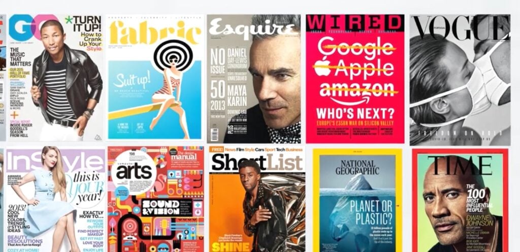
Get familiar with the practical aspects of typography, including key terms, font selection, common mistakes, and tips for applying typography in Adobe. With a particular focus on fonts—a defining character of typographic design—this class from designer Martin Perhiniak guides you on how to use them to create the best possible reader experience.
Skills Developed
You will learn about:
- Selecting and pairing fonts
- Important typography terms
- Text alignment and image positioning
- Choosing text color
- Overall visual and legibility
Make It Portfolio Ready
This class analyzes typography for various applications, including posters, business cards, apps, and billboards, providing you with applicable skills for all portfolio projects. The class project is a magazine page or spread PDF, which is easily shared in physical and digital formats.
2. Typography Pattern Design: From Sketch to Portfolio Ready Piece
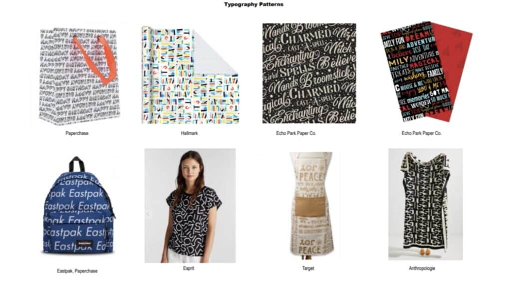
Maria Vashchuk walks you through how to incorporate lettering into surface patterns for paper and fabric products. If you enjoy stylized writing and fashion, surface design is your key to artistically blending these two interests. Whether you’re creating typography by hand or with a digital program, this class gives a sense of how to use that lettering in pattern design.
Skills Developed
You will learn about:
- Sketching pattern-worthy typography
- Digitizing pattern elements in Adobe
- Incorporating typography pattern design into your portfolio
Make It Portfolio Ready
This class concentrates on creating a repeating typography pattern, with the option to add illustrative elements. Once you understand how to create repeating typography, you can learn the techniques that make it translate into a good surface pattern. With this in your portfolio, you’ll demonstrate skills that adapt to a range of industry projects.
3. Type Design Basics: Design a Unique Decorative Grid-Based Typeface
Go beyond ready-made fonts by designing your own typeface with Evgeniya & Dominic Righini-Brand. You’ll go from selecting a source image and creating a grid to designing an original, one-of-a-kind typeface with a geometric vibe, though it leaves plenty of creative room for rounded elements.
Skills Developed
You will learn about:
- Grid development for glyph design
- Designing glyphs from a grid
- Adjusting glyph proportions
- Customizing typeface
- Using typeface in compositions
Make It Portfolio Ready
This class teaches you an entire typography process, from inspiration in the form of a photograph to creating the letters themselves to incorporating them into a larger design. As a portfolio piece, your final project can demonstrate a wide range of skills in the form of a flier, web page, or fashion design.
4. Playing and Designing With Typography for Brands
Font and text design are hugely important to branding, and must support the underlying message of who an organization is. Along with graphic design, well-executed typography can take branded campaigns from good to great in both print and digital formats.
Skills Developed
You will learn about:
- Choosing, pairing, and manipulating fonts
- Design techniques that resonate with brands
- Advanced digital design tools for typographic compositions
Make It Portfolio Ready
This class from Jeremy Mura guides you through creating both a logo and a hero image for a real or imaginary brand you’re familiar with. If possible, create both for the same brand to create a complete spread within your portfolio, displaying your ability to create marketing packages.
5. Matchbox Label Techniques: Typography, Vintage Fonts & Text Arrangements
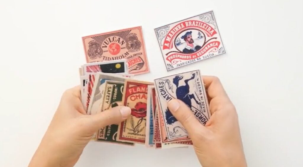
Old matchboxes feature fantastic art. Back when lamps and candles often needed lighting, and smoking indoors was a far more common habit, matchboxes were somewhat like beer labels today–a place to share branding. Even back then, typography was an essential part of that, and you can recreate these designs with modern text design.
Skills Developed
You will learn about:
- Limited color palettes of vintage design
- Resources for vintage-inspired fonts
- Matchbox design label process in Adobe Illustrator and Photoshop
- Combining illustration with typography for this specific style
Make It Portfolio Ready
Di Ujdi helps you create something that was once a standard feature on everyday objects found in homes and businesses. While you can undoubtedly keep digital copies, consider making a small collection of matchboxes featuring your labels, adding a little charm to a largely two-dimensional portfolio.
6. Dirty Design With Draplin: Crusty Techniques to Create Truly Original Work
Clean, perfect, and minimalistic isn’t always the most effective way to style marketing materials. Work with a bit of grit can evoke earlier times, and the interesting character of physical paper, ink, and scissor cuts. This class shows you how to incorporate that grit that can actually improve your projects.
Skills Developed
You will learn about:
- Using Photoshop and Illustrator for a handmade look
- Basic tools that give work a low-res appearance
- How to get an old printmaking look
Make It Portfolio Ready
Aaron Draplin doesn’t dictate the exact project you create, but instead teaches a range of techniques for a gritty, 20th-century aesthetic. It’s up to you how you combine them, though ideas may include magazine ads, concert posters, album covers, and comic strips.
7. How to Look at Type: Fundamentals of Web Typography
The text you see online might not seem all that different than what you see in print. But when someone online sees so much text at once, your typography choices need to stand out. This class teaches typography design specifically for the web, considering the endless possibilities and demands of web content creation.
Skills Developed
You will learn about:
- Key typographic terms and elements
- Selecting typefaces for different project types
- Pairing typefaces
- Typography layout sizing, spacing, and proportions
Make It Portfolio Ready
Jason Santa Maria guides you through creating a mockup personal webpage for which you’ll need to select at least two different typefaces. The final product will be the perfect addition to your portfolio as not only an example of your typography skills, but a brief introduction to you as a professional.
8. Hand Lettering Practice: 3 Easy Steps to Explore New Typography Styles

If you like drawing, this is the typography for you! Learn to develop your own lettering styles with an accessible, three-step process that results in numbers and letters with true personality. This class emphasizes the importance of daily practice over “tips and tricks” when it comes to building skill.
Skills Developed
You will learn about:
- The meaning of “lettering style”
- A structured approach to developing letters
- Hand lettering proportions, shapes, and details
Make It Portfolio Ready
Vinitha Mammen challenges you to create nine variations of each letter of the alphabet and each numeral, zero to nine. By the end, you’ll have an impressive library of originally crafted lettering styles that show off your dedication, creativity, and design consistency. To take it up a notch, add color to some or all of your variations.
Your Words Have Power. Make the Most of Them!
Typography is a vital component of design in both the analog and digital worlds. As a designer, you use images and words to communicate a message, and you know that attention to detail can make all the difference.
From font and color selection to hand-drawing completely original text, you have endless options for making your words catch attention and make a difference. Make the most of it as you build your design portfolio!
Related Reading
Katie Mitchell
Katie lives in Michigan with her husband, kids and pets. She enjoys cooking, travel and live music.
Try Skillshare for free! Sign up for a 7 day free trial today!
Get Started- Unlimited access to every class
- Supportive online creative community
- Learn offline with Skillshare's app


