Transcripts
1. Introduction: [MUSIC] Letters are just like us they come in
all sorts of shapes, sizes, and even personalities. What if I told you that you
have the ability to develop your own unique lettering styles from scratch to practice
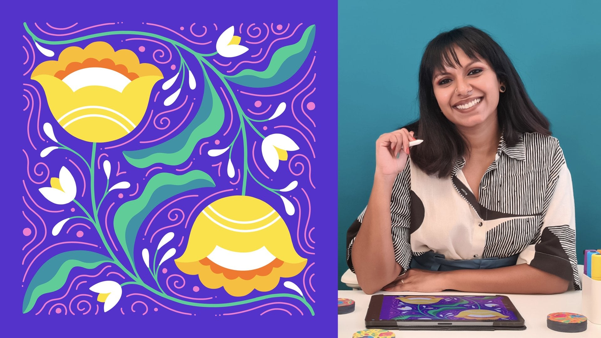
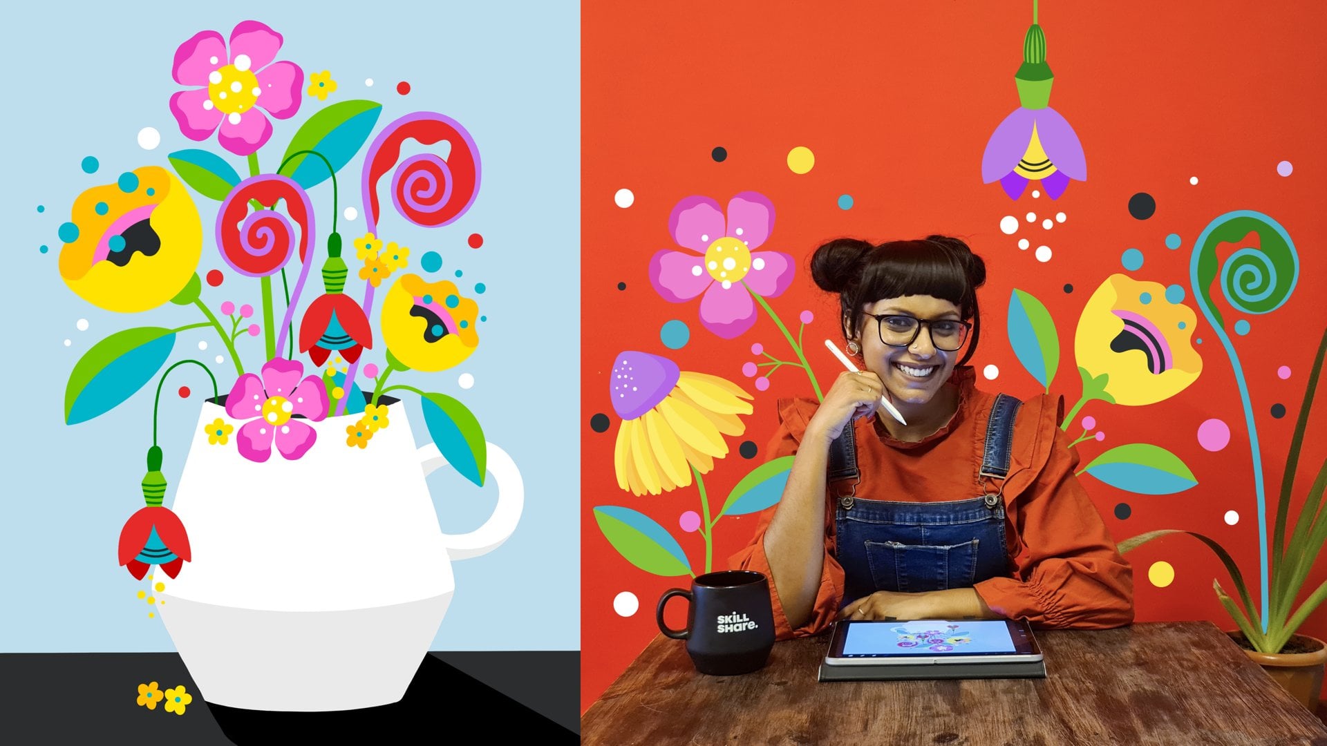
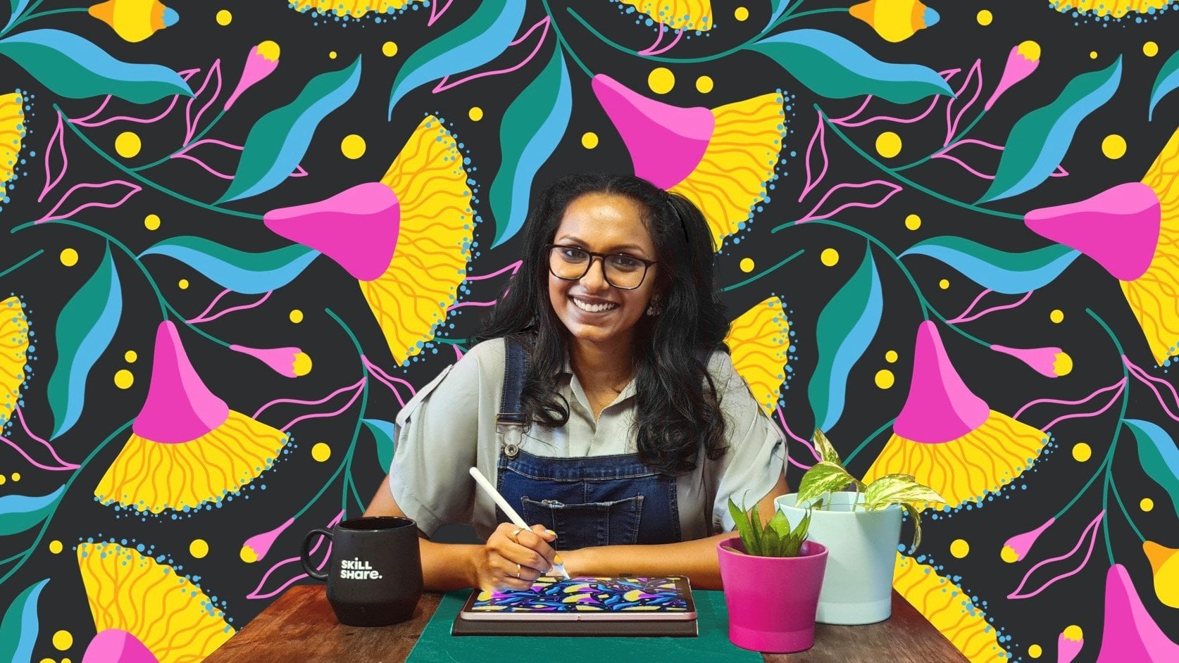
and exploration. I'm Vinitha Mammen, a freelance lettering artist and illustrator with a background
in fashion design, and a top teacher on Skillshare. In this class, I teach you how to develop lettering
styles through a structured approach using my three-step process
of building letters. I'll take you through
these steps in detail and show you exactly how I put them to use to develop multiple styles of
a single letter. All you need to do is use
this formula that I teach you to practice and develop your own unique
lettering styles, one character at a time. Working daily towards a specific
goal has helped me more than anything else has in my lettering and
illustration journey. Over the course of
these daily challenges, my own unique lettering style
started to reveal itself in different ways and that gave me a sense of direction
to move forward in. So if you take up
this challenge, I'm sure it's going
to present you with some life-changing
revelations along the way. By the end of this class, you will have an organized
and structured method to practice and explore
your lettering. If you complete your projects, you'll have a huge
reference library of your own lettering
styles that you can use in your future projects. This class is for anyone
who wants to level up your lettering game and it is suitable for all skill levels. Whether you're a beginner who doesn't know how to get started, or you're already
an intermediate or advanced level
lettering artist looking for some
authentic variety in your style, I've
got you covered. I'll be demonstrating
my techniques by sketching on my iPad using the drawing app
Procreate and an Apple pencil. However, you're welcome
to follow along with me using any sketching
medium of your choice. You do not need to have an
iPad to take this class. So are you ready to let loose and do some life-changing
lettering drills with me? Let's get started. [MUSIC]
2. Class Project: [MUSIC] In this class, we're going to explore different lettering styles
through practice, so your project
with this class is exactly that, practice. You're going to explore nine
different variations of each uppercase letter in the English alphabet
and numerals from 0-9, so that's 36 in all. For this I've put together some practice templates
with lettering guides, so you can get
straight to exploring without having to do all
of the boring stuff. Doing all of these
36 characters in one go is going to be exhausting
and even frustrating, so my suggestion is
that you tackle just one or a maximum of two per day. That way you'll be
less overwhelmed and you can approach each
one with a fresh mind. You're welcome to
use whatever medium you're most comfortable
with for sketching, you can either use the digital templates
to draw on your iPad or the printable templates
if you want to practice traditionally with pen
or pencil on paper. Before moving on,
please download these practice templates from the resource section
and keep them handy. As you progress
through your practice, you can upload
images and videos of your explorations in
the project gallery, so we can all get inspired by each other's work and hold ourselves and each
other accountable. I will also be doing this
project and I'll be uploading my practice sheets on the project gallery as
well as on Instagram. If you choose to share your practice journey
on Instagram, don't forget to tag
me in your posts, stories and reals so I can
both see and share your work. That said, I do not
want you to worry about sharing your
work as you explore. The pressure of sharing your work can sometimes
really get in the way of your
letting loose and if that is something
that bothers you, and I want you to know that you absolutely do not have
to share your work. Of course, we'd love to
see what you come up with, but the more important
thing here is that you explore without limiting
yourself in any way. You can very well finish
each character and then decide if you want
to share or not, cool? Similarly, do not worry about achieving perfect lines
and curves every single time or if you're
using Procreate about how your adjustments
are going to affect your time-lapse video, also you can use your eraser as much or as little
as you want to. All I want is for
you to let lose, trust the process and have
fun [MUSIC] so shall we? In the next lesson, I'll walk you through
my three-step process of arriving at different
lettering styles. [MUSIC]
3. Three Step Process: [MUSIC] What exactly do we mean when
we say lettering style? There are a lot of
different factors that go into defining a
particular lettering style. The kind of typeface,
the angles, the mood, weight of the lines, detail elements, and more. All of these collectively contribute to a particular
lettering style. When we try to come
up with new styles, we have a whole bunch of
things to think about, and if we try to tackle
them all at once, we're going to be
all over the place. Instead, we break this down into a simple three-step
process so that we have a more structured
approach to developing lettering styles and we can
focus on one thing at a time. Let me give you a little
glimpse into this process. First, we establish
the proportions of our characters by setting
guides for us to draw within. Secondly, we explore and arrive at the shapes
that form our letters. In the final step, we add details to wrap it up. I'll talk about
each of these steps in detail in the coming lessons. For now, all you need to
remember is proportions, shapes, details, in that order. It's actually a common
rookie mistake, not just with lettering but
with any kind of drawing, to get caught up in the
details right away, thereby ending up with pieces
that are either out of proportion or lack
visual balance. Instead, if you
start by laying down a strong foundation before refining things and
adding the details, you have a much better chance at ending up with a
well-balanced sketch. In the next lesson, we'll take a good
and detailed look at our first step, proportions. [MUSIC]
4. Step 1: Proportions: [MUSIC] As we saw in the
previous lesson, the first thing we focus on in our three-step process
is proportions. Let's take a look at
how proportions affect lettering styles
and how we can play with them to create
unique letters. Now, generally speaking, most of our uppercase
letters and numbers, fit nicely inside a
five by three grid. There are some exceptions
which we'll get to in a bit, but for now, let's
see how this works. I have a five by
three grid here. Let's try using it to
draw something simple like an E. With
letters like this, you just need to follow the guidelines and fill in the appropriate
squares in your grid. It's very straightforward. Same with other
straight-line letters like T, H, and so on. Now if you want to do a
more curvy letter, S, for instance, the
most rounded parts of the curves will pick a little bit outward
from the guides. Don't try to fit them
perfectly inside the guides. They look best when they
extend outwards of tad. As you can see, these are not as straightforward as street
letters but one thing that helps is to really use the grid to focus on
small sections at a time. Once you get a hang of it, it won't be a big deal anymore. Practice in order to get there. That's the only way. Now I have the top
and bottom parts. Next, we connect the two by bringing this down like this, bringing this up like this. Now we just need to follow
this curve and draw a parallel curve to this curve. Similarly here, you want to draw a curve parallel to this curve. We'll just bring the N down and then bit like this and close it. This comes up like this
and again, close it. See you're still using these grid lines to
guide your curves. Just that you need to get
your curves to extend out of the grid a little bit to get a smooth and balanced
looking shape. When you put it next
to the other letters, the curves are squished
into the grid, they will not look
cohesive together. I'll just fill those in as well so you can see the shape better. [MUSIC] Now, you
can use this grid, not just for letters, but for numbers too. Let's try one, like
seven for instance. This is how I would do a
seven with a slanting line like this and a
straight line on top. Fairly easy. Now so far, we used a five by
three grid with columns and rows of equal width. This and this are the same width and it
is even throughout. Now, we can try changing that. For example, this way we
can keep it the same, but along this side we
can increase the width. Let's do six instead of three. Two, three, four, five, six. I'll complete the rectangle. Now instead of drawing down
every line we'll draw down every other line so that we
still have three columns. It's just twice as wide now. It's still five by three, just with different proportions. Now let's try to use
this guy to join E. The process is exactly
the same as we did before. See, just by varying the
proportions of the grid, we have a different
looking E. Similarly, we can try all different
variations in the proportions. For example, let's do
one the other way. Instead of five squares
down, we'll do 10. This way, we'll go
back to just three. Now our columns
are all one square wide and our rows will
be two squares wide. Let's draw our E
on this new grid. [MUSIC] There we have yet
another variation of the E and you can go even
more crazy with this. Let's try something. We'll start off with a five by
three rectangle, just like our original one. Now instead of dividing this equally into rows and columns, we can even divide it unequally. Instead of drawing a line
at the first square, we draw it a little
bit higher up. Similarly here, we go
a little bit lower. For our middle row also, we can go a little bit inside. These three are almost the
same width and the two in-between are thicker and we'll stick to columns
of equal width for now. This is also a
three by five grid, but with varying robots. Now let's see what our E
looks like on this grid. It's similar to the first one, but still slightly different. Just like this, you can play
around and come up with all variations in the
grid proportions, arrive at letters with
different proportions. I'm trying another one here with thicker rows on the
top and bottom. That gives me an E
that looks like this. Next, I'll just start with a random square like this
and let's see what happens if we split just
the top row into two and keep the other
four rows one square wide. Once again, we have
five rows and I'm going completely random
with my column widths. I'm just experimenting here
by going completely random. This is what that gives me. I'm going to try one
more that's extra wide, with a really skinny middle row. This is what I ended up
with using this grid. This is where proportion
really comes into play. This is how we vary
the proportions of our letters by varying the proportions of the
guides themselves. As you can see, the
possibilities of the different
proportions you can arrive at are pretty
much endless. I want to encourage you to
pick any letter or number and go crazy by trying all
proportions for the guides. It's a very satisfying
activities. I'm sure you'll enjoy it. Fun fact, it is these
proportions that essentially give you the different font
styles within a font family, like regular, bold,
condensed, etc. Now that you know
how this works, you can even create your
own styles from scratch. Now, remember I mentioned
there are some exceptions. Wider letters like M and W do not fit very well into
the five by three grid. What they need instead is a five-by-five grid and then they'll fit nice and
snug just like this. You can play with
the proportions of the five-by-five grid, just like we did before, to arrive at
different proportions of M's and W's as well. I've put together two types of practice templates for you. One with just the
basic one is to one proportion and one with grids in a random
mix of proportions. You can decide if you want to do all nine variations in
just one proportion, or you want to mix it up
with random proportions. However, if you ask me, my personal recommendation
would be that you start with just
one proportion, especially if you're
a beginner or if you haven't done a similar
exercise before. That way you can
keep this one thing constant and explore shapes
and details more freely. In any case, you'll see this in the upcoming demo lesson that even with just one
basic proportion, you can create a whole bunch
of unique lettering styles. Then later on you can progress
on to doing a set with mixed proportions as a more
advanced level exercise. You're also more than welcome
to create your own guides, for you practice templates, depending on your
personal preferences. In the next lesson, we'll move on to our second
step, which is shapes.
5. Step 2: Shapes: [MUSIC] Now that we know how
different proportions of guides form letters
of different weights, let's take a look at shapes. This is my favorite step, probably because this is where my creative juices
get flowing the most. A single letter can be formed in multiple different ways by using different types of shapes. Depending on the shapes
that form letters, these can be categorized
into different types, like serifs, sans serifs, script, handwriting, black
letter, display, etc. But we are not going
down that road. For the purposes of this class, we're not going to classify our lettering styles or try and learn the
rules of each style. We are going to let our
imagination state control and intuitively flesh out
the shapes of each letter. Let me show you what I mean. I have here a basic E and the most basic proportion
from our previous lesson. Now we can start exploring different shape
variations for this. For example, instead of
these straight lines, we can code them inwards
a little just like this [MUSIC] and close off the ends. If we turn off the guide layers, this is what it looks like. In this case, it was just
a minor shape difference. But it is definitely a different
lettering style than the original because of the
difference in the shape. Here's another easy one. You can start by just curving out on the corners like this, [MUSIC] cover out even
the inner corners, and then connect them
to close off the shape. That's another one and you can leave it like this or
even take it further. When I look at it now, I think it'll be nice to
just push this part up a bit more and adjust the curves
to blend into the new shape, [MUSIC] and similarly, this can move down a tad. [MUSIC] That's another option. Just explore one
thing at a time, step back and take a look, and make some modifications
if you feel like it. We can also deviate
a lot more from our basic shape than
we've been doing so far. Let's see how we can
transform this into a more cursive
style E. For this, I'll start off by drawing some
big curves just like this and then refining them and closing up the shape
with more curvy lines. I'm not following any
rules of calligraphy here as I flush out the
shape, I'm just going for it. [MUSIC]. There we go. Just like that, you can create a wide variety of lettering
shapes by deviating as little or as much as you want to from the basic
shape of each letter. You just need to make sure that the foundational
elements of each letter are intact and that legibility is not
compromised along the way. Now, let's move on
to our last step, which is Details in
the next lesson. [MUSIC]
6. Step 3: Details: [MUSIC] Our last stage in this process
is adding the details. This is where we add those final touches to
elevate our lettering. These are the little
elements that give our letters their own
unique personalities. These details can be anything
from subtle elements like textures or highlights and shadows to more obvious
ones like 3D effects, drop shadows, inline, or set of details. Let's try adding some details to the Es we've been exploring. For this one, let's
start by adding some simple inline
details like that, just in the corners may be. Thicken them right
to the corners, a tad or something like that. Very simple, but
still effective. Maybe just a little
line like that on the middle crossbar
and that could be it, or you could add a
3D effect to this. If you want to
learn how I create these 3D effects in a
step-by-step manner, I teach that in detail in my class called
Hand Lettering and Beyond: Negative Space 3D
Lettering with Watercolors. That's another option or you can add some little
details to the ends here. Something like that maybe, where we just split
the end into two, and maybe add some dots to give it that retro
touch. Just like that. You can really take it to
any direction you want to. Let's try this with the
second shape we arrived at. We could do something
like an offset outline. This process is similar
to doing 3D effects, but without connecting the front and back faces
to each other. It's just like a
floating surface that slightly offset
from the main one. Or with bold letters like this, it's a great opportunity to
drop patterns inside them. Since you have so
much space to fill up so let's try a random
squiggly pattern. That's another fun option, or you can keep
it really minimal by simply adding some circles to these curvy ends so they look like little
holes in the letters. With these letters that
look curvy and flowy, my favorite details to add on them are just some
simple highlights. I'll just fill it in fully and then add these white blobs
over the rounded parts, just on one side, so it looks like it's
reflecting the light. Then a couple of
thin highlight lines around the thinner parts
of the letter as well. Or you can do a 3D effect on
these curvy letters as well, not just on the straight ones. The technique remains
exactly the same. This is what a simple 3D
version of this looks like. We can also mix multiple
details together. For example, you can do a 3D
effect as well as an inline. But don't overdo it, stick to a maximum of two so that you're not adding
chaos to the equation. In fact, you can even skip
adding details altogether. It's not a mandatory
step at all. In some cases, the shapes are loud enough to speak
for themselves. Or you're deliberately trying to keep things extra simple, in which case, adding details
could just be too much. It pretty much depends on individual preferences as
to where you draw the line. What feels an organic part of the letter and what
feels out of place. It's a good idea to always
check in with yourself after every detail you add and make sure you feel like
it was meant to be. That's it, now you know all
three steps of our process. In the next lesson,
I'll put all of these together and show you an example of how I would go about this exploration exercise
from start to finish.
7. Project Demo: Part 1: [MUSIC] We've taken a good look at our step-by-step process
and we're now ready to actually apply this process to practice developing
new lettering styles. I'll pick the letter
J to demonstrate to you how I would go
about this exercise. Let's get right to it. I have a square canvas opened up
here on my Procreate app. You can go with
whatever size you like. This is a 12 by 12
inch square canvas. Now let's bring in the
template for that. We'll go here to
this wrench icon. Go to Add, insert a photo, and your downloaded templates
should be right here. So tap on it. If your
template doesn't fill up your canvas
fully, just resize it. Make sure magnetics and
snapping are turned on. Just drag these handles to Resnap to the
edges of the canvas. Same on this side and release. That's it. Our
guide is now ready. You can go into the Layers panel and tap on this end here. You can reduce the opacity of your guidelines if you like. Normally I would do this, but I am not right now so that you can see the
guides clearly enough. All right, so let's start with our explorations
with the letter J. Let's open up a new layer, where we will start
with our sketching. First, I'm just using
my guide to draw a very basic J. I'm using
the 6B pencil brush, which is a default
Procreate brush under the sketching category, you can use whichever brush
you're comfortable using, and you can use whatever
color you like. I like sketching with blue. Now from here, it's
going to curve. Look at this square
alone for a moment, from this corner to this corner, which I'll curve just like that. Then extend it. Similarly parallel
to this curve. We draw a smaller
curve here like this. Then we'll just close
the site and fill it in. That's your basic J. One thing you can do is, if you want this basic
shape to just hover underneath your sketches,
you can do that. Just go here, swipe
left on this layer, tap duplicates to
make copies of it, and then you can drag it
over to all of your guides. You can also pinch
these three together to merge them and then duplicate. So you can move them
together like this. Duplicate once more, and put it here. Then you can merge
all those layers, and you can reduce the
opacity of this layer. It's just there for
you to see that this is the basic shape that
we are trying to evolve. If you're working traditionally
and not on the iPad, you can do this with a
light-colored marker and it'll work pretty
much the same way. You can even skip this step
altogether if you'd like, and just jump straight
to exploring. We'll open up a new layer and get to our actual sketching. Whatever comes off the top of
your head, just go for it. Whatever. Right now, I feel like curving
this top bar. So that's what I'm going to do. Just a simple curved
line like that. Then I'm going to take
it from there like this. I want to bring
the curve out like this and join it with this line. See how I'm not letting the
shape underneath restrict me. It's just a very generic
shape underneath. To just remind me what
I'm playing with here. I'll do a little
swirl over here, and a smaller one here. Feels like a bit too
much. Maybe not. I'll just leave it
like this for now. You can make all the
adjustments you want to make. Nobody is going to judge
you or question you, this is your practice exercise. Just feel absolutely
free to make mistakes. Fix them or not. I have a basic skeleton now. I'm going to flesh it
out a bit more next, I'm thickening the downstrokes, following the most basic
principle in calligraphy, which is upstrokes are thin, and downstrokes are thick. If you've no idea what
I'm talking about, checkout my Skillshare class titled hand lettering
and beyond. Where I explain this in detail. I want the upstrokes also
to be a little bit thicker, but still considerably
thinner than the downstrokes. Just like that. I'm fleshing out the
shape of my letter. I want the end of
this to be like this. Nice and round. Again here, a
similar bulbous end. Then I'll make the
thin parts a bit thicker and bring it here. I'll thicken this
one from the top. Then just finish
it off like this. That looks good so far. Now to get a better
sense of how this looks and to clean it up a bit. You can long press on
the eraser tool to erase using the same brush
you've been drawing with, and we'll just get rid of
some of these extra lines. I'm just switching
between the brush and the eraser to clean
up my shapes a bit. This is more about seeing the shape more clearly
than anything else, so that we can see if we need to make any more adjustments. Now it feels a little
bit unbalanced to me. This is a little bit high on this side and the top of this, to also match this, I'm going to just take it from here and lift it up from here. Then join it back into this. Now we can erase all
of this and redraw it. I think that looks better,
definitely more balanced. All right, so now the shape is done and we can get
to the details. I'm thinking of adding a
3D effect to this one. For that, I'll duplicate
this layer and move it to wherever you
want the 3D surface to be. I'll reduce the opacity
of this new copy we made, and on a new layer, we can draw over that
to get our 3D surfaces. We're just tracing
over these lines and then connecting them to the existing front
face of our letter. If you want to
learn how I create these 3D effects in a
step-by-step manner. I'll teach that in detail in my class called
hand-lettering and beyond, negative space 3D lettering
with watercolors. That's that. Now we can
turn off that guide layer. This is it. If you want, you can even fill
in one of them to make the 3D effect more obvious. Here I'm filling in the
front face of the letter. [MUSIC] That's our first one. Let's move on to the next. Now, you can keep continuing in the same layer if you like, or if your iPad offers
you enough layers, you can do each version
and a new layer, which is what I'm going to do. Now for my second one, I'm going to take
this basic shape itself and just curve
it a little bit. Similarly, I'll curve
this top one also. Again, this line. I'm
just trying it out. I've never done a J like this. I'm really just experimenting, which is what this exercise
is all about anyway. Maybe I'll end this
on a curve like that. This can be more
straight. Let's see. I think it looks weird
right now to be honest. I'm not very happy
with the shape yet, but I'm going to see if there's anything I can do
to make it better. Maybe the details will help. How about some Bevel
details? Let's try that. I'll just do a
basic inline first, just like that connected
to these points. From here to here. Also here and here. Now it's looking better I think. I'll just do some
shading to make the emboss look box and more. That's done. It
looks much better. Let's leave it at that and
move on to our next one. Open up a new layer, and what can we do now? How about we try a
set of the same. I'll just start by
drawing the sides here and extend them down a tad. Somewhere about now you'll start feeling yourself
loosen up a bit. Initially, you would have
probably felt a bit lost. But the more you do this, the more ideas you get
and the more flow you'll have. Maybe like that. We'll just mostly
follow the basic shape of our ghosts of J's beneath. We'll extend this also, and connect it like that. It looks like a good
shape to get started. Now, I want to make it more
interesting by splitting these setups into
like a fish tail. Here also will do the
same thing like that. Then erase all these extra bits. I think I want to
extend these just a little bit more on the top. Here also, I want to bring this outwards just a little bit. Yes, I like that. Actually. Yes, I like
how it looks over here, but up here, maybe the
shorter one is better. I'll go back to how
it was initially. Like I said, I'm
going to leave this, extend it a little bit. Now for this, I think a nice and fun inline
detail would be good. I'll first draw a light
inline as a guide. On a new layer, I'll do
the actual inline detail, just slightly thick and dark on the outside and tapering inward, and some dots
in-between the two. Similarly over here and here. Then again, a couple
of dots in the middle. Then I'll just erase that
inline guide we did. [MUSIC] That looks good to me. The next lesson, we'll continue this exercise by doing
the next three versions.
8. Project Demo: Part 2: [MUSIC] For this one, I want to try a more
skinny monoline type of J. I'll just start out by
drawing a basic J structure. I want to make it
come like this, and I want to take it to
the other side like that. Maybe curve it a little
bit more like that. [NOISE] I'll just refine
these curves a little bit, switching between my brush
and eraser tools once again. Then, how about
something like this? Just on the ends, just some bulbous
details like this, and another one like
this at the end. I'll just fill it and
see how that looks. I like it. [MUSIC] I think
the lines might need to be a tad thicker all over. Maybe we can make these joints
more curvy and flowy and see how that looks instead
of the sharp corners. I like that so I'm going to do that to this
intersection as well. This is giving me a whole
metal structure vibe. All the shading I want to do are a few highlights in
these rounded parts, and maybe tiny little
ones right at the joints, and maybe some here, and voila. Let's move on to the next one. This one, I'm going
to start off with a nice curvy cursive style J. If you notice, I'm not
following the ghost shape underneath to the
T. For example, I've shifted the downstroke
to the side a bit, so feel free to do that. I'll do a nice swirly tail
here, just like that. I think I'll curve this top
part a little bit more. Now, I'll add some flesh
to some parts like this from either
side of our lines, blend this into this curve here, keeping this part thin, and finishing the
curve just like this. Then maybe this part
can be like this. I'm just randomly trying things out based on where
there is space. Like here, there's
not much space, so I don't want to
thicken in that area. I'll see where I can fit
some extra thickness gracefully without
making it look stuffy. I think maybe just one side is probably enough in this case. Let me try raising this side. Yeah, I think I like that. It looks interesting to me. Maybe, over here, we'll get rid of the inner one. Here we'll make it
similar to this, just like that, [MUSIC] and
blend it into the curve. Nice. I'm just going to
quickly fill in these shapes. As for the details on this, I think I'll just do
something like that. Yeah, some thin
negative space details. Just starting from
the outside of the shape and casually
ending inside. [MUSIC] That might just be done. Now for our next one, I'd like to try something with the same basic shape so I
want to just duplicate that and move it here just like that and just keep it there
with a low opacity level. I can just follow that
shape again in a new net. [MUSIC] Just a basic shape. Now over here, I'll
have it come like this, and then like this, like a more traditional
script style, and this part just like that. Now I can go ahead and delete that extra guiding layer since this is all I want
to take from that. I'm just going to thicken
the downstrokes with more rounded shapes this time. Thicken the upstrokes
also a tiny bit, and finish off with
a thick rounded bulb and similarly up here as well. [MUSIC] Don't be concerned that these two styles look too similar and they're right
next to each other. That's all perfectly fine. In fact, they're most likely
not going to be next to each other at all when you actually use these styles
in your projects, so why should it matter? Just remember that
this is not the end. This is just a means to discover new ideas and let them evolve. Don't break the flow
of your ideas coming through by letting these
things bother you. It's totally perfectly fine. Just whatever comes
to your head, get that thought to
flow down to your hand and onto the paper or
screen in this case. Just get it all out of your
head and in front of you. That way, you make space for
new ideas and discoveries. Here I want the crossing
to be clearly visible, so I'll just erase
a tiny bit of this. This looks so flowy
and Juicy right now. I want to do some
highlights to make it look like some glossy
liquid lettering. [MUSIC] I'll do one here also to highlight that
intersection a bit more, and we can call this one done. The next lesson will be our third and final part of this exercise. I'll
see you there.
9. Project Demo: Part 3: For our seventh
variation at the Jape, I'm going to start with a
nice and bold monoline look. I'm going to shift the
downward line to the side, then bring it down to a curve. Sometimes it takes a
few adjustments to blend curves smoothly
into straight lines. This is coming like this, I want this to come over this line and I'll draw
a full circle here, and blend that into the curve. It looks pretty
messy at this point, doesn't it? That's okay. Given the goal of our exercise, that does not matter, especially at this stage when
they still figuring it out. Later, you can clean
it up if you want to. This is like this, and I have this circular
part coming in over it. I'll just clean up some of these distracting
lines so that I get a better sense of the
shape. Let's see. Actually this bit is not
going to be visible. Maybe we don't need the
top crossbar at all. Let's see what happens
if we get rid of that. This might just be all we need. It's still a J, just like that? Yeah why not, so let's
keep it like this. I'm just going to
draw this line again, so we can direct the
rest of that curve properly and then we
can erase it again. Because this is a
back-and-forth process, as you can see, not a linear one where we just go from
point A to point B. We're just trying to build
this transition between the thick downstroke and the
thin upstroke gradually. Again, too many
distracting lines, so I'm just going to get
rid of some of them, and I'm refining the
curves some more. Let's fill it in. Now here, I want the circular part to be distinctly visible
over the thick line. I'll just go around the
circle and leave out a thin negative space to define it just in
the intersecting part. Then we continue filling it in, making some more adjustments
to define the shapes nicely. Now for the details, maybe a spiral inside
the circle, like that. I like that. But I'm
going to do a neater one. Take a little bit of time to
refine the curves as I go. If you notice, I keep
tilting my cameras around a lot during
my sketching process, and this is so that I'm
drawing every curve at an angle that feels
most natural to me, which really helps me
get more smooth curves. This is something I love
about drawing on the iPad. It's so easy to adjust your
drawing angle as you draw. All right, there we have it. I don't think we need any
more details on this. Let's move on to the next one. If you've seen my work, you
know that I love my florals, so how can I not do
a floral version? I think I'm going
to use this shape itself actually and do some floral design and please of the circle maybe. Let's try. Again, I make a copy of
this and move it here, reduce the opacity, and in a new layer, I'm going to draw
over this shape. I'll start with a
circle this time, drawing a rough
circle like this, press and hold, and tap with one finger
to get a perfect circle. Now I'll just draw
around the G like this. That's it. Now I'm going to
delete this guide layer. I'm opening a new layer and
using this as my new guide, and I'm going to do
some flower over here. Maybe something like this, I don't know, I'm just
trying something. Let's see what we end up with. We'll have this form
into petals like this. I have an entire
in-depth class on developing these stylized
floral illustrations. So if you want to
learn how to do that, definitely check that out. I like how this looks so far. Now, I want to have this stem come out more
perpendicularly with respect to the flower as opposed to the tangential
line the guide is forming. So something like that. Then we blend it into the
guide shape, just like that. I'll just refine these curves a bit more to make them smoother. I think I want to add a
nice curvy top bar on this, so we have more stems to add more floral elements
to. I like that. Let's add a leaf right here, maybe another one here, and one more over here, a little bud in here. We can use that same shape
at the end over here. There's some more space here, so maybe one here as well. Actually, maybe we don't need this one at all,
just that will do. Yeah, that looks better. I'm wondering, what if we
bring this down a little bit? Just freehand select around
it and drag it down a tad. Maybe somewhere around here. That looks so much
more balanced. There was too much
empty space at the bottom and it was getting
a bit crowded on top, so now I'll just
smoothen this out, and I'll thicken the
entire stem a little bit and fill in the central bit just to bring in some
contrast to the flower. This came from this, but it looks so
different in the end. I love it despite
how simple it looks. I feel everything in
here looks like it was meant to be not forced in there, and that is the best
design in my opinion. Now let's do our very last one. You can also take
some time to look at the shape and explore
what you see. Like right now I
see the curve of the J being some kind of a tail, like a fish tail maybe. Let's explore that and
see where it takes us. I'll start with the tail
itself, just like that. Now, we can give our
fish a hit like that. I don't know. I don't
think that's working. Actually, we can do a
mermaid instead of a fish. Just molding out a body for her, and a nice round head. Maybe not so round. I'll make
the neck a little thinner, and do a slightly more pointy
face like that, maybe. Give her some hair, a cute bob maybe, now for some arms. This looks more
like a y than a j, and that is a big no. We cannot have our letters
look like other letters. Because then we're
messing with legibility. The one unbreakable rule in
lettering for me is this, do not compromise on legibility. I've gotten rid of the arms. She can do without
arms, that's fine. What if we make the hair
come more towards this side, like this, and from the
top crossbar of the j? I like that direction. I'm going to explore
that some more, maybe curl up the end, just like that, bring in some whimsy and refine
these curves a bit. Let's give her some
simple facial features. Maybe some cuter,
rounder details instead. Add some scales around here. I'll just reduce the
size of the whole thing a little bit so it fits
better into our grid, and then I'll fill in the hip. In this case, what
you're drawing itself drives the details. This is a mermaid, so we do mermaid details. But it's up to you to decide
how far you want to take it. For example, you can do scales all over the body
if you want to, you can even doodle some intricate patterns
into the scales, or maybe give her a fancy outfit and
some hair accessories, that's all up to you. I'm just defining the
face a little bit more and adding a loose strand of hair right here
to frame her face, and then I'll just clean up
all the lines a little bit. I like it. Now, we have all nine
variations of our j done. Now, typically at this point, I'll give them all
one final look to see how everything came together and see if I need to
make any more adjustments. There will always be some favorite versions and
some least favorite versions. That's totally normal.
You don't have to like them all to
the same intensity. However, if you have something that you
really don't like, and if you have other ideas
floating around in your head, go back in there and
give it another shot. Nothing is set in stone. For example, now
looking at this, I find this looks weird. It even looks like a T gone raw. I'm going to try and
do a different shape but keep the bevel element. I'll just turn off
visibility on that layer, open up a new layer
right above it and draw a simpler
shape like this. Curve it out over here. Could even go up
from here like that. More corners is good for these bevels-style
letters in fact. The more corners we have, the more opportunity to
add the bevel details. Now, just like we did before, we draw a simple inline
inside the shape, we can connect the corners like this to help us in the process. Again, here, if we just do this, we know exactly where the
inline changes direction, and then just connect all
the corners here like this and here like
this and like this. We can also split it like this and the roundest
part of the curve. Now, shading time, I'm imagining
a light source on top, so the bottom phases
will be the darkest, the top phase is the lightest, and everything else
will be in-between. Yes, I like that so much better. Now, I'm going to
do one last thing. I feel like this one needs
a little something more. I think I may be add a
3D effect also to it. I've duplicated this
and I'm moving it to a new position,
reducing the opacity. Go back to the original layer and connect the two surfaces. Now trace over the
lines like this, and I'm also going to fill it
in just like this as I go. I can now delete that guide, just clean it up a bit, and call it done. Yes, much better, I think. Now, you can get rid of the ghost layer and you
can either export it just like this with the guides visible or you can get rid
of the guide layer as well. As for me, I like to
do one more step. I enjoy sketching
with a blue color, but I like my finished
sketches to be either in black or a dark gray. Unfortunately, with Procreate, we have a quick and
easy way to do this. Select any layer,
tap "Alpha Lock", select a new color
that you want, in this case, it's a dark gray, and then tap the layer
again and do fillet. Now, I'll just do that
with all of them. If you're wondering
how this works, I have an entire lesson
dedicated to explaining the different kinds of
masking options in Procreate, including this Alpha Lock in my Procreate floral
illustration class , so check that out. That is all nine versions done. That's a wrap on this. Of course, we can
keep going forever, because as you can see there is so many different directions you can take these to and so many
different possibilities. But we have to stop
at some point. But see how even though we used our simplest guides and the
most basic proportions, we ended up with a wide
variety of lettering styles. Some of them very
exciting, even. If there was one key takeaway from all the research
I did during my master's in fashion design it is that constraints are good. The most exciting discoveries
are made when you keep one thing constant
while changing others, instead of trying to vary
everything all at once. This applies to our
lettering practice as well. By all means, try out
different proportions too, but maybe give yourself another constraint when
you do think about it. In that way, you have something to keep you routed while you explore away. Now,
it's your turn. Actually, it's our turn
because like I said, I will also be joining
you on this journey all the way from A to Z and 0-9, so keep an eye out in the
project gallery as well as on Instagram if you want
to follow my practice. Of course, I'll be eagerly waiting to see your
projects as well. I'll see you in the
next lesson with some final thoughts before
we wrap up the class.
10. Final Thoughts: [MUSIC] If you've explored
even one letter using our exercise format, I'm so proud of you. If you've done all 36, then you are an
absolute superstar. I hope you've
discovered something new and exciting
through this class, and you use it to keep honing
your lettering skills. My suggestion is that you
do this entire exercise at least once a year and hold
onto your practice sheets, whether they are digital
or on paper so that, one, you have this entire
reference library of your own lettering styles to use in your future projects, and two, you can look back at these and see how your
skills have grown over time. I'm beyond excited to see all of the different creative
ways in which you will apply what you learned
with me in this class. Personally, my favorite way to take these sketches
further is to create these kind of mixed
style compositions where each letter is done
in a different style. If you feel up for it, pick a word and do one of these, or better yet, do a poster with your favorite versions
of the entire alphabet. Do connect with me on Instagram, and don't forget to tag me in your posts when you share
your lettering drills. I would be thrilled to re-share student projects
through my stories and stay in touch with you. I also share process
videos and behind the scenes from my freelance
projects over on Insta, so follow me if you'd like
to tag along on my journey. If you enjoyed this class, please consider leaving
a review and giving me a shout out on
social media because your reviews and
personal recommendations massively help my class get
discovered by new students. [MUSIC] I have
more lettering and Procreate classes up on
Skillshare so do check them out, and hit that Follow button on my Skillshare profile page to be notified right away when
I publish a new class. Thank you so much
for sticking around. Until next time. Bye. [MUSIC]
 Vinitha Mammen, Illustrator | Lettering Artist