

Contrast as a Design Principle: The Creative’s Guide
Master the power of contrast to add clarity, impact, and visual interest to any design.


In any given design, every single element—from a single line of text to a detailed photograph—is fighting for the viewer’s attention. As a result, the designer's job is to harness visual chaos and turn it into a cohesive piece.
That’s where the core design principle of contrast comes in. Simply put, contrast is the deliberate juxtaposition of opposite elements, whether that means light against dark, small against large or smooth against rough. This strategic use of opposition is an incredibly effective way to grab the viewer's eye, create visual excitement and take a design from bland to showstopping.
The importance of contrast extends far beyond aesthetics, though; it’s the fundamental framework of successful communication and inclusivity. Whether you're designing a corporate logo, a smartphone app, a magazine spread or anything in between, effective contrast makes it possible to get your message across in a snap. And, in the world of digital design, a certain amount of contrast is a mandatory accessibility requirement, and ensures that content can be read and understood by everyone.
What Is Contrast?
As an essential principle of design, contrast means arranging opposing elements to create visual interest, excitement and drama, as well as to improve accessibility. Essentially, it's the juxtaposition of stark differences that serves to make one element stand out from another.
In some designs, the main purpose of contrast is to generate an area of focus (or a focal point) that immediately draws the viewer's eye. In others, its purpose is simply to make a block of text more legible, or to help an image stand out against its background.
Some of the qualities that designers frequently use to create contrast include:
- Color: Light colors against dark colors, or warm-tone colors against cool-toned ones.
- Size: Large elements next to small ones.
- Shape: Geometric shapes versus organic shapes, or angular shapes next to rounded ones.
- Texture: Smooth against rough, soft against hard or wet against dry.
- Space: Crowded areas paired with negative space.
- Typeface: Serif fonts paired with sans-serif fonts, or bold weight fonts with light weight ones.
We’ll dive into each of those types of contrast later. But for now, let’s find out why contrast matters to begin with.
Why Is Contrast Important?
Contrast in design is far from being a purely stylistic choice; it is a foundational element of effective and inclusive design that directly impacts how users engage with and comprehend content.
To fully understand how contrast impacts aesthetics, the user experience and accessibility alike, it’s crucial to look at each category on its own.
Aesthetic Impact and Visual Hierarchy
From an aesthetic viewpoint, contrast is critical for creating a design that is both visually engaging and well-structured.
Aesthetically speaking, contrast serves to:
- Create visual interest and focus: Without contrast, a design will be flat and monotonous. Juxtaposing differences (such as small vs. large, light vs. dark or smooth vs. rough) injects visual energy into a design and will help prevent "content blindness," a phenomenon in which viewers don’t perceive elements as being distinct from the background.
- Establish hierarchy: Contrast helps viewers immediately understand what is most important. For instance, a large, bold headline will contrast sharply with smaller body text, and as a result will instantly establish a visual hierarchy that guides the user's eye and helps them process information efficiently. Similarly, a bright, high-contrast button clearly represents the primary action a user can take, while more muted ones represent secondary actions.
Readability and User Experience (UX/UI)
In digital design, including web design, layout design and UX/UI, excellent contrast is essential for comfortable and efficient use. As such, it directly affects the overall user experience.
It does so by:
- Enhancing readability: High contrast between text and its background (e.g., black text on a white background, or vice versa) significantly improves legibility, which makes the text easier to read quickly and with less eye strain. This reduces the user's cognitive load, and allows them to focus on the content rather than struggling to distinguish elements.
- Improving usability: In user interfaces, contrast is used to highlight interactive elements. A brightly colored call-to-action (CTA) button contrasting with the page's background ensures users can easily find and click it, leading to smoother navigation and higher conversion rates. A lack of contrast between a button and its surrounding area can make it look inactive or decorative, causing user confusion and frustration.
Accessibility and WCAG Standards
The most crucial function of contrast is to make sure that your design is accessible to everyone, including people with low vision, color blindness, age-related vision changes or other visual impairments. This function is outlined by rules known as the Web Content Accessibility Guidelines (WCAG).
Created by the World Wide Web Consortium (or W3C for short), the WCAG mandates a minimum color contrast ratio between foreground elements (such as text and icons) and background elements. The ratio is calculated based on the relative luminance of the colors.
Depending on their target audience, designers can choose to use either the minimum or enhanced contrast ration standard:
- Level AA (minimum standard): Requires a contrast ratio of at least 4.5:1 for normal-sized text. For "large text" (18pt regular or 14pt bold), the requirement is reduced to 3:1, since larger text is inherently easier to read, even at a lower contrast.
- Level AAA (enhanced standard): Requires a higher, more stringent contrast ratio of at least 7:1 for normal-sized text and 4.5:1 for large text. This standard provides the best readability possible.
By adhering to these standards, designers can ensure that individuals with various visual impairments can understand and interact with their digital content effectively. Ultimately, such efforts make the web a more inclusive space for everyone.
Contrast Is Crucial Across Design Disciplines
As a universal principle of design, contrast can be applied in a variety of ways.
Here’s how designers across a wide array of disciplines use contrast in their work:
- Graphic design: A high-contrast layout or infographic will have a strong visual hierarchy and create a clear focal point. For instance, a poster could use a high-contrast complementary color scheme (e.g., bright orange text on a deep blue background) to make the central message pop, while the fine print is set in low-contrast gray to recede.
- Web design: On a website, proper contrast can both guide user attention and ensure accessibility. For example, a call-to-action (CTA) button could feature a highly saturated hue (e.g., lime green) that strongly contrasts with the website’s otherwise muted color palette.
- User experience (UX) and user interface (UI): In UX/UI design, contrast can serve to clarify interactive elements and the status of certain types of information. For instance, when a primary headline is set in a large, bold font and typeface, it will stand out in sharp contrast next to smaller, lighter body text. In the same vein, an error message that’s displayed in bright red text against a white box, the resulting color contrast will instantly convey urgency to the user.
- Interior design: With the help of contrast, interior designers can add depth, warmth and visual interest to a physical space. A room can be designed with contrasting textures by pairing a smooth, polished marble floor with a rough stone fireplace and a high-pile area rug, while a minimalist room can be brought to life by filling it with ornate accent furniture.
- Landscape design: In an outdoor space, contrast can create focal points, define boundaries between areas and add variety. For example, by placing a group of square, neatly clipped hedges next to a cluster of free-flowing grasses and flowering plants, a landscape designer can achieve contrast in terms of both shape and texture.
- Fashion design: Designers can quickly create drama, highlight the construction of their pieces or balance an ensemble by incorporating contrast. They can do so by combining a sleek silk bodice with a voluminous and textured linen skirt, for instance, or by pairing an oversized white shirt with a pair of slim black leather pants.
Main Types of Contrast
By now, you know that contrast is about much more than just black vs. white or light vs. dark. Rather, it can be achieved by leveraging differences in a number of visual properties. By employing multiple types of contrast, a designer can create maximum impact, clarity and visual interest.
Let’s take a more detailed look at the core types of contrast.
Color Contrast
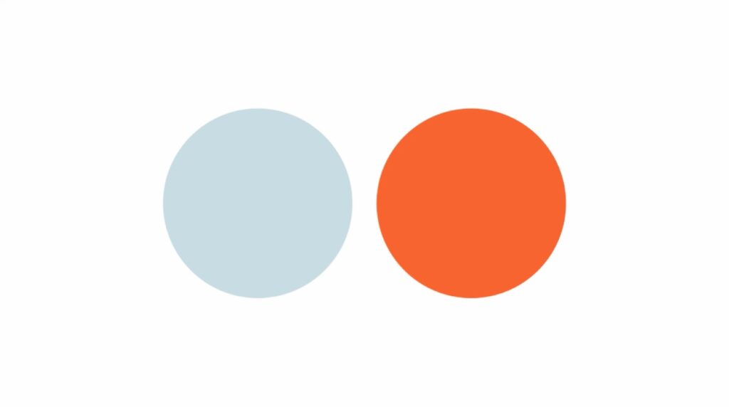
As the most common (and arguably the most impactful) form of contrast, color contrast involves the difference in value, hue, temperature and saturation.
- Value contrast (light vs. dark): The difference in brightness. This is the simplest and most vital contrast for readability.
- For example: Pure white text on a pure black background is the ultimate high-value contrast, used universally in books, documents, and most digital interfaces to ensure maximum legibility.
- For example: Pure white text on a pure black background is the ultimate high-value contrast, used universally in books, documents, and most digital interfaces to ensure maximum legibility.
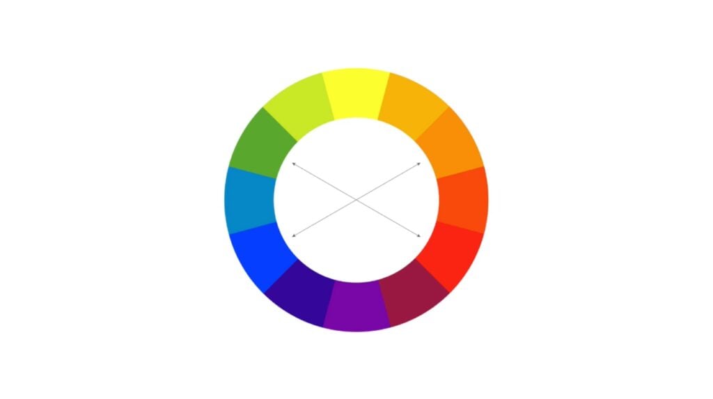
- Hue contrast (complementary colors): Colors that are opposite each other on the color wheel (e.g., red and green, blue and orange) create the strongest visual vibrations.
- For example: A vibrant orange call-to-action button placed on a website with a primarily blue color scheme will immediately attract attention.
- For example: A vibrant orange call-to-action button placed on a website with a primarily blue color scheme will immediately attract attention.
- Temperature contrast (warm vs. cool): Placing warm colors (such as reds, yellows and oranges) against cool ones (such as blues, greens and purples).
- For example: An action-shot photograph of a runner wearing a yellow track uniform while sprinting through a foggy, cool-toned landscape.
- For example: An action-shot photograph of a runner wearing a yellow track uniform while sprinting through a foggy, cool-toned landscape.
- Saturation contrast (bright vs. pale): Even when elements are the same color, adjusting their saturation can create contrast.
- For example: A deep red rose will stand out within a bouquet of pale pink flowers.
- For example: A deep red rose will stand out within a bouquet of pale pink flowers.
- For example: Pure white text on a pure black background is the ultimate high-value contrast, used universally in books, documents, and most digital interfaces to ensure maximum legibility.
- For example: A vibrant orange call-to-action button placed on a website with a primarily blue color scheme will immediately attract attention.
- For example: An action-shot photograph of a runner wearing a yellow track uniform while sprinting through a foggy, cool-toned landscape.
- For example: A deep red rose will stand out within a bouquet of pale pink flowers.
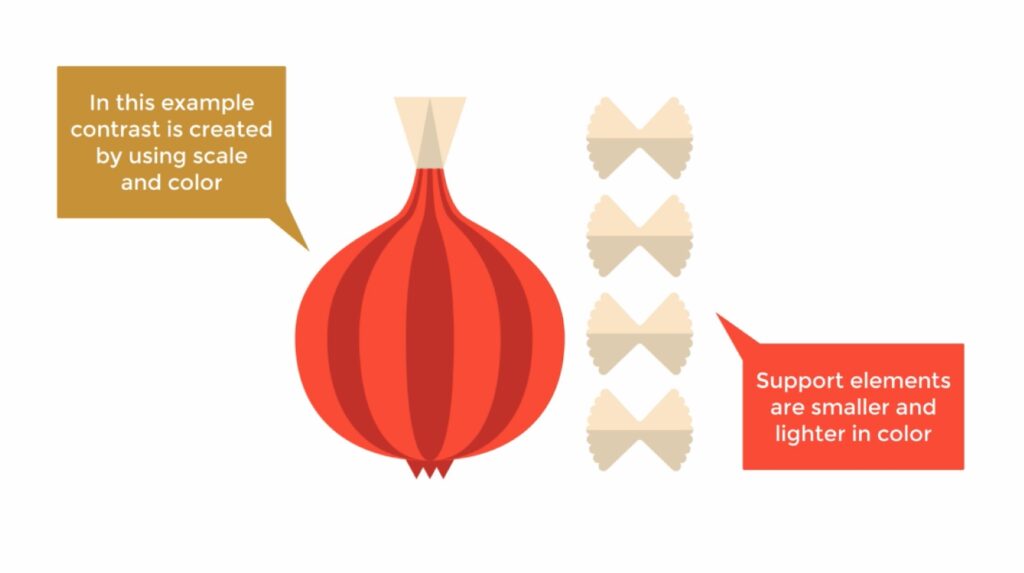
Size Contrast
This type of contrast involves changing the dimensions of elements to establish a hierarchy and draw the eye to a certain place. Larger elements are typically perceived as more important than smaller ones.
For instance:
- A movie poster where the movie title is set in an extremely large, dominant font, while the director's name and cast list are deliberately kept in tiny, almost hidden text to emphasize the main focal point.
- In an infographic, a large central icon or data point (such as a circle containing the figure “75%”) is juxtaposed against several small, secondary icons to quickly convey the main message.
Shape Contrast
By placing elements with dissimilar outlines next to each other, designers can highlight contrasting shapes.
Shapes can stand out from each other in a couple of different ways:
- Geometric vs. organic: Juxtaposing structured, man-made shapes (e.g., squares, triangles) with natural, free-flowing shapes (e.g., leaves, clouds, hand-drawn elements).
- For example: A corporate website that uses a clean, grid-based layout of square photo cards, but the prominent central image is a large, circular cutout. This will serve to break the monotony of the grid and draw viewers’ eyes to the circle.
- For example: A corporate website that uses a clean, grid-based layout of square photo cards, but the prominent central image is a large, circular cutout. This will serve to break the monotony of the grid and draw viewers’ eyes to the circle.
- Sharp vs. soft: Contrasting angular shapes (e.g. rectangles, diamonds) with curved shapes (e.g. circles, ovals, blobs).
- For example: In an app that features predominantly sharp and angular shapes, a UI designer could use a smoothly rounded button to highlight the desired action.
- For example: In an app that features predominantly sharp and angular shapes, a UI designer could use a smoothly rounded button to highlight the desired action.
- For example: A corporate website that uses a clean, grid-based layout of square photo cards, but the prominent central image is a large, circular cutout. This will serve to break the monotony of the grid and draw viewers’ eyes to the circle.
- For example: In an app that features predominantly sharp and angular shapes, a UI designer could use a smoothly rounded button to highlight the desired action.
Texture Contrast
This is the difference in the feel or appearance of an object’s surface, whether it actually exists (such as in interior design) or is implied with artistic techniques (such as in digital design).
- Rough vs. smooth: Contrasting rough, bumpy textures with smooth, glossy ones.
- For example: The background layer of a graphic design could feature a distressed, gritty or cardboard-like texture. When the design’s foreground text and logo is rendered in smooth, flat and solid vector shapes, they’ll appear to be extra crisp against the rough background.
- For example: The background layer of a graphic design could feature a distressed, gritty or cardboard-like texture. When the design’s foreground text and logo is rendered in smooth, flat and solid vector shapes, they’ll appear to be extra crisp against the rough background.
- Detailed vs. plain: Placing intricately detailed elements next to simple surfaces.
- For example: In a fashion photo shoot, a model wearing an ornate gown accented by glittering jewelry could be posed in front of a stark white background. As a result, the model and her outfit would seem to pop off the page.
- For example: In a fashion photo shoot, a model wearing an ornate gown accented by glittering jewelry could be posed in front of a stark white background. As a result, the model and her outfit would seem to pop off the page.
- For example: The background layer of a graphic design could feature a distressed, gritty or cardboard-like texture. When the design’s foreground text and logo is rendered in smooth, flat and solid vector shapes, they’ll appear to be extra crisp against the rough background.
- For example: In a fashion photo shoot, a model wearing an ornate gown accented by glittering jewelry could be posed in front of a stark white background. As a result, the model and her outfit would seem to pop off the page.
Space Contrast
This type of contrast refers to the variation in the amount of elements there are in a design, versus the amount of empty, unused space (in other words, negative space) around them.
- Cluttered vs. isolated: Creating density versus emptiness.
- For example: A product image could be placed in the center of a huge expanse of clean and uninterrupted white space. This isolation acts as a powerful form of contrast that forces the viewer's attention onto the small, focal item. (For a real-life example, just check out some of Apple’s advertisements.)
- For example: A product image could be placed in the center of a huge expanse of clean and uninterrupted white space. This isolation acts as a powerful form of contrast that forces the viewer's attention onto the small, focal item. (For a real-life example, just check out some of Apple’s advertisements.)
- Proximity vs. separation: Placing elements either very close to each other, or very far apart.
- For example: While a headline and a paragraph are tightly spaced (i.e., they’re in high proximity to each other), a small credit line is placed far down at the bottom of the page (i.e., in high separation to the main text) to indicate its lower importance.
- For example: While a headline and a paragraph are tightly spaced (i.e., they’re in high proximity to each other), a small credit line is placed far down at the bottom of the page (i.e., in high separation to the main text) to indicate its lower importance.
- For example: A product image could be placed in the center of a huge expanse of clean and uninterrupted white space. This isolation acts as a powerful form of contrast that forces the viewer's attention onto the small, focal item. (For a real-life example, just check out some of Apple’s advertisements.)
- For example: While a headline and a paragraph are tightly spaced (i.e., they’re in high proximity to each other), a small credit line is placed far down at the bottom of the page (i.e., in high separation to the main text) to indicate its lower importance.
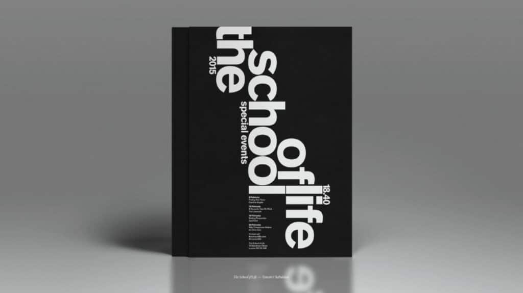
Typeface Contrast
Typography offers multiple layers of contrast, all of which are essential for creating an easily understandable hierarchy in text-heavy design.
These are a few types of typographic contrast you can use to make text stand out:
- Weight: To make a title pop, it might set in extra bold weight, while the rest of the text is set in regular weight.
- Structure: While a headline could be set in a traditional serif typeface (such as Garamond), a modern sans-serif font (such as Helvetica) could be used for the body copy.
- Form: A single word that’s written in italics could be juxtaposed with a block of otherwise upright text.
- Size: If the title of a section is set at 48pt while the accompanying description is set at 12pt, the title will naturally appear more important.
How to Use Contrast in Your Designs
Successfully implementing contrast requires intentionality and a clear understanding of your design goals.
With these practical tips, you can effectively incorporate contrast into your designs, and improve their overall quality in the process:
- Establish a strong visual hierarchy first: Before applying contrast, first determine which elements are most important—you should always use contrast to reinforce that hierarchy, not detract from it. As a rule of thumb, try to make your most critical element the largest, darkest or most vibrant element on the page. (Tip: Try using the "squint test" on your design. When you blur your vision, the most important elements should still appear to be the most prominent.)
- Maximize color value: Prioritize the difference in value (in other words, lightness or darkness) above all other color properties. This will go a long way toward achieving adequate readability and accessibility. For text and background combinations, for instance, always pair a very dark color with a very light color for maximum contrast, and steer clear of mid-tones.
- Adhere to WCAG standards: Always use a contrast checker tool (like WebAIM’s Contrast Checker) to ensure text-to-background contrast meets the WCAG’s Level AA minimum ratio of 4.5:1 for standard text. Or, you could shoot for Level AAA contrast to make sure that the widest possible audience will be able to read your content with ease.
- Don’t be shy about size differences: If you use size contrast, try making the difference obvious instead of sticking with sizes that are only slightly different. For example, a headline should be dramatically larger than the body text to clearly communicate importance and avoid conflicting messages.
- Limit typeface combinations: When using typeface contrast, keep your design clean and legible by limiting yourself to no more than two font families. You can contrast those two families using structure and weight, such as by using a traditional serif font for a headline while setting the body text in a sans-serif one.
- Leverage negative space: Use plenty of white space around a key element (like a logo, photograph or call-to-action button) to instantly give it clear visual importance. The contrast between the filled and the empty space will immediately elevate it.
- Contrast geometry and aesthetics: Deliberately mix up elements in various shapes and styles to add visual tension and interest. For instance, you could pair a clean, technical photo with an organic, hand-drawn illustration. Or, you could use geometric shapes (squares, rectangles) for containers and content blocks, but introduce a circular icon to draw attention.
- Reserve high-intensity colors for action: In UX projects, use saturated, highly contrasting colors (e.g., a bright red, neon green or electric blue) sparingly, and save them for elements that require user action—think "Submit" buttons, error messages and primary navigation links. By doing so, you’ll create immediate visual focus.
- Contrast detail with simplicity: Introduce contrast by varying the complexity of the elements in your design. For example, you could place highly detailed graphics or photos next to large areas of flat, simple colors. This will give the viewer's eye a place to rest, and thus give the viewer time to process the information they’ve just received.
The Indispensable Power of Difference
The principle of contrast is about so much more than a stylistic flourish—it’s the engine that drives effective, functional and accessible design. By intentionally arranging opposite elements like light and dark, large and small or rough and smooth, you can harness the natural way in which the human eye perceives difference to create a clear visual hierarchy.
This will allow you to expertly guide the viewer's attention and instantly establish which elements are most important, whether that means a headline, a call-to-action button or a critical piece of data. When skillfully executed, contrast ensures that a design is not just visually engaging and dynamic, but also that it communicates its message with speed and clarity. In that way, contrast is capable of transforming a flat composition into a compelling visual experience.
Ultimately, a mastery of contrast is a mastery of the user experience itself. In both physical and digital mediums, strong contrast directly correlates with enhanced readability and usability, which lowers user frustration significantly and makes navigation much more intuitive. Even more crucially, it’s the foundation of accessibility, and ensures that content meets the minimum WCAG standards for all users, including those with visual impairments.
Whether you’re crafting a compelling brand for your business, designing a seamless user interface or arranging an eye-catching poster, robust and intentional contrast is an incredibly powerful tool for making certain that your work is not only seen, but also comfortably understood and experienced by as many people as possible.
Carrie Buchholz
Carrie Buchholz is a freelance writer who lives in Northern Colorado with her husband and dog.
Try Skillshare for free! Sign up for a 7 day free trial today!
Get Started- Unlimited access to every class
- Supportive online creative community
- Learn offline with Skillshare's app


