The Unbearable Lightness of Being - Cover Re-design
ENTRY #1
The Unbearable Lightness of Being is a postmodern novel by Czech author Milan Kundera, first published in 1984. I have read this book some years ago but decided to re-read it recently (I am on the last pages now). I was also thinking of re-watching the movie just to remember how they interpreted the story.
For those who have not read the book, here is a little passage from Wikipedia which briefly describes a bit of the philoshopy of this book:
"Challenging Friedrich Nietzsche’s concept of eternal recurrence (the idea that the universe and its events have already occurred and will recur ad infinitum), the story’s thematic meditations posit the alternative; that each person has only one life to live, and that which occurs in life occurs only once and never again — thus the “lightness” of being. In contrast, the concept of eternal recurrence imposes a “heaviness” on our lives and on the decisions we make (to borrow from Nietzsche's metaphor, it gives them "weight".) Nietzsche believed this heaviness could be either a tremendous burden or great benefit depending on the individual's perspective.
The "unbearable lightness" in the title also refers to the lightness of love and sex, which are themes of the novel. Kundera portrays love as fleeting, haphazard and perhaps based on endless strings of coincidences, despite holding such significance for humans."
The book pretty much portrays 4 main characters: Thomas, his life partner Theresa, Sabina (one of Thomas' lovers), and Franz (Sabina's lover). They perceive life, meaning, sex and love in their own uniques ways, and Kundera makes us see how these perceptions affect their relationships.
So far, I just collected a bunch of covers. I was curios to see what the cover looked like for the book published in different languages so I looked up some French and Spanish covers as well, along with the Czech cover and, of course, lots of English covers.
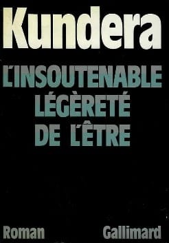
This is the original (the French translation was actaully published before the Czech version):
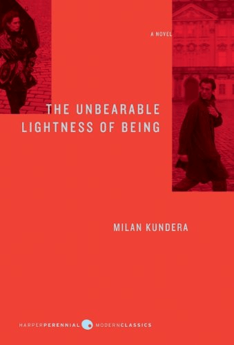
This is the English cover I have (bought in Canada). I think this is the best one, and I think it is quite clever (gonna be tough to beat ;) Here we have a woman in the corner, who looks like the is almost chasing the man who's all the way on the other side of the page. They are separate, but connected through their gaze. The umbrealla is also a really nice and subtle reference to a part of the book.
These are other English covers (some better than others):
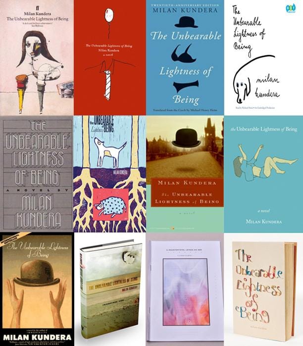
And finally, some non-English covers:
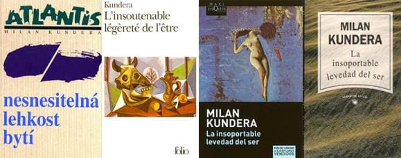
There is quite a variety of covers. The most repeated motif is the bowler hat and references to a woman's body. This book is quite philosophical so this does not surprise me. But the book is, in the end, about relationships - with yourself and with those you love or desire.
Time to do more research!
-----------
ENTRY #2
After reading a lot of explanations about the book in order to weigh my interpretation against others' and to clarify some more complex philosophical concepts, I narrowed it down to the following main dichotomies that this book focuses on:
- lightness vs heaviness (umbrella concept)
- body vs soul
- sex vs love
- coincidence vs fate
Next, I made a list of the most prevalent ideas within the story and other things that stood out to me, and they are as follows:
- Betrayal - giving in to the unknown, maintaining power.
- Kitsch - "categorical agreement with being" + "a lie that pretends the world is perfect"
- Body - body and soul as one vs wanting to break away from the body, hating/loving the body
- Attempting to adapt another person's ways of finding or renouncing meaning in order to answer the question of which is better? Lightness or Heaviness?
- Feeling like a burden to someone else - staying vs letting go
- Eternal uncertainty - "The unbearable lightness of being is that each decision is faced once and only one possible outcome tried. Tomas chose Teresa and burden, Sabina chose freedom and total lightness - neither can know if they chose correctly." This paradox cannot be solved.
- Those who focus on the soul are "heavy" yet the soul is light. Those who focus on the body are "light" but the body is heavy.
I also made a list of just words that fit under the "light" and "heavy" headings. I'm sure I'll be adding much more to this but for now this is what I have:
LIGHT
- feathers
- flying
- air
- petals
- wind
- balloons
- dust
- flour
- floating on water
- the soul
- outlines
- spider webs
- sheer fabrics
- shadows
- butterflies
HEAVY
- suitcase
- books
- the body
- water
- wind
- shadows
- anything in large amounts***
***As you will notice, some words can go both ways, and, in the end, anything can be relatively light or heavy depending on the amount. So this is something I'm going to explore in more depth. A drop of water is not heavy, but go 2 meters under water and it's really tough to stay there. Maybe the book is really about finding that perfect balance, maybe not...
And finally, some other words I listed. Again, some are straight up references from the book, others are just things that popped into my mind as I was writing:
- Bowler hat - fabric, old, dark
- Dog - soft, loving, innocent, loyal
- Prague
- Communism
- The Grand March
- Photography
- Journalism
- Suitcase
- Dreams
- Nightmares
- Painting
- Mirror
- Anna Karenina
- Bethoven
- Philosophers
- Surgery
- Scalpel
- Kitsch
- Country side
- Trees
- Baby pig
- Window washing
- Writing
- Politics
- Fear
- Surveillance
- Opened and closed eyes
- Searching for meaning
- Occupation
- Nudity
To be continued…
This book is quite complex and I just re-read my notes and came across this, from one of the videos:
"simple design for overwhelming content"
:)
I'm going to sleep on this. Next up, image research!
-----------
ENTRY #3
I've been collecting a bunch of images that I found could work. Weather these images will be used the way they are, manipulated digitally or physically, or at all, I don't know yet! I still have a lot of playing time ahead. But I wanted to share these with you guys.
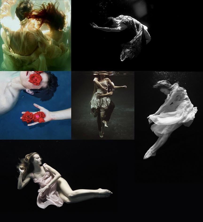
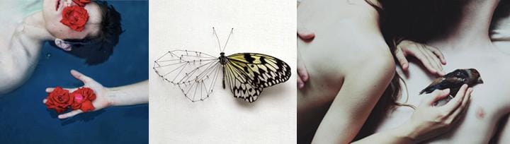
First theme (in no particular order) I thought could work is underwater photography. Like I mentioned in my previous entry, I think being on/under water does give you a weightless feeling, but there is a danger to it, and there is the weight itself of the water which can be hard to take. I really like the photos with the roses over the eyes, and in the hand. That one, too, speaks volumes. I feel this concept could work well at hinting what the book is about on the cover. These are some photos I liked:
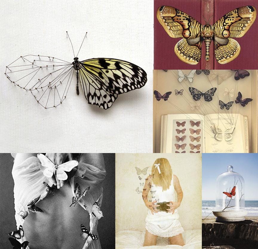
The next thing I looked at is butterflies. The butterfly symbolizes many things in different cultures: it personifies the soul in Japan; in Greece, it also symbolizes the soul and the mind; in China, love; in North America - nervousness ("stomach butterflies). These meanings all suit the book quite well. The largest image in the collage below really stood out to me as a potential front runner as it quite delicately illustrates the dychotomy of this book of light vs weight, soul vs body. I also liked the image in the top right corner - that could be an interesing way of wrapping the image around the book with the body of the butterfly across the spine.
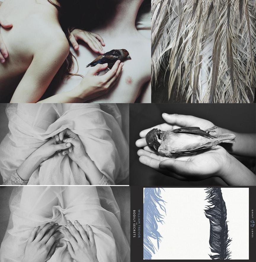
Last, but not least, I though about flight and feathers. Birds, how lightlly they live but are quite fragile, and feathers too. There is a part in the book where Theresa tries to nurse a dying crow that some kids burried half way, hurting it. The bird ends up dying, which is symbolic of Theresa's own stuggles with "weight" and feeling burried. Some of the photos below are quite evocative, which I like.
I have not began exploring type or anything else yet. Once I choose one of these main themes - I'll start exploring further with physical and digital experiments. I also have some other, totally unrelated ideas to the above themes but I'll have to see cos they are more abstract and they are not concrete enough yet.
To recap, these are my top 3 images for now.
SO! What do you guys think? Which concept do you feel has more potential? Any feedback would be appreciated, thanks!
-----------
ENTRY #4
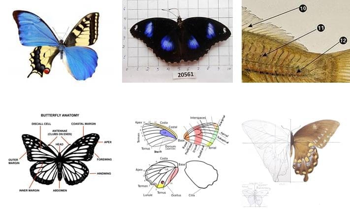
So I looked a bit more into entomology (thanks Andy!) and I colleced a few more images that I found interesting. I also came across this image of some sort of hybrid butterfly (top left in the images below).
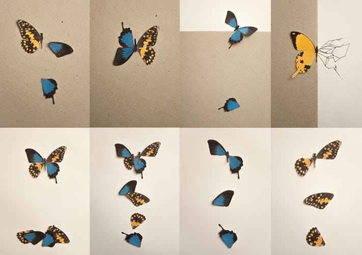
Going along with the hybrid butterfly that fascinated me, I printed off 2 different butterflies, cut them out, and began to play with mixing them up. Here are some of the things that happened:
I really like the idea of inverting the wings on one side of butterfly. This made me think of some of the characters in the book - how their differences affect their relationships, and how they tried to mix their worlds (quite unsuccesfully). People wanting different things from love/sex/life,etc.
In these next images I tried to play with the hybrid and inverted wing butterfly, keeping the body of the butterfly on the spine. This is a rough draft, I didn't really tweak the images, and I picked semi-random fonts. I just wanted to explore the idea, see what happens. I also incorporated some of the numbered bubbles and lines that I found in one of the earlier images. This has a science/medical kinda feel, which could work since Tomas (one of the main characters) is a surgeon. Ok, so here it is:
Do I love this? Meh... It's got development potential. I think I missed the mark with the bright colours one though - it does not go well with the overall feel of the book, but it's good to try and experiment different things, right? :)
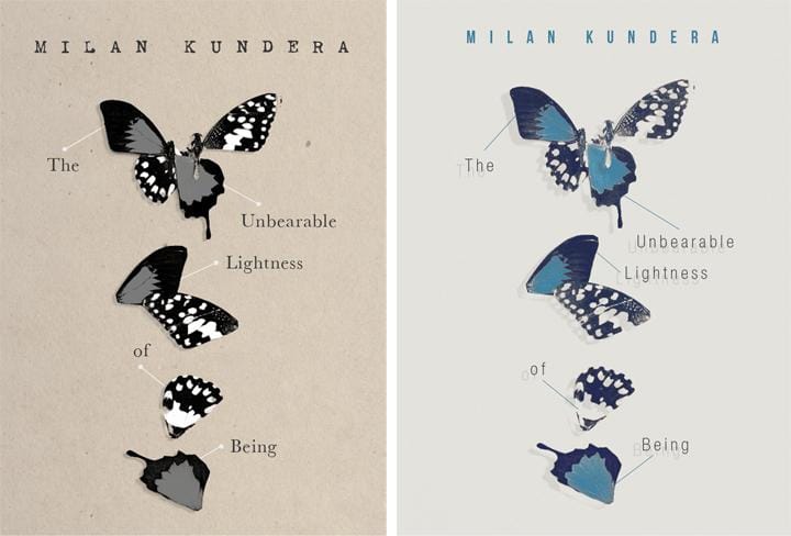
Ok so next I took one of the images of the collaged butterflies I was playing with and did these 2 versions:
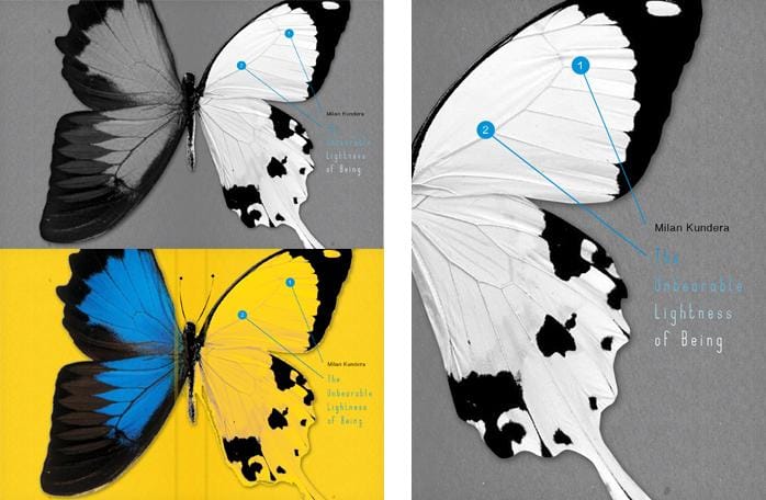
I chose this image because I love how the 2 halfs of the different butterflies are coming together at the top, after they lost/shed parts of themselves along the way. This is very, very relevant to the story, and illustrates it quite perfectlly. I also used the pins or just lines that point to different parts of the butterfly and spread out the title of the book. I quite like the one on the right BUT I feel this cover is very... feminine. Even though I tried to use faded colours and a more neutral palette, it still feels a bit too feminine. I think it's important to keep in mind who reads this book. I think this is a story equally appealing to men and women, and so I think it need a cover that is also appealing at first glance to both genders.
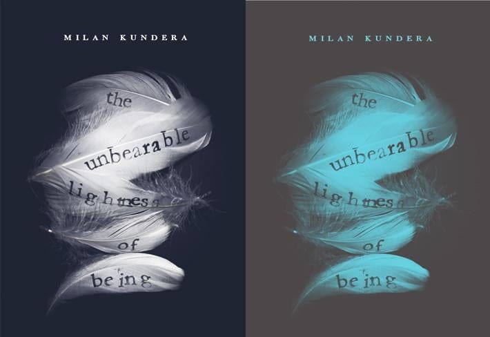
OKAY! So next, I did something a little different which turned out kinda cool. I wanted from the start to experiment with feathers. I had some feathers left over from an older project and so I picked the best ones and decided to write the title of the book on them. I did this using an alphabet set of rubber stamps I have. I just used india ink and stamped them onto the feathers, letter by letter. It was really tricky because the feathers bend and you have to be carefull not to make them split. I fugged the word "lightness" a little bit!!! The t and h are too close together (damn it!!! :P). Anyways, if I decide to go with this concep for the final, I'll re-do that one, or maybe all of them. As you can see, I photographed the arrangement from above, and then played around with the colours in Photoshop.
I really like the one on the right! I'm quite happy with it. I like that colour palette much more. I think it's unexpected and intriguing.
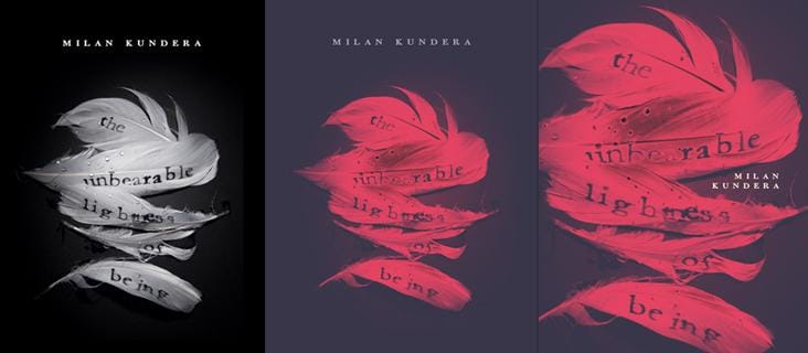
I also dipped the feathers in water to give them a bit more of a "roughend up" feel, and photographed them again. I tried another colour combination and ended up liking this reddish one - although I think it's looking a bit too agressive now, particulary in the closer cropped version on the far right.
The type in all of them needs more exploration for sure, but I'm gonna focus more on that at the very end.
Thoughts? :)
-----------
ENTRY #5
I wanted to explore the underwater idea with the images I collected as I found them quite beautiful and appropriate for the project. I decided to superimpose some of them and see what happens. I liked the colour effect I used in the previous entry with the feathers, so I used it again here:
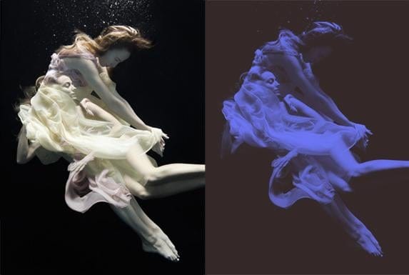
So I used this image, along with another similar version where I superimposed the images differently and went with a red colour:
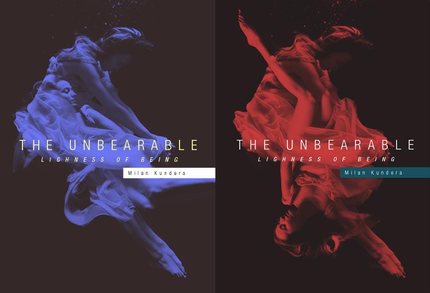
I really like how this turned out visually. It's got a more modern, visceral feel. While using 2 women is also appropriate, I think I'm going to try and find a photo in this same style of a man - if I can. Maybe using a man and a woman might be better. But the 2 women works too - it can refer to Theresa's inner stuggle with her identity, and it can also refer to Theresa and Sabina both being lovers of Tomas.
What do you guys think of this concept/execution?
---------
ENTRY #6
Since the butterfly idea seems to be in the lead here, as well as on facebook (with the feathers in second place), I decided to play with it more and try to fix some of the issues. I think this new version works better. It feels a bit more clinical, like the butterflies are really being analized and looked at up close, and at the same time shedding and morphing. I initially used a brighter red which in print looks great, but on screen it hurts the eyes. It's still quite vibrant but if I tone it down more it will start looking too drab.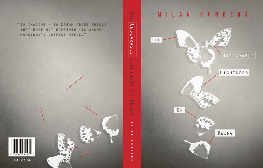
Next up I'm going to play more with the feathers cover and consider the spine and back cover for that one too. I don't think I'm going to make big changes to that one because I actually really like it the way it is.
---------
ENTRY #7
I decided I don't like the butterfly cover above much. I think I was just trying to be a crowd pleaser and see if I can make it work because it seems a lot of people (girls) liked that concept. It's cool, but I think it's looking a bit too clinical and little faded. It does have a weird fragility to it which makes it a little unsettling though, and that I still like.
Even though I personally really like the underwater concept the most, I have to consider what makes a cover sell. And that is, at the end of the day, the strong visual appeal. In one way or another you have to make your cover pop if you put in a row of 5 other books. And I think visually, the feathers pop the most. It is an image that would grab the attention and stand out.
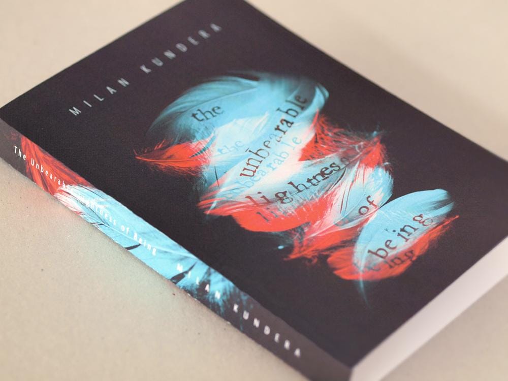
To me, design is a careful blend of rationality and intuition and, in this case, it led me to decide on this final, refined version of the feathers concept:
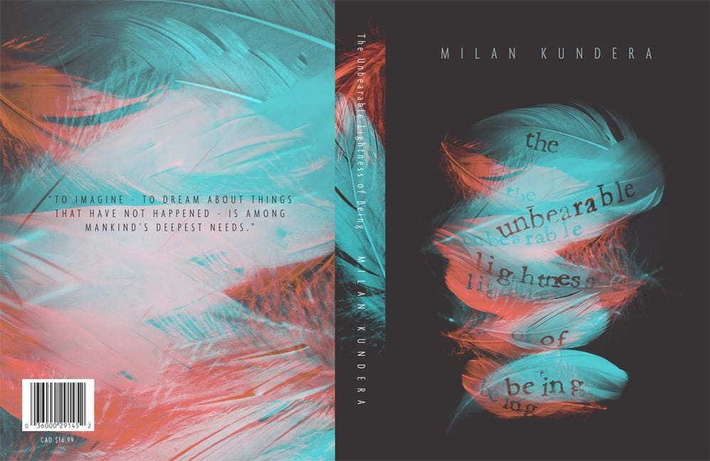
I photographed a new set of feathers with writing on them, but I already used up my best feathers in the first one, so I was not super happy with the result. The second set of feathers just did not have the same shapes and was not as pretty. So I tweaked the problematic letters of the old one in Photoshops (in the word lightness), and superimposed it with the new photo in a red/orange colour. The result is much more vibrant, and it is more dimensional - both visually and conceptually. It now has movement, and represents the duality that was missing before. On the back, I chose to use an enlarged version of the feathers composition, a bit more fragmented and more chaotic. For the spine, I photographed separately 2 independent feathers. I kept all the text in the same font. I wanted to keep it simple and elegant since the images were so complex.
In terms of how I think this would apply to a series of Kundera's books, it is a little hard to say because I have unfortunately not read any of his other books (but I hope to in the future). Coming up with a cover design is obviously a long, complex process that I think requires a good understanding of the books. So conceptually I cannot comment on other series covers but stylistically I would continue to try to incorporate hand lettering (either stamps like I used, or other manual ways) perhaps again on objects and photographing them in a similar style, while keeping the approach of the back cover as a close-up, slightly distorted version of the front.
I am quite happy with the final result. It's been an awesome learning journey, full of fun experimentation and brainstorming. Thank you all for your feedback and I hope you like my final design too :)
***Skillshare seems to be decreasing the quality of the images quite a bit, so if you'd like to see it more accurately, I am going to put it on my website www.vialavinia.ca in the Graphic Design gallery. Also you might notice there is a white stripe on the right side of the image when you enlarge it - this is a bug, as I have re-uploaded it severral times and it won't go away!! Thanks!