Transcripts
1. Introduction: Hello, everyone, and welcome
to my skill share class. Becoming a good or
professional artist takes dedication and time. You know, I think it's pretty
easy and common to come across little tips and
tricks videos online. But what is the path you need to take if you truly want to become a versatile and hirable artist in the entertainment
industry? I'm Marco Bucci. I've been a professional
artist for over 20 years. I've done work for
things like films, games, movies, TV,
books, you name it. I've also fulfilled many
roles in my career, ranging from character
design to concept art, finished illustration, and
kind of everything in between. I have also been teaching
now for over a decade. I've helped people
of all ages and all skill levels reach
their potential. Many have gone on to become professional artists themselves, while others were content
to stay serious hobbyists. In my teaching time,
I've been able to catalog so many of
those aha moments. Those moments that are so
precious to us as learners that help us ensure we're on the right path and
making good progress. As I teach those concepts, I also am able to refine how
I use them in my own work, which then feeds right
back into my teaching. This skill share class
is hyper concentrated. It focuses on the build
up to those aha moments. Those moments I want you
to have to encourage the fastest and most effective
growth in your learning. Everything in this class
revolves around hier ability, finding a job as an artist in different avenues and
different skill sets, things ranging from
character design to concept art and
backgrounds and environments. The nice part about
these skill sets is they apply across
different mediums. You could totally use
them to work in film, TV, books, games,
whatever you want. Being hirable means having solid fundamentals that
you can call upon, no matter what the task may be. On that note, we'll
be learning through real life jobs that I
actually had as an artist, jobs that required me to
wear many different hats. I might be doing character
development one day and then plugging that character into
an environment the next day. The material in this
class is very actionable. We will learn fundamentals
individually, but we'll also learn how to
juggle them because that's exactly what you'll be expected
to do as a professional. Through the class, you'll be
presented with lectures and skill building exercises
and demonstrations, and you'll also be encouraged to complete one or two
class projects. One of those projects
will be character based and one will be
environment based. The nice part about splitting it up into two projects is you can decide which subject matter you're most comfortable
or interested in. Or if you're super enthusiastic, you can do both projects.
It's totally up to you. Lastly, this class is appropriate for a wide
range of skill levels. If you're new to
this, this class will act as a solid base. Or if you're coming in with
a bit more experience, this class will help
you sharpen your skills and show you the path of
continued improvement. My goal in either case, is to meet you where you are and get you noticing that
progress in your work. I want you to start
seeing progress in as short a timeline as
weeks or even days. This class has lots of
information packed into it, so block off some time
on your calendar, give it your full attention, and let's get learning.
2. Workspace Meets Mindset: Okay, before we get into the nitty gritty of
drawing and painting, I'd like to talk about a broader theme of what we're doing here. What we're doing is we
are being creative. That's probably the
whole driving force that brings you
to this class and to your workstation or to your sketchbook is you
want to create things. I don't know about
you, but I was born not with any
skill or talent, but I was born wanting
to create things. I've been creating things
as long as I can remember. Be it terrible drawings in my sketchbook when I was
a kid. That's right. I could not draw as a kid,
but that's another story. Terrible sketch books.
I'd play a lot of music. I would read a lot, and I
still do all those things. But it's some innate drive in me, I don't know
where it came from, but I was born to create things
for better or for worse. When I say for worse, I mean, if I am not creative, if I can't be creative
for a week or two, I go a little stir crazy. I think a lot of you out
there can probably relate. Now, when it comes
to being creative, this may sound a little strange, but I kind of treat
it like work, but not work in the
negative sense, but work as in, you have
to show up to do a task. I remember when I was younger, I would kind of just be
creative when I felt like it. You know, I'd play
some music one day, I would draw something
another day. I treated it totally
casually, and that's fine. But when I decided to take it seriously and maybe one
day become a professional, I suddenly needed to bring forth that creative urge
kind of on demand. I couldn't wait for
inspiration to strike. I mean, if you do that,
you'll probably create something once every
two or three months. Inspiration is not that common. You need to create an
environment for yourself where if inspiration
strikes or if it does not, you can still be creative
and do the work. And one of the best ways
I found to do that. It's kind of a mind hack, let's call it, is to the
best of your ability, control and design the
space you work in, or maybe I should
say, make it so that you come to one space
to be creative. In my case, it's the studio
room that I'm in right now. This is where I come when
I do anything creative, be it drawing and painting, like I do professionally,
or I have other hobbies. I like to sculpt. I like to
do some three D printing. I have some electronic stuff
behind the camera there. But all of it is contained in
this room. This is my room. My kids don't come in
here or if they do, they're heavily supervised, not even my wife
really comes in here. This is my space. I
remember I was reading this book by Steven Pressfield
called The War of Art. It's a fantastic book, highly recommended
very quick read. I think it's 100 pages. It's about the psychology or mentality of being
a creative person. One of the lines
in that book that has always stuck with me was he said Steven Pressfield
Make your space a shrine, not to you, but a shrine to
the concept of creativity. Make it so that when you
enter your creative space, it makes you want to
create something. I mean, that sounds
trivial now that I've just heard it come out of my mouth
like that, but it's true. When I come in this
space, I feel good. I feel inspired.
I like this room. I want to sit in this chair
and look at those screens and bring out a sketchbook or whatever it is
I'm doing that day, and I want to create something. I will give you a
little video walk through of this space
in just a moment. There's a few
concepts that come to mind that helped me
design this space. Believe me, I'm no
interior designer. I mean, I should probably take some skill share classes
on interior design. What I did, though,
is I just thought about the things
that I like to see, the things that make
me feel comfortable. For example, this
wood paneling here. That is old pallet wood that I found on the
side of the street, that I chopped up with a
saw and I cut it to size, and I stapled it onto the wall. Why old pallet
wood? I don't know. There's something
about rustic old wood that I like. I find
it comforting. Woodworking is another
hobby of mine, and there's just
something about old reclaimed wood that I like. So I put this wood
paneling on my wall. Now, this wood paneling is specific to this
corner of my room. You know, where I
draw and paint. You can't see behind the camera, but the rest of
this room is plain old drywall that I've painted, just like a regular room,
but here is special. This paneling wraps around my whole creative
corner space here. And I don't know. It's just
an environment that I like. I've seen other
artist spaces that are populated with
a lot of plants. Now, I'm not really
a plant person. I mean, I like plants,
but I'm terrible at keeping them alive,
so no plants for me. Did try and keep a plant once, but it died in a week, so
no more plants for me. I like things to be tidy, but not necessarily
everything put away. I like to have things in their
place but available to me. If I need a pencil,
it's right there. I don't have to go
digging in a drawer, even though it might be neater if pencils were in a drawer, I like to have my stuff
within arm's reach. I'm never breaking my mentality away from the creative process. I can just grab
the tools I need. You'll see how that
comes into play when I do the little
video walk through. But the theme of
the whole thing is understanding what it is that makes you feel comfortable
or happy or creative, because especially if your goal is to take this to a
professional level, or even if your goal is to make this a very serious hobby, something that you can
do daily or semi daily. You cannot afford to
wait for inspiration. You have to be able to
show up and do something. Yes, when inspiration strikes, you might create
something just a little bit better because inspiration is like a mental stimulant
that just feels good. But speaking from
experience, I mean, I've been doing this
for more than 20 years or 20 years as a
professional anyway. I can honestly tell you
that inspiration is only there like 10% of
the time for me. Most of the time when I
wake up in the morning, I almost feel like I
don't want to do it, but this is the space that helps me feel like
I can settle in, maybe put on some ambient
music or drink a coffee, whatever I'm in the
mood for that day, and I can shut out the
world and do my thing. And then once I'm half hour
or maybe an hour into it, I find that I have a hard
time stopping myself. The time just blows right by. And that's all a
testament to mindset, and mindset, I think, starts with your personal space. So here's a little video walk through of what I've
got going on here. So here's the space
you've just seen, but from a different angle, this simulates me kind of
walking into the room. Now, this happens to be
a room above my garage, so it's pretty sizable. In fact, that's a seven
foot desk that I built. It's just built with a sheet of plywood that I cut the size. I copied my old ICA desk from my student days and cut
this little nook in here. It helps me kind of nestle
in and helps my posture. I don't have to
lean over so much. So yeah, this is where I work every single day,
well, weekdays anyway. And sometimes I sneak in
here on the weekends, too. Remember, this is my
shrine to creativity. The pieces of art
I have on my wall, and these are all originals
from other artists, remind me of that
raw creative drive. Notice that these are all
sketches, no finished work. That Batman sketch is mine, but there's some special
reasons behind that. Anyway, I chose pieces not
for their finished beauty, but for their raw
emotional drive. I can see the
literal fingerprints in these clay sculptures here. I really like the poses and gestures of the
Disney sculpts there, and I can see the graphite in
all those pencil sketches. So equipment wise, I'm running a pretty standard
dual monitor setup, just a cheap LCD on the left there for e mails and
web browsing and such. Then on the right, I have
a big old walk home cynic. It's the most professional,
largest model they make. Ironically, I
actually don't really use it except for as a monitor. I much prefer my
regular walkm tablet, which is right here. This is the Intuos P, which is the largest
tablet they make, but I started digital
painting in 2002. Back then, there were no
syntic or screen tablets, and I simply got used to this regular tablet and old
habits die hard, I guess. Now, there are times
when I do use a syntic, like when I'm working on
animation, for example. I've got it on a mounting arm
that I can easily pull out. And when I'm not
drawing with it, I can push it back into the wall just to get it further
away from my eyes. Here's a simulation of what I see when I sit
down in my chair. I keep that space to the
left of my tablet open for any traditional media or sculpting or sketching
that I might want to do. Sometimes I do little
gauche sketches there or just pencil sketches or just
taking notes or something. Of course, I have that
art surrounding me and you can really get the sense
of that from this view. I've got my keyboard and mouse
in a place below the desk. Again, I had an old
ICA desk that did this and I really like
it ergonomically. It helps my posture.
Just over here, I have my microphone
that I used to record educational videos like this
one and my YouTube stuff. Again, it's within arm's reach. I just turn my head and
I can say the lines, which is exactly what
I'm doing right now. The mic is tucked away.
It never has to move. It's always there
when I need it. I've got my little audio
interface right here. I can dial in the gain of the mic or whatever
I need to do. That never moves either. This
microphone is just a toy. It's a sculpture that I like. Looks like it's getting dusty. Hopefully, that proves to you that I have not staged this. Anyway, it just so
happens that three D printing interfaces
with all my hobbies. So I have the three D printer right here and it's
printing away. Anyway, that's why my
desk is seven feet long. So I can fit all this
stuff and again, have it all within arm's reach. Now, before I did all this, this used to be a nice
little reading nook. There was a couch here, a
little coffee table type thing, but I knew that this was the space that spoke
to me the most, so I got rid of all that stuff and replaced it with my studio. Over on the right here,
I have a nice window. I've read somewhere
that it's helpful to refocus your eyes on
different distances. When I take breaks that don't involve me actually
leaving the room, which I actually do try and do, I try and leave the room as much as possible when I
work just for breaks. But whenever I don't
have time for that, I'd like to just
look out the window. There's some beautiful
greens out there, and I've ensured that no birds shall die at the
hands of this window. Back to my hardware
for a second. This is not running on a
laptop or anything like that. It's running on a PC desktop. It's not a supercomputer though. My specs are on
the screen there. The place to spend your money though is on RAM, in my opinion. A lot of RAM helps ensure your
software doesn't bog down. Anyway, because I
produce a lot of files, I've got some portable
hard drives down here. Over here, just a
couple of drawers, my sculpture supplies
are in here. Now I don't sculpt that much, so these supplies
are tucked away, and when I do sculpt, I simply use the area to
the left of my tablet. On the other side of the room
is my traditional art desk. Now, this is strictly
for personal work. I don't use traditional
media professionally. Here's a personal piece I
just finished in acrylics. As you can see here, this is
a much more chaotic mess. I assure you though,
it's a controlled mess. I've got my brushes here. I've got some paints tucked
away in these mini drawers, and they are organized
by color temperature. I've got a different
type of paint here and a different
type of paint there. I've got a bunch of
colored pencils here and just above that is
my trusty airbrush. Once again, it's the
same philosophy. Everything is
within arm's reach. I personally don't need
everything to be spick and span. I do have a limited tolerance
for a bit of a mess, but what you're seeing here is the extent of that tolerance. When things inevitably do
cross that line of tolerance, I spend whatever time I need
to like half hour usually, just to get things
back to a baseline. Again, the mental payoff of
just doing that is huge. Now, before I go any further, I remember what it was like
to be a young student. I was renting a single
room in a house, and if that's your situation, then you literally can't have a dedicated room
for creative tasks. While I do recommend the second you have different
rooms to access, you should decouple
your sleeping quarters from your creative quarters. But if you can't do that yet, I still think you can put the
principles of this to use. Try and carve yourself
out a little corner of your room for
the creative stuff. If you're just renting one room, maybe your beds over there, creative stuff over there
as far away as possible. Make it so you can't
literally roll over on your chair and
fall into your bed, which is exactly what I
was doing 20 years ago. There is actual research to
support that that kind of situation is just not helpful
long term for your mindset. If you've got just one room, try and create as much
space as possible between where you're creative and the rest of your
life in that room. Okay, we're ready
to dive in here. Before we do though,
one last thing, you are going to
be presented with a lot of information
in this class, information that is heavily
condensed and concentrated. Please do not expect yourself to get it all and put it
all to use right away. I almost guarantee
that won't happen, simply because everything
is concentrated, you're going to need to
sort through it and give yourself time not only to
understand the concepts, but then see how you
can put them to use. Now, some of this, yes, it will happen right away. Just don't expect everything in the course to happen right away. But that's the nice thing about skill share and on demand
classes like this. You have so many options. You don't even have
to watch the whole class front to back right away. You could start with just say the first quarter or maybe
the first few lessons. Those first few lessons in this class can certainly support your drawing practice for
weeks or even months. We're going to start this
class with gesture drawing. When I first learned
gesture drawing, I did not move on for
about three months. You can do the same
with this class. Or maybe another
way to watch it is, yeah, watch it front to back. Don't even draw or anything,
just watch it all, which you could probably
do in a few sittings, and then go back, rewatch sections and
put those to practice, giving yourself enough
time to digest that before then moving on once again to the rest of the class. Think of it like having a bag
of cookies in front of you. You can eat just
one or two cookies and savor the experience. But if you eat the whole bag, you will have ironically robbed yourself of
all that pleasure. Feel like learning is like that. It generally works best when you take in
little bits at a time, digestible sections,
digest them, and then move on
to the next step. Remember, even when
you have moved on in your three quarters of
the way through the class, it's totally viable to go
back to the beginning, shore up some
fundamentals there. After all, these classes
all build on each other. If you do find yourself
going back and patching something up from
the first part of the class, that is actually helping
what comes way later. It's like repairing poor
foundations of a house. It's going to help the roof stay on if you have good foundations. Really think that's one of
the most common downfalls I see with students today. Just because of things
like Tick Talk and YouTube shorts and
Instagram Reels, everyone is just used
to scroll scroll scroll and getting instant
gratification. Drawing is not like
that, unfortunately. You need to give yourself time. So I'll make you a deal. I'll do my best to present
you the material as entertainingly and as
efficiently paced as possible, but you have to slow down and give yourself time
to take it all in. All right. So here we go.
3. Adaptable = Hireable: In this chapter, we'll
take a look at what might be expected of
you as an illustrator. A theme I've noticed in my work is that clients vary widely. And because I want to do this professionally and
make a living off it, it behooves me to be able to adapt to all kinds
of different styles. Now, I do have a
natural drawing style. Like if I'm drawing and
painting for myself, I tend to work in
a specific style. The one I feel most
comfortable in, but that can go out the window
when working for clients. Being adaptable like this
with your art is something that students struggle
with very commonly. It doesn't come naturally. Typically, maybe only one
style comes naturally to someone and something else can feel completely alien at first. But with our roots in
the fundamentals of art, we should be able to adapt
to really any style. Because this is the core
skill that makes you hirable, we need to put adaptability as a priority in our learning. In this lesson, I'll
show you first how I've had to adapt to various
styles over the years, and I'll also try and
explain how they are all rooted in the same
set of fundamentals. I'll follow that up with
a little demonstration where I paint the same
basic picture twice, using the same fundamentals
and the same subject matter, but I'll approach those paintings
completely differently. This will give you a good
understanding as to how the same core fundamentals of art can drive completely
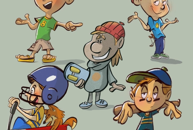
different styles. Let's get to it. All right. The first thing I'd
like to show you. What I have on screen here
are four different paintings, all of which I did, and they're all done in
different styles. You can probably see
that right away. This piece with the monster here is done in a
cartoony style, whereas this one
is more realistic. But also, if you look at
the application of paint, this one here is very
sharp with a lot of cut out edges
and straight lines. There are very few curves in it. The shapes appear very sharp
and hard edged versus say this one here where the shapes are very soft and airbrushed. It feels less like a razor blade and more like a soft
pillow, let's say. This painting here might also
feel like a soft pillow, but in this one, the brushwork is a little bit more pronounced. You can see the individual
strokes almost. Compared to say this
one where things are airbrushed and quite soft. If you look at the turning of form on Pete's muzzle there, it's very soft edged. Whereas if you look
at the turning of form in the monster, you can almost count
the brush strokes that are responsible
for doing that. The same is true around
the whole painting. The bridge, again, you can
count brush strokes here. In this area here, I can see the scribbly
strokes I made there. There's no effort to disguise. A similar philosophy is true
on this bottom one here, except instead of brush strokes, you have cut out shapes. It looks like things
were carved out with a template and then
applied to the painting. There's really no brush
strokes here at all. It's this concept of cut
out hard edged shapes. This painting here
on the right is somewhere in between
those things. It's definitely more similar
to say this one here. The brushtrokes are visible. But overall, the effect I'm going for here is more realism. Now, not photo realism. I don't want to trick anyone to thinking this
is a photograph. It still should be a painting. But if you zoom in
here, you can see that there are still very
noticeable brush strokes. For the most part,
I'm not trying to disguise the brushes
that I'm using. If we go to the main
character, Clara here, she is the most rendered out, meaning she has the widest range of edges from hard to soft. There's also a wide range
of brush types used. You can see little
sparkles and dots there. Mixed in here with some
broader brushwork where the brush strokes are disguised
more, blended, let's say. If we go up to her head
here, it's the same thing. There's a very soft
look to the form. I'm not trying to show off the strokes quite as much
as I was in this piece. But at the same time, I
don't want to disguise the fact that this is a
painting done by hand. In fact, the further back in the distance you
get in this piece, Zoom out, so you can
see some context, see all those people in
the very background there. If we zoom into them,
I mean, look at this. It's kind of full
disclosure that this is a painting or a
digital painting, where I'm using all kinds of digital brushes to
achieve a certain effect. Then, of course,
when you zoom out, all those brush strokes kind
of amalgamate together, and you get the illusion of
this being a crowd of people. The same is true in this
crowd of people, sure, I've picked out a few
details here and there, you can kind of see the
structure of this guy's head. There are certainly no eyes
or really no mouth in there. You can see this person here, it almost looks like a skull, just the basic
structure of a skull. But when you zoom
out, they all again, they amalgamate together and those strokes start
making sense. Sometimes I'll opt to do paintings that are a
little bit more rendered. The cathedral in this piece
just has a little bit more let's call it
tightness in the brushwork. Now, not fully, you can see
bare strokes like that, that I do enjoy leaving
stuff like that behind. A lot of the same dotty brushes here that I used on
this character here. It's the exact same
brushes because I generally do use the
same brush sets. But in other areas like
the structures up here, there's just a bit more
attention to the rendering. Again, not to the level of photo realism because that's generally not my
interest in art. But you can see that there is
specific attention to say, making sure that this
cylindrical form is very, very believably round, with
very soft transitions, and I probably used an airbrush
at least to block that in to make sure I had a smooth transition before adding detail. In other areas, like
say the clouds up here, it's fully abstract with the brush strokes
completely showing, and it's only when you zoom out that they all make
sense together. And yes, those are
zombies, by the way. Here's another piece with the
very hard edged aesthetic. It's from the same
project as this one. As you can see, they both
appear to live together. If this were a book, you
could absolutely imagine them being side by side
on the same spread. That is all to do with style. The stylistic approach
I'm taking between these two images is
fully consistent. I've established the
rules of these pictures. Namely, it's made of, like I said before,
hard edge shapes and shapes that are not hidden. You could get out your penil
here in photoshop and trace this light shape that's falling onto the floor
here, something like that. There's a very clear,
simple shape there. Even tiny little shapes. I could do the same thing
with this. See this, what is this a trapezoid. See this shape here.
It's like a warped box. One of the rules I had for
myself in these pictures is to make the shapes very
simple and geometric. We can zoom into this piece here and see the same
type of application. If you look at the light and
shadow falling on the grass, I'm trying to imitate dappled
light falling from a tree, but they're triangles and trapezoids and squares
and rectangles, there's really nothing
subtle about the shapes. They're graphic
and in your face, and that is the
number one rule of this style that I established for myself when I
did this project. Here's another example
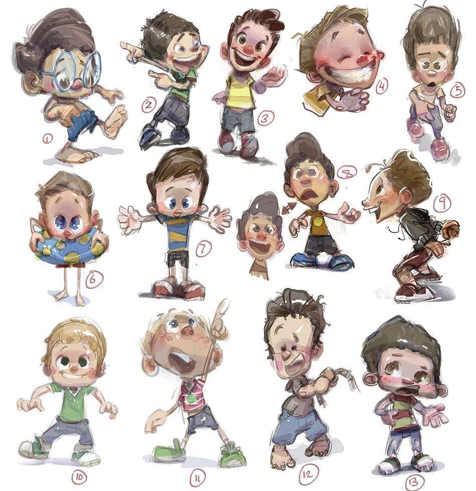
of a project that we'll be looking at even
more throughout this class. But it's a series of character concepts
for the same project. The project only
wants one character. It's this character named Jake, but they had no idea what
Jake should look like. Here's at least
here's 13 designs, and I think I had a whole
other page that I submitted. But you can see that just
like this project here, I made sure that all
of my Jake drawings are done with the
same aesthetic. If I had to put into words, it's kind of round shapes. There's nothing really
sharp about this, although sometimes
there are, his shirt is kind of a squash a
rectangle shape. There are straight lines
here. You could trace a straight line going
down his full body there. But for the most
part, it's round. His head is a round shape. This head, same thing,
it's a round shape. But even where I
do use straights, if you look at his arm
here, I mean, yes, that lower line is
kind of straight, but you notice it feeds
into a graceful curve. That is true even of
the lines in his body. That's a pretty
straight line there, but you notice it feeds
into a shoe that's rounded. I'm trying to whenever
I do use straights, I'm complimenting them with
their round counterparts, just to make sure it feels
nice and friendly and smooth. Round shapes tend to feel a bit more friendly with a
lot of these sketches. You can even see my rough ins. See this area right in here, you can see my roughed
in sketch marks. If you notice those
sketch marks show that I'm thinking about roundness
by going like this. It's only after I do
some sketch strokes that I find the final shape
that I want to go with. Of course, these are
all examples of how I have to be adaptable
as an artist. If this client comes to me from this project and wants
a certain cut out look, well, if I submitted to
that client these drawings, he would be like, that's
not going to work. Or if I had this client here
who is obviously Disney, these are Disney characters, they wanted that nice
almost air brushy look where you're calling
less attention to the approach of the painting, and it becomes a lot more about just reading
the characters and having them feel just nice and soft and easy on the eyes. Whereas with this painting here, this is one of my
own personal pieces. I'm going for a combination
where I want it to feel friendly and soft
and easy on the eyes, but I also want to draw you into the specific type of
brushwork that I'm using. I almost want you to feel like the energy of my arm
as I painted this. You can see and feel what it may have felt like
to paint these strokes. That's what I'm going for here. That is often what I do go
for in my own personal style. This project here required
a slight adaptation. I still want you to feel
the energy of the strokes, but I had to be mindful
of the focal points, these areas here
where this has to feel a little closer to this, where you just notice the rendering of the character
and less the brushwork. But again, as I
showed you before, as you go to the
background, it's more like this, where yes, you can tell what the
subject matter is, this is a giant moose statue, but there's a lot more
attention called to the physical brushwork
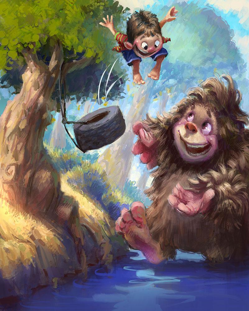
that it goes into it. Here's one done for the
same project as this. These are part of the same book. This is another Disney project. I got to illustrate
the book version of their nut cracker
movie from 2017, 2016 2017, and these are my illustrations
from that movie. Again, this one here
is more rendered. We can zoom in and we
can see how I'm using more soft edges to really show just the
roundness of form. But like I almost
always try and do. I still am finding areas to leave behind evidence
of the brushtrokes. But in areas where the
focal point like her face, I'm trying to be very soft and
very rendery in that area. And same with the hand, this is also a big part of the focus. I'm trying to be a little bit
more rendery with the hand. If we zoom in, you can see I'm blending and kind of blurring
my edges between strokes. I used a lot of smudge tool for this and airbrush on here. Can still see evidence
of my block in here, which I use my dotty brush for, which I do love using it. It just makes me feel
like I'm free to paint whatever I want before
locking into final strokes. But anyway, hopefully,
this gives you a bit of an overview as to
what it looks like, at least in the context
of my own career, of how I've had to
be adaptable to different projects and talking
about different styles. You might have the question,
well, how do you do that? How do you jump and be a chameleon between
different styles? The answer to that, as I alluded to in the
intro to this class, it's all about knowing
your fundamentals. If you know what you are fundamentally doing
to a picture. For example, adding
light versus shadow, that can be done in 1
million different styles. But to do that, you first
have to know, what is light? What does it do? What is shadow? What does that do? How do they relate to
each other in a picture? Those are not
stylistic questions. Those go beneath style, like the foundations of a house, and they are
fundamental questions. To further solidify
that concept for you. I want to do a little demo where I paint the
same thing twice, but in two different styles
with different approaches. Here we go. I've
got two canvases here and I'll paint
them concurrently. I'll follow the same approach on each and they're
relatively in sync, so you can compare
each step of the way. You'll get a clear view of how the fundamentals are
the same on both, but the approach, and therefore, the resulting
visual aesthetic or style are different
between the two. Already, you can
see on the left, I'm using much more
brushwork and on the right, I'm only using those
cutout shapes, similar to the projects I
showed you just previously. In both cases, though, I'm going for a dark
upper background and a light lower background. I'm going to imagine
that the lower part of the image is like the floor, and there will be a ball
sitting on that floor, which I'm blocking in here. Of course, on the
left, I'm using a brush to block in that
ball and on the right, I'm using that jagged selection. And already that illustrates the basic principle
at play here. The fundamental is we are portraying a ball
in this picture. But the way we
approach that ball completely differs from
one picture to the next. For example, on the left, I'm adding shadows just
with a round brush, painting it in, and
now on the right, I'll add those same shadows, but with a selection tool, and instead of painting
it with a brush, I'll use basic color fills. Each of those color fills on
the right can be adjusted, which I'm doing right now. Look at the shadow on
the ball on the left. Notice how it's very brushy. Now look at what's happening
on the right picture. I'm blocking in
that same shadow, but again, with a pixel
precision hard edged fill. I'll use that same
technique now to build up the lights on the ball. Notice I'm doing the same thing on the painting on the left, but I've built up those lights
just again with a brush. On the left, I am
pressing very lightly on my tablet to blend
these tones and colors. Whereas on the right painting,
that's not possible. I am restricting myself to
hard edged color fills. There is no soft blending. Blending is another one
of those fundamentals. I can imitate blending
on the right. I just have to do it
with shapes that are very close together in tone, not huge changes from
one shape to the next. Just look at the
shadow regions of the two spheres, the
left and the right, and notice how
they both have the fundamental of soft blending, but they're achieved in two
completely different ways. It almost looks like two
different artists painted these. Of course, that's the
power of being adaptable. You can imitate the look
of very different artists. That is what makes
you intrinsically hirable or desirable to
accompany or client. There's way more
versatility there than if you just
specialized in one thing. And yes, there are
many artists out there who do just
specialize in one thing. But I also think the market has vastly shifted in the last, let's say, decade or more, where artists are more
successful when they can adapt. After all, that's the
nature of the business. Different clients
have different needs, different needs require
different aesthetics and styles, it's always attractive to a company if you
can straddle that. Practically speaking,
a company or client would rather just
work with one artist, someone who they know and trust, that have to find a
different artist every time. For example, I've
done quite a bit of work for Walt
Disney Publishing. You just saw a few examples of that in the previous section. The art director always e
mails me and says, Hey, Marco, here's the style
of this upcoming book. Do you feel comfortable
working this way? Because I've always
been able to say, yes, I do feel comfortable
working that way, I can literally count the
number of jobs that I've gotten that I would not have gotten if I only worked in one style. I have probably procured
years of work that way. Again, it's all thanks
to the fundamentals.
4. Getting Hired: Industry Advice: One of the larger
debates you will have to solve for yourself revolves
around the question, should I be a generalist
or a specialist? A generalist is someone who has skills kind of everywhere, character design, which involves posing and turnarounds,
expression sheets, all the way through
to say, concept art, being able to visualize
something in a painting very quickly, to environments, putting characters
in a background or just backgrounds themselves
without characters, and perhaps all the way
to finished illustration. Which can combine
characters and background, as well as heavy
art directing tools like lighting and composition,
things like that. A generalist is someone whose aptitude spans
all that material. A specialist, on the other hand, is someone who is hyper hyper
focused on just one thing. You see it all over the
place in the industry. A very common one, for example, would be someone is a
character designer, and that's all they do. They don't even try
to do environments. You will commonly
see these things reflected in artists portfolios. If someone is a generalist, then you might see character
here environment here, or if someone is a specialist, when you see their portfolio, you should expect to
see only characters. Now, when it comes to style, I think there's a
very clear answer, you should be a generalist. Style wise. You should
be able to draw and paint in several
different styles. Of course, we just talked about that in the previous discussion. In my opinion, you
are only shooting yourself right in the foot if
you can only do one style. If art is your hobby,
then that's fine. One style is all you need. But this class has a
theme of being hirable, and one of the best and most obvious things you can do for yourself in that arena is being able to adapt to
different styles. But back to subject
matter for a second. There's no easy
answer. There's also no right and wrong answer. Everyone's different.
Everyone's got different aptitudes and
interests, and skill sets. While you can expand
your skill set, which is what I hope to be doing in this class
here with you, it's probably
reasonable to assume you're most comfortable
with one thing. This is where I can start
talking personally. I have noticed my own focus, kind of changed through
my years in art. I started mostly
interested in characters. Actually, I wanted to be
a character animator, so all I did was draw and
try and animate characters. It was only several years later, about four years
later, actually, that I discovered that I loved painting and not just
painting characters, but actually painting
backgrounds and environments. It totally caught me off guard, but I just followed
my heart on that one. I replaced characters
with environments, and I really made that my focus again for the
next several years. Now, I did eventually come
full circle and marry the two. Of course, I never fully
forgot about characters. I was able to bring
the two together. Remember, this is over the
course of several years. But I found that for me, it just felt natural
to be a generalist, meaning I had skills in different areas and I
would combine them. Not only that, but
I really wanted to create finished
illustrations, too, things that had characters
and backgrounds where you don't get a sense that one is done better
than the other. They feel like they
live together. For the longest time now, that's been my drive as an
artist, to be a generalist. That has done wonders for
me on a freelance level, because, of course, clients can come to me for all
kinds of things. The con I found about being a generalist is that
the big studios, your Pixars or
Dreamworks, or Sonys, they have a much harder
time looking at you and deciding where you would
fit in their pipeline. Because you can do a little bit of everything, the psychology, I think with a big studio is
they would probably rather look at a specialist because
they fit neatly in that box. Now, while I have worked at big studios before on
a freelance level, most of my work has
actually not been for like the AA Pixars of the world, or if it has, for example, I've worked for Disney
for almost ten years now. A lot of my Disney work has been in their
publishing department, where they can use
a generalist skill set to do complete
illustrations. But someone like a
Pixar or a Sony, they're not really
looking for that, except for the
concept art stage, but that tends to be
kind of a brief stage in the production pipeline. Most of the artists employed at those studios are specialists. Remember that bigger studios can afford to employ people
based on their specialties, and a job description in those studios will
be very clear. We want to fulfill a role
of character design. Because they're huge studios,
if you're a generalist, you might be competing with the world's top character designers who have spent their
whole artistic life focusing on that one skill, and because you've
broadened your skill set, you may have a harder time
competing in that area. So if your goal is specifically to work at the world's
biggest studios, again, your Pixars and Sonys, you should probably
be a specialist. I, however, have found
that for my career, I've been able to work for
all kinds of studios, again, sometimes big studios, but oftentimes like
studios like Haspro, which is a pretty
large toy company, but they have a film division. They had the budget to spend about a year putting
together a feature film. It's still not made
yet. I think it's in production right now,
though I'm not sure. They were hiring
mostly generalists to do all kinds of work. The work I did was, I took some character ideas that
someone else had done, and I put them in
two illustrations. And in those illustrations, one of my jobs as kind of a conceptual artist was not only to put the
characters in illustrations, but to invent and design the environments that
those characters were in. And with that came a lot
of like lighting design. I would have to integrate
the characters in an environment that was lit
the way I would see it lit. And it was a good kind
of test to see if their character designs could live in this kind
of environment. I've done many jobs like that. Jobs that required me to run the gamut from characters
to environments, combining them most of the time. Another example would
be children's books. You absolutely need
to be a generalist if you want to work in
any kind of publishing. Be typically with publishing, you don't really have a
character design section and an environment
design section. It's just one artist in the case of most
children's books, or if it's a small team,
which can sometimeshappen. I've done books where
there's two of us, but both artists tend to
be generalists kind of working together and
pooling your art together. From my experience, publishers largely prefer to work
with just one artist, and that artist can
ideally do everything. Now, remember that a generalist, which is what I am, doesn't mean that you are okay at everything. You should be good at
everything. Now, it takes time. I've been doing this
for about 20 years now, but at some point, I feel you can build the skill
to get to the point where you could compete with a
specialist character designer, although you probably
couldn't compete with their reputation and experience, because a specialist
will be able to rack up many character design
jobs where you might not be able to do
that as a generalist. But it's not to say
that your skills are lower than someone else's,
who's a specialist. The more you work at things, the more your skills will build. To tie that concept to the
coming chapters of this class, the chapters you are just
about to see right after this, we are about to work on
all our fundamentals. The nice thing about
art fundamentals is art fundamentals are
by nature general. You can apply them to anything. Let's pretend you want
to be a specialist. Not say to yourself, Oh,
I want to do characters. That means I don't have
to learn about color. No, don't do that because
you will limit yourself. The nature of art fundamentals is that they all intertwine. They all go hand in hand. There is nothing that is
off on its own island. Even something like
color, you might think that color is not
related to drawing. It's true, there is a
bit of a chasm there, but over many, many paintings, you'd be amazed at how color can influence your shapes
and your drawing. That brings me to my next point about working for studios. Remember that most of the
studios that exists in the world are not your Pixars
and Soonys and Dreamworks. There's smaller studios.
In my experience, it benefits you to
be a generalist in a smaller studio because smaller studios
generally don't have the super high budgets to hire
specialists in each area. Also, if it's a small studio, they are not going to attract the attention of those
specialists like a Pixar. So being a generalist has led me to do a lot of my work
in smaller studios. Sometimes even very
small studios, that can still pay, of course. But all the way up to
larger studios that maybe just fall one step
short of the Pixars. Just a quick note on
that. When I was younger, when I was like 20-years-old, I thought that an art career was worthless if you weren't
working for the big dogs, I do not feel that way anymore. This is my job. This is how I make money. I
have a family now. If someone wants to pay me
for my work Whether it's a mom and pop publishing agency who I've
worked for before, all the way up to a Dreamworks. It really doesn't matter to me. I no longer feel the need to see my name in a Dreamworks
credit sequence. This is coming from
someone who's had his name in a lot of
credit sequences. To me, they are all the same after 20 years
of doing this. I truly no longer care
if it's a big studio everyone's heard of or a small studio that
no one's heard of. If they pay you, that's
the important thing. Remember, your goal here is
to be hired for your work. If your goal is eventually
to work at Pixar, please give yourself time to climb that mountain and
reach that pinnacle. It probably won't happen
right out of college. Speaking of studios and
being hired by studios. It really behooves you to look at the studios you
might want to apply to and see what their projects are and tailor your
portfolio accordingly. I'll talk a bit more
about portfolio, and I'll show you
some of my portfolios at the end of this class. Consider this part one of the discussion, which
we'll pick up later. But it's really smart to
look at what a studio produces and try and do
work along that line. Whether you're a specialist or generalist, doesn't matter. Take some weeks or days or
months, whatever it is, to put together a
collection of work that looks like it could come
out of that studio. The other quick tip I
have about designing your portfolio and putting
together a body of work that looks
cohesive is try to reduce the amount of
one offs that you show. One offs meaning like, Oh, today, I did a picture
of a dog character. Oh, and now I'm doing
a Greek god scene. Oh, and tomorrow,
I'm going to do a cartoony sponge bob
square pant scene. Don't get me wrong. It's
great to do all those things. But if your portfolio is constantly coming
out of left field, even as a generalist, it's hard for people to really
know what you're good at. Try and put together
a collection of work that is general, but it feels like it's
a cohesive vision, or put together a project
where you're designing an environment of a singular
film or game, for example. You know, here's a page
of Mayan temple designs. Now, here's a page
of characters that would fit in that Mayan temple. And look on the next page, here's an example
of those characters actually in the Mayan
temple environment. So you have three
or four pages of a cohesive project or IP
that you can develop, that you can then show
your potential employer.
5. Getting Hired: Industry Advice cont'd: Remember that when people
look at your work, they are seeing it probably for the very first time unless
they already know you, which is something I'll talk about in the next
section as well, that form of networking. But you should consider the idea that a client will be
seeing your work for the first time and no one has the patience to really
sit and study your work. They're going to
flip through it. Or probably these days, they're going to
scroll through it. Scrolling is even worse because
scrolling on a phone or a computer is way faster than flipping the
pages of a book. If you can hit someone with several images that
are cohesive together, it almost becomes one statement in your potential
employer's brain, and that just puts you more at the forefront of their mind. When it comes to
portfolio curation and portfolio building, it's probably a bit easier
to be a specialist. For example, if you're
doing characters, you're just going to fill that
portfolio with characters. Of course, different
styles, like we mentioned, but one page might be several characters
collaged together. Then the next page might be detailed explorations
of one character. Another page would
be three dimensional turnarounds of that character. It flows pretty logically. If you're doing environments, you might have
thumbnails, one page. And maybe larger
compositions, the next page, then maybe isolated studies of each elements in the
environment on another page. And then maybe on the
next page, after that, a nice, beautiful full
rendering of that environment. And then after that, you go
to the next environment. So, you know, being
a specialist, it's pretty cut and dried, what you'll want to focus on in your portfolio and
how to arrange it. But the same
principle holds true. Don't just have everything
coming out of left field. For example, every
page, I don't think should be different characters
all over the place. Pick one and explore it. Different outfits,
different poses, different turnarounds,
different angles. Spend a few pages on that one character before
moving on to the next one. Just in general, don't fall
into that left field trap. Remember that when a studio or a production team
hires an artist, it's very different than an individual hiring
you for a commission. For a commission,
it's a one off, and I'm not really talking about commissions in this class. Commissions are great, but they are not a reliable
way to make a living. I would recommend that you build your career on project work. Either with teams of
artists like on a film or game or like a book project, where you might be the
only artist on it, but it's a book that's 32
pages long, for example. Those projects
demand more of you as an artist because if say if you're a character designer, you're going to need
to put a character in different poses,
different angles, different shots,
different compositions, different facial expressions. If you're an environment artist, you'll need to do
the same thing, but with different lighting
in that environment, different angles,
different compositions, different moods and feels. If you're a generalist, who knows what they're
going to throw at you, but they're going
to expect you to play ball every step of the way. You have to have the skills
to accommodate that. Of course, show up
to work every day or in your studio at home
every day freelancing, ready for any kind of challenge
they might throw at you. I find that type of
project work to be much more valuable experience because it rounds
out your skill set. You get a nice little
thing to write in your CV or your resume. If it's a project,
especially a bigger project, chances are people
will have heard of that project when they're hiring you a year down the road. Whereas if all you're focusing on is individual commissions, say for someone's dungeons
and dragons campaign, it's not going to pack
the same punch when it comes to your CV or
anything like that. It doesn't quite look the
same on paper when you say, I designed the orc
character from my friend Breeze DND campaign.
But I'll jokes aside. That type of work is
great. It's just not really the building
blocks of a career. And in this class, we are looking at art as
an ongoing career, something you can build upon in the years and years
you'll be doing this. I suppose in that context,
commissions are great. Just do them on the side. While you focus the bulk of your time on landing
like project work. That's what I recommend anyway. Again, I'm just one person, speaking from my own experience. But after doing
this for 20 years, I hope that experience
carries some weight with you. Okay, the dirty topic. Should you use AI? I
don't recommend it. I do not want to
turn this class into a debate over the ethics of AI. I know enough to
know that everyone kind of has their stance on it. I personally don't use it. And part of that is I do have
ethical problems with it. But also, I find that with good fundamentals
and good skills, you're better than AI.
You don't need it. You know, if I need
reference for something, I'll just do a good
old Google search. I don't need to use AI to give me the
answers to a problem. I want to solve the answers to my problem with my
own artistic brain. Feel like tools
like AI circumvent that and give you ready
made answers that well, they'll never be personal because you're not
the one solving it. In that vein, I feel
like AI platforms try and give you too much. I just feel like, slow down. I want to solve
the problems every step of the way,
not some algorithm. Because AI has really reduced
to the barrier to entry, which was low already, but AI has plummeted
it to the floor, you are now going
to be competing with artificial
intelligence users. But I say that as
a good news thing, it's that AI is usually
pretty easy to spot, and I know a bunch of
people in the industry and artists generally reject it. I actively know people who if they see AI in
someone's portfolio, they're not getting hired
because the use of AI, especially the overuse of it
or the obvious use of it, it projects the message
that you're a lazy artist. I mean, if you're going to let a computer do the work for you, why am I going to hire you? Now, obviously, I can't control, nor do I want to
control your compass? If you are ethically
okay with using AI, I would recommend
doing yourself a favor and not using it for
any finished work, maybe generate
reference with it. Again, I'm not going to
do that, but if you are, make sure the bulk
of the problems you're solving come from you. After all, that's
what's going to make one artist different
from another. Their unique solutions
to a problem, which is all wrapped
up and tied in with your own personality
and your own character. To close out this section before we pick it up at
the end of the class, we're about to get into the
fundamentals talk here. But to close out this section, there's one more thing
I want to talk about. That is, should you do an unpaid test for a
studio to get hired? This was extremely
common practice in the 90s and early 2000s, I started as a professional
in the early 2000s, and doing unpaid tests was
almost an expected thing. It's like, of course,
you do an unpaid test. That has changed now because people see it as
exploitative, which it is. But I'm of two minds of
the unpaid test thing. First of all, if you have a strong portfolio and you get a good reaction from
a potential employer, They ask you, would
you do this test for us to prove that you're
good for the project. It's obviously up to you
whether you say yes or no, but I highly recommend
asking a few questions. The first question is, do you have any kind of
budget for this? Even if it's not what you'll ultimately pay me for the job, do you have any kind of budget
allocated for your tests? Also, make sure
they are not asking you to do production
work as a test, especially if it's unpaid. If it's a paid test,
that's kind of different. Then it's not really a test, it's a job, just a smaller
job that may lead to more. That's how I see it.
If it's a paid test, you should be able to do
production work, no problem. If it's unpaid though, make sure that you
are not doing work for their project,
or if you are, make sure you have
something in writing, very important for it to be in writing that says they
may not use this. Perhaps unless you are hired
then to be that artist, maybe then you can work
out a compensation model, which is something
I've done before. I have done an unpaid test
where when they hired me, I allowed them to use it,
but they paid for it. I generally think the
more experience you have, the less willing you
should be to do a test, because your experience and your portfolio should be all the evidence someone
needs to hire you. I was actually asked to
do a test last year, and I was annoyed and I kind
of laughed like a test, I have all this work I've done. Why do what possible information
do you not have yet? But they wanted a test and I was able to negotiate a
small budget for it. I think I negotiated 250 bucks. I did the test in about two
days, so it worked out. However, if you are new to the field and you
don't have experience, I think, and this
is just my opinion, you can toss it right
out the window, I think you should be more
amenable to doing a test, even if it's unpaid, but make sure they are not giving you
a whole huge assignment. You know, like no full
character turnarounds, maybe just a character sketch or a piece of concept art that might take you
a couple hours. Nothing that is going to put you through the
stages of production, all of which to be unpaid for, and with no guarantee
that you're going to get the job
at the end anyway. But I'm speaking to you
from experience here, a lot of the biggest jobs I've landed I've done tests for. Now, once again, I have not done a test minus that one I
was paid for a year ago. I've not really done a test in a decade because
with experience, people know what
you're all about. But if you're new, you
might want to consider it as part of the cost of doing
business and breaking in. Again, just my opinion, please feel free to throw it right out the window if
you don't like that. The unfortunate reality is, though for every test
you decline to do, There's going to be other
artists who will do it. It's one of those
catch 22 things. I suppose this little segment here is just a
warning about that. You have to weigh practicalities against personal ethics,
against business. I think if it leads
to a good paying job, it's worth it to
do an unpaid test, but never do an unpaid test unless you ask if
there's a budget first, because oftentimes
there will be. Or if someone is
asking you to do a test and they're looking
for a specific vein of work, maybe you already have it, but it wasn't in your portfolio. You could say, Oh,
here, I have something just like that. Take
a look at this. Does this satisfy
your requirements? Just take it as a sign of
them not quite being sure, maybe how to talk to an artist or how to evaluate
an artist's work. Because remember, a
lot of your clients probably won't be
artists themselves, and someone who is
not an artist has a hard time kind of
evaluating an artist's work. They know they like
it, but they don't know exactly if you can do
what they want you to do. In the end, of course,
make your own decision. None of this is even relevant if you don't have good
art fundamentals. When it comes to getting
hired as an artist or an illustrator or a
character designer or whoever it is you want to be, you need good fundamentals. Let's shift gears
in this class now. Go over a bunch of fundamentals. Everything from characters,
gestures, form, shapes, color, and light, studies,
environments, illustration. Let's go through all that,
and then right after that, we'll circle back to the hier
ability stuff, portfolios, and how to approach
people, stuff like that, and we'll end the class
with that. Here we go. Let's shift gears and get
into some art fundamentals.
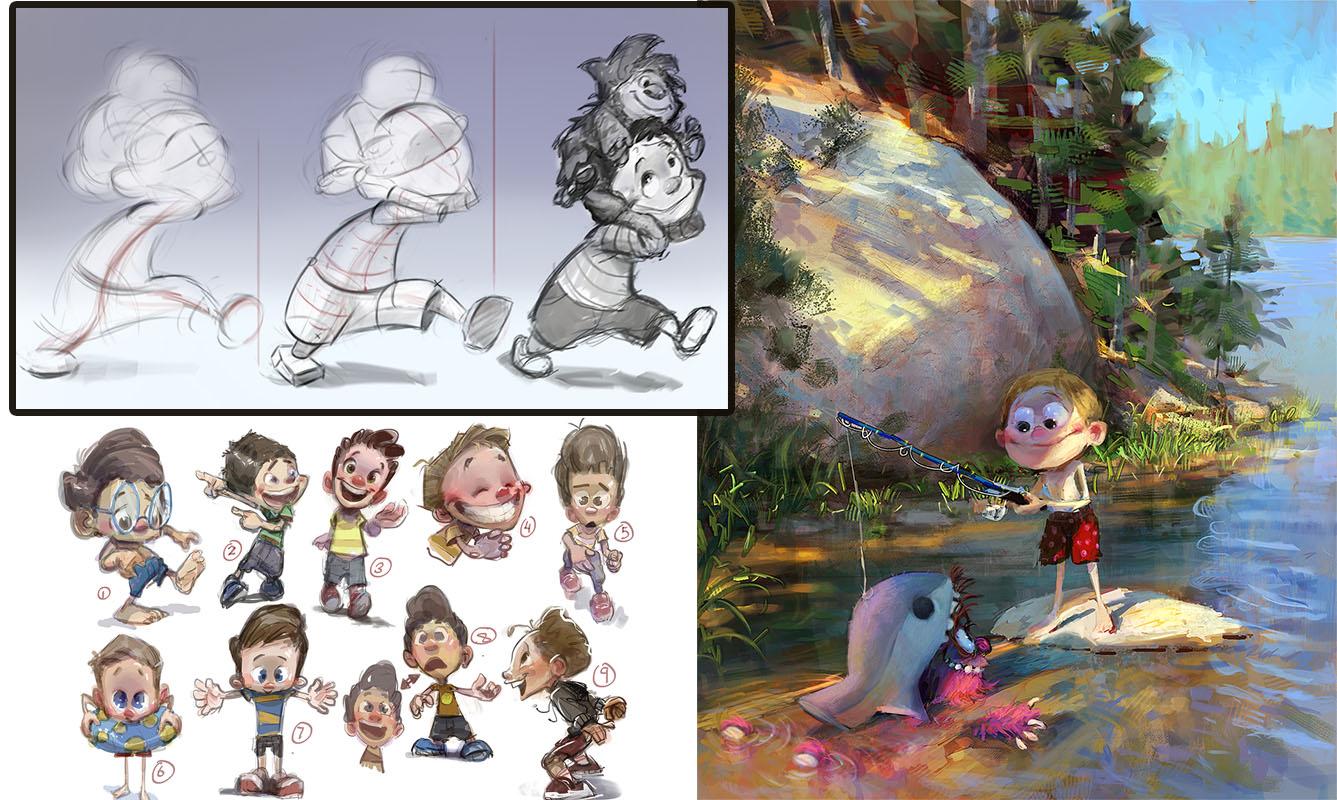
6. Characters: Gesture Drawing: Because we are
intimately familiar with how people look act and behave, drawing people is a great place to start forming
your fundamentals. Whether it's you looking at your own art or other
people looking at your art, with drawing people,
it'll become very obvious if something
just doesn't feel right. Because again, everyone has that interpersonal experience. So drawing people is
a great barometer with which you can
gauge your progress. Of course, it's also super helpful because you'll probably be drawing people or
characters an awful lot. When it comes to drawing people, the first aspect to understand
is the concept of pose. Posing relates to
how people move or behave, their body language. Body language is one of those universal things that everybody in the
world understands. It crosses countries
and cultures. Whether someone is
running to catch a train or just waiting
for their coffee, the way they pose can tell
us a lot about that person. Even me sitting here right now, I could be sitting like this,
projecting a certain image, or I could be sitting like this, which projects a whole
different image. What was the change there? Well, one, the shoulders
are back, the chest is out, and the other, the
shoulders are up, the arms are in,
everything's tighter. There is a whole world of body language difference there without a whole lot
of physical movement, though, and you would be
drawing conclusions as to my character
based on my posture. This is what we're interested
in in this lesson, how to observe and ultimately
capture those things. The best part of all
this is capturing poses can be done quickly with the
concept of gesture drawing. Gesture drawing is where I
started as a young student. Actually, I wasn't that
young, I was 19-years-old, but gesture is the
first concept I was introduced to as a
professional skill. We will not be drawing
finished lines in a gesture. A gesture drawing
aims to capture the movement or feel of a pose, using very broad, I call
them rhythmic lines, and we'll get into what
that means right away. In this lesson, it's all about analyzing what's important, separating that from what's
not important in a pose, and getting it down on the page quickly and with
energy and attitude. This gesture pass is what
captures the life on the page, and we hope to preserve that life all the way
to the final product. This lesson also kicks off our first official class
project, so let's get started. The first thing I'd
like to establish here is what I mean by rhythm lines. Well, let's first
take a look at what isn't a rhythm line.
Stuff like this. You might be used to
drawing where your lines are all very short and hatched out like
this and you are trying to arrive at
a finished contour. For example, if you were
drawing someone's head, you might draw them like this. Here's the shape of
the head like this, and here's the nose
and here's the eyes. You might think of drawing in this way
where you are trying to arrive at these finished
contours right away. This is not rhythmic drawing and it's not gesture drawing. You can draw this
way, but I highly recommend shifting your
focus to something else. Rhythm lines look
more like this. They capture broad
movements through the page or not only
through the page, but through the pose or through the form, through the subject, through the
composition, whatever it is you may be applying it to. I think if you look
at the strokes that I just made
on the page there, you can feel their energy. What I mean by energy is that you can hopefully feel the way my hand is moving when I make these strokes, just
by looking at this. Think of it almost
like a roller coaster, where you are tracing the path or trajectory of the thing. Any one given spot in the
line is not important. What's important is
that this goes up, like a roller coaster, stops at the top and plummets down. And as though you are
riding this roller coaster, you can feel the
pushes and pulls that you are propelled along
with that rhythmic line. With gesture drawing or
really any type of drawing, there are three basic lines
you need to be aware of. They are commonly
referred to as C curves, which looks like the letter C, S curves, which looks
like the letter S, or straights, which
are just straight. Now, it's important you don't take these letters literally. For example, a C curve doesn't
have to look exactly like the letter C. This here
is also a C curve, or how about we
invert it like this? That's also a C curve. A C curve could have
its hook more at the top and then come down
more gracefully like this. I would also call
that a C curve. They are very free form things. An S curve could look like that. It could look like say this. That's a combination of two S curves, but
you get the idea. It can be wide and
tight like this, or it can be broad and
graceful like this. Or anything in between. A straight doesn't have to be perfectly
straight like that. It can be straight like this. I would say this has a
subtle s curve to it, but I would classify
this as a straight. Of course, straights can
go in any direction. They can also be any length. You notice when I draw
these rhythmic lines, I make several
strokes to establish That has everything to do
with that concept of feeling. I am trying to feel these
rhythms in my body. For example, I equate
straights to carrying a lot of weight or containing
very pointed energy. We'll talk about that in
the upcoming section. But when I draw a straight, I'm really intent on
strongly putting that down, being confident with my hand. Whereas, say when
I draw an S curve, it's a more flowy
experience, a bit slower. I'm drawing this a bit slower, like I'm on a lazy river, a bit more graceful,
trying to feel it out. If I don't like
where this one went, I don't have to erase it, I can just draw over it, and maybe getting a bit darker or maybe a bit thicker as I arrive at something that is more like what I had in my mind, or just something that feels
right as I put it down. And a C curve to me is
also like an S curve. It has that more graceful feel. But I do think of a C curve
as in between an S curve and a straight and that it can have a little bit more of
that pointed energy. Sometimes I'll make C curves with two straights
even like this. You can see as I draw
these how a sense of energy can be captured based
on your own physicality, the way you physically
draw these lines. Here's a drawing
I worked with on one of my Disney projects. This is quite fitting
because animators helped popularize the idea of these rhythmic lines
and gesture drawing. Because animators have to
draw so many pictures, they've developed
tools to get through these drawings as quickly
and effectively as possible. One of those tools is commonly
called the line of action. Take a look at this pose. If I asked you to imagine this pose boiled down
to a single line, well, which rhythmic
line would you choose? An S curve, C
curve, or straight? To me, the answer is a C curve. It's a C curve that
looks like this, something that travels
through the entire pose. I generally think of lines of action as being in the
middle of the body. It's not defining
any one contour or side of the body,
it's down the middle. Notice this line of action
connects everything in the pose from the top of the hat to the
bottom of the feet. Everything in the pose is
themed off this curve. You can also start looking at the actual limbs of the pose. For example, this arm here. Let's imagine a line of
action for that arm. Well, it's also a C curve,
but it goes like this. It's a very steep curve with a very harsh
angle right there. In fact, this arm has a
bit of tension to it. It feels like it's cocked
back a little bit. You could almost draw
this with two straights. Remember how I said earlier
that straights tend to have a little bit more
pointed energy to them. This is an example of
what I'm talking about. I think you could consider the gesture of that arm
to be constructed with two straights or a C curve with a very steep
sharp angle to it. Let's look at his left leg here. There's a very
graceful pose to that. It's not carrying a
lot of weight, if any, I would say this limb conforms
to an S curve like this. It's a very graceful
type of rhythm. How about his right leg? Well, that leg is
bearing some weight, and actually, the rhythm of that leg is very
similar to the arm. I would say it's a
C curve that has likewise a very steep
angle right there, also very similar
to two straights. Again, the closer you are
to straight, in my opinion, the more weight or active
energy the part has to it. Of course, we'll develop this with several drawings
in this section. Let's go ahead now and gesture
out this pose together. I'll start with the
line of action. This is also helpful to
me in a practical sense. I know where the top and
bottom of the body is. But what I can do from
here is I can place the head with just
a basic lay and. I'm not trying to
draw the character. I'm just trying to
get a sense that, he's got a round
head, it goes there. That's the top of
the head and maybe this is the bottom
of the head here. From there, I can say,
where is the shoulder? The shoulder is
beneath the head. I'm going to say
it's about here. We gesture down from there. I can maybe start getting
the arm gesture in there. Again, that steep C
curve I talked about, and I can continue that rhythm to figure out where
the hand might go. I'm certainly not trying
to draw a hand, remember. I'm just trying to
get that again, similar C curvy rhythm
of the hand, like this. Because I now have the
shoulder and the arm, I can get a sense
of where the bottom of his jacket might
be. Somewhere here. I'll just put this in
with a indicator line. This is not a contour line. I'm not trying to draw the finished contour of his jacket. I'm just trying to
say, hey, the bottom of the jacket is right there. Now, why am I using a C curve? Well, that actually gets
into a little bit of form, which we cover in
the next lesson. You could easily just
put a straight line there to indicate where it is. But I like to
ballpark or landmark where that is just with
a little line there. Notice I get into
the habit of using multiple strokes to
draw my gestures with. Again, that helps you get into the feel or rhythm
that you're drawing. It is helpful to get the whole pose down as quickly as you can. I'll go to his right leg now, which is the weight bearing leg. Noticing two things here. I've already talked about the C curve gesture that it has, but I'm also looking at the relationship between
where the foot is and I'll use the front of the foot and the
front of the hand. It's got this angle. I want to replicate that
angle in my drawing. Sometimes it's even
helpful to landmark, put a little circle or an x as to where you think
that foot would land, and then gesture
toward it like this. Because that foot has
a lot of weight on it, I'll keep the foot
as a straight. It's a C curve into a straight. There's that leg and you notice I'm
preserving that angle. Now, whenever
possible, when I draw his back leg, for
example, I like to Feel that rhythm that I've
already got in the body and extend it down for the leg. Remember I said that leg is like an S curve that
goes like that. Well, that's what I'm trying to establish here that S curve. It's also helpful to landmark or plot where the foot
is in the drawing. It's like there's the
bottom of the foot where it impacts the ground and maybe here's the top of the foot, which is also a graceful
C curve type thing here. I'll look at maybe where
the top of his leg here and where his butt
is, this area here. I'll rough that in maybe two. It's an obvious C curve there. That allows me to maybe
lop around and find maybe where the side of it is like where the
side contour is. I don't literally want
to draw this line, but I'm noticing that
that's a C curve, that's a C curve,
that's a C curve, and I'm picking up on
those rhythms as well. This is my bridge to get into my first suggestion of where the contour lines
will eventually be. This line here, it's
broken by the sleeve, but it's also a C curve. This is the beauty of
studying animation drawings. They are kept just down to
the essentials of the pose. His back arm comes out like
this in another C curve. I'll apply the same
idea now to his beak. I'm feeling like this C
curvy action here to it. Here's the top of
his jacket, C curve. Even the top of his hat
is like a C curve there, and his whole hat itself
has an action to it. It goes down the body. The brim of his hat might
be an S curvy thing. I'm feeling out the things
that are going to give this drawing a sense
of energy in life. You notice it has nothing to
do with the final contours, but it's got an awful lot to do with the character itself. The sense that this character is moving or thinking or being. Now, when I drew in, say the
line of action for his arm, I went down the middle
of the arm like this. That's what I've drawn here,
the middle line of action. Again, when I draw
lines of actions, I go down the middle
of whatever it is, I'm line of actioning. But just like I showed you
with the body contours here, it is also very useful
to get a sense of what the opposing contours
are doing rhythmically. For example, these contours
are opposing C curves. I'll put it in my gesture. It's like one C curve going
down this way and the other one picking up where
it left off going this way. I'm expanding out even to
the contours of the thing. The cuff of his sleeve
is like another C curve. The nice part is having that
initial gesture laid in, like for example, I
know where the end of his hand might be versus
the end of his foot. I therefore know where
the cuff might land. A gesture is a way of also
mapping out proportions. For example, I might
look at this and say, h, these two elbows are a little
bit too close together. This is where maybe you
do erase a little bit. Maybe bring the elbow up, just redraw that rhythm so
that elbow is a bit higher, and that alters the action, it alters the body language. But if I now hide the
original line drawing, we still have a very
definitive pose here. It's something that I can feel
as the artist behind this. I know where this is going,
and I'm able to gauge like, Hey, is that the
type of pose I want? Is that the type of feel I want? In this case, it feels
like he's moving forward, but in a sneaky or wary way, he's not quite sure what
he's going to find, but he's moving forward anyway. This is certainly not
a confident strut. I can gauge all that just
off of this gesture, a gesture that can take you one to 2 minutes to draw,
if not even shorter. Let's move on now to
look at this page of Jake character designs
that you've seen before. Now that you have an intro and a basic grasp of
what gesture is, I want you to take a look at these drawings now
through that lens. Notice that all of them
have a dynamic gesture. The word dynamic means
that you generally are avoiding straight
up and down poses, where nothing is
moving in the body. And to show you
exactly what I mean, let's pick the most up and down pose you might
find in this one, like say this one here. The body is not very
acrobatic here. At first glance, it does appear to be straight
up and down. But just in terms of
the line of action, look what I'm doing
to offset that. I've tilted the head,
giving the pose still a nice s curve
running down it. The idea behind this
is that a normal human being rarely ever poses
straight up and down. I mean, yes, it does
happen, I guess. Usually we are in movement. Anyway, you want to
portray movement because that tells you way
more about the character. Movement implies that things are rarely in the same place. You legs will not be in the
same place, your shoulders, one may be up, one may be
down, your head might tilt. In drawing number three there, it looks like he's in the
middle of saying hi to you, so I've raised one hand. Your hips might be off
axis like this guy here. This side of his hips
being the weight carrying side as his foot
is planted on the ground, carrying that weight, and
the high side of his hips allows this foot to be raised and not
carrying much weight. This pose here,
drawing number seven. This is pretty close to being a straight up and
down pose as well. But even here, there's a
few things that are offset. For example, if I drew a line
connecting his shoulders, it's raised high into his head, like he's raising his shoulders, giving the pose a bit of action. Also, if I did a similar plumb
line connecting the feet, you notice it's
off axis as well. Those two lines are key parts of the drawing and
they're not parallel. And that little bit of offset
helps make it interesting. Sometimes I'll try poses that are based on
a straight line. It doesn't always have
to be an S curve or C curve. But notice
what I'm doing. I'm simply skewing that
line, so it's on an angle. Even this version of
the character here, that line is skewed, skewed away from the vertical. That's something I do quite
often like this guy here, that line is skewed. I would say it's straight here, but then it does a little C curve action right
at the bottom. I would say is somewhere in between a C curve
and a straight. I mean, it's a C curve, but it airs toward straight. Remember that C
curves can harness the power of both S
curves and straights. Let's look at this one here. I would actually call
this an S curve. If we think about going down the middle of the form, well, the middle of the head
starts going down this way, in a C curve action, but then it switches. This is an S curve. This one here is
also an S curve. Remember, traversing the
middle of the forms. This one here is
also an S curve. You can see how this
is not like a formula. Within the concept
of an S curve, you still have infinite
possibilities. It's not like you're
tied down to one pose just because it's
based on an S curve. This pose here is a C curve. But it's a C curve that has the apex of the
curve right there, in the lower third of
the C. It's not like a perfect letter C that you would get in a
font, for example. It's also skewed. Again, the outermost part of
that C curve is right there, which of course is
where his hips are. The hips being a pivot
point in the body. Let's go ahead and
take that pose and gesture it out together. Just to show you the
kind of mindset I was in when I first started
to work on this job. Real quick though,
I just want to talk about my digital interface. I'm using Photoshop here, but you definitely don't
have to use photoshop. There are tons of
apps out there, many of which are free, like Creta, for example, is free, and it's very
much like Photoshop. If you're using an iPad,
you'll probably want to use something like
Procreate or brushes. Those are both very cheap
and still professional. There are also other great apps like Clip Studio
Paint, for example. I think the only reason I use photoshop is because
I've been using it since the late 90s and
I just know it so well. Anyway, no matter
which app I'm using, I have my layers
window open up here, my color picker over here, and I have my basic tool
set over here. That's it. Now, as you know
from my studio tour, I do also have dual monitors. On my other monitor, I
have my brush list here. Sometimes I do put
my brushes here, although right now it's
colliding with my canvases. I put my brush
window off screen, which you can't see, but it's just on the monitor to my left. I'm only going to use one
brush for this anyway. Then I sometimes have this
navigator window open, which just gives you
a thumbnail view of the picture you have and you can navigate around with it. But that's it. Those are
the windows I have open. Now, when I draw gestures, I typically start with
this calligraphy brush. It's got a nice thick
to thin aspect to it. To me, it feeds
into the concept of rhythm because it's got such nice thickness
control to it, the harder I press,
the thicker it is. But I just find the
nature of the taper from thick to thin on
this calligraphy brush really, really nice. It ties in with
my own philosophy and feeling of gesture drawing. Okay, let's go ahead and gesture out drawing number nine there. Typically, I do start
out with the head. Now, I don't draw the head. I just indicate, again, if the head were boiled
down to a curve, it'd be in this case, a C curve, and I'll just indicate
where that head is and the general
gestural shape of it. I do often start with the
head because then I can get straight to the
relationship of the shoulders. The relationship between
the head and shoulders, I find to be your
first critical point, as we draw here and
as you practice this, you'll see how amazing it is, how much attitude you
can immediately start feeling when you get the head and shoulder
relationship in there. Then from here, I'll
gesture out that C curve. Making sure that the apex of
it is at the hip area here. I suppose the leg does come
down and make an S curve, if I'm following it right
down to the outer limb there, and then this other
leg is over here, making sure I've got a bit
of perspective in there. We'll talk about perspective
in the next section. But for now, just keep
in mind that it's pretty rare for the feet
to be on the same plane. Linear perspective will cause 1 ft to be behind and the
other foot to be in front. But again, we'll go over
that in the next section. His arms continue that
C curve rhythm or at least the upper part of the C curve of the body.
It's a bit straighter. Like to branch my gesture
off to indicate fingers. Again, I'm not trying
to draw a hand, I'm just indicating
where fingers might be, just thinking of them as
rhythmic extensions of the arm. Of course, I'll do the same
thing with the back arm here. Fingers tapering
off that C curve to give it a little special
hook at the end. Sometimes I'll just further
explore these rhythms and get indications of where the
outer contours might be. Again, these are
not final attempts at the outer contours. It's just that idea like, the knee is going to be here. I want to get an idea of how the outer
contour of that leg interfaces with the
rest of the gesture. I can do that in the
back leg as well. If we just look at
this area right here, you notice what I
have not drawn. I have not drawn two
parallel lines like that. Parallel lines tend to be a little bit of
a boring choice. I recommend avoiding
parallel lines. Notice what I did in my gesture, I first had my initial curve
for the leg like this, and then the outer one
tapered out and came in. It became this much more
interesting kind of rhythm. I really recommend
going that way. Think of it like the ebbs
and flows of a river. Nature will rarely make the two banks of a river
completely parallel. It's organic. It'll have
a nice offset flow to it. Back to our gesture
drawing here, there's a hood
that he's wearing, and that hood is
also a branch off of that thematic s curve.
I was like this. His hair might come out, also making a s curve. I'm deciding so much of my design choices are based
on gestural relationships. Specifically,
relationships of rhythms. This is his ear. Looks
like a drawing of an ear, at least a cartoony one. But what I'm concerned with is the rhythm that's driving it. Even the nose,
like the bottom of the nose is also a C curve. This little tiny C
curve of the nose being like an extension of
the C curves of the body, a continuation of the theme. I'm just choosing to really
take that to the M degree, dialing it up,
having it be rooted in almost every part.
Now that's not a rule. You don't have to have your
thematic C curve and line of action be echoed in every part. You do
not have to do that. If you can do that,
you're almost guaranteed that the drawing will have a nice appeal to it. It's like a story being
neatly tied to a theme, and you get the
sense of it being a very tightly woven
story in that sense. A drawing is the same way. Once again, for the shoes, he's got this nice
sea curve thing. When there's weight
placed on something, both of his feet are
planted on the ground, holding weight, I like to
indicate that with a straight. Put a straight there where
his shoe might impact the ground and a straight here where this shoe might
impact the ground. Can you see how it feels like he's really planted
on the ground? Here, let me get rid of
these things because I think they're a bit
confusing there now. Yeah, Can you see how shoes
because of these straights, really feel like
they're planted. It is really nice having a little bit of breakup
of your rhythm. I've talked about
thematic rhythms, everything being
based on C curves. But when you can have
a C curve like this, abruptly stopping at a straight. There's something
nice about that. It starts feeling like
these parts of the body are giving and taking in terms of how they're
distributing weight. Breaking up a
rhythm like that is almost like adding
pepper to something. Just a little bit
here and there. We'll give it a bit of a zing. The thing to understand about gesture drawing is
there are no rules. The ideas presented
here make up a series of tools that you can use
at your own disposal. So he's got his little
strings hanging off of his hoodie there
and even those strings. There's C curves. It's overkill to put these in a gesture
drawing by the way. This is a detail I
would say for the end. But just because we're analyzing a finished
piece of work, I just want you to see how
I'm thinking about it. I see what I did here. I made the same C curve twice.
Try not to do that. That's similar to
parallel lines. It's much better and more close to nature if
you can offset it. I'll just make one C curve
just different than the other. This one's wider,
this one's narrower. This one ends at a straight almost and this one
has more of a taper. Can you see how that's
much more interesting? I'll just erase out the
one I don't like there. You can see here, we have
a very solid lay in. Now, it took me several
minutes to draw that because I'm explaining
every step of the way. But if I were just drawing this, I could probably arrive at that drawing in 2
minutes or 1 minute. It's also very editable. Anything here I feel can change because I have not really
committed to anything. These rhythm lines
are abstract enough that everything is
pliable at this stage. But yet the magic is
you still totally get the feeling of what you
might produce from here. It's like a valuable
crystal ball in that sense. For this one, I recorded
it without speaking, so you can see how I
actually go about this. The process is the same. It's
just going to be faster. I started with the
head and I like to line of action my
way down the body. Then I like to do a
quick proportion check. I get the hips and shoulders
in just as lines for now. Then I try and
pinpoint exactly where the shoulders branch
out from the head. In this case, the
shoulders are raised, so they intersect the head. Now, rhythmically, look at
the straight responsible for his arm that's extended,
his right arm there. That straight really
helps communicate thrust. Again, straights
are very good at a acute type of pointed energy, like a thrust or
weight being held. Notice his left arm, which
is the arm on the right, is a C curve, which gives that arm a little bit
more of a relaxed feel. Having a difference
between the two helps the dynamicism
of the pose. For the legs here,
I'm just trying to play off the theme
that's going with the bit of a curvature to the body or the curvature
to the line of action. To give a hint of perspective, I do always like to make
sure the feet are not touching the floor at the same vertical point on the page. From here, the pose is laid in. I've been drawing for
about a minute now. Now, I couldn't always get an entire pose laid in in 1 minute. That is something that happens with practice and experience. But what I do at this
stage is I try and enhance some of the rhythms and relationships
that are there. For example, I don't
want the shoulders and hips to be parallel. As you can see, they
basically are now. Just using a couple
of different colors, I'll just offset that
angle just a little bit. It's totally valid to make lines like this in
gesture drawing. Remember gesture is
an abstract mode of drawing. It's
the foundations. Those lines help
remind me that as I add forms and detail to this to respect these
underlying relationships and not forget them
as I move ahead. Right Let's take a look at
drawing number eight here. For this one, I'll get
back to narrating it live so I can relay
my thoughts as I go. Again, start with the head. Sometimes it's useful to do a little cross hairs to mark where the eyes are and
where it's pointing. We'll look at this process a bit more in the next chapter. But if you have a
cross hair here that represents the
middle of the eyes, then sometimes you can just plot a nose with a simple curve, keeping your lines nice
and light to begin with, and you immediately develop a sense of where the
character is looking, the rotation and
angle of his head. Then maybe from here,
I could even build out gesture for
hair, for example. Coming down this way,
and maybe some ears. Again, with these gestural
rhythmic flowy lines, you can get a sense
for even perspective and the beginnings of
hints of form as well. I wanted to skew
this vertical line so it's off at an angle. Already, can you see the
amount of attitude that happens just with
that? Now, watch this. Here comes some more attitude. I'm going to place
the shoulder line. It's a bit off axis as well. It makes the letter T with
my body line of action. But again, it's not
a perfect T that crosses a perfect
90 degree angles. It's skewed. It's like this. Those angles are a bit wonky. They're not 90 degrees. I like to use the
word offset a lot. From here, I can place one shoulder high and
one shoulder low. No extremely high
or extremely low, but higher and lower. Those are critical words you can think about higher,
lower, offset. Maybe for the hips,
I'll offset that a little bit from
the shoulder line. This line goes like this,
this line goes like that. They're close to parallel, but not quite parallel. Then sometimes you can even
figure out where the feet are in this process. I
don't always do that. But in this case, because I am looking
at a finish drawing, I will ballpark where the
feet are about there. I often don't know enough about my design to place
where the feet are, but you can try it. You can always
move these things. Now watch this.
Sometimes it's nice to gesture down from the arm, a line of action for the arm. But instead of committing to it, just put a circle to where
you think the hand might be and then put another circle
where the other hand is. It's almost like he's wearing
boxing gloves or something. But immediately, I can get
a sense for that action. Then from here, I might want
to gesture toward that hand. Gesture toward this hand. Maybe I'm like, No, the arms
shouldn't go like that, it should maybe go out this way. If you place the hands first and then
gesture toward them, you might find that
a bit easier to build more natural
or believable poses. It's gesturing C curves
for the fingers here. Now, sometimes it
does help to know exactly what the
character is doing. For example, in drawing
number three here, this character is saying, hello. That's the action I pictured in my brain when I was drawing him. This guy was telling you about
a crazy sight he just saw. This guy is looking at some dirt on his foot or
something like that. This guy is
explaining something, but with a little
bit of trepidation, he's puzzled or maybe
fascinated by something, and he's moving his body
maybe toward the person that he's talking to perhaps or maybe moving his body away from
the thing he's explaining. I'm not sure. But the
more you can internalize about what the character is actually thinking and feeling, the more that will
inform your gesture on how his body is
physically positioned. I mean, you'll be
able to internalize those thoughts and your
body will move accordingly. Here, I'll hint at some of the outside contours, but
thinking rhythmically, this is a C curve, wider C curve and his foot is
going to be planted. Again, you already know this.
I like to use straights, whenever something
is bearing weight. Whenever I do 1 ft, I pivot and do the other foot. You notice they are on
two different planes. Planes, meaning, if I drew a horizontal line
from this point, crossing that point, This point is just a little bit higher. It's very subtle, but I do recommend playing with
that relationship. I can even make this a bit higher and this may
be a bit lower. I recommend playing with that
relationship in your work. It's just another one
of those elements that helps bring life to
what you're drawing. Here's another C
curve for his shoes. Maybe this aspect
of the gesture on the outside has more
of an S curve to it. This one's more of a C curve, and then his shorts maybe has a C curve like
that. There we go. With a few minutes, just
a few minutes into this, we have a working pose, certainly something that
can support being fleshed out into a fully drawn
character design. You might even apply C curves to indicate a general
shape of the eyes, for example, general
shape of the mouth. Hopefully, you can see by
now that it's all based on these thematic rhythmic lines of action and rhythmic
explorations. What that does is it
curates the pose. It ties it together. I've been using the word theme, but that's what a theme does. A theme ties it together. If you're at a party
that's Hawaiian themed. The Hawaiian shirts and the Hawaiian food ties
it all together, and nobody is left in the dark as to what
this is all about. That's the power of
theme. That's it. You don't have to go
any further than that. We could alter this
if we wanted to. For example, maybe I
don't like the way that arm is positioned.
I'll just delete it. Something you can try and
do is follow the rhythm from one arm through the
shoulders into the other arm, and maybe I want to
put this hand up here. And gesture toward it. Now I'm not worried about
the perspective of the hand. I don't necessarily need to know exactly what that hand is doing, but I'll just indicate
a few C curves for where the fingers might be. Instantly, I've got a different iteration of this gesture, but one that still
is very flowy. This is great because I do often recommend following
rhythms through the body, traversing multiple parts,
thinking abstractly as if these rhythms are like rivers flowing through different
parts of the body. Much like this C
curve line here. It flows through the chest, the hips, the leg, and ultimately into the foot. That's like four
different things. Once again, that's where these rhythm lines
are so powerful. They connect different
elements of the body, different elements of the pose, and make them feel
like a cohesive whole. This is how you avoid that
all too common beginner look. This drawing was donated to the class by a friend of mine. He drew this in high school. You can see that it looks flat. It is perfectly vertical, which is a very
common problem, yes, the arms are posed, but it feels more like a mannequin posing
and not a human. A question you might
have is, well, does this gesture stuff
work on humans too? Yes, it does. In fact, because this is an applied
course, I'm working backwards. I'm going from a
starting point of illustration and how we're
working backwards to humans. In reality, though, especially
if you're a beginner, you want to go the opposite way, start your studies
with human models and then work your way
toward characters. Here's the line of action. Look how light I'm
being on the page. Having a light touch allows
me to change my mind later. Times I use different colors
to indicate the angle of the shoulders versus
the angle of the hips. Once I'm confident with that, I state the shoulders a
little more confidently, and I'll state that
other shoulder as well. Somewhere over here. I think the head needs to
be pushed out more, so I can just quickly
scribble it out, push the head out more,
that feels better. Again, just using C
7. Characters: 3D Form: If gesture drawing represented the emotional part
of drawing where you capture feeling
and attitude and mood, Drawing form is the opposite end of that spectrum where we're
thinking very literally. We're still not thinking
about the final final lines, but we are thinking about the
solid three dimensionality of what it is we're looking at. We're going to be using a lot of basic forms, things
like cylinders, boxes, spheres, and building characters
out of those elements. But more importantly,
it's not really about building characters
at this point. A character is just
one of the many applications you
can use this for. This is more of a development of a mode of thinking and seeing where we are able to visualize things not in two D
space on the page, but in three D space going
in and out of space. That is the tool
that allows you to depict things from different angles from your imagination. Drawing form is the
ideal next step from a gesture drawing. So let's take the
same character we just worked with and
apply form to it. What I'd like to do
here is dive right in and apply some tools
of building form, and then we'll back up and
fill in some theoretical gaps. I want to keep this class
as applied as possible. Let's start off here and
we'll build right off the gesture that I just finished off with in the previous lesson. What I've got here is the drawing on the background layer, and then what I've
done is just put a layer over top of it
that I will draw on. All the stuff I'm doing here
is on a separate layer. Okay Let's start
again with the head. I still use the same
order of progression, and the head is laid in from our gesture is this shape
and it's a circular shape. I'll put this in and
this immediately, right here, this little
cross hair gets extended. Think of an elastic band
that travels over a sphere. Right now I'm drawing behind it. I'll use a dotted line for that. I'm drawing behind the sphere, then this is over it. Then same for the middle
line, but watch this, I'll extend it to go over this theoretical spherical form that I'm using as I lay in for the head and it goes around. Then if I were to be responsible and see
through the form, go like this and draw a
dotted line behind it. I say, be responsible because I find that if you
are a draft person, you know, someone who
wants to draw well, a draftsman, you want to always know the ins and outs
of all your forms, not just what you're seeing, but the backside of it, too. If you can see
through your forms, like you have X ray
vision or something, you will have more
solid form in general. Which seems to be self evident. If you know more, you will have more truth in your drawing. I'm also going to just turn
up my white layer to hide the gesture a little bit more
back to our form drawing. It's going to get rid of that
nose that was there from the gesture and restate it. It was a little too
far to the left. I want to put it right
in the middle like this, and I'll use my red
to indicate midlines. Let me redraw the midline
going down the head. This line is in the
middle of the form, going over the form. But when it hits
the nose, it has to travel around the
nose. You see that? Imagine like this
is an elastic band wrapping around these forms, and that elastic band travels, of course, around the form as
it wraps around it, right? And the same with
this cross hair here. Okay. Go back to our black. You see how useful it is to
have those colors up there. I don't have to drag
in the color picker. Then we will start building the body
because we have that. Now, our gesture, remember I was saying that in a
cartoon illustration, often your gesture
rhythmic lines can actually become
final contours. Well, here's where we can
start seeing that happen. But let's think of form though. Where would the top of his torso be like the top of rib cage? Well, in the actual
drawing here, the top of his rib cage
is hidden by the arms, but it's somewhere up there. Let's think of our drawing now, and let's put a little ellipse for the top of the torso form. Then that gestural
line we laid in here, I'm actually going
to just reuse it. This is the bottom of our torso. I'll use the bottom
of the shirt, the top of the hips as the
end point of this torso. Then we connect it with this
rhythm line that is from our gesture as
well. And this too. What we have here is a form. Let me just turn up my middle. There we go. What we
want to do is grab our red here and further
understand this form. It's flat at the top, then this midline goes
down to about here. I can landmark where
the middle point is at just below the belly
button. And draw up. Again, an elastic band tightly wrapping around that form would
look something like this. Now, notice how
this deviates from the gesture line beneath
it that you can still see. That's because this is
not a gesture line. The gesture line captured almost the average
rhythm of the body, whereas this line is going over the literal physical
three D form. So let's continue that and
draw another red line, this being an ellipse that goes over the front of
the upper torso, and it's always useful
to draw behind, and also our first line, let's draw behind the form. We can draw another one
coming down here and ellipse. Notice I'm being very careful. I'm not drawing
rhythmically anymore. I'm drawing technically. If the rhythm stuff was
the emotional part, then the technical stuff
is the physical part. So there is how I build the
torso. That's all I need. Let's go back to the black
color and let's continue. What I'd like to do looking at my reference drawing
there on the left, I'll use the shorts.
Let's build the shorts. Instead of building the leg, let's build the shorts and then the lower leg
coming out of that. We know we're starting
from here and here, let's build the shorts
over here first. Again, our gesture,
which let me just bring that back a little
bit so you can see it. O gesture told us where the
shorts end right there. But now it's time to resolve
the cylindrical form. That would be the
bottom of the shorts. I'll do is I'll draw
that all the way around. I'll use a very ghosted
line in the back there. This being the part of
the shorts you can't see, and this being the part of the shorts here
that you can see. Then I will draw the form connecting one side
of it, the contour. This is actually a contour
now, unlike gesture. You notice the
gesture in this case, some of those
contours were close, like that one there. But this is where I finally resolve the contours
of the form. Now, even this, I'm separating this lesson
from shape design. Shape design is the
very next lesson. Shape design is where you
can alter this further. But in this case, what I'm trying to do is just
make sure that I have a solid three dimensional understanding of this character. Not the character, but the three dimensional
understanding of the forms that build
the character. The final shape, which is the
next lesson is where we'll get a final understanding of
the character's full look. But this is the three
dimensional form. I'll grab my red
color here and draw another ellipse for the
front of the shorts. Here. I undo that. That ellipse was too flat. I'll talk about why when we back up in the very next
section of this lesson, we'll back up and
talk some theory. But right now want
to get that ellipse as close to right as I
can, go around the form. Good. We have this part
of the crotch here. The cylinder doesn't
go all the way there, but we can imagine it traveling
there and connecting. I use my red line connecting
with the body up here. Again, trying to see through the form as if we
had x ray vision. We are not only drawing
the front of these forms, the visible part to
us from this view, we are drawing what someone
from the back might see. This is a very, very useful and professional skill that if you want to be a character
designer of any kind, you absolutely need this skill. Because you will most likely be designing for
three D. I mean, usually, productions,
these days are three D. But even if you're designing
for two D, you know, the animators or
the production flow that goes through the pipeline needs to know what these
characters look like in three D. So even if you're
drawing for a two D medium, like a two D animation
or something, you still need to know the three dimensionality
of your character. Of course, that's what's
going to help you draw the character in any
different pose or angle. So I've drawn a couple of ellipses for the other
side of the shorts. And then I'll connect
that. Now, you know, it's not a perfect
cylinder like this. It's not a flat cylinder.
His leg is bent, right? So I'm going to bend
my cylinder as well. It's like that, and we'll go around to the
back of the shorts. Now some of this
like this part here, not to jump ahead too
much, but this part here, which I'm coloring
in black right now, that will actually
be visible, because his leg is going to
pop out of that. I'll undo that though, I'm
getting ahead of myself. I'm just thinking
ahead a little bit. There's that cylinder and we can probably make sure that we can connect this rhythm in here, going back to gesture
a little bit, making sure that these two forms do line up so that when I draw the crotch area that our forms are not misaligned
for that process. Okay, let's actually
go to this leg here. The leg comes directly out from inside of the shorts
cylinder, we can call it that. This one hits the top of that cylinder
because of gravity. The shorts are going
to rest on the leg. But this leg, as I showed
you just a minute ago, comes out from the middle of the shorts because those
are pretty baggy shorts. Meaning this part, we can see inside of this hollow cylinder. That is the inside of
the shorts garment, and this leg comes
out like that. We have a cylinder here
and a cylinder here. If you're responsible, you
should also continue that leg. I'll just draw with very
ghosted grade outlines or dotted lines,
whatever you want. Continue that leg
inside the shorts and trace it back to its
origin point near at the hips. But while we're here,
let's get the shoe. Now, the shoe is less like a cylinder and
more like a box. I'm going to draw as
a rounded box form. Here is what I mean. Here's
the underside of a box form. This is this being the sole
of the foot, the underside, and that box is going
to just come up like that interfacing
with the angle. We're seeing that box from a pretty extreme under
angle. Can you see that? That's how I'm going
to block in the shoe. Okay now it's time to apply
that to the other leg. The first question
I always ask myself when I'm drawing
pants and shorts is, where does the leg
come out from? It was pretty
obvious in this one because gravity will force this intersection right here where the shorts are
touching the leg. But in this one, these shorts are more in the middle
of the leg ish. I won't put it right out
of the middle because that's never a good
choice. Almost never. Usually, the form will spend more time on one
side or the other. I'll choose this side. I'm favoring the
right side here, the other side of the
leg comes out that way. This cylinder ends like this, this downward tapering ellipse, I'll draw around the form there. The very ghosted line or dotted line,
whatever you prefer. That leg is going to come
up. Now, where's the knee? In this one, the knee was
there. I didn't mention that. Sorry. In this leg.
Again, the knee is buried a little bit
within the shorts. Same thing here, the
knee is about there, and let's be
consistent as to where the knees are in relation
to the ends of the shorts. Then that leg comes up
and meets the hips, crotch right around there, and this leg around here, and we'll draw again, using red, I'll draw the
corresponding ellipses that represent the
cylindrical forms underneath. Make sure that our character has a semblance of believability
underneath the clothing. You'll see this all the time in animated productions
where the characters will be drawn naked. I mean, they don't
draw like genitalia or anything. There's
no point in that. But like a manikin is naked, they'll draw the character like that just to make sure the form is consistent and cohesive
and believable throughout. Same thing with the shoe here, I will just block in
this shoe as a box. I'm ignoring the
elasticity of it for now. I'll get that in in
the shape section, which is the very next
lesson after this. But I do want to get in the fact that it is
bent at the heel. It's like this. I went a
little too far back there. Let me just erase
that. It's like the shoe ends like this and it has a bent because he's
about to step off his foot. This is not a perfect. This is certainly not a
drawing of a shoe. This is a good place to remind you that this is not
necessarily the final shapes. In fact, it's not
the final shapes at all, it's just the forms. Some of these shapes actually
could be close to final, but in the case of this shoe and even that shoe
there, it's not. These are just the
basic forms that we are visualizing in our head before we can commit
to the shapes. Now, when it comes to
drawing like this, the more experience
you get with drawing, the less you have to
physically do this step, In fact, when I draw now, I almost never do this, but I always, and that word
is intentionally used. Always, think of it. There's never a point where
I'm not thinking three D. It's just do you have to go through the
steps of drawing this? That depends on your experience.
Let's get the shoulders. There's an ellipse here
where the shoulder is. Then again, using our gesture, we know our elbow is there. I'll get rid of that X though because I can see
the gesture there, and we'll draw the end cap of the cylinder, and then
we will connect that. In this case, the arm is a
pretty straight up cylinder. It's tapered a little bit
like it's wider here, narrower here, so it
tapers a little bit, but it is pretty much
a straight cylinder. Let's get the other arm
in while we're here, we know where the
elbow is right there. Again, we'll draw
through the form if I continue this up and we know where the
top of the torso is, that puts the other
shoulder around there. So we can draw that cylinder, I can draw through
the form cylinder. This is where I'm
noticing that my elbow is a bit too far out. That arm would have to be
too long to hit that point. Now, there is a such
thing as graphic cheats, especially in two D. In three D, you can't quite do this as much. In two D, I could extend the length of that arm a
little bit if I wanted to. In this case, I will bring it in a bit just to be
honest about it. But when we get to
the final shapes, I may change my mind there and bring it out a
little bit more. The D productions have
this problem all the time, by the way, where they
want a certain pose, a certain silhouette,
they can't get it because the character
can't physically do that. Studios like Pixar build cheating abilities into
their models all the time. It is a very common thing
to do in art to cheat the look of a silhouette based on the graphics or a
silhouette you want. But that is a shape question, not a form question, so we'll get to that
in the next lesson. Let's now get the
cylinder for the bottom, the lower arm, which is
the top of this drawing. There's where the
wrist would end for the front arm and we
know where the elbow is. I'm not even going
to draw anything, but it would be right there. I'll just continue this thing. Notice what I do
usually is I find the two end points of the
form, and then connect it. Then what I like to do, riding a bit muddled up
with lines here, just ghost out just by
painting white over this, ghost out what's behind. You still want to
see those lines, but I'm just ghosting it out. You can get an airbrush.
There's an airbrush here. You can do that. I'll just ghost out these lines a
little bit. Even here. Let that arm appear like
it's in front, there we go. Back to our drawing brush. I will share that drawing brush with the
class, by the way. I really really
enjoy this brush. It's one that I made
and customized. I think I got it from a
default photoshop brush that I then just customized
for my own drawing use. Again, always helpful to have these intermediary ellipses
traversing the form. You are responsible for the
form at every turn literally. You should know what that
form is doing everywhere. If you don't know what the form is doing at a certain point, you are more than likely
to make a mistake there. Drawing almost never
happens for free. It's very rare that
you get lucky and just put the right thing
down as extremely rare. When you watch a pro draw, it looks like that's
what's happening to them, but it's that their
instincts are so honed that they don't always
have to do these steps. Here's a box for the hand. Here's a box right
here and the fingers are curling in. See that. Here's the back side of
the fingers. There we go. This arm, we can use our red and just
continue it behind the head. The hand would be around here. There's the wrist, and the hand, of course, would
branch from that. But I know that hand
is in the right place, so I'm just not going
to draw it for this. But the key is, I know
it's in the right place. That's why I don't
have to draw it here. As for the toy that he's
hoisting in the air there, I'll just say thing, but I'll draw this quicker and with the most
basic of forms, here's a spherical
shape for the head, eye line up there, some
hair coming off of it. He's got a very
cylindrical tapered arm where it's narrower
at the shoulder and a lot wider where
the fingers are. And this arm here is also
like a tapered cylinder, and that leg is a huge
cylinder that goes like this. I'm just more quickly moving through this
part of the drawing here and some boxes here
for the toes. There we go. This is all making sense now in terms of three
dimensional form. I do see what I'm doing here. Going over the lines,
making sure things line up, making sure one form appears
in front of the other. One thinks the shoulders
are connecting to where they roughly
should be on the torso. I'm not thinking of anatomy, I'm not thinking about how
shoulders actually connect in real life to the collar
bone or anything like that. That's not important here. It's just general placement. Obviously, anatomy comes into play when you're
learning life drawing, which is a different
subject than this class, but the more anatomy you know, I suppose the more could
help you here as well. But you certainly
don't need to be an anatomy expert to draw
this way. All right. Being able to visualize things
this way will ensure that your final drawing has that desirable sense
of depth and form. To further gain a grasp of
what we're doing here though, I've switched over to Blender, which is a three D program. Now you don't need to
know blender for this. I'm just going to
show you a few things about the nature of
drawing in three D and three D space
that you need to know again in order
to do this well. I've got a cylinder
loaded up here, and I can rotate my view to see the cylinder from
different angles. But watch this. If I just
go into this mode here, I can see all the points that make it up,
which is helpful. Because what I'm about to do is add a ring around the cylinder. Here it is here. These are
like the rings that we've been drawing in our character.
Now watch this though. As I move this ring up and down, can you see that its
perspective is changing? I can further show you this by making the
cylinder transparent. So now we see around
the back of the form, just like we've been
drawing. Watch this. As I move the ring up, can you see the ellipse gets narrower? And as I move it down, the ellipse gets wider. You see that. Also, this is
dependent on the camera view. If I went like this, move the camera right in
line with the cylinder, or I should say with
the ellipse there, I'm right in line with that. What appears like
a straight line right now. Now watch this. If I do the same thing,
if I move it up, it gets wider as we go up. Then I can go down
and pass through the point where it's a
straight line right there, and I can go down and it
gets wider the opposite way. It's critical to
understand how this works. It all has to do with the
concept of the horizon line. Another word for the horizon
line is the ey line. The eyeline or horizon line is a theoretical line in space
that is level with your eyes, or in this case, my
camera view here in three D. The horizon line in
this image is here. I know it's there because
that's where my ellipse turned into a perfectly
straight line right there. The thing you have to know
about the horizon line is anything above the horizon line is above your eyes or above
the camera's lens. We're seeing the underside
of it. The opposite is true. Anything below the
horizon line is below your eyes or camera lens, and therefore, we see
the top side of it. For example, with this
cylinder here, again, the horizon line is
right about here where I'm crossing my
mouse cursor here. That means that the
top of the cylinder, this part here is
above our eye line, so we cannot see the top of it, and the bottom of the cylinder, this part here is
below our ey line, so we can't see
the bottom of it. If I move the cylinder down below the horizon line,
well, look at this. Now we can see that top
plane of the cylinder. Also what that
means is if I added another ring and I'll make the cylinder
transparent again. If I add this ring,
now watch this, even though I'm
placing this ring right at the top
of the cylinder, that ellipse has a
different perspective now. Just to remind you if I move this cylinder up
where it was before, that ellipse goes out like this. But if it's down here
below the eyeline, now that ellipse has changed
to go out this way downward. So I can put this
cylinder somewhere, put it here and maybe move my eyeline just about like that. You can tell where my
eyeline is in three D here, by the way, because
you can see that's where the grid terminates. It's very faint, but can
you see this line in the very distant
horizon, incidentally, that's why it's called
the horizon line, It's at your horizon, and it's determined
by your eyes. Don't mistake the horizon line for where the water
meets the sky. Yes, that is also
called a horizon, but that's not what the
horizon line is in drawing. The horizon line is
that horizontal line that is even with your eyes. In this case, even
though look at this, even though I'm
looking down, I've rotated my camera to look down. My horizon line is still here. That's because even
though I'm looking down, the physical height of my eyes, the level that my eyes are at in space is above the cylinder. Even though I'm looking down, my eye line is still
above the cylinder, which means if I
made the cylinder transparent and
moved this ellipse, you can see that no matter where the ellipse is in the cylinder, I can still see that the
top side of that ellipse, because it is always
below the horizon line. The change now is
the further down below the horizon line it
is, the wider it gets. All right. Here's
a screenshot of that last frame
here in photoshop. Let's just do a little practicing
drawing in space here. I know where the horizon
line is because again, I can see it right there where the grid terminates in three D. If I were to say just this distance
down from the horizon, well, that ellipse would
be darn near straight. But because we are still
below the horizon line here, we'd still be able to
see the top side of it, but we'd be very narrow,
something like this. If I continued my
distance down from the horizon line,
somewhere down here, which is about level
with this cylinder, then I know when I can
see it in the reference, that the ellipse gets wider than my first one,
something like that. Now, my ellipses are
drawn by hand by a human. They're not going to
be as mechanically perfect as the computer
model, but that's okay. I'll try and make it as good as I can, something like that. Now, if I just continue
lines down here, it's like draw a cylinder. Now that I'm way down
here at this level, I'm so much further down
from the horizon line, that ellipse needs to
really become wider. I'm trying to almost gesture it. I'm trying to feel
it with my arm before committing
to these lines. It's something like this. Now that ellipse has to
come off of the cylinders, legs there, of course, and
it's something like that. I could ghost out the back by
painting over But remember, it is important to draw
the back of these forms, just like we did with our
character a moment ago, we draw through the form
as if we had x ray vision. This helps our
draftsmanship improve. Because, again, if you can
see through your objects, you'll have more cohesive
form all the way through. There we go. There's
our cylinder. To emphasize that this is the
top side of the cylinder, maybe I'll just
paint this white, so it looks like a solid form there. And there's our cylinder. Now, let's say we were above the horizon line
somewhere up here. Well, now the ellipse
goes out this way. But because we are still
close to the horizon line, it doesn't come out that much. It's maybe something like this. But now we are seeing the
underside of that ellipse. If we just connected
these two points, well, now we have ourselves, yet another spatially
accurate cylinder. But in this case, I'd
mask out or ghost out that back area to make sure that we still see it, still
accountable for it. But the visible line to our
eyes is this bottom line. The opposite is true on top, I'll mask out or ghost out this part of the
ellipse to make sure to emphasize that the top line of this ellipse is the
one visible to our eyes. It's a simple
concept, but oddly, this goes untaught and
unnoticed by a lot of artists. As a result, it makes a lot of people's drawings just
incoherent in three D, the attempt is there,
but the accuracy is off. If the basic accuracy
is off in your form, it defeats the purpose. You can be off
with a gesture and still capture a
perfectly valid feel, but you can't really
be off too much with form and
capture valid form. Going back to our Jake
character sheet here, the one you've seen
before, I just want to show you how
I'm applying these. Let's look at this guy here. The first question to ask is, where is the horizon line? That is, if you were
to look at Jake here, that is to say, if you were to project
your eyeline forward, where would that line
collide with the character? What part of his body is
your eyes equal with? I would say it's
probably around here. Having the eyeline at his
chin there means that the camera is pretty low to
the ground, which is true. If you look at this, it does look like you're
low to the ground, looking up at him
just a little bit. Let me put that horizon
line back in there. That means that this area
is above the horizon line. As we saw with our ellipse a moment ago with the cylinders, that means that this cross
contour or this elastic band, sometimes they're
called cross contours, by the way, goes
around like that. Can you see how well that
wraps around his head, and it looks like it's
following the perspective? If I did this, something like that, it
doesn't look right. There's something wrong
about that or inaccurate. This is what feels like it's
wrapping around his head. Conversely, look at this part
here where the shirt ends, the belt line, that is
below the horizon line. Can you see how I've
got the ellipse going down? It's this way. If we were to draw a
theoretical cylinder there and then ghost in
the lines behind it, you can see that
we are accountable to our perspective there. All right, Let's move down the page to this
version of Jake. This is a very different angle. In this one, we're looking
slightly down at him. Same question applies. Where would our eyes be
level with in this view? I would say it's
somewhere up here, projecting my eye line
infinitely into space, it would line up around there, which means it collides
with basically the very tip of his hair. That means that in this case, unlike that one where the
line went around this way. On this guy, his whole head
is below the horizon line. This ellipse goes around
his head this way. If we were to ghost in the back of it, it
would be like that. If we look at his belt
line there again, notice that ellipse
is wider because it is further below
the horizon line. Again, we can be responsible
and do the back, and then we can connect our
theoretical cylinder there, and you can see how
I'm being accountable to the three D space that
these forms live in. Even on very realistic
pictures like this, this is painted in a
more realistic style. But of course, the same
principle holds true. First question, where
is the horizon line? Where is our eyes
level with his body? I would say it's
somewhere about there. There are some very obvious
ellipses like this one. See it bends outward
because it's going down. This one bends outward
even a bit more. This ellipse here
bends outward as well. Now his head is above
the horizon line, so this one goes out this way. Hopefully, this drives home the importance of knowing
where that horizon line is. Now, there is one
little extra thing that throws a monkey
wrench in all of this, and that is rotation. Back in blender here, I've got a box form selected
a rectangular box. I'll make it transparent
like I've always done, and I will put our little
cross section in there. Let's just put it right there. Now, we're below the
horizon line now, so we're looking down even
though it's a box form, it's the same principle as
an ellipse, as a cylinder. I just happened to
be using cylinders before and now it's boxes, but we're looking at the
top face of this cross contour or this cross section because we are
above the horizon line, it is below the horizon line. I'll just make it even with the horizon line or right there. Now it's perfectly flat. We can see neither the top
plane nor the bottom plane, so it's perfectly straight But watch what were
to happen now. If I rotate the object. I'm doing this. I'm
rotating like this. Let me get my view
back to where it was. If I rotate the object, well, suddenly now we are
seeing the top plane of that cross section because the object is tilted toward us. We do have to be
mindful of that. If the object were unrotated, just perfectly flat up
and down like this, we see it flat, but the
second it starts rotating, that's a variable we
have to consider. Back in my painting
here, there are a few objects that are rotated. For example, this leg here. This leg is like a cylinder, but because it's
extended toward us, like he's walking,
that cylinder form of the leg has been
rotated toward us. Our horizon line was
what about there? Even though that leg is below well below
the horizon line, because it has
rotated up toward us, these ellipses break
that and go this way. Cylinder goes like this and this wraps around the back like that. I'm accounting for
that rotation. It's the same thing
with the arms here. Let me just paint out
this arm real fast here. If I wanted to draw that
arm just flat up and down, well, it's below the
horizon line just barely. So this ellipse would be
just barely going downward. We'd have the legs of
our cylinder here, and this end of the arm
would be like that. That would represent the
arm hanging downward in space in a perfectly
vertical manner. But that's not what's
happening here. That arm has rotated
out toward us. That rotation is enough to change the nature
of the cylinder, so it goes out like this. Here, let me put
the horizon line back in somewhere about there. The horizon line
concept is still important because
what you can do is you can always mentally start from a perfectly flat
up and down form, like the box form here I
showed you a moment ago, and that was perfectly flat
up and down like this, you can imagine where
these cross sections are in relation to
the horizon line. Then from there, you can
rotate them accordingly. This is something that again, I feel is under taught in art, and you really need to
be aware of it so that your form makes cohesive
sense in a three D space. Let's move on now
to the next step of building a character, shape.
8. Characters: Final Shapes: All right, shape design. This is finally, where we get those final final
lines in our work. Shapes are like the glue that binds together
gesture and form. Shapes, though are also
their own problem to solve. A shape is simple. It's
like this is a circle. It's just a shape.
Everyone draws shapes from a very young age. But as a professional artist, we have to understand the
concept that we are going to be drawing many shapes
to create a picture. And those shapes need to be read or visually
understood by the viewer. It stands to reason that the simpler you can
design those shapes, the more logic you can put
into how they're drawn, the better it will
be for your viewer. As a result, good shape design gives your work an
appealing look. In this lesson, let's
dive right into shapes. We'll work with
the same character we've been working with, but we'll also look
at examples of how I use shapes more
broadly as well. We'll gain a general philosophy for shape design and
then we'll apply it. All right. So I've got my
Jake design drawings on the screen here and I've dug up a few more here on the right. I've got this is
the whole page I submitted to the client
for that particular job. Some of the numbers won't
make sense anymore. I've got two number five,
two number six, whatever. I initially presented these
drawings to the client on two different sheets and
in two different passes. But anyway, I'd like to go over these
drawings and develop a little checklist of shape design principles
to keep in mind. Principles that I
use all the time, principles that I think
are very effective, and we'll get a bit
of a cookbook going for shapes that we'll
then use in a drawing. Okay, Item one on
our checklist is something I like to consider right away, right off the bat. I like to call it
the meta shape. The meta shape is like
an overall shape that your character or whatever
object you're drawing, really, the overall shape
that it conforms to. I can pinpoint the thing
that taught me this. It's this right here. This model sheet from
Disney's Aladdin. I'll zoom in on it quickly here. It's pretty low res,
but it doesn't matter. You've got all the characters
from the movie up here. Down here, you can
see what simple meta shape or overall
shape they all conform to. You notice that each
shape is unique. The idea here being that the DNA of the shape
being different allows your eye to
quickly and easily differentiate between
any given character. It's such a useful tool that illustrators apply
it to their work, even though you can stare at an illustration forever
if you wanted to. It's still very useful
for getting that quick binary or DNA
read on your stuff. Let's take a look at some
of the more obvious ones. Like for example, this guy here, the shape is this big
tapering triangle thing, that's just for the body. If I were to include
the head in that, the head is like a
big balloon that further adds a
shape change to it. I like to even color these in or just get the paint bucket fill tool and just do to get a sense for what
that shape is doing. We'll get into how to gauge whether or not that's an interesting shape
in just a moment, those will be further
items on our checklist. But for now, let's just think of the idea of having an
overall meta shape. Now, again, these
are just principles. You don't always
have to do this. Sometimes I'll pronounce
it more, sometimes less. For example, this character
uses the same meta shape. It's the same tapered
triangular thing for the body. Know I'm not including the arms, by the way, because the
arms can move so much, it's helpful to really only consider the trunk of
the body for this stage, and I connect the feet
like I'm doing here. Then, yeah, for
this guy, the head, also tapers out, but it's
more of an angled style. The other one was more round, if you want, you can
just get a paint bucket fill tool and do that. It almost looks like
a chest pawn or something with this interesting
little spike there. When you fill in your
shapes like this, I was about to say silhouette. It's not a silhouette. The silhouette is the actual final shape the character makes. This is more of the driving
force behind the silhouette. What you're doing here is
just looking at your shape and trying to assign
it a character. In this case, does it look fun? I like how it's
got a tilt to it. It almost has a built
in gesture to it. I like that. This version of
Jake is still very similar, but it's a bit more rounded, a bit less exaggerated, a little bit more
based in reality, and where the curves and
angles are a bit more kept in balance with each other and we'll fill that in and
see what it looks like. You can see what
I'm thinking about here is an overall
design philosophy. Even as early on
as this stage is, when you're first laying
in your character, you can start tackling this
idea of the meta shape. This will actually
really help give your character while
that sense of character. This version of Jake is more slinky and silky and S curvy. Even the head has got that sleekness to it.
I'll fill that in. You can see the difference.
This shape suggests to me, a very different physiognomy or body language or
general attitude, then say this This version
of Jake is more bouncy. This guy is a bit more
turned inward, let's say. Let's look at this
funky version of him. In this one, it's like
the body goes out, it comes in and then
goes out again. Then on all of these,
the head is huge because he's a young character. Young characters lend
themselves to big heads. But there's a lot of undulations
here in out, in out, and that is what I was thinking when I designed this
version of him. Got a fairly animated look. I like it. This one
here, look at this. It's this very angular, almost like cubism
inspired version of Jake, where everything is geometric. There's a few curves in there like on the shoes, for example. But almost every
part of the body is this angular geometric, and I'll include the hands in here as well just because these totally reflect that same
meta shaped philosophy. Everything is super angled,
not a lot of curves, although there are some,
maybe most notably, the head is very curved. Is that a good idea? Well, I don't know.
That's up to the client. I'm just presenting
different options here. I'm just trying to build into my meta shapes a
bit of contrast, angles versus round
in this case. We can see how this one
has an almost abstract, again, cubist look to it. In this version of Jake, I inverted what I did
here and made it more of a downward taper where it starts wide at the
shoulders and goes down. Here I'll just fill this
one in without the head. It's not really my job here to decide what's
better than the other. My job is to provide options. All right. The thing that we've
been getting at so far is the ability to keep our shapes simple
and easily readable. The logic is pretty
straightforward. If a shape is simple, your eye can read it quickly, and if your eye can
read something quickly, your art has a much
higher chance at having a high level of
appeal to the viewer. Now, one key principle
we've been using to achieve that is a
difference in the shape. And so far we've been achieving that in a pretty basic way, and that is having a
difference of width from the top to the bottom. You can see this shape is much thinner at the top,
wider at the bottom. That has been a key player throughout all of
these silhouettes. This one is wider at the top, narrower at the bottom,
as we discussed. This one here, narrower at
the top, wider at the bottom. Remember this one here is much narrower at the top and
much wider at the bottom. Again, I'm talking about
the trunk of the body here, as that's generally what
I look for when I design characters because
that's the part of the silhouette that's
most consistent. So having that sense of difference in your
shape will give it an inherent level of interest as the eye can kind of identify, one side of the shape is
the top, one is the bottom. They're not interchangeable. That is maybe the core aspect of keeping your
shapes interesting. Let's take that now
and add to our list of shape tips that we've
been building so far. We've got them meta shape. Now we're moving
on to asymmetry. The driving principle
behind this is if you have a symmetrical
shape like a square, well, it's symmetrical
on all four sides, top to bottom, and side to side. You know, this square
could be rotated at any different angle and it's
the same shape every time. This is undesirable
in good shape design. Not to say that there's
never a place for symmetry. In art, the word never should almost never be used because
there's always exceptions. But the broad reality is
that symmetry tends to be boring and that
it doesn't really engage the viewer's
eye all that well. So what we need to
build are tools and ways to offset symmetry. And this is what I call
this offset symmetry. In this case, we want
the idea of a square, but how about if we did the square more of a
trapezoid like this? So what we've done
here to offset the symmetry is pretty simple. We've taken what
were parallel lines on the left and
right, for example, and we have made
them not parallel anymore by giving them just
slightly tapering angles. If we were to
continue these lines, it becomes obvious that the angles are no
longer symmetrical. The same is true with the
top and bottom lines, although these are a
little bit more subtle, if I were just to
trace them out, you can see that they
would converge way off to the right if I
kept those lines going. So whenever you're
dealing with a shape that has parallel lines, a great way to offset
it is just to rotate those angles a little
bit in either direction. Much the same thing applies. If we had a shape that
were too circular, say like this, this is a perfectly drawn
digital circle here. Well, for this it's
actually easy. If I just try to draw
a circle by hand, it auto just because I'm
human and imperfect, this circle automatically gets offset, and it's
something like this. I'll just continue to go
over this shape here, and then if I wanted
to, I can erase out the areas that I
don't want to commit to, something like this, and
M version of the circle now represents the same thing we just did with the square, we have offset the
symmetry of the circle. In this case, I have no parallel lines to compare to, of course, what I'll do is I'll take the widest point on either side. I think the widest point
on the right side is there and the widest point
on the left side is there. And you notice how that does
not make a horizontal line. It's rotated by
ten degrees or so. We can take the widest
part at the top, which is probably about there, and the widest part
at the bottom, which maybe is there,
and you have this. Instead of a perfect cross hair, we have offset it. This idea of measuring the widest points is
something I use all the time. Let's say we had more
of an organic shape, something that's not
a circle or a square, something that
combines the two has a few curves in it, maybe
something like this. The thing that I'm responding
to negatively about this shape is much like
the symmetry idea. If I were to measure the width of this shape
with these green lines, that width is more or less consistent all the way
through the shape. Again, while that
is not inherently breaking any rules or
anything like that, I don't like that generally, because once again,
I think it misses opportunities to
engage the viewer. How would I use a
shape like that, but design it in a slightly
more interesting way? Well, I would use the idea of offset symmetry, and
I would say, Okay, how can I find a way to make
the semblance of that shape, but maybe make the
widest point on either end slightly different,
maybe something like this. This shape, I would say, kind of fulfills the same purpose
as our original shape. It's got the same kind
of identity to it. But you can see now the
widest point of the shape, maybe is here to here and
that's the width of it. Well, that's different now
than the top and bottom. We have a wider middle and
a shrunken top and bottom, and even the bottom is even
more shrunken than the top. So this shape kind of
gains a tapering effect from top to bottom
as it travels down. And when a shape has those
tapers, those offsets, those differences, you have a much higher chance of that
shape engaging the eye. Going back to our
jake drawings here, these principles
of shape apply not only to the full
body as a whole. But any individual
little shape like if I zoom in on Jake's
arm right there. Let's first of all, trace that shape and I'll cut
it off at the wrist. This top part of the
arm is straight, a very subtle S curve maybe, and this bottom part of
the arm has this taper to it and will again just cut it off at
the shoulder there. Let me redraw that shape
up here just free hand. This was the top,
cut it off there, cut it off there, and
it's the bottom of that shape that has
that sense of offset. So there's a width change. It's wider up here,
narrower down here. One thing I know is
true of students, M having been a student
for the longest time, and I still consider
myself a student and also having taught students for
more than ten years now. I think I've been a teacher
for 13 years at this point. The general human nature
is not to do that. Human nature will
want to make shapes like this, just symmetrical. While, again, there is nothing inherently
wrong with that, if you repeat symmetry
over and over, you are on the quick road to
creating boring pictures. Now, this principle
is everywhere in my own work because I've
trained my muscles to do this. The way I move my hand, I've trained it over the years
to make shapes this way. You can see like the nose. You notice how that nose is slightly skewed and on
an angle like this. If we were again to identify the widest points of the shape, it's there and there,
it's on an angle. Even the sides, it's there
and there. It's on an angle. If you look at this ear, it's not a perfect
circle ear, it's offset. It's skewed. Again, I love using the widest points
there versus there. It's on that angle. It's not vertical, it's
20 degrees off of that. Remember how easy it would be if you weren't aware
of these principles, how easy it would be
to draw the ear as a perfect semicircle here, where things are a
bit too symmetric. Again, while that is not alone going to kill
this character. I mean, you could do that in a small area and get away with it. What you want to learn to
do in your art is train your hand to avoid that in favor of something
less symmetrical. That way, if you want symmetry, you can still do it, but it's
not happening by default. If I were just to select that
shape here in photoshop, I'll activate the
Warp tool here, and this is literally
what my brain is doing. My brain is warping
the shape like this, just skewing it a little
bit, so it's offset. Now, you might say that's all
well and good for cartoons, but what if I want to
draw realistically. But it turns out that nature is the thing
that teaches us this. I like to use the human
calf muscle as an example. This is just one small example. There's millions of
examples throughout nature. But look at the
offset symmetry that happens in this bit of anatomy, the widest part of the
shape is different. It's got those different angles like I showed you in the box, the widest part here versus here is off of the
horizontal axis, just a little bit, ten degrees, five degrees, something like
that, a little bit works. Even look at where
the bones are on either side of the
foot, it's offset. Also the middle of the back of the knee
here. It's offset. What nature will do time
and time again is it will change these
overall meta angles. The angles between one thing
and another will alternate. There's no exact pattern
to how they alternate. But as long as
they do alternate, or in other words, not just
be constantly parallel, you are well on your way to mimicking what nature
does, which, in turn, creates a very familiar sight to the viewer because they're used to seeing this in
nature all the time. I mean you don't have
to be an artist to know that nature very
rarely makes symmetry. Symmetry is more
of a human thing. Sure, if you're designing a building like a city building, maybe you use symmetry there. But probably for
the vast majority of what you're going
to be drawing, especially if you're drawing characters or organic scenes, this idea of offsetting
symmetry is hugely valuable. Again, you can find
this everywhere. Look at the widest point on the biceps here versus
the triceps there, pinpointing the widest
point of that shape, it's there versus there, offset. Let's look at the deltoid, which is the muscle up
here near the shoulder, where the arm interfaces
with the shoulder. Let's just trace
that deltoid shape. Look at this offset
like spheroid shape. If I were to draw it, it's got maybe a spherical
top up here, but the way it tapers down, we are pushed over on the right and only a
little bit to the left. That axis is offset. And what we're doing here
is not studying anatomy, although you could absolutely
apply this to anatomy, as it's quite literally
what anatomy does to shape. But what we're doing
is we're simply noticing what nature does, which is constantly offsetting. I just use the term meta angle. That just refers to
observing what's that angle versus that
angle versus that angle? If you can introduce variety in that from one thing to the next, down a form, this
is just an arm, but we have three very
different angles here, and we can take
that even further. Look at the angle that's created in the knuckle area here. I know he's wearing a glove, but the hand has been rotated
to make an angle like that. These are the simple
checks and balances you can use to help you
create offset symmetry, for example, or just that
sense of difference in your shape that helps propel
them so much further. Let's continue to explore the idea of adding
difference to your shapes, but the concept of
straights versus curves. Remember in gesture, we talked about things
being designed with straights or C
curves or S curves. It's the same with shapes. You're always using
a selection of those three basic types
of lines or curves. What you want to do with your
shapes, generally speaking, is make sure your shape is composed of a variety
of those things. Now, again, these are not
hard rules, these can change, or you can apply them in different amounts based on
the style you're looking for. But in general, adding
different types of curves to how you compose your shape
will help add interest. Here are a couple
of big foot designs that go along with
the Jake character. Let's just take a look at
this guy here, for example. Here is an S curve defining one side of the arm
and shoulder shape, do you notice on the
other side of that shape, it's a straight. Pretty simple. Now, let me show
you what it's not. If I were to quickly
edit this out. Notice that it's not this. It's not this because that
see how it looks like a balloon now at this point or just something that's
a bit less appealing. There's nothing inherently
wrong with it as I keep saying But in general, I think if I just undid that, went
back to the original, this idea of an S curve meeting a straight is a bit more dynamic and interesting
because it's more unexpected. Again, the eye has very little to do when
you present it with symmetry or when you present it with the
same choice repeatedly. Because it's kind
of like copying and pasting the same thing
on both sides, right? So in the case of this arm, if I have a nice S curve on
one side and a straight here, the resulting shape
will be a bit more unexpected to the viewer. Let me just quickly
fill this in. As a result, that
unexpected nature of the shape drives a level of interest that a shape like
this wouldn't as much. Because again, this shape has very similar sides
on either side. It's not a bad shape, it's
perfectly readable and simple, but if you have something
that you feel is too mirrored or symmetrical, simply take one
side, get rid of it, and try and compose it with
a different type of curve, a straight, or maybe
it's still an S curve, but this one swoops down lower. And we can use offset symmetry to offset the diagonal
axis of this. Let me show you some
more examples here. I'll just bring up a sheet of tracing paper here
like I've done before. If you look at the
overall meta shape of this character down the trunk of the body, here's a C curve. See how nice and simple that C curve is over
here, what is it? It's a straight, or maybe
it's a concave C curve, but a very narrow concave. This C curve is swooping and this one is very
almost angular. I combined this
principle of straights versus curves with the
principle of the meta shape, which is something I
highly recommend you do, and you will find opportunities
for this as you gain experience and practice is combining all of
these tips together. I took advantage of
a similar straights versus curves opportunity
on Jake here. He's lying down, so that means I probably
could use a straight, where his body is
hitting the ground, and also he's reaching, so I could use straights there too. This whole thing is
kind of two straights, and that left tons of room for this overall meta shape to be
really curved on this side. It's this very exaggerated idea of straights versus curves. Let me just grab the paint
bucket tool and fill it in. I'll draw a more abstract
version here at the bottom, basically a couple of straights. Then on the opposite side,
using every opportunity I can for all kinds of
different curves. The shape is not just Jake, it could be a
cloud, for example. It could be a dragon lying on
its back with a big belly. Shapes are abstract. They can be applied to so many
different things. Let's take a look at
the arm over here. The arm portion, here's a C curve and here's
another C curve, but there are two
different C curves. I still consider this under the banner of straights
versus curves, but you don't have to
think of it literally. You don't have to literally use a straight against a curve. It's more something
versus something. In this case, a narrow C
curve versus a wider C curve. Of course, that
gets combined with the idea of offset symmetry as we have an off axis widest
part of the angles here. You can see how this is like a cookbook for shapes rather than some formulaic thing that always produces the same result. You can look for
this everywhere. If we traced a shape behind the creature's
head like this, this is what an S curve, But then look at the other side. It's a big, wide C curve, even down to the finger designs. Like we have an S
curvy thing here, a wide, big bellied S curve versus a narrower
S curve there. Again, look for offset
symmetry, offset symmetry. I do like to remind people how easy it would be to
draw it the other way. For example, if we had the
finger going like that, imagine how easy it would be to create a very
symmetrical finger. Know this is easy because I see this over and
over in student work, including in my
own student work. From years ago when I was first discovering these principles. For me, it represented a
huge shift in mindset. It's so much within
human nature, I guess, to make a shape that
is symmetrical like this. But if you start doing symmetrical shape after
symmetrical shape, your stuff starts looking like bloated or I call it
the banana effect. It looks like a
bunch of bananas, and it's hard to unsee that. It's hard to get a
sense of appeal there. You know, even look at the
toenails. Straight, curve. There's the most
basic element of this tip straight versus curve. Let's look at Jake's
foot over here. We have S curve like this, kind of this interesting sort of S curvy shape versus a
straight and a curve. So it's kind of a boxy form.
Let me draw it down here. So it's kind of
like a boxy form. But it's made of
an S curve there, then a narrow C curve
and a straight. Instead of something
generic like this, you work within those guidelines and just make it a bit more interesting by varying the type of line that you're using
to create that shape. Another way to apply this
technique is to look at how a shape kind of travels
from beginning to end. And what I mean by that
is, let's take a look, for example, at his
pants right here. It would have been very
easy for me to just draw a straight line
all the way down. That would be fine.
That shape looks okay and I did do
that in other Jakes. That's not something that's
against the law or anything. But one thing you can
do to use straight versus curves is if
you're ever feeling like, Okay, I'm doing a lot of I'm traveling in a
straight line a lot here. Let's now somewhere down the
shape. It's the same shape. Let's now add a little
curve at the bottom, like a little spice, a little
swirl, a little flare. Again, this is like
a big long C curve, and let's just go S
curve at the bottom. In this case, it's like
C curve versus S curve, and the same here, C
curve versus S curve. I could do the same
thing with a straight. If I had a straight shape
that I was drawing here, this is one side of a shape, and I want to get say down here. Well, instead of having the
straight go all the way down, why not just say, go wide
and make a little C curve? Now, don't be tempted to do symmetry on the
other side like that. Maybe on the other
side, I would go straight and a wider
C curve like this. I'd offset that
symmetry and I would still use the idea of
straights versus curves, which is exactly what I
did on this Jake here. You could see overall, his
pants are narrow than wide. Within that, it's wider on one side and narrower
on the other side. Again, combining these
techniques of shape design. Now, remember, it's not a rule. For his pants here,
I didn't do that. I just made them straight. Now, I happen to
think that this is not as good of a
drawing as a result, though I'm not
personally attracted to this drawing as much as
I am, some of the others. I think it's
specifically because my shapes I think are
less interesting here. Now, this is a very
subjective area of art. This list of tips,
this little cookbook, is a series of
things you can try. Remember there are no art laws. The art police are not going to come to your door
if you ignore this. But if you look and examine any professional artists work, you will see these
principles at play. I'll just show you a
few more examples. If you take his head here, it's like a C curve on this side and a wider C curve
on this side. Same over here. C
curve on this side, straights on that side. This one's a bit
more symmetrical, but the angles are different. This is more of an
offset symmetry thing. Here's a good one,
A S curve design, like if you were to think of the overall line of his head, it's like an S curvy thing
with a C curve at the back. Then the bottom is
like a straight. Then if I were to connect
this it's a C curvy thing. This shape here, it
almost looks like one of those bullets from
Super Mario Brothers. Very simple shape that is made of all three types of
curves in this case. You can keep it very subtle, too, on this guy. I think of this as one
continuous C curve, but on the other side,
it's more of an S curve. It's subtle, it's subtle, and it's something that I'm
fully aware of as I draw it. Now, remember, I've
trained my hand, the way my hands move, I've trained over the years. I have relegated this to almost
an unconscious decision. This is something
that becomes easy when you get to that stage. Before you get to that stage, you have to consciously
practice it. Even if it's just
taking a sketchbook and making a shape
like this and say, Okay, there's a straight
versus a curve. I like to shade it in just to further emphasize the
shape to my eyes. I don't know why that
helps, but it seems to. Say, Okay, what's another
way to make that shape? How about if it's two straights and the s curve
goes up like that? That's a variation
of that shape. These are all very conscious
design decisions that you can make that will help make your shapes as
interesting as possible. As I always like to do, I like to contrast different styles just to show you that
these principles apply no matter what. This style could not be more
different than this style. But remember that this is
something that is not just for artists and draftsmen and
drawers and painters. Fashion design does this too. I had photo reference
for this dress. I'm not a fashion
designer. I had photo reference for this dress. But the way this dress is
designed, it's like straight, straight, on the back, it's more of a s curve and
like a big swooping s curve. That's how the fashion
designer made this dress. These principles are
universal that way. I made sure that
when I was painting Clara here that I chose the angle to paint her at that maximized this
shape relationship. Because remember, when you're zoomed out to see
the full thing, your eye doesn't have much
time to read everything. You need to give the viewer of these very simple shapes so they can boom, get it immediately. If your shape employs these
tips that I'm telling you, I swear they'll be more
memorable to the viewer. All right, Let's do
a drawing together. I'll be redrawing
this version of Jake, and I'll narrate my
thoughts throughout. This is real time with narrated
thoughts and we will get at all of these shape design
tools and put them to use. Now the first thing I
always do is get in a gesture and we'll get in a bit of the form
stuff we talked about. You notice I will be combining a lot of these
concepts together. I just did a bit of
form, a bit of gesture. I want to find where that
shoulder is pressing up against his cheek
versus the other shoulder. Then we'll get a nice C
curve here for the body and this pinpoint where I
think the shirt will end, maybe where the hips are here. And there's a cylinder there. It's like a tapered cylinder. There's some form here. Now, this is not
the final shape. I'll get the final
shape in later. The final shape will almost certainly deviate from
this a little bit. It's impossible to get
it right the first time, at least it is for me, and I
don't expect that of myself. The arm is going to
be coming down in a bit of a C curve ending here. This arm is out, maybe more of a straight with a
little hook at the end. The big hand here, and the boxing glove hand thing, which I can manipulate later. The feet now, let's go straight because the
legs are held taut. It's a very not awkward, but it's kind of
like, hitched pose. I want to get some straights in the legs to help sell that, and we'll just block
in this idea of a continuation of a C
curve at the gesture and also just a hint of the tapered offset
symmetrically shape here and the f I can also block in the feet with the boxing love principle as well. It's like this. This arm is in. There's my gesture pass with a little hint of
form in there as well. Now, what I'll do is I'll block in what I think is going to
be the shape of the head. I'm going to go C curve here. Let's go a bit straighter for the underside of the jaw and that filters right
into the neck. Once I have a solidified spot
for the neck right in here, and there's a cylinder here. Now I know where the shoulder
can be based off of that. I know right now the shoulder
is probably a bit too wide. So I can move it in. I want to have it
right up there and I think it's going to be
pressing up that way. But again, I can always erase
this out, if I want to. This is digital after all. Even if it were a pencil,
I could erase it. But it's just so much
easier with digital. Let's get in. I do like
to get in for the head, that center ellipse
that goes around. I can draw behind the form
right with my dotted line. But I usually don't do that
when I'm actually drawing. It's something I
recommend you practice, but when you go to draw, go ahead and do it if it
makes you more comfortable, but I'm not going
to do that as much, but I am always visualizing. You'll sometimes see me go
around the form invisibly, you could follow my cursor, my mouse cursor or
around the form here. Because I have the center line, I know where the nose will end
up landing somewhere here. I'll do my best right
away to get a shape that has offset symmetry to it, has two different
types of curves. This is maybe a straight
meeting a C curve. Then from here, I can block in where the eyes
are going to go. I'm thinking in
perspective here, so the nose is in front
of this far eyeball. I like to just ghost in almost gesture in a hint of
where those eyes are looking. When you have the character
looking somewhere, it immediately implies life. There's just something about
that. I even like to put the pupil in. I can
always change it. But I even like to put the
pupil in at this early stage. Then I can I also helps
me get the shape of the eye and in this
case, the eyebrowser, comedically or cartoony things
that are above the head, which makes no sense
on a literal level, but this is a cartoon
design after all. The back of the head will
be a sweeping s curve but meeting a straight back there and this inverted upside down s curve
going this way. I like to start with
the head because that will help me land on all
my other proportions. The gesture was a hint of that, but I'm already seeing, for example, I think I want
the shirt not to be as long. I want the torso, that is to be smaller, so I can
even just do this. I can move this up with digital. You can do all these things, and I'll get the shoulder in and the shoulder moving into the
arm now is like a cylinder. Now, remember the
horizon line concept. Where is the horizon line? I think the horizon
line is right around his hips, right around here. Which means when I'm
dealing with this arm, this is above the horizon line, so my cylinder goes that way. I'm going to have
a nice C curvy arm here, meeting more
of a straight. I'm modifying this a little
bit from the original. I'm k Freely thinking
through it as I go, just using the original
as a touch point. This is his elbow here, which I'll design in
this little swoopy shape to help have some fun there. Notice this whole
arm shape tapers in. Also, it has the
straight versus curves. I've got a C curve here,
Mr of a straight there. It digs into his
pocket about there, and I'm off from the gesture. I'll just erase that to emphasize that and
not trip myself up. Now, his shirt
Something I like to do is measure if I go back
to the original here, his head is this long and
his shirt is that long. It's about half
of a head length. You can study proportions
that way in head lengths. The human body is
generally well, in the default male human body is eight head lengths long. Female can be 7.5 generally. A child will vary like a toddler is like
three head lengths, and it changes with age
until we reach adulthood. But in general, it's
a good idea to keep your figure if you're drawing
a child about, there's one. Another head length and a half
like something like that, will keep your child looking
very young if you're doing a child design
like I am here. That's why I raised the torso. These are all charts
you can study. Just look up human head lengths. You can even look
up Andrew Loomis, I think is the first
person who popularized this form of measurement. Andrew Loomis human
head lengths and you'll find charts that
Andrew Loomis made. That's how I learned
it. This C curve. See I'm honoring the C curve that I built in with my
gesture, but I'm changing it. I'm making it more pronounced. I might even want to get rid
of my gesture a little bit, just ghost it out a little bit. I'm doing all this on
one layer, by the way. Just because I'm
comfortable that way. I like being able
to just go back and forth with the lines on the same layer and not have
to think about switching. That's just me,
though. The tummy comes out and it's
more of a straight. And then the pants, notice what I'm doing
with the angle. Look at the shirt
versus the pants angle, also the shoulder angle, right? And also the bottom
of the pants angle. These angles are all offset. These are all things
that we looked
9. Class Project 1: Create A Character Design Sheet: In this first class project, I'd like you to use all the drawing lessons we've looked at so far to design your
own sheet of characters. With character design
and development, it's important to come up with multiple versions
of a character. The comparison of those
designs helps you further understand and
refine who the character is. For this project, the
first criteria is to produce at least five
versions of a character. The character
description, I'll keep it simple, similar to Jake, a child five to 7-years-old
with a playful attitude. The gender and ethnicity of the child can be
of your choosing. In your drawings, be sure to explore various
poses and angles. Doing so will help not only
inform who the character is, but it'll help a client
further visualize their idea. Finally, coloring the
character is not required, but you're free to
do so if you choose. As a little bonus,
if you would like to present your various
stages of work, gesture, form, shape, in
your final presentation, feel free to do that as
well, but it's not required. That's the first class project. Go ahead and have fun with it.
10. Environments: Practical Light And Color Theory For Illustrators: Okay. We are about to take
a pretty massive pivot from drawing concepts and
bridge over into painting. Specifically, we're going to be dealing with color and light. The principles we're
about to discuss are almost purely divorced
from drawing principles, but as we'll see in
the very next lesson, they all do come together to
create a final illustration. In this section, though,
I'd like to focus on the key aspects of color
theory and how light and color work together in
order to give us kind of a visual vocabulary of how to
understand light and color, as well as how to analyze
it from photo reference, and I will ultimately show you my process for
painting a photo study specifically with the
goal of maximizing your skill increase
in color and light. Get ready for a fresh start
here. Let's get to it. Understanding color starts with understanding the concept
of color temperature. This is a color wheel. I'm sure you've seen one of these before. It shows all the
hues that we can see in the visible
spectrum of light, and the hue meaning
the color names, red, orange, yellow,
blue, cyan, violet, et cetera, green, and it shows the
progression through them. The main thing that we're
going to be looking at first, and this is kind
of the key concept of all of this, and
it's very basic. Is that there is an
overall warm section of colors on the color wheel and an overall section
of cool colors, and they are
opposite each other. This is the warm section
of the color wheel. It's like a pie slice that goes around here and
encompasses what the yellows, reds, oranges, this area here. This is the warm side
of the color wheel. The cool section is, well, it's the exact opposite
side of the color wheel. It is starting here with the cyan blues and going
into some of the purples, and on the way you have
the blues in here. Cyans, blues, purples,
some of the violets. That section is the cool
section of the color wheel. We have warm versus cool. That concept is called
color temperature. Let's take the next little baby step from there and look at individual colors as they
relate to color temperature, getting warmer or cooler. When it comes to
understanding color, the first and main thing we need to know is that
the color names, the hue is useless,
red, yellow, green, blue, purple, whatever,
cyan, turquoise, orange. That is not very useful. It's not useful because
it's not specific enough. Color temperature is
the tool that allows us to talk about color
with specificity in that it allows
us to compare and identify exactly the type
of hue we're looking at. I think anyone coming
into this class, even if you have no experience, you know that there are
different types of red, different types of green, it's different blues, et cetera. There's never just
one of the hue. You can see at the
top of my chart here. I've got cooler temperature
and warmer temperature, and in the middle is the hue
that they both emanate from. Let's just start with say red. Just to make sure everyone gets an understanding of what
this chart is saying, so we can move on to dig deeper. So we start with red. Now, where is that red
on the color wheel? It's probably right about
here. We're starting there. Now, we can go warmer, which means we are
shifting this way. Now why is that warmer? Well, the warm area of
the color wheel is, the yellows, the
oranges, the reds. This is the warm slice
of the color wheel. Shifting a red that
way ensures that it stays warm as opposed
to getting cooler, and as we shift that red warmer, we are modifying it slightly. It's eventually going
to turn orange. If we go back to our chart here, that is the same progression
I'm showing here. The inverse is true, we have that same red starting point, but we want to now shift cooler. If we look at our chart here, red wants to shift cooler, and you can just
visually see it. It's getting more violet
by the time it gets there. Well, on the color
wheel, that shift represents a movement this way. The red shifts this way, I'm selecting colors along the color wheel here until
we get into the violets. Now, I stopped at the
violet and I stopped at the orange on the other
side because once we get into those colors,
it's no longer red. It becomes orange and
eventually yellow and green, and on this side,
it would become violet into the purples
and then blues. Those are no longer red. I stopped my shift before
the hue totally changes. Let's do another one. Let's
pick a green because a lot of people wonder if green
is a warm or a cool. Green is kind of a chameleon. It happens to be
the color we can see the most variations of. It exists in between the warm and cool slices
of the color wheel. Green can really have a lot of flexibility in
going either way. Let's say this is our
middle green starting point that I've identified
here on our chart. When we shift a green
warm, same as the red. We are shifting it to this area. We are shifting the
green this way. We shift a green cooler, we are shifting it this way. There are a whole ton
of greens in between. You can see it on
the color wheel and likewise, you can
see it in the chart. As I make a green warmer
and I go this way, I am picking greens like that, and there are so many greens. All of this is green.
Remember, there are so many greens we can see. These greens are
getting warmer as they go toward the warm stop
on the color wheel. You can almost think
of the color wheel as having two different
train stops. This is the warm train station, and this is the
cool train station. And the basics of shifting from warm and cool
are, you know, you are traveling around the color wheel to shift
from warm to cool, and you can travel
back the other way to shift back from cool to warm. And that's what we are
doing with these charts. So that same green
is green here, which existed right in here. That green gets cooler
by shifting this way. These greens eventually
get into the cyan blues. It's the same for every color. That is also by the way,
how you warm up a blue. It's another common
color question that I get asked a lot, and Any instructor
would get asked is blue is a stereotypically cold
color, and that's true. How do you warm up a blue?
Is that even possible? Well, yeah, it's actually very easily possible using
this basic method. All you have to do is
take your starting point, let's say we're
starting at that blue. And just shift it this
way toward the warms. I would say that these blues, I don't want to go too
far because then again, I'm going to get
into violets and purples and eventually red, and those are no longer blue. But to shift a blue warmer, you just shift it that way. Now, if your blue is here, you might want to shift
it this way because it's closer to the
warms going that way. Now this is where this
particular method falls a bit short because if
you were to take a blue say there and
shift it that way, well, you have to go through the greens before
getting to the yellows, and that can be an issue. We will solve that issue
right in the next section. But in general, just
know that we have our warm pie slice
of the color wheel, and we have our cool pie
slice of the color wheel. The most basic way of shifting temperature is to
move the given hue, red, yellow, green,
blue, in this case, toward those areas
of the color wheel. With those concepts
under our belt, we can get into
more complex ways of moving from warm to cool. Here are four charts. Now, don't be
frightened if you don't immediately understand what's
on the screen right now. I'll explain it. It's
actually quite simple. Well, the first thing is
something we already know, the first two charts, these guys here are exactly
what we just talked about. It's just they're presented
in a different way. In both cases, I'm taking a warm color to start
with, in this case, this yellow, and
we want to arrive at a cool color in both
cases, the same blue. And in chart number one here, I am simply moving in one direction through
the color wheel. Yellow, turns into
orange, turns into red, turns into violet, turns
into purple or indigo, then turns into blue. On the color wheel
here, that yellow started about here and simply went around
the color wheel this way till it
arrived at our blue. Then before I escape
back to the chart here, chart number two simply
goes the other way. It takes the same yellow
and the same blue, but arrives at it this way. As you can see, Chart number
two here, same yellow, but this time we pass
through the greens, into the turquoises and cyans, and ultimately into
these deep blues here. That's Charts number
one and two covered. Those are both
totally valid ways of controlling
color temperature, moving from warm to cool. The problem with just
those two charts, though, is everything
is very saturated. The colors are obnoxious. It feels like something
you'd get at a cotton candy fair or something. They look too vibrant
all the way through. We need to be able to control more subtle
differences in color, and that is where the
next powerful concept comes in when it comes to understanding
color temperature, and that is the concept of gray. Back to our color wheel, you probably noticed
that there is this middle section that
is between every color. You probably also
noticed that as you move in from a saturated color, saturation being out here, saturation being when
you have any color, say this orange, saturation
of the colors way out here, the most vibrant
that color can be. That's saturation.
On this color wheel, if we picked a saturated color and moved in toward the middle, you notice that color is
getting progressively less and less saturated.
It's getting more gray. Looking at it on this screen, this orange, as you move toward the middle
of the color wheel, that orange would
be getting less and less saturated until ultimately it reaches this perfect
gray or zero saturation. That zero saturation, every single color
has that in common, which is why it's located in the middle of
our color wheel. Every color has this zero
saturated gray in common. Now on this color
wheel, it looks white, it could easily be
a gray like this. The whole point is
though is that it's zero saturation.
If I sample that, and bring in my sampler, you can see it's
zero saturation. That's the whole point of this middle section.
That is gray. But when I say gray, I'm not talking about
just one point. I'm talking about the
surrounding area. There's like blob
of color in here. Gray plural. Another way you may
have heard this before is the neutral colors. Concept of neutral
is pretty simple. If we pick a very saturated
color and put it there. Well, what's a neutral
version of that? Well, it's simply a color it's the same color,
just less saturated. This would be a neutralized
version of that, and you can maybe pick something in the middle, put
it in the middle. We have two neutrals and
one saturated color. The same is true for any color, let's pick this purple color. Let's put it here. That's a very saturated
version of that color. Well, how can I neutralize it? Same thing, reduce the
saturation and go like that. That is a neutralized
version of that. I can even neutralize it
further and go like this. Now, I tend to not use
the word neutral so much. I will just say gray it off. But whether someone says grays or neutrals, it's
the same thing. Now, you notice when I do
gray something off like that, the identity of the
color starts dissolving. If we just saw zoom way in here, if we just saw this
color like that, Well, suddenly, it's hard
to determine the hue. We can see it's purple ish, but it's nowhere near
as obvious as that is. And that is precisely where these bottom two charts come in. They progress through
color temperatures going through the gray. Let's take chart number
three, for example. This one is actually
pretty simple. I'll bring the color
picker back up here. All the charts you start at the same color and they
all end at the same color. I'll just sample
that yellow color and there it is on the
color picker here. This chart progresses
from warm to cool, not by using any of the hues. Let me sample that again. It simply goes this way, straight back through
zero saturation or through the neutral
or through the gray. Then it pops out, instantly pops out and comes
back out there. Now, How is it allowed
to just pop out? Because remember,
the top two charts, these guys up here, those ones moved through all these hues. I'll sample it, you could see if you look at the
color picker below, see it's moving
through all the hues. This one, if I sample it, again, look at the color picker. As I progress
through this chart, see it's going through the
gray and the hues are pinned. You see it just pop out?
Here it is in the yellows. When it gets to gray, it just pops right up into the blues. Now, it's only allowed to do
that because once you are at a perfect zero saturation gray or even somewhere
very close to it, somewhere in here, Well, remember, all of those colors, like if we are zero saturation, all of those colors
share that in common. That zero saturation point
might as well be any hue. That means you can use this
as a warp zone or a passport, maybe between any two colors
or even more than that, any three or four colors, whatever you want, actually. I'm just showing it to
you here in these charts with two colors just
to keep things simple. But when we get to painting, which we will in
the next lesson, we'll see that gray is a unique passage point between any of the colors
we're using in our palette. Okay. The fourth and final
chart once again shows the same progression overall from this yellow to this blue. But it does so using a combination of charts
number one and three. It uses the gray, but
it also uses hue. As I sample it, again, let me just enlarge so you can see it. Watch the color
picker as I do this. You see it's getting grayer, but also moving hues. Then once it gets
to somewhere in the near zero saturation, we are now into the cool pie slice of the color picker of the
color chart of the color. Obviously, even though
photoshop here represents the color wheel as a
straight vertical line, the hue progression
is still the same. In fact, let's bring up
our color wheel again, and I'll show you what
I just did in Chart three and four here
from this sheet. Chart three started
here and simply went directly through the
gray and ended there. Along the way, I picked these colors along
the way to get there. Then Chart number four is started and ended here to there. But this one, instead of going around the outside,
around the saturation, like Chart number one did, remember Chart number four is a combination
of one and three. Instead of doing that, It hugged the gray like this and
went out that way. As the colors progressed
away from the yellow, they got less saturated
and more gray. Then as they progressed
through the cooler colors, the violets and blues, they were able to get more saturated. Now, chart number
four, in my opinion, is the closest thing to
what nature actually does. A close second to that
is chart number three. Nature also often uses
chart number three, going straight through the grays to pop out at another color. Nature will very rarely
use pure saturation, Charts number one and two. You might see some of that
in a sunset, for example, very saturated colors,
but in general, you will see a lot of C
charts three and four. Let's transition now to
analyzing these colors and changes in temperature
from actual photographs. The first question you need
to know the answer to is, where are you going to put your warm and cool
colors overall? That has everything to do
with the light and shadow. This is obviously
a sunlit scene, and it looks like a
late afternoon thing, which means the sun is getting a lot warmer and more saturated. Now that is simply a
matter of science. Here's a Kelvin
temperature chart, and you can see in
this area here, We have a direct sunlight somewhere around
noon is like here. Then as we get to
sunrise and sunset earlier or later in the
day, saturation increases. Also the sun gets more orange. By the time we're way
into the deep sunset, you can actually get
into even the red. I'm sure we've all seen that
in just day to day life. This photo that we're looking at is middle to late afternoon, so that sun color is going
to be somewhere around here. The sun appears to change color through the day and that is
just a matter of science. You can look up the Kelvin
color temperature scale chart or simply reference the one
on the screen right now. Although you can
probably find some that label different times of day a bit more
clearly than this. But you don't even need
to know the Kelvin stuff. Just looking at the
photo, you should be able to determine what
the sun's color is, simply by sampling the areas
that are lit by the sun. Let's bring in our color picker. As we do this, we can see that
there's not a whole lot of variety between different
things lit by the sun. I can even pick some
of these tree colors. They're very look at
where the hue is. This is the wheat field,
and this is the tree. Notice that these hues
are not changing much. Here's the cut area of wheat. Here's like the grown wheat. I'm not sure if it's
actually wheat, looks like it is, but I don't
know. Then here's the tree. You can see overall,
even though I'm sampling three different
types of material. The hue is somewhere
stuck around here. That gives us an indication
as to the color of the sun. It's good evidence
because the sun is a very strong
influencer of color. The sun is actually the
strongest influencer of colors that we have. When you have a sunlight scene, just sample the things in light if you have a photograph
that you're looking at, just sample the colors in various materials,
various objects, directly hit by that sun, and you'll get the average
of where your hue is is what the sun's color will
What these colors represent, these warm colors
lit by the sun. That is the warm section
of our color chart. I've made a little space
beneath the picture here. I'll just put this here
as a representation of the warm part of our chart.
There's a few variations. I'll just sample a few
of those variations and have these are the warms. Now, where are the cools? Well, that's the
opposite? The cools you're going to find
them mostly in shadow. Now, let's just stop for a second and understand
why that's true. Well, remember that the sun gives its color to
whatever it hits. Well, the shadows are areas that are not hit directly by the sun. They are free of the
sun's influence, the brunt of it is gone
because it's blocked. Now, yes, some of
the sun's colors can find its way into
shadow by bounce light, but that's not what
we're talking about yet. We will talk about bounce light as we get into
painting and stuff. What we're talking about
is the direct influence. B shadows are shadows, because they're
not hit directly, they are liable to
be much cooler. Let's sample our shadows and
look at what we have here. We've got all kinds
of colors really. Now, as I do this, there are two overall things you
should be seeing here. One is that the hue
has gone up here, but also that there
are still some hues, down here, I can sample
one right there. That hue was in shadow,
but it's still there. There, meaning near where
the sun's hues were. But also you have
hues that are up into the blues and in some of
them are in the greens here. That's spans this whole range. That's the first
thing you should notice, the hue changes. The second thing you
should notice is that We have a lot of
neutrals or grays. Let me just sample
one of these perfect. This hue was in the sun's realm, but look at the saturation, the level of gray,
it's gone way down. By comparison, this
is the sunlit what, and this is that same, similar hue, but look
at it in shadow. It's much more gray.
Obviously, it's darker as well
because it's shadow, but let's just look at the color temperature for now if we can. Let's go back to our color charts to talk about what we've just seen and we'll use chart
number three to start with. The sun's warm colors, we're not all the way here. This is a full saturation
yellow. It wasn't that. It was more in this range. It was like, say
about that one there. In our photograph, we started about here as
our warmest color. Maybe we had a bit of
that too, so we can maybe started somewhere in
here as our warmest. Then we got to it
was about there. I'll cut this off. The chart in our photograph looks more like this. Let me bring that in. Let's bring this in
here. I'll just get rid of that initial chart.
I'll just sample that. L paint it in and see how it fits. Now, it's
a bit too yellow. Our wheat field is more orange, but all I have to
do is just do that. There we go and
maybe a bit lighter. There we go. There's our
wheat field in light. I can have little
varieties like I could go a bit less saturated, I can go a bit more saturated. All these colors appear to fit because they're within
the sun's influence. I could change the hue a
little bit and still be fine because I'm
within the realm of the sun's warm colors. Now, when I switch
over to shadow, if I were to just
make this color darker and paint with
it, it doesn't match. It no longer matches the
photograph, and why is that? Well, the value is correct. I've gone darker, value, meaning light versus dark. I've deepened the value to
get as dark as I need to be. That is certainly a
dark shadow color, but it's not the
right temperature. For that color to fit, I
would have to make it cooler. How do I do that? Well, I can
do it in one of two ways. Method number one is I could shift it away
from the warms, I could go up this way if
I wanted to and do that, but that's still too saturated, S, I could try going
the other way. Let's go the other way this way. And do that. But that's
too saturated as well. Method number one doesn't
quite work on its own, which corresponded to
chart number one and two. That's what I just tried there. Those didn't work because they were two candy coated colors. It was too saturated. What I have to do here, let's
try something else. Let's take our sun color again. Let's go darker with
it like we just did, but let's now gray it off. Look at this. It fits. Maybe it's a bit
too dark, I'll go a bit lighter. Look at that. It perfectly fits.
What I just did there was I used
chart number three. I simply grade off the color. Now I also darkened
ix. We're in shadow. The color charts don't show
you light versus dark. They just show you
color temperature. I had to add the extra
step here and darken it. But I use chart number three, taking the sun's color and if I want to go into a cooler shadow, I darkened it and decrease the saturation and
boom, look at that. Just like that, it looks like a photographically
believable color. Okay, I can do
something else though. I can also look at, going back to our
color chart here. Let's try chart number four, which decrease the saturation, but also change the hue. Let's try that in
our photograph. Again, I'll start with the sun color,
something like that, darken it for shadow, and let's also change the hue and decrease
the saturation. What about that color? Look
at this. Yeah, that works. I probably wouldn't want
to paint that everywhere, but I could find little spots
where that works as I'm scumbling it in scumbling as an artist's word
for scribbling. I can scumble that
in and it works. I can put it everywhere.
I can put it in this shadow,
this shadow, here. Wherever there's
shadow, it will fit. I'll undo it, though, just to
get back to the photograph. How about if I do
that same thing, but I continue my way down
toward Kool and I'm here. Look at that. That works too. What if I continue
that? That works too. What if I continue it to blue, and like we did in
Chart number four, we get more saturated the
closer we are to blue. How about if I did that? Well,
let's go back to our photo here and let's maybe go here
and increase the saturation. Y, that works. It looks like it could fit. As I'm putting it
in various shadows, it looks like it can fit. How would if I went there and just went even
more saturated? Now we're starting to
get a bit too saturated, but a little bit of
that here and there as I'm scumbling it in,
follow my cursor here. I'm dotting it throughout
the shadow areas. That can work as well. This is the power of our color charts. We suddenly have a map, a map of how worms turn
into cools and vice versa.
11. Environments: Light And Color Practice: I want to step you
through the process of studying from a
photograph and doing a painting that we can call our own in terms of how we're able to internalize
light and color. The first thing
I'm going to do is just prime the
underpainting surface here. We just some I don't know
generic warm and cool neutrals. Generic meaning, they
can come from any hues, so there's purples
and reds and here's some yellows and
greens, but neutrals. Notice that my color picker is never leaving 20% saturation. We get this pleasing already look of an underpainting
will help. You'll see how it informs
the colors moving forward. That's a bit dark,
so I'm going to open levels and brighten
it a little bit. I don't want it too bright, but just a little bit
brighter than that. So it slightly above mid
tone, something like this. Be these colors will bleed
through and generally, you want lighter colors
to bleed through. At least that's my experience. It's beneficial for lighter
colors to bleed through. Okay. Let's do the most
basic drawing here, and that's one of the
reasons I chose a photograph like this is because
it's very easy to draw. There's only a few shapes. Here are the trees
in the distance, the horizon lines back there. There's an interesting
cloud there that we'll just hint at. This is not supposed
to be some detailed, fully rendered study,
quite the opposite. This canvas, by the way, the one I'm painting on here
is only 600 pixels wide. This happens to be 600
by 439. Very small. That enables you to
paint not only quickly, but it discourages you
from painting detail. The other rule, and this is an absolute rule is
no sampling allowed. You're not allowed to
sample this because that's not learning
anything if you sample. You have to pick the colors yourself. You can always look. What you could do is you can bring the color
picker over and say, Oh, what's light versus shadow, you can look at those
relationships and then go back over here and re establish them by picking
them in your painting. That's allowed.
That's fair game, but not directly sampling. So the sky. The thing about skies is they
get warmer in the horizon. Now it's still a cooler color, it's sill a bluish color,
but a warmer blue. Now how do you warm up a blue? Well, we talked about this. You could go away from the blue, you can go up toward purple, which actually is happening in that sky, if you
can believe it. The sky, can you see it's
getting slightly more purple, but mostly it gets grayer. I will use these, I will use these purply grays
right in there. And put in make sure it's quite light to a bit
more toward the purple. Notice it's not
literally purple. That would be more
like a sunset thing. It's purple ish. It's
moving toward the purple. That's one thing
that we can learn about color is that it's not necessarily about the final
color you're arriving at. It's the direction that
it's moving that matters. That's why I showed you
these modes of moving color from changing the hue
to changing the saturation. It's not about the color that the eye does not actually see the color that you pick. It sees the context of that color through
how it is moving. The top of the sky gets more
saturated toward the blue. I just put this in. I'm leaving space for
that cloud there. The cloud I will
lay in a bit later. Let's just leave it
like this for now. There we go. I'm just trying to blend a little bit
of brushwork there. Just using this
hair style brush. Now, let's think about
the wheat fields. The color is somewhere in here. Now, it doesn't matter
exactly what it is. As long as I choose
what my sun color is and pick a relative
saturation for it. I'm going to say, it's around this orange and
it's about there. This is what the sun
is going to hit. It's going to influence
colors to be like this. You can see where the
underpainting is helping already. I don't have to contend
with a white background. Oh, by the way, I'm just
painting this on one layer. That's why you don't
see my layers window. The sun colors or something like this,
and you can vary that. I can make it a bit
more yellow and go like this. Scumble that in. Scumbing is a very
useful technique. I try and scumble in
a directional way though this would be scribbling. Scumbling is like dire like
that, directional scribbling. There is a good
definition for scumbling. Putting this in and I can go
a bit redder if I wanted to. Just by shifting the hue. Whenever you are within
close neighbors like yellow, orange, red, you
can freely shift. I could not go blue, this
would not work at all. You're opposite the color wheel. I could not even
really go green. That starts looking a bit odd. There's no reason
for those colors to mix, they are too far apart. But if you're doing
little shifts like this, you can easily just slide
with the same saturation, you can just slide between hues. But again, try and keep those movements minimal
when you're doing that. But at the early stage here, it is helpful to lay
in some of that. I want to get a few
shadow colors in already. To do that, I could
just paint them with a brush. But you
know what I'll do? I'll just grab the
selection tool and I'll draw in just looking
at the photograph, just kind of drawing in these, tree shadow shapes,
nothing special, and it's okay if
I get them wrong. I can always go at it again
and that covers all of this. But instead of
using a color fill, I will grab a brush, and I'll push control H in
photoshop which hides this. Now I got to think color. Well, I like to always
sample where I'm at. Sample my starting point. I want to go darker for shadow, and I want to go cooler. Now, that does it right there. But instead of staying
at exactly the same hue, let's also move away from this warm slice
of the color wheel. I can go in either direction.
I can go down this way. And ultimately ending up there
or I can go up this way. Let's go up that
way. Lay that in. While I do that, I could change my mind
and go down this way. It's totally valid to do that, mixing in some of these colors. But because this is a green
grass in the foreground, I'll maybe go up this way again, scumble in some of these greens. The other thing about
color is when you are mixing hues like this, try and stay in the same value. If I had a green
that's much darker, you see that doesn't
quite work as well. If you are in the same value, you can more freely mix hues.
That's what I'm doing here. I can also continue my trajectory toward blues and maybe even add a bit
of saturation as I do. Look at this. This works. Maybe more toward blue
and more saturated. Again, following
chart number four. Although, unlike
chart number four, which went down through
the hues this way, I'm going up through
the hues that way, which was what chart
number two did. I'm combining these charts. Now, I still have my pixel
hard selection there. I want to deselect that. I'll grab my favorite
smudge tool here and just start smudging
these shadows, which is a good way of imitating the soft edges that they have.
It's not really blending. I'm not trying to blend the
shadows into the lights. I'm simply trying to soften
the hard edge because the further away a shadow a cast shadow gets from
the object casting it. This is clearly trees behind the camera casting a
shadow onto this field. But because those
trees are so far away, the edges they create of the
shadow will be very soft. That is true of all shadows. The further away they are
from the object casting it, the softer their edge will be. I'm just trying to trying to keep the shapes
intact of these shadows, but I'm trying to
just soften the edge. Then with my smudge tool, by the way, I can
also paint with it. Maybe I'll get a neutral
warm here, that's too dark. There we go. Scumble in
some of these warms. Now I know there's
a grassy foreground and a cut what mid ground. I'll get that in a bit later. Right now I'm just trying to get some colors moving here
related to each other. These are even though I'm in the same hue here
as the sun was, I'm very gray down.
This is valid. This will still look
cooler than the sunlight. Then what I can do. Because now I have a bit of a
range of color. I can hop to my blues and
just remember where I was, and maybe even a bit lighter, I can get some of these
cooler blues over here. Now, I'm going to put the blues on the outskirts of the shadow because that is
where the skylight is most likely to come
down and hit them. Because that area of the field is just so open to the sky. Whereas, if we go back
to the photograph, this area of the field here, I feel is closer to the
trees casting the shadow. This area might block
the skylight a bit more, although you can definitely
see if I sample it. Look at how blue
those greens are. If I bring this in, look
how blue green that is. There's clearly a lot of blue
sky getting in there too. There's no blue sky getting
into the field in sun because the sun is so strong that it dominates all of
the blue skylight. There is effectively
no blue skylight visible to us where
the sun is hitting. What you get as a result
then is the idea of a separate color temperature of sunlight versus other separate color
temperatures of shadow. You have two different camps, and that is obvious
in this photograph. I chose this
photograph because of its clarity. Even clouds. If we were to paint this cloud, which got blocked in
right here, well, we know that the sun is
going to hit it from above, the sun is above the
clouds, of course. And the sun is
that warmer color. Now, clouds are white, whereas wheat fields have a bit of that earth
tone already, that kary tone to them. If let's say the earth, the wheat field, the local color of the wheat field
is about there. That's like if you took
away all the light, which is impossible to
do, but if you did, this would be the local color of the wheat field,
something like this. Well, then you add the warm
sun and it further warms it. A cloud doesn't start from here, a cloud starts without
color, they're white. What you do is you still increase it toward
the sun color, but only a little bit, and of course, clouds
are very light. Something about there.
Even that's maybe a bit too much. This
is a bit better. It's still the same principle of the sun color influencing
these clouds, but it starts from a lesser saturated local
color or base color that we have to take
that into consideration. The sun can't make it
quite as saturated, it can't make it as saturated
as the wheat fields. But if I sampled that and scumbled in this
color a little bit, I have to make it a
bit lighter to match value a bit better.
But this could fit. Actually, this could
help harmonize, even though I don't really
see it in the photograph, this could help harmonize
the scene by having that sun color
factor in even more. Even up here in the clouds. Now the shadow of the clouds, it's the same idea as the
shadow of the wheat fields. They are cooler. But due to
atmospheric perspective, think of distant mountains, they are going to
be even colder. I've really increased this blue. This blue does not
really exist down here. Even if I got the right
value right there, it's more saturated
than anything here. When you go in the distance, you are allowed to increase the saturation of
your blues because that is what nature does. That's what atmospheric
perspective does. It does that, by the
way, because, for some reason, I don't know why, yellows are the first colors to be filtered out with distance. Now that you'd have to ask a
scientist as to why that is. I don't know. Got
to be something to do with the wave
length, I suppose. But that's not what this skill
share class is all about. Here I am trying out a different type of
blue in the clouds, inspired by the photograph here. Again, this is just
for the shadows, the shadows of the clouds. Because they are
going to be cooler, just like the land, and everything is like that.
Let's do the trees. Let's start with the
light of the trees. Well, I know, a tree is
what, a tree is green. Well, there's green,
but that is too cold. It's got to be warmer green. This is where you can go
back to the photo and say, Okay, let's bring
our color picker in, there's the earth, the oaky wheat fields,
and there's the tree. You can see first of all, look at the hue. It's
not moving that much. Interestingly though, the value does move, the wheat
field is here, look at the value, the
light versus dark, it's up here, and the
tree is way down there. Trees are very dark.
Even in light. Trees are the darkest
things in your painting. Whoops I just sampled that,
that's against the rules. Let's start back here. Let's
see if we can recreate that. Well, a tree is green,
but a warmer green. I'm going to go about
there, greenish, darker. And but there. Let's put that in. When I say, I don't know
if that's right. I, let's try a different one. Let's try that. Let's
try a bit warmer. That's a bit too cold
for me, I think. Trees are dark because that's how they gain
their nourishment. They trap light,
photosynthesis and all that. Again, topic for another class, and I'm no expert in this, but that's how a tree
gains its nutrition. It traps the light,
and therefore, because it traps the light, it doesn't let out so much
light, so they are darker. Even a tree in light. This is true for basically
every species of tree, especially pines and
stuff like that, but they are very, very dark. Even in the light. You notice that though my values down here, it still looks like
a tree in the light. But watch what I do
with the shadows. The shadows are going to be
very much darker maybe here. Because these trees
are quite distant, I'm going to go way
into the blues. I'm just going to jump
straight into the blues and see if I can find
that's about right, very saturated due
to distance again. I'm just going to
try and put in, looks like there's a big
shadow being cast along these trees. Around here. By the way, I can always
press lightly on my table. If I press hard, it
looks like that. If I press lightly, I
get a bit of a mix. Just like with
traditional paint, you can load the brush
with less paint, which in digital means you press more lightly
on your stylist. I'm just trying to find
these little shadow patterns on the trees that I'm
referencing from the photo. I'm not trying to copy
them from the photo. First of all, my
canvas is too small to copy like that. I'm
trying different blues. Let's try this blue here,
bit more of a cyan. I know from experience that
the further back you get, the more cyan the blue gets. Up here, the distance between
this tree and this tree, I don't know, half a mile,
something like that. A significant difference in depth between those two points. The closer one, can be more of this deep
ultramarine blue, which is a warmer blue, is closer to the reds, as we discussed in the
beginning of the section. But as you get back to
this part of the trees, it is more cyan blue because that is closer
to the sky color. Because the atmospheric
perspective forces things ultimately to progress
toward the sky color, that should make sense
why it's like that. Let's darken the value for our foreground and
get a cool green. Something in here,
a cooler green, we're taking a green
moving it toward blue. I'm just going to get a
crazy brush for this, and this will just be just slap dashed together,
even darker, I think. Now, this part is interesting because watch
what's going to happen here. This would be
entirely in shadow. A these reeds and grass blades
are entirely in shadow. But they also have their deep In deep shadows within them. I'll show you what I mean
in the original photograph. Can you see how it
gets really dark in these areas like
underneath the grass? Like a shadow within a shadow. That is called
ambient occlusion, and that is not just a
fancy word for shadow, in fact, it's not shadow at all. The whole thing is shadow. Ambient occlusion is
where the ambient light, that is the light coming
down from the sky, the ambient light that lit our shadow colors
here from the sky. Ambient light cannot
get to those areas, the ambient light is occluded, so we call it ambient occlusion. It's kind of a holdover from
three D software, actually. Three D software started calling that effect
ambient occlusion. It's a very programary
language to use there, and it caught on Now ambient
occlusion is darker, but you also have
an excuse to go warmer there, inverts itself. You have the cooler
color for the grass and shadow that instantly reverts back to being warmer for
the ambient occlusion. This is something that
painters joke about. It's just something to do, just make your ambient
occlusion colors warm. It just looks better. I don't know why that
is, but for some reason, when you make your ambient
occlusion colors too cold, things start looking
a bit lifeless. I'm just going in with
this rake style brush and putting in dotting in really
some ambient occlusion, the darkest darks
of the picture. Ambient occlusion will
always be your darkest dark, yes, that is the word always. However, it's not always black. I'm still here, not totally
black, but it's pretty close. That's because this photo
is exposed that way. But depending on all
kinds of factors and maybe in the
demonstration we paint next, I will lighten up the
palette in general and we can have a lighter
ambient occlusion. We'll see, we'll see. Let's get a brush set
to multiply mode, as you can see up
here. L a warm color. What I'm going to do is lay in the cut wheat path here.
Just something like that. Gives me this cutaway path for free because I want the
values to all stay, the lights and shadows,
they should stay. I just want this
feeling like there's a little cut out section of the grass, something like this. And I can stay on
this multiply brush to continue blocking in
some of these details. Multiply, if you don't know,
it just makes things darker. It's like water color. It maintains the value
structure that you have. It just darkens it, but it
darkens it toward a color. If I picked blue, it would
darken it toward that blue. Actually, some of
that blue might be nice for some of the
shadow parts in here, where you'd have slightly
cooler passages. Even up in this area here, let's make the warm wheat a bit cooler to conform to
our cooler shadows better. While I'm here, I could darken my whole foreground just with
this big circular brush. Some interesting purples and stuff in that grass.
Can you see that? Just like little
splashes of purple? I'm doing this with my
multiply brush here. And I will get this
crazy brush out, and there's just these little purple wild flowers in there. This brush is ideal for
capturing the randomness of things like wild flowers
and a little warmer, but still grayed to be cooler. I would call this a warmer cool. In the context of this painting, this is a warmer
cool because it's certainly warmer than
the blue greens we had, but it's not that warm, it's
not as warm as the sun. It's like a neutral warm. So it's a warmer cool. And you can have
cooler warms too. If we went up in
the sunlit area, we grade that off, this
would be a cooler warm. Can you see that?
How it's doing that? It's just adding a little
bit of that variety and some of that might be nice.
Just to throw in there. Even if you don't see
it in the photograph, it's still appropriate
because it's still mixing in with
our actual warms. I'm realizing that just some of these trees here
are more shadow, I shod start prioritizing
wrapping this up so we can get to our next demonstration where we will paint something
from our imaginations. And this should give
you a just overview, like a good working base for
how colors and light work. Then in the next section, we'll go into it and
paint something. But right now I'm just having
fun I'm not quite done yet. I'm having fun with exploring
different types of hues. Remember chart number four, by the time I was
here, not all to blue, by the time I was here, I was
just starting to get out of the grays and chart number,
that's what I'm doing here. I'm getting that
level of the chart. Present in the picture. Now,
this is an important thing. You don't need every
single part of your chart present in the picture. That's
not a requirement. As long as you have little
checkpoints along the way, and wherever those checkpoints
are, that's up to you. But as long as you
have a few of them, and again, I don't
know how many. Three, four, five, I don't know. I try and go for at
least three though, I guess, if I can
put a number on it. As long as you have those checkpoints
present along the way. You will be able to communicate
to the viewer, like, Hey, this is the path
that I'm taking, because all the
paths that I showed you are very much
derived from nature, the viewer will recognize it. Even if they're not
an artist, they'll just just instinctively
know what you're doing because they're so used to seeing that
type of information. Here are just some bluer, very, very blue plant
leaves and stuff. That's because we are in a
very cool area of shadow. This grass is green. We
can go up to these cools. I would still consider
this a cool green. You might look at
this and say, Oh, that's not green, it's cyan. I don't know,
something like that. That is debatably not green, but for me, it's a cooler green because it was
derived from green. It's green got there. Through this path. To me in
my brain, that's still green. That's why back to the
opening part of this lesson, color names are useless. Because if I say green, well, who would have
thought that was green. But in this painting,
I think it's green. It's part of the greenery,
anyway, that's undeniable. We can even scumble some of that weird slightly
grayed off cyan. Now I've graded
off a little bit, which is warming it up, but
that's nowhere near warm. It's still plenty
saturated to be cool. But it's just not as cold
as it is in the foreground. I'm just scumbling that
into some of the shadows. I really like to have a
symphony of color in shadow. Whereas in light, you can be
a little bit more actually a lot more monotone
because the sunlight, especially in sunlit
situations like this, the sunlight is dominant, is so dominant that it won't
really allow much color. It bullies the colors to be
like it, as we discussed. No other colors are
really allowed. No one's allowed in the club. Was with shadow, everyone's allowed in the club
because shadow colors can come from anywhere. It can come from the sky, it
can come from bounce light. Now we haven't really talked
about bounce light yet. We will in the painting
demonstration. I'll make sure to pick a
scene that has a good amount of bounce light in it
and we can discuss how that further modifies this. But this is a good
representation of what we are looking at in
terms of color and light. It's a very lateral
step from characters. It's a completely
different track that we're on when it comes
to light and color. But the thing that I love
about light and color as complex as it may be and is
time consuming to learn, just like drawing is
time consuming to learn. What I love about
this is it really doesn't require a ton of
drawing, painting like this. I mean, I didn't do
much drawing here. There's a few
shapes. I feel like anyone could draw
what I just drew. Painting and color is
a different story, but the drawing behind this
is very simple and basic. If you can follow the
principles I laid out here, I think you could
easily follow me though and paint
this along with me. Your paintings will
get better with time, practice,
practice, practice. Remember that the
relationships of color just by nature,
are very subtle. What we are aiming to do
with our painting and our illustration is be able to manage and visualize and observe very subtle changes
of color, not big changes. Those subtle color changes,
they just take time. But keep practicing and
you will get there. My initial paintings
look nothing like this, and I certainly couldn't
paint this fast. But the nice part
about understanding, say the color charts I just
showed you in this section is that they really are a bit
of a recipe for nature. Nature will do this
over and over. And if you can understand it, you'll be able to see it not only in photographs like this, but even when you're
just standing outside and next time
you're on a walk. Hopefully, you'll be
looking for this stuff. If you're like me, you'll get to the point where you
can't even turn it off. You're like, Oh, wow, you
just see these relationships everywhere because they
are so consistent. Light and color is not a mystery once you dig
into these principles. All right Let's end
our study there, and I'll see you in the next
lesson where we will further this information by painting something completely
imaginative.
12. Completing An Illustration - Part 1: Okay, we've reached, I think the most exciting
point in the class. It's time to bring our
knowledge of character and environment together to come up with our own illustration. This is the product you'll probably be making
for your clients. Even if you're just doing
a character design, you'll probably be
asked to paint it up for that final
professional presentation. Or if you're like me, the client wants a whole
illustration, character, background, fully painted,
fully integrated, professional looking
and fully finished. That is what we will
tackle in this section. Along the way, though,
I'll also give you tips an actionable practice for developing environments and
working with perspective. So this project is
inspired by something a client asked me to do with
the Big Foot characters. So first, I'll show you that job and explain the steps
that went into it, and then we will execute a
similar project together. All right, let's get to it. First, I'll read to you verbatim what my project brief said. This is for the cover
of our pitch package. Neat image of Jake and
his big foot friend playing and having fun in a
welcoming lake environment, something like a cottage scene. Please depict them in motion
as they play together. All right seem simple enough. These are these
sketches I showed them. It's kind of the same
environment three times. I just changed the model of Big Foot because
actually at this stage, we had not done the
character design sheets yet. It's funny, this was actually my first stab at the characters. That's why Jake doesn't really look like any of the Jakes from the sheets and Big Foot has
three different ideas there. We ultimately went
with this one. And right off the bat, they liked the motion pose. I went cliche a little
bit, did the tire swing, but it's got the relationship
of the two characters, front and center,
and that's obviously the important thing I had to
do narrative wise, right? It's way more about the
character interaction than it is about
the environment. Now, the environment,
of course, is there, but I only had room for like a tree and a rock
and some water. You don't really
have a ton of room, especially on a vertical canvas, I find to do a lot of stuff. The characters being
kind of vertical themselves take up a
lot of that space. And this was the final
painting I produced for them. Let me just enlarge this a
bit. Actually, let me zoom in. You can see what my final
paintings look like. They're still quite brushy. They're rendered, but
not photo rendered. It certainly looks
like a painting, and this is a style that I've refined over
many, many years now. Again, I've been doing this
for at least 20 years. I've always searched for
this kind of painterly look. Let me zoom out so you can get an appreciation for
the whole thing here, because this is where all the brushwork
actually comes together. You can see that
compositionally, it's quite a simple piece. It's basically highlighting
the characters, and I say that because they are the points of highest
contrast in the picture. They're also the largest
elements in the picture. It may help to show you
this in gray scale. You can see that
on a value level, the characters are
the highest point of contrast and
the tire as well. It's like this triad, triangle of focal point, that's off to the right
third of the picture, you might say, and the highest contrast is where
your eye is going to look, and I use that as a very simple aesthetic for design
all the time. If you want somebody
to look somewhere, like the focal point, the
characters in this case, use high contrast there.
It's pretty basic. I made sure that
the characters had a full range of dark to light. If I bring in my
color picker here and I sample, I'll use this one. I'll sample like what's
the darkest dark? It's basically black,
even on the kid here, even on Jake, his darks
are equally dark. On the tire, those darks
are basically the same. And then the lightest lights. You can look at the
big foot muzzle there, it's close to white. Jake's eyes very close to The characters
represent that full range. Then the background is, if the characters were here, the background is here, just a step narrower. If you look at the
trees I'm sampling values in the tree.
Can you see that? Here's the lightest of
the tree right there, and here's the
darkest of the tree. It's close to the
characters because the tree is still a prominent
part of this picture, but it's not as prominent
as the characters. I likewise stepped its
contrast, just a bit down. Then of course, the
background tree, that tree may as well
not even be there. It's just there for ambience. It needs to be there
for the environment, but it's not important
to the picture. Look at its value range. It's like there to there. It's very narrow. Again,
it's that same basic idea. The higher contrast you go with various elements
in your picture, the more the audience will
be inclined to look at them. Now, inventing an environment
is a daunting task. What I like to do is start from some photo reference that
gets you in the ballpark. In this case, it's
this photograph that I took on a camping trip
a few summers ago. I actually sketched this scene from life in my
sketchbook as well, and I did that because
I wanted to capture this cozy feel that I
think this scene has. Of course, it's always
helpful to snap a photo of something if you
don't have time to sketch or just in general. I keep a very active folder of photo references that I
collect from who knows where? I'm here in photoshop and
I'll make a new canvas, and as per the clients request, I'll make it eight by ten,
and I'll set it to 150 DPI. Now, your final print
resolution will be 300 DPI, that's the standard. But to keep my computer and
brushes flowing faster, I like to set it lower
and then uprise as I go. I've sped up the footage for this opening part of
toning the canvas. I'm using mostly warms, but there's a neutral
cool, like a grayish cool. I will slow down the
footage now though, and I'm drawing in a
basic perspective grid. Now this being an
organic environment, linear perspective does
not play a huge role I'll show you exactly
where it does play a role and it's right
here at the beginning. Basically, I want to
develop the ground plane. In this case, the
ground is the water. I'm putting a vanishing
point off the frame. You can see where I'm
constantly returning to just to frame right there. You notice that point
lies on the horizon line, which is the purple
line I laid in first. Then just outcomes a series
of radiating lines from that. This is mostly a little
mental trick that helps me start seeing in three
D space more quickly. What I'm going to do
here though is just tone down the opacity
of that layer. I did do the perspective
grid on a new layer. Using the basic perspective theory we already talked about, I'm drawing in the
bottom of a cylinder, that is to say, an ellipse. This ellipse is going to
show me my ground plane. This is the water area in front of that big rock that you
see in the reference there. That area is important
to me because that's where I'm going
to have my center stage. That's where the characters
are going to go. That's where all the
interesting elements are going to be. I'm drawing the perspective area that I'll be working with. I'm branching off from that ellipse now to
figure out where the shoreline is
and this is where that big centerpiece rock goes. The rock is a centerpiece
of the background. It's like that tree in
my initial painting. It's an interesting
part of the background. It gives a lot of context, but ultimately it is
part of the background, and I'll be sure to put the
characters in front of this. Of course, I have my
two reference pieces loaded up to the left there, the photograph, as well as
my painting of the scene. You notice there
are differences. My painting of the
scene is a bit more idealized than
the photo reference. I have picked what I think is the most important
area of the scene, for example, in my sketch
on the lower left there. I have emphasized the nature
of that big round rock, making sure in my sketch, it is the focal point. In my painting, it will be
a secondary focal point. I've already just
mentioned the characters will take center stage. But I'm establishing
the environment here. This is what I normally do. There's different ways
to go about this. You could draw the characters first and then fill
in the environment. I like to go the
other way when I'm doing an environment
seen with characters. I like to establish
the environment first. Now, I don't fully render
it to a completed degree. You'll see as we progress here, the characters do need to
come in relatively early on in the process because they
inform the composition huge. I like to set a perspective for sure, which
is already there. I'm adjusting my perspective
grid right now, actually, just to make sure my horizon
line is where I think it is. Remember, I'm projecting my eyes straight into the scene
and asking myself, where would my eyes collide
with the photograph? I would be in the upper
area of that rock, which I know is
true because when I photographed that scene, I was also sitting on a rock elevated above the
water, as you can tell. If I projected my body
forward physically in space, it would collide with the
upper area of that rock. So I know I have my
perspective correct. All right at this early
stage, watch this. Here comes the characters. I've got this on
a separate layer. Now, let's not get
ahead of ourselves. This is not a final
drawing of the characters. It's just a placement. You notice it's just the most
crude possible silhouette for a boy. This is Jake there. I have no idea what
his pose will be or I didn't want to just copy and paste in one
of my previous designs. I want to show you
how I actually go about discovering
a brand new picture. This is a brand new Jake
in a brand new pose. I've never painted
the scene before, except for the background
in my sketchbook. But I mean, I've never painted
this as an illustration, never painted it digitally, never put characters
in there, et cetera. This is important to
me at this stage to define how big the
character is mostly. It is mostly about how
big the character is, which defines scale everywhere. Right now he's way too
big it's like a giant. Because I do want that
rock to look much bigger. And it is currently. That rock should be
like 15 feet tall. If Jake is that big, we suddenly get a sense
for the scale of the rock, which is only twice his height. I will scale this
down and of course, that's why I have it
on a separate layer. This is the big foot character,
if you can believe it. Again, having it on a layer means I can do this,
I can move it around. Now, already, there
is a very important fundamental that I
want to capitalize on, and that is the idea of overlap. You see the top
of Jake's head is overlapping the
shoreline behind him, like the shoreline disappears
behind Jake's head. That is important
because it shows depth. In your illustration, maximize the opportunity to put one
thing in front of another. Another example of that
here is how the big rock in the background is
in front of the trees. It seems so simple and it is. But it's amazingly common, and I'm always surprised
by this how often art students make the decision
to not overlap things. For example, I think
a worse decision in this case would be if I put Jake and Bigfoot fully silhouetted within
the water cylinder, like the ground plane there, if I put their silhouettes
fully within that water area. I mean, yeah, the
illustration could work. But I would have lost depth
depth that I'm gaining here just by having Jake's head intersect the
shoreline behind him. I'm already off the
character layer though. I'm in the background layer now. There's only two layers
in this picture. Sorry, there's only three layers if you count the
perspective grid, which I can't paint on anymore. To painting layers, the
background and the characters. There is no hard
rules to how you should divvy up your
illustration layers wise. It's really just what
you feel comfortable with I'm in the minority
where I actually don't like layers
because it forces me to break away from
the creative process. At least for me it does, and I have to start thinking
about what's on what layer, and I really can't stand that. I paint on as few
layers as possible. I only make a new layer where I absolutely don't know
where something goes. In this case, it's
the character. Okay, so I'm
starting to block in the beginnings of a reflection, a reflection of the
rock in the water as well as the background
trees in the water. Let's talk about reflections
because you might ask, does water respond to
the same light and color information as we
just saw in the landscape, which had just a regular ground
plane, the wheat fields. The answer is yes and no. Water does respond
to light hitting it, especially calm water, this
is medium calm water here. It's an inlet in a lake. It will respond to light,
and you'll see I will paint actual sunlight on
this as we go through. But You also have to
deal with reflections. Everyone knows what
a reflection is. It's the water reflecting
the surface above it, so the image shows
into the water. Because we're in this case,
reflecting dark trees, you're going to have a lot
of a dark passage there. You notice in my sketch
book illustration, I minimized that because I wanted to favor the rock
as I already discussed. I chose to highlight and emphasize the reflection of the lighter rock in the water, flanked by darker
reflections in my sketch. But in the photograph, the
dark reflection of the trees. Remember, trees are often very dark as we talked about
in the previous lesson, that dark reflection
dominates in the photograph. That's the direction I will
go with in this illustration. That's because I'm planning
ahead a little bit and I want to have the sunlight really
illuminate the characters. I think I'll have a beam of sunlight coming in
from the right, and we can see that beam
of sun in the photograph, but I will fully
emphasize that and have a full beam of sunlight coming in, illuminating the characters. Therefore, I can use
the dark reflection to add contrast to the
lighter characters. That is really the
number one tip I would have for
anyone wanting to do environments is
plan your contrast ahead of time and only
one aspect of it. That is where is the highest
contrast going to go? You can dive that from light, have light hit something in a certain way that gives
you that contrast, like for example,
maybe a character is in shadow or light, and the thing behind
the character is in shadow or light,
the opposite one. The other thing
that's really really helpful about darks and lights, managing darks and lights across your environment
is alternate them, light, dark, light, dark. If you look at my painting, the sky in the very background, which is not really laid in yet, but you can see the sky in the
background would be light, then the trees in
front of that is dark, then the rock in front
of that is light, then the reflection in
front of that is dark, it's alternating, dark
light, dark light. That will give you even
more depth in your picture. Here I'm trying a
different Jake. It's just a gesture
drawing of him swimming, but I don't like it,
so I get rid of it. And I'm back to square
one on the characters. Although in my mind,
I know that they will work in that center piece area. Another reason I'm confident in that is because if
you think of a stage, I've left that water area
of the stage fully blank. It feels empty right now. In my landscape sketch
on the lower left, that area was populated with an interesting
reflection of the rock. In my painting now, it's more blank than that, and that means it
can use characters. There's space to fill there. Using the Smudge tool here in photoshop to just start
developing these reflections. The other aspect of a
reflection is that they are softened or more blurry, let's say, versions of
what they are reflecting. A smudgy like tool in Photoshop, it's called the Smudge
tool literally, but in other apps, you have
different names for it. Anything that looks
like it can smudge paint is a good tool
for reflections. Now I'm using the Warp tool
just to get the shape of that rock a little bit more round and
central and friendly. I'm thinking about
my shape design lesson, clean shape there. I'm just looking for a certain
type of roundness to it. A roundness that I
feel would look good. That's the best I can say. Remember that when you take classes like this
or any art class, you're going to be
presented information and actionable stuff you
can use fundamentals. But there is also an aspect
of art that is intuitive, like the shape of that rock. How do I know it feels
right? Well, I don't know. It's just there's
something in me that says, the rock should look
more like this. That is something that
cannot be taught because it's completely individual
and subjective. You absolutely should use your own intuition when you
feel the urge to do so. Just remember though
that before all that, the fundamentals need
to be strong, and that, of course, is what this class focuses on for the
majority of it. So speaking of fundamentals, the colors I'm using
in my scene follow exactly the lesson I laid
out in the last section. Look at the light versus
shadow colors of the rock. You can see they are clearly
separated into two camps, the lights being warmer colors, the shadows being cooler colors. There's one extra layer of organization within
that and that the that is the bluest shadow
colors face up on the rock. See they're located on
the top of the rock. Then maybe at the
bottom of the rock, you have what I would
call warmer cools. That's because the skylight, which is blue, comes
down from above. It stands to reason that
the areas of the rock that face up toward the sky
get the most blue, simply because they are getting
the most direct skylight. Now I want to amp up
the effect of sunlight. In my layers window,
I made a new layer, set it to linear dodge mode, and I've got this triple headed brush here
that I don't know, it's like a round brush. There's nothing
special about it. It's just its shape is
slightly offset from round and I find myself using
it a lot I'm not sure why. There's nothing
special about it. I just enjoy its shape. Now, when you work with
a linear dodge layer, you don't have to pick
the color super light. Notice my color choice
is in the middle. It's a very additive process just like light is in real life. Light will react to the
object's color and bring it lighter and towards the
color of the sun in this case. But linear dodge acts
that way as well, making it an ideal blending mode for painting
things like sunlight. And I really, really like the composition of
shape that exists in the photograph and
the shapes I captured in my plan air painting
on the lower left. I like that the shapes
are varied in size. Look at the rock, for
example, in the photograph. I mean, there are large
shapes of sunlight, medium size shapes of sunlight, and small little dappled
shapes of sunlight in there. That's another form of contrast. It's almost like contrast
equals interest. Now that's not true every
time, but for the most part, we need contrast to have something look or feel
interesting to our eyes. A big way you can
add contrast to your pictures is by varying the shapes and sizes of things. Remember, we've
already talked about light and dark contrast,
creating interest. This is yet another way
of bringing contrast and therefore pumping in
the most interest you can into your picture. Now, getting back to
rendering water for a moment. Notice I'm keeping
this water much more still than it is
in the photograph. The more still the water is, the more it can accept light, much like a landscape does. I'm treating sunlight
on the water almost exactly the same
as sunlight on the rock. It's just maybe a little
bit darker because again, it's competing with the ref, the dark reflection
a little bit. It's going to bring that value, that light and dark value a
bit darker in its reflection. But otherwise, there's
no difference. You can see this again on calm water, which
I'm depicting here, but also shallower water
because the sun can actually get through the water surface and hit the ground beneath it. If you are doing a painting
in the middle of the ocean, where it's hundreds of meters deep, then you won't see this. It'll purely be reflection. Also the turbulence of the waves will distort
that reflection, and the water will
essentially be monochromatic. Okay. Let me quickly
talk about what I'm doing here in photoshop.
I made a new layer. I want to paint some grass
and seaweed and stuff. But I set the layer style
to a stroke effect. That is a stroke just puts an outline around
your brush stroke. I made it a very
dark warm outline, like it's a very
deep red outline, and I decrease the opacity, so it's not totally in your
13. Completing An Illustration - Part 2: As I put down these
brush strokes, it has that little extra
graphic punch to it. That is something
I've just found over the years that works
with my style. It it adds graphics, I think, graphics, meaning
those clean shapes. Because when you're
doing things like grass, you're adding so many shapes. Now one thing that's
great about that is grass like this tends
to be small shapes. Remember, I just talked
about the contrast inherent in big
medium small shapes. The thing about small shapes is you can have many of them. Exponentially more
small shapes can fit in your picture
than big shapes. Like see that big
rock. Well, there's only enough room for
one of those rocks, but there's room for
100 grass blades. At least. You want to maximize the amount of
small shapes that you put into your picture and where you put them is
important as well. My strategy, there are
no rules for this, but my strategy is to put the small shapes around
the focal point. The focal point will be the characters which
are not there yet, but you can see well, you know where they're
going to go because you saw me thumbnail them in before, and they'll still go there. But I know the characters
are going to go there. You notice I'm keeping that area of the stage just very open. I do like using the
analogy of a stage because that's
where the audience is going to look
in a stage play. Keep that area of
the stage nice and open and feeling a bit empty
without the characters. And here I'm just
putting in another rock, a medium sized rock that
Jake can be standing on. But you notice, I'm making
that rock very special by illuminating it with
that direct beam of sun. Here's where I'm
carrying that idea of the sunbeam as it cascades
its way into the scene, illuminating that little rock that Jake will be standing on, and the big foot
character will be, I think, swimming just
in front of that rock. This is where my
process pays off. I didn't have that idea until I was at this part
of the painting. I didn't have the idea of Jake standing on a rock
and big foot swimming. I needed to develop the
world a little bit, and this is where I
personally do find it helpful to get the
environment in first. Also the idea that
I'm thumbnailing on the same canvas as I'm
painting as you've seen, because I did start with the abstract nature of
the background, those bunches of trees in
the background and the rock. I was able to skew things around and move things
around and flip the cavas every which way and just use the brush
to paint things out, paint things in, and I
could do all this without much penalty because there was nothing fully committed yet. Once you start getting
the characters in, you're starting to really
commit to the scene. That's yet another benefit of starting with the
background first is that you can
really manipulate the stage in the world
these characters live in. Before then committing
with the characters. There's really nothing
worse than doing a nice rendering of your
characters only to find out that they really don't fit
in the environment or the environment feels pasted in somehow. That's
a very common one. The environment
feeling pasted into the background rather than truly being part of
the illustration. While I've been talking
for the last minute there, I just grabbed a
textured brush and just laid in a foreground tree. Again, repeating my
alternating pattern, Light for the sky, dark for the trees,
light for the rock, and now dark for that brand
new tree I just put in. So it's not like I just put a tree there because it happens to also be
in the reference. I mean, this is a good example. Yes, that tree is
in the reference, it's in front of the rock. But you notice in the reference, the tree argues with
the rock value wise, like the light on that tree is similar to the light on the
rock. But I've edited that. I've made the tree darker because of the idea of contrast, continuing my alternation
of light dark light dark. That's a good tip
for you when you do photo studies like we did
in the previous section. Now that photo we did
in the previous section happened to have a pretty good
alternating value system. I didn't even talk about
it there because I knew I was going to
talk about it here. But if you have a
photograph that is just not working out
in a photo study, try arranging the values in
a more art directed way. See if you can get the depth, for example, to read
better by doing so. Okay, it's time to get a
character actually in here. It's good that I
know where he goes because I got the spot
right there for him. You notice his head
intersects the shoreline, just like I had planned it now about half hour
ago, if not more. I've just got a basic
watercolor style brush out and I'm trying to
gesture with that. I picked a basic skin color off the reference there off
my Jake model sheet, and I'm just painting with that. Putting in a little
bit of light and shadow just a hint at the idea that sun will be raking
across half his body. I'm putting him on that
rock, which is half lit. I want Jake to also be half lit, which will just help sell a little bit of
interest and maybe some realism and unexpectedness
into lighting. When I paint like this, I mostly am thinking
about gesture. You notice my brush
strokes are very broad and sweeping and I'm not trying
to get exact shapes here. That's all of a
gestural mindset, which means that
painting this way, with a lot of
character relies on your previous fundamental
studies with gesture. I use that gestural mindset
throughout my painting. You notice the way
my brush strokes go down everywhere
is very gestural. I learn that from
gesture drawing. It's something that you
can't be comfortable with until you have a lot
of experience with it. Now, once I like the way the character is
roughly looking, I will then start
thinking about form and ultimately final shapes. But also because this is a
cartoon, sometimes gesture, I mentioned this in
the previous lesson, sometimes gesture can come
close to a final shape. Be a cartoon to begin with
is all about those rhythms, those simple
statements of a thing. But a big part of
this process right now is I have to figure out what the
characters are doing. I'm gesturing, but what
pose am I gesturing? I started with a pretty
generic thing for Jake. I just copied my drawing
on the left there, that Jake model I
drew on the left. I don't even really
know what he's doing. He's anticipatory
action of something. It's kind of unclear.
I drew that and I realized his arms were not
telling the right story. I'm also using, by the way, the floaty from the
top Jake drawing. I end up taking that away. You'll see why. But
it's there now. And the thing I'm going
to do with big foot, I'm actually going to
keep Big foot smaller, which is a common joke
that we've seen before, Big foot being a
small character. But I'm going to
keep big foot small, and I'm going to have him
wearing a shark costume, like how kids wear those
Halloween costumes that go over their head
like a big hoodie. The shark will be
swallowing Big Foot's head, there's the shark's
eyes right there or his eye seen from this angle. And there'll be a
shark fin, of course. But Big Foot's face will be coming out of
the shark costume. Now, the characters are
on a different layer. I've already described that because I don't know exactly where these characters
are going to go. Make sure they're
on a new layer so I can move them around at my whim. What I'm trying to
do here is engulf the big foot character in
this nice warm sunbeam, and mostly I'm doing that
for contrast reasons. If the sunbeam is hitting
the big foot character, then that means
he will also cast a shadow back onto the water. That alternation of
light dark will be nice. Here I've just got an
overlay brush and just warming up the ground that you can see through the water because this is a
shallower inlet of a lake. I had a shoreline there
before I took that away. I want this all to be water, but it'll be just a
few feet deep maybe. That's what I'm imagining
and the sun can easily get through and illuminate the
warm ground underneath. All right. Time for a little
digital texture trick. That is a photograph
of a rock that I just found off Google by
searching for rock texture. I set the layer to overlay
mode and I'll decrease its opacity here by a
significant amount. Then I'll just populate that same photo texture
over the whole rock. I just use Alton photoshop and click and it'll
duplicate it. I've got several layers,
I'll flatten them down, make sure they're
all set to overlay, and then I'll make a layer mask. If I paint black into
that layer mask, which I'm doing right
now, I'm hiding parts of the texture that
I don't want to see. It's a way of roughly blending
it into your painting. When it takes all of
30 seconds to do this, and when I'm happy with how it looks roughed in like this, I will flatten it down, which I'm doing right now. Now, this looks horribly digital right out of
the box like this, so it really requires more just hand painted brushwork to fully integrate the texture. But I only wanted
to do that here on the rock just for a
little bit of realism, and also just to show you a quick trick that you can use as an illustrator or concept
artist for efficiency's sake. Switching back to
color for a second. See how the light on the
water surface is redder. That's something I've
noticed from real life. For some reason, there is a slightly redder
quality to the color. I'm carcaturing that
here by adding even more red to separate it from the
yellowish light on the rock. It's okay to do that. There's
still both warm colors. Whether I'm using yellowish
light or reddish light, they'll still feel like
they're in the same camp, they're in the same warm,
influenced lighting. It's a nice bit of variety
that I found that nature does. You can see it in
the photograph, where the light is
hitting the water. In the photograph, it's
more orangy than red, but orange is on the
way to red from yellow. I've just progressed
that pre existing path. Putting in some eyebrows on Jake here really influences
the facial expression. It's not mean, but
he's playing mean. He's he's got a fishing
pole, as you can see. He's trying to catch the shark and he's playfully
being mean about it. I'm going to catch you thing. That's what I'm currently
thinking about anyway. Now, light and color wise, skin tone reacts exactly
the same as anything else. Jake's skin shares
almost identical colors with the rock colors. He's got a very pale skin, that's how I'm designing him and the rock is a very
pale colored rock, it's the same, basically. It's just the drawing that
changes what the object is. In my constant exploration
on the canvas here, you notice I'm changing
Jake's facial expression now. Something a little bit more friendly and almost apologetic. This is just done by
changing the eyebrows. I have not changed
a single thing. He's still got that
smirky smile on his face. But you notice that that can
take on like a chameleon. It can take on 100
different expressions just based on what the
eyebrows are doing. Eyebrows are magic that way. In fact, I always
start at the eyebrows, whether I'm doing a cartoon
or a realistic rendering, I always start with
the eyebrows and the brow area when working
on a facial expression. Say brow area because sometimes if say the
eyebrows are furrowed, the flesh of the
brow will overtake the eyes and hide the
eyeball a little bit. That's not really the
eyebrows doing that, it's like the fleshy area
around the eyebrows. I do have other classes here on skill share that
talk about that. You can look at understanding
and painting the head, as well as illustrating
children's books. In speaking of children's books, here is a fitting big
foot cartoon character, he would fit quite well
in a children's book. You notice that that light is going to illuminate
his face partially, just like it's illuminating
part of Jake's face. Now I'm playing a
little bit with color here using this purple color. That is something that
is not realistic. The sun would not really
allow that purple to exist. The sun would bully the
color closer to the reds. But again, because
this is a cartoon, I'm willing to skirt the rules of color
a little bit here. Again, when it comes
to aesthetics, there are no rules and you are free to break away from
reality as you see fit. The thing I would
suggest though is that when you are breaking
away from reality, as I'm doing here with
this purple color, that you know you
are breaking from reality and that you
have a reason to do it. If you can't fill
those two criteria, you'll be breaking away
from reality all the time and usually
without good reason, and it'll show in the work. It'll drag your work down. Philosophically, I do think
people enjoy art where it depicts what they expect to see in terms of
how light behaves, for example, If you show them art that depicts
how light behaves, already they have a built
in familiarity with it, and they can go from there. It's like they believe
in your world already. If you don't know how
light works and therefore, don't depict it well, suddenly, I think you're asking
too much of the viewer. Unless the whole point of
your art is to be completely abstract and otherworldly,
that's a whole other thing. That's not what I'm doing here. I want the viewer
to instantly have a recognition and a
connection with this scene. I want the viewer
to feel like, Oh, I know exactly what it
feels like to stand there, because I think we've all
seen scenes like this. I'm hoping the viewer has a similar reaction
that I do when I see scenes like
this and that it's beautiful and calming
and relaxing. That is largely pulled
off due to the basis of familiarity that exists if you can get the lighting
right, for example. I think that getting the
lighting right is way more important even than
get the drawing right. If you look at the trees
in the background, those are barely trees.
They're very abstract. But the lighting on
them is believable, the colors that exist
due to the light. I've noticed as I've worked on, particularly the big
foot character that it's difficult to know
the scale of him. I put his hand on the
right breaking out of the water surface and now I want to do the same
thing to the feet. I'm trying to draw two feet coming out of the
water, just the heels. And I'll see what
I can do there. I have really no idea how
that's supposed to look. So I will improvise until
something feels right. I do know that the heel
sticks out of the water, so I'm effectively just painting the backside
of a foot here, like a hairy foot. I'm simplifying them into basic boxes and just painting
color on top of that. The bottom of the foot will
be lighter for some reason, and then, the purply hair
will be on the heel itself, like an animal's
paw or something. Here, I'm just doing
a little bit of refinement around the muzzle
of the big foot character, just making sure
those shapes are prominent enough to be red. Small shapes are great,
but I don't want too many small shapes obscuring
the already small shape, that is Big Foot's face. Just making sure that his
muscle is one shape and light and his chin is large like chin area is another
shape and light, not too much going on there. And I like to ping
pong back and forth. I'm for some reason,
switching to the water here. That's because one shape
inspires other shapes around it. If I'm simplifying
shapes in one area, I may feel the room or the space to have more shapes
in a nearby area. Again, for by way of contrast. I've really got to
spend some time here to make sure his hands are articulating properly
with the interaction with the fishing pole. For me, fishing poles are
one of those things that it's easy to visualize
in your head, but actually hard to
paint the details of. I had no idea where that
crank shaft went in relation to the area you
hold with your other hand. And here I'm just
cleaning up this rock. This rock shape is very
important to keep clean, as well as the characters
shadows being cast on it. Now, there's one decision here. I edit later because
I don't like it. You see how Big Foot's
shadow is creeping up onto the rock and intersecting with Jake's shadow. I
don't like that. I think it's not clear that
that's what's happening. Speaking of things
not being clear, I don't love the shark
on the guy's head. I like the fact that
there is a shark costume on Big Foot's head, but I don't think it's clear enough or maybe just
not done well enough. I Googled shark costume and
I noticed that a lot of them have a different color
on the top than the bottom. Also, I was reminded that a shark's eye is
just a dark dot, and I think that was
tripping me up too. I'm making those alterations
and this is already better. It looks more like a fake
shark because before the way the eye was done on
the shark was very similar to the way the eyes
are done on the characters, like the living characters,
and that was confusing. This looks way more like a
synthetic costume shark. And I flip the
canvas all the time. You've probably seen me do
it several times already. I flipped the canvas a lot, I have a hot key for it that
I programmed because it helps you see your piece with fresh eyes just momentarily. Every five, 6 minutes, I'll flip the painting or whenever I feel like I
haven't done so in a while. Yeah, this is
looking way better. One thing I do for
texture here is I'm using this scattered dotted
brush and then I put a hard brush stroke
down like that and I fade it with photoshop, if you push control shift F, you can fade back
your last stroke. It's a handy way to blend
strokes into the painting. That's what I did just
to generate a bit of texture on that
synthetic shark outfit. Again, just to separate it out
from the living creatures. Then here, I'm
taking a few shots at maybe opening Jake's mouth, just trying a few brush
strokes in there. I'm not really liking any of it, so I'll undo, try again. I think I try like four
or five different things. Then I realize that maybe
pulling the smile over to the left a little bit and making sure it doesn't
collide with the ear. That was another tangent
that was happening. The left part of the smile was moving directly into the
upper contour of his ear, and I just don't like
that design wise. All I had to do to
fix it was pull the smile to the right
by a millimeter. He has light colored
blonde hair, but blonde hair in shadow
is still very dark. This whole head is in shadow, also thinking about
ambient occlusion, like underneath his hair, where his hair meets his scalp. There's going to be very
dark passages there. Now I'm thinking
about the whites of the eyes, just like the rock, adding a bit more blue where it would receive
more light from the sky, maybe a bit more yellow
there where it might receive a bit more bounce light coming up from the sunlit rock below. And now everyone's
favorite part, the highlights in the eye. The eyes are very
reflective materials. They have a wet gloss over them, so they will reflect a
few different things. Mostly they reflect the
lights of the environment. Because he's in a very
light environment that's fully engulfing him, I put a few different
highlights in the eye. This just even
further emphasizes the glossy nature
of that material. Also help separate it from the synthetic shark's
eye, by the way. I'm right at the end here,
just playing with the idea of extending the shark
costume a little bit. But I end up not
liking this because it starts to interfere with the two feet coming
out of the water. I'm crowding that, that
micro little area, right where the two
feet are coming out. I will get rid of
that extra shark body to preserve the two feet
because I've decided that the monster's feet are more
important than whatever I may be gaining with the
elongated shark costume here. I'll flip the canvas
just to fully decide. The second I did that, I even noticed the perspective mistake. The costume is it should be resting between the
monster's feet, but it's off, so just delete it. We don't need a new
problem at this stage. Let's just fill in
this dark area here, make it look like
it's not hollow. Notice the shadow colors on the shark get warmer
nearest the water. That's just due to
reflected light bouncing up off the water. I guess at this stage, I feel
like everything's working. Just this shark costume just could use a
little bit more of a different type of
material just to differentiate it even
further from the characters. Because people are
going to see that shark right away because it hides the monster and that's
by design, it hides Bigfoot. What I don't want
though is people to think that shark is alive. I want that when you look at it, you instantly know that
something is off about it, that it's not a character. Then, of course, you notice
big foot underneath it. Still fiddling around here, back behind the boy, I feel like increasing the
saturation of the blue. Just felt a little
gray back there. But when I'm punching up
little areas like that, I know that I'm finished. And here's the
fruits of our labor, a fully finished illustration
that combines character, narrative, environment,
light, color. Something like
this could be used conceptually to present
the type of story or narrative or fun
and games that could happen in this show or
book or whatever it is. But beneath all that, it's just an attractive
picture that will hold the attention or gain the attention of
whoever views it. Which is your primary goal as
an illustrator? All right. In the next section, let's talk about putting your work out there and strategies for
finding work as an artist.
14. Class Project 2: Create A Narrative Illustration: Before we move on to the
next section of this class, we have another
class project to do. Once again, it's what
you've just seen me do, create a narrative illustration, something suitable for the front cover of a pitch package. That is something that
effectively communicates the overall idea and mood of
a TV show or movie or book. You can work in a standard
eight by ten for like I did, or if you want it to be more, feel free to work in a 16 by nine widescreen aspect ratio. What you'll be painting is your child character
from Project one, playing in a fun
looking environment, and you may use multiple
characters here if you want. It doesn't have to include a
big foot, although it can. It could just be your
character doing something or maybe your character and
another human character. That's up to you. A small story or narrative should be invoked
by the characters, meaning you should be able
to read into the picture a little bit and understand
the action that's going on. If your character or
characters are playing a game, well, what kind of game is it? In my illustration, they were
playing a game of fishing where Big Foot is dressed up as the shark and the boy
is the fisherman. You get an overall sense for that window of interaction
they're having. You can imagine moments
that are happening before and after and
outside of the frame. Lastly, for this project, I'd like you to
depict a sunlit scene because that's the
lighting situation we've been looking
at in this course. It makes the most sense to try
that in your illustration. A quick tip there. Remember that sunlight scenes include shadow. Often I see students
trying to depict sunlight, and part of that is an
avoidance of shadow, but the presence of shadows is the very thing that helps
sell the idea of sunlight. Remember you can use shadows strategically as
a framing device for your characters like I did. One last tip, Don't give
yourself a time limit for this. Let the illustration take however long it needs
to take for you. You will become faster
with experience. But overall, it's
really important that you see your process
to a finish. If that takes you a day
or three days or a week, give it the time it needs. The most important thing about this class project is
that you see your idea evolve from an abstract idea to something tangible
and finished. All right. That's class
project number two. Enjoy.
15. Putting Yourself Out There: Okay, so you've got some
work under your belt, and you think you're
ready to get yourself out there and try and find work
as a professional artist. First of all, congratulations. That alone is a big step, and a lot of people might
struggle with the question, how do I know when
I'm ready for work? It's impossible to
answer that objectively. But what I like to do is, I like to look at someone's work or look at my own work and say, am I able to handle
the various aspects that a job might entail? For example, can I
draw characters well? Can I draw facial
expressions believably? Can I put that character
in an environment? You know the stuff that we
did together in this class, if you can span the
gamut of those skills, or if you want to hyperfocus, if you can run the gamut of just that one particular skill set, like character design, but have characters
rotate in space, being able to draw
them in certain poses, for example, then I would say you're ready to start looking. Now, as far as I'm concerned, there are two major
ways to look for work. One is as a freelancer, where you just work from
home and query clients and people online to see if you can find
some work, or two, try and find work in
an animation studio or any kind of studio,
advertising studio, for example, movie
studio game studio, some kind of studio that makes
art and employs artists. And that is the
road that I took. My first job happened in 2004. My first paid job, that is, and I have a
little story for you. The way I got into the industry was actually with an unpaid job. Now, I want to stop
right here and say, I do not necessarily
recommend working for free. In fact, I think today It's kind of frowned upon to do that and I would not do it. But I started my
professional journey, let's say, in 2004. At that time, the studio
I was life drawing at, the person I had become friends with a person who
ran the studio, and he was looking
just for an intern, someone to help him
with some art jobs, but also some management jobs like running the life drawing sessions and
things like that. I was a still university
student at that time. I was studying film, and I had the time to do it and I also loved being in
that environment. I was around him
being able to watch him work and he would
help me with my own art. For me, The benefit was there, and I took that role. I worked there for I
was about nine months, I think, before I found out about a job fair that
was coming to Toronto, the city I lived in,
and that job fair was for a studio that was just
down the street actually, and they were crewing up
for an animated show. Now, because I had that
unpaid intern job, by the way, if you seen
my YouTube channel, I have that unpaid intern
character, That's me. Anyway, because I've been
making art and really curating my portfolio for about nine months at this point, I had a pretty solid
presentation to show the art director
at that job fair. And long story short,
I got that job. I will expand on the story a little bit a little
later in this talk, but for now, I got the job, and that is how I broke
into the industry. The term breaking in
is actually really apt because once you get
your first job at a studio, you suddenly meet
hundreds of artists, hundreds of professional
artists just like you who want to work
in the industry. And the nice thing about that, the benefit of that is
once that job is done, and maybe the studio
has to let go of the employees because
they don't have more work or maybe they
only have some work, people filter out
to other studios. And when they do that, assuming you have been a
good person to work with, your name will kind
of be on their minds. And for me, how
that happened was, I had a friend who a friend
that I made at that job, went to a studio called Nlvana, which is a big studio
in Toronto, still is. And that person knew me and Nel Vanna was looking for a background painter
and I got a call. And that is kind of
free natural networking that happens when you
work in a studio. Now, I stayed in the
studio system from 2004, and I think I left in 2013
or something like that. So almost ten years, I was in the studio system. And during that time,
I really wasn't interested in freelance because I had the nine to five job, and I was doing art
all day at work. I didn't feel the need
to take on more But when it came time to part
ways with the studio system, I did that because just it was kind of a natural
flow because I had met so many people
in almost ten years. I started getting
freelance requests from other studios that
I'd worked with before or, you know, people who knew me, you know, friend of
a friend type stuff. I also started doing teaching stuff and getting
jobs that way, too. I started realizing, Hey, maybe I could do this without
the nine to five burden. Now, nine to five
was fun for a while, but yeah, eventually, I'm
like, I can do art at home. Maybe I could break into that personal
freedom type thing. I used the context that
I had at the time, landed some freelance work just from the word of mouth that had been organically developing.
Then here I am today. 2024, I'm recording this more
than ten years after that. I'm still freelancing today. I mean, unless something
catastrophic happens, I don't ever plan to go
back to the studio system, I much prefer the
freelance thing. Now, a lot of students
that I have met along my teaching years have been wanting to start
as a freelancer. And while I think that
is certainly possible, I definitely think
it's harder because you won't have that organic
networking going for you. So the question then is, how do you galvanize that?
How do you meet people? You could do several things, but I think the best one, and this is a bit contentious,
but in my opinion, this is just my
opinion, of course, I think the best option
is art conventions. Even if you are introverted
person, which I am. Trust me. You might not know that by
me talking to the camera, but I'm alone in
a room right now. I gain energy when I'm alone. I think a lot of
artists are like that. But at a art convention, you are surrounded with
like minded people. Everyone there is
kind of like you, at least at their core, they're interested in art
and creating things, which attracts people together, and it's very easy to make
friends at art conventions. You don't even have
to table. You can just be an attendee. Or if you want to table
and show your work, you'll find yourself getting
a lot of feedback that way. And you'll also make
friends that way with your table mats and maybe people who come up to your
table to talk to you. And remember,
professional studios often have a presence at
art conventions as well. So not only will you be
able to network with peers, but you'll also be able to
meet potential employers. In fact, I got several
jobs just last year. I was attending Lightbox, which is a popular art convention
in LA or just near LA. It's in Pasadena, California. I got two different
jobs from just that. And these are people I
had never met before. People who found my work and followed up several
months later, and I'm working for them today. I think that is a good way
of getting out there if you don't have the
studio experience, because the reality is if people know who you are and can
put a face to the name, it's much more likely that they're going
to think of you or remember you or consider you when they need
something done. If they need some art done, if they meaning a client. If a client needs work done, the first thought
they have is not, Oh, who's some random
person I can find online. First question they have
is, do I know anybody? Or does my friend,
Jim know anybody? That is what the
first thought is. I mean, I can't tell you how many times people have asked me, like Marco, do you know
someone who could do this job? It happens all the
time. Let's circle back to the idea of
having a portfolio. That's the crux of
this whole thing. Without a way to
present your art, you'll never get hired anyway. A portfolio kind of
has different forms. The main thing I think
a lot of artists do today is put their
work on social media, and you should
absolutely do that. Put your work on whatever social media platform you
feel comfortable with. And I think that
it's a good idea for social media stuff to put
sketches, finished work, studies, whatever it is
you do as an artist, try and keep a presence on there that reminds people that,
hey, I'm around doing work and people can look at an overall body
of work that you do. However, that is only one type of way to
present your work, and it's actually maybe not the best way when it
comes to landing a job. That is because when you
present your work to a client, you want to give them a very pre digested version of what you do. In other words, you want to
curate your work to a client. A typical client, especially if it's like a
studio or something, doesn't have time to go
through two years of Instagram posts and determine
what it is you're good at. You have to tell them with your portfolio, a
curated portfolio, curated selection of works, what it is you're good at,
what it is you want to do. That is material for a website.
16. Putting Yourself Out There, cont'd: Let's take a look now
at my own website. This is makobc.com. I can't get any more clear
and direct than that. I happen to be in the personal work section at the moment. One of the main things
you see is that they are very large thumbnails
that you don't even really need to click on
to fully appreciate. I mean, sure, I could
pick one and click on it, and there it is a bit larger. It's also nice to have these
arrows for easy scrolling. But you don't have to do that. The paintings read at this size, and someone can look
at my personal work and I think get a good
sense for what I do. For example, I'm very
interested in color, very interested in light,
I like cartooness. But there's also elements of realism to it like in this
one here and of course, you can click on it and
see it in higher detail, but not super high. I don't want someone to
be able to print this, but just enough that they can
get a sense for what I do. And, it just doesn't feel onerous to have to
scroll through all this. It's a very friendly experience. Maybe 30 paintings there. This many paintings that give a good sense for what
I do, and that's it. Of course, this is like what 5%, maybe less of my overall output, way less if you consider all 20 plus years
I've been doing this. But as a professional,
this might be like 3% or 5% of my output. So it's just the
strongest pieces or the pieces that you
think best represent you. Now, if you go to the
professional section, it's the exact same layout. But it's the exact same idea. You don't have to
click necessarily, but it gives you a
sense for clients I've worked for and different
projects I've done. Also the different
styles that personally, I feel presents a
strength for me. I'm able to do more
realistic work like this, and very traditional
cartoon work like that, and also very much more painfully cartoon work
like these ones here. And, you click on one
of these, for instance, this is a book cover I
did for the Jungle book, and you can scroll through
some detail posts. I actually like the
way that this is done. When I worked on I used WIC by the way to
build my website. This was just one of
the WIC templates. WIX is spelled W X and I
still use it to this day. I really like it. The amount
of interaction is minimal. Everything is here on one page. I really try and minimize
the amount of clicks that a client would have to go through to get a
sense for my work. Really only need to
click on one thing, say, personal work, for example, and done. You can see it. I mean, if you count
a second click being the click on the
sidebar here to scroll, two clicks, and you get
a sense for my work. Then if you're interested,
you can click more. But minimize the clicks and maximize the amount of work
that you show on a page. You know, I've got
a few things here. This is I call
this Finer things. This is kind of a
joke on fine art. I've got a store where I
have my premium classes, and you see a few more sections. Then I've got a clear
contact section. And instead of having a form, I like to just put my e
mail address right there. And yeah, Spam bots
will scrape it, but I just deal with that. Google has a good
junk mail filter. I like to put my e mail address there so people can type it in, e mail me directly,
and of course, I've got my social
links on here. L et's click now to my
Instagram and compare it, because I do think they
are very different things. Notice my Instagram is, yeah, you can definitely get a sense for thumbnails
on this too, but Instagram crops
things in a square, which is totally not conducive to artists because look at this. It's cropped it. Look at this one. Her face
is cropped out. To my knowledge, there's no
way of controlling that. Also, because Instagram
doesn't keep the aspect ratio, everything is the same square. Feel like compositionally,
it's very noisy. It's very difficult
to get a sense for, for example, this painting
here is totally cropped out. It's hard to get a
sense for how to read anything because you
can't control the framing. Whereas on my website, everything was framed in
its original aspect ratio, which is why you could freely scroll through it without
having to click on anything. Whereas on Instagram, especially if you're looking
at this on a phone, these thumbnails are very small, as I'm sure we're
all familiar with. You really do have to click on something to load it
up and look at it. Instagram is good. You saying Instagram is a proxy
for any social media. Kara is new now and
I'm new on Cara, so I'll have to
post more on there, but Facebook, art station, whatever it is you want to do. It's good for doing
posts like this, announcing that I'm at Lightbox. I would never put this
photo on my website. This is a very time
sensitive post. And the same thing
with stuff like this. Here's a little
sketchbook sketch that I happen to do after Lightbox. I like to talk about it, little small little
journal posts in Pasadena, had a great time at Lightbox. Here's a little goodbye sketch. I don't think this
sketch is strong enough to put in my
website portfolio. You know, I've done better
sketches in my opinion, but it's a nice little proof of life post for
an artist to say, Hey, I'm out here,
doing my thing. And I do like the idea
that you can combine little informal sketches like that with some
professional work. This is work I did
for Wizards of the Coast on Magic
the Gathering. And it's nice that you can
just have all this stuff. It is uncurated, meaning it's not the
best for presentation. Because a client
will look at this. Let's pretend you
don't know who I am, and you're like, Well, k, Marco does this book
cover of wrestlers, and then he's doing
this plane air painting of California scene. That's cool that he can do that, but what am I hiring him for? I as the client have
to do the work to determine if there's a proof
of concept here and see, is Marco going to
work for this job? That's just too much work.
For most clients to do. I operate under the assumption that people have short
attention spans. Unfortunately, I
think that proves more true than false,
especially today. So a website is a great way of pre digesting all this to
borrow a phrase I used earlier, pre digest all
this and only show a client exactly what it is you would like
to be hired for. Now, it goes without saying your work has to
be good as well. That's why you're
taking this class. You want to improve your work. Unfortunately, just having
your work up to Par, unless you are the best, that's not going to be enough. You need something to
help separate you, especially today
with tools like AI, which unfortunately allows
even more people to enter art schools pumping
out students every year. It's way more saturated
and therefore competitive today than
it was when I started. So that's a bit
of an unfortunate piece of news, I'm afraid. But I think the core tenets
of being hirable are still as applicable today as they were when I started
20 years ago, having good work and being able to do some
kind of networking. Now, is it possible
to network online? I think it is today, yes, way more than it was,
again, 20 years ago. Today, you have communities, like discord, for example, I think it is probably
the strongest one, at least as I record this here. And discord is nice
because it's kind of like a way of getting your name out there and just
meeting people. Being digital, it has a bit of a drawback and that people
still don't know your face. I mean, putting a face to a
name, I mean that literally. People know what you look like and what your voice sounds like, and they've talked
to you in person. That is, I think will always be more valuable
if you have both? That's ideal. Thankfully, art
conventions are worldwide. No matter where you live,
you're probably going to be able to find something nearby, even if you have to fly there. For me, when I go
to art conventions, usually, I fly out there. I'm flying to the states
most of the time. I want to go to some
art conventions in Europe next
year, for example, but you should be willing hopefully to save up some money, I think, to get to
an art convention. Now that leads me
to my next thing because I just mentioned money. Here's some advice. Again, this is just some advice, you can take it or leave it. Try not to put
pressure on yourself to get a job by a certain date. Don't discard any
current income and say, I'm going to quit
my job, do art, and I'm giving myself ten months to get a job, don't do that. The art world,
unfortunately, is volatile. It goes up and down. Studios and productions
and clients are subject to all kinds of
regular market forces. Investments are high,
then investments are low. Like during the pandemic,
investments were very high, and there was a lot
of hiring going on on the freelance level. Then after the pandemic, some of those
investments weren't paying off, so it went down. As I record this today
in June of 2024, there is a market low right now, and I think everyone's
feeling it. I was at Lightbox in October, and it was kind of
just starting around then or was happening
then anyway. And a lot of artists,
even big names were saying it's kind
of dry out there. But I've been
through this before. It was dry when I
first started as well, and then I've been through at least one cycle of
kind of a boom and bust. So I have faith that
it will come back. And those are powers beyond
your control, right? So if you give yourself ten
months to find a job, well, What if you can't do that and suddenly you've lost
income for ten months? That's going to
weigh on you, and as you probably know
from this class, I'm big on positive mindset, and if you do things that
may result in a self defeat, that kind of thing
can chip away at your mentality and over time, you may become jaded
to the whole thing. Don't put yourself
in that position. If you have a job that
gives you an income, I would really really
try and keep it and try and summon some creative
energy before or after that. That's what I did
when I was a student, I had a maintenance
job at a film studio. I was literally mopping floors, and that I would wake up
at 6:00 to go to that job and I'd get home around
4:00 and after 4:00, 4-10 or whatever it
is, I would do art. Now, I was younger and a
bit more energetic then. I was like 20-years-old. But at that time, that
worked out for me. I was able to
summon that energy. Now, next piece of advice, you do not need to work on your art for hours
and hours a day. It's great if you can summon
the energy to do that. When I was younger, I
was able to do that, for example, Today, things
are a bit different for me. I've got a family, I've
got two young kids, it's much harder
to find the time to hunker down in this
room and be creative. I reserve my nine to
five days in here, but that's kind of
taken up by work. When it comes to personal work, it's much harder to come
by the time for that. However, you do not need to spend and you do
not need to feel guilty if you cannot spend hours at a time on your own
personal projects. I'd say as long as
you can hit it for 30 minutes a day at a
minimum, you're good. And when I say per day, like five days a week, four days a week,
as long as you can put some momentum behind you, You're good. Even if
it's 30 minutes an hour, 2 hours, that's great.
To hours is great. Do not wait for big swathes of time to land in your
lap and you'll say, Oh, once I have that time, I'm going to do
that graphic novel. It's not going to happen. You got to do it
30 minutes a day. If that's all you can do,
if you're a working parent, maybe, 30 minutes a day, you can probably find that
time to squeeze into your day. That's how you get stuff
done. That's how you grow. Growing and skill development, especially creatively
is about momentum. You need that
momentum behind you. Wind at your back, that's
how you move forward. Being good at art and
honing your ability to express your creative
ideas, not a sprint. If you are truly in this, you need to be in it
for the long haul, and the long haul is
little bits per day. Maybe some days you can
spend 3 hours on it, maybe sundays you can
spend 10 hours on it. Maybe the next day, 30 minutes. Then maybe for two days you need a break. Breaks are great. It gives you time to think
about what you're doing. In fact, these days, I find my best creative ideas, come when I'm not
even in this room. This is my execution room. This is where I
execute my ideas. A lot of the time,
I'll go for a run or just hang out
outside with my kids, and suddenly all these ideas
start happening like, Oh, I could do this
here and this here, and that's when I
get my best stuff. Then whenever I can, I come
in here and then I execute. Okay. Getting back to some actionable advice and finding work though. One thing you might want to
do is appeal to an agent and apply for someone
professional to represent you. This is Kid Shannon, and this is the agency
that represented me for almost ten
years, actually. I'm no longer with them today, but my relationship
with them was great, and they actually
landed me some of my bigger jobs like Wizards
of the Coast, for example. An agent negotiates
on your behalf, and as you can see
on their website, they display all the artists
work under their banner. You've got some nifty
thumbnails here where a client could easily search through styles
just by scrolling, if they see an artist they like, they can click obviously and look at more of their portfolio. So let me show you the
portfolio I submitted to Kid Shannon that got
me represented by them. Here's the PDF I sent them. It's 26 pages. You see you've just got
contact information up there, that is no longer my
phone number, by the way. I've got illustrations that just range from characters
to environments, here's just a pure environment and here's a pure character. But most of them combine characters environments,
like stuff like this. You can see that
I'm only showing them the type of
illustration that well, A, I think they would
want to represent me with and B the type of
illustration that I enjoy doing. It's notable, I think to
talk about what's not here. For example, like
life drawing is not here or photo studies
are not in here. Those types of studies are the
things you do to practice. I equate it to going to the
gym to train for a sport. The thing you are ultimately doing is performing
in your sport. The stuff you do in the
gym is all preparatory. When you do life
drawing studies or photo studies or any practice, that stuff benefits
you as an artist. But the ultimate result you want to show a client
or in this case, an agent, is the
fruits of your labor. At the very end here, I allowed myself a couple
pages of thumbnails. These aren't studies, these are still concept illustrations, but I use the section to
cram in different moods, different color
palettes, et cetera. Yeah, I cold e mailed them, meaning they didn't
expect an e mail from me. I just e mailed them
out of the blue, and I'll read you now
the e mail I wrote to. Hello, Shannon Associates, LLC. My name is Marco Bucci. I'm an illustrator with
experience ranging from picture books to animation
and film design. I appreciate the
quality of artists that Shannon Associates and
Kid Shannon represent, and I would very much appreciate
your consideration with regards to my work finding
a home with your agency. My most recent project was illustrating a Disney
Press picture book for Sheriff Kalis Wild
West due out January 2015. Prior to that, my illustration
work includes both American and UK covers for
Lego's product catalog, Lucas Arts, Video
game illustrations, as well as character and
environment design for many animated TV productions
in Toronto, Canada. Please find a PDF selection of my work attached
to this e mail. Additionally, you can view my
website at www.marcab.com. Thank you for your
time and I hope to hear from you at
your convenience. Yeah, that was my e
mail, and they were interested in my work
and representing me. But before they
fully agreed to it, they wanted me to
complete a test, a sample project brief that
a client might provide. This was the illustration
that resulted from that. Very similar to this class. It's two characters engaging
in some narrative story. I imagined a spaghetti
delivery duo, that was my own idea. I still want to produce a
book of that, by the way. Maybe I'll do that one day.
The agent really liked it. They did have a couple of
revisions for me because at this point I had never worked in children's books before. They wanted me to clarify
the characters and text. Prior to this, I had a
lot of more trees and more brushtrokes behind the characters and
behind the text. I just cleaned that
up to make sure the characters and the text
both read very clearly. Yet, they accepted the work and I was then on their website. I credit that agency with
providing me many many jobs, but not only that,
many contacts, whom I still do work for today. Those are the actions I took to further get myself
into the industry. I hope this section
has given you ideas of actions you can take. I guess one final
closing tip here, I would not recommend
putting out your portfolio to
clients and agents, especially agents until
you feel you have ten to 20 solid images that you fully believe
optimally represent you. Agents specifically will
categorize you quickly, and if you submit to them a haphazard portfolio or
something that's not fully done, they will probably remember your name for the wrong reasons. So I don't recommend querying an agent until you have, again, about ten to 20 solid paintings that fully represent
your capabilities. All right, that wraps
it up for this section. Let's move on to some
final final thoughts.
17. Final Thoughts: Congratulations. We've
finished the class. I hope this class has helped
you learn the importance of the fundamentals needed to work professionally
as an artist. And I hope the
class has given you the inspiration to keep at it. Keep progressing. Keep giving this your time because
it is worth it. I'd like to take a quick
moment to remind you that if you are struggling with
any aspect of your art, drawing, painting,
color, light, whatever, It's probably your
fundamentals that are lacking, not the quality of your ideas. No matter what aspect
of life you come from, you are going to bring
with you all kinds of great ideas that are just
waiting to be realized, where people falter is the
fundamentals not being tuned enough to get your vision
across properly or optimally. That's where this
class comes in. I hope I've given you the
tools to practice various fundamentals
so that ultimately you can use them to express
what's inside of you, and that you can do this
in a professional way that will help perhaps
garner work in the future. Here on Skillshare, we have a great platform for feedback. Please post your projects in
the project gallery below. Doing that will help everybody, both you, me, and
all the students. We can see what you did. You can see what other
students have done, and that all swirls together
and inspires people, and you'll also probably get great feedback from maybe
even unexpected sources. Please post your work.
We'd all love to see it. At this point, I
think the last thing for me to say is goodbye, thank you, good
luck and have fun. This is Marco Bucci signing off, and I'll see you
in another class.
 Marco Bucci, Professional illustrator & teacher