Transcripts
1. Welcome To Class - Introduction: Hello, everybody. My name is Mark Obuchi, and I want to welcome you to my class, illustrating Children's books and beyond. Now why is it called and beyond? Well, while we will be focusing on illustrating Children's books, the techniques and tools and principles we're gonna learn translates to any medium, really, from books. Two games to television to movies, etcetera. Now the class comes in three chapters. In Chapter one, we'll be talking about working with the publisher what it's like to receive a blank manuscript that you have to fill in the illustrations for. I'll talk about my own principles behind storytelling for the medium of Children's books and how I go about producing something from a blank page to a finished product In Chapter two. I'll show you the techniques I used to draw characters. Obviously, if you're working in Children's books, you're gonna be drawing a lot of characters. We'll talk about gesture, posing, form shaped design, a little bit of lighting, and I'll show you how I get the most appeal possible out of characters. And finally, in Chapter three, we'll talk about painting your illustrations to get them to the final print ready product will be using the digital medium and I'll be talking about things like color shading, backgrounds, composition value, so much to get to in Chapter three, and I'll show you the process. I used to keep it all manageable anyway. There's a lot to get to in this class. I'm really excited. Let's get going.
2. Chapter 1 - The Manuscript: All right, let's get started as an illustrator. There is nothing more fundamental to your Children's book project than the manuscript. And if you're an illustrator being hired by a publisher or an author, it's standard procedure for them to send you a fully edited, finished and locked down manuscript to give you an example. This is a book I illustrated for fountains and Penhall. Ah, prolific publisher in the education space. And this is the manuscript they sent me. It came as a standard pdf document. Now, this is the interior pages, not the jacket. So, as you can see, if I scroll down, pages are neatly numbered and the text is laid out in its final arrangement. In fact, I was given explicit instruction to not obscure or change the text in any way. And this is something that can change from publisher to publisher. I'll show you other examples in a moment, but scrolling through the pdf, we get a pretty clear idea of what my task would be as an illustrator. But I gotta fill in all this grey space now. To that end, they also provided some art notes, and this is also something that will vary from publisher to publisher now working in the Children's book industry is refreshing because in my experience, publishers hire artists for their uniqueness. This is different from, say, working on a television show where your job is to be invisible and fit into the production and Children's books. They want the artist's voice to be a prominent part of the book. So to that end, most publishers won't overstep their bounds by giving you details. Art notes. The art notes essentially plot and overall progression for this book. In essence, we see a shadow in the tree. It looks scary, but we don't know what it is. And then that shadow in the tree as we progress through the book gets bigger and bigger. So right here, shadow getting bigger and darker. It has moved to the ground sound from the ground ger, which, of course, lines up with the text right here. So this art note is good because it gives me a clue as to what the page needs to communicate. Visually, I think it goes without saying that as an artist, looking at a blank sheet of paper can be kind of frightening in the sense that there are endless possibilities. But a good art note like this will corral you in a certain direction without pending you in completely. There's still lots of room here for me to come in and interpret what a big, dark and scary shadow looks like, as long as I'm sure that it is getting bigger and darker. As the book progresses, let's scroll all the way down to the bottom. Here this publisher included some samples of my own artwork that they responded to, which is also very helpful. So I know when I illustrate this book, I should be using the same techniques that I used when painting these. I did a second book for Fountains and Penhall. This being the manuscript for that second book, I produced these both of the same time. And in this pdf they included a little bit more information that would be useful to me as an artist just to read it. Our client loves the way you handled the monster in the attached sample, that being down here, it's basically the same page. He's warm and not too scary because this book is for a young audience. We'd like to avoid the oversized heads style for our lead character Poppies. Head size should be proportionally correct to her body throughout the story, similar to the way you treated the boy in the lower left of your samples. And then they go on to deliver information about the character you know, some basic context that I can work with. This is what you should expect from a professional publisher. Other helpful notes here, areas and gray, which we've seen before, are designated for your art, though you don't have to stick to the exact shape provided. We'd like the illustrations on the right page to bleed and a few elements conjunction gutter and appear on the left. However, the left page needs to remain relatively clean and simple, all right. They used the term gutter right here, so now is probably a good time to explain what that is. The gutter is where the book folds. The book, of course, will be bound along the center of the spread, and the binding process creates a little bit of waste space on the page. To show you what this looks like, I'll use a thick book like a novel where we can really see how that book folds in right, and you can appreciate how if there were text in this area, this would greatly anger the reader, because it be very difficult to see now. Children's books have this, too, although to a lesser extent, because they tend to be thinner and this book is especially thin. It's 16 pages, which is half the length of a standard 32 page picture book. But regardless, as the illustrator, you should be mindful of the gutter. I just refrain from putting any important part of the picture there or near there. We'll talk about setting up your digital canvas with markings for things like gutters and bleeds in a future section of this class. Okay, so I'd like to show you another manuscript. This is Norbert's big Dream, written by Lorry Dedmon. And by the way, there is an interview with Laurie Degnan included with this class. Just as a quick little aside here, I don't think many people realize that as an illustrator, I don't actually get to talk to the authors, and vice versa. The connection is made through the publisher, so the publisher solicits the manuscript, then matches that finished manuscript with the illustrator. You know, an illustrator whose portfolio they think would work well with this particular manuscript. So it's kind of ironic how Children's books look very collaborative, but they're really not or they are. But it's a silent collaboration, anyway. Laurie connected with me on Facebook after Norbert's big Dream came out, and we've been friends ever since. Anyway. She's the author of many Children's books, and I thought the inside of an author would be a great addition to this class, So be sure to check out the interview. It'll be a PdF file attached to the class anyway. Norbert's Big Dream is a standard 32 page picture book, which, when you consider the Spreads, is a 17 page PdF right with each PdF page. We're looking at two pages, which would, of course, be folded along a gutter that we actually can't see in this layout. But same as before. Each page is clearly numbered, and what you notice here is that the text is laid out in a almost a composition. Let's say now this confused me when I first got this manuscript because I didn't know if the publisher was committed to putting the text exactly where they laid it out here. You know, on this page, obviously the intention is for one big spread. But like on this page here did they want me to do, like, one illustration there and one illustration here and one illustration there. This is where basic communication comes in. I e mailed them and ask them that question, and their answer was, It's not set in stone, but it's kind of suggested what they had in mind. In fact, they sent me this version of the manuscript after that and indicated with the blue where they envisioned the art and some of them they even attached art notes. But even this, they said, was not set in stone. If I had better ideas for how to lay out the pages, I was free to explore that the only thing I could not change was which text appears on which page. In other words, this exact text has to appear on page 10 and 11 because you know when you only have 32 pages for your story, which again is the standard. It's the job of the publisher to lay out the text accordingly. now, the other property of Children's books is there are various standard sizes. For instance, nine by 12 inches is one particular size that Children's books come in, but they can come in virtually any size, so the Pdf manuscript should be formatted to the precise print size of the book. If I go back to the script we were looking at earlier, it's plain to see exactly the dimensions of this page. And again, I'll show you how you can import this into photo shop or you're painting app of choice later. But that's why Manu scripts are often delivered in pdf format because the publisher could determine exactly the size you're working with. If you receive a manuscript in like Microsoft Word Format, the first question I would ask the publisher is what is the size of the book? Because otherwise you'd have absolutely no idea how to approach the art. OK, in the next section will dive a little deeper into the print jargon you need to know. See, there
3. Chapter 1 - Print Jargon: dealing with the print process is always fun. And when I got started, there was a lot of jargon that confused me. Thankfully, it turned out that there actually isn't that much jargon to know, and what there is to know is pretty simple. So let's get acquainted with it once and for all. So when publishers or printers provide you a template, it should contain the following features. This is called the trim line. Within this box is where you will illustrate your pictures. It's called trim because the paper that runs through the printer is larger than the final book size, and then they're simply trimmed down. So sometimes you might see this called trim size or trim guide. This, of course, will reveal the actual dimensions of the book. And usually there will also be a notation about how big the book is in physical dimensions inches, centimeters, millimeters etcetera and traditionally with is measured first and height. Second all right. The next feature is one. We've already looked at the gutter, which, of course, cuts one big page in half, making two pages. Those two pages should be labeled with page numbers, which, believe me, is remarkably handy when it comes to communicating with your client as well as internal things like file naming. It's important to note here that when you deliver your final arts to a printer instead of delivering at one page per file, you'll be delivering it in groups like Page 23 page 45 page 67 etcetera. The printer prints each one is one page and then binds everything along the middle, creating the gutter. The next feature is the one that confuses the most people, including me, when I started out, and that is the bleed. This is usually referred to as bleed, guide or bleed of lines, and often a printer will accompany it with little text indicators as to exactly how much bleed to give in this case, quarter inch bleed all the way around. Okay, so let me explain what bleed is. I already mentioned that books get printed larger than their final size and then trimmed down Well, imagine you did illustrations right up to the trim guide represented by these two colors here. Now, when that page gets printed and trimmed to its final size, if you Onley illustrated to the trim guide you can imagine there's a high probability of error. See this little white strip that's been left behind? That may look minor, but it's caused for a reprint. And imagine you just printed 5000 books, all of which were garbage. That would get you fired or at least never rehired, which is something we'd like to avoid if possible. So the solution is to extend your illustration up to or beyond the bleed lines. And, of course, when you do that, make sure you don't put anything remotely important there. Bleed is just a safety net for the printer. Most of it just gets trimmed away. Another important thing to be aware of is that Page one of a book is not a spread. It stands on its own. Here's an example of a published book to give you a sense for what I'm talking about. That page is usually referred to as the title page, by the way, So on the left is usually just like a ghost page of blank white page on the right is the first piece of art, so the bleed only extends to the right and to the bottoms and tops. Here's the Norbert manuscript again to correspond with the video clip we just saw now. The Norbert manuscript did not include bleed guides. I was sent that information separately, like in an email or something. What we see on the pdf here is just the trim size now scrolling back up to the top here because the title pages its own single page. The dimensions of this page will be half the width of Page 23 and the height stays the same , of course, so to scroll through the pages here. Most of the book will be the exact same dimensions, because pages will come in groups groups of two. But that first page and the very last page, Page 32 which is usually not part of the story it's usually reserved for in this case, a dedication. Sometimes author bios air located here, But this page is also standing alone, and the publisher will print a blank white page on this side, which we don't need to worry about as the illustrator. So when you're making your canvas sizes for the last page as well as the first page, just make sure you cut the whipped in half the front cover of a book in industry parlance is called the jacket. The jacket is one piece of paper. It includes the front cover, the spine, the back cover and often these little flaps that fold in on the inside. Here's the template for the jacket of a different book I illustrated. I actually don't have the one for Norbert anymore. For some reason, this looks more complicated, but it's really the same stuff you could see the border indicated for where the art will print on the front cover dimensions clearly marked 5.625 inches by 8.5 the spine, of course, being the middle of the book, the part that faces out when books are on a bookshelf and then a corresponding back cover, which will be the exact same dimensions as the front cover and then on flanking sides. We have those little folding flaps, and you can see that between the folding flaps and the cover is this little area, which the client has indicated here. It says art needs to extend here, but will most likely get folded under, which is kind of like bleed right. It's stuff that's gonna get lost, so don't put anything important there. In fact, you can see the characters hand in. This rough in the hand is extended way too close to that for my liking in the final art I brought his hand in so would not get lost by the fold. But otherwise this template is similar to what we looked at. You can see the minimum bleed 0.25 inches. Noticed this template calls it minimum bleed, kind of hinting like, Hey, you might want to give us half an inch bleed, which is what I did on this project. I think I have actually noticed that clients love bleed. I once provided a client one inch bleed all the way around, which is crazy and otherwise. The client does a pretty good job of filling out the template for you, which again, is something that a professional publisher will handle. And that just makes it easier for me, the illustrator, to focus on the artwork. Okay, I think that concludes our discussion of print jargon. Now I know I still haven't shown you how to set up a digital canvas for this, but I'll save that for Chapter three when we're actually working on our final illustrations . As for now, let's continue by talking about storytelling and Children's books
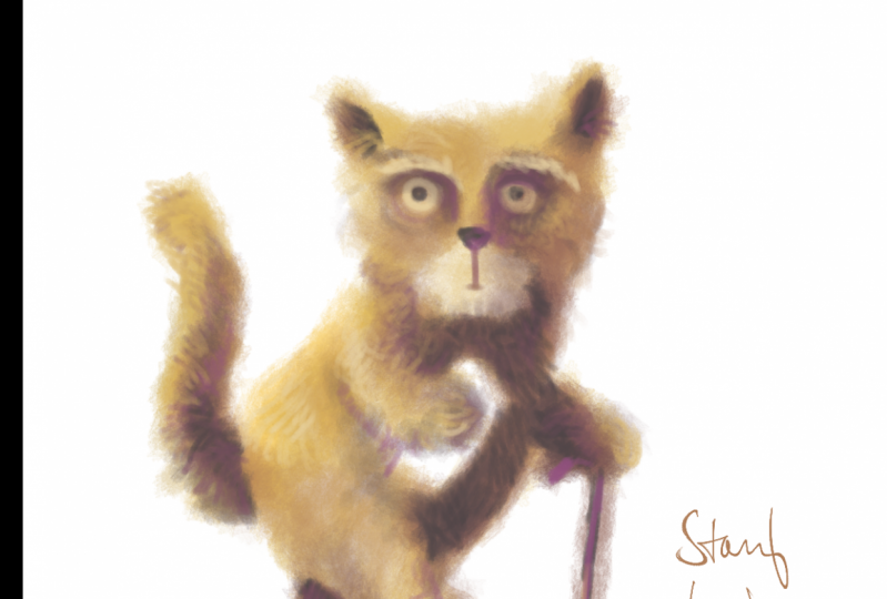
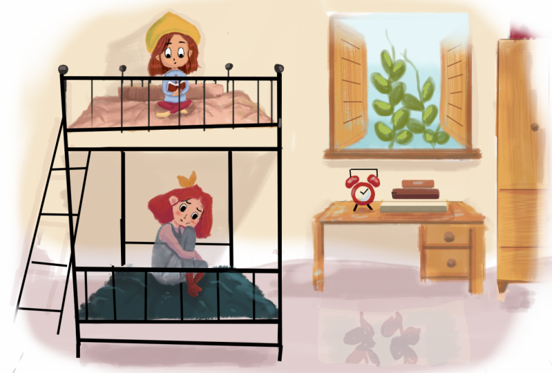
4. Chapter 1 - Visual Storytelling: Oh, picture books can play a huge role in a child's development from gaining an awareness of things that exist in the world to learning language, color, fostering an attention span. Picture books do all those things and more, and it wraps them all up in the age old ritual of storytelling. Now storytelling is one of those intensely personal things. You know, the way I tell a story will be different from the way you tell a story. So in this chapter I want to share with you some of my overall philosophies and thoughts and practices on how I go about telling stories in the medium of Children's books. So I'll start with some basic process. The first thing I do when I get a manuscript is well, I read it and I read it several times. Yes, Children's books may be simple, but they often speak to profound truths. After all, they are learning materials for kids, and usually publishers want to publish books that have universal meaning. So I have respect for that, and I take the text very seriously. Sure, it may be far below your or my reading level, but that doesn't take away the importance of the things you conglomerate from the text, especially when you're a child to whom all this is new. Anyway, let's bookmark that thought and come back to it in a few minutes. Okay, What you're looking at now is the Ruff's for Norbert's big dream. And this is the version I sent to the client which was the publisher Sleeping Bear Press. So I consider these drawings very readable, even though they're of course not finished their scratchy and rough. And Nino Norbert might not be exactly on model in each one. But the basic action is there on each page and you notice I'm also preserving the text roughly in the places that they provided in the manuscript. I may have moved things around a little bit, but that's OK. I like to use basic shading in my rough drawings. This is an area I largely elaborate on it and painting, you know, the final lighting and stuff. But I do find it really help sell your ideas to the client if you could block things out in overall values like this. You know, in this case, Norbert, closer to camera is very dark, and these three pigs a little further away are lighter. Comparatively. Now this pertains to my own particular art style, which is heavily value based. If you've seen my art online, you know, I'm a painter and as a painter, ideal heavily with light and shadow and color. So I do like to bring that into my rough drawings, but not always like you notice on the right. I don't feel like I need much shading there at all. Maybe a little cash shadow on the floor. Also, notice on each of these spreads, the gutter is indicated. If I didn't have that and be very difficult for the client to figure out, you know where the page would overlap. So in this case, the gutter would probably lead me to believe that this pig is going to get cut off a little too much. I might want to push this pig to the right. Yeah, going through this, you can see the whole book is roughed out in the same style, the same level of drawing. And I will complete the entire manuscript before sending it to the client. Because the way each page flows together is part of like a visual rhythm, and I want the client to be aware of what I have in mind, and the only way to do that is to give them the whole book, or at least a big chunk of the book. I think I've only ever done it for one client, where I submit one page at a time. And by the way, I used the same approach for my rough drawings for different publishers. Different books like this book is for Disney, and you can see the drawings air done and pretty much the same way I leave in my rough markings. I do a lot of scribbling, hatching and some basic values, and I do my best to put the text on the page where I think it should go, whether that be me moving it around based on composition or if I have to stick with exactly what the client gives me, I do that. So I send each page to the clients, and usually what they'll do is put it together in a pdf. Of course, because I've sized my files correctly, all they gotta do is just copy and paste them in, and usually I get it revisions passed. I mean, this This is a very simple book, so I didn't have too many revisions here. They wanted me to, like, get rid of some of the painting that's hiding the text. Here, you can see their notes in this pink box. Oh, and actually, for this one, I did do one fully finished painted page to also get their approval for style. So that's a finished spread right there, and then you can see the rest of just my rough drawings. And at this point, once clients can see the actual rough artwork, they'll often move text around based on what the artist gives them and make any other kind of, you know, minor change they might want to dio. Or sometimes they'll ask you to redraw page completely. Now this book again is simple. I didn't have to redraw much. I think down here I had to make this cat in front of the tree instead of behind the tree. That was probably the biggest change on this book. Other times I'll do multiple iterations per page. This is a wholly different book, and the idea of this page was this kooky old woman is friends with a cake. So there's the old woman. There's the cake. And these two kids were like telling, like narrating the story. And I mean, there's a 1,000,000 ways illustrate that. So I started with three different versions. There's that one. There's this one with her rocking chair on the cake is on the table with some mice eating the cake without her even noticing. And there's this option, which is I haven't seen these drawings in a while. This book actually was done quite a few years ago. It was one of my first Children's books I ever roughed out, actually, and I hadn't really arrived at my preferred rough drawing style. So that's why these drawings look a bit different. But you can see I'm still putting the text where I think it should go. Men also noticed whenever you're dealing with text, which is all the time in this medium, I recommend designing an area of your composition where it's a pretty clean value, you notice, like here, I'm throwing the entire tablecloth into a shadow, and the text would just read light over dark. There's not a whole lot of detail that would go here and like back here, I have this slice of light on the floor and the text to be dark over that. And here just be dark text over a light sky. So, you know, sometimes giving options to a client is something I'll do. I usually don't like to provide more than three options at 1st 3 is to me, is like a magic number, assuming you're giving them three good options, right? Three is enough for the client to pick a direction, even if they don't choose one of the three is the Final three is enough to pick a direction . So when I rough on a manuscript a minute ago, I said, I do the whole book, I dio, but sometimes I'll deliver one or two or three versions of a page, you know, a single page or a two page spread, and I'll just see where they're at creatively. Here's a different page of that book. It's a part of the story where this little boy falls in love with this girl, and here I'm trying a very dramatic staging, and here I'm trying more of a just a standard sort of wide shot of the two characters whenever possible. I like to break things up by having very simple compositions like these two kids are just lying down on a blank white page. I think it's pretty obvious to us that text has a rhythm, you know. For example, Children's books that rhyme rhymes have a rhythm to them, right? Well, pages and pictures and illustrations have a rhythm to them as well. So if you're doing something fully realized like this, you know the picture goes from corner to corner. You might want to follow that up with some visual relief like this, and I want to mention Chapter two is all about drawing characters. So if you're wondering when I'm gonna get into that chapter to Chapter one, here is more of an overall discussion of ideas and philosophies. I use in my books sometimes will take inspiration from graphic novels and split up the page and panels, this one being a very literal interpretation of panels where I've actually got four different panels here, each one slightly descending in size, which relates to the emotional beats happening in this part of the story. This particular book features these two child characters you see at the top, narrating a novel. It's actually Charles Dickens literary classic, Great Expectations. There they're reading great expectations. So the Children's book shows them reading it, but then dives into the world of great expectations. That is the world of great expectations imagined by Children. So in this book, I had to deal with literally two different worlds. The real world of these two kids reading and then the world of the Dickens's tale, which was more fantastical. So to present those two worlds in this book, I used a lot of paneling. So in here I try to use the text as a break in the panel. And then the kids up here looking down into the fantasy world which sweeps you to the right kind of sweeps you into this page, which is a full fantasy scene, which then would lead us to the next page, which is a full spread, a spread meaning two pages, both left and right of a full fantasy scene. I was actually quite happy with some of the creative decisions we ended up with on this book. We ended up straddling two different art styles in the same book. When were in the real world. It's this kind of clean, hard edged illustration style, you know, not very painterly, not overly textural, kind of straightforward, still interesting, but pretty straightforward and clean. Here's another page. In the real world, all objects were, you know, kind of handled with the same aesthetic. And stuff like that versus this, which is a full spread in the fantasy world, were playing with like, graphic icons. You know, the picture frames in the background are just like scrawl ings, and there's even some creative paneling going on, like where I'm circling here is meant to be one panel, and then that panel is divided by this character who leads us into this scene. So this is like three different panels where this character is used as like the divider between the left and the right. Also on this page, we have the silhouettes down here of the two characters from the real world narrating the scene. So I thought that keeping them just silhouettes would remove them from the fantasy reality of the scene and still communicate to the reader that it's this kid reading a book to this character, and this is what's happening in the book. So it's stuff like this that really excites me about the medium of Children's books. To me, a Children's book is a mix between a graphic novel, a comic book and a traditional novel. The form is so pliable you could do so much with it. Here's another page where we're exiting out of the fantasy world back into the real world. So when this fantasy scene, this is a scene where Jane Eyre gets taken away. Oh, by the way, this is not the great Expectations book anymore. It's Jane Eyre, which is another installment in this Children's book series, and because she's getting taken away from her home, I gave this panel well. First of all, I gave it a very weird triangular shape, and I shoved it all the way it in the top, left to kind of visually mirror the fact that this is a very uncomfortable moment. She's leaving her home. It doesn't deserve a beautiful full page. You kind of wanted to feel isolated because that's how the character feels. So it's like the form of the book. The composition is dictated by the story, and I really, really enjoy opportunities to play with this kind of stuff, and then here in the bottom were in the real world. And of course, the text would go in this big, blank white space as backs. This kid here narrates Jane's tail to his baby sitter. And just to keep going, here is a full page fantasy world image again, stylistically. If I go back, that's the real world where everything is kind of clean. And then here's the fantasy world where things are anything but clean. I mean, the shapes are still appealing, hopefully, but there's like scribbling lines like trees or not actual trees or just triangles I made with a pencil brush. We have very graphic stuff going on here and a visual language that overall is quite different from this one. Here's another page from the fantasy world, where you can see a lot of the same stuff, like odd color palettes, green vs Purple kind of splitting the frame in thirds here, big passages of dark over light Jane here being dark over a big passage of light in the background. And that's another thing I really, really think is important in Children's books is clarity. Clarity is like the theme that permeates all the art I do for my Children's books. Obviously, human beings see based on contrast, but for Children, that's especially true. Their eyes just go straight to the contrast, and I have first hand experience. I have a five month old daughter, and there's actually a whole line of books created for infants that are just pure black and white. Very high contrast pictures, and it's amazing when I open one of those books around her, her eyes just get sucked to the page. Now this book you're looking at is not made for infants, but you can see I'm trying to design my picture. So the contrast is very clear. And the highest contrast always goes where the focal point is in this case, the focal point being Jane, looking at the window in the background. So Jane being very dark window, being very light. This is the highest point of contrast, and that's true for any image. Here's the next page right here. The focal point of this picture is this sort of area here that I'm circling with my mouse and you notice all the highest bits of contrast in the picture are found there. So we look at this a lot more in chapter three when we're actually doing paintings. But clarity achieved through contrast is basically the Onley unifying principle that I use on every single page. Here's another page here where this big school teacher is kind of malevolently dictating what the students should be doing. He's in the process of punishing Jane here. So the focal point of this picture is this big, rotund teacher. So no surprise. I gave him the most contrast with the background Dark versus light. Jane here is not the focal point. She still needs to be visible, so she still has some contrast. He probably has, like the second most contrast in the picture, as well as this girl here who is also quite important to the story. You know, she's in the process of carrying out her punishment, writing the Lord's prayer on the chalkboard. So these girls have contrast, but less than this guy. Also, he's such a big shape making for such a big area of contrast that the viewer just can't help but look there. And just to reiterate what I said earlier, I'm leaving a sizable portion of this composition open and with a very similar value, which provides a nice little bed for the textile. A. In now, I do want to be clear about something that is a principle, not a rule. Here's a spread from backs that is absolutely ridiculously busy. I would venture to say that there is no focal point here in the sense that there's so many competing elements. For your focus. You might think this clock tower is a focal point, but actually, when this book gets folded along the gutter here, that clock tower kind of dies away a little bit. And that was done on purpose. You know, when I illustrated this page, the publisher and I almost compared it to like a wears Waldo book where you can look at any given part of this picture and find something worth really paying attention to. I particularly like this area of the page where it's just a bunch of nondescript houses, and you contract the little pedestrians walking along the street and sitting by the fountain and such. Of course, the characters are over here having a nice little soiree, and you can probably imagine that when the text would lay in, which would go over the sky. Here, the text would discuss what the characters are doing. But visually, we wanted to sell like the opulence of all this, the overwhelming nature of being suddenly high class and, as the Dickens story tells, dumped into a world with which you have very little experience. So this page was designed to be overwhelming because it matched the story beat. And I think it's effective for that purpose, and I've seen entire books that kind of used this aesthetic. But in general, this is not what I like to dio. In fact, one of my friends who is a mother told me that her little son, whose one year old hates books like this because he gets frustrated by simply not knowing where to look. He just starts pounding the pages like a gorilla, she said, whereas books that have a simple area of contrast and therefore a focal point really hold his attention much better. And I kind of used that philosophy has a little more of a driving force in my compositions , and what you're seeing here is more of a one off. All right, I mentioned earlier in this section that Children's books are learning materials for kids, you know, teaching them common things that exist in the world. Norbert's Big Dream takes place on a farm, and this is the manuscript for Pages two and three, which is, in effect, the first page of the book Page one, Remember, was the title page. So the manuscript reads. Most pigs air satisfied just rolling in the mud or slurping slop or snoozing in the shade, but not Norbert. So, of course, me is the artist. Looking at this blank manuscript, I have to visualize what goes on these two pages. The text describes four different actions. Pigs rolling around in the mud, pigs slurping slop pigs using in the shade. And then Norbert, who's doing none of those things. So the very first image I conjured for that was kind of a collage. You know where this section is, the pigs rolling in the mud. This bottom section is pig slurping slop, and we got pig snoozing in the shade. And then we have Norbert kind of sitting there may be prompting the reader to ask what makes him so special, and I think this would have worked, but I don't think it maximizes what I can bring to the learning elements of this page. So I roughed it out a second time and came up with this. Now, if you notice the drawing of the characters is pretty much the same. In fact, those pigs, they're just a copy and paste of those pigs. But the simple change I did here was I put everything in one environment, and this leads to something I've learned about Children's books. Or I should say how kids interact with the illustrations in a Children's book. If you ever watch a teacher or parents reading a Children's book to a child, you'll notice that the experience of each page is not finished once the text is red. Oftentimes the teacher will spend a lot more time on the page, just pointing out things that relate to the text. For instance, the fact that there's a barn in the background. This is not mentioned in the text, but having that context helps a kid visualize what a farmyard looks like. You know there's a barn with some mud over here, and offense in the fenced area is where the cow hangs out. You know, these are all obvious concepts to you and me, but I mean, a kid might not know that animals hang out together chickens and pigs and cows. They have to learn that somewhere. And just presenting them of vista like view of a farm, complete with the various elements of a farm, kind of takes the spirit of the text and adds just a touch of a deeper layer to the page. So, of course, while the focal point of these drawings mirrors the action represented in the text, you know, pigs rolling in the mud, pig slurping the slop and stuff like that. This design ultimately gives the reader of the book, um, or rich experience. And instead of having Norbert just sit there, I have him walking, which is probably just a more fun way to see Norbert for the first time, this year's Page 28 29 right at the end of the book where Norbert has completed his adventure and you notice I'm illustrating the same part of the farm, just from a different angle and the main changes. Norbert is now walking on two legs, indicating his arc as a character. So I thought that was a nice kind of button to wrap up the book with. And my hope is a kid reading the book would be able to say, like, Hey, those are the same pigs as the ones over here. Isn't it funny how they're still sleeping? And you can even make a little sub story like There are four pigs sleeping in the shade and here there are only three, you know, perhaps suggesting that a pig happened toe wandered by and say, Hey, that sleeping thing looks pretty good. Don't mind if I do. These were a little sub stories that are not important enough to write about. You know, this book is about Norbert, not the sleeping pigs. But whatever you can do as an illustrator to bring something mawr to the manuscript while still keeping focus. Where it needs to be, I think, is a good idea for your illustration. Here's another example of me going through the same thought process. This was for a book called Goodnight Reindeer, where the whole book is saying good night to various things. So we have comments and stars and planets and cars and cookies and toys, and I illustrated each one separately as its own. Kind of been yet, and I think the drawings would have been fun enough to illustrate. But the publisher and I ended up going with this, which, just like Norbert, provides context for where these items exist in. And there's the reindeer herself, fast asleep, surrounded by all her favorite things, which represents the simple thought of organization something we all have to deal with. So you know, it's like toys go on the plane, Matt, because that's where we play. The cars are maybe collector's items, so they go nicely on the chest here, and maybe the cookies go by the bed for a midnight snack. Also, this prompts a very common interaction with the page, where a teacher a parent will say, like, wears the cookies and the kid will point here. You know, where's the planets? The kid points up here. This page facilitates that kind of thing, whereas this page doesn't I mean, yeah, you could say Where's the cookies? But obviously the right there, where is this again provides more of a context for that, connecting an item with its relationship in the real world. Here's yet another example of a time where that happened. This is supposed to be the elves workshop, and they sleep on this triple bunk bed here and instead of keeping them to separate entities by simply combined them into the same environment. And I wasn't too surprised that the publisher heavily preferred this one. But this one you get a sense that they've just put their tools down, the brooms on the floor, the toolbox there with screwdrivers as work time is over and it's time for a night's sleep . So again, showing things in context can be a little bit more powerful for storytelling. That isn't a rule. Of course. It just seems to be a common thing that I keep discovering. I wanted to show you this spread as well. This is one of the last pages in the book. Santa here is saying Good night to Rudolph and, of course, Rudolph being a bit of a light junkie. His room is festooned with Christmas lights, and in the manuscript, Santa's gonna ask for it off to turn out the light. In fact, he does that on this page. Time for bed. Turn off your light And of course, my first instinct here was toe have him dimming a light switch. But then I thought there could be some interesting visual continuity between these two spreads. If I go back to remind you about all these lights that are lining his room, I thought wouldn't be neat if we brought some of those lights into the next spread. And instead of Santa flicking off a light switch, he's gonna unplug Rudolph's Christmas lights. Now. I'm not claiming this is a genius idea. I'm just saying it goes one step deeper than the text on the page, which is kind of a metric that I tried evaluate my work by and Children's books. How many times I'm able to plumb one or two layers beyond what the texts literally says, and maybe just spin something in an unexpected direction because that creates surprise. And when you can surprise somebody, it's way more likely to be memorable. And in this one ended up flipping it, because when you turn the pages of a book, Rudolph's room would be to the left there, so it makes sense of the lights air coming in from the left, not the right color, of course, plays a huge role in Children's book art, and Chapter three of this class is gonna be devoted to using color and actually painting your illustrations so we'll get into the nitty gritty of it there. But as an overall note, I find that the medium is best suited for brighter colors because Children's books tend to be printed pretty large, especially in relation to the size of a child. And when you have a very large page laid out in front of you that's covered in dark ink, there's just something not appealing about that now. This is, of course, just my opinion, and this is not to say that you can't ever have shadows or anything. You can see in this page their shadows on Norbert, their shadows on the wall. But if I bring in my color picker here and I sample the shadow values, you can see that the shadows air very, very light. They're all up here. Norbert Shadows will be a bit darker, but even his shadows, you know, are in the mid range. Of course, little accents like inside the mouth that will get quite dark. But any shadow that's part of the subject. You know, his belly, his chest, the wall. I'll keep those very light. You know the haystack here. They're all kept in the mid range around here. And then what that means is your actual lights, like the light on the wall. Those will be pushed even lighter. In my experience, printers tend to darken the image a little bit, especially those of us working on bright LCD displays. Remember that your monitor is projecting light into your eyes, whereas a print is very different. Apprentice physical pigment on paper and pigment will take a white sheet of paper and make it darker. So in a way, prints darkened things. Monitors lighten things. I know that's oversimplified, but that's kind of what I used to remind myself when I'm painting for Children's books, you know, I remind myself to push my shadows just a bit lighter. In fact, my first pass on this spread looked like this. Now, when I painted this, I didn't quite realize it, but there are a lot of dark colors in here again, bringing back in the color picker you see on these pigs like we're getting quite dark. The trough is quite dark. The slop. The reading is basically black. The barn is completely in shadow and these shadows are Yeah, they're kind of in the mid range. But, you know, it gets quite dark up here. And while this might look OK on a screen, this prince just abysmally dark and that can take a happy book and spin it in the complete opposite direction. So I revise the spread toe look like this, and I don't know about you, but I almost feel a weight being lifted when I do that like I go before and then after, it just feels like the sun came out or something. Notice that the broad side of the barn here is still in shadow. But look how much more fun you can have with color when the shadows are a bit lighter in value. In painting, this is called Hai Kee Ah, high keep painting uses values in the lighter range even for the shadows. Get bringing my color picker back in. I'll sample some of the shadows on the ground here. Look how light those are ill sample the color and value on the barn wall here, and, yeah, same sort of lightness going on because of ambient occlusion. It gets a bit darker up here, but if this were a real life painting where the ambient occlusion would probably be down here I have a whole YouTube video about ambient occlusion, by the way. So I'm just kind of talking as though you've seen that normally ambient occlusion would be quite dark. But in here I raised the key of the painting so dramatically that even the ambient occlusion, the darkest areas, are still pushed up. And I'm happy to say that in print, the mood really carried through. It just felt like an inviting scene that you want to be a part of. This here was the cover art for Norbert, and it's obviously a night scene, but you notice what I'm doing here. First of all, the blue sky at its darkest is still way up here. Also right around Norbert. I even lightened the sky further, so it's way up here. Blues, by the way, are notorious for printing very dark. For some reason that I can't explain printers have a hard time with blue. So whenever I use blue in my paintings, I try and ramp them up. You can calibrate this with experience, which is what I did. I noticed blues got quite dark, so I just over the years developed a habit of painting blues lighter anyway, pushing the blew up pretty light around Norbert forced me to make Norbert's light side quite light. In fact, the highlights are basically white. And then that gave me the value space for his shadows to again not be so dark. The thing about color that I've learned is that and this is true not just for print Children's books but in painting. In general, anything around this range, any color you pick is that if your values down here, it's just gonna look black to the viewer, like the viewers not going to really be able to appreciate the difference in color between this and this if your value is so low. So when when I'm down here, color really doesn't matter, and I don't want that in my Children's books. I want the colors to be identifiable, you know, that's the other thing kids are learning with Children's books color like red and pink and yellow. So by pushing your values up, I'd say This is about the darkest I would go and still expect someone to appreciate the difference in hue. Anything below that color kind of goes away and just becomes opaquely dark, and I try and keep those areas to a minimum. There are some areas like his hooves here, a pretty dark. Some of the cows, eyebrows and hose air dark, and that's okay. A few little areas like that's fine, but in general my advice is, keep your values up high key paintings as opposed to Loki paintings. And, of course, you do this on a per project basis, like in Scary Story here. Remember, the manuscript called for that shadow to get darker Well, by the end, when the monsters air scared and running away. That shadow is opaquely black, which, of course, sets up the punch line for this kitten to pop out. But I built up to that black over the entire book. This here is what the tree's shadow originally looks like. It the beginning of the book, The values Air kept much lighter, definitely with some very dark accents, but overall you get the sense of ah, higher key in the painting. So in this case, the value use was truly tied in with the storytelling. Looking back at this page here, this book has not yet been printed, so I have not actually seen how this turns out. The publisher and I consciously pushed our contrast to a pretty high extreme here. Like if I sample Jane's hair that is very dark, even the lightest part of her hair well, that's definitely the mid range that will probably print well. But this a lot of this, even the lines in your hair might get crushed to black. I'm worried about that, but it's nothing a sample prints can't solve will do a sample print, which in industry jargon, is called a proof, by the way, and then I'll come back and adjust. I think it looks great on a computer monitor, but again, print is a bit of a different beast. Anyway, let's save further color discussion for Chapter three. Ask for right now. I think that wraps up our discussion of storytelling and wraps up Chapter one. So let's move on to Chapter two, where I will discuss and show you some of the key concepts I use to draw characters. I'll see you there
5. Chapter 2 - Posing: Oh, all right. So let's start talking about actually creating art, and I want to kick off this section with a lesson about posing your character. Now I don't have any official stats, but I'm pretty sure like 99% of Children's books involve characters. And whether your book has a pig or a person or anything in between, you have to know how to draw them in various poses. You know, when you think of finished artwork, you might think of cool things like detail and lighting and shading and dimensionality. And those things are all part of finished art. But in my opinion, those elements are all secondary to a well thought out gesture drawing because it's through gesture drawing that we define what pose the character is in any lighting or form or dimension we apply has to serve the pose. I think the power of gesture drawing is best demonstrated with traditional two D hand drawn animation. Here on YouTube, I'm gonna search for Sergio Pablos Disney Animation. We get our search results and I'll click on this 1st 1 here. Oh, and by the way, before we watch this, Sergio Pablos is the owner of spa studios. That's the studio that made close the 2019 Netflix film, which I really, really loved. Anyway, he's been a long time favorite animator of mine, and I think you're going to see why. Right now, officers. And if I might interject here I am the noted astrophysicist, Dr Delbert Dubler. Perhaps you've heard of me? No, I have a clinic officers. And if I might interject here I am the noted astrophysicist, Dr Delbert Dubler. Perhaps you've heard of me? No, I have a clinic, officers. And if I might interject here I am the noted astrophysicist, Dr Delbert Dubler. Perhaps you've heard of me? No, Uh, I have a clipping. So the thing I want you to notice here as we play this now, without audio is that the posing, the acting? The gesture is Justus clear in this very rough phase as it is here in the final finished film. This is Disney's treasure Planet. By the way, in this finished frame, we have clean lines, detail, polish, dimension, light color, all of that good stuff. But the artist Sergio Pablos, in this case at the very beginning, is not resolving any of those things. He's resolving the pose, and he's doing so using very rough drawings, the lines air gestural and flowing. It's not a labor intensive process. Don't get me wrong. It's a thinking, intensive process. But these drawings are designed to be done pretty rapidly. Looking at these three drawings, I think they're very descriptive. And what they describe is how this character carries himself. In other words, his attitude. You can get a sense for who he is as a human being or animal human, in this case, just through the simple flow of his body's position, his pose. In that sense, I think these drawings are also very accurate, not necessarily accurate in terms of the arts finished look accurate in the sense that it appears that every element of his body is all acting toward a singular emotion. And, of course, it doesn't take a great leap of the imagination to see that this is exactly what we want to do in Children's book art, too. The reason I'm showing this to you an animation is that animators have to draw so many pictures to convey the sense of motion. So by necessity, animators have had to boil down their art to the most simple yet the most expressive elements possible. And studying animation is really how I started my journey in art. I actually didn't start off wanting to be a painter or illustrator. I started off with the inspiration of the legacy of Disney animation, and I wanted to be an animator not to get into my life story, but I ended up pivoting away from that. But I am really happy. I started for a few years studying animation because I developed a really respect, I guess, for the power of oppose. All right, So I want to show you what I look for when I do a gesture drawing, and it's really a personal thing. That's the other beautiful thing about gestures is every artist is allowed to look for what they think is the most important thing, and I'll show you what I look for. The first thing I do is I look for a single line, if possible, that describes the whole pose. You've probably heard this called the line of Action. Um, it'll either usually be an S curve, a C curve or a straight in this 1st 1 here for instance, it's a C curve, and it looks like that now, when I say the term seeker of you think of the letter C is like this, right? We'll see. Curve could also be like this, or like that, or like that, like it could be different variations of the letter C. Like this one has a pretty hard taper right there and then it's smoother over here. This second pose here is a similar curb, although it's steeper up top. So you know where this C curve looks like that the second C curve has a more of a kink at the top. It's almost like an inverted L shape, which falls under the category of a C curve. It affects the attitude just slightly, obviously, these air to see curves so they're gonna be similar. This also speaks toe how riel people pose. You know, you and I have had years of experience in real life, you know, building up our muscle memory in our habits and our attitudes and all this stuff that filters down to our gate to are posing like our natural way that you and I hold ourselves when we walk or when we sit when we stand. Sergio Pablos has implemented that sense of history into this character. If you've seen the movie, this character makes a whole lot of C curves in his posing, you know, speaking of seekers, this third pose is also a seeker of, although this time it's inverted, it goes the other way, and I'll just throw him anyone there so we can compare the three now. The next thing that's really, really important to look for at least what I look for. And I want to remind you at this point that every artist can have their own system of priorities. But the thing I look for is how the shoulder line crosses the line of action. So I've chosen a different color here, and it's just a simple is doing something like this. Making this T crossing where the shoulder line is the 2nd 1 here is very similar to the first, Although much like the line of action, there is a difference in angle ever so slight. That's the other thing that super powerful about gesture because, as we all have experience with, we're extremely good at reading people's body language. You know, the slightest turn of a shoulder can appear rude or the thrust of a chest can appear brave . The slump of a back congeal ese. We have a lifetime of experience reading people's posture, so the exact angle, the exact crossing of the shoulders to the line of action of the body is what I really think is is indispensable imposing. And in this one we have the line crossing here. The next thing I like to do is pretty much the same thing as the shoulder exercise we just did, but I apply it to the hips. So if you think about like where the apex of the hip is, you know the two highest points of the iliac crest, which is the hip bones. Think of where those two points are, and it's just draw the line down this way. This one is a little bit like this, and this one is off frame, but we can imagine it's probably something like that, and these are the kind of road signs that I look for in any pose I ever draw. This includes when I draw gestures from riel models like real life people, or when I'm inventing a character from my imagination. I always start here turning off the artwork. You can see what I mean by road signs. It's like this gives me a little bit of a map as to how to block in the actual drawing of the character. So now that we have the shoulder line kind of in place, I kind of do the same thing as the line of action of the body, this red line. But I do it to the arms. And it should come as no surprise that this character's arms also make a lot of C curves kind of as a way to echo the C curve in the body. You see, we're already talking about design here. I could do a seeker of their a straighter C curve there. This line is very close to straight, but not quite. It still has a bit of an arc to it. And, of course, I'm trying to make sure that the blue line sort of intersects the shoulder points. Not this point. It intersects where the shoulders are right on this post. Here it's almost like the upper arm is a seeker than the forearm is a straight Remember s curve, see curves and straits. You can combine them. This 12 It's kind of like a seeker of that way and a nice straight You see how the characters got a lot of weight on his hand, right there, Like his hand is, you know, his hand is posed solidly on his hip like gripping his hip. Whenever you have something that contains weight like that or force, typically a straighter curve will communicate that force a little bit more strongly than a seeker of or s curve you notice. Even in this pose, his hand is pushing off of a table. So the arm needs to be straighter because that seems to indicate that he's engaging his muscles. So in that way, gesture is even tied to anatomical reasoning. Now, the cool thing is, you don't need to know anatomy to be able to gesture. Well, in fact, when I learned drawing, I didn't touch anatomy for like 2 to 3 years, I spent 100% of my focus on gesture and maybe some basic shape construction, which I'm going to get into right after this. Anyway, on this third post here, this arm is like a steep C curve almost like a fishhook, and this arm is a more graceful C curve. Now, of course, this character's legs were cut off. So in the interest of showing you the entire body, I want to bring up this file here. These are just drawings by Glenville coup who I kind of indirectly studied from my teacher . My first drawing teacher was a big disciple of Glenn's, so the way he taught me was the way Glenn taught him. So it's kind of a bit of a lineage there. I can trace my learning back to Glenn's teachings. Anyway, you should recognize most of what's going on here. Of course, there are some legs here, but the legs are just treated like the arms. You know, when we did the arms here, Glenn is doing the same thing here with the legs, and I want to point out you see how he's kind of got this double line like it almost looks like these air contour lines. They're not. He's not trying to draw ah, leg. It's still a gesture. If you ever get to watch Glenn draw, he often does this kind of rhythmical thing like hell like for the gesture of the leg. He will make a stroke going down the top and then lift his pencil up and like just feeling the rhythm of his arm. As he's doing that, he'll make the stroke going down this way. So instead of like doing one line going like that, he'll go like this and, like, let that rhythm breathe a little bit on the page, so to speak, the way you draw gestures can take years to develop. Even though they're so simple, the gesture is equally about feeling as it is about physical reality, and that will kind of force you to look at your work from a slightly different angle. Now, the other piece of information that we haven't looked at yet is what he's doing with the heads here. You know, when we did these, I wasn't really dealing with the head. I just put the line of action there. But here, Glenn is being pretty specific about the orientation of the head. So I'm looking at this seated figure here. He'll usually block. It was some kind of oval shaped like an egg shape, and then he'll throw in an ellipse to show the axis of the head. And typically Glenn will start his gestures this way. And then what he'll do is he'll go down the body. In this case, here's an example of an s curve. By the way, the slump spine meeting the legs making this graceful sort of s men will find the shoulder line. Sometimes I also draw little ellipses there to indicate you know, that the plane of the shoulders and then you know more more gesturing down the body here. This arm has slumped forward, getting some weight on the leg. So maybe I'll use a straight there. Then the knees come up a little bit higher. Sometimes it helps to put a little X or some kind of dot and then you can draw to that. And then maybe the other knee is just out there. And I could gesture toward that and the feet, and sometimes it helps to use lines or, you know, some kind of directional stroke or a stroke that reveals direction, I should say, for the feet and again. That's something Glenn does throughout his gesture drawing, you know, other things to notice. In Glenn's drawing, look at this floating arm like you don't literally have to draw a T crossing for the shoulder as long as you kind of know where the shoulders are, Like the gesture can communicate that t crossing without you having to literally draw it. You notice that in most of these Glenn doesn't really draw that same T crossing. I tend to draw it in my work just cause it seems to help me. But, you know, you don't have to do that as long as you're observing these patterns that the body will make. I love on this gesture in the lower right here. It's a graceful s curve with a nice, sharp, straight to kind of counterbalance the s. Now, that's not a rule you don't have to use straits to. Counterbalance s is there are no rules. In fact, Glenville blew himself. Will tell you there are no rules, just tools. That's his famous saying. So there are no rules, but sometimes an s curve counterbalanced by a sharper straight could look nice. You know, design is often based on contrast, whereas this post here goes the opposite way, and it and it uses, sort of like curves. You know similar flowing curves throughout and you get two different attitudes. You know, this top one here looks more like maybe a dancer or like a happy go lucky little child or something where the bottom one looks like a little bit more aggressive than that. And that's the other beautiful thing about gesture. When you're putting down these curves on your own work, they will start communicating to you immediately. And I remember it being a real breakthrough in my progress when that started to happen. Alright, What I'd like to do now is draw some gestures from reference. So here we go a limit these drawings to, you know, roughly a minute each. I'm not specifically keeping time, but, you know, gestures tend to be quick, as I just talked about. And usually I get them done in a minute or less. Eso this This woman here is a nice s curve running through, um you notice I've got the shoulders, the hips. Here's the head coming in now kind of the Glenville who sort of lips to identify the eye line like the tilt of the head. And now I'm just kind of just fleshing it out a bit again. These are not contours. They may be hinting at contours, but like there's the knees and I'll just gesture down. I'm not worried about designing the legs like the Contras of the legs, though I'm just worried about capturing that basic thrust of the hip that is so characteristic of this pose, and I'll use lines that I just feel will help me. Now. I know that's not very helpful, but this is where experience comes in the lines. I'm drawing our lines that I know from experience. Help me with the pose, and it's kind of like this. I start with that sort of almost stick man thing, and then I'm getting into some kind of almost quasi contours here. Let's do another one. I'm changing my brush this time just to show you that. You know, certainly the brush you choose doesn't matter. I've got the head, shoulder and arm this time because I think they describe so much than the Seeker of Of the Body is second. But that those arms thrusting forward so sharply I wanted to get first and then I'm just capturing, you know, the tilt of the foot or the feet and ah, that to two she's wearing makes a bit of an interesting gesture itself, with some straits that play against the C curve again, Each pose will present different opportunities for your gesture. All right, here's another one, and I'll use a totally different approach this time up. Use a marker brush and kind of fill in the gesture as if it were like a big, chunky marker that I were using. I'm still thinking about, you know, you can see the S curve that's running through her body. They're down her left leg on blocking in her right leg. And then now it just changed my brush to a more of a linear brush, and I can go over top of this again. These are not contour lines. It's just a bit of a refinement on my super abstract gesture that I laid in. I'm doing different methods for all of these gestures just to drive home guys that there is no one way to do it. One of the downfalls of learning art from another person, as opposed to like fully being explored of yourself. It's very easy. Get locked into like your teachers way of doing things. So I want to show you that there is no one way of doing things, especially when it comes to gesture, which again, is more of a feel thing. All right, so for this one, I'm not going to start with the head. I'm gonna start with the legs because that C curve is so obvious. It's the most important part of this pose. According to me, eso start there. And then when it comes to roughing in the rest of the proportions like I'm doing now, I'll just ballpark it based on where the legs are, you know, usually I start with the head and go down. That's what I usually dio. But in this case, it warranted the opposite approach. And I could call this finish now. But I'm just trying to map out again these quasi contours just to see if I can connect like the hip to the shoulder of the hip, to the elbow, just exploring the pose in terms of how it flows. So this one is more of a back view where the arm is like overlapping the body. These could be a bit trickier, so I'm slowing down a little bit, getting a little bit more of the head blocked in more accurately, Still moving quickly, though. A bit of an s curve down the body. So I'm just gonna shrink this up here so I could fit the whole body on the page, which is a common problem I have. I always tend to draw too big. Um, now that have the head sort of their I confined these curves a little bit more accurately finding the shoulder, Still finding where the hand is. At this point, I'll start locating where those hips are, because that will help with proportions. So there they are about their And then from there, of course, gesturing down toward the legs and then finding the feet you can really think of gesture as finding the pose. You know, I'm not always precisely sure where the hand or feet or hips are. And because gesture is so free, you could make, like, five or six lines to kind of test where you think things are and then commit to the one that you think looks most accurate. So as a quick little bonus for this one just to show you the you know, the freedom in the power and fun of gesture. I'm just gonna do a variation on this pose. So block in the head roughly the same way as it is in the reference like I want to make this pose just offshoots of the original. So the body is gonna be thrust forward, perhaps a little bit more. I'm emphasizing the curves in the original putting, throwing both arms back, thrusting the hip out to the left. This almost looks more like a graceful dance maneuver or something at this point, but it's inspired by the original. You can see how one comes from the other. So this is how you can take photo reference and get away from kind of blindly copying it. Rather use it as a springboard into the world of your imagination. Which is, of course, the world you want to be in when you're illustrating Children's books. Okay, let's move on to the next section where we'll talk about building volume and form on our gesture
6. Chapter 2 - Form: So now that we have the gesture, we want to begin constructing forms. And when I say form, I mean like basic three dimensional objects like this year that I'm drawing is a simple box form. It has a plane that points up a plane that points out and a plane that points to the side. You know, we get a sense of its three dimensionality or other times you can have, like, this circle here. Unlike the box. I can't separate this into obvious planes, but I do want this to look more dimensional. So something we can do is we can put in a lips going around the circle, thus making it into a sphere. I could even do that from the other axis like this way, going around the form, and we now get a sense of its three dimensionality. These lines that go over the form are called cross contours. We will be using a lot of cross contours and the rest of this class. So let's say I had a gesture that kind of looked like this like a little seeker of gesture like we've seen before. Well, now what I could do is I could put a box over on this part of it just very quickly. Doesn't have to be like some kind of perfectly technically accurate box ranting. This could be just quick. And then let's say I put like a sphere right there or a circle at this point. And because I did that on a layer, I can always just dim down my gesture drawing. And now what I can do is using some cross contours. I can figure out a little bit more accurately what the three dimensionality of this little object is. You see how it bulges out for the sphere tucks in here? This would be like where the stomach would be. It tucks in and then comes back out here. I have that on the layer to let me dim that as well. And then on a new layer, I could begin to more fully understand the form that I'm drawing comes around here. These are actual contour lines. Now this box is gonna be on top of the sphere so it comes down but haven't overlap there. And then from behind it comes the mass of the sphere. On this part. There's a bit of a stretch happening here is like the form kind of gives away so bit of a stretch, and then it takes on the form of the sphere. This is looking like a torso, is it not? In fact, this is a very common construction for a torso. You can use boxes or spheres or whatever. Whatever you suits you really let me quickly gesture in some arms. Like if the shoulders air here, maybe there's an arm coming in this way with the hand going down. And maybe this arm comes out this way again. I'm using s curves. I'm thinking about secrets. Ask of straights. I'm going right back to my gesture Language thes drawing fundamentals can flow together. You can switch from gesture to form, back to gesture, etcetera. Then maybe there's a head up here that is pointed all drawn ellipses pointing up like this is a dancer or something. There's a head there and maybe there's some hair spilling this way. Some flowy s curves. Now what I'll do is I will go into construction mode. Ah, landmark where I think the elbow would be. This one is over here, and I'm gonna use a cylinder to draw these arms. Now a cylinder has a top, a bottom. And then, of course, the connection, which is pretty straight. Now, the tricky thing about cylinders is the way the ellipse goes depends on your view. This cylinder I'm looking slightly down at, which means I can see the top of that ellipse. Same with this one. If I wanted to draw through the form, you could see the top of it. Now contrast that with this other one. I'll do with the same sort of thing. But this one I'll have go, like above my eye line and I'll do this side as well. But this time I will cap it off This way. So this imitates a cylinder where I'm looking down at it on this plane, I could see the top, but then here I'm looking up at it. And this the backside goes underneath that way. You know, that plane is pointed that way in space. Can you see the difference between these two? This top plane is oriented toward our eyes, whereas this one is going away. That is a subtle bit of construction that you have to have control over. And I'll apply it to this figure right now. So because we're kind of looking slightly up at this model, you cannot see the top of the shoulder. So I'm gonna draw the lips moving away from us. Same with the elbow here. It's gonna be sort of this way. And then I could just connect them. When I could do is I can also cross contour this cylinder to emphasize the form. I'm thinking maybe it's a bit short. Maybe the elbow is maybe a here. And then I will ah, ballpark quickly where the wrist is, and I will do another cylinder. Only this time the Ellipse at the end of this cylinder is going to go this way, indicating there's a slight bend in the elbow. Now you notice my gestured hand is all the way over here. That's wrong. It's not in the right place anymore. The gesture has already served its purpose. I'm now refining it. I'm building on top of it with my construction. With my three dimensional forms for the hand, I will draw pretty simple box kind of going down this way, sort of this tapered box to indicate both the poem and the finger areas of the hand. And then very quickly I will do the same process for the other side using cylinders. Don't forget to cross contour them. It always helps to understand which direction the form is flowing. Maybe the box for her hand will be kind of twisted here and then for the head. It's largely the same thing. What I've got laid in is kind of a combination of a sphere in a box. So what I'll do is I'll push it in the direction of a box, figuring out where the side plane is this being with side plane, then we have across Contra here, wrapping around the side of the box. This is the underside of the box right here. And then the neck, of course, comes out there like a cylinder. So put that in. We could see that from our imagination. I'm not using any reference for this week unbilled simple figures that actually have motion and wait and dynamic poses to them. Knowing the orientation of this box will also help me place things like the nose which is in itself like a little box. Sort of like this, of course, were looking up at this head, so we're going to see the underside of the nose just like we're seeing the underside of the chin and jaw. And then from here, you know, you could just start chiseling out certain things. You can always add more cross contours going over the form to help you understand what's happening. For instance, this ellipse goes up like this, but the Ellipse here would go this way, and the lips even further down would be even more steep. Can you see how that really informs the dimensionality of the drawing? And just for fun? If I wanted to add legs to this, I could think of where the cylinder would be. Go down this cylinder. Let's have her. Let's have a leg going up this way. So this cylinder would be the Ellipse would be this way and then would come out. They're being me here. Obviously this is cropped cylinder down, and then we can connect these masses here. This is essentially basic figure drawing. Now, don't worry. I know this is a Children's book illustration class, not a figure drawing class, but these air drawing fundamentals that are essential for what's to come and I don't want anybody to be left in the dark here. If this whole notion of constructing forms is very new to you, I recommend stopping right here in practicing. And here's a very basic exercise. I'll draw two circles, one overlapping the other and using that same light color, I'll cross Contour kind of interesting sort of thing, like going over the spheres and different axes like this. Now, with a darker color, I want to build the final form and the exercises, visualizing which sphere is in front and which fears behind. So I'll start with the far one. This is gonna be behind, so I'll start with this one. Here. This comes down. Now I'll stop around this point because that's where the closer sphere overlaps it. So I'll draw his contour. And now, to show the three dimensional overlap at this little nub of a form that really helps communicate that one sphere is in front of another. And on this side it stretches a bit and comes down to meet this sphere like this. And then I could just wrap this around like that. Then I can further bring back my cross contours essentially we have a sort of a torso thing . It almost looks like we're looking at the back side of a figure. Here's another one. Draw circle there and a circle here. Quickly give it some cross contours. This is similar delighted earlier. But on this one, let's have the top sphere be in front in the bottom syrup, be behind. So again I'll switch to a darker color. We'll start with this outside. One goes down like this. So here I bring my contour down, feeling the form of that sphere. Now this is in front. It's gonna overlap it like this. Then from behind comes this sphere and we just complete that volume like this. And then, of course, I could bring back my cross contours to enhance my understanding of this form. I could cross contour this way. This is similar to the figure we just drew. How about one words more of a boxy form like this where we can really see the underside of it. And then here's a sphere. Cross contour would look something like this down the middle of that box down here and then this is like a twisting torso. Can you see how that cross contour really helps show that twist. Now, what I could do with my darker color again is go over it and kind of find exactly where one form is overlapped by the other. I think this sphere would overlap it like this. I can draw that little. I've heard this called the accordion effect in animation school. These little lumps on drawing here that comes down, this comes in down, but it's overlapped by the sphere again. So we get these convincing little three D form exercises that are kind of emblematic of the human body. But they don't have to be. The idea is that you're able to mentally turn the two dimensional page into a three dimensional space, you know, and thinking about your gesture like this and then perhaps constructing some simple box forms on top of it, it's a great way to get in tune with how these fundamentals connect. His bottom box might be over here. We're looking at it this way. And then in this case, you could just be creative With that final contour, you arrive at a little bit of, ah, depression here, as these forms are organic and squishy. This is an exercise that my teacher had me Do you know when I would go to figure drawing class before the if the model were ever late or something? We would just do this. We would just draw circles or boxes and connect them and have all kinds of fun with them. Another thing you can do is anticipate the overlaps. I'll draw a circle here, and then I will drop behind it. This other form So this already looks three D and then I'll just get a darker color and I'll figure out you know where that overlap is happening here. This coming in fronts that coming out from behind and then I can cross contour that have really understand its form. Here's another quick little variation on that exercise is gonna draw a little box just so we know what we're working with. And I want to twist that form as if it were alive or something. So how about if I tried something like this? This is the top plane of the box that maybe we see a little bit of its back and the bottom kind of gets twisted and the box like comes out here. I just toss this into a quick shadow to communicate that you see the box. It looks like it has a spine or something. Now it's like a character out of a box. Um, let's try. A different one will have the side plane. This is the side plane and this is doing this and it's like stepping out. It's walking the red carpet or something again. Sometimes it helps just to throw one of the back planes in shadow. You know what this reminds me of? Remember this character from Aladdin, the carpet character? He's not even a box. He's a rectangle. He doesn't really have, like the same thickness that the box did. He's just flat, but this carpet is a fully a motive character with, like, irreducibly simple geometry. And when it comes to getting your brain to understand three dimensional forms in space, I think drawing this magic carpet character is a really, really good exercise you can get, like, you know, he's kind of got feet by way of those carpet fiber things. I don't know what they're called. These things on drawing now. These would be his hands, but you know there's oppose that looks like he's being sneaky or shy or something. You could see I had my initial gesture there, by the way. And if I want to be accountable for my three dimensionality, I could cross contour down the middle of this fold here. When it wraps behind the carpet, I'll use disconnected lines like that. This comes out in front, down. You know, when this cross contour traces the center line of our magic carpet character here. If you wanted to further clarify it, just take anything that's being tucked underneath and just throw a quick little value on it for a shadow, and you'll get a sense that that top portion is coming forward. You don't have to do this, but this is just something that is really, really good for getting again. Getting your brain to recognize, not recognize. It's getting your brain to interpret. The two dimensional page has a three dimensional space. That's kind of the crux of any successful drawing is you want to be able to do that. The cool thing about the magic carpet character is he can like, fold and sort of ripple on in on himself, right? He's a carpet, so you'll see like the front of him. And then around the back, you'll see that underside is it sort of wraps around again. I'll just toss this into a quick shadow there and then maybe his arms slash legs things. If he's sort of flying here while you cylinders right, I'll block in these cylinders. Although these air tapered cylinders right, they're not straight on their kind of one side is shorter than the other. Right? Like it, the cylinder like this, like 1/2 cylinder half cone, I guess with his little carpet fiber thing, he's anyway, let's get an actual cross contour in there, so we understand the dimension of it. It just is like a modification to this. What if we erased this part and just had him like almost waving at the camera like this part is coming up, and it's like, you know, we can see the underside of it and he's sort of giving the camera a little wave or something. This would be the underside, so I'm throwing it in shadow. Something like that. See if you can get that working. You know, this is the kind of thing that will really stretch your your brain to again convert two dimensions into three in an intrinsic sort of instinctual way, I should say, And that will again, just for you up for, you know, drawing characters. Which don't worry. We're going to get to actual character drawing. Right after this, we're gonna talk about shapes, which I want to talk about before we do that, Then we'll get right into some rapid fire character drawing. Let's see, just for fun just to round up the page. How about one brothers? Even more, But twist to him. Let's see like he's triumphantly walking forward or something. So let's see if I could figure this out. So this is gonna be a tough one. So where this is gonna be like the back side of him. This would be the front. So let's say I want to plant a foot. This foot will be right here. Get that little cylinder in there. This is one hand. This is the other hand, and then this is his other foot. I don't need this line in the middle, just tryingto in real time, solve a problem and try to keep it gestural. But at the same time, I'm trying to think about form and gesture, sort of all at the same time, because this post twists and turns so dramatically, I find that I don't quite need the gesture and there's so much. I just need to think about it as I draw these forms overlapping. This would be his other foot, of course, like he's taking a step forward and twisting, like if, if you were looking somewhere, he'd be looking off. That way I can throw this in shadow is to communicate this pose. There we go. That reads, Right, A great little exercise. Inform. Okay, But like I said, there's another fundamental to talk about. Before we start combining all these and do actual character drawings, that fundamental is shape. So I'll see you in the next section where we'll talk about shape.
7. Chapter 2 - Shape: shape is the third riel important fundamental we have to look at before we can start applying all this stuff together. And I'd like to open the section with my overall philosophy of shape design. As I've mentioned before, there are no rules with this stuff. So if you're not guided by rules, what are you guided by? Well, you have to be guided by a philosophy. Many artists have similar philosophies. Many artists will have different philosophies. So I'd like to share with you my philosophy of shape design. And these are all ideas I've picked up partially from my own teachers. But more importantly, from my experience in applying this stuff, you know, habits and beliefs that I formed along the way, let's first recall some familiar material. Here are the three drawings we've already looked at. They're gestural and rough, and here are the final versions of those drawings with the fully finished shape design applied to them. Shape is a very powerful thing because it encapsulates both. The gesture and the form shape is also the final statement Your audience actually sees. They don't physically see the gesture. They don't physically see the construction of your three D forms. They see the shapes. So speaking philosophically here, if you think of like the art you're producing for a Children's book, what you're doing is you're telling a story with your pictures. That's why we read books is to be told stories. So as the illustrator of the Children's book, the shapes you use become the vehicle for your storytelling. And when you think about storytelling, what is like the number one sin that you can commit at a storyteller? You know what is the thing that will make an audience not want to listen to your stories? To me, that sin is being boring or being predictable, which is another version of being boring. If your telling a predictable story, the audience will already know where it's going, so they'll tune out and they won't remember you. This is something we absolutely must avoid. This is tricky, though, because stories have to promise and deliver on certain things, like, for example, but say you're going to the movie theater to see a detective movie. Well, that movie better have a detective in it, and that detective better be investigating something in that movie, you know, if you don't deliver on some basic obligations as a storyteller. That's another way to lose your audience. Anyway. In that detective movie, there will probably also be a section where the detective thinks he's got it solved. But then an unexpected twist happens, and he realizes he doesn't know as much as he thought he did. You know, maybe a character who he thought of as his ally turns into an enemy. These air all genre conventions things we expect as an audience on audience, conditioned by millennia of hearing stories. So the trick with storytelling is how do you satisfy an audience is expectations while working within that framework to deliver something unexpected and creative? So remember a minute ago I said that being predictable is another way of being boring? Well, I think you should have some amount of predictability in your storytelling because that's what will help give it structure. But then you have to play with that structure at just the right times. That's the kind of thing that will engender trust in your audience. And quite simply, they'll stick around to hear what you have to say. Okay, so you're probably sitting there like how does this even remotely relate to shapes? Well, let's say we had a shape like this. A square. It's made of four equal sides. It's a very common shape. In fact, it's probably one of the first shapes we were ever introduced to as young babies. So it has a very strong identity. But at the same time, there's nothing particularly interesting about a square. So let's say this square represents a theoretical shape that we want to put in our drawing . Well, instead of making it like a perfect square like that, why not work within that framework and just deviate a little bit from the square and do something like this? Now, I'm not saying you have to draw all your squares like that. I'm just showing you an example of how we work within a structure to come up with something perhaps a little bit more unexpected. And in so doing, the hope is to generate creativity. You know, stay tuned for the next section of this chapter to actually apply all this. This is kind of the theory section here, but by working within our genre obligations here, that genre being a square and just giving it our own little twist. That is a very good first step towards shape originality, another common method to adjust shapes. We have this circle here, right? Well, think about maybe applying like a force to it. Let's say a force going down. Well, instead of the circle looking like that, maybe the circle now looks a little bit. Waited this way like again, the four supplying down to it and that circle is affected almost by gravity or something. You could do the same thing, you know, with the force going upward. Another extremely common thing to do with shape design is combined, curves and straight. So we have a circle in the square. So let's say we start with the square like this. But then there is a little round part to it. You know, it goes up in a nice, predictable straight line, maybe a neighboring straight line. And then maybe there's this con cave sort of thing and, you know, connects encloses like that. What's required here is not really artistic skill. I mean, after all, this is really easy stuff to do. But what's required is that we engage your mind in a more philosophical way, and I don't mean to sound profound with that. This is very simple stuff, but that's the whole beauty of having a philosophy. It guide you towards simple solutions. In fact, chances are if you're drawings, look over complicated. That usually means you're not really guided by anything, which means you're not grounded by anything, which means you're gonna be prone to doing too many things all at once. And doing too many things all at once is not good structure. Another common thing that risks being too predictable is like two parallel lines say, like, this is a sleeve And like, here's the cuff right there. Well, instead of that being your arm shape, why not have one of those straight lines be there? But the other one kind of does this and, you know, maybe the cuff does this were just breaking up that symmetry. Can you see how it's still based on a very obvious structure here? I'm simply riffing on that structure, maintaining its solidity while adding something new, even something as simple was like changing the angle of the symmetry. So it's something like this. I would argue that that is more interesting than that usually anyway, again, there are no rules. Nothing is absolute going back to this sheet. Let's take a look at this forearm and its corresponding finished art. Noticing the gestural drawing Sergio Pablos hasn't really paid a lot of attention to design . Now, make no mistake, there's still some design even in these rough drawings. After all, Sergio Pablos is of master artists, someone who knows his fundamentals, and when you know your fundamentals, you can combine them. But look at the shape refinement that's happening down here. That same forearm has a straight a little hook and then another little curve to make up one side. And then on the other side, it's a curve that kind of goes in, and with little s end, like a little official to it there. Then, of course, it flares out for the cuff. Can you see how that shape is very similar to what we were just talking about? This reminds me of another really important principle, one I use all the time. I call it offset symmetry. So if you think of the forearm, I think everyone kind of knows that the forearm bulges out because of the muscles you know , nearest to the elbow. Of course, what I just drew right there is too symmetrical, so offset symmetry well offsets the symmetry. So instead of this, you have this where it's still kind of symmetrical, but it's the access is like diagonal like that. That's the kind of principle that's at play here. Except in addition to the offset symmetry, Sergio Pablos is also using variations of straights and curves. Allow me to bring up this diagram of the human calf muscle. Now, Don't worry, I'm not gonna get into an anatomy lesson here, but I find it really interesting that nature herself. Does this offset symmetry? You can find it all over the human body, so let's look at the calf muscle on the left. Let's trace this elegant sort of C curve notice. Its neighboring side has a seeker, but it's offset if we examine where the widest points are in this CAF on either side. They're right here and look at the access those to make offset symmetry. Guys, I personally live by it. Here's just another great little example of breaking up the shapes. This arm, for all intents and purposes, is pretty symmetrical Like I said earlier, that arm has some weight on it as he's pushing his body up from the table. So you know the sleeve will be stretched out. Pablo's here is using straits to communicate a sense of weight. But let me just take what I just drew their move it over here. What I love about what's going on here is there's a little bit of a taper here and then up here, it kind of cuts in like that. It's just this little accent of shape that piggybacks on the structure of two parallel lines, but it just adds that little twist on it. And speaking of the sleeves, I really like what's going on with these little frilly things, like on both sleeves. He's got those little I don't know what those are. Double sleeves. I'm not even sure what they're called. I like them because that part of his clothing gives further leeway to break up the shapes before moving on. I want to elaborate a little bit on this whole Straits carrying weight thing. Let's say I'm drawing this gesture here. This figure and I want let's say there's a table here and I want this figure to be leaning on the table. Here's the shoulder here. Using straits is a great way to show that there's weight on that arm. And then maybe this arm here is gesturing like this person's talking or something. If I do the same drawing a different way, you can see that the weight is not quite the same. So here's the same sort of gesture. But if I had the figure going like this, you can see that it doesn't quite look like there's much weight on the arm. In my opinion, this one sells the action more to the viewer. Now don't get me wrong. This one has its own action. That's perfectly legitimate. It just doesn't look like there's the same amount of weight being placed on the table. Another example is like a contra pasta. Oppose those air poses were like the hip is thrust out. And then that foot is carrying a lot of weight. Kind of like this. By using this straight right here, that really shows that that hip is holding a lot of this character's weight, and then, of course, with the other leg, you're free to maybe give it a curve to show that there's less weight on this foot, like maybe those characters walking or something, or just starting to move that leg forward, Or maybe the characters just still on the ground. Maybe the arm is attached to the hip here, and you have this kind of straight to show the weight being placed on it. And then this arm is kind of just dangling lazily to the side. Now I don't mean to compare my work, Teoh Michelangelo, but you can see in this highly realistic sculpture where all the weight is placed on one leg, the same principle still shows up. The only difference is that cartoons are more simplified and therefore more exaggerated. Yet another facet of shape is something I call continuous rhythm. And what I mean by that is where one side of the body gets lost like it goes behind something and then picks up on the other side. A great example are like his two shoulders here. If I were to trace the shoulder line here, it gets lost as it passes behind the head, but when it gets picked up on the other side, we can anticipate exactly where it's gonna come out of the silhouette because of the rhythm that's in play here. This is similar and spirit to those obligations I was talking about in storytelling. You set up a rhythm, break it, and then the audience will expect you to fulfill the obligation of continuing it. And when you do, you build that visual trust with the audience. Another example of continuous rhythm is this line down the body Here it gets broken right there by the shirts. It gets broken right there by the Ascot. I think that's what that's called. But our brains are smart enough to recognize that there's a line here that's continuous. In fact, if you look up at the gesture, drawing that line is literally continuous. Which, of course, is part of the tool set of the gesture drawing. You want to find that flow right in the final design. We cannot literally keep that flow because of all these items, but we do have to make sure those continuous rhythms are still in place. Look over here. Here's another sneaky little one. Look at this beautiful rhythm from the arm up to the hand. See, that s curve. It's broken right there by the cuff. But again, the rhythm is undeniably kept intact. Here's another obvious one here you can see up here. Pablo's was thinking about that really dramatic C curve, right for the arm again in a gesture drawing. He's very literal about that. In his final, you can still see the evidence of it. It's just masked a little bit by, you know, shape accents and, you know, interrupted shapes while still preserving the essence of this. So this is what I mean when I say shapes encapsulate both the gesture and the form. The other thing that falls under the jurisdiction of shape is proportions or, in other words, the size and space between elements. Let's start just by looking at spacing. Here's a circle, which I'm dividing roughly in half. Then I'll divide those in half and then I'll just throw some features here, and we have a pretty generic face. In keeping with my philosophy about predictability. There's really nothing interesting about that character I just designed. Quite frankly, it's very boring. Nobody would remember this design, but just by changing this up, let me apply some of that force to the sphere or to the ball. And let's change the proportions a little bit. Let's go something like this. And let's also maybe add some kind of angular quality to the eyes to change their shapes. And here we go. This is more interesting. You know, we have various degrees of spacing between each feature here, whereas with this one it was much more predictable. We could go the other way and extend the head this way. Maybe let's Adam kind of curves vs straight thing to this head this time. Let's put the nose down here in the mouth. Maybe down there we have our two eyes. Maybe the nose comes down here and the mouth is there instead of having that mouth line up perfectly with the knows what happens if we just erased that mouth and redrew it like this . So it's is way bigger, maybe even overlapping the nose a little bit. So now we have different wits. The I width is there. The nose with is there, and the mouth with is like that. How about we go back to a little basic circle ish and do something like this? We have the eyes here, the nose here in the mouth, maybe all the way over here. Deviating from perfect proportions is where you'll find character. There seems to be something about this design that suggests an individual. And, of course, where you put things like ears could play a huge role as well. That versus this. I usually do think of concepts like Wait a lot of the time. So, like on this head here, instead of putting the ears right in the middle of the features, which is roughly where they would go in real life, I'll think about adding some weight to it. So again, like gravity pushing the form down, so undo those. You know what if I put the ear a little bit more weighted to the bottom? Now this doesn't always work, but it's just something I look for. I try and implement it. I find that usually gets more interesting, like on this guy here. Instead of putting the ears in the middle, try putting them either down here or maybe up here in keeping with the force thing. The other thing to be aware of when it comes to proportions and facial features, I'll do a few more quick examples. Let's draw like an underlying shape. This will be a person in profile just gonna put that shape over there and duplicated a couple of times, and now we'll start adding some features to it. Maybe on this one will keep the eyes and nose high and the mouth low and will keep the ear high as well. Maybe on the 2nd 1 will have the features kind of squish more into the middle of this shape . So the forehead becomes high, the chin becomes compressed and the features air squeezed in the middle. On this last one, let's try more like radiating features. This time, the brow and chin will be roughly the same size, and the nose will offset that by being elongated. So three different personalities on the same shape just by changing the proportions. Okay, so this brings me to the final principle I'd like to talk about in this section on shapes. I'll now introduce you to something I call thematic shapes. So let's say I had a shape like this. That's our thematic shape. It provides the theme around which I will now construct or design this entire character. The cool thing about somatic shapes is you can just brush in any shape. Riel quickly. Let's say something like this and then grab a brush and just see what happens when you construct something on top of it. This one happens to be turning to do some bear like character. For this one. Here are blocking something, just using a soft brush, and this looks like the proportions of a child, so I'll use it as reference for that. And maybe she's like wearing a flowy sort of cape. I've obviously sped this drawing up. This is not a demonstration of character design, rather just how thematic shapes could be. A facets of your overall shape design, which could lead to anything, not just characters. Thematic shapes are great tools for understanding overall attitudes. Like when I designed this guy, I wanted him to be very brutish, so the thematic shape I had in mind was a square. But I riffed on that square. His head is kind of this tapered square like this. His body is kind of, ah squarish sort of thing. Like that. Again, I'll bring you back to what I talked about earlier in this section, where I'm not exactly drawing squares, but these air still identifiably squares to play with proportions. I gave him two little small stick like squares at the bottom. Rectangles, actually. And then really, the only curve he got is the pelvis area. Thought that was kind of funny Toe have. I mean, he's kind of a bigger character, right? So I thought this sold some of the weight of his stomach and his arms are also large, sort of tapered squares, sort of like this. Even his little feet were a little stick like squares there. And when I would paint him or draw him or sketch him and various pages to keep his design consistent, I would usually start with something like this. But again, the beauty of thematic shapes is they're so simple that quite often you don't actually need to draw this. You could just think about it, although in the concept stage it does help to draw this stuff out just to root it in your brain. In this case, the thematic shapes even played into the costume design. You know, everything is very squarish the stripes on his shirts, the caller that I just drew. It's all based on squares and you notice I'm offsetting all of these shapes to create the maximum amount of interest while hopefully still holding onto the structure of the square. Of course, yeah, this is really how you can start stacking all these lessons together to design a appealing and fresh and original character. Another great function of the thematic shape is to differentiate characters that have to appear on the same page or in the same book. These monsters are both based on a circle, but there's enough difference in how I theme to that circle for anyone, Children and adults alike to recognize the difference. All right, so that wraps up our fundamental discussion of shape in the next section will take everything we've learned in this entire chapter, and I'll combine them to show you the actual process I use when working on Children's books . So I'll see you there
8. Chapter 2 - Real Assignments: Oh, okay. In this section, I'll do some drawings based on real assignments that I've had in the past. Here's a book I illustrated for Disney. Sheriff Callie's Wild West. Sheriff Callie's Wild West was a pretty popular TV show a few years ago, and as an existing property, the characters were already designed. This character here is named Peck. He's the deputy sheriff of a town that in this book, is being ravaged by bad guys, and he does his best to help. But ultimately it's Sheriff Callie who comes to save the town anyway, after Sheriff Callie saves the day, there's this passage that reads like this. Everybody cheered. Callie had saved the day again. Why isn't your share of protecting this town? Kelly asked. Everybody's afraid, Peck explained, and the bad guys keep coming back. This is the source material I had to work with from the text. We know that Peck is admitting fear of the bad guys that keep coming back and what this text is leading to on the next pages that Callie gets the sheriff job for this town. So we need to drop Peck and oppose that engages Callie, but is deferential to her, you know, as if to confer her superiority in the bravery department now, because this is a character that I did not design. In order to draw this guy properly, I need to take stock of some proportions. What I like to do is measure the head against the rest of the body. The head and hat in this case comprise about 2/3 of the body, with the actual rest of the body being 1/3. This is obviously critical information, because when it comes to gesturing out this character, I do want to maintain some kind of proportion. So I'll start him out like this. This will be his head, obviously. And I'm thinking that he's gonna be leading with his head. That is, his head is gonna be the furthest, most part of the pose. And as a kind of dim your kind of guy, he's gonna be leaning almost as if shy to show himself to Callie. So the gesture is gonna be the C curve. If I follow the cross contour from the front of the head down the body and making this s curve and the arms will be kind of back behind him. I think this helps show a a reverential kind of subdued, shy pose. His feet will be somewhere here. Now. I'm just thinking gesture right now. I'm not thinking shape yet. Let's see if I can tilt his head a little bit more. I'm constantly going back to my eye line and just tweaking how, exactly? It's oriented. I think a little bit of the tilt of the head again shows that deferential sort of treatment . The hat is somewhere up here. So the thing I like about the Peck character is this red part in here is very good for going around the form. It's like a big sort of cross contour. So I will use that even at this rough gesture phase to figure out the dimension of his head . This midline that I'm drawing now literally is across contour. It goes down the mid line of the face, and we get a sense for exactly how that head is oriented. And this will also show me where the eyes go. Now I make sure I keep their orientation as this head is, um, tilted a little bit. So when I will be a bit lower than the other because the whole head is being rotated right now. At this point, I want to start thinking about shape. His head is very circular, but can you see? It's a little bit flat here at the bottom. Now, as the illustrator of this book, I would like it to be a bit more flat at the bottom, but I'll see what I could get away with. This is where I have to adhere to Disney's design. I can't just go rogue on them, right? But at the same time, I'm pretty sure I would be able to edit this head shape just a little bit to give a little bit more weight to the bottom. Maybe something like this. Now the eyes are going to be engaging Sheriff Callie, who will be, you know, to the left here, which I haven't drawn. I'll draw her next. Maybe I'll play with a bit of up tilted brow like he's apologetic about being so scared of the bad guys. He's, you know, he's This is not his best moment admitting this to them to the hero character. Now, remember, in the shape section, we talked about proportions. Where is the mouth in relation to the I. Another thing you can do to elaborate on this is draw a triangle that connects the corners of the eyes to the middle of the mouth, and the nature of that triangle needs to be preserved in order to keep the likeness. Now he's got a beak that sticks out, so I'll see if I could get a beak just roughed in there. Just roughing this in starting to deal with shapes a little bit now. Now that I have a gesture worked out, however, I don't want to complete the head, you know, in all of its detail. I do want to go to the body and let's see if I can figure out how his arm goes. His arm is a basic cylinder, and it's gonna wrap around to the back. The bandanna, By the way, it was a nice sort of V shape that traces the center. In fact, the point should be a little bit more in, I think, and now what I'll do is I'll start working out some volumes for the body. Can you see this nice curve there for the hips? He's got this sort of cylinder thing going, I will get that right here. And sometimes it does help to draw with a different color like I'm doing right now, by the way, for your landmarks and stuff. The feet are actually a bit low on my gesture, his legs air riel tiny so his feet will probably go right around here. His body is a slightly tapered sort of thing. It's not straight up and down. It has a bit of, ah taper to it, and he's gonna have a lot of weight coming forward to support his body, leaning back. So all your strengths here to get his lower side there, and I'm not worried about the boots yet. I just want to know where his feats kind of touched the ground somewhere like this. I think that's probably the right location for them. His other arm is hidden from view, but I can kind of rough and where it it is, all right. And now his hat is, you know, somewhere in here, remember, his head is tilted, so the hat is also going to be tilted. It's not a straight up and down had it rotates with the head. Throw this in shadow just to show that it wraps behind the head. And that hat also wraps around the sphere across contour around the sphere. This way to show that the hat is wrapping around a three dimensional object. Okay, let me just fill in this sort of red section of his head here. The pattern that I like so much it makes me realize that his eyes are too close together. So what I'll do is I'll just erase them and redraw them. This is the nice part about kind of building on a gesture. The gesture is determining the pose, not my finished details. So, you know, in this case, I consider the eyes like finished detail. There's not a whole lot of detail in this character. So the gesture being in place, I could just move those eyes a little bit and know that it's still gonna exist on good structure. This is better. I also want to circle if I his head a little bit more. It was just a little flat before. Now we can deal with maybe his jacket here, which drapes down on his body. Let me just get rid of these purple across Contras here so we can see how the body works. The white part of his chest is there, and then the legs have, like this crotch area that's low. So it's like this and then his boots wrapped around his legs. So I'll drive a cylinder thing as if his is if the boot and foot are like a cylinder. And then I could just find that V where it meets the center of the leg and I can trace down to get the boot. So there we go. There's our peck drawing coming to life, and what I want to do at this point is just fixed mistakes and clean it up. So here's a little mistake. I got his belly wrong. It kind of curves in more than the knee comes out, some fixing that I'm bringing back his left leg because I feel like without that, he would topple over. He would like, toppled backwards, so he needs more support on the left leg. Here. I'm just applying some value just to separate the boots from the red portion of his skin, tweaking contours. Now you know, making sure my shapes are where they should be for me to then send this drawing into into the client for approval. I'm still working on the shape of the head. It's not quite circular enough. I'll keep going back to that. Um, here's the other side of the red portion of his head that continue is that continues from this part. The eyes are close. The far, I think, is a bit small. So here I'll just increase the size. I find that putting some solid irises in really helps give the character life. Here's a bit of continuous rhythm with the eyebrows. Watch the sea. This rhythm line here continuous rhythm connecting the eyebrows is a good idea. Um, the beak, from this perspective, like a 3/4 perspective, is gonna be a bit of ah, challenge of Have to figure out exactly how to draw that. So bear with me while I try a few different iterations again. I'm working on just one layer here, um, which I often do with my rough drawings. I don't want to get bogged down in technology, although if you're more comfortable with more layers like, maybe you want your gesture on a layer and then like you know, this stage of later in the drawing. You want to build your volumes on another layer. That's totally fine. Whatever workflow you choose, I'm obviously not showing you my layers here cause I'm just using one. I will be. I will be sure to show you my layers in chapter three when we're doing more painting. When I do keep things more on layers for the most part anyway. Yes. So I'm arriving at a beak shape there. That looks about right for this angle, I might tweak that when I go to paint. Of course, all of this stuff is subject to further tweaking in the paint stage. And you know who knows what a client will say to you? Submit this to a client. They might like the post, but they might, you know, say adjust the size of his boots or whatever it is. Clients can be all kinds of picky. It really depends on who you're working for. So here I'm going back to the head and just trying to emphasize the circular nature of it. His head is so circular to the point where too much deviation will really look obvious. So I want to make sure I have maintained that you noticed my circle shape for the head is a bit flatter at the bottom, which I like here. I'm just figuring out exactly how the hat goes. Some detail up top there is the hat kind of compresses in on itself. This is similar to that accordion effect I was showing you before in the form section. Here is just a bit of cash shadow on the ground to root him to the ground and just tweaking the folds on the bandanna and tweaking now the final contours of the hat. The drawing at this point is at the stage where its client ready. I find that clients you should really give them a finished or something near finished in the shape department. You don't want to give them too much of a rough drawing because they won't appreciate the steps that are still to come. And I'm just realizing here that I haven't drawn his deputy badge. This is something I would probably just handle in paints. I could just block it in here figuring out roughly where that star goes. But I'm not too worried about it. You notice I just blocked it in with a ellipse first, something that encapsulates the entire star, just deepening the lines on the eyes, which helps give them a bit of life. I find you know, those eyes air still just a little bit high. Let's grab them with the lasso tool. Drop them down a little bit. The bottoms of the eyes, air like in line with the top of the beak. It was have to clean this up a little bit. The beak might even overlap that I, in this 3/4 perspective, just reinforced my cross contours there and continue with some general clean up and a couple of little highlights to finish it off. And there we have our finished rough drawing. It has the emotion that character design, the pose, the form, the shape and it's clean enough to be client ready. Okay, so let's add Callie to the drawing. There she is on the left proportionately. She's very similar to Peck, and it's really through her color palette that she differentiates herself. I find that in young Children's programming like this, proportions do often tend to be similar from character to character, which can help them feel like they all live in the same world. So anyway, on a new layer, let's gesture out something here. Cali is asking, Why isn't the sheriff protecting this town? And this is after she just saved the day. So she's got some confidence here, but she's still inquisitive, so you don't want her to be like Inpex. Face her anything. But you do want her to have an air of confidence. And we have a lot of room for that because Peck is lacking confidence, which you spent great effort on communicating in his drawing. So there's a lot of emotional space you might say for Callie to take on the confidence role here, so I'm gonna tilt her head as well. I noticed that head tilts are something that happens so often in real life. Like, you know, people tilt their head a lot when they speak, and adding that to your cartooning can really bring a sense of life and believability to your work. Which publishers Likas Well, because Children's books, after all, model behavior for Children. So the more natural you could be in that department, the better. So I think I'll have Kallis arms Ah, Kimbo here on her hip. Let's get a bit of continuous rhythm here to find the other arm, which is maybe gesturing toward Peck like, Hey, what's going on here? Figure out this basic seeker of gesture, which I can trace down for the back like maybe the front leg is out. Kind of like this. You notice. I'm kind of dealing with shape and gesture and form, kind of all jumbled at once. This is what I actually do. When I draw, I combine them. Now I'm on a layer here so I could make her a bit larger. I'm noticing her. I want their feet two to line up and their heads to roughly be in the same spot as well, because proportionately they are very similar. We just switched to a different color here. Figure out the cross contour for her hips and this rhythm for her shoulders, and I could just go one foot there. The other foot back there, she bit small. Now let's go a little larger. Let's work on the eyes. I find that once you get the eyes working, the rest of the drawing comes together so much more quickly, so she has to be looking at him, which she's currently not. This is not the right position for the eyes, so let's just erase them out. That's fixed the tilt of her head. This is why haven't drawn any detail yet. I still want to be able to rotate my volumes here and figure this stuff out across contour down her head. Now her snow comes out. So across contour the snow. This is a way to block it in without actually drawing anything. It's gonna ballpark where that snow comes out, which I can see over here, by the way, is like, I don't know, 2/3 down the head. So make sure that mine is also roughly 2/3 down the head. Sometimes even putting in the nose helps you ballpark the dimension of a snout. Now her mouth is down here. I'll have her smiling because she's you know she's friendly. She's just asking a question and see if I can get her eyes correctly in place. Now her head needs to be a bit wider here. Well, just the curve of it There now, across contour around the head to find where the ears protrude, which is roughly like this. This year. Make sure it's in perspective, so you can kind of see the side part of it more front on there. This year's more flat to camera. Her head is more oval shapes. I'm getting having fun with that oval, and then her hat frames her head. Something like this probably comes around to the back there, and from this angle, I don't think you see the top of her sombrero, just the underside of the brim. Okay, gesturing down the body to reinforce my pose. Let's get the bandanna in the middle of the bandanna. Should touch the center line here, wraps around the shoulder. I confined that shoulder right there now, and let's go to the other side of the body to figure out where this volume ends. Then I use the cross contour and thinking about the cylinder to find the curvature of the belt. You roughly like that. This leg is going to go into to continuous rhythm with the upper torso. Here, thes hips are gonna be thrust out. Let's find the underside of her belly here. I think I should rotate her entire body toward Peck and play with the distance between them . Here I'm thinking the gesture of her body needs to be kind of more like this s curve sort of thing. She's trusting her body forward with confidence, but not that much. But again, against Peck, it's just enough to read, I think, as a good, confident pose. She has her vest, which wrapped around the torso, thinking about cross contouring. Here. I'm literally drawing the vests has across contour and again. Sometimes it helps just ballpark in local value. You know, the vest is a darker local value, so let's just throw that in there. Same with the belt. Throw that Lupin there, too. Now let's get Thea the boot in there the same way we did with Peck, these air tiny little toes that she has in this leg coming up the back, of course, thinking about the cylinder and thinking about a bit of a perspective line. Here. You can see that these two characters the feet are not quite on the same plane. They're drawn in perspective, so I'm thinking about a cohesive depth, que almost as if there's a vanishing point right there and the feet are acting accordingly . Right? See if we can figure out the arms. Her arm starts thin and then gets thicker. So I'm thinking about the cylinders there getting thicker at the bottom this time, and her hand will be just resting on her thigh. But it's a nice straight line there is it to show the weight of the hand pressing into her thigh. And then her fingers were kind of just nondescript, almost lumps that kind of just go like that continuous rhythm to find the other shoulder. And let's see if we can come up with a pose for this arm again. It gets thicker toward the wrist. I'll try and block in some fingers here as she's gesturing toward him like a you know, kind of catching them in mid mid sentence. I find it helps to unite fingers with a curve like this. It's a very realistic thing that happens in real life. Now Kelly has a tail. If I use my X ray vision, the tail would probably come out about their. So I'll just gesture out this just a rough, little happy, upward pointed tail there. Okay, it's time to figure out the rest of the head and just get everything in there to achieve some client ready sort of level with it. It's, um she has some eyelashes, which are a big part of her designs. Let's get those in. Get that characteristic kind of flattened oval shape that she has like this. Make sure, just make sure it looks like she's looking at Peck. And that's really important and actually looking at Peck right here. He doesn't appear to be looking at Cali. He's kind of looking past her. This is obviously because I didn't have Callie there when I drew him, so I have to fix that, too. But for now, let's get these eyes working, and the mouth is already looking pretty good. This little line here just shows the weight of the cheek being pushed up. Now the neighboring one on the other side is hidden by the three dimensionality of the snow . Three years, and to be a touch bigger, I think, was throw in some value here toe show that does help by the way to flip your canvas and see your drawings from the other side. It's really becoming obvious that pecks eyes are in the wrong spot, not his eyes, but the where they're looking he's not looking in the right area. I will fix that after this and Kelly is spotted, so let's get some of that pattern in. It's a big part of the character through the underside of the brim of her hat in shadow. Anything that points under always nice to throw it in shadow in her tail has a few spots on it as well. We'll get a cash shadow in there just to match the one under Peck. This will also help them look like they're existing on the same ground plane now going back to Peck. Let's see if we can fix where his eyes are looking. Needs to be more like this, his eyes turning more elliptical as they progress into 3/4 perspective. And he's looking slightly up it. Callie, this is where I might do something like this will make a lasso of his entire head and just tilt the whole thing like that. I think that actually really, really helps the pose hit. Enter Aereo. I'm just noticing. They're a bit close talking here, so let's just grab Cali and move her a bit back. There we go. That's more of a healthy, conversational distance. Somewhere along the line, I emerged my layers accidentally. That's why I had to select Cali. And she has. A sheriff's badge is, Well, it's on this side. I'll just block it in again within the lips and just sort of hint at where the points are again. That's something I would deal with in paint. Okay, so we're looking good here. But I just want to do one more little past on random things like here. I think I could get a little bit more of an expressive pose out of his foot, like maybe he's He's shy, right? So maybe he's like playing with his heel a little bit like lifting his foot up and down. Oh, are like kicking a pebble or something. That's probably gonna help his character. Just you give it a bit more of a unique spin, just adjusting his jacket. There, Here, on Callie, I'm just tweaking exactly how her fingers go, changing the direction of her index finger. You know, things that are I would consider detail here, just tweaking the shape of her head, adding some shape and thickness and darkness in her eyes and some highlights as well. And Sometimes I'll just go over forms like with cross contours like you see me doing there and just, you know, going over continuous rhythms and just making sure that the drawing is sound. Sometimes it's almost like I'm not even doing anything, but I'm just going over things here. Some belt loops. I forgot to put those in. So just a couple hints of the belt loops. You know, sometimes you just going over your drawing like exploring it almost just by moving your pencil over it or your stylist in this case and just seeing if there's anything that feels off, because drawing is such a tactile thing, right? If you're thinking about continuous rhythms, you should be able to slide your pencil from one thing to the next. And that's how you contest. If you're continuous. Rhythm is feeling right, is actually by feeling it out. I feel like I could get something better with Kallis right foot there. You know that maybe the toe was pointed more at the viewer before they were kind of pointed in the same direction, which felt a little stiff to me. Here it's like she's interacting with perspective more so there's a little tweak there. These are the things that really only become apparent to me anyway at the end of the drawing, when I can see you know, the finished impact of it, also the finished structure. And then when I can build on that, I could easily just tweak all these little things. Like, I think, you know, the feet changes I did both on Peck and Cali, or good examples of little changes that don't affect the structure of the drawing. They don't really affect the design of the drawing, but they do affect the character that's being portrayed here and also maybe some structural things. Like in Callie's case, there was a perspective shift there, yet another pass at Pecs. I I really made those two big. I just didn't notice it. I was looking back at Pecs Design, and the triangle between the eyes and the beak was really much more dramatic than what I had in there. What I'm doing here is adjusting the smile in Callie's eyes. When you smile, your flesh pushes up, and it causes a little bit of an upturned bump, like a con que a convex curve on your eyes I just added that to Callie, So she's smiling a bit more in the eyes. And, yeah, this is something I would be comfortable in sending to an art director.
9. Chapter 2 - Real Assignments ii: All right, let's do some more drawings. Here's Norbert's Big Dream Again, which is a book I illustrated for Sleeping Bear Press and Sleeping Bear Press did not come to me with any existing art property. Norbert was just a manuscript. This is quite typical. Publishers get a manuscript and then pair it with an illustrator and the illustrators responsible for all the visuals, character design, lighting environments, color palettes, etcetera. So Norbert's dream is to swim across the English Channel, which in the book is actually a pond in the farm that he lives in. And the whole intro to the book is built around Norbert, building up to his dream from eating healthy to training. Anyway, there's a page that's entirely dedicated to this passage, and when he was big enough, he started training Finally, said Norbert. So my first thought here was the cliche pose like Norbert flexing his biceps. But as is so often the case with me and with a lot of creative types, your first thought is the most obvious cliche, and I am loath to go in that direction. So I expelled that thought for my system and tried to dive a little deeper into it, you know, be a little more creative. So I started thinking that Norbert's mission here kind of parallels a mission that a lot of kids go on and that is to be big. They want to be a big kid, and I live in this house where the previous owners had this wall and so many of us have done this. They had a wall where they would mark their heights at different ages. You know, here's Jeffrey at age one. Put a pencil mark Jeffery at age three. Another pencil mark. That's a little higher, right? So I have a wall in my basement where the previous owners have done this over like 10 years . Honestly, it's so cute. I don't have the heart to paint over it. So that's what I thought of when I read this. Norbert would be measuring himself, and when he considers himself big enough, he's ready to, you know, start training for swimming the English Channel. So when I roughed up this page, the first thing I did was I just drew This little scale here was, you know, some notches on it. And then I started working on Norbert himself. No, Norbert is a pig. And finally I had the design rights here. I could do whatever I wanted with the design, So I wanted to do this thing where in pushing the body forward, which is something I always not always do. But often I'll try and find a secret for an s curve for the body, especially in Children's books, where the pages are usually active, like in a traditional Children's book. You have 32 pages. It's a shame toe waste any of those pages with, like a boring, static pose, of course, unless a boring, static pose is what the story calls for. But most of the time there's something active you can do with these pages. So I really wanted this highly active pose. Norbert is a character based on curves, so his head is gonna have this C curve here that leads to his snout. His head wraps around here. I'm gonna twist the head. Maybe this way, here's the center line cross country in the center line of this head here. So we're going to see one of his eyes here. His eyes, by the way, are button eyes. They're just dark circles with the little highlights on them anyway, so blocked that in the other I would be somewhere over here. Now, remember, when you're drawing that other I in perspective, it becomes in ellipse, right? So it's something in the order of this. I've already got a form going for the head, which is more than I can say for the body. The body doesn't really have a form yet. It has a gesture. So let's continue down here. His feet are gonna be somewhere over here. He's got a he's a pig, She's got a thick backside and his arms are gonna be like he's kind of pushing himself up against this wall where he's measuring himself against. So he's like doing this in his arms are gonna be just pushing out, and these other arm's gonna be Maybe over here. I'm thinking about cylinders when I draw these arms right now. So let's see. I think the seeker for the chest should actually arc more up top and park down inward at the bottom. This will mean he's thrusting his chest out rather than his belly. You know, the nature, the exact nature of these secrets and s curves really matter in this case. Like I said, it's either your going with belly first or chest first. And I wanted that confidence, that exuberance, which usually makes us lead with our chest. It's a very common kind of posture that says confidence. If you've ever watched like pro wrestling or something, you know W W E stuff. They play on these archetypes all the time. Okay, so let's work on his big smile Here he is super excited that he's finally measured up to the heights that, uh, he determines to be worthy to swimming with channel. I suppose this is his ear. His ear just comes off his head. This is like the Aladdin magic carpet. His ear is going to fold up as if he were. You know, if he's thrusting his body forward, that here is gonna be swung with momentum. Right? So thinking about the Aladdin magic carpet to draw the underside of that year, folding upward in on itself, this is the snout Now the snow it has the little nostril thing is somewhere in here there's like the eyes. One of them is an ellipse. The one in perspective here and this one is more of Ah, it's also in the lips, but it's more of, Ah, long gated the lips because it's closer to camera. The snout is like a cylinder like this, right with the nostrils. But instead of just a boring cylinder, I wanted to taper it. So it's like there's a still under here and another cylinder here, like it's like they're overlapping. So what I wanted to do was have that cylinder overlap this other one. So it's like there's a bit of a double sort of form to it, two cylinders making up the snout, so I don't think that's the right perspective on it. I think it needs to overlap that and be pointed up more. And I'm running into some problems with the negative space here because if I did this, like if I had his arm here bright and his nose there, there's just not a whole lot of room. You see where my mouse is here? There's not a whole lot of room there, and that's gonna compromise this silhouette. I could I could do two things here. I could. If I race the arm, I could have the arm coming out from behind the nostril, but that looks like it's disconnected. So let's not do that. I could have it coming out up here, but I don't like that either. I want the head to occupy it's own silhouette space, that is, I don't want anything to interfere with the readability of this. Still a lot of the head, the shape of the head. So I want the arm to come out down here and have a healthy bit of negative space right in here on. I want to design that negative space to be, you know, equally as appealing as the positive shapes. Now I have the arms at equal horizontal depths. Let's say like they, they line up and I I don't want that either. Eso all erased this arm and let's just play with angling it down this way and taper that cylinder so it's wider at the end. Of course, this arm is facing toward camera, so we're going to see the bottom end of that cylinder. Same with this cylinder. It's kind of like this that that's starting to look a little bit more dynamic and you see how just offsetting these things really helps with the life of the post. It feels like this character is, you know, has achieved this posed by being in motion, and it's not like a cardboard cut out. This is what the gesture really helps with. And then, you know, building solid forms on that gesture is what brings you the rest of the way. His body could be overlapping, like squishing here. The other principle that I learned from animation that is very common is called squash and stretch. You know, in the form section, I talked about building forms like this and then having it overlap. Well, one thing you could think about is having one side stretch on the other side. Squash and the squash E side gets that accordion style overlap there. This is actually a like sacred principle of animation, squash and stretch, and it's something you can use in your Children's book illustration for that extra sense of life. This stuff also happens in real life, you know, like if if you thrust your chest forward, which I'm doing right now, you can't see me. But my back is compressing. My back is squishing and my chest is stretching. All right, there's something about the head. That is still kind of bugging me. I like this structure, but I don't like the proportion. So another tool I like to use is the liquefy tool in photo shop, which is a tricky little tool. It won't fix bad structure, but it will work wonders on little things like I'm doing now. Like I want the I to be a little bit over here wide in the head a little bit. If my three dimensionality was not there, I could not add it with this tool. To me, this reminds me of sculpting. Sculpting is an exercise I also do. I don't do it professionally, but I like to sculpt with Clay. And this is the kind of thing you can do with Clay. Just, you know, pick a section and move it around and kind of warped form. Let's see if I could move this smile a little bit more like that obviously will have to go in and redraw some of this stuff. This is kind of like a rough in for my my changes. I'm just trying to get the nose to feel more compressed in toward the head. I think something like that is a little bit better than what I had. Will increase the brush size and bring down this shoulder a bit. Okay, I'll hit. Okay, we have our drawing now. There's areas that are a bit rough now. My cross contours kind of went away, So I want to redraw those just to make sure that my form is clear. Let's get this. This is Ah, his eyebrow is a good way to wrap around this thing because this plane turns under. Let's throw this with just a quick shadow there. And now that I've done that to his mouth, that kind of makes me think like his mouth should be open like he's really happy here and maybe has some teeth there. It was dark inside his mouth. Let's go ahead and tweak how this smile goes here. I like this rhythm that I've now finding now, with the the mouth going sliding right up into the muzzle here to be a nostril here nostril . Here, there's across contour in the middle. Let's just throw this with a different local value deep in the tone there for the nostrils . Now I'm thinking this arm is encroaching on the mouth too much. So get rid of it will redraw it again. This is the next thing about staying rough, right? I can always go back and just blast something out of their redraw it. Now that the mouth is open puts extend that job back. Kind of like the jaws pressed up against the shoulder. Now something like this. So the arm is like coming out from behind the jaw and then out and we need a row of teeth at the bottom. The teeth wrap around the cylinder of the mouth. So that's what I'm getting at here with his teeth. Okay? His legs are gonna be down here. They're like big cylinders as well, but curved cylinders. So here's across Contour. The hoof, the dark part of the the pig's hoof is gonna be offset Cylinder as well, meaning it's not perfectly symmetrical. There's his bum going behind. And of course he has a little piggy tail, which is gonna be curved and his other foot. He's leaning against the wall so his both his feet can be like coming out like this. It's the wall that's going to be just get rid of these eyes here, It's the wall. It's gonna be supporting him. So here's like the wooden wall that he's leaning up against. Perhaps it would have helped if I drew that in earlier, but I had it in my head that it was a wall that he's leaning up against. And these air, you know, wooden boards that are comprising this wall here. And then, of course, on this wall is where the scale is drawn. It could go behind his ear there, and then we have a few notches, which this is right. I've resolved that in pain to begin a 1234 or something like that. Okay, let's go back in there and find the final statement for the eyes. Notice. I'm kind of offsetting the circle again. It's not like a perfectly round circle. It's offset in a few different axes. Highlights will bring a pop of life to those button eyes. And just because I'm thinking about three D forms, I'll take this, drawing it one step further than I did with the Sheriff Callie stuff, and that is adequate light source. I will think of my light source coming in from the top, right, so it's coming down this way. So basically I'm just thinking of planes that face the opposite directions. I've already got this in shadow, this underside of his brow. There the snout is already in shadow. But I can just deep in that a little bit the ear would cast a shadow on to the head like this. I'm just using this soft marker brushed. By the way to do this, the head would cast a shadow on to the body like thistle. And this entire lower part of the job would probably be in shadow as well. Deep in the inside of the mouth, that should be very dark. This entire arm would probably be in shadow from the body, and then the roundness of Norbert's form would be causing what's called a form shadow. You know, as the form turns around, it exits from the light right about here. This is called the Terminator. So I will, you know, terminate the light there and start introducing shadow there. This foot would be entirely in shadow. This part of the leg would be also in shadow where it leaves the light. And let's not forget the cash shadow which helps ground the character. It's amazing how much believability Akash Shadow just brings to the scene is gonna dark in the hopes area a little bit more. Okay, now I can go in with a little bit more of a confident line. Just pull out some of the forms here. Maybe Norbert's elbow has a little curly Q there, which I did in the book just to mirror his tail. The year can have a bit more of a curly Q. And yeah, this part could just be fun with design. I feel like the form is there the gestures there. I spent a long time getting those things in, and now the final shapes can really start taking effect. So, like for the arm here, I'll make sure that I'm Instead of drawing like a cylinder end like that, I'm tapering it into like a triangle, right? Can you see how I'm doing that? I'm switching up my shape language here. I'm urging cylinder with triangle of this case. This bottom area would be in shadow, and this shadow would actually be lowered. Be like more like this, like we're coming in. I think that should be a bit lower underside of the arm would be in shadow as well. It's the underside of the bum here and just a separate Norbert from the wall. Just throw the entire wall in a select lee darker local value. This will just graphically pop Norbert forward. This is not painting like I don't consider this the painting stage. It's just presenting my rough drawing to a client. My personal rule is that you should eliminate as much doubt from the client's mind as possible. So if you submitted a sketch that let's say like this, the client wouldn't know that this line needs to be erased and this line needs to be erased and this line would be cleaner. I wouldn't rely on the clients to know any of that. So I like to bring my drawings to the point where they're still rough, as in, they're clearly unfinished, but they're finished enough to communicate all of the essentials. I'm leaving nothing to imagination when it comes to like the form and shape of this character. But enough to imagination were like I could paint this in any style. I haven't committed to a stylistic choice in the rendering yet, so there's still creative freedom to be discussed with the art director. But in terms of getting that pose and that sense of character across, I find that's more my job than the clients job. I need to be the one to confidently put a foot forward in that in that department, and then the client can. Or the art director. Whoever you're working for can then feel free to weigh in with their opinions and wishes on how to progress and stuff like that. All right, so that'll wrap up that drawing, let's try another one. So in this next drawing, I want to show you how I tackled Norbert walking on all fours. After all, he is a pig. It's really the same thing. Lots of continuous rhythms and gesture here. I'm just working out the shape and cross contours of the head. There's the eye line again, giving him a tilted head again. That's his body, of course, and you notice I'm like waiting it to be high at the back and low at the front. That's a choice that I made just for that variety. I could have illustrated him just straight horizontal like like a normal pig But I thought , you know, that's just not There's something I could bring to the character. And as so often is the case, it's the way you manipulate these shapes. Here in purple. I'm showing you the continuous rhythms. I'm thinking about the 1st 1 there was for the ears, like one year connect to the other. This is the spine kind of running down the back but also wrapping right around the contour of the head, and that rhythm wraps all the way down to his back leg. You see that like this exaggerated C curve, so his ears are making a continuous rhythm of C curves, and his head, body and leg are all connected with the continuous rhythm. Here's his eyes again, his eyes, a little button eyes. So just draw those in but Nuys ca NBI cute on animals. They look a little strange on human characters, although I have done it on human characters to but but neither just so easy to draw in front of draw, and I find they can still be expressive here with the smile. I'm gonna bunch up his cheek now that something will actually talk a little bit more about in a later section of this chapter about facial expressions. So stay tuned for that. Here's the ear, The Aladdin carpet thing. Wrapping the year around a little bit, just like I did in the last drawing Thief are year wraps kind of the opposite way here now , with more of a regular line drawing brush. Before this, I was using a softer marker to rough things in. This is more of my definitive line drawing brush. I'm going in there just finding some limbs that would be a back leg far away from us, kind of thrusting out, you know, as if he's propelling himself forward in a walk cycle, just dealing with his little curly tail, which is kind of also a continuous rhythm off the spine of the body. There, whenever possible, I like toe link things with continuous rhythm. This is his belly notice. I'm using straits at the bottom and curves at the top, so his whole body is kind of like this bean shape, but it's not made of the same curves on either side. It's against trade, the bottom curve to the top and kind of this wide curve for the rear area. This keeps the variety alive, which adds to the life, but also that straight at the bottom. Kind of denotes this sense of weight, like there's weight falling on the belly and the legs are holding up the belly, so it's kind of compressing it into the straight line. That's kind of my logic, sort of my dual logic for using a straight at the bottom. You know, you don't have to draw a pig with a straight at the bottom. Of course, that's the whole thing about shaped like to me. Shape is really where one artist will differ from the next, because with a gesture, you know, shoulders our shoulders because they can only move so much and legs only move so much so a gesture, maybe similar from artists artists. But it's how you connect your gestures and forms with your shapes that will determine who you are as an artist, really, And as you'll see when we get into the painting chapter of this lesson, shapes really matter there as well, although in painting it's more shapes of light and shadow and stuff like that here I'm not really dealing with light and shadow. Other than my crude value block ins. But here I'm just dealing with overall silhouette to the character and how the forms go and stuff like that. This is the really important stuff. Paintings important, too. But this is if you don't have this foundation, you can't paint anything because you're painting Just won't look good without this kind of thing in place. I'm just giving a little bit of value there to the back legs switched back to my soft marker brush for that, actually, not just the back legs. Just the legs in general, be just because they're underneath the body on and here's the underside of the body, getting a bit of shadow to me like anything that is underneath something or pointing under . I'll just throw in with the quick value. I'm not trying to paint, form or render form here. I'm just thinking about basic directions. Things pointed up like the top of the body will be in light and things pointing under like the belly and the legs being underneath the body. You know, they just get a bit of shadow, kind of like this basic top lighting scenario, which is, you know, you can think the same way in paint as well. I don't want to get ahead of myself here, but you can think the same way when you're painting. I'm just thinking of the most basic basic delineations of light and shadow and putting that in. I find it really helps when you're proposing a drawing to a client, or even if you're just roughing something out for yourself. If you're working on your own Children's book like you're the writer and illustrator, applying these basic observations to your drawings will just help elaborate on good habits . And that's something that will help you as an artist no matter what you're doing. Anyway, Norbert has a few patches on him, which I didn't put in the previous trying. I forgot to put those in. Anybody's got some patches on his backside. Throw those in and you know those patches or another opportunity to not be repetitive with shapes, to look at the difference in negative shape and all that stuff. Here's just a little bit of a shadow underneath the ear, and the last thing I'll do is just erase that line because this leg should come forward. You know, it's the one in front of the body and all right, let's move on to a different subject
10. Chapter 2 - Real Assignments iii: all right, I want to do some or drawing here. This time, I'll do the character that we just saw in the title screen a second ago. This is a character of my own creation, someone I'm coming up with for a potential Children's book of my own in the future So nobody steal it. I'm just kidding. But yeah, I know this is, ah, character. I've been drawing on my own for a while, and when I was developing her, I would just draw like this. This is how I would explore the form. She's lean and tall in contrast to the characters we've been looking at, where their heads are pretty big. This character's hadas, well, still big. I mean, she's a child, after all, in a cartoony child at that, But her body is roughly 3.5 head lengths high, which is only a little bit exaggerated. She might be about six years old, and a six year old's body is about six head lengths high. A toddler's body can be about forehead lengths high, so you know I'm caricaturing her toward a younger proportion. But that's what cartoons do. They exaggerate. I'm also gonna tackle, aim or straight up and down pose, meaning she's not in any extreme kind of action here. It's almost as though she were like drawing at her easel, and her parents came in the room and said, Hey, honey, and she's looking around at them, and what I want to show you is how there is still action to be found even in these static poses. One of the number one things I get when I teach students illustration like this, like cartooning and stuff is poses tend to look really, really stiff, almost as though we're made of cardboard and the slightest gust of wind would topple over that cardboard. That's the feeling I get I get when I look at a very stiff drawing and the very flat drawing so you can see I'm building up forms of the head and forms the body here. I'm cross contouring the upper torso. I'm trying to get a twist like the shoulders air twisted toward camera a little bit, and then the hips are more square to camera, like the hips or more in profile, I should say, while the shoulders are a little bit twisted toward camera and sometimes, you know, if I'm having trouble with a pose, one of the best solutions is to put your stylist down and just get up and act out the pose yourself. You know, if you get up and pretend like you're drawing at an easel all quietly and then someone storms in the room to get your attention and you, like, really turn your head to see them, you'll notice that your shoulders turn a little bit with it. It's not all in the neck. It's your I'm doing it right now again. You can't see me. I can't help but move around when I draw, because the way your physicality, the way you feel your own physicality when you move, should appeal to your sense of gesture. That's why we do gesture Drawings is not to draw realistic drawings. It's to figure out how you feel. You're drawing on paper as it relates to riel physicality. So, like oftentimes when I'm drawing, if I'm drawing like someone with really hunched shoulders, as I'm gesturing up those hunt shoulders, I want to actually feel that sensation rippled through my own body. It's a weird, metaphysical description, I know, but I firmly believe that what you will gain with experience is you will actually be able to connect your pencil to your own physicality. And that's something that I really think you can benefit from by studying animation drawings. Because animators are actors, they are actors with a pencil, and they have to draw like maybe 24 frames to make one second of motion. They need to really be able to feel every little facet of how the body moves. So drawing like this is all from all. But it's mostly from studying animation. It's also from studying from the live model. You know, when you study from the live model and they do oppose, you can probably feel that pose. At least in my experience. You can feel that pose mawr. So then, if it were from a photograph, because when someone's right in front of you doing oppose, it's almost like there's a physical awareness being shared between the two of you. Like if someone is really straining to reach something and they're doing it live in front of you. The sensation their feeling is probably more likely to sink in with you because you'll also be experiencing all the other subtle nuances of life, like maybe they're twitching a bit as they struggle, you know, maybe their balance is shifting ever so slightly. These are all things that are just not present in a photo, which by definition, is lifeless. Of course, I don't mean to say here that photos can't be good reference. I was drawing from photos in the gesture section. But if you're listening to this and you've never been life drawing that is in a classroom with a nude model or even a clothed model doesn't matter. That is my number one recommendation for you to improve your drawing skills, get out to a life drawing class and then apply all the stuff I've been talking about these gestures, forms and shapes just to the live model. All right, so speaking of shapes, I just want to make a few comments about the shapes going on here. Notice her arms are tapered. They start skinny and get wider toward the wrist. It's the same motif in the legs. They start thinner at the waist and get wider toward the ankles. That is a you can call it a thematic shape. I guess that I'm using here tapering shapes. I'm also using kind of contrast. E shapes for the head is very horizontal. It's like a football shape, and the body is more of, ah, beanpole shape. So to opposing kind of things. It's like the head is like a swivel on a stick that will really help her silhouette be identifiable. Her hair is extensions on the football shape, and I'm just trying to make sure that none of those little strands of hair are repetitive as best I can while still having a flow like they still flow out of the scalp and downward with gravity. But I want to make sure that the shapes that each individual lock makes is kind of different, and it plays with positive and negative shape in unique ways. So you can see that's what I'm building up here as a final touch on this concept sketch. I just want to throw in some rudimentary light and shadow just very quick. I've got a brush set to multiply mode which will darken areas again. I'm just working on one layer, by the way, which I so often dio, so I deep in some areas of shadow I'm deepening the local value of the hair just she's got . She's a brunette, so it's making a bit darker. Now. I'm gonna go straight into the eyes and get the eyes to be a bit lighter. Where the whites of the eyes are some highlights there you notice the white to the eyes are not pure white that will make it look like two flashlights, but just a little bit lighter, just to show that it is a bit of a different material. There the pants have some polka dots on them. Get that in just a little bit more shading. Here's a cash shadow. I'm always sure to include a little cash shadow. It just really helps show that this character is standing on the ground, you know, no matter what its surface were on, no matter what lighting, there's always gonna be a bit of darkening beneath our feet. So it's a very realistic touch that you can apply really quickly, and you can see that just by using these fundamentals, we've arrived at a comprehensive character design pretty quickly. All right, let's try another one. I'm taking this idea from a page in my theoretical book where she's leaning over to engage her little monster friends. So just imagine that there's a monster of a tiny little monster on the ground, and she's looking at him, leaning over and talking to him. So I'm getting the gesture and there's a nice S curve there for the body. The arms will be carrying the weight of her leaning. So she's leaning forward, right, her arms gonna be resting against her, her legs. So I'll use more straits on the arms to give that sense of weight. The first thing I want to do, though, is get the volume of the head in place. I'm not only rotating the head downward, I'm also tilting the head laterally, so it's a very odd angle to draw ahead at. And this is where I really need to put most of my focus at the beginning to make sure that I'm on the right track. I do like to tackle the hardest part of a drawing first. Now that'll vary from artists, artists, but I think many of us would have problems with this particular angle of the head, so I want to get that first and then the body, comparatively is easier, so I'll save that for later. If you save the hard parts of a drawing to the end, chances are you're not going to set yourself up to solve them. I'd rather solve the hard part, setting myself up for the easier parts. Not that I have to completely finish the head. I mean, obviously the head is still roughed in, but you know, dimensionally, it looks good. I think it looks right now I'm gonna try and get the the shirt and the pants, figuring out how the cylinders work. For that, you can see that the shirt is basically a tapered cylinder and the pants, or I talked about this in the previous drawing. Their everything sort of tapered in this design, going from thinner to thicker. And I'll try and emphasize that as I draw these pants. Currently, they're a bit too symmetrical, but there we go. Here's a bit more of a thickening happening, a widening happening. You're the bottom. You're seeing these drawings in real time. Although I am speaking over top of a recording just cause I feel like sometimes when I draw live and you know also provide live commentary while I'm drawing. I do a lot of starts and stops and ums and ahhs, and I just wanted to switch that up a little bit. After all, drawing is a huge problem solving tasks. Like, right now I'm trying to solve these feet. I want perspective in those feet, so I'm not gonna have them parallel. You know, the foot closest to us is pointed a little bit more toward camera. The foot in the back is pointed a little bit more obliquely to camera here. I'm just rotating the entire pose. It looks like she was at a odd angle there. Feet will do that in real life. You know, feet are even when they're parallel. Depending on where your camera angle is, they will appear in two different perspectives, right? Because that's how a perspective grid works. It's always changing the orientation based on in this case where the foot is making contact with the ground. Anyway, while I was just talking there, you just saw me use the lasso tool to make selections of like, her head and her torso and just move things around a little bit. This is the benefit of working digitally. I've actually seen people do it traditionally with scissors. They'll literally cut up their drawing, moving around and then use tape to paste it back on another sheet of paper. My my original drawing teacher used to do that. His his finished drawings were just a mash up of tape and pencil lines. It was there. They were, like living things. By the end, it was great. But hey, in digital, you know, we have the tools. Why not use them? Take advantage of the tools that we have. It's not cheating unless you don't have your structure. And if you don't your structure and your trying to use tools toe like solve that, then I would question, you know, your game plan. But if you have a solid structure in there, feel free to use whatever digital tools are at your disposal to move things around. Okay, back to the drawing here. I'm just dealing with this arm. The her sleeve is a cylinder and her arm comes out. One side of the cylinder, you know, doesn't come out the straight middle. Her arm is pressed up against the front. I'm thinking of her just having leaned into this pose so you know the inertia will have pushed your sleeve back a little bit, and you notice the arms, air, tapered shapes, but they're also using straight lines. The taper helps the arms not be so parallel while still preserving the structure that comes with two parallel lines. That solid structure. There's nothing, really. There's nothing more solid than two parallel lines. You just don't want the boredom that comes with that shape. Not always, anyway. I mean, sometimes you do. Sometimes you actually want to parallel lines. It's just in my experience. That's the exception, all right, so here I'm just struggling to figure out how, exactly that hand is resting on the leg. I'm dealing with things like, Are the two hands resting on two separate legs or are they crossing each other to rest on one leg? This is where I'll get up and do oppose myself and just see what feels more natural. I think she's having. She's resting both hands on one leg, and it's the leg closest to us, and you know, that's a detail at this point. It's not something I would worry about so much in my gesture, although you could, but usually I find it best to save that fine tuning till later. It's like when I did that Peck drawing in the last section where I changed him at the end to be kicking his feet out a little bit or his one foot. It's, Ah, little detail of the pose that you confined later, at this point, just kind of going over my shapes. Whenever I don't know what to Dio, I just audit to the shapes that air there by going over them or or another great one is going over your cross contours. You just saw me go over the back of her head. I found her cranium underneath her hair. You can see my gestural sort of not gestural. You could see that my form underneath her hair figuring out where her skull is like her cranium. That's the kind of thing I'll do when I don't know what else to Dio. I'll kind of figure out or make sure that what is there is sound, and then that gives me confidence to move on. So here I'm finding the exact shape of that mouth, including the teeth getting, you know, some dark in there just to set off that mouth, usually with my values. By the way, I work pretty neutral, like in the like. I don't draw with a thick black line. I build to work darkness as I go. And that's true with values as well. Even though I'm not really worried about values in these drawings, these air, the values that air, they're just basic block ins. I do think about keeping always leaving room to go darker or lighter as well. Like I'm not really dealing with highlights in this drawing a little bit in the eyes, maybe, but I like to work on a slightly neutral gray. It's like a light gray. You see, my background is not white, right? It's this slightly beige color. And then I could just go lighter from that. If I want Teoh and that can, you know, help pop the formas well, at this point, the drawing is basically done. I just want to sweeten it up with maybe a few values. One place I always look for is underneath the brow because usually the lights coming from above, so underneath the brow is a plane that faces down on most head well, all heads really? Because our skull and even animals calls. They have eye sockets, right? So underneath the brow usually will is a good candidate for getting some shadow. Um, just here, figuring out the shape of the hair. The final shape that will end up with little swirls and curly cues at the ends of the hair is a nice way to just, you know, set off that shape at the end. Little cherry on top. And the last thing I want to tweak is something that has escaped my notice this whole time . See her eyebrow right there? You notice how it flows right into the lock of hair that's called a tangent. When two unrelated things become related in two dimensional space by touching each other, that's no good. It kind of looks like she has this weird, elongated eyebrow. It doesn't make any sense. It makes sense to me because I'm used to the strong. It might make sense to you because you've seen me draw this, But to Anu viewer of this picture, that would probably throw them off. So let's figure out a way to get the hair working where that is not an issue. Maybe we could get a bit of a lock of hair coming out here, traveling down something like that and just eliminate any possible way that someone could misread that. It's kind of like, you know, when you're do a job interview and you come home, you're like home ago. Did they misread what I said there? It's the same withdrawing You want to make sure no one can possibly misread you. And avoiding tangents is one of those insurance policies against that. Okay, so there's are finished drawing. Let's try another one. So for this one, I'm back to talking live as I record, because I want to show you some four shortening with this pose. I'll do this. They're going to be the same character, but she's going to be engaging the camera a little bit more. She's gonna be like having a conversation with somebody, and she's gonna be gesturing forward with her arms. So these things I'm drawing right here are gonna be her hands, which will be overlapping her head with perspective. And right now I'm just blocking out a gesture. She's gonna be like going like this. I don't think you can see it yet. But where I'm circling now that's gonna be her right hand coming forward toward camera heavily foreshortened on the arm. So you had to do some four shortening stuff with your pose is gonna get a bit of a tight s curve. It's actually more of a a secret. I'll show you it's a C curve and then a straight so the upper chest is gonna be or the chest is a seeker and then down straight for the legs on. I'll get the proportions kind of roughed in here. Shoulder line is gonna be like this hip line's gonna be like that. I love drawing with this marker brush O R. This is not the brush that matters. I love drawing with this soft marker like sort of thing that I could just quickly scrub in and overall gestural block in. I really enjoy this. One foot will be going that way. One foot will be going this way. She's kind of holding her heels together. I think now you can kind of read what's going on here. Okay, so let's ah, grab a brush now. You know, I haven't talked about brushes very much because they're really not important. It's whatever is comfortable for you. But I have this kind of calligraphy sort of brush that goes thick versus thin, depending on the angle of my brush stroke. Yeah, that's the brush I use for the majority of my line. Work that and the soft marker brush. And those Russians will be included with the purchase of this video. Okay, so her head is going to be tilted, as I almost always do. Even the slightest tilt for me is preferable to a straight on the face. Of course, don't do anything ever as a rule, only do things if it looks good. Sometimes a straight ahead face will be what you want again. Just for me. That's usually the exception. So let's block in her eyes. She's gonna be engaging a character that's over here, right? So across Contra for the I's cross conquer for the middle of the face. This will show me where her nose is, and I'm thinking about this triangle here. Just a quick aside here. Speaking of that triangle, you know what I heard once I heard that a cat has the optimal triangle for acuteness like how we humans respond acuteness I heard that a cat's triangle from the edge of the eyes to the middle of the nose. This is like the ideal cute triangle, and a baby is is just slightly off of that is very close. But statistically a cat is cuter than a baby. I mean, I don't think so, but depends on baby, I guess. Anyway, my point is you can see that these two triangles are quite similar. Another quality of acuteness. And I apologize. This baby's head is cut off, but another quality of acuteness is the height of the forehead. You want to make sure you have a sizable forehead there. Nothing will kill Cute more than putting the eyes close to the top of the head. You know, babies, air known for their giant or the appearance anyway of a giant cranium, and you want to make sure that stays intact in your work. Okay, so getting back to our drawing here, you can see that this is why I so often go over the top of my characters heads just to make sure I can feel that skull. And it's always nice to get the eye line in, like the direction of the eyes where she is looking. This always injects the characters with just a little bit of life that's otherwise eyes missing. And it's nice to have that injection of life early just cause it will inspire you to keep drawing. This I is dropping on me here is going to redraw it. Gonna be up here. There we go. Those little things really really matter and the mouth is gonna be open like she's talking and you can play with mouth shape. We just block this in with a dark value, though for now and then the cheek. Our sorry, the job. When the mouth opens, the jaw extends right. So I want to make sure I stretched down to encompass the jaw of this kids mouth, which is open. The ear is going to be, you know, roughly in here. Although I think her hair covers the ear anyway. Okay, I talked about four shortening and haven't gotten to it yet, but let's get the torso in tour. So she's got a bit of a crop top pajama thing going on. So this is her bare skin here. Here's the hip line shoulder line, which I'm reinforcing with the darker line here and the pants come down, they flare out at the bottom. So I'm thinking overall, like the pants are basically, like one cylinder right now. Can you see that? And then I could draw the dividing line. I'm not gonna just draw a straight line, though. I mean, I could, but I don't like the symmetry. So what I'm gonna do is I'm gonna draw that line to be, you know, uneven. Just indicate maybe some folds of the pants just have a little fun with it. Really. Now, when I draw the other side like this contour for the pants, I don't want to mimic this one, right? That's another way of making symmetry. You don't want that either. So you got to make sure that you are always conscious of what's happening with your shapes . But I'll deal with the final shape a little later. Right now, I want to get I want to get her hand in her hand, is going to be toward camera. So is gonna overlap her head. And what I like to do right now is I'll just take my brush here and just paint in or a race out the part that the hand is covering. It helps me visualize that there's something in front. So her thumb is maybe gonna be here some almost like I'm drawing with the background color right now. Um, thumb is there. Her shoulder starts about there. And the thing with four shortening is for sorting is actually quite simple. It just one form is right on top of the other. So the so in this case, there's three forms. If you think of the four, if you think of the arm, here's the arm from the front. This is the top of the arm. This is the forearm to the bottom of the arm. And here's the hand right 123 So when you're dealing with foreshortened perspective, you just have to make sure that in this case, the hand is coming forward. So you gotta make sure the hand is the biggest and that it's obscuring numbers one and two . So the handing number three is obscuring one and two, and then when you draw a number two, you gotta make sure it's bigger than one and obscuring one eso for shorting is Actually, it's weird. It's a three dimensional effect, but it's actually a two dimensional exercise. So here's her hand gesturing. Let's have her index finger pointing down a little bit. I don't like this. That's your little pinkie coming out the back. I'll go with that for now. I don't know if that's the final pose, but we'll just see. Here's her. Here's the number two section her forearm and then just barely behind. That is the shoulder. This is the elbow right there, which I think you could see from this view. I talked about the importance of life drawing earlier. That is where I learned this stuff, too. Nothing will inform your drawing more than life drawing. Of course, drawing from photos is great to you should absolutely do that as well. They all benefit the other. But life drawing is the thing, the catalyst for all of them. In my opinion, there's no set rule for how toe for best practices. But if you're asking me those air, my best practices, okay, this arm is not foreshortened. There's a cylinder going on here. Um, this arm is more kind of like this. Let's have this thumb extend up and the hand extend down. It's always nice to give hands a bit of a curve, so I like to do a sweeping curve from the thumb, tracking right down to the index finger and maybe something like that. And then sometimes it's nice to have the pinky just offset. So the index fingers down the pinkies out. I know she has giant hands, but that's Ah, that's part of the appeal of this character. I think I'm not sure if I like it yet the big hands. But there's something about hands that are so expressive, and a lot of cartoons do emphasize hands. If you go back to the movie close, which I mentioned in the previous section, the hands in close air, just beautiful and they're big. If you look at Jesper, the main character's hands, their giant hands. But there's so expressive you can pause any frame and study his hands. Another great film for hands is the Iron Giant. If you look at Hogarth, Hughes is hands their do giant massive hands. But there's so expressive you get a real sense for how an artist can emote with their hands , which of course, is true of real life as well, we use our hands a lot, especially if you're Italian like me. Okay, let's get a bit of, Ah, the white of the eye in there. Just a bit of a lighter value in the highlight always helps. And let's not neglect the feet for too long. The theater Here's the big toe and then other toes kind of in there, and this foot is basically the inverse of that other one. We have this kind of thing, and we'll just block in a shadow, as I always do. Now we have an interesting pose for this character is clearly engaged in explaining something to somebody, maybe her imaginary friend. Over here, the hair is a little Wolverine, like right now. Let's zip it away from that. I do like that. She's She's got, like, bedhead basically. So let's try and find some kind of expressive way to draw her hair. Maybe something like this. Don't forget the hair that overlaps the head in this area here, and this is hair behind her. So it's a nice excuse to get a nice, dark value that really shows thesis a lot of the arm. Okay, now it's it's up to you whether you like the hand overlapping the mouth. That's not my favorite thing. But just for the sake of this drawing, I leave it. That's something that's bugging me a little bit. You know, It's the mouth is kind of a story telling part of this drawing like it's wide open like she's talking, and that's still clear. But there's something about blocking the mouth with hand. That I'm not sure is the best choice. But you know what? Let's just leave it like that's something I would refine later. Like if if this drawing were actually making it into my Children's book or something, I would refine that later. But I think as a conceptual sort of drawing, and especially as a lesson which this chapter is meant to be, I think it's okay. Lets give her pants a bit of a darker value, which is always a nice way to just graphically separate one item from the next. Like you know, flesh from clothing. In this case, a bit of a value under the brow here, bit of a value in the lower jaw. The hair already has a dark value, but we'll just emphasize that a little bit again. The value I put around the hair here, what really helps identify the silhouette of her head. So it's a nice opportunity to get in there with some definitive shapes, and you can see how I kind of like creep up on my shapes. You know, this drawing is looking pretty finished now as a rough drawing that is like a finished rough drawing, right? But I crept up on it, and you can see how you can really use these tools that this chapter hopefully has presented to you, you know, to arrive at a Finnish statement in a way that doesn't demand that you get it right off the jump. All right, so let's call that finished.
11. Chapter 2 - Real Assignments iv: all right. I want to take a slightly different angle on this and show you a real life project. Where I was given an old character design this year is a sheep named Gloria, and they wanted me to kind of give it a fresh, modern spin. And I first want to give you kind of some live commentary on my first impressions when I saw this character, you know, when I was taking internal stock of the design that's happening here, just the visual things I was thinking about. Now, as with any art form, things come and go with trends and styles. So there probably was a time when this character was trendy. I think this character was designed in the late eighties, early nineties or something, and maybe around that time, a lot of kids books and TV programming which this character was part of did look like this . But looking at it now, some of these symmetries and rhythms feel a little bit dated. And that's not just me thinking that the company hired me for that reason, like if you look at the mouth shape the sides of the same, the top is symmetrical. The bottom is symmetrical. Even the tongue is kind of symmetrical. This looks like a mouth, sure, but it's just not very interesting, you know. Look at the eyes as well. You know, I'm willing to bet that this I is a simple copy and paste of this. I just with the eyelashes reversed. This to me is an ineffective use of shapes. I'm also looking at things like the head. If you look at the top of the head shape, it's sort of like this. The bottoms like that. It's the same distance, you know. Those lines are essentially parallel there, just curved, but they're curved in the same way. So even though they have little lumps in like furry shapes there still symmetrical, even things like the way these lumps are drawn. It's basically the same shape three times or four times right there, maybe even five times. This top ones a little better. They have some smaller ones here. Then there's a big one there, tapering back to small. But even this, like these three of the same, these three the same, and that one's different. You kind of want to add some variety there, I think, at least again. I'm talking about modern context. I'm not talking about what's objectively better or worse, that doesn't exist. We're simply talking about If you're working in the industry today, what are the things you should look at? And these are the things that I noticed about this character design. Now, one thing I like about the character design is there is a nice C curve gesture to her. It also looks like there's a little bit more weight on this leg, a little less on this leg, although they are both kind of like straits. And I do think that seeker of while it's there, it is a little stiff that the body is essentially straight up and down from the neck to the foot. It's almost like the C curve is both there and not there at the same time, You know, elsewhere, I see shapes that don't seem to be designed with any function in mind. Like this is essentially a parallel line or two parallel lines. And yes, the shapes are varied from one side to the other, like it's not exactly the same, but it's so kind of randomized that it doesn't seem to be communicating anything interesting about that arm. These undulations seem to be just sort of random, as opposed to say something more overall, like maybe the design going like this, where it's like an overall widening here, this part of the arm and a tapering at that part of the arm. This arm seems to be more localized, like lumps for no reason kind of thing. Something I missed on the head here to the headband basically divides the wool area in half . The purple headband itself is varied to be thicker up here and thinner down at the sides. That's cool. I like that. And because I'm redesigning Gloria, I'll probably have to give her a headband. But I want to make it a bit more interesting, and lastly, the features on the head appear flat, like they're lining up with a flat cardboard cut out of the head. They don't appear to be wrapping around a skull or any three dimensional structure. This can work in a still picture like this, but it makes the character hard to draw from different angles. And that's something I also wanted to change in my design. Okay, so let's put Gloria over there. And I did kind of two rounds of design for my first set. Looked like this. My second set looked like this with this one. I tried changing her likeness completely, whereas with the 1st 1 I kind of stayed a little bit more similar to the original model. Like the original likeness A little bit. It was not a total requirement that I stay true to the actual likeness so I could drift a little bit. So drawing number one here was the first drawing. I did. And you notice I did actually kind of stick to the overall flatness of the head like that mouth shape is pretty much identical to the original mouth shape. But the main thing I'm playing within drawing number one and all these drawings. If you look at the proportion of the head, the hair basically takes up so much more space like I've offset it. I've given the hair kind of that 2/3 versus 1/3 in relation to the rest of the face sort of thing, bores the original is basically divided in half. I'm also offsetting the entire head as compared to the body using the same kind of Formula 2/3 versus 1/3. I've also given the body a bit of perspective. You know, if this is her body like this on her feet are like that. There's across Contour going around. It's not just straight on like this. Original body is kind of straight on, right? I've given it a bit of ah, perspective, some curvature for the cylinders. That's the other thing, By the way, that doesn't exist in the original. These are very straight, like everything is straight. There's no perspective here because the original design ignores the cylinder thing. So by giving the characters some basic cylinders also for the arms, like how the arms work, you can give the character instant dimension over here. On drawing Number two, you can see I'm really playing with that head shape, right kind of giving it that 2/3 versus 1/3 hair to head ratio sort of thing. And I'm keeping the ear super low like this is a very streamlined shape. I feel like you could design a spaceship with this shape or something. There's something very aerodynamic about it. I don't if that's the right term, but there's something fun about this kind of shape you notice it's curvy here, straight there. That reminds me of the Norbert character I drew in the previous section where I did his backside curved in his belly straight. You can also see him preserving a little bit of that seeker for the body. But one of the things that makes this a bit more interesting is that the book bag is dragging behind her, and that's something I like in the original. By the way, I really liked how she was holding the book. It felt like it had some weight pressed up against her body. I was inspired by that sense of weight, but in this one, I just, you know, put the book on the floor. That was probably not in keeping with the character I'd imagined. She looks a little bit more neat and tidy for that, but, hey, this is just exploration, right? You also noticed that where I placed the bow on both these characters is just, you know, it's off center, essentially, and both of those I did keep the symmetry of the kind of will now wish like maybe I overlapped it like the hair would overlap the bow. I kind of wish I did something like that. Just have it feel like it's sitting in a bed of soft woolen surface. You know, if I'm critiquing my own work, which I do all the time, that would be a little bit more fun. You can see in drawing number three, I played with a bit more of a diamond thematic shape for the body. The body is essentially a diamond shape, and you notice the shawl she's wearing is also made of diamonds. So I'm playing with, you know, thematic shape. They're not only with the body, but the wardrobe that's on the body and then two playoff that sharpness I gave her like very rounded legs. So these are all things that you think about in order to inform your drawing. It's a very common thing, toe like stare at the white piece of paper and be intimidated by its You don't know what to draw and thematic shape could be an easy solution to get you past that fear, because thematic shape is designed to get you started, and then once you get started, your creativity kicks in. I also gave her a very rounded, you know, head shape, right? And then, of course, I'm also playing with, like, a big section of hair versus a smaller section for her face. And then on drawing number four, I didn't explore so much with the proportions. I kept it a little bit more, even if we measured the head to the body. It's kind of like a 1/2 1 half sort of thing. Same with the actual head. The hair to the rest of the head is also kind of 1/2 1 half, you know, just trying to play with different kinds of proportions. When you're sending concepts to a client, you kind of want to hit all the bases and see what they respond with. Okay, so the other page of Gloria's I did was this one, and in this one, I kind of really went out on a limb with the redesign, which the client allowed me to do. I would never do this if I had to stick to the original model. But the client asked me to explore some wildly different Gloria designs. The thing I always do when I do a character design is I always try and think of the dimension of the character. So if I want across contour this first face here, the form goes up and then goes down eso When I was drawing this shape, I would block in an overall sort of thing here, across contour it and make sure that maybe one side was a little bit closer to camera. So what I mean by that is like this side here is facing camera a little bit more straight on than this side. So this side would get a shadow value, actually reversed it. I gave this side the shadow value. What? This does it. It just shows you like this Looks like a dimensional form. It's almost like a box or something, right? I mean, it's based on a box like a box meeting a sphere. And then from here I could build mawr three dimensional forms like a nose whose underside is there. And then I could build more forms on it like a mouth hinging out from the bottom. We're gonna talk about mouths in the facial expressions section of this chapter, which is coming up next, then, because I have a solid dimensional form here, I could build the eyes on that. This guy is more rounded because it's facing camera mawr just face on. Where is the eye in the back is a little bit more elliptical, and it's also being blocked partially by this form here, like the form of the nose, the muzzle area. So this I comes out from behind and then we can get our irises there. And before long we have a dimensional design that is pretty simple to draw pretty quick to draw. No, I'm running out of space here, but you can see what I did with the hair. I just had extend way up high to play with that proportion. Now, if you're being mesmerized by the color of these designs, please don't be. The color is easy if your drawing is right. In fact, it's kind of a common thing that I faces. It is an art teacher. A lot of students come up to me, worried about their color, but then, when I actually look at their work, it's not the color that's bringing down the the art. It's the drawing. So if you have these fundamentals and you can call upon them at will and you can deal with them with ease, which comes with practice, then your color could just be plugged in. Now there are still principles of color, and we'll talk about those in Chapter three is they pertain to Children's books. And if you see my YouTube channel, I have extensive videos on color use. But again, the irony behind color is that color only works when you're drawing, fundamentals are in place. So that's why, in chapter, to hear of this class trying to tackle the drawing problem from different angles and show you that no matter what, I'm drawing a pig, a human, a sheep all in various poses. It all comes down to the same fundamentals of gesture, form and shape over here on the second drawing and its wanted to recall like concepts that I've been using before. Like the idea of a cranium. Can you see how it's behind the wool hair here? But the cranium is tucked in there. There's a lot of space for it. It works dimensionally with the rest of the head. In fact, all these characters you can kind of see that behind the scenes, I've been tracing the entire head shape. So you know when something overlaps a shape like the hair overlaps the head right. Don't just stop drawing the head where the hair overlaps it. Make sure you understand the form as if you had X ray vision. You can see behind things down here on a thematic shape level. If you examine the thematic shape of the entire hairpiece here, it's kind of this, you know, blobby sort of wavy thing. Notice that the face itself shares many characteristics with the shape of the hair. Now they're not identical. But in terms of the way those curves flow, the let's call it the DNA that makes up the shape is the same. And these are the qualities I revere and other artists work so naturally. It's been a mission for me to figure out how I can get that in my own work. So hopefully this little section can provide some insights in that regard. All right, before we close out the chapter, let's do one final section on facial expression
12. Chapter 2 - Facial Expression: all right, So a huge part of drawing Children's books is facial expression. And contrary to some popular belief, today's publishers don't really want smiley faces on every single page. Remember that Children's books are a model of behaviour for kids. So there are many Children's books, especially these days, that deal with emotions other than plain happiness. We all know the face is very elastic, capable of many shades of emotion, and I want to go over some of the things I think about when tackling facial expression. In keeping with the theme of learning from animation, I want to show you this little page showing various Disney characters. Now, in my opinion, you make or break facial expression with the eyes, specifically the eyes and eyebrow relationship. Now, by now we know all about continuous rhythm, and that happens to be one of the main principles I look for in facial expression. From left to right, look at the continuous rhythm that exists and binds the eyebrows of these characters. Aladdin here is more of an S curve, and Prince, whatever his name is more of a seeker. This is something that happens with human faces to the muscles in our brow are connected. So when we move one eyebrow, it's very difficult to do that without having the other one kind of tail off. But the reason is not just anatomical. Continuous rhythm helps us read a picture quickly. You know, in this case, it's so easy to slide from one eyebrow right up to the next. So this kind of uni brow look, this line I just drew. Creating a unibrow is something I think of all the time when I do facial expressions. It's also important to note that the eye is in set in an eye socket, so there's a nose and the eyebrow. Here, let me just show you the other eyebrow for context. There we go. Now you can see the profile of the face for drawing. A very common mistake is people draw the eyes too close to the nose. This violates a fundamental relationship of our anatomy, which is eyes are inset into sockets. The correct way to draw these eyes is back here. And as I would sit probably somewhere in there, you see now it looks like they're recessed back into the skull. Now, in your cartooning, I highly advise you follow this because after all, cartoons are only possible because they're caricatures of real life. And while there are anatomical things you can ignore This, in my opinion, is not one of them. So could be a fun exercise to just draw like a continuous rhythm line. Now, with the darker pencils, separate that into two eyebrows. Make sure you adhere to that continuous rhythm and then see if you can find where the eyes should go again following the idea that these eyes are inset into the skull. Of course, this leaves room for the nose to come out. We should probably end somewhere down here traditionally, and just like that, we have a believable expression that took me, what, 12 seconds to draw. If you want to further sweetness up, you can always toss the eye socket into shadow. Now, remember that eye sockets almost have, like a raccoon eyes sort of shape or sunglasses or something. They follow the orbital of the skull. I have a whole class called understanding and painting the head that dives into this. It's a seven hour class on Li about the head, so I'm not gonna dive into anatomy and stuff here. We're simply going to stick with the graphics of facial expression. You can touch up the eyes with a little bit more lighter value, and then it's a little catch. Light always helps set off the eyes a little bit. Anyway, let's try this again with a different sort of rhythm. Was try that was plug in one eyebrow there, the other one up like this now because that eyebrow is up. This I you're going to see the whole thing. Let's have it look up like this and this. I will be obscured by the eyebrow a little bit, so you'll have it more like this. It's always nice to round out the eyebrows at their edges like this. And if you want a little bit more graphic, look, you can thicken up the the hairs of the eyebrow. Obviously, I'm not talking about design here. I'm talking about, you know, the mechanics of facial expression. You could, of course, plug this lesson into the design of your choosing, and then this part is called the septum. It's where the nose connects to the brow and then, you know you have your nose like this Let's try that again with something like two straight . It's almost like a V shape, right? Inverted V. One eyebrow is like this. The other one is like that. The nose comes down here. Sometimes it is helpful to get the nose in there to help you identify the three dimensionality of the head. Now, you might think this I would be somewhere in here. But no, this is not enough space between the eyebrow in the eye. That eyebrow, after all, is lifted. Now, when the eyebrow lifts, the eye does not lift with it. So the I is down here leaving a lot of space right there. This eyebrows lower so you can leave less space here. Of course, I can across contour the head a little bit. This I would be somewhere in here, throw in the pupil there, you know, that's still a bit close to the nose. Was gonna take that and move it. The air we go. Can you feel it being inset into the skull when I do that? And, of course, when in doubt, feel free to just shade in your eye sockets just with a bit of tone leaving the nose which protrudes out. This does not get shadow. Only the eye sockets get the shadow and our customary slightly lighter value for the whites of the eye and a bit of a highlight. Here's a mistake. When drawing eyes with heavy eyelids, you have your eye and a lot of people just put a line there that might work for unintentionally crude art style like South Park. But if you want something a little more natural, try overlapping the lid like this. Get the lid with a bit of an angle to it. The lid basically acts like across contour here, going over the form of the round eyeball and then follow that I as it comes out and get the I like this. Can you see how much more dimension this has? We could, of course, cross contour this whole thing to see it better in three dimensions. The eyebrow would be, you know, somewhere in here again, leaving enough room here that we could get the eye socket in place. Now, sometimes your character won't have eyebrows like this monster here, but I'm still thinking about the continuous rhythm. Like when I draw his eyes, I'm still thinking about that continuous rhythm, which helps me plot where those eyes go. And by the way, the continuous rhythm can also help you at the bottom of the eyes as well. This is a great way to unify two eyes that are not really connected with, you know, human anatomy. After all, this monster doesn't even have a nose, so you can get a very expressive and recognizably human eyes with very little. It's all about that continuous rhythm. If I wanted to draw this character with, like this facial expression, all I would do is just make sure I apply like these faux eyebrows. But you know, kind of having the tops of the eyes themselves be the eyebrows sort of thing, and you get the sense that there are eyebrows here without actually having them. Here's Norbert the Pig from Norbert's Big Dream, and you can see that this is the finished cover illustration or a cropping of it. You can you see how clear I'm being about that continuous rhythm for the eyebrows and how all of this is like his eye socket. It's all in shadow again. It's almost like sunglasses, just a sunglasses made with shadow just like I was doing here with this character. Okay, I want to talk about smiles for a second. You know, use this photograph here. Two things happened of note. When we smile, I think everyone knows about, like, the upturned mouth. That's pretty obvious. So I guess three things happen that that's thing number one. But thing number two is because our mouths are turning up the flesh on our cheek Bunches up . It creates like this ball of flesh fired across contour her skin. Here it would go like this right around over the skin, over the form on the outside. Contrary here this creates a convex line that goes like this. If she were not smiling, her contour would be more flat like this. But because you smiling the cheek Bunches up and it gives you more of this curve and thing Number three. That happens. And I've already mentioned this briefly, but the lower eyelid gets pushed up with the cheek and it gives you this curve like this. This might remind you of the common anime convention to have these upturned eyelids to graphically get across a smiling expression. Now, notably the smile has the least amount to do with the mouth. This character's mouth is not very upturned. The smile exists in the eyes, just like over here. If I were to cover up her mouth, you can still tell she's smiling. I'll even cover up the cheek and the mouth. You can still tell she's smiling again. Facial expression usually starts with the eyes. All right, so to quickly Ruffin, a character who's smiling here is a little shape for the head. Let's cross contour for the eye line. The nose would be down here so we can get the up turned lower eyelids. We can get the eyebrows, you know, and continuous rhythm just kind of raised a touch. Let's get a generic sort of upturned mouth Now. One cartoon convention that is very realistic is to put this little line right here. We've all seen, like the classic smiley face, right with the lines here. Those two lines are the most realistic part of this little icon because it shows the balling of the cheek now going back to my drawing. I would like to edit this part of the contour because the balling of the cheek would push that up. In fact, you could even continuous rhythm it from the eyelashes or I'm sorry, the eyelid. You can even throw in sort of a spherical form here to get a sense for that. In fact, there's a lot of classic cartoons that used this continuous rhythm from the bottom of the cheek here, right up to the upturned eyelid over on this side, you can sense the sphere that's underneath there. You know, if this wasn't already clear, I have a high degree of respect for good cartooning because I find it's a very clever reduction of reality, you know, capturing the essence of something very simply. Anyway, back to my drawing. Let me just get rid of this bottom contour. And this is something I commonly do. I often have to adjust my contours once the expression is actually there a little bit of a chin there and then we go up. I've also altered the head shape, toe, have a big brow and a little bit area for the actual facial features. You know, we're calling some of the lessons from the shape section. We'll throw some quick values down for further clarity, and this kid will have some kind of hair do. But just a rough this in here, the ears over here. There we go. This looks like a pliable head that's made of flesh rather than plastic or something. And that's how you can deal with a smile. If the eyes are open, draw the eye. Maybe have it. Ah, you have a bit of a thicker upper eyelid Here. Draw the pupil. Let's put the other eye in place with its pupil than what we can do is try erasing out the bottom lid. Here, get a continuous rhythm going for the actual upturned eyelids and see if you can get a sort of smiley thing going. And look at the mouth here, bunching up the cheeks. There we go. There's little cute. See little character smiling. Looks like a little chipmunk or something. Okay, let's go back to this boy character, which, if you don't mind, deserves a quick update. So now let's talk about mouth expressions and how the mouth moves in the head. I mentioned at the beginning of his chapter that the head is very elastic and the mouth is probably one of the places you see that the most because the mouth will not only open and close itself, but as it does so it moves the jaws. Let me ghost this out a little bit so you can kind of see what's there. Actually got a ghost the cheek out as well, because the cheek is the number one thing that changes. So let's say we wanted to do a more open mouth instead of drawing the mouth first. I'll actually draw the head first. And you know what? I already have to get rid of my previous contours because there and now in the way. So we have a lot of room here for a very wide mouth now tumble to make sure that the structure of the jaw stays like that. So the head doesn't just go up like a V shape, the jaws extended down, and then it goes up again. Styles will differ here, but some some anatomical adherents usually does yield nicer characters, and what you can do is maybe pinpoint where the corners of the mouth are and then go across it with something. A bit of a curve, like a bit of a curved line, can sometimes help, and then that can go basically, Just find a shape that looks good. You know, something like that looks like a pretty good open mouth expression. Sometimes this line out here needs to be retooled a little bit, like in this case, because of the 3/4 perspective on the head, it wouldn't be out just like that. That's a bit of a flat shape. It would actually go in a little bit and then taper out like this. This is how we indicate in two dimensions that the mouth goes into the head and then comes back out and the way it comes out, you can play with as well, like you could get the mouth coming out more like that. So it goes in and then out more. Or you could be more subtle with it. Something in this range. But it can be sometimes helpful for this top line here to overlap where the mouth opens. So it's not like this that can start looking flat, but you know, that could work to Okay, let me back up a quick second and explain this mouth thing a little bit better, cause it's important. OK, imagine the character Pac Man you know he's a circle with a mouth like this That's two dimensional and flat. But what if we were to draw Pacman in three D with that same open mouth? We'll start with our circle again and will cross contour for the eyes. Let's put one I over here, another I over here so is in perspective. Now the mouth is open. So we have something like this. Here's the corner of the mouth and the lower jaw extended down here. But how do we connect the backside? Well, because the mouth wraps around the sphere fired across Contour it. It goes around the sphere this way, and same with the lower mouth. The lower mouth goes around the sphere this way. So when we draw the backside of that mouth that goes back and then comes out and then of course, comes up to meet the corner of the mouth. And then the lower jaw, in this case just comes out from there. And we have our three d Pac man. Let me just shade this in for some quick clarity. So that's what we're dealing with up here with this kid. It's the Pac Man mouth that goes in and then out. And if you wanted to, you could change the contour to reflect a little bit more of that fleshy poll for the head . All right, hopefully that example helps. Now, if you want to just indicate what's inside the mouth, you can throw a tongue shape in there. You can put some teeth in like this. Now make sure when you put teeth in that you end the teeth somewhere around there. The teeth don't go like this because our mouth is not covered in teeth are teeth wrap around the cylinder of the jaw to cross contoured. Here it goes around a cylinder like that, and the bottom row of teeth also go around a cylinder like that. So the block in teeth, I usually like to end them somewhere around there. And if I'm doing a bottom row of teeth, I make sure to show how they wrap. Of course, the tongue would be gone from this area here in the teeth wrap around there, and then you could just get a dark value, fill in everything except the teeth. This is how it usually do it and then go in and just fill in everything again with the teeth so the teeth get a bit of a darker value. Even though t they're white, they're still in the recess of the mouth, right? And there we go. If you kind of flash your eyes from the left to the right, drawing you get a sense of animation. Like this kid is the same. He's on model both times on model just means that it's the same character, even though the expression is different, which, of course, is a huge thing with Children's books you wanted be illustrating the same character or multiple pages. You should know how various expressions of your character affects the shapes of your head. In animation, this is called an expression sheet and, of course, me being inspired by animation, I will usually submit a little expression sheet to the client that I'm working for. It gives them peace of mind that I understand the character. It also gives them options like they can see expressions to be like, Oh, maybe that would work on this page or whatever it ISS on this one. Here, I'm having the mouth to something very cartooning exaggerated. That is, it's gonna overlap the face like this. So the chin comes out here and this dreary expression is so droopy that it overlaps it and then the jaw continues behind here. This looks more like a miserable, sickly kind of expression. And this little lump right in here is kind of interesting. It just adds an extra bit of Malays to the expression. I think you know, a more traditional male shape. There would have been just something like like this. I think that's a little bit less interesting than having a little a little lump here to exaggerate a little part of that shape just to throw it off a little bit. Go in the direction of the unexpected, notice the continuous rhythm here that the eyelids make you throw this whole thing back in . Ah, tone again. All right. So let me just make a few more points on mouths. And you know what? I don't even really need to draw the face on upturned mouth. Of course denotes happiness. So we're looking at this mouth from, like, a 3/4 angle. So you notice that this part overlaps like the bottom does not come out here. It comes out here because of the perspective. The upper mouth is overlapping the lower. So anyway, we have the upper lip curving up denoting happiness. You know, we have the cheek sort of thing. Here you can drop a tongue shape and the tooth shape shade this in, as I've shown you, and we have happiness. Now if we kind of inverted these curves, you have a mouth that gives you more of the opposite expression and in this case, will show the lower teeth, not the upper teeth. This mouth could look more exasperated or aghast or surprised or disappointed. You know, things opposite of happiness. I basically did a riff on that mouth here, except with this extreme exaggeration Here it looks more sickly. Almost. This melt doesn't quite look bad. Extreme is just kind of going in the opposite direction of happiness. And just like these lines here that show the bunching of the cheeks, it's kind of the opposite that happens over here. It's not the cheeks that bunch up. It's your kind of Jowell area, so you can kind of get this sort of overlapping thing. If you wanted Teoh again similar to what I did there just less exaggerated just to help set off the dimensionality of the mouth. The other thing you could do. If you want to show the lower lip being thrust out like a pouch or something, throw a little shadow right under there. And this will look like the lower lip is, you know, has a form like firewood across Contour. The lower left. It would look like that. So I've just added dimension to what was otherwise flat. You do that same thing down here, By the way, throw this in tone and this sets off the dimensionality of the lower lip. If you wanted to do that, this would be useful for a character with more full lips. Probably not with a child. Another thing I really like to do in cartooning is exaggerate the tilt of the head to give the mouth the most real estate of your drawing. So you know this Santa Claus head on, Lee the top? What? Fifth of his head is his actual eyes and nose than the entire lower part. This is all gonna be mouth, some kind of simulating this forced perspective thing. Res tilting his head back. You know, So that the tip of his nose actually goes above his eyes. His eyes would be down here and in the far I the noses in front of the I, completely obscuring it a little bit. We can get the continuous rhythm kind of thing for the eyebrows. And then, of course, because we're looking up, the hair would start back here because of the perspective. And then because Santa's very, you know, traditionally curvy character I wanted to echo that thematic shape in the mouth and just give his mouth this just curvy fund shape. You notice I'm still playing a little bit with the curve here. It's very rare that I'll just do it. Oh, shape for a mouth again that gets back to my philosophy on shapes. I think that's low, too predictable. And on top of that, it's also not very anatomically correct. Not that this drawing is anatomically correct, but again, that's the thing with cartooning. It could be based on anatomically correct observations, and that's what I'm trying to hammer home with this section. Because of the perspective, we see the underside of the top teeth, so that cylinder wrapping around and I'll just put in some delineations of different teeth . My original painting has more teeth in this, but that's OK. And then we can see the lower teeth as well, wrapping around that cylinder. Just throw a little few shapes in there to separate the teeth again, keeping the shapes random and a little bit disorganized. If you want, I could be a nice aesthetic. The tongue is somewhere in here, and this one I won't obscure it with hand. I'll just a shade this in and we get a nice, gaping mouth with a bit of forced perspective, that kind of shows or shows off the mouth area. So this expression is mainly being held by the mouth now because that jaw is really, really wide open. I'm gonna stretch the beard this way. And then what I did is I gave the shape a little bit of a kick right there and then around . Kind of like this. So it looks like he has a jaw that's just being crazy hyper extended. Although because this is a cartoon, it actually doesn't look hyper extended. It just looks natural. And just because I can't help it, I just want to remind you guys about things like continuous rhythm. Look at the rhythm, running up the entire silhouette here that will just help with very fast readability. In fact, this Santa character was used on the back flap of one of my books. The publisher chose to put it there, and I knew it was going there. So I knew this drawing had to be just instantly readable because this is what a parent or child would see on the actual bookshelf. That notion also led me to have the entire hand silhouetted by the mouth. So the mouth is a big, dark shape. The hand is a light shape. We're gonna talk about that in the painting section in Chapter three, but back to continuous rhythm. Like if I traced up the sleeve here, it doesn't just end there. You can see it kind of goes up the sleeve. It slides right into the head. Like these air. These curves are all connected. You can probably find a rhythm up the head and write down. I know it's blocked right here, but it connects all the way down here. So the Santa character has, like a thematic shape that kind of looks like a bell like that, or like a Hershey's kiss or something. All right, I think that should do it for facial expression. And I think it goes without saying that you should combine all of these ideas to make any expression you want, right? These are all principles and tools you can experiment with. All right, let's do one final section where we discuss homework and assignments you can use to practice all this.
13. Chapter 2 - Homework Ideas: Let's wrap up this chapter with some homework assignments now at first like to say the way I went about presenting the information in this chapter, I did it in a way that parallels the way you can practice it. So in a sense, you could take what I'm doing in each video and just make that your assignment. But at the same time, I know that when I was a student, I really liked being given exact homework ideas that are meant to kind of build skills in a logical progression. So I have three ideas for you. Three assignments that are meant to progress from beginner to intermediate to advanced. The first assignment is drawing gestures from reference. Now, you saw me do exactly this in the posing section of this chapter, and for the assignment, I would do absolutely nothing different. In summary. Try to analyze the entire flow of the body rather than getting fixated on arms and legs. Can the post be described in a big s curve? A big C curve, maybe a slightly offset straight. Then, when it comes to the limbs like arms and legs, can you combine s curves and see curves to make them flow together. Remember that adjuster drawing is not meant to be finished art. It's not even really supposed to look good. It is, however, supposed to accurately capture the energy or feeling of oppose. If you're looking for reference, try going to reference dot sketch daily dot net. You'll be presented with a form, or you can pick your various options as well as timer settings. Let's say one minute and I apologize the images being cropped right here. But you'll be presented with a full body pose and you see the timer's ticking up here. You could push pause if you want, which I recommend. I don't really like the idea of being bound specifically to a time limit so strictly, Or maybe just make the time or a little longer. Then you can move on to the next post here and do all kinds of fun stuff. So this is a great tool. Now, if you can. I really recommend getting out there from life a swell these air drawings by Nick Callously in my first ever art teacher. You can visit his website here at Nick Callously in art dot com, and I'm in the life drawing section. So these are all quick sketches from life, just with a pen. And the color stuff is with a marker or colored pencil. I was actually with Nick when he drew many of these here on the left. We were at the zoo together and here on the right, the city's air drawings from our daily warmups that we would do in coffee shops or on the subway. In fact, this guy here is me drawing other people from life. And this over here is my friend Marcus. He drew people. We would just work in a sketchbook just on our lap or on the coffee table. And drawing from life is great because the figures air moving right. So it really enables you to capture quick gestures because you're not bound to a final. If you use photo reference. Obviously the photos not going anywhere, so the temptation is to kind of copy it or otherwise spend too much time on it. Whereas when you're from life, it really, really drives home the quality of capturing the essence of a pose. Now, if you could get yourself into the life drawing class room where there is a nude model posing. I also highly recommend that these air more drawings from Nick callously in and a good life drawing model will be able to distribute their weight in interesting ways and will have all kinds of character. Like I love the character of this man here that appears in several drawings. Now these drawings here go beyond just the gesture. These have three D forms and volumes, and in this one, even some shading. But many life drawing sessions will have the model start with, like, one minute poses. And in that one minute, you can disregard all the complexities of detail and lighting and just try and get that gesture to communicate how people carry their weight. And also the nice part about a live drawing session, especially when the poses air only a minute long is the model can do like 30 or 40 of them . So gestures from reference, both from photo and from life, is a fantastic place to start improving your drawing. Okay, My second assignment suggestion is to draw forms in three D space, try starting with the gesture line and orienting your forms around it. Remember the way I presented this in the chapter is exactly how you should go about doing it. And by the way, your drawings don't have to resemble human bodies or anything. They can simply be boxes or cylinders or spheres arranged in three D space and remembered across contour over them to truly make the conversion from a flat page to a dimensional space. Also, remember to draw forms overlapping each other in space. You know one form in front or behind another practice using squash and stretch to getting that little accordion effect where the forms squishes and um, or elongated line where the form stretches as a more advanced exercise. Try twisting forms in various orientations as well as extreme perspectives like in here. We're looking up at that top box and more flat on at the sphere below it. And don't neglect the Aladdin magic carpet to remember that because it's a flat, paper like object, it presents a little less of a barrier between you and the three D space of the page. In fact, if drawing three D form is a weakness of yours, I recommend starting with the magic carpet and then moving on to boxes and spheres and cylinders, etcetera. All right, so the third assignment idea. We'll obviously bring everything together, and it is posing a character without reference. In my experience, a good way to do this is to pick a common character type and action. So, for example, a kid reading, Okay, simple enough. Now get directly to drawing. How many ways can a kid read while its endless try Just draw whatever comes to mind? How about a kid with supporting themselves with elbows on the floor, knees bent inward? You know, kind of ah, opposed that a kid would use for reading there so close to the floor all the time. And this is the first thing that came to mind as I'm now doing this assignment with you guys. Full disclosure. The drawing video you're watching right now is a bit sped up, sped up by 1.5 times because you've already seen me use all these techniques. I'm just exploring them all together. In my own personal process. There's some gesture. There's some shape. There's some form. I'm looking for things like offset symmetry to help my shapes be more appealing, mixing and matching fundamentals as I go now? Another thing to do with this assignment is keep all your drawings on the single page. This is partially for inspiration reasons. It really helps you feel productive when you're filling a page, especially one with various ideas surrounding a central theme like this. By almost guarantee, nothing will jump start your creativity quite like it. And of course, it will get you that valuable experience here. You can see I'm starting with the basic gesture that I'm already building forms onto here. I'm thinking of some shape, trying to make sure his arms air not quite parallel just a little bit tapered. Thinking about perspective on the head. You know, the head is it basically a sphere in this case? And I've rotated that form accordingly. And then I've plotted the three D forms of the eyes and nose. On top of that rotated sphere, I'm thinking about cylinders for the legs. Remember, we talked about cylinders and the orientation of the ellipses that make up the cylinder that will help with legs. In this case, I'm just playing here with the pose. I thought maybe one leg on the ground might be interesting, you know, more interesting than having both legs doing the exact same thing. Remember, if you can surprise the viewer in any way, that's usually better than something stock. And that relates to posing, too. I think that post I just came up with was made more memorable with that leg tweak at the end and that just finished it off with some basic shading. For this third pose, I'll take the character off the ground and have her kind of walking. And by the way, I'm not trying to limit myself to one specific character designed for this. I'm making up my own here, just drawing upon previous experiences these or similar to characters I've drawn before because you sometimes you don't wanna have to do the character design and the pose at the same time. That might be too demanding. Try and find a character design that exists in the world already a character you might like . Or maybe you invented one yesterday and you're opposing him or her today. Have a design at your disposal already, and then just pose that character in various ways that will help you get to the meat and potatoes of this assignment and not have to fracture your thinking into also coming up with a good design and a good pose. That would be a level of magnitude, more difficulty, which, if you're up for it, give it a shot. Remember that it's totally okay to erase and redraw things. I find that if things were based on a good gesture and then forms are built upon that gesture, you can erase and redraw anything you want. And it'll hold together structurally because you followed that logical process. Whereas if you start by drawing a finished head, then it finished shoulder than a finished arm, then it finished torso. Chances are your pose will be very stiff in the sense that nothing will look interconnected because you didn't draw it that way. Anyway, I'll do one more drawing here, and I'm gonna take the first pose idea I had, but this time rotated in perspective, so it becomes foreshortened, so the kids head is gonna be closest to the viewer, and then his body parts will cascade back in space. Remember, this is largely a to D exercise, so make sure his head and arms are the biggest part. His torsos a bit smaller. And then when I get the legs in there, they'll be even a bit smaller than that. With this assignment, you could leave your drawings at a gestural stage, kind of like my 1st 1 and you can add forms and shapes. As you see in my Final three. Remember to trace out your continuous rhythms as you see here in purple. To help figure this stuff out, try posing it out yourself, either in front of a mirror or simply just on the floor, feeling how your own body stretches and compresses. Now don't take a photo reference of this. Try and remember it as you. Then go back to your paper. This nurtures your visual memory, which is a step I feel you must take to maximize your creativity as an artist akin to riding a bike with training wheels and without. Not that the goal is to never use reference. I use reference all the time, but when you have an expansive visual memory, you can take what the reference gives you and change it to fit your needs and all three of these assignments together. We'll get you much closer to accomplishing that goal and with that, we are done with Chapter two. I'll see you in Chapter three will be dealing with color, composition, shading and more.
14. Chapter 3 - Warm vs Cool Colors: Oh, I'd like to open Chapter three by talking about color theory. Now Don't worry. In my 15 plus years of experience as a professional artist, specifically as a painter, I can tell you you Onley need to be good at one color theory. Color temperature in other words, warm colors vs cool colors. And what I'd like to show you in this segment is my Let's call it an internal model for managing and understanding warm vs. Cool the things I show you in this segment, I will constantly be referring back to so study this video properly, even if you're already familiar with what warm vs Cool is. You should still watch this closely because I have my own kind of model for understanding it. Like I said, the first thing is, when I say warm vs Cool, What does that mean? Well, you know, when I was in like third grade, I learned about warm colors in art class, and they were colors like this. Yellows, oranges, reds, the colors of fire. Really these air warm colors. At least we all kind of agree that these are the warm colors in the color spectrum. If we bring up the color picker. It's, you know, somewhere in this range, these air where the warmest colors are located. Now I already want to stop and say I'm on Lee talking about Hugh right now, Hugh, being this strip here, the color strip. I'm not talking about saturation or anything like that that will come into play a little later. Right now we're talking about Hugh, and the warm hues are, you know, in this range here. So the opposite of warm is cool. And what do we think of when we think cool colors? Well, how about colors like this? I mean, I think it's no surprise that these colors remind us of ice and cold waters and stuff like that. You know, blues and purples and the colors in this range. You probably also won't be surprised to realize that these colors are on the opposite side than these now photo shops. Hue Strip is a bit of an anomaly. Most Softwares and color theory books don't show Hughes in a strip like this. Other applications will have a color picker that looks something more like this. It's a true color wheel. Now the thing to note is It's obviously the same Hughes and in the same order. You know, like the red here borders on the purple, which borders on the you know, the blue and etcetera. It's the same thing is just this is displayed in a strip. And in fact, if you're using photo shop like I am, I think you can even download plug ins that make your color picker into a color wheel rather than a strip. And arguably, that's even better. I've just been using the color strip, this Photoshopped default color picker for like, 20 years now, and I'm just so used to it, which is why I like it. But if you're new words of painting, you might want to look into a cover wheel. It may make a little more sense to you, but regardless of which is your preference, you'll still be able to benefit from everything in this section because, after all, it's the same color picker. And as I was just saying before I went on that tangent, the cool region of colors. These colors in here are directly opposite of the warm colors, and when you see that on the color wheel, you get a sense that we can move from warm to cool and from cool toe warm, it's possible to transition between them. That transition is what color temperature is all about, and I want to show you right now the various ways we can handle those transitions. So let's go ahead and take one of our warm colors. Say this yellow here and just paint a swatch of it right there. Now let's take one of the cool colors. Let's say that blue right there and we'll go straight across and paint a swatch of that right over here. Let me just bring in the color picker and I will make it a little larger here for you so you can see it. Let's grab our yellow the first way we transition. Color temperature is strictly with you. Move the hue a little bit down. Paint this Watch down, paint us watch. I'm going to speed this up so you don't have to sit through this. Okay, so there we have our first transition or our first pathway from warm to cool again Onley using the hue strip Now, of course, I went from yellows down this way through reds. You could also do one the exact same way, but going up through the greens and through the scions into the blues this way and just sped up quickly. Here's what that looks like. Pretty obvious stuff so far, right? So for the next one, let me paint in my two swatches again. This time we're gonna go not through the hue spectrum, but through the grays or, in other words, different levels of saturation. When I say saturation, I mean this, you know, this is a more saturated blue than this. This is a gray or blue. So when I say the word grays or the words saturation, I mean the same thing. You know the level of color that exists within the hue. So let's pick the yellow. And this time we'll take the picker here and just drag it a little toward the gray, dragging a little more toward the gray, a little more toward the gray. It's the same basic exercise. I'm not changing the hue, as you can see, and I'm not worried about value right now. Just in case anyone is wondering about value, I am only thinking about color so right in the middle of our transition we should have like a perfect gray now perfect grey is very special. Allow me to enlarge the color picker Just a moment we have here a zero saturated color. The reason this color is special is because every single color has this color in common. Just to quickly show you like I could pick any color, this color, this color, this color it's all the same, right? I'm painting the same color. No matter which you I choose because I'm at perfectly zero saturation or perfectly gray. What this means is once I'm in perfect gray like this, I can warp into any color I want. So I want to go to my blue. So let me pick the blue, go back to perfect gray and I'll just just warp right out of there toward my blues. Just complete the color chart like so something like this. So we now have three color strips that all do the same thing. That is transition from a warm color to a cool color. But they all do it in different ways, but we're not done yet. There's one more to do, So let me just sample of the yellow once again in the blue once again, and I apologize for always moving this color picker around. I don't have much space for it. I want to make it a little larger so you can see what I'm doing here. I was put it up in the middle here. I'll take the warm color, and what I'm going to do now is I'm going to combine. I'm going to combine our first chart here with our third chart, so let's see how that works. I'll pick my yellow again and I'll start by what I did in the 1st 1 Move the hue down. But this time I also move it toward the gray and I'll paint That's watchin, So move it down a little bit, moving a little toward the gray. I'm not really thinking about how much I'm just kind of ball parking. It just this. There's no like rules or laws aren't laws for how much you should move it. Just try and be somewhat even with it. So maybe this Congar oh more we can We can hit perfect gray again for our middle, but this time, instead of warping right to the blue, let's Let's go, you know, like we did in the 1st 1 will go up to the Magenta is here and just start coming out of it like this. So obviously, on this half of the transition chart, we are adding saturation until we finally arrive at our saturated blue color. So there we go, I promise you. And I'm speaking sincerely. I promise you that these charts unlock the secrets of color because what they do is they give you systems for understanding, movement or transition from warm to cool or cool toe warm. And no matter what painting you're doing, fully realistic painting or a cartoony painting. If you're using different colors, you will be using one of these charts whether you know it or not. Of course, if you don't know it, you'll just be randomly picking colors and you'll have no system of control. If you are aware of these charts, you can think in your painting. You can think of which chart you're using or which combination of chart you're using. You know, like our last chart here combined charts one and three right. But what the's charts give you is a very riel kind of placement for your temperatures in plain English. The charts say that this color is warmer than that color because this color is closer to the left, which is the warm side. And this color is closer to the right, which is the cool side. You can look at our second chart. This chart dictates that this color is warmer than that color. Now I want to stop right here again and say, This is not science. I'm I'm not saying that objectively, this color is warmer than this color. This is where art is emotional and not intellectual. Nobody can really say that this color is warmer than that color 100% of the time that doesn't exist. I feel the need to say this because a lot of people ask me about colors as if there's some recipe, a recipe that guides me toe like picking the exact right color when I paint. No, there isn't. What there is is just context. And again, these charts are giving you context. Something is warmer or cooler than something else, and with color you always need that something else. There has to be more than one color for you to be able to to determine if it's warmer or cooler. Like if I just had this color and I asked you, Is that a warm or cool color? And you said, Oh, that's a cool color. Well, how about if I just did this? Well, is that that's a colder color, right? Well, yeah. So does that mean that our original color is now warm? You see what I mean? You need to colors so you can say this color is colder or warmer than this one. And then the next question you have to ask yourself is how much warmer or cooler? So looking at our charts here, the difference between this color and this color is smaller in temperature than the difference between this color and this color. That's a greater temperature difference. So when you're analyzing these color transitions, these charts are so handy because they allow you to determine not only if a color is warmer or cooler, but by what degree? How much warmer or cooler is it? You know, what's the distance between these colors? This is also why you will never hear me say the words like red or green or yellow. I will never use those words alone to describe a color. It's not good enough. I will always qualify it with a warmer yellow or a cooler green or a warmer green to show you how that works May bring back in the color picker. So we have green. But degree the word green is useless because all of this is green. But when you're painting, you need to know what kind of green. So if I say a warmer green, it's gonna be somewhere down here, you know, moving toward the yellows, looking at our second chart here the greens that are closer to the yellows. I'm considering to be warmer. This is my model for color temperature. These greens here are warmer to me than the greens over here, which are closer to blue. So there, colder. So when you look at green on the Hugh picker, we have our warm greens. On this side are cool greens on that side. You can think of reds the same way. If you have a read, the word red is not good enough. Is it a warmer red meaning? Is it going this way like moving up toward the oranges and then the yellows. Is it moving that way, or is it a cooler red which moves down this way towards the magenta is and ultimately into the blues. Every hue that you pick red, green, blue whatever will have a quality of movement to it. It will have a position in the warm vs. Cool spectrum. So these charts are instrumental in helping you to understand how colors move. And in doing so, you will enrich the vocabulary that you have internally to describe color. Okay, so that was about 11 minutes of color theory. I hope you're still awake because we're gonna look at an actual painting now. I'm sorry. I tried to keep that as quick as I could, because I know if you're anything like me, that stuff puts you to sleep. But everything I just said was the essential. So Okay, let's look at this painting. I chose this one because it's very obvious to see the warm light versus the cooler shadow. Now, I'm gonna talk about lighting in more videos in this chapter. So for now, just accept the idea that I'm going from a warm light to a cooler shadow. The reason I'm sure you can see that is because the lights are very yellow and the shadows are very blue. And if you look at our first chart, this guy up here, that's exactly what I am doing. Overall, in this painting, both on the monster and on the girl like if you look at the girl's face, her flesh tones and light are redder, and her flesh tones and shadow are bluer. And you know what? Let's look at the girl a little bit closer just because a lot of people ask me about flesh tones. You know how to choose colors for flesh tones, as if there is an answer. There isn't. Everything is about color temperature. And in the scene like this, because I'm painting such a warm sunlight, you know, this is like a almost sunset kind of light, a very warm light. It makes sense that whatever the light hits, you know this part of her face I'm going to be using. I'll just start sampling some colors that are in the light. I'm going to be using ah Siris of warm colors here. Now, all these colors I'm sampling are different, like they're not. I didn't just pick one flesh tone. I have a series of flesh tones now. Some of these flesh tones are warmer or cooler than others. Like this flesh tone here is warmer to me than this flesh tone here. Why is that? Well, if I sample that, let's look where it is. Look at the hue. Look at the saturation. That's a you know, a red That's certainly on the warm side, you know, moving up toward the oranges. That's where it's close to, where as this color. Well, let's look at what happened there. So again, here's the original. I want you to watch the color picker ready to sample this. 123 Okay, Two things happened there. It got gray er it lost saturation. And this huge change. Just a touch. Watch it again. Here's the original color. Ready? 123 Do you see that transition? I'm combining charts. I basically using our bottom chart. Here I went from a you know, saturated, warmish red down to a less saturated, slightly colder red. Now that is, Ah, relationship within the warm light. If we start sampling the shadows now and I'll put them just down here for comparison we start sampling the shadows, we see that overall, the shadows are overall cooler, like they're in a cooler family. This would probably be a little more clear if I just put a little background behind these colors just so we can see them a little bit more isolated. So at the top of these air, my lights, my warm lights and these are my cooler shadows. You can see that there's an overall categorical difference between the light and shadow. But just like we had in the light, we had a you know, a warmer, warm and a cooler warm in the shadow. We have the same kind of relationship, like Look at these two colors. I would say that this color here is a warmer color than that color here. But this color and this color are both categorically cooler than anything up here, he said. I mean, so you have, like relationships within relationships. You have the overall relationship of, you know, warmer versus cooler, but then within that you have these sub relationships this being warmer than that. This is what keeps color interesting, the overall macro relationships and the internal micro relationships. But let's examine these two colors. Just so we're all on the same page here with this color theory. Once again, I said that this color is warmer than that color. Okay, why? Let's sample this color, This Look where it is, it's a I would call that a very cold red. It's funny. I wouldn't even say purple here because purple to me doesn't mean anything. Quick side story. I have a six month old kid, and you know what? What do you do with kids? You teach them colors, right? This is green. This is red. I'm terrible at that. It's so funny to my wife because she's like you're an artist. How do you not know these colors? Like I'll tell my child that something is read and my wife's like, That's not red That's pink or that's purple. And I'm like, Well, yeah, I guess you're right. But I don't think that way. And to her, it's hilarious cause she can't fathom how I don't know color names, but I would say to me, this is a cold read because it's, you know, it's on this side of the red spectrum and I just call purples Reds, I guess But anyway, I'm majorly digressing. Here. Let me get back on target. Whatever you call this color with, look where it is and let's look what its next to Let's sample this color. Okay, two things happened again, just like these two colors to things happen down here. Let's go back to the original. It's right there. We sample this one. The two things that happened are the color hue moved down this way toward the blues and it moved more saturated again. Don't worry about value. I'm just looking at color temperature. So the here's the original. To get to this second color, it's gonna move down and more saturated. That's getting colder in two different ways. To me, it's getting cold because it's moving down toward the blues, where I'm saying the coldest colors exist. I'm just telling you, in my model for color temperature, these air the coldest colors, according to me, Not according to law, according to me. So if I'm here and I moved down this way, I'm getting colder. And if I'm here on I move this way, I'm also getting colder cause I'm getting bluer with it. You know, I've moved down two the blues and I'm getting bluer. So I'm moving. I'm gaining coldness in two different ways. Let's look at two different colors. Let's look at this color versus that color. These air both reds according to me, Anyway, with sample this warm red, I think we can all agree that that's a red color. It's got a fair bit of saturation and it's, you know, on the warm side of red. So sure, that's a pretty warm color, I guess. But this color here that I'm circling this is also read, is it not? But let's sample it. Can you see what happened again? Two different things happen. Go back to my original. What's going to happen here is that when I sample, this is it's going to move down toward the blues. It's still the red, though, so it's gonna stop, you know, somewhere here, and it's going to get a bit gray. Er so again, let me sample the original and just watch the color picker. One, 23 See what happened to things. It went toward the blues but stopped still within the Reds on, and it went grey er So to me, this color here is getting colder than this one in two different ways. And ironically, it takes so much longer to talk about this than it does to just paint it honestly. When you're very familiar with these charts, they're just they just become part of your DNA, like your brain just processes this stuff very quickly. You know, I'm looking at this painting here, and I'm just like, OK, that color is warmer than that color by a degree of five that covers cool the matte color by a degree of six. It all reminds me of this guy from Spirited Away. Just sorting everything out. Okay, so let's look at the monster. To me, the monster is much more obvious. We have our lights, which are extremely warm. This reminds me of our charts, almost literally like Look at these colors there, almost the same as what's going on over here. In our most to me, this is our most obvious chart. It was just the one with the huge shifts, like I did with the girl's face were playing with various warms. You got yellows and oranges, not a huge degree of them there, even some greens in here, after all, he is a green monster, but here's where my color brain doesn't work like my wife would expect it to. Um, he's a green monster, but the colors on him are yellow. These aren't green, they're yellow. But to me, a yellow can just be a warm green. Because, you know, if you push green far enough into the warms, it just becomes yellow. So in a way, yellow and green in my brain can be the same thing, right? That's why I say color names Yellow, green, red are are not good enough. You need to know the temperature. So because I'm in these warms and a warm green is just next door. I can use some yellows mixed in with these warm greens. No problem. It'll all work because it's all within the correct context. Then, conversely, in the shadows we have no surprise a variety of cools and this again should very much remind you of chart number one, where we have a lot of purples and blues and whatever these are magenta as showing up in the shadow. Now this also combines. Actually, this combines three different charts because we have this cooler color this color is achieved its coolness by moving up this way, right. We also have this color which achieves its coolness by moving down this way. So I'm using both charts one and two on the Green Monster. I'm also using Chart three. You know the greys. I'm also manipulating it with grays. You'll never you almost never do a painting that Onley uses Chart one and two because if you have the same, remember these have the same saturation all the way across. If you do that, you're painting will just look like a giant candy cane or something, and that's no good. You're gonna have to combine your charts with the greys. So whenever I do a painting, if I sample these shadows, look at look at the different levels of gray or the different levels of saturation that are being used. So I'm always combining the great chart in with whatever I'm doing. That's just how nature works. Like if you look at nature, it's not just equal saturation. There's all kinds of graves. I want to select one of the greens in the monster and shadow, so I think there's a green right there. Let's put it on our list, and let's just quickly compare it to this screen. This is the green that I sampled from right there, the green in light. So this green to me, is warmer than back green, and I think you are ahead of me now. Why is it warmer? Well, it's It's closer to the yellows, which I'm telling you, is the warmer part of the spectrum, according to me. And versus this green, which is way up here. This is so much cooler. Look how much distance is between those two colors is a great deal of distance there, but they're both green, just ones warmer ones cooler. And once again, I am organizing my painting in. This is a warmer light with a cooler shadow, which I'll talk about in future segments in this chapter as faras, this segment's concerned. I only want you to understand how I engaging warmer versus cooler, but just to keep UNP Ealing layers here, let's look at the monsters cheeks, which are classically, you know, red cartoonish cheeks. So all sample this. Let me just put this red here. I'll paint it down here, take this red and put it here and let's take the red of the child's cheek and put it here. One of these reds is in shadow, the red on the monsters cheek that's in shadow. The red of the child's cheek is in light, so because I am always trying to categorize warm vs Cool. And I've already told you that in the lights, I want to have warmer colors because it Zaveri warm sunlight. Let's examine the subtle difference between warm and cool that's happening here. Let's take our warm. There it is. Now it's sample are other red. This time, I think only one thing happened again. Ignoring value. Ignore value. Just look at saturation This time. I think the saturation is the only thing that changed. Here's the original. Watched the color picker ready 123 Really only saturation changed. In other words, I am using just the great chart, you know, taking a color red in this case, not yellow and granite off, meaning I'm going this way, meaning I'm getting cooler. So going back here, that's what's happening. It's very subtle, but what's so interesting is look how red that looks like. If you look at this color and then you look at those colors, they almost don't look the same. And that's because, as will continue to explore in Chapter three, the identity of a color, what it looks like is based so much more on context, what it's surrounded by than anything you can examine in isolation. So, in other words, this red looks very red because it's up against colors that are so much colder than it. Blues and purples and grays and whatever. But when you compare it to an even warmer red, you can see the discipline behind it. And let me just get rid of these. The the secret behind the way I use color if there is a secret is I'm always using variety . So if I sample the the many reds that I'm using in this area, I'm never. I try to never be stagnant. I've put a great deal of effort into my training with color to always be changing. You know, those reds all exists coexist in this one small area of the painting, and then that transitions out to you know, much colder colors by comparison. So I'm always thinking about these macro slash micro relationships, and I'm always trying to add variety to my colors, never leaving them the same. And with that kind of categorization in mind, when you paint, you can achieve all kinds of dazzling color. Okay, that's the end of this segment. Take a minute to think about it. It could be a bit tricky, but trust me when I start painting, I think you'll see how practical it really is.
15. Chapter 3 - Painting A Character: on the heels of that color theory lesson. Let's paint a character together. I'll take this character here. This is Peck, the character we looked at in Chapter two, although this is a drawing I did for the actual published Children's book, and I'll take you now through my process of painting this guy. Alright, so I've gone ahead and just isolated. Pack on to his own. His own layer got rid of the background and you can see I just have one layer. I will set that layer to multiply mode. Now this will be the same in any digital painting software. Every software that I know of has multiply mode. What that means is I could make a layer beneath the line layer. In fact, let's just go ahead and call this line. I like to lock the line layer so I don't accidentally paint on it. I could just take any layer below paint any color, and it will show up below the line layer. Now let me just bring my brushes in here. This is a tool for those who haven't seen it called Brush Box, which is commercially available. I think it's very cheap. I paid, like $7 for it. Just a word on these brushes. Many of the brushes. You see, this is my favorites box here. Many of the brushes I use come from my favorites box. And many of them are available to you with this class, I say many of them as opposed to all of them. Because some brushes I use I have actually purchased from other artists. And therefore you can't legally sell them. For example, my brushes up here, This folder here, this half tone folder This is a kit by Kyle Webster. I also known as Kyle Brush. And in my day to day painting, I also use a lot of brushes by him. But the good news is, if you have a subscription to Adobe Creative Cloud like I do, you have access to all of Kyle Webster's brush sets. But like I said, most of the brushes I use in my favorites box you will have access to with the purchase of this class. Okay, so I'm gonna pick a particularly oily soft brush here, and I'm just gonna give a little bit of a background sky color. I don't want this to be totally isolated on white. I want to have some context. This will be a sunlit day, so I'm just kind of blocking in, You know, a rudimentary sky Grady int back here and this will transition. It's way too, like a desert kind of landscape, which is, you know, where they live in the actual book. So he's sweeping the ground in this desert sand area, and I've got this little color pass blocked in notice. I'm just working on one layer. I'll probably just work on two layers for this whole demo, the background being one layer and then the character being the other. Now my goal is to eventually get to the point where I don't need the line layer anymore. Right now, the line layer is there, and it's a nice drawing, but I want the paint to do all of the work. That's just an aesthetic choice that I'm making for this painting. So OK, skies blocked in with skies and stuff. It's helpful toe. Have some Grady into them. You know you have the horizon, which is typically the lightest part of the sky. Then, as the sky goes upwards, it gets bluer and darker eso if you see this in grayscale just for a little quick tip on skies skies get darker as they go up in value. And then the horizon is traditionally the lightest point in this guy. All right, so what I'll do, I'll just, uh, I'll just call this BG for background. I'll make a new layer. And on this layer, I will start painting. Just bringing in the reference for Peck that we looked at in chapter two. I have local colors there for me, you know, his flesh is red and white and his jacket is brown. I have all these colors, so the first thing I'll do is just block in local colors. This would be very easy because all we got to do is say, OK, is this part of his head is white? Um, I'll leave a little bit of room value wise to, so I have room to go a bit lighter if I need to. And after I do this step, we're gonna talk about light and shadow and those considerations. But for now, you know his skin here is that his skin, his feathers, whatever that is is red. I'm again. I'm not going to use this color, though, because this color is already kind of roof. There's not a whole lot of room for me to go lighter with it. I like to block in my stuff a little bit darker, so I have room to go both lighter and darker as I apply the light to it. So I'll block in the red this color, knowing it's gonna be a little bit lighter in the light and darker in the shadows. So basically, I'm using a mid tone now, the head being white. I guess I could have gone a little darker. Let's see how that works, although a bit darker, whether just to, you know, stay predictable with my color choices. Now this is odd, because if I sample this color, it's sampling the color red plus the dark line. You see the red is way down there. I don't want that. I want to sample just the red and painting. If I all to click on a layer, I can reveal the color. Now I can pick this, but that's that's a bit annoying to do, right? So what I like to do is go over to the sample tool and then at the top of the screen, we have this pull down that currently is set to the default of sample all layers. Well, I only wanted to sample the current layer for now. So a pick current layer. And now, when I have my layer selected and I hold all to sample you notice it's only sampling the red from that layer. So I'll continue here to block in the arms. And I feel like I should speed this process up a little bit because this is less painting and more like rote copying. So here we are, sped up a little bit. Just while I block in these local colors. I'm doing the same thing with every color. I'm picking it from the reference and then just making sure that on the color picker I have enough value room to go both lighter and darker on things for the broom and stuff. I'm just improvising some kind of yellowish orange color. I'm not using any logic behind this other than like, if I were a child, what crayon color? What? I used to cover that in. Okay, so here we are, with the block in now, if I hide the line layer, you can see what are painting so far actually looks like now that's very rough. The paint doesn't hold up yet. We still need the line to kind of determine what the lighting is doing and what the forms are doing. But this is a start. This is local color and local value, meaning every part has, like one decision about value and one decision about color. It's the same thing you would get with the crayon and a coloring book. So while this is not a complete painting, it's a good first step. Now you might wonder if I want to clean this up. You know, this is very messy, but I really recommend if you're interested in a painterly language, don't worry about a mess. The thing with painting is I find it very beneficial to be able to dwell inside of a mess and work your way around it or out of it, because that will help influence the look of your brushwork. Ironically, brushwork is less about the brushes you choose and more about the workflow you implement. So I actually enjoy this little mess that I've got going for myself here. Okay? It's time to think about the lighting. And actually, before I do that, you see how the background is kind of transparent. My little trick for that is take the background, duplicate it that gets rid of the transparency, may be duplicated again, and then just flatten these three with a shift. Select and control e to flatten them. So okay, let's talk about the light that's going to hit this character. I wanted to be lit by the sun. This is a nice blue sky day, which means there's a sun out there somewhere. I think I'll have the sun coming in from a top right so down this way. And that's a critical decision for our overall color. Because now that I know what the light source is and where it's coming from, I can formulate an overall vision for how these local colors will be affected by just enlarged the color picker. For a second, I could give you some basic theory on how light works, at least as far as this class goes about Children's books. Let me give you a basic working theory for light. If the sun is a warm orangey yellowish lights, which it often is. And that's what I'm making it in this painting, a nice and welcoming you know, warm color. Everything the sun hits will be influenced by this warmth. So whether it hits a red or a white or a yellow or an orange, which are, you know, colors and whatever this range of green, it doesn't matter. Whatever color it hits, it's going to drag that color toward the sun color because the sun is the light source and therefore imparts its color on everything it hits. So I can be very organized with my light decisions, knowing that they're all gonna be influenced to some degree or another by the yellowish orange ish son. In other words, yellow and orange being like on the warm end of the color spectrum, every color I paint that's in the light will have to be warmer than the colors I paint in the shadow. The shadow is the lack of the sunlight, so it stands to reason that those colors will appear a little cooler. So when I cool those off, well, I'll be using my color charts from the last segment. I might cool them off by moving the hue toward the cools like we've seen either down that way or up this way. Or I might cool them off by going grey er or a combination of both. Now, at this stage in the painting, I don't actually know yet which colors I'm going to choose. All I know is that I will be freely using all of those color charts. I can combine them in any fashion I like. I'll start with the head itself. Now, if the sun is going to hit the head because the head is white whites doesn't really have a color. So I'm just gonna make sure it's very light, and I'll slant it to the side of the yellows like instead of making a blue light, I'll make it a yellowish light because, you know, the sun is warm, so why not do this now? This doesn't really look warm right now. I could even put a little more color in there if I wanted maybe something like this. The sun is going to hit the top of the head because again, the sun is gonna come down this way. So it's gonna hit the top of the head. But really, we won't have a definition of that lights until we have the shadow. The shadow is what reveals the light. So what I'll do now is I think about my shadow color so I'll sample the light. I want to think about getting a cover that's darker. And then I also want to think about getting a color that's cooler. So what I'll probably Dio is all go darker. Maybe something like this. I'll go down this way toward the Cools and let's start there. I could go here. It doesn't matter as long as it's cooler. Let's let's start here, Okay, that looks a little dark. Let's go up. After all, this is a what he you know. He has a very white face here. So let's make sure that when we put these values in, we preserve something of a lightness in the shadow. We'll put this color an obviously at the bottom of the head because this is where the shadow would be on the bottom of the head as it turns around, you know, thinking about three D forms that we covered so thoroughly in Chapter two. Now you know, let's just keep going. This this bandanna would be entirely in shadow because his head is gonna cast a shadow down . So I'll take the bandanna color and it's already very cold, so I'll just deep in it for a darker colored bandanna. This will start making the bandanna look like it's in shadow, and I'll do the same thing to the jacket. I'll sample the jacket. Now that's a very warm color, kind of by default. So what I'll do. I want to cool that down because it's gonna be in a cooler shadow. So I will. Again, let's go down this way toward the cools. Let's even go a little further. Let's go grayer and darker, darker because it's a shadow. So value goes darker and cooler in two ways. Down this way to the purples in gray er. And let's block this in, get a little bit more color in. They're going to gray on a strong local color like this is a strong, saturated color. If you go to gray, you'll suck the color out of it. Yeah, I don't want to do that, so I'll pick my shadow, and I feel like if it's a little too grey. I could just start adding color back into it. And this might be where I want to go with that shadow. Oh, I should sample my shadow for the head because this his chest should also be in shadow, and you notice hasn't doing this. I'm refining my contours, refining my not my line drawing, but I'm refining the shapes so that they're a bit closer to my line drawing. So essentially, what I'm thinking here, guys, is that the head is, um, casting a shadow on the body that goes like this. So the head being a big round form is casting a shadow on toothy cylinder of the body just to do a quick demo up here. If this is the head and this is the body, the head being a sphere will be dark here and will cast a shadow on to the body. This is all I'm thinking about. Very simple little model crude mock up for this more complex character. This character is not very complex, but he's more complex than that s Oh, there we go. And then now his his bottom area here, Um, I gotta deal with his red skin in shadow. I haven't done that yet, so let's sample his Redskin and I want to get cooler for a shadow. So what am I gonna do? Well, it's already on the cool side of red, but I want to go even colder. So I go down this way darker for shadow and maybe just a touch gray or not too much, Just a touch. There's gonna be a cash shadow from the hat that goes on his head, the cash at all from the hat on to his head. And you know, this bottom area is gonna be in shadow. This part of his arm is going to be cast in shadow from the head. The shadow might continue around his arm here, thinking about three D forms and cross contouring cash. Shadows, by the way, are very good opportunities for cross contouring the bottom of his arm. Here. The reason cast shadows over good opportunities for cross contouring is because when a shadow gets thrown over a form, it adopts the three dimensionality of the forms that goes around the arm. It doesn't just go flat like this. When you zoom in, you can see that it doesn't just go flat like that. It goes around the arm and describes the cylinder it describes. And just like this one, it'll describe the cylinder of the arm described the form that it's, you know, thrown onto. Alright, zoom back out and already are painting is starting to look more dimensional. Something I like to get into a painting early on is a cast shadow that connects the character with the ground and defines that relationship. Right now, it's hard to tell how high he's jumping. It's hard to tell where those broomsticks are, you know, Where is the point of the ground that he's jumping off of a cash shadow will help resolve all that. So let me describe a soft brush. This is like a marker brush. Make a layer underneath the color layer, which is above the background layer, and I'll just sample the ground color and again I'll go darker and cooler. So let's go darker and let's go a little bit cooler. Actually, let's go way into the blues. The reason I'm gonna go into the blues well, violets. But way toward the blues is because there's gonna be a lot of sky just beaming itself into the shadows. So on this layer, I'm just gonna paint ah, cash shadow that I think would occur under this letting condition So you could see already how this really really helps define where the character is will have the shadow go right off frame, cause again the sun is coming down from an angle, Right? So the cash out is gonna be slightly offset to the left of this character. And this is nice. This this part of the shot I'm painting now is from his body. And from here, um, I could put in some more colors. Like, if I want the blue sky to show up more, I could grab some blue And, you know, just this is called scum bling. If you make little brush strokes like this little scribbles, basically, it's an artistic word for scribbling. But if if I'm working within the same value the shadow in this case all being the same relative value, I could get any cover. Watch this, I'll get a green color and I can stumble it in, and it works. The color works because it's working within the same value value. Trump's color 100% of the time value is the most important decision, and then your colors can work into that. Now, what I'm talking about here, guys, is reflected light or ambient light. They mean the same thing that is, lights coming from the atmosphere, you know, light coming from sources other than the sunlight. Now which light sources come from areas other than the sunlight? Well, I just talked about the sky coming down. Or how about sunlight coming into the scene like this? This is a ray of sunlight. It would strike the ground and bounce up. And as it bounces up, it's gonna hit our character. Specifically, it's gonna hit the undersides of our character. And those are two very common sources of reflected light light from the sky light from the sun bouncing around very common sources of reflected or ambient light. So with our shadows done, it's time to start factoring that into this painting. And just as I say that I realized I got a little bit ahead of myself. I don't have, like, a shadow pass on the hat yet, so let me just grab a brush I can get Okay, it's sample this go bit darker a bit cooler and select the right layer and then get some little shadow passes on this hat. This is where I could reference my line drawings. I put a lot of thought. OK, I had the shadows do something like that. Let me see me bring back my color layer with the line. I can reduce the capacity of that line just so I have a bit of reference. This is a good way Just to use the line drawing is a little bit of a reference, because I remember had, you know, worked out some of these shadow shapes in the line drawing. Okay, turn off the line. And there we go. There's our little shadow pass for the hat. This is a good opportunity to clean up the drawing on that hat. There's a bit of oddities going on there. So let's see what I did with my line. Yeah, it looks like in my block in I totally didn't get the rest of the head blocked in. This red pattern would go all the way around here. This is what happens when you adopt sort of that messy thing in your painting. But it's OK. You know. I'm just gonna fix it right now. Well, I'm here. The red of his head here would go just around here before it disappears around the back end of his head. You see, I could have got these shapes perfected in my block in pass. But you lose life when you do that. At least I dio I don't think this is a universal thing. But if I try and get my shapes perfect the first time the whole painting starts losing life . I like to refine my shapes as I go. Let's use this weird texture A brush to get in a shadow pass for the brooms. Just little offset little lines here to simulate the bristles of the broom. And finally, I think we have a full living on the boots here. Full shadow pass done for our painting. And this goes a long way. Like all I have here are light shapes and shadows. Shapes kind of one shape each and one color each. Hopefully, you can see the power of these decisions. And I want to remind you these aren't just painting decisions. I've made good drawing decisions IE Chapter two stuff along the way to help me get here. So it's good fundamentals that contribute to speed. Okay, let's zoom in just a tiny little touch here and look at some of the reflected light on the bottom of his head. The first thing I'll do is I'll switch to the smudge tool. This guy here and I want to quickly show you my settings. I have to bring the photo shop window down so you can see it. I turn on finger painting, and what that does is it uses the color you have selected to paint with. So you can see I can pick like this green color and it paints with it. If I don't have that selected, it only smudges the colors that are on there with it selected. It'll paint and smudge, so finger painting turned on. I like to set my strength to 95% and if you're painting on more than one layer like I am, turn on sample all layers and then it will smudge the sky in with the character in with the background etcetera. Now that setting can get computational e intense if you have a lot of layers, but I only have like three layers so my computer can handle it. No problem. And I really like painting with this much tool. The only problem with it is I can't push, alter and change my cursor into a sample tool. So to change colors, I have to go back to the box. So let me just put the box closer to the painting. And I think the first thing I'll do is get some blues from the sky, maybe filtering into the shadow. So just that's the wrong value. So let's change it and just start smudging. That's still the wrong value. I want this guy to be a bit lighter. There we go, putting in some lighter blues into the shadow, you know, still keeping the identity of a shadow, you know, not changing the value too much, but the sky is lending light to the shadows. So I want that blue to be a bit lighter than when I had there. And in this way I could make take a harsh shadow and soften it a bit with this reflected Lay or Andean light again. When I say reflected light, I also mean ambient light. They're the same thing. What I can also think about is the other type of reflected light, which is the sun coming in, hitting the warm sand and bouncing up. So maybe what I'll do is get a warmer reflected light, something in this range and, you know, start hitting the bottom of his face. Now, why the bottom? Well, because this is where the sun would bounce and hit the sand and come up to the underside of his chin and his jaw area, whereas the outsides of the shadow. I'll leave that in the realm of the blues because that's where the sky would probably hit most accurately. You've probably been to my YouTube channel, but I have a whole 25 minute lecture on how light bounces around and effects shadow colors , so you might want to go check that out. It's youtube dot com slash mark Obuchi. The other thing I want to do well, I'm here is I want to soften the edge between the light and shadow. So what I might do here is just pick something up in the light range and just use this to soften the edge. And again, I feel like what I'm doing here is I'm contributing to the overall interesting brushwork Look of this painting by using tools that smudge paint around and using, you know, energetic brushstrokes you can see like I'm moving my hand quite rapidly as I'm doing these strokes, but still trying to maintain some degree of control. But I'm not being so careful. This contributes to an energy in your brush work, and this is something I hold really sacred in my own painting process. I want the painting to look like I had fun painting it. I mean, after all, kids gravitate to Children's books that they have fun reading. And I really do believe people can sense a joy in the process if you also feel that as you work Okay, so let me sample the beak here. We don't have a light pass on this yet it looks a little dark. I'll sample the beak, go back to my smudge tool and let's get a nice light beak. After all, if I pull up the pack references because very yellow, almost the same color as the eyes. So I will get a nice, bright yellow warm to represent the sun hitting this thing, and I will use this much tool to paint light on that beak. And in this time I'll use the color I had blocked in there as the shadow previous to this all the other areas. The color I had blocked in is basically standing in for light right now, and I probably change that a little bit. But in the case of the beak, it looks like that color is better suited as the shadow. Get a little bit more lights on the bottom, but not much, because the bottom of the B could be more in shadow. And while I'm here, switched to a brush sample the shadow that I think the entire beak would cast a shadow onto the face. So I'll do that. And I'll use this opportunity to really clean up this shape here as well. And here I've just sped up the video a little bit to address the actual drawing and proper shapes of his hand. It's just carving away. It shapes his hands, air weird, their little spiral e things. You can see it in the reference at the top right there. So I'm just adjusting my shapes, thinking about drawing and you know, wrapping these little weird finger things around the broom sticks and the broomsticks themselves will have little shadows like that as they go under the hand. Just basic stuff. That little finicky things that I felt would be better just sped up like this. And while I'm here, I'll use this opportunity to clean up some shapes, like on the waistband on the arms, just little things that have fallen to the wayside so far. Let's get those up to speed. Speaking of getting things up to speed, let's look at the eyes. This is just the original block in. I'll get a brush that's more of a calligraphy style brush. I really like painting with this brush. Let's start just giving them some definition. I'll get a dark red color and start putting in just some form definition. This is where the upper I would dip into the head before the eyeball starts poking out and I won't. Here's what I won't do. I won't do this. I won't draw lines around it in a painterly language. It's very rare that you can get away with a solid line that defines something. This is why I don't have my line drawing on anymore because these lines are now disrupting and conflicting with the language of the painting. So what I want to do here is I want to indicate that there is a bit of a plane change, therefore, a shadow that goes that makes this brow region look like it's turning under, just like the human brow region turns under before our eyes show up and here I'll just tweak the shape of the actual white of the eye, revealing the pupil, and I'll sample the pupil. Let's get a nice, dark, warm. I like to favor warm colors for pupils. It just don't for some reason, makes it feel like there's more life in the I am not sure how that works, but somehow I've just noticed that it does, so I go with it now. I want the eye to look like it has some form to it. It looks a bit flat right now, so I'll pick a brush that's set to multiply mode. Essentially multiply mobile, dark and what's there, right? So I could just pick any color and dark in it, so I'll pick a very light ish color, maybe cooler because the I will be drifting in a shadow and just give some form to these eyeballs just a little bit. And then I can switch to my smudge tool and soften this up a little bit. Maybe I could go into the light and add a little bit more light in it, just working with very soft edges here to make sure the eyeball just feels like a little bit like it's a ball and not a flat disc. If I want those guys to be more yellow overall, I'll go back to my multiply brush and just get a strong yellow color and just put that in. There we go. Those eyeballs are starting to look like they have more form, and then everyone's favorite part the highlight. I'll just go pure white for that and for the shape of the highlights. I'll let the shape overlap both the pupil and the white of the eye, so I'm not gonna do it like this. I'm going to do it more like this since the same with this, I may be a slightly different shape. This will mimic more the actual structure of the of the eyeball. Not that the point is anatomical accuracy. After all, this is a penguin cartoon character. At least I think he's a penguin. But because we're painting Mawr to mimic the effects of natural light, I think this is a better highlight shape. Maybe also another highlight shape up here just to make those eyes look super shiny, and I'll make sure they're not the same on both eyes. That's another principle. I used to keep life in things. Whenever you have two of something two arms, two legs, two eyes try and not give them exactly equal treatment. You can see that on the arms, like this light shape is bigger than that light shape. Little things that offset it's almost like offset symmetry from Chapter two, just in a painterly sense, Let me just go grab a brush, sample the boot color and let's get some lights on those boots. They're feeling a bit dark, so I'll go. Okay, stay in the warm because it's a sunlight and I'll just try and get little bits of definition as this plane points up these planes up here and this is a leather boots, so there might be a little bit of ah highlight running down it like this. The highlight there at the tip. And same with this boot over here. Just little lights that contribute to the form. I want to keep the shapes very simple. You know, this is not the point of this character. The boots are not where the audience is gonna look. So the lower down it is in that visual hierarchy, the more simple and minimal I will be with shape grabbing eraser and clean up this little part of this boot as well. Make sure that shape is clean. And with this eraser I can actually help design the boot shapes as well. Now I'm noticing that there needs to be more leg here to fit into that boot. Now, we have an interesting problem right in here where the arm and leg are side by side and it looks like the same value. Well, it is the same value right now. The leg would be in kind of a double shadow. And by that I mean the arm is in front of the leg, so the arm would cast even more darkness into the shadow of the leg. This is called ambient occlusion. The ambient light that's keeping the shadow value relatively light right now, there would be less of it there because the arm would be including it. So I'm gonna go darker and just give this leg this darker shadow value that separates it from the arm. Conversely, I'll go into the arm and give it a bit of a lighter and cooler shadow cooler cause the sky , I think, would come down and hit this part of the arm. I'll use this smudge tool for this, and this will also further separate the arm form from the leg form. So something like this, getting this blue into the arm of Put That Blue in here is well, the sky would probably be hitting this part of the shadow to again. The smudge tool is nice here because it mixes my chosen color with the color is already on the canvas. I will grab a soft brush like this marker one, and this jacket, I think, would be a little bit warmer. It's looking a little gray, a little too cold. It needs to have more of its radish local color in there. Still cooler than the light, though, but a little bit warmer and a bit darker to as this vest is plunge deeply into shadow, so it's gonna get a bit darker. Now I leave this shadow alone, maybe a touch of this darker shadow here, as the vest is really turning under hitting the body, making contact with the body there, there's gonna be a lot of ambient occlusion in that area and once again on my YouTube page . If you want a deeper dive into ambient occlusion, check out this video Ambien, seclusion and ambient light for painters. As you can see, it's about 20 minutes of lecture just on the topic of ambient occlusion. Another area of ambient occlusion could be where the hat touches the head. There's such a tight space there that I think the hat would just bleed in this little Ami conclusion. There wouldn't be so much reflected light from there, and they'll use that as an opportunity to soften the edge so the head kind of emerges into the hat in a very soft way. You don't need hard edges on everything. In fact, if you're painting like a painterly thing like this, I encourage that you don't have hard edges everywhere. It will help the painting have a bit of a life to it when not everything is perfectly defined. After all, in real life, we don't see everything as perfectly defined shapes. Our own eyes have areas of focus. The thing we're looking at tends to be in the most focus, where everything else kind of fades away a little bit, or at least steps back in visual importance. All this to say find reasons to soften edges and ambient occlusion is one such reason. I might also look at the bandanna here. It might get darker with occlusion. I change the color just because whenever I'm painting Amy Inclusion, I do like to just do a little color shift. I have no reason for why I went up toward their. I could just go red if I wanted to. It doesn't really matter as long as the value is dark. What reads is the darkness, not necessarily the hue. In fact, this is an important not a rule at all. But a color theory I use is the darker the value, the less the color matters because the darker the value of the I will just register it as dark in fact, let's just do a quick demo. If I have this green versus this blue with these values up high, you can really notice the difference, right? But now let's go. That same green versus that same blue With dark values, the color becomes much less evident. You can still notice the difference, but it's not nearly as evident as the top one is. So the letter, the value, the more the I will be able to discern color and vice versa for the darker values. The opposite of ambient occlusion, of course, is reflected light. And I think underneath his crotch area here you would have some warm ish reflected light coming up from the dirt. Now it's gonna be still a bit cooler than the light you noticed the light has this heavy saturation to it. So for the reflected light, I wanna keep that grayer, even though on the Hugh Spectrum it's closer to the yellows, I want to keep it a bit gray er, just so it doesn't quite compete, but there are no rules with this stuff, like I could, I could skirt the line of having this even warmer than the light. And as long as the value is correct. Remember, values King. It'll work. I could maybe use my smudge tool to paint some of that up here is well in the arm. Oh, and while I'm here and be seclusion, I think the head, the tight meeting space between the head and the arm There'd be a bit of occlusion up here as well. You don't have to do this with this much tool. Feel free to use like texturally brushes like this to put in. You know, whatever brushstrokes you want, so long as you're thinking about the proper values, good shapes and an overall context for color, the brush you uses up to your own personal taste. Here in the bandanna, I think parts of it would reflect the sky. So go a little bit lighter, you know, making sure the bandannas still in shadow, but little touches with this texture. A brush just settle for reflected light from the sky. Sometimes I think leather as the material tends to be very reflective, so I'll actually use this blue to reflect little bits of the sky in the leather boot. I've seen this so many times when I'm just observing real life, how certain materials are very reflective, and I think leather is one of those. So I get a bit of blue as it reflects the sky. Maybe under here I'll get a bit of this warmth as it reflects the desert sand beneath him. Just scum bling it in with the same texture, a brush. And while I'm here, I think there might be some like lacework on the boot. So let's get in these little laces as they travel around the boot itself. These little details, which I feel like I'm at the correct stage to implement in the painting, and he has a sheriff's badge. What I'm going to do, I want That's a such a hard shape to draw well, so I'm going to just copy and paste this by tracing it, and I'll get my elliptical to a holding shifts so I could get the little circle thing ease , and on a new layer, I will just color fill it and then back here I could just drag it into place, rotating it into place. It goes without their it needs a light and shadow passed. So watch this. I'll enable this box this is the preserve Transparency Box, which means that no matter what I paint, it will only fall on the star. So with a soft brush, I will pick a dark sort of blew a shadow and just get some of the star going into Shadow Blue because it's gonna reflect a lot of the sky. Also blue. Because, of course, that's much cooler than the yellow, which is appropriate here for my shadows. And now I'm just dotting in some sparkly little highlights. Now what I can do is I can merge that down to the color layer. And, of course, that star is going to be casting a little bit of a shadow on the vest. This helps make it pop out, make the whole thing look like it's dimensional, like it's being hit by the same light source. All that good stuff going back up to a light color. Let's give the beacon nice, nice little tight highlight there. Maybe redefined some better light and shadow separation on the boot itself. This would probably be Maurin Lights. This side is pretty good for the broom. I'll try this other kind of technique. I'll grab the lasso tool and I'll just select almost at random various shapes, not keeping them the same for the little bristles that would occur in each broom. So I'm keeping the shapes very fun and random, and I'll go back to this texture brush that I've been enjoying. Ah, push control H, which hides the selection, but it's still there. I just can't see those marching ants.
16. Chapter 3 - Backgrounds in Perspective: let's put color aside for just a moment to do a couple sections on backgrounds. Now, as an art teacher, I've heard over and over from students that backgrounds pose a lot of difficulty to them, and I understand the background can be very complex. Not only that, but you have to deal with technical challenges like perspective and how perspective meets design. And then some scenes don't even have linear perspective. They have more oven organic perspective, and I'll cover that in the next section. In this section. I want to talk about linear perspective and how you can design with it. And when I say linear perspective, I mean scenes that have a horizon line, a vanishing point which would actually be just off the frame here, where my mouse is circling and from that vanishing point, you know, comes lines that radiate through the scene and seem to define the perspective. Now the thing that I do in my work is especially in my Children's book work. I want to be very stylized with it. I want my scenes toe, have a sense of space, and I use the principles of linear perspective to do that. But I don't adhere to it like a mathematician or something. I'm very flexible with it. If you look at the radiating lines I just drew here, if I just zoom in, you know, what is that like? The floorboards don't all follow those lines. Exactly. They have a little wonky nous to them, you know, a little stylization. But in general, things do follow it like look at the legs of the easel there pretty much following that perspective line. Same with the little shelf at this part of the easel, roughly following that perspective line. And then as we go to the top of the easel again, it's wonky. But it's roughly following that perspective line. So within a certain threshold, I like to improvise within a rigid perspective. Grid and I have a few more examples open here. Here's one in a garage, and if I were to place a horizon line on this, it would be roughly right about here. You know how you can tell where to place the horizon line when you're breaking down a scene or a photograph or someone else's art. It's at the surface where you can just no longer see the top plane. So if I zoom in on this door, this is very hidden. But you see this door here there are steps leading up to the door. Can you see those two steps right around here? If there is a step right here, I would just barely not be able to see the top of this step as opposed to say this step where I can pretty much see that top plane. Right? And this stuff, I can see the top plane just a little bit. If there was a step right here, it would be level with my eye line. So I know if I just zoom out, I know that that's where the horizon line is. It's where the top plane is level with your eye line. And then from there to trace your vanishing point, you can actually see some of my initial perspective lines. Can you see those lines? Those were the ones I blocked in first. The vanishing point is right in the middle of that door. And then from there I drew a grid and you can see that my forms throughout the scene are roughly following the grid and let me draw a line for the top of the garage. Here you can see it follows that the lines for the garage doors. Now, these scenes have been showing you actually have to vanishing points. We have one vanishing point here. And if I zoomed way, way out, there would be another vanishing point, right? Probably where I'm circling my mouse right here. So if I roughly started here and drew some lines into the scene again, you don't have to be super accurate with this, at least not in this style. You can get a sense for the forms also aligning with these vanishing points. You can see the desk. You know, the workbench thing over here roughly lines with it. Now just bring this perspective grid down a little bit in opacity. Another thing that's really, really essential when you're dealing with linear perspective is where things touch the ground. Our eyes are very adept at triangulating points that touch the ground. For instance, the characters foot right here touches the ground. There, the monsters foot touches the ground There. I'll hide my perspective grid for a moment, and what I want to show you here is that those lines are not the same vertical point. They're very close. But the I is able to determine that this character is just ever so slightly closer to camera than this character, you know, in terms of how far back in depth they are in this garage, a more obvious point. We can look at where the tire touches the ground here and now we essentially have a triangle. We can triangulate the position of different objects in the scene. We know that those three points touched the ground. We also know that our perspective grid looks like this. Those three points really tell us a lot of depth information. So as much as possible when I'm doing my drawings that have linear perspective, I try and show multiple objects as many as I can. Really, I try and show where they touch the ground. If there's no ground in your scene, then I'll use another plane like maybe it's a wall or a ceiling or whatever plane is known to be level to the viewer like a ground is level. A wall is level of stealing his level. If you have an object like that in your picture, try and show multiple things touching it. You know, right in here, the viewer is able to make a clear distinction that the easel touches the floor there. The middle point in between the girl's feet is basically right there, and the other canvas leg touches the floor there. This little triangular relationship clearly puts the girl in the middle of that easel. If I had cropped the picture, say, like this and you had, I don't have the bottom. I no longer have depth information there, and that's okay. You can crop things out of perspective, but you have to be very careful. If you crop out to many of the focal point objects, the you know, the main objects, the quality of perspective will flatten, and the viewer won't have enough depth cues to really understand what's going on. You know this cropping we're looking at right now does not work. At least I don't think it's very good, because I don't know where anything is in relation to anything else. You know, we need this data that our brains can process. We need to know that this stool contacts the ground at a different point than that, and then when our brains cross reference that to our perspective grid we can place where things are in three dimensions, even though our picture is actually two dimensional. The last example I wanted to show you before we start actually drawing something is this one here. Now This has principles of linear perspective in it, although it doesn't really have a vanishing point. The reason it doesn't have a vanishing point is unlike this drawing, where things air roughly oriented in a similar way. You know that easel is sort of parallel with wall parallel with the bed parallel with the floor boards that will allow the grid to recede to a common vanishing point. Whereas here things are oriented differently, there aren't enough objects to determine where a vanishing point might lay. You know who's to say the orientation of this girl is the same as this is probably not. In fact, if you trace the line from the two legs here and the line from the two feet here, those recede two completely different vanishing points. So in this picture, I'm not using vanishing points, but I am using this triangulation concept. In fact, there's a very clear example I can show you with both of the major players in this picture of the girl and the stool. Here they both make three contact points with the ground foot foot bum in three legs here. And like I've been demonstrating, they will form triangles that give us valuable depth information. Now, as I draw these triangles, what I want you to notice is that there's a sort of compression happening. Take a look at the girls pose. Okay, if if we were to draw her completely from the top, this being the top of her head, you know, let's say she's holding the book here. Her legs are posed like that. She's creating an equal triangle with her legs. But notice in perspective that triangle is compressed. This angle here is much greater than this angle here. Also, notice in general how this triangle is much more vertical than this triangle, which is much more squished. This is a very critical thing. That perspective does. It compresses vertical space as you move back in depth. Here's another comparison. This line here is much more diagonal than this line here, which is getting more horizontal. If I were to draw this same stool way back here like this that lets say, this room is very, very long, and there's a stool here. The stools legs would basically form a triangle like this, where the triangle is extremely flattened. So with depth you must flatten the let's call it vertical relationship of your shapes or the vertical quality. I consider this one of the lesser known secrets of perspective. You know, I think it's very common knowledge for people to know about vanishing points in perspective grids. But the thing I find people tripping up on a lot is this vertical compression or squishing of shapes and relationship of points with depth. And if you don't keep track of this, like if I just let me just erase this stuff out here if you don't keep track of this stuff and let's see you drew this leg here, in other words, ignored the vertical squishing and made more of a stretched out triangle. We could just take a look at that scene. The three legs are no longer on the same floor that she is sitting on. In other words, both of these objects now appeared to reference to different ground planes and in a larger seen that can cause big problems. So this whole vertical compression thing is one way to keep your perspective in check even when you're not working with a perspective grid. Okay, so let's try and reproduce that bedroom scene. And just like I did with the painting of Peck in the last section, I'll sort of narrate you through my process and what I'm thinking right now. What I'm doing is just something I like to do. I am allergic to a white canvas. I need to have just something there. I don't know why, but this is just me. You don't have to do this. I'm just taking a brush. My chalky brush with a huge size just killing that white on the campus. But keeping it very light is obviously want to be able to use a value later and go darker. So I'll pick a This is my calligraphy style brush. That kind of does this and what I'll do right away and just on one layer. I'm not interested in using layers right now. I'll let you know when I am, but let's put a horizon line down. Maybe somewhere here, usually Ah, common thing people say is it's not advisable to put the line right in the middle. That's not a rule, just a bit of a guideline. So, you know, I'll follow that here. I'll place it a little bit off center. The vanishing point is gonna be just off frame. Now what I like to do to draw a grid, I don't mean you could use the line tool and go like this, but I don't like having such a rigid grid, especially when I know that stylistically, I want to veer off it a little bit. So what I'll do is I'll zoom out and that just gives me less room to cover with my hand on my tablet. So the vanishing points will be roughly right here, and I'll just ballpark in. Sometimes. Actually, I'll use a different color. It was like a red color. I'll just ballpark in perspective grid and undo that line redrawing. Try and get it as accurate as possible, but with a free hand. So I'm not worried about technical accuracy here. And then there's gonna be another perspective. Sorry, there's gonna be another vanishing point way off frame somewhere over here. probably still further out when you have a two point perspective. Often one of the points or both the points are way off frame. I don't want the perspective running this way to be super dramatic. So the further away it is, you know, the less dramatic perspective will be. And I'll just put in some lines that you gotta undo a few times here. This is where maybe the line told would help. But here we go. But put in a few lines that will just help me get the space going. That's good. There's my grid. I might even just grab a color and just scribble over it, just so I don't have to worry about it too much, okay? Getting a dark color and now I like to actually zoom out a little bit and just start laying out of space. So again I know what I'm drawing some looking at the room that I've previously drawn. But this is what I would do. I would know that there's a bed here and I'm, you know, ball parking. I have my perspective line. So where that bed recedes? Basically drawing a box where the box received this way the side of the bed would be here. This side of the mattress recedes, up comes down, and I know that this is a pretty straight lines that's near the horizon. Actually, it's gonna be below the horizon because we need to see the top of that bed. So I need to put that bed below the horizon line. That's the only way I can see the top of it if it's below the horizon. So where it crosses has to be, maybe here, below the horizon. Anything above the horizon line. I will not be able to see the top of it. So put the bed in there. Maybe it's got a a weird stylistic headboard, the pillow and throwing in some messy bedspread here. At this point, I'll just switch a brush. I like to go to my marker brush for no other reason than it's It's fatter, and I could just block in just, you know, quick values with it Now. In the original, I had a rug here. It's a circular rug, but remember, this is in perspective and vertical points get squished. So a circle in perspective becomes an ellipse because those points gets squished. There's a perfect example of where you use vertical squishing in perspective to draw a circular rug, and I like to just throw in. This at this point, was put in some of the floorboards and again, I'm being very liberal with my perspective. Great. I do not care about following it verbatim. There will be times in arts where I do want to follow it verbatim. It depends on the style of illustration of doing depends on the you know the application. But a Children's book, in my opinion, should be a bit more fun. And one of the things about a technical perspective great is they tend to toe lack fun a little bit if I'm just being totally frank about it. You know, I'm not saying that you can't do good art that it follows a perspective grid to the tea, but I like it when it doesn't. There's gonna be a desk here, and I think what I'll do This is just a little court board. I think with the desk, I will have it overlap the bed so the bed is gonna be in front of the desk. That's another great thing to think about when you're drawing scenes that have perspective is remember with depth, something is in front of something else which happens a lot because we have a lot of stuff in our house. So don't be shy about overlapping things. So there's gonna be a desk here and there's gonna be a lamp here, and, you know, the lamp is gonna overlap the court board behind it. I'm not gonna be able to see the top plane of that desk because it's above the horizon line . So there's the desk, and now I've got a bit of a space. You notice I'm working in a very like connected area like all these objects have drawn are connected to each other in two dimensions. That this gives me a bit of a starting point, which I can now, you know, branch off from, And if I ever want to erase something what I like to do, I just sample whatever garbage I have going on here, and I just erase this like, if I don't like that shape, well, just erase it by just painting over it, still on just one layer. Then I'll, you know, switch my collar back to this. I have my color picker just off screen. Of course, it's not really imperative. You see what colors I'm using here. I'm just drawing with lions, and maybe I can make a more fun kind of shape with this system or exaggerated sort of shape . This is obviously to your design liking. We talked about shapes and Chapter two. I'm thinking about that, you know, keeping my shapes varied and may be distributed between big, medium, small shapes. Like maybe this side could be a bit more off set, you know, just tryingto trying to make it not repetitive and therefore not boring. But just like I talked about in Chapter two, you can give your shape too much variety which kind of destroys its identity. So I'm trying not to do that. Here's an area where with the bed, I might want to just sample this and just erase the box that I laid this in with because the bedspread is over, the boxes over the mattress. Right. So when I draw that bedspread, I want to see the bedspread, not necessarily the mattress box that I started with. And then I can maybe have fun with how that how the bedspread folds under. Here's the side plane of the footboard. Okay, let's move on here. So let's figure out where the side of the room is. The verticals in the room are just gonna be mostly vertical. I could hold shift and draw a perfectly straight line, But again, I'm a bit allergic to that. So I will just draw freehand line. They're falling. My vanishing point. This is the side of the wall. Vertically, The bed is sitting on the floor here, so the wall would be right behind it, so I could just kind of This is where the wall would be. Switch brush again. My marker is a bit too thick for this stuff. And then the ceiling is here in her room. Maybe here room has one of these. Like ball Keady. Things were the It's not quite a a perfectly square room. Get my marker brush. Just fill this end. See what we can do with something like that. You mean there is Ah could have a recessed area here. This comes forward now. The key thing about this scene is she is drawing at her easel. So let's let's figure out where the easels gonna go, What I like to do, I just I just ballpark the most basic gestural idea of this stuff and figure out where in relation to the bed the easels gonna go So the easels gonna go It's, you know, it's gonna be against the wall on the side of her room. So I figure out where those points are. Maybe the top of the easel should be up here. Here's the thing that holds the paper. Okay, Paper itself is like this. Now I want a reference. My perspective great. A little bit like that, you know, is just how choppy I'm being with my lines. I might want at this point erase the wall behind the paper. So it's confusing me when I see through the, you know, when I see through my objects, it's confusing. So I just erased what's out behind it. When I say a race, I'm not really erasing. I'm just painting over it again. This is all just done on one layer. I could have put my perspective grade on a new layer and then just erased it as I went. But that slows me down, and I just don't like to be slowed down when I'm working. So the legs, signore, in my original point, always to race them like they're gonna be coming out here, and I always just jump back to the bed and see where it is in relation to the bed. It's kind of in line with the the footboard. It's okay. Let's see how that works out. Make sure see, Here's a Here's a little mistake I'm already making. I can't. I got to make sure that my vertical alignment on these two legs follows the grid more closely than this. This is no good. These two legs air of two completely different lengths to make sure that this leg ends a little bit more in relation to where the perspective grid dictates, which is here. Just throw this in a shadow And shadows also really helped, because when you put in a shadow like under this thing, that shadow should follow the perspective grid, right? We know the perspective Grid line goes like that, so this shadow should reinforce the perspective grid. The thing with drawing in perspective is basically you want to try and make it so everything you draw also has a reason to reinforce the perspective you're just drawing on here. You're never just putting something in for the sake of its own physical presence. Things always have to follow perspective. There's a you know, and reinforce what the perspective grid is doing, because at the end of the day, if I were to finish this illustration in a painting, I would obviously turn the perspective grid off completely. And even if I did that, the viewer should have enough depth cues to re calculate the perspective grid in their brains. And that's something that the viewer is will do very readily if you give them enough information. Even if it's your wonky and stylized like I'm doing here, the viewer will have enough information to calibrate and calculate where that great is. The floorboards will have little en pieces you know is the is. The floorboards are installed in various ways. One thing that I might want to try and do is just dark in the entire floor, because it's gonna be like a dark wood floor or something. Now, let's put something you know, this this room is feeling very empty and not like a fun kids room. So let's put another carpet circular carpet here. And what's nice about another circular carpet here is it's gonna be less vertically squished than this carpet waas. This carpet is very squished, very elliptical, because it's further back in depth. This carpet is closer to us. Just color it darker so we could see what I'm doing. I'll get rid of the floor underneath it. This is gonna be much more open of a circle, and what I'll put here is like I had in the original. There's a little bench that goes here with some books on top in the way I like to block in those books, I dropped like a box that will be a placeholder for all those books off. Further subdivide that in two different books, and now I will just make this into a fun little footstool or a little stool that holds some books. I noticed the actual drawing of this stool is very rough. You know, I'm not interested in right now hitting the final design of that. I will get there later, but right now it's way more helpful, especially if you're learning this stuff to practice roughing in a space, you know, drawing roughly but getting the space to look cohesive, the depth of the space of a cohesive. Here's where I'm subdividing that original box into more books, and I'm gonna try and orient those books in different ways so that one box becomes, you know, three boxes where each box now is like its own book. And what I like to do is just have this little value convention where things in the foreground are darker and things in the background are lighter. Now when I actually go to paint a scene, you know, paint a full scene in a future section. In this chapter, I don't always adhere to this value system, but as far as drawing goes, it helps to separate, you know, foreground and background just by blocking in different values for each one. So anything in the foreground is gonna get a bit of a darker value here. Let's put another shelf may be off to the side here, and for now I'll just block it in with another dark value, which overlaps the easels. I'll get rid of the information that's behind this little shelf, and just to evaluate some of our depth. Now we have definitely enough points that touch the ground and have relationships to each other to really get a sense for things resting on the ground plane, and that's great. But at this point, I want to just reevaluate just the design of the room I'm making. I'm not sure I like it all yet. I don't think this is doing us anything, so I'm going to get rid of it. In fact, the room appears to be way too long or something. So I think maybe what we should Dio is have the room come in. Maybe here, and maybe there's like a weird sort of no. Here. I'm just drawing boxes basically in perspective and, you know, like maybe that's a closet in her parent's room, which is next door, you know, so like, it comes into her room a little bit, and this wall would obliterate the corner of the room. And then maybe the corner of her room is where this wall meets this wall. So it's We compress the space a bit, and maybe that bulkhead thinking still work. But it would be be more like this. Walk this in and just just play with different types of geometry and stuff. This is interesting. I think we'll see if that if, if I were a kid and I had this kind of space in my room, I would fill this space with posters and papers and, you know, little writing on the paper. Maybe there's a desk here like a little circular desk. Now, this desk is gonna be right at the horizon line, so I don't want to be able to see the top of it or just let's see their rise in line. I wish my horizon line was higher. I can kind of cheated a little bit If I made this bed, I'm gonna have to adjust. But I would have to adjust other objects to accommodate. So I'm gonna do some cheating here. In the name of visual design, I'm gonna cheat the bed to kind of have this sort of wonky perspective. Get rid of this. And this is why it's so nice to just have one layer. I could just paint things out, put things in. I really do recommend, you know, whether you choose to use more layers up to you. But I do recommend fostering a drawing process that allows for very quick iteration and correction. It's so easy and harmful to fall in love with your own work and say, Oh, I've already drawn that area so I can't go back if you catch yourself having even an inkling of that thought, squish it immediately. The thing that makes drawing good and the thing that makes artists good is revision. So what I'm doing is I'm revising the space and there's a pillow gonna be up here. I'm revising the space so that my her highs and lines a bit higher because I want to see the top of this desk. But I also think that it makes more sense on if I just, you know, if I raise the rise in line a little bit because things were wonky in this scene, no one's going to notice slash care. This wouldn't work if I were doing a very technical perspective drawing. You can't just raise a horizon line like that cause everything would be affected. But in this one, because there's such a healthy margin of error, let's say I can totally get away with this. Okay, so on this little writing desk there'll be legs, Obviously. So put three legs. They're making sure I'm very squished vertically. You know that triangle I'm making my zoom in that triangle I'm making between the legs is very vertically squished, right? It's helpful as you're going just to I like to switch to my marker brush again. It's helpful just to block in just some basic light and shadow as you're working. I'm not thinking about, like technique here. I'm just thinking about you know, things underneath are gonna get darker, cause of shadow, things above will get lighter. I'm just imagining light coming from above. In fact, I might even consider a light source in the whole scene. Now, like maybe there's a skylight above us that we can't see. But the skylight would be like above this point in the floor, you know, shining into this area of the room. So watch this. I'll set my brush to multiply mode, and I'll just go ahead and darkened the scene in general, just going over the whole thing, darkening it down, and I'll maybe exaggerate the darkness over on this side of the room. I could also just push control l and bring up levels and just drag this guy down again. I'm on one layer. This levels just been affects everything. So throw it down. The maybe What I'll do is, um I will grab on airbrush and set the airbrush to linear Dodge and just start playing with an idea of, ah, light source shining in. Maybe I'll even get a selection like this. Let's see. I'll get a selection like this, exclude the foreground stuff so it goes around the books like this is very loose. Maybe it'll go here. I like to push control h toe. Hide that selection, and I can still paint inside it. This is that skylight I push control de to de select that skylights gonna hit the floor. An easel here? Maybe. So it's Did you get that Picked in control age to hide it, paint in a bit of light. It would probably make more visual sense if the entire piece of paper we're getting the light from the skylight like this is her favorite drawing spot. Because it's so sunny here or something. So this is nice. Okay, Good. Now my dark foreground is really helping pop the picture. And we had a solid focal point. Okay, so at this point in the drawing, I put the character in and just for ease, I'm gonna paste in what we had before. Here we go. Take our character just, you know, scale her appropriately. She's probably about this tall. I like how she's, you know, she's blocking this area because this is just a boring boxes. Got some nice detail there, but having detail get blocked by something in front of it is a very good way to create believe ability in your work because again, real life does this all the time. We're so used to things being blocked from our view. We're so used to it, we don't even think about it. But chances are when you're just looking around the room that you're in right now, more things air probably blocked from your view, then revealed to you, and I'll just push control l for levels again and just get her to be darker. There we go. You just keep the lighting consistent. We will just, uh, throw some light on the character. And one thing I like to do, sometimes with skylights and things like that is often times you know Windows will have patterns on them, like those little bars that go through the window frame. So I'll just sample like a generic sort of dark tone here and just have just draw them in a little bit, as though this window was casting but of a shadow. Also, the character would cast a shadow onto the easel again. I'm not being super technical with these shadows or anything. I'm just blocking them in. This is not a painting. After all, this is a drawing. This is a design drawing that if I went to go toe to go to paint this, I would be redrawing these shapes from scratch with paint like I did with Peck. You know, I started with a line drawing, but then quickly reverted to a painting. This would go through the same process. So any value and putting in right now, like any hint of the light and shadow, is strictly for suggestive purposes. In the original painting, I had a kind of fun sort of beam thing on the on the ceiling, like the ceiling was constructed with these like warehouse kind of beams. Now this doesn't quite make sense with the bulkhead thing, but maybe the bulk had ends here, and then it gives away to this beam sort of roof. I've played with the idea of beams on the roof a lot, and I like it because what it does is if I had beams in my room, which, unfortunately I don't I would totally hang stuff off of them like little toys and stuff. And this gives a lot of interest to this part of the picture. Speaking of that, let's start developing what's going on back here. This is gonna be a court board. I think you know, she's a very creative girl. So she has a little drawings and little story ideas on her court board and it being a court board. This would be a bit of a darker value. The cork part casting little shadows. Remember that? Like the reason I talk about shadows so much, even though you might be like Why you bothering? You can put in shadows. Shadows contribute to the design of your picture, and sometimes you don't need anything else. Like if you draw a shadow shape, the shadow shape alone contributes enough to the shape language that you don't need anything else? Maybe here we see, like the underside of the of the lamp. And if there's a ceiling here, it's gonna be quite dark up there due to all the ambient occlusion, Not a whole lot of balance light from the floor is gonna be able to get up to that ceiling . So I'm just just got a big marker brush and just darkening, pressing lightly on my tablet, darkening this down. We can further dark in the headboard of the bed, and I'm thinking there's a bit of odd perspective thing that's bugging me. It looks like that desk is way too far up, is too high in the frame. I want the desk to be sitting more there. Now, the difference between having a point there and having a point there that's a good five feet of space, which in a room is a big deal. So what I'm gonna do is I'm gonna take this entire wall Now Here's for my working on one layer insistence kind of comes back to haunt me because the girl is just on one layer. I flattened her down so I don't want toe adjust her. Now what? I'll do with all push control J, which duplicates my selection. I'll get rid of my layers and then I can just move this selection. I'll scale it up, put the desk where I think it should go. I think it should go right about here and then I'll hit, enter. And then, of course, this being on a layer temporarily. I can erase out. You know, everything that the girl should occupy all the space the girl should occupy. So this gets erased out, and I know it's a silly, but this is just my creative process. You do not by any means have to use my myopic insistence of using one layer. And then when I'm happy with that, always push control E flatten it down. Now I could just zoom out again and continue working. Yeah, that desk now looks like it's occupying the right space like it looks like the room is a bit smaller now, which it should be. You know, this is just a little kid's bedroom. It's not gonna be a huge room. Um, and this is right. Then I just redraw the stuff that I accidentally messed up over here. Maybe another poster something hangs on the wall over here. Give it a bit of a lighter touch of a lighter value. So we read. That is a separate object. Maybe it's hanging from a string or something. Suggest something on it. It's gonna lighten the girls value in general here, just quickly get her interacting with the light in the scene, you know, darkening my hair and stuff like that. Even though the section is on backgrounds, I do include characters in with the background sketches, but as you've seen, I don't put the character in until I have a believable space represented on the canvas. Then I'll attempt the character. I find that going the other way it can for sure work. It just doesn't work as well for me, like putting the character first in the background behind them, I find I kind of had to get a little bit of a ways through with the background first and then find the perspective that the character occupies. Here's just some drawers and this one in the original drawing. I liked it. It was kind of hanging open like that. Of course, when a drawer hangs open, you can see the DNC workers into its drawer holder there. And maybe you can see some of the contents in the drawer, which I'll just scribble in. You can see the handle on it. You know, she's an artist. She's, uh she needs to have her tools at the ready, which means leaving drawers open, which I do all the time. Okay, I'm thinking this foreground thing is a little too big. It's definitely closer to camera, so it should be bigger, but it just a little too big. Those books look kind of massive to me. So I'm just gonna take this and shrink it down. That's a little bit better. Rotated a bit. And, of course, me working on one layer. I don't have any information behind that. So was gonna fill this in. Here we go. I'll take this opportunity to darken the footboard of the bed so it matches the same kind of wood that the headboard is made of. Little hints at detail and speaking of detail, finding some more little hints at folds and shapes on the bedspread as well as on the carpet. And now let's audit where that wall actually goes. I think it goes behind the easel here, the easel is gonna be pressed up right against the wall, which right now it doesn't look it like it is. But if I just put a shadow, just little contact shadow where the easel is near the wall Boom. We now have a position for that back wall. Finally, that's what this was missing for a while. Maybe a little wallpaper pattern suggesting that. And if I'm doing that, this would have the same wallpaper pattern over here. Maybe this has the wallpaper pattern as well. And as well as back here, a little strips, patterns, flowery wallpaper that I'm just suggesting here. All right, so I'm actually going to speed up a little bit here. I flipped my canvas, and I just, you know, looking at it from a different angle. This always helps by the way to flip your canvas around as you work, it gives you kind of ah, brief sense of having fresh eyes of your own piece. It's very easy to get used to what you're doing and flipping your canvas is the antidote to that. I have sped up the video at this point, cause at this point, I'm just drawing little details, little shapes. It's the same process. You're seeing it at three times the speed, but I'll just talk about things. I go. I'm just differentiating little values like the court board got a bit darker. Here is a bit of a bigger shadow coming in over the wall that shadows kind of the uniting those elements a little bit closer together in value, so they don't have quite as much contrast back there. Here's a few little d
17. Chapter 3 - Organic Perspective: Oh, this is a page rough I did for a Children's book called Goodnight Forest. Now, as the name implies, goodnight Forest takes place entirely out in nature, and as a result, you can't really expect to follow any sort of linear perspective grid, because linear perspective grids air only really useful when predictable geometry lines up like the walls in a room or a streetscape or cityscape with buildings. So a scene like this is what I call organic perspective. Now organic perspective is not completely different from the lessons we just looked at in the last section. Remember the whole vertical compression or vertical squishing thing? That is one of the primary perspective tools that I use whenever possible with organic perspective. And I'll just remind you what I mean by that. Here, here's a perspective grid that is very technically generated. This is like a mathematically precise grid here, and what I want you to focus on is the nature of the lines close to camera like here versus the nature of the lines over here as it goes away from camera. Thes lines are quite diagonal and the lines further away from camera. If I can trace them properly are getting more horizontal Now. If this hypothetical space had even more distance this way in depth, the lines on the ground would eventually become indistinguishable from horizontal. So this balance is something I'm very careful to preserve in my organic perspective arts. When we can see it here in the stream, I'll just trace some diagonal lines, you know, diagonal lines in all directions. They're very diagonal as the as. This area is very close to the camera, but then watch this As we start moving back in depth, these lines start losing that sense of diagonal nous and start becoming very much horizontal. Now they don't have to be perfectly horizontal here. I mean, this is still fairly close to camera. It's just that they need to be more horizontal. If that stream were to continue way back in the background over here, I would be holding shift here in a photo shop which causes me to draw perfectly horizontal lines. That's how a perspective would work this far away from camera. This is the kind of relationship that will really do a lot in terms of selling depth without a perspective grid. I want to show you this painting by Scott Christenson, who paints a lot of landscapes. There's a fine art landscape oil painter now. In this particular scene, almost everything is far away from cameras. You're going to see a lot of horizontal everywhere. But what I want to illustrate with this picture is the change of distance that happens with diagonal lines. Here, I'll show you what I mean. I'll draw two points a point here and a point there and will connect them with a line. Now if I were to ask you what's the distance between those two points in terms of, let's say, meters, how many meters exists between those two points? You might say that looks like about 100 meters. That's the 100 meter dash right there. And for the sake of argument, let's just say that that's correct. It's 100 meters between those two points. If I duplicated this line and brought it up here, that is further away in depth. What is the distance between these two points now? Well, now that's more like half a mile or something much more dramatic than this. So to preserve that cohesive sense of depth this line here. If we wanted to be the same as the other one in terms of distance, it would have to. It would probably look more like this to me. These lines look like they describe the same distance now between two points in terms of three dimensional space in this scene. So hopefully you can see how critical this relationship is. Another principle you can uses the simple idea of size relationships between similar objects at the top. Here is a photograph, and we can see, like the width of the tree becomes thinner with depth. I'm kind of outlining trees at various depth points. This simple exercises something my first ever art teacher had us practice. Just drawing compositions where things appeared to go in depth based on size. It looks like the depth is increasing simply because of size difference. Certainly there is no semblance of a perspective grid there. Here is Disney's Paul Felix, doing the same thing with both trees and rocks. He's designed it. So there's a very clear tree there, a 2nd 1 there that gets a bit smaller and, of course, all these background ones. Now I know these air probably different species of tree. But the general idea is you design your pictures with very similar objects so that the viewer can interpret this size difference. You know, I would not put an evergreen tree here and a birch tree. They're they don't share the same properties to begin with, so you couldn't expect to achieve the size depth with such totally different species of tree. But in this case, using trees that have similar trunk diameters, you can use this simple principle of decreasing size with depth, and it's the same with the rocks. I'm just tracing out some rock shapes that are closer to camera. They will be generally larger, and as we go into the mid ground, see, these rocks are getting a bit smaller as we go to the background. These rocks are very small, and while I'm here, the diagonal principle still completely exists in this picture as well. And really, those two principles, alone in combination will be quite powerful. Yet another principle we can use is categorizing depth in three different planes, foreground mid ground background and applying a logical system of values to them. What you're looking at is a frame from Disney's Brother Bear. There's no perspective. Great, of course. And in this one, there isn't even that vertical compression thing. You know what? The diagonals becoming more horizontal with depth. There hasn't been a reason to do that in this picture, but the depth is still very clear. The first thing I want to do is change it to black and white. I promise we'll keep talking about color in Chapter three. Don't worry. This is actually the last section that we're dealing with black and white only, although as a side note, as I'm sure you know or have probably heard before, values trump color every day of the week. If you don't have good values, you cannot get good color. So as pretty as color is, it is worth the time to do our studies in black and white, at least in this section here. Anyway, the whole idea is that the foreground, which is probably this entire area here that I'm scribbling it goes up through these trees down through these trees in this whole ground plane. All of this stuff here that's foreground, the foreground, congenitally have a Siris of dark values. In fact, I'll just sample them from the picture and I'll put them in and you can see how similar these values are. What I mean by similar is their grouped together in sort of a dark pattern, thes air, all dark values, the mid ground, you know, areas behind it. All this sample this is the mid ground. These are overall lighter values. That tree there's mid ground street here. Now it's a subtle relationship. Remember, we only have so much room here as painters toe work with, so these groupings can be quite subtle. Now, I do want to quickly point out that there can be crossover between this mid ground value grouping and our foreground value grouping. Let me sample this value right here. This might be the darkest value currently sampled in our mid ground range and save this value right here might be the lightest value in our foreground range, and they're basically identical. In fact, if I'm being super technical about it, the lightest value in our foreground grouping, which is supposed to be dark, is ever so slightly lighter than the darkest value of our mid ground grouping. So all this to say there can be crossover, but in general, you want to make sure that you have very clear, distinct groups. And then, of course, no one will care if you know there's a hair of cross over here and there. But in general, you kind of want to maintain this relationship. Or maybe I should say this segregation between planes and then to complete our demo, hear the background, which I'm sampling now I'll put down here, which is actually conflicting with my background color. Let me just change that. There we go. We can see it better now. These are values that we're seeing in the background. So let me just quickly label this foreground mid ground and background, you know, to navigate the value picker. It may be helpful to simply paint thes swatches without any regard to painting an actual picture. If this concept is new to you, I think this would actually be quite useful. So what I want to show you here is a quick method of study that you can do without having to overtax yourself, withdrawing anything Oftentimes with exercises. We want to approach them quickly, so I'll show you a little shortcut to the drawing part. I've duplicated the painting and I'll just throw it down here. And then in photo shop, I'll go up to filter stylized find edges. And Photoshopped basically creates this quasi I line drawing based on the image. Now there's way more detail than we need there, so I'll just push control L for levels and essentially just sort of flattened this out a little bit. Just take away some of the darks, raise some of the lights just to give myself the most basic, fundamental drawing of this scene. Something like That's probably OK. Actually, I'll go back into levels and just raise the white point because you do want the background to be pretty white so that I could. Now I can set this layer to multiply and with a white layer beneath it, which I'll just quickly fill in there. We now have a nice little canvas, so basically this is my line drawing, and then on this layer, I'll paint some values, so grab any brush you feel comfortable with. I'll use the sort of Harry oily brush that was shared as part of this class. Brushed download sets sample one of my foreground values, and let's just start filling it in Maybe a slightly lighter one. So I don't paint completely over the lines just so I can see the lines, actually, and this doesn't even really have to be perfectly clean. Remember that we want a grouping of various values here. So just block in all this stuff. And you know what? I think I'm gonna speed up the video just because you don't have to see me to do this in real time. So at three times the speed here, you'll see me block in the foreground. Now, I am trying to replicate some of the value range in the foreground. So I've got my value chart there on the lower right of the screen. I'm sampling from that, and I'm also just using my eyes to see which values go where. So, for example, the tree on the very left, this big tree trunk here and painting that looks a bit darker to me than the birch trees and also the ground plane. The birch tree trunks are lighter but still within the dark range of the foreground. But they're lighter within that, and then the foliage that in painting here, that's a bit darker. foliage of trees, by the way, often will be some of the darkest parts of your painting, because trees absorb light. That's how they feed themselves with the photosynthesis, which I wish I could explain further, but I can't. But trees absorb light and therefore are darker. So I'm just painting in some of the patterns here. I'm not trying to go detail for detail. After all, this is just a quick value exercise. But you know where I see some darks, probably darkest darks in the foreground. I'll put them in, and I'm noticing that the birch trees have a pattern of on them. Of course, the signature birch pattern. Those air darks over the relatively lighter trunks put those in and that is our foreground . If I turned the line layer off, you can see I've got a little scene going for myself here and feel free to put more detail like, obviously, I'm being very loose with how I'm describing, you know, the form of the root of the trunk right here. I don't really care about that. We're talking about value studies here, not object studies. And, of course, the next step. I want to take in this value study is to put the mid ground plane behind the foreground plane. So through the magic of sped up video once more, I will paint the mid ground. Sometimes I got confused as to what was mid ground you saw. I just painted out something there. But, you know, looking carefully at the photo reference, I'll just paint in the mid ground, and I noticed that this is where I have to be very controlled with my values. I started noticing that as I was putting down those mid ground values, my foreground values were not sufficiently dark enough. And throughout this sped up video here, you'll see me go back to the foreground and darkened areas that I think need darkening, also high missed some of the foreground areas, and I'll have to paint those in as I go. And that's totally fine. So continuing to paint and I'm painting out when I mis categorized as mid ground there. It's actually part of the background, Um, and we'll see very soon. Once I'm done here, I'll turn the line layer on and off, and we'll see the full impact. That's the thing when you're painting underneath the line, drawing the line drawing starts hiding the impact of your value decisions because lines air so persistent there, so visually persistent. They're very dark, continuous objects. Lines are, and sometimes they don't drive so well with the painting. But here we go. There's my finished mid ground. I'll turn the line layer off, and we can see that painting starting to really come together. Now remember, it's always possible to grab, say, a dark foreground color. And I, you know, I think I should, you know, make sure that my foreground here is darker, just so it separates. There's these dark, grassy patches here that really helps separate the darkness of the foreground group from the lightness of the mid ground group. Because, like I said, they are quite similar. So you want to make excuses for the separation to become obvious in this case, putting some darker bushes here right up against that mid ground. That's not an accident. That's a design choice to achieve organic perspective. Same with some of these darker plants that I'm seeing over here up against this tree is kind of spot. Some of that in here same is over here, just a few little strokes throughout one last thing. I think the general side of the tree trunk here is still a bit darker than I have it, and even the top of the tree trunk is getting a bit darker than I had it. It does kind of bleed into sort of a lighter passage below here, but the top is quite dark, no doubt to provide a maximum separation between foreground and background in this area. Now, speaking of background, I think what I'll do here, I'll just get the magic one tool. Select all the white pixels that I'm working on one layer here. So I select all the white pixels control H, which hides that selection. And now I can push, say, control you, which brings up the hue saturation dialogue. But it also has a lightness control, and I just I can change the value of the whites right. I could just bring this down to approximate that sort of a a good average value for our background, and the background doesn't need ah whole lot of detail. I'll just quickly indicate a couple of trees here, making sure their overall sort of thinner than what's in the foreground, like we talked about earlier in this section looks like due to all the bushes and stuff below at the bottom it it's a bit darker at the bottom here than it is at the top, which is a little bit more dominated by skylight. So what? I'll do well, even actually get some of that little skylight. I've heard these called sky holes. You know, as you can see through the foliage in a forest to the sky, little holes, sky holes and seems an appropriate name for it. The other thing you can think about is the amount of contrast in each plane. The if you look at our value chart here, the foreground plane that is the plane closest to camera has a little bit more value contrast than the mid ground, which is slightly further away from camera. And then the background, which is furthest away from camera, has the least amount of value contrast. This is something nature does, by the way, especially outdoors. There's something called atmospheric perspective. I'm sure you all seeing it. It's the reason why background mountains appear blue and very low and contrast the atmosphere kind of swallows up contrast, and therefore we get a softer sort of value pattern, the further we are away from camera. And that's a principle I have not mentioned yet. In our checklist of organic perspective values reducing in contrast with depth looks like there's a fallen log in this area. That is, I would still say it's in the background, but it's probably sort of almost in between foreground and background, really, or between mid ground background, I should say, and it's causing a little bit of a break up there. A few little odds and ends, branches and miscellaneous foliage coming off of it. And you know, with that we have a good little study here, and then you can tweak. You know, I'm thinking, if I sample this dark value, it looks like some shadows bleeding down onto the birch tree here. I could get a little bit more specific with some of these, you know, birch patterns. Over here in the foreground, there's actually some light. It's a very strong sunlight spilling into the tree. Same with over here. And this is one of those areas where you have to say a strong light coming in this is where you can cross that line from foreground to background. I'm actually, you know, sampling some of the background colors values I should say, and bring them into the foreground. But this is to achieve a sort of overall light effect. I don't want to do this too much in this scene because it'll detract from the overall value groupings, so the foreground mid ground background thing can often work best when the scene is predominantly in shadow. You know this scene has some might, but the sun is Onley, influencing just a few areas of the scene. And those lighting situations are really tailor made for this kind of categorized foreground, mid ground background treatment. And just to bring the study home, I'll add some little more touches specifically, like some shape varieties and breakup like how the foliage kind of breaks up into smaller and smaller leaves near the silhouette, perhaps a more sky holes in the tree to take away from just the flat foliage shapes, you know, and just bring this to a point where it feels appealing like the original. And there we go. I think that's a good exercise that will really get you thinking about various aspects of organic perspective, even though we're not using perspective grids as an essential tool in this section, I do want to point out that you can draw on arbitrary perspective grid to help you make sense of a flat object like we've got a big, flat ground surface here. I could easily make up a vanishing point, stay right there and draw from that point, you know, a series of radiating perspective lines. Of course, they get more horizontal with depth. And from here, you know, maybe I'll invent a point somewhere, way off frame left like I showed you in the last section and just sort of ballpark myself a little grid like this. Now, if I go ahead and hide the original, I'm left with my grid, and I have just made it easier on my brain to convert to D space into three D space. And, you know, I could kind of start having fun in this space, like maybe this is a fence and, you know, the fence posts are like this. I could easily see how offense would interact in perspective here. Maybe there's a there's a pig behind the fence a few different pigs behind the fence. If I wanted there to be a pig trough up here, I could easily use my arbitrary perspective grid to block in this pig trough abuse slopping they're more pigs here and making sure that these pigs are larger than the pigs in the middle ground there because of depth. And yeah, this is a great way to combine elements from the last section with organic perspective elements of this section. If I wanted to be that grassy sort of landmass, I could think about diagonal lines here on. Then, as I drift back in space, the diagonals become very much horizontal. If I wanted a little bit of death here, I could just cut it. So instead of like going diagonal like this, I'll do a small diagonal and another horizontal to help me preserve that horizontal nature . One of my friends is a storyboard. Artists for television shows and storyboard artists have to draw like, ah, 100 pictures a day, probably more, and one of the things my friend uses to get him started with his drawings is exactly this kind of an arbitrary grid that converts the page into a three d space, and then we'll just start placing elements. And, of course, if now we were to hide the perspective grid, you can see how that has helped us visualize this space in Three D. Like if I wanted to. Now, to draw a path I could you know more easily visualized how that path would interact in three dimensional space. And maybe there's a barn here in the background. I'm thinking about drawing essentially something that is sort of I don't need a perspective grid for this, because the paper has been converted sufficiently into something that has depth. And now I can just kind of block in my elements here. Maybe there's another fence going on here, just quick. Little indications of various forms, some trees, background. And you can see how quickly you can start composing a scene with these fundamentals at your disposal, even something as silly as this small section from Norbert's big Dream. I've arranged these elements as though there were a perspective grid, you know, I've dropped little clues that the reader can extract a perspective grid from We can look at the line created by the bottom of the fence posts here. So a line like that, the line of the flippers, the line of these objects. And from there you can kind of extrapolate another line here, crossing the goggles and, you know, based on how the objects grow in size, like how the goggles here are a bit larger than they are there. And you know, this is just a bottle of lotion, which is pretty large because it's close to camera. Those were all depth cues disguised as regular objects. We can also generate a grid going this way with again little hints in the drawing, like a point between his bum and his heel right there creates a line going like that. The relationship between these two objects creates a line going like that, and the perspective on this guy creates a line going like that. So it's all a hidden little trick to convince the viewer that they're seeing something in depth. Now, of course, you don't have to do this, but I found this to be an appealing way of presenting a otherwise blank vignette style page and these air compositions that happen often in Children's books cause you we need to leave a lot of room for text sometimes. And as you can imagine, there's ample room to put text all around this artwork. Okay, so to recap this section, we went through four big ideas for organic perspective. The first was a vigilant use of the vertical squishing idea, and related to that the idea of how diagonal lines become horizontal with depth. We also looked at the simple idea of size relationships that is, things getting smaller as they get further away from the viewer. We looked at depth being delivered by foreground, mid ground background value groupings, and I'll squeeze a number of foreign here. We looked at arbitrary perspective grids, which can quickly convert the two D page into a three D space. And that can kind of help kick start the top three items. Okay, that wraps it up for this section. I'll see you in the next section where we will use all this stuff in conjunction with color
18. Chapter 3 - Color Roughs i: Okay, let's bring color back into the mix and talk about planning your pages with color roofs. I recall a passage from Norbert's big dream that called for a bunch of pigs snoozing outside. So I'm gonna make a new canvas and I'm going to make it very tiny, maybe 600 by 400 and we'll say Okay, here it is. In fact, that's even too large. Let's go back into image size and just say like 4 50 by whatever 300 side. Note. If you have fear of working in color, working on a small canvas is a great way to assuage that. The first thing I generally like to do is tone the canvas, and I like to do, Ah, warm, neutral color so, you know, warm anywhere in the oranges or yellows or reds or whatever neutral meaning it's near gray . Sometimes I'll even Sprinkle in like opposite colors because remember, as I talked about in less than one in Chapter three about color temperature, if you're in the gray, you can basically be in any color, so just augment this neutral warm with some neutral cool. So I have this little soup of neutral colors that I can paint into. I do this because already the page appears colorful to me, which is something that I find stimulating. And it helps me work If this is almost just to keep my mood positive more than it is a painting technique. Okay, so this is what I do. I picture I might have a pencil rough sketch by now, but at this point, this is draw a few pigs in the shade. This is based on a page I illustrated in Norbert's big dreams. Some kind of recalling what was there, these air pigs in the foreground. This is gonna be a kind of organic perspective Shot. Ah, block in the barest perspective grid here, there's gonna be trees all in the back here, and these pigs are gonna be snoozing partially in the shade of these trees. May be back here. There's gonna be the barn or something. So just block in, uh, just scribbles. Now, let's talk about what we want to do with focal point. The pigs of the focal point. Remember Chapter one? I talked about focal point and you want to give that area the most contrast, So these pigs Here's pig one pig to pig three. Just little butter balls that are going to be sleeping. Although in a color rough I'm not even really interested in the exact design of the pig. You know, this pig's eyes might be like this. His snow might be here, you know, sticking into the ground or something. All the stuff I talked about in Chapter two, all the drawing principles, I, ironically, kind of throw those out in a color rough. Now, if you know the fundamentals, it's impossible to throw them out completely. You know, by default, I'll still be obliging them to some degree, but I don't necessarily have to hit my final design. Drawing color office is four color, not necessarily for drawing. So you know when I drawing these pigs, I don't necessarily need to have their eyes perfectly in perspective. Or things like that was just a block in the Aren't you know, the limbs of a pig here. Let's talk color, though, so I want the pigs to being the focal point, which means generally I want to start by giving them the most contrast and what that means just on a value level and by the way, I'm just working on one layer right now. Let's block in. The background is dark like this. I'm just using one brush, one layer let you know You can see my brushes down here. Oh, sometimes use all sometimes switch to, like, a round brush or something. But right now I like the sort of Harry oil brush, and the trees are gonna be dark like this. I'm not even worried about making them look like trees. Right now, I'm strictly thinking about how I can use value design, you know, black and white, sort of shading to determine a focal point. And I'm not even really thinking about color right now. Just value the ground is gonna be a bit lighter than that. I happen to know, by the way, just from years of painting outdoors that trees are good candidates to be very dark. Trees absorb light. That's how they feed themselves. Therefore, they don't let out a lot of light. They don't reflect a lot of light. Therefore, their dark So a tree, especially a tree and shadow. That's gonna be the darkest thing in your painting. If you ever are looking for an excuse to paint something near black paint the tree in shadow. So I'm gonna pretend like these trees are in shadow, which of course, would cast shade onto where the pigs were sleeping. And this will give me a good excuse to go very dark in the background. This pig's tail, it's gotta be here. This is giving excuse to go very dark in the background with those trees. And now the pigs air in this shade. But I want to make sure that some of that sunlight is maybe filtering onto them. So we get enough contrast, cause if I had the pigs all in shadow, they would be like this and I would lose them into that background. I don't want that. So undo a few stages there, open up some some lights from the sun hitting these pigs. In fact, there's nothing that says I can't go lighter with my value. And already I have a very simple contrast design in my picture. A value design, Really. This pig would have shadow here. Now these pigs would be casting shadows onto the ground so I can hook up these shadows with the trees in the background and The idea here is I'm trying to group and merge as many shapes as I can. What I mean by that is the shadow that I'm painting right here. This cash shadow from the pig. I want to see if I could maybe group that in with the trees. You can't do this all the time. Some some shapes have to remain separate like the shadow of this pig. Here. This is going to be a separate shape, not grouped in with anything. It might be grouped in with the shadow of the pig here, which is nice. But, you know, some shapes have to operate on their own. But the more grouping you have, the more readily the I will read this picture, the more quickly the I will read the picture. And that's really what we want, especially in a quick on a small thumbnail like this. It precludes me from painting detail and more importantly, it draws me into thinking about quick readability. The thing that makes a painting read is how simple and effective your composition is, not how clever you've been with rendering all kinds of detail details. Nice. Of course. Sometimes there's room for it. Sometimes there isn't room for it. Depending on your picture, sometimes you will be required to zoom in and noodle stuff out. Other times, like in this composition, it's the big shapes that basically do all the work. Now let's start thinking about color right now. I've just thought about value, but I'm gonna paint color right over top of this. Let's start with the most obvious color in the painting. The sky, The sky's blue right? So I'm gonna pick a blue color somewhere around here, Um, paint right over this neutral, warm value. In fact, this is an oil painting technique. That what? At least I learned it as an oil painter. A lot of oil painters tone their canvas with, like a burnt number or something. You know, some kind of warm color, burnt sienna, maybe, And then they just paint their cooler colors right over top of it. And when you do that, you get this electricity as the blue kind of vibrates off the neutral reds. There's just something interesting about that. It's arguably more interesting than if you just went in there with straight blue and color filled it. There's just something about the vibrating compliments. Nice. Um, in the horizon, I might go, but warmer. Maybe it's maybe this is like an early morning type of scenario. In the early mornings, the horizon of the sky gets just warmer toward the yellows. And this also makes sense for this leading condition because there should be some pretty dramatic shade being cast by those trees. So what I might do now is right now the ground in the composition is too. It's too blank. I don't think I'm doing enough with that now. If I wanted there to be text here, like maybe the text goes here in that case, I would leave the ground open. You know what? I think there still could be text here, but we want some shadows. Or at least I think it be nice to have some Dapple shadows from the trees just coming into these areas. Okay, so let's keep walking in with color. Um, I know from our discussion in chapter in the first section of chapter three that it's this is a sunlight sunlight. Morning sun is somewhere in the warm range. Doesn't matter exactly where it is, but I'm gonna ballpark my morning sun around here. So you know this color is gonna hit a warm path like a farmyard dirt path. So it's really gonna warm it up. So spino probably pick a color that's right there in the warms. Put this in, in fact, is gonna zoom out of touch and just gonna paint this in because you can see your painting right over top of my word block ins. You know, my text block is I'm not worried about messiness or any kind of orderly process. When I do my color refs, I want accidents to happen. You know, as Bob Ross would say, Happy accidents. I'm gunning for that. If there's a bit of grass Uh oh. Just ramp up to the greens. Still a warm green, though, because this is warm sun hitting these areas. So maybe there's some patches of grass here. Um, I'm just trying to invent this stuff on the fly. The pigs are gonna be, well pink, so let's let's start with a sort of local color, Um, airing on the light side. I know I want them to be a bit light. So this was put in this kind of pinkish color. It Maybe that's a bit too Piglets Eric to a little bit toward the oranges. Get this guy in there. In fact, I'll paint right over the shadows. I'll just repaint those shadows in there to paint these pig balls here. Let's vary up the color a little bit, just for fun. It's always nice to have a call it color vibrations. You know when one color is up against another color that tends to b'more engaging to the eye than if it's just one color. So if a pig is pink, just make sure you're not painting the same pink for every pig in every area of every pig. It just won't look as good a taste. In my opinion, the color is very subjective, and you know anyone who's teaching about color, including me. You should take what they say with a grain of salt because there are no definitive answers on color. It's just what your experience tells you. And this is what my experience tells me. What's block in some shadows for these pigs? In fact, we just get rid of that shadow here. Oh, um, I'll switch to this brush. This is a multiply brush. You could see up here. It's set to multiply mode. This is multiplies. It goes darker, right? I'll pick a cooler color because the pig this is sunlight, which is a warm light. So the shadows are gonna get a bit cooler. So what I'll do is I'll get a cooler pink and maybe somewhere around there. And I'll just use this multiply brush to block this in. This pig here is gonna get it. Here we go. And let's go back out of multiply mode. Teoh, Back to this round brush. This is just again. You have this brush included with the class. This is just a regular round brush, but with what edges turned on what edges sort of makes the stroke transparent in the middle and opaque around the edges, which is how watercolor works. So it's, you know, I'm also ah, watercolor painter, and I love the way watercolor pigment drives. And this what EJ brush kind of mimics that even here in the path vary the colors area of these colors. Get a few pinks in there. Why, I don't know the pigs or pink. Let's have a few other pinks in the ground, you know Why not? I like these little grass patches that they look interesting to me. Sometimes it might help just to show their thickness. Bit of a cooler shadow, just toe. You know, the grass is raised above the paths. I'm just showing that thickness with a bit of a shadow. I'm just scribbling in some grass here. Remember to change the color of that grass to Maybe there's some like dirt patches, which might be a little bit more earthy colored. Maybe the grasses we go back. Sometimes It's nice to get a bit of a cooler color as, um, the atmosphere perspective that blue sky starts to filter into our colors back here. In fact, I'll just get a generic sort of blue and block in this entire background with it. We're gonna get very atmospheric as we go back. That's where the barn's gonna be. But the barn is not the focal point of the shot, so I'm playing it down. The trees need color while they have a color, but it's not the right color unless you want to paint a field of dead trees. And I guess, But let's let's go a bit greener with them and I want to keep their value dark. But let's just this is called scum bling when you just scribble in like this is a fine art technique called scum bling. And whenever I have a fancy term for scribbling, I love it because it makes me sound like I know what I'm doing. I guess I do know what I'm doing because I've painted color now for almost 20 years. But I don't have definitive answers. What I do have is experience that has led me to uncovers the fundamentals. So I'm recording this segment this way. You know, in real time I'm narrating my thoughts in real time. This is something I would never do in YouTube, by the way, because it makes for videos that are way too long for YouTube audiences. But at the same time, I think this is way more in depth because you're seeing every thought and every step of the way. I learned this stuff from painting from life. Now, if these trees Aaron shadow, I know that in shadow there's gonna be something called reflected light. I have lessons on my YouTube channel about how shadow colors work with reflected light check those out, but essentially the blue of the sky is going to infiltrate my shadow colors. The sun is not hitting those trees. So what is hitting the trees? Well, it's the light from the sky when we don't have to contend with sunlight, but some lights very strong. When we don't have to contend with sunlight, the light from the sky can sneak its way in, so I'll sample my treat color somewhere around here, and I will go cooler. I'm going cooler by going up this way and let's go a little bit lighter because it is. It's light from the sky. So we'll go a bit lighter than what I've got. And I could just start. I'm using my smudge tool here switches much tools. Go to this one. I'll just start putting in these blues and you notice they appear to harmonize quite nicely . This is because I'm creating or re creating a very natural effect. I am painting what we all see, basically every day, assuming you go outside or look out a window, I'm seeing the influence of the sky in the shadows. We see this all the time, whether or not we acknowledge it. We see it all the time. I just changed my blue to a different kind of blue. Let's put this in. It almost doesn't matter where I put it because the trees are all in shadow. So as long as I keep my value reading as shadow, I could essentially put that blue anywhere. Now there is some logic to it. I don't probably don't want to put the blue down here at the bottom because I don't think the sky would be able to get all the way underneath those trees. In fact, what's under the tree is going to be ambient occlusion. I have a YouTube video on ambient occlusion for those of you who want to brush up on that fundamental. But what ambient occlusion does is it will dark in the shadow even more because the ambient light, for example, light from the sky is occluded. It's blocked. So underneath these trees, you might actually get very, very dark stuff. And this is just great for my value plan, because Aiken basically art direct the darkest darks to be right next to the lightest pigs . And now, with these darks in place, we have something that really and I don't put the darks other other places as well. But we have now some very nice contrast in this shot. I'll show you what I mean. I consume way out and look, it still reads. There's you don't need detail like I could almost be done This color rough right now. In 15 minutes, I can have a color rough, and I think that's very powerful. And remember, it has nothing to do with painting detail. It is everything to do with organizing your values and, of course, Ah, little bit of knowledge as to how nature works, you know, in terms of reflected light and the light from the sky that can really help. Now let's let's switch to the pigs in shadow. I've kind of just loosely blocked that in these pigs. Aaron Shadow at this part. Now I think what I want to do here right now I have a warmer pink, which is in the warmer reds oranges area, and then I have a cooler shadow who ISAT cooler well, because it dropped down this way toward the magenta reds. Remember, to me, that's cooler, but there's a lot of green around these pigs from the grass. So what I want to try and do is see if I can get some of the influence of green bouncing up into the shadows of the pigs. So what I'll do is I'll sample where they're at. Here we go back to my nice round brush. I like this round brush a lot. Sample room at I know I wanted to be a cooler green because we're in the shadow, so there's no warm sun to encourage our color to go warm. So I'll go to a cooler green somewhere up here as opposed to a warmer green down there. Go up here and let's just try graying it off because remember, Gray to me, is always where I start because it's closer to every color. So if I'm taking a risk here and putting some green into a pink shadow, which is kind of crazy, right? Let's Ah, let's hedge our bets a little bit and gray off the color, and I'll just paint in this green very softly and look at that it to me. That looks OK now, whether or not I like every lighten up, whether or not I like every brush stroke. I don't know. That remains to be seen. This is where this is a color rough, not a color final. This is the part in the process, guys, where you are allowed to explore and discover things that don't work. If you feel like these greens don't work, then all you got to dio is go back to your you know, cooler pink shadow and just put it in again. Go right over the green. Don't worry about erasing. I'm not working on layers is all one layer this much tools night because it kind of mixes color in. But here's a little tip, though, and I kind of mentioned this already with the reflected light and stuff. When you're working colors into other colors like, let's say, wanted more color variety in the light of this pig here. Well, I want to make sure that I can pick my other color. Let's go with a purplish color for some reason for no reason other than that's different. The thing is, you got to use soft edges, so I'm using my smudge tool, which makes very soft edges, right. And by the way, when I use my smudge tool. I have the finger painting option right here turned on when you end, my strength is set to 95%. When you have finger painting on, it will use the color that you have selected in this case, my purplish pinkish color to paint with. If I had finger painting turned off, it won't paint that. It'll just smudge what's there? So I want finger painting on. And then now, with this much tool and with some soft edges, I can put really any color in here. The other thing you got to do, though, is make sure your value is consistent, like even this crazy blue color choice. If it's the same value, it can work. It's really a free for all. Color is probably the least rigid part of art. Um, is long as you're working in the correct value grouping, you can almost use any color you want. Then, from there, it's a matter of do you want to adhere to nature or do you not? In this case, I both do when I do not. I want nature to influence the picture because, you know, I think that leads to a very kind of natural aesthetic in my work, but at the same time, I want to make sure I'm probably more colorful than nature. Nature does not color things so brightly. Not that these are extremely bright colors. I mean, I can if I sample them. You know, they're pretty much not even in the middle of a saturation scale. And by the way, this is nice, because if I wanted a saturated color just to really sing off of this, I could increase the saturation in apart and all of the sale. Try and find a place for this orange. You can see how it really starts having a nice to me. It's like singing. I use the term the verbs singing a lot. These colors sort of sing over the gray er colors, even though the colors that are there are not gray. They're gray er right. Just like these trees, like these air, you know somewhat. Just be on neutral. I would say neutrals air in this area. My treat colors are just beyond that. But watch this. I could take this, maybe go up into the blues again and just try and really ramp this saturation and perhaps a bit too light value. But some of these colors can really become special when they're placed over top of slightly more subdued or de saturated colors. At this point, By the way, I might want to think about designing in some sunlight, hitting those trees. The trees are mostly in shadow is already said, but maybe some someone's coming in and you know, just hitting some of these leaves. And I'm just using this brush That gives me a lot of Dottie patterns. You know, like maybe some of the summit's coming in, I'll switch to a more concrete, solid graphic. This and maybe some sun is raking in through these trees here. And, of course, the trees being full of leaves and foliage. You're gonna cause all kinds of interesting little smaller shapes. So just to talk about shapes quickly, I've already talked about grouping values, and when you do that, you create larger shapes like when I grouped this pig's shadow up into the trees, I essentially emerged that shape with this shape, although now that I'm looking at it, I do think for the sake of perspective, showing a little bit of ground back there is going to be desirable, so I'm actually going against my earlier decision and ungh rooting that shape. But still, despite that, I'm still using very few shapes in this picture. I have left room now for four little small shapes. Toe happen when I say small shapes, I'm thinking like, you know, little leaves that are just breaking the silhouette of the tree little sky holes like I talked about in a previous section. Well, sky holds through the tree. All these little incidental shapes that might help the composition feel a little bit more busy. You don't want the composition to be busy everywhere, but with some well placed small shapes, you can really get some nice life pumped into your your pictures. Another area for small shapes, like how it if I found some you know, some tree branches and tree trunks through these trees and just found little passages of lost and found tree trunks, and some of those tree trunks might actually be hit by some sunlight Again, this is a color. Rough is the thumbnail. I'm not trying to design nice tree trunks right now. Some of this might would actually make it to final. Some of it is just my first grasp at it, and it's up to you to decide what you like. What you don't just like. As with any form of art, few tree trunks, there may be some skylight hitting it. So I've shifted into the cooler blues, and these were all smaller shapes. I could now maybe get some foliage things. I'll get a weird dottie kind of brush and maybe finds of some small shapes that overlap the tree trunk. You hear me, you hear my tablet right? Just dotting little areas in. And this is how you can make your big shapes feel a little bit more populated. Eso If you have a composition just totally full of big shapes, it will run the risk of looking a bit boring because it's so quick to read. The small shapes will slow down the read a little bit, which is good. You know, you want the viewer to be able, Teoh really sink their teeth into some parts of your picture, but just not everywhere. Ah, hallmark of bad composition is when there's just too much clutter everywhere. Of course, as I mentioned in Chapter one, you can do that on purpose, but just be very careful. If you do do that, sometimes it could be nice. Have a soft brush here to just imitate like hurt. He's called God raised just rays from the sun just spilling in over the shade of the tree. We're not painting lights into the tree like I'm not doing this and painting actual sunlight on the tree. I'm just imitating the sense that we all see in real life where when sun streaks through shadow, you see this often like after rainstorms. When the sun streaks through an opening in the clouds, you get these rays of light. They're very straight and parallel because that's how light travels, and it can just add a nice sense of atmosphere to your work. Let's deal with some of the shadows on the pigs there, too dark and too just dead colored. They need to be more bluish because the sky is gonna be shining in there. So just like you did with the trees, some of these blues gonna make their way into the shadows of the pigs. And you know this. This really adds life. I find when you get the right kind of reflected light dialed into your shadows. It has a whole lot of life to your stuff. As the shadow progress is closer to the pig, though, maybe it gets a little bit warmer as there's less sunlight hitting. Sorry, less skylight hitting it and maybe more influence from the pink pigs bouncing around. So the shadows almost are dual colored, going from a warmer read to a cooler scion blue. One thing I've been neglecting so far is the dappled light that would cast little shapes of shadows on the pigs. So a sample of the shadows side of the pigs and here I'm just trying to figure out little shapes. You know, cast shadows by leaves. The trick here is to is to not do it. 50 50 favor either the light or the shadow. In this case, I'm favoring the light, meaning there's gonna be more light shapes than there are shadows, shapes, and this could be tricky. Human tendency is to make very repetitive shapes like a checkerboard. Almost. I don't want that. I want to try and do it randomly, so one of the tricks is to just not give yourself a lot of time on Just let your muscles sort of relax a bit and just make random strokes as best you can. Anyway. I'm done with that already. At least I've blocked in a value for them. Now. I'm just trying to get the pigs toe look a little bit more like pigs, especially this one on the left who doesn't have any features at all. So I'm putting in some some legs, you know, all four legs there now. Well, he's got three. I'll put in another one in a moment. Here we go. Figure out where the eyes go, also momentarily and, you know, just get these guys looking like characters. After all, this is work you would submit to a publisher, and as such, they do need, you know, you should generally get a sense for what the characters poses. Even though you're drawing will be refined in the final. You know, you want to get a sense for what the character is doing and just doing some simple eyes, nose, mouth, kind of thing can really just help. Although these pigs don't really have mouths, at least they do, but their mouth, they're hidden by the snows so I haven't really drawn any mouth yet. You know, get the floppy ears like this guy here has just a near just flopping to the right. All that stuff can be fully painted later, but it's nice toe have indications of it in the color sketch and often, to be honest, sometimes because a color sketch encourages faster working, I sometimes find that the shapes I come up with in a color sketch I actually want to recreate in the final because their shapes that are not overworked you know, that can sometimes happen when you're working on a large canvas and you get trapped into, like, zooming in and overworking stuff. You know, I like some of the little, for example, the little facial expressions that are occurring now on some of these pigs, especially the middle pig. I kind of like how his face is totally squished up against the ground. That's something that I did not draw at the beginning. I mean, you saw me to draw circles at the beginning and, you know, it gets fleshed out over time, almost accidentally, into a fund pose. But then there opposes where I probably would change you know the pig on the left. He's kind of sort of. He almost kind of looks dead, just kind of splayed out evenly. I would probably change that. But that middle pig, I like that pose. Anyway, If this were being taken to final, I would evaluate what successes I had in the color rough in terms of the design. And then I would appropriate that in the final. And but again, the point of these sketches is color and value. You know, your composition, your value scheme and your color scheme I'm doing now is I'm just getting a little bit of that blue sky into the cast shadows on the pigs. Just to be consistent. Any area that faces the sky, such as the tops of those pigs, bodies, they're gonna have influence from the blue sky. So some of the shadows on the pigs might appear more bluish. And here what I'm doing is I'm trying to get a cooler color for the cast shadow from the trees onto the ground from just scribbling in a shape. And I want to favor the left side of the composition. What I'm trying to do is I'm trying to bring the whole composition from a dark passage on the left to lighter passages, the further you get to the right, so you know, the trees air shoved to the left. And I think having the shadow also shoved to the left will give this composition a bit of movement, you know, left to right movement, dark to light on. That's what I'm doing. So way more shadow action going on in the left and then tapering off as we gain light as we move to the right. And that's something again that is value organization. And then the colors just plug into the values. As you can see, though, I don't pick the exact color that I want first, like these shadows on painting on the pigs right now. A good example, and also how I approach this whole cover key. I kind of block in my values. First value is always the most important thing, so even eso. If you're worried about color, ask yourself or give yourself permission to not even think about the color yet. Ask yourself what is the value is a darker light and how dark or how light you know, does it link up with other darks or other lights, for example, and then block that in with any color. Just pick of value any color, blocked the value in and look and see if it's suits your needs. And then if the value suit your needs. Finding the right color is, ah, whole lot less stressful. So try and break it up into two segments if you can. And here with an overlay brush setting into overlay, I'm just gonna emphasize a few colors and maybe a few more God raising here, and we're looking quite good now, probably just maybe a few indications little offense in the background. Let's get, um, the barn itself. I think if the sun is coming in from the left, the roof of the barn is gonna be very brighter. That gets that sunlight and then also the wall of the barn. It's gonna be like a red barn. I wonder if we could just indicate just with some scum, Billy strokes. Just some of the red barn there in shadow. I don't want to take away from the blueness, so just very softly with a dark red. But it may be a cooler red, actually, me undo that, actually, and go back to a cooler red here, Just block in an indication of the red, cool red shadow of the barn. And there we go, And then we can maybe get get a few indications of just randomness. If there's a door here in the barn, weaken, block that in a little double door classic thing. Maybe there's, ah, well, timber pattern here on the barn. This stuff is really not the point of the sketch, though it could be totally solved in the final. This is just an indication of something hanging out back there. It's good for clients, you know, especially with Norbert's big dream. One of the challenges with that book was the farmyard geography. So if you knew where the barn was, you know, by its surrounding elements and stuff, I wanted the viewer to always be able to recognize where Norbert was in the book. So sometimes he's far away from the barn, and sometimes he's close, and I would make sure that I would replicate the correct geography of the place. So, you know, having a little bit of a block in of other elements from previous parts of the book is a good idea. Like maybe earlier in the book. Those pigs would be close to the barn and the reader would have a nice close up of the barn . And now we're a bit further away, like a movie that continuity in a movie. This is all these are all things that readers pick up on, or the parents who are reading the books to their kids. You know, when I read my daughter books, I always comment on the things in the background and, you know, maybe there's something on Page five that we saw also on Page two, when I'll be sure to point that kind of thing out. It's all in the name of story telling me what I'm doing now is I'm putting some purple ish stuff in the foreground just to keep offsetting that color just so the path doesn't appear just blank orange. It's a kind of a cliche. See, I see a lot of in students work. There's a lot of pathways in art, I guess, and a lot of people just like pick orange. I'm trying to make sure my path has some, you know, interesting color movement in it and why Purple? Well, I was just painting with some purples back in the barn, so I thought, Hey, why not bring some of those into the path in the foreground? It's a good way to carry colors through a picture with various graze, so the barn in the background has some more saturated purples in the shadow there. And then I brought some gray or versions of that in the foreground, and that's just a way of carrying color through a picture in various forms of saturation. And it will harmonize your palate. It really helps to do that here. I'm just doing little tweaks to the shadows and just bringing this home. Really, There's nothing else to figure out. It's all there. I'm just tweaking things to taste. I want to get some more a little foliage from the tree. It looks like the barn is almost in front of those trees, and that's not the effect I want. So just bringing some getting a brush that I can dot around some foliage here, and what I'm doing now is tweaking the horizon. I want to get rid of any dark lines like that one right there. at the top of the barn and just get that horizon being a little bit more warm. I lost the warmth as I painted. So bringing that back a couple of sky holes through the tree just to see if I can maximize some shape language here, I'm just tweaking the lights on the pigs. And, you know, I realize that they don't all have tails, and they also have little curly Q tales putting that in. It's so easy to do. Might as well get it in the color sketch. And I love the look of these little cover sketches. They're my favorite things to dio figuring out color in a small thumbnail like this. You'll find them to be super helpful when devising the final illustration. Okay, let's do a few more of these color sketches in the next video
19. Chapter 3 - Color Roughs ii: All right, So here's a page that we looked at briefly in Chapter one, and actually, these drawings never got approved for the backs project that they were drawn for. We ended up doing revisions and settling on different pages. But I always like these drawings, especially this one on the right. I think this could make for a nice little little scene, So why don't we do some color roofs for this one? This time, though, let's do to color wraps instead of just one. Of course, the reason you do several color offices to present options to a client or just for your own edification as the illustrator, making sure you've covered all the bases before moving to a final. Okay, so here's the page. Isolated. Now it's a few drawing decisions that I don't actually like, And I'll tell you why. As I change them, you see these three grave markers in the front. I do like what they're bringing to the atmosphere. It provides a lot of context. You know, these characters are in a graveyard, thanks to these three grave markers, mostly, and having those be a little bit more detailed allows me to just indicate them in the background. However, this one here, I'm just going to erase for now because it's, um, it conflicts with the characters feet on the ground. We talked a lot about that in the previous section in Chapter three here. I really want to show the relationship of the character on the ground the feet of the character, because that really shows it hints at a perspective grid. It hints at depth. There's a lot of information that is hidden, hidden if I don't show the characters feet. So I do want to show the feet for that reason. So there we go. Just that one change really helps now also, let's see, let's test something. Let's get rid of this gravestone as well. I'll have to put these back because now just having one there that's not good enough again . Like Bob, Ross says, every tree needs a friend, while ever in this case, every grave marker needs a friend. The theory behind that is, if you only show one of something, it can be mistaken as just randomly there. But if you show more than one of something, they appear more purposeful and will contribute more concrete Lee to the scene. So I'm gonna put more grave markers back. But the reason I took that one out is now we have the ability to play with exactly where this hill that I'm outlining in the back here, where this hill it meets the ground using horizontal is because those are very far away from camera or far enough away that they're going horizontal. I think that's gonna be some water there that I'm just roughing in. There's gonna be perhaps a fence here. I'm not sure we'll see what happens there. But the Pip character here remember, this is great expectations. So this is Pip and that's mag, which for those of you who know the Dickens's story, Pip will have a shadow right there, a little bit of a shadow linking him with his position in the ground. And the reason I like that is that we now have this triangle relationship between the feet of the feet of mag witch. And the shadow of Pip really gives us a lot of depth information now for the foreground grave markers. Because I'm selling the depth in this area, I don't necessarily need to do that with the gravestone. So what I can do? Where can I put this? Maybe like this could be a four round one. Not sure, maybe. Let's see, Maybe it goes here. Actually, instead of this fence that I was haphazardly blocking in before instead of that, maybe now this could be where I put a little foreground gravestone like that. Then maybe over here, put a small one. I've seen lots of graveyards that have little small, little grave grave markers and this could be overgrown with some grass. Actually, all these can, and that's pretty good. I think that can work. Maybe over here there's just a little bush kind of thing that's just obscuring some of the concrete of the grave marker and these hills in the background. That could be some birds. And, of course, we're gonna save room for text. There's gonna be text here, so I'll make sure that the sky is very blank to support that. Okay, so let's go ahead and get some color on this thing. I'm going Teoh double click on this, which makes it a regular layer instead of a background layer. I'll set this to multiply and then control clicking the new layer button brings a layer underneath that one, and I will paint color on this. I will flatten them later. But I'll tell you when I do that for now, I just want that line drawing on its own layer to give me the ability to do this and just paint, you know, right under it. And I'm just gonna figure out on overall palette. So in the previous example with the Norbert pigs, I toned the canvas with, like, a sort of neutral warm slash. Cool. This time I'll do kind of the same thing. But with this one, I'm gonna try and actually hint at the atmosphere. I want to know the color of the atmosphere. I'm gonna pretend like this is a very dull, classic London overcast day. You know, the Dickens book Great Expectations describes a lot of dreary sort of gray type of days. And let's go with the classic stereotype of London and Co. With a dreary palate. No offense to London. I actually love London, but they get a lot of great days, so let's go with that. And I think what I want to do is let's use the value scheme that we had in this painting, which remember, as I mentioned earlier, this value scheme is very useful when there's no direct sunlight in the scene. You know, in the pigs painting, we did hear there was sunlight, so, like the pigs were lighter than the trees behind them. Obviously, if something is hit by the sunlight, it's gonna make it pretty light. But in this case, there is no sun. So I'm gonna make things progressively darker, the closer they get to camera. So I grabbed the same oily brush that I used before, and I just block out this background. I wanted to be light, of course. In fact, maybe what I'll do is I'll switch to a darker color and I'll start blocking in the foreground. At least this is actually more than middle ground, where Mag, which and Pip are languages. Shirt is a prison jumpsuit. In the book, he basically just got out of prison, and maybe what hell it'll be is like orange stripes like orange and white kind of thing. Um would see an orange striped there and there and here. But it's a white shirt that's darker, so I'm using like a pretty great off cool color. Most of the lighting in this scene is gonna be a cooler light that that's the nature of overcast light. There clouds right and clouds are generally at least in nature there, you know, in the blues and the cooler colors like this, and somewhere in the and the neutral cools. So whenever I am blocking in, this light will make sure that I have a fair share of blues and purples that are just kind of playing off each other may be moving into some scions. There's, of course, no rules with color, but as I am wants to do, I will try and vary that color and have them sort of vibrate off each other anyway. The same with his shirt shirt will be made of various blues and stuff. His flesh tone will be more in the PCI range, but again, keeping it dark because he needs to be darker cause he's closer to camera. He's gonna have some jeans on, so I'll go with a richer sort of blue. And let's just block this in and see how it looks right now. I can't really tell how it looks because the lines are really dominating. That's OK for now. I need the lines to help me block out the shapes because that's what the line drawing is good for. But I will hide that eventually. It's not quite yet. I like to take my best guess at blocking in some colors and stuff and values, and then I will hide the line drawing and let the entire piece sort of hit me all at once. And then I can adjust here. I'm just thinking that his cheeks and his nose would be a bit more red. Uh, let's get the opening of his mouth here. Would be, of course, darker. Oh, by the way, let's ah, reduce the canvas size. This is way too big. Let's go for 50 again. So it's to a different brush just for fun. Pip is gonna have a slightly more rosy face. I think he has a blue scarf, which is a bit darker, which will nicely contrast with the background and also the lighter flesh tone. And his hat is like this tweed earthy colored sort of hats will block that in the whites of his eyes. I'm just guessing here, folks I do not think that these air the right colors. That's why I'm just going so fast. That's the beauty of a color. Rough it. In the last video, I mentioned it. It takes the fear away from painting and color. I don't I don't even expect myself to get the colors right. Right now. I mean, some of them will be right, or at least there is no right. But some of them will look OK and some of them won't. And then I'll adjust from there. Okay, so they're they're on a grassy ground, but it needs to be a bit darker because it is in the mid ground. So let's see. Let's go with a maybe slightly warmish grass because I'm going with a warmish color so that I can add cooler colors later and cool it off because of the cool light. I mentioned that the light from the sky is very bluish, which will cool off, um, warmer grass when it hits it. So I'm starting warmer, which will allow me to go cooler on top of it later. Um, the gravestones. Let's get those in. I'll pick this weird texture, a brush and let's just block these in. I don't know car like that. I'm not sure this brush is a lot of variety to it. Like it changes color and value. So it almost doesn't matter what color and pick. It's gonna change so much. Let's block in these gravestones with darks, And I already know that those are gonna be way to contrast. He compared to the grass. So with that same color in this rake style brush, I'll get the foreground reading even darker. You know, as we go closer to camera, these areas are gonna get progressively darker Just for fun. All spill some of this brush into mag, which here those air chains coming off of his arm. By the way, in the book, he again he escapes prison, and we thought it be funny for him to still have the chain's attached to his arms. Let's put in a few chain links there, and he's got a the chain, uh, shackle around his wrists Still. Okay, Still not ready to hide the lines yet because I want to block in this background. No thinking. Now, this is gonna be lighter and cooler lighter because it's further away from camera and that follows my value scheme and cooler mixing. Some warms in there as well, but cooler color of grass in the foreground grass, because I just think atmosphere perspective will make it slightly cooler as it goes back. That sort of a given when you're out in nature, atmosphere, perspective will always make things cooler. And that's that's despite time of day, despite location or anything like that, despite the lighting, because our sky is generally a cool thing, it makes colors cooler as we go back in depth. Just because of its influence is how atmospheric perspective works. Okay, so getting this now, if that If that grass looks a little too cold, I can always warm it up by going down toward the orange is a bit and just scum ble in some warms. And let's get in some of those background hills. What color would they be? Probably grayish, a mix of warm and cool grays. Maybe it's maybe pump up the blues a little bit. These are just little background hills like more more graveyard. But there's It's so distant that we don't even really see it. But maybe there would be a few greens in their transition, the mid ground grass into the background hills. Okay, let's take a leap of faith and hide the line layer. Okay? Okay. That's not a terrible start. You could see some transparency. Still, like I didn't push 100% heart of my brush. So what I'd like to do with my layers? Here's the painting layer. Right. So what I'd like to do is duplicate my painting layer and you can see it becomes more opaque. All that transparent checkerboard stuff has gone away. Then I'll just control E and merge it down. Then what I might do is go up to image adjustments, curves. And then I could just play a little bit with the color grading just deep in the scene a bit . Preserve the lights, though. The top of the curve is lights, and the bottom of the curve is darks. On them in the middle are the mid tones. Something like this, I think, is kind of what I'm after. Okay, now, at this point, I only want to work on the painting. I don't really need the lines anymore, but I'll take a copy of the line drawing and just put it off screen on my other monitor so I can look at it as reference as I go. But now we'll do is I will just hide the line layer and keep painting on layer one so effectively I'm painting on just one layer now and now. I could make decisions based on the color and the paint that's on the canvas, not the lines. Remember that after a certain point, lines will fight with your painting technique and because I'm, you know, very painterly in style. I want those lines to go away as quickly as I can. I think what I'll do is remove the hill behind him and get a better silhouette of character . I'm just put Maybe I'll switch to an airbrush here. Just get some nice soft sky behind the character and the text. Remember, there will be text here at the top, so really leave that area light and sort of blank, so these hills will still be here. But they'll be lower as to not interfere with the text and, you know, not interfere with the character so much. All right, Um, this is gonna be a little stream. I think so. What I'll do is I'll sample the sky, maybe deep in the color of touch, and this will be its gonna be lighter than that. It's going to reflect the light sky. So this is gonna be a little stream running through the graveyard again, using very horizontal strokes to give it more distance. And here's that critical area were the feet Meet the ground mag, which has these tiny little cartoonish feet which we thought was a fun little design elements where he's got such a big upper body. Then these tiny little feet like he keeps missing leg day at the gym or something. Um, let's get this in here. And then I said there would be a shadow for Pip. That shadow is going to be right in there now. Okay, let's see if we can figure out a bit more of the lighting on this First. Let me just quickly continue to scum ble in the Little creek going through the scene here, so we have a good block in, but there's no riel sense of light yet. I mean, it's kind of there, but what I want to start doing now is linking the objects in the characters in the scene to a common light source. That light source is going to be the cool sky. So what I'll do? I'll just grab a little round brush here, the wet edges brush that I like so much pick. I'll start with his head, Let's say and I want to cool it off so I can go Grey er, And maybe because the Grey is so close to all the other colors, maybe I'll switch up to the blues and I'll see if I can get kind of a bluish sort of light on his head on his nose on hiss hands cheeks. Now, at this point, I want to go warmer for the shadows of his nose. Is their cast a shadow, his entire head going into shadow down here, using this warmer red to be not. I don't care that it's red. It just a warmer color. I could I could have gone here. This is also a warmer color than those blues. I could have used this if I wanted Teoh. In fact, if he has a beard, sometimes beards get a bit cooler so I can get almost like a five oclock shadow thing with his cooler green A touch of a cooler blue but not as cold as this blue. This is this blue is the light source. So make sure this blue remains the lightest blue in the scene. Also, his shirt here is going to be lit by that same light source top part of his shoulder. To be very blew. His head would cast a shadow on to the body here. So what I'll do is I'll grab my multiply round brush. Goto a warmer color anywhere in here probably is warmer than the blue is right. And it's a multiply brush. I can pick a light color and then have the brush sort of multiply it down, darken it down for shadow. This is his head casting a shadow on to his body. His arm would be in shadow under there. His entire belly would be in shadow as it turns under Looks like I already have a dark value for his pants. So that's already kind of in shadow. His hand would be in shadow here. His arm, you know, all the forms that turn under are gonna be in shadow. Even Pip here is gonna have some shadows, and it looks weird that he's got just blank whites for the eyes. So let's put in a hint of eyeballs there. This is it. The brim of his hat. Remember, color roofs don't need to be drawn in a finished way. I can just indicate, like if his ears, they're gonna indicate that, Um, if Pip is getting a bit of that same bluish light on him, I'll goto a purple er purple er goto more purple blue block this in. I just use that same color for the rim of the hat. Maybe. And while I'm on these purples, let's see if some of those purples can, like, harmonize the light on the mag. Which character and I think they do. There's a nice you know, it's It's as long as it's within the range of a cooler light. This purple is cooler, just the same as that blue was. I could just mix them, mix the purple in with the blue. Of course, I'm trying to use soft edges like I talked about in the pig demo from the last video, and I'm trying. Teoh, make sure my values air right. You know, if I'm if I'm. If I had a purple here that was too dark, it no longer looks like light. So that's no good. Your value has to be correct, and then your color can, you know, just mingle. So maybe some of that purple would look nice on the arm here. But one thing I liked about the drawing was there was a very straight line at a very straight line here. That was a nice sort of design element. The orange of his jumpsuit has to also go into shadow, this part of his jumpsuit probably being shadows at another one down there, one for the arm. Don't be too specific about this. Let's clean up some of the brushwork, though, going on in his belly down here. Let's get some of these. Blosil switched over to my smudge tool. Some of these blues at the top, hitting the tops of the grave markers. This will give them dimensions. I'm hitting the top planes of the gravestones. My bring back in my drawing. That's like a box, right? They have top planes inside planes, and here's another top plane. There's a top plane there. I want to make sure I'm hitting those planes with the blue light from the sky because you know why those planes, Well, they're the ones that face the sky, you know, just like I hit the top of mag, which is head there. I'm hitting the tops of the grave markers and I instantly links them with the sky just like I've linked Mag which with sky and pip with the sky I'm linking all these objects thing with the grass. Here, I'll select the green here. This is the green of the grass. That was cool it off. Let's call it off by going this way and raising the value a bit because it's gonna be light from the sky. This is very much like how I put that blue reflected light into the trees in the previous example with the pigs. This is the same thing. This is light coming from the sky. When you have no sunlight, all your light comes from the sky. So in the sunlight demo from previous I only could put the light from the sky in the shadow areas because that's how nature works. If you have some might the things that the sun hits don't also receive skylight. At least you can't really see it. But in here, there's no sun to contend with, so the light from the sky influences basically everything. I will keep it a bit darker, though, so I still have cooler light from the sky. But I want those background hills here to be even colder, so cool them off even more now. They should have stuff on them like fence posts. Let's see if I get a grayish. I have no idea if this is correct, but somewhat of, ah, fence here walking within. Maybe some grave markers on this part again because I have these calling them the hero gravestones here, calling them hero because they do most of the work drawing wise and environment wise, I can then have the freedom to suggest them over here. This is how it would do it in a final illustration to I would just suggest them. Of course, the fence would cast shadows which, to a warmer color, just, uh, indicate a bit of shadow being cast by the fence. Same with the little grave markers there. And I jump around a lot, right? I'm I don't like a render out one object, then render up the next object. Like right now I'm gonna jump to Mag Witch's face and just sort of get where his eyes are. He's got this really sharply protruding brow that ramps into his eye sockets, and I wanna make sure I get that he's got some little broken teeth that I can indicate. These are all little things that you know, just make your color rough, come to life a little bit. This would be his tongue. Here I do. I do try and get some of that, even in my color robs. You don't have to, though. Artists artists will vary in terms of what they want to capture in their roofs. I do like to capture a bit of life, though in the rocks, especially when it comes to the characters. Okay, it's looking like he's lit by the sky, and now what I'll do is I will just start with softens, get my smudge tool. You soften the gravestones into the grass, maybe O mag, which needs a bit of ah, shadow underneath them that can link him with the gravestones, literally drawing the triangle that relates his position on the on the ground with Pips position on the ground. There's a bush here. I just started shapes. It's going dark in some of that water. It's that water was so light and it would be reflecting some of the grassy stuff there's was dark in that down. In fact, to show the intersection of the hill with the river, What we can do is we can get a bit of thickness, a bit of a bit of shadow, right where the hill intersects the water and I'm just varying that line. I'm not drawing a straight line like this. I am drawing straight lines, but I'm varying their positions just to show the organic nature of this landscape, but definitely using horizontal lines, because this area needs to appear far away from us in depth. And as we know, it's horizontal lines that will help do that. I made a quick selection, which, on a new layer I will just filled with dark to indicate that there's text there. You know the text is part of the composition. That's one thing that's so easy to forget with Children's books that the text can't just be slapped onto anything. You have to leave room for it without the text. That sky looks very boring, but with the text all of a sudden it you know it feels in that area. But in fact, there's way more room than that for tech, so bring these blocks a little larger. I'll just lock that layer so I don't accidentally paint on it. And then I'll keep going from here. Eso what needs to be done? I'm thinking this just the landscape is looking a little boring, like there's not much feature to it. I like the grave markers like the fence, But you know what? If we grabbed a brush, maybe this thing's weird texture a brush. And what if there were some trees that were in here like evergreens and stuff? I remember visiting various graveyards, and there's always nice, you know, scenery. It's a respectful place and like there's a lot of gardening being done and stuff. So if there's some trees that air there, maybe this one shouldn't be there. Exit intersects with pip too much, but some trees and then, of course, would be that you know it was Carry those trees as a design feature over to this side. Maybe there is, You know, some other kind of tree branches here. Just some kind of vegetation in this area. This is a bit of Ah ah, gloomy sort of downward, emotionally seen. So maybe there, you know, I could get away with some tree branches that are just bear. This kind of adds to the feeling of entrapment that Pip is feeling at this part of the story. So, you know, after all, this is where mag, which who has just been released from jail or escape from jail, This is where he goes to hide out. So it does make sense that, you know, Teoh emphasize that kind of mood. We can play with just some simple dead trees or trees that have shed their leaves itself. Like that. Of course, the evergreen trees being evergreens would have their greens intact. And here I am just trying to get some of that skylight on them. That blue skylight just scum bling it in being very, very loose with it. And I think mag, which does not stand out enough, So gonna go lighter with that background and darker with him. So it's to a multiply brush. Same color is dark and it in. There we go. That's what I want to see. I just felt like a sigh of relief. Go through my eyeballs as I as I did that same with pit. Let's get him darker. Remember, these guys have to read. Here's a good a good way. Zoom out. Does it read? Yes, I think it does. Another way is to flip the canvas. Flipping the canvas will always help. You know, I don't know if you feel this as I just did that, but I feel like, Wow, this is a brand new picture. I've never seen this picture before. That's that's kind of the illusion that you get when you flip a canvas. Your brain kind of gets fooled into thinking it's never seen this picture before, and all of a sudden, you know, as such, you see things that you never would have the scene before. I guess Pips hands are out here. Get those and I hadn't even blocked those in before. Fix up some of the contours. There's his ear. There's the back of his hat. Just be a little bit more honest with the drawing in parts underneath the hat is the brim, which is gonna be very dark. Maybe that's his mouth. Here we go. Top of the scarf is gonna get some light from the sky, some rosy cheeks on the character here. Rosie knows Rosie ears and maybe just tweak where the silhouette of his arm is just for readability, that it was a bit of a tangent where it met the head. So I think the head should overlap the arm a little bit more, just for clarity of shape. That's better. The head looks a little too blue, especially. It's like it's become the same color as the shirt. So let's just change that. Um, just add a bit more of that flesh tone back in this scum bullet in get his head reading more fleshy. Something that commonly happens to me is I'm putting in, you know, blue light from the sky, for instance. I'll overdo it, and all of a sudden his head looks like it's blue skin. I don't want that. I want it to look like it's, you know, fleshy colored skin but lit by a blue light. So you're I'm always wrestling back and forth with local color versus color from the light and bring local color back into it. You know, you'll go through many iterations of that kind of thing. Even his beard area here feels a bit too blue to me. Let's stumble back in some flesh color. You know, I'm picking like this orange orangey flash color for this. He would have, ah, dramatic sort of laugh line there, and maybe the top of his beard is gonna catch a bit of a highlight from the sky. A bit of highlight on his head, maybe highlight on the nose is a few predictable highlights on the head that, uh, you know, if you know about the planes of the head, you can dial those into. There's so many fundamentals to drawing that you know, it's not like Children's book. It's not like drawing Children's books requires a different set of fundamentals than fine art portraiture. If you want to draw well, the fundamentals are always the same. You know, I have a whole class on the plains of the head. If you haven't checked that out. It's a seven hour class that talks about just the human head and if you know the planes of the human head. You can then cartoon them, you know, edit them, simplify them, delete them or add different planes. But it all starts with a fundamental understanding of reality. I feel like that's what I'm doing here with drawing, yes, but also lighting. I'm trying to describe fundamentals of lighting that I've noticed in nature, and I'm trying to use them to arrive at a cartoon version. So again, like right now, I'm dealing with atmosphere perspective in the background hills, which makes things blue. But, you know, have fun with a few other colors, maybe some purples in here. My purple so purple is also a cooler color, which I think would fit nicely. After all, it doesn't matter what color you use as long as you're thinking of the correct temperatures . I kind of like how this thing is. The yellow that's was originally there from my original blocking of the canvas. I like it. I wonder if I could just carry that through of it more. It adds a bit of, ah, almost like a slight warmth to the scene that is interesting, a bit of hopefulness in the palate. It's not so aggressively steely blue I think it's kind of nice. It's a foot the canvas back to its proper orientation. This is starting to look interesting. I will now deal with maybe some shadows underneath these trees. They're gonna be very soft shadows. If you ever next time you're walking around on a gloomy day like this overcast day, take a look at the shadows underneath pine trees. They're very, very dark. And that's because even though the lighting is diffuse and sort of hits everything, you know, diffuse light comes from all areas of the sky, which makes it very, very even light. But the areas of where the light cannot get like underneath a pine tree. They're gonna be very dark. I just want to play with some of that. Even the pine tree itself will be quite dark because again, trees absorb light and pine trees are very dense, so they absorb even more light. So what I just did design wise with those trees and those darks is I kind of made this sort of framing. It's like this big V shape and of course, in the middle of the VR. The characters have kind of curated this composition. This way. There's a painter named Jim Wilcox. He's a fine art oil landscape painter, fantastic painter, and in one of his DVDs that I own. He said that in his opinion, compositions should smile, and what he meant by that was there is a smile curve, two compositions. That is not a rule, but it's something I always remembered. And there's There is something about compositions that smile that have a pleasant shape. And that's something oddly enough, that is stuck with me ever since I saw that DVD, like 10 years ago. So I'm making this composition smile. I just want to spend the next few minutes just wrapping up this thing. I feel like some warmer notes. Color nose in the bottom of these trees could help just augment the overall coolness of this piece. Cool color temperature, that is. I find that when you have the darkest shadows, like under those trees, for some reason, you can really get away with some hints of warmth There. Nature does this, too, by the way, and I don't know how to explain why. In fact, I can't explain why, but it just something visually I see over and over and a lot of painters echo this in the darkest darks. You can go a bit warmer than you might think, and it actually looks pretty good so that some of those trees have those warms there. I just love those red color notes. Now I'm doing the opposite, putting some bluish color notes around spotting that around and you know those two opposites warm vs cool. As you push their extremes, they will add more color to the painting than if you just made everything super colorful. As you can see, I started with like new trolls and then branched a bit more colorful, bit more colorful, and then over top of all that, you can put some very colorful stuff, and it will really have a nice effect. That's the thing that Gray's do. They provide the foundation for color, whereas if everything was just really saturated, it's meaningless because it doesn't have anything to compare itself to. I just use a little texture brush here to add some dots and grime and whatever to indicate texture on those grave markers, just like a dot brush that I have. I believe I got that from Kyle Brushes, one of Kyle brushes Kyle Webster's brush kits. I can't share those with this class because I didn't make those brushes. But if you have a subscription to Adobe Creative Cloud, you can look for Kyle Webster's brush kits. There's so many and they're all really good. Here's just a few more indications of the top plains of these grave markers. There's just a bit of a detail on top of this one and the same detail on top of that one. Really, I'm basically indulging myself a little too much in this color sketch. Now this is done. I'm just gonna spend the next what a couple of minutes. Just tweaking will things. Sometimes when I start painting on something and I have my visual solutions figured out here, I just have so much fun painting that I don't want to stop. That's kind of what's happening now. It's the same with when I do my final illustrations. You know, you start with the hard part, which is solving the problems, and then hopefully at some point into the painting, maybe 30% of the process you feel like you've got the problem solved or most of them and then painting becomes fun because you're just working within the parameters, successful parameters that you set up for yourself. You know, I neglected to mention that at some point in your painting, you should take stock of how the thing feels like emotionally. What does this painting communicate to me? It's a gloomy, overcast day, but it's not overly morose or sad or anything. It's gloomy, but there's enough warmth in there, too. Make it feel a little bit more fun, like there's some kind of fun being had. Or maybe there's hope in this world. That's what this palette is telling me. It's not so gloomy that I want to go cry in the corner. Of course, that feeling might be appropriate for other things, but in this one, I think this is nice. Now, in the next color rough that'll do of this same composition, I'll try for a different mood. I'm not quite yet sure what that mood is. I have not yet recorded that section, but we'll see something different than this. But but this is kind of walking a bit of a fine line between gloomy and fun, not quite sure where on that line it sits, but it's somewhere in the middle, and I kind I like that. There's something special about that. There's something friendly about that, and I do find that if your art feels friendly, it's nice for the medium of Children's books. Even when the mood is supposed to be a bit dour, it's not quite the same thing as a drama film for adults. Dour, two different flavors need to be hit. They're now. Of course, we're getting into my subjective opinion here, but I want to be clear about it. I do think the same breadth of emotion is accessible to both kids and adults, though adults hopefully are equipped with enough life experience to deal with the full brunt of an emotion with a book intended for Children, you might want to take that same emotion, but dress it up or disguise it a little bit. Anyway, I will get off my soapbox and go back to painting fundamentals. Here's the finished color rough for this guy. Let's tackle the same scene again in the next section
20. Chapter 3 - Color Roughs iii: Okay, let's go ahead and try something else for this one. I think I'll make it at night, And one of my main reasons for doing that is that I get to show you a whole different kind of palette. So instead of this warm block in that I start with before the previous two, let's start with some kind of cool mixture. Now I'm using my mixer brush right here, which is a tool that allows you to kind of It's like this much tool you can like. If I pick a green color, you can mix the paint with the existing pixels letter on the canvas, right? It's not gonna paint just that flat green. So what I might do here is I have to still determine of value structure. The same principles hold up. I think what I'll do here in the spirit of just reversing course on what I did previously, let's make the background darker and the characters overall lighter, and I'll try and make this as clean as I can, meaning like clean meeting. The characters are gonna be wholesale lighter than the background, so that is a simple thought that leads me to a very effective and overall solution, which is make the background dark. First they commit background, Dark will pop out the characters. So I'm instantly trying to think of what I can do on a grand level that will help me solve the picture. Let me just get rid of this text. It's kind of bug, and May doesn't need to be there for this as long as you know where the text roughly goes kind of favor. This sort of text block idea works like this now because this, um texts is against the dark background. I will make that text lighter, so just make a new layer and just fill it with sort of a light box there and maybe decreased capacity a bit. Then I'll just lock that later down. So I don't paint over it and then back here all sorts to a regular brush tool. And here's what we want to do here. We want to start blocking in skin tones, I guess. And the thing with this palette is this palette is it's gonna be a nighttime palette and night 10 pallets are generally favored towards the blues. Now that's like a convention this is not realistic night. It's more like cartoony night. But even Hollywood movies do this. They make they color correct night toward the blues. This means that our flesh tones are not gonna be over here anymore like they were previous . They need to relate to the temperature of this blue, so the flesh tone is going to be warmer than this blue. But it doesn't eat again. Doesn't need to be this much warmer. So I picked the blue and I'll just go toward the Reds by sliding up this way, and I'll gray it off. And, of course, lighten it up because I want the characters to be lighter and look at this magic that happens. It's just great off, actually, and notice how great my colors are actually just switched to a blue Here, look out gray. My colors are, and this looks like pinkish flesh. To me, this has always been a magic thing, that this is possible. The color that's the cover that I'm painting does not look like the color I'm picking. And if I want Pip to be a little more red, I could just slide up to the Reds a little bit more Their eyeballs are going to be lightest blue while his eyeballs mag witches eyeballs are hidden by shadow. So for him, let's go with a warm shadow. And what I want to do with his shadows is, um, yeah, make them warmer than the lights. And also, I want to take that line layer, Just decrease its opacity so I can kind of see what I'm doing. Color wise, his shirts, eyes again. Light stripes with dark stripes. So these are gonna be the light stripes just gonna paint over the whole shirt for now. Gonna get his flesh on this is his stomach sticking out. Here's his arm. Now the Monaco that he's wearing, that's no, not monocle shackle that was called the armed shackle that he's wearing is gonna be dark. So let's just get a dark value again. When I'm down here and the colors down here, it matters less what? Hugh, I'm in. So as long as I'm in a dark value, will get those in there and his shirts is where I was before, just making sure I get any known color. If I've picked a flesh tone, I'll put the flesh tone where it goes, and he's gonna have an orange shirt. Now keep the orange is close to the grey darker than that, though, close to the grey because I don't need toe. Overstate my orange for its toe look orange in this lighting. You know this palette. Everything is favored toward the blues in this palette, so it's like if any of you out there are musicians, think of it like a key change. That's why these air called color keys and music. We have a key signature, which kind of helps you determine which notes to play for your cords to be harmonious. But in music, you can change keys and have the songs sound the same, but in like a different like higher or lower key. And when you do that, you shift all the notes all at once, so you keep the same relationships. That's what I'm doing here. I'm changing the temperature from warm to cool. You know, the cool color in this painting is very cold, and therefore the warm colors do not have to be as warm because it's less about what color this is, and more about how it relates to the cool color it's up against again. The best analogy is key changing music, although I know that's not totally effective if you're not a musician, which I'm a hobbyist musician, not a probe position. But these principles are ubiquitous in art. So in fact, one of the best pieces of advice I ever got remember who told me actually know what it was . It was an Iain McCaig DVD from back in the early two thousands. He said that if you're an artist, it will benefit you to study all kinds of our study music studies, sculpture, study, animation, study, painting, study, figure drawing. Because everything feeds back into everything else, there's no art form that exists alone and in. McCaig, in my opinion, is totally correct about that. I study music. I have actually studied music for my whole life. I've studied some sculpture. I've definitely studied fine arts. I've studied figure drawing all these things, help me gain a knowledge of the fundamentals. And then, you know you're able to pick and choose which which fundamentals you want to use in your work. You know, you know you has No, I meant animation because I showed it to you in Chapter two. I started my art studies wanting to be an animator because I just thought that and I still think that the are the form of animation is just demands so much knowledge of the world around you and putting those observations of the world into an art form. And I just absolutely love that kind of thing. That's my favorite thing about art is you're putting your knowledge of the world on paper, be it an animation or in painting, painting on canvas like this, that's that's what we're doing. So the more art forms you study, I think the more well rounded you'll be. What? I'm just adjusting the key. I think the grave markers here. We'll go back to being dark and what I'll do. I'll just grab an airbrush, have been talking a lot and haven't really focusing on the painting. I do want to point out, though, that the green of the grass there isn't actually all that green. It's just green in relation to the blue and just looking at it compositionally. I think my text is taking up a little too much room because what I want to do with this sky Maybe the text would go up there in this particular version of this composition. But what I want to do just grab a brush and put in some stars whenever you have a night sky just dotting in. And I'm using a sort of ah, round brush, that kind of texture to it. So it has different sizes as I dot in this brush in the name of shape variety. I'm just dotting in some stars and I find stars can really help, you know, just sell a night sky, obviously, but it just looks nice. I think I need a different brush because my canvas is so low resolution That textured rush was not even showing up half the time. So let's just get a different brush here. You know, trying change the spacing and sizing of these stars, not doing a particularly good job. But I can always just paint paint stars out of paint them back in right. Maybe we can even get a moon. Let's get a moon sitting where? Up here, Let's get it with a texture, A brush that doesn't like just a dot little textured moon. Sometimes you get a warm moon, sometimes moons, even in real life, are warm. What I like to do when I have a moon like that is grabbing airbrush Every now and then I'll turn on the noise box Here, turn up the hardness of touch set that brush to, say linear dodge And then just the subtle grade down color even darker than that. Maybe should go to the Blues, actually, Just get a bit of a glowy kind of thing that what this will motivate is a bit of rim light on the characters. Let me just kill the line layer for now are just hide it, actually, and instantly it turns into more of a painting, right with the line drawing, the lines are now fighting. I've talked about this before. The lines fight with the language of paint. Just turn the line drawing off. This is what our picture looks like. It looks much more harmonious without those lines. Even with even though we're not done, are blocking. Yet I'm gonna pick our moon color, which in my efforts to light in the sky, has become white. I'll get some yellows back in there, just using my calligraphy drawing brush here just toe stumbling a few interesting textures into that moonlight. So anyway, with that color, I'll start picking off little room light on the character. Rim Light is a traditional film method of lighting. You can just Google Rim lights. In fact, I'll do it for you here I'm using unspool ash dot com, which is a free stock photo site. You see, like the woman in room light here, it's just a little pinprick of a light that is from behind, like our moonlight in our picture, and it just, you know, it illuminates the well to self explanatory term room. Light illuminates the side of them. Just the hair of light that we can see is the former wraps around from back to front. Now the thing with the rim light is you want to keep them varied if this looks like a sharp line, but it's really not sharp all the way around. There are various elements of softness there, little bits of lost and found, especially to look at the light over there. See, it's like it's more predominant on the shoulder here, less so on the forearm. This is the kind of thing we want to do and, you know, different rim lights will have a lot, even a lot more variety than that. Um So what I want to do when I do this Rim light is I just want to hit the the top plains of mag, which here and also pip his hats. Probably gonna go there and I want Oh, break that line up, Use a bit of lost and found use a bit of varieties of thickness is always a good one. So here's the shackle on his on his wrist. And I think this would have a wider top plane so it would get more of that moonlight versus . Maybe his head actually would get a bit more of it to its like such a flat top of his head . Where is his arm is more of a cylinder, So his arms only lit the top of his arm is only a little bit of a fraction of that shapes. It's like that. You see, I'm breaking up that rim like it adds all kinds of variety to the shape. When you do that, there would not be remain on this side. Eso leave that alone. In fact, that would go into shadow. So what I'll do is I'll get my multiply brush, which is this guy here. You know, it's set to multiply as you can see there, and I'll grab a warm color. Let's see what this multiple I brush if I can block in bit of a shadow on him now, I don't want to conflict with the background. That background is darker than the character, so even in the character shadow, I want to make sure I am still lighter than the background. So and, well, undo all that. Sometimes it helps to pick a more a lighter color and just go very aggressive with the tablet. I get more of that orange in the shadow. I could do multiple passes, of course, like multiple broad strokes in the same area to further multiply it and let's get as he wraps her under here, the back, the the grassy ground in this area is quite light. So here I will actually go dark with the character. So the character is reading lights over dark here, dark over light there, when I say dark over light. I mean, his pants are dark, and the thing behind him is light and vice versa. Here his skin is light, the backgrounds dark. I did have some trees there before, didn't I? Some little trees. Now these trees can I probably have license to go quite dark with them. By the way, I don't think I mentioned I'm working this color key even smaller than the last one. This is nice. This tree here, really Still a wedding against that moon will probably bring in some little room lights on the tree as well. I'm using the same kind of brush. Remember you. I use this brush last time for the other color key. This is just a sort of wildly it's got. This effect is achieved by the way in photo shop with the, uh, color dynamics box. The Hugh Hugh Jitter saturation Jenner brightness. Jitter. It just changes. Minute, Lee, based on your sliders. Well, the hue saturation in value as you paint, I think what I'll do, though, is let's get a more predictable brush like, say, this one and raise this for some rim light. The rim light on the tree will keep more subtle. In theory, it would be the same room light. It would be the same guy here, But I don't want to do that because I don't want to draw too much attention to those trees . I want the rim light in those trees just to give me a little bit of form on a little bit of , you know, interest and attention being drawn to those trees. But I don't want them to be dominant in the composition at all. I'm just realizing that I have not. I kind of abandoned my block in halfway through, so let's just get this area in here. I feel like I need my line drawing back and we'll get in scarf, which will keep the same colors like the scarf. Local color is blue. Let's keep that. So what? I want you guys to watch how I deal with the same colors. The in terms of the object colors, the local colors, but just with different lighting, different palette. The palate I'm using right now, by the way, is called in an analogous palette. Analogous meaning. Next door neighbors like the colors are next door to each other. They're analogous to each other. So you know that shadow looks orangey. But when I sample it look what it actually is. It's a great off blue now. I I achieved that by mixing the colors on the canvas. I want to be clear about that. I picked a multiply brush picked on orange color orangish whatever color this is and put it on. But Photoshopped mixed the colors for me on the canvas. So I knew full well just because I know my brushes and I know you know, I just know color mixing from experience that, you know, And also, by the way, this this multiple brushes set to 52% opacity and 40% opacity, so it's not gonna be 100% brushstroke, right? So I knew that photo shop would be mixing those results or sorry, mixing those two colors to arrive at a different result. I'm just doing the simple thing of mixing colors on the canvas as opposed to choosing the color, choosing my final cholera on here it is ah, a common practice to kind of overshoot your color and then let Photoshopped makes you the results. Which much? If I mentioned this earlier in the workshop earlier in this class, but that's what traditional artists do all the time. You know, when you mix colors on a palette, you you mix two colors and arrive at 1/3 color. That's what I'm doing here. So for those of you who maybe have only worked digital, there is a temptation with digital artists who feel like they need to pick the right color off of the color picker here. But you don't. You can overshoot your color and mix it like mix it on the painting. I wonder the spirit of exploration, Grab a brush, said it screen mode, actually color dodge mode. And I wonder if some of that moonlight could actually spill into the character like this. So this line right here becomes a cash shadow that that's the arm casting a big shadow in the body. And what I've just done here is a bit of moonlight that's interesting to me, that is, and this is would be the orange stripe on his shirt, just amplified by the moonlight. And we re do that with a different color because this brush is set to color dodge mode, and sometimes I don't know which color to pick to get the color I'm looking for. But that's nice. Yeah, that's something I had not planned for when I started this. And that's That's the magic of Ah, Color Ruff's is you'll often find things you did not plan for. Also, that's another. It's another reason to work small, because when you work small, this is. I don't understand the psychology here, but it's true when you work small, you are much less fearful of taking risks, and you'll do things that you just won't do when the canvases 3000 pixels large, trust me, work small, and you will find magic there and that kind of metal inform your you know, larger paintings, of course. And you know, for those wondering, we will do a larger painting. That's what we'll do in the very next section will finish the class with, you know, an actual print size canvas, and you know we'll choose a picture to paint together, and I'll walk you through that process, too. Although the miners spoiler alert, it's very similar to this process, just with a bit more attention to detail. In terms of each individual, objects gets a bit more recognition because it has to be, you know, more resolve than this does, but in terms of color, it's the same stuff. So here this had I blocked it in to be like this tweed brown, which, of course, is a grayish red because it's closer to blue, right? But I still want some of that bluish moonlight to be spilling into it. So I'll go up. You know that grayish red can go grey er and that gray is close to a blue. So I'm just gonna use that license to pop up into the blues and just get this bluish light on it a little bit just before the rim might hits. Of course, the shadow of the hat here and I could go very dark. Here's a truth about night scenes seems self explanatory, but shadows at night are very dark because there's very little bounce light. So, like underneath these trees, Aiken dark in this safely dark in this stuff, shadows at night, very dark, same with like under the character, have neglected the foreground. But it's really, really dark in this. This down, that's the thing that makes night scary. I mean, even in real life is because we can't see into the shadows as much. That's That's why people are afraid of the dark. That's my theory, anyway. We can't see what's out there. So who know if we know when we can't see what's out there? God knows what's out there so you can use this in your painting. Um, make the shadows mawr Impenetrable e dark. So if you do this during the daylight, it'll look false, which could be fine. Like you know, you're the artist. You can invent any color scheme and lighting scheme you want, even if it deviates from reality. But this would look false in the daylight, because daylight is more known to us. There's a lot of bounce light, for instance, which illuminates the shadows in which can make scenes very friendly, by the way, for Children's books, when you throw a lot of balance light into places. Oh, and by the way, just for fun, I'm going to try and bring back the original drawing of these three tombstones, even though before I told you my reasons for changing them here, I'm gonna be like and let's just see what happens. It's just a color rough, after all, always worth experimenting, even if you think something breaks the rules of art, which there are no rules. But even if you think something is breaking the rules of art, try one where you break the rules and see what happens. I have found I've made great discoveries by breaking these so called rules of art and, you know, led me to discover that there actually are known. So hopefully in this workshop, someone can email me if I've slipped up on this. But hopefully I've never once said that anything is a rule. I always try and do my best to remind everyone that, hey, these air principles based on experience and this is maybe how nature does it. But even if this is how nature does it, that still doesn't mean it's an art rule. Nature. Nature is not an artist. Nature is beautiful and perfect, but not an artist. Human beings are the artists, and we change and filter nature into our arts. If we choose Teoh, we can also choose to go the other way and do the opposite of what nature would dio. For example, if if this were a real night scene in real life, it would not be nearly this bright. You know, go outside at night. It's dark. Your you're not going to see beautifully lit. You know, Hollywood ask scenes like this that would require part direction, which is exactly what I'm doing. I'm art directing nature's night, taking cues from nature and heightening them or exaggerating them or perhaps discarding them. If I feel like I don't need them but changing things and that's that's the part of arts that I can tell you how I'm doing it. Like, I totally I started this whole chapter with my whole outline of how color temperature works in my brain, right. I trying my best to give you the reasons and the mechanics behind how I do things. And of course I'm showing you physically painting here in real time. How I do it but s so much is based on experience. That, and that's that's the part that no teacher can give you. It's very helpful to watch artists work, and I love watching other artists worked, You know, to this day, I buy DVDs from artists I love just because I want to see their process. I want to see how they solve problems, but I know full well When I watch another artist work, I can't download their experience like a download. Their videos can't download their experience, so it's up to you to gain experience. And you know what? You do that with practice. You do it by doing what I'm doing here following my assignments, watching this workshop a few times over, going outside and painting, you know, getting away from this class and going outside and saying, Hey, you know Marco was talking about color temperatures. Let's go outside and see if just on my front porch and see if I can notice the's color temperatures. That's what ideo In fact, I have dozens of paintings of garbage cans on my curb. You know when I take the garbage out, because those were just subjects that were readily available to me to paint. You do not need to paint epic fantasy scenes. You can paint garbage cans for even garbage bags. Very helpful. I feel like I'm being a bit shy with that river in this. Let's, uh, bring it in. It's a frame more and use more of these diagonals that I've been talking about earlier in this chapter. So how about if the Creek just flowed, You know, closer to us in that part now what I can do here is I can play with maybe this fence getting a bit closer, but also maybe some of the shadows I can play with some shapes of shadow here. One thing I always forget to mention enough is flip the canvas so I will go up to image. What is an image Rotation? Flip cameras, horizontal. You know, when you do that, you know, you just get a fresh sense of fresh, fresh eyes in your painting into what I just noticed. I haven't been blocked in the bottom of pit. I honestly had forgotten. I didn't do that. So So let's do that. He's gonna have dark Hance, just like mag witches pants or darker. I'm gonna have Pips pants beat dark and his He's got these little skinny little legs, which would be light, and at this point I can hide the line drawing again. Skinny little legs or light? Probably. Would they get a bit of that rim like to? So just a little touch of it. Maybe just on that leg. Let's not do both legs and dark shoes. This motivates me to paint the background behind him. Lighter? Well, the sea. No, cause I want him to be lighter, right? So let's see here. Let's go darker with the background. Then this reminds me of another piece of advice I learned somewhere in my collection of DVDs might have been in McCaig again. I'm not sure said that you could boil down every problem in your illustration to either a matter of dark, over light or light over dark, or every now and then the same value, which would then get lost, which you can do on purpose as well. But you know, what is it that you're doing light over dark or dark over light? Every little part is this scarf light over dark, which it iss you know, the skin, the hat, the the character of the Tombstone theater. Dark over light, that tomb zone is dark against light. That's what makes things read in a picture, Of course. The contrast right, the comparative values of two things sitting Santa's side by side in the picture, I will have it read, So if you're ever struggling with anything in your pictures, I would probably ask myself that question first. Is it dark over light or is it light over dark? And you'd be amazed how often? You'll probably not readily have the answer to that because you haven't thought of it. And I catch myself not knowing the answers that all the time. It's kind of embarrassing. I'm like, you know, been doing this for a long time. I should probably know the answer to this question, but every now and then I will forget. And it's always helpful to just bring yourself back down to Earth when you are illustrating something. And just remember that simple question. This is, Ah, tree that I had in in the other one having the tree overlap. The moon is nice, and I was just using my textured brush because again, there's nothing worse than having trees that just go like this. And what I'm doing here is the same edge, the same line quality. It really flattens out your work. Try not to do that. If you're painting something that has a repetitive shaped like a tree. A tree is like that most of the time. In real life, there's not a whole lot of variety and tree trunks make. Make your painting mawr interesting than nature. Give it. Give your painting more variety because, remember, this is not a painting of a tree. This is a painting where there is a tree in the background. Those are two different things. If you're doing a portrait of a tree like just a painting of a tree, then maybe you know you to use different advice. But in this case that tree is not. It's there for flavor. It's not there to be seen. It's there to be felt, not seen. That's another way to put it. So I'll pick up a sample, the sun, pick up a couple rim lights. And then again, Lawson found with those room lights. Don't don't do this. Don't do that. That's too literal. Not even literal doesn't even it's too. It's too little to the point of being fake when I say literally. Don't mean realistic. Um, a lot of the times we tend to paint intellectually rather than visually. What I mean by that is like intellectually, we know that a tree branches ah, hard edged, solid shape all the way through. So we paint it like that. But what we don't What we neglect when we do that is the visual reality of life, which is so often different than the objective reality of life. I have a video on my YouTube channel called Learn to See Like a Painter with Edges, and it's the theme of that video is about how paintings often differ from how we actually know life to be, where things are concrete and things have hard edges. One object is different than another object in real life. In painting that's often not the case. Painters merge objects all the time and lose objects that in in real life would not be lost . Its on my YouTube channel, it's again called Learned to See like a painter with edges. It's another, uh, little video you can watch that also complements what you're learning here in this class. There's so many subjects to cover with painting that anyone class cannot teach them. Also, you know this class. I've tried to boil it down to the fundamentals I use on Children's books and, you know, general illustration beyond Children's books, of course, but I can't dive into every fundamental. So, you know, I have my YouTube videos and I have my other workshops, and I guess my goal is a teacher is over the course of, you know, umpteen amounts of videos. Maybe I can communicate everything I know about painting, which is not that much, But it's more than one videos worth anyway. And the more you paint, the more you learn. That's the back of the magic of it. Okay, so I'm almost finished with this key. Maybe that's is that Moon would be casting a bit of reflection or not casting, but the water would be reflecting that moon just a little bit down here at the bottom. I just want to bring back some of the yellows in the night sky here. I've made that moon a warm light like a yellowish light. So let's get that back a little bit. I will flip my canvas back and this The placement of this text is really bothering me. I think I just did a sloppy job originally laying it out. I think I need to consider how much text actually goes in this space. And maybe it's like a baby is like this sometime. It depends on the book you're working on. Sometimes authors will you know, right, a lot of words in a book. Sometimes authors will right just a few words. In fact, one of the things that a professionally published manuscript we'll tell you is the number of words in the book. I didn't mention that in Chapter One, but it will say, like Norbert's big dream 200 words. I can remember the actual word count of Norbert's Big Dream. But some books are like hundreds of words longer than other books, and you should obviously consider where the text goes when you're planning your stuff. And when I do the final illustration in the next chapter in the next section here in this chapter, we will, you know, deal more directly with literal text that appeared in one of my books, or maybe just invent text to put there. We'll see. Let's get a bit lighter. This creek can be lighter because it is, um, reading lighter against the darker mag witch. I'm gonna get some just some or lose in his pants cause they're supposed to be like blue jeans, and I had them looking a bit read before, so just you're in there. But some blues in there Here we go. We don't have to render anything more than this. Were basically finished here. I'm just making some last minute adjustments. Oh, here's something I do all the time. I've been painting on this layer this top layer, right, which is supposed to just be my text layer, but I was painting, you know, brush strokes. So in this case, we'll do is all. Select this push control X to cut it, then control shift V to paste it in its place. A locket take layer to bring it down here, control the you murdered down. I do that all the time. I forget to lock layers than I paint on them. Which is why mostly if I could never get away with it. I paint just on one layer. It just avoids all this nonsense. Anyway, I want to bring this to a finish. Were basically there. I just want Teoh, I think a bit of shadow here on the side of him. You know, if the light is coming in this way, we may be expected. A bit more shadow on the face. Maybe a bit more lights over here. It's not again. Make the face blue. Get some red back in there, some cold reds, this violet that I'm painting with his closer to the blues. So it's closer to the color palette that I have in mind. It's a little bit of right on the nose. I don't want to venture too often, too far off of this blue color palette. I've done a good job of sticking to it so far would be a shame if I ventured too far from it. Now I wonder, though, if just a little bit here underneath the character. We couldn't even make this a bit lighter still in the bluish green range, just to enforce some contrast, which will be interesting you know I want. Obviously, this is the focal point area, so the more contrast Aiken boil down into this one area of the better. And while I have this crazy color, put a few a few little color notes just around the picture in different values. Same sort of color, but different values is a great way to just achieve a subtle bit of color harmony in your painting. If you're ever painting with a bit of a wild color note like this, see if you can find other areas just to sneak it in, it'll really, really tie your picture together. On a very subliminal level. I find it really effective. Make sure I get MAG, which reading with ease the darks of the trees behind him, right up against his lighter values, comparatively speaking and just darkening stuff behind pip again just to make sure that he is also reading, Let's get, uh, switch to a warmer cover there for the shadows under this fence just because the colder light will leave behind warmer shadows, the general philosophy of, uh, temperature. If you're using a warm light, you might wanna be fined cooler shadows. That's more of a fundamental lesson for a different day, but you don't have to do that. It's not a painting rule. That's not even how light works. But if it is a general truism of painting that if you paint warm light go cooler with your shadows, you're painting a cold light go warmer with their shadows. It's something that works like 99% of the time. Nature does not do it 99% of the time, but again, that's where that's a different topic. for a different class. I can go if it looks almost like the ground is turning blue. So I could just get a few, uh, subtle grayish greens in here just so the viewer doesn't think someone spray painted the ground blue or purple or anything. Maybe we can find a few little color notes on the tombstone, little purples and these air kind of rhyming with the flesh colors. So instead of just one color for those, get a few in there and I you know, you notice I found a little spot for that purple in all three of them. Maybe I'll switch it. Let's go back to this cover note that we had earlier, and I'm using a different brush here. It's like this smudgy smudgy dot brush and with scum, ballin are basically find the right stroke. I tend to undo a lot when I'm using these unpredictable brushes like this. I kind of undo and redo until I find the right stroke. And some reason I'm not getting in here, maybe something just like that, and then just finding a few areas for this crazy little green color here just so against this foreground reads is grass. You can always get in there with just a more predictable brush and slap in some individual grass blades. Here, make sure some of them are catching light. Maybe some of them would actually be catching a little room light. Just little touches of that life source. Just like how a color can be repeated like I showed you in these areas. And how like that was similar to the flesh tone. How color can be repeated for harmony. The light source also gets repeated for harmony, like the different objects in the painting respond to the same light source right. That also contributes to a different kind of harmony in the painting. Not so much color harmony, although yes, because the color of the light hitting different objects that produces color harmony, too. But it just like more of a visual continuity. Let's say when the same light source can be seen affecting different objects in the scene that makes the viewer very comfortable because they're like, Oh, yeah, that reminds me of real life. They won't actually say that, but that's what they feel, which is kind of the driving motivation behind my art. I do more often than not take cues from nature. Now, even if I depart from them, I still start with what nature does in my brain like I start thinking about, but it that way. And most of my studies have been directed at what nature does because then if I choose to deviate from and I have a good reason and I also know what I'm editing if you don't know what nature does, I think you're at a loss because you won't know what you're changing and why you might have good taste and, like, superb aesthetics. And you might still be ab
21. Chapter 3 - Final Art: Okay, let's do a painting from start to finish something that I would feel comfortable sending to a publisher for print. Now the first thing you want to do is make a new canvas, Of course. So I will go to file new and this stage could be surprisingly tricky. The first piece of information you need to know is the dimensions of the book you're making here in North America. We use inches a lot, so I will switch this two inches. And I was recently working on a book that was 10 by 12. The width was 12 and the height was 10. So punch that in and hit OK, and you might think I could just start painting. But no, I've actually already made a critical mistake if I go back into my image size and I flip this back over two inches, yes, I have my 12 by 10 inch canvas, but my resolution is set to 72. Resolution is also known as DP I or P P. I dots per inch or pixels per inch means the same thing for prints. You want this number to be 300 but watch what the problem is, if you accept a value of 72 like I just did. And you do a painting. Let's just pretend I just painted this. And of course, that painting looks nice and sharp. But now I'm like, Oh, no, I got to make sure my dp I set the 300 cause that's what the printer needs. So I go in here, I set this to 300 I hit. Okay, well, photo shopped has just added a lot of pixels. And if I zoom in, can you see how it's just blurry? It does not look good like these. Not these were sharp before. Let me undo this and go back to 72. Look how sharp it was here. But then if I go back to my image size, back a 300 FBI, look how soft this is. This is just ugly. This is no good. When we make our new canvas file new, we need to make sure two things air in place. I'll go back to inches. We'll make our 12 by 10 canvas in this resolution box again, depending on the software you use. This might be called DP I or P. p I. You probably want to set this to 300 hit. OK, now your canvas is at the correct size for printing. This this file would print at 10 by 12 inches, and it will look exactly how you paint it pixel for pixel. Now, if you want to know exactly what the difference is between 72 d. P. I and 300 DP I I've actually made a brief overview about that in a different video lesson. So if you don't mind, I'm just gonna play that for you right now. Here we go. When you start a new canvas, there are two important things to consider the pixel dimensions for both width and height, as well as this setting, which Photoshopped calls resolution. It's the amount of pixels per inch. Commonly, this is shortened to peopie I pixels per inch, or DP I dots per inch. Now, the more important of the two here is the pixel dimensions. The amount of pixels determines how much data you're canvas can hold a 7 20 by 4 80 pixel canvases fairly small by today's standards. A 1920 by 10 80 pixel image is what you see on most HD screens and an image at 38 40 by 2160 is what you're looking at on four K displays. Okay, if you're making arts for digital viewing on Lee, pixels are all you have to worry about. The dp i or P P. I is irrelevant. Here's a digital painting. Let's go check the pixels and dp I on it. All right are pixels are 1100 with by 8 79 height and our dp i slash p p I is 72. Let's do a little experiment. I'm gonna uncheck the re sample box which locks the pixels in place so I can't change them . And now I'm gonna change the dp i to something crazy like 3000. Now, you might think my computer will explode when I hit. OK, but nothing happens. My computer monitor is only reading those pixels, which, despite the hike in DP, I have not changed. Okay, so what does dp I even do then? Well, dp I matters when you're printing. Let's say we want to do an eight inch by 10 inch print. First, we need to tell the printer how many dots or pixels it should use to populate each inch of the paper. For the sake of simple math, let's set our DP I to 100. And here's a little ruler dividing our with into eight segments because we're printing at 100 DP I. The printer will use 100 pixels from our image to fill each consecutive inch. The math here is easy. We're using 100 pixels per inch multiplied by eight inches. This canvas would need to be 800 pixels wide, and for the heights, it's just 100 pixels per inch times 10 inches. This canvas would need to be 1000 pixels tall. Photoshopped can do this math for you. Of course, if I go to file new change this over two inches and set my destination print size to eight by 10 and change my resolution or DP I or P P I to 100 hit. Okay, I get my file, and now we'll go back into image size and look at it in pixels. We can see that our math checks out now for professional quality. You'll want to print at 300 dp I so that same eight inch by 10 inch prints at 300 DP I. The width is 300 times eight, which equals 2400 pixels, and the height would be 300 times 10 which equals 3000 pixels. It's helpful to know how this works to avoid basic pitfalls. For instance, if I go to file new switch this two inches and I want a nine by 12 print and I hit OK and then spend hours painting some iron giant fan art. Great. Now I can get my nine by 12 print, right? Well, not so fast. Did you catch the mistake I made When I created that canvas, I accepted the default value of 72 d. P. I. And if I went to image size here, you can see I was actually painting with very few pixels. And if I wanted to print this at 300 DP, I well, I would be getting a pitifully small print. Now let me show you one last thing. I'll switch this back to 72. You can brute force this and have Photoshopped give you a nine by 12 prints at 300 dp. I I'll click on the re sample button now will change. This is 300 DP. I hit OK and Photoshopped ads the pixel data necessary to achieve this. However, it does so indiscriminately and the painting looks soft and fuzzy and pixelated and generally awful. And it will print that way too. So I don't recommend doing this. What I do recommend is that you keep your output in mind whenever you make a new canvas. A little information goes a long way. So having gone through all that, you might think I would just go. OK, file new switches two inches and make my 12 by 10 canvas at 300 BP, I say Okay, and just be happy and start painting. But no, I am still not going to do that. And to explain why. Here's another brief segment from that same video lesson. Here we go. We've already discussed how canvases can have different pixel sizes, and because this is a digital environment, it makes sense that brushes act the same way. Photoshopped indicates the brushes size in pixels. With these numbers, a brushes resolution is set when it's created, so this brush that I have active here is 261 pixels which means that when used at its full size, it will repeat itself every 261 pixels, digital brushes, air like stamps that get pressed over and over. And that's the root of an overall aesthetic challenge we all face with the digital medium to demonstrate how this impacts your painting. I've got two different sized canvases loaded up here. The first canvass is 700 pixels wide, so the brush only has to repeat a few times to get across it. This canvas, however, is 3000 pixels wide, so that same brush at that same size has to repeat many more times to get across. And when I look at this one, I can really detect the repetition. Whereas the 1st 1 feels more organic to me now, you could simply raise your brush size to a similar size relative to the canvas and paint with that. But the problem now is that brushes at a much higher resolution than it was designed for, and it's prone to looking soft and digital as a result. So the dilemma is this. I would like to paint at a lower resolution to benefit my brushwork, but I often want my final to be high resolution. So that's the basic problem. My solution to it is when I make my new canvas and once again we will go 12 by 10. And instead of setting this to 300 DP, I I'll set it to something below that, say, like, 1 90 I just made up that number, but it's probably fine and I'll hit. Okay, this is the canvas I will start painting on and let me just do a quick demonstration as to how this goes. I'll choose a brush and I'll start painting like this. And then once I'm like 20 minutes into the painting, I'll go up to image size. My inches are already set, so the dimensions are perfect. But I'll just add some resolution. I'll go up to, like, say, to 10 and Photoshopped does a little bit of uprising. Now, when you do little bits of uprising like that, Photoshopped actually does a great job, and then we'll do now is I'll just paint Mawr onto this painting. But say that's half hour's worth of painting. I'll go to image size again, and I'll add maybe another 20 pixels per inch I find that adding 20 to 30 pixels per inch at a time is usually a good number as long as you're within that kind of range. Photo shop will do a pretty good job uprising. And because you're constantly working on the painting throughout the uprising, by the time we're done and we're at 300 DP I in theory it will look indistinguishable, as if you painted it at 300 db I the whole time. But of course, the benefit we get from this is that at the beginning we can use brushes at their native resolutions, and our computers will just run more quickly because there's so many fewer pixels to compute. So I've brought in one of my rough sketches from Norbert's Big Dream, and this is what will be painting as a final. This canvas, of course, is 12 by 10 inches at 100 90 dp. I just like I just showed you, and as I go through the process, I'll try and point out when I'm uprising it. But just keep your eye out, you'll see me doing it as I go and okay, let's get started. You see the gray scale shading I did here is part of my rough sketch pass. To prepare this repainting, I will go up to image adjustments levels, and I'm just moving these sliders to the left, which raises the white point. I don't need to see all that black and white shading I did there. It's nice, is a sketch, but now that I want to do the painting, I don't want to compete with my own values. I want the paint pass itself to control all the values, and the best way to do that is to start on a white canvas or something is close toe white as you can get. So I'm just basically destroying my sketch a little bit. Here. I just use the eraser there to a race up the sky. Then I will double click on the layer and call it line just to label my stuff neatly, switch it to multiply and then control. Click on the new layer button to make a layer underneath. On this layer. I'll fill it with this blue color. This will serve as like I just under painting past and on top of that blue, I will just start blocking in colors that I think are close to the colors I want. You know, Like I said, I don't know exactly which colors are the correct ones, but I do know that this is going to be a night sky. So I'm going with a bluish color key, just like I did in the previous section with the graveyard scene. And also I want there to be a lot of texture going down early. This is one thing that's true about painting that we haven't really discussed yet because we haven't done a finished painting yet. You're the process you use heavily dictates the outcome. So if you want a painterly Tex Cherie tactile sort of picture, especially in the digital environment like this, you have to go for it. Released, in my opinion, right away. Don't wait till later to add the textures and painterly strokes. Go for them now because the way you lay your stuff in well, really dictate the way you progress, right? And you can you can see here I'm using very textured brushes and the picture doesn't even look very good right now. Like the color is nowhere near final here. By the way, I'm just outlining the moon. I couldn't see it with my colors there, so I hid my color layer, outlined the moon. We'll make a new layer for that moon, and I'll label it just color. Fill it and that's a very flat shape. I don't like the flatness of it. Let's let's give it a bit of a texture here. And to make this texture, I'm just using this brush, this round sort of watercolor brush to spot into it. That's all. For now. I'll get back to it, and that's the other thing with your process. Don't feel the need to finish anyone Area. In fact, you're painting probably will look best when you build it all up at once because that's the thing with, you know, light and I'll start painting light and shadows soon is you kind of want the light to effect mawr than just one area like you want to see how the light affects the pig and how it affects the haystack haystack and how it affects the animals and and you know how it looks in the sky. You want to see all those things coming together at once to evaluate how the entire picture is working, so it's it's much less impactful what one object looks like way more impactful what everything else looks like. So here what I'm doing is I'm just inventing this weird kind of spotlight in the sky that will help bring our attention to Norbert attention via contrast, both color and value. And here I'm just using the lasso tool to carve out a shape for the haystack. And in that shape will get some of the stray little Hey, strands. You can see me selecting them out, going around the pig. I'm just working on one layer here. I don't have Norbert on a layer and I don't have the haystack on a layer. You don't have to do it like this. This is just the sort of the local color of the hay that'll add light and shadow to later. So, you know, hay bales or like yellowish brown. That's what I'm doing here and mixing, you know, like you see me here, mixing colors into other colors. Don't worry that it's one flat color, just like Norbert. You know, I blocked in Norbert with a weird texture re brush that changes color by itself. and then for the haystack. I'm doing the same thing here. I've just got a smudge tool out and I'm blocking in the color local color for the grass. And I'll add light in shadow to all of these elements as I go and I will add light and shadow kind of all at once. I won't finish one area as I was just discussing. This is just the sort of dirt path you know that's on the ground there. Then I'll blocking the animals a bit later. I don't know. I don't feel the need to block in everything all at once. Like you've got the the chickens and the cow there. I probably will save them a little bit for later. They're just minor players in the picture. And when I say you should bring everything up at once, Really, what I mean is the major players, and this is what I consider Major Norbert the sky, the haystack in the ground. Those are what I consider the sort of the major things. And then the hands and the cows. Those were just there for glitter, I guess. Just a bit of fun. I don't need to block those in right away. You know, the success of those will hinge on the success of the things I have blocked in currently. So my block in phases very brief. I'm already now starting to add the light and shadow on Norbert's. Now, when I do this, I'm looking for simple shapes. In chapter two, we talked a lot about shapes. Now I want to say that those shapes those principles also apply to how you render out light and shadow. So as you see me blocking in my shadow shape here on Norbert, I'd say the overall shape. I'm looking for that. The thing I have in mind just looking at the three dimensional form of this pig, the shape of shadow looks something like this. And this is me. In hindsight, I'm record. I'm speaking to you here after this painting has been completed. But even as I'm painting, I'm searching for a shape that's clean on again. Refer to Chapter two for all kinds of principles on shape. I don't want this shape to feel too boring, but at the same time it can't feel so complex that it's unreadable. It has to be quickly readable. I have this funny rule in It's not really a rule, but I have this guiding principle in my c g m a class. I call it the kindergarten principal, and it's all about shapes. The kindergarten principal basically says if the shape could not be cut out with scissors by a kindergarten kid, it's probably not a very good shape. And I mean that quite literally. If you think of a kid with basic manual dexterity, give them a shape that you've designed and ask the kid. Can you cut this out with a pair of scissors? If it's a simple shape, will probably be able to do it. But I'm talking to literally right now. But if the shape has so many little undulations and ins and outs and ups and downs and all these little things, probably they're not gonna be able to do it. And if that's the case, you probably aren't also going to be able to read it visually very well. So simple shapes in both light and shadow. And that's not just for the pig character. I'll do the same thing in the haystack and the same thing in the grass. The same thing the animals. Everything is shaped based. One thing that I think flies under the radar a lot in painting, not just digital painting, but any painting or drawing, too. Everything you do reduces itself down to a two D shape, two dimensional shape on the canvas. No matter if you're drawing anatomy or animals or gestures or motion or ah, don't cloth or whatever details. Whatever you're drawing or painting, everything you put down is a two dimensional shape. It's kind of like the binary code of painting isa two D shape, so those shapes have to be well designed. And when you're designing a shape, it doesn't matter whether its anatomy or cloth or, you know, human figure or whatever it is lighter shadow. Whatever that shape is representing, it doesn't matter what it is. You have to apply the language of shape to make it look good. So it's possible to have a lot of knowledge about something like anatomy is a great example . It's possible to have a lot of knowledge about anatomy, yet still not be able to draw it well. I heard analogy once, you know, if all it took were knowledge, then, like doctors would be the best artists because they know the human body so much better than I do. So much better than we do is artists, you know. But the doctor in general doesn't have drawing skills. They don't have shape skills. So, in a way, being good at art comes with to kind of separate disciplines. One is the knowledge of the world that you need to know what to draw, and then the second is the aesthetics you apply to shape it and filter it into the medium of art. Okay, the next thing I want to point out before getting too far here is I'm using the concept of continuous rhythm during my rant a minute ago, you may have missed me figuring out the continuous rhythm of the haystack. It's just a simple line that looks like this, you know, the line travels through Norbert and make sure that haystack feels like a nice sort of crescent moon. And it's just occurring to me as I say this, that there is actually a literal moon in the picture. Maybe these shapes kind of rhyme together. I have to admit that's not something I literally thought of when I designed this, but it makes sense. And because visual rhythms are everywhere, the more you can notice about them, the better. Your picture will probably become another rhythm I'm well aware of as I paint. This is how Norbert's body kind of conforms to the curve that I just showed you on the haystack. I wanted to make sure that despite his limbs and the perspective that there's a general curve on the bottom of him that will, you know, rhyme with the continuous rhythm of the haystack. Also look at the top side of Norbert, the his, the back of his body, as well as his head there kind of exaggerations of the haystack curve. To me, those are like rhyming rhythms, like If you think of a poem which, in my opinion, is the closest analogy to painting in the world of writing as poetry. Those air like nearer rhyming words you know, words that don't quite rhyme perfectly, but they're close enough to feel that they have that flow. It's very, very much keeps this pictures world consistent or maybe a better. Word is the design, and it takes the design of the picture and makes it feel cohesive. So the pig becomes part of the haystack, which becomes part of the moon and everything else. That's that's the thing that good designers do is they understand on a two dimensional like abstract shape level, what it is they're creating again. I'm sort of repeating the comment I made a few minutes earlier about the knowledge you have is part one, But then how you put those into two dimensional shapes? How those boiled down into two dimensional shapes and patterns and rhythms. That's really the compositional design part of the picture. And that's part two, and you need both. You know, if you don't know how to draw a pig or a cartoon pig, then you won't be able to even get to the rhythmic part. But if you you know you have a design worked out, then you can start analyzing it on that abstract level and just sort of see, you know, thematically what it is you're creating on a design level. Okay, let's talk about the color of the haystack. I think it's pretty visually obvious the cool versus warm that I'm going for, and I haven't actually talked about that at all I get in this demonstration. So let me talk about it. Everything in this scene is going to be lit with a cool light. Now there is a bit of a tricky thing going on here, even though the moon appears to be a pretty warm, yellowish saturated color. I'm not using that as a warm light. I'm still thinking that the scene is being lit by a cold light. So if you look at the haystack, I think the haystack shows the most obvious example of a cool light notice. I'm using grayish blues at the top, where the light would be striking the haystack, and what I'm doing here is I'm using my lasso tool to draw myself a shadow shape. So just feather it out, which softens the selection there and then look at the color I'm using. It's a pretty warm color by comparison, and I'm just brushing in a big, graphic, simple shadow shape. Now, when I chose that color just now for the shadow I wasn't thinking about Oh, what's the shadow color of that haystack? I was thinking. What is a warmer version of the local color compared to the light which is a bit more of a complex question because it brings into question two things you're no longer just thinking about. What's the color of this? You're thinking? What is the color compared to another color? So I had some grayish blues of the top. Maybe I'll get some more saturated oranges and reds at the bottom for the shadow, and then I'll just look at it and just visually analyze that comparison. Do I like the warm vs Cool that I've created? Is it obvious enough? Does it need to be more obvious or less obvious? That's where your taste comes in. Every artist who is good with color will play with these warm and cool principles, but where people changes just based on their own personality. Some artists will really like toe pump in a lot of color and a lot of contrast between their color temperature shifts, while others might prefer to work Maurin the Grays. You know, we're both like there were times where I'll definitely have more grayish paintings. Usually I don't do that with Children's books. I like to pump in more color like here I am going even a little warmer with the shadow tone . I also drew amore child friendly shape. Let's say something a little more graphically obvious. I will soften that a little bit, but that's what this is all I'm doing here. I'm comparing the warm vs. Cool, in this case, the cool zehren, the lights and the warm air in the shadows. All right, let's talk about the colors I'm using on Norbert. Now they follow the same principle. If you look at the light colors and Norbert, they are generally cooler. I'm using mostly reds in this range, which to me is cooler of a red because it's closer to the blue family. You know, it's in the violent family versus Norbert's shadows, where I'm using reds more from this part of the color wheel. And when you see those color picker is side by side like that, you can really see how dramatic that differences, you know. Both of those colors are in the I would consider them in the red category, even though I know one is more pinkish violet. Technically, they're both mixtures of red. Look at the difference in temperature. This is the type of thing you want to be able to notice in your paintings, and you want to organize that difference based on the light and shadow. In this case, it's a cold light, so I'll use cooler versions of the colors in the light and warmer in the shadows. Now I do break these rules all the time because they're not rules. Nature doesn't follow rules like this. For example, if you look on Norbert's forehead there, there's like a stroke of yellow, which doesn't make any sense. I can't explain why I did that. I just enjoy breaking rules and principles again. There are there are no rules so much to stop saying the word rules. But I enjoyed taking principles and bending them and seeing where they break now when it comes to color, If your values and shapes air good, you can do anything with color. You don't have to follow barely any structure at all. I like to follow structure because that does remind me of nature. But there will be times where I will deviate from that, and then what I do is I simply asked myself, Okay, when a my deviating from it and why and the reason why is always taste, it's like I think this will look good. It's never like Oh, I'm doing it because scientifically, this is shown to be that nothing like that. It's just I think that yellow looks good on Norbert's head. Let's go with it has no meaning other than that I use colors because I like the way they look on the canvas. Now, if you look at what I'm doing here with Norbert's light side, I'm just working in various temperatures and colors like I'm working with a slightly more saturated pink here. I'm even putting some greenest strokes in their color temperature wise, though, I think those greens are pretty cold. Colors like you notice how great they are to me, the greatness of that green brings them closer to the more pinky tones. Because gray, you know, like I talked about in part one of Chapter three Graze is a good way of bringing covers close together so I can link those greens with the violets through the grey, and that's what I'm doing there. Now I'm well aware that red and green are complementary colors, and again and again there's no rule that says you can't put complementary colors together, but what I'm doing to kind of buffer. The effect is because Green is a compliment to read, which means the at the opposite end of the color wheel I buy graying off that green. You give it a fighting chance against the red. If I had gone very saturated with that green against some of the more saturated reds that are currently there, then you might get into a bit of a Gadi sort of effect that it's very hard to get that to work. I'm not sure if you call this color theory, but if you're using complementary colors at equal saturation, I recommend having one of them relegated to the light and one of them relegated to the shadow. That's how you can get compliments like that to work. If you want to put complementary colors together in the same family, you know either in the light family or the shadow family. Try grand one off, thereby making it closer to the compliment, which could be more saturated in this part of the painting. I've got a oily sort of hair style brush or the rake brush. I kind of used both in conjunction, and I'm just softening up the shapes. This is a very suitable brush to mimic the texture of the haystack you noticed. Sometimes I've got a bigger brush out. Sometimes I got a smaller brush here. I'm making another selection, and then I'll probably use those texture brushes within that selection to kind of make both a clear shape and a texture shape all at once. It's a very common thing. I do is, you know, select a shape that's, you know, nice and controlled with a lasso tool, but then use a very textured on rough brush to paint into it. It's a good way of mixing both techniques. That something I learned with airbrushing, like traditional airbrushing airbrush artists always cut out little masks for themselves and then, you know, Arab rush into those masks. It's a good digital workflow that I found, you know, works quite well. And if you look at the light colors on the haystack now, I mentioned before those are gonna be cooler lights. But look at the variety of cools. I've got scions in there. I've got purples in there. I've got muted yellows in there. I've got like I just listed three different types of cool color and because the thing they all have in common is that they're cool in comparison to the warmer shadow they work, you know you can mix any cool color together. In my experience, there is no limit to how far you can experiment with color as long as you if you follow that structure of you know you know you're using cooler colors in the light. For in this case, you can mix like any amount of cool colors together. And they will be unified by that aspect that they're all cool colors again in comparison to the warmer shadows and just the same in the warm shadows. If you want to go crazy by mixing different warm colors and shadow, you can get away with it now. One aesthetic choice that I often make is I kind of control where I go crazy versus where I don't so in the light of the painting, and this is often the choice I make, because light is the special part of the painting. You know, light is where people are gonna look. I will reserve my fun color shifts for the light often and keep the shadow of little less playful, little more solid in terms of the color, not moving around as much. That's what I mean by solid, like it could move around some. But most of the color play is happening in the light, or you can reverse that and have most of the color play happening in the shadow and lessen the light. That's that's an aesthetic choice you can make. And I recommend waiting one or the other. You know, wait 1 70% weighted versus 30% in terms of how much you're playing with color, you know, 70% play and the light 30% play in the shadow. That kind of ratio generally works out. That's kind of what I'm thinking about, although it's not like I'm thinking numbers when I paint. But if I had to analyze what I'm doing here, that's kind of what I'm doing. And here's another good example, these little shadows I'm putting in the grass. This shows the thickness of the grass. Look at the color so it's a red color, but I'm painting green grass but using a red shadow. This is because I'm I'm much more favoring the color temperature relationship than I am the literal color that still looks like grass and shadow even though it's red. I kind of harp on this, cause a lot of students ask me, you know, how do you know what color to paint something, And I really don't. The question should be reframed as what are the relative temperatures? And trust me, you can paint red grass like I just did there. And it will look fine if the color temperature works. Now, interestingly, though, the light part of the grass, the light side of the grass is a bluish green. So what we have is bluish green grass, which in itself is not green per se. And then we have, like a red is shadow, which in itself is not green. But, you know, in the middle of that is green. And that's kind of the psychological effect that happens. You know, the viewer doesn't necessarily read anyone color. Okay, What I'm doing here is I'm selecting the haystack and I want to squeeze some more texture out of it. So I went up to the sharpened more filter and I'm doing it twice. I just did it twice. I'm zooming in here to show you the effect of that before and after. I'll try to third time, but that's too much so faded back. The fade option and photo shop is control shift F. You can fade back the most recent command, and this is a good way. The using the sharpened more filter to just get a little bit more grittiness out of your brushes. And I do that on, you know, work. The texture would support it like a haystack is kind of a gritty, sharp thing. I felt like that would work. It may be imperceptible now because, as you can see, I'm zoomed out to 24%. You see, I might the top of my canvas there, it says 24%. That means that I'm pretty far zoomed out, and this is typical of how I work. I will zoom in at times if I really need to finally dial in something. But most commonly, even when you're working on more realistic pictures, the shapes you make should be able to be made zoomed out like it's not like you're ever going in there and making like pixel perfect shapes that are like three pixels wide. I mean sometimes you are if you're painting hyper hyper detail. But in a Children's book, generally the shapes are quite large, and I can make them just find while zoomed out. And, of course, the other benefit of being zoomed out is you get to constantly evaluate the whole picture. Speaking of picture size, here I am operating the picture from 2 35 dp i 2 to 55. Photoshopped makes the picture a little bit higher resolution. And as I mentioned in the intro, I've been doing this throughout the painting. Earlier on, I talked over it, but earlier on my upraised from 192 I think was 210. Remember, we started at 190 d. P. I. And now I'm all the way at 255. I'll try and get as close as I can to 300. But honestly, even if I end up, it's a 270 dp I. That's close enough to 300 that I could just have Photoshopped upper as the whole finished painting by 30 points so it gets to 300 photo Shop will do a fine job on that here. I'm just putting the stars in the sky. I made a new layer for this because it's something I might want to edit. You know, if text has to go there, I'll make sure, you know, having that on a layer will help me make sure that I can remove stars when needed. I just bought a round brush and dialed up the scatter settings in the brush menu and just dotting my tablet around and just trying to get a nice little array of stars. And then with an eraser, you know, I'll erase out stars that I don't want. Maybe I'm looking for stars that it may be too big, like that one stars that are maybe similar size and similar spacing. I'll just try and edit them out so they feel they feel organic and natural here. I'm just grabbing an airbrush, and I want to clean up the cover. Grady INTs from the top of the sky to the bottom. It's got some nice texture that I don't want to obliterate completely, but I just want to clean this up a little bit, and the brush is set to overlay mode right now as you can see it. I'm just brushing some of the blues in the sky into the haystack, just for some visual continuity. In terms of the color, it's another. One thing I find helps. Color Harmony is if you can get little bits of cover from one overall area into another overall area. Here, I'm just lightning the sky right around the moon just to have a bit of a glow on it. I'm using the linear dodge brush mode, which you can see at the top of the screen there and then on the moon layer itself. Aiken swap around the color that's with the hue saturation box. The shortcut for that is control. You brings up hue saturation, and now I'm just cutting into the moon with an eraser just cutting into the moon shape to give it a bit more texture. It's re sizing it a bit. This is why it helps to have some elements on layers. If you feel like you're going to revisit them and finalize their design later now, depending on your workflow, you could put everything on the layer. Norbert the haystack, the animals, which I'll paint later. You can put all that stuff on different layers if you want. And a lot of artists do that. In fact, if I'm working for a client, sometimes I will choose to do that, knowing that I'll probably get revisions. But, um, the thing with digital tools is they work best when they're on one layer. Like for example, right now, I just put a bit of glow on Norbert. If I had everything on layers, it would be their difficulty to get that glow to effect both Norbert and the sky. If Norbert in the sky are on two different layers, you have to make 1/3 layer to like have a glow effect were in this case. I'll just do it on one layer and not be bogged down with technical stuff. It just It connects me more to the creative process when I don't have to switch modes in my brain to think technically what I'm doing now is I'm just just softening the transition from light to shadow. These air called half tones, but I'm using a soft brush, amusing my smudge tool, actually to make soft edges, and I'm just softening these edges. You know Norbert is around pig roundness means that the transition is gonna be soft from, like to shadow, just think of like, a ball or something soft transition and the smudge tool helps me do that. And then, you know, here I am zoomed in a touch. Still not 100%. You can see him. Still, only 40% zoomed in. Um, I will just adjust these shapes just so they're clean enough. They don't have to be perfectly clean. I, you know, you're always at least I am always balancing the texture with the shape.
22. Chapter 3 - Delivery To Client: Okay, so the paintings done, But we have to now prep it for delivery as a first step will have to provide bleeds for the printer if we go up to image image size and switch this over two inches. You know, we made a 10 by 12 canvas, which we saw at the beginning of this section. Now let's just pretend the publisher wants 1/4 inch of bleed all around, so that means 1/4 inch bleed on the left side. Here, 1/4 inch bleed on the right side quarters but in the bottom and 1/4 inch blade on the top. So that's 1/4 inch. Times two is half inch all the way around, so we need to add 1/2 inch all the way around. So this is this becomes easy. I'll cancel out of this and instead will go up to image canvas size, not image size, canvas size. And we get the same measurements, of course, but here I'll just go 12.5 by 10.5, adding 1/2 inch all the way around. Photo shop will do that, and this is the bleed. This is what we have to fill in now bleeds a pretty easy to paint. All you have to do is in this case, just take ah, slice of the sky. I'm on my bottom layer Here, take a slice of this guy, Push control T and Photoshopped to bring up the transform. You have to hold shift and just drag this up. Done. That's That's the bleed for the sky. And then maybe for the stars. Honestly, what I'll do is I'll take the star layer, control tea and just scale it up a bit. So just just so it doesn't look like the stars get cut off anywhere, and then I'll do the same thing on this side. Now this right side is more difficult because it encompasses the cow, the haystack. So what I'll probably do is I'll start, say, here, control T hold, shift, drag this out and honestly, that doesn't look bad. Like that could probably fly, but I may repaint the cow a little bit, but let's see what happens the same thing in the bottom. I'll grab this control T bring it down and see here. I'm starting to stretch the cow out, right? Also, I have to keep in mind that this bottom stuff that I just changed is probably not gonna be seen. The whole point of bleed is that it gets cut off, so I probably will want toe repaint the cow. Let's just go over to the left to do the same thing will just take a healthy chunk. Here, control T bring it over. Okay, so now we have a picture with our bleeds fully intact. But like I mentioned, I want to re paint a few areas like, for example, the cow being the main one. I just want to bring this hoof back into view. So, you know, just quick over paint here. This is where layers could help you. Like if you had that cow on a layer that in theory, you wouldn't have to stretch her when I'm doing this bleed pass. But, I mean, it doesn't take long just to get back in here with a brush and just go back to where it waas before the bleed thing happened. Something in there. And of course I could, you know, refine this more if I wanted Teoh. In fact, here's a little tip. If you push control are in a photo shop. You get rulers and I have my ruler set two inches. If you don't have your ruler set two inches go up to edit, and then preferences, which is just off screen, is at the bottom of the menu preferences and then go to which one is it? Units and rulers. Here we go Units, rulers, and then make sure that your rulers are set two inches by default. I think it's pixels, so go up two inches. It okay? And you'll have this in inches. And what I like to do now is Mark. The Guides guide is just. If you take the move to a here and you click on the ruler, you have this guide you could bring down. Ah, position this guide at the quarter inch mark. So there's 1/4 inch there. Um, here is it's a 10 half, so there's 1/4 inch there, and then out from the side here is 1/4 inch there and 1/4 inch there. Okay, so now I know exactly well, almost exactly where the publisher will will cut the page. The trim line, right? This is basically I've recreated the trim line and Now what I'll do well, just make sure that the cow's hoof is just off of that. So make a selection rotated. If you push control H, you can get rid of the trim lines. By the way, the guides, I should say control h will hide them and on hide them and just filling in the gaps that have just been created by moving this again. This is where having the cow on a layer could have helped. But it's not a big deal just to do this. And also this is such a minor party of the illustration that I don't mind that it, even if it does get chopped off by 1/16 of an inch or less, that doesn't really matter. You know that it's not holding any particular power of story. The cow is holding some story, but not the bottom of the hoof. That's okay. And then just filling in the gaps and we will call that finished. One final step here would be exporting the painting. Now. The first thing is, I have not yet reached 300 BP. I'm sitting here a to 75 so in one fell swoop, I'll just go up to 300 It okay? It's such a minor uprising at this point, that photo shop does a great job, you know, Here I am. I'll zoom into 100%. The brush strokes look nice and sharp. I can go all the way around the painting and you can see areas here that are really loose. Like I actually really like the way that pig's tail was rendered. It's so loose, but it still looks like a swirly tail. Um, this is the stuff that you can kill if you zoom in. You know, I like these little brush strokes here, and the hoof is done just with the scratchy lines and, you know, other areas air smoother. This is what I enjoy in, especially in Children's book art. You can really push this If you're working for a client whose target is more adults, they like in the video game industry. Probably you're not gonna get be able to get away with this level of pain chilliness, although it wouldn't be far off, but you probably have to tighten up a little bit. But in Children's books, they really, really like a lot of texture. It just seems to promote more like exploration on the part of kids just occurring to me Now that I never really solved. I stretched out the cow here and never fixed it. But I forgot. And it looks okay. I'm just gonna leave. It looks fine. There's a bit of a gap there. I at this point will grab a brush and just fill in this gap. Just so we're not exporting things with, like, white lines going through it, that would be bad. But I'm going to resist the urge to clean up the painting. You know, when you zoom in 200% like this, you might be like, Oh, my gosh, look at all this stuff. Don't worry about it. You're the person is never going to see this. They're going to see this. And if it works here, it will work in print. Okay, Next up is the color space. You see where it says RGB up here. This is the default color space that we paint in when we're working digitally. But printers don't usually print in RGB space. They'll print in what's called C M Y K. It's a different way of mixing colors now in Photoshopped by default. If you press control why the painting will go. You see, It says See him like a right there are pushed control. Why again? Seeing Mike A goes away back to RGB control. Why gets you to see my K? This is just a preview. I'm previewing my painting and see him like a look at the change. We'll flip back and forth mostly you'll probably see the blue. And the blue sky is completely being sucked away into this ugly like gray version of itself . C M y que. Has physical limitations based on how pigments mixed in a printer. And I wish I could explain it better than that. I actually don't know why it's like this, but there are limitations in print. It just can't seem to produce the same vibrance of color that our digital monitors can. Which kind of makes sense, right, cause Prince printers use pigment like physical media to reproduce colors where with digital were just lighting up pixels. You know, we're dealing with far fewer limitations in color display when it comes to digital. So we have to have a solve for this because we want to submit our work in C M. Y que. But we don't want this hideousness in prints like, I really prefer my nice blue sky there. So here's my process for submitting finals and see him like a I'll bring back in my layers . This is the time where I will make a duplicate of my file to do that. By the way, in Photoshop, just in the history window, click the plus button. It makes a new version of your picture. Then what I'll do is I'll close off my original. Let me just bring this back into frame for you here. And then on this, I will layer flatten image discarded layers, Yes. So I'm all back on one layer Now, What I'll do here is I want to actually convert this to see him like a control. Why is just a preview? I want to actually, you know, dedicate myself to the seeing Mike a version so image mode C m y que. And the same transition happens with color. So what I like to do to solve this? Um, on my second monitor, I have two monitors here. I do put a RGB version on my other screen so I can refer to it. And then on this seemed like a version. I will make a new layer, and usually I set this layer to overlay. Then, with my brushes, I will grab an airbrush, which I just have Somewhere down here, here's an airbrush and I will paint a blue on overlay mode into the sky. Now, when you're painting on C m y que mode like I am now, these colors will print seem like a will only let you paint colors that will print. Now you might be like Why don't you just do your painting in C M y que space from the start ? And absolutely, you could do that. I don't like to do that, though, because I don't want to paint in a limited space from the get go. I would rather just completely be free to use the colors I want to use. And then at the end, which is what I'm doing now, I just want to, you know, bring those colors back now because C. M. Y que is limited compared to RGB. The colors I'm getting here are actually different than my RGB. But overly motives such a nice blending mode. You see, I got back some of those pinky glows on Norbert. I can get some glow back here on the moon, and this will all print everything you see in C N y que mode will translate, at least in my experience, to the printer. I mean, I imagine there's probably some, you know, bad print shops out there that will do a bad job anyway. But from my experience, you know, having published or having my artwork published in many professional books. What I see and seeing my K on my monitor generally is what shows up in the final book. So if I flip this layer on and off, here's before and here's after you know, I get that color back. Another thing you can try. We just move this off screen. If you make an adjustment layer and go to hue saturation, and then just try and ramp up the saturation of it, don't do Don't go crazy, but just just a touch of saturation. There might be good so I can click this on and off, and it's definitely I think it's basically an improvement, so let's leave that. So here's everything here is just the natural. Seemed like a version. And here's my edits much better right before after. Okay, so let's say that's good. You can edit this to your heart's content, of course, but let's just say we're happy with this. I will. I will layer flatten image, which is just off screen, but I'm going to flatten image, and now it's just time to save it. I'm in C M I K mode, so I want to save it in C M I k. Again. The way to get there is image mode seats and seemed like a file save as. And this is just my Children's book folder here. I like to use the tiff format, which is just down here, and let's just call it, you know, Norbert Final and hit OK, and you'll get a dialog box that comes up here. Everything's good image compression. Make sure it's set to none. Thes two items air fine. These are all the defaults, and you should not have any layer stuff even available because we're just on one layer, so you shouldn't have any of these. If you do have layers, just hit, discard layers and save a copy that will save it all on just one. Layer it. Okay. And there we go. If I were to just close off my file and load it back up, it's called Norbert Final. That tiff so right there will load this up. It even saves it with the guides, which is handy so the printer can see your bleed marks. If I go image size, we have our 300 DP I canvas. Put this two inches. You know, it's 10 by 12 with the bleed, and it's in C m y que Mode, as we can see here. And as we can further prove to ourselves by going up to image mode, see him like a. This is a printable file ready for the client, ready for the printer, and that's it. That's my delivery process. Obviously, you'll have to check with your publisher slash printer if they want just individual pages like this submitted or if they want pages in spreads submitted, you know, left page right page, different publishers will have different requirements there. That's a job. The job criteria, anyway, that wraps up this section. Let's do one more section together where I recommend some homework exercises. I'll see you there
23. Chapter 3 - Homework Ideas: All right, everybody, here we are in the last section of this class. I have some homework ideas for you. The first is to analyze color temperatures based on swatches. When I mean by that is take any painting. I'll just use the one we just did in the last section Go up to image canvas size. Click this button here. So it expands the canvas downward, go 2% and just expand the height toe like 120. And Photoshopped will give you this sort of extra bit. Now, what I like to do is I like to just draw a line right down the middle. These are gonna be my light colors, and these are gonna be my shadow colors. You could do this with paintings with photographs and then in my lights, just sample colors that are in the lights in this painting and just put him side by side here. So the you know, the haystack that chickens the grass peg anything goes. Don't. I'm not gonna sample the sky. I'm sampling like objects that are hit by lights. Eso You know, all the physical objects in here. Okay, that's probably good for light. maybe let's get some of the cow stuff here, too. Okay? And then, um, and then for the shadow. Same thing just quick into your shadows. I'm just holding down Ault toe access the sample tool, of course. And let's get in some shadow colors. Okay, let's go with that. There's more shadows in this picture, but this is good enough. Now I'll just zoom in here and put this on screen, even devoid of the painting. Don't even look at the painting. Look at your swatches and just start seeing if you can categorize the difference. I think it's actually quite obvious in our SWAT study here to see cool versus warm, the light being cooler and the shadows being warmer. If you can't just see it, start sampling. And this is where you'll reference Part one of Chapter three, where I talk about my model for color temperature. Let's take two reds. Okay, there's a pinkie, a pink color, which to me is a version of red. There it is. Look where it is on the Hugh Spectrum. First, that's your biggest give away, and then you can look where it is. Unlike the gray versus saturation scale It's kind of right in the middle. But, you know, the hue is the most telling usually s. Oh, there it is. And then sample a red in shadow. Okay. What happened here? Two things happened. Let's go back to this one. Look where it is, Hugh wise, and then let me sample this. Keep your eye right here. Okay. The hue slid from roughly there. Up to roughly there. This is going toward the warms in again reference part one of this chapter for my model here, in my mind, that is getting warmer on a hue level. Not only is it getting warmer, let me sample our starting point. Not only is it getting warmer, it's also gotten a little bit more saturated. It went from roughly this level of saturation to roughly this level of saturation. So it's gotten warmer by going there. And while it's in, it's warmer. Hugh. It's also gotten more saturated, which, to me, is like a double warmth. Two ways is getting warmer. Now, be careful here. I'm not saying that getting more saturated equals warmer. It equals warmer in this case because the Hugh got warmer. Okay. Like if you know, If this color were to get bluer and more saturated, I would call that colder. So saturation doesn't always equal warmth. It depends on where. Which way the hue is sliding on the color wheel. Okay, um, you can also look at, like, grayish colors. Let's look at this gray in light. Okay, let's take stock of where it is both on the Hugh Spectrum and the saturation slash gray spectrum. All right, let's now sample a gray. This looks pretty great to me in the shadow and look at it got warmer. Now, how did it get warmer? Let's go back to the original. The Hugh didn't change at all. When you see that the huge has not changed, sample these two colors. Look at that does not change a hair, but the saturation changes. And because this is a you know, in my mind of fairly warmish red, it's a red that airs on the warm side of red. Getting more saturated equals warmth. So this is how you can study again. Paintings, photographs, uh, anything. Really. You can study them on this level and you'll find that more often than not, ah, pattern will emerge within your light and shadow families. You'll find these categories. Lights will either be cooler or warmer as a whole, and shadows will be the opposite as a whole. But do not expect a rule. This is not a rule. There are no rules and art, and especially there are no rules with color. This is this is a principle that I am describing that more often than not, you'll probably find to be true. I wish I could guarantee it, but I can't. Um, you know, artists will bend this all the time, as I have done in this very painting. This is a warm up I used to do in my when I was just learning this stuff. This is how I would kind of start my day. I would just do these Swatch studies and just sample them and just start internalizing. You know how this crazy color picker works in terms of relationships between warm and cool . Okay, so there's exercise. Number one exercise Number two is all about painting simple objects in different kinds of light, and the simplest object I can think of is a sphere. You could also paint a box or a cylinder, but I like to use spheres. So what I'm gonna do here first is lay in a kind of environment, Just a little swatch. This could be a blue sky is kind of like what I did for the peck painting that opened up chapter three. In terms of the painting lessons, this is just a little environment with a little bit of ingredient from ground to sky. And I'm going to start with basically what something that could represent what we did with Peck. A red sphere. So here is a little sphere. I'm using this kind of hairy brush. It doesn't matter what brush you use here. Any brush you feel comfortable with paint. This fear doesn't even have to be a well drawn sphere. This is kind of blobby. Put this fear there and let's do this one as a warm light. Okay, so red in warm light is probably gonna get you know it's going to stay warm, so stay in this range is gonna probably go up in value paint the light in the light's gonna be coming down by the way, from this way. So it's paint the light in here and let's paint the shadow will sample are red. And what are we gonna do to get cooler? Well, we're going to go down toward the blues as we've seen, Not all the way. This is a red ball after all, so it can't go too far beyond the Reds will lower our value. Maybe gray it off a bit, which is also a way of getting cooler under my model for color temperature. It's maybe a little dark. Let's go little lighter, and this should be quick. Don't try and paint like perfect spheres that you want to send to your mom to look at. Just ah, you know, just like this. And then what we can do is maybe grab this much tool and manage the transition. Just soften this edge a little bit from light to shadow. And let's not forget to put in a cash shadow in the cash shadow. Let's experiment with something even cooler like something like this. Just play with colors and values. Remember these air studies these air not like again. These are not finished paintings. These air studies, their throw away don't even feel the need to post these on social media or anything. These air, Not for bragging rights per se. This is warm up. This is exercising in the gym, exercising those muscles for your eventual illustration work. Okay, so there is a warm light. If we wanted to, we could add a highlight, which would just be very light. Little spot right there. Highlight being the reflection of the light source. So there is a sphere lit with warm light. Okay, let's, um, just paint ourselves another little Swatch will do the same thing. Same environment, but this time will make it a cold, like so, I'll grab the same sort of red Put this red ball. Same thing. Do this on the same canvas, too, By the way, like I'm doing here, this will really help get you comparing. You know, understanding, color and light is all about making comparisons like to shadow warm to cool, etcetera. So this fear is gonna be lit with a cooler light. So we'll take our red local color this time instead of warming it, keeping it warm. We will cool it. And of course, lightning. Um, let's go a little gray er, just because I think that'll look OK. Um, there we go. There's are cooler, right? And for the shadow, it's just take the same color cause it's warmer, right are made, are based. Color. That I laid in here is warmer than what I just did for the lights. I'll just drop the value, and then this could be our warmer shadow. And for the cash shadow instead of going blue like that, let's keep it warm. Let's don't know something in here. Drop the value. Maybe a little warmer and just see what works for you again. What works is not based on textbooks or even what I say. What works is based on what you like. Now, when it comes to like shapes and stuff, you can still obviously use all the shape evaluations we did in Chapter two. But the nice part about painting spheres and this is why I recommend doing it is that it's so easy to draw a sphere. It's just a rough circle, with a few easy to count, easy to draw light shapes. You know, my light shape looks like this, and my shadow shape looks like that in my cash shadow shape. Looks like that a sphere is basically three shapes when you add light and shadow to it, and they're all very easy to draw shapes. And now you can just start comparing, uh, color temperatures. So there's my sphere. Red sphere in cool light. Let's do two more. Um, it's very the environment. Just for fun. We'll get more of a I don't even know what I'm painting here, some kind of grayish reddish color. And then we'll just transition that something darker for the ground. This time was put a white sphere in there. I'll start with, like this. Here's our undo That actually put it a bit higher. This is our white sphere, okay? And you can see the brisk pace I'm keeping here. This is what I want you guys to do when you're studying this stuff. I'm I'm a firm believer in quantity. Now, I'm not saying your your quality, Congar. Oh, completely by the wayside. But quantity is what will lead you to quality paints. You know, as one of my teachers said, paint into the waste basket as in paint for the garbage can paint as if you're gonna throw it away. You're not gonna show anyone this. You're gonna throw it away. And that will help you paint more. Let's make this a cool sphere, A cool lit sphere. So pick that my color here. And let's cool it off somewhere over here, Maybe I could have gone up here. Those are also cools. But I use those colors on my red sphere. So let's go somewhere over here lighting it up. After all, this is a white sphere, so it's gonna be very, very light. Let's go right up there and paint this in. And now the shadow on a white sphere is actually quite dark. A lot of people make this mistake. They'll make it to light. But for my shadow, go darker. Something like this. Let's say now this almost looks a little wrong right now. I could maybe increase the reds a little bit, get a little warmer there, make the difference between warm and cool. A bit more obvious. Let's put some other colors in there that are still warmer than the light. This is all okay to Dio now in, um, got a bit of just a bit of a soft transition there and for the shadow. Let's just get a darker shadow and this is what will make the white ball look like a white ball is when the shadow, the cast shadow, is even darker. This will really help that white ball pop out. Um, and I'm not even to worry that it's kind of blending in with its environment right there. That is OK, if you don't like that, feel free to dark in the ball. In fact, what I'll do is I'll get a brush here, which is set to multiply mode. And with that multiply brush, I can just go over this and dark in it. If I wanted to again multiply, you know, darkens your value toward a color. And there we go. Look at that. It just it's popping right out of that background. Great. Let's do one more will do the same kind of abstract e Swatch e background. I love studies like this. It's just just so fun to dio. There's so freeing. I don't want to go on a rant about social media, but I do recommend that you don't feel the need to post to social media as often as people report. It's really not the best for your development. I'm not saying don't post a social media. You definitely should do that, too, To get that's a good way to get feedback, obviously. But when it comes to your studies, you know, keep some things sacred, keep some things under lock and key People don't need to see this. They'll see the result of this in your work. Let that be the surprise for the world. Let this be. You know you're doing reps in the gym here. Okay, let's get the same white ball and we'll do a warm light this time. So okay, there's my base color. It's nice and average neutral. Aiken. Warm it up by going down this way toward what I'm calling warmer hues and lights. We'll put that in and for the cooler shadow, this is already cooler. But hey, let's cool it off by going toward the blues more dark in it. Maybe cool it off even more by going more saturated with that blue. And let's put that in like this. If that's feeling a little too blue, I can always great off and maybe with a different purple color. Just again. If I'm in the same. If I'm in the correct value and I'm in the correct temperature relationship This being cooler than the light? I could just do this. It's OK. The color like watch. I'll get a greenish cool. It will still work like color is extremely freeing. And then for the shadow. Hey, for the for this one, let's get a softer shadow. I just got an airbrush here. I don't have my brushes on screen on purpose because I don't want you to think that I I don't want you toe pick the same brushes I'm using. Um, obviously I've been showing you my brushes for the other demos, but for this one, just any brush you feel comfortable with, which is true for all the other painting demos, too. But anyway, what I'm doing here is just gonna get a softer shadow just for fun. I sample a lot like maybe we'll sample that and just pick it up into the sphere a bit. Sample this and darken it a little bit. Let's get a soft shadow here, and let's manage this transition of this sphere so it gets a bit darker as it slides into shadow. Look at this. We have a very interesting looking white ball, painterly and expressive with color, and it's just a simple sphere. If we wanted to put a little touch of highlight on these guys, we could. This 12 I missed that one if I wanted to warm up this color in the light. If it's not feeling quite warm enough, I could easily do that. Just stumble into scribble in this little bit of warmth here. And this is a great way to get you testing theory and putting it into practice. You know, the SWAT studies I just showed you in this section are like great for theory, like understanding the theory of color color theory. And these SWAT studies air great for practice. So that's how I'm kind of organizing this homework section theory and practice. And that's it. Those air my two overall homework ideas for you guys. And then, of course, you know further than this just try painting your own pictures. Of course, which is not necessarily homework. That's like the application we're all working towards. All right, everybody, that class is dismissed. I hope you've enjoyed this. I have certainly enjoyed making it. I think we covered a lot. I think we've earned the title and beyond that I've tagged onto this class as everything I've presented in this class is applicable not only to Children's books but certainly beyond. Thank you for watching. I really hope this helps your art and development. I want to wish you all the best with your work, and I'll see you in another lesson.
 Marco Bucci, Professional illustrator & teacher