Transcripts
1. MarcoBucciSketchbookPainting part1of8: Hi guys. I'm Marco ButI. Just want to thank you for joining me out here. I'm in High Park, Toronto today and I'm going to do one of my favorite things ever, which is paint from life A Z. You probably know I do a lot of digital painting. In fact, it's what I do for a living. But really where I learnt about drawing color, brushwork, composition, capturing mood and tone, all that fundamental painting stuff is really out in nature. I carry around a small sketchbook and I just find subjects and sit for a while in pain. And it's really good way of continuing your own learning. No matter if you're a beginner or advanced, I think this is for everyone. So why don't you join me for a few paintings? We're gonna find a bunch of great subjects here and let's go have some fun. Okay, so the set up, this is a bag. I bought it a local hiking supply store. This front pouch opens up and the sketchbook fits perfectly in here. This is a mole skin watercolor sketch book. The pages are really nice and thick. They can really take a hammering with water, which is important when you're working with wet media in the front pouch. I carry some white wash. I'll talk more about washing a second, Uh, and this is a film canister that I fill with water. In this pouch I have the brush container has a few old favorite brushes, real cheap stuff, a pencil. I also have a paper towel, which I used again and again and the palate. This clip clips the palate to the book as you'll see when I paint with it. This is a Senate Lear watercolor dry palate. These watercolor pans come with the palate. You can find all kinds of these in art stores. So, like I said, these air, all watercolors and what I've done is I've put some gua sha around the the you know, the borders of the palate. Just some yellows, greens, this colors that I go back to over and over. They mix real well with the water colors, and what they do is the Gua shi being an opaque watercolor. They give the watercolor some body some thickness to it, and that's what the White Wash does as well. So I can really use the best of transparent watercolor with opaque wash on. And then it have some grays, charcoal warm gray and a Payne's gray cool gray. And you know, I used the entire pallet is my mixing space, and the last thing I have in this pouch I've got a few markers and a few pastels that you know, sometimes Sprinkle into the painting. They're just really rich color. They give the painting a nice you know, color notes where, where I need them and that's it. So with that, we're off the paint. I wanted Teoh do a bit of a slideshow here or a little show and tell presentation to show you what's possible with these small sketchbook setups. It surprised me when I first started doing them how much you could actually pack into such a small painting. You know, these these air inches, long, as you can tell by the scale from my hand there is, and yet so much information can be packed in there. What what you really have to sacrifice is is detail. And that suits me just fine, because I I prefer broad brushstrokes any day of the week over fine detail, and that's what these air really all about? It's by doing broad brushwork. You begin to train your eye to see what's really important and really, what's there? Because when you look around in real life, you're actually not seeing a whole lot of detail. Your brain is constantly chunking information and, um, delivering the information you need in order to comprehend. And oftentimes that is very just big patches of color and light. You know, as I go through these, one of the added benefits of having them in this journal form is, um I can just write little notes and, you know, maybe a little anecdote like that one right there of what was happening that day. And, um, it triggers the picture in the textures trigger shots, such a strong, visceral memory of the day I painted those and, you know, as I'm looking through these California paintings, I know exactly when that was. I can smell the air of that day and it's it's kind of Ah, a trip for me just looking back at these paintings, reliving all these moments. Um, it's quite cool toe have, ah book like this and I have many books. I'm I'm showing you samples from maybe five or six books, Um, that are all filled. And they're all in my bookshelf and they're, you know, great keepsakes to So it it's an all round win. You get to study, you get to, you know, practice. You get to journal, um, and just get to live outside a little bit. And you know the temptation with a lot of this digital painting, which I love. As I said, um, the temptation is to stay inside too much. And in doing so, you kind of forget what it's like to just be outside and be a painter and not have to worry about clients or expectations or anything like that. Just get outside and capture, capture What's in front of you. They're not always gonna work. But you know what? There's a bit of delight in the struggle and, you know, abstracting complex scenes like that ones. And that was a lot of forced stuff. You just get toe, have fun just moving the brush around and, you know, it inspires confidence. Um, and and that permeates your digital work. As you'll see with my digital videos. I paint very similar. Similarly to how I paint when I'm outside doing these small sketchbooks paintings. Um, so you know, that's about it for my slideshow. Let's move on and get some painting done.
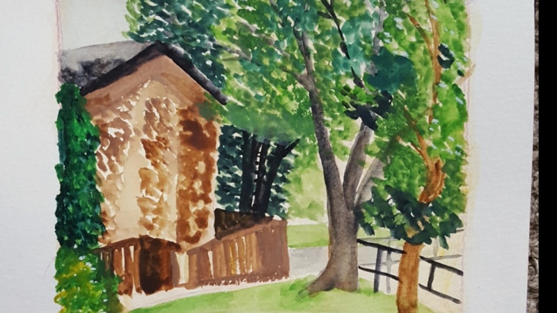
2. MarcoBucciSketchbookPainting part2of8: first thing I always like to do is I kind of find a frame within the page, and I just have a black marker and I'm just gonna draw very crudely a space for this painting to exist in. I like doing this because I don't like painting right to the edges of the page. There's something about that. It's like a psychological thing. Where if I'm painting right to the edge of the page is a tendency to try and fit everything in where is gonna have a frame like this? I don't know. There's something about it that just allows me to arrange things and composed them a little more freely and more naturally. So the nice thing about this composition is I see this sort of said pattern happening like this and then up. I kind of said, that is kind of Ah, you know of compositional staple that I always look for if I can find a dead pattern while you go for it. So, in this case, this said gonna be some grass here leading in the bridge will be right in this sort of middle third fish area. Sometimes I like to use a pencil. Just put in some dark like the bottom of that bridge. Just help me see what I'm gonna be eventually painting, okay? Just quickly is that we're gonna get into the painting process. So the first thing I do is, uh I pull out the brushes I think I'm going to use um I love this brush because it's been through hell and you can see all the flayed hairs on it. It's It's really harsh. Now the bristles of all stiffened up. I like it. For that reason. This heaven painting is not about luxin luxurious items. It's all about utility. So, um, I'm just kind of holding it under my finger there. I like this round brush similar I bought this years ago. It's terrible. And I love it. And lastly, a flat brush for larger areas. Sometimes I'll use that. So also got this white wash. This is the only paint that I like to have wet on the palate, freshly squeezed out. So I'll take that. Put a little bit of it right in there. And everything else is dry. As you can see, that's all dry color, You know, most of it. Watercolor. Some of the gua shall have the washes down here. Watercolor here. So the first thing I'm gonna do is just wet all of those wells with some water. Just get the pigment running a little bit up here in this corner, I have to graze. This is a cold gray that's a warm gray. I obviously do not clean this palette. That is a waste of time. So I'm going straight into it. I want to block in. The bridge is so light that I want to block in the values and colors around the bridge to set off the bridge. Right now, everything is obviously the white of the paper. So let's go and find a, um, a dark color. And you see, I just I just goto every color and let's just put in a dark that's going Teoh. Approximate the value of some of these trees, and I I just pulled colors from everywhere, even reds and stuff. This is kind of an under painting, which I will then go over at this point while it's still wet. I'll grab this green, the squash, maybe mix it with a bit of this yellow gua sh maybe some white and I can start actually getting some greens playing within those reds, and I can take advantage of the whole wedding toe wet nature of them. Now I'm you know, the last thing I want to do is try and copy plant shapes and foliate shapes. That would be not a smart use of my time. I'm just trying to get a sense of the randomness and abstract quality that's happening back there. Put in some more this red read. It just seems like to me to be a good color for an under painting. If you put cooler tones on top of really dark, rich, warm tones, something about that seems to really work. And I love the random shapes that wet into wet painting gives you like all these little splotches and splatters that you can never replicate without doing this technique. So let's continue on with just get a bit of warmth in here again. I'll try and leave most of that bridge. White will help it glow a little bit. So this is, I think, Payne's gray or charcoal grey with some red in it. I don't really know it, which colors I have on the palate. I just kind of know that, you know, cold colors here, warm colors There you can see in my wet into wet because I just put this washed down here. I get this cool bleed e effect here. I like to use that as much as possible. It just gives the painting a spontaneity that I really, really like again that is really hard to get any other way. Well, I have this dark on my brush. I want to see if there's any other areas I can use it. It's another compositional thing where I think that you should never just have, like, an island of something. If I can connect this dark with other darks in the frame, it will just tie together the composition. So maybe I can find a few dark accents in these rocks. And again, some of these might exist in the subject. But honestly, I'm gonna I'm gonna be inventing a lot of this and I'm spending equal time looking at my painting. As I am looking at the subject. I'm not trying to copy the subject at all. I'm trying to really just use it as information with which I will edit. Okay, so the picture is kind of starting to read now it's got an interesting statement to it in terms of paint application. Um, it's not finished yet, but it's already moving in a direction that looks good. So let's keep moving along here. Let's get in some of the the water. I just grab some white, wash some water color blue, some of this red that was spilled over its This is really guerilla painting. This is not This doesn't rely on technique at all, which is so much fun. Which is why I encourage everyone to try this. It's really just coming up with abstract statements. The rocks in the foreground have this interesting light play on them, which, um, shadows being cast from behind me via these trees. So I'm just gonna approximate some of the patterns that are happening with some of this bluish value, you know, work into that. I don't want to lose that set that z shape, right? You see, it's still very strong. That's the motivation for this composition. And if I lose that, then really I'm fighting uphill from there, so I don't want to lose that. Okay, so this might start to work as a lay in for the foreground area. Let's, uh, get this rich blue. I don't want the painting toe look to warm, um, the shadows. I can really exploit some of the blue messing them. Um, often times I'll do is I'll grab some of this water color and a bit of the white wash. It's up here, and it just helps the watercolor have a bit of body to it, and I'll use that in my shadows.
3. MarcoBucciSketchbookPainting part3of8: As far as the actual bridge goes, I want to get in a basic just a really quick wash, really thinned down with water for the warmth of the bridge. I want to maintain the white of the paper, though, so I want to keep that wash real thin and the sun is gone. Now it went away. But that's OK. I can still work still adhere to the things that I've been seeing. You move quickly when you paint this way, so if the sun does go away, it's not a big deal. I can still remember what was there. There's a bush here that I should get in this right here. I want it. There is a Bush, their real in real life, and I actually like it, so I'm gonna use it, which is really I think if it's there in real life, that just gives me an option of whether or not I want to use it. You don't have to use it just because it's there, which is a mistake that I still make. The tendency is just human. Nature seems to be is to want to copy what's there and again. This is why I recommend working small like this is so you can get away from that tendency. You're just encouraged. Last to copy what's there when you're working small. I'm gonna grab some of my pastels off screen here and get in a few of the lighter yellows that were in the tree area behind the bridge. I can combine that with pain. I don't want to use the same yellow everywhere, so getting some green in there will help. And again, I just want to keep it abstract, maybe focus it around the bridge. Yes. I'm just trying to hint at a bit of a reflection. Gonna let that water dry and see what it gives me. You can take my marker if I want and try and get at some the the posts, the railings on the bridge. I don't want to draw too many lines, though, So I'm gonna try and be loose with this thing at this point, getting some white, loading up the brush, giving it a bit of warmth. Try and find some of these rocks, go back into the shadows. Maybe definitely coming to the point where it's almost time to stop. But before I do that. I want to get more of my pastels out. This blue is this really dark, rich blue that I I like to try and find areas for. It's kind of like the shadow color that I was painting with earlier, but it's got this nice just richness to it that helps as a dark accent. I'm just going to try and find little patterns of darks that I could bring in with this blue trying to kind of work around this area here again. I'm trying not to just create spots everywhere around you get like the Christmas tree effect. So I'm tryingto make sure these spots are connected. And at this point, I'm really not looking at the subject at all. I'm looking at my paintings. My painting is so far removed from the actual subject that it's not worth. It'll be. The real subject is actually a distraction. Now put that away. Get out the orange one. I wonder if there's a few areas trees in the background. There is some water coming down, this little stair step thing, which I can hint at from the water, kind of empties out into the ravine here. Okay, The last thing I think I want to do is I want to get some more darks into the foreground area and just make it like a framing device. So you kind of your eye kind of goes past this area and favors this one. - Now I'm finding some highlights on the rocks. Just the top, the top planes of the rocks. They catch some of the light. You could do that in the shadows to if you had a a bit of a cooler light color. You can find some of these rocks and shadows well, so when I basically think a sketch like this is done when I have kind of built up a bit of , ah, tapestry of color that is pleasing to me that is inspired by what's there in real life, and I'm pretty much at that point now. There's a bit of a bush here that I might want to put in. Greenery is sometimes hard to paint because it's always hard to paint because it's so abstract, just kind of pick and choose your spots, and it's easy to overdo, and I'm probably approaching the point where I should stop on this painting No, just a few more. A few more dark marks. And then I think we're good. - Yeah , So I think we've arrived at a Finnish sketch. I don't think is a much more I could do to it. So let's call this one finished and let's move on.
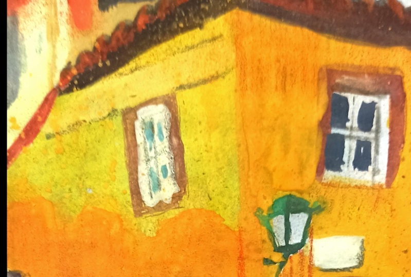
4. MarcoBucciSketchbookPainting part4of8: So with this one, I'm gonna start with a warm wash which transparently goes over everything using this what looks like burnt sienna or some kind of warm, earthy color. And the reason I'm doing that is, um it helps me work either lighter or darker than this. Um, because I don't have It's not like the bridge scene we just did where the bridge was. So obviously a light shape against dark shapes. This one doesn't really have that. So I want to kind of start with this grayness that I can then work into. I'm pretty much working fully transparent right now. This is water. This is all watercolor at the moment. And I'm using this flat brush this time. Just I think it will help me get the architectural shapes of this house. So this is like a block in where I'm just sort of getting some basic shapes in their, um, right away. I do want to get to that sky, which will punch out the house. I'm just laying in a few more colors. First again, This is not something you want to be exact with. You don't want to burden yourself with that. It will make. First of all, it will make things less fun for you. But it will also kill the spontaneity of the painting. Usually especially with these nice flat brushes, put down a stroke and leave it. Try and leave it alone. It has, ah charismatic quality to it. That is really kind of desirable. So I'm mixing up a blue sky here, really loading up on some white paint. And now I will go back and lay that on, and you can see how we're starting to get the house to pop out from the sky from the background. I'm laying this on fairly thick. It was gonna be a tree that is in this area that I we'll put in. Okay, so let's keep moving. Now that I have some whitewashing my brush as well. Put it on the palate and maybe you some of it. Um, I want to keep going here and get to some of these darks. Those rooftops have some nice darks in them. And you know, before you know it, you start putting together enough of these little pieces of color that you start getting Ah , a picture happening. Let's get some greenery in here. There are trees here splitting the houses. I'm not too particular with exact shapes. I'm sort of thinking about this like like a mosaic, like little blobs of color, little patches of color that will come together and create the effect of this picture. Sometimes when I put a warm wash down like I just did for that rooftop following it up with a cool that goes over top of those warms can really look nice. And it's It's not something that I always see from life, but it's just Ah, cool over top of warms is just something I like to dio. There are some trees in the background that are still a wedding against that sky, and I'm gonna try and get that with something a bit lighter than that again, These ah colors are just little will, piano keys that you just go to and you get your value. This value is working nicely against that sky, helping to pop up that rooftop and maybe another one over here. We got some color and it would be nice. There is some really nice colorful leaves intersecting with the house here lets you know it's this is a nice season, the paint. And so why not capture some of that? And then that tree trunk actually kind of intersects the whole house. So I'm gonna really carefully put that in. I have to be direct with this because I really only get one shot at it. If I really messed this up, it's gonna be hard to fix it. It's where the flat brush comes in real nice, because you can just spot in these areas, so that's kind of looking. Okay, I'm not going to touch it again. It's better if you can really be economical with your brush work. One of the challenges about being out here is you want overwork everything. Like here I am going back into that tree branch when I said I wouldn't. So I'm gonna stop You gotta catch yourself, switch brushes for a second and get this. Uh, there's some real nice light rooftops. I'm just gonna lay that paint on real thick. Whenever I want a strong white. I usually just go for it with some real in Pasto. Thick paint. Just hold it up where it was. But are we rolling? So and I like the texture that's going down with the dry brush. It's not an even line. It's broken up anything to avoid that monotony. It's probably why these sketches, air so appealing to most people is because they're so small just by nature. And they're so they're done so quickly by nature, you avoid a lot of that monotony that comes in when you try and over direct the process. It's one of the reasons I like painting like this. It's really it's real hard. Teoh capture this kind of attitude in the studio where you do have a lot of time, So being out here actually kind of trains you in a sort of interesting psychological way, So when you're in the studio, you can loosen up.
5. MarcoBucciSketchbookPainting part5of8: just trying to touch the page and let that let those brush strokes have a life of their own. You know, let let the but the brushwork be as much a subject of the painting as the actual subject is . That's the goal. And it's Ah, once you start thinking that way, you'll actually find that you can almost sometimes capture the subject more accurately than if you try to over direct the whole thing. I think too much control too much attempt that control is on art killer. You have to just get enough experience that you feel comfortable just letting go a little bit. We're in a very gray light situation now that the skies clouded over, which is causing a lot of these colors to be fairly close in value. So I'm doing my best. Teoh, maintain some kind of separation in value. As I go about this, I'm also emitting a lot if you if you refer back to the subject, one of the houses, the one this one here is kind of overgrown with ivy, and you know what? I'm not really putting that in. I might put a little bit of it in just to be a little truthful to the subject, but I definitely don't want toe. Do I feel like I have to copy what it actually is? I also get into a lot of trouble. I might just put a few spots of this just to indicate that there is some kind of growth there. It might actually look good at the edge of the frame toe. Keep your eye inside the frame. So maybe if I use it compositionally, that could work. Now let's move down to the road area, which I haven't touched yet. Interestingly, I've kind of just by accident painted this from top to bottom, which is not always what I dio, but really, when I paint like this, I don't usually do anything. It's always different. The road has this Kulish look, which I was put down in a wash like that, which then, because I've made that cooler, it looks like that is a lot warmer. I've made a difference there, and all of a sudden that sidewalk, just the under the just the initial washes is good. That's that's vanished. Don't have to paint anything. Um, I do want to get a little more texture on that road. So if I grab maybe this yellow and put in the indication of the painted line on the road and I think I do want to include a car, there are some parked cars there. Um, there are two or three of them. I don't want to include all those. I'm just gonna choose one, and I'm gonna put it here again. This is This is where you look at the subject, see what's there and then choose what you want to put. So I'm gonna get white paint, get the basic shape of this car not looking for anything remotely accurate, really. In terms of the drawing of that car, the brand of car that it is, I really don't care about that. I just want the viewer to know that there is a car there, and what really is going to sell it as a car is the shadow underneath. So I will put that in a second. There's some rear lights just to brush strokes. Let's get in a window. Which is this blue color reflecting the sky? Get in the rear view or the, uh, the back window as well. A few spots just for texture. Let's get the tires in. And while those air still wet, let's let's get in the shadow. It's gonna go real dark with that shadow and now in all of a sudden it has some form to it . I'm still going to give it a bit more, uh, definition in volume. You can see that this painting is a little more controlled. My brush strokes a little more controlled than the bridge paintings. The bridge one had so much abstraction in it, with all those leaves and such and such. This one has less abstraction because it's very geometric shapes the house, the car of the street. It's all very plainer. So I'm painting more like a sculpture in this one, uh, adapting my technique to capture the subject. And once again, that's why this type of painting is really good, because it only takes a few minutes, you know, 20 or 30 minutes per painting and you get to really exercise all these different techniques that you then Kenbrell back into the studio. Um, you know, I'm definitely not joking when I say that I learned most of what I know about painting from painting outdoors tending painting here, and I'm almost done. Let's, um, that car almost looks like it's a bit transparent right now. Let's fix that. Uh, just need to darken up the the body of the car. Maybe by doing this, that's better. Now, this one, I don't feel the need to go to my pastels. That much this one seems to be seems to have been able to find a nice statement with just the pain. So again, if you don't need it, don't use it. And we are ready to call this one. Finished? Um, maybe just this is the classic way you ruin a painting. You just say maybe just this and then you wreck it. But maybe just that And maybe just that, Um, yeah, that's the other question that you get asked a lot is when do you How do you know when the painting is finished? And actually did come up with an answer to that. And my answer was, when there's no more questions, Um, but when you're painting a small sketch like this, it's tough to answer that because there's always more things you can clarify. I can always go back to anyone area. But let's look at it more from a zoomed out standpoint, and I condom it. I'm kind of enjoying the simplified brushwork. It's got a nice read to it kind of graphic in his brushwork. That was a fun one. Let's move on and see if we can find something else.
6. MarcoBucciSketchbookPainting part6of8: we found this great street scene the afternoon we're in sort of mid afternoon right now. The shadows, They're starting to get a bit long. That will really, really be a nice feature of this one. I really like the sort of throw that kind of snakes upward gets smaller and the horizon as it goes. All these great cars driving by. There's actually a lot going on. There's trees overhanging onto the street. There are rooftops that air playing peekaboo here. So I really gotta be mindful of simplification. Always, always remember to simplify. So when I do my drawing, I'm not truly trying to draw everything that's there. I'm just trying to get a basic composition. This competition is going to be more like an s like a sweeping s through the canvas, using the road really as almost a literal path for your eye to follow a lot of shadow here . So it's gonna block that in trying to decide the size of cars. I think that's probably the size of a car streetlights. And before I overdo the drawing, it's time to paint. So, as you can see very bare bones composition, it's not really a drawing at all. It's a guideline that just happens to be done in pencil. It's almost like mental notes at this stage, like I did with the last one. This is going to get a very light, transparent wash of this warm color, which azi remember from the last one. Some of that actually might show through the end whenever I have a son might shot. I tend to start this way because what this washed does, because this stuff is all kind of transparent based that wash sort of permeates and shows through the paint a little bit. And having that warm wash there is nice, I'd say most of time. I start with that. So let's get in some of the dark. Some of the shadow side. I'm gonna start with the upper area, the shadows. There are going to be, ah, whole lot lighter than the shadows in the foreground area. Get those in. Let's get some something that happens toe light. When it goes into the distance, it gets shadows, get a little redder, so I'm just getting a little hint of red. I got a friend called the Mr Be here. This whole area is in shadow his whole upper road area. So I'm gonna put in the shadow. I'm using this nice blue lavender tone. Um, because another characteristic of light is it takes on the color of the atmosphere. And we have a nice blue sky above us, which is really going to color this road. Purplish color. Um, because it mixes with sort of the warmth of the asphalt mixed with the blue of the sky Gives us this. Now I can put it may be a little more red in there, just little hints of it. Let's get a bit of color dancing around and it starts looking real nice. Um, same thing with this area of the road. There are some nice shadows, but I want to put in maybe a little more blue. Little more the ultra marine blue color in here. Get some of this dappled light coming off the houses. Get some darks of the, uh, the houses that are here in the on the left. The sun is going in and out on us, so we are forced to compensate with the camera a little bit. Stuff is any difference in lightness. That's what's happening. I'm painting, though, is if it's always in light. I'm gonna That was when I first saw its what was there when I started. So I'm going to stick with it. Some of the rooftops cool the trees. I'm going to get this really dark red like I did in the 1st 1 This was served as a sort of a shadow of the tree, another one over here, and then we'll that is still sort of wet. Let that bleed into the trunks. Maybe I also put in some of the lights of the tree as well. - Try and get a darker value on this road so that the so it leaves behind the light of the sidewalks. Now what I'll do is punch in that sky. It's really all about setting up your values, so they read. So at this point, I need a light value for that sky back there. Maybe I can get a few light rooftops peeking through. This one is really starting to rely on abstract shapes I'm gonna get. That road is still wet, some almost erasing out some of the pain. It's it's almost like I feel like I'm in an improvised improv session. As I work on this, the light is changing, which causes problems for the painter. Um, Actually, I causes major problems because all of a sudden what was warm, all of a sudden becomes cool. What was like, become shadow? It was. Shadow becomes light. It's a It's a painter's nightmare when you have this kind of situation. But what you want to do is persevere, first of all, and try and remember what it waas when you started, because that will help you make decisions more clearly. I remember there was light on the sidewalks coming into the road here.
7. MarcoBucciSketchbookPainting part7of8: really trying to get that road to the right value. Sometimes it helps to put in like those road markers those road lines. It helps it read as a road, so your your mind expects it. It's so used to seeing those details that putting them in was actually get in a car. Let's actually get in a car or two. These will just be flat. Shapes change the color a bit, so not every car is the same out in the background here. We can really have fun with some just body, you know, fun looking car is just one brush. Stroke equals a car. It's one of the nice parts about working small like this, and we will hit the tops of those with some light in just a second. It's realizing I've kind of neglected the right side of the frame, which is not a good thing to let happen any any longer than this. Mostly just foliage again. I want the I want the I to follow the road, So okay, let's change brushes. It's OK, you can see I'm kind of re wedding that wash, which allows me Teoh let it run and create textures put wet on top of ah, what's already dry. It looks like I've completely lost the sunlight. So I you know, like I said, I'm gonna remember what I had in mind. But there are there. You know, there are some things I can adapt and put in there, so it's kind of maybe a halfway thing. In the end, let's get some, uh, light in the house area. Just so it's not one big lobby dark shape. Maybe there are from porches are things painted white, which there are actually in real life. Little details. - This one, this one has been maybe the most uniquely challenging today because it's given me at least two or three different types of light from pure son might to partial. Some might to now know somebody. But again, that's one of the reasons I paint outside is. Develop a bit of that resilience through kind of developing some dexterity with your technique, and you're also your mental attitude is important, too, that when that happens to you, you don't get all freaked out because it will happen If you paint outdoors, let's look at those cars and get first of all the tires bled too much into the ground. Fix that and let's look at some shadows just dark, dark and maybe warm. And I should also get the cars in the foreground to be a little bit more removed from the lobby. Nebulous sort of state. They're in a few highlights. Another trick with the backs of cars is getting the rear tail light's painted in. All of a sudden makes them Sella's cars. Let's put it, Keep going with those cars. Maybe put one here. And while I remember, I've just noticed that I've neglected the streets on the street lights. Let's get those into just a few indications of some traffic lights. Okay? I feel like the road is needs to be revisited. Once again, Let's get some lighter, cooler blue again. Like I said before, I'm spending most of my time looking at the painting that I am the subject because especially this one, we're so far away from where it was when it started. Even the original scene is far away from where it was when it started that it's really about how to make this work more. Then I have to pull that information for my head Rather than look at the actual scene, Teoh get to tell me what's going to work because the information is so different at this point.
8. MarcoBucciSketchbookPainting part8of8: pastels will help me bring back some of the more brilliant colors that I think I lost a little bit while painting this one, and I'm kind of using them almost in a linear fashion, like drawing lines to help. In this case, we have such a strong perspective going through the picture that drawing lines in perspective well, actually help not only lends color and value to the peace, but also informed the perspective can hit some of the rooftops. Change to this blue color, maybe get in some. This might be a good value for, like, lawns and shadow and these bright saturated colors. I'm not so much bright, but the saturated colors. Like I said, we'll help lend a fume or interesting color notes to the picture. I can actually get some lawns, maybe in more sunlight, bringing it back to what it originally looked like. I feel like this green is something the painting was missing for a while. The pastels are best at the end when they relay over top of the pain, and it's such a in perfect tool. I mean, look how blunt that edges. I'm just trying toe. You know, I'm 1/2 praying when I put it down that I'm putting it in the right spot. Part of the fun. It's good. Get the rest of this house. - Okay , so we're almost finished here. I feel like the background needs a bit more blue in the shadows. If you ah lighten, lighten your shadows in the background and make them bluer. It all of a sudden gives this illusion of depth. So I'm putting this lighter blue into the shadows. Might be a little too light, so go back over it a bit, and there's really not much more I could do to this. It's It's kind of reached its limit in terms of visual information on such a small scale. I was gonna put a few highlights on tops of these cars. Reinstate that. I think they were lost a little bit and just revisit these shadows of those cars as well. If nothing else, this painting is a very honest interpretation of what's been happening out here with the light. Um, I think it's got a nice abstract brush. Look to it. It's hard to say when you're painting it. You know, when I'm actually painting these, I'm really not so much concerned with quality so much them with just doing my best to convert the raw material into something visual, then later on will determine the quality of it. Again. It kind of goes back to what I said about just being this type of painting outdoors, being just free and fun, and you learn so much. Like even in unsuccessful painting, you'll still capture things that you can then bring back to the studio. So I am pretty much finished here. Anything else I do? Well, just money, the painting. So let's call this one on this crazy part of the day Finished. Okay, so here's what I ended up with. One thing I actually added after we stopped rolling just some of those light posts, I felt they helped show the perspective of the scene that got a bit compromises I painted due to all the rapidly changing light. Uh, so I think that helped. And let's put a few marks for stops for street signs and things like that just to give the scene a bit more realism. Ultimately, I think it was a fun exercise on a tough day. Um, you know all this stuff you take back to the studio with you. I think the palate ended up looking kind of fun on this one. This kind of combination of everything that happened.
 Marco Bucci, Professional illustrator & teacher