Transcripts
1. MarcoBucci PaintingOutdoors 00INTRO: Hi. My name is Mark Obuchi has a production artist. Painting outdoors is one of my absolute favorite things to do. So I'm really happy you're here joining me. Let's get started. Okay? So before we get going, I just wanted to explain my set up real quick. That is a Windsor Newton Bristol watercolor easel. Um, for those who've never seen a watercolor easel before, the difference between that and a regular easel for, like, oil painting or something is that the top? The angles is adjustable, so you can see right there. I'm adjusting that and you adjust it based on how much you want the water off the watercolor to to run down the page. And that's, ah, personal preference. It depends on to me. It depends on the temperature of the day, if you know how quickly the water is gonna dry off the page. Um, right now I've got it's a sunny day right now, so I've got it kind of a comedian. Steep angle, you might say. And you can also adjust it on the fly. You can kind of hold it with your hand, and as you paint, you can move it to a steeper or less steep angle, depending on how you want the water to run. Um, that's just my water container, which just hooks on to right there to the little clip on the bottom. Um, any water container will dio um and then my paper that I like I like to paint on watercolor blocks just because I find them the easiest to travel with, and you don't need to stretch them. Um, I use Ah, Saunders. Waterford £140 cold press, Watercolor paper. Cold press refers to the texture on the page. Ah, hot press page will be very smooth, cold presses textured, and I really, really want to use the texture of the page. So I always use cold press. Um, I just use masking tape to mask off a ah, the dimensions of the painting. I kind of look at the subject and I just go off my gut feeling of how I want to compose it . And what what the best dimensions will be for that picture. Let's take a quick look at my palate on the bottom From the left, I have cobalt blue than ultra marine blue. Those are my two blues. The two main ones. I always use Rossi and a deep, which is a very dark value, very dark, warm value, then have raw sienna, which is a little lighter still, in the very warm yellowy side Ah, permanent blue violet, which is just purple. Basically, it's a very, very rich color, has a lot of standing power. I use it for a lot of dark mixtures. Moving on, we have cad yellow light corn accreting red, which is basically like a lizard in crimson, sort of a purple e red cadmium red light, which is a pretty classic color, and then yellow Oakar, another classic. And then at the top we have cadmium orange, this interesting yellow called iso yellow, which is very green. It makes really, really bright greens when you mix it with pretty much any blue, but I like to mix it with that cadmium turquoise for a great green color. Cadmium Turquoise is a really versatile, unique blue that I like to use a lot, and then another unique blue is this mag unease Blue, which finds its way into a lot of my grey mixtures, and that's my watercolor palette. I pretty much used that all the time and don't really change it that much
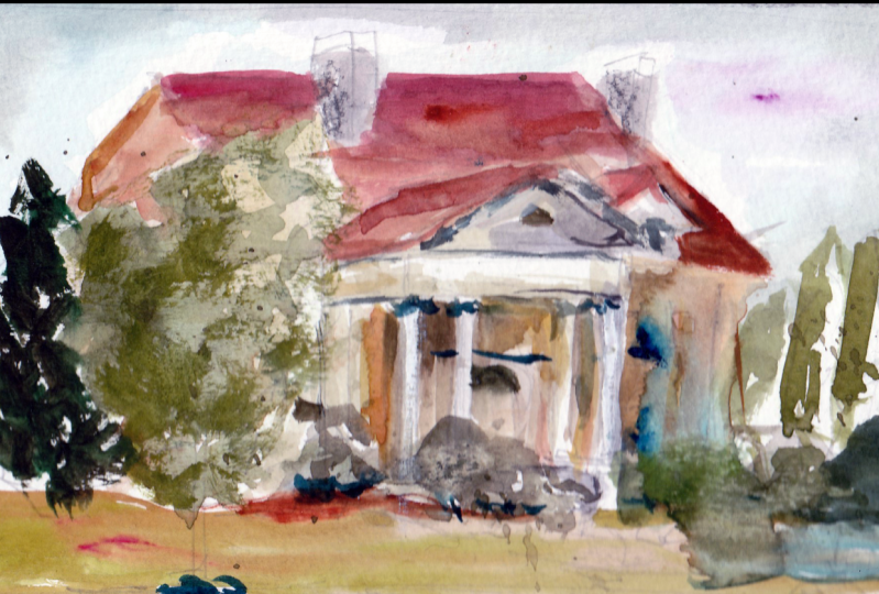
2. MarcoBucci PaintingOutdoors Demonstration1: This is sunny side in Toronto, right on lakeshore, west end of the city. Actually, this area used to be an amusement park right up into the late fifties, and then, ah, they got cleared away to make the gardener highway, and they built this really nice venue here that I've painted a few times. The light always hits it really nicely, especially around five or six o'clock. Justus. The sun is dipping down into the horizon a little bit, so the first thing I like to do after the drawing is done is get in the sky just cause I find that it's that sets the tone for the palate. The key of the painting meaning how lighter, dark the whole thing is going to be. Eso. I like to tackle that first so that I probably start with a wash of cobalt blue, maybe a little burnt sienna in it, and then I'll modify. You'll see. Very soon, I'll start to add warmer colors into that sky. There's a little bit of it there, and here's some more of it coming in here. That's probably cadmium red in the mixture. Maybe a bit of yellow ochre or two on. The reason for that is just to keep the color different, just to keep it. Watercolor is very good at having colors flow into one another, so if you put down what looks like an aggressive read, it will actually merge into the blue quite seamlessly. As you can see, it's already doing that. Um, I like to keep the colors moving by always going back to the palate and mixing up new colors. So I'll refer to that often throughout this demo and throughout all the demos in this film . But I'm carving out the silhouette of the building. Obviously, one of the big challenges with watercolor is you have to leave behind things. You kind of have to plan your attack a bit unlike, say, oil paint where it's opaque. What I do here I can't undo. You know I can't go over things with opaque paint. It's always transparent, so the paint the sky is dry now, and I'm painting in the shadow value, or at least the first pass of the shadow value of the building structure. Um, it's a whoa. It's a sunlit day, which means the lights are going to adopt the warmness of the sunlight and therefore the shadows air going to appear cooler. So I'm keeping the shadows in the neutral sort of warmest, coolest gray. As you can see, I'm mixing my colors together. Um, you know, I'll run a little bit of read into that blue mixture. You can kind of see little hints of it. Little warm hints within that overall cool pool of color there. And ah, my goal here is to get in his broad strokes as possible as much as I can. So I'm using a number eight brush. That's Ah, that is a S Kota watercolor brush number 81 of my favorite brushes. Certainly my favorite brand of watercolor brushes. Skoda as the number eight I use between number two, number four, number eight. Rarely I'll use a 10 or 12 depending on the size of the page. Um, you know, you can see it how the color is. Ah, murder is going from a slightly cooler blue now to what I'm painting with now. Whereas before it was a little bit more neutral. Um, And again, the goal here is just to get the drawing right. I had a pencil drawing, but it was very loose. That's the reason I didn't I didn't show my my drawing very much is I only draw as much as I need to get me going. And that will change depending on who you are. Depending on what? How, how much like, for example, the amount of pencil I needed changed over the years before, I would need a very detailed drawing. Now I just need a few just quick impressions of what's going on, and then I'll continue the drawing with the brush. That's what I'm doing now. So what I'm doing now is drawing. I'm drawing and painting at the same time. Okay, I'm very cognizant of the strokes I'm making here, creating shapes and creating design. Um, and not only that, but with the addition of this being watercolor, I have to be conscious of the light that I have to leave behind. So right now I'm working. Now that little archway is partially in shadow, which I'm painting the shadow right there. But it's also light, so I have to make sure I'm drawing shapes So the drawing and painting is not just outlining the architecture in this case, it's also where the light and shadow meat that's also drawing you're designing with each little stroke. You know, um, and your design. It's very difficult to teach someone design, is it? In fact, it's impossible because that's all personality. The best thing I can tell you is simplify. You have to simplify things into shapes. For example, I'm painting a column there notice. I tried to do it in one stroke, that verticals stroke that defined the column. The just the nature of the beast seems to be that the more you try and do it, the worse it is. Try and do things in as few strokes as possible. One of the best things about watercolor is what it gives back to you. Um, artistically, it gives you these really magical effects. And if you just can force yourself to do less strokes, you'll find the painting actually gives back to you much more than you could have ever put in yourself. Um, that's why I love watercolor so much so I'm still in this process of drawing. Most of the architecture is in shadow, so I'm still on my first passive shadow here. But however, once I'm finished with an area like that center structure. I leave it. I'm not going to go back there on touch things up. I'll go back into it for more detail, but I'm not gonna go back into it in this past. Okay? Um yeah. Still doing that. This is really determines. The success or failure of your painting is how well you get this in. These, in my opinion, is how effective can you be with this first pass of ah, establishing your your picture. Now, A large part of this is also composition. I am doing something here where I'm determining that this picture will have more shadow than it has light. So I'm most of those pictures in shadow, and they're just gonna be a few punches of light as the sun hits the right side of the architecture and you'll see you can see I'm leaving that behind with the white of the page . Right now I'm drawing in a cast shadow, right. You see how very conscious I am of the shapes I'm making? Very soon I'll put the cash shadow wrapping around there it is wrapping around the column. I'm seeing that in real life, and I'm designing it into my painting. Okay, Um, and as a designer, you have to pick the areas that work best for these shapes. You know, you the shadow may have been higher or lower on the column. I chose to put it there 1/3 of the way from the bottom. Just because that's ah design principle. You know, I never like anything right in the middle. Kind of go 1/3 on either side. So what I'm doing now is I'm still continuing my sort of block in phase. I'm working on the ground now. Now the ground is in light. So what I'm establishing here is the what will be the lightest tone on the ground. Whereas before I was establishing the shadow of the building we're doing now is I'm establishing the light of the ground. Um, and again, notice how maney little color mixtures are going into this. I usually start out with my mixture kind of my classic mixture of ultra marine blue with raw sienna. It gives you this very rich gray that I always start with men into that I will mix in things like yellow Oakar, um burnt umber, cadmium red, a lizard crimson. Uh, you know, turquoise, blue, whatever it is I want to modify it with. But I usually start. You can see it there. That's that pool I work out. I usually start with that altering blue and raw sienna mix. So what I'm doing now is what I like to define. As I'm establishing the full range of contrast that this picture is going toe have it already has the lightest light, which is the white of the page. Now we need to get in what will be the darkest dark. And that is the opening in the center of this building. And you can see again how conscious I am of drawing here because this is water color. You can't undo this. What I do here is that's done its final. So I'm getting in this Ah, this dark and ah, to mix that rich dark again. It's probably just a lot of, ah, ultra marine blue raw sienna. Um, any dark color I have maybe some burn number in there, rahm or whatever. Whatever dark colors you have, mix them all together and you'll get a dark passage. The tendency with watercolors to not go dark enough because the water actually makes it makes your mixtures lighter. Right. Um, just load up that pigment loaded up. Don't be afraid to waste pain. Don't be afraid to use pain. I should say, loaded up and get those passages there. You can see what I've been painting that dark accent right in the building. And what that does for me is it gives me the range of contrast. Like I said, So what I'm doing now is I'm getting that transition. As the building dips into that darkness, I'm getting the transition and I'm doing this while the wash is still wet, that dark wash is still wet and you can see that diffused edge that magic allege that watercolor gives you when you go wet into wet or it's not wet into wet, it's actually wet against wet. It gives me that diffuse edge that is really just gonna be beautiful to soften it, something that you have to work very hard to do and say oil pain actually comes for free and watercolor. If you can control it now, of course, I'm painting over a dry wash of my initial past. My initial shadow passes dry. Um, you can't get hard edges like that if the washes wet. So a big part of watercolor technique is understanding how the medium is going to react, whether it's going to diffuse itself wet into wet or whether it will give you the hard edge . And then, obviously you need to know what you kind of want as a painter. Hard address. I fused edge. Um, with that brushes is still my number eight s coat a brush, but it's got a very sharp point on it. It's a round brush, as you can see. Ah, and what I love about round brushes, that is, if you can take care of them, they maintain their point, and you can draw detail with a round brush. Um, so what I'm doing now is I'm putting in a shadow pass for the ground and again talking about color temperature. I want the shadow to be very cool, Um, meaning I wanted to exist in the blues and purples and anything that could be considered opposite of oranges and reds. Because the sunlight is warm and because I've established the ground as a very neutral kind of warmish gray, I really need to pump it up, pump up the coolness of my shadow for it to look like a cool shadow. There's a lot of purple in there. I use this purple color. I honestly can't remember what it's called. It's not important what the exact purple I use, but it's his purple color that I mixed with a bit of yellow Oakar. But I let the purple dominate the mixture. Maybe a little cobalt blue in there, and you kind of see the influence of cobalt blue in that mixture, Um, to keep it cool. And I'm trying my best in just a few strokes as possible to get in shapes of shadow that served two purposes. One is for them to replicate what I see in real life, but more importantly, is for them to create a good design. And that's kind of the issue. The hard part for me, um, having painted outdoors for a number of years. Now, the hard part is not capturing light. I mean, that is difficult, but I've kind of gotten so used to seeing light that kind of no what I kind of know what is going to throw at me. I know it's tricks. What's hard is capturing light as well as good design. That's the that's the challenge. That's what will keep me Painting for the rest of my life is design. Um, so when you're designing a shadow pattern onto a ground like I am now, I'm trying my best to keep the design simple. And usually what that means to me is keeping the strokes as few as possible and kind of letting kind of letting it happen by accident. That sounds kind of cheap, But, um, I'm trying to not trying dictate the painting that much. I want to let the painting also give back to me. It's a process there. It's a relationship there you have with what you're doing. Um, which is why painters get so obsessed with their work because you can't just go into a painting and and do it. You have to let the painting, uh, give back for lack of better term. It is difficult. You just need to establish, um, you know, control over the medium that you know what is going to do, and you kind of have to let it do at, um, my hands in the way right now. I apologize. Well, cut from the shot soon. I'm just drawing some architecture on the left there where I hadn't done it before. So what, you see, there is a good impression of the scene. It's Ah, it's Ah, first impression I've I've done a little more than a block and I've got the shadows on the ground. But the picture needs to read at that early stage. I'm probably vote, what, seven or eight minutes in? Um, we didn't get that on camera, but I just did that blue sort of pass at the top. And I'm putting pure cadmium orange into that blue to to simulate the gold writing that was on it wet into wet. So it's not so harsh. Um, the washes on the page or dry again on a sunny day, your washes dry real quick, so if you're gonna work wet into wet, you have to be able to plan ahead for that and get get moving fast. Um, luckily, in sunlight, the paint dries pretty quick, so working wedding to drive is actually pretty easy. I'm putting in some tree values now, and I've been purposely waiting until the drawing was moving along before I did this, Because what these trees are going to dio them, You can see it. There is such a darker value that it really pops the white paper. You can see that area of the architecture now is really starting to come forward because I've put that dark value behind it. Um, and again, making sure my colors are moving, mingling with each other. There's some. There's some greens in there. I don't actually use green tubes of paint. I mix my own greens with, um, with blues and yellows. I have this a zo yellow, which I mixed with this turquoise blue that gives me a really rich green. Um, and then I can gray it down with some Rossi. Anna. I can cool it down with cobalt warming up with cat red. You know, just you just play with color it It's color is not the important thing. Its value values the important thing. Um, for example, in this picture, I basically have three values I have the light sky are sorry, the light of the building, which is my lightest value, the average shadow of the architecture that pass it in the very beginning, defining the architecture. That's but one big value. And then a dark for my dark accents, which is the trees, the trees, air getting that dark. The middle of the building is dark. I basically have those three major value families going, and it's very true that the fewer values you need to use, the better. You know, there's nothing that muddies up a picture more than more than too many values. And trust me, you're gonna want to see you're gonna want to paint too many values because when you're out there in real life and your painting, your eye is just seeing a 1,000,000,000 values and you're you're gonna want to paint them all, especially if you haven't done this before painted outdoors before you're gonna want to paint everything thinking that's gonna be the answer to your problem. But really, that's the opposite of the answer. And you're just gonna create problems doing that, so you have to simplify and watercolor happens to be a great medium to simplify with, because it's nature doesn't allow you to paint too much detail, you will go crazy. S o. The secret toe watercolor is understanding how to simplify and all the nightmares. Watercolor will be over once you do that. Trust me. I've been through the process where I absolutely thought watercolor was the devil, and now it's my best friend because of simplification. So I I could You kind of can ward it like I tell the watercolor how simplified I want it. And then it tells me what it wants to look like, based on how it reacts, the washes and all that. It's That's another reason. Watercolors. So fun I've never had. I've never experienced a medium with as much personality as watercolor as it goes through moods. It's almost like it could be in a good mood or a bad mood, depending on ah if it likes you that day. So I'm working ah into my average values for the shadows of the architecture now creating a deeper value. And what that deeper values doing is it's popping out the drawing. It's also giving me more contrast, obviously, and it's popping out some of the light because within shadow there is still light. There's bounce light lights coming in from the sun, Um, and let me hold that thought for a second, guys because my friend Alexey just passed by on his bike and stopped to check out what I was doing. Is this your Viking route? Every day, Alexey and I used to paint together a lot, so that was pretty cool that he came by. Um, So what I'm doing is I'm continuing the drawing into the shadow. Um, I find that adding dark accents into shadow like this that I'm doing now really pops out the light. It just gives the shadow some luminosity. And that's what I was saying before I took the little break there. Um, there is still light within shadow. So within shadow, you'll have darker accents which bring out the lighter passages. Um, you know, the sunlight bounces around him, reflects into shadows. So you gonna you have to sort of find a way to work into your shadow washes to get mawr, you know, to get a few more values within your shadow, but still keep it simple. You know, I've got a dark accent, which is kind of what I'm drawing with now, getting the undersides of little ridges and stuff. And then, ah, the rest of shadow. I'm still keeping fairly close together in value not trying to add too many values. That's another reason these pointed brushes these round brushes air really, really useful because they allow you to draw. In fact, I think I do this painting with one or two brushes and I think they're all number six is. I never really get out my small brush. I do sometimes, but in this case, I don't think I did. Um, these are just little flower pots that are in the foreground that I left behind with when I did the washes for the ground. I left those behind. I used to use masking fluid when I started watercolor, which masking fluid, if you don't know, is the stuff that you put on. It's kind of like this waxy substance that you can put it on the page. It dries and then you can go wet over it, and then it will keep the page there, and then you kind of peel it off later, preserving your lights. I used to use that thinking that was ah, what every watercolorist did because it was impossible to keep my lights. Ah, I found it way too time consuming, and I find it actually much more organic and artistic to just keep the light of the page behind as you work, um, to me, it's it's it leaves much more artistic shapes When you do that, where's the masking fluid? I never found like I had good shapes and I hated the amount of time it took to let it dry and and all that stuff. So I'm just getting into details here. There's a fence there, and ah, when you're drawing something like a fence, you just want to do it in one stroke. So each little fence post I'm trying to keep it toe. One stroke. That's a little tree. I'm putting a tree behind there. Now. I actually don't think that tree was there in real life. I'm doing it to pop out the architecture again. You are the painter. You're the designer. If if a tree needs to be moved, go ahead and move it. No one's gonna shoot you for that. So more fancy. See? One stroke, right, one stroke and just let that stroke have its own life. Just let it be. Don't get too crazy that I'm putting in some design is a bit of design in that fence. And again, each little design stroke is just one stroke. Uh, it's you'll quickly find you can ruin paintings. The more strokes you do past a certain point, the worst you're painting gets. You want that freshness to your work. You want that, Especially when you're painting outside where you're just trying to get an impression of what you're looking at. Um, the most perfect stroke will be a simple a single stroke that is designed that will be all you want. And that's kind of my goal for every stroke. Not that I achieve that goal every time, but that is what I'm aiming for. Um, mixing up a ah warmish dark color. I purposely I'm not showing my palette that much because I don't want anyone to get wrapped up in what colors I'm using. That is the farthest thing from from being relevant, its temperature right overall, if you can do you kind of see the whole picture Now it. So it's a warm light with a cool shadow. So I've left the paper is just white paper for the light, so it actually doesn't have any warm qualities to it. White is actually a fairly cold color. So I've made my shadows all a little more blue to make the white look warm, right? I could have done a wash of yellow ochre over this thing and let that be the light page. But I decided not to do that for this one. I didn't want to have to wait for that wash to dry. So what I'm doing here is I'm just darkening the sky. One of the things I love, what watercolor is you could just put a wash over it and just darkens everything. Um, and I'm doing that for contrast. I just want I wanted the building to pop out just a little more the light of the building. So that just meant making the sky a bit darker just a little bit. So just putting that where I think it goes. And this panning is pretty much done. A little bit more detail may be in the ah archway. I just see a few little things in real life that I wanted to simplify and just throw some shapes in there. Of course, I'm not trying to replicate what was actually there. Just I'm just adding something. T tell you that it's, ah that it was there. I get really nervous watching this. I'm recording this narration after the paintings done. I'm really nervous watching myself do this because I am afraid I'm gonna ruin it with too many strokes. This is where you can ruin a painting. Thankfully, I stopped. And, um, you know, the less you can do the better, really. But there is a stage of painting where you want to do those fine touches. Just those little tweaks that hopefully bring your painting, give it more of a punch. And that's what I'm doing. Now, You see, I just dark in that pillar just to sink it in with the dark accent behind it. A little more. I'm just darkening. Something's there just for readability. You know, you might see some shapes that were that are a little off at this point, I'm really looking at my painting a lot more than I'm looking at the subject. And I'm determining what the painting needs shape wise like, does it need a dark shape here to connect to shape so that they read is one doesn't need, you know, a little more clarification. One area that I definitely clarify a bit. Oh, actually, there. I'm adding some dark accents. A little just restating them. Sometimes in watercolor. Your washes, when they go down, look great. But then when they dry, they get a little lighter. They fade a bit. So it just kind of restating some things that I've lost. There's one area I think I touch up on the left. That poll that post? Yeah, right here. Watch this. Just by doing that, I have popped out the post. Can you see that? Rewind it a bit before I did that, and then go after. And you can see now how that reads is one vertical structure just with that little wash? Yeah. That's kind of the nature of watercolor is, you know, doing one thing to reveal another thing. So here is I'm in full blown painting ruining phase. I really should stop right now. If I could go back in time, I pull myself away from the page right now. Uh, let's just see. Oh, it's done. Good. Here's there's some detail shots and, um, yeah, we'll call that done. That was about a 45 minute painting. Let's move onto the next one
3. MarcoBucci PaintingOutdoors Demonstration2: Okay, so here we are in Grand Bend, Ontario. For our second demonstration, I found a little country road that seemed pretty secluded. Great place to set up. Um, I've already explained my set up, so this will be a little quicker. Just like my paintings. I try and keep my set up. Simple too. But as you can see, I'm on the side of a dirt road. Um, a couple of cars passed me throughout this painting, but it's not a big deal. I like side road paintings because there's often good subject matter. You just can't paint any other way once again, though, starting with the sky. It's a very overcast, fast moving clouds type of day, which could be trouble later on in terms of the weather. But I'm trying to get in this dark sky that was there, um, running a lot of wet into wet washes. As you can see, I'm getting a lot of warms into the otherwise cool sky just to try and capture a bit of Ah , what looked like storm clouds forming this painting is moving a lot quicker because ah, it Ah, I knew that the weather was a bit variable here, so I wanted to get this painting it as fast as I could. So again, it's my number six s coat a brush, which I think I used throughout this whole video. I use that 90% of the time, to be honest, so right away, getting into the rooftop here now design wise, I There's two houses and a silo in this painting, and they all are white or light shapes popping out of a darker background so you can see once my hand moves out of the way. While you can see it when we zoom out is that I am leaving behind those light shapes as my design. So the whole painting is sort of designed as, um is three light shapes punching out of a darker background. That's kind of my idea. My simple idea for this one. It's less about the architectural drawing like the last one was last. One had a lot of drawing in it. This one's less about that, and more about just simple shapes. Light versus dark, simple shapes. I'm putting in trees, um, to pop out the rooftop and to pop out the house. Of course I'm leaving behind the light of the page. A little bit of the trees kind of bled into the rooftop. I'm just not gonna worry about that. That's something that you just can't afford to worry about. When you're painting on location, that stuff will happen. But you know what? That stuff will give it the magic of, ah, sketch. So don't be too concerned. When things beyond your control happen. Be thankful for it. They will make your work bigger than you could have hoped for. So, of course, Hannah. There I am, fiddling with it. But it still is there, so you can see the light shapes there in that sort of long shot, Um, getting in some of the grass that was in the field and the nice thing about grasses, it really ranges. That's not just green. You know, you don't just say grass is green. Therefore, I use green. It's ah mixture. So you can see I'm mixing in some what looks like more of a pure green into a dirtier, orangey greenish thing. Greenish grey. And I'll keep these temperatures moving. Every nothing is ever one color. It's always moving. Ah, the light is a cool light, which means that my mixtures air going to be predominantly cooler. As you can see, those trees are very blue. Um, I'm just spattering in some warm red that I mixed with burnt sienna and probably a little bit of cadmium red, maybe a bit of a lizard crimson in there to just to, ah, warm just to get a bit of a cool, warm relationship. You know, watercolor works really well when you're running wet into wet washes. If you run a cool into a warm, just like I talked about in the last demo, when was painting those shadows more trees? And, of course, part of the big part of watercolor is when you draw one thing, you're often drawing two things. So I'm drawing trees as well as the silo that's in front of it, and I'm leaving all the architectural elements just white. Right now, I'm leaving the page behind. You can really see my design happening there, and ah, because it's just the white of the page. I will work into that and, you know, finish off those architectural things later. That's one of the ways you can actually control watercolor a bit. Is simply leave behind some of the stuff you want to deal with later. If it's a house or something, just leave it all white and then deal with it after it doesn't always work, but sometimes you can get away with that. Um, just a bit of dark accent again. Simple values, just like I mentioned in the last one where I only had about three or four value groups in my whole painting. Same with this one dark background, like the trees or dark light for light of houses and, ah, sort of middle ground for the grass. A middle value and that's it. You know, you don't have to worry too much is keep your values simple. When you're looking around for subject matter in real life, look for things you can simplify. You know, try and try and notice opportunities to simplify things rather than Oh, look at all the detail in that house. I'm gonna paint all that. No. Think of how you can simplify things, you know? Ah, light roof popping out against a dark background can make a beautiful painting. So there's I set up cars half in the ditch. Beautiful. Um, just putting in some very, very high key shadows. High key meetings, sort of light value. Trying to keep the house reading is one light unit. Okay, It's very important. I want. Even though I'm putting in shadows, I want them to be light. Reading is light over a dark background to keep my value groupings as minimal as possible. Right? But I couldn't just leave him his white of the paper. Then it would look unfinished. I want to put some kind of shadow in, um, these are all just shapes to me. You know, I'm not really painting a house. I'm just painting a shape. It's a triangular shape. I'm paying right now. It happens to look like a roof, but it's just a shape. You have to train your eye to think like that. Okay, um, little details. There was little fences, kind of poking out of the grass and, you know, whatever baby bales of hay or I don't know, I don't even know what I'm painting. It's just shapes. Um, in these shapes will help the values pop. You know, a dark value helps a light value pop. That's that. That's what watercolor is all about. Again using kind of my one stroke rule for detail, just like I did the fence in the last one. One stroke. If you could do it less than one stroke. Do it in less than one stroke, getting in a couple warm colors for the trees. Um, you know, you can see the painting coming together really fast. This painting was much faster than the last one, Um, because it actually begins to rain very soon. I've kind of just spoil the surprise, but it does begin to rain soon, putting in a couple of details as you can see very minimal strokes. That's how I'm doing offense just quick. You don't have to worry about drawing each little post. Just get the impression of offense. Um, let the paint be dry. Sometimes. You know you don't always need water. If you're painting details like that, it sometimes helps to have a dry brush just so you can take advantage of some textural differences between wet and dry strokes. Um, putting in a pretty aggressive blue color there, which actually will really help pop some of the other colors whenever you have kind of a note of one color, that's really strong. Like that blue. It really helps pop the gray er colors. Just just contrast. Contracts also applies to color. Okay, so starting a rain now, as you can see. And I am desperately trying to get in the last minute things because watercolor and rain don't mix. Who would have thought that, Um, So a couple of little posts there that are on the side of the road, Just little details that I felt like I wanted to put in there. Um, I I had maybe a minute to do this before it. The paint starts bleeding. And believe me, the paint does start bleeding. Um, you know, I just I don't even know what I'm doing. I should just probably just stop and save the painting. But I'm just accenting a couple things before I decide to pack it away. Okay, so we got rained out of this. One is this is far as I got the paints bleeding like crazy, but that's the name of the game out here in the elements trying to capture it. I think this is kind of an honest expression of what was out there today. Even though as you can see. It's basically ruined now because the water's running everywhere. But there you go. Thanks. When I got back home, I put some work into this, trying to capture a bit of the darker mood that happened as the weather was changing on me . Ah, the jury is still out as to whether I ruined the painting or made it better, but this was the final.
4. MarcoBucci PaintingOutdoors Demonstration3: All right. So I'm in Stratford, Ontario, at one of my favorite bed and breakfast called a fool's Paradise. I'm here every August checking out some of the plays that their festival This is a few shots of the inside of the house. Really great people run this place, and I highly recommend it. If you're ever in Stratford, here's Ah, the bedroom we were staying in and I really liked the look of it. Um, have his old vintage look. So I decided to, ah, not paint outdoors for this one and paint indoors. Light was coming in from a window on the left, which you can't see, but it was giving this really soft light effect. Um, that was that. I think watercolor is a perfect medium for capturing, and it also demonstrates a bit of a different technique in this one, which is I'll be painting some key wet into wet areas, which up until this point, I haven't really done that much. So the first thing I'm doing is I'm getting in a bit of ah ah, wall color. This I'm using this wall as a means of setting sort of the color key. The overall neutral warmness. I guess you might say that this painting is set in. It's certainly not a warm painting, but it's neutral and it's kind of on the warm side, I guess. But, ah, a lot of greys, so I'll be mixing. A lot of grays are very simple mixtures to make. There's just you just combine everything, really. A bunch of blues, a bunch of yellows and reds and oranges, purples, every color combined will make a gray, and then to make it a warm gray, you just predominate it with more of your warm colors or to make it a cool one. You just put more blues in it. So here's a key area going what in toe? Wet The wall, Um, is still wet, and I'm putting in the shadows now into the wet paint, and you can see this beautiful diffusion that's happening. That's just characteristic of water color. You can't really do this. And other mediums. Um, I love watercolor. For that, I'm making use of it to paint these really soft shadows that are created by the ah, just soft window light coming in. So again, it's very crucial to do this. While the paint is still wet. You can see that it's just diffusing onto the page. This is also where your paper choice comes in, handy or not comes in handy. But it's very important, a very important consideration because the type of paper you use determines how the paint reacts. How how the fibers absorb the pigment. Watercolor paper. Zahra's different as night and day. You know, you have to experiment with different papers to try to find which one you like best. Um, I've experimented with lots and lots of different papers, and I personally like the Saunders Waterford, one that I showed in the intro video. Um, but it's up to you. You know, a lot of watercolor painters like arches paper and I like are just paper, too. But, you know, there's something about the Saunders that I just like better. Just something about how the fibers take the pigment. You know how it acts when it's dry, how it acts when it's wet. Those were all considerations you have to make on your own, and it just takes experimentation. Um, anyway, you can see that I'm still laying in sort of some of the base colors here and you can see that they're all influenced by that same type of grey. That's sort of ah, keying a color idea. When you want your colors to be very similar, you basically mix out of the same pool. You know, I'm not using different mixtures for each part. I'm kind of I kind of have one big sort of mother color on the palate, and I'm just mixing out of that. So I'm continually adding water to that mixture and adding pigment to that mixture and, um, working that way. So everything is kind of analogous all these colors air kind of next to each other on the color wheel. If you were to plot the mode on a color wheel, they'd be very close together. And then what you can do as you will see I do later in this painting. Ah, there's a shot of the palate. You can see. Ah, Well, in this case, I'm just mixing up a bit more of a red, but I'm mixing it in out of the other mixture. I'm just adding more red to it, and you can see that it's red, but it still has the influence of that grayish. Ah, neutral, Hugh. That's there. Um, what I was saying earlier is if when you have a painting that's that's dominated by the same sort of mixture, the second you put one more pure mixture, it just pops out and you'll see. I do that a little later on as an experiment, I kind of try putting in a green mixture. You know, you'll see it later. In this case, I'm still putting in sort of the base washes for a lot of the ah, a lot of the things in this painting, Um, with a couple shadows, I've put in the shadows on the wall like I did earlier, and then one underneath the bed again. What in toe wet. This painting is really, ah, wet into wet type of thing. Um, and I'm trying to keep my washes minimal. You know, I only want to go over things once or twice. There's the window you can see in that shot there. So here's an area where I'm mixing up more of a pure green, probably a mixture of iso yellow with, um, the cobalt turquoise, maybe a bit of yellow Oakar. And there, as long as it parades as a more pure green, and I would have washed the brush between using this mixture. And the previous mixture is just so I don't dirty it up. And I'm just trying to get in and more of a pure color note into that, and you can see how that is sort of popping out, color wise of the rest of the painting. I'm just establishing some darks like I mentioned in the first demo, getting that full range of contrast. I hadn't quite done that yet. Um, so I'm putting in some key darks where I want them to pop out the lamp in this case and also leaving behind the shape of the bed. And while I'm working on that dark accent, you kind of want to put it, you know, everywhere that it belongs, you kind of wanna. If you have a mixture on your in your palate, try and find every area where you can apply it. Instead of going piecemeal, piece by piece, try and get these values in as a whole and your picture. You bring the whole picture up together, you know, so it's not like you render one area, then move on to the other area. You constantly jump around, but it's based on the value you have on your brush. And again, I'm trying to keep my value groupings very simple, um, kind of a medium value for the wallpaper bed and floor, dark value for the shadows. And then I'm keeping the, ah, the lightest value, these curtains, which will hopefully start to pop out of the picture at this point. Once you see ah more of ah longer shot of the painting, you'll see those curtains that are starting to pop through. One thing that happens when you paint wet into wet, like the shadows that I've painted, they kind of they kind of fade away. You can see they're not as strong as they looked on. I painted them. That's one of the ah character six watercolor that you just have to get used to. I'll probably go back in and try and restate some of that. I probably should have painted them a little stronger, but right now I'm just working on these curtains and I'm making sure that I keep them looking lights as, and I want them to be the lightest value, So I'm not gonna add to money dark values that destroy that feeling. And there I am with a very, very wet wash going back and just adding back in some of those shadows. I don't want to completely pain over X. I want to preserve the wet into wet thing. The other thing you can do is with the just plain water. Go over that area and then add pigment, which is kind of what I'm doing here is well, so you still get that defused that diffusion. Um, and not you're not going just dry over over dry. But again, you don't want to do too many passes on these things. You know, I as a personal rule, If I'm doing more than three washes over something, I feel like I've spoiled the effect of the medium of watercolor. I mean, the thing that you're after is transparency. That's what this medium is all about. And if you go over something too many times, you simply lose that transparency. So you have to work very mindfully. Here's a long shot where you can see my value groupings. You see how simple it is? It has a very graphic read to it. I mean, I could walk away at this point and call it done, and it would have a very interesting effect, and I'm always too scared to walk away. At that point, there's always more I want to do. But when you look back at it like I'm looking back at his painting now, I you know, in a weird way, wish I had walked away at that point and had, ah, very graphic statement. But there is more, you know, hadn't There's a few things I haven't filled in yet, and I wanna, you know, keep exploring the light a little bit. That's kind of the thing that ah, I think, Richard Schmidt said. One of my favorite painters, Richard Schmidt. He said that Ah, he feels like a hunter when he's out painting, it's not. It's less that you're an artist and more that you're trying to trap something. In this case, you're you're out hunting light and, ah, you know that light that's in the room at this point when I'm paint painting. This is only there for that moment in time. You know, it's probably gonna be different the next day and you see it on that one day, and you you want to get it. You want to try and trap it, and that's why you work quickly. You know, another reason why I love watercolors, cause it really facilitates quick brushstrokes and quick mark making paint dries very quickly. You know, I like all that stuff. I I don't like painting and mediums that require a lot of set up and a lot of labor to get done. You know, I love oil, but I like it for studio work rather than plain air work. But, you know, I've painted a lot plane Aaron oil as well, so I'm trying not to destroy my graphic read here. Um, again, that's sort of three value grouping medium, light and dark. I'm trying to maintain that as you ADM or things to a painting. The biggest risk is that you lose that simple statement. So adding more is generally not the answer to good painting. It's keeping it less. So try and keep that in mind as you paint. The longer you paint, the more things you're gonna add. Right, This makes sense. But if you ah, you have to keep the mentality that you're trying to add things while still maintaining that simple read, and that simple read is something you should get within the 1st 5 10 minutes of your painting. Um, that's if you can keep that in mind when you paint your your likelihood of success will will be greater just because you're you're not destroying that overall simple statement. You know, people react to simple statements. They don't react to a lot of desperate brushwork. So as I'm adding, like that wallpaper pattern key, see how complicated it is in real life? Look how I'm interpreting it. Just a few little's brushstrokes that look like wallpaper pattern. But don't take away. Hopefully don't take away from the overall simple statement of that value on the wall. Okay? I mean, alternatively, I could have ignored the fact that that wallpaper pattern was there, but that's part of the charm of the room to me. Was that the flower pattern on the wall? So I wanted to get that in the painting without hopefully without destroying it. Same with this pattern that I'm painting right now on the overhead. Uh, I don't even know what you call it. This little curtain thing here. I wanted to get that in in a simple statement. You know, it wasn't trying to replicate the actual pattern. Just trying to get the idea of it in and the picture frame again. I'm gonna try and do it in one brushstroke. Well, one brush stroke per per side, you know, and let let the texture happen. You know, the fact that there's still some paper showing through Let that happen, that that's actually appealing. When that happens, it's less appealing. The more you try and fill things in, it's just the nature of it. You just have to kind of accept it that your first few brushstrokes are often going to be the most powerful. And anything you try and do after is gonna take away. So again with the shadow just trying to keep it one or two strokes and just let the watercolor be watercolor, just, um, fiddling around with the desk. I didn't want to leave the white paper behind on the corner of the picture, so I'm just softening it up with a very subtle value just to keep it a bit closer to the bad value. You kind of want your focal point to be the highest contrast. And you you don't want those to be on the edges. You kind of want it to be in in the painting. So in this case, it's sort of where the lamp is. The highest contrast will probably be where the lamp meets. The wall meets the bed. So you kind of want to keep that in mind. Keep your focal point in mind and you only want, you know, one or two focal points per picture. Everything else can just kind of sit back. There was a bit of a flower thing on the wall, which I easily could have omitted, but I decided to put it in always like to see how much I can put in without destroying the overall simplicity. Sometimes I go too far. In this case, I felt like putting it in and and cropping it off lends it lends the room a little bit of size, you know, if it makes it feel like like a photograph, you know, you'd have parts cut off of the frame. And I like to do that. I like to cut things off, um, to imply that this room continues, you know, it's sort of a subtle implication there and again, just treated with one or two values. Very simple, not introducing any new value groupings to that. It also might help pop out the curtains just going back in. You know I'm again. Here's Here's the part of the painting where you're always at risk of destroying that simple read. Everything is basically there. I could walk away, but there's always a couple things I want to do. You know, a bit of line work like this to help show folds and to help with edges harden soft edges. But I just decided to call it done. And I'm glad I did, because I was getting close to destroying it. Um, yeah, it has a nice, simple read, and I enjoyed painting that. Let's move on to the next one.
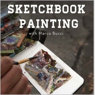
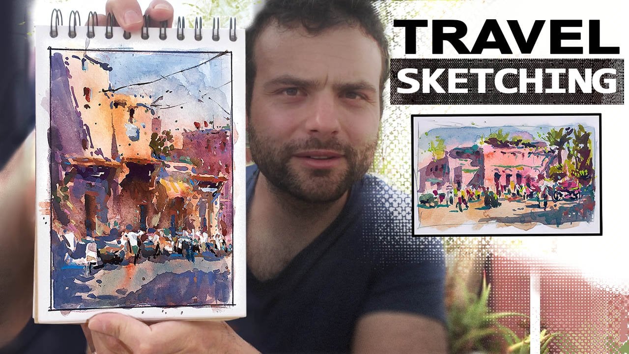
5. MarcoBucci PaintingOutdoors Demonstration4: okay for this fourth and final demonstration, let's change the medium. This is my travel sketchbook that I carry with me. Whenever I'm traveling somewhere where I can't bring a larger set up, I always have this on me. It's a little mole skin watercolor sketch book, and these are in done in watercolor and wash. That's the medium for these. I'm just flipping through a bunch of them for you. I have many of these books collected over the years, and I find little sketches like this to be great ways of keeping your eyes fresh. Um, as you travel, you know, there's wherever you go. There's a lot of opportunities to paint, and, you know, you don't always have a watercolor kit or oil kit with you. Um, you wanna have something that you could just whip out and sketch with really quickly, and that's what this set up is for me. So these sketches air from random areas that one's from Toronto Harbour Front. There's I have tons of painting from different countries in here, so many things that is really valuable to keep, keep fresh and keep studying and learning and, you know, your because the sketchbook is very small. It encouraged to try different things. Like that's an interior I probably wouldn't have painted otherwise. You know, um, I was flipping through a few of these to show you the loose type of brushwork. Almost abstract type of thing I I'm going for with ease. Um, not a whole lot of drawing required. That was very abstract. You know, not a whole lot of drawing. Just trying to get colors mixed together. And again, it's watercolors mixed with wash. I kind of combine them. I do some watercolor passes first, and then you can go opaque over it. Ah, of course. I'll show you the process in a moment. Um, yeah, you know, it works great. It's I have a couple old brushes that I use, and I love traveling with this little sketchbook. That's a waterfall trying to capture some of the edges as the water rushed down. You know, just all types of different light effects. You can try and get very quickly, and what it does for me is it really boosts. My confidence is a painter because you because you are painting mawr. If you have a small sketchbook like this, I find myself painting more and more. And what all that does is just boost your confidence. So whenever you're working in a watercolor or a studio painting, you feel like you understand. You know what you can do with color and things a little, you know, a little stronger once you have a whole lot of sketches under your belt. So for those of you who, um, maybe don't do so much of this, I would really encourage it as a means to better your entire skill set. Do a lot of small studies like this. This is with Scott Christenson, who is actually one of my favorite painters. He he was the one who showed me these, the one who showed me small studies. You know, I had always done larger studies before this. I went to a workshop with him and ah, he said, you know, don't paint big paint, lots of small ones. And from then on I was hooked on small studies. So I'm outside here in ah, again on Lakeshore in Toronto and what's behind me? There is actually the subject. I end up painting, So here's a still shot of it. Now take a look at this. There's about 50 trees, about three billion leaves, footprints in the sand floorboards on the boardwalk, umbrellas everywhere. Little fence posts. There's a 1,000,000 things here. My sketchbook is about five inches wide, so here's what you have to see. Shape one shape, too. Shape three and shape for, and each shape has a corresponding value relationship. If you get those four shapes in there, trust me, you will have a painting that looks good and then within those shapes, then you can experiment with little things like little color temperature shifts or things like that. Okay, so let's see what I can make of this. So this is the set up. It's in a little hiking bag. That's the mole skin watercolor book. Its key that you get the watercolor book because you want to be able to hold washes right. Otherwise, the the paper will crumble on. You just have a regular pencil. That's a little film canister that I put water in in ah, old brush case with some old brushes. I have, like, two or three of them that I use different sizes, a square rush, round brush, whatever you have lying around. That is a ah, the brand is she monkey? I don't know how to pronounce it. So it's a watercolor palette, and you'll see that how I clipped that to the book in a second actually stole this idea from James Gurney, who is another fantastic painter and blogger. Look up Gurney Journey for great insights on painting, and he posted this a few years ago, and I totally stole the idea from him. So credit to James. But as you can see, it clips on really nicely. It's like they were made for each other. And there you go. Travel sketchbook, travel studio. Ah, you could sit down or stand up. You don't need an easel. It's perfect. I love painting this way. So I'm just doing a quick sketch. Um, that's that's whitewash paint. So the what you see there is Ah, those pans are all watercolor dry watercolors, and I'm just adding water to them now to kind of activate them. Um, and then the white gua sh helps me to make opaque color. Oh, also the colors at the bottom. There are some glass colors to the pans are all watercolor than at the bottom are quash. And then that's the whitewash. I just put a wash of kind of a yellow car. I don't know what my colors are. I just have random colors. So I'm sorry. I can't tell you what the actual palate is. I don't even know, just warms and cools. That's how I think anyway. So I do a wash of a warm color first just to kill some of the white page. It dries very quickly, especially in the sunlight and mixing up a dark right now with, uh, I think that's Payne's gray, which I'm adding some, uh, which is a cold gray that I'm adding some reds into it, and yellow is just to warm it up a bit. Maybe a few purple, a little purple color in there, too. And what I'm trying to dio is get the effect of the mass of trees that is there now when you're painting this small, the name of the game is really simplification, even more so than in ah, larger watercolor. Like I've done previous to this, you have to simplify things into just masses and simple values. So what in reality is like 50 trees? I'm gonna try and paint in one blob. Okay, One designed blob. That's what I'm doing now. I'm working in a ah wash of kind of transparent watercolor with There might be a bit of washing their but it's mostly transparent. And I'm just trying to capture a shape. Of course, I'm leaving behind the white building. These sketches move very quickly. Um, because they're so small, you don't have a lot of time to get too literal with them. In fact, that's the challenge I had to overcome when I first started these, I would try and do too much, and it would just kill it. Um ah, you have to actually do less and just be abstract. So this is a sketching. Small is a very good exercise in abstraction, and doing that will help you a build your confidence. But also it will help you learn the kind of the mentality of simplification. And, for example, I'm confident in turning 50 trees in tow. One blob. That's that's kind of a skill you need to develop a zone artist. Um, I think again, it was Richard Smith who said, Ah, Richard Smith just has a lot of great quotes he said. Something about painters don't actually Seymour than other people they see less. This is, I think, what he means when he said that was Ah, you know, 50 trees could be seen as one blob and still read his trees anyway, mixing up a relatively opaque pass of a lighter color, which I'll put. I'll just hit the tops of the trees with that, just to get a bit of an effective the light there. But again, I'm trying to see them is one big shape, so I don't want to fragment it too much. But one thing I am doing is playing with color temperature. I just mixed up a cooler green, as you can see, and I'm putting that in there, mostly in the distance, to try and help bridge the temperature gap between warm colors upfront and cooler colors. As you go back into the horizon, you can see how I'm mixing that right into the same pool, and you can see how when I apply it, it's creating a really nice transition from warm colors to cool. Those are just some buildings in the background. I'll probably introduced that color Yeah, a little bit more into the middle ground area just to help it. Now the nature of wash pain it's opaque. But because I'm using a bit of water, it's going to dry. It's going to be a bit transparent. It's a bit of a tricky medium. You have to kind of get used to how it works. But when you put down a color, it doesn't necessarily have total opaqueness. Total opacity. Sorry. That's why I'm not an English teacher. Um, yes, you have to just play with it. You know, it took me a while before I started to understand the character of wash pain. Um, wash pain often drives a little darker than when you apply it. So another thing you gotta watch out for a bit of a funny medium. But it's great to travel with, and it drives really fast. And the nice thing about wash to is you can re wet it. So once it's on there, if you want to say blended or paint over it, you can actually re wet the guac on the page. It's really nice. So, uh, I'm using my wash as ah to stand in for the sand colors. It actually works quite well for that. And I'm just painting the boardwalk here. You know, the painting has a read already. I'm just a few minutes into it. Um, it's a really nice area. It's actually the back of the Sunnyside Pavilion. The very first demo in this video. This is the back of that really nice boardwalk area. I'm using a round brush. Probably number four, number six old escorted brush that I just happen to have. Um you know, I just use that for everything. Used one brush for everything You don't Don't get caught up. I do have another brush there. You can see kind of in waiting if I ever need a square brush, but I don't end up using it in this painting. Other times I do. It's all depending on your mood. Really? This sketchbook is is less for you know, I I don't sell these paintings. I don't. These air Just these air. This is a journal for me. This is a visual journal. I'm not even after accuracy. Really. I'm only after impression, You know, I'm just trying to capture quickly. What I see. Because it for me it's a travel book. Really So when I'm out traveling, I just want to be able to remember what I've seen instead of using a camera. This is this is my camera. You know, I try and do it this way, and it helps me really remember vividly being there. You know, when I looked through these sketches, each one of them, I could have done the sketch five years ago. But it instantly brings me back to that moment, and that's why I really enjoy doing this where my watercolor ones are a little more about accuracy. I do a lot more drawing in the water colors, but in these sketches, the success depends more on how simply you can group things into masses, the fewer, the better. And then within that you can play all you want with color temperatures taking cues from real life. But try and see how much you can get away with, you know, see what's too much. See what you need to pull back on. Treat it as a time to experiment. So I have a cool color on the brush, just trying new Um, it's a darker color, just trying to put some cooler shadows from the trees, the mixture I'm dipping into there. Those are my glass colors. That's a a wash green, yellow, which are opaque. And it helps me. I mixed those right with the water color. You know, the two mediums blend really nice. Just restating a bit of the greens and the trees there. Um, the other thing about this medium is like water color. The more you go over it, the muddier and uglier it gets because wash paint actually has a thickness to it. And you'll your building up thicknesses, you go. And it really starts to get ugly them. The more layers you put on So, uh, the medium kind of forces you to work quickly and kind of get out of there as soon as you can, which is another reason I like it. You know, these quick sketches should be fun. And for me, part of being fun is to keep it fast, especially when you're traveling with with friends or family who aren't painters. You don't wanna have to make them wait for you for an hour. When you paint something, I find this. Ah, actually kind of built this set up out of necessity because I used to bother my travel, friends and family a lot with my incessant wanting to paint. Um, and they all get annoyed at me, so I had to devise a set up that was fast. And this was it, actually pay a sketch like this exclusively for years. I didn't do any larger pieces, Clay. I kind of fell in love with this method, Um, which is a bit shortsighted, you know, I should have kept doing the larger stuff, because that's a skill to you need to know how to deal with problems on a large scale, whereas in a small scale like this, you can get away like see, these abstract brushstrokes I'm making You can really get away with that. And they have a charisma to them were, whereas in a large painting, you can't really do that quite as freely. You have to design a little more in a large painting. Um, but in in the small painting, really, as long as you have your big design shapes in ah, you can kind of go crazy with little abstract marks and it actually works for the painting . So two different beasts painting small painting, large both worthy of your attention as an artist. So just again restating some of those cool colors there in the back. Same brush, you know, I am. I use my film canister of water to also wash the brush. That water gets really dirty. But that's OK. I mean, again, these paintings aren't about ah, accuracy. As you can see, my shirt is a very important message that we should all know as painters. I actually wore that shirt by accident, but it turned out perfect for this video. Um, so I'm almost done here. I will sometimes feel the need to add some, um, pure colors with, uh, with some pastels that I carry around. And I'll show you that in a 2nd 0 I think I'm just putting in some of the umbrellas that air there. Just a bit of a greener touch, a couple of last touches. And you know, this one should be finished pretty soon. I never really spend more than about 20 minutes on these because again, if I do spend more than 20 minutes, chances are in building up the layers too much, and it actually starts looking ugly just because of the squash paint doesn't look good when it's too many layers on top of itself. So, yeah, there you can see the umbrellas that I was painting. There's the pastels I was talking about. Um, I just have, you know, a selection of oranges and greens, reds blue, and I'll just put that in. I wanted to lighten up the boardwalk. The wash dried a little too dark instead of layering, wash on it. Like I said, that it gets a bit ugly. Output pastel on it. That's a yellow, a bright yellow color, which I'm using to poke some light, some negative space through the trees. That's a blue one I'm using. It's kind of a darker value that I used for, ah, to punch up some of the shadow colors and then this green color. It's a light green I'll use for the tops of the trees a little bit. Not too much. I'm not trying to make this into a pastel painting. I'm just kind of punch up the colors where I feel the need. Teoh. Sometimes I don't do this. Step it all, but ah, in this video, I wanted to show you kind of a full range of this medium. So I decided to use it. And that's it. Um, I because this is a journal. I carry around a little marker, and I always ah, right. A little comment underneath in this case, um, filming this painting demo with my good friend Elissa, who was gracious enough to let me her time to film it. And I always date them too, because when I look back after years of painting, I like toe. Remember the date? And there it is. That's the finish sketch. In my opinion, these sketches are the best thing you can do for your confidence as well as your ability to quickly take a complex scene and simplify it. Well, I'm home now. I had a great time. Thanks very much for joining me. I really hope this inspired you to get up there. Pain. Maybe I'll see you in next workshop.
 Marco Bucci, Professional illustrator & teacher