Transcripts
1. Course Preview : the graphic design masterclass Intermediate level are you rated toe? Level up your design skills. So who should take this glass? Those with very basic skills Adobe Photo Shop and Illustrator And you may have already be familiar with some of the pin tool basics. Understand the layering system and no a few other basic tools, and you have a little experience using these programs or have a solid, basic working knowledge of these programs, or you've taken my graphic design masterclass Learn great design, the first in the Master Class series. Although taking this class is not a requirement to join this one, just needing those basic software skills is all you need. But this class is a natural next intermediate step. This is a practical design course meant to teach you techniques and skills by producing real world projects. We will first talk about intermediate techniques when it comes to Adobe Photo Shop, like diving deep with removing complex objects from photos and using the content. Aware Tools will then talk about photo compositions and composites and put two totally different photos together, using curves and other intermediate Photoshopped tools to make him look like they belong together. We will brush up on the brush tool on adobe Photoshopped toe, learn how the pain on realistic shadows that could be applied to a variety of situations. Way will quickly get into real world projects by tackling a fast food burger ad that is both dynamic and helps his practice. Working with typography, headlines and a affects in Adobe Photo Shop, this course includes a fairly large local design section. We talk about the power of sketching or ideas on paper or on a digital sketching app. This course even includes an extensive downloadable logo design worksheet, and we'll talk more about client presentation when to present a client's color and even exporting files. The golden ratio is a great intermediate local design concept to master and will do just that in this course and speaking of grids will not stop there will talk about the isometric grid system and work through an entire project using isometric grids to create this realistic three D illustration. And brand new to this course is an intermediate in design section will walk through the creation of a magazine, spread and cover and talk more in depth about creating strong editorial designs. Headlines and crafting compelling stories using photography. Infographics is a tough topic for designers, and it could have a steep learning curve I thought would be great To make this the perfect project to work through together in this extensive section, knowing how to craft effective ads and advertisement is a great quality to have it can help you have more success is a designer. We'll talk about how to create effective advertising as we work through an entire social media campaign. There are tons of extra project sections, including one on creating a poster using just typography. Package design is another great intermediate topic, and we'll go in depth about the package design process, including how to work with files set them up, create a rich looking package design for a chocolate bar. Graphic design is more than just creating projects. It's also about finding work and clients. I've included an entire portfolio building section when we walk through how to create studying portfolio presentations and how to build them online and offline. I hope you decide to join me for this incredible journey through lots of fantastic intermediate design topics, projects and more. Are you ready for the next level
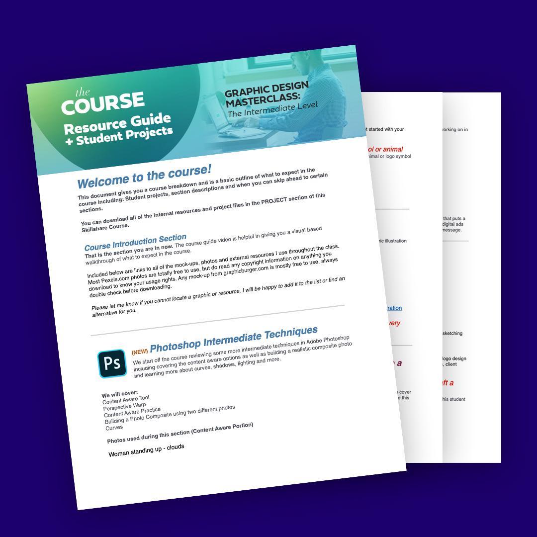
2. Course Guide : welcome to the graphic design masterclass, the intermediate level. As you know this, classes for those who already have some basic working knowledge of the Adobe design software, and you're ready to start exploring more intermediate techniques and projects. And before we get started, I wanted to make sure you know about the downloadable Resource is in this lesson you'll have access to a few different files. First off is the Course guide and Student Project document. This acts as a course outline and syllabus, and we'll walk you through the order of the course when certain project types come up and also when you might be able to skip a few sections. It also contains points where student projects come up along the way. This guide has links to external resource is used throughout the course like photos, mock ups and more. This is an incredibly handy guide. You should reference frequently throughout the course. You also have access to downloadable resource is that complement the class projects and sections There. Great resource is like the golden Ratio Guide portfolio Building resource is isometric grid templates and even an extensive local design worksheet guide that will work through in the local design section. So depending on what platform you work on two taking this class, you can download that ZIP file in the file section of the course, or you can find them right in the sections they are attached to. This course is a take it at your own pace style course and is mostly project driven. The last few projects and sections can be taken in any order, depending on the interest level for that particular intermediate topic. Also, make sure to check out the portfolio building section toward the end of the course will be working on many great student projects throughout the class, so we can build up some professional looking projects to put in our portfolio. I hope you enjoy this intermediate level design course. There's also a student Facebook group. You could join the poster projects, get feedback and even participate in extra monthly design challenges. Where I review submitted work in a live video review session, you can access that student Facebook group by simply typing in learn design, go freelance and the freelance search bar and go to groups. You can also post student questions and post your work in the community areas of the course . And if you don't have Facebook, no worries. I'm also posting these design challenges on YouTube at youtube dot com slash Lindsay Marsh . I'm also active on Instagram at Lindsey Marsh Design, so there's lots of ways to stay connected, even outside of the course platform you were on. I look forward to seeing you in the course soon as we start off with an intermediate Photoshopped techniques. You can also post student questions and toast your work in the community areas of the course. I look forward to seeing you in the four soon as we start off was an intermediate Photoshopped techniques.
3. Master Layout with Gestalt Theory - Section Introduction : Have you ever played the
game when you look up at the clouds and you try to find people, animals, or things, your brain is always subconsciously finding
patterns, shapes, and meaning to everything you look at to try to make
sense of the world. This is the basic foundation
of Gestalt theory, which stems from
Gestalt psychology, a theory thought that originated in Germany in the
early 20th century. We will review some of
the laws associated with each stalled psychology and talk about how it
relates to design. When we understand how
the human brain processes and categorizes a
series of elements. We can use that understanding
to help us craft easy to digest visual messages. Each adult theory is
really just trying to explain how we visualize
and organize information. Organizing this information is the very core of what we
do as graphic designers. So there's several
different principles or laws within each stoke theory. And we're gonna go over
these seven today. Similarity, proximity,
symmetry and order, simplicity, closure, continuation, and the
law of experience. After taking this class, you'll be very comfortable identifying several
Gestalt principles. We'll be able to get
a chance to look at tons of real-world examples. You'll even be tasked with a student project
that allows you to discover these design
principles in the wild. My name is Lindsay Marsh and teaching design
theory is my jam. I'd been a graphic designer
for over 20 years and a design instructor to over 350,000 graphic design students. I'm excited to be able to
bring this class to you today. I'll see you in
the first lesson.
4. Gestalt Theory - Similarity, Proximity & Simplicity: Let's first start
with similarity. Our brains like to group objects together regardless of
where they are placed. In this case, we
group these circles based on color, not by location. The human brain loves
to categorize things. When you look at the
following random assortment of squares and triangles, what do you see better yet? How do you see them? There is likely a
chance your brain is deciding to group
together the triangles, like in this example. Or it has decided to group
the squares together, like in this example, your brain is
working hard to make sense of the different
shapes presented. The principle of similarity
also applies to color, texture, shape, position,
orientation, and size. And knowing how the brain works here comes in handy
as a designer, we can use this principle to shape how we develop
our layouts. We can bring attention to the
most important elements in the design by making it
different than the rest. We could do that by making
it a different color. Like this example. We have two layouts. Each shape represents a photo, text or element in the layout. We are using similar
shapes in our layout. This helps everything feel
like it belongs together. This example features
different shapes of photos and content, which does not allow
the brain to categorize all the different information presented, it causing confusion. The next principle
we're going to go over as the principle of proximity. Close objects are
grouped together. Your car console uses the idea of proximity to make it easier for you to find and locate related controls
on the dashboard. You may notice all of the air
conditioning and heat are dials located in close
proximity to each other. You may also see the radio
controls put tightly together in relation to the other unrelated
controls of the car. This is a helpful
concept to keep in mind when doing
layout design. We can group related
items and the layout together so they
feel like a larger, cohesive group that
share a similar goal. This helps the human
brain organized larger amounts of information that would otherwise
be overwhelming. And the logo above, the logo on the top
is a good example of the principle of
proximity and action. The logo on the top
has the words of the company travel and loop spaced rather
closely together. I'm able to read this logo as one company name travel loop. In the logo in the middle, you see a wider gap between the two words and they start
to read a separate words, but also start to feel
disconnected from each other. The event name and the descriptor line are grouped together in the same area. You can also see
related date and location items grouped
close together. This allows the viewer
to group related items together so they can easily
understand the information. Imagine if we placed all
the information into one area without any
sort of separation. It can be really messy and intimidating for the
viewer to look at. The next principle is the
principle of simplicity. And we break down elements and to the simplest
forms possible. We see the image on top is one complex shape with
curves and lines. Instead, what our brains
tried to do is break that complex image down into
something easier to handle. And we suddenly see
three simple shapes. Instead of just
one complex shape. We see the principle
of simplicity applied to Icon
design. All the time. Icons need to be seen
and very small sizes. If we were to have a
detailed illustration for a small icon, it would not always be
easy to tell what it was. We instead simplified
illustrations down to icons that could be identified
in many different sizes. So when you take this
icon, for example, when reduced down
to smaller sizes, this simplified icon fares much better than the more
complex illustration. One thing to always ask
yourself when creating a design is can I make
this more simple? You could do this by reducing
unnecessary elements, graphics, and even combining texts that are saying
the same thing. Simplification can
make your message appear more clean and concise. Ask yourself another question. Is this graphic or element
adding value to my design? As designers, we typically feel we need to show
up for creativity. But remember, your designs overall message is always
the most important. Make it clear, concise, and rewarding to look at. So take this example. The layout to the
left is busy and complex with many different sized
elements and structures. Simplifying our
layout to focus on our main photo idea
or focal point, can help a viewer cut through
the noise, so to speak. To have an enjoyable experience. Using simplicity makes complex objects
easier to understand. The goal is to reduce it down to the point where
it's still retains its core meaning and use this clock is still
understood as a clock, even though it's just a
circle. And one bit line
5. Gestalt Theory - Figure & Ground, Closure & Continuation: The next Gestalt principle we're gonna go over is
figure and ground. We instantly try to
figure out what's in the background and what
is in the foreground. This is very important for our
brains to process quickly. And it goes back to our
hunter-gatherer days. We needed to quickly
determine what the animal we were hunting and what was in the background. This can be tough if
you're looking for a brown lizard and a
sea of brown sand, our brain looks at color and contrast differently
to find and assign objects as either either in the foreground or
in the background. This principle is evident with the classic Rubin's
vase experiment. Look at figure a. What do you see? Do you see a vase
first or two faces? What if we switch the colors? Are you now able to see both? Among darker colors,
lighter colors tend to stand out more as foreground
are elements in the front. This is true with this example. The bright orange
vase really stands out compared to the
darker purple faces. The opposite is
true for this one. In this example, if we have
a website landing page, we have a pop-up box where a user can sign up
for a newsletter. You can help the viewer better
maintain the focal point, the most important item by darkening all the
unrelated items. This darkened area now becomes the background and the lighter, higher contrast areas
become the foreground. Without giving the user cues to help determine the foreground
or the background, it can make a viewer
lose focus on what is the most important part of
the design at any given time. Now it's time to talk
about symmetry and order. And your mind tries to
achieve balanced and establish order with
everything it sees. What do you see when you
look at this graphic? In reality, they're
just six brackets, three facing to the left and
three facing to the right. But when you place the left
and right brackets together, the mind naturally tends
to seek completion. In this case, making the
form of a rectangle. When we talk about
balance and design, we're mostly talking about
symmetry and order at work. In this graphic, we have
two uneven triangles. When we make them the same
shape and put them together, it achieves a natural
symmetrical balance. And looking at this example, there's a much
better chance that the two symmetrical halves
on the left will be grouped together as one unit
and our mind as opposed to the asymmetrical
parts to the right. This logo for a sushi
restaurant features letter of equal width on both the left and the
right side of the logo. When you put both letters
together on the left, but do not balance it
out on the other side. The logo looks
really lopsided and unbalanced and it
feels unnatural. You will see magazine
covers use the same tactic, making sure to balance the article titles
on both the left and the right sides instead of listing all of them
down one side. This helps to achieve balance. The principle of closure. We like to fill in the gaps. Take a look at the square
and the circle below. Even though they have
gaps in their strokes, we have no problems filling
in the rest of the shape. To complete it. The circle could just
be two curved lines, but we still like to see it as a complete circle in our brains. In this series of shapes, what do you see? In reality? There are four pies with one slice missing
from its shape. What our minds
like to do is fill in the gaps and view this as four circles and square because it's the
simplest explanation. A practical use of
principle of closure and Design is the use of negative
space and logo design. Below is a classic example of how our brains fill
in negative space. We fill in the
open space between the E and the T to
form the letter a. The letter a is not anywhere in the active
positive space, but only exists in
the negative space that exists between
the positive spaces. The same is true for
the 0 that is formed by the shapes created by the positive space
of the T and the M. The shape below looks
like two opposing arrows, but in fact it forms
a D for direction. The law of experience. We use past experiences to
try to interpret new ones. If you're reading this, then you've learned
how to identify each character in the
English alphabet. The letter a can be presented to us without its distinct
center crossbar. And it's still view to us
as the letter a. Somehow. We are assuming it is
a letter a based on our past knowledge with how
the letter a is formed. Remember our example
of finding animals, people and objects and clouds. The only reason we were
able to do this through our past experience of
observing the world around us. We have certain expectations when we view or interact
with the design. For instance, when
we are on a website and we want to know if
a link is clickable. We know from our
past experience that underlined words typically
tend to be active links. If the text is not underlined, sometimes it's bolder or has a different contrasting
color used for the text. If we decide to make our
active links on our website dramatically
different than what's expected by the viewer. We're, it's confusing them
and confusing the viewer. The same rule applies
to lay out design. Based on past experiences, we typically see company
contact information at the bottom of
an advertisement. Then doing otherwise would
seem really strange. Have you ever seen fine
print of an ad at the top? That would seem
extremely odd and not in sync with our expectations
from past experiences. With magazine articles
we are expected to read from the left
to the right page, not start from the right
and right to the left. And this would just
be an English. There are languages
that do the opposite. But what is really interesting is that we can use
this principle of experience to do something unpredictable to bring more
attention to our design. It could be adjusting our
main headline topography go up and down instead of the predictable going left to right. This could cause
viewers to stop for a moment and pay attention to something that is unexpected. The principle of continuation, we prefer to follow smooth, curved paths over
inconsistent rigid ones. And the example here, you see two intersecting lines. According to the principle
of continuation, your brain will continue
to follow smooth, curved lines even if there is a separation or another
intersecting line. In this case, your eye follows the black line all the way past where the green
line intersects. Following a smooth path. Your eye usually does not tend to fall with
the black line, then veer off in a dramatic
tangent like you see here. Rather it continues on a smooth direct path regardless
of the color change. In this example, you see
two intersecting paths. You will most likely
follow either the green or the black path all the way through
until completion. We can use this principle
of continuity to act as our signposts along the road to guide your viewers eyes
toward the desired message. A very simple illustration. This is displayed in a
magazine spread below. The model is glancing toward
the top right of the page, guiding the user
to the next page with the advertising headline. Once again, the
viewer site is pulled downward toward the photo to
the product of the chair. If we were to tweak
this lightly and have the model's eyes looking
in the opposite direction. The natural smooth flow of
the sign would be broken
6. Reviewing Strong Gestalt Examples: So these principles
are really need to understand on a
theoretical level. But let's start looking at some real-world
designs to see some of these laws and principles and action of Gestalt theory. So you should all principles are great guides to
follow as designers. And we're going to review
several print advertisements, logos, movie posters, and other projects you
might see in the wild. We can study how
multiple principles are at work and strong design. This logo, you'll
notice the law of continuation used to guide the
viewer's eyes from the top of the F down
through the rest of the word to the tip
of the leg and the K. You'll also notice the law of symmetry in order
used to balance the left and the
right sides with equal weight in the
extended tails. The tails, you see at the
end of the k and at the F. And this logo design example, if you look long enough, you'll start to see
the letters S and R and abbreviation
for the company name, Silk Road, that also forms
the chassis of the bicycle. The law of experience allows us to see
both of the letters, but also discern the shape
of the bicycle tube because we've seen the
same bicycle shape many times in our lifetime. And this logo example, simplicity is at play here. We read this word as
the full word, happy, even though there
is a curved line that is substituted for the age. The law of experience
also indicates that this slightly curved
line represents a smile, which then makes the word have
intended meaning of happy. For this logo closure
allows us to see the a shape created
from the safety pin. There is no crossbar in the a, but we still are able to
see this as the letter a. For this logo. What seems to be a random, messy accident of shapes ends
up representing a cloud. Our brains are
marvelous at locating everyday objects
and a pile of goo. Gish stalled
principles never age. That's why it's so important
to really study these. Here we encounter a
series of advertisements, mostly from the
1960s and the 1970s. And it proves that
classic design and layout never gets old. This is largely because
the way our brain organizes and handles
information doesn't change. This advertisement
for Jaguar from 1964 represents a time
and advertising more subtle messages spoke
louder than large headlines. It was an understated
approach and was unique, new way to present products. Figure and ground principle is applied here with a
dark black color, creating an obvious background. While the car and the white text functions
as the foreground. This high contrast
helps the product, the car, to be the
main focus of the ad. The law of simplicity graces itself with a
headline that focuses all of its attention with its small size and
clear background. It is simple, clean, organized, and makes me feel
good when I look at it. The Ford Pinto may have
been an awful car, but the advertisement
does work well to draw your attention through
the use of continuation. The striped lines run
throughout the entire ad, directing the focus
first on the headline, then to the cars, and finally down to
the final ad copy. Everything has an order. And this law helps to bring that order about
through graphics. This tobacco ad, it's an old Russian ad
where we see the legs of the gentlemen create
letters that spill the word. This 1974 Bell Telephone add. We see the headline use continuation to completely
move the viewer's eye from one page to the next with a headline ending with
additional ad copy. This car ad from 1973
we reviewed before. We tend to like to group items together with the
law of similarity. This ad groups like
items by color AT pairs, the red square of
information with the red car and the yellow box of information
with the yellow car. Because of color, we pair the right car with the
right information. Movie posters really have
to grab our attention. This one also uses the law of continuation to move you from the movie title all the way down to different
characters in the movie. This provides the viewer with
an experience that entices them to find out more about the movie and these characters. In this movie poster, which was a creative deviation
from the official one, uses the law of
symmetry to commit to a balanced focus design with equal weight on the left
and right side of the ad. This is a book cover that
uses figure and ground, is a two faces or the
smoke from the rocket ship
7. Gestalt Theory in the Bookstore & Beyond: Gestalt examples are
everywhere and I love to visit my local
bookstore and look at all the book covers
and really find out what principles are
at play that make these design covers awesome. This book really experiments with figure and ground and that in-between space of trying
to figure out what's the foreground and trying to figure out what's
the background. And this playfulness, if
you will make some really, really intriguing book cover, you can tell with
the words that are integrated with the
subject matter. Sometimes the words are on
top and the foreground, and sometimes they're
in the background with the bunny
rabbit popping out, out of certain letters to almost make it look like
it's in the foreground. So this play with the
figure and ground, the background and
the foreground, it makes for a really, really intriguing book cover. This book cover uses
symmetry to create an incredibly strong
focal point at the very center of the book
with the colorful paints. They also put some
very vital texts and the inside of this focal point
so that you read the top, get out of your head and then your eye moves
toward that center. Symmetrical focal point also uses figure and ground to get your eyes to
look at the arrows, but then also invites no pun
intended with the title. So you have this interesting
back-and-forth between what's foreground and
what's background. And it makes for a really interesting
book cover that way. There's also the law
of continuation here. It has this very
strong diagonal. Notice how the arrows
are going from the top right to the top left, and the letters
are going from the top-left to the top right. So it's kinda got this
interesting design tension using these basic law,
laws and principles. This book cover uses
the law of experience. If you were to just look at the center of this book and not focus at all on anything else is stare at
the center of the book, you may see just a collection
of different shapes, maybe some that have right
angles, maybe some circles. But really when you study this, you can absolutely
read this very easily. You can read each
letter in each word. Because of our law
of experience, we know that these are
the very basic shapes of classic English. Characters. Were able to read it, but
it also can be abstract. It can almost look
like art in a way, and our brains can
still make it readable. And this uses the law of continuation because these
are two separate books. It's the first
book in the series and the second book
in the series. And when they're displayed
in the store like this, it creates one single face. And I thought that
was absolutely incredible and what a
great and brilliant idea. This one uses symmetry
in order to create a very wonderfully powerful
center aligned piece where you have the
eyes and the face of the subject matter
right there in the center, as well as the topography. And because of this
amazing symmetry, you can get away with a little bit more spacing
between the title words. Normally you'd want to
be able to keep those together to maintain
readability. And that would be the
law of proximity. When things are close together, we group them together. But because there's such
symmetry with this, we can read the title very easily even though
there's spaces, big spaces between the words. We can see the principle
of continuation here with all the
interconnected lines, everything kind of goes back to that center focal
point in the circle. And instead of being all these random circles
that are unconnected, you have these lines that
allow you to move throughout the whole thing and it draws
your eye towards the center. And you'll notice a lot of times you'll see the law
of continuation use. I probably use that more as an example in
design because that is an incredibly powerful
tool and you see it very, very frequently and designs. There are times as a
designer we want to break these laws and break the rules to create positive
design tension. So that means there's tension built up in your design that intrigues the person to want
to continue to study it. And this is a wonderful
example of that. Breaks all sorts of laws. At breaks the symmetry
in order law. There's nothing symmetrical
here with the topography. It also breaks the
continuation rule. There's no continuity or
flow within the topography. It also breaks with proximity. The letters are not together
even though it's the title. But I can still read this, take up and read. I'm able to read it, but it takes a
couple of seconds, but it makes me want
to stop and go. What is this book? What is
this design? It's interesting. So there are times where
we intentionally and meaningfully break some laws to bring attention and a
standout among the crowd. Here's another example to
reiterate what I was saying in my last point is
this example where you have a really low
contrast between the wolf and white van letters and
the background lines, which makes it at first
kind of hard to see But it was all very intentional. It's to intrigue you to look
at it a few more seconds. It's not super obvious, but it is very, very intriguing. So I picked up this
book out of a sea of other very boring books that
had normal readable titles. So that's another
reason we're okay. How can I break some rules of design to make my book
look interesting? You can see a nice figure
and ground here where we have this very
strong foreground with the black stripe across it. And then you have a higher
contrast white background as the background. So you have a nice figure, nice ground balance so
that the whole book isn't trying to get your
attention using the same color. You have this nice
contrast and balance. And a lot of times when I have
a design that's looking a little busy and
it's got a title. Sometimes they'll put
a very dark or light, whatever the height
higher contrast color is, and put that behind the title to cut the design a little bit. So you're not just looking
at one big square, but you kinda have
it chopped up in your brain so that
there's a little bit of help to help you break down the title away
from the background. So here's the law of simplicity. Instead of using complex
cooking utensils and putting a real picture of a spatula and all the knife and
all these other things. They simplified it
into simple icons so that it didn't take away
from the very simple words. So the simple icons paired
with a simple topography mix, a really clean read. That even though this
really strange half circle is between the L and the W, that I read that as
an 0, so 35 below. But there's also this
interesting action that it takes place as it's sinking down below
the other characters and below the baseline. It actually has a sense of
it's sinking and of movement. And it makes it really dynamic, even though all they're doing is lowering the circle
and cutting it in half. But I think the portrayal of movement here is interesting. In this poster I created dance. It looks like it's, you have
the n as the second letter. But because of the
law of experience and because the woman is
actually dancing, I'm able to put together
that this says dance, even though the n and the a look like they could
be out of order. I move from the D to the a, then down to the end,
then the C and the E. And I'm able to, my
brain is able to simultaneously within a second
go. Okay, that's dance. There's a woman dancing
and the word dance. It can be out of order. You can play around with
typography a little bit more because of this
law of experience. I was at Starbucks
this morning and found this nice array of three different package
design for a coffee. And I noticed there's a really strong
symmetry in order here. First of all, you have
nice figure and ground. You have a nice foreground
and a background defined because
of high contrast. But there's also this
beautiful symmetry in order with the white oval, but also the top and the
bottom topography that is also perfectly symmetrical and they end at the same level
with the.in the center. So everything is
perfectly center aligned and it just
really draws my eye there to the name of Coffee is actually a student
project that was submitted, featured it on my Instagram
because I really enjoyed it. But it has a nice
figure and ground, as you can see, there's
this background on the top and the bottom. They put this nice blue
high contrast box. So you almost, when
I look at this, I see this as two
digestible halves. I have this top half
with the product, and they have this bottom half. And I'm also able
to read if this was all and they do this
a lot and package design, if it was all just
one color or all, just that background that you see at the top throughout
the whole thing. I might lose the
cookie or I might lose the title or the
name of the product. And because she was able to use this nice foreground elements, she was able to break
that foreground and the background and make it way more digestible
than it normally would be.
8. Student Project: So as you can see, I love finding
inspiration by going out, taking pictures of designs that I feel like I
connect with and I feel like I have some really good design theory
principles at work. So that's gonna be
your student project. I want you to go out
to the bookstore, to the grocery
store where there's package designs and
there's wine labels, or anywhere out in the mall, even a banner that's
hanging up on a billboard. And I want you to take
pictures of things that you feel like have
strong design principles, especially ones that
exercise Gestalt theory. What I want you to do is almost build a folder of
different items. You can even make this
a journal if you want. However you wanna do this, but I want you to
take each one of the pictures that you take. And I want you to
figure out a couple of the laws or principles
that are applied. So if there's the law of symmetry for a certain
poster design, I want you to make a note of that and go, well,
how does it work? Why did this really speak to me? That's what I
want you to do. Just go out into
the wild and take some pictures and discover some of these principles
at work because these principles are about
how our brain works. It's about human psychology and how we digest information. So if we understand these laws, then we're gonna be
able to understand the human psyche and
we'll be able to know how people look at
things and how you look. It's a random
assortment of letters and shapes and colors and we
somehow make sense of that. And how we can unlock that and how we can
understand that will make us superior designers
because we are not just creating random
shapes and letters. Everything has intentionality. And everything is either
playing with our brain and a good way or helping our brain digest all
this crazy world, all this crazy information. So I hope you got a
lot out of this class. I can't wait to see
kind of some of your ideas and examples. You could just post it in
the student project section. You can just post a few pictures and then
just say underneath, what laws are, what
principles do you think that design or that picture
you took of that design has? Let me know what you
think of the class. Leave a review and I can't wait to see your projects
and see what you discover as you go out and look at the world
in a different way?
9. How Much Do Graphic Designers Make? Introduction: So I spent some
time doing a lot of research to figure
out two things. I think there's two
questions here is how much do graphic designers make, R can make, and how
to make more money? And I think the second
one is even more important than the first
because a lot of us are going, well, can you make a good
living as a graphic designer? And the Hooper short
answer is, absolutely. Let's do a quick overview of how much do graphic designers make. And I put together this
chart and did some research. I went to indeed.com,
upwork.com, glassdoor.com. Always like websites
where you can find out this generic salary information. I even did research on Facebook groups and as
several of you guys, How much do you make as
full-time graphic designers? And I thought that provided
a lot of real insight too, because some of these
websites like glass door, they give a generic salary. And I really wanted to
find out how much do real full-time graphic
designers make. And I got some really
interesting answers. And I think what's
complicated about this as I have people from Australia
answering Canada, the UK, Brazil, and all of these have different
currencies and cost of living. So if you make 50,000 and
urine the United Kingdom, that might be better than 50,000 in the United
States and vice versa. Same thing with
Canada and Australia. The Canadian dollar
is just not worth as much per dollar
than the US dollar. So it's kinda complicated. So just to kinda make it
a level playing field, I will be talking in US dollars and in US
currency for this video. One of the biggest
things to remember is how much experienced factors and to pay of a
Graphic Designer. The first few years of
a graphic designer, just like the first
few years of a lot of careers is not a
high-paying salary. And that's to be expected
out of this industry. I'm going to break it down
into two different salaries. So an in-house graphic designer gonna be working
a part of a large or a medium-sized company that has the money to hire a
full-time graphic designer. You're going to be part of
the marketing department. Or if it's a small
enough company, you're probably going to be the marketing department
or be a big part of it, or work with a
marketing coordinator. And then there's
freelance graphic design and you're kinda have a
lot more freedom here. And it's a lot harder to get started, but you're on your own. You can make your own salary depending on how many
clients you get, how much you can charge. It's really, everything is open-ended for freelance
graphic designers. For in-house graphic designer, your income growth is
steady and gradual. You get slow raises over the years as your
experience gets larger. And he continued to do
good work for the company. But income is kept
at a lower rate. But income is more stable
and he had benefits. So you have health insurance,
you have retirement. Those benefits are
really helpful, especially me as I
spent 20 years as a freelance graphic designer
without any benefits. And let me tell you,
benefits are expensive. So it's good to think about that when you think
about the salary, you get a base salary, but you also get
other things on top of the salary that are
still very valuable. But your income is kept as an
in-house graphic designer. You can only really make
the average industry. I mean, if you work for
a really large company, they're gonna go back and continually look at
the market rate for a graphic designer
and pay you within that range because they don't want to overpay any employee. So big companies, they don't want to spend more
than they have to. Your income could be kept a lot here isn't in-house
graphic designer. But then you also get the
stability as the benefit. For freelance graphic design. It is wide open, but the pay at first
is incredibly low. You might not make any money for three or four months as
you build a portfolio, as you try to find your first clients and
your first few clients, you may have to
charge a lot less than you really want to just to get something in your
portfolio or just to get maybe some referrals
from other people. And so income is lower
in the first few years, but it can go much
higher in later years. There's no price ceiling. I was interviewing some
people and asking what their salary was as a
full-time freelance designer. And there was someone
who was making 60 K as an in-house designer, but then they went freelance. They have about ten
years of experience. Now. They make 200,000 as a
freelance graphic designer, doing branding work, which
is usually what you'll find. Those high income
freelance designers are usually doing that high
level work like branding. So let's break
down hourly rates. So in-house graphic designer and makes 23 average per hour. And then a freelance
graphic designer can make more at $25 an hour. But then again, it scales with experience that depends
on how many years of experience you have dramatically changes how much you get made. So how do you make more as an
in-house graphic designer? We're first going to
talk about in-house, then we're going to
talk about freelance. You're working at a company, you have a salary, you
might have some benefits. So this is the traditional
track of a graphic designer and how you slowly get promoted. The first one is usually a
junior graphic designer, especially if you're
at a medium to larger size company and they
have multiple designers, you're going to be the junior. You're gonna be like not
the best in the house, but you're just getting started. Maybe you just got out of
college, maybe you're just Getting rolling and
the average per year based on indeed.com was $42,820. So you might be able
to pay your bills, but it's gonna be tight. So the best way to break
out of the income range is to move up that graphic
design job ladder. And the next natural thing
is senior graphic designer. So you might be managing a junior graphic designer or you might be the
only graphic designer, but you are experienced
and you can have that title and a bump in pay. So usually you get
back up into the '60s. Of course, this is
all US dollars. All that changes
when you start to explore other countries
and other currencies. And then the next thing, the next move up
is art director. So this means you
definitely have some other creatives
that you're managing. And you might be managing more than just
graphic designers. So this starts to
break a little bit out of the traditional
graphic design job title. And you might be an art
director that needs to also direct maybe some
ads that are video-based, or maybe some social
media campaigns. You're going to move a
little bit beyond just doing logos and flyers
and billboards. And then lastly, if you're
part of an ad agency, a larger agency or
a larger company, they're going to have
a creative director. They're going to manage
multiple projects at one time. They're going to manage
everything that is considered advertising or marketing that
has a creative flow to it. So videos, print
ads, magazine ads, all this kinda stuff,
even events and conferences doing some of the
branding work for that too. So that's $98,077. That's not bad, That's almost six figures, and that's an average. An average, averages
tend to be lower. You have people that
make more than 98, yet people that
make lower than 98. This is a very
traditional route. If you are looking
for stability, this is a nice root
to get a part of. The larger the company, the more possibility you
have to move up that ladder. Okay, So this is great
to find out what is the traditional
hierarchy and movement of the graphic design
promotion ladder. But how do I move higher in
this graphic design chain? That's the real question here. And I'm gonna give you
some tips on how to move through a design job
ladder with ease. Each Evolution brings more
and more collaboration and less time
working on your own. Being a good manager of people and reigning
in their best talents and expectations is paramount to move through this ladder. So as a junior graphic designer, you don't make a lot of money, but some of the things
that you could do to be really good at your job and maybe get some races is complete task given by
your team managers. So just get everything done and do it a good job
at it. So that's it. That's pretty simple. The next one is beat deadlines. So okay, I need
this by tomorrow. You get that project in by tomorrow and maybe even
earlier if you can. Don't stress yourself out
but just showing that, hey, I can complete
tasks on time. So you can tell the expectations are a lot lower with this, but they will get
dramatically higher. Create work that goes
beyond expectations. So even though your
junior graphic designer do senior graphic designer work, you have to do the
level of work. The next job up to prove
that you're ready. You might not be ready
that first year, but that second or third year as a junior graphic designer, I'm in work your butt off
and do some amazing work. And then hopefully your
talents will be realized. And when it comes up to
maybe a possible promotion, you can get that senior
graphic design designer title. So as a senior graphic
designer, you make more money. But of course, with each
one of these races, you're gonna get a lot
more expectations on you. You're going to gain
larger project experience. So you're going to
move beyond just doing a social media ad or
doing a billboard, or doing events signage perhaps, or a label for a product. You're gonna go a
little bit beyond that. And so that might be
more digital projects. Maybe you're managing
something with a website, the front end part working
with a front-end developer to kinda help with
graphics for a website. Perhaps you're doing a product
design and you're part of designing the entire
package of a product design. These are all This next level senior graphic designer stuff. So you're gonna be
able to manage, you need to manage long-term
projects and meet deadlines. So you're going to
need to manage longer, bigger, or larger projects. They're not gonna be
something you do in a day. It's gonna be
something these could be month long projects. We're going to take
initiative to bring up ideas for overall
project direction. So you are going to say, Hey, I have some ideas and
I want to be heard. It's not like I'm just receiving the ideas and I'm doing
exactly what you tell me too. This is taking that initiative
to say I have an idea. This is how we could do
it better because I have a couple of years of experience and I know how this works. I know it's going to resonate
with the target audience. I know what's going to
really sell things better. And also complete a wider array of project types of
already did that one. So what's next starting to make the big bucks
as an art director? Well, you're going to have
a lot more responsibility. You're going to have to manage multiple creatives in a team So you're good and manage
somebody as an art director, There's never just, Oh, you're an art director
and he handle everything. Well, you'll just be at
senior graphic designer or an art director
needs to be able to manage a team of people. And that's going to
take some experience and some time to
get used to that. You're going to
have to be able to maximize the talent of
your creative team. We're going to have to
be able to motivate them, encourage them, really find out
what their talents are and maximize those talents. And you're going
to have to be very intuitive with finding out and getting to know your
team how to do that. Then you can create
projects that make clients exceed their goals with
real-world results to back it up. So you are exceeding
all expectations, but then you also have
proof to back it up. Okay. This project, this, the YouTube video we did or whatever
project that you managed, you can track it and say, okay, we increase sales by 200%. And having that data point is really important when you
want to go to that next level and get those races and
go up to the last part of this job ladder is
being able to do that, but also have quantifiable
proof that you are doing some great work and making
the company money and selling products or connecting
and selling services. So what's last on this
job chain ladder? The creative director,
This is the big one. This people spend
about ten to 15 years trying to get this
position at ad agencies. Either ad agencies
or larger companies, which are gonna be the
only ones that can employ a creative director because
they are expensive, right? So you're starting to get
that six-figure range. They're going to expect
the world out of you. And it's going to take a long
time to try to get here. So this isn't something
you're gonna do in two years. This is a decade or more of work to work toward this
part of the career. So at this point you're managing multiple large-scale projects
at one time with ease. So you're going to have
a team doing this, you're going to have
a team doing that. You're going to have
a team doing this. They're all, you're
going to have to manage all of them
simultaneously. And then we're just
gonna have one thing. There's never just one
branding project you're doing. You're gonna be working with
three or four other clients at the same time and
managing separate teams too. So you're not just
managing a team, you're managing multiple
teams are multiple projects. So anyway, it kinda like a
project manager for creatives. Another thing is you
need to be good at managing difficult creative
conflicts and a project. So there's gonna be a lot
of creative conflicts. I have an idea and this
other person has idea. They're both great
ideas and they need somebody to be able to say, all right, we're going
to choose this one. You're the one
that makes all the final decisions and passes those decisions down the
line to execute a project. So you're gonna be
needing to make those leadership creative
decisions to say, alright, Johnson,
it's your idea, you want that kind of thing. Need to manage
projects alongside non creatives to increase
client satisfaction. So when you're at the
creative director level, you might be directly communicating or having
meetings with clients. And clients are
non-creative people and they're going to
have goals and ideas. You're going to have
to take those goals and ideas and add that creativity with your team and make those goals happen. So you're kinda combining
the creativity side. You're combining
the business side, and you have a lot more
relationships with non creatives that
you're going to have to utilize to complete
your projects. You might be working with
highly technical people. Maybe coders are
part of a website. Maybe they're not the
creative side of people, but you're going
to need to be able to work with them to get those creative goals completed.
10. How Much Do Freelance Designers Make? : So we've talked about the traditional graphic
design route, how to get promoted as a salaried graphic
designer as part of an ad agency or a larger
organization or non-profit. But I want to talk
about the other way to make money as a
graphic designer. And this is the one that has a lot of endless possibilities. And that is growing your income as a freelance graphic designer. And there are two
big things that contribute to income
growth as a freelancer. And getting your hourly or per project rates up is paramount. So how do we do this? So number one, you
can gain years and years of experience
in social proof. Time and good reviews can
help you slowly in general, your prices beyond
in-house or salary levels. And this takes once again, years of effort and experience. Number two, you can
expand beyond the basics. So go beyond just simple
design projects and expand into brand design
and marketing strategy. Just one example,
but we'll talk about other different
avenues you can go down to expand beyond just the traditional
rapid design offerings. So one of the things I
love to do is to go to upwork.com and research
graphic designers and how much they're charging, How much some of the top
reviewed people are charging. What are they offering? What
are the ones that are really successful and able to
offer 50 or 60 or 70, or even $100 per hour. What services are they offering? That's different
than what I know and how can I get to
know those services? So a lot of times you might see brand design offered
with some of the ones that are charging
75 or higher per hour. So let's just quickly go to Upwork so I could show
you how it's done. I'm on upwork.com
and I'm going to be able to find some talents. So let's find some talent. I went to hire a
graphic designer or a freelance graphic designer. So I might just need to go
ahead and type that in. Let's just say graphic designer. And I'm going to type that in. And I'm going to
figure out what is, what are people charging
35 and our 35 an hour. 40 is a great way to do, to do research, uh, 60, 75. And you start to get into these beyond $50 an hour
and you start to go, okay, well, why, how are
they able to charge so much? What can I do to charge
that much myself? And you got the template
right here of success. And you can study these silica. She charges $75 an hour. She has a really
good rating score. She's made $10,000
on the platform. Of course, there's way more than Upwork to make
money freelancing. That's a whole nother video. But let's just click on
her and see what does Emma do in South Carolina? What does she do to
make so much per hour? So she just Squarespace, so some web design
stuff and branding. So those are kinda
branching out of just logo design
or branching out of just billboard design or doing an ad or a
flyer or a poster. She's branching beyond that. So she specializes in so she
has a specialized skill. She's spent a couple
of years honing in a particular skill and Squarespace and web
design, super in-demand. Also, Webflow is
another website builder that doesn't require tons
of coding knowledge. And what does require
tons of design knowledge, which you guys probably
are working on. So that's something to
explore is to maybe add Webflow or Squarespace as
one of your offerings. She also does brand
identities and logo design. So once again, branding
work going beyond the logo, which I actually teach
a class on branding. Kinda going beyond just
looking at designing a logo. It's way more
complicated than that. Adding some branding work has helped her charge
a lot of money. So let's look at some
other entries here. And this is just so good for research because you
have everything right here to know what it
takes to be successful. It's all right here,
the template is here. So she's an accomplished
graphic designer, 30 years of experience, so she's able to charge $6
an hour based on experience. She's skilled in InDesign, Illustrator, Photoshop,
all these kind of things. She also has experience
and other software, so she's expanded her
software repertoire and she specializes in
digital illustration, print, and digital collateral. She does publication design,
t-shirt, graphics, cartoons. So just a really, probably a really good Let's
see if there's a portfolio. So she has some portfolio of work here that you
can look through and kinda see what the quality is of people who
are charging a lot. So this is interesting,
$45 an hour, it's not bad, It's a
great way to start. So let's check him out. So he specializes in
YouTube thumbnail design. So if you're a video editor and YouTube thumbnail designer, you can spend a year hyper
studying YouTube thumbnails, how to make do AB split
testing on videos to find out what thumbnails, $50 an hour. That's very respectable
as a freelance designer. Lets see what he's done. He's an art director. So once again, he's
probably moved up that job chain letter
at some point in his life as a salaried person. But he's an art director, so he does a little
bit more than just graphic design work. He manages creatives,
are manages larger projects and 20
years of experience. So you'll notice a theme
here. There's a lot. You got to put some time into this to really
start making money, not to discourage anybody, but that's almost any
industry you get into. Brand identity. Once again, brand identity, branding,
that seems to be a theme. Web design also seems to be a theme with these
higher income earners
11. From $10 Logos to $10,000 The Long Journey: So we've talked
about two ways to increase your earnings as a
freelance designer and that's getting experience
and social proof and also expanding your services. So I wanted to talk about
kind of the time thing and experience just like we witnessed
with the Upwork people, how it tends to
be when they have the five to ten
level experience of years that it tends to really dramatically increase
how much you can charge. I wanted to talk about
my own experience with logo design and I guess you can say branding toward
the end of this chart. If you're not happy with your
freelancing pricing power right now in your
first-year freelancing. Just give it time. And I don't want anybody to
feel discouraged because it takes time to really
become good at your craft. You can't learn
graphic design in a month and then
charge $75 an hour. There might be the
2% of you he could do that because you just
have this natural talent. But for most of us, it
has taken me 510 years to really make the big bucks
to go beyond six figures. It's taken me at least ten
years to get to that point. And then of course it's
taken me 20 years of graphic design experience to get beyond the
seven figure mark. And that is possible
with graphic design, candy make $1 million
as a graphic designer? Absolutely, yes. Yes. Yes. So hopefully I'm
proof to that and maybe a little encouragement for you guys to stick with it. Not everyone's timeline
is exactly the same. It's not always like mine. You might go faster than me, but almost everyone's timeline trends upward with
experience in social proof, it can take time to
establish yourself as a freelancer and learning new
software tricks and styles, reading books, and
just practicing can all be considered some
form of experience. Yes, even watching this video is some level of experience. So I started rock
bottom $10 an hour. I had no experience or software
training and logo design. You can see my logo designs were not very good 15, 20 years ago. So I charged bear
bottom, rock bottom $10. There wasn't a
whole lot of money, but it's all I feel like I
could do to attract anyone. And sometimes you
feel that you're in this mode right
now you are there, you're at rock bottom. But the good news is, if you stick with it and
continue to work hard, learn something new
in logo design or branding or graphic
design every day, you'll be able to get
to that next step. So baby steps, maybe one month or two
months of struggling. I might've been able to bump it up to $20 for a logo design. I did one logo, so maybe
I knew what I was doing. I started to charge a little bit more after I got a paid project. Then you flatline
for a little bit. So $25 for a logo
which is super, super, super, super cheap. This was of course 20 years ago, but even 20 years ago, this is just almost
embarrassingly cheap. It's not valuing
yourself as a designer, I don't recommend
charging $10 for a logo, but this is just my own
personal what I felt like I had to do to get clients. So I started charging
a little bit more and all this could happen
in a month or two. This isn't years. This is like a few weeks. Then you're like, okay, why? I got like five or ten logo
designs under my belt. Let me charge $100
for a logo design. I feel like that's more fair. And there's still so much to learn at this stage
because maybe it's only been three or
four months of doing logo design or graphic design. And I have so much, I'm still learning,
I'm still learning. I'm not just doing logo design, I'm also taking courses. I'm in a community of other designers
and trying to get feedback, trying to get better. So I'm a learning and making
money at the same time. Now that I had a system, I've done maybe 30 logos or so, maybe this I'm six months
into this whole process. I had a system. I've
done this before. I know to do three revisions. I know how how to package
up the files afterwards, what kind of files
the client needs kinda working with
clients with email, I'm starting to get
really comfortable. So I developed this
logo design process and I was able to
generate concepts and timelines and developed
a client questionnaire to make everything a lot
more smoother, right? I didn't have a questionnaire
at first, right. For $10. I'm not going to even read your client questionnaire
that point, but now, making a little bit
more money I could spend some more time
makes a better stuff. I am getting some credibility. So $500 for a logo. I used prior case
studies to land larger clients and
client referrals were starting to come in. So it had some social proof. Uh, my system became
more refined. So now I can charge $500, maybe I'm at one
year of doing this. At this stage. This isn't five
years of doing this. Okay, So after I've
done $500 logos for maybe 20 or 30 of those,
I'm like, okay, well, if I can charge 500 and clients don't get worried
about the price, I'm charging too low, charging way too
low, way too low. Even $500 for someone who has ear to experience
is pretty low. So I'm undervaluing
myself as a designer. Let me see if I can
raise those prices. At several years of logo
design projects under my belt and I felt confident and offering much higher pricing. I had prior client testimonials
to prove my value. I have proof now. I'm a good designer
and not worth hiring of worth this price, right? So there's a point in
your career where even $2,000 for a logo
design is not enough. Because you have more
than just logo design. You're worried about clients or wanting to put their logo on t-shirts and do advertising and do large format
printing with the logo. And they went stationary and matching this
and matching that. And you've got to
think about branding, which is way more complicated than just thinking
about a logo design. You're starting to get
big picture here and thinking about brand strategy
and marketing strategy. And how can a branding project integrate nicely with all those, right, so that's
high level stuff. So then you need to start
charging more than 2000 years, start charging $10,000
for a branding package. So I'm in-demand. I have to say no to
people because I have a lot of people
coming my way. And when you have to
say no to people, then you can charge
the people that are available that
you do project work. You can charge more money for them because you are
saying no to stuff, right? For them to say yes to me
for to pick your project. I'm going to want
the most, right? So this of course, all took ten years to develop
and to get here. Maybe eight, maybe eight years was when I could start
charging 10,000. I'm now fortunately in
my career where I don't even charge $10,000 because I don't even do logo
design work because I make a lot more money doing
video work right now. What you're watching right now, I do full courses. I've made multiple
million dollars as a graphic designer of teaching
and this teaching space, but it took me 20
years to get there. I wouldn't, I can't
just hop right in there and make millions of dollars
as a graphic designer, it's good to take a
decade or decade or two of social proof,
experience proved myself. And also this whole
time I've been advancing my skills
beyond graphic design. I've learned video editing. I've learned how to
direct videos and paste videos and create
huge courses and resources and write books and do social media marketing and do Instagram Reels and
learning everything every day of my life
I learned something. Because of that. I want to encourage you and
get you excited about this. That if you're
feeling like you're in the rock-bottom, that's okay. Because I've been there too. Everybody starts at rock bottom. That doesn't mean you
charge $10 for a logo. That's what I did. That was my personal journey. Those were the choices that I make and I didn't
value myself when I first started because I was scared that I
wasn't good enough. I was scared I
wasn't good enough. So I charged $10.10
dollars for a logo design. But you may value yourself
more and you may start at 100. For logo design, It's up to you. It's can you get clients with what you're
charging and can you get experience with what
you're charging and just reassess that daily. Hopefully you come
away with this a little bit more encouraged
12. How to Make More and Level Up Your Design Skills: And sometimes graphic design
as a career can lead to your success and higher
paying fields later on. So what we're gonna
be talking about next is how can I move beyond the basics of graphic design and add skill
sets that are related, that can make me six
figures or more. So look at this chart. So graphic design skills
can be beneficial to front-end web design,
social media management, content creation, being a small business owner
and being able to save thousands of dollars
because you know how to do all the
graphic design projects. I'm publishing,
writing articles, and being able to format that
and really nice ways and have type hierarchy
that's really pretty and nice and effective. Video editing. I can't tell you every time
I edit a video, I'm like this is just
graphic design and motion. If you want to get
into video editing, understanding graphic
design theory and basics, we'll help you out. It can help with advertising,
brand management, printing anything dealing
with printing process and understanding colors
and all that stuff. And then UX UI design. And we're going to talk about
that a little bit later. How UX UI design, you can make a lot of
money in that field. And graphic design is a wonderful prerequisite for really being a good
UX UI designer. Okay, so we're gonna
talk about growing these secondary skills
alongside your design skills, it can make you a
highly desired person. So a lot of people
think a career as a graphic designer is forever. For ever. It can be, but it can also be a jumpstart to higher paying
professions and job titles. It'll take consistent adding of new creative and technical
skill sets though. I think we all need
to expand our minds to what a graphic designer
can be in the future. There's a huge talk about
his graphic design. Dead is graphic design. Google away is
artificial intelligence because takeaway of graphic
design, I don't think so. If we embrace things that are beyond the traditional graphic design projects and offerings, I think we need to expand what
it means to be a crop them signer so that we can elevate
our whole profession. So here's just some
ways we can level up our skills to
make more money. This is just an example. It's not an exact
pathway, right? So there's lots of different
little things you can learn. So let's say level one, you learn new software. You're learning Adobe,
you're learning Pro Tools. Go from maybe you just
know Canva, maybe. Okay, now I want to
know pro level tools. I want to learn Adobe. That's one way to level up. Then explore 3D. 3d is really huge to use this
graphical elements, but is also good to
understand the 3D space, especially if we're
going to talk about the multiverse and 3D
immersive environments in the future like
510 years from now, it's great to really understand 3D space and how 3D
works, just the basics. If you want to learn blender, one of those free 3D tools, or I use Adobe Dimensions. I just feel like it's been
incredible to have that in my back pocket and my mind knowing how the 3D space
works, super great. Then master graphic
design theory. I think anybody
needs to do this, just really get a couple
awesome books and study advanced color
theory, typography. How, how to make a font. Just to understand like
what goes into making a font and understanding
typography on deeper levels. Level one. So let's move up to level two. So we're going to level
up and we're going to beef up your marketing
and skills knowledge. So graphic design is a part of the marketing chain, right? It's not just a creative field, it's a creative
field that exists in a business and the
business machine. So you got to understand how
to make money to increase sales and to understand marketing and how
marketing works. So taking a marketing
course would be a recommendation
that I would have. I have a degree in marketing and then has been invaluable. I'm so glad I got a degree
in marketing and I didn't get a degree in graphic
design because I could teach myself design
online, right? But it's really hard to learn business of marketing online, I guess you can
do, but I'm glad I got I chose that degree. So understanding
the whole branding process for obvious reasons, what we've talked about already, that understanding how to brand something and how to make it consistent throughout lots of different marketing
channels is really good. And also talking about
not just how it looks, but maybe brand messaging. How, how can we have
consistent brand messaging and our headlines and
our ads and everything, and also master
digital marketing. So obviously, you
need to know how to create Instagram
reels, TikTok videos. You're going to have to be really comfortable with this if you want to level up to
this next level, right? We're talking about
next level learning. You need to be able to do
that just by practicing, putting your own portfolio
work out there by using video and short-form video on
social media would be good. And learning carousel
design on Instagram, just like you don't have
to learn all of that, but just pick something and just say I'm going to
learn that this month. Let's Level Up Level three, going up to the next level. So you're gonna have to
mask for social media. So not just learn new things, but like really
become good at it. Try to get your followers up, building an audience's
amazing experience. Just not even just
gaining followers, but learning how
to gain followers How you gain followers, how do you get content that people are
really going to soak up and enjoy and they
want to engage with you. And if you can learn how
to get people excited about your stuff and get people to engage with your stuff, then you can sell
just about anything. And that's, that's
absolutely next. Next next level is mastering social media and being
so comfortable with it. So also learning to collaborate with others
who are successful. This one is where I'm at now, where I'm a little scared, I'm a little intimidated
or reach out to some of my favorite people that I follow that have way more
followers than me. I get a little bit scared, but I need to be brave and
reach out to those people and say I want to collaborate with you because that's how I can go. Next level is to be among people who are better
than me, right? And to be humble and say, Hey, I want to
collaborate with you. I can learn a lot from you. You're better than
me. You've got something that's amazing
that I want to learn. And so having a really awesome
mentor is a part of this to managing creative teams
and tackle large projects. Just like being an
art director or a creative director who
has to do this too. You want to probably
do this on your own. Let's say you're a freelancer. Maybe instead of saying, oh, well, I just offer
these services. What if you can team
up with a programmer, offer these big
website packages, and you team up with these
people and you're able to learn and manage and work
with other creatives. Let's go to level
four, next level. So we can specialize and
a skill you do best. So this is when we hyperfocus, hyper-specialized, you become
the best at that niche. So let's say, I don t know, logo design, like we
talked about earlier, you can become the
best logo designer and your country, right? As good as a big goal. But this is like the
final level, right? You gotta be the best. Focus on doing really good work. And the best way to do that is to follow everyone you
think is better than u, which is a lot of
people, there's a lot of people that are
better than me. I have followed a lot of people, but I'm striving for this. I'm striving to get
to their level, to get beyond their level. But of course there's mental health we have to
think about and we don't want to be really upset because you're trying
to be perfect either. So you got to just
balance this out, trying to be the best, but also making sure your
expectations are reasonable. And that we focus on mental
health and not feel like we're horrible all
the time because we follow all these amazing people. We have to look up to people but not be so jealous that it eats, eats us up inside
and we feel like we're horrible, bad designers. That's easy to do. So once again, hyperfocus on a niche that shows
promise, right? So we don't want to focus on
a niche like Myspace design. You're designing
headers for MySpace, that's probably not gonna be, you're not going to be successful
if you do that, right? Because Myspace, I don't even
think that's open anymore. But let's say it's
Facebook, Facebook stuff. Facebook is not doing
super well right now. So I'm on Facebook all the time, but I can see it
slowly fading away. So hyper focusing on a
niche that shows promise. There's chat, GPT that's
helping people do things. There's, I say there's AI and I'm a little
bit nervous about AI, but it's something
that we need to utilize or know something about. It shows promise, right butt. Ux UI is a perfect example
of a niche that shows promise because there's a
lot of growth in that area. There's a lot of people
interacting with stuff digitally. It just makes a lot of sense. So once again, become the
expert in that field. So not only is it about
learning and doing stuff, and it's also about
being able to teach. And this is this
last level here. And this is where I
feel like I'm trying to grow is to become an expert in that field,
trying to get there. I'm trying to share my decades
of experience with you. I'm trying to
become an expert in that field so that
possibly it'll open up a lot of opportunities
for writing and for speaking and all
these kind of things. So that's kinda where I'm at, at this level personally. And then share your knowledge by creating content
that helps others. This is what I'm trying
to do. I'm trying to share tips and tricks. What I've done to be successful and trying to help other people. I think this is kinda what you do when you reach a
level where you're like, I feel like I'm at a good place. How can I help other people? How can I, I've learned
so much by teaching. I've learned more by teaching
that I have anything else. So all of this to say that graphic design has
so much potential, don't let others
convince you that graphic design is
a low paying job. Yes, there are times when people do not charge enough
as a designer, clients decide to not
offer enough her job. But as you can see, there's so many tracks or paths
you can take to increase your chance of higher pay hit those races that have
overall success?
13. Photoshop Intermediate - ContentAware: the first few lessons of the adobe Photoshopped intermediate sections. So this section already assumes, you know, the basic tools we're gonna die right into more intermediate topics and the kind of more advanced, intermediate things that you need to dio as a graphic designer. So one thing that we're always task to do is remove an object from a particular photo for a lot of different reasons. We're gonna go over the content aware tool, but work our way through more advanced projects. We're going to start off with something really easy just to kind of introduce you re introduce you back to the content Aware tool. So we have a selection here. We want to remove the woman completely from the photo, so that seems almost impossible. We'd have to use the clone tool and slowly cloner out. Well, now there's the content aware tool for later versions of Adobe Photoshopped. So the first thing we want to do is we want to make some kind of selection. If we don't make a selection at all, we go up to edit. If we don't select anything at all and we go up to edit, you'll notice that the content aware fill option, which is what we need to do is not available. Just make sure you make a selection. You can make it really rough with the lasso tool. Make a or you could take that lasso tool, do a little bit more of a precise selection and take your time slowly selector. You don't have to be perfectly accurate with the continent where tools actually beneficial to not be perfectly accurate if we were to do the select subject tool and select right up to the line, Sometimes it doesn't always replace all the pixels of her. So what we're gonna do now is now that we have everything selected and go to content aware fill is gonna pop up with a new window. And everything that's green is where the Content Aware Tool is sourcing our sampling the pixels to replace the woman. So all this green sky it's gonna take all those pixels and recreate clouds to replace the woman. So the more sample you have, the more pixels that photo shop has. This is a good thing that we have a nice big sky to sample. It's gonna do a great job at replacing the woman. So this is our selection that's going to be replaced. You could see a preview right here on the right side so you could see kind of what your actions are doing. If you ever wanted to change the sample, you know you can cut into your sample and you can add back into your sample. Same thing with the selection. He could de select and add new parts of the woman by just going to the lasso tool, adding or subtracting from your selection. So I like that preview. That's a pretty good preview we'll work. Going to do here is go down to output settings. Just make sure it's on a new layer you can do on the current layer and will fuse with the layer beneath. And she'll be gone forever. Or if you do a new layer, it will be a new layer on top and she'll still be hiding below. So let's do a new layer and click on OK, just gonna work its magic. And just like that, she's absolutely gone. So everything inside the selection was auto filled by photo shops, content aware algorithm, see how good it did of a job of continuing that cloud right here in this area. It's a very brilliant tool, so now we have it on a separate layer. So if we ever wanted toe move this away, we have a right there. So it's great for nondestructive editing. Ever wanted to keep that original photo intact? Just do your content aware tool. Keep going with this, but let's get a tiny bit more complicated and have some texture involved. So have all these windows that need to be removed or will select a couple of windows to remove. We're gonna go down here and there's a couple different ways we can do this. We can even just select the window just like we did before. Go up to edit Phil, and there's a content aware fill option in the fill category right up here to drop down option content, aware it's just a little bit of a quicker way. If we have a very simple sample that we want to do, so click OK, it replaces it. We could also do what we did in the prior video. We could also do what we did in the prior project and go to edit content aware fill. It's gonna bring up our sampling and we can and went ahead and de selected some of these windows for us, which is really smart of Photoshopped to think about so I don't have to de select this. These windows. We don't want windows Toby filled in this area. We wanted to only sample the texture. It's nice, clean texture. So here's a sample of what it's gonna look like. We can do it on the new layer. We could do it on a current layer. Let's go ahead and click on OK, and just like that. So let's say we want to remove multiple windows, so let's remove this one, just kind of selecting it with the lasso tool. I'm gonna hold down shift and maybe let's remove this one. So now we have both selected and we go to edit, make sure our late base layer is selected. We're gonna go up to edit content aware fill. It's gonna fill in both of us pretty both of the windows really easily. We're to click on OK, and both of those windows are just absolutely gone. Let's say you have something a little bit more tricky, so we have the shadowing here, it's gonna be hard to remove this window and replicate that shadow. Let's see what the content, well aware field. Let's see what the content aware tool does. So let's select our window. We want to get rid of that window, go to edit, content, aware fill. And that's kind of the job it does. We'll see if I can't zoom in here so you can see we could move our windows here to get a better accurate view. So this is kind of the sample it created. It looks a little wonky. Comptel there spend some photo shop effects applied to that so we can see if we can't maybe narrow the sampling down to get a better effect. So this is the sample that they have. They kind of missed out on that. So let's see if we can't click up here to our sampling brush tool and add to our selection , just adding a little bit more that to see if it does a better job. It's kind of filling in little areas. Here we can de select look like looks like it's taking a sample of this pipe in its replicating that. So let's see if we can't subtract that from the sample, make it a smaller size. Well, you don't want to include that pipe anywhere. So if we remove the pipe from the sampling, let's see if it helps. Absolutely. It helped a little bit, but it's not gonna be perfect because this is very geometric and Photoshopped doesn't know that. So we're going to do some things by hand afterwards, and that's okay. Let's click on OK, that has now disappeared. We have all these on different layers. But if we ever wanted to sit there and do the clone tool do some more detailed work, it wouldn't be the worst thing of the world. We need to burge all your layers to kind of make it a lot easier on you. So let's at least merge this layer that we just created. I think they do command e the quick merge of those layers or you can right click merge. So now this is when, Okay, The content Aware tool. It's not doing an accurate job, but that's OK. We have a spot healing brush tool we could use, which is right over here. This is your spot healing brush tool, which basically is similar to the clone tool or someone to the content Aware Tool. But you can brush it on. So let's see if we can't brush that away and he can't really select. With this tool, it's gonna select everything around it as a sample. You can't control the selection like you can with a content aware tool. It's gonna automatically just sample what's around it. So it's really good for a pimple or mole or something really quick. You need to get rid of like, let's say, this poll, and there's a lot of great samples that exist around it. That's when that tool really comes in handy. So for this, we're going to need to go back to the old school tool, the clone tool. So let's see if we can't select this out and let's grab our trusty clone tool. Every version of Photo shop will have this tool. It goes way back. You don't have to have a new version. We're gonna hold down option to take a sample. So let's take a sample nearby so we could take a sample right here. And since we have the selected no go on pretty smooth. So just kind of correcting that error. We can go back here. We're just manually kind of re creating this little complex geometric shape using samples. So let's take the clone tool. Let's see if we can't sample something right up here. Let's do a new layer so we can rotate this. So creating that railing assistance on its own layer. I can rotate this now so I can rotate it, so it's right about there. Now. We just have that little railing, so now we can go back, and this is really complicated, but this is probably one of the harder parts he would have to do. So let's go to our original layer here we need to get that's a part of the original photo that we didn't use the content aware tool For that. Let's just take the spot healing brush tool that will be a quick way to do, like really small areas that did a pretty good job so you could see how you can rebuild really complex objects by using the clone tool, selecting objects out, creating a new layer. That's that's kind of the only way to do things if we would have to go back and replicate this banister. So in this case, let's take this whole area drawing a box around this, we take this whole area, we're gonna copy and paste on a new layer and kind of replicated and paste it that way. So there's a lot of different ways we can do this. We're gonna have to match it up and we can get the layering mask and kind of pain all this away. Now we're getting pretty darn close. It can get pretty complicated, but you could see how we rebuilt that. So when you zoom out, there's a little area there that we could go back and find Tune. But outside of that, it really looks pretty realistic. Everything is gone. All those windows air gone, and so that was a little bit more of a complicated version. You're not gonna always run across something that complicated, but sometimes when you have stairs and you need to remove somebody from stairs, it's really hard to reproduce that perspective, especially if the stairs are at a different perspective. So you would use this to rebuild doing clone tools, content aware, fill tools to really get that realistic replacement
14. Photoshop Intermediate - PerspectiveWarp: Let's continue to play around with that idea of replacing perspective. So this has a diagonal perspective here. We want to totally remove this woman or this man, and we can take the lasso tool, make our quick selection, and we can go to content aware fill. And so this is what's difficult because Photoshopped doesn't know what's diagonal or not. They don't know exactly what to sample, but it looks like they did a super fabulous job. They've really improved in the 2020 version of photo shop This, um, this algorithm, because before it would not quite understand how to fill in the blank there. But it did an excellent job here. But let's say we didn't have the content aware tool. For some reason, we either have an older version of photo shop or we just don't have it available. For whatever reason, how would we replace this? So one thing we could do, take a selection of the white and then we're gonna take the clone tool. We're gonna sample this white section, cover it right up just taking a sample right about here and filling it right on up. You do the same thing for the black just kind of showing you lots of options here. You never know what situations are gonna find yourself in continuing to take multiple samples so I don't accidentally get a man again. And so that's another way to use the clone tool to eliminate it as well. This next one is getting even more complex. So now we have perspective. But we also have these squares, and she's also not perfectly fitting in that square, either. So let's grab the lasso tool. Let's do a quick selection of what we want to replace, and we also have shadows here we gotta worry about. Let's see what the content aware fill dude tool can do for us image, content aware Fill. Take a sample so you can see the replacement. It's not doing a great job there. This is kind of what I expected. The last one to do is kind of leave some empty spots there so I can zoom in and you could see that's probably not going to work. So this is where we have to do some good old fashioned manual work to get her to be removed . So what we're gonna do is we're gonna take a fresh sample of this or we can even take this one because it's got a full sample. Or I think we can do this bigger one, cause it's gonna give us a better resolution. We're just gonna isolate this shape, and we're good to just duplicate it. So we're just gonna isolate it and let's take a little bit of that white. Why not? And we're just gonna duplicate. So command C Command V. We have a duplicate layer, and now we're gonna have to use the perspective tool to replace it, because now it's a slightly different perspective. We can't just kind of cover her up because it's not gonna work. But that's what the perspective tool is all about. We're gonna go to edit perspective, warped, and we're gonna do this a little bit later in the classes. Well, and what is going to do is it's gonna ask us to put the points of where the object exists. So it exists right in this area. So is where our object exists, right about they're gonna press, enter and it's gonna go to step. Step two. Step two is where we want to put the object. So this is where we're gonna warp it. We're gonna move it to all four corners of the original square, try to do the best job we can press, enter. And it just did a really nice perspective war for us. It's like she never existed. Our only issue now is we didn't have a complete square because we took it from this area that didn't have the photo. Just doesn't extend that way near you to run into those situations all the time. So what we can do is this is where content aware tool commit might be able to come in hand again. It's gonna make a quick selection here of what we really want to kind of replicate. Let's see what content aware fill can do here. Not a fantastic job. Let's see of changing the sampling will help here. So I think what it's doing is it had this white portion selected, so it was replicating that white portion. Let's get rid of that. We just want black squares. There we go. That's that's kind of more what I'm looking for. I'm just gonna do more of ah, very short, small selection so it doesn't take a sample from a bunch of different stuff. And that's why I love having this preview, because you get to kind of get it better and better without having to go back and forth. So there it filled it a little bit. Still not perfect. But that's okay, because what we could do is do the same thing we did before. Let's take this nice sample. Let's do the same thing we did was copy it. It's copied. I believe it's this layer right here that's covering her up. Copy and paste that layer and see if we can't do the perspective warp again to get a cleaner look to see how the perspective is a little off because this whole thing is going toward a different focal point. So let's go to perspective Warp. I was gonna have a select where this object ISS That's one corner, another corner, another corner and another corner. We're gonna press enter, and now we get to move it to where we'd like to move it to. So let's do the four corners here, one to three floor, enter line up the tile a little bit, so not bad. It's like she doesn't exist. Of course, there's things we can polish up. You could see right here. I can go ahead and get rid of that white selection. I'm not gonna really need that ever again, so I'm just gonna permanently delete it. And we have a little bit of this issue right here, So let's just get rid of her. So let's go ahead and get rid of this little hand that's left over. The best thing we could probably do is do the clone tool that's gonna give us more accurate control. We're gonna get the clone tool. We're gonna sample. Think it's the bottom layer. We're to sample her to do a smaller sample a sample nearby. We want to get rid of hers or get a sample right here in this area and see later, go back and do some more. Just have way more control with that, uh, clone tool. So there's a little perspective off. When I did the perspective warp tool, it probably could aligned this up a little better, but overall, it's a little complicated, but you have. This is a very complicated piece to dio because you have to go ahead and knock all these layers off. So here's the original photo. We still have the original photo intact, so she's coming off of into the white. She has a foot that's coming off into the white, and you have this really big perspective where your samples. She's covering up all the great samples here, so we can't just select this into content aware we had to sample some other work and bring it in and change the perspective. So once again, another really complicated project, but she is completely gone. I just have to do a little bit right there, but no big deal. But other than that, it's like she doesn't even exist. And so that's exactly what we're going for and what we can't want to do with mixing the content aware fill tools in the classic clone tool that Photoshopped has always had access to. You could pretty much do eliminate anything you want from any picture
15. Photoshop Intermediate - ContentAwareTexture: so I'm not afraid to throw some challenges at you in this course. This is what it's all about is tackling those really difficult situations you'll find yourself in. So this is another one. So instead of perspective, the problem here is texture. How do we accurately replace texture of the grass over on top of leaf? Because it's organic and it's going all these different places. It's gonna be really hard to disc. Ah, pee and paste over it. Let's try a few things. First, let's loosely selector leaf with the lasso tool and see how the content Aware Toe Tool does naturally. Selector, layer edit, content, aware fill. Let's see what it does. It does a pretty good job. It's going zoom in. You can still see where the leaf waas kind of cut out. There's some kind of weird coloring happening here. It's pretty darn good, but it's not perfect. So let's click on OK, this gives us a better start than starting from scratch. So let's click on OK, let's zoom in and see if we can't kind of correct a little bit of it. It's really not too bad. There's just some areas where you can tell. It's not a smooth blade of grass. So one thing we can do is we can add a new layer and we can use the clone tool. We're gonna have perfect control over this. Let's get a nice feathered soft round brush. We want this to be very feathered. Let's just do a little sample. Okay, there we go. So let's see if we can't sample around. So we're just gonna try to get rid of this blurry spot here and just make it a little bit more accurate. So let's grab a sample from a little bit further away. So let's get the sample right up here and hold down option. Go ahead and get a sample. And I could do this on a new layer just to keep everything in layers because I could have more control over it, and it's gonna give me a preview of where it's gonna be So you can always kind of match it up right about here, and we want to make sure it's at the top. Players we could see kind of the effects were gonna paint kind of loosely around it, and then we can subtract. So we can add a layering mask and we're gonna paint on with black so that we can remove what's around it. And this is where you might need to zoom in and get really accurate. If you're just really want to line up blades of grass so you just go in there and you patch it up. Over time, you create a pretty accurate replacement. So for our last content aware clone tool experiment project, we're gonna eliminate this woman right here from the steps. So this is complicated because you have unique steps. They're not repeat steps. They each have their own unique look to them. So how do we do this? Let's make it easy and start out with a content aware and just kind of see what it does for us if it gives us a head start, great. But then we might have to manually replaced each step, using a perspective warp tool. Let's go to edit, content aware fill, Beautiful. Look at that. I am always impressed with how they're changing their algorithms. You could still see some imperfections, so let's zoom in some places where it's broken on the floor. But it is pretty darn accurate. So let's make sure we can't. We don't need to change your sample to get a better look and let's click on, OK, that gave us a fantastic start. We don't have to do everything from scratch like we used to do before the content Aware tools invented where you'd have to get the clone tool or duplicate each step and fill it in manually. We're gonna do a little bit of that just to make sure we don't have this broken step. Look, so let's start with this step. I'm gonna go ahead and merge these layers together. Just command E. I just want to have one working layer here. So this is where we have to do a little bit of manual work here, so it's gonna select this little area, zoom in and just kind of flatten that out. We're gonna take the clone tool to make it easy. We do a smaller sample. Let's sample right above it. Hold down option sample and get rid of it. It was kind of flattening out the steps on some of these. Some of them. It might look more natural. Believe it that way. So every situation is gonna be different. So let's take a sample nearby and slowly kind of get rid of this little object to a dark sample to the light sample. Just kind of crafting a new look for this area. See how that looks so you can go in. Do the little details are not gonna probably take me 30 minutes to really get all those steps even. Or keep some of those jagged edges. Just a have a look to them. But just like that, she's gone. Um, so the content aware tools an amazing tool. I definitely want to spend a lot of time, especially starting out with this because it's also incredibly fun to do, and it almost feels like magic. So I wanted to start off this intermediate level course with just a little bit of something that's fun to do something that you could do easily. In 5 to 10 minutes. You can do a couple of these projects on your own so you can download some of these photos . I have photo links and the resource guide. You can do download these exact photos or find other photos really, really challenging ones. Not just really easy ones but find the ones that have perspective, maybe one that has steps and see if we can't accurately remove a particular object and make it look as realistic as possible. So that's your task before we move on to doing a quick composition.
16. Photoshop Intermediate - photocomposite: how to successfully take two photos and composed them together and make him look like the lighting in the photo was taken in the same place, even though the lighting was different in both scenarios were to take this woman right here walking on the beach, and we're gonna put her coming through this window. And this could be really challenging because the lighting and the sunset is very different . We're gonna use a couple of tools to be able to match that lighting to make it look like a good heat, cohesive composition. So first we need to isolate the woman. So there's a couple of quick tools weaken do, like select subject, which is a newer versions of photo shop. Just like that, we were able to make a nice selection. Of course, there's so many different ways you can isolate and cut out objects, which I go over in that basic class where we can you the magnetic lasso tool, polygon lasso tool. There's even a new object selection tools, so let's use that one, which is basically what we just did when we did select subject. This is a very this is a tool that basically takes that idea. It makes it an act of tool on your toolbar. So object selection to look into straw box and it's gonna automatically find the subject in the photo and do the selection. So that's the same thing is going to select subject. So even if we had to use the pin tool, the selector or all sorts of different ways to select her, let's go ahead. Just copy her and let's paste her right into this document. So, as you can see, this is gonna be a huge challenge because her feet are in a different direction. Her coloring is totally different. This is gonna be a challenging project, so let's make sure the selection of her is cut out. Well, there's all sorts of little jagged edges that didn't do a perfect job, so we can go ahead and do a layering mask. And as you know, with layering mass when you paint on with black, it's gonna remove. When you paint on with white, it's gonna add, so we're gonna decrease from her selection on the layering mass by painting on it black. We're going to do the soft round brush tool, and we're gonna make it pretty smaller is gonna go around and clean up the selection. Okay, so let's see what we have here. We have her helping. So let's size or down because this is a pretty big frame door. It's probably eight or nine feet tall, and she's probably only five feet tall, so let's just make sure she's the right perspective. So what I want to do is I want to right click, and I want to convert to a smart object because in any time you're re sizing photos. If you make it a smart object, it will be able to be scaled up and down without being rast, a riser being pixellated. So any time you're increasing or decreasing the size of a photo, make sure you convert to smart object, so right click convert to smart object. Now I can go down and up as many times as they want, and the resolution will stay the original resolution of the photo. Let's try to get the right perspective and also the right stepping so we can have her step onto the platform, which would be really great, because we had those distorted toes that we don't have to worry about now, which is really great. So sometimes your placement is done, because the way the feet are see her foot is pointed down. There's no way she can stand on a flat surface with this perspective, so we almost have to shift her down and make it look like she's stepping onto the area just like this. So that's probably a great placement, probably sent to her a little bit. So let's zoom out. So if we have the right size, we could make this a really big door, make it look like it's Goldfinger or make her just a little bit bigger, just like that. So now we need to make sure these two look like they belong together. So if we look at the original photo, let's take a look at the lighting so the lighting is coming to the left. You could see the highlight hitting her hair. You could see the highlights in her dress, and you can also see the highlights on the sole of your shoe. So it's coming from the left. In this example, it looks like it might have been becoming from the left as well, so you could see kind of how the sun is hitting this side, but it still looks like daytime over here so we could make this work. Ach, these two photos is to adjust the curves on her to match kind of the curves in the background. So I don't go over curves a lot in my previous courses, so it's more of a photography thing. But, hey, this is photography. So this is when we can really talk about hers. So there's one way we can add curves to a layer. So let's say this is our woman is going title or woman, and I want to be able to add that adjustment tour before I would just go to image adjustments. Go to curves. I'd be able to make a change click on OK, and since my layer is already a smart object layer or smart layer, when I make an adjustment, it will automatically make it a smart filter, which is really great, because I can't remove the filter at any time, and it's not doing any permanent changes. You can also do adjustments panel here. Curves are also available on your adjustments panel. Whatever you feel comfortable selecting, they both do the same thing any time we want. Edit a filter. So let's say a put on curves. We can click on curbs and double click. So this is the adjustment. I'm a Let's go and bring it back here. So how curves works is you have This is all the dark pixels to the left, and this is all the white pixels to the right. So this is kind of the distribution of light or dark toe light pixels so you can see we have a lot of pixels that are kind of darker, and that's probably where all this is coming from. And we have some that are a little bit lighter so you can change the curves to bring out more of the lighter pixels or bring down the lighter pixels. And the opposite is true. You can use this curve to bring up those darker pixels and make him lighter. So this is where a lot of this could happen. So we're trying to change her, and she was from a very bright environment, so you might even want a dark in some of her shadows to match the shadow that's coming behind her. So away we could do that is kind of mess with the right or the left side. Where are darker pixels are gonna be We want to bring them down So down is dark up its light So let's bring a few of these points down So this is our brightest point of her. Let's see if we can't click and make a point and drag it down to change kind of the profile of those pixels to be a little bit darker and also lighter pixels. We could make lighter up at the top and so you could see this natural s curve. That happens because you're adding more contrast. You're making the brighter pixels brighter and the darker pictures. Doctor CC, this natural s curve is kind of the curves will naturally see when you're really trying to bring out contrast in a photo and exaggerate pixels and you could see it doesn't take much to make a difference. And this is just for the RGB red green blue channels. You can also do red, green and blue isolated. Let's say here's all the red pixels and the particular photo and we want to bring them out a little bit because this is a sunset kind of photo. This is where all of our red pixels are kind of more shadowy pixels, probably because their skin is kind of reddish, because the highlight this is click on a point and see if we can't match our photo a little bit better is bringing out a little bit more the red. And we could bring down the red and the lighter pixels if we wanted to, or make him even everything more red because she kind of had a little bit sinless. Look, order green pixels because we don't want to have too much green in there. Let's see if we can't reduce some of that and just go through each channel. So this is blue. So Oliver blue pixels, we could make really bright ones darker down. This dark up is light. The blue may not need to be messed with too much. There's just one way to kind of quickly match. A photo is using those curves, so let's see what we had before we could go back in her history panel. This is what we had before, and this is after we did curves. So we took a lot of the greenness out. We added a little bit of red, and we kind of added more contrast by bringing up the dark pixels and bringing down the bright pixels. Another thing I wanted to talk about is theater, just mints layer and how we can continue to make these smart filters instead of just permanently changing or altering the photo. So let's say you don't have a layer selected at all. If I add an adjustment, I don't have any layer selected. And let's say I wanted to mess with brightness and contrast. I could select a specific layer and add brightness and contrast to just that layer. But if I don't select one when I click on brightness and contrast, it will do it for both images. It'll do a brightness and contrast filter on top of both. Which is great because I'm doing the same thing for both. It's gonna really bring these photos together. So let's add, we could change our brightness, probably reduced the brightness little bit and increase the contrast, and you could see how that could be toggled off and on or edited, edited by clicking on the icon, we can also add some more here. Exposure has pretty big effects. We don't need toe ramp this up too much. So let's leave all that at zero. Just wanted to kind of go through all my adjustments and see if I can help match these. So let's delete that layer and it eliminate that entirely. So color balance weaken ADM or Dramatic Sunset by adding in red changed the highlights. Whatever. This is kind of more helping a match a little bit and getting a right color profile. I definitely don't like the blue green. I kind of like more of the warmer tones. You could see all these different adjustment layers being added on top. It's doing a selective color, and I'm selecting my reds and you could change your reds toe. Have less scion more sigh In less magenta, more magenta can select only specific colored pixels. And I find this really has a big effect on photography. I really like the use of selective color keep going down the list. It can even change blacks. The black starker make the blacks lighter, produce the yellow, and this has a big effect because we have a lot of black in our photos. Okay, so not a whole lot of changes on that. We could see these slowly blending together if we go back in our history. It was before, and this is after. So you can see how those changes really help her become intimately involved in this photo. She's just not placed there, but now she has some of the same lighting characteristics on her.
17. Photoshop Intermediate - PhotoComposite part2: So now we're gonna work on shadowing. We're gonna go ahead and go right down here and try to make this look like she's realistically stepping and to this area. So it's kind of positioning her feet a little bit better. And if you look at the shadows, you could see how you have a shadow coming in here. So it looks like the light source is going to be coming from this direction. You need to think about that when we cast our shadows will be casting their shadows on the left and right was add a new layer. Spring this below and let's get our brush tool. Let's do a very big, soft round brush. We're just gonna be painting on some shadows Now. We're gonna go up to our blending modes right up here and are layers panel and see if we can't blend these a little bit better. Maybe this soft light might be the trick. A little soft light and let's just reduce your past. You just want a little bit of shadowing there to make it look like she's stepping in there a little bit more realistically, you might want to add another layer of more intense shadows right underneath. So let's drag that underneath. So this is Shadow. This is another new shadowy, or we're gonna have and worst could do a little bit more of an intense shadowing right there with your foot us right there where she's stepping in. Of course, you might need to go back and find Tune that Littlefoot later. But just for this exercise, let's reduce the A passage e a little bit just to kind of give more dynamic shadows. And they're not all the same tone. Some of sometimes there will be a little bit darker in certain areas, and there is shadows. So let's see if we can't sharpen her, because this is a very sharp photo background, very high resolution. She was cut out from a much bigger photo. So in this case, probably should sharpened her to match the sharpness and high resolution of the background photos. So just get a sharp in her, go to her layer and sharpen. So now we can add more dynamic light. So here's what we're going to do. We're going or starting to collect a lot of layers here, we're gonna add a layer on the very top, and this is gonna be kind of our lighting layer. We're gonna add a little bit of lighting here to kind of bring out more of that evening effect on both photos. So here's what we're going to do. We're gonna take a sample using the eyedropper tool and let's take a sample of this orange kind of the sunset color and we're gonna get a soft round brush. But we're gonna make it really, really big, maybe even 2000 2500. So here's what we're gonna do. We're gonna paste it right. We're gonna zoom out of the sun. Looks like from the shadow. Now we know the sun is kind of coming from this direction. So let's do right here where the sun would be coming from. And let's add a little more pop orange to that, adding some color. So now we're gonna use the but looks like a total mess right now. But let's set this to a blending mode. It's gonna soften it quite a bit and give it more of a and e it light. So so far screen and lighten. Both look really good. Let's do the lighten And of course, we don't need to have any kind of light going outside of this store. Select in verse, and then we could just do a clipping mask cropped that out. So that's what it looks like before, After we can soften this, we don't need to do 100% capacity just ways to add a little bit more of that ambient light . This course is all about those fine little details. So let's add another layer of detail to this. We're gonna create a new layer. This is gonna be hair highlight. Were you do the same thing we've done before? Let's set its soft light. Let's get a nice, really light peach sunset color and we're gonna paint on some highlights on her hair. So just who is in the soft round brush and we're gonna just bring in and we got to select her first. So let's selector a woman. It's doing the quick selection tool. Just gonna inverse that selection. I just have her selected back to the hair highlight tool. They're grabber brush. Just gonna start at the very top. I'm just gonna add a little bit of highlight. It's really brings out that sunset and her hair even do her shoulder and down her arm. They'll also emphasized the sunlight coming from that direction. Could even do it on a dress a little bit if you wanted to. We're just adding those little highlights. And there we go. So this is before, and this is after having a little bit of that sunset to her. So I think we're done for right now. I think we got something started here, and we could continue to work on this for another hour or so. But I'm gonna go ahead and show you the final that we're able to kind of take two totally different photos. One where she was walking on the beach with different sunset and another sunset photo, and we were able to compose them together and make them look like they belong as one photo
18. Photoshop - Hamburger Ad Project - Setup: in this intermediate level project, we're going to create an engaging, dynamic hamburger ad for a fast food chain. Here's the client brief. They're looking for a full page ad to go in a regional travel magazine, but they're also using some of the same graphics to create a series of digital post in a digital ad campaign. The full page ad has the following dimensions and interest. The digital sizes will vary, but they're looking for a J Peg version of the full page ad. First, they want this to focus on the popular burger they've created. Called the Hot and Juicy Burger. They want the photo of the burger to be the biggest element on the ad. They also want to avoid a lot of text and want the called action to be a very simple website. You are. L. The client does not want to use our focus on one word over the other, but to balance both hot and juicy so people don't think the burgers too spicy or to mild. They're looking for something colorful and, of course, dynamic. So there is our quick client brief in the measurements. So let's get started in a dopey photo shop. So welcome to Adobe Photo Shop. We're going to do our first intermediate level project. We're gonna create this ad together, and I would assume already some basic working knowledge. So we're gonna go fairly quickly, creating and crafting this ad together. I hope to complete this full ad and 45 minutes or less, we're gonna need a couple of photos toe work with. You don't have to use thes same photos. You can use a food item of your own when crafting your own version of this ad. But at the end of this video, I'm going to challenge you to create your own fast food ad. So this is a nice, juicy hamburger I found on pixels dot com. You can find that in the resource guide, have links to all the photos I use throughout all the projects to have a nice, juicy photo of a hamburger. And this is great cause it's gonna be really easy to cut. Isolate out of the photo. We also have some droplets for our juicy text I thought would be neat to overlay on top of it. We also have some fire to describe the spicy hot portion of the burger. So this is all we're really gonna need is these three photos were gonna get started with opening up a new document and making sure we have the right sizes for ads we were supplied with. Add specs are specifications from her client and this is from the magazine. They're gonna be placing the full page ad on Let's go ahead and create a new document. Let's pull up our sizes. We have three different sizes. And as an intermediate level designer, you may have already created an ad and and you're used to these terms live, trim and bleed these air Very standard terms for those who are still learning and and needing to kind of figure out what these terms are, the size that we really will need will be the trim size. This is the final size that you're going to see in the magazines Gonna be a 7.875 inches or 10.75 inches. This will also be centimeters if you're outside of the United States, but the same rules apply. So let's go and do our trim size. So 7.875 we could even just copy and paste and make sure we're set two inches free is gonna be 10 inches. We want to make sure resolution is nice. High resolution. So 300 will be fantastic and we're gonna have a vertical orientation. And this is where it's gonna be a little bit tricky. So normally with any kind of print document and this is gonna be on a printed magazine, you would want to do C m y que color. But in our client brief, they're going to be doing a huge digital campaign with This is Well, so what I've been doing lately is instead of starting off the ad in seemed like a print. I've been starting off my adds an RGB color because RGB color is gonna give you those vibrant colors you cannot achieve with seem like a c m y que has dull colors across the board. So what we're gonna do is we're gonna create this an RGB creator digital documents, and then we're gonna be able to convert this to see him like a and retain better color that way than starting off as a seeing wake, see him like a document and converting to RGB so that maybe the opposite of what you're expecting. That's okay. This is both a digital and a print project. So let's do RGB so we can get those very vibrant colors at first. And I'll show you why at the very end, why, that's gonna be important. Three to click on. OK, so this is our trim size. This is gonna be the trim size of the document, and we're gonna need to add our bleed. This is required by the printer. They're gonna be able to cut all this off so that they can mess up in printing just a little bit by a millimeter or two, and it's OK, so the bleed is really for the benefit of the printer. But we need to add this in addition to what we already have. So we have her trim size is 7.875 and we have a bleed sizes of 8.125 So if you hash all that out, there's about 1/2 an inch or 1/4 of an inch bleed all the way around. So we just need to add 1/4 of an inch bleed. All the way around. So what we're gonna do is we are going to put some guides here, so we have a ruler set on. So I went to view and have a ruler set. So now that I can drag in some guides, so I'm dragging and guides right at the tip of this area, so just dragging him over, it's gonna set our border are trained area. So when we add the bleed, we know where the final trim is going to be for the document and an adobe illustrator. This is even easier. And we'll be doing some Adobe Illustrator projects later. But this is a very photo manipulation heavy ad. So I decided to keep this in photo shop. We're gonna go to image. We're gonna resize our canvas, click on campus size, said it two inches, and now we're going to do the sizes that has the bleed. So we're gonna do the bleed sizes now sort of change or document to eight 0.1 to 5 and change it to 11. So this is gonna add that quarter of an inch bleed all the way around. Click on. OK, and there we have it. We have our guides toe. Let us know where it's actually going to be printed or trimmed, and the bleed is just extra stuff that'll be not even included in the ad. But we still need to have that for the printer. So we have a kind of her documents set up, and we're ready to kind of get some of our photography in here. So you might be wondering, What is this live area? The library is just for you, with the designer to make sure you don't have vital text or photos outside of the live area because there could be a chance it gets caught and the folding of the magazine. You know where it bends when you turn the page. It just kind of gives you that extra margin to have so that your stuff, your really important text and photos, they don't get cut off or messed up, or you're really able to see them. So it's really not anything you have to send to the printer. It's just for you as a designer toe have this rule set in your mind. So in this case, it's 7.375 and 10.25 so I can create a new document and Photoshopped with those exact measurements. 7.375 It looks like it's 1/2 an inch are an inch margin and then 10.25 We're gonna create a new document. This is just for me as a designer to be able to toggle it on and off. I'm just filling it in with the paint bucket. So now I have just a solid shape of that same size. Get a copy. It can also use guides if you want to measure it and paste it right there in the center. And this is the kind of your margin safety area, So anything in this is that could be text and photos and important stuff. Anything outside it treated just like you would any other margin. Just don't put a whole lot of important stuff there so you could toggle this on and off. Call this live area, and we don't really necessarily need it until really getting finalized with some items. So let's get to the fun part. Let's start off with the hamburger. So here's our hamburger. What we want to do is just go ahead and bring this in. I'm just gonna copy at a pace that juicy hamburger in. And before I resize any photo, I want a right click and make sure that it's a smart object so we can continue to scale down and up without messing up the resolution of the photo. So now we can scale it down without pixelated it. And we need to go ahead and set a size for this so we can go ahead and set where we were. They the client wants it really big and very prominent. Let's go ahead and put it right about this area. We would have some room for headline. This is where we kind of start to plan and block out our design. And we wanted to bring her typography in this so we know how to balance the size of the hamburger and the size of the typography. Since the hamburger and the typography are really gonna be one unit here. So let's bring in our typography. I'm gonna type out our basic stuff that we need that the client requested, and I'll be right back
19. Hamburger Ad Project - LayoutandBlocking: I was able to load in our generic text that we need hot, juicy and then the Eurail that we're going to need so we could go and bring that your l down here just to do some basic blocking of our elements. So we won't have a nice headline about right here in this area when everything to be very simple, big and dynamic. So the phrases hot and juicy. So we need to be able to make this fairly large. And I would love the type toe overlap the photo because that would always make it very interactive. So maybe have it come right around this area. And I already know that I kind of want this to be all caps because it's a very short word and we can get away with all caps and have it be a stronger statement. So let's make this all caps. I'm gonna go up here to our character panel and just click on all caps. That will make it a lot easier for us to do it that way. We want to have some room for our safety so we can toggle that on and make sure we don't have any text out on that, it's gonna be outside of that safety or that live area. And we wonder your U. R L or website or called action to to be very prominent. So we're thinking, somewhere around this area we may want to make it a little bit smaller. Make sure that photo is definitely the main player in this as well as the headline. So we need to balance out Hot, Juicy because the client did request that Hot, juicy have an equal balance. So we need to probably keep them the same size, same contrast and colors and and just keep that in mind that one never overpowers the other . So let's work on our photo will hear a little bit and get a basic background going. So let's isolate this hamburger. So let's go ahead and see if we can't do we could do something quick. I bet I bet the Magic Wand tool might isolate this pretty well. Look at that. Beautiful. We could select inverse, and so now we just have the hamburger selected, and here's what I'm gonna do. I am going to do a layer mask because just in case I want to get some of this original background left. This is nondestructive editing. I try to do layering mass on everything. So addle airing mask and then we are in a background. So let's create our own new background, using kind of a light gray and see how that works. Is putting her own background on the top there and maybe make it a little bit darker, just doing a color overlay and making it maybe like a deep purple. That might be kind of fun, never deep purple on there. We have the hamburger isolated. We can keep this bottom portion, but we really don't want to distract from the hamburger. So what if we took this portion, the spot and portion of the hamburger, and we made it black and white so that it really focuses in on the hamburger? And remember that port that small little portion is going to be trimmed off? So let's see if we can isolate just this part and let's find the right tool. Let's see if we can get the magnetic lasso tool. We're just gonna make that black and white. Let's take this and make it black and white. So we're just gonna go down to black and white. But I'm in my adjustments layer. Click. OK, so all of a sudden the hamburger really pops out. You're kind of ignoring the platform. It's on, which is exactly what we want to do. And you have this nice, handy little area for the your l to go. And now we know we want to definitely make that white. Just making that white. We're getting kind of a basic layout for this, So let's work a little bit more on the headline, and we confined to in the colors on the photos a little bit later, but we got kind of a basic layout. Let's make this a very dynamic headline. So now it comes to type choice. We've got the layout ready to go, and now we need to get a Type two a choice. So I'm thinking dynamic bold. I want a nice, thick, chunky San serif typeface. I've already kind of figured that out based on what the client is looking for, so let's already have one kind of picked out ahead of time. It's an adobe font. You can always find an alternative on Google fonts, just looking for a big, chunky one. And there's one called Amboy, So I'm using Amboy Black A M B O Y. I thought this was a nice, modern kind of chunky Sarah. It's got kind of some interesting curves. It's not a geo metric typeface. It's got these kind of chunky nous to it. And I think that works really well with a food ad course we could do, Ah, character style, too, so you don't have to replicate the same type. So now we need a great fought pairing. So we have this big, chunky, tight face. What better to pair that with with something a little softer with some smoother curves? So I thought about a script typeface, and I found one that wasn't too delicate because we need to have a very strong script. We can't have this delicate, fancy looking script because this is not a fancy ad. So I found one called Cold Lobster. It's going type that in lobster regular, and I thought what was great with this fought pairing is yes. It has kind of these softer curves to counter all the sharp edges. But I also liked how it was thicker to so when we put all of these effects that we're gonna put on the headline, it's really gonna be able to stand out among all those different dynamic things we're gonna have going on. So it's a very strong typeface. So let's start to arrange these, we might need to make certain elements bigger. This is just where we're gonna use our typography knowledge to find the right pairing. And I'd love to put and on top, And I'd love for these two overlap, but lets first get our colors and our tight face really finalized and notice how I'm not afraid to overlap the typography over the image to create that layered effect. So now we have just this straight across kind of static headline. How can we make this more dynamic or give it a little bit of movement? So let's add movement to our type. We're gonna add the slanted look from from downed up, just like a little diagonal slanted look. So there's one way you could do this by going to type and work text. That's one way to do it. There's all sorts of different options here where you can kind of warp text slightly and that is fantastic. But we want to have more of a skewed look. So we're gonna go up to had it transform and go down to skew. It's harder to do skew. And I'm just gonna tilt this up a little bit to give it a little bit of a movement. What I like about this is it doesn't warp anything. It keeps everything on the same perspective. So we're gonna keep track. See that little that the degree sign the 7.46 point six we're gonna try were gonna remember that. So when we do, the other ones will know what degree to do it. It's so let's do like a nice even eight degrees. We're shifting this eight degrees up right about there. Press enter. We're going to do the same thing with the other type. Transform, skew. That's do eight degrees and we can No, we can match it. And it could also do it up here, too. If you just want to do eight, pop it in. Same thing with her and we want everything to be joined together. Let's skew this, too, and we can go ahead and type and eight save herself some time It looks like it was a negative eight. Negative hates it's gonna go upward. Great. So now we're kind of getting some really popping headline text here with some movement. And now we need to add some effects because I'd love to have the and overlay on top of the hot juicy so they're not just, uh, spaced apart. They're really together as one unit. So let's add a little bit of Pa's as to this type right now, it's a solid color. We need to change that. So one way and photo shop. And this is one of the reasons why I chose photo shop for this ad instead of illustrator illustrators. Better when you have a lot of flat shapes and photos. But photo shop is fantastic if we want to some nice layer styles, so I'm gonna double click hot. We're gonna start with hot first and we're gonna add some really cool beveling effects to this will make it look like three d text without it. Actually, big three D text
20. Hamburger Ad Project - TextEffects: we're gonna click on Devil and I'm boss. And right here on the left of your screen is a preview of where I'm gonna end up so you can see all those settings of the final hot word were all done with this bevel effect. We're just gonna chip a click on Bevel in, Boss, we're gonna want to do an inner bevel. And when we do a softer, smoother, it kind of gives it a little bit of a dated look. See if I can't make that more depth so you can see you could see how it softens it, but it gives it kind of a slow resolution. Look, that's why I'm going with chisel hard with this one, cause I want a really sharp urgent of this so we can have this huge depth of the effect or we can have it down to almost zero. In this case who went a little bit of death, zero would be nothing. So let's do 22% and we want to make sure sizes really big. If we don't have much of a size, you're not going to see much of the devil effect. And lastly, soften We want to reduce that almost toe pretty low. Because if we were to have this nice soft look, it gives it that dated Grady it look. But if you reduce the softness, it gives it that hard three D block. Look to it as well. We could also change the angle of the light coming in. So, you see, it was kind of this upper 51 degrees to the upper right. But when we change it, it changes the way the lighting hits. And we want the lighting, I guess to be on the top coming shining down on the hamburger. So let's kind of have our angle be somewhere around 1 53 Don't have to be exact. This is how you think it'll look good. So we're gonna need to change the color on this. We're not gonna leave it grey. So when you think of hot, what color do you think of the most? I think of bright, vivid reds. I'm just selecting a color of red. I think would work really good. Maybe even have a little orange, kind of like a flame or fire. But I want to have it dark enough where I can overlay some flames and some effects on it, and it's still be good. So let's bring a little bit more read into their just like that. So now when we go back to our bevel of boss, we can see how the effects are gonna be. So you just notice how it adds a little bit of three D pop to it. But it's not overdone. It's just a really subtle effect. Even increase the depth a little bit to bring out more of the shadow. So let's do that here. Let's add a little more depth and what I had here before just to really make it shone, and we probably want to eventually have a drop shadow on here, and we're gonna have to find to that after we get all over effects on there. So it's putting in the light generic drop shadow for now, that will probably end up changing. So let's say we want to save all this and do the same thing to Juicy. We could do the same effects to Juicy or we could save it as a layer style and save a lot of time. So we're gonna create this as a new style we call this hot click on. OK, so now I'll have to do is select juicy. We don't need that anymore. It's elect juicy. Apply the same layer, style says. Make sure my styles up and have all these styles have saved, and this one should be hot right here. Just like that. I got the 2nd 1 already completed, but we don't want to have it read, so let's go ahead. Double click and change it. The clicker layer styles and let's get that color overlay. Let's bring out. So when you think about Juicy, the reason this hamburger is so juicy is they use fresh vegetables. So it's all about using organic lettuce and tomato. So let's really bring out the green and the lettuce. So let's go ahead and click on a green to get started. We want something even more green than that, so let's do it manually. Bring out some really juicy lime green thinking lime green but bright, vibrant. We don't want to be too light. We don't want to be too dark would be just right, and we could probably see her drop shadow a little bit better on this one so we can go ahead and change or drop shadow. We could make it a bit stronger. So now you can kind of see that overlapping shadow effect from the drop shadow. So now we have the word and and now that we have our effects on hot juicy, we're gonna be able to figure out how what to do with. And let's make this white to contrast against the very sharp colors of red and green. So we need white to balance those two colors. So let's also do a very, very strong drop shadow on this so that it can really stand on its own. We could also apply the same effect too. So we have our little layer styles here. We need to kind of manipulate this one, though, and make it white and maybe make the bevel not as strong. We just want to have a little bit so just reducing the depth just a little bit. We don't want everything to be beveled because then it gets a little bit too busy. So let's make and a little bit bigger without hurting the readability of our other type. So hot and juicy everything is readable. There's nothing that's blocked too much. We have just enough spacing to fit that. An and there. It was good to save this pretty happy with kind of how the type and the basic blocking is going, and we could even size up. A lot of times I like to do a visibility test, so that means I zoom out. I kind of see how the ad is coming together at a distance. This really helps me out with basic blocking. Do I feel like anything needs to be shifted around or anything made, made bigger or smaller? So in this case, I think the headline could even afford to come down a little bit over the hamburger. So just to bring those elements together more so I'm just using my arrow keys and lining that up. That also gives us a little bit more margin at the top. A little nice professional breathing room. It's nice to have that. We could even make this just a tiny bit smaller, and everything is still vector and could be scaled up without reducing the quality. We need to do something with this hot, juicy burger. Now we've already picked out a tight face. That's kind of remained tight face. Let's kind of stick with it. Let's do our Amboy and let's make that slightly smaller and we can add kind of our drop shadow to make sure it stands out. And also, when it comes to your ills, when you have all caps onto your Ailes, that's okay. But this is a very long multiple word your L, and it's easy for people to remember you. RL's If you are to isolate, help the viewer isolate the euro by highlighting one particular word. So it reads more natural. So instead of hot, juicy burger reading, it's one word. All we have to do is change the color, adapting some of this lime green. And so now it breaks up the words. And so now it reads, is three separate words as instead of one together words, So it just kind of helps a little bit with viewer readability. Every once in a while, toggle in our live area. Just make sure we don't have anything. Vitals go and bring that to the top, and we could even do a capacity on that so we can kind of see how everything's going? Nothing is extending out of the margin. The type is within the margin So fantastic continuing to finesse the headline I feel like Juicy could even afford to be a little bit bigger compared to Hot Did want one word to overpower the other So now it's time to add a little bit of effect here. We need some background effects. We need some effects are dark typography. So before we move on to adding effects to the typography I want to do one more tweak to the headline So I'm selecting all three of my main words are going back up to edit And I'm just gonna do another skew And here's what I'm gonna do I'm not gonna type in anything. I'm going to take this top left corner I'm gonna shift, can add a little more of a slant to it just to add a sense of it moving. So this is what we had before. Okay, so it straight up and down still looks great and just kind of showing you what it looks like after just adding even more movement just went up to skew and shifted that top left corner just a little bit to skew it even more. So we have this awesome fire photo have found on pixels dot com What I like about this photo is it has a black background and not a white one, which we're gonna be using Blending modes to overlay this on the typography and having a black background always helps with what we're doing here. So I tend to prefer to find fire photos that have a black background. If there's another fire photo you want to use for your example paste this cool fire photo in, Of course, I'm gonna make sure have smart guides on so I could bring it down and bring it up in size. So we're gonna overlay this fire effect over top of hot. And let's zoom in here. We're gonna set this to a blending modes of blending muds will let certain pixels through, and we're going to scroll through this to find the right one. So I believe screen is the one I ended up going with, in my example, but just kind of scrolling through to show you how there's different ways we can get this fire effect to really overlay on top of the hot. It looks like screen is going to be our winner. What's also sizes up make it a little bit smaller. We don't want to overwhelm the word with too many flames. So here's what we're gonna do. We cannot see the t at all, and that's not a good thing. So what we're gonna do is we're gonna take our flame layers, go ahead and call it flame, and we're going to add a layering mask to this. So just adding a layering mask and we're gonna paint away some of the flames so it doesn't overwhelm and block the tea. So let me paint with black brush, Soft round, almost always use soft rounds because it feathers it better and we can go in. This is when we can really zoom in and figure out what flames air worth keeping and what flames are just too much. So, first of all, I want to be able to read the tea. So let's get straight of some of these flames on the tea and same thing for oh, wouldn't be needed if it looked like the fire came into the o and behind the O on the right side so if we got rid of this, it will do just that. It'll look like the flames air coming out of the O. Probably don't need the flames up top e there, just cleaning it up and we don't want it to be too busy. So let's leave the H relatively clear. Clean. We can choose to have the flame come over here, but then the flame not be active here. That's going around and hand picking what I think would be worth keeping some of this extra stuff. We're not gonna need either kind of deleting some of this background stuff. We don't want to have the flames be too overwhelming for our viewer. The burger is not literally on fire. It's just a little spicy. And I still think the tea is a bit overwhelmed by the flames. It was clicking twice, so it looks like a part of the flame is going up, and we can always make her brush smaller to have a little bit tighter of a cut out. I love layering masks on that any time we can paint with white and bring back our flame, that's what I love about layer Mask is nothing is ever permanent with a layer mask. So I think that looks pretty good. Course him out. Really? Great. So now we need juicy what can describe? Juicy. When I think of Juicy, I think of water. I think of water droplets. And that's exactly why we have these droplets right here. So let's get this photo of droplets and do the same thing we did with Juicy. But now we're just doing it with droplets. Let's angle this to get the same angle are droplets press enter. We're gonna find a nice blending mode for this when that really helps those droplets pop out over juicy who divide. That looks really good. So we're gonna position the dots are the droplets. So they're all in the type as best as we can. And here's what we're gonna do. We're gonna mask this photo so we have juicy the word juicy right here. We're gonna scare to get the magic wand tool, click outside and just do an inverse selection. Select in verse. So now we have just the type selected. We're gonna go back to our and we're just gonna click. Now that we have the selection, we're gonna do a layering mask and clipped that. But just like that. So now we can go in, do the same thing and we can paint on with black and get rid of some droplets we may not need is to make it a little less busy. Let's sharpen it because I do feel like it could use a nice sharpening. So just sharpening that layer, we could even sharpen it again. Adding a sharpness were probably sharpen up the, um, flame as well. So just going to that flame layer and sharpening it same thing with her burger can always use a little sharpening. So let's save it. I think our effects were done, and we'll move on to doing some photo treatment to the hamburger next.
21. Hamburger Ad Project - photoediting: So I like this hamburger, and this is just a regular photo found on pencils dot com. But I think we can add a little bit more dynamic pop to the colors by adding some adjustments. Whoever adjustments layer right here. And you can also get to your adjustments panel over here. And since we have a smart layer on this hamburger, whenever we add a new adjustment, it will give us a smart adjustment that we can go back and delete later if we decide we don't want it. Let's start with brightness and contrast and kind of work her way through this. So let's click out her icon and adjust it so we don't want it to look washed out. So we would need to be careful with brightness. But maybe a little contrast won't hurt. Kind of having bringing out your higher highlights, and also bringing out your shadows is what contrast does we can change. Our curves have mawr of her lighter pixels or darker pictures be lighter, which I don't like or could make him deeper. Looks like that might already be. It's in pretty good levels, but I'm just kind of going through each one of these. I'm just adding so that as we studied before, this is our brighter pixels were making them even more brighter. But we're keeping our darker pixels the same. So just added, basically another way to brighten the photo. Even saturation, we could always add a little saturation. We don't want to look crazy oversaturated, so that would be a little over saturated. So just a tiny bit. Don't want to change the hue unless because it's gonna start looking a look on appetizing if he had greens to any food products you always want have warm tones to any food photo, so it's got a kind of make sure that has some warm tones, and that's pretty much it. Let's see what else we have, but you go back into her history. This is what we had before says Go back. That's what we had before. And this is what we have afterwards. So you can see we really kind of brought out a lot of those colors there and made it definitely higher contrast photo, and we can't even get really detailed and do a dodge and burn here on the burger to bring out specific shadows and highlights, but I think it was already a well edited photo to begin with. So now our background, because right now is just a solid purple. Let's add some really cool lighting on the background of our photo so I could do this in a couple of ways. We can add a new layer on the very top. Let's bring this layer all the way up and let's title this lighting background lighting, and we're going to just do a soft light blending mode, and we're gonna paint on some lighting effects by using the brush tool and her soft light blending mode. Let's get a brush tool. Let's make it pretty big. A nice soft round brush. It would be nice and blended. We would make this really big, maybe even Ah, 2500 pixels and see if that's too big to 2500. Okay, so let's do a kind of some light coming into the tops. Cook once, and of course, we need to set are nice colors. Let's do kind of a bright purple look up at the top. Maybe do kind of sliding on the bottom. You could see how that instantly added a nice pop of color. We could change our shade at a little lighter color to it. Warm tones. I could see how it's kind of adding that dynamic pop so you can continue to add different layers here so you can add another one and do, ah, overlay or a soft light and do kind of a different color palettes. So maybe this kind of almost pinkish you click twice on top, adding a little bit of background layer to this, and I also want to go back. I'm kind of noticing. Now that I'm doing that, that are flame. Let's go back to her flame. It needs to be trend a little bit. You see that little bit of edge here? We want to make sure that's all trimmed off. We have a flame right here, and we have our leering mask. This is paint with black and just make sure all that is just not there. That could cause problems and prick print production. So we're just leading any of that that we don't need trimming that up because the other one , we were able to trim the whole photo up, but with the flame we wanted to keep a little bit of late. Now we have a little bit more dynamic lighting and we can even bring in another photo because this is already isolated so we can bring any photo behind the hamburger. It is gonna show. You can use any old background photo you want, but I found this on pixels dot com Just typing in texture and just thought this vertical line kind of looked really nice or diagonal line, I should say. So we're gonna get this photo like we've done all the other photos and put it in the back in the background and let's set up lending mode. I like to do luminosity, so it adapts the colors from the background. It's not gonna change. Any of the colors could adapt to whatever is in the background, which is our purple color, and we need to reduce the opacity quite a bit on that and just reduce the opacity. We just want a little bit of background texture or something to kind of really tie all this together so we could even make that a smart object and bring it out. Have a tighter shot. So there's not quite as many lines in the background. It's a little bit bigger. There we go. Perfect. So hot and juicy. I feel like we're almost done. Are just doing a last check on colors and everything and making sure everything is okay. I think whether hamburger, we can even add a little drop shattered to our hamburger. So it's double click or hamburger layer at a little drop shadow cause you'll notice this is before. And this is after just kind of cast a nice, deep far shadow on the background. We make sure the sizes big, maybe even the distance is big and make sure it's very high opacity. So I think that was a nice improvement. So that was before. After is adding a little bit of depth there. We can even add a new list getting really complicated, but this is intermediate level class, so this is what we're here to do. So I created a layer under Juicy and let me find the juicy text. There's the juicy This is work. Having folders can be cut quite helpful if you have time to to sit there and do folders. Some people love them. Some people hate him so have her juicy layer. Let's create a layer below it, and I want a paint on some shadows, so I'm gonna take Are Soft brush tool. It's just a standard black. Maybe make it pretty big would be like 1 66 I'm just gonna paint on a little bit of shadows here for our juicy type. Just a little bit. Nothing big. Have a dip down right where the type is, and we can reduce that quite a bit, adding a little more dynamic pop. I don't think I need all its getting the eraser tool. I have maybe too much shadow back there, and so that's before we still had some drops. Shadow effects on there. I think that adds a little more richness to it. We could even take our top era tool. Tuck it up a little further, so doesn't cast down as much. He's really small things. They make very small changes, but in the end it's a bunch of small changes that ends up making it great. It's back above one more thing I want to do and I think we're pretty much finished. Is this hot? It's this nice, deep red, but I'm losing it a little bit. I'd love it if we added ingredient to this to kind of give it more than just the solid color. Maybe brighten it up a little bit. So let's double click on our hot layer and let's go instead of a color overlay, let's do a radiant overlay and there's a great photo shop. 2020 came out with some really great default radiance, by the way, so that is really refreshing. So right now I'm in my oranges. Let's go to reds. So these were available in the newest version, where she could bring in any create your own radiant. You take this one double, click it and let's just make it more red. There's that orange. Let's bring it down, are yellow. I guess I should say, make this slightly orange like a bright vibrant. There we go. I think that looks a little bit better. Let's bring this up, Okay, so we could still do our color overlay if we like hot where we can toggle offer Grady in. So whatever we feel like would work a little bit better. I think I might just stick with color and just brighten it somehow Just a little bit just like that. And let's do a layering mask. I am just gonna kind of do a vignette and take a paint brush tool with black. And instead of having everything be the same, I'm gonna kind of just trim the edges, make it kind of fade away on the edges. Kind of gives it a vignette. Look Great. Let's save it. I think we're ready to start getting this thing ready. I had a little bit of small print that the client needed have on there. So I thought that would be good placement for it because it's not as important to read for the viewer, it's more of a legal requirement. So I'm kind of just doing this vertical presentation, our up and down presentation for that. So now we need to make sure everything is aligned. Even so, let's make sure we have our smart guides on smart guides air on. So I'm just gonna move this to make sure I have a center point right about there. There's my centrepoint right where that line is, and this is gonna be something we're gonna have to eyeball. So let's lock all of our background layers, anything that we don't want to accidentally move around everything but the text. So now we can take this big chunk. We're going to put this in its own folder and be able to move it by group or folder. But we're just gonna do this kind of cook it over, make sure we have kind of a halfway point. Do some small adjustments with my keyboard. Just make sure we have the right, so it's already RGB mode. It's ready to save as a digital document, so I can resize this. We can, and what's great about this is we have smart objects on all of our layers. I don't that we have live text. We didn't have to. Rast arise the text so this whole thing could be scaled up and down without losing, having any picks, elation, which is fantastic. If we wanted to scale this up to something larger
22. Hamburger Ad Project - Exporting: So with RGB, which go file and export, this is a J peg or a P A G like J pegs, because the file sizes are a little bit smaller for social media. We could size this down to any size that we want, or we can go back to our canvas size, create a new canvas if it's instagram post to 10 80 by 10 80 pixels and start to get that all done. So that's easy export as a J. Peg ready for the Web. So here's the really tricky part. So we designed this all in RGB, which is a digital environment color mode. And, as you know, see him like a is what we need to have our print documents in. So now we need to convert this to see him like a and get it ready to export. So this is the tricky part. I wanted to create these vibrant colors and see him like a just doesn't give you a lot of great options with blending modes and creating this really cool, dynamic colors. So here's what's gonna happen. Normally, you would just go up to image and say, OK, well, let's just switch it to see him like a mode to get the print ad print ready to go. Changing modes will discard some adjustment layers. Change the mode anyway. We're gonna have to click on OK. Changing modes can affect the parents of smart objects, so we have all these filters and blending modes and smart objects when you switch over to the sea. And, like a environment, blending modes act a lot differently because you're working in a different color mode. So we're gonna click on Don't Rast arise because we want to keep this is vectors possible. So let's see what happens. You. Now that is ugly. Look at all the wonderful, beautiful, vibrant colors we lost when we converted it. To see him like a And this is a common problem with the designer, something we have to deal with and see him like a We can go in and we can go back and edit these colors to bring out more vibrance, and that is possible. But it will never be the same as what we had an RGB mode that's just the reality of C and y Que. There's just not as many available bright colors in this mode because we need to have an ink to be able print on a piece of paper. And there's just not that many in colors out there compared to colors on a screen. So one thing we could do, I'm just doing commands you to go back was tried a little bit differently, so we're gonna go to convert it to see him like a load seemed like a And what we're gonna do is instead of clicking, okay, we're gonna merge it. So what's gonna happen is gonna merge all of our layers and tow one file so you'll notice it's still kind of gets a little dole, but it really helped retain a lot of the vibrant colors. It's never gonna be as vibrant as RGB. That's okay. That's just part of how it's how the difference between the two colors. You can't avoid that as a designer, but at least we can merge the layers and it will be a little bit better. So now we're ready to export. So let's go ahead and export. We're gonna say this as a PdF, which is standard when you're exporting ads, and we also want to make sure that we before we did all this. Just make sure we had our live area and we already kind of check this before There's nothing extending outside of the live area were great to go. I was gonna file save as photo shop. Pdf and illustrator has more powerful export options when it comes to doing this. But since we had to do so much photo heavy work, I decided to keep this offender shop. I don't always do my flyers and posters and ads in photo shop, but this was a special case. Let's save. We want to do press quality. High quality print will actually be okay for print for a printer or magazine. But I like to do press quality. We're gonna uncheck preserve Photoshopped editing capabilities because if I had that checked, that means it keeps all the original edit ability of the thing. But since we merged, our layers doesn't really matter. But it adds to the file size and printers rarely need to get into your document. You should be sending him a document they don't need to get into, so I always. For both programs illustrator and Photoshop ion click Preserve Photo Shop editing capabilities. Whenever I'm sending a final pdf to a printer to make sure we're at a nice high resolution , which is 300. All this is gonna be set up when you click on press quality. So I don't think we need to change a thing. So all we did was unclipped preserved photo shop editing capabilities, never right to save the pdf. And it's gonna add that bleed. And this could be the right document that they're gonna need. And when it comes to print and crop marks, this is where the throat of shop fails a little bit because it doesn't have a lot of the crop marks and printer marks that some printers require for magazines. They don't like you to put crop marks. They just want you to make sure you have the bleed built into the document. But some bigger things, like banners and posters, they may require you to have crop marks. And so you would definitely want to bring this into Adobe illustrator and export as a PdF with crop marks because photo shop just doesn't have that ability to put the crop marks in there for you. But you would just open up a similar document and Adobe Illustrator and put your P D. J Peg in there and export it with the crop marks or a lot of times with posters. I will already have it in Adobe Illustrator because I won't be creating in photo shop. But this was a definite a different case because the entire ad required photo shop and some of its editing capabilities. So that's one of the few times I do a Flyer poster for print in Adobe Photoshopped. So we have our digital items or digital kind of RGB ready to go. We have this print ad ready to go If the client requires all these different sizes for social media, we have everything as smart layers and everything that could be sized up and down without any issue. So here we go. So hopefully enjoyed this project. It's a little bit different than prior projects I've done and hopefully a little bit more intermediate for you guys, especially those who already have kind of that basic software foundation
23. Logo Design Section - Client Brief - Flux: welcome to the intermediate level logo design section. In the section, we're going to explore the entire local design process from sketch to finished exported files. We're going to work through a client brief for a mock video sharing company called Video Flux. We need to work through our sketching and brainstorming process, but we also need to make sure our local is flexible and adaptable to many different situations. Will also work with color and will add that final bit of polish. This is an intermediate section, so they'll be some focus on intermediate level tools and workflow shortcuts. But the main focus of this section will be working and learning the logo design process and more detail, and also how and windows and work to clients. At the end of this lesson, I'll show you a quick two minute client brief so you can get an idea of what this mock client is looking for. Some of you may recognize this client brief as a recent student design challenge, but also as a student project in my previous beginner level masterclass. But this time will work side by side, learning how to create something the client will be happy with. Also, I created a step by step downloadable Adobe Illustrator local design file that will walk you through the entire process with you with tips, tricks and more. As we work through this together, feel free to use your own logo design and ideas if you really want to push your creativity a bit further. So the goal for this worksheet is I wanted to create one concise document you can use to work through the entire logo design process and Adobe Illustrator from sketching to exporting your logos. You'll notice two layers in this document that could be toggled on and off. One layer contains the example logo video flux as I worked through the entire process, and you could toggle that layer off and on to have a clear space to put your own local design work. And what's great about this worksheet is by the end, you can export this a separate J peg pages, or is one concise pdf that you can share with colleagues, students, clients and others. Remember, the logo design process is complex, and there's many ways to approach this process. This is just one method that helps you break it down into more manageable stages as we covered in a prior lessen. The act of sketching and brainstorming plays a super important part of this process, and finding logo inspiration could be tough. I'm also going to include a couple of websites to visit to help give you a little bit of brainstorming juice. Great ideas come sometimes to be found by accident and also be found with time. Do not rush this creative process. Some ideas come quicker than others. Here's the quick two minute client brief for the project. We're gonna work on together after watching this. We're going to head on over to the logo design worksheet and start off with our brainstorming and sketching process so we could start to get some ideas on paper. Congratulations. The client selected you to be the one to create a local design for them. Your task for this challenge is to create a local design that not only matches the clients desires and requests, but also matches the company's target demographics. So here is the client brief. Your client is wanting to create a new short format video streaming mobile app similar to Tic Tac and Snapchat. They hope to capitalize on the popularity of the short format video apse, where shorter videos become popular, share a ble and viral. Their name will be video flux. They may just go by flux in the future as a shorter name, but the word flux is a synonym for motion. They were asked the following question. What key words or short phrases would most likely describe your app? They said. Trendy, youthful, hip, edgy, dynamic, high energy, out spoken, a voice and platform for the younger generations. They want the logo to be simple enough toe look good in small spaces, like the header of a mobile APP design similar to Facebook and Instagram. They're not looking for a mascot or a very complicated illustration to go with it. When asked what type of style or look they're thinking about, they sent the following examples. Their competitors will be closer to TIC Tac and Snapchat, where they're mostly be interested in promoting and hosting. Short form videos are videos that are shorter than 30 seconds long. YouTube caters to longer and shorter format videos, so they'd be less likely a competitors for them. They will also only be available on a phone and will not feature a desktop version. The client has not developed the APP yet, but hopes your logo design will help when pitching to tech investors in the coming months to gain that funding to start development. They want something that looks polished, professional and ready to be used in the development stage of the APP. So are you ready to take all this logo design challenge? I would love to see one solid concept, but if you wanted to show up to three concepts you can. I also like to see your brainstorming process and the lie behind your concept decisions. This could be a sketch showing how your concept evolves are just a few sentences explaining your direction. Good luck out there, and I hope you in this pretend client can build a long term relationship. You never know if you do good on the logo. It could turn into a branding package job in the near future. If they do gave funding. Remember these design challenges Air Fantastic portfolio building opportunities to take advantage of them
24. Logo Design - Flux BrainstormingandSketching: welcome to Phase one. The brainstorming process, as we saw before, said the sketching process is an incredibly important part of the concept development stage . What it does is it helps us get through our rough ideas on paper. It also helps us quickly decide if a concept will work or not, making this a huge time saving step. We can hop right into Adobe Illustrator with some ideas, and I've done that many times. But sketching out ideas first as a quicker way to jot down those ideas. An illustrator can take a little bit of time to create these concepts compared to sketching , as they say to each his own and hope. Hopping right into illustrator in the brainstorming process is, of course, still allowed, If that's how you feel most comfortable when struck by an idea or inspiration that can come immediately upon getting a question answered back from the client, it could come one day later. It has been known to strike you in the middle of the night. In some cases. This time I was ready to start sketching out ideas. It was when I was attending a conference and sitting there listening to a boring speaker. I took the nearest piece of paper I had and just started to sketch out our letters. F L u X, The client brief did indicate that flux could possibly be shortened and be a nickname for this app. But eventually we do need to find out how to work the word video in there. In terms of concept, I felt like the word flux, and those letters needed to be where the core of the concept resided After sketching out some ideas in the morning, there was another moment in the afternoon where I explored more ideas with pen and paper. It's not about looking pretty here. It's all about the idea. Adobe Illustrator will help us perfect her lines make them straight, so don't worry about that until later in the process. Further in the process, I hopped into the procreate app to sketch out the Aero Play icon concept. With the letter, F X was starting to be ah, harder letter to work with because things started to focus more on the back of the word than the front of the word. Also, with bringing X out more than the other, it started to sometimes read like flu X and not flux, with those issues starting to arrive. After sketching for 45 minutes or so, I started to explore the possibility of working with a simple play button arrow and work that into the F. Somehow I am trying out many different arrangements, since sketching only takes around 20 seconds per f. I'm able to work through a ton of these arrangement and sizes to find out the right feeling and the one that I think will be the most readable and flexible. Procreate is great because once I sketched all these out, I could simply export it as a dot p and G with a transparent background. Bring it right into Adobe Illustrator. No need to take a photo and bright in the photo and photo shop. Let's head over to our first page in our local design worksheet. I'm going to bring in our pen and paper sketches. I first need to go to Adobe Photo Shop and lighten these photos up a little bit. I increase the brightness level and also the contrast level on these photos. Until I was happy. The procreate sketches were a little easier, and I'm just bringing in a dot PNG file of my sketches. After seeing all of these sketches together in one place, I could start to assess which ones might work and which ones I need to explore in more detail in Adobe Illustrator. This is the point where we need to narrow down our options to maybe just 2 to 3 main ideas or concepts. In this case, I'm going to explore the negative space I saw between the U in the X that creates this natural play. But narrow. This could be done in a simple, professional way, and I think it's worth exploring Mawr and Vector format. For the second concept, I want to explore the same play arrow idea, but on the character f, perhaps even replacing an arm of the F with the arrow. And with two main ideas or concepts selected, I'm ready to move into face to the process, which is the vector rising of her sketches so we can play with a further work with live typography and easily switch out colors and war
25. Logo Design - Flux Vectorizing: So now it's time to take the two main ideas we have, and we need to vector rise this so we can continue to play with the anchor points and really customize and find out some different variations of these two men concepts we like. So the first car, except was the idea of the arrow in front of the F or part of the arm of the F. So these are the sketches I just brought over, and I just put a clipping mask on him so I can simplify that image. And weirdos could have vector rise this. So sometimes you have, ah, sketch. That's perfect that you want to trace over. And in this case, we wouldn't mind doing that. So what we want to do is we want to be able to have some snap to grids on, and we want to maybe even show a grid. So let's go and show a grid, and then we can kind of use this to kind of create this perfect shape that we already sketched out. So in this case, I'm going to get the pen tool and I am going to, since this isn't a transparent background I'm going to just reduce the transparency a little bit. And I'm just gonna simply trace a lot of times having your, um, snap to grid will be really important. So snap to grid just kind of make it a little bit easier to get out. Our idea. Get her direct selection tool. It's kind of perfect that a little bit. Let's do our arrow. And sometimes snapping to grid or using the grid may not be for your concept if you have a lot of curves and bends just doing it for this concept, So there's kind of a quick vector rising process we can eliminate original sketch. We could flip this to a Phil. We could even soften the corners on this. Just attached a very small little bit so it doesn't seem so harsh. So that was kind of a quick way to bring in that idea. And then we need to kind of sketch out the other characters as well. There's also something called image trace that I wanted to bring to your attention. It could be good if you have a very illustrative, hand drawn typography. I'm gonna talk about image trace really quickly. Just for those who have, who really want to keep that sketchy, raw, organic feel to their logo. Let's talk about image trace for just a few minutes. So this is a hand brush typography that I didn't procreate, and I brought it in as a transparent background. So there's no background on here. It's just transparent. And you have this brush lettering. Let's say I want to do a hand written typography for my logo, and I want to be able to vector rise this very quickly. Let's use image tray. So have our image selected. We're gonna go up to object image trays, and we're going to make and expand, so it's gonna make an image trace, and then it's could expand it so we could start to edit and look at the little individual anchor points it creates. Okay, so you can see when you move in that there's definitely some changes that they had to make to be able to emulate that brush lettering. And this is not perfect. Results are gonna be varied, but it did its best job at hand, tracing that brush look, and it looks pretty good from a distance and looks pretty good up, just just up close. You can see the little bit of jagged edges, but you can always smooth that out a little bit later. But it does a good job of getting the really basics outlined for you, and it saves you a lot of time. So let's take the direct selection tool. We don't need the background box anymore. Now, if you highlight all this, you could see all those little anchor points. And we can even simplify the amount of anchor points we see. We zoom in. Let's get a direct selection tool. You could see how it's created quite a bit. Anchor points to create all those different jagged edges. But look how much time we saved. And there was some concessions made. We don't get to keep all that texture and grittiness, but we at least got the basic outline there. So I just wanted to demonstrate that really quickly for you. For those who doing a different type or style of logo and let's say the hundreds and hundreds of anchor points that this image trace created, we wanted to simplify the amount of anchor points that are used to create this. Where there's a simple way to do that. You can simplify the amount of anchor points used by going upto object path. We're gonna go select simplify. This is gonna give us a little range where we can simplify you. Notice how it kind of made it more smooth and we can change us. What it's doing is it's taking the hundreds of different anchor points and trying to simplify and eliminate anchor points so that they doesn't need as many Acker points to create the shape. So this could be one way to smooth it out so you can get it very simple arm or come complex . And what if we have a concept that has some really rough, chunky lettering and it's not worth tracing because that's kind of worthless. It's not very exciting. So how do we bring this in? And how do we create kind of this simple typography? This one's gonna be a little bit different. We can trace over this F, but instead of using the grid, I'm just gonna toggle off the grid here, toggle off any snap to we're just gonna kind of do this with the pen tool. We're just gonna trace roughly R f try to get a rough idea of what this f will look like this tracing it over. We can always perfect it later. But when you have some time, wouldn't he have kind of some characters or lettering that reminds you of another tight face or another font? Sometimes it's nice to bring in what's called a base font. We're gonna bring in a base font and manipulate that to make it what we want to make it. So I'll show you an example. So this is kind of how the originals is quicksand typeface. And I found that this had the same thickness of my sketches and had the same kind of idea and thickness and everything of the characters, and I wanted to retain that nice thickness. So I'm using This is a base font, and when you zoom in on this particular type of type font choice, you'll notice a lot of imperfections or things that I don't think really take on the character of the simplicity of the logo I want to go for. So you'll notice how the U looks. How has this really strange bending, Uh, right here at the leg of the letter, and it also has some inconsistent thickness. So you have a lot of contrast here. So you have kind of a thinner line here and a thicker line here. So all that contrast is really making this a unique you, but not really anything I'm very excited about. I kind of definitely want to eliminate that. And we're gonna do that by customizing this same thing with the X. You have this really unique flair about the character, but we want to create our own, and I want to have a little bit more of a simple kind of angle and same thing goes for the F you notice is really wonky. Weird how this kind of it's a little bit thicker up here that it is down here and it creates this almost Ah, childlike look. And I don't want to We want to go for a child like look, But we can go ourselves and change the anchor point. So this has that part of that character is eliminated so we can eliminate all the imperfections that we don't want for our brand and make it our own. And this is what we're gonna end up with. I'm going to do this with you for just a few minutes to kind of show you the process of how you do this. But this will be what we end up with. We would have removed the weirdness of the top of the F and the we would have changed the contrast. So it's more even throughout. So you have this nice, bold, even contrast throughout all of the characters and the X, All the strange little dips and things or been eliminated and has have been made a lot smoother. This is the overlay of both you can. This is on the worksheet. If you wanted to look at it yourself, the the original is the kind of the scion blue green color, and the modified is black stroke outline. And you could see I also adjusted the Kern ing or the spacing between each character to make it tighter and more concise because before it's pretty loose and it didn't feel as connected, and just evening the spacing and bring them tied it tighter. Together, I think, makes a more cohesive word, especially with a very nice, thick, bold characters. So let's do this by hand. I'll show you how I did this just for a few minutes
26. Logo Design - Flux ManuallyAdjustingType: So I have this typeface. I'm gonna go ahead, right click it, create outlines. We don't need it live anymore. So now let's go ahead and take her pin tool, curvature, tool, shape, builder tool if we need it and carve out and make this our own. So let's first start off with the X. So we want to kind of smooth that out of it. So I just taking the direct selection tool, and I could even I can delete as well so I could go to my pin tool a race and points. I can even take a curvature tool and just bring it down. And if you double click the coverage or tool, it'll make it a point. So just kind of a simple way to kind of make that a little bit more to our liking. I always take that direct selection tool. There's gonna be some slight imperfections, and that's where having the grid on will really help you be able to do this. Because sometimes it's hard to eyeball this and make sure that straight it may look straight, but when you put it on the grid, it may not be straight. That's always really simple to toggle on the grid and check our work. What we could do is we could switch this to stroke and make it pretty thin. I kind of see how everything is laying out on the grid. So let's go ahead in line all of our items on some kind of baseline. So this could be our baseline of the type right about here, right there on that line has kind of helps us make sure everything is straight on the baseline and also the top line. Well, it's going to go in and just make sure it dips down about the same amount. And there could be character that you add to your typography. So it is not perfect, and you may want everything to be perfectly aligned. Or you may want everything to be off a little just to add character to it. It just depends on the style of logo that you're looking to do. So I feel really happy with the X, and I'm gonna keep it as a stroke because I feel like I could really see it a lot better with the grid. So let's go ahead and change is really strange you how it kind of bends and has this really small contrast in this really big contrast just looks kind of comical a little bit that we would have a more of a serious look. So let's see what we can do here. We can probably eliminate an anchor point here, and that automatically solves that issue. But now we need to thicken the space here. That's what we could do is get the direct selection tool. Just pull it down. And we're just hand sculpting this taken are handles and probably to bring that down quite a bit, huh? No one need to zoom out, kind of make sure we're making the right decisions. We can bring this. You up is well, so it kind of stays along the baseline. That might help us. Well, so all these little things can help make this character a little bit better. And don't forget about the curvature tool. It can really help in these situations. Workers really need to be perfect. So what we could do? Let's go ahead and eliminate that anchor point that's getting in the way. And let's do the curvature tool and see if that can help us kind around these corners out a little bit better than what we had before when we can always double click and change it from around two a sharp when you have the curvature tool. Look how much we're bringing this down. It used to be such a small with and now it's a lot. And maybe it does dip down below the baseline. Not everything has to fit perfectly. Sometimes that could be a normal typography choice. Okay, so we corrected the contrast there, and I think that looks a lot better than it did. And we could always make the decision to bring that up at the baseline. But with some characters, it's okay to go past the baseline or the top line. Que the l is very easy. That looks great. And then we have the f This is gonna need a lot of work. We have this really strange wonky top, so let's see if we can't do the same thing we've been doing and change it. Let's take let's start off with the current your tool first. All right, so let's bring this in and straighten it up. And don't don't be afraid to erase anchor points and rebuild it. That's what this is all about. You do what you can to make this shape, even if you start from scratch and do the shape. If it's just way too far gone or you can't find a typeface that works in the situation, you can always create your own. It's a little bit harder to do, but if you have a sketch, that's a way to make it a little easier. So just kind of shifting. This was making sure we have more, even contrast with stroke all throughout this curve. What's even thinking this up and match all of this together. So the thickness of this bottom of the stem of this F Let's continue that all the way. Let's bring it up here, And it's also nice to have smart guides on. Please put your smart guides on. It will help you snap to certain positions when you're moving and shifting things around to have my spark guides on from what I thought was a little bit more of an immature tight face and made it a more mature one by kind of doing the kind of things we did. So what? We're gonna do next is I'd love to round the corners on this because when I look at this and I go ahead and flip this into a Phil and I zoom out, I see a lot of harsh corners, and that's fine, if that's the look you want to go for. But I do want a softer look. If you look at the Instagram logo, the Snapchat logo, a couple of these Legos, even tick talk, they kind of have a little softness to them. So I'm just going around these corners very, very subtly. So I'm gonna select all of them and it's get are direct selection tool have, ah, a recent version of the Illustrator, but most people have this rounded corner option. I'm gonna just click and hold. It's gonna do all of the quarters for me. And if you have problems sometimes with different characters, it'll have issues if you try to do them all at the same time. So in some cases, yet angel individually select the letter, so it's ungroomed this and do it one at a time. So let's go ahead and click, and we're just doing a very small amount. So you see how little I'm doing. There's kind of chopping off those harsh edges and making it just a little smoother. You can always go up and check the sizes on each one. So you're doing them all the same. We're pretty much just doing a 0.1 up here in your corners. Okay, so just kind of rounded it just a little bit. I don't want to over exaggerate the roundness cause then it starts to look cartoony and immature again. So we have this done. We also now want to adjust the spacing between the characters and to make them a little tighter. We adjust our Kern ing. So if he ever heard occurring, this is exactly what we're gonna be doing. We need to tighten the spaces here. The grid is gonna help us a lot with this. So let's kind of line it up, and we won't have the same spacing between characters. And sometimes that changes. Sometimes there's certain characters that are heavy on one side that may need tighter spacing. So this is really about what looks good to your eye, what looks like the best space into your eye. You don't have to be a computer and be like every space needs to be the same size. This is when your eyeball can really override certain decide design decisions. So I'm just gonna take my arrow key, and I'm gonna make sure everything is on the baseline. I'm just making sure characters are moved down so they rest on the baseline just like that . And then now I'm just gonna take my arrow keys. It's kind of Nedum. So I think would be some good spacing. And this is we're gonna be exploring some negative space. So maybe now we'll have to figure that one out. But I'd like to have similar spacing. They don't all have to be that way, but it's kind of a general guide. So let's say it has one column or one square. Let's go ahead and bring that over. Let's have some similar spacing between these two characters, and same goes for this. Just kind of using that. It's very simple. And now they have some similar spacing. Zoom out and we need eyeball it. Is it too tight? Is it too loose? This is the time when we can adjust our current ing to make sure it's not too tight or too wide. So now for this concept, we're missing the arrow. So what we want to do is we want to bring that arrow in and what we're gonna do with this as we're going to take the direct selection tool words could eliminate these anchor points right here. And of course, we could use the shape color tool instead. That might even be a cleaner. Look, let's get our little rectangle tool. Let's just shave this part of the arm off. We're gonna put the arrow in its place. Shape, pillar, tool pulled out. Option. Erase all of it. So that was a simple way to get rid of that. We can always go back in with the tool and do these small little changes. We can even delete that anchor point because we don't need it. Let's draw arrow. And in this case, with an arrow being a triangle, let me see if I can't Snapped. Agreed on this one that will help me create a more perfect triangle. And let's also around the era because we've rounded the characters. So let's be consistent. So the same 0.1 rounding of the corners. And so now we need to figure out there could be contrast here. And right now we're working in just in black and white. But that doesn't mean we can't do shades of gray to emulate color in the future or contrast . So in this case, I'm gonna do a light grace who can kind of see how that overlaps bl We're just slowly getting our concept to come alive and riel vector format.
27. Logo Design - Flux DetailsandTypography: So now we're ready for phase three, which is getting more into those details like the arrow which is created and figuring out, should our font be slanted, should it be closer for their part, far pairing. This is working to be exploring those different type choices and arrangements. We also have to work in the word video. So we have two words here. Let's do some font pairing to see if having some different font styles will help. Really? Ah, let this logo stand out. We're gonna type in video here. We gotta work this word into this logo somehow. So the most important word of this will be flux because that's gonna be what's going to be the most memorable part of this name. Video is video. It's not a throwaway word. It's still important to the logo and identifying the company name. But if the company is eventually gonna be known, it's flux. And that's how people are gonna shorten it. You know, we it doesn't have to be quite as big. So when we think about the concept and what the client wants and what they showed us Ah, we can that could definitely help direct how we make the size and what font choices we choose. The examples that they shown us are very simple typefaces there. Sand Saref. They're not really fancy, so we need to find something that's really simple as well. So let's kind of find the right size if we can always use the grid and you have this nice spacing that's created have this lower case F and look at this wonderful spacing that's left over. This would be a great place to put the word video, so we're gonna kind of put it right here. And I'd love it to extend out a little bit more. So it's not so condensed because we have a very nice condensed typeface here. There's not a whole lot of huge gaps or spacing. So what if we put a little more spacing on the paired font to have contrast between the two ones? Tighter ones looser. So I'm gonna change the tracking. Let's try 200 for now, and I'm getting an idea for size and spacing before I start to mess with with font choices . So zoom out, do visibility tests at all times. Can I read it? Can I read video Canary Flux. How are things looking in terms of being able to be looked at it a very small size so far? It checks out, and I like how we have this nice, thick, tight face. And then video could be a little bit more slender and thinner. Once again. Contrast works really well with with far peering. So if I had a bold typeface for video, let's see if I can find that. So let's say use the same type base I use is my based on for flux, so you'll notice that they kind of compete with each other and I consume out so you can see they're kind of competing a lot because it's the same thickness throughout the whole entire logo. But when you make it thinner, it kind of helps break up those two words for you to make it a little more readable. So let's find a good tight face here. And this is when if we find something we like, we can start to make different iterations or versions of that. So I'm just gonna take this hold down option shifted over and continue as I find different ones, I think, could fit, and this process can be repeated over and over as many as you feel like would fit. We're gonna eliminate a lot of these quickly, so feel free to try out as many as possible. We're gonna eliminate these very quickly. A few of these, I did, just to show you examples of bad tight pairing off aren't parents. So let's go ahead and zoom. And you could see how. Just a slight change in that video typography changed the entire feeling of the logo. Some of these work really well, some of them do not. So this one on the top, right and has this kind of playful, hand written typography. But you have this very stable, thick text, and it doesn't really go together their conflicting styles. So we can just easily eliminate some of these same thing with this. We have this nice, thick, bold typeface, and we have another thick, bold typeface. But it's just different enough for there to them to not flow very well together. They're fighting and competing against each other. So you know, you can easily eliminate that We have this San Sarah for the serif typeface paired with a sans serif typeface, which normally with headlines and magazine covers and a lot of different graphic design Things can look really good. But for this logo, it deceives a little bit inconsistent because this seems very traditional and high end, and this seems more casual and fun, So once again, they're just not pairing well together. Same thing for this one. This one has almost a childlike curves, and it's not going with. It's got more dramatic curves and the ones we created and they're fighting against each other and competing so easy to eliminate some of these. The spacing here bothers me, so I'm just gonna bring it down. But you have this very tall Ah, typography with is very kind of normal height. Typography, I guess you could say and those were fighting against each other again. We have this one, and this kind of has this slab serif kind of look see of these chunky slabs. And once again, you have almost this Ah, conflicting styles here is well, because you think of that newspaper and different things when I think of a slab serif like this. So we're left with just two mawr and I definitely kind of know the one on the bottom is gonna be a better fit, because it's then it's got some roundness to it. But it's also thin enough to have enough contrast between the two. It's a very simple style, too. Let's eliminate that, and we kind of have our typeface chosen ends up being quicksand. So we have quicksand, and we have this antique typeface were kind of picking out what are font pairings were gonna be, and we can figure out sizes of video a little bit later. I'm liking how this is coming together, but we need to really assess everything about it. So we have our arrow. I like the position of that. We have some nice font parent going on. We were able to work in that second word, But what can we do to make this more have more movement and have more character? Because right now it seems good, but it's missing an element of motion movement youth, and we need to incorporate that somehow. So let's create some different versions to see if we like it this way, or maybe even slightly slanted to show movement. So this is part of the concept process. In my sketch, you could see how I tried some more angled typography. And I want to kind of try that here in Adobe Illustrator as well, because those came up in my sketches once again. Another reason why to go back to your sketches and see if you were starting to work on kind of some styling there how we could do that in Adobe Illustrator. So in this case, I want to slant everything, not video, but just flux. So let's use our warp tools. We're gonna go upto object, envelope, distort and let's we could see if we have a default warp option. But let's do Ah, let's make with mesh and let's do a very, very simple mesh. Just one point for row and column. And we could preview that, get a direct selection tool and just kind of select this one and shifted over. And let's line that up. Let's make this a nice straight bend. We'll do the same angle here. Nice straight. Bendis adjusting This warped. I kind of have to adjust our other typography here, so I think that added a lot more motion to everything so you can kind of see before and we can compare after right here we have before and after. I don't have the arrow on the top one, but you can kind of get idea of the basic typography. And I definitely think the one down below is the way to go. And this is how you slowly refine your logo. It's one stage at a time. It's one change at a time. So you noticed how we spent some time on font pairing and now we're spending time on style , and then we're gonna be spending time on color. So all these come in stages. You can't do all of this at one time because you have to process each stage to make it more digestible for you. As a creator, you're not like what colors do I choose? What? You don't worry about that yet. Just do this one step at a time and eliminate ideas that aren't working and keep the ideas that are working. That's the whole idea of this entire worksheet is to take a lot of ideas. Find out the ones that work refined them, continue to refine them, eliminate things all the time so you can get to that final local concept that you need. That's all what we're trying to do. And right here you can kind of see this is on the worksheet that you can download is just playing around. I also decided to eliminate the left arm just to try a different version. Why not? And I've realised it looked like upside down J. And it wasn't really working really well because the F no longer became an F. Since we already changed the right side of the F When we eliminated the left side of the F it, it started to lose its identity as an F, so I quickly was able to eliminate that idea. It also changed the size of the arrow because I felt like the arrow wasn't coming out enough. So the big size made it look kind of clunky, and I decided to eliminate that option as well. Also decided, put spacing. So instead of having that overlapping arrow that we had in the first version, I wanted to create some spacing so that it didn't overlap, and that ended up being a mistake, because now the F is all by himself over to the left, and there's just way too much inconsistency with spacing that I had to eliminate that option as well. And we also need to explore this second concept. So that was the first concept we've been working on. And now we have this idea of the arrow. There's this natural, wonderful white space that's created between the U and the X, and I know I wanted to explore that. So I had combined a You in the X is one character and filled it in with just a simple shape over top that will eventually punch out. So then I tried different positionings, and so I decided, well, instead of just putting it where everybody would expect it. What if I put it also one on the outside to create kind of this double arrow movement to the right, and I saw it. It might be a little busy that way, and the fact that you have an arrow pointing this way in the air, pointing that way. This part bothered me because I felt like there was this this poll of direction to the left , into the right. It didn't feel smooth. It felt conflicting. So then I reversed it and said Okay, well, let me go with the movement. But now we have arrows going left and right, and it starts to lose. The idea of being a play button is a play button only exists pointing to the right doesn't really exist pointing to the left unless you want to go reverse. And so I just wanted to keep it just is one arrow And so I went with what would was my first idea, and that's okay, That was part of my sketch, and that's okay. If you didn't evolve it anymore, that's OK. I think it worked the way I sketched it out. So where these two concepts now and you could see the refinement process, how he slowly worked through some ideas, made things bigger, spacing to be able to come with something that I think we can refine to the next level
28. Logo Design - LogoDesignFlux PickingYourFinalConcept: Now it's time to move into Face four, which is picking your final concept, and we're getting pretty close to bringing the client into the decision making process with us in your goal at the end of this page is to choose the final concept and variation of that concept so you can explore more details like color and arrangement, adapting the logo to smaller spaces like horizontal, vertical and square spaces. It's gonna be very helpful of determined in terminating which logo is the most flexible, adaptable and viable. This page is all about finding out your logo flexibility, and locals that do not adapt very well for the long term may need to be revisited in terms of concept and structure. So here we are. Phase for this is the time where we start to apply this to square spaces. We start to make the logo very small to see. How does it translate as a very small logo? Can we read everything? Is it flexible? Is it realistic? This is the page where we're gonna test this out of two different concepts, the one on left and the one on the right, and there's a little variation of the first concept in the middle, and this is where we need to start eliminating ideas and let's do that spy adapting it to a square icon. That's gonna be a mobile app. So eventually this will have to be translated to a smaller squarespace. But even if it wasn't an app, it still needs to be able to work in square spaces cause there's a lot of digital media profile picks that all existence square spaces. So if your logo can't fit in that space, you might need to find a way to do this so we don't have to put the entire logo into a square space like this. So let's take this example. We're gonna copy it, put it in your typical squarespace. So a lot of people could do this and their logo could get away with it. I think here you start to lose a little bit of the arrow there, and we're gonna have to figure out a solution for that. But this could work. But if you have a long name, rarely two people fit the entire brand name on this little square icon or app. A lot of times they use a symbol or they use a brand asset from their logo design and bring that into the icon to represent the company. So in this case, instead of doing this, we could take this f symbol, and that could be the symbol that helps represent our logo. So we're starting to kind of think about branding at this point and let's make that a little bit different contrast to show that that would probably be a different color. So I think that works really well here. Let's see how the other one looks. So this is the one where we eliminated the arm on the left side and it looks like upside down. J, this is confirmation. This is kind of why we adapt the logo two different sizes because it helps us in our elimination process. So because of this, I just don't quite see it as a standalone f. We're gonna completely eliminate this version. So now we're down to our two final concepts. We only have to tow work with here, which makes life a lot simple when it comes to figuring out color. Here's the problem you have with this version. So you have this Matt vice natural spacing between you and the X, the negative space, they call it and were able to get the arrow in there. But to be able to capture this whole idea and concept, we're gonna have to bring this entire block in to test it out. So let's make that a little bit of a lighter color. So as you can see, it looks like you X. It doesn't look like flux, so that's an issue. And if we were to bring the whole logo in here, let's bring it in and do the whole law because not a really long word, so I could get away with it here. But you can't always get away with it now. You can see it, but it's It's pretty small when you zoom out. It doesn't have the same impact as just that simple f with the arrow. So because we were able to do this, were starting to realize that perhaps the left concept is stronger than the right concept because of this flexibility of having the standalone icon and symbol that could be used as a brand asset later, let's do one more test. Let's bring both of these low goes down, let's make him really small And can we can even zoom out more? Can we make out everything? Can we read video? Yes, we can. Can we read every single letter? Fl ux fl ux. They both worked really good in small levels. So this is not eliminating anything for me. But it does help me figure out it Does video need to be made larger, more legible? Is there a problem with reading a particular character? I need to fix an address. That issue right now. So we've done a couple of tests here. We did a visibility test, so we made her logo very small and we tested it out. We did a flexibility test. Can it adapt to a square environment? And eventually we're gonna need a have a horizontal logo. The logo fits in this nice vertical space, but we're going eventually need a horizontal logo if we need to put it in really narrow horizontal spaces, especially in the top of an app or a website, we need to kind of be able to adapt that. So that's another adaptation we're gonna need to be able to do down the road and so there's one more test We did a visibility. We did a flexibility test. There's more more tests to do. Does this logo mark and logo type doesn't hit the target market or satisfy the clients desires? So does the logo fit with what the client was requesting in the brief? Does it fit with the target market of the client's company? If you don't know this information, you need to work with the client to be able to figure out what their target market is. Age demographic are. They could be mostly male female. If the style you feel doesn't match with what they're looking for, you need to go back and modify it a little bit before presenting to the client. This is probably one of the things that I think a lot of designers skip is. They get excited about how cool the logo looks, how flexible and trendy it looks. But they forget to go back and go. OK, what did the client request? Did they send examples to me of the kind of style they like doesn't match up with the style that they are expecting? Because the client has a certain expectation and if you fall flat or fail on that expectation, they're gonna be disappointed. It's gonna be a struggle to continue to get the logo approved. So we also need to keep this client requests and mind anything that they've request today. I don't want a mascot. I don't want this. Make sure that that you're following client requests, but you're also hitting their target market. That's really important, because if the logo can't hit the target market, it fails. It's not converting new customers. It's not making new sales. So this is when we have to be careful that our logo has to look really good, has to be flexible. But it also has to translate to more money, more profit for you or your client. Whoever you're designing the logo for, it has to be a positive impact on the brand in the company, and that's gonna be hitting that target market. So in this case, we have a young demographic, you know, 18 to 35 or so. They're gonna be mobile. They're gonna have their iPhones. They're gonna be very video driven, very image driven. So I think we have something really simple, but also it's not necessarily gender specific. I think it's gender neutral Cirque, and it kind of reminds me of some of the examples they supplied us in the client brief. Just really simple San Serif typography. There's nothing fancy or high end about this brand. It's a very approachable brand, so it's passed a couple of tests, or at least my own personal tests, and that test can be different for you as well. But these are the three that I really, really focus on, and we have this one issue before we move forward. And this is where doing that flexibility invisibility test really helps us. This is the issue. So remember when we had this issue about this overlapping arrow in the L, I feel like it gets lost. And so I had a solution prior, shifting that f over to give more space. But it looked really awkward, so we're going to need to figure out a solution for this. So let's figure out a solution off all this concept. Just one more step, and I think we'll be ready for color. So let's make a copy of this so we can always look at our original for comparison. I had an idea. What if we were to kind of displaced this or remove an area here in the l and have it be cut out? And that way, when you have a little white space there with the arrow, it's not gonna be overlapping the black and it's gonna have its own little carved out area . So what I want to do is I wanna basically cut this out perfectly. So I'm going to use the path offset path tool to do this. So I'm gonna go upto object path gonna offset the path here. It's to a preview, and we want to do a positive. So gonna erase that negative sign subtraction sign. That might be the right thickness, but we're gonna have to test this out. So let's do a 0.3, maybe something in the middle of two and three. So 25 inches. Course, he might not be in inches. So now we have two shapes here. We have our original shape and it expanded the path or offset the path. So now we have this bigger shape and I can select the l and get thes shape color tool. It's hold down option. I'm just gonna erase that particular area of the shape. So now we have this nice, beautiful cut out that follows the same shape and curves as the arrow. So let's compare the two. What do we think? Works better? We have the top one and we have the bottom one. I think the top one is a better improvement because it's ableto have that cut out space, and there's no overlapping of a color on black or whatever colors we decide to use. They're not going to be overlapping, which could give us a lot more flexibility when we apply our color.
29. Logo Design - Flux GridWork: way. Have something a little more final here. So we have this. Ah, we have everything slanted to show movement. We have zero cut out. We have the type choice, all selected. And now it's time to grid this because right now we did a lot of grading before to make sure the currently or the spacing was good. But let's really grid this out so we can really refine this a little bit and this is kind of bonus. So I have This is a bonus section. You can use grids and really get down to little small details if you want. Or if you want a more natural organic feel, you can skip grating altogether and have something a little more interesting. But since this is a pretty everything kind of lined up pretty nicely, let's just apply it to the grid to really just make sure we have the correct spacing between elements. So I'm just gonna put on our grid. I could adapt this to the grid, putting the bottom right about here. I just kind of just putting it on a particular spot here. I like to start with the baseline down on the bottom So now we can go in and go. Okay, that's baseline. We can even take some of these elements and even do an alignment down at the bottom, so we know they're all aligned. It might have to do some hand stuff. So let's go down. Bring this down. See how this overlaps the baseline. That is okay, in this case, typography. There's some parts of the typography that can come down and escape that baseline, and that's probably a good case there. Let's make sure everything on the top and sometimes you just take a square. It's going to make sure everything's aligned properly, taking a box kind of my cheap, cheap, quick way to do it. And we know there's equal spacing here because we did the pat offset path tool and was able to carve that out perfectly. And, you know, you can even check the distance between these two items. So I'm just drawing a simple line, and I'm going to duplicate this and to see how it compares over here. Is it the same sizing? Does it need to be adjusted? A little bit Looks like, and I'm probably making these different colors will help to So you could see there's a little bit of a difference here. So what if I move this over? And these were just really small, almost down to the pixel adjustments. But just little things to think about when you start to really make this really big on banners. Thes small little details really matter in terms of spacing, and we can start to kind of draw some lines here. So I'm just gonna get kind of generic line. I'm gonna hold down shift after I click once, and I'm able to make a perfectly straight line. This is just gonna help me visualize everything, and we could just duplicate that. I'd like to put it right here on this, a sending line. Let's do our cap height right there. And that extends outside. That's okay. That's kind of the similar way this you dips down and the F dips over. That's a very common typography thing. You see, not everything bumps up because if we were to have the f come down here, then all of a sudden the Ellis dominant and we don't want that, and that's why we have that little bit exceeding over the top and you can get really detailed. This is really up to you to help you find areas. And I'm just kind of seeing how the width of that can match maybe the width of some of these strokes not going to do some diagonal because we have a lot of diagonal movement here . So I'm just gonna make a line. And if you had a very curvy symbol or logo, you can do this with circles as well. You'll see that done frequently, bringing this over, and I'm just kind of doing each line, just making sure they're all the same all the way across. They have the same angle course we did an envelope warp, so they're all going toe match because we did the same warp effect on all So, so far, everything's lining up really well with this particular one. Let's do this. You could even do the shape of the triangle. But I already did that with the grid, So I know that's kind of a perfect triangle shaped with an angled the same way that the characters were. So now when it comes to placement of video, that wasn't really necessarily finalized. We had a great carved out space for it. But now we can find out the perfect spacing for this using the grid technique. So what I'm gonna do is I'm gonna draw a box here, Gonna fill this in. Let's try like a pink or something that we haven't used yet. And we're just gonna reduce the transparency so you can see everything and this is gonna help. Died replacement. So we have this nice angle here of the U. Let's angle the tip of the V right here to right there. Let's see if we can't extend that up, right? Just bump it up right there to that line. So now we have kind of some lines that we can use as guides. There's also this nice align here on the grid that I could put the bass line of the video on, and you could even get crazy and even have a letter in each slot. But I think I like the spacing already between the lettering. We could extend this, go out and have a bump up right up. Against this end, we were able to frame video and a great way because we're able to use a couple of these diagonal lines when we created it out. The grid doesn't look pretty, but we can carve all that off and use the shape builder tool to make all those lines, even for presentation purposes, because it's great to show this to a client because they can really see that you took serious effort to make sure there was alignment and that there was a purpose between the size and the placement of particular characters. So you may end up with something like this is showing that there's equal spacing between characters and we found placement for the video using the horizontal lines. So we're able to take that really seriously. And now it's time to do one of my favorite parts of this whole process that's gonna be getting down to color. So now that we have everything gritted out, we feel very happy with everything. Now it's time to bring the client in on this decision before we get into color, because when you give clients a lot of options, they hesitate. They have a hard time choosing. They go back and forth and they add a lot of revisions to early on. So you wanna present one solid concepts, sometimes two solid concepts to the client, but one to do this on one nice, concise page, and we want to show him the horizontal presentation, a vertical presentation and a square presentation, mostly because we need to show how adaptable the logo is. It's not just a really cool logo. You can put this on all products and digital and print mediums, and now is the time we need to reverse our logo and see how it works on a darker background for presentation, because we want to show them how it looks on lighter backgrounds. But it's realistic that a logo is not always gonna be on white. There's times where it's good to be on different colored backgrounds and photography, and we want to show how flexible it is on darker and lighter environments. So in her presentation, we want to have something just like this. We have a column on the white on white in a column on the dark, and we're showing the flexibility, and this is just one concept. Never put more than one concept on one page, because just confuses them. So what you want to do if you have two concepts. You have two pages and you dedicate that whole page to present the logo in all these different situations. So do I present this in black and white? Yes, because color is gonna mess everything up and we're gonna get approval for color next time . We're to send that a different round of revisions to the client. That's gonna include color options. That's for another time. So is this it? Why don't I present all these flashy mock ups? Well, that's more down the line in the branding process. When it comes to a local design, you need to explain to the client in the email where you send this J peg or a PDF high resolution, Of course, that this is more about getting down to the root concept. It's about the concept over all these flashy things, and we can make it look amazing in the future with polish and drop shadow. Great. Whatever you want to add to your logo, we're gonna get to that later. But just explain to the client it's about finding the core deep value, adding parts of the logo. This is where the core of the logo will be approved and presented. So as long as they understand that that color's gonna come later, that the final polishes and extra stuff that go with it, the more of the branding side of things will come a little bit later. But they just need to be happy with the concept with the idea of the arrow with the idea of the F, and if they're happy with that, we're gonna move on to the next stage. So what I want you to do is this practice. I have this client presentation. If you're doing a different logo throughout this process, put your own logo in all these different variations and in this case added a horizontal presentation. And I was able to use the grid to find out some nice the nice placement for video and a horizontal presentation. And that was his finding kind of a thickness the same thickness as the arm of the F. I thought that looked really good. They're not sought. The site sizing was really good, because video is just not the most important part of the word, and it kind of matches the balance that we have on the vertical presentation. So that's how I came up with that, but I want you to be able to put together what you whatever you're working on now, whether you're working on the same video flux idea or you're doing it told Different Logo, I want you to be able to present this in one page, exported as a PdF or JPEG, an RGB format that's really important to have RGB perform at because seem like a It can look really strange on a client's computer if they're not opening it, opening it up in the right program. So keep everything an RGB for presentation, and this is also a digital based logo, so we're keeping it RGB for now.
30. Logo Design - Flux Color: Let's say the client got back to us and said, We love the idea of the arrow and F We're ready to move on to the next phase if they're not ready to move on or they didn't feel like the concept was strong or they have some ideas for another concept, you're gonna need to go back to the sketching process and start again or to modify the current concept if they're happy with it. But they just had some ideas and changes. That's part of how the SCO's it doesn't always go in this nice, perfect order. Sometimes you have to go back and repeat a couple steps to satisfy the client, and that's very normal. So now that they've approved our idea, now we need to figure out color. And this takes a little bit longer than you think is color combinations. This could come in such a wide variety of color combinations. Which ones do we choose? How to even start to think about color? So this is face six color exploration. And remember, when we're discussing color, it has to work on a dark background in a light background out, and that's why this has two columns because they need the color needs to work on both different situations and so color inspiration could be found by creating a mood board, which is collecting a series of photos together that remind us of the target demographic and things that they would resonate with, and using that as an inspiration for color. Bringing that into color dot adobe dot com and just kind of finding some color combos. That way you could look a trending colors and trending color palettes that you think would be fresh. Or you can figure it out manually by using some of the colors, watches and Adobe Illustrator and just finding combinations on your own that you think would work really well. And one thing I wanted to bring up is you'll notice I don't have any drop shadows. I don't have any Grady INTs. I don't have any Bev ALS. I don't have any layering effects on any of this stuff right now. The logo is still a flat logo, doesn't have any of those effects, and that's on purpose. We're gonna play some really cool effects to this for a different version of the logo later on. But right now everything needs to stay flat because every logo needs to be able to be a flat, simple shape for embroidery, embroidery on T shirts, embroidery on hats. You need to have this simple logo. So it's great to start at the most simple form of the logo, and you can add details later if needed. So what? What I did here is, instead of going the mood board route, I did a mood board kind of just to get some inspiration for sketching. But I'm not gonna use the mood board for color. I do that a lot in some other logo designs. I got to try something a little bit different. I'm gonna go the manual route, and I'm gonna just pick some colors and my color swatch palates. You can download pallets, color palettes as well. You go into your library and look at all these different color palettes that you have access to. You have art history, color books. All these things could be used as color inspiration for you to test out different combinations. And one of the reasons I'm going this route as I know I want to have a dark grey or a dark color for flux. And I'm really just looking for one single color for the arrow and for video. So we're not talking about a really complicated color palette, So I'm gonna try some manual colors out, just kind of get a feeling of what they look like. So this is the example I've tried out kind of kind of a greenish blue color than I tried pink because I thought that b a very strong color for a youthful brand. I started to get worried about spending way too much to one gender over another. Is this natural when you use the color pink so far, orange is really working out Well, my only concern about orange is started to kind of remind me of Halloween. So Halloween is naturally orange and black, and I looked a little bit too close to that sun like Okay, I may need to gravitate away from the dark gray for flux, and that's when you start to change and have two colors. Now you're trying to figure out so you have a base color for flux in a highlight color. So in this case, I thought the purple worked really well here And of course, I'm also doing a different version here. And the only problem with the purple is when I adapted the purple to the dark background. Let me see if I can do that here real quick for you. It's gonna eyedropper tool. You notice I can't quite translate it perfectly. And so this is why you might need to have a different version for the dark color. So in this case, a white would look really, really good here, so it kind of translates a little bit better. You still have this Halloween look, though, so you could even bring out a lighter, lighter purple, which is what I tried down here is bringing out the purple. So you're just testing out all these combinations to see if they work on both environments . I even tried dark purple with a lighter purple, but I thought it looked a little bit to the It wasn't brought out enough. The concept of the arrow was hiding in a similar color palette. So these air in the same family purple family and I felt like we needed to have opposite color to really have that arrow pop out. So continue to play with color and finally kind of deciding on some different colors here. So we're landing on this bright orange high contrast highlight color in a deeper purple so that we can kind of move away from that Halloween color palette that I thought was popping up when I used darker A. So we're making some color decisions that we're gonna present to the client. So what we need to do is now bring the client in on this decision making process and say, Here's the selected color palette. I think as a designer, as expert that I think would work best with your brand, and you can present multiple pages. So do one page for each color palette, so this would be one page. And if he wanted to percent another option. You can present another page on its own page with a different set of colors. But in this case, we're just gonna present the one page because I feel very confident about these color choices because I have worked through a lot of other color combinations already. So what we want to do is we want to present this in a really professional way, so one way to do that is to get our hex codes are RGB and R C m y que ink colors set up. So what we're gonna do is we selected our This is our vivid purple and I like to name colors too. Is a part kind of the branding process there. So we have vivid purple, just kind of a name I picked out for it and you can double click this watch and an illustrator. You have access to all this information right here to the right. So we have our hex code number, which is great for digital stuff in website design we ever seen? Why k for printing and we have our RGB colors. So you just kind of copying that down to these columns. So you have a little bit more of a polish look like you've really spent the time picking out these colors that were not chosen at random. We have orange rust and also Emma starting to explore Grady and options for that added effect. And I am very scared to use Grady INTs that are very strong because it can look dated very quickly. So this very smooth, radiant, and if you look at the Grady int, right, He'll go ahead, bring it out. You'll notice is all in the same color family. We have a dark, medium and lighter hues of purple, but they're all in the same same color family and makes it a very smooth settle. Grading. It's not harsh. It's not two totally different colors put together that can look dated very quickly. So I wanted to also provide some Grady and options to add a little bit a possessor right here I have. This is a greedy int. I just want to took my Grady int tool has tried to find a nice, long extended radiant to really kind of give it a little more of a shine in a three d Look , of course, we're always gonna have a single color option available to the client if they need something flat in single color for printing. So this is where adapting it and showing different colors is really important. How does it look on this purple Grady int background? Since we kind of this is our color palette Now, we're gonna work with just these colors. How does it look on a purple background? You know, what we reverse out this with or would keep that orange. And we have this be white. Also, alternative backgrounds, maybe wanna wanna have that bright orange, be a part of a background for the logo and a part of the brand. This is where you're doing the logo design process, and when you pick out colors, it's almost impossible to avoid the branding process. There's gonna be some branding in anything you do logo design, especially when you talk about color. So this is a little bit of the branding part. Even if you're not tasked with doing the branding, it's impossible to do a logo without thinking about branding. It's a part of what did it what what you do. So we have three different environments. A logo can exist on darker environments and lighter environments and present this to the client. I would not move on to the next stage until you have client approval on color, because clients could be the pickiest about color. Let me tell you, they will want you to explore color combinations that are just not fitting with the brand, and you have to give him those options. You have to work with the client. The client requests blue and gray. You're going to need to give him a version that's blue gray, and hopefully they'll see that and realize the choices that you chose as an expert designer will be the way to go. But it's up to the client. Whatever they choose is the colors you need to work with.
31. Logo Design - Flux Adding Details: So we're almost done. We have two more phases left. Phase eight is adding effects and refinement. So if we wanted to explore more effects, Grady INTs three D shadows. This is exactly when we add there's a final polish touches to the logo. This is after we get approval for colors. So we have approval for the concept from the client. We have approval for colors. So now we can really kind of spices up a little bit. And we need to create an icon that goes along with this because that's part of the local design package for this client little app icon and also the logo itself. So we need to create these in tandem with each other, so we have our colors already picked out for a flat design. I wanted to try out a couple of Polish versions of this logo, and let's focus on this APP icon. We really wanted to pop out because right now it's just flat and we can add a little bit of style to this. So let's do a version that works really well on white backgrounds so it can explore Grady and options here, or the logo just kind of a top down lighting and let's make this orange. And we have all of our color palette saved years we can easily access. Those was creating a slide, radiant to give the effect of highlights and shadows. And so one thing I wanted to explore with this and let me get the grating and at the right angle here, have it be a little bit more top down. I really want this arrow to pop out quite a bit. And what I thought we would do is have a version that had a three D element to the arrow because you have this nice, carved out space. So what I'm gonna do is I'm gonna go up here and I'm just gonna do use my three D tools extruding the ville, and we're gonna go over this. I have isometric class where I go over isometric designs and we do a ton of three D work. So we're gonna go over that in more detail in that isometric design section. So for right now, we're gonna do something really simple to get out of very slight rotation to this and do a preview. We want to have the extrude depth. Be a lot smaller. Just like that. I want to kind of have an upward angle so you can kind of see the three D elements of dis moving my cube. Getting a custom rotation. I couldn't even reduce the extra debt just a little bit more, just like I just want a little pop out of color and it can change your highlighting as well . Great. So just adding that little three D element helps. If I ever want to expand this, make it a finalize shape because right now I could go back to my properties panel and double click on this, and I can change it anytime. But let's say I'm ready and I'm finished and I'm ready to put the final touches on it. You can always go up to object. We can always expand your appearance. That'll kind of outline the three D Bovell effect and kind of lock it in, just like creating outlines. So now it's blocked in, and I can even now that I have expanded the appearance. There's two separate shapes now, so it's just like if I were to draw it with the pin tool by hand, so Now I can take this, apply our color here that we selected and take this color and do the same thing. It's adding little polishing effects. Still have that flat version of the logo, which will be very needed by the client. We can even add a little stroke here was adding a little slight purple stroke, making it really thin. Maybe just 0.25 points. Just add a little bit of outline and we can even make that a radiant tube we wanted to or make it lighter just like just adds a little bit a dimension. We could even do a slight drop shadow. Remember, this is just an extra version that has effects. You still have that nice, flat version you can use. And what drop shadows? Probably if you take in my classes before I love to do very small ones. I don't like these Harsh drop shadows have a lot of students who do that. You do this big, dark shadows and it does tend to date designs. Make them look like they're a little bit older. So notice how we're just using 9%. We're gonna have a tight shadow, tight blurring just enough to help it kind of pop. You see, everything's starting to kind of be a little more rich, a little bit kind of popping off the page, do the same thing with video Bingo, even crazier. And he could do a three D Bovell on this type as well. Weaken Group This together go up to three D, extruding developed to a very small one, but we're going a little bit too crazy here, but just kind of showing you some things that you could do. So let's add. We got this pretty good down. Pretty good. So let's take our simple icon here that we created. Let's make it three d. We want everything to match. Let's also do a drop shadow on this. We already have it on the arrow, but we don't have it here. We could make this one a bit stronger cause it's on a colored background. Maybe not quite that strong. So now we can add a border to this to make it more dynamic. So I'm just gonna copy this background, make it a stroke, make it a little bit thicker, and bring it on over. Mike over app. Icahn designed in more detail in my digital design master class, where we developed one from scratch and size it perfectly to a template. We're just getting the idea right here for this one. That's a great Ian. So let's see if we can't shift this around, add the right angle to it. Now, what we want to do is we want to have to borders, and we're gonna create almost a three d effect with this by creating another one. So we're gonna take this and we're going to do an outline stroke. So it is outlined the border. So we want to have two copies. We want to make this one a different color. So let's reverse everything here, and this is a lighter shade was gonna reduce it just a little bit and just bring it backward into the layering system. And let's do an all outline stroke on these two so we can have more control of ingredients . It's got a path outline, er, stroke. Now they're just objects. Now I could have a lot more control of ingredients. Let's have this be light and go dark on the bottom. And then the one on the inside well, have the opposite, so it's gonna go from dark to light. Do you notice? It creates kind of that cool three d effect. So it just kind of reversed Just basically to strokes outlined the past. I'm just reversed the shadows Highlights to create that cool shadow. Look, office looks like a shadow cast here, and we could fix this up a little bit later. You could see how we're adding little pizazz and we could continue to go down the line. We got a couple of their backgrounds we have to work with. So a lot of these we can just copy and paste and then adapted to the new background. So in this case, we wanna have white. We could use our little Grady int option that we already kind of developed here, even angle and then switch out these colors. You make that a nice bright orange or keep it purple, whatever we want to do. So you to continue that process until you work through all three and you'll notice a couple of different design elements we have here. And that's something where it starts to get a little bit more into the branding process. So if you're hired to do the branding, then this is a great time to start incorporating other branding assets. So what is a branding asset of reigning Asset is anything that exists outside of the main logo to complement the logo or complement the brand. So in this case, his background is a brand asset, and this little triangle thing is a brand assets. So I'm gonna teach you real quickly how it kind of came up with the idea of the triangle original Slanted arrow. It's an aspect of the logo. I thought we could expand further and kind of have created the school background effect. So I took this and I want to make it a stroke and maybe don't make it quite as thick. And all I'm gonna do is go to object path, offset path and do a positive. So it couldn't erase the negative and make it a little bit smaller. So maybe 0.5 inches and even smaller than that, let's 2.2 And then I took the outside shape and did the same thing, and then you do the same thing. You just keep doing this over and over until you get this really deep at going effect. You can kind of see it in action here. You can also see how I'm applying it here as a kind of a brand aspect to really spice it up . And this is the point where if you're just doing a logo, design some of these extras air not gonna be required. But when you want to create craft a logo for a portfolio presentation, sometimes these extra brand assets go a long way in helping you present this in a really neat, polished manner. Take, for instance, this marbled background. I created this easily in adobe Photoshopped by creating a purple document purple color and then overlaying a couple of lighter purple color rose went and use the liquefy tool and did some liquefying experiments and created my own marble texture. This looks really good, as opposed to dis using plain purple as a way to add motion and almost a sense of animation with the background asset. It just makes the presentation overall more rich
32. Logo Design - Flux Exporting: We have a lot of different versions of this logo, and let's say we have final approval and client loves the simple flat version and you have this Polish version that they can use for other kind of areas. We have a lot of versions here. We need to export this conjugate very tedious. So be prepared. You're gonna be creating a lot of different files. We have a horizontal version, a flat version, a icon square version. We have black and white versions that we need to be able to supply as well. We also want to present single color ones for embroidery on hats and polo shirts. There's a lot of reasons to have so many different options to give to the client went exporting your files. Not only that, we have to think about supplying them with vector files. So original vector files like this file you're in right now. And Adobe Illustrator. There's also a dot GPS, which is another more universal vector file and also a press ready PdF, which can also be technically, um, a vector file. You also need to think about Web or digital files like J Pegs and P and G's with transparent background so they could start to put this on Web assets like a website. You also need to supply files that work on dark backgrounds and lighter backgrounds. We have her different variations, which which I just went over. We need a black and white version, a flat version with no effects or drop shadows a detailed version if they decide to add three D or do some extra effects to it. You also need a horizontal, a square and a vertical version of every logo you do. And, yes, that is a lot of different files, and they're gonna be over 50 plus files by the end of the process. I like to keep my final local files and folders to export to the client and zip it up So all of a vector folder and then I'll have a digital folder, and then it's further broken down by subcategory sub categories, by variation or type so black and white flat, detailed, etcetera. This will make it easier for you to maintain and find a specific file. If you decide to go further with this client, it's also gonna help the client know. OK, so this folder is digital. This is for print, and then it will be a lot easier for them. Remember to use art boards as a time saver. If your version of illustrator supports our boards, is the great time to use them. Create several art boards and put one logo version in each art board so you can export a lot of different variations at one time instead of having to do one per file, which is what I had to do before they came out with art boards. So make a checklist of the different files your need for your logo package, and this will vary for each client. And make sure you get client approval of the logo before you start to export. Can you imagine exporting over 50 different file types and they decide to make a change? It's happened to me before, and it took me hours to go back and re export all the different files for them because they wanted to do a simple change. So exporting should be the very last thing an interaction you should have with your client For this particular local design project. I made a little sample checklist for what I would probably need for this project. So please feel free to look at this phase Face number nine in the guide to kind of get a little bit more detail about what? How, how this process works. And it's very tedious, and there's a lot there to do. And you may not need every one of these for your particular logo for your client, so you could have half the amount that I have here. Or you can have twice the amount, depending in all the different versions they may request or need. So how do I How big do I make these file sizes? So for vector files, there's not really a specific size because they're all scalable in their vector formats. So I like to keep. But I like to keep him in a standard page size. So if I put AH logo on a 8.5 by 11 inch, I like to do 1/2 a page. So if I can create an art board that's a bunch of half page sizes and export that way, it just just this more of a standard size. But it's not required size because it's scalable. It's vector it could be scaled up and down, so the file size is not quite as important with vector files with Web and digital files. Thes do need to be a specific size, and I don't want to make him too large, because if you make him really large for digital or Web, the file sizes will be too big to use. So with P and G's, I do at least 1200 by 1200 pixels for a large size, but it also export a smaller size, maybe 300 by 300. But remember, these dimensions can change if it's a horizontal or vertical logo, it's just a general size I shoot for, And J Pegs could be smaller than 500 by 500 pixels. It could even go lower than that if the client needs or requests a very tiny digital pixel based logo. So we're pretty much done with the entire logo design process. And if the client wants to continue to go further with branding, this is when we could take our logo and do some different things with it. To continue that branding, I took this hero, did some things with it and This is where we continue to get some really good ideas. Here, have this last one is an example you, but this is also good. If if the client doesn't want to go with the branding process, then you could even create these on your own for portfolio purposes. Yeah, this could be a made up company you're working with, and you could put it on T shirt mock ups. I did instagram Post. You could even do a log in screen for the app and have everything. There's well to kind of show the application of the logo in a real world situations. So there's lots of amazing mock ups you confined on graphic booker dot com. There's so many resource is of places to find these mock ups. I like using Photoshopped mock ups because I can customize them quite a bit. I can change the backgrounds out, and this example. I changed it to our little orange custom made background image, but she could even change the color of the phone if you want to do wanted to do that. And so I just feel like Photoshopped. Mock ups for the most flexible one to use for presentation. So if I wanted to present this on a online website of mine for a portfolio, I can if I want to put on be Hance. Um, something that's helpful along with all these wonderful riel application images is you can create a presentation video, and that's exactly what I did for this. And you're gonna be able tow, Watch that full here in a minute. But I just used a very simple video editing software. It's called Screen Flow. This is how I kind of created it and kind of just brought in certain things. I wanted to have a little animated logo, so use something simple called Screen Flow. And this is a very, very simple video editor for Max courses Kim Tasia, which is for Windows. There's after effects if you really want to go to the next level and animating your logo and doing something really neat like that. Aftereffects is amazing, although it's quite a learning curve to learn. But it's great a great program to learn because it's a part of the adobe sweet. So you have creating a presentation video for your Be Hance just kind of kick off your whole presentation really helps. Video's amazing. It's not something I'm gonna teach in this class, per se I'm gonna teach in other classes are future classes. It was kind of nice to have a little video editing skills to really, really present your logo in your brand and the best way possible. So we went a little further than just the logo design process. We kind of had it a little bit of branding elements, but I'm really happy with kind of how things turned out. We have all of her files exported, ready to package it up in a ZIP file, ready to send it off to the client. We have a happy client who was involved a few times in the process. We're able to sketch out all over ideas, so we feel like we've explored the ideas that are worth exploring. And I feel like this process is complete as a designer, and I could feel confident moving on to the next local design process. And eventually you won't even need this guide. You'll just know it, and you'll just be able to do it intuitively, and you'll be able to cut your time in half How much you spend doing the logo design like this, and then you'll be able to cut it in half, but yet could still charge the same amount and even increase your rates as well. So it's all about just getting used to this process and practicing.
33. STUDENT LOGO CHALLENGE: So here's your student challenge. I want you to take a logo, and I don't want you to copy what I did. If you did that through the class, that's totally fine. But this for your student project, I want you to take a brand that you really like or appreciate or a real client project. Or you can make up a client project, and I want you to walk through this entire process. I want to skip see your sketches. I want to see how you've evolved the logo. I want to see you picking out and weeding out the right concepts. I want to see you work through the color process, the color selection process, and I don't need to see your exported files. But I want you to practice exporting files and all those different formats and having a nice file system for that. I love to see your logo applied on real world situations like a T shirt, instagram post, whatever that is. Your student challenge is a big challenge if you choose to accept it. I've had a lot of students do this challenge, and I can't wait to see what you come up with. - How much
34. Logo Design Client Presentation Template: I get asked this question a lot by students. How do I present my local design work to clients or in portfolios? I wanted to create a template that can guide you step by step through this process. You confined the files for this template and a downloadable ZIP file at the beginning of the course. First off, there's the template I crafted this toe have several different loud options for various presentations. This is pages representing color palettes, local variations, grid typography, usage and more. This template is meant to be customized to your unique client or logo presentation needs. You can craft shorter 2 to 3 page presentations showing multiple concepts are go more in depth with more detailed local presentations in the folder you confined a sample. Pdf of when I put together for a logo design for a museum that shows it in action. If you open up the Adobe Illustrator template file, you'll notice you have multiple layout options for certain pages. Simply toggle on and off the sample layer to remove the example logo and place your own logo stuff. There. You can add and delete pages to your liking. And yes, this could be open using an updated version of affinity. Designer to you can toggle off the sample layers by going into each page and turning them off. It does open a bit differently, an affinity designer, but most of the file remains usable. There is a detailed guide on how to use the template in the file in the same folder called How to Use Logo Presentation. Pdf. This file gives you tons of great tips and tricks for crafting professional logo design presentations. There are tips on how to export and send the presentation to the client how to handle multiple concepts. Presenting your work that uses golden ratio are grids. How to present color differences between a local presentation and branding guidelines and more definitely worth the read. I hope you enjoy this added resource. I wanted to create something that gave you a head start on your logo and branding presentations, something I wish I had when I first started to do client and professional level
35. NEW! Student Logo Design Challenge - The Golden Hop : Once again, it's time to beef up our portfolios with a realistic client object. I created this client brief to emulate a real-world client situation. All questions are answered with as much detail as possible. So you can have everything you need to tackle this task. This one is for a yet to be built local brewery and restaurant concept. They need a logo designed to use for their sign, beer cans, bottles, and war. They found your portfolio online and you sent them a series of questions to help guide your logo design process. While doing this challenge, use the hashtag, logo student challenge. If you haven't to be on Instagram or tag me at Lindsey marsh design. If you decide to post your student projects there. You can also post on my Facebook page at Lindsey marsh designed in an any of the student Facebook groups. I love to feature select student projects across all my social media channels. So it never hurts to post and tag. I cannot wait to see what you guys come up with. So let's hop pun intended and to the client brief. First question, what does your company name and how would you like it to appear on your logo? The golden hop brewery and restaurant. Note. The word Brewery is born important than the word restaurant. What industry are you in? The golden hop brewery and restaurant will be a full brewery in restaurant experience. We will focus mostly on serving our signature line of beer brewed right here, the facility. And we'll also offer a full restaurant menu including classic petabytes in appetizers. What is the unique selling point of your product? Are Brewery has a smaller footprint than most, and we brew smaller batches of her signature drinks. We focused mostly on IPAs, are Indian parallels, which are known to be more happy than other beer varieties. Hints are named. The word golden comes from the fact that our drinks have a lighter, almost golden color to them. Our facility will be very traditional and appearance just like an old local pub you might run across in London. It will feature rich dark woods, bricks and accents like hand carved crests and ornamental details. You will find a lot of newer breweries are going for the more contemporary industrial look with their design. We want to keep with a more traditional look and feel. So we will be a bit different. Our place will be warm and inviting with small places to gather. Instead of just one big long bar table. We feel like post COVID, this might be a more sustainable environment to support any general concerns about your name or logo. When we came up with a name, the golden hump Brewery, we fell in love with it. We felt like it instantly matched our potential brand feel and mood. After doing research on the name, we did discover there's an ornamental plant that has the same name and it's actually not really a hop at all. It's called the golden hop. There is some concern that people might confuse the two as the hop we used to brew our beer is a totally different plant entirely. We use the cascade hop in our process, which is a very common variety. Makes sure to download the client brief document or looking at it on my website to have the live clickable links to a lot of these different items. Who is your target audience? Our target audiences, anyone wanting a warm, cozy atmosphere to have a drink, meet with friends, and enjoy community together. We will feature a board game area of a restaurant, and also feature of daily events like quiz competitions, live music and dancing. We want this to be more of a local family place, not this large giant Polish brewery like you see around our area. This means we can attract adults of all ages. What is your price point? This is a good question. I believe we are a mid tier price for our beer. We are a smaller facility and because we produce our product and smaller batches, it does need to be a bit of a higher price point as we cannot scale and save money like some of the bigger guys do. But I think the slightly higher price than normal is reflected in our better quality style preferences. This is where you come in handy. We are having a tough time figuring out what our style is. We know we like more of a traditional detailed look. We want our logo to be easy to read, but we don't want it to look too busy either. We're going to post a few styles we found online of other breweries we like and the style of them. Of course, we want something unique to us and we don't want you to copy anybody directly. We love the overall look of this brewery, the boiler Brewing Company. The logo for lamp lighter brewing.com. We like the stamped effect used on the logo. Looks kinda neat, interesting, and authentic. There are so many great options here. We really liked the look of a lot of these. We'd definitely like the hop supply company logo here. And we also like this lake Wilcox logo and the happy logo section. What do you want included in your logo? Anything I should avoid using were opened to using a hop and our logo. Please do not feel like this is a requirement. Just using text and our logo is an option as well. We're also a place to gather and eat food, so there could be something usable there too, since we'll be serving food. We also have the word Golden to work with. A gold accent for a more polished version of the logo would be neat. Even if that accent is just a really small area or accent on the logo. Once again, this is not a requirement to use gold. We don't want to limit you too much. And honestly, we feel like we're not experts on this topic either we'll leave that up to you. Or do you think of, when you think of your restaurant concept? Small, local, warm, cozy, friendly. Everybody knows your name. Traditional but familiar and lighthearted. Outside of the logo, what else will you be needing? We are starting from the ground up and our facility is just now being built. We will eventually need a logo so we can create a sign for the front of our building. We also need cans and bottles labels to place in our product when the facility is built and operational. I believe the most important thing now would be a main logo that we can use on anything. And I'd like to see it placed on at least one other kind of product. Good luck, and I cannot wait to see the logos you come up with.
36. Lesson 1 - Golden Ratio: What is the golden ratio? Who? Why is it so important? Design Mathematicians in the Greek Age originally discovered the golden ratio by studying geometric patterns. A Greek mathematician by the number Euclid first mentioned, the golden ratio in his book includes elements his mathematicians kept noticing the repeat patterns in the geometric shapes. They said a human beauty and aesthetics are derived from the golden ratio. It said that the Pantheon and other major Greek buildings were designed with the golden ratio in mind, including their columns. The painter Salvador Dali was inspired by the golden ratio, but his painting, The Sacrament of the Last Supper, not only is his campus size adapted to the golden ratio, but also the window that you see behind Jesus in this photo in the Last Supper is also based on the golden ratio. You probably most associate the golden ratio with an invertebrate called in Nautilus, which grows in a pattern that is measurable almost perfectly to the golden ratio. Let's break down the golden ratio in simple terms so we can understand how to apply to design. Here's the ratio so forever everyone meter box. There's another box that's only 0.61 meters of its original height, and it makes up the other half of the ratio. This is the exact equation that we use, but don't worry about memorizing that you really just have to keep this simple ratio in mind. It is said that this ratio and things designed within these con strains are most aesthetically beautiful and feel balanced. Right now I'm in Adobe Illustrator, and I'm constructing my very own golden ratio according to Inches, which is the measurement I used in the United States. But the ratio still stays the same. It could be inches millimeters meters. It doesn't matter as long as the bottom boxes one inch and the top boxes 10.61 inches. So as long as they keep that point 61 ratio from comparing the bottom to the top. What I'm doing is I'm copying this top and bottom ratio, and I'm rotating it by 90 degrees and putting it in the smaller box. And then I'm copying and pasting, rotating that box 90 degrees and then putting that into the smaller box, and I'm copying and pasting once more, rotating at 90 degrees and putting it into the smaller box on to do that over and over until I get to the center point and something incredible starts toe happen. I rotate this entire rectangle onto its side and go horizontally, and I start to be I'm starting to be able to make this Nautilus circular type thing that you see classically associated with the golden ratio. It's called the golden ratio spiral, so that 0.61 to 1 ratio. It's also echoed in the National Geographic logo, with the one being on the length of the box, and the width is only 10.61 Link the sides of the one. So the ratios echoed perfectly here, in this example of a great gold Roshi ratio logo. When you Google Golden Ratio logo, you'll probably come up with a bunch of graphics that look like this, and it almost seems like a random array of circles. How is that anything close to what we just did, getting ready to show you how they came up with those circles and why are they that size? So remember the spiral we just created by replicating that ratio over and over into the smallest box? Well, if you create a circle from each one of the squares created By that ratio, you'll get a wide array of different sized circles. So we're gonna do that. Each one of the main boxes that was created and this is taking the rectangle applied golden ratio and make it applied to a circular fashion. And this is what we're gonna be using in our logo design process with the golden ratio. So now what we did is we applied it the golden ratio to a circular fashion. We're left with these wide array of circles. So now we're gonna go ahead and center, align them, and each one of these is only 10.61 the size of the previous circle. So I'm just going to my line panel on illustrator and doing center line all the way across the board until I have almost a perfect target. Let's see how this Pepsi logos was inspired by the golden ratio circles we just created. They took one of the larger ones and one of the medium to smaller size pair them together, and they were able to come up with some interesting curves by overlapping those two circles . If this all seems a little overwhelming. Don't worry. Go back and re watch this video in creature own golden ratio. Go ahead and create this squares, and then you'll be able to create that spiral, remove the spiral and then drilled circles in each one of the boxes to create your circles and then align them like I just did. And that will be all you need for the golden ratio to apply toe logos and also layout design. So in the next video, we're gonna be able to go over a bird logo and how I apply the circular gold ratio to create curves and to help the local be stronger.
37. Lesson 2 - Golden Ratio Logo Design Practice: If you have a chance, download the Golden Ratio Guide, which is an adobe illustrator. And there's also a j peg of it. But open up the adobe illustrator. You can go ahead and take these already created golden ratio circles. That's where we're going to use for this lesson of the class. Or if you decided to draw your own golden ratio with the methods we use previously, even better so I'm gonna do is open up a new document. We're gonna pace those in here already. Have it kind of loaded and ready to go. And these already still have their strokes on it. So I can toggle Phil, which is gonna be really important for what we're going to do in a second. So have a lot of people ask me, How do you create shapes and begin to know how to create animal shapes or any kind of shape season the golden ratio when I just have a blank canvas? How do I go about the creative process of figuring that out? The next lesson, Artur is gonna go through that process of how I could take reference photos and fine ideas how it could do rough drawings and be able to take the golden ratio circles to create better shapes for those drawings. But first, I'm gonna show you kind of some great cheat kind of ways that you can make logos a lot quicker. Using the golden ratio, you can increase and decrease the size of your circles together. But you could never take one circle and make it bigger, cause then it'll mess up the balance of the ratio. So whenever you increase the circle or one of the circles, make sure you do them all the same amount, so that ratio always stays the same. So why don't you do this? Could be my main guide, some copying and pasting from here. So I'm just gonna take a couple of circles. It's gonna take three circles, and I'm just gonna copy and paste it. And any time I need a certain size, I'll just kind of copy and pasted over here and start working on that particular piece. So with this, I'm gonna go and zoom in here. So with the golden ratio, there's something really cool. So let's say I'm gonna take this middle one right here. I'm gonna create a doughnut. A donut with a bite taken out. Well, I want to make the doughnut and the bite taken out according to the gold ratio. So I just have these two golden ratio circles and that will make the doughnut. And let's say I want to take a bite out of it, take a big bite out of it right there. And so how do we kind of cut all this out? We've been selected all I'm gonna take the shape builder tool. And also, I can toggle on Phil's. I can see it a little bit better And get the Schapelle Artur, get a hold down option Aiken, subtract all sorts of shapes out. And just like that, it kind of create a little doughnut. We can create a couple of things as well. So just for another example, let's say I just copied and pasted thes set of circles had and let's create a little snowman. So this will be the bottom of the snowman and we can overlap if we wanted to. Okay, these could be the buttons, so I'm just gonna hold down Option. This is a golden ratio, snowman. Just kind of show you how I use the shape builder tool too quickly. Cut and subtract objects. I'm just gonna line all that. No one in my circles. Okay, So what I would do? Yes, I go ahead and talk everything to a Phil, get my shape. Older tool. I would add all of these together. Okay. And now it's select everything. Shape, color to it. Hold down. Option to get my subtraction. There's your little gold ratios. No, man. And of course, we can always make adjustments to that. So let's say we already have an object in mind. Let's say a bird. We want to have a bird for a symbol or a logo or an icon, and we want to go ahead and create that. So what I like to do, I have a lot of students struggle and they go, OK, I have these circles. Let's say they just kicked take a couple circles and they're trying to build a bird out of it, and they're just kind of a little bit confused about how they draw the shape. What I like to do is I like to draw a rough version sketch of the bird and then use the golden ratios to come up with the curves and the bins and having and it could do the same thing with the photo is some kind of reference photo to help guide you. So I'm going to destroy this really rough looking bird sketch. So I'm just gonna kind of deal Just have the pin tool. Just a rough looking bird doesn't have to be anything brilliant because the golden ratio is really gonna help you out here. There's our little bird, not not too exciting. And we're gonna take a couple of these circles here and go ahead and find the right curves for our shape. So every kind of see curves and let's go ahead and make this a different color doing kind of see differentiate a little bit where we see curves you can use that opportunity to kind of find your shapes. I'm just gonna copy and paste from my master golden ratio over there and what is really great for his head's. So see how that's really, really close That that size I chose is really close to the head. So now I know kind of where when I'm gonna go back and smooth at head out to match the golden ratio circle. And then now we could start getting some smaller ones to help us with particular areas. So just continuing to use kind of some shapes to get a good idea of the curves to use. Okay, so now what we could do is we can start to adapt some of these curves from selecting our bird shape and getting our curvature tool and just kind of matching it. We're gonna do this a lot in our logo example we're gonna do for the class. So now there's gonna be like a curve to the beak, and we could use our golden ratio to kind of figure out what that curve is going to be. Exactly what I'm going to use our bigger one. I kind of see if we get a curve. That's a pretty close batch. So now we can get a good idea of the curve for that, and we could even get, um, find something to really get that curve going. So let's get a smaller one and see if that matches pretty good right about there and then it just helps us really get our curves correct and have some kind of direction for where to take these curves and bends. And so when it gets a little bit busy and go ahead and make everything a little bit smaller in terms of the path, you can also reduce the transparency cause sometimes it gets a little bit busy and a lot of these may not end up being used. So if I don't end up using maybe this one down here, you don't necessarily have to keep it around. Just gonna keep the ones that you're actually using in the design to help you create the shape. So this this body right here, I could extend this body out a little bit if I wanted to, or I can take a smaller circle shape. I can match that. Just getting the curvature tool. Bring that down. See how I'm kind of matched that curve right there. You kind of see a much better bird shaped kind of coming along. And right here we could find something for that little curve here to find out where that should go. We could just get maybe the bigger one and a nice big curve there. Right about there. You can start to see these intersecting lines and these air opportunities to make certain shapes. And so we'll get to that a little bit. When we do more complex shapes where we start to find shapes within overlapping circles and you'll see a lot of examples, I'm gonna show you another example of someone you know, another talented designer who takes all these circles and finds opportunities in the overlapping parts of the circle to find shapes. So right there, there's opportunity to do that and also this been who could maybe even.
38. Lesson 3 - Golden Ratio Logo Design Practice Part 2 - Updated: So let's say I'm finding out This body is way too long and I want a short in the body. I may feel stuck because see, this how this goes nicely forms the back of the body and then comes down, informs the bottom. It's not a big deal with golden ratio design. You can get a smaller circle and you could find a different curved to follow. So I'm gonna go ahead and try to shorten this body a little bit. It's gonna line this up. See, I'm kind of lining the circle up here, but also down here, we could follow this circle. So this follows this one right here all the way down and and then we could start to change . And it can follow this one now so I could short in the body. So it's really just following this curves. As long as you follow this curves and they're all within the golden ratio, it's all fair game. Remember, subtracting points that I have too many. I could even subtract this tale and do the tail at another time. That might make it a little bit easier. I could just add that tail and with shape builder tool or the Pathfinder tool. Let me smooth all this out. Get that. I love the courage. Tool just helps me match the curves when I do this kind of work. But now we have a shorter body and we can go and toggle that on kind of see how that's starting to form. If we wanted to go ahead and move this. Make sure that's on the top. Could see that how the rounded head goes make the head bigger, taller. You just combine those circles and find opportunities to use them. And also make sure you keep the circles that are being used. So if you have any circles that aren't being used for a curve, delete them cause it could be a crazy mess if you have something super complicated. So I think all of these circles were being used on some curve at some point. Let's just take it in another direction just to continue to practice. I erase the tail and we're gonna try to make a little penguin shape out of this. I think we got a really good body for a penguin, and I speak that body s so you know a lot of penguins have this little white kind of curve on their chest. And once again, the Golden Race, you can come in handy, kind of trying to find where that curve would start and begin. We could do it here and have it be Come this little area right here, we can get a even bigger circle and try to find the curve that way. So maybe right about here, but what I like to do is find another opportunity toe, line it up with another circle. So see how this winds up right there at the tip of the nose, so that could be a good location. It could also use the shape builder tool to draw and subtract the shape as well. But just get a draw your real quick on top. Go ahead. Make that a solid color when go back and find tune where it bins using the curvature tool, whatever. Till you like to use. If you just like using the pin tool. Nothing beats the curvature tool when you're trying to do curse, though, and we could make this a different color. Could make a little bit lighter, so we kind of know what shape it is and send it behind. It could also put thesis circles on another layer. So you don't accidentally select that? Yeah. And that we could create little feet and we got her a little penguin icon. We could even create an eye with the golden ratio. Let's go ahead and create. Get two of these little ones. It's going. Grab all three. Bring him over. And what I'd like to do is see how these kind of cross over here we could put the I in that location. Seems like a natural fit. Put it right here. Okay, We can make that a fill. Solid, Phil, Maybe use this color we'll have to do is Ad's defeat. And I think we have a little penguin icon here. So we went back and I added just a little bit of a foot there to strew a foot shape. You can kind of see the shape that I drew and just added a circle to kind of get the curve of the Paul or the foot or whatever you call it on a penguin right there. And then I just added, like a little tail and use this curve to get kind of the downward slope of the tail. So with all penguins, this penguin doesn't have any wings. So let's add maybe a little flap of wings here so we can take two of these circles and see what would might make some good overlapping wings. So I'm just gonna copy and paste the same size and see these overlapping. I'm gonna go ahead and make them a different color. You could start to really see them. So you see kind of the overlap that I made here with the circles and that's how you use the golden ratio is finding those overlapping objects. So let's say I want to instead of having to draw over that and do all that, I could just take the shape builder tool. We're seeing a copy and paste cause I want to keep the circles as a reference, and I am going to do a fill on that and then just subtract it. And now I have my wing. Now I could make it the same color here and go ahead and keep these circles here for a reference guides. I could show people how I came up with that shape. And what's really cool is now that I have this have the shape I can find a way to baby position in our angle. It a little difference that matches up with the already existing circle. So you see this circle right around here? I'm gonna see if I can't just bring it down just a little bit so kind of overlaps and intersex. So at least there's some kind of connection with the other circles, so this looks like a hot mess. But what we'll do is we'll go ahead and you can always put these on different leg layers so you can toggle off your golden ratio circles and not affect the penguin. So let's see what we have here. So here's our penguin taking shape, and I decided to extend this white belly portion all the way up through the neck after looking at some reference photos of penguins. So it's really good to kind of check on a real photo just to kind of see uh, in terms of their anatomy, how it looks. So I just kind of did that, and I used the golden ratio is inspiration. I also switched out the color started to put some coloring into our icon If we wanted to add colors are gonna toggle on my golden ratio layer years I can talk a little on and off, and I made it a nice color That's gonna have a nice high contrast. So I can kind of see kind of what's going on here with all these different overlapping circles and what I did when I zoomed in here. You can kind of see my inspiration for doing some of the curves of the neck. So I use this circle to kind of be the curve all the way up and then used kind of curves to go down. So just kind of using the golden ratio already existing circles to create additional shapes . So there you have it also have a shadow here that I cast. That's just a little extra thing I did. And we did this in about 20 minutes or so. Eso not bad for a little icon and 20 minutes with a big help. Ah, from the golden ratio. And so a lot of times I'm gonna go ahead and lock this layer. Now it is have my golden ratio circles. What I want to do is I want to select by circles and you'll see this a lot done with Golden Ratio logos. And I'm in my stroke panel and I'm gonna click on dash line. So let's click on dash line. It's gonna make him all dashed and we're gonna make it a much tighter dash. So let's go ahead and make it a two. And so you can kind of see when you see that they have the dashes and kind of make out the circles a lot easier. And I'm even gonna adjust the color just a little bit. There we go. So now people can have a better idea of kind of wear these intersecting circles. Ours. The dotted lines just kind of help guide the I a little bit better. So there you go. Just gonna add a little bit of color and pizazz and have a final presentation for a little penguin icon s. Oh, that's kind of the basics of how the golden ratio works
39. Photoshop Poster Project - Depth & Movement: In this class will
work together in Adobe Photoshop to create
this dynamic art poster. The main goal for this
project will be to practice adding depth
and your designs, but also to learn
how to show movement by using shapes,
objects, colors. And we will choose our
main focal point and use repetition and
consistent color themes to really bring all
the elements together. We will get a chance to
create 3D shapes and Adobe Illustrator to add an extra polish to
our poster design. This is an intermediate
level class, so familiarity with the layering
system in Photoshop and wearing masks will be very
helpful in this project. At the end, you'll be
tasked to complete a student poster design
where you will get a chance to create
your own variation of the class projects. My name is Lindsey Marsh and teaching design
theory is my jam. I had been a graphic designer
for over 20 years and a design instructor to over 350,000 graphic design students. I'm excited to be able to
bring this class to you today. This is the perfect class
to take if you're wanting to elevate your
design skills and learn how to use
both movement and depth to create rich
dynamic layouts. So I'll see you in
the first lesson.
40. Photoshop Poster Project - Getting Started: Let's go ahead and get started. We're gonna do this
in Adobe Photoshop. And just another reminder, this is an intermediate
level projects, so we're going to use lots of layering masks and
lots of layers. It's gonna be a little bit
more on the complex side, but hopefully you
guys are prepared and can handle it
and don't worry, I will move at a steady pace and not too
fast and not too slow. So let's get started
opening up a new document. We're gonna be doing
a poster size. But for this, we're
gonna do a little bit of a smaller poster just to kinda keep file sizes
down because we're gonna be working with a
lot of graphic elements. And so we're just going to
keep it on the smaller side. So let's go ahead and get into Photoshop and open
up a new document. I'm going to stick with a
standard size of 8.5 by 11. But if you wanted to do
like an a for document or an A2 document,
whatever you wanna do. But I'm just going
to stick with an eight-and-a-half by 11 just because I want to have
a tall orientation. Alright, so with this, I really want to talk about a lot of things
with layout design, with how to create a sense of movement and how to
create a sense of depth. And both of those are
really hard to do in static poster design because
it doesn't move at all. But you have to create the sense of movement throughout a design. And so that's what
we're gonna do with angles and curves and layering. And we're going to make a very active poster to create a lot of positive design tension
and create something really colorful and awesome. So first of all, we need a
focal point, a subject matter. So you can go on pexels.com and just type in dance movement. You can go on other websites
like Pixabay and just find a and locate somebody
that has movement. And I suggest finding
somebody where you have the whole person shown. You don't have anything
cropped at the waist, just get the entire person they're going to be
our focal point. We're going to build
all of our elements around this person. And I found this person and
what I liked about her. She had a nice
smile on her face. I wanted this to be
fun and energetic, but also how her
arms go diagonal. And I think diagonal and having things away from the horizon are just straight vertical
will really help add movement and a
sense of dynamic pop. So I'm gonna go
with this person, but you can have someone
who is in the air dancing, jumping whatever you
wanna do for yours. So now that we have our photo, Let's go ahead and
isolate the woman completely from the background. So I'm just going to
select the object and do a quick Select Subject. And I, for this project, I did about ten of these, ten different people dancing and moving and tried to
find the right one. And when I did the object, I did the select object tool. Sometimes it did a good job, and this one it did
an excellent job. But a lot of times
you have to zoom in and make better selections. So let's go ahead and add a go down here and adding
layering mask. So I just master. And so now I'm just going
to copy her or you can drag and then paste
her into the document. So we want to make sure
that it's a smart object. So I'm just right-clicking
and just converting it to a smart object so we can scale
her down to where we need. So we need to figure out how, what's gonna be our blocking, what's gonna be our layout. So we don't want to make
her too big or too small. So let's kinda make her
right there in the middle. We can always make her
bigger or smaller. But I want to have some
background elements, maybe some 3D objects that are around her
that are moving, kind of creating that
sense of movement. So I don't want to make her so big that we don't have room for some of these
other 3D elements. So one thing I usually like to do when I have lots
of pop of color, I want to just apply a black
and white filter to her. And it kinda takes everything to black and white
and really allows the color to show off
on the other elements. So I'm just gonna make
her black and white. I can always change that if
I want to in the future, gonna go up to image adjustments and just do a black
and white filter. And I might need to
adjust it because she she's looking a little dark. So I just wanted to just kind of lighten that a little
bit so she doesn't get sometimes you
have to tweak this and rarely does it do
it perfect by default. So now we have to think of
blocking and shape and layout. So what shape? Usually putting
something that really helped that focal
point be grounded. And you could do this in a
lot of ways with shapes and putting a shape in
the background to ground the focal point. Because if I were
to start putting all these objects around her, she could easily get
lost if there wasn't another graphical element to
draw your eye toward her. And what, we're gonna
do that with a shape. So we can do that with a
lot of different shapes. Let's try just the Ellipse tool. And let's add a
super pop of color. And usually something
that's really attention-grabbing is kind
of a brighter yellow, but I'm going to put just a
tiny bit of orange in there just to not make it like
that greenish yellow. Just like that, and just
bring it behind her. So already you are
seeing your eye really be drawn to her and you don't want that
shape to overpower her. So it's always a
balance of sizing. So you want to get there right? Sizing and I like
the idea with layers is to have a little bit of herself popping
outside of the shape. So in this case, her hands and her legs are popping
out of the shape. It's not completely
encapsulating her shape matters. You could do all sorts of
different shapes with this, we can even go into Adobe
Illustrator and create a custom shape using
the curvature tool. So we can go into
Adobe Illustrator. I'm just going to get
the ellipse tool. And let's go ahead and
make that a solid color. Let's make it similar to
the color we had earlier. And what we could do is I
can get the curvature tool and create this abstract shape. And so you don't have to use
just straight up circles. You can do all sorts
of interesting shapes. And you can just toggle between these two to find the right one. So that adds a lot more
movement than just a circle. A circle is very centering
and this kind of oblong abstract shape
gives more flow as well. But I want to do something that really compliments her movement. And her movement is very
diagonal and sharp. So she has her arms
and they're aligned. What is a good shape that
I think would really help to make this really pop. And I'm thinking triangle, triangle just kinda gets
into my head at the moment. So we're going to
create a triangle. We're gonna make it the
same color that we had. We already have it
saved in our swatches. And what I wanna do, I'm
trying with this project, I'm trying to create
as much movement and layering as possible. That's just the goal for this particular project is movement. So instead of keeping the triangle to
straight up and down, we're going to need
to spin this thing. So let's go ahead
and spin and see, and see how our
arms are going out. Let I wonder if we can align, not perfectly aligned, but kinda go with the flow of design. So the flow is this
diagonal shapes. So let's do the triangle
and a similar manner. You can see already switching to the triangle
instead of the circle, it just flows really
well together. They're not fighting each other. They kinda work a little
bit better together. So you can use whatever shape you want for your
subject matter. As you can see, lots of
different shapes work well, but I'm just trying to create the most dynamic sense
of movement I can. We have some movement going on? We need to make sure we add
depth because movement in depth or two goals
for this design. So how can we add depth? We can add a simple drop shadow to give her placement
with the triangle. It's not just a
floating triangle, but she exists with
angle and a 3D space. So there's gonna be some kind of shadowing That's happening
with this to create depth. We can hand paint a
shadow which I teach, taught, and some other lessons, but we're gonna do
it right here today. Or you can just double-click the layer and just
do a drop shadow. But what I find with these, it's very limited, very
generic. Not a fan. I really love hand painting
shadows because you can add curvatures and your shadows
and bending and your shadows, instead of just a perfect, everything is casted
the same distance. So let's create a
layer underneath. And we're going to name
this shadow layer. And we're going to be at
the point, we're gonna have tons of layers by
the end of this. So I'm just going to
delete anything that is not necessary and
name those layers. And if I don't name a layer, I apologize because it gets, it's going to be intense. So here's shadow. So I'm just going to
get the brush tool and I'm going to do
a soft round brush. And what I really want to do
is hand paint those shadows. And I want it to be
a rather big brush. Let's try out 500 pixels. And I want to paint
this on at 50% opacity. And the reason for
that is I want shadows are complicated things. Rarely do they just cast at
one strength the whole way, like it would when you
do a Layer Style words generically does it. A real realistic drop shadow will have layers of intensity. So you have intensity
that's closer to the subject matter and
then it gets faded out as it moves away from
the subject matter, especially when you have
a soft light source. So understanding shadows and how they work are really critical. I'm going to get black. And I'm going to show
you what I mean. So I'm gonna go ahead. I
have 50% opacity here. So as I keep painting
over the layers, I can make it darker. So I'm going to start
off large and just paint where I think the shadows
would be cast with her. And just a tiny bit on the other side just
to get her grounded. That's it. Then we're
going to make it smaller. And we're gonna go a
little bit closer to her. So this will be more of the the darker side of the shadow, kind of layering our shadows and making it whatever
it's closer to her, a little bit darker and
it looks like a mess now, but we're going to be
erasing some of this later. So we can go back
through, maybe even lower the opacity some
more, make it bigger. We're just going back
and we're layering the shadow where we think it would be
and it can go along with their body as well. So you just make it curvier. It all really depends on the
light source and I can spend an entire hour just
talking about shadowing. Let's instead just erasing this. We can easily just erase this top shadow
that we don't need I'm going to make it
non-destructive and I'm just going to
add a layer mask. And as you know,
with layering mass, if you paint with black, it will make it disappear. If you paint with white
on the layer mask, it'll make it show up. We're gonna be doing a
lot of layering mass. So I'm going to paint
with black with the soft round brush tool on my layer mask, which
is right here. And I'm just going to go ahead
and delete and a mixture. I have full strength on this. Just going back and just
fine tuning the shadows. Like I don't really
need it down here because I'm casting
light on the triangle. But when you get back here,
there's gonna be depth. The background is
going to be way behind her in the 3D space, so we don't need shadowing
right here quite yet. Now I can go back and this is all just little small
things isn't going away. Calm tablets really helpful
because you can go in. I'm just have the layering mask and I just have black
and I'm just kinda slowly erasing it at a light opacity just to make it softer
and more realistic. Now it feels like she's
there on the triangle. So we need to add
layering to the triangle. We have shadows on her, but we need to add
shadows on the triangle. We really want to
create a sense of place for the triangle because right now it's just floating
on a white background. Let's go ahead and
create a background. So what I'm gonna do
is I'm just to create a simple backgrounds
can be gray. It's gonna be very light gray. So I'm just gonna
do the background. And I'm going to
do a light gray. This will just help the
colors pop a little bit. And I could just do something as simple as the paint bucket tool. And I'm going to bring that all the way down to the bottom. Now we want to create that
sense of depth again. So let's go ahead and add
another layer and put it behind the triangle so we can paint behind and we're going to paint on some shadows using
the brush tool, soft round brush tool. Let's make it nice and big. And you want to create shadows that are going to
show some distance. I want to create lots of depth. So you're gonna put more distance and your
shadows are going to be longer and bigger if you're trying to
create lots of depth. So it's not gonna be super
close to the object. If I want it to be super close, I would just be taking a very small brush and
making it look closer. Let me go ahead and get black. Change the opacity. So it would just be
a very tight shadow. We want very loose long shadows. So let's make it nice and big. Maybe even, gosh,
1,400 pixels, maybe. I have my opacity
set to lighter. I'm just going to click.
And of course you see her shadows on the
right side of her. So we don't want to
draw shadows here that wouldn't make any sense
with the lighting source. So if the lighting
sources coming here, let's go ahead and
do it to the right. I'm just going to click and
just drag up maybe just once or twice doesn't
take a whole lot, but it just adds a little
more depth and click a little bit closer to create
those deeper shadows. If you ever think
it's too intense, you got it on its own layer. So you can just
reduce the opacity. So we already starting to see
a little bit of depth here. What I wanna do is
with the background. And a lot of designers do this to add a little bit of detail. So you could do that
by going up a filter and go to add noise,
Noise, Add Noise. And this effect can really
look awful if you do too much. So I only do just a little bit. Maybe seven, 7% is all you need. Because if you do too much, it starts to look very static. And also sometimes if
you click monochromatic, so let's say I don't have
monochromatic selected and I do a lot almost looks like TV static has all
this color to it, but when you do monochromatic, it takes that color away. It makes it look less
like a TV static. So let's go ahead and
go back to seven. So clear, I'm going to do
that to the triangle filter, add noise and just
adds that texturing. And you see a lot
of artists do this. A lot of illustrators do
this with a little bit of texture, adds some richness. We also need to make
sure that her feet have a place because right
now she is floating. She has a sense of place
with the triangle. The triangle has a sense of
place with the background. But what about her poor feet? She is floating. So we're going to once again
need to create a new layer. We're going to have to
title this foot shadow or whatever you wanna call it, or just do the same thing. And we're going to have to do
a lot shorter of a shadow. And just we're gonna just add a little place for her feet. So it's going to kind of at
the shadows to the right. Let's kinda make
a right dominant. And sometimes I just
click, click, click. It's hard, hard to get
shadows right sometimes. So that at least
gives her a sense of place on the ground. Now, we're gonna be
ready to add lots of really neat elements to
really make this pop
41. Photoshop Poster Project - Creating 3D shapes in illustrator: We're looking for a
very dynamic piece that has a pop of color, a pop of movement, and a pop of depth. We're really trying to
be more dramatic here. We need to have
dramatic contrast in colors on the color wheel. And what is the color that's
super high contrast with yellow on the color wheel
is going to be purple. So that purple is going to
pair so well with the yellow. It's going to feel
like they belong together because it's
a color harmony. So it makes a lot of sense
to maybe work with purple. And of course, at the very end, we can tweak color and see what other color
combinations may work. So This dress, it's
a black dress, but right now we
really want color. Let's change the
color of the dress. So I have her selected. We need to isolate
just her dress. So let's see if we can
cheat a little bit and do the objects selection
tool and just see how well it automatically
exit for us. Thank goodness for these
updates and tools. Of course, it's not perfect. So I'm going to
have to go in with the Magnetic Lasso Tool and
I'm going to be subtracting. I'm just going to
subtract all of this selection and we do not want to select
her hair in this. We're going to be
very precise because we're gonna be changing
lots of colors here and we can't have anything that's not actually
a part of the dress. Okay. So if I feel like I got her
dress pretty well selected, what I'm gonna do is I'm going
to create a copy of this. I'm just going to copy. I'm going to do some shortcuts, but let me do it the long way. I'm going to just copy this
layer and paste it in place. It's going to paste it
right on top of it. And this is gonna
be purple dress. And there we have it completely
isolated from the woman. So now we need, it's really hard to
add color to black. So we're gonna do
a little trick to help change the black color. So if I go up to Image
Adjustments and humans saturation and I tried
to change her color. You're not going to see it because there's no color there. There's no color to
change, it's just black. We're gonna have to change that. So we're going to have to
go to Image Adjustments. And this is a little
trick I discovered. We're going to have to
go to selective color, which I use a lot
in previous lessons and previous beginner
level courses. And so what we're gonna do is we're gonna go down to blacks. So we're going to try to
select, That's the only thing here was black and
maybe some white. We're gonna go to
blacks and we're gonna try to add just enough color, doesn't matter what color, as long as it changes color. So try to get where
it's a color. So it's green, so we're
going to click Okay, now we have color. So when we go to the
hue saturation portion, It's got color now
that we can change the hue of that green to
whatever color we want. So you can see how
it can change. So just a little tweak to
kinda give it a little color. So then now you can
go into the hue and saturation and be able
to have an effect. So let's try to find a nice
purple color that looks nice. Let's go on the other end. Probably, probably
at the very end here. That looks great. Add a little saturation while
we're here and click Okay. Of course we can always
do some adjustments. We can go to exposure if we
really want to bring out those shadows a little bit
more so they're not so dark. They're just going to up the
exposure just a tiny bit. You can really overdo exposure. We can go to the left
of gamma correction. That's really going to
bring out those shadows. So that hurt. Her dress is not
so dark and drab. So we added lots of
color very simply. So now I can easily
toggle that on and off if I want to
change the color. Super easy. So if I ever decide,
Hey, I don't know, I'm going to do orange and blue. It's gonna be really easy
to change all that and then change the color of
your rectangle right here. Let's surround her with some
kind of design element to really help draw the background and the foreground together. Because right now it's just
her and a yellow triangle. Let's add some dimension and just something to look at,
something to kind of go. Okay, that's really
complimentary of the triangle shapes
and everything like that. So what I'm gonna do is we're going to do a little
bit of 3D work in Adobe Illustrator because I love illustrators, new 3D tools. We're going to pop
into Illustrator. And we're going to
create some shapes. And create, make a
little bit of a 3D. What I like about 3D
objects is they're going to add the highlights and
shadows perfectly. Then you can bring it into Photoshop and really
bring them out. It just adds a really
nice polished look, two designs instead
of just doing flat. Of course you could do flat shapes and still make it work. But we want depth. We went shadows, highlights,
distance, and movement. I really think 3D shapes could
help really make this look a little bit more polished
than just flat, simple shapes. We wouldn't let say
Swiss design style. Let's create some shapes. What indicates movement,
what gives the eye, what draws the eye places? And that is arrows. Every time we look at an arrow, you're always gonna
be looking toward whatever that arrow is pointing. So I figured that would be a really good selection as
something to put around the woman to indicate that sense of movement
and direction. Okay, So let's create an arrow That's pretty easy. And Adobe Illustrator, Let's go ahead and
make this black for now to make it a nice
big stroke and around, we're just rounding
the corners here. This is intermediate level, so hopefully you guys
have already done this in the first masterclass or
other lessons of mine. We're just gonna
do a simple arrow. Put this together. Just like that. Maybe we'll make sure
that's centered. Just do a center alignment. So I'm going to group these
together because when you do 3D objects in Adobe Illustrator, if you don't group
them, they'll do them as separate 3D objects. So we're going to
group them and go to Effect 3D materials
Extrude and Bevel. We might want to make
this a different color just so we can see
what's going on. So let's make it
blue for right now. There we go. So now
we can take this and let's go get the
center point here. And we can just move this
around however we'd like. So let's kind of what we
wanna do is we want to get, we want to play with
that sense of direction. So we have this diagonal
kind of look to it. So let's kinda keep that
going with our arms. So let's do it with
along with her arms. So let's go, let's point the
arrow in that direction, which is going to be two, going to the right. Like this. And we want
to have a little depth. So let's show the distance
there by tilting it up. So let's bring this forward. It's kinda flat on the top. So let's add a bevel. And I love these new this, this is probably added
about two years ago. And I'm just really
loving the new tools. So I thought keeping
with round would be nice, nice and round. Or there's lots of neat
things you can do with this. So if I do step, I do repeat. So it's good to
repeat that shape. Many times you can create some really detailed 3D objects. But let's stick with
nice around bevel. And let's make it higher. So we want to add a little
bit more height to the bevel, a little more width. And it's really a chunky arrow. So one way to change that
as reduced the depth. So up here in depth,
we can reduce that. Of course, it's really small, so it might not be able
to let me drag it yet. Well, we're just going to
make it a little bit smaller, just like we don't want
it to be so chunky that can't really
see the front of it. So let's go to materials. So we're gonna go to the
materials object right here. It's just on the default,
everything's on default, on the whites hidden so far below because
it's so important. Roughness this, so this is how light is bouncing
off the 3D object. We want to have a low roughness. So I want it to be shiny. And a little bit of metallic and metallic is really good to add. Of course, you could do
so much metallic that it reflects all the light
and it looks dark. But the metallic will
give you that little bit of a nice gloss. So play around with the
roughness and metallic. I was just looking
for a little bit of gloss. Let's go to lighting. We could change the
rotation of the light. How, where do we want the
light to bounce off of? And we kinda have
a light source on our picture on the
top coming down. Because you want to be, you don't want to have too much gloss that you can't really see the detail that
might not work out. So you kinda have it where
it's shining on there, but it's not as intense where it takes away
from the object. So once again, you're
just going to have to tweak these things until
you're happy with it. We can always add more
contrast in Photoshop, so don't worry if
it doesn't feel like it has enough contrast. You can do a lot of similar
post editing in Photoshop. Okay, so what you could
do up here, and this, this could be an entirely
new section of the course, but you can actually
render with ray tracing. So let's render with ray
tracing what that's gonna do, it's gonna take its time and
make it a higher-quality. So you're just gonna
go down to the drop-down and go mediums. So it's going to render it. Let's go to really polish it up. That's all I'm doing is doing
medium and clicking render. And it's going to
kill your computer. Although with the small arrow, it's not actually so bad. But every time you
make a change with this ray tracing on
it, re-renders it. So sometimes you gotta get
everything nice and then when you're ready to render,
you can render it. When you're happy
with your arrow, you can just drag it
right on into Photoshop. And you have your arrow. We want to make it big
enough to make an impact. And if you don't
like how it looks, you want to add more contrast. You can go to hue
and saturation, or you can do brightness and contrast and adjust it to add more depth or whatever
you want to add
42. Photoshop Poster Project - Depth & Movement: So we have our arrow. I went back and tweaked
it just a tiny bit. But now we need to really
think about coloring. We did this super bright yellow just because it just was
the brightest color. We just started a
blank document. It's really the first
color we picked, but now that we have
this deep purple, Let's tweak this triangle
just a little bit. Let's just make sure
it's a smart object. I don't know how it got. I think when I added the grain, it converted it
at rasterized it. So I'm just right-clicking, just making it a smart object. And so now I can do
hue and saturation. I just want to tweak
this a little bit. What I wanna do is I want to add a little more warmth to it. So I want to add a
little more orange. I don't want to make it orange, but just a little bit more orange to help
complement the purple. I'm just going to make
it ever so slightly. Orange. Click, Okay, so now we
have this arrow, but what, how many do we put around
and how big do we make them, and what color do we make them? So let's take a, let's really think
about our color palette before we move forward. So we have these high
contrast colors like this, orange, really yellow,
orange and this purple. What if we made, let's go ahead and do hue
saturation on this arrow. So there's a lot of
colors we can make this. And if you make them
too close to that, as green as Really, it concerns me is the green and the purple
and the orange. They're not really complementing
each other very well. So you just have to find a color that's going
to complement well. And what compliments well is analogous colors which are close together on
the color wheel. So what we can do
instead of making it the same exact
shade of the triangle, because the arrows
will just disappear and they'll just be
these leftover elements. As we can make it
slightly darker or lighter to have more
of an analogous color. So I'm just making
it slightly darker. So the arrow pops out at
you beyond the triangle, but it complements the
color of the triangle. We don't have ten different
colors going on here. We're trying to be thematic
with our color choices. So that's why I've decided
to go with a dark orange. Now, let's have a, what we wanna do is we want
to duplicate this layer. So I'm just going to
duplicate the layer. And also before I
duplicate the layer, just for the cleanliness
of my design file, I need to name this arrow. So now it's gonna be really, Let's do orange arrow. When we duplicate it, it's
already named for us. So I'm just going to
duplicate the layer, just gonna do a copy and paste. So now we need to think
about design repetition. Repetition and design
is so important because you're able to kind
of throughout the piece, see similar objects
and connect them all together and having a
sense of repetition. That's the key word there. So we want to
repeat these arrows without being overwhelming. So we want to make these different sizes
because once again, we want to add depth,
depth and motion. Depth and motion as the two
things we're looking for. So adding depth, we want to make these different
sizes so they look like they exist on different
planes in the 3D space. Meaning this one is really large and this one
is really small. And they, they look like
they're just different distance from my site, my eyesight. So let's take this and make
it a little bit bigger. And so now we have to figure
out where to place this. If we want to have a sense
of layering and depth, we want to have them
crossover other objects. So instead of having
them all exists nicely like put like right here. If we have it cross
over the arrow, it adds depth
because now you have the object going behind
or past a certain object. So what we're gonna
do is we're to sprinkle a few of these about. We're gonna make some smaller. And the smaller ones are probably going
to exist behind her. If you really think
about how all of these layers are really
existing in the 3D space. The smaller ones are
gonna be further back. So they're probably gonna
be behind the woman. So we're just going to drag
this behind the woman. What I'm gonna do is
I'm going to bring my layer panel out so you can
see it a little bit better. Okay, so it's gonna
probably going to be behind the woman right here. But I wanted to also
cross over here. Let's zoom in so I can show you all these little small
design decisions matter. So she's behind the woman, but also like having it crossed over the shape of the
triangle to add depth. So it's crossing over
an object right here. And that's also going behind the woman because it's smaller. Let's do one more. We don't
want to do too many of these. We don't want to
overwhelm with arrows. Let's bring this on top. This is when you're
layering system, it starts to get a little busy. So here's what we wanna do. We wanna make one
that's pretty big. And if we had it like this, and we kept it
exactly how it is, kind of really becomes
the focal point. And we don't want this to
take away from the woman, the woman and the triangle or the focal point
of this piece. The arrows are
complimentary of the piece, but they're not, they're
not the main attraction. So we want to be able
to also create depth. So let's blur this a little
bit so it takes away from the strength of the arrow and make sure it makes the focal
point the focal point. So what we're gonna
do is we're do a Gaussian blur on this. So we're gonna go
up to Filter Blur. Just do a simple
Gaussian blur to this. And we want to make it
really blurry because it's really the front of the piece And we don't want it
too much close to who. We want it as a background
element like this. Or we can have it up at the top. And it creates that
sense of depth. We also want to have balance
with everything we do. We want to make
sure we don't have things heavily
weighted on one side. So I don't want to have
three arrows over here and one arrow over there because
it's not, it's not balanced. You need to have okay, we have one here and your eye darts to the left or to the
right darts to the left kinda have
this centering, this balance that happens. And that's kinda what helps you determine where I
placed the arrows. And that's going to be balanced. So it's just trying
to figure out all these little small
design decisions. Five to 10 min to just rearrange the arrows
to make sure that we have some nice
layering opportunities with some behind her son
behind the triangle. So I'm in front of the triangle, just having a sense of balance. My plan for this is not
just to have 50 arrows, but to have something
different than just arrows, to maybe have another
complimentary shape. So perhaps, let's bring out
the theme of the triangle. We have the triangle, it's a very centered
part of the piece. Let's incorporate
that triangle and another additional shape that we can incorporate with the arrows. Let's go back into
Adobe Illustrator. This goes back to repetition. We're trying to repeat
similar objects to create a thematic presence in the design, which is
really important. That theme really ties
everything together. So let's just create
a simple triangle. And let's make it 3D
effect, Extrude and Bevel. Let's kinda do a similar angle. We can always go back
to this original shape and find out what the
angle was on this. Alright, so let's get
the right angle here. Kinda match what we had before. We want everything to
go in the same flow. That will help stay with
the flow of design. Let's not make it so deep. Let's make it a little
bit more shallow, and let's do some beveling. Keep it around bevels. I'm just reducing
the size of it. And we want to do
the repeat this time because I think
that's such a rich effect, adds lots of texturing to it. So what I wanna do
is I've created, I think for maybe
let's do three. I don't want to do too many
where you lose the details. Let's do three and let's create a little more
space between them. And what I wanna do is I want to round these sharp corners. Just think it'd be a more
polished looking 3D object if it had some rounded corners. So I'm going to take the
direct selection tool and this is what's cool about the 3D elements in Illustrator as you
can live, edit them. I'm just going to go and
create rounded edges. Kinda helps to keep it a little bit more polished looking. Let's go to Materials and make sure we reduce
the roughness. Maybe increase a
little metallic so we can have a nice
little shine to it. We can change our lighting,
get the right lighting. There we go. And
then we can also make sure we do ray
tracing to give it that nice rendered look and
maybe change the depth on it, just make it a little
bit more shallow. We don't want to have
this big chunky object. We want to have it be nice
and simple just like this. So we can drag that
into Photoshop. And I went ahead
and applied hue and saturation to match the orange. So now we have two
elements here. We have these arrows and we have these little
triangle thing. So now here's where it does get a little bit
more complicated. How do we balance
all of these out and integrate both of these without having it be unbalanced. Like too many triangles are too many triangles
on the left side or too many on the right side. But we're gonna do
the same thing. We're going to try to
find little spaces and opportunities to integrate these with the arrows and have everything
seemed balanced. This is the tricky part because you don't want
to overwhelm with too many objects which
were starting to do. But one way to
balance this out is I have this really
close arrow object. We can also have a really
close triangle object down here to balance
out the design. So that's exactly
what I'm gonna do. I'm gonna go and
do a Gaussian blur on this bottom-right triangle. There we go. Make sure
that goes over that shape as much overlapping we can
do over shapes, the better
43. Photoshop Poster Project - Adding Details: I feel like I have enough
triangles and arrows and I feel like I'm happy with the
layering and the placement. But now we have some
overwhelming colors happening now and we
need to tweak it. We have too much
of the same color, we have lots of orange elements. It's very busy looking. One way to change
that is with color. So we're going to
select a few of these arrows and triangles
and do a balance of having some of them be orange
and some of them bring out the other dominant color in
this, and that's the purple. So I'm just gonna do simple hue and saturation for some of these and try to match
that purple color. Okay, great. So now it's still seems
a little bit busy, but I like the idea of
having the dual colors. The theme is really
starting to come together. But I think we need to
add something else. And to create depth that's put something behind the woman. But in front of the triangle, Let's add another layer
of fun and excitement. We kinda have a lot going on here and I want to
have something to help really tie it all together to make it
a super fun piece. So what I'm gonna do
is I'm gonna go over to Pexels and I'm going to find something with powder
or smoke or fire, or probably going to go in the powder direction to have something look like
it's exploding. Like you see those color
battles where there's, they're just throwing that
chalk, that colored chalk. So let me go locate
an image now. I couldn't find what I
want it on pexels.com, but I did go to Adobe Stock. If you go to Adobe Stock
and you search for free, they actually have
some free photos that you can use in
the Adobe stock. You don't have to be in Adobe subscriber to be able
to get the free ones? I don't believe so. I have to double-check on
that, but it just went too. Just went to Adobe Stock, typed in free than
just typed in dust. And I was able to find one. I'll have to double-check
to see if you need a subscription. I'm logged in. So I'm wondering
if you need to be logged in to get the free, but if you don't
have to be a paying premium stock member to get it. Okay, so I have
this and this one's gonna be a little bit
tricky to isolate. So it has this black background and if you do any kind of
objects selection tool, it's going to fail
miserably because there's so many little details that
it's going to leave out. So we're going to
have to do some photo editing tricks to get this ready to isolate from
the black background. If I were just to
do a blending mode and blend it over the object, I wouldn't get a sense
that the photo is actually they're just
slightly transparent. So I'm not looking to just do a quick blending mode either. Let's cut this object out and get the blackout
as best as we can. So what I wanna do is go to Select and go down
to Color Range. Select color range, since
this is just black, I could select black. Notice how it just selects
all the black right here. And what we wanna
do is we can adjust the fuzziness to get details
or to not get details. And let's just go ahead
and click Okay and see how it selects it. You can also invert it. You want to invert
your selection. So white would be
what it selects and black would be what it doesn't
select. It can invert it. So now I just clicked on the black to select the black and then I
inverted that selection. So now we're selecting
everything that's not black. So let's click on Okay
and see how it does. And it left out a lot here. So we can tell if we go down and do a
layering mask on this, you can see it's selection. Actually that's really good.
That's actually really good. Maybe the selection to preview wasn't as good as the actual. I thought I think
that's excellent. Let's go ahead and just
copy and bring that over. To this. What we wanna do is we don't
want this to overwhelm. This is not the focal point. This is a decorative detail. So we don't want to make
it be overwhelming. So let's make it smaller. And let's bring this
behind the woman. This is really going
to help us with our color theme
because it's gonna be able to add a lot
of color for us. So let's make it smaller.
We just want it to be some small details
that are coming behind her and instantly it feels like that
gap is filled in. Anybody know, the colors are
a little jarring right now. It kinda helps take
the busy-ness of the arrows and helps
complement that as well. We want to make this
a nice deep rich purple and we might want
to turn this to get, we want to take that
blew out of there because right now
blue is not working, but Purple might work well. So what we need to do
is make this a rich, saturated purple to
complement or dress. So what we're gonna do
is I'm going to go up to adjustments and I'm
going to do a gradient map. Okay, So what we're gonna do, keep that black,
keep the shadows, blacks, change this purple, all the highlights are
now going to be purple. We might need to slide this, so that's some of the
mid tones become purple. We don't want this to be
a dark blob behind her. We want this to be a very
highly saturated purple. We might need to even add a lighter shade,
maybe even white. So you're just
gonna have to slide this around and figure out what result you want to have. This can even be a deep purple. So there isn't. But there's all purple but
deep, deep, dark purple. Great. So we're
going to click Okay. What would be really
need is to somehow incorporate orange and
this explosion too. So I'm going to copy and paste. I have another version of this. I'm going to turn it, so
it's not an exact copy. Here's what I'm gonna do. I just want I want
this to be orange. So I'm going to go up and do a, make sure that's a smart layer. And let's go up and add a gradient map to this
one. And let's do orange. Instead. We're
going to do orange. Now we have orange, but it's taken away
from the purple. So what I'm gonna do,
I just want orange to kinda be in small elements. I'm going to add a layer mask. It's going to paint
and delete with black. Nice soft round brush, nice enlarge one, just
deleting with black. Make sure I have 100% opacity. Just deleting all
this stuff I don't need just keeping a little orange where
I want to have it. Just a little pop orange and we can even go to hue and saturate. Well, let's see, Let's
go back to Gradient Map. Well, here we go. I want a little bit
deeper, orange. There we go. That's going to really help
pop out against the purple. We're getting there.
But I think we need to add our typography elements very soon or we're
going to not be able to have a
proper place for it. So let's add our
typography elements and then we can adjust any of our elements or 3D elements
around the topography. And really just kinda block
this out and we start getting to the background
and some final elements
44. Photoshop Poster Project - Adding Typography : Now we need our
typography choice. For that, we're just going
to have a very simple phrase in it to win. It could be, it, you don't
have to use that phrase is something that was
short and easy to use. You don't want to have a
lot of words on this one. There's a lot going on. So it's really simple, short phrase. I picked out this typeface and it's a nice
condensed typeface. So it's got these nice
tall condensed letters. And I thought that
would be really good in such a tight space. So let's go ahead and make this. Right now. Let's just make
it white so we can see it, but we're gonna be
changing some things. So let's go ahead and
put our whole headline together and then we'll figure
out the rest from there. So let's do n in it to
win it or in it to win. It's trying to
think of something that we can use it to win. So we have four
different words here. What are ways that we can maybe condense or pack in
a couple of these, what I notice, and this is
how my design brain works, is I noticed these are
very similar widths. So what if we were
to stack these two? It should probably still be readable because it's
a very popular phrase. And we can stack those
two so that now we have less horizontal space that we're going to have to
use for this headline. And I think it reads, okay, you always got to make
sure it reads okay, in it to win. I
think that works. So let's go ahead
and make it smaller. Let's go ahead and get
the sizing we need here. We do not ever want to
overpower focal point, but this is kind of part
of the focal point. You have some topography,
have the woman, the triangle that's all kind of centered here
in the beginning. And you notice that once
I added the topography, some of the arrows and
the other 3D objects, it just seems a little
bit less busy because those words really center everything, really kinda anchor. So that's kinda planned
on the words being here, whatever, whichever works
for you in this case, I just decided to
do the topography after the 3D elements
so I can see what typography I needed to use that complemented
the 3D objects. But whatever works for you, we want to do movement,
movement and depth. So how can we make this
not moving much at all. It's nice and stable. It adds stability to the
design being horizontal. But what, but that's not
the point of this project. That point is to maximize
depth and maximize movement. So let's add movement
to the topography. We can select all
the typography. I want to share it. I just want to add a diagonal
movement to the typography. So I'm gonna go up to edit, Transform and we're
gonna go to skew. So we're going to skew
the topography here. And we want to go with
the movement of her arms, with the movement
of the triangle. So let's just move it up. Just like this, this
upward movement. We want to go with
the flow of design. And there we go, just
adds a little bit of a dynamic pop to it. This is more detailed
than I would normally have in InDesign, but I want to make sure
everything matches that detail. I just want to do some
stylistic things. Maybe change some of the color and maybe
add something to it. So here's what I'm gonna do. I'm gonna make this black. Here's what I'm gonna do. I'm just copying and pasting
another version of this n. And I'm going to make it
a stroke really quickly. So I'm gonna go up here. I'm going to add a string
to take away color overlay. I'm going to add a stroke. I just want to have a white stroke and I want
to take away the fill. I talk about this in
my first masterclass. We do it a few times. We're
going to reduce the fill. And I'm just going
to do a stroke. And I want to add, this, just adds detail and it's
just a stylistic choice. It's not a, not anything
you have to do. It just adds a little bit of a more modern appearance
to the topography. And we want to add
layers here, right? So what if, what if we had part of the eye or the
end go behind the woman? We can do that. We could do that. So what we're gonna do
is we're going to add a layer mass to the black in. Let's go find the black end. There's the black end and
you're going to have to start naming these things or you're
gonna get completely lost. And then this is the
white light in outline. Black in and we're going
to add a layering mask. And I'm just going to
take the brush tool and I'm going to paint
away some of this. We want her arm to
kinda go over the n. We do like an actual selection
would probably be even better if I selected
a little bit. Let's go all the way back
to them when I do this, but I think that might be
the best way to do it. I'm going to select the woman's go ahead and title or woman. Yeah, that's messy. So let me just get the polygons, do it. Old school. There we go. So now that we have
that selection, we can go all the way
back up to our black in there it is. Do our layering
mask and paint on. Paint this off. So it
looks like it's layered. Oop, I don't wanna go there. I just want to do the, the I
might look a little messy. That's okay. You can just
go in and clean that up. Alright, so now
that's cleaned up, it kinda adds a little depth to her put kinda pushing
her arm through. We're gonna keep the stroke
on top just for readability. And let's see what
we can do to make the win also different colors. So white is not working
with this because we have a lot of color to this. It's kinda washed out. So what if, what if we
kept with our theme and made this orange and maybe a little bit
of brighter orange. And right now it
washes out, right? I can't see it. But let's keep our theme with
the stroke that we have. Let's duplicate this and do a black outline it with
the same style as in. And white kinda blends in. So let's do nice high contrast. Black with the stroke. Maybe even make it a
five-point stroke. We're just going to offset it. I'm just taking my
arrow tools and just kinda slowly
off-setting it. We also want to make sure
the fill on this is reduced. We just want the stroke.
There we go. Perfect. And maybe let's go back and make that a
four-point stroke. All these little details. I mean, if I included every single thing I did when I originally did this
practice project, if I were to go
step-by-step over everything I did to get there. It took me 5 h to
figure all this out. It'll be a very long,
arduous boring lesson. So some of this is not as detailed as I would normally
have it in a project, but I don't want to have
a five-hour project either and bore
you guys to death. So we need to do something
with it and two, and since there's a lot
going on with color, Let's, I think it could
stand alone as a stroke. So let's just make
these some strokes. Going to have to do
white to show up on our purple dress and
reduce the fill. Let's do the same thing here. Reduce the fill. And we're just adding a stroke. Just like that. Oh, I think that's still
reads really well. So let's go ahead
and just fine tune is moving some
topography around. Make sure I have
everything, how I like it. We can even put all this into a folder because right now
it's hard to put some of these into folders because I have some arrows on the very top and some errors
in the very bottom. So it's kind of
hard. You can guess, you can group or
link them in a way. But what I'm gonna do is
I'm going to at least take all the typography
and put it in a folder. So I'm going to select all
the typography we have here and just pop
it into a folder. And now I have a place for type, which makes it a
lot easier to go up here and do auto
select by group. All this is kinda
beginner stuff, but go ahead and select
by group and then I can move it all together at once, find
the right placement
45. Photoshop Poster Project - Finishing Touches: Okay, so now let's take some of these 3D elements that should be on top and put them on top. So this triangle should
go all the way up at, up at the top in
front of the type. And we might just need to jog. We don't want to cover up
the bottom of the end, but just a little bit at
the end would be neat to add more depth. Same
thing with this arrow. This arrow most likely would
be on top of the typography. So we can go even further
and add shadows that cast on the woman from this triangle. You
have right here. It just looked like the
triangles floating. But what we can do is we can add shadows below it that
cast on her leg. So we're going to duplicate
this. Put it behind. I probably should a name, this is just a
vector smart object or should name that
arrow. I had a chance. I'm gonna make this smaller and put it where the
shadow would be casts. So what I'm gonna do is I'm just going to double-click this and do a color overlay. Maybe do a little bit
of a Gaussian Blur. Not too much, just a
little Gaussian blur. And then I'm going to reduce
the opacity on this layer. So it's gonna look like it's
casting a shadow on her leg. But the background is further
behind in the 3D space, so it wouldn't, that little
part wouldn't be there. So what I can do is I can
create a layering mask and is simply erase
that part away, just keep it casts on her leg. So being able to study shadows and highlights
is so important in design to know like how
they operate in real life, how our shadows
cast in real life. So now it looks like the
shadow is on her leg. It just adds more
depth and realism. Maybe back-off the shadow
just a little bit, maybe 20%. Great. Same thing. And some of the other areas, if we wanted to cache, if we wanted to
cast a shadow here, Let's bring that below. And do the same thing. We're just going to make
it a color overlay. Do a Gaussian Blur, reduce the opacity, and make
it a little bit smaller. And then do a layering mass. There's a lot of steps.
I know it can be overwhelming for some of
you somebody be like, Oh, I know how to do
all this, but some of you guys may be like
this is a lot of steps. But that's why this is an
intermediate project and not a beginner level
project or there's something incomplete about this. She's still kinda floating. There's nothing bringing her really centering her. I
mean, she's centered. But I think the
background can help to further exaggerate the
sense of movement. And I want to create some
little background elements that'll be in the
very background. And it's not just a white space. So here's what I'm gonna do. I'm going to just create a, Let's do like a not quite all the way black because I
want to add color to this. So I'm gonna do a little
bit of a dark gray. So as little color
that we can use are a little bit lighter colors we can use to change the color. I'm just going to make
a rectangle shape. What I'm gonna do is
I'm going to bring this in the very back, all the way in the back and make sure there's not a
stroke on this either. So what I'm gonna do
is I'm going to add more sense of diagonal angle
and direction and movement. So I'm just going to
angle this and having this darker color helps to
bring everything together. So it was she just floating in a whitespace and now she's
gonna be more grounded. And so I'm going
to duplicate this, bring this on the
bottom to kinda continued to anchor this. So what I'm gonna do is
I'm just going to do, add a little bit of that noise, a little bit of that
grain kinda adds texture. Convert to smart
object and click. Okay, so just add a little bit of texture to it
makes a difference, in my opinion, could
do the same down here. A little bit of nice texture. Then I'm going to make sure that this has a little hint of
our color theme in it. So what I'm gonna do is I'm gonna go to Hue
and Saturation, see if I can't bring out a test, a tiny bit of purple. And why might need to do
what I did in the beginning, which is go to my
Selective Color and go ahead and get to black and add a little
color that way. There we go. It'd be great
if I can go ahead and add purple this way too. Right? So now I can go to
hue and saturation and be able to have an effect. Here. I can also, since this is, let's go ahead and do
a quick Dodge Tool, lets rasterize this.
Let's make it big. I just want to add a little
bit of highlights to this, this at the top. And that needs a lot
more saturation. So just all these
little tiny things in here at a lot of
people leave out. But I'm just showing
you my whole process because it's, it's messy. There's a lot of activity happening when you
do design like this. I'm going to zoom
out and we can take a look what feels
unbalanced here. What about this top-right
sat too much orange, especially when you
have this orange here, is it almost too jarring? Maybe. Let's switch that to purple and see if it
makes a difference. That looks much better.
It's not as jar doesn't bring my eye
to the upper left. I don't want my eye
to be the upper left. That's a detail, a small detail. My eye to continue
to be centered. And there's all sorts
of tweaks we can make. Let's, let's say,
okay, the triangle. How can we tweak this to make it a little bit better so you can go to
brightness contrast. Can we add more
brightness to it? Orange. What can we do to
make that a better color? So you're just going
to continue to do this over and over
and over again. This is what I ended
up in the end, of course, this is the one
I did before the project. I don't think they're
too different. So this is the one that we
did in the class together. And everything's going
to come out different. You can't recreate
it exactly the same. And this is the one
that I did as a teaser, kinda figuring out what
project we're going to do. A lot of you might go,
oh, this is really busy. But this is more, less of an ad and more
of an artistic piece. Just crew and just kind of creating depth and
layering and practicing. That's what this is about. You don't have to
have it be this busy, you can have it be really clean. I did another version of this where it was just a
little bit more clean. There's not as much detail, but it still had a lot of
the basic elements and use different shapes
for your project. I'm gonna go ahead and
give you your project in the next lesson. And it'll be really fun. I can't wait to see what
you guys come up with.
46. Student Challenge: So for your project, I want you to create an
artistic poster that has one nice centered focal point and have expressive
things around it. Let's say 3D shapes
or flat shapes, or some type of
graphical little element or illustration or something
around the focal point. I want you to put
a shape behind it that compliments that person. And after that, you can choose
anything you want to do. You can choose your
own color theme. Whoever you want to
feature doesn't have to be someone who's
dancing or moving. But I want you to have
two goals in mind. I want you to have something
that shows layering, lots of layers and depth. And I want you to
have something that shows lots of movement, lots of dynamic movement and expressing that through this art poster that
you're going to create. Those are the only rules as long as you're doing a
few of those things, you can do whatever
you want with the shapes and illustrations and focal point that you want
to choose for your design. You could do a
different background. You could do
something more clean. You could do something
that's more Swiss style, more clean and elegant
with your typography, I would like you to incorporate one piece of typography in here, but if you really don't
want to, you don't have to. But just as an added bonus, if you can work in a word, a very short, short,
short phrase. We don't want to
get too busy with this very short phrase
or one word that helps to express whatever it is that focal point
person is doing. But once again, not
required for the project. You could do it in any
color theme you want. You don't have to do
high contrast in colors. So it's really up to you what you want to come
up with some really, really looking forward
to seeing your work. Make sure you tag me on my Instagram at
Lindsey marsh design. I would love to share whatever
you guys put on there. I'd like to do that often, so please do that and
make sure to post in the project section if you want to get some feedback on it or in the student
Facebook group as well. So excited and hopefully you've been able to
stick with this. It was very complicated. Lots of layers, as you can see, just layer after
layer after layer. It can get a little complicated, but in the end it's
just a few shapes. It's just repeated and copied layers and it just makes it
a little bit more complex, but nothing that
you intermediate designers can not handle. So anyway, looking forward to, and hopefully you've enjoyed this little additional project. There's one more thing
I want to talk about, and that is color. So we picked our colors. Some of you may be like, I don't like the orange or I don't like the purple advice I
want to change at all. So I'm gonna go to Export, Export As and save it
as the max quality. And here's what I'm going to do. I'm going to zoom
in a little bit so I can see the details. I'm going to double-click
on lock this layer and I'm going to go up to
selective color. As you can see, this is like my favorite color selection tool that I use a lot. So what I'm gonna do is this, Let's say I just want
to change the yellow. Let's say I'm like,
I don't want I don't want orange, yellow. So we're just going to
go down to yellows. We're gonna tweak this. We're just going to
tweak the color. You can completely change
the color and it completely changes the look and feel
of the piece as well. So that has a much more
softer look to it, having the peach color, right? So let's do peach. And then what we
could do is we can go and get the magentas, change those as well, and also make that
a different color. What you could do is if
we want to find out how much of an effect
it has go to black. And you'll see, okay, well
I have no greens in there, so it's not going to have a
whole lot of been effect. Now I'm on blues and I would love to make this
instead of purple. Loved to make it blue. I might just need to
go back to magentas. There we go. There's some blue. So that whole
different feel to it, doesn't it? Very different. And then you can see
kind of how you can keep going and get lots of
different color variations. And you can find out what color color
combinations you like. And you can do that
really quickly just by editing the jpeg, instead of having to go back and edit all those
little layers. You could do that quickly
with selective color
47. Lesson1 IsometricGrids Setup: isometric design When talking about grids. It's hard not to notice isometric design grids being used everywhere to create a wider variety of interesting and unique looking design projects. They could be used to create buildings and icons for use for branding and create really professional looking design assets. You can even craft entire cities using isometric grids to give it a consistent perspective . Isometric grids could be used to create interesting infographics that convey a sense of wonder and excitement that could make any design more appealing toe look at. And they don't always have to be these huge, large scale projects, either. They could be used in modern practical ways, like small graphics for landing pages and Web designs. You can easily see the wide application isometric grids can give you, and the section is going to get you one step closer to mastering this wonderful grid set up . The isometric grid is simple in its structure, its created by overlapping, equally spaced horizontal lines with two copies and simply rotating those each 60 degrees and then another time, 60 degrees. You'll notice the grid almost looks like overlapping three D cubes. We're going to take a few minutes to talk about the basic uses for this type of grid and talk about how we can properly use shadows and highlight color shades to make your three D ideas come to life. First of all, let's talk about light. Source is an isometric designs. You'll notice that a light source must stay consistent throughout the entire design piece. For instance, if you have a direct light source coming from a noon sun than your top isometric plane will all be a similar shade throughout the piece. This means you're isometric top plane will be your brightest in your isometric left plane will have a medium shade or tone, and your isometric right will have the darker shade. Colors could be different throughout, but it's the shade, brightness and darkness of a color that changes. And speaking of isometric planes, there's four of them isometric left, which will be everything facing the left part of your art board. Isometric right will will be the plane that faces rightward. Isometric top is everything at the top plane and, of course, lastly your isometric bottom, which will be everything underneath when it comes to creating your different shades. Sometimes I'd like to start out with the middle shade. In this case, it's blue. Then I go to my color picker and move up my selection to add a little bit more white or highlight to my color to create a highlight color. Then I like to take my middle shade and move my color picker downward to create my darker shadow shade. So now we have a highlight color, a shadow color and something a little bit in the middle. We also need to talk about showing depth and height. Using isometric grid, you could show height by extending items upward. You could show depth by extending items to the upper right or left diagonally, and lastly, you can show with by extending object diagonally downward or upward. You can practice the art of layering different objects to create a layered rich look like. In this example, Adobe Illustrator makes it easy to automatically create shapes and different isometric planes. You just go up to the Effect three D extrude and bevel options, and you access the position drop down menu to create isometric left, right top or bottom positions. You could do the same thing with text. Increase your extrude depth, our number to add more death to your object and the shading options. Plastic shading will give you the best results. And it could change that position on the sphere to match your lighting source. And we're gonna practice this a lot in our project coming up where we're gonna use this tool to really speed up our work flow. I have provided a simple geometric grid on Adobe Illustrator as a template so you can hop a right into creating this isometric design without worrying about creating the grid. Then we're gonna tackle this project where we use both the Ice Metric cred and Adobe Illustrator's three D tools to craft an iPad graphic with three D layers. I'll even show you where you can find some free isometric people to use in your design.
48. Lesson2 IsometricDesign GettingStarted: I have the template open. That's a downloadable resource in this class called the isometric grid dot ai. It's illustrator file that's got to simple layers has got a locked isometric grid layer, and it's got another layer where you could put your design either on top or on the bottom. So sometimes it's helpful to change that position. So in this case, I'm gonna drag this layer to right below the isometric grid. So anything I design, I will always see the grid on top so I can kind of see where what direction I need to go in . This is gonna be the design layer. And for this project, we're gonna cheat a lot. And we're going to use the three D tools in Adobe Illustrator to create the majority of the objects you see in the project. But let's first start out with doing a little manual work we're gonna create our base layer is gonna be a very simple flat box. So it's Quentin zoom in, kind of create our base layer. We're gonna get the pen tool and you'll notice with this great, he can go up to view. And if you want to turn on smart guides. It can be very helpful in terms of helping you snap to certain parts of the grid. We're gonna turn smart guides on. We're just kind of doing a basic square. Of course, we can always change us with direct selection tool. Look that to a Phil, we could make this any size. We once kind of nicely snaps for us. It must make that a different colors. We could see our grid underneath, making it a nice. So this is gonna be our base color or a base shade. So now I need to draw the three D elements were just gonna do a very small little platform . So we're gonna get the pen tool. We're gonna zoom in on this one. We're gonna do this halfway. We don't want to have it. The full thickness. And here's what we're going to do. We're gonna double click, and this is gonna be we're gonna have a direct lighting source on the top. So our top isometric top is gonna be the brightest. That means their isometric left is gonna be kind of that middle ground shade. We're gonna double click our color swatch and lets us make it just a little bit darker. We'll add a little bit of depth and dimension. What's with the same thing with the other side? So this is isometric, right? This is gonna be our darker shade. So let's double click and go further down and add a little darkness to that. So now we have three different shades. We can always toggle offer grid to cut a see what we have. So I could see our light source is coming down and we have a darker shade and then kind of that middle shade to the left. You could always add ingredient to this toe, add even more highlights shadows. So let's make this a simple radiant. We have kind of the light source coming from the top. So gonna go this all the way down and let's create our shades. Weaken DoubleClick the brightest. Go ahead and make it our top shade. And we could even make this writer too. So why don't we make the darker shade the lightest and make this even lighter than our original highlight? There's gonna double click. It just adds a little pop of dimension so you can see how it adds a richness by adding that radio Grady int So now we have our base layer here, so it is toggle ing off are isometric grid layer, which is locked and going back to my design layer. Let's go ahead and see if we can't create a iPad base, so we're gonna cheat a little bit and use the three D tools here. So let's do the rounded rectangle tool it's gonna do and iPad and let's make this black for right now. Let's go up to our swatches and make it a solid color, maybe like a gray, and we don't need to have this big, huge corner. So let's extend that out, make it just a slightly rounded rectangle. So this is how easy it is to create kind of realistic three D isometric designs were instead of hand drawing all of this, what you can do just by doing how we did the bass player. But adding layer upon layer, we could go to effect three D extrude and bevel, so you'll notice you can manually move this around and we can go down and click on preview , and you can kind of manually do this and this is really hard to get the right match manually. So that's why they have some preset custom rotation positions, and they happen to have all the isometric ones. So what we want to do is we wanna have it face. We can do it. Either way, we can have it do an isometric left and isometric right, and I symmetric top and have it be on the bottom like you saw the iPhone on the example that would be an isometric top and then a nice symmetric bottom. So it's going to show the bottom we're going to do, and I symmetric right? So we're gonna do it, just like the example we saw. And you'll notice a couple things you'll notice. The depth here is pretty thick. That's a really thick iPad that might be the iPad one, where it was super duper thick. Well, we need to reduce the depth. We're gonna go to this next extrude depth option and let's reduce it down quite a bit. Let's try 20 and let's say a press enter and I wasn't ready, and I want to go back and changed again. You could just go into your properties panel and you'll see your effects right down here. You could just double click that and get right back into your settings and click on preview . So let's try a little thinner. Let's try 14. That's getting really close. Let's just continue to trial in here. That's pretty good. I'm trying to go for the iPad Pro version, which has a pretty thin basil. So here's what's really neat about using the the shading, and we're gonna be using plastic shading just because it's gonna add more realistic highlights and brightness to the edges of our iPad. So let's click on plastic shading, and this is where the magic happened. This is your lighting source, so we're gonna kind of have a top lighting source. But we really kind of want to test out and see what would look really good. So let's continue to move this more toward the center, so we're gonna move this around until I can see the edges. I want to have this nice highlight right there in the corner to make it look like the lights coming that way. And let's say it's kind of dark and you really want that to come out. Mawr. You can increase the ambient light to make it a little bit lighter. Overall, you can also increase the highlight intensity. So that's gonna increase, increase the intensity of the highlight and also highlight side. So these are three things that you can manipulate to kind of get that right brightness setting for you. All right, so these are the settings that I'm gonna be happy with. Let me play around with the location of the light source just a little bit. See how I do a front light source. You It's all flat. You don't get any of the highlights on the edges. Okay, let's click on OK, We can always change the shade, and we can always go in our layers and toggle the soft to get a better idea of what it's really looking like. And at any time, this is the original shape. So this is basically the rounded rectangle tool, and we can manipulate this at any time, and it will automatically apply the three d effect to it. So, for example, I can change the roundness. It's gonna automatically update for me. And I could also continue to change the color, make it brighter overall if I wanted to. So there's the base of her iPad. We could talk a lot, are isometric grid and lined this up where we'd like tow line it up on the grid. There's lining the quarters up just to kind of get a nice center. And I might want to push it a little bit backward because I want to put some people and some other things happening here. And I can change us at any time. And there is our little iPad.
49. Lesson3 IsometricDesign CreatingOur3DLayers: So now we need to build in the screen. So let's build on the screen. So let's What's great about Adobe Illustrator is it's gonna remember the same settings that we did previously. So just go up to effect and right here is gonna automatically save it. We're gonna apply the same exact settings. And now we confined to knits. We're gonna have a zero depth. It's not gonna have any depth. It's gonna be in completely flat plane. When we click off of that, it loses. All of the depth we're gonna get are direct selection tool or just couldn't manipulate the screen here to make it stretch where we think it needs to stretch just to be the screen. I need to do this ahead of time and draw the two squares on top of each other and then do the three D tool. If you don't want to do these separately, could be a little bit of a time saver. But just kind of doing this, that kind of show you how to do it this way. Lots of different ways to do things. All right, so there's our screen. So I got her screen action going on, go back and make sure that's perfect. There we go. We could toggle off on her layers and kind of see what we have here. So here's our screen. So now what we want to do is we want to create this website layout that's popping out. So we want to build a little bit of a quick Web layout, a Web design. We're gonna layer that so you can kind of get this look we have here is we? We just want to kind of create a base layer. This will just be the white background of the website. Now we need to create a layer that is going to be the top header. So it's gonna get the let's just get the rectangle tool where it's just like building a website. And let's kind of make it a Caridi int. Kind of like we have the blue Grady it before, and we could make it, uh, radio if we wanted to have it coming down just like that. And let's add a little curved to one side. So I'm just gonna click once just to get that one side. It's a very popular thing to do now, is having that kind of top head or do something like that. It's also do the same thing for this side's a tux kind of inward. We're gonna need a profile pic. So let's go ahead and just crop a circle. So we're just gonna get a circle for a profile pic we're gonna need to find a profile pic, right? Here's where we're gonna need to crop. And he could do it with photos to can add a three D effect Two photos. So we just need to crop this circle and find a photo, So I'm gonna bring that in. So have a photo I found from pixels dot com. You can use any floated like just getting a photo of a profile shot. It's gonna send this backwards in the layering system and just crop it. Select both right click. And I'm just gonna make a clipping mask and there's a profile pic. So let's create kind of some titles. We could just represent that with white boxes. This will just represent data or text. Are a little description kind of what you a typical see typically see in the U X You I kind of layout and I want to have a little search icon because you could apply the three D effects to photos to objects and also to icons. I just happen to have this icon grid set that we developed in the digital design masterclass where we did this whole icon set using this grid system. I'm gonna borrow a couple of these a couple of these instead of doing one from scratch. So have this little search icon right here, and I will supply that. The icons we used in this particular project I will supply supply that to you in the downloadable resource is so have a little icon here. And I want to make sure any time you do a three D effect and you have kind of some live paths and strokes, we want to make sure we outline our paths because it does weird things when you have live strokes and paths. So we could just do that, But going object path, we're gonna outline that stroke. So now it's a solid object. It's gonna make sure it's group together. So let's do the body of her layout. We're gonna have four different lists here. Rebel icon. There too, so we could change the size of this. Let's repeat this. A couple times have like, a list, so these could be discussions. These could be anything. Let's make sure they're even. Once we do all the three d layering, it's gonna be hard to make sure they're even. So this is the time to do it. Let's lastly have kind of ah, a list for some kind of box and once kind of do some data here, this will be kind of an icon or a bullet point. And we also have a little box of data here, and I'm gonna show you a little special trick. I want to replicate, replicate or duplicate these all the way down the list. So I'm gonna group these together. I'm gonna hold down option and dragged downward, get the right spacing. Not going to do a little keyboard shortcut, which is command D. So I just keep on pressing D and it's just makes life a lot easier. Command e command E command E. Of course, it will be different for a windows, but pretty close. Good my way out. How I like it. That is my very basic You X you I little layout. I want to show off and let me just kind of change spacing here. If I have smart guides on, it'll automatically snap into place for me. So I think we're ready to make this three D and adapt it to our isometric grit.
50. Lesson4 IsometricDesign 3DwebLayoutandEffects: So now we're ready to take our little website design and flip it to make it by symmetric. Let's take her entire design. We're gonna go up and we're gonna knock group. We're gonna keep him on grouped. We're gonna go up and do our extruding Bovell We're gonna make it isometric right and we're gonna significantly change the extreme depth. So let's try a couple of different numbers here to get something that is not too thick. So let's try three. And then now we're gonna need toe change the lighting cause it's awfully dark. So let's bring some lighting toward the front. Gets a nice bright lighting kind of change her ambient light. Add a little bit more. Same thing with highlight intensity And let's click on, OK, we're gonna be individually editing these layers. So we're just getting started. Let's bring it in front of the iPad. This is where we're gonna start to work with depth. So let's bring in our isometric grid. We're gonna start arranging these to give it kind of this layered look Regretted. Arranged the elements These there are two iPad borders. Here's what I'm gonna do to make life a lot easier on me. I'm taking these two. This is the two iPad layers. I'm just going to cut those. I'm gonna put it on a different layer and paste in place and move that down when I'm just doing that toe, lock it so I don't accidentally grab things. So now I can easily select some of these other items and I like to use my arrow keys to kind of do very small minute adjustments. So let's get our header in place here. So here's your header. Let's get that right back in line. Of course, you can use that isometric grid to help you out. And there's the original red border of the shape. Select all three. Give it up and over, bringing her profile pic, and we have a little icon here. Search icon, slowly building this out. We can always change this corner at any time on the original shape and will update right there and change the simp sense of depth as dramatically as you want to buy. Bringing more distance between each layer. So right now, everything is kind of tight, but I'm just pulling this layer away from this one by bringing it forward to ADM or of ah, dramatic sense of depth. So play around with depth and location with a lot of these things, and you can add depth to each one of these elements. So if I want to make this top header thicker, I select this one layer, go back to my properties panel, go ahead and click on three D extruding Bovell and I can add more extra depth to it to make it even more dramatic. Same thing with these items at any time. It's like the original shapes and add more depth. So instead of three, we're gonna do five and just kind of changing the lighting. I want to show you a little trick here. So right now everything is a solid Phil. So everything is a solid Phil. So you just kind of have this kind of single shade, Phil. So what we're gonna do instead of just having a Phil we're gonna add a stroke to this and it's gonna change the color of the side. So we're gonna take a darker to see if we can't find a darker red. They were perfect. So I have a darker kind of reddish orange here that pairs against the Phil, and you could see how it changed the color of the border. Same thing with here. We get the eyedropper tool and adapted and notice that added a little bit more of a three D element to it by adding the stroke. And you could change the stroke size, too. Right now, it's one By increased that you could see how it affects the shape, decrease it. It gives it a smaller little basil. And when we go back into our three D in a Properties panel, click on preview. Yeah, let's see what kind of lighting effects Texas could have. So it's gonna give us a little bit more realistic lighting on our stroke instead of it just being nothing. We didn't have a stroke there before. Now we do now. We're getting some really cool, realistic lighting here, so look at that right there. Gets a nice kind of lighting going that direction. Let's change her ambient light. Some get some more light on the front so doesn't look so dark and drab. But yeah, make sure you change the location to get that nice natural highlight look, So I like I think those buttons look a lot better. We could do the same thing with these buttons. A little bit of a stroke go back to extrude, extrude and bevel, increaser, ambient light and voila! We get a little bit more realistic shading pretty naturally, and I could dis manually adjust the thickness on that as well. Let's try the same thing with our header. Here's our header. Well, looks like we already have a stroke on that one, But let's go to our extruding Bovell. Let's make that header even more dramatic, making that a seven death and let's play around with her shading. There we go. That's got a nice look to it, and we could always change your stroke size. There are a lot of little elements happening here, but when you put them all together, you could kind of see some of the effects that you can create. Let's do a nice thin one. Just like that, we could make that darker lighter. It's gonna change the appearance of that stroke. So let's say you want to add icons after the fact, so let's take one of these icons. Let's take these, son. I'm gonna make sure I have the strokes outlined. So now it's just one solid little icon. Let's see if I can add a cool metallic effectiveness. So here it is. Student of ill gonna savor settings. Let's make it pretty flat. Listens. Do a one extrude changer, shade or lighting Here, change our highlight and light if we want to. And let's get the right color here. Let's see if we can't get a really dark orange, but let's not make it a stroke. Let's just make it a fill and reducing the ambient light kind of gives it that silver effect. Let's reduce that a little bit and click on OK, got ourselves a cool silver icon.
51. Lesson5 IsometricDesign Shadows: so I want to talk about layers for a little bit. As an intermediate level designer, I'm really trying to use layers to make things make life a lot more simple. So you notice how I'm takings, particular categories of objects like in this case, the iPad base and putting it on its own layer and locking it. So if I ever just needed to move around in this portion right here, I have it on its own layer. So don't be afraid of using layers to make life easy for you when you try to select specific objects. So let's put on her isometric grid and let's line this up on the platform a little nicer. So now the next thing I want to do is I want to be able to add a deeper sense of depth by adding shadows. We don't want to add super strong shadows, just really subtle shadows to bring out the fact that this is a layered design that we're showing, and it's not just static and flat, so here's kind of some simple ways to add some shadows. So let's start off with this first area, so we're going to select this buttons. Make sure this button is grouped together. Get a group some of these elements together. These are the original. These can even be on separate layers to make it easier to grab. I'm just kind of grouping all of these elements together, so this whole thing is selected and grouped. So now what I'm gonna do is I'm gonna go ahead and hold down. Option and drag was making a copy, and I'm gonna make it all a blacks watch. It was all just blacks watch. And I might need to take off that stroke. So now we just created a dark copy, and I don't think I'm gonna need that play button. I'm just gonna erase that. We're just trying to get a background for our shadow. This makes it easier than hand drawing the shadow. So now that we have that, we need to reduce this quite a bit. We also need to add a little bit of blurring to it. Kind of soften that shadow. So what I'm gonna do is I'm just gonna do a Gaussian blur, Gonna go down to blur. I'm gonna go down to blur Gaussian Blur. I was gonna do a very slight blurring here, try 6.2. Perhaps we can always go back and change it, and we're gonna go and reduce our transparency quite a bit to make it very, very soft. So maybe even just 8% were just really looking to cast a little bit of shadow behind it. So let's bring it back here, and we're gonna put it behind this layer. So I'm just gonna do Come, man left bracket is my little keyboard shortcut and put it behind the shadow. So now we can come in here. We can cast this shadow downward and to the left, and we have to be consistent with their shadows. So if we cast this down into the left, all shadows in the isometric design need to go downward into the left. So we're committing to that being where the shadows being cast And of course, the Dittemore distance you add with the shadow, the more dramatic distance you create between the object. So that would be a much bigger distance. Or you can have a tighter distance by bring it, bringing it closer to the object. And at any time we can bring out the shadow more so we could do 12% and so see kind of the difference between the top. Let me see if I can't just bring us up just a little more and out on over you see the difference between the top on the bottom. How the top looks a lot more three D. It's definitely got more of that layered look. So that's exactly what we're trying to go for. Since this is already gonna be the same shape all the way down, I could just duplicate this. Voila! So we can also do that with our icon here. This just looks like a flat icon. This has a little stroke on it to give it that cool metallic look to it. So just kind of showing you added a white stroke to that, let's do a drop shadow. We could even do a drop shadow directly on the layer. Or we could do what we did before. We just copy the object, make it black and blurred. But you notice you don't have quite as much control over direction like you would if you were to mainly create the shadow. So you could definitely do this, and we were able to project it backwards, but I think it's almost better to stick with what we did before. I just wanted to show you the other way. You could do it, so let's make it black. And for this case, we may need to remove the photo, so I'm going to click on the photo. It's using the direct selection tool to access the photo and remove that and let's make that a fill. So now we just got a filled shape. Let's do a Gaussian blur and let's reduce the transparency to what we had. I think we did 12 got to be consistent with our shadows. So let's we use 12 before let's use 12 again. And now I just have way more control over Shadow Casting. So now what's missing is we don't have a lot of dynamic lighting happening on our platform . So we need this is gonna cast a shadow, the iPad and the layout is gonna be popping out and casting a shadow. So how do we do realistic shadows with isometric design? Go and toggle on our grid and we're gonna hand draw some shadows because we're not gonna be able to duplicate this whole iPad and do the same thing we did in the front because if we did, that would have this big block a shadow. But really, if we have the lighting source coming this way coming down and it's creating that highlight here, and it's casting shadows outward, we wanna have kind of a skinnier, more narrow shadow. We're gonna hand draw that. It's gonna get pay our do a black shape, and I'm gonna cast two shadows, one that's going to be the iPad and one that's going to be the popping out sheet. I'm just gonna create a long rectangle. It'll be our shadow. We're going to a Gaussian Blur, maybe make that a little bit more dramatic of a blur. And we're gonna send this backwards into the layering system. And this is when we can reduce the transparency to give it more of a subtle shadow. Look, and that's that one. And we can always duplicate this, make it a little more narrow, and now we're gonna make the second shadow for the bottom that's gonna be cast down from the paper, and we might need to just change the length with direct selection tools trying to create that little sense of realism. Because these things are naturally, they're kind of floating. This has given the effect that's floating in. The more distance you put between the objects the mawr, the higher the floating is and the tighter it is the closer to the plane, the ground plane that you're on So we can even add more depth to our Grady in here. Right now, we just have a two tone Grady int. We have a darker blue and a lighter blue, but we can always add more color by adding just right here, my Grady int panel, adding even more lighting here. And what would be interesting is see how I'm adding a little bit of a warm tone. A little bit of a pink kind of gives an interesting lighting perspective there Just added, It's all I did was add a little pink at the end of that radiant, and it kind of really changed the lighting dynamics and made the top surface look a little bit more reflective. Does those little tiny things you could do to make your design a little bit better
52. Lesson6 IsometricDesign Typography: but I want to talk a little bit about typography because you can apply the same effect to typography. It really creates a neat effects with it. So we're gonna do something similar to this and kind of do some isometric designs with typography. So let's go ahead and slide these examples off to the side. Let's type in with some type, Do I? So metric? Let's pick out a nice, bold typeface. Let's go with Amboy and doing Amboy Black Solid tight face. And we could do the same thing with the three D options and let's pick a color while we're at it. So we're gonna have two things going on. We're gonna have a Phil and a stroke. So let's just have two different colors so we can see how that is going toe to react. So now we're gonna go up and do the same thing we've been doing before. Three D extrude and bevel, and what we can do is we can do some different layouts. We don't always have to stick with geometric left, so geometric right will line up with our iPad and let's do something a lot smaller with our depth falls to 10 and you could see how the stroke becomes kind of the other parts of the three D that extends behind the text so you can definitely change that color as well as the main color. So let's kind of adjust our plastic shading here, and I might need to zoom in a bit with this one so I can show you. So when we do our plastic shading, if we kind of do what we've done before, it will have a nice, smooth glass kind of look to it. Increase our highlight intensity. We can increase our ambient light to make that Phil or that stroke orange a little bit brighter. Once you feel happy with how the light is being cast, you can click on OK, and we can brighten this up by instead of making it black. We can make it white text. This case with the word isometric. We can't have a two tone of the same family. We both have oranges, so let's try a different orange here for this one, and we can increase or decrease the ambient light to get it to be a little bit brighter. Perfect. Maybe. Let's change the extrude depth to be a little skinnier. It was pretty easy. Make sure you play around with stroke if you didn't have any stroke on. That's kind of how it would look like it all kind of blend together. But because you added the stroke, it kind of adds that two tone ability to have more shading on the other side. So we did this one. Let's see what happens if we copy and paste it. We did design, but we can also quickly change would go back into our appearance three d. We can change the isometric right to isometric left. We can also change the color profile here. Let's do white text with maybe some blue kind of bring out the blue we have in the design just like that And using the grid, you can line these up, make some pretty cool arrangement of typography, and you can keep going with this type in a generic word. And just think about all the applications you can have with this three d layer type. I can already probably start to see some things you can dio. So this is isometric top, and we're gonna talk about isometric top in a little bit. We've been doing left and right this whole time. But I mean, think of kind of some things you can do when you have all these different angles that you could do it typography. You can really create this treaty environment without having to be in a three D program. And that's why I really wanted to go over these three D tools to show you that soon is trying a couple of funky colors just to kind of show you what you can do. I lined up this on isometric grid to plan to bring it down here and help me kind of find the right location and placement. Just like with this, we have this kind of floating a little bit on this isometric plane or base. We could do the same thing with our type here. Wickedest, duplicate er type make it all black right click. Create outlines that might might make this process a little bit easier on Adobe Illustrator's announced just outlined object that is now all black. We have a Gaussian blur and we're just gonna put this behind her layer. We can have a float, we can have it has cast a shadow behind it. Whatever we want to do, it's definitely reduce the opacity. We just want a little hint of shadow to make it look like it's standing up. We can also cast this by warping it. We could do envelope distort, make with mesh. Let's do one row. I cover this a couple lessons in the previous course, but we're just gonna have it cast downwards. See how I'm changing the perspective of the shadow, just kind of warping it manually. So a lot of options weaken due to cast that we could even another option to showing you all sorts of different ways. You can tackle things up to appearance, go to our extruded Bovell and let's do a different isometric presentation. Let's do an isometric top there. There's an isometric top We're gonna click, OK, it's now flat on the service and we're just gonna rotate this to make it cast behind it. So it is a different way to do a different type of shadow and let's screen it back and shifted over. So now we can have this perfectly cast shadow on the front just like that, or we can have it cast behind. So now we're gonna tackle one quick thing. I'm not gonna do the entire iPhone that you see in this preview. We're just gonna just going to show you what it's like to use Isometric Top instead of what we've been using. Let's say we want to create a little iPhone. We could do it in the same way we did the iPad rectangle tool, slightly rounded corners. And we're gonna do the three D tool, but we're gonna use it a little bit differently. We're gonna have a different preset. We're gonna do isometric top. We're gonna change the extra depth to make it a realistic iPhone depth and, of course, changed our lighting. We can even add a little bit of a gray here so that we can get the bottom. So this is what I did. I just have a black shape. And for the stroke, I added a light gray to kind of get the metallic side. But I'm gonna stick with a solid gray because that is what the lighting effects and the three D tool will really help you do. So now we want to make the screen a little bit reflective. because right now it's just a solid color. We like to reflect some of the light of the blue and because create some better lighting effects for the screen. So let's select our little iPhone we just created. Instead of just a solid Phil Black. Let's make it a Grady int. It's making it a standard black to white, radiant, and we're gonna edit this a little bit. So let's change. This color was changed this white to be fairly dark, but add like a little hint of blue. See how I'm adding a tiny hint of blue there just to give it a little bit of the reflection from the blue base? We could, of course, continue to change the direction on this. We could make this a radio. We could even add 1/3 color, do something a little bit different at a little bit of warm tone to it. So you notice how had just a little bit of warm tones, and it makes the Grady and a lot more dynamic. There's gotta be careful with how it extends outward, so that's kind of your iPhone is. Let's say we want to add little details. Toe iPhone like the microphone area, which is that little areas see at the top. I was gonna make that a solid black Phil circuit, a go to extruding Bovell. It's on no extreme depth or we need to change at 20 isometric top. And let's lie that right. Let's move that right on the top and we got her a little microphone. So just using the isometric grid defined placement for certain items also duplicated the iPhone ended a shadow. And with your shadows course, the more distance you create, the more has that floating effect. So whatever you want to go for and I'm just gonna back off that shadow just a little bit, you don't have to do blurred shadow. If you want to. A direct light source, you can make it non blurred and just do flat so you can add things on top of the iPhone, just like we did before. We can even add a little sign like a little heart sign so it's gonna make that ourselves. Just do a little arrow. Going downward we get is join these together using the shape pillar tool really quickly. So now it's one object and we could do what we've done before. We can put like a little hard icon in there. If we wanted to group these together and just simply do what we've been doing this entire section, and we could do this differently. We could do an isometric right, which is what we've been doing. Was this to a five extreme change our lighting? Or we can even do an isometric left, which is not one that we've done a lot. Look on. Okay. And you can drag it over and you can see how we're using isometric left right on top to create kind of this interesting effect where something's or left, right top. And it just kind of creates this really interesting layered effect. This showing you some basics here, gonna show you one more thing, and we're gonna be completely done. We're going to show you how to find some of these isometric people and bring this in
53. Lesson7 IsometricDesign People: Googled free vector isometric people. And there's a set that I really like called Isometric People Free Vector Art. It's from beck cheesy dot com. You can use any of these, has checked the licensing to see if we can use it and commercial work or not. Sometimes you are a little bit restricted with that. So let's just find a couple of Derek people we can put into our isometric design. It is kind of interesting. It looks like they're working on something. We can download this. We have some really interesting people here. Let's see if we can't just on group this. Let's incorporate her first. We can draw your own people, takes a little bit of illustrative work. But if you want to draw your own people, let's get the grid back on. Do you notice how she fits nicely on to this space? Her whole entire body, and make her the right size fits and one of these cubes? I notice how the way she is lengthwise. So what she would do is you probably draw little border here just like this that goes over the grid, and you would build and draw your person that would fit nice into that area. So if you're an illustrator or you love to draw people in, that could be something for you. So now we just need to place them in the square so you can place him anywhere and it would make sense. But it's kind of nice to keep them within the grid. So we have someone who wants to look like she's interacting with the piece. We could do that. It's kind of remove a few of these lettering just so we can poses for practice. We can make her look like she's interacting with the Web site and a liner up right there into a square. Perfect. There's already shadows built into this graphic, but they don't really match up with what we're doing. We have a little bit more of a softer light source, so we just change her shadow, blurred a little bit and maybe not Have it be cast out as much. Just make it more circular, which we could do at another date. So just for now, just kind of showing you how to quickly bring these people in. We can change her short color, maybe bring out instead of having that default blue. Let's see if we can't bring out some of the orange kind of incorporating colors. Anytime you do infographics, you kind of wanna have a color theme where you're kind of bringing out colors. Another part of the design. Of course, this green doesn't really belong, but they were just practicing, weren't we? So you bring this hover that over here we can create just like this example you're seeing. You could do the same thing we've done before, but just doing isometric Top instead of left to kind of build out the iPhone. Let's bring in one more person, and we'll call it a day. Let's bring in the ladder. That's pretty clever. And we need always size these down so that they are proportionate to each other. No one is gigantic compared to the other person. Just about right there, and we have a ladder here. Looks like you, maybe he's fixing something on here would have to do some shadows on the on the ladder, their shadows there. But we can change it, so it's not as far casted. We have more of a direct top down. So all in all this is what we created in this about an hour, hour and 20 minute project. You kind of know how to use those three D tools to short cut a lot of this and the creates of natural highlights and shadows that would be really hard to do manually. You can always do manual isometric grids where you're drawing the boxes yourself, and you're not using any of the three D tools to create more of a flat illustration, And that might work when you're building those cities. But every once a while, the three D tools will help you create some of those round objects, spherical objects and different things. It's a lot quicker to use the three D tools that it is, too mainly drawl. The mainly drawing could give your own unique illustrations style, and you would just use the grid and build it yourself, using some of the methods we went over in the first lesson. So hopefully got a lot out of the section I wanted to bring. Introduce this because I really want to talk about the three D tools, and it really wanted to go more in depth with grids because I feel like that's something students really want to know so they can know how to expand that to client work. Do lots of illustrations for Web landing pages. This style is very popular for infographics as well. This has a lot of real world client applications.
54. The Guide to Print Design - Introduction: You will most likely
not see this type of content covered
in depth on YouTube. The following lessons
are not flashy, cool or trendy, but incredibly
practical and real. Learning how to create and Layout print design projects is essential for any budding
designer to master. We're going to review print
design projects by critiquing a few items I've collected from my mailbox and other places. I will also go over
old client work to show a wide variety
of print sizes, inks, folds, and options. We will even go over how packaged design
boxes and labels are designed and created
by breaking down a few boxes and looking
at some examples. Lastly, there is an
incredible resource that's a part of these lessons. This 22 page document
walks through all of the most essential aspects of
preparing files for print. We talk about color options, different projects
sizes, paper types, textures, special print effects, and package design basis. Although designing for
digital spaces is important, knowing how to work with and create print design projects is critical when working with clients or starting
your own business. So let's get started.
55. Print Design Critique: Welcome to the first section. Usually you only hear my voice, but this time you
get to see my hands. I'm going to get
very hands-on with a lot of different
design products. I've spent a couple of months
saving everything I got in my mail and everything that I've seen out in the wild and
brought it back to the house. I even have stuff
that I did way back when I was a graphic
designer 15 years ago. Things I did box designs,
business cards, catalogs, and we're going to take
a really good look at all of those, find out how they work, how to get them printed, and also critique some
really good stuff I found out in the wild. So the first thing we have here, I have my little red pin. I'm going to be marking this
up to show you a lot of the design theory that we've talked about already
in the course. I'm gonna be talking
about that throughout this lesson so you can
really see it in action. So let's go ahead
and get started. This is just a magazine that
was delivered to my house. It's a home furnishing magazine
and I really appreciated the clean approach
to this magazine. You have a lot of
high contrast here. You have this black. They call this a masthead. This is a masthead that
goes all the way around. You'll see this on magazines
and also on newspapers. And you have this
clean masks head with this really detailed
serif typeface. You also have a black
and white contrast, so it really jumps off the page. You also have this
really nice margin all the way along the
front of the magazine. And so you kinda have
this nice framing of the photo and it really draws your eye inward
toward the photo, but it also gives it a very
clean professional look. As we open up the magazine, you continue to see the very generous margins
all over this magazine. Once again, you're
seeing a theme, so you're seeing repetition. So we had the generous
margins on the front, but you're seeing in
the same exact margins echoed on this page. There's a theme here and
there's consistency. You also have the
similar serif typeface that which is your
nice headline. And you can see some really
nice type hierarchy happening here with a larger headline
and the smaller details. As I flip through this magazine, you're seeing similar
consistency with margins and how the size or making
the photos you're seeing. This is another type hierarchy
and action where you have this bigger headline, you have a subheading, and then you have a
much smaller text here it all goes in order. You'll also notice
this dividing line right here that helps to break up the headline
and the body copy. It gives it a nice clean look. As I'm flipping
through, you'll see, continued to see this
consistency with the typefaces and the size of the headline and sub-heading. This is a very photo
driven magazine. You might have a catalog
that you have to do that has to use a lot more
photos than this does. This is why we know
design theory so we can be able to tackle any
project that comes our way. I also save this one. This is a Charles Schwab
investing magazine that you get quarterly. And I know a lot of
graphic designers wonder, how can I use illustration not, Let's say I'm really good
at illustration and I wouldn't be able to use that and my graphic design practice, you'll see a lot
of magazine covers include this nice
illustration and you'll see throughout all the articles,
you'll see illustration. So there's definitely
a way to bring illustration into your
graphic design practice. If you're not a good
Illustrator, that's okay. That's why illustrators exist. It's a specialty
where all they do is illustrate and you
can pair up and work with an illustrator
to be able to make that happen and be able
to do things like this. When it comes to magazines, there's a graphic designer who lays out the entire magazine. They did the entire magazine. There's usually one
graphic designer and then maybe an
art director that also helps the graphic designer
with the overall layout. But in terms of
putting it together in Adobe InDesign or
whatever they use. There's one graphic designer and then there's usually
an illustrator. They'll hire to do
the illustrations. And the graphic
designer works with those images provided
to the Illustrator. So if you're not an
Illustrator, don't worry. In this case, they
had someone do the illustration and send
it to the graphic designer. The graphic designer did not
have to do the illustration. But this is a classic
magazine layout. And you'll notice the use of
all these dividing lines. So you have this kind
of leading lines. Leading lines kinda helped guide the eye to certain areas. So this helps to me to know
that these are two columns. And this helps me to know
these are separate items. And all there is is just
this thin little line and it just really helps
to break that all up. If you didn't have
any of these lines? Your eye would have a
really hard time following the content and digesting it. You'll also notice consistency
with the headline. They use a sans serif
here at the top. And wonderful use of
typography hierarchy. So we have headline, we add the second size, we have a body copy. You also notice how they don't have super long paragraphs. They break their paragraphs up. So it doesn't seem
too overwhelming. Once again, we have an illustrator who did
this illustration. You'll also notice this
is a three-column layout, so we have three columns that go all the
way down the side. They actually used
a leading line or line here to
divide that up to help the eye further differentiate between
the different columns. And notice here,
instead of just having this all BY this
page, all be white. They put this little light
blue border right here. And this also helps to break up. This page. Also helps to say this is an
entirely new section. So they're just having
that little nice, very, very light, low contrast
blue border really helped. And so that's just
some basic editorials that I saw Joe lot more
projects and good to review. This is a fun one. I actually have cell some
posters on society six, my design theory posters. Artists can upload their
work and sell it so you can create a geometric poster
and uploaded on society six. And you can sell it, and you can sell
it to people and they take care of all of the printing and process. Let's take a look. This is a wonderful cover. You'll notice their masthead and their logo is not gigantic, but I think it works because
there's brand recognition. Once again, you're seeing
a generous margin. A lot of times you'll go all the way to the
bleed with photos. And just the last
couple of examples just happened to have
margins that's not required, but it does give it a nice,
clean professional look. So you'll notice, I'll do
this in a couple of projects, especially my InDesign section. Will you noticed, instead
of having everything perfectly divided from
one page to another, you have a little
bit of this photo bleeding in to this page. You see right here it bleeds and just add this little section. And what it does is it
helps kinda bring both of these pages together
stylistically and design wise. You also notice the nice, generous whitespace all
around this document. It really helps them to breathe, especially when you have this nice high contrast black and white and a wonderful
color hierarchy. Once again, you're seeing
these kind of leading lines, dividing lines that help
to break up content. And what a lot of magazine
designs do is they take a photographer's photo
and they'll find little spaces to put the
headline or topography. Instead of having the topography over here away from the photo, they integrate the two. So in this case, this is all says is placed in that little whitespace that was leftover between the
couch and the photos, they were able to have
that little space. So just kinda finding
a way to blend both, then you can make the photo bigger and you
don't have to have the separate area for the
headline and then a photo. You can kind of integrate the
to make the photo bigger. Once again, you're seeing these little
dividing lines here. These actually have arrows that point to the product,
which is really nice. And also don't be afraid to
use vertical topography. Not everything has
to be horizontal. Sometimes to fit all the photos, you might need to put
something vertical. So never be afraid to try that out if it works well
for your layout. And right here on this
page you'll notice this popular trend I've seen
in the last couple of years. Very popular this year is kind of a outlined typography where you just had the
stroke all the way down. You don't have the fill
on the topography. And also notice
how it's vertical. I think it looks nice and it's a great way to have
something subtle, but also have a
title here as well. And you're seeing a theme here, he seemed consistency and you're seeing kind of repetition. And so you also have
vertical type here as well. That was one magazine
I wanted to show you. Of course there's
a lot more to do and we'll do that
in the next lesson.
56. Print Design Critique - part 2: Okay, we're back. And I'm gonna, it's gonna seem like random stuff
I'm showing you, but this is the real-world
practical projects you may be tasked to
as a graphic designer. Not all of it is glamorous. Some of it is just mailers
that you get in the mailbox. So we're going to talk
about how they're designed and we'll show
you some things here. So here we go. This is just a simple postcard
that I got in the mail. There's nothing incredibly
exciting about it. One of the weaknesses
of this postcard is it doesn't have one
main focal point. Right now we have, we have 1234 main focal points. We also have all of
this text right here. It's incredibly busy. They're probably be a way to do one main photo and maybe have some smaller
photo sprinkled without, but without a sense of design hierarchy and a focal point. This just looks incredibly
overwhelming to look at. I don't really feel
like I want to read it. And the backside is
exactly the same. There's different photos
and different services, but there's nothing
really differentiating the front side with backside. So I feel like this
could use a lot of work. There's also not a whole lot
of branding to this either. They have this really tiny logo, and they have a couple of these other logos that
are the same size. We'll company is it It's
not super obvious at front. There's also not a
specific color theme or anything that's really
a part of this. It feels like they
took a template in Word and they sent to the printer and this
is what they have. So here's another one. This is just a magazine I'd
gotten the mailbox last week. And I like to pick on
these a little bit because I've never really
liked the layout of these. But let's go ahead
and take a look. Front cover. We have this 360 home, but there is not enough contrast between this blue and
this dark background. So this masthead, they
call it the masthead, doesn't stand out at all. Even though this
is a lovely photo, they could probably could
have brighten this photo or found a different photo that worked a little
bit better here. So a lot of these,
this is what I did. A lot of this when I first
started out in graphic design, just like a simple ad. And you would do an add, you would send it to the
magazine and they would have a layout designer and
they basically just popped your ad and to all
these different sections. And sometimes he
had a full-page ad. So this is a full-page ad and sometimes you add
little half-page ad. So these are half-page
ads and these all have a specific size which the magazine will let you
know what that size is, and then you just
send them a PDF. They could just pop
it right in here. And same thing with
the full size. So this is an eight-and-a-half
by 11 full-size, then this would be
a half of a page. There's also a quarter of a
pages which I don't know. There are any quarter
page ads in here. I think these are all
half-page and full-page ads. This is actually a spread. They call this a
full spread ads. So it's got 1.2 pages
and it's the spread. So they can be more thematic
with their layout and have something that goes
from one page to another, which usually works out
best, but it's expensive. So not all clients can afford
a full double-page add. So with a lot of these, as
I'm flipping through them, I'm not very impressed
with a lot of the layouts. There's so much stuff that especially with
this one down here, look at all of this text. There's so much more you
can direct them to if you send them to a website
or social media. Ways that you can really have a video that you
can send them to, but to have all of it in such
a small ad is really tough. But unfortunately, sometimes clients make you
use whatever they say. You say, I need you to cut
the amount of content. Can you please cut
some of this in half so the ad doesn't
look too busy. Sometimes they see your ad and it looks really
busy and they say, Yes, I'll cut it for you. I'll cut a little bit off. And we can really focus on a nice attention-grabbing image. And sometimes they say
We have to use all this, especially medical ads,
especially in the United States, they're required to list
all of the side effects. So sometimes you're stuck
with a lot of texts. So you've got to
really learn how to manage all this text
without it looking really, really busy and it can be tough. Here's an example of an ad I'm not too
excited about either. They're not very consistent
with our type choices. You have a different
type choice here. You have this very fancy
script serif typeface. Our, it's got a kind
of a script look, even though it's not
actually a script. You have this kind of
chunky sans serif typeface. And you also have, I think, an entirely different
typeface here. So it looks very amateur. You also have red on red, nothing's really
popping out at me. You also have this
free estimates, which is a great opportunity to make a different color than red. So it'll pop out. That would be really good
yellow in this case, but they decided to use red. So all this just
basically disappears. And I don't even take the
time to look at the AD. When you do a layout designer and you lay out the
entire Magazine A lot of these are
sent in the mail, so they'll tell you a
specific end print area. They call it an imprint
area that this will need to be clear so that the printing company
will automatically add all of this
postage information. Of course, this is for
the United States. You might, in a different
country might have different sizes and
standards for your mailing. But this is all told to you. You don't have to memorize the size of how much
you have to leave. They will let you know
in the back how much to leave for that kind
of information. So I kinda like this postcard. I think the photo is what
cells, what they're selling. So it's a design, design your own dream room. It's very simple. It's a beautiful photo and makes me want to renovate my bathroom. The only issue I see
here is the Tile Shop blends right into the
shadowy area of the photo. And I do have a problem
with reading that. So that could be the
only issue with there is the branding is kinda
missing from this. But the image made me
want to pick it up, and that is
incredibly important. So let's turn it around. You have this divided in half. This is all required
in the United States. You need to have a postage area. This is standard, and this is also standard and
added by the printer. So you don't have to add this information most of the time. You just have this little small. Usually it's about 60%. Postcard depends on
the postcard size, but this is a standard, this before by six, I believe this is a five
by seven course in Europe, you're going to have
different sizing. But they took the half of this and they made
it full color, which I thought
was really smart. I can read this very well. I can read this
went really well. And there's some
nice type hierarchy. They could have an
opportunity to really bring out this take 20% off. Because right now this is
one big block of topography. If they were to somehow make that stand out
a little bit more, maybe even make it a badge, kind of a transparent badge with a stroke and have 20% off there. That would have been
a better opportunity to cross sell me their discount. Alright, this is a geico ad which they sell car insurance. And I wanted to talk about this. So this uses a very
bright vivid yellow color to bring my eye to the design. And I thought that
worked out really well. This is interesting
how it's divided. It creates a nice
positive tension design. You also have this
photo that goes between the two halves to
bring everything together. You also have a very
simple headline, and you have some
icons that show the different kinds of
insurances they have. And they don't have to
sit there and write it all out there using images and graphics instead of just
very long drawn out type. Super-simple Presentation,
nice and broken down. I thought this was effective. Here's another one I found
from good old Burger King, wonderful use of branding. Of course, Burger King, Jr.'s an ad agency. Their ad agency creates all
of their work for them. So they have professionals working for them so they
know what they're doing. So nice, big logo, It's not too big. You don't want to make
it so overwhelming, but it's nice clear branding and a nice clear area of the photo. You have this wonderful
product that makes me want to dip those
fries and ketchup. And what I like about
this is it integrates the topography with the
photos are right here. You have this opportunity
where overlaps the EU, but I can still read
it really well. So both the headline
and the photo feel like they're right there. The text feels like it's
right there among the fries. And I think it's nice and
big and very, very simple. And also like the rounded, more playful topography choice, especially when you have
rounded typography in the logo
57. Envelopes and Multiple Piece Designs: This next section is gonna be
really fun because I get to go over lots of
different print items and how they're constructed. You also get to take
a look at some of my prior client work as well. So let's go ahead and get
started with business cards. So yes, people still get business cards printed
even the digital age, because as we start to get
around people more post-COVID, we're definitely going to want something to give to
them to take away. So I wanted to talk to you about business cards because
a lot of times what surprised me as a
graphic designer is when I would do
a business card, I was shocked about
how small it really was when I saw the
final printed product. It always seemed so much
bigger on my screen. But when you get it
printed, you realize just how tiny it is and
how you have to be very careful about
the legibility of your typography and not
to put too much on here. So this is how small a
business card really is. This is a business card
and we have a simple logo. We have name contact
information. We turn it around.
What I like about business cards that do this is they have one side that's one color and one
side that's another. So you feel like they're
two different sides. You don't feel like you're just turning it over and years, nothing new to look at. When you have the
different color, it just feels like
there's something new and something to kind of
a call to action. This is another business card. You have to be very careful about legibility
and readability. The orange can be a
little bit tough to read. It's great here as a big
block of information, but it's really hard to read the detailed of the orange here. So you might need to
make it a shade darker. And this has rounded corners, which some printing places allow you to make
a rounded corners. This also has a
slight gloss to it, which might be a Larry go, you can see it a little bit now. Has a UV gloss which
kinda has its own look. I think it looks sleek
and professional. So let's talk about adapting
to different sizes. So this is work I did about
six or seven years ago for a high-end mall area in my town. So this is something
I did a lot. I would create an ad and
then I would have to adapt that add to so
many different places. It was challenging
because you would take something that
looked great, large. So this is a little bit beat up because it's been a long
time since I've had this. But we have this printed on
newsprint for newspaper. And you have this on
a slick high gloss, but it's half the size. So trying to take this
information and condense it down, you have to be careful
to make sure it's all readable and
it is a challenge, but it's something as
a graphic designer you're gonna do over
and over again. You might have to
take this and make a digital ad out of it as well, or make a Facebook ad
image and you have to rearrange it and have
all this information. Maybe be on the landing page of a website and
then you just have this as your Facebook image. So all this has to
be translated to digital and digital to print. If you're working with
larger companies that have both a print and a
digital profile. I wanted to talk about
newsprint newspaper. You may not find
yourself having to do newsprint or
print on newspaper, but some of you guys
may have that chance. If you do, I want you to
talk about newsprint. Newsprint is very muddy
and messy-looking. It's this kind of got
this darkness to it and it comes out
on your fingers. So the ink is a lot different
than a nice high gloss. Look. It's kinda more vivid. You kinda have a shine to it. This has zero shine,
zero reflection. It does look darker. Make sure it's brighter than
you think it needs to be, because that print is
very harsh on this paper, because the paper
is very porous, has all these little
fine pores in it. It really soaks up the ink. And so it kinda gives it that
appearance where it appears darker because it's soaked
up more of the ink. So just some things
to think about. This is all the stuff
I've learned in 15 years that I wish. I learned when I started, but I didn't know what to learn. That's why I'm teaching this
lesson to kinda give you everything I've learned
over the last 15 years. So you don't feel
like you're totally lost when it comes
to print projects. I wanted to talk about this one. This is I used to work
for the wine industry and this was a piece that I did for an ad agency
I worked for. And I thought this was neat. This is a different
kind of paper. So this another thing
when you're doing print projects is picking
your type of paper. Do you want something that's high gloss has a shine to it? Do you want something
that's Matt? So this is a matte finish. It's porous, that's got
some texture to it. If I can show you the texture
and it feels different, it feels very high-quality. So with this one,
when you do a design, sometimes there's
multiple pieces. In this case, there's
a separate sticker with a logo I designed. That's just an adhesive sticker that came as a role of stickers. This is the row of
stickers that comes on. And when we made these, we just took this off. This was easy to buy. Pre-made stickers. You just put your design
on it and you order them and they tell you
the specific size. And then we were able
to place it on this. So this is the invitation and we decided to make a custom
size that folds out. So you have this nice kind of invitation that has
all the information About the event and
they can roll it up, put on their refrigerator, and it can be mailed
in the mail because you have all the mailing
information on the back. So we thought the sticker was this nice extra
component to seal. We needed a way to seal this. We wanted to seal
it with a sticker. This we worked with
the printer on this to see what size
we needed to have. And really this
is just one piece of paper that they printed on. And then the machine
folded it for us and it kinda came
together just like this. This is really just one
sheet in front and back. This is what's
really interesting. This is what I wish
someone told me is when you design
things that fold, when it's really
one sheet of paper. So when you turn it around, There's gonna be
things that have to be upside down so that they, when they fold over, they become right-side up. This is when taking
a piece of paper sometimes and planning
out your whatever it is you have and folding it before you go to design
it will help you know what to put upside down and what to put right-side up. So in this case, both of
these had to be upside down because they flip.
I'll put it down. Now the right side up when
they're finally folded. But in the design
and my design file in Adobe Illustrator
for the back, this is the back and this is
the front and add two PDFs. When PDF was the front. One PDF was the back. And on this I actually have it upside down when I
sent them the file. Knowing that when they
print and folded, it'll be just perfect. I just wanted to kind of
demonstrate that for you. So I went to a really nice hotel for my 15th wedding anniversary. And I kept a lot of these little stationery items because I wanted to
talk about envelopes, but also wanted to show what gold foil stamping looks like. And it's really liked
how this was designed. So this is like a
little welcome, welcome to the room and
you're able to take this out. This is gold foil stamping. And you'll notice
against the light has this nice shine to it. This is easy to do. This would just be black
or a different color, whatever it was, solid color, you'd have this as a
separate layer and Adobe Illustrator or whatever vector or layout
program you're using. And you would just label it gold foil stamping and you would let the printer now
you want to take everything on that one layer. So let's say it's
just the topography. And they would print it with the gold foil stamping
on it for you. So it's easy to do when he talked to your printer about it. And just have that
as a separate layer. Because you may have
elements that don't have gold foil stamping on it, that would be on another
layer that wouldn't have it. So I just wanted to show
you what that looked like. I talk about gold foil stamping. There's also silver
or copper green. Any color, There's metallics,
There's glitter ink. There's all sorts of different kinds of
ink so you can have, but I liked how clean I
can write notes on this. And it's nice. And this is size to fit appropriately into this
particular envelope. The envelope, this has a theme. You also have a tiny bit of gold foil right
here on the edge. And these are premade
envelopes and then they just got
that printed on it. I thought that
looked really nice. It's very simple. This is something
else from the hotel. This is kind of our room key. I love the theme that they had. They continued with the
gold foil stamping. This had to cost
them a lot of money. Just the materials is kind
of a linen linen texture. So I want to show you
what linen textures look like. If you can see it. Kinda has this nice grain
to it. It's very nice. It's not slick.
It has a texture, I feel it when I rub it. And this very expensive
to do, of course, it was a nice hotel, so they had the money
to spend it and they didn't have a lot of rooms. So they were able to
spend a little bit money, more money to create something higher-quality because they were not handing out
thousands of these things. They were only handing
out maybe 100 a year. So you can open this up. We have some nice
information to write stuff. You have this little pocket.
So when you do a design, sometimes you'll have
several different documents. You'll have the Insert. You might have a secondary
insert that folds. Once again, this
is like a little note card that says the weather. When you fold it open, you'll notice how this is upside down and this is how the design will be in
Adobe Illustrator, this will be right-side up. There'll be upside down
and you just go like this. And when it's printed,
it'll be right-side up. So sometimes you have
to just take a piece of paper right front side, back side inside and
just fold it to figure out how you need to set it
up in Adobe Illustrator. Sometimes you'll have multiple files to send to the printer. So next we're going to
talk about gatefold, trifold by folds, all these different
printable brochures. That'll be the next lesson.
58. Brochures and Booklets: This lesson will focus on other kind of brochures
and different ways. Brochures can be folded. So let's take a look
at the first one. This is a client
project I did for a seminary or a graduate school. And what you do is this
is called a gatefold. So there's so many different
ways to fold a brochure. And this is just one option if he needed for different panels. And we went for
this one because we needed that extra panel because we had a lot of information and a lot of articles
we wanted to have. So we needed that extra panel, usually there's three
called a trifle, but this is a gatefold. So when you open it up, you have these two areas and
then it folds out and the center to become
basically one large document. So when you have an
Illustrator file, I had one file. This was all for inside panels
and I had another file. Or you can probably
have another art board and have the outside. So you have an
outside and inside. And this is exactly how it
looks in Adobe Illustrator. I even have this going
vertical upside down. Why? Because when it's folded and
it folds like this big hole, so it kinda comes out
this and it folds again. Because then when
I have it here, it can go in the
mail just like that. So I wanted to kinda go over
these because there's always a mystery how these folder
had to learn this on my own, just Googling it and figuring out how should I put my design,
how should I design it? When I opened this up a lot
of times with gatefold, what I like to do is kinda unite the middle two panels design wise so that these feel
like they're one unit and then you have these
wings of extra information, but you could do it however
you like and whatever works best for the client.
So there's a gatefold. This is another one I did. I made it look like a door. Just use little
Photoshop editing to make it look like
he can open the door. Opening the door to the
future is kinda one of those. This is probably
eight years old, so it's a little bit older. But just wanted to use
real student photos. But this is a trifle, was
a very classic trifled. You open it up and you have
three different items. This uses high gloss, UV gloss, or semi gloss in there,
and you can close it up. That is very, very
typical trifle. You'll probably do
a lot more of these and you would the gatefold. But you notice how there's
just not as many panels. So this is great
if you don't have a ton of information
to give the viewer. This is a tri-fold, but this is a, a little bit. This is not a gatefold, but it's a tri-fold,
but it's bigger. You notice how it's
almost double the size. It's very tall. Once again, there's so
many different sizes that can fit what you need. So this is a standard
trifold sizes is basically an 8.5 by 11 sheet. And of course this
one is much bigger, but I'm able to put
a lot more on it. That's why we chose this size. This is basically
a jumbo postcard. So it's a jumbo postcard. So it costs more to send this
in the male than it does. Kind of a smaller
eight-and-a-half by 11. This is a lot cheaper to mail, and this is a lot more expensive because it's
got the jumbo size. But she just talk
with your client to see how much mailing costs would be to make sure when
you choose your design, you're thinking about costs and what the client can afford. This is another trifle that I designed and this one's
actually, I take that back. This is a quadrupole instead of quad means
four, tri means three. So this is just used to have
so many different options. This is the standard layout, but it just folds one more time. So in Adobe Illustrator, I had all of this laid
out as the inside and all of this laid
out as the outside. And not to confuse things more, this is called a Z Fold. What a Z Fold does is it opens
a little bit differently. What trifold opens like this, and then you would open it. But this is a Z Fold and
he can tell because it kinda, the way it opens. It. Notice how this
one folds 123. This one folds differently, is kinda has a Z formation
and it goes almost like, I guess this is more
like an accordion, isn't, it goes like this. Instead of flipping like this, it doesn't really matter, just a different way to fold it. You still have the
same information. What it does do is it changes
the panel you see first, when I open up this first panel, you open it up and
you see this panel, which is the very last
panel and a standard one. The first one you see
is this panel which is actually on the back. So once again, figure out
what fold works for you best. And then you need to just
take a piece of paper and labeled panel one panel
to panel three to figure out how you
need to lay out the design so the
people see it in the order that you'd
like them to see it in another client project. I did. I created this
entire package design. I had a box with a see-through window and all this really
neat things for this product. And this is the little manual
that kinda came with it So this is something I
didn't Adobe InDesign just because it has so many
different pages to it. And all this was done
in Adobe InDesign and printed there and
there's the back. So it just kinda wanted to show you what that looks
like an action. Definitely something I did in Adobe InDesign has steps
and kinda flip through it. Here's a little annual report
I did several years back. You see the infographics. If you've taken my
infographic section, you probably see some of
these infographics here. You see me flip through that. So you'll notice there's
a big difference between the sizes here. You have this is I think
there's a six by nine. So that's of course,
the United States. He would have different
sizes in Europe, but it's a smaller, more handy sizes fit into a box. So that's why it
needed to be the size. This one is a handout
to annual report, so it's more of a
standard page size. But you can kind of
see the difference spacing when you can
design for this, you can do so much more. You can have so much
more information packed. That's why for an annual report, I thought that the size worked a lot better
than this size. This is another one I did
awhile ago for a wine summit, work for the wine industry
for a little bit. And so kinda had this document. So with this one,
I tried to keep a theme throughout
the entire piece. And I believe this
is only 20 pages, so we're able to make it a
thicker, thicker paper weight. And so paperweight
is a big deal. This is very thick,
feels luxurious, it feels really high-quality. You also have thinner paper
weights, which are cheaper. This is a thinner paper
weight. It's very cheap. Tears very easily. I think I just
accidentally toward that's picking it up the
tears very easily, but it's super cheap, cheap, cheap to produce. This is more expensive, but boy, it just feels great. It really feels like
something I never want to throw away. Feels like a keeper. It's like a keepers item. So just think about paperweight. Do you need the higher-quality, thicker feeling paper that's not going to tear very easily. This is something
I did awhile ago. We have this role
packed schedule, but I tried to divide
it up by using these cream divider boxes because there's an also use
the little divider lines. This is a lot information.
I talked with the client. We could not reduce this any, so I had to fit all this in
and try to make it readable. So these are different kinds of tastings that you could do. Different events, had to do
custom logos for all of this. This was quite a big project. Took me about a month to
complete, about two months, if you count client
communication time where I was just kinda waiting for information on
all the different events. We also took time to
pick the photos to make sure they matched
everything that we needed. So just wanted to kind
of see how the papers term such a nice
high-quality thing. And this is kind
of a mistake that I did, which I didn't do it. But I had this beautiful, I used a blending
mode for this photo. Kinda see the
mountains continue on. These little
mountains back here. And it's on this branded read. But it didn't print
out very good. And that's why with
blending modes, sometimes you need to
make sure you do it and see CMYK color mode. Make sure you test it out because it might print
out a little bit differently when it's
printed with the CMYK color, then when you see it
on the screen, RGB. So just something to look
out in the state guy made that I'd love for
you guys not to make. Another exciting thing is doing these kind of
booklets. This is a map. I don't know if you guys will
get a chance to do a map, but I wanted to show
you how this works. So this is the front cover. We took a long time to
figure out what photo to use and wanted to have a
nice high contrast headline. Very simple and clean. Because this is how it works. So you flip it open. And this is an accordion. So those out like an accordion. To be able to see all
this. It's massive. It took four months
to do all this. Fortunately, I worked with a cartographer who did the map. So I just had to do
everything else, but I had to figure out, so this was a map and there's a lot of white used
in the background. So I wanted to use this
blended blue all the way down the column to kind
of break it up and use some nice kinda photography. And same thing with here
trying to make it fun. I have a more updated
version of this, which I don't have the updated
version for the next year. I did this for several years. Sorry for the noise. But I had photos and
little snapshot pictures, almost a political
Instagram things. I don't have that map with me, but just kinda showing
you when I had I think this was Adobe InDesign. I did this in Adobe InDesign. But yes, it was took quite a bit of time to
put all this together. And yes, it was a
very large document. And I had to figure
out how to put in InDesign little guides so I
can know where it folded. Because if I didn't
know where I folded, I might folded it might
have a foldRight and a very important piece of texts that I didn't
want to be folded. So that'd be very careful. Put little guides so I know
kind of where it folded. It can pull that up and
there's the backside. I did all of the backside. So all of the backside, all of that had to be
worked out as took months. But it's a high pain project. So these are the type
of things where okay. Yeah, you're booked for
a couple of months, but you're getting a lot of
hours of work in once again, this is one of those
upside-down things. So this is how it's designed. And I had to send it to the printer pretty much
this is one big sheet. If you printed on. I had to know exactly where things folded
so that it did this. It's printed upside
down and then it folds. You have the front and then you have the testimonials
on the back. So just kinda showing
you practically kinda how I worked
through that project
59. Package Design: You're probably wondering why I have all these random
products sprinkled about. But I wanted to talk
about package design as another form of printing. So let's talk about
boxes first because I think that's something students
have a lot of questions. How do you do a box design? How are these laid out? So I'm going to put
all these aside. This is just T that I
grabbed my cabinet. We're going to break this box down and we're
going to figure out how it's laid out so you can
figure out how it works. When do you lay it out
in Adobe Illustrator? This actually opens at it from the top and opens from the side. So you can have a
product that opens from the top or the side. You open up, you have all of
these different tea bags, which should be a
separate design. But this is the
box and how it is. So really this is just
one cardboard sheet printed on the
inside and outside. That's all it is. It's not any more complicated than that. So we're gonna go ahead
and break it down. So glue, There's a little
bit of glue adhesive there. And we're going to fold it out. That's all it is. So what's great about this
is a pretty easy one. There's an inside and
there's outside this. So this is the inside print. This is just cardboard.
That's all it is. Just cardboard. And in Adobe Illustrator, what you would do is a lot of times the printer will supply you with a template if it's
a specific standard box. And if it's a custom box, you can size everything
out and build your own template in
Adobe Illustrator. But fortunately,
there's a lot of templates already made for you. And you'll need to size, do the size to figure
out how they fold. Also these little flaps
which usually don't need to have design
on them because they're gonna be flipped around. And there's going to
be adhesive area. So there's no design
here because that's the adhesive glue that
held the box together, say would probably not
have any prints on there. And usually there's not
print on the inside. This one happens to
have some items. This is very easy. So when you flip it around, this is how it's
going to be looking in Adobe Illustrator
just like this, you're gonna have put different lines like
guides and lines. So you know where
everything folds. Just like the tri-fold. You have your front here, your side, and your backs. So this will just easily come together and it falls
right back into the box. So what helps is getting a box that's similar
at your grocery store if the one you want to
design for a client so that you can break it
down, you can size it. And you might need to
maybe adjust the size slightly depending on
printer requirements. And you can really be able
to hold something in 3D. It really helps to
be able to do that. So there you go. The front sides and bottom. I'll just one sheet inside
and outside printed. That's exactly how you'd
set it up in Illustrator. I have another T here. Really liked this t. Actually it's a like a lavender
blueberry kind of tease. Asleep helps me sleep. So anyway, I was
looking at the can. I'm like This is interesting. So this is not printed on the
can itself like a soda can. It is actually an adhesive
sticker that's put on the whole side of it to make it look like it's
printed out the can. And how I can tell us this
is very vivid colors, which you can only
get printing on paper sometimes when
you print on bottles, it tends to, you can't
get that vivid color. So we have this top sticky label that you would need to design. So when I looked at this, I actually noticed there's just a sticker
that wraps around. So you would take this off. And that is just a piece of
sticker that wraps around. So when you set this
up in Illustrator, it would just start right here. And it would just be one big flat rectangle just like this. And you would design
all the way around it. And the key to designing
something that's cylindrical is making sure you keep everything
readable on one side. So you have everything
condensed here. It's not spread too far over where you have
to turn to read. You should never have to
turn to read a label. So you need to make
sure everything's condensed in one easy to read area and have a simple
back and front. So make sure you put
the right spacing between the front and the back. So it feels like a true front
and back labeled design. That's all it is, is a lot more simple than you think
to do package design. This is actually not a
sticker or anything. This is literally printed on the plastic bottle and wanted
to kinda show you that. So it's literally
printed on there. There's no adhesive, so it's
printed on the plastic. So you'll notice texts
Teams seems to be a little bit not as sharp when it's
printed on the bottles. So you gotta be really careful with this particular brand. They probably could
have used a little more gray, darker colors That orange gets
really hard to read. But I wanted to show you
how this bottle is printed. So what you would do
in Adobe Illustrator is you'd find the
sizing and the front. You double it. And so they can give you the size of what they
need to wrap around it. Soda can. So this is
different because this is also printed on the
aluminum can itself. There's no sticker, It's
literally printed on the cam. You'll notice the ink used on soda cans never tends to be
super-duper, brighter, vivid. It has a dullness to it because the way aluminum
absorbs the ink. So that's something
to keep in mind. When you do soda can design. In Adobe Illustrator
like everything is just one big flat rectangle. And you have the
front, the back, and the design in-between. So there's the back,
there's the front. And you have this
in-between design. So it's not like
you have the front and the back right next to it. You have some
spacing between it. Once again, with all
packaged design, get something very close
to what you're going to design and study it
and figure it out. That's the best way
to do package design. Same thing for this
peanut butter. Actually it's sun butter. And it's just literally an adhesive sticker
they put on the can. That's all it says.
There's nothing too complicated about it. And so notice here they have everything kind of easy to read, that it's not too wide where
I have to turn to read it. Same thing with this box. You take this box open. This is just something
my baby likes to eat. Got it in the kitchen. And I love to just break
open boxes to see how they're printed because
I'm a geek like that. So let's open this up. Once again, you'll
see this is exactly what the print document
will look like. An Adobe Illustrator, move all those teabags
out of the way. Have those later. This is exactly how it's set up in Illustrator, just like this, you'd have your kind of folding lines that you would
indicate and they'll separate layer to let the
printer no where to fold, but it wouldn't
actually be printed off and document just guides basically that help you
to know where it folds. And a lot of this
will be supplied for the box manufacturer
or the printer. A lot of times they
will provide this for you and you just
pop on the front, pop on the back,
you've got the sides. You have to kinda understand in 3D how it's all going to fold together to really understand you're never going to see
everything all at once. And that's the tricky thing
with package design as you see everything at once
when you design it. But that's not how the viewer sees that the viewer
sees at chopped up. So you're going to
have to figure out what the viewing experience
is by putting together a little prototype or good
doing a test print to see how the viewing experience is looking at it
one side at a time. I just wanted to show
you a package design. This is a very, very, very
old client project I did. I have a much better box that
had a translucent window. That was really cool and I
cannot find it in my closet. So you just have to
deal with as older one. But I did this box design, similar process to what
I just showed you, how I figured out
how to create it. The printer sent me a template that showed me how all
this was broken down. Of course, there's booklets
and things that come with it. But this had no inside printing,
so it was a lot cheaper. And then you flip it around
and you have the spine, I guess you can
say, or a side in this case, a back and front. And you have this is exactly how it's laid out on my file that
I made it kinda have this. I extended this texture. So you have the
bottom, have the wood, and it's just extended on
the panels as they fold it. You'll see the texture. Just kinda thinking in mind all these little design items. Lastly, let's take a
look at this book. So this is a book that
I just wanted to show you how a book jackets are made. So you have this front
and you have a spine, and there's no way
you, as a designer, can figure out the spine on
your own because it's about the page width and
the page weight. So if you have a lot
of heavy thick paper, you can have a big thick spine. If you have a super tiny, just like ten pages, you might not have
a spine at all. So this is something that
printer needs to give you. Okay. It's gonna be a
half an inch wider. However, centimeters
millimeters, it's gonna be wide. And then you put that
into your document, just like we did with
our Romance book cover. Now you have your front. This is all just
one printed jacket. You put your guides to make sure you know how where the spine is. When they get it printed, they know exactly that falls right in that center spine area. And you have this and what's
tricky about jackets. Lot of times they have this little insert to
be able to hold it together. Let's just take this off. The jacket. Have some
books, don't have a jacket. And they're just printed
right on their same way. But what the jacket he
had these extra inserts. So really your documents
a little bit longer and bigger because now you have these little inside
flaps that flip over. You have the back
spine, the front, and the other insert that
flips over to make the book. I hope you enjoyed this section. You got to see lots of different projects for
me over the years, but also technically
how things fold, how things are printed. All these kind of questions I've gotten a lot from students
over the years about how the printing process
works. And it's complicated. There's so many different
custom sizes that you can do, but makes sure to talk to
and work with your printer. They're there for you
to help you through this process so that you know
how to get things printed, what paperweight to use, what inks to use? How did it go? Foil stamping, special Pantone
colors, all these inks. So anyway, hopefully
this section was helpful and
beneficial for you. And I'll see you in
the next section.
60. InDesign Magazine Project - Getting Started: Now it's time to conquer one of my favorite types of projects. And that's an editorial design layout. We're gonna do a editorial layout, and also as a bonus, we're gonna be doing the front cover of a magazine. So when it comes to proper layout design, there's a lot of things to think about. We're gonna go through those things as we work through this project together. So this is the article we're gonna be creating. We're going to kind of a left photo introduction to the article and then a right two column layout with kind of a small article that will spill over to another page. So we're gonna go ahead and get these photos available. I have, um, you can download them in the resource guide, But if you cannot find those photos or you want to try something different, this is an intermediate level project. I encourage you to find your own or write your own article and kind of do your own layout with different photos, using this as a guide. But if you want to follow along with this exact project, you can download the photos. So let me go ahead and download all of these. We need workers. Start from scratch. Actually did some editing on each of the ones you see here, and we're gonna get this copy as well. So let's start with a fresh new document. I'm here and Adobe in design is our first project in design. And I just created a new document, and this is gonna be I switched it down two inches. It's just a standard 8.5 by 11. For now, we don't have the final magazine size, but we're to go do it. And 1/2 by 11 which is fairly standard in the American magazine industry. Of course, in Europe they have taller size is a little more slender, so you might just need to it make some adjustments depending on where you live. I did, uh, you could do six pages. We're just gonna do a front cover and one spread. So as long as you have three or more pages, we'll have what we need. Make sure that facing pages is selected because we are gonna do a front cover. We wanna have a spread. So we wanna have facing pages selected and with margins. Default margins are I believe 1/2 an inch. But I like to reduce my margins to 1/4 of an inch because I feel like they're a little bit too big by default and I want to have some margins I really want to stick by, so I'm just reducing it 2.25 inches all the way around, or about half with the original sizes if you're working with other sizes and, of course, we want to have a bleed. So I added, on 1/8 of an inch bleed all around, which is very standard in the magazine industry, and I created a document. So here we are. Let's get started. So we're gonna do what's called blocking. So we're gonna block out basic elements, knowing what we need to have on the page. So we know we have an article that's gonna be about two columns, maybe 300 words, or so I'm nothing really too lengthy, but we need to have an area for a block of copy, an area for a headline and maybe an area for a quote. So let's block it out. I'm just gonna grab the rectangle tool, and I'm gonna go over and I have. This is a newer version of Adobe in design, so I have a properties panel. If you don't see a Properties panel, it means you probably have an older version, and that's okay, because you'll be able to access all of this and different windows. We go up to window, you can call out all of them. What they did is they combined about five different main panels into one panel and the newest version. So if you have something different, don't panic. You'll still be able to access everything I'm accessing right here in the Properties panel . So for now, I'm just gonna select a light gray just for blocking and getting that rectangle tool. I'm just kind of figuring out where my photos gotta go. So when it comes to a layout design, sometimes it's nice to push things over to other panels, especially when you're doing spreads. It's kind of nice to be able to push the envelope. We can have it go across the page just a little bit. I think it just connects those two pages better. You could even have kind of some circles here and cut it out. You can make any kind of frame for your photo, but we're gonna kind of just have it spill over to the other page just a little bit. So it gives our photo Ah, lot of attention because we're also gonna put her title there as well. So let's go ahead and create our blocks of type. I just have the type tool. And if we ever need to fill our type with information instead of having to go to the Internet and find random information, I'm just gonna go up to type fill with placeholder text. So it's just gonna automatically fill with a bunch text so I don't have to mess with it. So what I'm gonna do is I'm good. A copy this over to make a second column will come show you how to do. This is intermediate level lessons to hopefully have a little bit of experience and Adobe illustrator. But for those who are still struggling a little bit sometimes when you collapse a text box and there's extra text that's still there, that would be there if you un collapsed it. There's this little plus sign icon. I'm gonna click on that and any spillover type could be put in a separate box. And we're just doing that was creating two columns. And what I like to do is finesse or type a little bit. So let me copy and paste. I need a little more lengthier to article. This is just gobbledygook. It's not a riel particle, so you can always collapse and they're all connected. So whenever I collapsed this all that extra type will spill over to the other paragraphs. They're all connected. Very nice when you're doing multiple page layouts. Okay, so I'm gonna make sure these are the same column length, just making sure that the same length and they have some nice spacing. So I want to make sure the spacing on the left and the right of the same. What I'm gonna do is I'm gonna toggle. I'm just gonna press the letter key. W some just pressing W and I'm toggle ing on my margins and my bleed. It's all gonna be there. So you could now see my bleeding can see my margins. So I'm just gonna make sure just using that as a guide and a toggle it often on. I do that a lot when I'm doing layout designs talking that on, Sometimes it could be distracting the lines when you really want to kind of assess what it looks like. So with columns. So one thing I want to do is I want to go over to my properties panel and I want to select my type and have some new options that automatically appear in my properties panel. I'd like to do a left justification with last line a line left. So you have all these different paragraph options we could do. Centre left, right? What I love is a flush to look on the left and right side. We did this in the previous book project right here. Justify with last line A line left. I think that just looks very editorial, very professional to have that right side be nice and even. And also with hyphens. I'm not a huge fan of hyphens. Um, I I like hyphens when you have a very tight column. So if you had a very tight column like that, I think hyphens air necessary or you get too much spacing between the words, but with a normal width column. I like toe uncheck hyphens impossible. So I'm gonna select my type and go down to hyphenate Just gonna unclipped hyphenate. It just looks a little better without all those hyphens. So I'm talk going w again to kind of see what it looks like. So let's go ahead and add a title. This will not necessarily be This will be a title for this page, but there'll be a main article title to the left over the photo. But this is just kind of something to help introduce. You never want to just have type You never would have a paragraph floating by itself. You always have one have a header for everything or a subtitle So I guess this would really kind of be a subtitle And the main title would be here so we could do sub So its subtitle will be there and then type here You never want to leave body copy hanging out without any kind of anchor or any kind of ah headline or guide. So this this will be a guiding line to help you get started with reading that type and also what I like to do when I have longer type And let's add a couple more paragraphs to this. So a lot of times, what I like to do is break up to longer columns. And this isn't too long. Ah, with a quote, because right now you have two blocks of copy. There's nothing that's breaking these this big, large block, a copy up. So it's not making it very enticing for me to read. But if we were to isolate a little something, so maybe a little quote about this length who was copying and pasting into a new and we make it made it a little bit bigger. So let's make it or 18 size now I might have to adjust the columns here, you to find a good spacing right in the middle to put our quote and so I could make manual spacing there and drag it here. Or I could do a text rap, and I got to go here to the letting down here, and I'm just kind of collapse in the spacing a little bit because I don't like to super duper white spacing between my lines and less. It's intentional. So there is a nice, tighter look and let's maybe make it a tiny bit smaller. Let's see how 16 looks. Maybe 15. I want to have it on three lines. There we go. So there's a little quote so we could make the manual spacing there, which can kind of be frustrating when you have to move it around or we could do a text rap , and any time we drag this in, it'll automatically add the spacing. Soto, add a text rap. I'm gonna go here to my text wrap panel. If you don't see this in your panel system, you go up and call it out up here. So I have my text rap. I'm going to put on a wraparound object shape so anything, anytime I drag, the Senate's gonna wrap around just like that. So now this makes it a lot easier at quotes because that could shift this around in an automatically, add spacing, which is kind of neat. So I just did a text rap, and I want to make sure that matches the same size so we can finesse the type choice and all of that a little bit later in this process. But this one had find a good place for a quote, so that will be a pull quote subtitle We have our photo. I thought since this is a white background, I felt let's find some photography That's flat lay, which is a top down view, and I'll show you what that looks like. So it looks like we have food resting here when we may be having item down here to kind of really fill in the top parts and help to tell the story of the main photo. So right now we're gonna have a photo of this gonna be about pant pancakes. So I found a perfect photo of someone pouring honey over pancakes. It's very mouth watering. It's very it's well edited. It's a great photo, really great drawing. Drawing in your eye photo. We're gonna put that here on the left, and what I want to do is I want to tell a story and help complement the photo with the secondary photos. So we want to have one main focal point. That will be the photo and the title, and the other photos will play second fiddle. They will not be main primary. They will help boost the story that the main photo is telling. So let's think about a title here, but how to make the perfect pancake. So we're gonna break this down, and then perfect pancake, I thought would be a little bit bigger. So I'm just gonna put that on the separate line. Perfect. We have a little title. We're not gonna be able to do much with the title until we find the photo and incorporate that in there. So there's our basic blocking. Get toggle on W make sure everything looks OK. There's not a ton of type that's gonna go on here. We also want to make sure we have a page number. Let's make that a little bit smaller. You don't have a super large page number and put that on the bottom of ketagalan. W This is why I love margins. Just gonna double click that bottom corner and it's gonna adapt it to the size and then to shifting it to that bottom right corner of the margin kind of helps helps guide me. We have page numbers. I'm trying to think of any other type that will need to go on here. This is probably gonna be it. So let's go ahead and get our photos loaded in here and can really start to finesse this layout
61. Magazine Project Lesson 2 Working With Photos: So we have three photos we're gonna use were one of the top one on the bottom and one on the left. But I like to do is go ahead and create a container for this top photo, even though I'm not quite sure how I'm gonna crop it. I'm still going to have a box here is gonna really help us drag it in and loaded in. So just creating some separate boxes for these bottom photos, making sure I have enough breathing room between the types. It's gonna screw that up there. Let's quit. Drag all of these in. First of all we have are made title photo, and so it's gonna load it in pretty zoomed in. But we're gonna right click. They have a new option. Now, in the latest version of in design called Content Aware Fit is going to use an algorithm that's gonna automatically size it up properly. It's gonna find the subject matter and do it properly. If you don't have that, you can always do feel fame proportionately and manually do it. But I'm gonna do content aware fit. It's gonna automatically find the right cropping on you. Leave it there for now, it's going dragging. The other ones have this top one selected. Is there a flat lay photography? We're gonna do the same thing. Content Aware Fits could kind of locate the main items. We're gonna have to just that later. And let's drag in some eggs what I thought I wanted to do. It's not the perfect photo, but I think it will work for now. What I wanted to do is find an in process photo, so that means I have kind of a final product, which is the pancake, and we have kind of it laid out another final product shot. But I wanted to have a process photo someone actually making pancakes, cooking pancakes, the raw ingredients so that you just don't see final pancakes put together. But you see kind of the process of making pancakes, and I wanted to find a cook actually on a griddle, But I couldn't find a photo that would work really good with this white background that was for free. So I decided to kind of stick with these eggs, but just kind of going through what I think about when I'm trying to tell a story I want to have different photos, so this is more satiating. It's it zoomed in its It's a tight shot. It's very, you know, makes you hungry. And this one's mawr you setting the tone. You're setting the table, and it's a little bit of a different zoomed out view of the whole table. And, of course, this one is a tighter shot of not a pancake, but a raw ingredient of a pancake. So they have different features to them. They're not a photo that is three photos of a pancake that's finished that has syrup on it . They're different parts of the process. So just thinking of that as you're trying to tell a story with your editorial and not just have a bunch of photos that look good, but they all lead to one another in terms of helping tell that story. Okay, so let's adjust this a little bit. Let's get are direct selection tool and select this so we can start to adjust the photo in the frame. I'm just kind of scaling this up, get a tighter shot. I want to see the hand and the honey boring on, and I want to try to center This so I'm gonna zoom out and really try toe. Get a nice cropping for this. I also want to make sure all my photos have enough to go over to the bleeds. Are going to talk along W and make sure I have everything go out to the red area cause I don't want Ignore bleed. And then I have toe readjust a photo because I forgot about that little bit of believe. Just miniature every. The photo at least extends to the red mark Tata going off W. So I think that might be a good framing. I could even zoom it out a little bit more honestly to make sure I get the direct selection tool and you'll notice it's red when they use the direct selection tool. And that's how it won't change the container. It will change the image inside of it. It's trying to properly frame it. So now we could work on the titles. Let's do the title, then we'll kind of move over to the right, so this will obviously all need to probably start off is white. So I'm just going to color and just making these white and now we gotta do sizing. So with everything, there's less important words. And there's more important words. So how to make the perfect pancake so perfect Pancake would definitely be bigger and a little bit more prominent is perfect is a strong word, and pancake is the whole part of the article. So just getting under, selecting my text and just adapting the same. But there we go. I like to double click that bottom right corner toe automatically frame for me, just adapting the same size. So what I thought would be neat because we have this really wonderful photo and I don't wanna mess with it too much. I want to work with it. I wanna have the type play with the dropping honey down here. So how can we make this playful? I thought we would split it from a left to right so that this little drip falls between the title we have. How to let's separate this into a second text box and reduce this. He's doing some typography work here with the most important things about being a graphic designer is trying to figure out proper layouts just like that, a little bit bigger, so how to make the perfect pancake, and this could probably be just a touch smaller. So I thought splitting it in half, kind of make made it in a little interesting. And it frames that nice is right there in the center, and we could even add color to this is well, but first, we really need to find the right fought pairing for this. So what I'd like to do is have how to make the in a different type face and perfect pancake . I would love to explore a more detailed typeface, maybe a more decorative typeface that could really stand really strong on this nice gray background. Just got a little personality to it. Not just a boring, typical fought, but something a little more specialized. So I'm gonna go ahead and scroll through my character here and my character payroll and try to find something like this is lust display? It's quite lovely. Has got a lot of personality to it. Look, a look at the treatment to the F and how it this is very exaggerated. Scott, these thin look at the f here. See kind of this little skinny part here and kind of have a fat here fat part here. Let me just got a high contrast between the strokes and it just has a very lovely artistic effect to it. And this is lust display. So I really like that tight face, but we're gonna continue toe, keep finding one. Although that really looks great. It's got a lot of personality. It could really hold on its own. And this is probably the hardest part of being a graphic designer is finding the right font choice because you have thousands of choices. I like to find my fonts on Google fonts. I use Theodore B subscription. So I have access to the adobe fonts, which we're seeing a lot of here now. A script type could work, but it's not super strong, and it's a little bit hard to read, so I'm gonna keep moving on. Although I like the character of it. The Victor script. Now this is a little bit better. It's a lot more readable. I could definitely there's death. There's definition between each character. I can read each one. It's definitely got a little punch of personality are really like this one. That's Vic Victor script. I'm gonna keep going. I'm gonna find one. Settle on one and I'll be right back. Okay, So I'm back, and I decided to stick with the victor script typeface. I thought it was readable and it was thicker and had personality. So it checked up, all checked off all my boxes, and I also paired it with an italicized fought because I thought the italicize had a very classy look and it worked very well with the slanted script. So you notice how this has a little bit of a slant and this has a little bit of a slant, so it kind of works well together. And this is just something we've been using a lot this but Dhoni So that Spadoni 72 book metallic so just kind of arranging that in that way, I also decided to pull out a color in the photo, which is a very common great thing to do because it helps tie in the photo with the type. And so what I did is I just selected both of these. I got my eyedropper tool and I took some time to sample the golden Brown because I wanted to bring out the wheat and the flower and the cooked golden brown butter buttery goodness of wheat to kind of bring in that there's let you drool a little bit and get enticed by the food. So I found one right in this area just kind of clicked around till I found one that was bright enough to be seen on the dark gray, but not but still have that wheat cooked wheat color. So there is that and one thing I want to do. And this is a really great feature in in design and any adobe product how they're all connected. I I want to bring this into photo shop. But instead of having to open up photo shop and drag it into Photoshopped, I can edit it right from here. So I'm still gonna be opening Photoshopped. I'm gonna click this image right here. I wanna It's got a lot of warm tones in it. I want to add a few cooler tones in it to the pancake just to kind of make it a little bit of a modern editing. So I'm gonna right click my photo here, go down to edit with, and I could edit with photo shop so of the 2019 version, you're gonna click on that. It's gonna automatically open this an adobe Photoshopped, so that's really awesome. So now it could make edits and save it, and it automatically updates. And in design, I don't have to drag it back in, which is super nice. So let's do just some small editing to this. I just wanted to bring some cooler tones to this photo, so I'm just gonna go to adjustments. So let's try color balance and just bring out a little bit of cooler tones. Not a lot, just a little bit of blue. So you noticed that was before. It's a fine photo. It looks fantastic when I add a little bit of blue. Just kind of adds a modern kind of filter to It just kind of really brings out some richness to it, adding a little bit. It wasn't a lot wasn't a lot, but you notice modern photos have a lot more cooler tones. Gray tones, um, then they do super duper warm tones
62. Magazine Project Lesson 3 InsideSpreadFinal: Yeah, So I can even sharpen this while I'm here in the editing process, I'm gonna sharpen it just a little bit. All right? So I'm just gonna save it as a J peg. When I save it as a J peg, it should automatically update when I go to in design. So you notice how the colors just changed a little bit from warmer to cooler. So I thought it helped also complement the golden perfect pancake as well. So just doing some small editing there. Let's move on to the right side of the page. Let's try to frame this a little bit. We want the plate to come down to go and drag us all the way down. I'm just gonna arrange send this to the back and try to find a really good cropping for this so we don't need to show the whole slate with the blueberries in the strawberries. We just want to show the plate. So let's make it a little bit bigger. Just a little peek at that plate. What I also thought would be neat is if we maybe put the title or the subtitle here in this little area kind of fit everything together like it was supposed to belong together like a puzzle. And there's a couple things we could do with this plate as well. So we can drag this plate a little bit lower or make it bigger. And we can even do a text wraps So that this this tight, this block raps a little bit around the plate and kind of plays with it a little bit. So what we need to do is we need to feather this because right now there's a very harsh edge there. So that's feather this photo. So it looks like it blends naturally into the white background. So I gotta go to my effects panel, and if you don't have this, you can call it up in your window. I'm gonna click over here effects and I'm gonna do what's called directional feather because we just wanted to feather in one direction, and that's at the bottom. So I'm over here at the bottom of just feathering this just a tad, do you? Maybe a couple inches. It has a nice feather. I don't want it to feather the plate, so that's probably perfect right there. So it blends in nicely. So well, we will kind of work with the title here or the subtitle A little bit. When we find out the right type choice for this, it'll probably go somewhere sandwiched here. So let's go and do our textract before we do our bottom photo. So if I want to do a text rap on a photo, but I want to do a specific shape, I'm gonna go ahead and do a little bit of a trick, so I'm gonna draw a shape of the plate. This is where I want the text to wrap right about there, and I'm gonna apply text rap to the shape. So let's go to my text wrap options and let's apply what we've been doing, which is the wraparound objects. And so you notice it's beginning to add one, and I can add a little bit more spacing to that. So just adding all spacing. So now what I can do is I can make this transparent, some going to my colors and I'm going instead of gray. I'm gonna go here, which is gonna be none. So you have no colors, and so I get the same effect as I would a text wrap if it was an actual circle shape on the photo. So just a little trick. So now I can select this at any time, move this circle around to do the text rap. But I'm gonna keep it right here on the plate just to add a little character, little interaction between the photo and the tight below. And also, if we wanted to add this is also a warm photo. So if we wanted to kind of update this one and that some cooler tones here we can, but just going at it original or edit with and go to photo shop and do the same thing we did before. Add a little color balance and just add some cooler tones. Nothing dramatic. We don't want to make it look blue, which want to bring out those blacks a little bit. All right, go to save it, automatically update for me in and design. Perfect. So let's do this bottom egg photo. So what I'm gonna do and zoom out you to find what I think would be a good cropping for this striking out my container and that's send it to the back, and we could probably reduce this in size. We don't want to overtake the type. Just wanna have a little basket of eggs down there in the bottom. Let's do the same thing and do a directional feather. But this time on the top. Directional feather and let's do it on the top. Let's make a nice blend. There we go blends nicely. You also go in photo shop and cut specific objects out. You could just right click and cut that out and then put it back in here. You could do it that way. If you have a different colored background, that's not just get a blend nicely and toe white. So here's one thing. Let's look at her photos. We have a lot going on here. We have a lot of colors, so we have reds. We have pancake colors, we have eggs and they all have different shades and tones, and they're all fighting with each other. So one thing we can do is we can maybe make one of these photos black and white. So I thought about the eggs. The eggs were just really an extra background storytelling photo. So what I want to do is I want a right click and edit this with Photoshopped. Let's just grayscale this so I'm just gonna go toe adjustments Good. A black and white and just kind of gray. Scale it, that's all. I'm gonna do it to save it. I love how adobe you could go back and forth without having to drag anything around and it gets automatically updated. I love that. So now it's black and white, so that's one less color that's fighting with the perfect pancake color instance were already using. But Dhoni, over here on the title Let's see how it looks on her body copy. So we're gonna do the same. But, Dhoni, we're do padonia book on. What I'm also gonna do is I'm gonna make sure the type size is good. So a nice, readable type sizes around 10 to 12 for editorial. You could even get away with nine every once in a while, but I would never really go under eight unless it's a very small print kind of thing. But I would try to keep it between 10 to 12. So I'm gonna do 11 for right now. I'm gonna add just a little bit of space in between the, uh the lines just going up here and adding some letting kind of helps it breathe a little bit, and one thing I want to do has changed the color. So right now it's just black. It's 100% black, but watch when I add and reduce it down to maybe 80 80% gray. So where is that 100% of school do? 80%. It helps to soften the type a little bit. See how it's softened that a little bit kind of at adds a professional punch to it. And same thing with her quote, we'll have to figure out a quote. So let's go ahead and adds Emmanuel, line breaks. Paragraphs are good to have. You don't have big one big, long tight box. You can have some breathing room with your type by adding paragraphs. All right, so we have a little quote here, so let's find a good typeface for our quote. Let's go ahead and stick with this Bondo knee. I'm actually going to take the eyedropper tool on sample this and just reduce the size three lines would be great. Maybe I've been tighten the leading. So select this and tighten a leading Let's see how italics love putting quotes in italics because thes air, not a tallix and these are italics. And so there's that contrast between the different type. There's some differentiation going on and another thing we could do You can add a little more space in here. So this is a text wraps all have to do his increases facing it will automatically do everything for us. Don't have a little bit of breathing room. Doesn't that help? Quite a bit to add some breathing room to that type. And what I thought would add an extra little punch. A little division is to add a line here out of line all the way across, and I'm gonna make it orange. Bring our little pancake color in there and I'm making sure it's a stroke. And I'm just gonna go to my stroke panel and I'm gonna make this dotted just adding a little dotted line here that might need to make the dots a little bigger. Sums could do 1.3 and I'm just gonna hold down option and create another one. What this does really helps to block out the area here where the quote is. It brings a little bit more attention to it, and it further breaks down all this types. And now this type doesn't seem so arduous to read. It's like more fun dory, cause there's things happening. There's quotes, there's natural breaks and the type so two more things we can do to break this down further . We can take the first sentence of this and make it a little bit bigger and offset it a little bit and make it a different color because it'll help because you could do a drop cap , which is where you make this. When you click over here on your paragraph panel, make it bigger. Just called a drop cap. We could do that. It's very formal, and it looks good for certain articles. But since this is kind of a youthful, fun article, I thought maybe sticking with the first paragraph and making it a little bit bigger than making it that orange color. So let's say I want to adapt this orange color right here. When I could do is I'm gonna double click this orange palette color and I'm gonna add to swatches. So if I add just watches, I'll be able to recall this color whenever I need it, some adding just watches. So now I get to go down to my swatches panel and I have it right here. Seconds looked select on anything, and it'll automatically apply it once a highlight text. So there's that exact color and it's a little bit light, and that's okay. We can always customize it a little bit, making a little darker, just a little darker, not anything dramatic. We want to keep it in the same color family, but just enough to read a little bit better. What I thought we would do is connect these two pages more. So we have this wonderful tight face here, and I think the color changed a little bit on this. So what I want to do is I really want to connect these two panels so we've done so with color. We've done so with photos, but let's do so with typography. So we have this really fun, strong, creative, decorative script type. I thought we would adapt this and use it one time, at least one time over on this panel. So Let's see what happens when we use it here. So I'm just taken eyedropper tool. But it reduces quite a bit of size What I want to do. So I want to align this tea with the paragraphs. I might need a nudge it over just a little bit more to kind of create a sense of alignment . But notice how I have a little bit of spacing over here. It's going past the margin a little bit or not. The margin but moving over to the left a little bit and indentation. It just kind of creates a nice smooth ride instead of just being, everything is on the left alignment. There's just one that's off, and then one that is in alignment kind of adds a little bit of character to it. Let's bring this type out a little more. I'm going to make that same color and a little bit larger, so I'm gonna make this 13 and then put a little spacing here. Really want that type to stand out? Let's make it the same color that we've been using the darker version of that gold, so its able to can reduce that you never want toe, Have a pop out. Highlight blind be too long. So if that was multiple sentences, it would be too overwhelming. So just having one little sentence, it almost acts like a sub line. And this acts kind of like a headline. And this is your main headline. You kind of have this sense of type hierarchy. Yeah, this is the main focal point. This is kind of your secondary title that helps kick off the page. And then you have this little third kind of highlight, and then you go into the body copy. Then you have kind of something that breaks it all up with a quote, and then you're done. And what I wanted to do is I wanted to bring we have gold gold, and we didn't have any gold on the right side of the page. So I wanted to add a little gold side has changed eg quality to gold and kept the rest of this, um, a little bit more of a readable black or grey type. We have our page numbers, which all he did was bring in that gold once again and made the page number gold. And it works really well on this left side, having the gold type. So there we are. There is the final. I'm happy with this layout. I just wanted to check off a few boxes when it comes to having a strong layout that we have a photo that is the main focal point. And the headline is the largest type, and that's the case. So there is one main focal point is to the left of the page, and the right photos don't fight or take away from the main picture there a little bit smaller, and they're offset. And they helped to tell the story to make the bottom photo better. I would find a process photo or somebody baking cooking. If I had a chance to find that perfect photo that would work really well. There, I would. So you want to tell the story of actually cooking the pancakes as well as showing the finish pancakes or so into the process. The beginning. In the end, courses will probably have another two pages. Do it with a recipe, and, you know, maybe someday we'll do that together. But we want to do the cover. Another thing is the columns air not too wide. They're nice and broken down into nice. Two column layout. Three columns would be too tight and one column would be too wide across the page and make it hard to read. So I feel like there's a readability here. I could read the very fancy script, which I usually hesitate when I use fancy script. But I can read it really well from a distance just doing the distance tests Starting off right away. How to make the perfect pancake. I could even read the quote, so there's a readability check that's being checked off of readability check box. So I feel very good about the colors. I think I added cool colors, toe all of them. So they do feel like they go together. They both have that little bit of blue added to him. And I feel good about the crispness of the photos and the photography. I feel like I made some good choices. So here is our layout or editorial layout. Did that probably in what, about 40 minutes or so, What we're gonna do next as we're gonna work on the front cover. So this is gonna be the pancake issue So we're going to do one based on this article that's gonna be an entire new magazine were coming up with. We're gonna be able to do the editing on the photo. We're gonna be able to integrate the type of the magazine in here as well and do some other little articles to work on the front to further practice our editorial layout skills.
63. Magazine Project Lesson 4 TheFrontCover: So now it's time to do a front cover of a magazine. And I love doing these because it's a little bit different than thes spreads or the editorial layouts, because you're really trying to draw people's attention with a really high impact photo, and the type has to be very readable. It's a little bit harder to do covers. And so I really wanted toe to do. This is kind of a bonus extra, uh, challenging ourselves a little bit. So we're gonna be creating the front cover that you see here, and I like to show you what the final looks like ahead of time so that she can kind of see where I'm going during the process. You kind of know what I'm doing instead of you being surprised at what it looks like in the end. So this is exactly what we're gonna create. So I'm gonna be here in Adobe in design, and I'm up here. This was the spread that we just completed together and scrolling back up. And this is going to be the front pages, very top page. So they go to pages. It's number one. So let's bring in our photo I've taken a lot of time to find a photo that would work really well on the front cover. And I'm gonna go ahead and bring that in. What I can do is do our container first. It's doing a rectangle tool bringing that in and making sure we have enough room for bleeds . I'm just toggle ing on W and making sure everything goes out to the red line and then getting our image loaded in and let's do the right click fitting and we could do any of these. But that content aware fit just works so well. So now what we need to do is start to plan our cover. So we're going to have we're gonna block this out just like we did before. So we're gonna have kind of a magazine name right here. We're gonna probably have some kind of little tag that has the date. Who could have 32 different articles. We're gonna have an article that goes down here that's gonna have a number. And we wanna have the want the article that we just completed, how to make the perfect pancake and what I thought I would do is there some natural shadows cast by this photo. Why not take advantage of that to put type on there? It's gonna be a little bit more readable if I really take advantage of the shadows. I don't have to add in the artificial shadowing or do a whole lot of photo editing. So let's take the assets of this photo and utilize. Um, so we're gonna put another article, that perfect pancake article, maybe across the bottom here and this is gonna be the pancake issue. So we're gonna want to put that And that's gonna be the main focal point of this magazine is the pancake issue. And I thought we put it right on top of the pancakes right there. Just doing some blocking. Of course, The boring part. We're gonna need to have some kind of barcode area so we don't want to touch this area, so it's gonna make it white and leave it alone. Lbr Barak barcode. So I think we have all the information we need to have on our type. It's a little bit left heavy, so that's why I'm putting the date here on the right and the barcode on the right to kind of balance the heaviness of the left. And if we maketh e zoom in a little bit more on the pancakes and make the pancake issue more of a focal point, maybe that will help to center everything and make these two articles not seem so left heavy. So there's lots of ways we can balance everything out to make it look nice. So what I want to do is maybe make these transparent Justin effects of just gonna make it a little transparent. So when I do scale the image or are zoom in on it and kind of know where the pancakes gonna fall? Let me zoom in on this kind of crop this little bit better, really bringing focus on that plate of food and making sure we have room for all of our items in our article, I think that's a much tighter cropping which really entices me mawr now that the product is right in front of me. So here's the pancake issue here. Let's cut a ship this over the right. We need a little bit born room on that left side to put our article, make sure we have enough room and in the pancake issue could go there and then are other article girl right here and that we could put our magazine. We could somehow incorporate this honey drop and maybe put it in front of the type to make you see this a lot in magazine design. If you look at a magazine front cover, you see that the main subject is sometimes covering the magazine title Enough where you know what magazine it is, but sometimes entire letters or covered up. And it's OK because you know that it's that particular magazine because you just know that's what it is. So it's OK to cover up certain type with objects on a magazine front cover. Just make sure it remains readable. Now that we have an idea we have a plan we can go into, ah, photo shop and be ableto edit this a little bit. Edit this front, cover an ad, our magazine type. So I got a right click our main pancake we're gonna edit with photo shop. There it is. We're not gonna worry about cropping it. We already have that crop in adobe in design. And let's add our magazine title somewhere right here where we planned, on added, adding, It was gonna be called homemade magazine. Tighten the spacing a little bit on that make that bigger and then magazine, which is going to be smaller. Homemade is the most important part, and magazine is least important, right? So let's take homemade. Let's find a really good typeface. Maybe a serif typeface that has a little character has really nice Sarasa, very traditional. Look for this. Let's go ahead and find one. I already started spending a ton of time going through them. I went ahead and settled on a Brill fat face. I thought this was a very nice traditional typeface had beautiful, thin serifis. I thought it looked really good with this type of homemade Kraft Food magazine. We're gonna have it right here in the middle. I could eventually have that line of Golden Honey come over top of it. Let's think about colors. Let's see if we can't find some inspiration and the photo itself. What I thought would be nice, as have a two tone so homemade the kind of it's one word, but it's gonna read is to homemade. So I thought it would be really neat to have kind of a two tone look to this. I thought it helped break down the type a little more, so it kind of settled for this. I actually brought out the raspberry color and then kind of did kind of a golden orange color for here. I thought that looked really good. And let's do magazine. Let's make this a lot smaller. It's not quite as important as of a word. Let's have it stretch across a little bit. Let's add some spacing. It's going my character panel and add a little bit of spacing. Let's add quite a bit at a nice modern flair to this with the white spacing. And this is railway. So you notice I'm doing some classic fought pairing. I have a serif typeface paired with a sans serif typeface. It's a very classic font pairing, you see, and let's instead of making it a harsh black always like to soften my blacks, maybe do a dark gray. I also want to position the type work really fully interacts with the honey. So I brought this magazine down a little bit so that a could be covered up by the honey and a little bit of the Z, but it's not gonna totally cover up the letter. And I could even have the honey take a layering mask and bring out that that right there. So let's put let's go ahead and cut. We're gonna isolate this pancake so it can paste it on top of the A and Z. We just need to have this cut out and pasted on top. So what I might do is cheat a little bit and do my select subject and see if it can automatically select the pancake for me would just need the top selected. That's good enough that covers up the A in the Z. Just got a copy and paste that and move that layer above the type and then voila, it's already covered up. So what are we gonna do with this type up here? What we can do is we're gonna take a layering mask, was adding a layering mask, and I'm going to paint this on. Let's do a nice small brush, maybe about the switch of the honey droplet. Let's zoom in and just kind of make it disappear just like that's. Make sure your flow and you rapacity is at 100%. I think it just makes it look a little bit more natural than cutting it out with a straight edge. Who's kind of feathered a little bit. You may need to go back and make the brush just a tiny bit smaller or even a hard round. See what a hard ground looks like? Be pretty precise with this. What don't you? Sometimes it helps to make it a little transparent. You can cut a see where it overlaps, maybe do a combination of hard and then go back and do a nice soft just right there just to soften that edge. Okay, so let's go ahead and make it fully transparent so you can see it's going zoom out so it loaded into in design automatically. It kind of naturally fit what we planned on for where the title would go. So we don't need that anymore. Let's go ahead and do our little side tag here with the date so there's gonna corporate this. What I want to do is I want to make it a color that really pops out. But if I made it orange, it's gonna compete with the maid. But if I make it the color on the opposite side, I think it will help compete a little bit less. So we're just gonna make it that kind of raspberry or blackberry kind of color. So now it's gonna add some type. Put October and let's make this. Let's kind of not have too many typeface is going on with magazine covers. You could be more liberal with font choices in terms of how many you can have on one single page, but we want to have some consistency throughout. So let's see if we could keep this a Brill fat face, which is what we use for homemade. Let's go ahead and rotate it. It's gonna rotate it to 90 degrees, shifted over there and make it white. Let's make it a little bit smaller. The You notice how when you look at magazines, sometimes you have to hunt for the date. It's not super big and obvious to doesn't have to be super large. And also let's soften that by making it lower case, so that softens the overall appearance of that, which is what we kind of the look we're going for here. Let's also soften the edges of these corners. So these air sharp corners was this. Soften the edges by rounding him a little bit. I'm just over here in my appearance panel and I'm just gonna click over to round it. And I'm not gonna have a very large round because sometimes that can start to look a little dated. We're gonna do a very small round. So instead of 0.1, I could viewpoint 06 just wanting a little round this on the corner. Nothing too dramatic. So let's do our articles. So the first articles gonna be over here is gonna be 13 baking mistakes and ways to solve them. So I'm gonna go ahead and load that type, and then we're gonna work on our typography for that article.
64. Magazine Project Lesson 5 FontCover Articles: So we have our type loaded here. Let's go ahead. And Fidesz is quite a bit. Let's stick with that a Brill fat face to keep our theme with our type. Let's make this big because when you look at a lot of magazine covers, any time there's articles that have the top 10 or five favorite things, that number is always very prominent. So we're gonna make that a little bit bigger to be our draw for the article. And we have this baking mistake type. Let's break this up and make it a little thicker. This is a railway. I'm just gonna make it a nice we could try semi bold, but let's do medium and see how that looks. We're gonna break this up on two lines. We're just gonna be stacking this so we're gonna make mistakes a little bit smaller so that it's flush on the left and right sides. Almost is. Everything is in a box format, kind of keeps it more concise and then have solved them. Could go right under here. And this is but Dhoni. So you're seeing some familiar tight faces over and over. You're not seeing a lot of brand new ones. So let's kind of find the right spacing for this. So we'll zoom out, grab our entire entire article and just kind of just using the directional tools. Kind of got a hug. The pancake. We need to have lots of margin on the right. We could even toggle or w make sure we're not gonna exceed the margin and then talk all the W again. So there we go. One thing that could help is some color changes here, So let's make that 13. Let's bring out once again that purple color and then make baking mistakes. Keep that orange and one thing we could do is have a little contrast with their weights, so baking is a little bit bigger. What if we change the weight on that two semi bold with a little bit of weight changes there, and another thing we could do is bring in some lines, so dividing lines always helps further breakdown information. So instead of being four lines of type, we can use some lines to really break it up so we could cheat a little bit because we already have some nice dotted lines with the right coloring in our article. So I'm just gonna copy and paste those lines we created earlier and adapt him right on here . And we want to make sure we have lots of space in here. So everything Kenbrell I'm gonna tightness and then maybe loosen the spacing between that line in the bottom, just adding that spacing that we need at a little spacing. There's nothing wrong with a little breathing room. So there's the final. I made 13 just a little bit larger to be more of an anchor for that particular article piece. So now we're gonna go and move down to this bottom one, which will be the perfect pancake, which we did the article spread for. So this will be very easy to incorporate, So I'm gonna go ahead and just borrow it right from the title. We already crafted some nice tight pairing here, and let's introduce that and keep that same script typeface toe, have consistency with the magazine. So now I'm using this natural shadow that's cast by the pancakes to really have this tight , be able to show up a little bit bit better without having to add a ton of drop shadow So let's go ahead and make this one line of type. So how to make that's nice and readable, even though it's over for a photo. So now let's try to put perfect pancake kind of together. I thought I'd be need to overlap of just a little bit, maybe like this, and have a nice kind of angle going on here. So instead of having a straight uh, although that looks really good right there. But instead of having a straight on top of each other, where does taking these little space opportunities this little space here to cut a tuck in that P just like we've been doing a lot in this class, maybe overlapping just a little bit. They both have drop shadows on him, so it kind of makes it look like their scripted together. And let's get a idea per sizing. Maybe make that just a little smaller. And if we need to accentuate the drop shadows more, we can, Right? So one thing I noticed when I was putting this together is how to make That was very long compared to the T and perfect. So there's the just kind of hung out there and created this awkward space. So what I did is I'm just gonna delete the and I just copy Put the that over here in that script typeface. And so let's talk a lot w and make sure nothing's going past Our margin could always make that margin a little bit bigger, too. And one thing we could do for ah, we can keep this the same color. Or we could make this white and see how that looks for contrast. So for readability, that really pops out making them two toned. So, you know, we can't stick with that for now and see, so we get out of the bar clued last. But we have one more thing to do, which is our main focal point is the pancake issues. So that's gonna go right here. I'm gonna go ahead and add in that type. So it is added ence of generic apparel fat face, which we've been using, and we could do some font pairing to really break this up because this looks OK as is, but it needs something to really stand out on that pancake. So, first of all, those not as important of a word So let's make that smaller. And let's do some fought pairing here cause I don't think these two are really going well together. Let's let's do something more flowy and script for the on a nice character, high character script type. There's one called Lucky Turns and let's go ahead and click on that one. And what I want to do is I wanna angle this a little bit because it has a little bit of an angles and just dangling it, make it a little bit bigger and tuck it in this nice natural area created between the P and the K. So the pancake, I think those pair very well together. Let's stick with something. What's instead of doing all these air? All these are both very detailed typefaces. So for this bottom one, let's do a very simple, bold sans serif. So we've been using railway a lot, so let's stick with our Sand Saref we've been using and we use Railway up in the title is well, so let's do a nice, bold but not super bold. Let's do a semi bold, and maybe we need to make it one step bigger. Let's try bold there we go Think that has a nice contrast to add further contrast to this? I think we need to bring out a color, so we need to figure out a good color to bring out. I think this kind of pumpkin color, this kind of darker color is not going to look good on the pancake is it's a similar color , but perhaps our gold would go really well and we have that saved in our swatches. Cem's gonna go down and select are lighter gold. I think that looks pretty good. The pancake issue. We can start to align this a little bit more. Kind of selective, says a group just kind of try to position this on the pancake the nice even way. So if I bring it too far to the top, it's gonna be too close to this article. If I bring it too far down to the bottom, it's gonna feel disconnected from the pancake. So it's kind of an obvious choice to kind of stick with this middle ground. So you're, I reads. If you look at the magazine as a total, your eye starts here at the main title, the Nakata goes down in this article down to the main pancake issue down to this article. So it's got this nice downward. It doesn't jerk over the right jerk over the left as his nice movement of your eye down the page. So if you had article here, an article here would dart across, so it just has that nice, smooth kind of viewing movement as you move down the page.
65. Magazine Project Lesson 6 ExportingandPrintPrep: So now that we have a basic concept, we can send this to somebody who matters who will be approving this a client yourself. If it's a personal project, it kind of just make sure you're happy with the overall layout. And once you're happy with the layout and he got some approval, we could start to prepare this for the rial printing process. So one of the first things I do is I'm gonna talk along W. And I'm gonna make sure there's nothing past my margins. Course your margins. Maybe greater. And I do like thick margins, especially on the cover, because all sorts of printing mistakes can happen, and it's nice to have, ah lot of margin there. So when I do this, I just like to shift things over just a little bit, so that those a little close for comfort, just shifting it over just a tad to make sure there's nice pacing in the margin I did at a bar code. You can Google and find a bar code you can add in there. It's just a simple bar code I found online just to kind of emulate a real barcode. You probably would put a price and all that as well on the bar code, so just making sure that has enough margin is going around the edges. This would be a problem right here this little October. We just need to make sure that is within the margin, which is the peak are the pink line. And that means we made it. Need to thicken this far just a little bit and toggle off W to see how it looks good to have nice margins. And another thing we could do is make sure our photo goes all the way to the bleed. So in this case, I just need to drag it over and drag it over because that bleed will be required by the printer is preparing our document. We also want to go down to our article and make sure everything is off to the bleed, which it looks like it is. All the photos go off to. The bleed is going down looking at everything. This looks like there's nothing there. There's like some. I think that's what I faded. The photo. That's not a big deal. I can fix that in a box there, making sure my bleed looks consistent to sending it to the back. So yeah, there we go. Now it's bleed all the way around, making sure everything is within the margin. Also, this is where the magazine is going to fold. So I don't want to make the make it this e too close to where it folds. Okay, so just doing some final checks. You also want to go in and make sure there's the same Spacey between this column in the end , are right where you're bleed is ending right there. So I wanna make sure that's the same size as that. And you want to make sure there's nice even spacing in your margins. It's really, really important. OK, so if I feel like I'm ready to export, we can go ahead and get this exported as a print ready. PdF. So there's one thing we want to make sure before we export any magazine or anything that we do in end design. You want to go down here to this area. It's little green thing that says no errors. Sometimes there's errors, such as missing typefaces and fonts and missing photos that are not properly linked up. If you go up here. Toe links. Let's go over here. Links Here's links. This is all of the photos that are linked in here. And sometimes if you delete a photo or if you move a photo on your desktop and it was linked, sometimes these could get unlinked and you have to right click and re link them. But that error will appear here, so make sure you don't have any errors in your pre flight panel. So what I'm gonna do is I'm gonna click on this little arrow and I just went to preflight panel and I'm just making sure there's no errors. There's nothing to worry about. So I'm just gonna go ahead and click off of preflight. I'm gonna export this. Okay, so we're gonna do print you're not gonna do interactive. That will probably save it an RGB mode. We want to do print and then export. So with here, there should be a default. What we've been doing with most of them is press quality. We're gonna click out press quality, and we're going to make sure that pages are selected. So when you do an export, a magazine and its multiple pages do not do spreads. Spreads are great for looking at it and reviewing it and correcting it. But in terms of the printer, the printer is gonna want to see it in single pages. That's how they like it. It's how they require you to submit multiple page magazines, booklets, catalogues, etcetera. This make sure pages is selected. We're just making sure everything looks good in terms of resolution. Usually the press quality defaults are great. Okay, with marks and bleed, we definitely want to add crop marks. We went at her crop marks sometimes sometimes magazine printers, either Light crop marks are they? Don't just ask him. Sometimes I include crop marks. Sometimes I don't but definitely bleed. We want to have our believe marks on there. And since we already added bleed when we opened the document, all we have to do is click on use bleed settings, and it will do it. So sometimes they like this checked. Sometimes they don't. So just kind of asked him what they like to have exported in the pdf output. We want to make sure see him. Why K selected. That is a great color profile to be on when you're printing and that's it. We're ready to go. We could even save this preset if we don't have to do all the same settings again if we're gonna do something very similar in the future. So let's go ahead and export. So one thing I want to talk about is let's say I want to hand this off to another designer . I want to sell this layout. I want to be able to give an edit herbal file to the printer. There's a lot of reasons why you want to give an edit herbal file to somebody, and so I'm gonna show you a way to package files. This is the best way to send around Ah, file and design file that you want other people to be able to fully edit. So if I were to say this, it's just a regular and design file. So I'm gonna go ahead and do this, and there it is, right here is just a nen design file. If I were to send this in design files, somebody, they wouldn't have any of the fonts, they wouldn't have any of the photos that we embedded in there. They would just have everything blocked out, but they wouldn't have a linked up photos and files. They wouldn't have any of this in your links. And so everything would be disconnected. They wouldn't be able to edit it. So what we need to do is create an in design package. I'm gonna go up to file and go down to something called Package and this you get a package thean design file along with all the fonts used, as well as all of the linked up photos. So this is all the fonts are going to be exported. So there's certain protected fonts, fonts that you may not have a license for and all of these I have a license for. So it's all protected. There is one type face that is protected. So if I were to export this victor script, I would not be able to package it up because I don't I just have a demo. I don't have the full license for this type face so you can outline the type on here or you can purchase that license and then we'll have the protection or find another tight face. That's not that doesn't have a license that's not protected It's just our script type, so we can just go in changes to another script type that we do have a license for. You know, that's not my favorite one, but, you know, just kind of showing you how to just address that issue. So now I'm gonna go back up to package, and now everything is going to be Now that I got rid of vicar, everything. All the fonts will be exported properly. So I'm just going back and just double checking things, making sure all these photos look good. But most the time I just go ahead and package. I feel like everything is good to go. All right, So let's go ahead and package. We must save its Let's go ahead and say that since we made a change. So this will be a packaged and design for our magazine. So we're gonna want to copy the fonts because they may not have the fonts installed on the computer. Copy the link graphics, which will be the photos update. The graphic links in the package All that by default is great. So let's go ahead and package it up. So that's why it's great to have a font subscription I have of the Adobe Creative Cloud subscription. So I get access to all these fonts. So if there's one that I run across that's licensed, I can always swap it out with one that is licensed. Okay, so here's the package. It's gonna be a folder, so get a double click it, and you could zip this folder up and send it to anybody you want, including the printer, if they require it. But have all my lengths of all these photos that we edited and used, it's going to have the original in design file. It's going to have a PdF so you can double check so when ahead and exported our pdf. And it also gives us all of the document fonts that we have licenses Force not include any we don't have the license for. So if you package it up, they'll be be able to open it up just like you did and your computer and take over take over the project. So if you ever wanted to produce a magazine design and sell it online, this is kind of how you would sell it or if you wanted to hand it off to another designer or ad agency or hand it off to your client. This is a great way to do it, so I want to kind of show you that another. It's a little tedious, a little boring, but it's essential to really understand how to maximize in design because it's our first our only project that we're gonna be doing in design, and I really wanted to review it. So here's our final magazine. I'm pretty happy with kind of how it looks and feels. There's always tweaks. He could do a little things you could do with the layout, but overall, for this example for the 45 minutes that we had to create the cover, unhappy with it also the spread. I'm happy with how everything seems thematic. Everything seems connected with the front cover and the inside spread. You could tell the same person put it together, and they're thinking about similar fought choices. But it's not too matchy matchy, either. There's there's a little bit of distinct quality to the article as opposed to the front cover, so I hope you enjoy this project. It's our big editorial project of its class. I hope you liked it and lay out. Design is one of the most difficult parts of learning. Graphic sign. Because you're dealing with so many elements, it is like putting together a puzzle piece, but just taking some of the foundations of fundamentals you have learned throughout this class, with fought pairing and type hierarchy and just ways to balance out your design, I think you could go really far and helping you create more professional, polished layout pieces.
66. Other Classes I Offer: I'm so glad you made it to the end of the course, and you're probably wondering, what course should I take next? I get this question a lot from students, and I wanted to bribe you a quick guide, an overview of the other great classes I offer at any time you can goto Lindsay marsh dot my portfolio dot com for a full list, of course, is you can watch preview videos there to find out which class might be best for you. There's even a discount list you confined at the top of my website that will give you access to lower priced course discounts at any time. First of all, I offer a few different categories of classes and summat. Different skill levels. If you're interested in beginner level courses, the graphic design masterclass learn great design as a great, well rounded course for review and graphic design, including ref, it design theory, practical projects and beginner level software training. This teaches Theodore B design software not interested in learning the adobe design software. I also teach a design class that teaches all of the affinity suite of products, including software that can replace illustrator Photoshopped and in design and as a cheaper alternative for those looking for Nick Alternative to Adobe products. Interested in going freelance with your creative skills of a very extensive course that goes over all aspects of freelancing and creative fields, and you'll set your goals and your target market. You'll create a personal brand. You'll build a portfolio. You'll learn how to find clients, create contracts and learn how to price your work. And I recommend this class for anyone who has ever thought that freelancing could be for them also have to specialty courses that focuses on one topic. The 1st 1 is a specialty local design mastery course, which dives deep into the local design process. As we work with the golden ratio, we work with clients as we produced two full local designs and create finish files. We'll also talk about logo design theory and learn Adobe Illustrator's awesome tools to help us create dynamic symbols, icons and logos. I have another specialty course dedicated and going deep into Adobe Photo Shop will learn and master editing and photo manipulation by completing five very unique and fund projects looking for more intermediate level courses. The graphic design mastery course follows the entire brand design process from logo design to website layout for a high end lotion. Brand will create all the assets needed for a brand, including a package design, advertising, social media, stationary and more. And it's a great intermediate level glass. Newly added, this digital design master class has a deep focus on digital design projects, including icon, set design, social media, graphics and campaigns. E book covers digitizing illustration, assets and hand drawn assets, website Design and WordPress and an Adobe X'd. This is a great class for those wanting to expand. Their skill sets into popular and demand digital design projects recommended For those who already have some very basic fundamental experience and a photo shop and illustrator, other software is taught from scratch. I also offer a great project based course that has both beginner, intermediate and advanced level projects. This is a pure, project based course, and we conquer lots of different popular design projects, including book cover design, food package design, branding for a conference which includes large sign Ege lanyards, posters and mawr, and we even do a YouTube thumbnail and an album cover for those looking to follow the U X or you I or user experience and user interface side of design. I have a course that walks through the creation of the mobile food delivery app. The entire user experience process and the design process. Using Adobe X D will also learn Adobe X'd from scratch. If you want to stay up to date with projects, designed trends, horse updates and also participate and student design challenges, I have a lot of different social media accounts you can follow. I haven't Instagram Pound at Lindsey Marsh. Design a YouTube account at youtube dot com slash Lindsay Marsh and lastly, a Facebook page. Facebook dot com slash Lindsay Marsh Design. I try to give feedback to student projects. I even tried a post free lessons and videos from time to time, as well as do those student design challenge with videos. So I look forward to seeing you there. Remember to check out my website it for interested in finding any of these courses at a discounted price and also keep an eye out for special, deeper discounts that are offered periodically. If you still have questions on what class might be best for you, please feel free to reach out to me any time and ask. I'm happy to put together a personalized course plan for you.
67. Adobe Illustrator - Infographics Project - Lesson1 intro: infographics with a visual display of facts, statistics and data in a compelling layout that not only looks graphically appealing but also is able to effectively communicate both complex and simple data sets. A lot of people think of the visual side of infographics. How does it look? But more importantly, it needs to display the facts and figures in a way the viewer can understand fairly quickly . It should never be too complex to figure out there is a balance and you to strike. As a designer who creates infographics, you need to balance both creativity and visual appeal with practicality and science. Most designed jobs that are infographic in nature require you to work with sometimes complex figures as well as financial figures. The most common type of infographic work includes doing annual reports, financial reports for companies who want to display their data and a non boring or exciting way. It may also be a nonprofit wanting to break down what they accomplished this year with its donations, and these next few lessons were going to talk about how to make compelling info graphics and know what type of charm, symbol or graphic to use in different situations, then my time doing infographics for clients. Clients would normally send me a big word document full of data, facts and figures, usually around 20 lines of uninspiring text that it needs to make come alive and be bright graphic that clearly communicates the clients and gold to the viewer. Like with any type of design work, we want to start off with basic layout and blocking of her main elements. This will help us break down the list into what's most important so we can have a sense of hierarchy in the design, meaning that most important items air highlighted by even being bigger, perhaps highlighted with a different color. If I had 10 different fax, I wanted display in a visually appealing way. Let's say pie charts as they deal with percentages, and I made them all the same size. They would all compete for attention and make the design peaceful flat on its purpose. If I were to increase the size of one or more of the interesting facts or figures or charts and had varying ways that displaying the other fax and makes for a more interesting infographic full of life and begging to be looked at. Same goes for color. A darker themed infographic can change the mood or tone of the design, using cool tone colors for the majority of the infographic and having a very important highlighted items be a warmer color can help of contrast. Contrast is critical and integrated design, as there could be a huge amount of data needing to be squeezed in a very small space. Having enough contrast with your elements can help the user further breakdown information or important areas of the graphic. For instance, Hi Con design is another great asset. You can use an infographic creation. Some require custom icons, and these some icons can be purchased or downloaded to adapter work or strike a balance between symbols and type. Creating icons yourself on a vector program like Adobe Illustrator or affinity designer gives you the chance to create themed icons that strike a similar style with the charts and graphics. You have, for example, having icons that have a similar stroke weight compared to the line graphics used. There are so many different ways to display facts and figures and infographics. How do you know whether you should use a pie chart or a line graph. Let's work through a few examples to see the best practices in action. Here is a line of data we need to create a visual charter graph for for our infographic, 65% of millennials prefer avocado toast over bacon for breakfast. What if we visualize this data using a bar chart? It seems to communicate our data set well. What if we switched it up and tried a pie chart format? Both the bar in the pie charts do a great job of simplifying the data, but the pie chart does it in a much more compact way. Percentages tend to do well in a pie chart style format. Let's add to this a bit further and added custom icon and labels to the graph. Now let's add a themed color to highlight them or important majority number in the pie graph. And now we're getting somewhere. Let's try another example. Here's the next piece of data we need to work with this time. Six different items. This is degrees earned by 2020 graduates in a business program. We can use our trusty pie chart. It does deal with the percentages breakdown, but we have a problem here. There's not a lot of differentiation or variety and our percentages. We have three data points that all have the same 20% number. Make us making this chart a little less exciting to look at. There is something called a then diagram, where you could see overlapping bubbles or circles. The size of the bubble or circle is relational to the other bubbles or data sets and the size. So if we had a bubble that is 20% and another one that is 10% than the 10% bubble will be half the size of the 20% bubble. I'm going to lay out our five data sets using a Venn diagram, lay out. What do you think? Is this more compelling of a layout or next example? What if we create a chart that also took time is a factor. For instance, the status set the average time to complete a marathon based on age and time. In this case, we have two different axes. We have our age data set, and we have our second set that rates time is a factor. We can't do pie charts because we don't have an age broken down into the amount of people would just have an average number. In this case, I'm going to share with you a great resource. Called the Viz Data Viz Project, this website allows you to breeze through most of our different data visualization methods available, and you could decide the best way to communicate your data set in the most compelling way possible. And, yes, it's more than one right way to display data. Perhaps an angular gauge might make this a compelling design if I put each age group in its own chart like the example you see below, I'm looking at this website list for other ideas we can try out. I'm thinking this pick Toral stack chart with the Y axis being time that gets longer, the more you move closer to. The head of the runner looks compelling. We can have. The age is broken down by a different color shade, moving up the runner. There is also the traditional bar graph with both Hawaiian and X axis. That could work well here, too, so there's many different options, and your job as a designer is to make thes charts a visual treat enticing but also keeping that data set easy to understand by the viewer. Let's do one more example. Data set. This one involves the numbers of cookies consumed if given unlimited access. And so this is broken down by age and how many cookies they consume based on their age. We can make this more visually compelling by using icons to communicate or data set. We can build this using a stack of cookies and each stack, moving higher or lower relative to each other, just like our been diagram. Example. Prior when data sets start to get too large, let's say 12 different points. Now certain icons or pictorial graphs can start to get too busy and fall apart. So it really depends on how many things lay out in the end or how many data sets you have. You want to avoid graphic overload. Looking back at our website resource. Perhaps a waffle chart might work better for the 10 data samples. More like this example of having our cookie icon be in the background instead of 10 different stacks of cookies repeated 10 times. As you can see, there's so many different ways to display data And sometimes there's more than one right way, and your job is to find the best combinations of charts, graphics, visual displays, icons to create a unified, interesting infographic. Her last topic for this lesson is creating our theme. You may have several different types of charts displayed on one page as a designer confined ways to unify the charts, graphics and icons by having a similar font style liner, stroke, thickness and, of course, of thematic color. Theme remembered have strong layout hierarchy when putting together infographics, providing a central graphic that ties everything together. Like I mentioned before, I like to block out my infographics with rough gray blocks and charts so I can get a good idea of how much space each data set will take up and how much room I have to play around with for larger graphics, photos and icons. The best way to work through this process is to work on real world examples. We're going to do just that in the next coming. Few lessons will tackle this long list of uninspiring quotes, backs and figures, and we hope to turn this into something visually exciting that will make her clients happy and our readers to
68. Infographics - Lesson 2 setup: So here we are in Adobe Illustrator. We're gonna take a crack at our infographic and I thought I'd do a darker seemed info graphics so we can have pops of color on, went ahead and just had a new layer and just kind of did a very subtle radiant of different kinds of dark grays to kind of set the mood and tone for a background. I also have some different jewel tones and different bright colors that would really pop out on a dark background kind of set, although those who might change by the time we're done doing our infographics. But it's good to kind of get started with an idea of colors and some type this using some typical Helvetica typeface because it's not only easy to use, but the numbers look good as well. And so kind of picking out your typeface for your infographics to conceal have just a standard Helvetica. Ah, sometimes if you use one of my favorite typefaces, let's say railway. Sometimes they have issues with numbers, and when you're working with infographics is very number Hebert heavy. So you want to make sure you have a typeface that's gonna look great with the numbers used . So if you do this 12345 Notice how the three in the forego past the baseline It doesn't have kind of an even look like Helvetica would have when you go ahead and just adapt this so you can kind of see the difference between, um, how this stays on the baseline and it looks a lot more clean when it comes to infographics . So that's that's kind of something to think about when you're looking at the type face, you got to choose for your infographics. The numbers are almost more important than the letters. So let's go ahead and get started. We're gonna do some basic layout and blocking of our elements. We're gonna go open up that word document that has all of the kind of different fax we're gonna work on with this project. You can download that so you can have all these random fax or it's gonna copy and paste that into Adobe Illustrator and we could slide that off to the side. We're gonna go ahead and see how many we have. So I have 1234567 different random facts. This will kind of be a random infographic kind of theme. It's not going to necessarily talk about one thing, but it's gonna go over different few fax so that we can do different types of statistics. So we have seven different items. It looks like we haven't eighth, but that's a large. It looks like it could be a more of a bar graph or a line graph. So we want to make sure we have a lot of room for that one. So let's have our title. We're gonna have our title is gonna be the big page of random infographics. So that title is gonna go here. You do it right here in the middle. That could look really nice. And this is what blocking and layout is all about. Us figuring out what we think might look best. And that can change quite frequently as we figure this out. So that could be a good place for a tile right here in the middle. Or we can have the infographics spread around. So I'm assuming the other seven just based looking at the figures and kind of seeing okay, by the age of 60 they're very simple statistics and facts and figures. So I'm thinking when we have seven simple ones, we kind of just have different varying boxes. You can always hold down, option and dragged, go ahead and duplicate your box and make it easier. We have seven different infographics to fit in. So this is great because we can see how much room we have for each infographic as we do them, we don't have to do the infographics. And then all of a sudden we realize we didn't have enough room to fit in the 7th 1 And then Now it's a cram design and we wanna have room for our bottom one, which is going to be Go ahead, make these a small show you the final one. I've already kind of figured out the layout, but I'm just kind of showing you how I go through this process. We have this big line graph that we're gonna have to do. Let's go ahead and hold down option and make a bigger area for the line graph. We'll make sure we have enough room for that, and this may mean we need to make our title a bit smaller. So it can have room for info graphics. That's why blocking ahead of time. It's so critical because you can avoid having to go back and do a lot of modifications because you've already kind of set a plan in place for your design. So I know it's not perfect, but there's kind of seven different specs. We have our eighth larger line graph, and we have a title. So we have all over main elements plucked out. Let's get to the fun part. We're going to do these one at a time. We're gonna start with the top and work our way down. So as you could see, I spend a few moments kind of fine tuning. Our layout just kind of find the right balance and making sure certain elements kind of fit nicely in different areas. And we had different variations of sizes. So let's get started with our 1st 1 So our 1st 1 is by the age of 60 most people have lost 50% of their taste buds. Well, I didn't know that. That's kind of a neat fact. So start to break this down and figure out the best way to visually present this So this is a very easy one. It's a nice 50. 50 split. Ah, the first thing that comes to my mind is kind of a part pie chart or kind of something that split in half. So I thought, Let's do kind of a pie chart. But instead of doing a full circle, let's kind of do a more streamlined, modern skinny ah pie chart. And I'll go ahead and show you an example here of kind of what I'm talking about. A little bit more modern, you don't have the whole center filled in, doesn't take up much space. So how we're gonna do this is we're gonna draw simple circle and we're just gonna make it a stroke. So we're doing white stroke. Let's go ahead and make this about the size that we want to make it. So maybe about that size would be slightly bigger. And let's increase our stroke a little bit. We don't want to have it too thick. We don't want it to be too chunky. That could work with certain instances, but I think I want to incorporate a photo into this one. I want this to be very clean because It's a very simple fact. So you go ahead and reduce this. Maybe find the right stroke. I wanted to be that skinny modern look. So perhaps maybe 17. In this case, this is a 8.5 by 11 inch document. Just just so you know, the size of this total documents and give us a sense of what 17 points means relative to the document. Okay, so that's a good size. So what we're gonna do, we're gonna make this a solid color, I think. Right now, grab that, Grady int I was clicking down here and making it a solid color. So now that we have a dozen solid color, what I want to do is cut this in half so we could have won the top side one color in the bottom side. Another. So the best way to do that is using the shape color tool. We can also use the Pathfinder tool bringing to the shape color tool. In this instance, I'm gonna go and draw boxes. How it could help cut this in half. You make this a different color so we don't get lost with all our different shapes. That's kind of where I wanted to be. Cut. Bring it down a little bit. So now I'm gonna go ahead and switch it back to a fills. Go ahead and cut it out and highlight both of these and grab the shape older tool. And the first thing I want to do is I want to make sure I outlined my path. So you notice I still I'm able to edit the stroke and this and I need to go ahead and outline the path. So I'm gonna go to object path, outline the stroke, and so it's gonna go ahead and outline it. I can no longer edit it, but that's OK, because we already go ahead and cut it out. So it's like both objects gonna go over here to my shape builder tool. And instead of adding I'm going to subtract from this, I want to punch these two elements out. So I'm gonna hold down the option key and gonna punch out this outside, and I'm gonna punch out this inside. So just holding down that option key, I believe it's the command or old key on the windows and go ahead and select. So I have my original circle, and then I have this shape that I cut out. And so now I have two different shapes that I could make two different colors. So let's go ahead and do that. I picked out two colors I thought would look really good on a black background kind of some Grady INTs. You can download that and find that where I have the color Swatch is going to the top. Let's do the top a purple and with ah, Adobe illustrator, you can always grab ingredient tool and kind of find the right shading kind of the right direction for that particular piece. And I'm gonna go ahead and grab the green and get my grading and tool and try to find the right shading for that, approach it at any angle you'd like whatever you think would look good. So now we have a little pie chart. But what I'd like to do is that's a nice, soft, rounded edges, kind of give it a little bit more modern, sleek appearance over. To do that next
69. Infographics - Lesson 3 piechart: so I wanna have that nice, rounded pill shaped to give it the modern look. So there's a couple ways we can go about this, Um, under try this method where I can add, I'm just going over to add an anchor point. And I'm just gonna add anchor point right there in the middle and I'm gonna get my direct selection tools. Go push that up a little bit. Where went the curve to start, and then you can take this and drag it down and make it round it. You could do that method, or you can grab the curvature tool and only have to do is double click that top and will convert it to a rounded shape. Our double click he converted back. So if you kind of want the arrow look, you could just keep it that way. Or, if you want the soft pill looked, just double click and you'll have that added, were to do the same thing on the other side and then take our curvature tool. And there's a lot of different ways to do this. Lots of different ways to skin a cat when it comes to doing design work If you have a better, better method, please go for it. But this is just one that worked out best here. So we have the basics over Infographic here and loaded in. I thought that since this is such a simple fact, what I think would really work well is ah, photo of some sort, maybe a black and white, to counter all the different colors we have going on. So a cool black and white photo that really kind of has a tongue, perhaps, Maybe one that's sticking out. And I'm gonna go over the pixels dot com, which is where I find a lot of my free photos I can use. And I went ahead and downloaded this one right here, and I wanted a photo shop, but I punched out the background because I'm gonna be putting it on the doubt. Dark background. So I did some ways clever ways of cutting all that out, which I can go over and other lessons and other classes. But I'm gonna bring that in. As you can see, I made this photo black and wide. I up the contrast a little bit to provide more of a pop out against the dark background, and I thought I'd be need to go ahead and use this. I thought I could have her kind of coming out of the circle like she's inside the circle. So maybe having her hair coming on top, but having her corrupt here on the bottom, so it almost looks like she's coming out of the circle was kind of adding, um kind of some more interesting design elements to make this somewhat kind of simple, boring fact kind of really stand out and be kind of visually stunning. So let's go ahead and get her into the circle. Is Quinn sizer up dragger? And there we can see kind of where we want her hair to go. We don't want are so big that she's overwhelming the 50 50 pie. We don't want her so small that her hair doesn't get a chance to kind of come out and really make it look like a three d piece. So let's make it a little bit bigger, perhaps, or here goes all the way out above this area, this top area, and so let's Cropper. So let's grab our Ellipse tool and let's just doesn't have to be exact. As long as you're kind of close, go ahead and bring our lips still here. We want to crop her right about there's find the right period a cropper. So here's the thing. We want to crop this out, but we don't want a crop. Your hair, one her hair to remain on top. So you take the direct selection tool and bring this up. Click it. Bring it up. You want to keep that here? Kind of an odd thing we're we're doing here. But we couldn't keep all that hair. I might need to add a anchor point. Here we go. So I wanted to keep kind of crop, that area, but I wanted to keep her hair on top. Two years kind of our odd shape. We made to kind of almost like an egg shape. I'm gonna go ahead and make that a different colors. You can kind of see, So we're gonna do a clipping mask going to select our top layer selector photo underneath, get a right click, and do a very simple clipping mask. That one hadn't clipped her. And always take the direct selection tools, any clipping mask you can always go back and adjust it after you've clipped it. So now we ever popping out. We have the dynamic colors. We kind of have the 50 50. We can ship this anyway. We want to go ahead and group these together. We wanted to, and we can spend these. So maybe they're not just half and half that. Maybe they kind of have a diagonal presentation and I shakes it up a little bit, or you can keep it half and half. So it's kind of more clear that it is a 50%. So that's up to you as the infographic designer, what you think communicates 50% the most. I kind of like a little bit of a diagonal twist to it just to kind of show a more dynamic pop. It still looks like 50% to me. So let's add the 50% somewhere on here. We really want to communicate that very clearly, so let's go ahead and grab this 15 50%. We have our Helvetica bold on, and we have appears kind of some guidance we have for typography. I'm gonna make that a little bit bigger and white. Let's find a place we can place this that doesn't distract from her face. So we can probably get away with putting our hair. It's nice high contrast, so that's dark. This is light. I don't want it too close to her eyes because I don't want the eyes in this to compete. So that's gonna move that a little bit higher up and maybe add a little bit of drop shadow , maybe go into the character panel and kind of reduced the tracking a little bit. Maybe. Ah, a negative. 25% so kind of closes in the letters. The gaps between the letters cler the numbers close is a little bit, so it's a little bit tighter, very subtle stuff here we're talking about. Let's do a nice long cast, a shadow in the semi drop shadow options panel and let's do a preview and let's it's already kind of cast pretty far out. Um, pretty high capacity just helps dark and around it, so it really stands out a longer here. But it's not obvious that it's a drop shadow. It has a lot of distance to it. It's got a lot of blur to it, so it's not like you see this super stark drop shadow. It looks more kind of blended in over top of her and same thing for here. We can even add a drop shadow on this top layer when goto effect, apply the same drop shadow. Take a look at the preview. Kind of adds a drop shadow down there, which looks really lovely. Maybe reduce it a little bit. Maybe 44%. So it's not so strong. Click OK, is that kind of added a nice little drop shadow effect down there just once again, adding more of that layered kind of interactive. It's not just a flat kind of design, there's layers. There's their shadows, that that type of thing, we'll do the same thing with the top one. I'm not sure if it'll look is good, but go and try it out. So that's great. We can even apply it to her. But then again, it might do the drop shadow right there, so that could be a neat look. That's another kind of shadow here that you can use or you can just have it plain. So now we need to add the text because we have 50% but 50% What? It's nothing without the rest of the sentence. So we could go ahead and bring this in, mused copy and paste it just in case I want to play and experiment with it. So let's make this white okay so we can have this straight across his two lines. Maybe center, align it. We just have it here. We could have it stacked with several lines of type. And this is going to depend on how are blocking and lay out for the rest of the document goes so we could have something simple like this, and that could be the same look throughout all the rest of the document, and that's great. But I thought, you know, this is a very dynamic peace. We got a lot of colors going on. Let's try something a little bit more graphically challenging. Let's do a type on path all the way around a circle do that's we're gonna do a circle about the same with as our little pie graph here. Okay, so now I'm just gonna copy and paste is and put this all on the same line, or I guess I have it up here. That's nice. I can always slide that over, just in case. I don't like this new method and then go down to type on path and go and click anywhere on the line and paste it, See how it looks. So what? I want to do it. I don't want all bold text. I don't want a mobile tech because I think we already have a very bold picture and a very bold 50%. So let's make this whites. You can see what I have here. Let's make this a regular weight or even a lightweight just like this and notice how it's on the outside of the circle. I'd like to bring it on the inside of the circle so I can put it on the bottom of the Texan . It's not gonna read backwards. Second, rotate this and then now it reads backwards and are upside down. We don't want to have that. It was gonna go over here to reach right to this little area, and it's shifted inside. That could be a little tricky sometimes, but I switch it to the inside. Let's place it on, like there might need to make some adjustments. And with the size, this is a 8.5 by 11 inch document. So you might have. You might use the metric system. You might have different sizes, but for this case, usually nine points works really well with readability. Don't really wanna have text below eight. So why don't we do one up from that and do nine points? And that should give us a lot more room to work with their type That really reduced the size quite a bit. I want to make sure we have it halfway. You know, it might be able to get away with it being just a little bit bigger. That's never gonna hurt with readability. You're OK, so we just want to do a little optical adjustment. Make sure it's halfway. I might need to just adjust it a little bit, but it's about even on both sides, and we can highlight a particular item. So we want a highlight 50% or want to highlight taste buds. I think the most important ward here is taste buds, that that's what we're talking about. That's what the facts about. I think we could even make that type a little bigger to really emphasize it and also change the weight to make it boulder and going a step further. We can even make this a green or a purple, really kind of bring it out. So I'm going to double click this and see if I can't find a matching green. And so notice the taste buds really come out 50% taste buds. I know that this infographic immediately is talking about taste buds and something about 50% so I'm already starting to put it together without reading it. That's exactly the power of Infographics is understanding what it is before actually reading the whole thing. Let's make this a little bit bigger and just do some little minor tweaks and adjustments to see if we can't make it a little better. But I think just in what about 15 minutes were able to put together this one, we've got several more to go going to try different methods and different techniques all throughout this to kind of, uh show you different ways you can present infographics, so this is a very simple one. As we work through these, some of these get a little more complex especially the ones with large numbers who can find creative ways to present large numbers that make it look a little more enticing.
70. Infographics - Lesson 4 infographics usingicons: Now it's time for a 2nd 1 this one. It's approximately 1/3 of the population can't snap your fingers. Which doesn't surprise me because it took me a long time to figure out how to snap mine. So now we're dealing with a fraction eso. There's different ways we can present this. Visually, I think the most interesting way. And since there's only broken into thirds basically one out of three, it's really easy to graphically show. If this was 23 out of 87 it might be a little bit more challenging to show. But since is very simple. I thought about having three snapping finger icons. We go ahead and draw this and then have a simple kind of phrase below it. So kind of a very simple, pictorial way to show off this statistic. So what we need to do is find snapping hand icon. We've used picture in the previous one, so let's shake it up a little bit and use icon so we can draw our own hand using the pin tool. But to save time, I went ahead and found this great vector resource. Go ahead and download. It doesn't have a snapping person snapping their fingers because it's really hard to illustrate. But we're going to do that ourselves. We're gonna go and open up this document and grab this icon right here, and we're gonna modify it. So I have this over here copy and paste it and make it a lighter color so I can see what I'm doing. We're gonna make this a snapping fingers were gonna kind of do it up like you would kind of present your hand to snap, and we're gonna add a couple little kind of squiggly lines to indicate sound. And so the best way to do that to make it look like organic, little hand drawn, squiggly lines. I'm gonna grab the brush tool over here in a moment. But it's also gonna make sure I have the brush window open so I can change the brush size so the brush size is pretty big us. We don't need that. Let's go ahead and get a nice light color, and we're going to reduce the brush size a little bit. So when you have the brush, um, open panel open, you'll be able to change the stroke size. So it's 2.25 appear and it made it a little bit smaller. Let's continue to make it smaller. We'll zoom in so we can do this. We do five old squiggly lines, this 12345 And that just indicates the snapping sound. We can also indicated from kind of down here, that might make a little more sense. What's kind of rethink this a little bit? Now that I'm seeing it in real life, let's kind of make it come from the phone. But that's where you here, the snapping. As you could see, it took me a lot of noodling to find the right kind of flow for the the indication of the snapping sound from the finger. But I think I got it. If I want to go ahead and select, these is what we created with the paint brush tool. Let's go ahead and go to Pam Object Path. What's going outlined? Stroke on that. So that's now when I scale it up or down, it's not gonna change in size. Give us any problems, so now I can go ahead and select these. Take her eyedropper tool and sample are lighter color, so Now we have our icons. Got a group that together so I can ship these round, so this one will be a lot more simple to do. We're gonna do three different ones. We're gonna hold down the option key drag release, drag release, and we're just gonna do three different icons. We're gonna make sure they're aligned properly. Some just appear in my line panel. Could align them you different ways. Subs make sure I do the horizontal distribute center another all the line properly. So let's do the 1st 1 We could do the middle one a different color, but I think the 1st 1 kind of makes it more obvious that it's a fraction. So now we can can go to our color palette and see if there's a nice, bright, vivid color we can use for this. Perhaps, maybe a dark orange that kind of really pops out there. So that's kind of it when it comes to kind of displaying the smoke and make it a little bit bigger and go ahead and bring in our type, hearing a copy and paste it. So I still have the original and it is the eyedropper tool to see if I can sample are the size of the one we just did. And the colors just to kind of be consistent with our type. Okay. And so weaken, of course. Highlight certain ones a 1/3. Ah, we can make this a fraction showed as a fraction. Instead of just saying 1/3 we actually have a fraction. So we can do that. I'm gonna create my own fraction here. Uh, make that bold. Wait, We can do it. A fraction. A traditional way we could do a diagonal. However, you want to show a fraction. I was doing a simple 1/3 fraction. Make that thicker. Maybe a little shorter. Make sure all these air aligned in the center make it smaller. So in terms of position, we can make that diagonal that might be able to make it more streamlined. So now I can kind of be an icon here. This could even be in the orange circle to highlight the fact that that's the one out of the three people in the population that can't snap their fingers. Make that white is trying to find high contrast items. Proctor's ingredient that has orange in it that might look a little softer, so I'm just getting one that has a little bit of a softer Grady Int tone to it. What could do style I, we could really style eyes is as much as you want to go in, get around the corners just a little bit. Just have the direct selection tooling around corners there instead of a sharp. It's got a nice pill shape kind of matches the pill shaped we've been doing. I can even do that with my type. I can right click, create outlines. I can even soften the edges of my type, doing the same method, grabbing the direct selection tool and softening my type just a little bit so I could see the type of softened. Maybe I don't need to soften it quite as much, just the tiniest little bit. So maybe we can make this that softer, grading it tone kind of get it to match. So approximately 1/3 of the population can't snap their fingers. So that's the more important thing to highlight. So let's get our eyedropper tool and sample what we had over here. It will be green, but we can always tweak the color. It's tweaked the color and make it kind of that orange color that we see. So now it could play around with type to see what looks better with into kind of a staggered presentation with their lines, you could make a bigger I know that will kind of be different than what we had before was going bring our other one back in so that we can see how they live together. So that's the 1st 1 And this is the second winsome kind of seeing. I like the snapping fingers, but this thing is definitely not jiving, not working. That's okay, So perhaps we can just stick with making this a different color. That's why it's great to kind of see these together so you can have Panova a matching theme . We could even do the same. Coloring doesn't have to be different colors, just kind of doing that to show you variety, but we can adapt this green or the purple so that all infographics will match and color, which is important, and maybe that stays white. Maybe the line is green. 1/3. I think we can play with this quite a bit going to spend a few minutes to try to figure out this fraction, which the best layout for that and maybe kind of fine tune colors. But overall, I like the idea of having the three different icons represent the fraction. I think that's a lot better than just showing a fraction kind of shows you a visual image of that. So I spent about 15 additional minutes tweaking the layout and it came up with this. I decided to keep kind of with circular theme. We don't have to do that for everyone, but I have this little no symbol that I created is just a circle and a line with Cem six strokes and just kind of made it really blend into the background, but yet still communicate that. No, that this is 1/3 that cannot snap their fingers so kind of reemphasizing what the 1/3 part of the fraction was, which is cannot. So probably 1/3 of the population cannot snap. Their fingers are highlighted, snap their fingers. I'm keeping everything that relates to the one one out of the three in orange so they can all connect the one finger. The one number one, and then the words so connecting all those with color and not using too much color to distract but really kind of honing in trying to communicate, communicate This is clearly as possible. So that's how we got to kind of this one. We're gonna be ready for the 3rd 1 could maybe do some different things and different approaches. Let's kind of check out what it is. The state of Florida is bigger than England. So once again, we can do kind of a comparison this time can actually do on scale. Way could find some vector images of England and Florida. Lay them over top of each other, Try to find it to scale if we can kind of do kind of an interesting take on that one.
71. Infographics - Lesson 5 infographics showingscale: for next statistic. The state of Florida is bigger than England, so kind of a very simple quote. How do we make this a little bit more visual? So I thought, Let's go ahead and do an actual visual comparison. We can find a vector graphic of the state of Florida and a vector graphic of the country of England and see if we can't kind of get some kind of visual appearing here because that'll work a lot better than just a regular sentence. So I actually downloaded a couple of great vector graphics, and I'll put the resource links and the resource guide. You can download that and and find these icons s. This is Florida. This is a pretty simple icons going on group it, and I agree. But again, sometimes you have to one group. He's quite a bit there would go. I have Florida. I'm just gonna copy and paste Florida on in here and go ahead and make a lighter color. And let's grab England. So I have the whole United Kingdom. We're gonna find a way to isolate that here in a second eso a lot of times, and I wanted to address this when you download vector graphics. First of all, make sure you have the rights to use it or you need to get proper credit. So this was from free pick, and you know, I'll make sure ill get proper credits in the links. But in time used kind of a free resource, make sure you give proper credits or you purchase it if you need to get a premium license. So a lot of times these graphics will not be exactly how you need them. So what I need is I need a solid graphic. I don't need the lines or the outlines, but since you're great at using Adobe Illustrator, it'll be a breeze. So let's go and highlight this and let's go in, Turn off strokes. I'm gonna go down here to my stroke, Phil, and let's just go ahead in the gate, all of that. And so now we have a nice, smooth graphic. So now I have one objects. Let's go ahead and copy the whole United Kingdom and popped him in here. It's making slightly different color. It's Goto Phil, just so we can kind of see the difference. Hold down shift and scale it down. So one thing we need to do is we need to figure out how much bigger Florida is to England. And we need to separate England from the United Kingdom because it doesn't say the United Kingdom. So we also want to make sure we're statistically and scientifically accurate. So I'm gonna go do some comparisons and try to find what is the right scale, and I will be right back. So is able to find the right scale. I literally just put how much bigger is Florida than England? And there's some great Google resource is, and some images where I can kind of find the right fitting. Um, so now we need to figure out how to arrange this visually to kind of see the comparison. So I want to kind of tuck this in. I see this nice kind of clear cut out area and kind of slide the United Kingdom a little bit underneath here, kind of see how they can kind of compare a little bit. And if it goes over, that's okay. We're gonna end up isolating England here in a moment. So now let's go ahead, apply some nice colors. We already have some colors and some really cool, greedy int lighter Grady int jewel tones that we have your arms could take the eyedropper tool and go ahead and apply a couple of those. And let's go ahead and make the United Kingdom a nice bright orange. So there's a nice contrast between the green and the, um, the orange. So I just go take migrating to on a smooth that out, make sure it's all the same graphic. You don't see the individual counties, or however it was divided into cities. And let's go ahead and make this a more smooth and do nice, long drawn out radiant so it doesn't look like obvious. Grady. It's kind of more of a very subtle transition, just maybe a little bit darker. So now we need to isolate England. So England is only gonna be the bottom half of the right. So let's go ahead. Drag this out real quick and we can do some simple cropping. We could probably use, Ah, the rectangle tool and let's see where we want to have it corrupt. It's not gonna be exact. So if you're from the UK or like it's more North but this will just kind of be a rough estimate. For now, you can probably find more accurate maps of where England begins and where Scotland ends. So I have this thing could go and make it a different color. I'm going to simply kind of cut this out. We're gonna go in, highlight both, and I'm going to right click and do make clipping mask And what I'm gonna do now as I'm gonna isolate it a little bit further cause I don't want Ireland in there, so I'm gonna see if I can't. Um if we just do the pin tool and kind of draw more accurate cut out there we go. So I must go draw shape over that that I want to be able to isolate. Gonna select both of them. I can, Right click, and I'm gonna just go ahead and make clipping mask. So there, that is. So I have that isolated we can bring in our original graphic of, um bring this back in. We can overlay it and make it darker so that they can see kind of where they're located because you rarely see England isolated from United Kingdom. So it be nice to kind of keep that these air. There's little infographic things you really gotta think like the viewer. What are they gonna be used to seeing what's gonna help them digest its information and so thinking about, you know, kind of ways we can present this in a way that you'd like to see it in the way that you would understand. It's kind of the key to great infographic design, so I just need to go in. I'm just gonna take the direct selection tool kind of adjust my cropping there just a little bit better. I could also cut it out using the shape builder tool. But since the a graphic was a little bit more complex of little crossovers, I decided not to worry about that and do something more simple. So now I'm gonna bring Florida on the top and let's see if I can't find a better color spine, find a little bit of a color that matches the background but is a little bit lighter. Just like that, Mrs. Find the best way to overlap these. And let's also add a punch of drop shadow sums go to go back and do our drop shadow here. It's got a stylized drop. Shadows do a nice, deep dark drop. Shadow it 75% to do a little preview to see how it looks. Maybe back that off to about 44%. I don't wanna have it too overwhelming. So just a little. That drop shadow really helps that Florida pop out over the UK can really compare the two. So I'm just gonna continue to mess around with the layout and the next we're gonna focus on the actual type and see what's the best way to present this type and said It is having like , That's quite boring, let's say kind of user type as a way to also label the map, and you kind of see what I mean when we get there. So with infographics, he never want to take up too much room because usually you have 10 other maybe visuals or graphics. You also have to fit around it or on this particular page. Do you want to be a tight as you can with space and so conserving space? So, in this case, instead of having a separate line, I'm kind of gonna integrate this and labelling and as well. So the state of Florida and ah highlighted Florida with the same color so that there's a color connection is bigger than England and there's the color connection there. So we're just gonna do a simple stroke. I'm just gonna grab the pin tool, or we're just gonna do a nice green line. Go ahead, make that green Grady int line. I got to go to my stroke panel. Let's make it a nice, chunky line and let's smooth out. Just do around Capitol, give a nice round cap and given a nice polish look and let me see if I can't flip that green to stroke, you can go back and add that cap, and there we go. So there's that line, and we can add another line of the similar color to this one right down here that their eyes were drawn to the correct location. Not everybody knows their geography. You can always assume people know what you know, and let's do a nice round of Kappa. The Gardi have that set, so there we go. That's a very simple graphic weaken Miami make get away with making the type a little bit bigger. Just depends on how much room you have. I was just trying to match Some of the font sizes I have elsewhere are going to get rid of that extra stuff over here, and that's it. So that's kind of a nice visual comparison. Very easy, very straight forward. And they're still able to kind of see where they're at. They know that's the United Kingdom, cause we left that in there for them so that they can really kind of know where they are geographically and compare very easily. That was a quick fund. When the next one, we're going to get into pie charts and we're gonna find a way to use the pie chart tool, an adobe illustrator to make perfectly section pie sections so that we can have mathematically correct pie charts. And we're gonna make a do a little three D spin on it at some radiance and trying to make it a visually appearing, appealing pie chart. So we're doing that next
72. Infographics - Lesson 6 infographic piechart complex: So this is a sample of the pie chart. We're going to recreate its the breakdown of the federal US spending by category 2.45 trillion. I think that's the 2015 numbers. I found it on Google, but I created this chart, but I'm gonna show you kind of the process. I went due to create a very accurate pie chart. So with pie charts, especially when you start to get three or more different slices of the pie, it starts to get harder to guess. What does a 48% of the pie look like? What does the 5% of the pie look like? You really want to be accurate with? How you're displaying your visual information is where the science part comes into infographics. So you're gonna need to use some kind of tool. You can actually do this and excel. But Adobe Illustrator has a fantastic tool for this. You're gonna go down in your tools. If you don't see it listed your toolbar, you probably don't. It's usually hidden. Let's go ahead and call it up down here into the edit toolbar section. You click on here, gonna find his course of 2019 version as this is filmed of illustrator, and there's all sorts of different tools you can use. We're gonna use the pie graph tool, which I already haven't selected, and I wouldn't hadn't dragged it right into my tool bar. So go ahead and access that now. So if we haven't used to me the built in adobe graphing and charting tools, you're in luck. So let's go ahead and select our pie graph tool. We haven't selected right here. And we're gonna go ahead and draw where, What? We think the size ought to be for our pie graphs or it's gonna go ahead and click it and drag, and it's gonna be able to load it. This we're gonna load in the data just like you would and excel we're not going to do. We're gonna columns across. We're not gonna do Rose. And we can you I'll show you why you can do Rose and how that could be beneficial. But for this case, we're going to do columns. We're gonna go pop into our ah word document and go ahead and type in our information. So we have a 45 38 48 to 1 to 2%. You could do this with any. We can't even grab your own statist if you don't have to do the ones that I provided. So let's go ahead and type that and I'm gonna type it in by in order. So you start with the largest and go the smallest cause you don't want to put your largest pie slice next to your smallest and then another large one. You want to kind of go in order from largest all the way down to smallest because that's the way it's gonna load the pie slices. So let's start with the largest, which is 48 38 and we're gonna go ahead and click on this little check mark, and it's gonna automatically create the pie slices for us. Awesome! Yea, that makes life so much easier starting to go ahead and click on here and it has kind of this stroke to it kind of has this little small stroke and I don't like this whole thin strokes were to do something different with it. Some schools go select my stroke over here and just negate that and get it to none. So now I have a nice clean grab. So when we're done with this and what's great about this is this is 100% accurate. I know that is Ah, 5% slice of the pie. I can feel comfortable statistically showing that and being representing that. So at any time, if you want to update kind of the numbers, if you want at another pie slice, make it more complicated. Whatever you need to do, you can always has change that right here and we'll update it Live for you. So we can kind of make this a little bit more dynamic because right now, this is kind of boring pie chart that you would see in any kind of boring financial statement. So let's spice it up just a little bit with color, maybe a little bit of a three D jazz to it. So right now, when I right click, I have everything Great out. Have everything great out here. I can't seem to kind of isolate it. So we're gonna have to do is we would have to close out school box, and we gotta feel like we're really confident with those numbers were kind of done tweaking the pie chart. We're ready to kind of add kind of the slick style to it. So let's go ahead and say, We're done. It's were clicking off of that and now we'll have a lot of those options are now in grade. And so now we can kind of ungroomed this a little bit. We're gonna goto object on group, and it's going to say this election contained the graph after the draft. His own group, that's it. You can't access the graph anymore. So we just turning this into regular shape elements. We lose the graph portion. That's okay, cause we feel final about that going Click on Yes. So now I have the option to take the direct selection tool and just kind of selecting each pie slice. And using my arrow keys is kind of shifting, shifting it around a little bit to isolate these pie slices from each other. Just so the smaller pipe chai, uh, high slices can be seen a little better. So kind of what we did up there kind of putting our smaller slices a little bit higher up and gradually higher ups. It kind of looks like they're slowly coming out. And of course, these colors definitely have to be changed. And now that we've ungroomed all this, we have total control over these elements. Let's go ahead and right click. We're gonna have to UN group again. And now, Soup. We have one group got on group A couple times to kind of finally isolate thes, but I should eventually. So now it can safely kind of tilt these a little bit and just kind of find the right angle for each one of these, creating something a little bit more special than your standard pie chart. So let's add a little pop of color. Here have lots of different color options I can add appear to kind of match this bright jewel tone color theme we have so far here. So I'm just gonna kind of borrow the ones that have already kind of selected here. And I'm just gonna do a slower Grady in here. Click on Phil into a nice transition with some of these. Yes, we have blue, purple, and I'm not doing colors that are so far off from each other. They're kind of in a similar jewel tone theme and color palette and usually starting with kind of going in order. So I kind of have kind of purple to blue to green toe orange kind and then down to read the the darker orange is the smallest and kind of works its way around. So now that I have a nice thematic color palette applied to this, it needs kind of a little shimmer shine. We could do some kind of three D effects to it just to kind of make it pop a little bit. So I'm gonna go and select everything. Now it's no longer connected to the pie chart tool. It's its own element or a combination of different symbols and elements. I was gonna right click and worst get a group everything together. So we're getting ready to use the three d tool. So when we did use the three D toy when a group things together so it all are. They all are treated as one element. So it's good and go up to effect. We're gonna go down to three d. You ever have an experience with using three D eight and Adobe Illustrator? This is exactly what we're doing. We're gonna be doing extruding and of the extrude and bevel. Let's go ahead and click on that. We also want to check on previous who could see what the heck is happening? We're, ah kind of messing with this, So you're kind of a visual representation of the angle that it's gonna be doing. And we want to keep the front nice and center. We just want to apply a very small, subtle three d effect to it. We don't wanna have it spend this way and you can't properly see the pie slices in their order. So we're just gonna do a little bit of a change and one of the biggest things I change. I don't change. I don't mess with that. Ah, lot of settings in the three D. But one I do, uh, mess with a lot is the extrude depth which will be held deep. It is. So if I do 200 points and press enter, it's gonna be this incredibly thick, um, chart where I could go back up. And if if you're once you close out of that and you want to go back and edit, just always go to your properties panel and you'll be able to go back and click on any properties you applied to your subjects. So if you applied a three D, you can go back and click on this and get back to your settings. Let's click on preview again. And let's do I like to do a nice, skinny, extreme depth because we don't want it to look fake her cheesy who? Let's just do like a 10 points and see how that looks. We could test it out just a little bit. Maybe kind of shift this upward to get whatever angle that you like or you think would look really good. And there's also perspective. This is perspective right here. So let's see. I don't think you could see a big change with the circle in perspective. I don't think you can, but I love using perspective because almost gives you a kind of that unique camera lens almost lip seculars. There's a person like a like a fish. I type lens on. It kind of gives it a really neat look, but in this case with the pie graph, I don't think it's necessarily going to show up too much
73. Infographics - Lesson 7 infographics piechart part2: when it comes to labelling, don't be afraid to use vertical, Um, or instead of going horizontal, you go a little bit vertical with your type. Because in this case, if I try to label the small little 2% 1 it doesn't always work out in the same size, and you have to make it really small. Doesn't quite work. So my solution was to kind of go outside of the graph for the smaller numbers and kind of go a little bit vertical. And it kind of helps the I kind of connect this pie slice with that particular percentage number, even though it's not actually resting on the pie slice. And another thing I think that helps is you see how these air kind of right next to each other, and they kind of conflict with each other. So when I'm trying to break down this information, they kind of they're just competing way too much. So another thing you can do is to shift this to the upper left and maybe ship this down a little bit, and so that kind of helps the I. A sign that 38% to the purple of the 48% to the blue. There's a really small changes, and but But they do add up to help people digest the information a little bit better. So just little tweaks there we can do. And so now it can add a little labels on the same held that a calm, maybe kind of similar to this up here kind of are finished version, kind of just adding it. We could stack it. So instead of having this go all the way out, I could put this food and agriculture on two lines. Um, and that can kind of help. Since I have a little bit of a room there, sitting kind of be creative and how you do all your labels, I think the label here somehow got erased, but you could see how I'm also assigning the same color to the label that the pie slice is just another way of connecting everything together. So the people who view this don't have to think very hard. He never want the viewer to have to think it should just they should just get it that connect everything where it needs to be connected and but of being. But a boom and finally have my little title here. I didn't mind over landed over the pie slice. I think that looks fine. How it iss just using Helvetica bold here. So, um, I can kind of make that title very readable. I made the total slightly bigger than the the other information here so that people can know that this is ah, what the total amount ISS. And it could even put down here. You know, 2015 or whatever year it waas that the data was captured, whatever detailed information you have to add. So let me go ahead and do that to this little pie chart and see kind of how it looks kind of the one we did for the class and I'll be right back. So here's the version in the class that we did together kind of made some adjustments compared to the sample when I did before filming this class and just kind of making those a little bit more bold. There's a couple things we could do, added a drop shattered to this overlay text. We can add a drop shattered to the to the pie slices themselves. So I'm just going to a drop shadow effect there and maybe do a nice blurring effects of nice, distant big blur. Kind of see how that looks and maybe do a 44% just adding a little bit more depth there. And another thing we could do is right now we're reading the text upside down, which is obviously a little bit harder to do. So let's make it easy on the viewer. Let's just do something really easy, select everything, but are too little numbers there. I'm just gonna rotate the pike is it doesn't matter how the pie looks because it's goes long as the pie slices are in the right divisions, it's gonna look great. We're gonna go ahead and make sure that's 38% and that's 40%. That just makes it a lot easier for them to read it. And I'm just gonna go ahead and adjust. If you these numbers and get it right and then we'll be done. Here's our final little pie chart. We can go ahead and duplicate this and make a cleaner version. If we want to be able to have one without the three D, we can kind of present both of them and see which one looks better. So I'm just gonna go ahead and select our object here. I'm going to right click. I'm going toe on group. It's gonna go ahead and get rid of the three d effect that we applied that we can kind of just these really quickly and see which version like better. We like the flat, more clean design. If we like a little bit of the three d you know, three D is optional. Dis adds a little something. But the three D tools in Adobe Illustrator are not super super advanced compared to other programs. So it doesn't have kind of that shine or glossy would get with other types of three D rendering renderings you would see in maybe Adobe Dimensions or another three D program. But maybe one day there will be better three D options. An adobe illustrator. There we go. There's a little pie chart brighter. It's accurate. So everything is divided perfectly, and I think it's dynamic enough where we could definitely see the information in a very, uh, easier, easily digestible way. So now we've done a pie chart. We have another a little bit more difficult chart to tackle. It's gonna be a line graph our bar graph we're gonna be doing working with this next complex set of information. You can open this in your word document. We're going to the annual average household income according to generations, and it's gonna have a lot of different very lines going across the grafts. We're gonna create a line graph, but we're going to try to make it visually exciting by using our colors and kind of making it also easy to read as well. So we're gonna do that next. And then we have just one or two more and then we'll be done with our graphic. And we would have gone through quite a bit of different infographic situations. I'm not super duper complex infographics, but this is just enough to kind of get you started and getting you really thinking about how to tackle visually displaying some of these ah otherwise boring fax. So I wanted to show you one little extra tip when we're doing the pie graph chart, so have our pie graph tool selected in Adobe Illustrator. It's gonna draw kind of really quick pie graph instead of going across. I'm actually gonna go down into the columns, so I'm gonna break this down by a couple. Different. That's 50%. Let's just make sure I have everything correct. Let's do 25 to 100%. So just kind of doing some random numbers that all do 100%. And since we're doing it down by the column and then go Pierre and transpose it, if he ever want to get it back to a regular pie chart with pie slices, go and switch it back. And now it's down in the column. Gonna go and click on OK, and so you'll notice it broke it down into different high slices. What's great about this is each one of these circles. Let me see if I can't close this down and go ahead and isolate this. Let's go on Group kind of unlock that kind of on group these and get these is different colors, So I kind of really show you what's going on here. There we go finally and then group it quite a bit. But the great thing is, all of these are scaled perfectly, so each one of these circles represent the exact ratio according to 100%. So just like the pie slices, this is accurate. And what's great about this is you can do a Venn diagram creative in diagram out of this Once I go ahead and get some color set up love and diagrams because I think it's a really interesting way to kind of show scale relative to each other. So going to zoom in and make these a little bit bigger as long as I scaled them all at the same time, the scales between each other stay the same. So this was our biggest one. And this is her smaller one. I love overlapping these kind of like this. And then I love going to blending modes. I get a select all of them. I'm gonna bring out my transparency window, and this is where blending modes are. And I'm gonna go down to the overlay blending mode and you notice how it overlays. And this works really well on a lighter backgrounds. It's gonna couldn't bring this over, so you can kind of see how they can kind of overlap with each other and you can kind of have things overlap her to do something similar in another stat. But this is called a Venn diagram. We could bring that bigger one up front, and then you could put the percentages in here so I can go ahead on group this and it's kind of bring in. Now the stats. I know these are 100%. It's just a an interesting way to display. Instead of doing a pie chart you could display in this been diagram format, which could be kind of a little bit more interesting. These aren't the exact fax, but and I kind of show you an example. Something I did for something I did for client very similar to this. Just a different way to kind of show, you know, breakdown of percentages. So I want to share that with you. Just kind of a different way. Uh, kind of knowing. How do I create circles all relative to each other that all break down to 100% just like a pie chart? How do I do that? That was just going down the columns instead of going across and roses how you did that using the pie chart in Adobe Illustrator
74. Infographics - Lesson 8 infographics Linegraph: Welcome back. We're ready to tackle or most complicated graph. Yet we're gonna do a line graph. Sounds simple enough. But here is our data set right here. It's the average annual household income according to generations. So you have time going by. But she also have different generations having a different amount of money and some generations I don't have any data sets earlier because they weren't even born yet. So this will kind of show kind of overlapping generations of what different generations made at different times in their life span. And so we don't have a line chart that's gonna span all the way across for all of them. So you say we have missing some data sets here. So just like the pie chart with Adobe Illustrator, if you don't see it on the toolbar, just go down here to edit toolbar and go ahead and drag that end. It's gonna look just like this is gonna be the line graph tools to go ahead and select that what you could do all you have to do is just like the pie chart. Click and drag and it's gonna go ahead and pop up with this little dialogue menu where you can input your data. So what we're needing to do is we're needing get a realistic, different line graph that goes across the different numbers. So right near here, I have him labeled. So have our silent generation, which is the first kind of generation we're doing. We have generation X generation. Why in generation Z, So I'm putting in all of their data sets. As you know, there's some data sets missing because Jin Z wasn't even born. Um, and that first data set. So I just want you to kind of study this a little bit. How I set this up, go ahead and put in those numbers and give it a try to kind of experiment. How to get the line graph. Correct. It actually took quite a while to figure out what columns to use and how to kind of break this down. So just kind of take a moment pause kind of study, how I set up the columns in this You click on the check box when you're ready and you're gonna get a chart that looks a lot like this. So we have our different charts and we have our labels. If you go back to here, you could see how have the labels on the top of each column. And that's gonna show up in your key right over here. So its good go ahead and create all this for you. So there's a few things we can do. We can go ahead and go up to object on group it and start to kind of put our own visual spin to it, make it more exciting and visually compelling. Or we could even keep the line graph, edit herbal and and add some different items to it are at a visual appeal to it without having to run, group it and break the graph. We're gonna show you how to do that, but in the end, we're gonna break the graph, and I'm gonna add a whole lot more than I could do if I kept the graph intact or creditable . So I'm gonna go ahead and what you could do is grab the direct selection tool and you can directly select any of these objects and change it just like you would a regular object. Just try not to un group it good object known group. Once you do that, it's no longer connected or creditable. So let's take this really long. One. Let's let's make it. Let's make it nice. I'm just directly selecting all these little elements, and I could go down here to my stroke panel. I can increase the thickness. I can add a nice round cap to it, which it already is, could make it a different color. Make it red if I wanted to. And so on and so on. And what's great about doing it this way without on grouping it and just using the direct selection tool is I still haven't edit herbal in my graph, so I could go ahead and change this data set toe 22,000 and it's going to update it. And it's gonna keep the look and feel of it as well. So you can keep going with that and keep it intact, just in case you're not comfortable with the numbers and the client wants to add a data set , you know, have to go back and try to figure that out manually. That could be very helpful. So what I'm gonna do is I'm really happy with kind of the basic set up of these lines, and we're going to do something a little creative with it. So I'm gonna go ahead and ungroomed this and no longer make it inevitable. We're gonna go upto object. I'm gonna go and select our graph. First, let's go ahead and close this go to object UN group and I'm going to say yes, that's fine. And so now I have him just as individual objects. And now we can really play around graphically with how this looks. So being able to use the line chart kind of tool in Adobe Illustrator saved us a lot of time from having to figure out all the data points and doing manually. So now that we have this, let's go ahead and drag it down and let's put it in our dark background and start making some design decisions, and it could take up quite a bit of room, as we already kind of planned in the beginning that we're gonna have a lot of room for this particular infographic. I went ahead and I added labels. Let me see if I can't get this to be white, so I can kind of see show you. I just added simple labels, one for each data set As we know the time goes forward. Just look at your original data set and figure out how you need to label that it's on was making all the black things white so we can have some high contrast and kind of see what we have going on here and also could have to right click and on group to have access to some of these elements. Okay, great. So now that we have kind of our basic charts set up, we can mess out, mess around with typography a little bit. Let's on group this. Let's make this a thinner. Wait. Maybe a little bit smaller. Make it a nice lightweight. It's kind of making a little more slick than we can make the years a little bit bigger. Bolder. So we have bold here. Do we have bold oblique? What does this do? Regular bold. That's where it really gets to be fun. As a designer, kind of past the data set, we got the data set perfect and according to how it should be. So now we can add a slick polish to it, so I'm just gonna un group all these elements and see what we could do with these line charts. What's at kind of a cool, um, nice Grady into it. So let's see if we can't just sample super duper bright color for this one. Let's make it green. We might have to ungroomed bit. Gets a lot of it on grouping that comes with these charts to make sure I have this in isolation. It's on Group one more time. There we go. So now we can go ahead and sample Green. Flip that two stroke. Make sure I have my nice round cap on, but I just think that looks more polished. Okay, that's a data set right here. Kind of like how it's all connected or how it's instead of one big, long radiant. It's kind of segmented like that kind of looks really interesting. We can also do something with these squares here. We could make those wider weaken at her own, and I think we should add her own Let's do the Ellipse tool and we're just gonna grab the Grady int that we used. We're gonna flip it to fill, add a little bit of a drop shadow to this and kind of put it on top of her data point. Maybe we can make that, uh, change the radiant, just a tiny bit. Get a little softer. There's like that. Maybe we could mess with the drop shadow a little bit more, and I can always just go to my properties panel. If I can't find my properties panel, I can always just pop it up. Bring it up Double quick out drop shadow. Let's preview this. We'll see if we can't make it stronger, nice and strong. Maybe the blurs a little bit too much. That's 2.5 There we go. Nice. Couldn't really kind of see that. And we can even add another circle. So I'm just gonna hold down, option and drag and make a smaller circle here. Maybe we could make this like a great radiant. I can always just go to edit edit colors and I'm just going to go down to convert to grayscale. This is just a quick way to change a color. Anything from color. It's a colored radiant to a grayscale radiant, and it saves us a little time Step having to go in the grading panel and making adjustments there. That's when a little Papa Gray. So now I do have to go into my grade. Ian Pannell, my radiant panel. It's like push some of these back, maybe drop that darker color on that a lightning quite a bit. Maybe make this pure white. So now we have a white to a gray. Let's do a drop shadow on this since it remembered or drop shadow settings up here in the effects, we just have to recall it appears to effect drop shadow. I'm just in my drop shadow panel and 1/2 kind of these settings set up a little bit of blur , a little bit of distance and a pretty strong radiant. You can kind of see it kind of looks like it cast a little bit of a shadow. Um, I'm just doing small edits now is making it even brighter. Here we go has a nice kind of metallic look to it. We can zoom out and see if we kind of like how that data set looks. We can always make this. We have an outline this path on this so it could always make that a little bit skinnier, and that will bring out the strength of that a little bit. So now that we like that, let's go and group that little element together. And we could just hold down option and kind of drag it manually over these points. And it's so much easier to do this than to keep the graph live. But once you have the data sets, if you don't think the data sets are gonna change, it's always I just find it easier, more creative toe. Unlock that graph and to start to do things manually. At that point, let's find a different color for this one. Of course, we're going to change our labels or key on the right. So let's do this. A nice contrast from Green. Let's do a bright purple or maybe this kind of orange color and we can adopt the same stroke. So let's find out what stroke we have here. Ah, we have a three point stroke, so let's do a three point stroke here, do around the cap and we don't need these little points anymore, and we could delete those and we can go ahead and make our adjustments and see what it looks like using these colors. So now let's do a nice purple little contrast, great from the green and orange. I'm just adopting some of the same colors we've been using throughout the class, and you can access thes same Grady INTs in the downloadable sheet that'll have provided in the resource is that makes just doing the same settings there and just getting rid of some of these points and just doing the same thing. Just get a copy and paste this one down here and then make that purple and for the last Data said, I'll make that purple in a little bit. You have this one little data set. We only have one for the Generation Z because they haven't been alive for very long, so they just have one data point. We don't want to forget that little guy right there, so it's got a copy and Paste will have to make that its own color doesn't really have a connecting line because it doesn't have a second data set. So let me adjust some of these colors, and they were going to start looking at the graph is a hole to see if there's any way we can streamline it a little bit and save some room
75. Infographics - Lesson 9 infographics linechart part2: So I went ahead and updated kind of the colors here. I think in the stroke to four points instead of five. Just kind of make it very fixing. When you zoom out, you can really make out the lines really well. Also up today updated our key right here. And I'm gonna go ahead and move our key over here cause it's all about saving room. This takes up a lot of horizontal space. So if I go ahead and move my key over here, it's really gonna help. And I might need to do summon grouping here. There we go. So now we're gonna move it over here, and now it's more concise. And what's great about this is the key is really close to the lines, so you don't have to look very hard to understand what line is which. That makes it easier for the viewer to see it. I could even think in these up even more dramatically just as long as I could make it easy . Course. As you know, I'm gonna change these instead of white. I'm gonna make these the corresponding colors toe once again help the user and the viewer be able to digest this information and a sign these and look at them a lot easier. So I finished up correlating the color with the key. And one thing we want to do is we have the all these nice kind of want really want the users I to be drawn to this kind of more colorful part of the portion. This is really important information, but it's not as critical. It is critical to look at, but let's just maybe not. There's so much attention because it's a bright white drawn to the numbers. We really want people's I to be drawn here, and then they can refer back to the numbers to get an idea of what it's talking about. So all that to say, Let's kind of make it a little bit of a medium gray, so it kind of blends into the background. We still wanted to be eligible. Lets this kind of see what maybe just a little bit of a darker light gray looks like and notice how this really starts to pop out over here. I also made sure this was in dollar amounts and we could probably afford to make this a tiny, bit smaller once again to kind of draw the users I here and not be so heavy on the left. It's all about balance, and you don't want to have something be too heavy or too bright on the far side of the design. You really want to have that one main focal point and not have too many things drawing your eye at the same time so we can continue to make these bold. I like having these bold and these light because there's contrast between those. So I don't kind of mix these two columns up when I look at it right away. Um, there's kind of some differentiation with the type, so I'm pretty happy with that. So here we are, I think, in what about 15 minutes really kind of create kind of a somewhat attractive line graph. We could probably continue to work on this more, but all this was created just by using illustrators line graph to help get you started with data points and then make sure the line graphs were accurate in the world ableto un group that really kind of add a polish and shine using our bright radiance in keeping with the theme of some of the infographics we've been doing in the beginning of the class. So one thing we can do, there's an option here called the area graph tool. And you kind of see that little icon how he can actually do draw, uh, kind of ah, solid box underneath the line graph to really kind of around the data. So instead of having it be floating and then you have to have your I look down to the data , it really helps to ground the data and help your I connect it to the bottom now kind of show it a little harder to explain. But I'm gonna take the pin tool and I'm gonna just trace this. It's tracing the line. They're going to draw it all the way down to the bottom of the state of set doesn't have to be perfect, because we can always change it using the direct selection tool later and tweak it. What I'm gonna do is I'm going to send us all the way to the back. I could even just right click and just send it to the back or do my little keyboard shortcut and I'm gonna do the eyedropper tool. Sample that radiant, make sure it's a fill and kind of adjust it. So maybe it goes from light to dark, and so it kind of helps to ground the data. I do see a problem with just having one data set. There's nothing to really ground that data. So it's gonna be kind of a floating point. That might be the only issue with this particular method. But I think it works really great visually instead of it kind of really helps fill out the graph a little bit instead of having large open gaps. So if you have a data set that works really well with this method at say, go for it when you do kind of bright on the top, little bit darker on the bottom and what I'm gonna do is going right. Click and send us all the way to the back. Resume a keyboard shortcut. You do command right bracket to pop it one more layer in front and you do the same thing for the purple. And it could cut a see how this really looks great. Um, I think our data set might have an issue because our line graph we only have one point on that one line graph for that generation. So let's and that it will have to send that too far in the back. You could see how that looks neat. So the only issue is, what do we do here? Do we do a line here to kind of represent the blue? We don't know there's health that looks that probably might take away the Grady int on here . I could even make that white now, because now we have a lot of radiance going on. We can even add a drop shadow to some of these strokes back, so only add a drop shattered kind of adds a little bit of layers to it. We could do the same thing with ease. The solid Grady in boxes. We could apply the same drop shadow, and then it kind of has that layered look. But for this particular graph, I don't think it will work quite as well. But I'm just show you just kind of some options that you can do to kind of spice up your line charts and line graphs a little bit. So there you have it. Hopefully you enjoyed this class. We got to do all of these exciting infographics. Ah, as extra lessons hopefully add and added to the class either now or later we never have a chance to start putting all these little graphics together to make a more concise maybe have a theme and do our little title in the middle, just like when we were blocking out in the beginning. Um, I just wanted to kind of end it now to be a good steward of your time and not go on too long. But look for those extra lessons, maybe they're already added. I'll go ahead and send out an email whenever those air ready. Um, you could be able to see how I make all this until one theme and try to make it all work.
76. Infographics - STUDENT PROJECT: it is now time for a student project. Make sure to download the resource guide in Resource is you could find those in the project section or file sections class. They contain all the stats with you so you can create your own spin on these facts to make them visually compelling. You could do the ones we worked on throughout the class, or you can find your own facts and figures and created custom. And from that, it could be a line chart. A bar graph pie graph of men, diagrams, whatever you need to use the best, display the data and a logical but creative way, and I look forward to seeing your projects.
77. Chocolate Bar Package Design Project - lesson1 getting started: So the first thing we want to do with their chocolate bar design is center theme. So right now I'm doing kind of a high end chocolate. Or I would say the price point would be anywhere from $6 to $10. It's artisan chocolate bar and it's gonna be single origin. So there's gonna become from the cocoa beans, they're going to come from one place in the world. So this is kind of the example I came up with working to do the next one in the series. In this class, this one is a South American single origin, and the one that we're gonna do in the class is gonna be African single origin. So you kind of take a different approach. But it's gonna have a very similar look and feel. And I love chocolate bars that have a really simple pattern. I know that masked. Our collection has beautiful geometric patterns and shapes, and it's a its simplicity of the shapes and the design that makes the chocolate bar so appealing, cause it's so simple and clean. That's kind of the look I want to go for. But I also want to go for a little bit more of a traditional look than a high end look, especially gonna be charging 6 to $10 for a single chocolate bar. We want to make it look like it's a 6 to $10 chocolate bar. So that's the whole goal of this chocolate bar design. So in keeping with the same theme with this next version, this is the illustrator file where I have the finished chocolate bar design. And I have this kind of repeated pattern. This is kind of the original kind of pattern shape. I'm gonna go ahead and zoom in so you can see this. I'm that it developed with it for the South African one or the South American one. And I was inspired by South American kind of more triangular kind of patterns. So I'm gonna do the same thing with the African. The first thing we're gonna do is kind of develop a pattern the African use on the background. Um, so I go ahead and click over already have kind of a document set up. I believe this is six inches, but go ahead and check the dimensions. I think I actually measured the chocolate bar that I bought to kind of get the right measurement. But if you are working on actual chocolate bar design, the printer who will be printing the rapper for you will will provide a template that will have that sizing information. But just in general, I kind of have some general settings here. Courses could vary a little bit for the actual chocolate bar design, and of course, is is I have it in inches. You might want to dio centimeters this kind of her basic kind of Ah, I guess dimension of the chocolate bar. Bigoted designed. So let's get started with the pattern. So if you're not sure how to do repetitive patterns and illustrator urine looks, that's exactly what we're going to do. And there's a couple things I want to set up for my pattern. I want to be able to have a grid. I want to do this very geometric in style. Eso What helps you with that? As we go to view, Let's go ahead and show our grid. So just go view show grid and I'm also gonna go back into view and do I could do snap to grid, and so that's gonna help me be able to uncle had show you what snap to grid does. Kind of snaps to those points in the grid. Kind of helps you make more, um, structure, geometric patterns. So now what pattern do I do? Okay, So I had this one for South America. What do we do for Africa? Well, I need to go to Google because I have to get some inspiration and some patterns, so I can kind of study just for maybe 10 to 20 minutes, some different patterns. So I'm gonna do that right now. Go ahead, pop in to Google, and I just get a type in African patterns. Kind of gets a little bit of inspiration. I would have a very simple, repetitive pattern. So when I go here, I'm kind of looking for overall themes, Kind of an overall style that I think is kind of reflected over and over. And one thing I'm already noticing is triangles. Um and I'm note noticing lines, so the triangles kind of going in opposite angles. This is kind of a really good example of what I'm kind of thinking. I'm going back, and I'm looking at kind of these chunk feeling, so that would be a little more complicated for the little subtle geometric background. So I want to find a way. How do I simplify all these complex designs into one little simple line shape? I'm just getting a little inspiration. I think this is really neat, really complicated for what we need, but I think it's super cool. I'm going to just spend some time kind of sourcing some sort of inspiration. And I'm I'm continually seeing diamonds. I'm seeing triangles so similar to our saw Salam could pull up my South American kind of. I was kind of also inspired by something a little bit similar. But I want to do kind of a more modern take on it. So let me go back to the drawing board and play around that I've spent some time kind of looking. This has been another 20 minutes before this video, kind of, ah, looking at these patterns whose go back to our blank template and let's ah kind of think about emulating those triangles. So I'm just gonna click over here to see if I can't distraught simple triangle, and I'm gonna go to my stroke panel good. Drag that out now to do a rounded cap because I like the way rounded caps look. So if I have take off rounded caps sees got it kind of got this awkward cut off there. But if I do rounded caps, you'll notice it looks really nice and smooth. So I'm gonna continue, perhaps to maybe do another triangle inside this triangle. You make sure my around the cap is on. And I thought maybe maybe reversing this, So I'm gonna copy and paste. That's another theme I was noticing. And I have these two lines selected and gonna goto object transform. I'm gonna reflect those transform, reflect. And I can always do a preview to do vertical. So preview, There we go. You just will line this up right above, because I also noticed with the African pattern, it kind of went down in vertical lines like the different types of patterns. So this kind of just a basic shape. I want to try to get the stroke right in the size, right? So this is already are size of our chocolate bar, so we can go ahead and kind of source, figure out what size we think would be good. I mean, this would be a really big, chunky pattern, or it could make it really small. I don't have it be more detailed. I'm thinking I went a little bit of a bigger pattern, so it's not overwhelming. It's not too detailed. I don't want toe think about my stroke here. So if I would have a really nice thin stroke, I could do that. Or a nice, thick junkie stroke. We can always adjust this after we do the pattern to see if we like the stroke. You can always go back and edit this pattern. So now I want to start to repeat this pattern. Go ahead and select. This could go toe object down to pattern, and I'm gonna make
78. Chocolate Bar Lesson 2 Patterns: So this is where we have the power to mess with matter. But so I'm gonna go. There's a couple of options. He have tile type. You could do a brick by column, but I think I'm gonna go with just a regular grid on this one, and we're also gonna be able to adjust the width and height, and this is trial and error just to find the right pattern shape for what I'm looking for. So I'm just gonna kind of do trial and error. That's too tight. So now I'm gonna expand the width to instead of 0.5, maybe a 0.8 and then get a trial. Ah, trial and error the height that let's do 1.8. Make it smaller. And I like that so far so we can do the with, maybe tighten the width a little bit. Working might get elected a looser, looser style, so that could be one option. So I'm gonna go ahead, name this pattern option one, because I think we want to maybe try allow tsum different ones. So I just did save copy. And so now it's gonna be saved over to my swatches panel. Is a pattern. There's a couple of my pattern options on Slim it. Let me, um, try some different spacing and see if I like a different type. Just trialling an error. Five. That's tight. Interesting to go back to seven and let's go back to to do some wider spacing and let's do wire spacing. So I think the pattern we had was good. I also kind of developed a couple other patterns very similar to this, that I also have right over here my swatch panel that I can play with. Let's go ahead and save a copy or do this option to his press. Internal savory can do. Save a copy and then title that a new pattern. So you create 10 different pattern types with different spacings to kind of figure out the pattern you like. So now that we're done, we can kind of slide our pattern over here, and we can go ahead and remove our guides, smart guides and also removed um, I'm sorry. Snap to grid. Go ahead and remove that because we don't want snap to grid for the rest of the document. That would just get in our way and hide grid but hide grid. So now we're to start to apply the pattern to the chocolate bar. We're gonna go ahead and do a full box here, just kind of see how it looks. I'm gonna select on a couple of my different patterns that I developed a summer tighter, somewhere more loose kind of figure out the one that I think would work the best so far, kind of like this tighter pattern I made if I ever wanted to adjust it, I just select my pattern double click it and then you could make some adjustments. You can go ahead and select, kind of get the select box. There's my original pattern right here so you can actually take your direct selection tool and you can even add it this original pattern and it'll edit all the rest of the patterns. So it's a very quick way to be patterns. You can ship that over anything. We can also change the colors well and the stroke love with Let's go ahead and cancel. So there's kind of our pattern so far. So now we gotta think of the overall composition of the chocolate bar. I want to have this pattern. But I also need to have some crucial elements, like the name of the bar and the percentage of chocolate that's in the bars. Well, so I'm gonna look back at my previous design here, and we're going to emulate this little bit. So now I'm starting to think of the overall blocking and layout of the design s Oh, I wanna have something similar to what I have with my South American bar. Um, somebody could go ahead and start kind of creating that same look and feel what kind of talk about what I was thinking about when I did the original one. So I think chocolate bars really stand out when they have this nice, dark, deep black color we start out with kind of a It's not necessarily black. It's got a little bit of gray. It's not just a stark black like this. It's got that nice charcoal gray kind of has a nicer appeal to it, do a little bit darker. And then I also wanted to have kind of, and this is when you have to start doing some research and go to maybe ah kind of organic market or somewhere that's gonna have more artists and chocolate bars and kind of do some research. Eso I have right here a mask bar that I grabbed, and I wanted to kind of show you kind of how packaging design works and kind of how I thought about this design that I did. This is kind of what I used as my research. This is the fun part because you get to kind of open up a chapel, partied it, so that's always fun. But anyway, so here's kind of the packaging, how the front and this is kind of a geometric pattern that Mass does have a kind of liked, and I really kind of have, like how this is kind of a sticker. It's like a little adhesive kind of square. It's not printed on the front itself. It's just an extra sticker added on top. And it kind of adds a nice layered feel, and that's kind of what I wanted to do with Mine is kind of have some kind of sticker adhesive on the top that felt like it was tactile, that it could feel like there's a layer there. It's not just one printed sheet of paper wrapped around the bar. There was some complexity to it. I'm same thing for the bottom. You'll see kind of in this example where I kind of have the dark cocoa. Go ahead and show you the photo shop here. I kind of wanted to have a little sticker that came around the side and wrapped around, and maybe you had the bar code on the back. And so this is when you really need to think about, um, packaging design. But it's three D, and it's something that you can turn around and you can look at. So for this chocolate bar, I have to think about how it's wrapped. So this is kind of your standard rapper bar that folds in half, and I was thinking of having the adhesive sticker go down, But also it goes over around and down here to seal the bar and then the other having a sticker that goes across and on the back because you have to think about the, um, the contents, the ingredients. All these bar code will definitely need to be there. You have to think about all those elements when you're doing the design. It's not just the front That looks pretty, but it's the entire package and rapper. So I'm gonna go ahead and open this up right now. Some kind of see how the packaging design works was opened carefully. That looks really good. If you can kind of see this design mock ups, or right now we're just kind of looking at the front kind of getting a good, good idea of what we want the front toe look like. But how does that how do we design all the way around so we can set that up usually if a printer supplies of Ah, a chocolate the wood Whoever's gonna be printing the rapper the printer, they usually have a template for this. But if you have to create your own, you can ask for sizing guidelines and you can create that and your own an illustrator. And so there's a couple ways we could do that. We can do that by, uh, doing going to document set up going to edit art boards, and we can create a couple of different art boards to kind of show the back, or we can go ahead and get the final sizing. So in this case as the front of our chocolate bar. Um, and let's say it's double the width. So you have everything that wraps around eso the width instead of, ah, 2.63 before, you know, kind of double. That s so we're just gonna do kind of a rough doubling. What we could do is you go ahead and copy this, and we're just gonna make kind of Cem marks for us. This is just for us personally. So we know where the center is. You know, that's gonna be the center of the bar and the left Quinn slider text away and the right and the left side is gonna be where it wraps around the back. And they were gonna have to have a separate put on a separate area. This is course when we do final print print prep, we're going to create a new art board over here for the two adhesive stickers that would go on the chocolate bar. But for right now, it's going to a final design over all of this. And we can always separate those elements for the printer later. So let's get started with the layout, so I have all of my text right here that I know needs to be on the chocolate bars. And now I need to arrange is in the very appeasing, appealing way. So let's go ahead and wrap our little black over the sides. Trying to do our little adhesive sticker courses will be a separate element. But we're just doing this to show a mock up to the client to show what a final design would look like. I would like to kind of feature kind of an image that kind of represents Africa, but kind of in a traditional artistic sense. So I would like to feature that somewhere in this area. And I'd like to have chocolate bar featured on the top and the South America are This would actually be African African single origin on the bottom. And I'd love to go ahead and put my chocolate contents Click Click on this down here in the bottom, go ahead in a range and bring that to the front who were on the bottom in another adhesive sticker. Yes, we want it kind of roughly there. Maybe about that sizing, Uh, what chocolate bar to be the very first thing people see Liko had select all my text elements and make sure they're on the top layer is going to arrange, bring different announcer students and basic blocking and doesn't have to be perfect. We just kind of getting an idea of layout where our text and type should go. You go ahead here 90 to start to think about four choices. So I'm gonna do kind of a mixture. I like to mix up sand. Sarah and Sarah plots together because I think they paradise nice together. So let me go ahead and kind of look to response and kind of figure out some wants to use.
79. Chocolate Bar - lesson 3 FIndingtheRightFont: I found this alternate Gothic number one D, and it just for some reason, I just cycled through probably 100 thoughts. And I found this to be a really nice sand. Sarah thought I thought it looked nice. It's condensed, so it's kind of got a taller, taller, more condensed. Let me go ahead and collapse this space in here to zero. So you notice how kind of has his tall, lengthy kind of appearance it does. It's not very wide. The characters are not very wide, so it tends to kind of, ah, fit into smaller, more narrow places. Condense Montes are really good for narrow places, and this is a very narrow This is only probably two inches across. So having a nice font that's tall but not necessarily stretches across so great, I go ahead and play around with this. I went bar to be a little bit bigger. I love to have contrast with my type like have small type paired with big type Sarah's with Sand Saref. Just lots of contrast. Contrast is the key to good, solid design, so just kind of messing with those also wanna have consistent with consistency with my fonts so I'm gonna also make this alternate. Doesn't mean every phone has to be alternate Gothic. And this is where we can maybe have fun with South America. Or actually, this would be a switch that to Africa. This is where I love to play around with. Maybe so we already have a lot of Sand Saref. So let's do a Sarah font and a very high end elegance. Sarah Font would be died out. So let's check out, died out and see how that looks. Died out. Looks nice. But you know what? I think I need even more contrast year. What if I were to change it to italic? That's a really nice traditional look and feel to it, doesn't it? So now I'm gonna play around with margins and making sure have enough white space between all of my elements, and this is too tight here, so I'm just gonna take these elements, create a little bit more margin and white space here. I'm leaving open space for that little photo that I wanted to bring in. That's gonna be similar to this bird that I use and I'll show you where I get those photos and how I go into photo shop and get those prepared. We're gonna do something very similar to the size. So I think I want even mawr space. Definitely want breathing room. I keep saying that when I do critiques of people's work, I'm like white space is your friend more, more more horses too much. But now one also make sure I have enough margin here on the top. I'm just gonna slide this down ever so slightly. So now we're starting to see our design kind of being blocked out. So now we have this other adhesive sticker. I'd like to have it The bottom. I'm just gonna create kind of a white box to represent what that sticker would be When we get this ready for print will have to put this on a separate element, have it as a separate image so they can create the sticker out of that. But for right now, we're just creating our mock up, so to speak. You change around color. I like to use kind of that charcoal color instead of a stark white try to get an idea for about. Sometimes I zoom out a lot when I look a design to kind of get a sense of how does it look far away when the product would actually be in your hands? This is probably kind of the view you'll see from the store shelf to get an idea of balance of elements. So when a kind that kind of have this at the bottom, I won't have my pattern shown somewhere that beautiful pattern we made. So you want to have lots of room here to cut a make room to show off a pattern? So now I'm gonna finesse this a little bit. I want a really interesting fought. So these pair well, together, But let's come up with something really chunky. So down here in my other example, I took a while to find this font. But this is mighty slab one, and it just looks really beautiful. So I'm gonna go ahead and apply mighty slab one just really bold, chunky, beautiful slap Sarah. And I'm just zooming in. I'm just making sure have the right alignment. Click on both. Go to a line, do like a vertical line. Also want to make sure that the same size So that's Ah, 31 point you're a little bit different. Sizes could take my eyedropper tool. I could l seduce a manual adjustments. I could go ahead and draw bar or a box and make it a stroke, just making sure they're lined appropriately. What this kind of fought, sometimes aligning it perfectly, doesn't always look aligned. Kind of optical illusion going on. And so what I like to do. I originally had I think I had this. I was originally experimenting with having the percentage sign also being that chunky slap Sarah. But it kind of competed a lot with the numbers, and the numbers are very important. That's what I think people look at the most when they look. A chocolate bar is. What's the percentage of cocoa or Cacau or everyone say it. Um so that's very important number. I didn't want this percentage to take away from it, so I decided to find a believe a little bit of a skinnier version. Can a pair. It's died dot so it's great about that. As I'm using pulling a font that I'm already using, I'm not adding a new font to the list of what I'm using, so let's go to die dot and we can go in and make some little adjustments there. And I also want to bring out, um, a similar style appear sums could take the eyedropper tool for the dark cocoa. And I just brought out the same spacing that I have up there. This is the alternate Gothic. So now I'm gonna play around with spacing. Margin will make sure of nice margins. Nice white space here. This will eventually wrap around the other side. Too little wrap around and this will rapper out the back. So this is just giving us a good idea of the kind of the pattern how everything's gonna stretch across to the rapper, and this will wrap around the back, so that will be a separate design element, which we'll talk about later. We're gonna zoom out again, kind of makes you have a right balance, and I'm just cycling between. These two have already worked on this quite a bit to get the right balance on this version . And since this is a Siri's, we want to have some consistency with spacing. I think that's good. I can always make sure that's even straw bosses. My will cheat way to do it The straw box, copy and paste. And that's pretty close. It's gonna bring this doing some small optical adjustments. So now I think I'm ready for my little picture, and then I'm ready to get my pattern looted in. So I think what I want to do is get my pattern loaded. And now So I want to get, like, a little bar where I could show my pattern. And so on my other version, I can have a green color. Good shape right here. So have that green. So what I think about after this might be where I need to go and do a little bit of research with color and patterns. But I noticed a lot of warm toes, oranges, reds. So let me go ahead and see if I can't find kind of an orange when you really, really, really need something brightened. Vibert. We have a very dark color palette so far, so this will be our pop of color that will. We gotta think about consumer shelf. What's gonna pop out? What designs gonna pop out to them? It's gonna be something that has a nice streak of bold color. So don't think about settle here. Think about really grabbing the consumer's attention. So I'm gonna do that with kind of ah, red orange color. We can experiment a little bit. So what I'm gonna do is I want to apply the pattern to here. So I'm just gonna copy and paste this box. That's the pattern where we need the pattern loaded. It's gonna bring it right on top. So that's the second box here. We're going or pattern. Actually, our your color. Okay. So I could go and apply the pattern I think will work well. And I'm just going to do a command in the command and a left bracket stew in my layers, sending it back in a layering system, a little shortcut instead of back to the brackets. So I kind of like the black pattern. But we can also double click our pattern and highlighted, but we can also change this from black to white. Everything quite well look good, too. We can save done, but I kind of like it. Relax. I'm just gonna go back. And every time we want to edit the pattern, you just double click. So this is when where do we want our pattern to start end? No. We could play around with that by just kind of adjusting where loads. Kind of like how it cuts off a different angles there. That's very bold. Go ahead. I'm gonna make this instead of red. I'm gonna make this kind of Ah, really dark gray so it doesn't interfere with my design. It's a little more space, Martin. Margin there, make small adjustments. There we go. That makes me feel better after just a little bit more white space. Okay, so now I think we're ready for our little graphic. We want to kind of represent Africa. And so, for my other one, I have this bird that it was able to isolate and let me show you where I've found that burgers.
80. Chocolate Bar Lesson 4 SourcingandFindingYourImagesandPhotos: so that flicker and I found this resource just kind of browsing around on a forum one day I'm talking about open source photos that she can use and he can using freely and commercial projects. And this is one of the resource is that I found is the British Library, and I looked this up and you are free to use the's on anything, even commercial projects. So double check. I always tell people double check. Those things can change. But you can use these as, uh, anything in your project, their open source and free to use. So I stopped. Thought some of these really cool has that traditional look. I kind of like the hand drawn with the pin and I wanted to do. That's where I found my bird. So I wanted to find something with Africa. So it's good type in Africa, and I'm not the type it down up here because this will search all a flicker. You want to go down to here to this little icon and search that way? Of course you confined your photo anywhere. Doesn't have to be from the British Library. You may want a more modern style You may be fine without a photo, and you just want to stick with a cool geometric pattern. Then we were almost done and he couldn't do kind of a different arrangement. But go kind of go through my whole process. So let's go search and I just type in Africa and see what pops up when you make sure we're culturally sensitive, that we don't use anything that's offending our offensive, that we use something that's really classy and classic. We could use a map. Um, we could use a zebra, something that kind of represents Africa and the single origin cocoa beans that are harvested. So we kind of want to think about that. We could do the interesting lots of different options. So one had found a couple had a time, and I'm going to see when photo shop where we're going to prepare those images to be able to be placed on our design. So these are the three photos that I found that I thought would be kind of neat and pair well with the other version, the other bar of a Siri's. So I'm trying to think which one would maybe work better. We go back to this. Um, this one's good. I've have to do some Photoshopped to cut out. It could tell this was taken a picture out of a book. You could see kind of where the type is, and all these voters will be perfect, but they're free to use. So thankful for that. This looks like could be really cool and interesting. So I'm gonna go ahead and double click will use this one if we don't like it. We have a really cool second option. Eso how we're gonna prepare this toe. Go on. White background. This kind of has this kind of old book texture. It was just a picture taken from an old book. So we need to be able to remove that with a couple of ways. We could do that. We could kind of see what we can grab with a magic wand tool, glenn selector layer and click. And see how how good it removes everything. Which a couple ways. There's also a way where we can isolate that color. So we didn't go to select color range. We're gonna isolate that Fenella color. Go ahead and take the eyedropper tool sample. This maybe hold down, shift and sample a couple of colors around of it around it kind of adjust the spiciness have the pickiness of it. I can click on. Okay. And let's see how well that removed everything. Somebody go ahead. Just delete. Go ahead and add another layer underneath transparent layer I was gonna delete. And now I'm just left with the ink. Let's go ahead and do a solid color. Just gonna do a color to test out how well that removed. So I'm just taking this bottom transparent layer and just adding color to come to see how that looks. Let's go ahead, do White. So that's why so that that did a pretty good job. I don't like how it removed too much of the plant, but it did a really good job of isolating. I guess that's a antelope or whatever. That is a white problem. It looks like antelope to me. Um, so I could take the racer tool. I could remove the elements here and just not have the plant. That's always an option. I could have just added a mask to just kind of erased it. Oh, let's go back, See what it looked like before. So yeah, it did. Didn't select all that as much as I want. So we could go back and do the color picker again and see if we get some better luck. We could go back and manually, kind of kind of erase it arm. So let's go back to color range. What's uninsulated? Let's try again. So let's go to select color range, go ahead and select. Um, this general color No wonder the image selection. So that's gonna select less so maybe kind of reduced the fuzzy hair click on. OK, let's see how that works. So that keeps a little bit more of the background intact. It's doing a white color to see how much it removed. I was gonna take the eraser tool. He was gonna race some of these kind of erroneous kind of parts of the photo things that I just think is too much unnecessary. I think that's probably good. Keep that Great. So I'm gonna go ahead and remove this little solid color I was using just to see how it looks. And so we're gonna export this as a Photoshopped file or save as so I just went to file, save as type in photo saved to my desktop. So I'm back here in voter shop. I imported it to illustrator and realize You know what? That ain't color is a little too light. I want to have a little bit more like a darker ink stamp color. That's no problem. I have our little isolated graphic here. I'm just double clicking on this top player, and I'm just going to a color overlay. So it's gonna call a go ahead and color Aral the ink on that layer, the same color. I'm gonna make it a dark color. Not too dark, but kind of a little more grain. A little darker, maybe right about there. So we're able to darken it. So this is the original, and this is us isolating it. So now we don't need this colored layer anymore, cause we wanted to be transparent. Now I'm ready to go back to Illustrator. Okay, so I opened up our little transparent Photoshopped file, and I'm just gonna drag it over to our illustrator document course. It's humongous, which is also a good sign. That's a high resolution. Ever want to know what the resolution is on imported photo and illustrator. Let's go ahead and I have it just selected. We go up here. It says it's a 578 p p I, which is excellent. I try to shoot for 300 if I can for printed projects, so sometimes it's 200. I'll let it slide. But anything lower than 100 and 50 you might want to start to seek a high resolution photo cause it's gonna print a little less crisp. Then he like. Okay, so I'm just doing some positioning and sizing. Just play around with some positioning. Make that a little bit smaller, perhaps. So overall, I like that I can select this. I can reduce the transparency a little. If I do think the ink is too dark, I want to make it smaller. I can, So I'm liking how this is coming together. I think I wanted maybe tweak the pattern a little bit more, and, um, I'm thinking the sticker of this adhesive sticker that's gonna go on the front and go up and back into the back and become the ingredients list and some in the barcode. I want this to be like a linen texture. So when you think about product design, you got to think of the textures and the type of paper that you're gonna be printing on. So I'm thinking of this linen blend on day. I want to show the client this, but I can't exactly get this printed yet because we're just not that far and the approval process. So I'm gonna try to emulate and kind of make it look like there's a little texture to kind of give the client an idea of kind of what textures I wanted to use for the sticker and also for the actual rapper. So I'm gonna go ahead and find a white linen texture I wouldn't hadn't found one for this one that I'm just gonna adapt. I believe I found it on pixels dot com. It's gonna go ahead and just copy and paste this little guy right here. I'm gonna go ahead and release the clipping mask. I'll show you how I did all this and make it harder for services. The linen texture I found right here and all I did was kind of make it a little bit smaller . A copy and pasted the size of the box, This drug it over. What I'm gonna do isn't a select both elements, right click. And I'm gonna make a clipping mask just so it's in that perfect square. Zoom in and I'm gonna send it backwards in the layer and system. I'm just holding command and doing a bracket doing the left bracket. When you do the right bracket to send it up and back and layering system and I'm gonna go ahead and reduce the transparency just a little bit. You can see how when I reduce the transparency, it gives the effect of maybe a linen texture, but it's not at all. This is kind of the effect when you zoom out, but it's got some sort of texture to it. It's not just a, um, a glossy finish. So now I feel like there's something missing with the design. Um I mean, I like it, but I feel like this top part. It just needs a little kind of ah, blocking out. So I thinking about putting a nice border around the white sticker to kind of give it more of ah, a distinct, layered look, I'm gonna go and highlight all my elements here selecting all my elements, and I'm gonna just reduce the size because I want to make room for the line the border. So I'm just gonna take a simple box, a job order, make it a stroke. I want to make a thin, thin, elegant stroke. I don't want it to be thick and chunky, and I do want to do, like, rounded my joint round joined corners and my round cap kind of gives it a polish look. So now I may have to play a little bit with the stroke. I don't want the stroke to overpower anything in the design, so I want it nice. And then I also want to make sure have a thick margin between everything, including this line. I can't even make it even thicker. Make sure I don't have snapped a point on view. Smart guides. I will do everything manually that will roll off to the other side when we do that. Okay, so I want to add something else to this. I think it needs a little bit of ah, pizazz to it. Instead of just being a simple box when you make it the pattern of the stroke a little more complex. It's gonna add another box. I'm gonna hold down shift as I make this box to make sure it's even box. You get my eyedropper tool sample my stroke. So it's the same style. I'm just gonna bump it up. So zoom in here is bumping it up to this right here, maybe make it a tad bit smaller, consume in men. There we go. The corners, Ted. But smaller. Make sure the stroke stays the same since I dropped a tool. That's good. Copy and paste. Bring it on over to the other side. I was gonna select these two elements and go down to a line and make sure they're aligned across perfectly since Could do maybe a bottom align click on that. So there we go. We have kind of a little bit of extra element. I could even maybe bring in this white part just a little bit so great. So let me bring back my linen texture. And there's another thing we could do. Just cut and make give the client a good idea of kind of the layering we're trying to do with adhesive sticker. Select this white element adds very tiny bit of a drop shadow. So I'm gonna go down to stylized drop shadow to do Preview stood a very subtle drop shadow , not too much. And I want it to be very close. I don't want it to be a long cast in shadow on to be very tights of the heats of sticker. It's not gonna be floating in midair, so we'll have a nice tight cash. Shadow very settles that maybe just 33%. That just kind of gives the idea that that is not printed on the wrapper, that that's something that goes on top of the rapper. Let's bring her linen texture. That's not gonna actually be on our final design we sent to the printer, but it is on the mock up that will send to our client. I want to add kind of a texture that's gonna be printed on this black, sometimes having a solid charcoal grey. Let's add a little bit of a texture, and I sourced around for textures for a little bit. I believe I found this on pixels dot com. Go ahead and make this you almost a beautiful little texture. It's like a slate rock. I thought that was really cool in the black. So let me go ahead and release the clipping mask so you could see what it looks like. This is what it originally looked like. We're going to a little transparency mode on this to get the right look over the black. Let's kind of reduce size on that right click. I get all It's kind of my little trick toe kind of do layering a arrange, send it to the back, and then I'm still doing my little command, right bracket, kind of bring it forward until I see it appear. They write about their Of course. You can always go to your layers and have a background layer. Have said using everything in one layer, so just depends on how you like toe work. Sometimes I'd like to just have one layer. I know I'm crazy. It makes sense to have multiple layers here so that you can lock layers and not accidentally select the background. So want to do more complicated designs? I definitely like to use layers, but for this I'm gonna keep it all in one layer. That's up to you. What you want to. Dio and I have do some transparency modes because this is way too way too much. We just want a very subtle texture to show through the black. So I'm gonna play around with some different transparency overlays. I believe I had soft light. Some played a hard light, hard light. I think I kind of reduced the transparency a little bit. It's great right there, so just add a little bit of texture to it, missy. Kind of what I did here. Hard light 62. So let's go back. Hard light, make a little bit stronger. So 62 opacity. There we go. So let's play around with Pattern. I think that's the only thing kind of missing here is the pattern. And then we're gonna apply this chuckle bar to a mock up so we could get this approved by the client. And then, lastly, we could go ahead and do our backside Go ahead sticker as a separate little thing we can export and sent to the client are to the printer. So kind of that's kind of what's coming up. Jobs State
81. Chocolate Bar lesson 5 mockup: So now comes the really fun part where we get to make it kind of come to life for our client. So I downloaded this template or marca Photoshopped mark up. I'm gonna go ahead and provide the week for you so you'll be able Teoh, See that link to be able to grab that the same template or if you want to find another template. But this one was really easy to work with that I didn't have to sign up for an account to get it either. So that was nice. So go ahead and check it out. Download it and I haven't opened here. If I don't want to see any of these kind of blue guides, I just go to a view and just click on extra off. So go ahead on Click Extra. And now I have this nice, clean pallet to work with. So this is how mock ups usually work. So this is a little bit of a different sizing, So we're just gonna have to kind of, ah mess around with that a little bit just for client presentation, because this the whole point of doing a mock up is to get client presentation or to have a portfolio peace. So we want to make it look. We're really, really cool and kind of extend the design and brand outside of the chocolate bar. Eso. Here's how Photoshopped mock ups work, so I'm gonna go ahead, click on the mock Ups folder right here in my layers panel, Go and click on 01 Go ahead and toggle that it looks like there could be a couple of other different versions. So there's kind of a slanted version and there's bar stacked on top of each other. And there's the two bars here, which we may end up using now that we have two in the series. So let's go ahead and do this 1st 1 So I'm gonna go ahead and un collapsed this number one and go to believe It's templates Folder, when I'm looking for is right here, says Rectangle. One. Go ahead and double click that this is gonna be what populates this section so it can always find it by toggle ing toppling on and off the view. You can go ahead and find that layer and good double click this layer. It's gonna open it up and a new folder. Our new window. This is wearing a dragon. Drop my design. So I'm gonna go back into illustrator I could export as a J. Paige and bring it over. Or even better yet, it's a little bit of a different size. What I'm gonna do ISMs could expand this out just a little bit. Kind of give me some leeway. With the size of the bar on the mock up, the best thing to do is find a market that has it Zack sizing that you need. But that doesn't always happen. So we're just gonna work with this for now. We're just expanding everything out past the sides just a little bit to give us a more room to fit on this mock up properly. There we go. Who's got drag it over, Strack everything and drop it in. Let's see how this looks. This looks a little wider than our designer designed. Seems taller for some reason, so this could be a different looks like its European. So 40 grams so it could just be the difference between American bar sizes and European juggle bar sizes. I'm sure there's definitely a difference, so you can ask your printer or ask around What is this right size for a chocolate bar rapper And that will usually be supplied by the client. So yet it's a little wider than usual. That's okay. We're just doing this for presentation. We can kind of get this approved so we could start working on the backside and have a complete design and theme since Could drag that down, get it to the right sizing. But now when I got to do is I'm gonna close this window to click on clothes and I'm gonna save it. And when I saved the window, it's gonna automatically populate in the mock up would be like Magic is gonna pop on there . So updating smart objects on my computer fan was whizzing away there would go. So I love to tweak mock ups a lot, and it's really when you know, photo shop, it's really easy to do. So I'm gonna go down. I'm here kind of in this folder system. I'm in mock ups. I am in the template. So this is the file that are the layer that we just modified, and I'm gonna un collapsed that I'm gonna find lights and highlights. And this is where you can kind of mess with the lighting. So I like to toggle to see what the heck I'm doing here. Some ta going that and I'm just gonna reduce the capacity. I don't want so much glare on mine because it's not gonna be a high gloss finish. It's gonna be kind of a Matt finish and a linen finish. So I'm just reducing the light. You could toggle it to see the effect that's it's really having a huge effect, this layer. So what I could do is reduce the A pass ity on it, have just enough gloss to show a little bit of lighting showing on the mock up, but not enough where it looks, you know, crazy, shiny. So template. I'm school. I go through each one a toggle. I see what affected half see shadows. I think those shadows are too harsh. So just gonna just reduce the capacity of the shadows. It's a little bit and there we go. So I want to kind of extend and show my client kind of the texture we created. We spent some time kind of researching that what was your inspiration. I'm gonna kind of apply it to the background. So I'm gonna go and bring in some of our texture and elements. So I'm just I'm just gonna release my clipping mask Bringing are bringing our dark charcoal gray. I'm going. It's like just that. Let me see. I think I need to move this higher up. Ah, there we go. You to bring this into the background, Boulder since could drag this below. There we go announce behind the chocolate bar. That's her charcoal color. I want to bring in our texture here. We used, I think my Okay, I release the clipping mask already. So this is the full texture. Make sure it's higher as enough. That's bringing it in sometimes. And it brings in smart objects from illustrator. It takes a little bit of time to load. I'm just gonna do this. Aiken, stretch the texture out a little better without blowing it up so much in reducing the resolution, press enter and since all the way back, right above the bottom layer, I want this to be settled, etc. I believe I applied a hard light 62 transparency setting. So let's do the same and better shop go here to buy blending modes. A soft light are hard light, I believe. There we go hard light. Bring that a little bit more so it looks like it's almost laying on top of a cool slab rock table, which is kind of what I'm going for. So let's bring in our cool textures. So it's good to make this bigger with this very big that we could bring the send us a smart object. But what I'm gonna do some just double clicking on the layer I'm just doing a simple color overlay. I'm just doing a gray color tract this all the way back down, down, down, down down here and maybe I want to angle it. Maybe I don't I don't know is right. You have it straight up and down to have this pattern straight up and down. But if I angle it on the background, adds a cool contrast, and I could show how the pattern could be adaptable. So I'm gonna zoom in on the patterns of people. Really. I kind of see that it's not too detailed, and I'm just gonna reduce the a passively a little bit on it. Oops, I did that on the overlay of accident. Go back down in my layer. Toggle Sure Got the right one Looking for the texture. Look, with this award naming it really helps texture OK, to produce the capacity on that just so people could barely see it. And I could even add a layer mask here. I just grabbed my great Aunt Tool have a black and white Grady int. I'm just gonna click and drag like some of it. Transparent, maybe. Was blending a little bit like that. I think I like it awful like that. Play around with the blending mode here on our texture. Haven't name now doing overlay. I could do soft light, but they understood normal. You don't want to texture to overpower the bar. The whole point is showing off the bar. So now people can see the pattern and I'm gonna change my mind. I never do that right. I'm gonna select pattern and go back. And what What helps if you right now I have. It's just a little trick is I have auto select on. So each time I select an object, it's gonna select the one on top or wherever I click, but it go and click Auto. Select off and you go ahead and select your layer and it won't automatically select the one on top. So if that ever bothers you, just go up here to auto Select. It will select the one on top I'm selected. It will keep with what you selected are the layers and I won't automatically select another one just in case you didn't know that or that was driving crazy. How waas double click and do our color overlay produced the transparency. So now it's showing the same pattern. I think that might work better. I think the other pattern it was just just didn't work with this one this much as I was hoping, There we go. So I think we're done their presentation. So that will be kind of how we present it to the client. Of course, we have our other one that we can show too. So we have this one that has a very similar pattern, just like that's is very See it across the board. Good consistency with those. So now we could even do remarkable. We show both of them together. So It could kind of show them how these bars are. Always look on the shelf together. We're going to do that. And they were gonna do the backside of the design, and then we will be done.
82. Chocolate Bar Lesson 6 Mockup2 ShowingOurTheme: So how do we make this design complete? How do we do it so that there's a backside and have all the elements we need? What we have the front done. So let's go ahead and do all the other elements. This is where it does get a little bit tricky because we're going to start to separate elements for the printer. So we need to design the back side of this. So if we looked at our chocolate wrapper are massed, Um, example we kind of had the rapper fold around, which will be the left and the right side that will fold around so that that part is done and screen line is just for me to indicate where the front that begins Onda left and right is the outside. But now we need to go up and do kind of this white section up top that will end up being upside down because it's gonna flip and and go over the bar and be behind on the label. So when we do, the design will actually gonna have it end up upside down. So it'll all print is one sticker that this whole area will print is one sticker and will be put on the front and then will be wrapped around. So what's upside down will now become right side up eso that we're going to do that. But I'm not gonna do that Design upside down on the design right side up, and then just do a, um ah, a transform and flip it 180 degrees and then I have it where I needed to be. So let's start thinking about the backside design. I am just going to copy a couple of these elements. I'm gonna just take this entire portion right here. Un select UN Select should have this on another layer. That would be smart. Gonna copy and paste it up here. And this is where we're gonna work on the back. We don't need that anymore. We don't need some of the drag some of these elements over to the side cause I would like to use some of these thoughts, but I like to continue my line to go all the way down. We also have to think about having a little bit extra for the top part of the bar that actually gets wrapped around that little small portion have to adjust for that. And so now we gotta think. Okay, what do we need to have on the back? We're gonna need to have an ingredients list in a barcode. So I'm gonna go ahead and put those elements together, and I'll be right back. So I'm back. And if this was a real project, I would contact the client and say, I need to get some information of ingredients, and we need to know what legally you have to put on the back, and they're gonna go ahead and give you that information. You don't have to figure that out. And also, they'll give you the barcode because they have to get the barcode from the manufacturer. So here we go. So let's is the back label. So we're gonna kind of play around with blocking a little bit, kind of already adapting my died dot font choice. We want to go ahead and adapt as many fonts as possible and carry those over to the back side. And I'd like to do maybe a center alignment, since this is a nice presentation here just to center, align with, put some nice wide spacing make it nice and elegant little spacing there between our, um, objects. And this is 33 point size. So, yeah, we don't need it that big. Great. And so I also have to probably place the barcode right in the bottom there. We don't want that to be in the top. We went all the good stuff to be on the top, and we have to have her logo because that we have to have a company name. So I kind of made up, Up Kaba, Quick, take one. Maybe put that toward the top and let me I might even make this. I think that is our charcoal gray. Okay, Just making sure that's the same. Oh, that is actually black. So let me take my little skinning of a sample here is getting our eyedropper tool. I want to make sure everything is the same shade, this kind of dark charcoal color. Make sure that's the same down here. Just make sure that those are all similar. So now we have some kind of contact information that were required to have It doesn't need to be large. I wouldn't make it less than, um right now I have a 10. I wouldn't make it less than 8.5 because then readability becomes an issue. So best buy may that's important. Let's make that a little larger. Maybe make that, um, this wider font that's 700 spacing of the very wide spacing. Let's just to 300 and make make 18. We really want people to see that so they know it's not expired. Okay, so it's good a kind of center. Align everything here and kind of a quick way to center align from school. Dropbox. Let's select my box where I wantedto line. I'm gonna select all these elements. Let's do a center alignment up here, center line, and then I'm just gonna just it all together. So now they're all aligned with each other, probably should do the same thing with that. Uh, make sure that's aligned. So yeah, just go back through and make sure you have center alignment on all objects, so I need to make sure the ingredients list is aligned as well. Airline panel on the line. Make sure you have enough space here for the bar code. You don't put anything close to the barcode because there could be problems with scanning so great. I think I'm happy with the back of that. So now what we're gonna do is we're gonna put these elements together to make one big sticker that's gonna wrap around.
83. Chocolate Bar - lesson 7 Export Final: so I'm gonna make it easy on me and stay in the same file, but just create new art boards. So I'm gonna go file documents set up, gonna go to edit art board. So I'm gonna be able to create a new art board. I gotta create it the same size. Has this been gonna end up doubling it? So now I'm gonna go to edit our ports again. I'm gonna I'm sorry. Document set up at our ports to adjust. My are pouring in to double the size and you'll have it Zack Sizes for the sticker. If you do that, if you go through the manufacturer. Okay, so this is going to be the back, so that's actually gonna be upside down. So I'm going to go ahead and flip all of this upside down. I'm going to select all go to object transform. Just gonna do a 1 80 rotate. I could do it manually, work and just do it exactly like that. And do it rotate where I could just take this tool and rotated that way. So that will be upside down. And now we got to go Grab are right side up. Portion we need to un select. I should've group this and have on different layers. But that's OK. We all have our own way to do stuff. It's not always perfect. So instead of copying this, I'm just gonna drag it up because we no longer needed on the bar anymore. Don't bring that up here. I need to make sure I double it. Of course, I don't have the exact sizing because I'm kind of doing this as a kind of a personal project. So I'm just gonna make sure I get pretty close. Was to show you guys you would have the exact size and pop it in the document. Okay. And so now I would ask the manufacture kind of where does it fold? And he'll tell me, Oh, it folds five inches or whatever measurement used. So it folds five inches on the top. And so I would measure that. You kind of put like a little indication of where it would fold right here just for me. So I can know spacing how to do everything. So that's where it folds on. Make another line to indicate, um well, hell, thick is the bar, and they'll go. It's 0.25 inches. And so I would just measure to fund 2.5 inches between the spacing. And I would know that that's the top of the bar. So you're not going to see that from the front of the back that will be on the top. And there we go. So we have these two kind of extra boxes. We get it, we're gonna need to combine those because we don't want to have this line here that ends here because we created a box to create this little line so we don't want this line anymore , So let's go ahead and get rid of it. We may need to re draw some skin on group going delete this box. The numbers could take this top box and drag it down here. So this is for our backside line. So now we have some nice consistency. The here, have a go and delete this. You can see how there is the good zoom out. There's the bottom. There's the gonna be the top, that little area, and then the back will fold backwards. So this is exactly how you present it to the printer, not really the client. The client will see a proof from the printer, so and they've already approved your design. You're just trying to make it actually come to life. I'm just making some small adjustments I've had to make for sizing because what we had before was just a mock up. It wasn't exact. Now we have to be exact. So there we go. There is our first adhesive label sticker that will go on the front of the bar. And so now we're gonna do this sticker that wraps around. But first, go ahead and prepare this. We don't need the drop shadow that was just to present to the client. So we want to bring our pattern all the way up to the top. So this will be the what's actually printed on the wrapper. So we're gonna provide it just like this. The green indicates where the center is, which we, the front and the left and right indicates what will be wrapped around and you'll get the sizing from the template. So that's ready. This is just for my own use. So I can put this on a different layer. I can cut and same goes for this little indication. This is just for me as a designer to know where things fold. So I'm just cutting those elements out and adding a new layer and just pasting them back in hopes I'm going to paste in place. So it pace right where I cut it off, paste in place. I'm just gonna lock that layer. And I got a name. It, um Let's see, indications were bleed is or so what? Whatever you want to indicate. Okay, so now I can toggle that often on if I don't want that to get in the way of me studying the design so I could talk all that off and go. Okay, great. That's where cuts off. So now this is ready. That's ready to go. And so we do have to do one more element. And that is the sticker that goes across. So it would get the sizing of the sticker. And how much? How much? How was the link that needs to be to wrap around appropriately and we would work on with the printer on that sizing and with the client, we're gonna go to edit our boards. We do the same thing we did before. We're going to create a new art board right down here, but a double size where I think it may need to wrap around a little further because we want it to seal the chocolate bar. So it may need to go out a little further on the back to seal the bottom part of where the chocolate bar folds. Okay. And I don't think these are the same color. So I'm just kind of doing some final tweaks here when I'm noticing things like that on making that the right shade, making sure alignment this proper XYZ when we do all of our really final tweaks. And so that's pretty much it. I would find the center point of this and find out how thick the bar is, which we would know from studying the thickness of the top of the bar appear. We know it's gonna be about that thick, so that means it's also gonna be that thick here, So it's gonna transform rotated 90 degrees. You have, ah, vertical up and down. I would find the Zak centre of that point. Put it there. So this is just my indication of where it's gonna fold. And it might even be thicker than that in real life. You know, it could be a very thick chocolate bar. Could be that thickness. And that will help me determine where to place my 82. To know how far it wraps. It'll be stuck on here. And then we removed all the linen texture because that was just for presentation purposes, and we would talk with the printer and the client. About what? What's the quality of the sticker adhesive? Do we want to do, like a linen blend for the sticker and have a cool texture on it? Do we just want a slick? Um, UV gloss? Finished? Do we want all these different kinds of finishes you can get with printed materials and products? And you would work that out. But we don't have to put that in the design because that's gonna be the material. This could have naturally create that texture. But we do want to keep this because this will be printed. Uh, just a printed, uh, Matt kind of finish. We don't need this little highlight anymore. So they would go, so I would just go back in. I would make sure this is perfectly center. Along with this, I would just kind of double check my guidelines. Send this to the printer. Happen, do a test run to see how it looks because you may be off a little bit and you have to go back and do some adjustments. That's very common. So I'm gonna delete all this extra stuff and I have my things ready. I'm gonna go ahead and toggle the lines off because the printer does not need those. They already have that information. And I would go to file export and export as you do a couple things. A lot of times they like to have a better files to send them an E. P s and they would just have this file and they'll be able to adapt it to get a print ready . Or I could updf ah see file save as there it is. Pdf been said that to my desktop e gotta go ahead and unclipped preserve illustrator editing capabilities, cause that makes the file very, very large. And since this is press ready and ready to go, you don't need to have editing capabilities unless the printer requests like an E. P s and that will give them editing capabilities. So let's do I have a press quality. So it's do that, and one click. You can click on that. It just gives them the ability to go in and edit it. But if this is final, we don't need to edit it anymore. We don't need trim marks unless they request it. They may need trim marks around this rapper, so let's say they need a 18 inch bleed around the rapper. Let's go ahead and add that just just to kind of see what we're doing here. The document set ups it at a bleed will say that's 1/8 of an inch. Of course you may have centimeters and it adds 1/8 of an inch to that. I'm gonna go ahead and just make sure my document extends all the way out past the bleed so that when they printed, taken trim that little bit extra off and have a nice, smooth cut. Same thing with this. I'm just gonna drag it up, track it down, select the next object below, which is our red background pregnant down and bring that up. Okay, so now we can export. And here's where. Okay, so they may not need bleed uncertain on the adhesive stickers, but they may need it if they do need bleed on the stickers. Um, then that's great. I adding bleed to the one dot When you add lead to one document, it adds bleed toe all the art boards, even if you don't need it on a certain art board. So if you find out that your stickers don't need bleed, then you can open up a new document and put your stickers there and not have the bleed because I think with Illustrator, if you apply Bleed, that's it. It's on all our boards you can't like have one without one with Okay, so documents set up just kind of double checking my our boards. Okay, so let's export and be done. We're gonna save as pdf where she could also do ups. Whatever they request press quality and uncheck that keep the file size down. I'm gonna goto. Sometimes they like print Trump's remarks. I'm gonna use document bleed settings who already set that up. So 0.25 all the way across, or you could just do it manually. So 0.25 all across on each side. That's 1/8 eventual the way around. Um, trim marks. Um, I I usually do trim marks on printed products pieces, but I don't do trim marks on magazine ads. For some reason, people don't like to have trim marks on magazine ads because then they have to go in the room even. But for something like this, I liked remarks, but ask the printer. They will gladly share their preference with you. Click. OK, so it's gonna do, um, three p d efs, probably all in this name. Do it in chocolate bar. Let's see. PdF there it Isett. Let's go ahead and double click and see what it looks like and you're seeing my entire process. I'm not leaving anything out of this. All the nitty gritty details that air somewhat boring sometimes but necessary for a new designer to go through and learn. It took me a couple of years to learn how printers like things. How what bleed is crop marks? All those. It took me a while to kind of learn that, so hopefully you'll able to kind of see this applied to a real project. So there's our wrapper that will wrap around the chocolate bar. There is our and looks like there's a little bit of a drop shadow here. I just need to go in and remove the drop shadow That was just for presentations all removed that the Socrates of sticker label that will wrap around the bar top to the back and then our little it. He's of sticker on the front that will wrap around to the back. And there we go. This is our final bar design. I'm very happy with it and excited. I wish it would become a real chocolate bar. I would love that. My client would approaching with a chocolate bar designed project that be so much fun. But I've done a lot of other product designs very similar to this. So this is the process, roughly that I would go to say thank you for staying tuned, and it was a little bit of a longer course or lessons to kind of go through this project. But you get to see all the nitty gritty details of a really practical project that you would have a good chance of doing and your job So let me know what project you want to work on next. I love creating extra bonus content and new projects all the time. So just let me know what you're curious about creating and I had a lot of fun. Thank you so much for tuning in.
84. Next Class Suggestion - Branding Masterclass : The branding masterclass. This course covers all aspects of the brand design process, from sketching to portfolio presentations. There is not one thing this class leaves out. It is massive covering topics such as understanding client briefs, learning to ask the right questions, client and competitor research. Finding a target audience, creating a customer persona, finding a style direction, finding a brand's position in the market. Word association exercises, word mapping and other brainstorming activities. How to start sketching and sketching out different concepts. The select concepts for further development, the entire logo design process, picking the right typeface, gridding in a finalizing our logos, creating a logo system, creating a typographic system, creating a flexible color system. Understanding color psychology and its effect on brand design. Working with projects and mock-ups to further develop color palettes. Applying our brand systems to real-world projects. Creating and writing your brand voice and language, creating photography rules for brands, developing a full client presentation, creating a Behance portfolio case-study, understanding the basics, a brand standards and brand guidelines. And so much more. The brand development process plays a critical part of the marketing and success of a company. I want to show you not only what successful brand design looks like, but also how to brainstorm those concepts and ideas to finally turn that spark of an idea into a fully finished project ready for the client presentation, your portfolio, and the world. So this class gently guides you through this process with a practical real-world branding project. Using a case study for a sushi restaurant and delivery service. I created this course so you can start to offer branding packages to land bigger, higher paying clients and propeller to the next level in your design career. This course gives you the tools to know how to spark creativity, ideas, concepts, and put them into motion. We go over several tools to help prevent creator's block and to make it easy to come up with ideas that are relevant, authentic, and meaningful. Looking at blank pages never has to be scary again, you'll feel confident filling those pages with Finish Polish content that will wow your potential clients. We will work on building a finished case study presentation for you to start building a strong portfolio. We will work on creating both a client presentation and a brand guidelines manual to help people know how to use your brand design and identity system you developed. This course has a nice balance of theory and practical software projects. This classes for those who have taken any of my software courses or have basic knowledge of Adobe Photoshop and Adobe Illustrator and Adobe alternatives, as we will not cover beginner level software basics. This course comes loaded with a 50 page brand design guide that details the entire class and the easy to read accessible PDF. This course comes with a style presentation, Adobe Photoshop template and Adobe Illustrator brand presentation template and an Adobe Photoshop be hands portfolio template and more ready to serve. Charging more elevate your design offerings and changed the direction of a career. When to be a designer that understands both the business and design aspect of the branding process to craft strong brands. I will see you in the first lesson.
85. Portfolio Building Section - Building Strong Portfolios : strong personal branding is critical to your freelance success. But having and building a strong stellar portfolio is even more important and landing those first few clients. Portfolio's come in a few different flavors, and it's nice to have options for your clients. First of all, I could either be a PdF style portfolio, an online digital portfolio, which functions like a personal website, or a portfolio that exists on 1/3 party website similar to having a social media account. Having at least two out of the three portfolio options and styles is very important. Many larger clients will sometimes prefer. You submit a portfolio and a PDF format. What others prefer. A simple link to an online portfolio. It's nice to be able to have that print or digital pdf option, just in case that situation and rises. Also, don't ignore that third option of having your portfolio on 1/3 party website like be hands dot com, where you can build on add your projects. You have less control over this option, but it's great for those who may not want to build an independent website that requires a hosting plan or a domain name, no matter which of the formats you choose. There's some basic portfolio building basics you should be aware of. First of all, they don't feature too many projects. You may have a detailed work history or tons of great personal projects that can fill up hundreds of pages, but that doesn't mean you should display every one of them. Strong portfolios feature a few projects and present them well, with beautifully crafted images and smaller descriptions. Try featuring 3 to 6 strong projects and leave the rest to another link page or block area . They have an attention grabbing element. This could be a strong quote or a previous client testimonial. This could be a beautifully crafted client project or personal project. There has to be something that makes your portfolio interesting. Recently, I found the use of video appealing in this situation, even for those who are not in motion graphics. You can craft motion videos easily using free software like I movie our Adobe Spark that features and highlights your work. We will craft one of these a little bit later in this section. I know your name in the 1st 5 seconds of your in your portfolio. I need to know who you are before I look at your work. This could be done by having a strong personal logo, our name nearby, toward the top of the first page or home page. I need to remember your name, So displaying it in a clever or unique way also helps. I may view hundreds of portfolios, and I need a way to remember you and connect you back to your work. They feature your personal work. Not all freelancers have large previous client work in their portfolios, especially when they're first starting out. Like many of you guys, I do enjoy seeing at least one personal work as personal work tends to better display your passions in your talents than client work does. As client work can be, limiting the use simple and clean design elements, they're less focused on the extra junk and more interested in showing you what matters their work. They use less photos but make him a little bit larger and easier to see. The work they take on a more magazine design layout style, featuring important items that are larger and easy to view. They show their process. I love seeing sketches and viewing photos of their raw, creative process. I love viewing behind the scenes photos of them at work. It just brings a nice personal touch and richness to their work. There's a man or woman behind your work, and it's nice to take a quick peek at that. This can also be showing your brainstorming process as well with authentic sketches so they can see that final finished project once again, a story driven narrative works really well. I've had the chance to hire many freelancers in my 14 year work history. I've had to survey many portfolios and have come to understand what potential clients are businesses are looking for and what makes them quickly turn away years of things that turn me off when looking at freelancers portfolios. First of all, they feature projects from several different disciplines. You arrive on their portfolio to be greeted by projects that seem disjointed, such as photography over here and then illustration project right next to it. It's not bad showing off your varied skills, but if I'm looking for a photographer, I want to see photographer projects. It goes back to giving your viewer what they want to see. First this may mean your future, your other skills elsewhere on your portfolio, perhaps in the footer of your website, or have to separate portfolios one for illustration and one for photography. I see graphic designers do this all the time. They'll feature personal photography projects, and I'm trying to find a logo designer, not someone to take my photos. There's always the option of applying a graphic design technique to your own photography, making it relevant to the other pieces in your portfolio. Some skills connect very well in connect directly. What other skills are a little less connected? Also, they overwhelm me with project photos. Sometimes I arrive out of portfolio and fined 10 images on the first green above the fold. When building a portfolio, it's best to have a storytelling narrative approach, guiding viewer slowly through a well crafted, curated project. Images or text. Once again, the theme here is less AZM, or try to feature less than five images on the first home page or viewable portion of the screen. Obviously, there are creative ways to include more, and it's project dependent. But a rule of thumb is if you want to feature more than five, make sure they're all connected to the same project and not part of different projects. These were just general guidelines. They're not hard rules. I've seen so many portfolios that can break this rule or use multiple photos very well. Some portfolios are just too long. I find this mostly with PdF base portfolios. They're just too long and future. Too many projects. It gets very tiring viewing many, many, many one projects, one after the other. Another reason to select just 3 to 6 strong projects and keeping it at just that. Another thing I noticed on wheat portfolios is they do not properly introduce or explain their projects or work. I've had to research and hunt down an explanation of what the project is. Even worse, they may not even know what they personally contributed to the project. Did they do the photos and the design? What role did they play? I find having a small narrative. Our story driving sentences help to explain the project as I scroll through the project photos. Nothing too long unless it's imperative to explaining your role in the project such as a U X Y designer were text and project descriptions. Sometimes play an even bigger role than project photos, and lastly, it just try to sell themselves way too hard. Yes, it's a very common thing, and you have these strong statements about how they're the only solution or that the best way to go. But they just feel like empty statements. Try to avoid cliche and common phrases in your headlines or text. You want to create unique headlines that are custom to you. An echo, your unique approach and your craft. Remember when we crafted your bio earlier in this class? They're silver ways to incorporate your bio in your portfolio. You can have a separate page, or you can Sprinkle a little bit about yourself between project photos on the home page. As a creative freelancer, you have more freedom to express yourself and talk more about your personal goals and passions. Make sure you show this throughout to drive a sense of authenticity with your portfolio. I have a great downloadable resource that sums up the last lesson and gives you a few layout tips when we start to build her online portfolio. In later lessons, we had a chance to review some positive portfolio building qualities we talked about a few of the negative ones. Let's start crafting our first portfolio type together. We're gonna go over how to present work in the best way possible, highlighting your skills and talents. We're gonna be doing the PdF style portfolio first. We'll see you in the next lesson.
86. Lesson 2 - Portfolio Building PDF Portfolios Gathering Resources: there are many ways to present your projects, and having the right photos can make or break your portfolio will be creating our PDF version of report Folo using Adobe in Design, But you can use any program where you can work with multiple page documents. Believe it or not, you can even build a strong portfolio with Microsoft Word. The first step in creating our Pdf portfolio or any type of portfolio is organizing and creating our project images and writing your project descriptions. This may differ depending on what industry are type of freelance services you will offer. We went super polished, high resolution photos that can best represent our various projects to show off to our potential clients. If your photographer than making sure each photo is presented in its final edited format has the right color correction and this cropped for high impact viewing. Let's say your aux ey designer, perhaps taking some great screenshots of your final website layouts or designs or mock ups , you can start to think about best ways to display or tell your UX are you? I design process through a series of photos that document your whole process. You also want to think about writing your process and a short, easy to digest paragraphs that pair well with the particular photos you choose. Let's say you're a graphic designer. You can apply your final designs onto Polish mock ups. You can find plenty of great photo shop mock ups on graphic burger dot com. You can even create your own custom mock ups using a program called Adobe Dimensions, using stock three D models or importing your own. Also, think about writing a brief statements about your projects. Who the client waas so you can give client proper credits. And make sure you note which projects are personal projects if their personal projects make sure you include a small line underneath the main project title that says personal work. So clients. No, it's not paid work. We never want to mislead anyone. Illustrators. You can start to take photos every work. If it's not currently in digital format. You also apply your patterns to mock ups as well. To make simple pattern projects come toe life. You can include stills of your process at work. You can even stage the creation of an illustration to take snapshots of your drawing process. If you're a digital illustrator, for example, these little shots add a little value to your static projects. They also add a little bit of character and makes the project feel more riel relevant and professional. All photos should be high resolution. If they're not, then try to obtain photos of your projects that are nothing should be blurry when printed or viewed as a digital. Pdf on your final portfolio Written copy should be written in your style. Someone has some of the things you develop in the gold section of the course. Also, get that bio you have written. Ready will be placing your bio and a bit about yourself in the 1st 3 pages of the portfolio . Doesn't have to always be on the first page. Lastly, grab a great professional headshot of yourself will be needing this for our online website . And when we build profiles on other freelancing websites, your headshot should be crisp, clean with great lighting and also have nice background settings. Headshots need to be properly cropped, with your face being the main focal point. Some profile photos can include computers or other equipment necessary for your craft. This is a great way to add a little authenticity to your photos. If you know of an affordable professional photographer, it would not be a bad idea to have them do a small photo shoot to gather some of these professional personal photos and headshots. Now that we gathered everything together, let's talk about strong PDF portfolio Building basics. You could download this downloadable resource to read along as I go through this lesson. Try to keep your portfolio short and manageable. Keep it between 3 to 10 pages of possible. You have to continue to capture the viewer as portfolios that are too long will cause viewer fatigue. Create a cover page that wows future your favorite project on the front. Cover along with your name logo title contact information and create a highlight gallery to highlight multiple projects. If you feel like that can tell a better story to the viewer, Kraft and tell your story. Well, you want to show more than just static portfolio project photos. You'll want to dedicate at least 1/2 of a Page two, including a short bio photo if desired, and maybe a mission statement, headline or sentence. That explains your unique approach process style visions, our goals. You could present this in the 1st 3 pages of her portfolio. Oregon. Sprinkle a bit about yourself throughout the entire PdF and small snippets between projects . So do I do horizontal or vertical presentations? Well, either way works for PdF's that air printed off by your clients or you portrait or vertical orientation tends to work a little bit better. Do not overwhelm with too many photos or text. This is easier said than done. Sometimes the effectiveness of 1 to 3 well chosen photos can outweigh the effect of a big gallery page that may contain over 10 photos. Remember to balance out your photos, project descriptions and testimonials. You will have several pages to display all this information. Feel free to adopt that storytelling narrative approach and show bits and pieces and very planned ways. Create a rough layout for your entire portfolio before adding final photos and text. This really helps if you create a plan for your portfolio. Once you sketch this out, you'll know how many photos you may need or need to create for each project. You also know the amount of tech space you're dedicating to a particular project or space, and how many client testimonials you may need to capture. Switch up your page layouts. This leads to the next tip as the viewer moves through your pages. Sometimes it's nice to switch up the layout. To keep things interesting, try not to use the same presentation or layout for each one of your projects. Doing this may start to make your portfolio look stale. Each project will have its own layout that will work best for its style in the photos that you have. We do this all the time. When building websites, Why not have a layout plan for our PDF portfolios? We're gonna do that right now. Together in Adobe in Design and Design is a great multiple page layout program, perfect for magazine layout design and, of course, creating that PdF portfolio. You can use any multiple page layout, project or programme you would like. Adobe Illustrator has the art board tool, which allows you to create multiple pages and export them as one pdf file. If you feel more comfortable using Adobe Illustrator, Even Camba, that online cloud based design tool I've talked about prior, has the ability to build documents with multiple pages, including our online print PDF portfolio. We're going to first focus on creating are rough page layouts. There are many different layout, options and ideas. I included a handful in that downloadable resource for you to take a look as we start to sketch out are roughly out or PDF portfolio. I'm going to use this as a guide from the next lesson to make some of these page layouts a reality with our chosen project photos for our graphic designer example, Lillian Hernandez.
87. Lesson 3 - Portfolio Building Project Page Layouts: So here we are. We're in Adobe in design, and we're gonna create our layout or our plan for a portfolio. You can see I've already kind of started sketching this out a little bit. You're gonna wanna have to figure out how many total projects you wanna have in your portfolio. I've decided to have three that Lillian Hernandez is going to feature and we're gonna do a little bit more of a detailed overview of each project. So that's why I'm only sticking to three. I'm thinking overall might commit three total pages to each project, although not every project is gonna need all three and so many for so as long as I keep it within 10 pages or less, I'm gonna feel pretty happy if I go over 12 pages. I just need to make sure this two extra pages, I added, are worth it. Is it really needed to have those two pages? If so, you can go beyond 10. But only if you feel like it really, really adds to the descriptions and an extra images you're able to have for your projects. So first things first, we can lay out all these different things. Once we get idea, we gather all of our project images together. I went ahead and did this. I have all of our projects have the three projects and different folders for each one. And I need to figure out I have way more photos than I need to present a 5% at all of these photos. I think it would overwhelm the clients. So, ah, lot of times you need to write your project descriptions to know what photos you need to incorporate and how many. And you need to go cooperate. So we're gonna do that. We're gonna write our project descriptions. And once we have our project descriptions, we can do our basic layout and then start popping in those photos and really figuring out the design and layout side of things. We're going to switch gears a little bit away from in design. I'm just gonna go two word and I'm creating a little bit of a plan, and you can download this as a downloadable resource. You can be able to read these bios and read the the project description so you can get an idea of how I've written mind for Lillian but it could be very different, depending on what kind of work you do. If you're an illustrator, your descriptions might be a lot shorter. If your aux you I designer, you might have a very, very long descriptions. I'm so for Lillian. She's a graphic designer, so that's kind of the example I'm using. So this is Project One we have. Of course, you need a title and you want to go ahead. And just instead of saying what the project name is, go ahead and be a little more descriptive. So for this, it's a branding projects. So for this case, it's elemental local development, brand creation and extension. So I'm pretty much saying what the company name is and all the major things that I did for them. And so the headlines with headline could be anything you feel. I can further describe the project in this case. I'm using a client test and we'll testimonial because I feel like that's gonna have a little bit of a higher impact when viewed on that first page that we're gonna develop. So in this case, it's working with Win. Lilien has been a pure joy. I thought that was a really great testimonial to use, so you could see this is the total description. It's not super long. It's not super short either. And so instead of putting the description all on the front page, we are going to dull the South and little small snippets throughout the three pages I'm dedicating to this project. So I'm gonna put, ah, the first couple of lines on may be the first pages introduction. And then as I describe the project, I have different project images. I'll go to another page and put a little bit of ah explanation for each photo so you don't have one big block of text, your kind of slowly letting them read the description as they move through your project. So after you spent some time writing your prescriptions for each project, I'm going to go ahead and do the first project first so we can see what that looks like so we can start to work on the other projects. So this is kind of the first page is obviously gonna be your front cover. Let's go to your Splash Page is gonna be your hero. Image it maybe one image that is your favorite that you feel like, really captures your skill set. Have it on the front to sail. Or it could be a collage, just maybe a couple of hand selected images. We're gonna do that after we do the first project. We're just gonna kind of put some placeholders. We're gonna put that there. We're also gonna put a logo as we start to develop our other project. Layouts will be thinking of what that hero image is gonna be for the front. What is gonna be that big image that I feel like it's gonna capture the clients attention to move on. And so after we do a couple of pages, I think we might start to get ideas for that. So we're gonna come and visit that front page. But I haven't already planned out already. Have the first page dedicated to that already have the next three pages dedicated to our client project. So right now I'm gonna continually take a look at some of these layout ideas. This is a downloadable resource from the last lesson. There's lots of different ideas here for different ways. You can percent images, and so I'm gonna take a look at this and see if there's any. I feel like it would be really good for this particular project. I'm also going to take a look at my images to see kind of where I can get a little bit of inspiration. So what? I'm thinking for it first. I don't I'm not gonna put a huge long description in the front, so I don't need a lot of text, but I do think kind of having one big hero image to kick off the project might be good for this particular project, cause I'm a lot of great images. So perhaps his magazine feature layout might be really good. Or if I wanted a feature to I could do this headline feature split where I can have, you know, a headline and it and I put our testimonial there, but it can also have two images so I can be able to have more control over cropping those images because they're not taking up the whole page. So let's take a look at that. Lay out to see if it's gonna work. Go to our 1st 1 and I already have this layout right here. Amsco, switch these pages right in in design. You could use whatever software you're using, but I'm just switching those pages out. I feel like this might be a really good headlines. So just going into a word and just copying and pasting my title on headline and I'll be right back. So here's our first page of her first project. It decided a feature. The logo of the company or the project, instead of just having it in a regular type, just can add a little bit toothy project presentation. We're gonna find tuned graphics and everything later. We're just figuring out the basic layout, so we have the ability to do different. Two different photos or one big photo just depends on which photo would choose for this particular header cover. So for project beginning pages, I like to have this wow photos that really capture the project. In its entire E. You can have multiple photos If you feel like it works, just try not to use too many. We also have this quotation for a client testimonial that will want to also incorporate in there as well. So we need to figure out a place for that. We can also start to work in some of our project description, maybe the first couple of lines. But let's see how the front page looks as we start to put it together, we still have to other pages or even 1/4 1 If we wanted to dedicate four pages to this project project, so we need to create the best way possible. So we just need to be flexible with different layout, options and ideas as we start to put this together. So I'm gonna go ahead and open up my project. We have several different project images we can use. Kind of a czar. Well, first page image, and I already have a few in my mind that I want to kind of pick out. Um, this is kind of a branding project where the whole idea was to create a package design in a local design. So what best to feature an image that has both of those on here? So that would be this one right here. It's gonna go and drag this in here. Of course, you're gonna have a lot of different projects that you're gonna wanna feature. You may be a photographer Web designer. you're gonna be presenting is a little bit differently. But the overall idea creating a layout plan is the same. And that or what type of work you do. So this is when layouts need to be flexible. Not all the layouts I have in the downloadable resource of the ones you come up with it first are gonna work perfectly. So feel free to manipulate and change. Everything is needed. So throughout this portfolio building process, I'm looking at her branding standards in the brand that she developed for her personal business or her personal freelance business, trying to find ways to incorporate the color palette, the iconography, the background, the colors. All this consumption will be incorporated into the look of your portfolio. So you can see I've adapted some of that that blue light blue greenish color to the portfolio as well. So I'm just thinking about that as I develop these pages so continuing to figure out what looks best for this first page in terms of her layout plan. And I'm also realizing that if I would have a description and a title in the name of the project, it's starting to get pretty heavy. and and there's a lot of things going on. So there's some things we can do to improve that. I can shift this away and kind of start off with the logo design. You kind of have that be a little bit better of a compliment. We don't need the divider bar anymore. I can also do the quote. So right now I'm starting with the description. And so maybe since there's a lot already going on, I may decide to not do the description and wait til the second page that can move that off to the side. Also working, Working Quote. If this is a real project, it could do quotes. Obviously, if it's a personal project, you want to start off with the description or maybe a title and make sure you have personal work somewhere on the first page. So clients are not misled and thinking it was a real client project you need to be upfront about. That doesn't have to be really big. It could be a little small, Ah, text below the first image that just lets them know it's a personal project. But for this case, we're gonna make it a real project just kind of show that example. So we have the quote and we'll just start a description on the next page. You got three or four pages to do this. Lots of room to slowly tell your story. So don't feel you have to like, you have to cram everything on the front page. You're really just trying to grab their attention, the product project, and then you're ready for that second page. So now we're on to the second page already, and we need to figure out a layout plan for this one as well as we have a couple more pages left. And since we've already written our description, we know exactly what images we're gonna wanna show and with the description as well. So the first thing I talk about is kind of how I sit down and plan with them. So if I have a great brainstorming, sitting down at a meeting kind of image is kind of like the examples I'm showing where you kind of showing that process thinking, preparing, meeting, discussing If you can kind of have an image that really goes well with that description, then great. Let's go ahead and find that
88. Lesson 4 - Portfolio Building ProjectPages: So when looking at our project description genocide, a story driven narrative might work better for the next page. As we have lots of little descriptions, weaken slowly, work in and find the perfect photo that pairs with the proper description on the right or the left. So this is the layout that I found in the layout downloadable resource off. That would be really helpful. So I'm just kind of applying it forced. You can adjust it to how we think would work best with your particular photos. But I want to really maximize the photos. So this is when you may not have a particular photo for this. So brainstorming do I have a brainstorming photo of this project? Um, maybe Lillian didn't have that when she created this project. So that's where you need to maybe find one. You can get a stock photo. It's best think about this when you're doing your next project. Work to capture some of those beginning stages so that when you do your portfolio you could show some of these more authentic brainstorming type, um, actions where you're showing sketches. You can kind of think about that the next time you do, Ah, personal work or a paid client work. Keep track of all those take photos of that process because it could really come in handy when putting together your portfolio or your website to kind of have this really cool images. So I found this one, but I think it could work for what we have. We can find something a little bit more fitting. We can create our own if we have a little bit of time. So continuing to find photos that I think pair well with the descriptions you could do. If you feel like you need to put all three steps here, that's great. If you feel like you really want to make the images bigger and show more of the details, you can only do two per page. Or it can really focus on one per page. If you don't have a lot of product, Total projects in portfolio can spend more time. Really? Ah, focusing in on detailed photos so we could do that for the next one. This one's pretty description heavy. So for the next page, we're gonna focus ah, lot on just one or two photos to have more of a focus page where they could stop and see a lot more details, especially when it comes to the product or package design that we designed for them. We really want to show that off in a nice, big image. They were to do that for our next page. So when thinking about the layout for this one working to really display the product package design, I really wanted to use this photo. But we already used that as our hero image in the first page introduction of the project. And this is why it's great to do a layout plan ahead of time. You can figure out what what photos were gonna go where. So what I decided to do is go back to the front page and use this one as kind of our hero image, because I feel like it has lots of different things going on. Um, we're using multiple images butts, really one well put together branded image that I think can really capture the branding side of the project, so that will also leave us available for the package design page toe have that image displayed. This probably goes pairs better with a description here. We want to make sure descriptions pair well together. You're probably noticing how each page is presented just a little bit differently. Yet they're still a connecting theme. I think this is nice to break it up, so this one has quite a bit of photos. It tells the story. This one's more about showing off your design or your skill set. So you kind of see kind of the different arrangements I'm having on each page just to shake it up and to keep the viewer on their toes and to kind of make a more rich experience. So this is the next page kind of doing two photos that are trying not to compete with each other, but really highlight the logo and then going down to another page already kind of going past what I planned. That's OK. Sometimes you have to go past it if you have a pretty large project that you want to present. And so here's the social media. I thought I'd kind of maybe show one as a larger image and to a smaller images, because if you were to show all of them at the same time, they can't really get a good idea what it looks like. So having kind of one that zoomed in a little bit bigger helps when you have the kind of projects that have, Ah, lot of detail or maybe have eight different versions or variations. Sometimes it's nice to have a little hierarchy and have one be a little bit bigger. So they can really see the details because it was all small. This is a pdf they have to zoom into really, really look at the details. You don't want them to have to do any work. You don't want them to have to zoom in to see anything. They should be able to see everything right here at this, uh, this view. So for Project number two, we don't have a really big project, which is good, because our 1st 1 took up a lot of pages. So this one will only take up two pages. Only have a few images, but I really wanted to include it in the portfolio because I think it be a nice compliment to the last project. It's a little bit different, but it's still in the branding design side of things. So this is a personal project for a school project that Lillian had. So we want to make sure somewhere there's personal project labeled and will find. It may be a clever way to do that in a very short description. So we're gonna be a little less wordy. We're gonna be a little bit mawr visual with our photos. So let's go ahead and get started. I'm gonna hop into in design just kind of a basic layout I borrowed from our layout ideas guide that I have is the downloadable resource. Let's look at our photos first in our project, this will be Project number two. We have several different photos, not quite as many as the last one. But we need to find one for kind of our hero image is gonna grab people's attention. This one already has kind of, ah label or designed to it, that we can go ahead and put in here, and I always have to kind of fight myself when I have a couple of good photos to use to Onley. Choose the one I think is the most effective because there's 45 I wanna throw in there because I really want to describe my project. But there's always ways you could do that on the next page, so less is more. I always have to fight myself on that, because when I put together my portfolio, I feel like every image is good, but you really want to choose the images. They're gonna be the most effective at showing the details. So really practicing, the less is more approach. With this project, I found one image. I think it really display both the products or package designs that I developed for this project. Instead of showing lots of different ones, I feel like showing the one worked a lot better. I also took AIM or editorial design layout approach to this and don't worry about being tooth matching matches with our first theme. We kind of had our branded colors in this block of copy. We're still using the same type or not changing her Fonar type style. That's part of our brand, but it's okay to do maybe a white on black. If I feel like it matches a little bit better with the project, you don't have to keep the same white bar because it may not look is good with the next project. As long as you keep with the same fonts and type choices, you could be a little bit more creative with how you present another project. So for this particular layout, I had this little circle here why I wanted to kind of zoom in and show little details of a project or illustration or a photo. So if you have a particular illustration where there's a lot of detailed work, having a little circle that zooms in on that really helps because it's a pdf, it's only one size. It's not like a website working down with the photo and zoom in. So kind of have that opportunity. If you want Teoh bring out details of a particular project. So there's our second project. That was a lot quicker to put together, and we have our first project done is already I think we're gonna be ready to create this cover photo. This is gonna be kind of the best page that we need to design. We needed to really make this attention grabbing as much as possible. I'm gonna go ahead, drag in some of the elements that we're gonna have to have on here like the logo and maybe some of her branded colors. And then we can figure out what photos will best represent our portfolio. This is where we need to spend the most time.
89. Lesson 5 - Portfolio Building PdfPortfolio TheCoverPage: Let's come up with a layout plan for photo. We have two different local variations. We did a personal branding project. These are some of the logos that Lillian came up with for the brand project, trying to figure out which one will be the most effective. I liked to, since her name and her title are already in the logo. Maybe we could make the logo a little bit bigger and in the front center, so it's really obvious whose portfolio this is. You want your name to be the center object of this piece. Your name is the most important thing because a lot of recruiters or people who are looking for freelancers are seeing portfolio after portfolio and names really get mixed up. They really get lost. So making sure you have a memorable presentation of your name or make it big enough, it's incredibly important to pair it with a really, really good photo of your work. So we're gonna go ahead and use that 1 may be the full color display. Maybe could tuck this away. You never know when we might need that website. Is Justus important as the name? Usually the bottom is where people naturally go to find the website. Not gonna have this on its own bar, so there's no photo to blur it out. So I'm just gonna put a white bar here. So when we do start to dragon photos, that name and the websites gonna be very, very clear. And so this is the only thing we're not quite sure where that needs to be. It's very, very important that we tell them exactly what we do. We can even have this up here and the top Borras. Well, we could go ahead and copy and paste this and put that up there so that it's easy, easy to read. So how are we gonna pick a photo from everything we've done? Let's say you've done well. Lots of personal work. You've done lots of student work that a lot of work you want to display. How do you know which one to pick to feature on the front? We could always send that send this out to other colleagues and go Which one of these two do you like? You can have a poll on your Facebook or social media. Which project do you think deserves the top billing for my portfolio cover. Or you could do a combination of a couple of great screenshots to kind of make a little bit of the gallery. Of course, avoid using too many, because then people will kind of it'll lose its effectiveness. So one thing I'm gonna do is in scroll through my projects. I haven't done the third project yet. We may or may not do that in the class. It depends on how much time we have, but I think a combination of maybe one or two photos might work really Well, we're gonna just kind of figured this out. I'm gonna go and dragsholm photos in and see what I can do for this cover. - So this is what I settled on a horse. You could go do a lot of different layouts, but I wanted to have something that kind of captured everything that she does. So instead of just doing one project image, I used a mock up from graphic burger dot com. I'm gonna go ahead and show the screen should of the one I used and put together lots of her different logos and local designs to create kind of a little bit off a different image here, where you get to see and taste a little bit of all the different style she has, which is kind of nice to be able to not feel like you have to show just one project on that cover photo. You can put to use mock ups to really kind of present all of your couple of different illustrations or designs or photos or Web designs in your own special way. So I wanted to tick off a couple boxes to make sure this is going to be an effective cover . First of all, I know the person's name within the first few seconds, so check I know what they do or what they can offer. So that's their check. Ah, have a contact way to find you. Check. And so next we're going to focus on the bio, and we're gonna figure out where to place this. In the overall portfolio, we have two projects done. We still need to do 1/3 1 We have a cover image. So where does that bio fit in all this? Do we need to have that in the next page? Do we need to have it after the first project? We're gonna go ahead and put that page together right now.
90. Lesson 6 - Portfolio Building PDF portfolio BIO page: so every good portfolio needs a great bio page. And what's also good about putting this together now is when we do a website based portfolio and also have our profile on lots of different freelancer websites and other places. Toe, have your portfolio or profile All this is gonna come in handy. So in the gold section of the class, you've already written kind of a bio. But we're going to talk about how to kind of perfect that bio for different situations. So for a print or digital, PDF, you could be a little bit longer with your bio. That's okay. You can dedicated entire page to it, or half a page whatever you feel like you have room for. So you've already written your bio. But what do you do? Do you do 1/3 person bio or a first person bio so you can download this document so you can kind of see how I have written her bio? I've done it from 1/3 person and a first person. Which one works better? That's really up to you. What's great about each one of the 1st 1 The first person bio. What's great about this is you get to write this from your own perspective. I did this. I got these awards. Um, it's great to be able to be personal. You feel like you're talking directly to the viewer, which has that personal touch to it. The great thing about 1/3 person bio, which is where it feels like someone else is writing to you. So talk in the third person. So Lillian Hernandez was always dabbling and creative things, from sketching Portrait's in high school to diving headfirst into Photoshopped. Four photo shop was even a thing. Lillian is now using her very talents so you can kind of see how it looks like someone wrote this for them. It looks really professional, and when you look at a lot of really famous people's bios, usually they use third person because it's really hard. When you reach a certain level of success, it's kind of hard to talk about yourself on the first person without sounding a little conceited. Ah, so that's where the third person is nice, because you can talk about awards that you've won, but you can do it in a way that doesn't sound like your boasting. So That's kind of the benefit to the third person bio so you can take a look and figure out which how you want to crafted if he wanted to do in the third person in the first person and we could be a little bit longer with this. So now that we have our bio put together, we're gonna head into in design and we're going to lay this out. Of course, we need to find the best cropping for our profile image or head shot. We're gonna do that right now. So I'm starting to put together all the essential things that we're gonna need for her bio page, we have a head shot. We have kind of this attention grabbing headline and then the bio. So I just took the first line of her written bio and made it more of a headline to kind of grab your attention. So you just don't have a big old block, A bio? You want to have it be, have little pull quotes or little interesting things to break up large blocks of text. And this is a pretty large bio, so we could even put a pull quote here we can, uh, kind of put a little spacing here and find some kind of pull quote there. There's a lot of different things we can do to make this a little bit more interesting. And so, with headshots, we want to make sure it's nice and big. This is a chance for people to really get to know you and to kind of, um, have a personal connection with you along with the bio. We could also put another photo in the background and be faded of some work. Or maybe her at work. Maybe heard a desk or take a picture of you Or have a friend take a picture of you working a computer at your desk, something that makes you more of a real person. We want to make you a real person, doctor, someone smiling in the camera. So having that secondary photo would be really important tohave along with ah, formal head shot. So I'm gonna kind of work with this. Lay out a little bit. You can also work in client testimonials. You could put three client testimonials here in this area so that people can see your bio. They can read all the great things clients have said about you. Not all of you go to have client testimonials yet, so you may not be able to do that. But you can work in other things. Certain facts about you, certain skill sets that you have. I would think this a little bit like a resume. You don't have to be quite as detailed or have your entire work history. We're not gonna do anything like that, but this will act a little bit like a resume. You're not applying for a job that you're applying for client work a little bit different, but you're gonna want to know and tell people about your skill sets and kind of kind of talk about who you are a little bit. This is the final bio page I came up with after maybe an hour of finding several different versions. I want to do a couple things I definitely wanted have a bigger head shot. I wanted to have that background photo of creation process. Although this particular photos not perfect at least kind of proves the point of having just one other secondary photo of that person. Are you in action? Would be really helpful. I also included a kind of a script. Fought for the bottom toe. Look like it was Ah, hand written signature, I think hand written signatures air. Great. You can actually write it with a pin and take a picture of it and be able to import that in that way. So get a really signature. That'll be even more authentic than using a script font also included a quote down here. Of course, if you're using a quote on your project down here, make sure these quotes are different. Make sure you find a different quote. You don't want to repeat the same one all the time. So we will make sure you have different quotes there if you even have a quote. And then I like to incorporate the logo again here on the on the bio page to kind of bring home that brand consistency and kind of show him a little bit of your talent at work and in branding your own stuff. So this is it. This is kind of what we've created for the bio. No. Where does the bio fit in all of this? So we have our cover photo. We have a bio. We have two projects. Will have 1/3 project there at the bottom, you know, where do we put their bio? A lot of people put it as the first page, but we have a nice cover photo. So we haven't as the second page. Some people wait and they put it after the first project as kind of a storytelling kind of thing where they have a project. Then you show share a little bit about yourself. I kind of prefer it after the cover photo, but she could put it really on any page you'd like. I got zoom out, figure out where you think it would fit well in the plan. As I mentioned before prior lessons, you can Sprinkle in a little bit about yourself throughout between each project. So instead of having one big bio page, you can divide that up and be able to Sprinkle that out between projects. Who people could to know you Ah, through a series of different paragraphs. So here's kind of your ah, I would call it a more of a resume kind of presentation. That's not exactly a resume that's kind of written a little bit more like that you're trying to sell yourself. This is your big marketing page. Your marketing push. So there you have it. We have just created a pdf portfolio. We can export this as a pdf. I'm in adobe, uh, in design. But if you're in Canberra are even inward, just export that and a pdf digital or print, depending on which one you need, I would do a adobe pdf interactive or print our digital version If you're gonna be uploading, uploaded to a website or emailing it if if anybody's ever gonna print it out, which is kind of rare these days you make sure you do a print version, but an interactive version keeps it nice and light, so the file size is not so heavy. We're gonna go ahead and export that. Just another side note. Try not to export Pdf's as spreads, which is what this looks like. It's a spread. You want to do single pages because that's easier for people to look at when you email it. So I'm just gonna keep it as single pages and exporting at all and courses is not finished . Pdf portfolio. It's still kind of in process but just wanting to show you a quick example of how I put together that And of course, next we have lots of different portfolios to do. We can do our online website based one. Next. We're not gonna do a full blown Web design, but I'm gonna go through some of the basics of what you need to gather together and think about before doing your website based portfolio, so I'll see you there.
91. Lesson 7 - Portfolio Building Online Website: online portfolios are a little more fun to create way now have the ability to include video on our websites as well. Azad motions, animations and interactions. So the biggest question I get is where do I build my website? Do I need my own website, or can I just host my portfolio and 1/3 party website like hands dot com? The downside to hosting your portfolio on 1/3 party website is you lose control over your portfolio. That website can close down at any time, taking your portfolio with it, another great benefit of having your own website as having a professional domain name. You can purchase a domain name on websites like Go daddy dot com for a fairly cheap price. Depending on what you want your domain name to be, I can look up Lillian Hernandez on Go Daddy. To find her domain name would be fairly cheap. Once you purchase a hosting plan, you can link up your domain name with your hosting plan and you're ready to go. Lillian Hernandez dot com or Lillian Hernandez, designer dot com. Sounds a lot better and easier to remember than be hands dot com slash Lillian Hernandez. There are a lot of options when it comes to finding a good hosting plan. I've used Go Daddy in the past and they've been the cheapest. They also have the option of automatically installing WordPress for you. Seeing it started right away. Built in your website, using WordPress squarespace is a great alternative. They provide hosting and a website builder that includes some pretty great looking templates. There's the ability to customize a squarespace website, but it's a little bit more limited than a WordPress template or website. If you're looking for a super polished out of the box template website or designed than squarespace is worth checking out. There's also the option of building your portfolio on adobes portfolio building solution called Adobe Portfolio. This is free if you're in Adobe Creative Cloud subscriber. This also includes free hosting and a great website builder, although do find it a little limiting when it comes to total customization like you can do with that WordPress website. Speaking of WordPress, WordPress offers a combination of ease of use and customization. I use WordPress myself for over 10 years from my business before switching over to the adobe portfolio option I use Go Daddy, as my host for my WordPress website and also to purchase my domain name. This was the cheapest solution as WordPress, basic templates or free. Once you learn WordPress and understand the basics of how templates work and working with plug ins, you can create just about anything, even from basic templates. There are tons of fantastic premium WordPress themes, so these costs money each with their own style and layout focus. There are some themes that offer out of the box total customization and do not require any coding knowledge. One of those themes is called a Vada. I will be listing in the Resource Guide several great places to find WordPress themes. If this is the route you plan to go, I'll also list several themes that I've used in the past that I think are not only flexible but would also make great portfolio websites. I'll be teaching a WordPress course that teaches the basics of getting WordPress set up and learning all the ends announced, like setting up your plug ins, your widgets themes and adding and customizing templates. I'll be teaching this alongside my buddy Jonathan Davis. If you're interested in going into more detail about building out a WordPress website. I'll briefly touch on the basics, but it would take quite a bit of time to go through. Everything in this course will be focusing on building an adobe portfolio website and will also, as I mentioned before, be showing the very basics of building a WordPress website and walking through, choosing the right template for a freelance business. Later on, we'll be focusing on building our profiles on several freelancer websites and also building a B hands dot com portfolio. As we work through the creation of all these different portfolio types, it gets Onley easier and quicker as we already have gathered or descriptions or photos. We have our layout ideas. We have several graphics now system matter of using different websites and software to maximize our potential and our presentation before we get started building our online portfolios and profiles. I wanted to show you another downloadable resource that walks through several layout ideas for online portfolios. Which one you decide to go with really depends on what will show off your work the best and what industry there. Thousands of layout choices some which are not listed, but these will give you a head start and thinking about your layout for an online portfolio
92. Lesson 8 - Portfolio Building Adobe Portfolio: I'm on adobes Adobe portfolio, and this is free for use for anybody who has adobe Creative Cloud subscription. So if you pay your monthly subscription for the adobe cloud, you automatically have ah, place where you can host a website. You can even purchase a domain name from Go daddy and bring it into Adobe portfolio so you can have a professional. You are l or website name. So I've used this for a couple of years, have been pretty impressed with how easy it was to build a portfolio. This is built for portfolios in mind. So all of these templates benefit a portfolio driven website hum, not necessarily magazines or blog's it really, really benefits showing off photos and work and videos as well. So they've since added a lot of extra templates. I'm gonna go through each and everyone but go to go through the basics of creating a basic website here, and we're gonna do that right now, So we're gonna create a new site already have my portfolio loaded there. We're gonna go ahead and create a new site. So I'm gonna go ahead and click on the gallery of work because we really want to show off all of her stuff, and this is where it's great to sketch out your layout, have a layout plan. Look at that downloadable resource to get some ideas of some basic layouts, even if you just take a pen and paper and sketch out what you think is your desire portfolio layout. Do that ahead of time. So when you're finding templates for WordPress or themes for WordPress, are your using adobe portfolio or using squarespace? You kind of know which template out of the box is gonna match what kind of layout you desired the quickest. So we're gonna go ahead and do gallery of work. And so there's a lot of great fantastic themes. You know, I've already kind of thought about what I I think, would be the best layout for Lillian and her portfolio in her projects. And I'm thinking, you know, we have three that we want a future, but on our online website or we had three we featured on the pdf portfolio, but on the online website we can add a few more. I think if we stick to six very simple projects, a lot of these layouts will show those all above the fold. And so if you don't know what website basic terminology is, above the fold is when you get onto a website, that's what you see on the on the screen. You don't have to scroll. It's right there in front of your face. It's above the fold, which comes back from the days of newspaper, where everything that was below, where the newspaper folded or anything that was above it was more important because that's what the user or the viewer sees first. So trying to find a portfolio that I think would work with that I think this one down here . Thomas might work really well. If I had. If I was a writer or if I had something where copyrighting or text was really important, then maybe this Marta might be very good, because it really puts maybe a client testimonial or some kind of headline puts text at the forefront instead of photography. And if it depends on kind of what you do, if you have high resolution images that need to be bigger on screen when you show them off , using something like this Marina template might work out a little bit better for you. We're gonna go with the Thomas layout. We can always change is very easily and automatically make the adjustments for us if we change the templates. So it's gonna automatically load a lot of my projects from Beyonce dot com, Cosby hands and Adobe Portfolio or connected. So every time you post a project on be hands, it can automatically load on your portfolio on Adobe, which is kind of a neat way to connect both both websites, both types of portfolios. So I'm gonna kind of remove the ones that I'm not gonna include for Lillian and go ahead and add her projects in. And of course, you can change the size of these boxes as well. You give them rounded edges padding between each box, which can kind of be nice. You gonna have add a little bit of visual separation between each project and you can also change the amount of columns that you have. So I'm gonna go ahead and just this. And so this is when kind of layout theory comes in handy when it comes to portfolio building. So this would it really overwhelm a user coming in because your profile cover voters for different projects. They're gonna look pretty different. And so it's gonna seem quite disjointed. All these projects slammed together, so if we reduce the amount that were shown to maybe three per bar, we could show are six and have nice big preview files for them to be able to see so they can click on and see the whole project. In all of its detailed glory, We're gonna stick with just three across, just due to rows of three projects each. Of course, with this you can change anything. We could switch it to our font choice that we have, Ah, that we developed in our branding standards for Lillian, we can use those same type faces are the same bonds throughout so that everything matches. Of course, we could even use those hex codes that we developed in the branding. We did the personal branding for Lillian in the previous section of the course. You can add those hex codes that we have in our branding standards to be able to pull those out. So I'm just gonna take this as an example. Take our bleu, grab our hex code here. This is where it really comes in handy and it's paste it in there. And now we have her blue in there. So now we need to add kind of a top header. We need to add her logo in there. And this is why when we did the personal branding for her, we developed a horizontal version for her logo, so it would fit really well on a traditional Web site layout. Not that the big seal that we develop for her may work really well on certain things, but it's not gonna work well all the time in those traditional ah portfolio website layout . So we're gonna add that in right now, and it depends We're gonna need to get that plan going. So if you sketched out your plan and you decided you wanted to do a darker background instead, you can have have the logo load that in with white, so it looks really good on a black background. Or in my case, I think I'm going to stick with a stark white and try to do a very clean contemporary look with my portfolio. I'm going to stick with a just a black ink on a white background, just making sure everything matches up in terms of all the typography or all the font choices. So the links and the ta her logo are all the same tight face, which is bitten Sands and the same type. Wait, so they're all bold, so each project will need a specific cover in this particular layout. So we really want to find a photo that really captures each project. And so we already did the pdf portfolios who already got a lot of our photos gathered together. Those hero images that we used in the pdf portfolios for our first page, Whatever. Whatever image we use for our first page to introduce that project, that's probably what you'll end up cropping for your ah project photos. This is a perfect square cropping if your photographer, if you have something that needs to be in a different ratio. If you're in video, you can always change the ratio of these as well. You can also add social media icons very easily, so we're just going to customize, appear at the top and just kind of switch these on and add as many relevant social media channels as possible. Don't put any social media channel that you haven't built up yet. Make sure it has a really nice at least several projects already posted on there. The clients very well may check the south. So you need to make sure you have all your social media that you're posting. Make sure its final make Sure they're several really great post already on the on there. It doesn't look like an empty social media page. So we have some kind of basic structure here. Each one of these. We need to find kind of the right cover photo for each one of our projects. I need to start loading in all those images. When you click on a particular project. It goes to a landing page, and this is kind of what we want to kind of expand on and talk about. Kind of having a nice title, having a client quote. This is when we did our pdf portfolios. We did a lot of work with that already. So this will be really easy to put together, cause it's gonna be very similar. Your guard already gonna have your descriptions written for your project and already gonna have the types of photos you gonna use as well. So we're gonna be rebuilding that. But in the digital format for each one of these landing pages. And this is where it's nice to show the process as I talked about in prior lessons. Are you showing the brain storing process and your guiding users kind of through a journey , walking him through your project in detail?
93. Lesson 9 - Portfolio Building AdobePortfolio Part2: So I spent a few minutes using the builder to add new assets and build out this page, and so far I kind of have something very, very simple. Kind of have that quote I used. Our pdf portfolio is a guide to kind of how to build out this page in what images to use. So that's already kind of been determined. And I'm sprinkling a little bit of description throughout. Instead of having one big old description, I can kind of have some photos that go along with it. So it feels like there's a mixture of photos and text to read as you kind of scroll down through each one. So all the way down to the bottom of the website, of course, you don't have too many at this point. You just need to stop. And you know we could always if you feel like you're Project needs a really, really, really long page to describe it all. Sometimes having the use of video is not a bad idea at all. Um, toe have video as a way to help really describe your course without them having to continually scrolls, rolls roll. So we're gonna create a extra little promo video for one of our projects in an upcoming bonus lessons. We can go and check that out if you want to skip ahead. So just kind of using this portfolio builder. I'm not gonna get into too much detail about how to use it. Actually, it's pretty intuitive. You can click here, you can add images text, and you can reorder the water of everything as well. So you can add images, text, photo grids. You could even bring in light room photos, audio video. We can embed YouTube videos as a way to add your videos, of course, social icons and, of course, a contact form, which we all need on our portfolio. And you can easily arrange these by hovering over any element here and then clicking on this edit icon and going down to reorder page content. And this is kind of your big plan. So this lays out all the different things on your particular project page, and you can sit there and you can reorder these. However you wish so you can kind of have to see your whole layout here so you can have a nice plan of how everything looks and blows. So that's just one project. Let me go ahead and go back to the home page. Of course, now that we've finished the project, we need to find a really good cover photo for that. So we need to probably edit and crop this particular one right here So I can just go click on the edit and good to go to edit cover image. You can show whatever you'd like. You can even bring in one of your other project photos. If you feel like that. Really, uh, tells the project better so it can cut of how that have that wow image. What's the most important photo to put on your cover? That's how you get a really grabbed people. I think this is nice because it's clean and you have a lot of thumbnails. You're gonna have a lot of business dizziness going on. So choosing mawr clean thumbnails might be a good idea. So you click on Done, that's gonna update. And so there's our first project will go ahead and add actually like the cover for the second project, and we can go ahead and add all of that and go ahead and do our second project, or third or fourth or fifth or six. Go ahead and load all these end kind of See what this final portfolio will look like. So what about a bio page on here that's gonna be created, Buried? Similar? We're gonna go ahead and add a new page. Of course, it's gonna give you some basic layout options. I think I'd be really need to do kind of a profile pic on the right with a little description on the left. So it's quite and click on that. This will be about me because bio sounds a little impersonal and we've already done a lot of this hard work already. We already have this developed from our pdf portfolio. Let's go ahead and get that nice statement. Highlight quote. Make that a little bit bigger. I'm gonna be adding a button. I think having a button here kind of a call to action. You're on a bio page. Let's have some kind of call to action button work together. Contact me. Let's get together. Find a quote. All these kind of buttons can kind of help. Have some kind of action for that user or viewer to take after they read your beautifully well written bio, and they've seen your picture always have some kind of call to action or send them toothy the contact page where they'll be able to contact you or have that right there below just to make it easy. We're just adding a text box, and we have everything we need here in our bios. Going scroll up to her bio weaken. Decide to use the third person bio on the website. If we feel like that works a little bit better in this portfolio, it's really up to you. We're gonna try the third person bio here. We're going to do some significant little edits to the text on typography. Kind of highlight this and let's go ahead and make it what we've been making. Everything, which is our bitten sands. Let's try a lighter weight. It's too light and make it a lot smaller. This is we're having a little bit more of a reduced bio for a Web digital environment. I know we kind of had a longer one for PdF portfolio, which is more of a formal document for a website bio. I would probably even cut. As much as you can just say less with more, I'd probably cut a fume or, uh, lines of type here. Try to get it to a decent size. So now let's add was Go and change your name Here we can even add her logo instead so we can go ahead and delete this and let's add our logo, cause that's gonna look really nice. And what's great about this space is we can add a nice seal or circular logo. Here you look a little bit more professional. It's changed. The margin here had a little more padding, gets nice. White space helps everything look a little bit more professional. So let's add a little head shot. So there's your headshot added. I would say this is a very nice, clean, professional bio. If I were to arrive on this person's website, I would take them incredibly seriously. I could scroll down here. I can even click on the work together. I can go down the social media. They're giving me something that kind of click on. I got a nice, big, bold photo here. I think this looks great as a bio. So now we haven't about me. We have our work. We have a contact page where you can add a form on the contact page or some way toe toe. Have them contact you. We have kind of, or other social media icons. We even have a footer at the bottom that has kind of are all rights reserved. And we have our six different items here. So you see how clean this is. Let's go ahead and preview the site and see how clean it is. We don't need a lot of junk on our portfolio. There it is. We're on the website. You can scroll over, find the titles. It's very easy to use and that's it. We're not offering rows and rows and rows of projects. It's nice and clean. I feel like if I'm visiting this website, I'm not overwhelmed. I can click on one project, and I could get a lot more detail that way if I want to find out more detail, so there's kind of the landing page have a little quote up at the top. Everything's nice and readable. This is nothing fancy. There's not a whole lot of major design work going on here it is all very, very basic, and we know kind of put this together in about 1/2 hour or so, so you don't have to spend a ton of time putting together a nice website portfolio. Let's go ahead and go back. Of course, there's always the ability to add video. We're gonna do a bonus video. Next, we're gonna be ableto switch out our theme and add a video driven portfolio for those who want to use a video riel or when a show off your projects, you can also embed them like we did in this project. At the end on BET a YouTube video, you can upload it to YouTube and get the embed code. You could be able to embed that on any website where she could switch your themes at any time and automatically populate for you. So if we wanted to switch to maybe this Ludwig Ludwig theme, we can go ahead and click, and it's gonna automatically populate. That's one of the big benefits to this type of website, so you can look I can all have to do is switch my logo out to make sure I have white type. Instead of dark, But other than that, I really, really like this presentation. This looks actually a lot better, so scrolling down. We have just six very simple projects here, and that's it. Look out nice and simple that IHS. And so I would just need to do some work lightning that up. I could even change this background toe blue and maybe have a white logo that would look really nice, too. So it's very easy to switch your themes and find out which one you want, and it will automatically populate with all the content that you have. So if we wanted to have one that had the headline driven thing or an image driven thing, let's do this, Marta. Click on that and kind of see how that looks. So this would be good. Of course I'd have to change all that text out, but this would be good. You could actually put a video, I believe, back here our photo and have it be driven with the headline. And then you scroll down to your content so you can see all the wide variety of templates and options, and it's very, very, very quick to put together That's probably one of the big benefits to using Adobe Portfolio as your Web builder. Of course, you need to have a subscription to access this, but I don't pay anything for my portfolio. I don't I don't have a professional domain name linked up. Um, I just kind of use the one that's that's here that you're seeing right now, but you can easily link went up. If you go to settings, you can buy a domain name off, Go Daddy or any other domain seller, and you can link up a professional domain name so that you don't have to have ah portfolio dot adobe slash something. It could be, um, your you know, graphic design business or your photography business or whatever name that you have for your freelance creative business. So I wanted to go over that real quickly. Of course, I can't dive into all the little details, or this would be the longest class ever. But there's so many different options. I wouldn't really kind of going a little more detail on that one, because this is one that I personally prefer and really like to use because it's made for creative portfolios. It's it's designed for this
94. Lesson 10 - Portfolio Building Behance: So now that we built an online portfolio using Adobe Portfolio, I thought I would also talk about be hands dot com. Be hands is owned by Adobe. But this what's great about be hands is it's absolutely free to sign up for an account. It's basically a social media site for creative freelancers and other creatives, not just freelancers but anybody in the creative business and any type of creative business of photography. Web design, graphic design illustration, even copyrighting All sorts of things are represented here. If you're creative freelancer, you have to be on B hands. I've noticed a lot of people getting jobs. Some students getting jobs through, be hands by just posting some strong work. And it was shared and it was featured. And they happen to get a job because a potential client saw that work saw that it was featured and they contacted them. So it's a great way to kind of find work. Um, it's gonna take a while to get to that point. You have to have an incredibly amazing project to really kind of stand out from the crowd because it's a very overcrowded space. There's a lot of creative freelancers on here, buying for the attention of ad agencies and other clients who might be kind of looking for talent. Here s oh, it's so don't expect to disk get jobs falling from the sky, But at least it's a first step because having a profile on here is better than not, and it doesn't take a lot of time to set up, so we're gonna just go through the very basics of getting it set up. And if you're already familiar with the dhobi portfolio, which we just kind of, I just did a little sample overview of that in the last few lessons. Then you'll be right at home cause it's the very same builder to build out your projects. So here is your portfolio or your profile. I guess I should say on Beyonce. Make sure you have if you have your website. This is why having the website is so important. We're also gonna be doing a WordPress kind of reviewing that and a few other website options. But go and get that website, you're gonna be posting it everywhere. When we do our marketing, when we do our social media campaigns, we're gonna need to have that so you can go ahead and list as many projects as you want. Of course, less is more, but this is kind of more of a social media account. So as you come up with new projects and client work, you know, post this as you continually get more projects because it's only gonna give you more exposure. And when you post will go over this in a little bit when you post a new project, you can put in certain tags in terms search terms in there. So if someone searches letterhead design or someone searches product photography, you'll have those tags as a part of your project, and you have a chance to be shown in the search results. So go over how to properly do that soon. So you're gonna be able to put your title. So make sure you have kind of, ah, title developed for yourself, and also that bios gonna come in handy. Of course, when you're doing online profile social media type bios, you may want to tweak it a little bit. You can be a little bit more raw and natural and a little more authentic. You don't have to be so much like you're applying for a job, you could be a little bit more, um, friendly and open and honest with your bios for social media. Eso Let's go ahead and get started. I'm gonna start a new project to go up here to create a new project. And so this will be very similar toe to the last Web builder we worked with. You're gonna be able to add files, texted her buble to in bed YouTube videos or anything as in bed code. You also got to be able to create gallery or photo grids. We're gonna build this out just like we would a landing page on a project on a website. So it's gonna be very similar, bigger, the better. In terms of photos, you really want to show off the visual creative skills you have, So make sure you have big photos that go all the way across the page for the for the B hands type of items. So be hands. Projects are a little less focused on the description and a little more focused on this visual. So this is an example of a really strong post. There's not a lot of text involved in describing the whole project like it would on your personal portfolio. So they're focusing on the images and they're big and they're beautiful, nicely crafted photos here. You could see there's not a lot of words describing each thing because it's pretty obvious what what we're kind of looking at. Ah, the photos kind of help describe the project. So the easiest thing to do is get all of your project images ready and crafted. So all you do is load these in s. We're gonna do just that. I have all these photos ready all the mock ups and everything that I did to create this project. I'm gonna go ahead and upload all the files at once everything in my folder and it's got to do it in a random order. But that's OK, because we're gonna be able to reorder our projects of once. All those load in. You go up to any edit of any photo and we'll have a little option that says a reorder project. We're gonna reorder the project. We can shift these around anyway, We'd like we have already kind of had that has my headline photo are my starter photo, and we can order these any way we want. So I'm gonna go ahead and click on saving the order and see how it looks. You could see how quick it is toe to kind of create this. You can also add a description, text anything here. If you wanted to kind of have a project header. Portia Project will already have a project name. So you can go ahead and describe what your project is using the project name. Do you have the chance to kind of put a little buffer there In terms of having some margin or not, it can have it be full screen. So I'm just looking through the order here. I think this is probably very zoomed in. I kind of want to show a little bit more of these two photos side by side. So I'm gonna go ahead and delete this project or delete that image, and I'm gonna do those side by side. So what I'm gonna do is I'm gonna insert a gallery, go and click on this icon right here, and I'm gonna upload both of those files that's gonna load them side by side. and what's great about that is it's not so zoomed in. I'm able to kind of really see those projects together so you can also do galleries to do side by side photos. If you feel like a photo is gonna be way too zoomed in, you're not gonna be able to see the details. Especially with photography. That's another way. Can do is putting two side by sides together. And of course, you could do more than two if he wanted Teoh and it just scrolls down. You can also add video as well. You can do in in bed so we can go up here and in bed. Here's Thean bed link. I can copy and paste from YouTube. My promo video for this. This is my promo video that I want to Also embedded. Might be hands profile. I think videos go a long way in helping describe projects big fan of video. So I'm gonna go ahead and in bed this clicking on the in bed option when I go to share, and I'm just gonna pop that into here and it's gonna in bed that video for me. So if we want include at the bottom or the beginning of our project. I think video is very, very helpful and selling yourself. Course you can edit styles and lay out there's gonna be spacing stylings. We're gonna go down here and see the spacing between. These is almost none, but you can increase and decrease it. It also changed background colors. If you want to do black, there's a simple project that does not need descriptions, but you can also add Type in Here is, Well, if you want to add descriptions. So the most important part about posting a project on be Hance is the tags and the descriptions that she put when he posted Let's go and click on Save and We're Gonna Continue and this is the most vital part of everything. Putting it together is the easy part cause we already had those. So project title. You want to use a title that has a lot of key words that people that would be searching for your type of creative skills. So if you're a Web designer, you might want to put you XY y. That's something that's a part of the project, so I'm gonna do logo design and branding project for Pacific Calm. And so I have logo design and branding. So there's there some keywords that are already in their course. It does limit you to how many words and letters that you can use. So cover photo. This is what people will see when on the search that you really need to make this high impact. A lot of times like to zoom in on small details instead of having a lot of detail. So right about here could also be the T shirt, but I don't feel that really describes the project quite as well. So let's just stick to the water bottle. We could even zoom in If this is a high resolution. Enough photo looks a little blurry when I do that, zoom in on the golden ratio part of the logo design or just stick right to that rate. So we have our thing. We can go and crop and continue. So go ahead and add your creative field so I could do branding. I can do graphic design as well get select up to three. Okay, done and tools used. Aiken. You know, say the software that as more is more detail you can provide, the easier searchable your project will be. You can add copyright or licensing or could go for licensing a little bit later in the class. But I usually like to stick with the default unless you have something in mind for that hands, Go ahead and don't forget this is the tab and you're tempted to click on Publish. Don't forget, these little tabs appear. Just make sure you kind of work through those tapped as well. It's easy to miss those. And so especially this tab. This is where all those keywords we're really gonna come in handy. And so it's very easy to miss that tab. So we're gonna go ahead and write a good description for this just as much as they'll allow us to do, because it helps with search for people finding and searching your project when they search for specific keywords. So keywords think about the keywords for your particular type of projects are gonna do branding, logo design, logo marketing golden ratio because he's the golden ratio, which is a way to kind of do a local design, so that's specific to my project. You can add up to 10 so really maximize all 10 if you can. All right. So when we're done with your keywords, let's go ahead and publish this. This is a real project that I'm posting, so I'm ready to go Go out, ready to publish. So it's always a little nerve racking. When you're publishing a project, you can all share your ah profile with anybody that you want, and there it is. There's a little quick project we put together on Be hands. I'll show you what it looks like on my profile course. I can always move the video and put the video a little bit higher up. This is what it looks like in the profile. You could see how important that cover photo is, trying to keep it as simple as possible. So there we go. Continue to add your projects as you get a chance and build that portfolio and be able to send that out to clients, but also be discovered by who knows who
95. Lesson 11 - Portfolio Building Wordpress: So let's talk about WordPress. Probably the most powerful, flexible option you have in terms of building your own freelance Web site. So there's a lot of different templates you can use that are free that are already installed when you have WordPress. Where press it does require a hosting plan and the need to install WordPress on your hosting plan. And it can link up your domain name on your hosting plan to have a formal domain name. So after you have installed WordPress is is kind of the basic dashboard. I'm not gonna be going through how to use WordPress, which is kind of showing you through the template process to try to find a layout or a template that would work best for your freelancer website. So first of all, let's talk about the free default themes, so we're just gonna go to appearance and themes and check those out. It's amazing what you can do with what they already have for you for free, and it's going to depend on what you want to focus on first in what industry you're end, where they want it lead with a photo where they want to lead with a video or whether you want to lead with type or a headline. You can preview these at any time. Go ahead and do a live preview to see how it works, forcing customizes pretty heavily if you know coding or CSS. But even out of the box, these things are pretty customizable. You could even change the menu system very easily. They've just recently updated WordPress, and they're continuing to change the desktop. So are the dashboard, so you might see a lot of some differences for when you're looking at it, but its overall pretty much the same. You can go ahead. Just activate that theme, and then you can customize Let's say we won't go and activate this. When go down to customize and thats I can go in and dio some of the theme options at at the Menus, and then you can go down to theme editor, which is gonna be a little bit more advanced. So if you know any kind of coding, or if this is what you do for a living, this is where you're gonna be going to edit all sorts of template files and CSS files and PHP files so if you're kind of the advanced user and go to theme editor, editor and really have a little bit of fun with us. But if not and go to customize and then you can do your themes that way this year old default themes, you know they're not gonna be for everybody Not gonna be this. This one is not necessarily great for a portfolio. It's great for a regular business that may have products. So let's see if we can't find a few free or premium wordpress templates that I think would work really good with the type of layouts you want. So I'm gonna take my layout guide here. I have has some different website layout ideas. I'm gonna find a theme that I think matches really well for each one of those layouts. And I'm gonna have that as another downloadable resource in this lesson so you can get some ideas of wort. War press themes would naturally good with this layouts. Of course, you can add in what's called plug ins. These are extra little plug ins you can add to a wordpress site. It could be social media that you're adding onto your website. It could be S CEO or adding some search stuff onto your website. You can actually search free plug ins on a lot of different places, and you can download those to add additional functionality to your website. And this is the big power and benefit to WordPress is it takes, there's a learning curve and learning What's a plug in and and what's the theme and how do I get started with all that? But once you understand plug ins and themes, you've really understood well, a big part of WordPress and how it works. So there's a great S CEO plug in that you can download to be able to add s CEO and be able to be searchable. These are things that are may not always be in squarespace. Of course, they have some of that built in. But the great thing about WordPress is you have complete control over this. You can have 30 plug ins that all help drive your website and drive customers to website or clients so you don't need a maximum custom ability there. We're gonna look for some webs, templates or WordPress templates. We're gonna go to one of my favorite places to go, which is the creative market dot com, and they have a lot of great not only photos and graphics, but they also have WordPress themes right here. You can also get plug ins as well of their specific plug ins you're looking for, which is basically additional functionalities you're adding to your website is what a plug in is. So let's go ahead and find these air different ideas. So there's a business blawg, Commerce nonprofit, minimal. We want to do portfolio for our particular ones. We're gonna click on the Portfolio ones course. You can order these by popularity, but I like to order them on. Handpicked is pretty good because they're curated. Let's go to go through these, and I've already make sure you download that resource. I've already picked out several. I've done a couple hours of research on templates. I've used several of these for client projects when I did Web design for client work, and they're really flexible on pretty solid options, and they're pretty affordable. Some of them are only $25 some are about 60. Some of the high end ones could be a couple $100 but I don't think you need to really spend all that much to get a really good solid template. I mean, you have one that's $5 right here and has got kind of a lot of functionality built in there . You go ahead and preview this $5. That's not much for a website, is it? So let's go ahead and click on it and see what this looks like. This is great for portfolio. If this is the style that you're 12 could change your background image, you could have a full screen video when they go on the Web page. Always look at the reviews I like. I don't buy anything under four stars. Doesn't matter how cheap it is. If it's under four stars, I'm very weary of it. So this looks like a really nice modern clean design at $60. So let's go ahead and look at the live preview. This is very simplistic. I even like the little touches that it has. Ah, that my arrow icon has turned into a little icon there. It's really nice, really nice touch. This is be great for a photographer, very, very simple, and some of the simple ones are great cause they're gonna be really easy to edit some of these more complex template sites, their overwhelming when you're still learning how to do WordPress. If you're need a WordPress, so sometimes is more simplistic. Ones work really well because they don't have a lot of working parts to them, and they're not confusing to edit. So let's take a look at this one. This one's a little more affordable. What, $24? Let's take a look at this very simplistic clean. I'm sure you can change the column with and the photo size for those. These are all pop up videos. They're very simple, but I would almost, um, be willing to work with a free template if it's gonna be quite this basic. So let's try to find some free templates just so I can show you how to find those to the best place to go for that is wordpress dot org's. It's the non profit organization that covers WordPress. So anything with the DOT organs nonprofit, they're not trying to make money. They're nonprofit open source company, so you can trust anything that wordpress dot org's puts out. These are all free Let's take a look. Of course, the quality goes down a little bit when you're looking at free. But if you kind of spend some time adding a plug in or working with the lay out a little bit, you could probably get this toe where you need it to be. You know, this Neptune looks pretty good, so you can just download it and you would just go and install it. You would go to appearance themes once you download that zip file and you click up here to add new and you'll be able to upload your theme or right here, and then you'll be able to select it on the bottom. So please check out those recommendations. Of course, you can look on your own to find what you think would work best for your portfolio, but just wanted to take a 10 minutes or so to talk about WordPress is it's the most flexible option. Takes a little bit more time to get set up and learn, but it's the most flexible option you have available
96. PORTFOLIO STUDENT CHALLENGE: ready for a student challenge. Your task is to create a portfolio or revamp a current portfolio. Your portfolio could be one of several different types. First of all, you can try your hand in a traditional PDF portfolio. You could be more creative with how you lay out your projects. And PDF perf lawyers. Air helpful when sending proposals are featuring certain selected works. You can also create a website based portfolio. I find the best Web portfolios. Keep it simple and clean, featuring six or less total projects and a more detailed case study or two with it. Portfolio websites exude personality. Do not be afraid to show off your unique style. Another option is you can create a portfolio on a website like Be hance dot com are another third party website where you can post your projects. Lastly, we cannot forget Instagram. Do you feel like turning your INSTAGRAM account into our portfolio display? I'd love to review it. Feel free to post it in the student Facebook group for feedback, and I really look forward to seeing your portfolio's
97. BONUS! InDesign Portfolio Building Template: I need to be able to offer you this great resource. I spent a couple days really crafting this to make sure it could be really helpful for my students. So one of the biggest questions I get is how do I build a portfolio? I have classes and lessons that go in more detail about that, but I wanted to provide you guys with a template a portfolio building template when very sizes. So you can at least have a framework to get started with building your portfolio. And this would be a pdf based portfolio for sending to clients for applying to jobs. Whatever it is you need a pdf base portfolio four. So if you look at the resource files I provide you, you're gonna have this file system. I have this in two different sizes. We have a horizontal presentation and a vertical presentation. They both have their benefits. Depends on what kind of work you do and how your photos air working what orientation and you want to go for, um and also I'm happy to announce that I have this in both a four size so European sizes. Asian size is basically the whole world uses this measurement system and then for the United States. For this, For those who use inches, I have 8.5 by 11 template as well. So two different sizes, depending on where you are in the world and two different orientations vertical and horizontal. So I wanted to talk a little bit about how to use the template. If you've taken the in design basic lessons and you'll be right at home, you're gonna be ableto really move around this template without any issues. I also provided an example. Pdf So you can kind of see how I adapted this template, and ah grabbed a couple of different layout pages to craft something a little more custom. I'm seeing kind of see how I've used that in this example, just kind of scroll through this. I have a pdf where you'll be able to access this and see how have used some of the pre made layouts to be able to craft a portfolio. So let's open one of these. In the example. Let's do a horizontal version and one state stick with the A four horizontal size. We're gonna go ahead and open this up and this is a packaged in design file. We studied that in the basic in design lessons, and so you have the links here to all the photos that are used in this case, there's only one photo you have document fonts, which you have roboto. This is from Google fonts. Make sure you check the license. It's free for personal use, so you could just check out the license on that. And that is the only fun I used throughout the entire piece. And you can get it on Google fonts. Or you could install it directly from the template files. And lastly, is a two different files. The i N D D would be the file that you woop, and that's the in design file. The I D. Um El is kind of a more universal format that you can open it up. It's kind of more of that universal documents. So if you have an older version of Adobe in design, this would be kind of the file that she would use. If you don't have a current up to date version, let's go ahead. I have the 2020 version, so let's go ahead and open it up, and here is the basic template. I'm gonna go and zoom out. You can see all the page layout options. You have to go ahead and start with Page one, and it's got some basic instructions on page one. But I figured a video might be a little bit easier, so moving pages around are gonna go up to my pages tab and we could go ahead and move any of these around. So how do you use this portfolio builder? What I like to do is go through all the different layouts to see kind of what particular case study might match with a certain layout. Of course, all these customize you can move this over and make it go bleed, or however you want to customize it. But they're just some basic layouts that I think are personally effective. Win displaying different case studies and graphic design projects. So let's say I want to use this one right here. This is the photo overlap layout. That's the eighth layout. Let's say I want to start with that page for my first case study. I can just drag this page all the way up to the top make that my first page, and same goes for the other ones I can even duplicate. Let's say I want to have two of those in a row. I can right click duplicates, spread and now have Page one and Page two, and you can customize all this is just a header, so I can either say this is my first case study and swap that out with information. So let's say I want to change the color so I don't really like this color for my headers, or I want to use a different color for each one and my portfolio. For each case study, I decided to go with a different header color so that when people were scrolling through the pdf, they'd be able to identify what pages went with what case study. But let's say you wanna have them all changed the same. I'm gonna go over to my colors, watches this, watches panels, go and drag this out, and I have something called branded color so this could transfer over and your template. I'm just gonna double click this branded color, and I'm gonna change it to any old color. Let's say kind of this darker blue click. OK, and this is global. So that's watch is on all of the headers and also all of the type. So let me go ahead and change that again so you can see. So I noticed that changed the top, but also all of the headers as well. So you can kind of change that globally. You don't have to sit there and change it on each page. That's what's so nice about having the swatches assigned to specific objects. Let's say I want to drag this photo right in and just drag it right in. It populates. I can right click goto fitting, go to fill, frame proportionately or however you want to fit it and you can go ahead and do your photo . Of course, we covered a lot of this in my in design basic left lessons where you can double click the photo and crop it within the frame or just click the frame wants to change the frame size, as you could see. For my example, there are so many different varieties of layouts here that she can use, and I find these layouts barely effective, and it's gonna depend on your project type and how many photos you have? What layout might work out best? I like to have a variety of layouts in my pdf presentation so that they're not the same layout over and over Your switching it up. Maybe you have a photo on the right and then you have a photo on the left on the next page just trying to keep her pdf portfolio. Interesting. As people looked through the pages and remember not to make it too long, try to keep it. You know, under 15 pages is possible because that's a whole lot of work for people to look through. They may never get all the way to the bottom. So keeping it with your only your best work maybe pick 3 to 6 different case studies that she can have pick out your best work only all that other smaller work. You could put that on the side or make a gallery page of the very end with some kind of random selected work instead of featuring a whole page on some of those. So there's some quick tips, and hopefully you will enjoy this portfolio building template. I spent a lot of time on it, making sure you had both a vertical and horizontal version and came up with some what I thought were really good layouts. But you can customize it, make it your own. I can't wait to see your pdf portfolios and actions that can land some of that client work and start to get jobs.
 Lindsay Marsh, Over 600,000 Design Students & Counting!