Transcripts
1. Introduction: Hi, my name is Marie. I am a former art teacher and I currently run my own creative brand at home called Serafine Art and Design. While I take care of my two-year-old son, my favorite art media art, digital, watercolor and ink. In this class, I will show you how to create an expressive portrait using line in Adobe Photoshop, you will learn not only how to create unique portraits like this one, but also portrait skills that can be transferred to any media. Whether you are experienced in portrait drawing or just starting out. My hope is to show you how to create a work of art that is unique and show stopping. Let's get started.
2. Your Project: During this class you will create a portrait side-by-side with me while I will be using Adobe Photoshop, this concept easily transferred to other digital media, such as Procreate for the iPad. Throughout this class, I will also be giving you tips for transferring this concept to physical media as well, use whatever media and supplies that you like the most you have available to you and that you feel most comfortable. It may be wondering how I came upon this unique style of drawing portraits. To be quite honest with you, my brain is a little bit all over the place. And while I loved drawing with ink, perfect stippling and cross hatching is not really my cup of tea. I am not patient enough to draw a hundreds of tiny little dots. When I draw with pencil, I tend to scribble and smooth everything out later on. And since blending isn't really possible with ink, I decided to just embrace that. To complete this class, you will need either a computer or tablet with Adobe Photoshop, an iPad with Procreate. Or if you'd rather go the physical route, some drawing paper, a printed reference photo, charcoal, pencil, and a felt tip pen.
3. Taking a Dynamic Reference Photo for Portrait Drawing: In this section we will discuss why I suggest taking your own reference photo. What to do when taking your own reference photo is just not possible. And tips for successfully taking your own reference photo. To start drawing, we need a reference to work from. I highly suggest taking your own photos, but for the purposes of practice, you can choose any photo that you like. There are a few reasons why I suggest taking your own photos whenever possible. The first is because you can control every aspect of the photo and therefore the main result, lighting, positioning, composition are completely up to you. The second is because if you plan to solve this, we're using photos that don't belong to you as harmful to the original photographer who took that photo that you're referencing using a photo from a search engine like Google for practice and not for sale is perfectly fine. Using photos that are public domain is an option as well when you absolutely can't take your own reference photo. For example, for this drawing of Rosa Parks. I use a public domain photo because I can't take photo of her myself. Here's some tips for taking your own reference photo for the purposes of this class. First, divide up your camera frame into nine squares. On those lines is where you should place the important parts of your drawing, such as the eyes. If you're drawing a portrait or any other focal point of the piece, this is called the rule of thirds because you're dividing your canvas vertically into thirds horizontally, firms use lighting to make the subject more interesting. Notice here how the soft light on the left is not quite as interesting as the more dramatic lighting on the right. You've angles to create an interesting composition. Imagine with me for a moment that we have arrows coming out of the major parts of our bodies. So one coming out of the nose, one from the eyes, and one from the chest. Now, ideally for an interesting composition, you want to make those arrows face different directions. So the chest, I can make face this way, my head, I can turn this way, and my eyes like this. And this composition is much more interesting than just if I were street, all three of those major parts of my body, we're facing the same direction once you have your photo and I would suggest taking it in black and white for the purposes of this class, you can move on to the next step. Feel free to share your reference photo in the discussion portion of this class as well, if you'd like more feedback.
4. Photoshop for Drawing: The Basics: Photoshop for drawing the basics. In this section, we will discuss a short tour of the Adobe Photoshop program. How to set up your program for painting and tools that we will be using for the purposes of this class. If you're at the step, hooray! that means we're ready to start drawing. If you're not familiar with Adobe Photoshop or you're not familiar with using Photoshop for painting. Let me show you around a little bit. Photoshop is very customizable in terms of which tools you can place in the toolbar here on the left and the windows here on the right. I have my toolbar set to painting, which up here. And I use the color slider, my brush settings and layers to tools the most. So I have them all set up right here on the right. You can add or switch out which windows you have open right here. I also have the History Window hidden right there so that if I make a mistake, I can undo it without using the eraser tool. You can create and delete new layers here, drag them up and down to change their order and hide them as well. The tool you will be using the most for this project is the brush tool. The settings that work best for me for working in this style is the hard round pressure size tool. (I know that's a mouthful) at a very small size in a very dark gray color. I like to use gray first and my initial layer so that I can go back later and make certain parts of it darker if I need to, rather than using the darkest color right from the start. As far as Canvas size goes, bigger is better. The smaller the canvas you use, the more pixelated the drawing will become if you try to blow it up. Also, make sure you set it to 300 dpi or highest quality printing purposes.
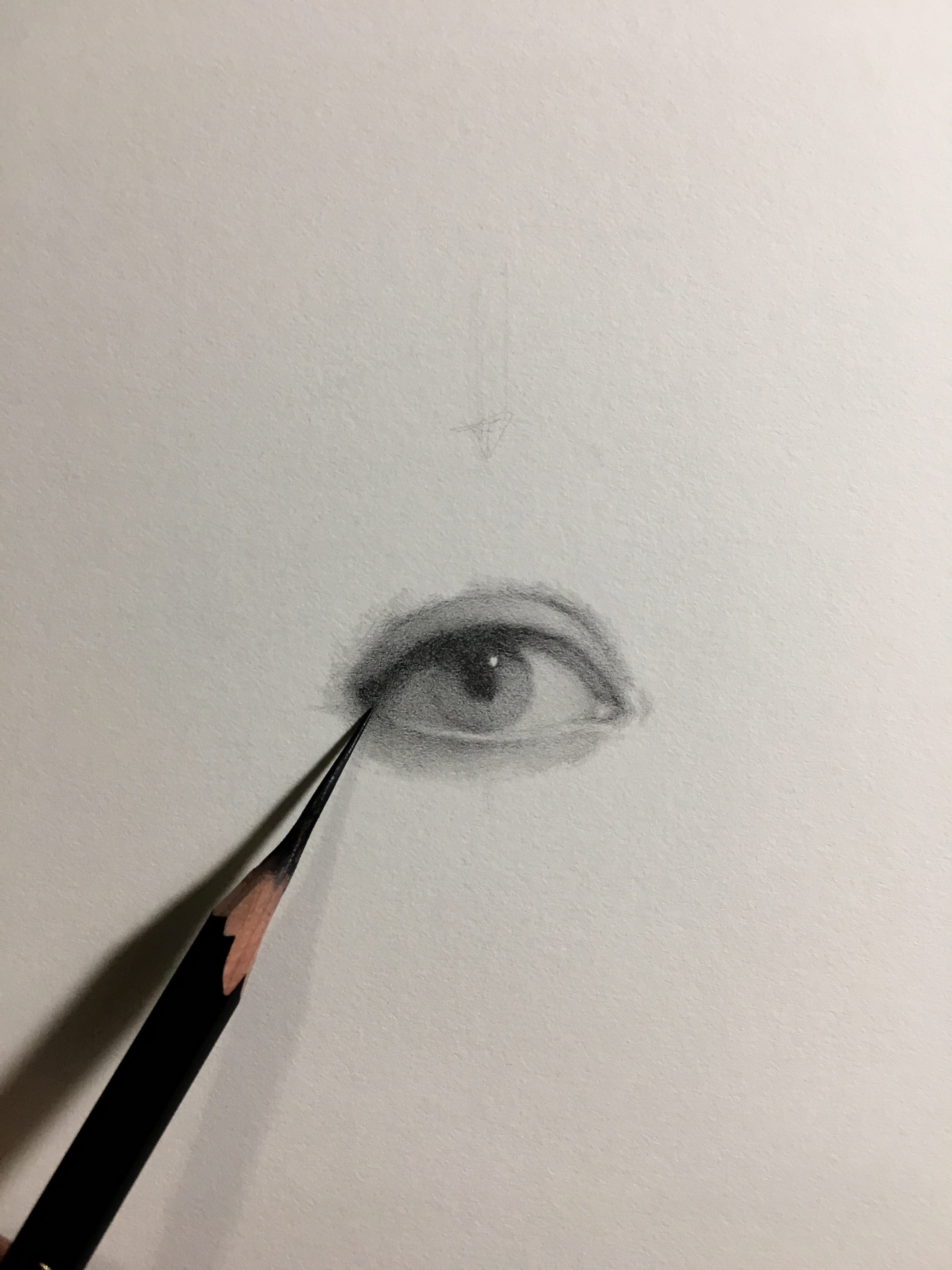
5. Initial Sketch: Finding Major Facial Features and Shadows through Tracing: Initial sketch, finding major facial features and shadows through tracing. In this section, we will discuss why tracing is not cheating, Creating a drawing maps using reference photo to help you during later steps. And looking for shadows and seeing them as shapes. Let's get drawing. First, copy and paste your reference photo into its own layer and resize it to fit your drawing area. Then creating a new layer on top of that. (Don't skip this step! Use as many layers as you need when drawing digitally. It makes it so much easier to edit later if you decide to change something.) I'm going to edit my photos so that it's in black and white right here. I just go to Image and black and white and then I hit Okay, and that's it. And here is where we'll begin the initial sketch. I like to use red for this part so that it's easy to see later, even when I'm drawing on top of it. Tracing over your reference begin to lightly map out the major facial features with that red brush. You might be wondering. Marie, isn't tracing cheating?" The answer is no! You can't cheat at art, do whatever you need to do to help yourself be successful. Especially with portraits. This sort of mapping makes it and simpler to achieve likeness and cuts a lot of time off of my drawings, which can save my customers, and me, money. As you get more skilled, You may or may not need to continue using that step. You can start to freehand it if you start to feel comfortable. But at anytime you can go back and look at your reference photo to make sure that you're on the right track. Once you have all of the major facial features traced out, you don't need to go into a ton of detail here. Start looking for shadows. And this is something that might take a little practice depending on how experienced you are with art. I used to teach high school and one of the major things I taught when it comes to shading is looking at values as shapes. Look for the darkest values in your reference and trace around that as a shape. Look for the mid-tones, trace around that shape. If you see any prominent highlights, trace over those two. Don't go too crazy. But the goal here is to make things easier for yourself later on by making a drawing that for yourself. Now, if you're using physical pen and ink, trace these features and shadows with a colored pencil. Then put charcoal or pencil all over the back of your photo. Place that reference on top of your drawing paper and gently but firmly trace all of your mapped out shapes onto your reference photo. This is kind of like old carbon copies and it will transfer some of the charcoal on the back of your photo to the drawing paper, allowing me to see where everything should go.
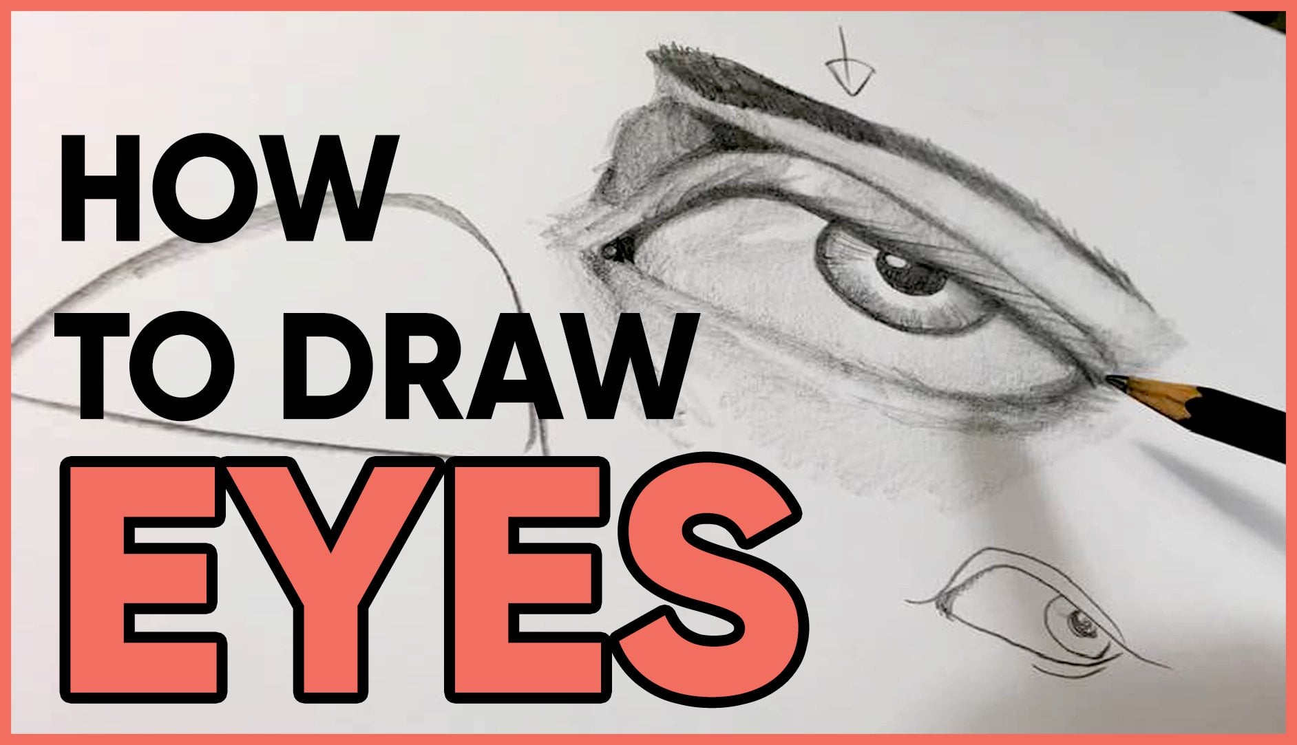
6. Adding Value and Shading with Line: Adding value and shading with lines. In this section, we will discuss why I work in small sections when I'm drawing and how to manipulate your lines to make darker and lighter values. Sweet. Now we're ready to add shading using those scribbly lines. Make a new layer and change your brush color to a medium dark gray, and make sure it's relatively small in size. For this part, I zoom into small sections rather than looking at the whole thing all at once. This keeps me from over analyzing the drawing too early and allows me to add more detail by focusing on smaller sections. I don't change the size or color of my brush for this entire first layer is simply move around the drawing, scribbling more in places that are darker and less in places that are supposed to be lighter. Take your time with this stuff and trying not to trace around the shapes that each year in the previous step, just fill them in with scribbles. And again, at anytime it's completely okay for you to turn back on that reference photo layer to make sure that you're on the right track. If you were drawing this in real life, you'd be able to look at the reference photo right then and there without having to switch back and forth. So it's completely okay for you to keep checking to make sure that the shadows are where you think they are or anything like that. Just to kinda talk you through what I'm doing here. I'm just kinda scribbling around those lines that I made it. Again, I'm trying not to trace over them and make those lines too harsh and just scribbling closer together where I want the darker shadows to go and farther apart where I want the lighter shutters to go. The nice thing about the brush that we chose as well is the light of the pressure that I use. The lighter and smaller the brush will be. So I can press a little bit harder if I want something to get a little bit darker, faster, or I can let up on that pressure a little bit and it will stay lighter. So I'm just kinda of scribbling, scribbling, scrolling away, and kind of try to vary the amount of scribbling that I'm doing as I go so that it can kind of create that illusion. Shadows fading from dark to light if that makes sense. And also gonna show you how to do hair here. So I'm starting out with that same dark gray color and just laying down one big base color. And your hair is lighter than this, then it could use a lighter color. If it's darker than you could go little bit darker. My hair is kind of a dark brown, so I'm going to stick with this gray that I've been using. And I'm just going to cover everywhere that there's hair with this just one layer of gray. From there, I'm going to grab a soft, *low* opacity brush. And I'm going to use some black. And I'm just going to lay down some lines in the areas that I see, the locks of my hair, especially in the direction that I see my hair going in the reference photo. And I'm just going to leave it at that right now until we get to the adding details section.
7. Adding Fine Details: Adding fine details. In this section we will discuss adding final shadows and highlights to your piece. And other optional details you can add. Once you have the whole canvas filled with the first layer of scribbles, you can start to add finer details. These might include areas where you add pure black to emphasize the really dark areas, and pure white to emphasize the highlights. I suggest doing both of these on a separate layer from your original gray so that you can erase if you need to. To add details to the hair. I'm just taking that same hard round pressure brush in black and I am adding just a bunch of straight or looking scribbles to go along with the direction of my hair here. I'm not trying to draw every single hair. I'm just kinda trying to get the lux of my hair and the net, the natural direction that my hair is going in order to get that sort of hair feeling. If that makes us once I have all of that laid down, then I can go back with a lighter gray, which you'll see me do here in a second, and add some highlights in there. And Ms. Really ups the realism look of the hair. Really lovely. Watch this. And then I can go in with white as well and do some scribbles here and there to make it kinda look like stray hairs. I also have a few gray hair so it works out. Now I'm just adding a few more fine details as I go, kinda fixing things up, making them look more in the way that I want them to me. You can even create a new layer beneath your drawing and add some soft shadows in certain places with a low opacity brush, if you like. I also love hand lettering. So for my Rosa Parks drawing, I added a quote of hers above and below her face For some added interest. This is completely optional.
8. Final Tips and Recap: Final tips and recap. That's it. I hope you enjoyed drawing with me. To recap, during this class, we discuss taking your own dynamic reference photos, the basics of Adobe Photoshop for drawing, using a reference photo to create a map for drawing portraits, seeing values and shadows as shapes, and creating those values using only scribbly lines. I would love to see what you're drawing looks like, so please upload it to the project section of this class. Feel free to ask questions are asked for feedback in the discussion section as well. Your engagement with this class helps Skillshare know that you loved it and shows it to more people who will hopefully love it too. You can follow my creative business on Instagram and Tiktok @serafineartanddesign to see more of my art. And you can also follow me here on Skillshare so that you can be up to date anytime I post a new class. Thank you so much for joining me!
 Marie Lipocky, Artist and Small Business Owner