Transcripts
1. Trailer: Designing novels is an awesome yet challenging experience. Good design helps the readers immerse themselves within the world of the book and brings the author's words life in a subtle yet crucial way. In this class, we'll go from a simple Word document to a fully designed InDesign file that's up to industry standards. By the time you're done, you'll have a print-ready PDF that can be supplied to a book printer or the basic components of an ePub file that can be read on e-devices like iBooks or the Kindle. We'll go over everything from setting up your documents correctly to working with style sheets to generating master pages to help with all of your book elements. We'll also talk about how to add that wow factor to your designs to liven up your books and make them stand out from all the others on the market. I'll be taking you there through every step of the way. I'm an art director and illustrator who's been in the business for 14 years. My work has been seen in and on the pages of almost every major US publisher. My work's been recognized by the Society of Illustrators, Print magazine, and the Type Directors Club among others. So, join me and let's get started on making an awesome book together.
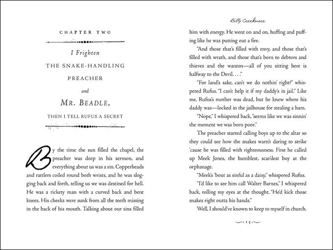
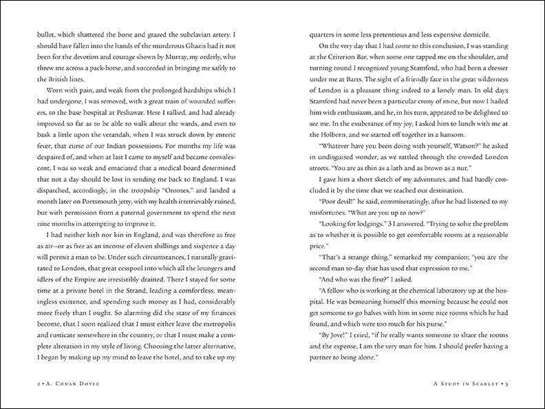
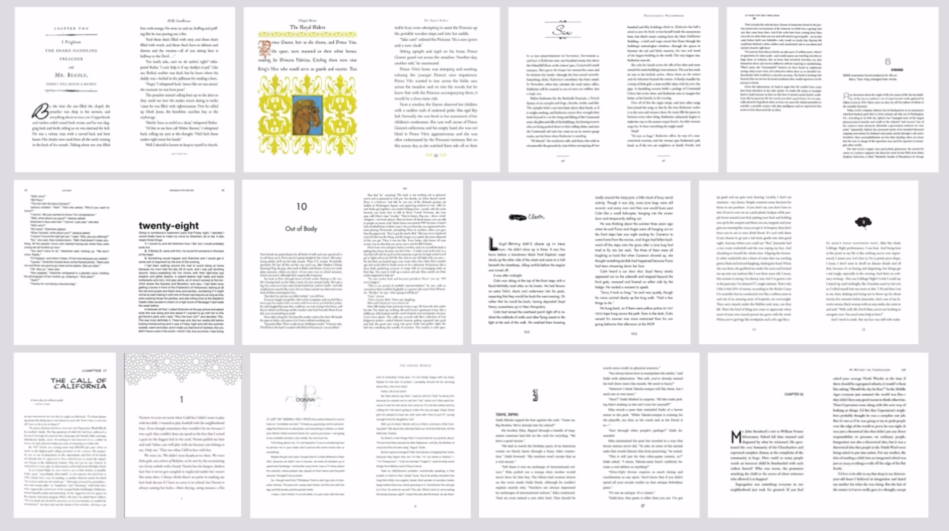
2. Introduction: Welcome to the first lesson. We're going to learn all about the basics of designing a novel interior. Working on novels is a unique design experience. A good design helps the reader immerse themselves more fully into the narrative. Unlike some of the other more flashy design experiences, book design is primarily about the text and making sure it's legible, easy to read and works for the book. It's subtle. Good book design is often invisible. We tend to notice bad design more than good. Through book design, the designer also gets to have connection with the great literary work as well as helping an author to bring the vision that they've slaved over for years to life, which is really cool. There are many different kinds of designs that you can look at for inspiration as you begin and work through these lessons. Here are a variety of samples to check out showing the different array of styles and treatments, some from my own books I've worked on and some are from a few other designers I've cobbled together. Look around on the Web and go to the bookstore and library to find more samples to help you through this course. They'll definitely be beneficial. For our project, we're going to design a full novel interior starting with a raw manuscript and turning it into a print ready InDesign document, PDF, and working ePub file. In order to get started though, you'll need a manuscript to work with. You can use your own if you have one but since many of you won't have a manuscript lying around, you'll need to find one. When looking for a manuscript, look for one that has a decent length. You'll want something long enough to really give you the full experience of working with the novel and the challenges that come with it. Something that has the standard novel elements we're all accustomed to you like chapters and maybe parts, we won't go into too much depth about the table of contents. So, if yours doesn't have one that's alright. Try to find one with proper formatting, too. Nothing that does anything funky for the purposes of this class, and finally, find something that's free and available for you to use. Project Gutenberg has a full archive of works in the public domain that you can copy and paste into a Word document to use if you need a good resource. So go out and collect some inspiration and find a manuscript to work with and we'll be ready to get started.
3. How Book Design Happens at Publishers: Let's take a couple of minutes to briefly discuss how the book design process typically happens at a publishing house. So, first, in a publishing house, the manuscript is going to start with editorial, where it will then be passed on to copy editing, who will clean it up and get it ready for design. The designer will then take that manuscript to create some initial sample pages. They won't design the full book, just several pages and any design elements that may need to be approved. They'll then actually show that to the creative director and the production person in order to make sure the page looks good, nobody has any objections, and there just aren't any issues that are going to pop up when it's printed, and of course, get it approved by the editor who will then pass it on to the author to get the author's approval. Once the authors approved, they'll pass it back to editorial, who will in turn give design the go ahead. Once design knows that the sample pages are approved, they're going to use that to then flow out the full book to generate a first pass. However, some publishing houses, the designer won't actually even do all that busy work, but will instead pass it on to their production person, who will then pass it on to an outside compositor who will do that busy work of flowing out page to page to page following the original designers' designs and instructions. Either way, they will then generate a first pass that will then go to copy editing and proofreading in order to make sure that there are no mistakes, errors, those kind of things. That will then go back to the editor and the author in order to approve. Once that's done, they'll pass it back onto design in order to generate a second pass. That second pass will then follow all the steps the first pass followed and will keep following that through each additional pass. You typically will have four to five passes of a book. Eventually, you will reach the final pass. Once you've got the final approved pass, the designer will then pass that on to their production person who will then pass it on to the printer. The printer will use that final pass and any instructions that came from the production person to generate the final book.
4. Vocabulary: Parts of the Book: Let's take a look at the different parts of a book. A book is divided into three parts. There's the front matter, which is all the stuff that comes at the beginning of the book, there's the body matter which is the main text, it's really going to be the bulk of the book. Then there's the back matter or the end matter, which is all the stuff that comes afterwards. Additionally, printed separately, there's also endpapers, which are used to bind our book to the cover. Inside the front matter, we'll possibly have what's known as a half title. The half title is really just a simplified version of the title page. For our title page spread, we may possibly have what's known as a Frontispiece, which is a piece of art that falls opposite the title page. On the actual title page, it'll be comprised of a book title and any subtitles that go with it, the author name and the colophon, which is the publisher's mark. On our left hand side also looking at book terminology, we'll have the Verso page and on our right hand side, we'll have the Recto page. Also falling within our front matter, will be a copyright page, as well as the dedication page. Sometimes, the two will actually be combined. It really depends on how much space is in the front matter and what the design calls for. Also falling in our front matter maybe a table of contents, which will give a breakdown chapter by chapter and part by part of where those fall within the book. Some additional things that may be in the front matter would be an Ad card, which would be an advertisement for say other books by this particular author, Forewords, a Preface, an Introduction, an Epigraph or a Prologue. Not every book is going to have all of these. Some may have none of them, some may have just one or two, it really depends on the book, what the author wants and what the editor wants. In our body matter, it's really just going to be composed of two different things. Body matter will either be parts or chapters. Inside of our chapters that will be composed of a chapter number, a chapter title or it may even have something fun like a drop cap, which is really just a fancy initial cap to start off each chapter. Our text pages, which compose the chapters are going to have a text block, as well as possibly running heads, which may have the author name on one page, the book title on another page, it may have the book title on one page, the part titles on another, it really depends book by book what you want to do for that. We'll also have a basic text page folios, which are the page numbers for the book. Also worth discussing in our text page are some common issues just so you'll know some terminology. There's loose lines where you can see there's a lot of space in between each word, as well as tight lines where you can see that it's quite cramped. Some other things you'll look at are bad breaks, where for instance, you can see we have a word breaking across the page, as well as widows where at the beginning of our page, we don't have a full line of text. Opposite of them at the bottom of our page are orphans, which are very similar just at the bottom. Additionally, you've got stacks where we may have the same words stacking on top of each other or particularly say hyphenations on top of each other, that typically don't look good that we'd want to correct for. For our back matter or end matter, we'll have possibly some acknowledgements. Acknowledgements may also come at the front too, it really depends on the book, but most typically will fall at the back. Some additional things that may be in the back matter would be an author bio, an index if you've got one, back of the book ads, which may be advertisements for other books or things like that that the reader may be interested in, as well as a teaser which could be if it's a book series and maybe the editors already have the first couple of chapters of the next book, they might run one or two chapters just to give a little teaser and entice the reader to buy additional books. So, those are really all the different parts we have in a book.
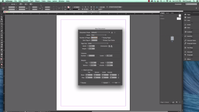
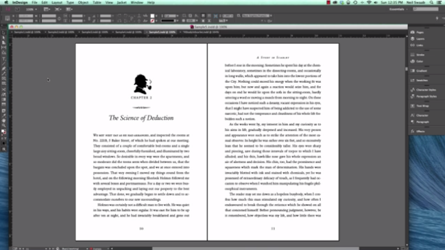
5. Set Up Your Document + Import Text: In this lesson, we're going to talk about setting up your document, and importing your text. So let's get started. First, let's open up InDesign, and go to file, new. Now you'll see several different options pop up. Document, book, folio, and library. Let's ignore the last two, and just talk about document and book. Now, initially you may be tempted to say, "well I'm designing a novel, shouldn't that be a book?" Well actually in InDesign, it treats a book as a collection of different documents. So, for instance say, you're working at a magazine where every designer designs her own section. Those would probably be treated like different documents that would then come together into a book to create the magazine. Since we're just doing a novel, and it's relatively simple, a document is more than fine. When that happens, when you click it, you'll see the new document dialog box will pop open as well as a preview behind it. If you don't see the preview, just make sure preview's checked down here. So, looking at our options, we've got our document preset. Default's fine for us, but you may put it in a preset if for instance, you're designing the same kind of book over and over and over again that has all the same settings. That just lets you do it in one click. For intent, we have print, web, and digital publishing. We'll use print for ourselves, but you could easily create a website, acting InDesign, or a specific digital publishing device like an e-book, like Kindle or the Nook or something like that, if you wanted to. For number of pages, we'll leave it at one because we'll let InDesign do the heavy lifting and figure out the number of pages we'll end up using. We'll also leave it at one for our start of our page, because that's fine too. We'll make sure facing pages is checked off because we do want our document pages to face each, other since that's what happens in a book. And, we'll also make sure primary text frame is checked off, and that will ensure that we actually have a text frame, on each individual page of our book, which is very important. For page size, InDesign has some standard pages here, but we're going to work with our own page size. Typically a standard novel is going to be five and a half by eight and a quarter inches. But, you may have different sizes as well. There maybe larger books, or maybe smaller, you may work on a children's picture book for instance, which will be a large square format. So you can feel free to design it however you would want to design yours. But if you want to deal with a standard book design, it's going to be 5.5, by 8.25 inches, okay. For columns, we'll leave it at one, but you could put in more columns here, and you can see behind how that changes. That might be useful if you're designing something that requires columns, like maybe you're doing the manual, or some sort of academic text, that may be beneficial for that. If you change the gutter here too, you can see how you can create wider, or smaller gutters. We'll go back to one column. For our margins, we should talk about some basic book design principles before setting margins. In general, with a book, your bottom margin is going to be your biggest margin. That's going to be followed by your outside margin, which will be your second largest margin. Your top margin, which will be your third largest margin and your inside margin, which is going to be the smallest margin. That's just a basic book sign principle that we use a lot. In general also, the wider the margins you have, the more luxurious the book is going to feel. That white space really helps. You definitely don't want too skinny margins, because that's going to feel really uncomfortable on the page. If you do have really wide margins, just be conscious that the wider they are, the less text you're going to fit on the page. So, the longer the book's going to end up being. Which may be a very realistic concern, when you're trying to get down to a specific page count. So, I have something very specific in mind. So, I'm going to set my top margin at 0.625 inches, and hit tab. Now you'll see everything changed to 0.625 Inches. That's because this little link icon is checked, if I uncheck it here, I can change these margins individually. Now, rather than type a number or use the up and down arrow keys here, I'm just going to click in, and use the up and down arrow keys on my keyboard, to change it and I'll set the bottom margin, at one inch and I'm going to hit tab. I'll change my inside margin, to 0.75. And my outside margin, to 0.75. Now, I know you're probably also saying, "Didn't you just say the inside margin should be the shortest?" Well, technically yes. But these days I've kind of been setting my inside and my outside exactly the same because, when the book prints a lot of times, that gutter ends up getting swallowed up a bit by the inside margin. So, it kind of offsets it. So I've just been letting that work for me. Now we're going to talk about bleed and slug. If your bleed and slug isn't open, just make sure to check that box here, and it'll pop open. Now bleed is essentially anything that's going to print towards the edge of the page or off it. You want a little bit extra because, if it doesn't chop evenly at the printer, you can end up with like a sliver of white space. So we definitely don't want that. So we need to extend the arc just slightly past where it's going to cut off. So, for our bleed, I'm going to change that to 0.125 inches, overall, that's standard, and you can see the red, is where the bleed is going come through. Our slug is also a non-printing area where we'll put stuff sometimes like color bars, or specific information, that the printer needs to know when they're printing their file. We're not going to really mess with that for our file here. So that's okay. When you're all set up, and have margins that feel comfortable to you, it's okay. And now we've got our whole document setup, which is great. Now it's time to also start importing our text. When importing text, you don't want to copy and paste, but you want to make sure you're going to file place, and I'll show you why. If I open up my word doc here, I can see inside of it we've got some things that are bolded, we've got some things that are italicized here. If I copy it, command C, and click inside the document, and paste it. If I scroll down, I can see all of those italics, all those bolds are gone. That's going to be a huge problem because you're not going to want to, have to try to find each one individually and replace them and in case you don't, or even if you don't, that's going to end up with a very angry copy editor, who's going to yell at you. So instead, you want to go to file, place, or command D. You can locate your file. So from here me it's in Skillshare, a study in scarlet doc, and you'll hit open. Now, we also have show import options checked off. I usually don't do that, but I want you to see what's in there. So, this gives a whole bunch of different options for things that you may or may not want to import, or whether or not you want to preserve certain styles that are part of the document or not. Usually it's fine to go with whatever is standard in the InDesign file. However, there may be certain scenarios where you don't want to include certain things. For us though, it's okay. So you can just hit okay and, sometimes you get a warning here. This is just telling me that the font that's in the document, for some reason, is not my computer. That's fine. We're going to replace all that stuff anyway. So I can hit close, and this will pop up here. Now, I want to hit shift. As you'll see the cursor will change. This will just show that, when I actually click through, it'll place the text on every single page and flow through the whole document rather than just limiting it to the first page. So, I'm going to come up here into the corner, and click, while holding shift. It'll take a moment, but then it'll actually flow all the text the entire documents. So, we can see everything's here. And if I look at my page count, rather than being one page, it's now 261 pages. So that's great. So we have our document pretty much set up. So, one thing to know, with the text, is that I actually did make a few changes. If you're copying your own text from, say a different project and not using mine. Basically the text I took from the Hmail document, I just remove some of the formatting, and tweaked it a little, just to make it a little easier to work with. I also added a few things in here that weren't part of it, stuff like a copyright page, or a dedication. Just to give you enough stuff to actually be able to work with for demonstration purposes. So, something you may want to consider when working through your file. Another thing that we're going to want to do before we finish up with this unit, is just make sure all of our elements are on the appropriate pages. So, let's go through it briefly. So, we've got a half title here starting us off, that's perfect. If I scroll down here, we've got our title page. Now our title page, shouldn't ever be on the left side. We always want our important pages, part openers, title pages, things like that, to be on the right hand side or an odd page. So, you can very easily do that by hitting the enter key, to get it to the next page. If you don't have the kind of keyboard that has a specific enter key like that, you might do function return, which also gives you the enter, just like that. So that'll bring it over to the next page. Let's scroll down here. Our copyright will be on the left. Our dedication will actually fall on this page here although it's flowing to the next page. So that's okay for now. Our contents is also going to start on the right hand side, so that's great too, even though this will eventually come up to that page, that's okay. Our half title should start on the right hand page as well. Our part one, should never start on the left page, which it started on a right hand page, so, we'll get that over there. Our chapter one should also, start on this side too and that's enough. We don't need to go through the entire document, but we just at least want to make sure our front matter's paging out where it needs to page out. So, once you're done with this initial setup, you'll be ready to actually start designing your novel a little bit. So, now that you've seen how to set up your document, it's time to do your own. You can use that Sherlock Holmes file linked to in the class notes. Grab another one in the public domain off the Gutenberg Project website, or even use your own manuscript if you have one available. Just get your documents set up, your word doc imported into it, and your front matter and beginning chapters on the appropriate pages. Once that's all set, we'll be ready to begin the next phase of designing the novel interior.
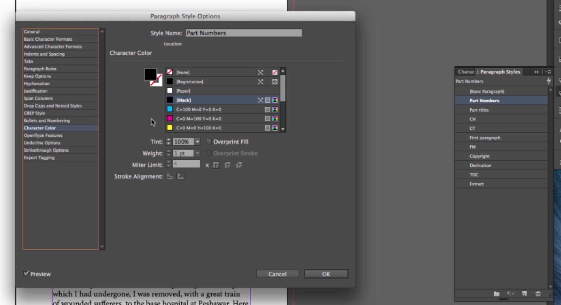
6. Getting Stylish: Working with InDesign Styles: In this lesson, we're going to talk about working with InDesign styles. Now what exactly are styles? Styles are basically rules that are applied to chunks of texts that tell it how to look and behave. For instance, they may tell what font should be used, or what color it should be, or what size and they allow you to do these things in one central location that will then update and reflect in your entire document. The basic building blocks working with InDesign and they're super-duper powerful. If you're coming from the world of web design or have ever use CSS for instance, this should already be very familiar concept. Now, InDesign styles come in two general classifications. You got paragraph styles and character styles. Paragraph styles affect entire paragraphs while character styles affect individual characters inside those paragraphs. We're going to use both for our document. So, in case you're a little confused, I'll show you a quick example of what a paragraph style can do. I'll just go here to my paragraph styles and open that up. If you don't see that by the way, just got a window, styles, and check off paragraph styles. We can see there's already a few in here that have imported. I'm going to create a new one, just doing that here and double-click, and I'm going to rename it CN for Chapter Number because this will be a chapter number style and just change the basic character color to cyan just to give you a little show of what it does. Now, if I highlight Chapter One and change it to CN, you'll see it will change it to blue. It also changed the font size a little bit too because there's some settings already that it's picking up on. I'll do the same thing for Chapter Two. Now you also don't need to highlight, you can just click actually inside of it and change it that way, and I'll do one more for Chapter Three just to show you. So, what happens if you've already gone through and done your whole book and decided that you hate the cyan color and wanted to change it to another color? Well, if you hadn't done these with styles, you'd have to go in individually and find each one of those and change them and it would be hugely time-consuming and a pain in the butt. But because we've used styles, we can actually do it with one click. I can just click on the style, locate the character color where I've changed it and change it to magenta and now I can see it updates here, and it updates here, and it updates at the very first instance that we've used it, right there. So, you can see, it's obviously a very, very powerful thing. So, before we really get started though with styles, I wanted to do a couple of things. The first thing I want to do is get rid of this normal style that's right here. So, normal is basically a style that imports from the Word document, it's Microsoft's kind of Basic Paragraph style, we can get rid of that. Just click on it, delete it, and replace it with Basic Paragraph. That's got very easily. Next thing I want to do is just make sure to set up a specific character style for bold and italic, because as we're working with some of these stylings, it may erase the bold and italic and we definitely want to make sure that we keep them. So, this is sort of a preventative measure. So, I'm just going to go into here and create a Character Style. Create a brand new one, double-click on it, I'm going to call it bold, and just hit OK. I'm going to create a new one and I'm going to call it italic. I'm not going to base it on bold, base it on none, and hit OK. Next thing I'm going to do is do a find and replace. I want to find all the bold in the document and just make sure it has the character style of bold and the same thing with italic. So I'm going to hit Command F, which is going to bring up our find menu. So, I'm actually going to go to find a format, I'm going to go down here and I want to look for a basic character format of a font style that's going to be bold, and I'm going to hit OK. I also want to change it right here for a character style of bold and I'm going to hit OK. I'm going to go to Change all, it's going to find 21 replacements, hit OK, and done. So, now if I highlight this, you can see it instantly changed a bold and that changes to none so that's perfect. So, now I want to do the same thing for the italic. So, I'm going to go back here, I'm going to change that bold to italic, hit OK, and then I'm going to change the format to the character style of italic and hit OK, and change all in it's done that 20 times and I'm going to hit done. So again, we can go up to where we've got italics if I highlight that I can see that changed that to italic which is great. Click into the regular text and still be none so that's perfect. At this point, it's probably a good idea to hit Command S and save it. The next thing we want to do is actually take out some of the overrides that are happening to our paragraph style. If I go into my paragraph style, I can see this little plus symbol here. Now that plus symbol actually indicates that certain things have been done to the style. I just want to revert everything to its natural order. So, I'm going to select the whole text, just click here and hit Command A and then I'm going to go to the Fly out menu and just say clear overrides. You could see instantly the text changes again. That's because all those things like the font sizes and things that were coming through we're from the Word document but we don't want them, we want our natural styles here so that we can change them on our own. Once that's done, it's time to actually start setting up all the different styles we're going to use in our document. So, let's go through and start adding them. So, going through the front, we can set up one for front matter and again, I'm just going to click off to make sure I'm not affecting any text, I'm going to create a brand new one for paragraph. So, I'm call it FM. I'm not going to base it on any paragraph style so that's fine, I'm going to hit OK. We've got, this is more front matter. We'll do one for copyright and you just double-click, type in copyright. We are going to base this on the basic paragraph and hit OK. We'll do one for dedication. We'll base this one on Basic Paragraph as well and hit OK. We'll do one for TOC. We'll base that on the Basic Paragraph. We've got our half title but again that will be the front matter. We've got our part numbers. We'll base that on no paragraph style because we're going to do something specific for them and we've got our part titles or subtitles I guess. And we will base that off of no paragraph style as well. We've already done our CN but let's do our chapter title or CT. So, we'll call that CT, we'll base that off of no paragraph style. Actually we can base that off Basic Paragraph, that's fine and let's just double-check CN, we'll base that off to the Basic Paragraph too because we'll make a few changes but it'll probably be best to keep a few elements that are in there. Let's also do one for our first paragraph because sometimes it's nice to set off the first paragraph a little differently, maybe you'll do a drop cap or something fun with it so that's good to have as well too. So, we'll call this one first paragraph, and we'll base this one off of the Basic Paragraph is well. Now, we can also change the order a little bit too and sometimes I like to do that. So, we can just drag these, we'll do the page number or the part numbers up top here, the part title after, chapter number here, and the chapter title here, so at least we know as we're going through the order would be pretty easy for us to do. So now that these are all set up, we want to actually apply these to the document to make sure everything is tagged. One really helpful thing is to maybe color-code all of these so you can make sure that everything is tagged. It's not something I would do as a designer but starting out, it's a great way just to see that everything is done and just know the effects you've got. So, I'm going to just go through it quickly and just change these all to a color. So I'm going to go to my character color down here, we'll do part numbers is cyan, we'll just run through the color, part titles as pink magenta, CN, we've already got a character color, let's go to yellow, we'll just go down the list, CT, red first paragraph, green front matter, blue, copyright. We can do this other blue. The dedication, we'll just go back up the list, TOC and the extract. So, once that's done, we want to actually go through and start tagging things. So, this here is going to be front matter, this will also be front matter, we're going to highlight that whole string, we're going to style this as our copyright. This is going to be our dedication. We've got our TOC here, this is more front matter. We've got our part number, our part title. We've got a chapter number, our chapter title, our first paragraph. So, you'll want to go through your entire document. At this point, it's pretty much just going to be parts, chapter numbers and chapter titles, and go through and just make sure everything is styled the way that it needs to be.
7. Typography Basics: Now that your InDesign document is set up and your elements have all been tagged with the appropriate styles, it's time we consider the typography for the main body text. This is extremely important because this is what people are going to be reading, so you don't want anything that's going to ruin their experience or pull them out of the book or make it difficult for them. In fact, it's probably the most important design decision that you can actually make when working with the novel. So, let's discuss how we can do that for our readers. Here we have a basic text page. I've set this at 10 point font. Ten point is a pretty good place to start. Now you can certainly go larger or smaller depending on the type based on the age of the readers. Some typefaces are just bigger, some are smaller and some readers are bigger and smaller actually too. So, for the younger and older readers, they're going to need a larger point face. In general though, you're going to want to stick somewhere between nine points and 12 points in font size. You're also going to want to indent the first line in a paragraph that obviously helps readers get from one paragraph to another. Looking at this page though, however, it does feel like the leading is a bit tight like I'm feeling like this is kind of claustrophobic and dense, I'm actually a little bit scared to read this page, it's intimidating. That's because it's using InDesign auto leading which is set this and I believe a 12 point font which is just not enough or a 12 point leading which is just not enough for this. Let us look at this page now, this feels much better, it's airier, it's breathing. I want to read this page, this is at 16 point leading. In general, I find it's good to keep the point size at about 4-6 points larger than what the font is going to be. So, a 12 point font maybe should be around 16 to an 18 point leading for text space. Pretty good example. In general though, the larger the leading, the more luxuries the book can feel. You just want to be careful not to have your leading too large because you don't want to create too wide gaps in between the lines of text. Otherwise, that's also more work for the eye to get from one thing to the other. Looking at this page as well though, we're using ragged type on the right side as you can see it doesn't align evenly. That's perfectly okay. Some novels are set in ragged type but most are probably going to be justified to the left. So, let's take a look at this page. This one is justified to the left and you can see on the right side how it's completely even. That's the way most are going to be design. When you're doing justified type, just make sure that the hyphenation is turned on. Otherwise, you can get odd gaps in between words because it's not using hyphenation to account for that. So, we can do all these things we've just discussed very simply by opening up the main text font style that you're using. Open that up and you can go right here under indents and spacing, where you can set what your first line indent is going to be. It's very important to indent this way rather than using tabs, you never ever, ever, ever want to use tabs for your first line indents. We want that all to be controlled in the style, okay. So, you'll want to do that here. Also, we can set our alignment right there, pretty easy. For hyphenation, we're going to go into the same stylesheet but instead, we're going to click there for hyphenation and we're just going to make sure that hyphenate is checked off. So, with that in mind there are basically two types of fonts that we're going to set our body copy in or that will work with for our text. We've got display fonts. That's typically what we're going to use for say chapter titles, drop caps. Things like that, that aren't going to be a long passage of text because it'll just be too difficult to read and we have text fonts. Those are basically what the main body copy is going to be. They're designed to be read for long passages of text. So, taking a look at this particular page, for instance, it's a very pretty font but it's way too busy. This is going to have so much strain on our eyes and it's just going to be exhausting to read through for an entire book. You have to remember, readers are going to read over 200 pages of this thing, so it cause too much attention to itself, it's just going to be a nightmare for a reader. So, basically, we want two styles of text fonts then we're going to use that are going to be a little bit more simple. We could use Serif or we could use Sans-serif, both are acceptable depending on the book. Here's an example of Sans-serif one. This is set in alright sans which is a very beautiful face. Typically with Sans-serif, they're more modern, they can be slightly colder than Serifs, and also slightly a little less easy to read over long passages but with the right font and this one is a beautiful font, you can certainly set a book in it. So, there's nothing wrong with it. But most traditionally are going to be set in a Serif font and as you can see this is a Serif font here. The Serif traditionally are more classical, they're easier to read for long passages of time and they're warmer. So, in thinking about text font choices, we have some options or things that you want to consider. One is some are more masculine and some are more feminine. Depending on what our book is, some books are more masculine and some are more feminine. So, we're probably going to want to pick a font that's going to match up with that. Fonts also have a personality. Some feel more fun, some feel more adventurous, some are more somber. So, the personality of that font can also be a subtle way to have the reader immersed into the story. The time period of the story will also affect the font choice. If we have a story that's set in the future in a very clean robotic society, it may call for a very crisp Sans-serif font whereas a book set in the past, probably is going to require a more classical font. The general feeling of a story too is going to affect the font choice. We really want to try to have our readers just feel like they're in the story and the font can suddenly do that in ways and that's really what we're trying to get. So, let's take a look at just a few Serif text spaces as we're looking at particularly my project to the Sherlock Holmes book. Sabon is a great font choice. Two, it's got a great even color and is used commonly, it's so frequently used in books, it's a great choice if you want. Adobe Caslon is a very classic choice that's used in a lot of books. Adobe Jenson could also be a great option and ITC Legacy is another fantastic option. Now, I just breeze through those pretty quickly and it's hard to see the differences in all of them, so let's look at them together. Here we can see each one and maybe you can see it might be a little difficult. If not, I'm going to zoom in just on Adobe Caslon and Adobe Jenson so you can see. Now, we can definitely see the difference between these two fonts. Sometimes it's more subtle than this. With this it's pretty easy and I'll point out some of the differences just in case you're not able to see them. You can see the Es house, the E in Adobe Jenson has more of a diagonal stroke to it, where the Adobe Caslon is more straight across. You can look at the cross bars on the W between the two and see the differences there. The period in Adobe Jenson is more angular where Adobe Caslon on is just more of a round circle and the Y's in Adobe Jenson are straighter down where they curl up a little bit on Adobe Caslon. So, all typefaces even if they look very similar are going to have these subtle differences and it may be a little hard to notice at first but if you actually look at the characters you'll see them. If you're still having trouble, I would also recommend looking at the italics which can give you a much clear indication of the differences between fonts. Finally, the bolds are also phenomenal to look at. Bolds are typically almost like caricatures of the font. In particularly, the bold are the font. If you have a black version or a heavy version, that will really show you what the substance of that font is. So, that can be another good thing to look at too. Things to remember when considering fonts are that you shouldn't judge by what you see on screen. You have to, you have to, have to print out samples of every font. I would set your type in that particular font at the right size and leading and print out samples because you'd be surprised and just shocked how different it might look on screen to what you're ending up reading on the page. That's very important and also that's usually the only time I can actually tell the difference between a lot of fonts is if I print out the samples and look at them all together and try reading them, so extremely important. Look at how the font handles at various sizes too, try it out at five point size, at 10 point size, at 30 point size because you might see some subtle differences there. I would also avoid free fonts just for your text faces. If you feel like you need to get some free fonts for your display fonts, that's okay. But for text faces, it's so important because free fonts may often have really bad spacing in between the characters and the words, it maybe missing certain glyphs that you may need to use. There are a lot of reasons why free fonts are just not really a good use for you. So, I would find ones that you pay for or use ones that are reputable and already well known. You may already have some especially if you have Adobe programs, some automatically come installed on your computer and those can be good ones to use.
8. Master Pages, Folios, Running Heads, Sections, Baseline Grids: Welcome back. At this point, I've got some nice margin setup. I've updated the style sheet to reflect our nice typography with appropriate font, letting, alignment, all of those things, and we've got our indent setup, but we're missing a couple of different things. When I updated the style sheet, I lost all those bold and italics. Well, that's one of the reasons I said we needed to actually create separate character styles for both of them. So, we need to get those back. Let's go back to our character styles here, and very quickly, we can just click on bold, double-click. Under basic character format, we're going to change the font style to Bold, and click okay, and we can see it reflected here. We'll do the same thing for italic. Basic Character Formats, Font Style, Italic. So, that took care of that. Now, the other thing we need to add, is that we actually don't have any page numbers or folios. We've almost got all the elements, but we need those. So, we're going to do that using Master Pages. So, that's up here in our pages menu. So, master pages are on top here and our regular pages are here. A master page is basically a template for what all the other pages will do, anything that's put on a master page will also be reflected on all these pages here, and that's where we're going to add our running heads and folios. So, we can double-click into A master and let's actually create a whole new text box here and we'll type in A Study in Scarlet, and we will give it appropriate style. So, first off, this is for some reason picking up the italic style, we'll just make sure that that says none, and then we're going to create a whole new style for it. We'll call this Running Head. Make sure that it's not based off anything and that's okay. We'll alter a few things. I'm going to make sure that it's not indented, and I'm going to align it to the right, and make it small caps. Now, you can see this plus symbol came up, which means that I've altered something in here versus what's in the style sheet, but I like what's in here. So, I want to change the style sheet, I can simply just right-click and say redefine style and that plus goes away and that's now what the style will be. So, I'm going to drag this down here and just align that with my text frame. I'm also going to make sure that rather than this being aligned with the top of the text box, I want it aligned with the bottom. So, I can do that right here and just say align bottom. So, I'm not using any measurements in the moment, I'm just going to eyeball it into something that feels good and then I'll actually do some real measurements later. In the meantime, I'm going to click option and hold Shift and drag this across, which will create a duplicate that aligns perfectly. I'm going to double-click in here, align that to the left and let's change that to the author name. So, we can now see how that reflects in the pages, if I scroll down, I can see every single page now has what was put on the A master. So, that's how master pages work. I also want to hide this outline. Sometimes I don't find the guides very helpful, so I'm just going to go to view, extra, hide frame edges. That makes it a little easier for me to work with. So, we still need to add our folios, I'm going to come back here and rather than type one, two, three, four, five in every single page, we're going to use a marker. So, I'm going to hit space and I'm going to type, insert special character, markers, current page number. Now, that creates a letter A for us that we can style however we want, I'm going to copy it. Just come in here, and I'll show you again, on our page numbers, all of a sudden now we've got 8, 9, 10, 11, 12, it's perfect. So, let's style it a little, give it a little more flash. So, firstly, I'm just going to come in and make a bullet point in between, you could do any kind of element if you wanted to. It's always nice to do something fun if you can. An option space there, let's also maybe letter space out our words here. So, I'm going create a new style in my character styles, not a paragraph style now for the running head. Going to call it Running Head. Not going to base it on italic, I'll base it on none, and for basic characters, we're just going to change, Oop, the font style is still coming in in italic, we definitely don't want that. So, let's just change that to book and we will change the tracking to 200, and boom, there we go, it's nice. This one will match as well the running head. I still think they're a little bit big though, so let's change the overall paragraph size of my running head. Click on that and let's just go down to eight points. So, now, if I go to my pages, I can see how this reflects on everything and I'll hide the guides, which will show you a little bit better. So, that's looking quite nice. However, we got another problem. We've got our chapter one starting on page 11 and that's not usually the way it is. Usually, chapter one starts on page one. Now, I do have to be honest and sometimes, I'm never really sure, but the part one should be page one or chapter one should be page one. I'm sure somebody knows, but for me, I'm going to start it at chapter one and if I'm wrong, just know that I am admitting it. So, how do we do that? Well, we're going to use section markers here. So, I'm actually going to first, change all the beginning parts into Roman numerals. So, if I double-click on page one in our pages tab here, I'm going to right-click and I'm going to say numbering and section options. I'm going to change the style to lowercase Roman numerals and hit okay. You can see it updates here, as well as here too. Now, let's go to where our page actually starts, our text starts, and I'm going to right-click here, and I'm going to say also numbering and section options, actually want our page numbering to now start at page one and the style is going to be numbers and I'll hit okay, and now we can see one, two, three, beautiful. Finally, I actually don't want any of the folios or running heads on any of the things before chapter one. So, let's get rid of them, but we'll actually create a whole new master page for that. So, I'm going to go up here in my pages and say new master. I'm going to call it B and let's name it No Running Heads. We'll base it on A master, so it's going to pick up all the same elements from A master. Now, if I double-click on B with no running heads, I can't actually delete any of these items here unless I hold Shift Command and that unlocks them. So, hold Shift and Command and unlock them. So, you can see now, A master has text frames and running heads, B master has text frame, but no running heads. I can very easily just drag B to the page and it deletes. However, I don't necessarily need to do that for every single page, I can actually just click on the first page and holding Shift, click on the last page, and open up the menu and say apply master to pages and we'll apply B, no running heads. Now, we can see, they're all gone and you can even see here that these are labeled B and B and these are labeled A and A. So, that's a quick way to find out what things are labeled and how to use the master pages. So, there's one other thing that we still need to do and that's to align our text or lock our text rather to the baseline grid. So, the baseline grid, basically, is a grid that you can lock text to and it makes sure that it's even. So, if I take this text box, for instance and shift it a little bit down you can see these no longer align, that's not particularly good in the world of book design. So, we want to make sure that we're actually locking things to a baseline grid. You can view the baseline grid by going to view, grids and guides, show baseline grid, and that shows us what the grid is. Well, our grid is not quite what our letting should be, so we want to alter the grid first before we lock anything to the grid. Typically, a baseline grid would be the same exact point size as what your letting is going to be. However, I like to make the baseline grid half of what the letting is because it gives me a little bit more flexibility. So, minus 16.16, so it should be 8.08. So, I can change the baseline grid by going into InDesign, Preferences, Grids. From here, I'm going to rather than have it relative to the top of the page, I'm going to have it start at the top margin, and I'm also going to have it start zero from the top margin. Every increment, the increment is going to be 8.08 points and I'm going to hit okay. Now, that looks pretty darn close to what we want. So, the final step then, is to, you guessed it, go into paragraph styles and go to our basic paragraph, undor, excuse me, under indents and spacing, aligned to grid, all lines, and boom, you can see they've just aligned. Watch what happens as I move this down one, two, three, four, five. See how it's not changing from the baseline grid? Now, it may hop one because I've got multiple or my baseline grids half the size of my letting, but I've done that for a reason, but typically, it'll stay locked to the baseline grid. So, now that you've seen how that's all done, go back into your document and reestablish your bold and italics. Also, go in and create some cool fun running heads or folios that work well with your book. Also, make sure that your pages are starting and numbered at exactly where they should be. Finally, go in and make sure that your text, your body text in particular is locked to the baseline grid.
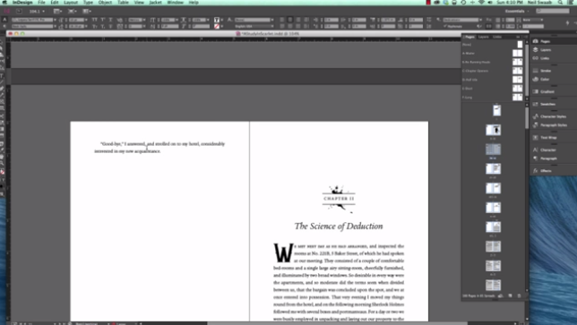
9. Wow Factor: Making Your Design Come to Life: Now that we have all of our elements on the page and they've been tagged with styles, locked to the baseline grid, and everything is set up for us to work, it's time to actually get into the nitty-gritty of design, the fun stuff that really makes this book feel like a cool package. So, let's start. I'll show you how and then we will discuss some different examples you may want to try. So, the first thing we're probably going to want to do is sink down the chapter numbers a little bit. That's just a nicer way to come into each chapter, it feels like a fresh beginning and it just looks nice. So, what we're probably not going to want to do though is hit return, return, return, return, return, we're actually going to use a thing called space before to set a style for that. So, I'm going to hit Return and just once because we actually do need a paragraph in front of it in order to use space before. I'm going to go to paragraph styles and just make sure that that space before is set to the basic paragraph. Now, clicking into our chapter number, up here is the space before, I'm feeling like about a little bit over an inch is probably going to be good for us. So maybe, 1.375 or something like that feels pretty good. Let's also make sure that we don't have any indents and let's do a little bit of styling to this chapter numbers. So, I'll just highlight it, set it to all caps, I'm thinking a 9.0 font feels pretty good for that, we'll letter space that out 200 and I'm thinking about centering that as well. I also think a rule above and below would look pretty cool for this. So, up at the top right here, I'll just open this menu, go to paragraph rules, and I'm going to make sure preview is checked on and I'll check on rule so we can see a preview in here. Now, this is taking up the whole column but if I click down here, it'll just take up the text and I'm going to offset it a little on the left and on the right so it's slightly larger than my text. I'm also going to offset the distance from it a little bit too to about 0.1875 up top and then below I'm going to do the same thing. Make sure that takes up the text, offset that a little here, a little here, and offset the bottom a little bit as well. So, that's nice. I'll hit Okay. I also probably want to give some space in between here and here. So, I again instead of going to the space before, now I'm going to go to the space below it. Space above, space below, and I'm going to give it about, I don't know, I think about 0.5 inches seems about right for this. Now, we can see our CN has a plus symbol. I'm going to right-click on that and hit Redefined Style. So, just briefly, if I scroll down to the next chapter, you can see it's applying that here and the reason it's at the same height is because we have not added a paragraph which again, I want to make sure is set to the basic paragraph. So, everything will be exactly equal. Now, let's take a look at our chapter title. So, I'm going to click in here, highlight that and we probably already still have the bold set from when we originally changed all the character styles to bold, let's just make sure that's checked none for this and let's also do some other subtle changes. Let's maybe make this italic. I'm thinking about 21 points, feels pretty good. I'm also going to change the lighting to 24 only because this way, if I do have a chapter title that falls on two lines, I want at least knit that in the bide right now. Let's also take care of our indent. I'm going to center this as well, and it probably also is going to need a space after it as well. So, we'll say, thinking about 0.3125, feels pretty good. So, great. We can go back into our paragraph styles and I'm going to again redefine style. So next, let's do something fun for our first paragraph. I'm thinking it could probably use a drop cap and maybe some small caps for the first eight or nine words or so of the paragraph. So, I'm going to create a new character style for that. I'll go into character styles and I'm going to create a new one here and I'll highlight that and I'll call it Drop Cap, and just make sure it's based on none and I'm going to make a new style as well and I'll call this one first line and I'm going to make sure that's based on none. So now, I'm going to go back into our paragraph styles and I'm going to click on first paragraph. Let's not do that. It makes sense if you're not clicked in a paragraph to do that. So, go to first paragraph and I'm going to go under Drop Caps and Nested Styles. Now here, I can click above certain numbers and you can see it changing. So, three is taking up three lines here. If I do characters, that will take up a certain number of characters here. So, I'm not too concerned with that. I also want to make sure that we're turning off our indents and spacing on the first line because you generally don't indent the first paragraph. Coming back to our drop caps, I'm also going to make sure that it's picking up a certain character style. Now, we haven't actually done much with it but we're going to do that a little bit later so that'll have the drop cap style here. I'm also going to go now to Nested Styles and create a new nested style. I'm going to pick up our First line and it's going to go through the first eight words, and I'm going to hit okay. Now, this doesn't look like anything fancy yet but it's going to. We are going to go now to our character styles and let's actually put some styling into the drop cap. So, I'm going to double-click on drop cap, I'm going to go to basic formats and I'm going to give it a font family of Sly Light and hit Okay. Now, we can see that that updated. That's looking cool. Now, let's also go to our First line and I'm going go to Basic Character Formats, I'm going to change the case to small caps and hit Okay. Now, that looks pretty good here too. Now, for some reason, this changed and that's because, for some reason, it's picking up that first line. Let's just make sure that that character style is set to none for that. So, that's looking pretty, pretty good. However, it's not quite done yet. I think we could probably add one more graphical element to make this a little bit more interesting. So, this book is Sherlock Holmes, he's investigating murder mysteries so I thought it might be interesting to have a splatter effect for this in our chapter number. So, I've actually already gone ahead and created a master page for this and you can see the master page here if I go to my chapter openers. It's basically just a splatter icon with a white box in front of it. What I'm going to do is actually take that and apply that master page to our chapter numbers and press done. Now, we've got something that looks really, really pretty and I'll go ahead now and just apply it to one or two other chapters just to make sure that that works. So, if I scroll down here to Chapter two, we can take that and we'll see if that that's page 11 and just apply our chapter openers to here and hopefully, it should also work for the next chapter, Chapter three. We'll hit Return once, highlight that, go to our paragraph styles, make sure that's set to Basic Paragraph, I haven't styled everything here so I might have to do some quick styling. We'll just remove all the styling from that, make sure that this is set to Chapter Title, which I hadn't done yet in first paragraph. Again, now that we're on Chapter 23 or page 23 rather, we'll just add that right here. So, that's looking pretty done cool I think. Now that you've seen that done, you should do some other examples and try a whole variety of different things to get your sample pages working. I'll show you some that I tried out for this book as well too just to get you inspired. So, for instance, you could do something that's cool just like a little blood spatter and this one has a large number. Now, you don't have to say Chapter one, Chapter two in all of your books, you could just say two and see how that looks. This particular one, I've done something a little subtler. No different lines up top and bottom just one to separate them both. Just added a slight spatter effect to the drop cap initial. I've also gotten rid of the running head in favor of just simple folios at the bottom which can also be a nice look too. This one here has a very simple look where I'm just taking more of a display font to try that out. I've also eliminated the drop cap to have a simpler look for that. This one here, I've looked at that spatter effect and try that in other ways. I've also looked at a different font as well. More of an old tiny font that could be very cool for this one. I've also looked at a more elegant solution that also takes that familiar Sherlock Holmes icon that we've all known to love. So, you should try a lot of different examples and see what looks best for you on the page. Don't just look at these but also try out those other body text fonts that you might have been playing with and see how everything looks together as a package. When you're done, print everything out, get together four or five of your best ones and think about this for a while. But as a designer, that's what I would do is I would actually show them to the editors, I'd print out four or five different samples. Between them and myself, we'd pick a sample and go ahead with it and that's what you're going to have to do now. So, go ahead and have fun.
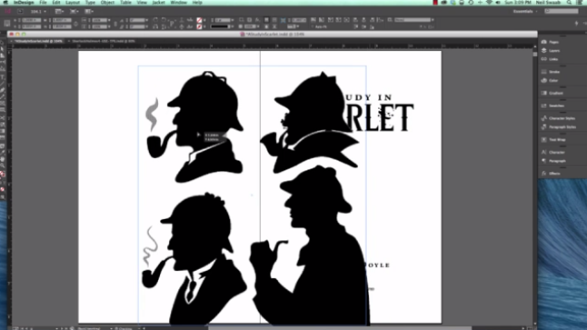
10. Front and Back Matter Matters: Okay. Now, that we have a nice design for text pages, it's time to actually go and design the front matter, and the back matter, and the other tidbits we haven't done yet, like the part titles and the extracts. Now, I've already gone in and designed all these things, I'm just going to take you through them because they follow a lot of the same things we've already done. There's just one or two minor things I haven't done that I'll show you now. So, first let's just go to the title page. So, with a title page, a lot of times you're trying to pick up on elements that may already be on the cover, so for instance, if you do have a cover, you could pick up on what that topography is. Maybe, there's some visual cue you can grab to put that in here. You could also do the same thing and take those visual cues, by the way, and apply them to any of the other things we've done. So, if you'd like that topography that can be the chapter title font, or the drop cap font. So, I'm picking up on what we've already done so far since we don't have a cover. The only thing this one's missing though is an image. So, I want to import an image in here, and I want to go with that sort of typical Sherlock Holmes profile we all know and love that we've seen in a million times over. So, I'm grabbing mine from a resource called Shutterstock, which for pretty cheap prices you can get photos, or drawings, or things like that. So, if you don't have drawing ability, there are a ton of resources available for you to cheaply get some things to liven up your book a little bit. So, in order to place my image, I'm going to go to File, Place. I'm going locate it in my images folder where I've dragged it and open it, and just hit "OK" if it gives you a popup warning, and I'll click off to the side here. So, in order to just have this image, I'm just going to drag this box closed and crop out all these other guys. Now, this is also looking a little bit jagged, that's because InDesign showing us a low res preview which is the default. If I right-click, I go to Display Performance, High Quality Display, that's a lot crisper. I can also flip it right here because I do want him to be facing into the book and drag him into the center here. Now, he's a little smaller, I want to make them bigger. So, if I hold Shift and Command and grab the corner here and pull, I can enlarge proportionally, and just a little bit more here, and just click off there, and I think that looks pretty good. So, one thing we'll look at too with the title page is, I'm always looking at alignments and how this aligns with the rest of the book. So, if I show my guides, I'm just going to hit Command-colon. You can see all these different guides. Well, I've drawn these in proportion to my basic text page. So, these are what those guides represent, this is the baseline of where chapter one starts, this is where that rule falls here, this is the baseline of our chapter title, and the baseline of our first line of text. So, I'm always trying to see where things line up as I'm designing, so you can see here, this is going to fall right on that baseline. I haven't checked this, but if I view the baseline grid, and go to Guides & Grids, Show Baseline Grid, I can see this doesn't quite fall on it, so I wanted just shift that down just a smidge. I'm going to hide the baseline grids again to you now, and you can see I've done the same thing for the half title here, which is lining right up top here. For the half title, since I'm using it repeatedly, I actually just created a whole new master page for the half title because I've also applied that here as well. Now, we're going to skip the table of contents for now because that's actually the last thing you should style. The copy right here isn't fully styled. We still got some bad breaks and stuff here, but for the most part, I basically just made it smaller, and with a bigger lighting to help utilize that space. The dedication, I've just made italic, and again aligned it exactly in a nice spot where it should be aligned. So, that's the basic parts of it. Let's also take a look at the back matter very quickly. We'll just jump down to, I believe page 143, which is going to have our acknowledgments, and just to show you there too. I've looked at where alignments are and try to align things pretty closely with the rest of the book. Finally, let's also take a look at our extracts. I believe we have some around page 14, I believe. So, extracts are basically things in the text where you may want to style or design them a little bit differently. You'll do them on a case by case basis, some maybe letters that people write, some maybe like messages that are typed on a typewriter, and maybe they should have a typewriter font instead. So, for this I just took a quick one that Watson's writing down and just styled it a little bit differently, so you'll find those throughout the text. In a manuscript, they'll be marked down, but in our particular ones, nobody has actually mark them, so if you're using one of the free files you find online somewhere, you'll just have to come through yourself and see what you might determine needs to be considered an extract. So, go through your book now and design front matter, your back matter, and any other extracts that may be called out within the text.
11. Flowing Out the Rest of the Book: All right. So now we've got our book fully designed which is awesome, but we're not quite out of the woods yet. We still have a couple of things we need to go over. We've got to look at the page count, and we've got to look at a page-by-page basis and make sure we're not seeing any other issues popping up like Widows stacks, bad breaks, orphans, you know words breaking cross the page those kind of things. So, first let's deal with page count really quickly. Our book right now is 144 pages plus the front matter. So, we're actually equaling 156 pages total. Well, books are actually printed and even signatures of 16 pages. That's just part of how the book process, the book printing process works. So, we need to either come at 144 pages which means we have to cut 12 or 160 pages, which means we need to add four which certainly seems a lot easier. So, let's talk about some of the ways you can add or cut pages. First is just looking at adding or cutting content that's in there. We could add things or remove things like half titles you know, we could add an author bio, we could put an ad card in the front, we have a lot of ways to bulk up the book or just remove some of the things that are already in here if we need to. The other way is to just look at chapters that are either short or long you know, maybe there are some that have five lines of tax on a page. Maybe you could push them up a little bit or maybe, there are some which feel like you could push that to an extra page if you needed to and you'll do that throughout the book to kind of add or remove pages. So, first before we go in and look at a page by page basis and look at some of these issues that may pop up. Let's just delete all the access pages we're not going to need. So, I know that this book is going to need to page in at about 160 pages. So, I think, I do this correctly. We're going to be 104 more pages sorry. So, I'll just select this here and hold shift and select that and just trash all these pages, and now we've got 160 pages here, and here's are four blank that we need to get rid of. So, let's just go to the front of the book and make sure we're not having any issues and deal with any of that are popping up. So, automatically, off the bat here, I'm seeing that we've got an orphan and I want to get rid of it. I can either push these few words here or I can bring this up. Let's just triple click inside this paragraph and bring the tracking in. So, the tracking is going to control the space in between the letters and we want to either make it bigger or smaller depending on if we're trying to bring words to another line or bring things up. You want to keep it between zero and 15, or zero and negative 15. Anything more and it's just going to look bad, It's going to look too loose or too tight. So, we'll start off at negative five which worked perfectly for us. Because this is a Web site, I'm actually just going to hold shift for turn and break this and put it on its own line. Now this also needed to get pushed over, sorry, here. So, that's better too. That became a little problem as we were dealing with some issues here. Everything's looking good here. Now, this chapter I noticed ended on two lines. That's not good. We want our chapter to have at least four or five lines if we can give it to end on. So, the simplest option would probably be to start tracking in a few things and see if we can bring these two lines up. However, let's remember, we're trying to get an extra four pages at the back of our book. So, if we bring this up that means we're going to need an extra five pages. So, we want to actually try to bring three lines over to the next page if we can. So, let's go to the beginning of our chapter, and initially here, I'm already seeing this line looks a little bit long and I bet I could push this over. If this duty's was you know, right over here, that would probably not be very successful. But I can click into the paragraph. Let's try it out five points. Doesn't quite work. Let's try it at 10 and that pushes it over to the next one. Let's also look here, we've got ourselves a widow that this has created. So, we want to get rid of that. So, I can go into here and let's just say 15 right off the bat. Well that actually gives us two lines which is nice. We don't necessarily need this to break into lines. With widow, as long as it goes about 75 to 85% of the way there, that's comfortable enough. It doesn't have to go all the way to the edge and over. The thing to note though is this created a whole other widow. So, maybe 15 isn't the best, maybe just 10 will be good and then we solved that problem too. So, there's a lot of pushing and pulling that you're doing when you're trying to get pages to go to where they need to be and trying to get the words to go where that you want them to be. Let's look for any other lines too that we can maybe make a little bit bigger. You know, maybe this one might work. Not quite successful. This one probably. So, let's start off again at five, if that doesn't work, we'll try 10 and that works beautifully. And I can see we'll have an issue here so probably don't want to push anything else over there. This one looks like it could probably change a little bit. Lets try that at 10 and at 15, and beautiful. One, two, three, four, five lines which is perfect. Now, let's say for instance, you tried this throughout the chapter and it's just not working, either you just don't have a big enough chapter to be able to do this or you're encountering problems left and right every time you try to solve a widow, it creates an orphan and vice versa. Well you have an option of also running pages short or long. So, basically what that means is we're going to have one less line of text for a short page and folios will bounce up with them, or we'll have one more line of text and the folios will push down with them as well and I've created master pages for each. So, if I look at my short page here, first my long page, you can see the difference here. And what we want to do at that point is also make sure when you're using short and long pages that you got a layout, margins and columns, and make sure that enable layout adjustment is checked off. If it's not, you'll use the master pages on your pages and you won't see the text reflected in it. The text is just going to stay locked to its usual margin. So, we want to make sure that it's checked off. So, following to run this page short for instance, I'll just drag the short page here and now you see how that pushes up. What we also want to make sure that whatever our spread is, it's unified. We never want to have a short page, you know on the left and normal page on the right, that is really bad and uneven. So, we're also going to want to run a short page for page 9 here too, and that's perfect and that even looks a little bit better here. So, that's something you can do throughout the document to make sure you know, your pages are falling where they need to and you're not having orphans or widows, and you're actually pushing or pulling the text to where it needs to go. So, let's also take a look at a couple of other things that may pop out as we're going through the text. You know you may have something like a stack. Which may come up like I'm seeing one right here, where we've got these two hyphens right on top of each other. That's not necessarily the best either. So, I'm probably going to come in here and fix this to make sure that that works out and now that looks a lot better too. So, you're going to go through and fix all of these little issues from page to page as you go through the entire document making sure that none of these things go outside of your control and everything gets taken care of. While doing that also keep in mind that you're trying to get an additional four pages out of this or if you're working with your own manuscript, you're trying to get whatever you can to get that even signature and not have any blanks at the back of the book. So, go for it now and then you'll be ready to get the table of contents set up and start outputting your files.
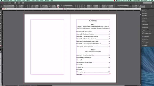
12. Table of Contents: All right. So, now that the whole book is paged out and designed, it's time to put the last piece of the puzzle together before we output the table of contents. So, I'm actually not going to go into a lot of detail about the table of contents because it's actually pretty complicated and more of an advanced lesson. So, if you're not that comfortable with InDesign, the easiest thing for you to do is just take the TOC that's part of the manuscript, style it however you see fit visually that looks best, and actually come through and make sure you're inputting the correct page numbers where they belong. But I'll show you how I would do it though because I think it is important just to get a general sense of the power of InDesign and how you really would do this. So, I've already created a bunch of table of contents styles and character styles as well. Now, what I do then is go into Layout, Table of Contents, and here, you can see a bunch of different options. This tells me what the title is going to be, the style it's going to use. These are the different styles I'm going to pick up to actually be used in the table of contents. So, wherever we've tagged them, part numbers, part titles, chapter numbers, and chapter titles, InDesign is going to pull all that information and spit out a table of contents for us, which is really handy. You can see, each one is going to be styled on its own. So, when that's all set up, I'm just going to hit Okay, click here, and you can see we've got a table of contents that actually has all the numbers input. It's pulled it out automatically, and it looks pretty good. So, I can actually just delete that, pull this over here, drop that down, and really quickly, I'll actually want these to all go on one line here. Now, there's probably a much easier way to do this, but I haven't really found it yet. So, I'm not going to mess around too much. I'll just do this manually. It's not too difficult. So, as I'm doing this, one thing that you should note is I'm still really just playing on the same styles we've already set up for the rest of our book. I'm not introducing anything new here. The part titles are the same font that we've used for the part titles elsewhere. All the fonts are pretty much exactly the same and close to the same size too. So, it's nothing crazy. It's just trying to get something that visually looks nice and matches with the rest of the style and tone for the book. We've got the last one here. The only issue I'm seeing is we have this 126 probably fit on the same mind somehow. So, I might play around a little bit further with that, but I'm not going to worry about it too much. So, now we've basically got our books setup. We've got a half title. We've got our title page. We've got a copyright dedication. We've got beautiful table of contents. We've got another half title, our first part title, the first chapter, and our first text page, which looks really nice. I'd say, "Oh, now, we've got a really complete book."
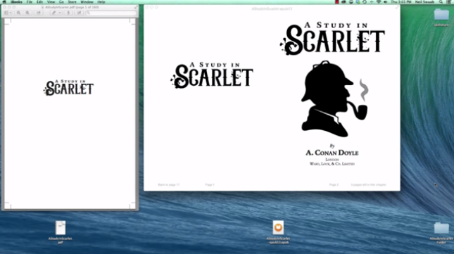
13. Output and Delivery: Okay. Now that your book is completely designed, it's time to ship it to the printer. So to do that, we can go to File, Package, which will bring up a box that shows us all the different things that are going on with our file. We'll click package, and continue and choose location, the desktops fine for me for right now, and click "Package." Now while this is doing this, it's essentially taking all the fonts, all the images, the actual InDesign file and just collecting them together in one folder so that the printer has all of those things. If I go to my desktop, you can see right here. Now we have the InDesign file, we have the document fonts, we can see all the fonts we're using, the instructions for the printer and all the different links that are associated with our file. But some printers however don't want all those things and may just require you to actually send them higher as pdf. So to do that, we'll just go back into our document and we'll go to File, Export, and we'll do a format of pdf print. We can also say that to the desktop that's fine, and click "Save." This will give us several different options, you've got all the different ones from high-quality to different kinds of formats the printers may give you, as well as, a few different options. Usually saving it as high-quality print is fine, but you also may want to go to marks and bleeds and just make sure that you have maybe your crop marks turned on and make sure that it's using the document bleed settings. Once that's set, you can click "Export", and if we go to our desktop here, we can see the file being generated right now. If I double-click on it, now you can see we have a pdf that shows the crop marks and has the appropriate bleed that we actually need for our document. Finally, if your book is destined for some kind of E-format, like the Apple bookstore or the Kindle, you'll want to do this instead. You'll need to export as an epub file, however, it's not as straightforward as it may seem, you actually need to work on your file a little bit, I've taken this epub document which is exactly what I've got already, and just tweaked it out a little bit because with those formats the images actually need to be anchored within the text, it doesn't respect master pages at all, so those objects disappear in the final format. It's not as straightforward as it would seem and it would take quite a long tutorial that go into specifics on how to make it better, but the essentials are you're going to go into File, Export, for format, choose epub, and click "Save", and you can use the different versions they've got here, some have different options and click "OK." This is just giving me a warning because I have some images in there and that's fine, and it'll generate a file here. So, here we have the beginning of our book, we've got our half title, our title page, we can see the copyright, got our dedication, our table of contents, part one in our chapter one, and the menu actually works too. So, if I come here and go to Chapter five for instance, it'll take me right to chapter 5. So, now we have a print-ready pdf and epub file and the collected InDesign document ready to ship to the printer in whatever media we wish to see our book printed.
 Neil Swaab, Freelance Art Director and Illustrator