Hello Summer!

I’m currently working on improving my colouring skills, so I took Gia Graham’s class on Skillshare. I absolutely loved her teaching style—clear, detailed, and very methodical. After watching the lessons, I created a few Procreate templates to make it easier for me to apply her colour palette technique in the future.
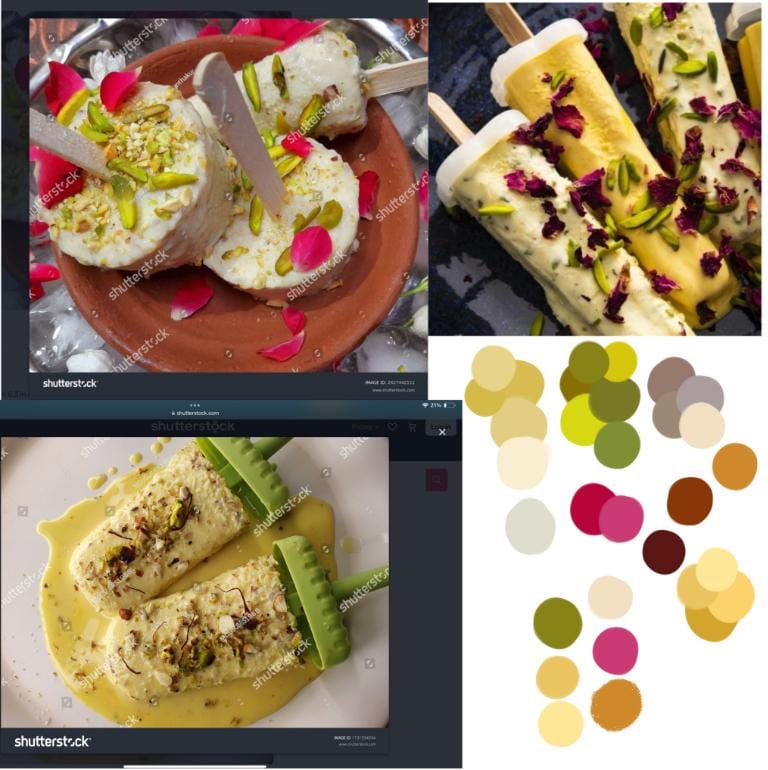
Next, I gathered some inspiration images and brainstormed ideas for an illustration where I could practice everything I learned. Gia’s theme for the class was “summer,” so I decided to use the same theme but give it an Indian twist. Being Indian, one of our all-time favourite summer treats is malai kulfi. It’s a creamy ice cream infused with rose, pistachios, almonds, cashews, and sometimes saffron, so I collected reference photos around that idea.
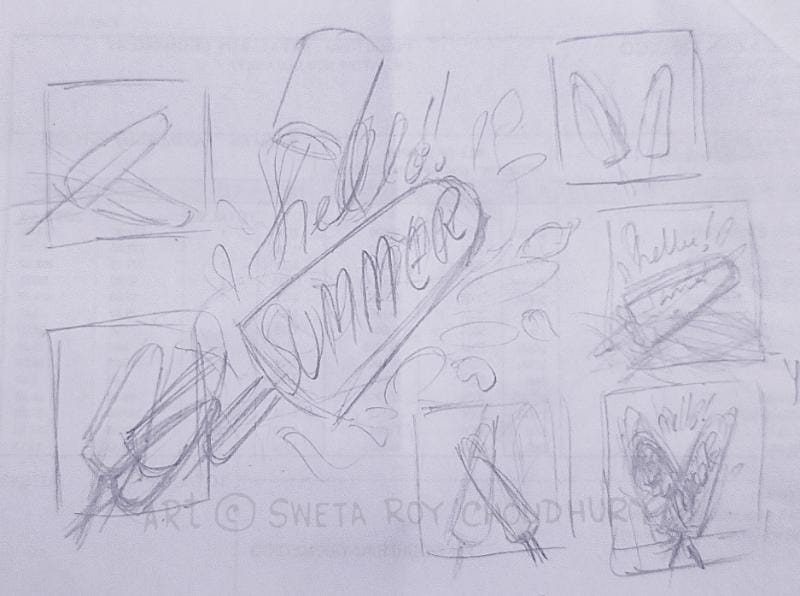
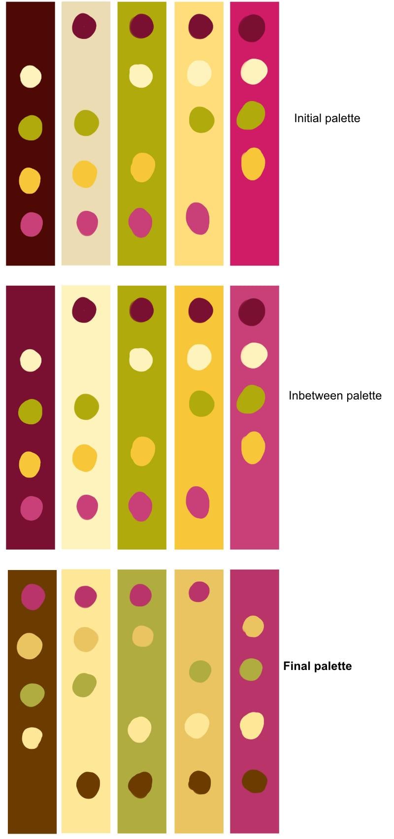
With this in mind, I sketched out a few thumbnail compositions and narrowed it down to one. Initially, I added a splash element in the background, but it started to feel too busy, so I removed it. My first colour choices also didn’t account for the colour of the almonds, so I revisited my palette, reselected the colours, and fine-tuned them again.
After finalizing the palette, I refined the lettering—another technique I picked up from Gia’s class- Handlettering in Procreate.
Here is my finished illustration, and I’d love to receive feedback on it!

Here are my questions:
1. Hi Gia! You mentioned treating white as a “bonus” colour and not including it in the five-colour palette during fine-tuning. Would you suggest the same approach when the artwork uses black?
2. Once we’ve decided on our five colours, if we use tints or shades of those same colours to create highlights and shadows, does that still count as a five-colour palette, or is it considered adding more colours?