Complex Flower Petal Mandalas - Part 3
Grasping the concept of using 6 primary colors instead of 3. I thought it would be a blast to have more colors to choose from but I actually felt a little lost with so many choices after getting more confident with 3 primaries in the other two classes. BUT not to be swayed, I thought of how I felt lost when I started with only 3. So here we go!
———————————
08132021:
My process to get back to art making:
Wow, over a year since I have posted to this project…I have not been doing any art for quite some time but i could feel creative energy being alive in me for a month before I started painting again. I have seen how doing art is like a circle (spiral?) that is always moving and changing - when I stop for any amount of time, it is a challenge to jump into the flow of the creative circle again. Think: where do I start? There are so many voices in my head with conflicting ideas about where to start. This can contribute to not moving into the circle, until one idea comes in and sticks.
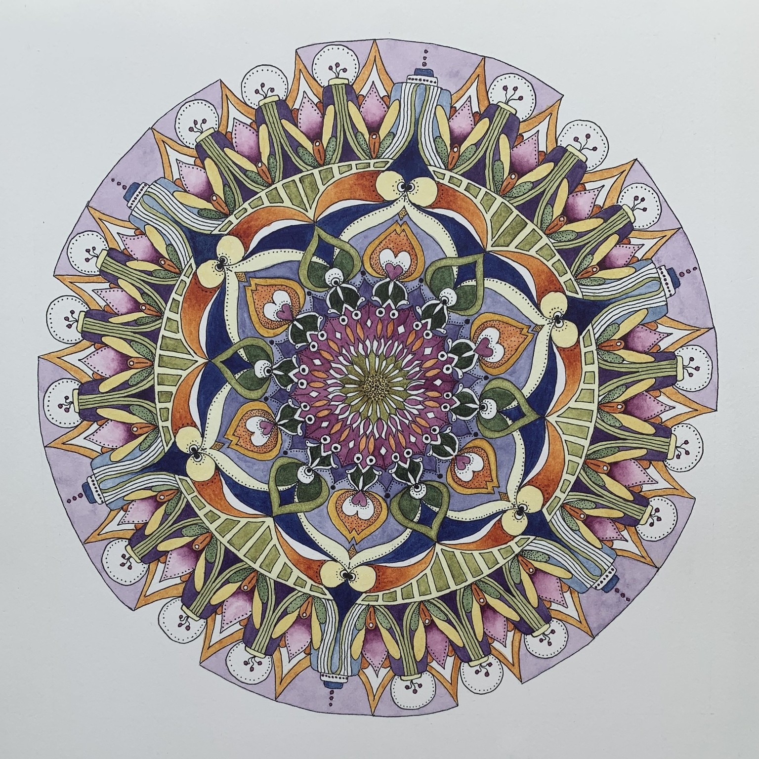
I picked up a mandala I had almost finished just before I stopped doing art. It was an easy entry point and the flow into the curiosity about the design took over right away, I am happy to say.
I chose a palette of colors I had used previously (so I didn’t agonize any further about that!). It is: Quin Gold, Quin Rose, Indanthrone Blue (DS). I used an extended complementary color scheme: BG/B/BV/V/RV with RO/O/YO and slipped in some pale yellow along with a YG. It was challenging to use so many colors!
Paper is Stonehenge White - it says it was originally created for printmakers. It is recommended for drawing and colored pencils. It was wonderfully smooth for inking the mandala and I like how white it is. It took watercolor fine - although I don’t know how it would be for larger washes.
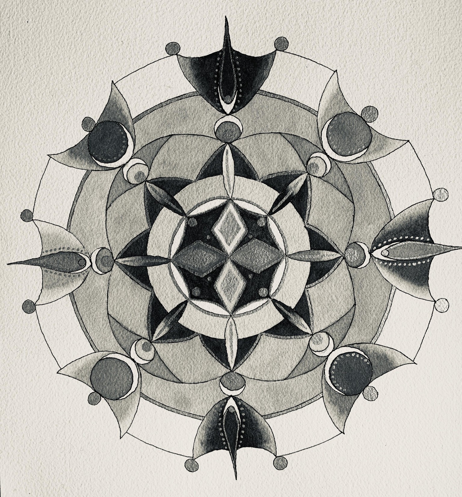
Also including a black and white version for kicks and giggles.
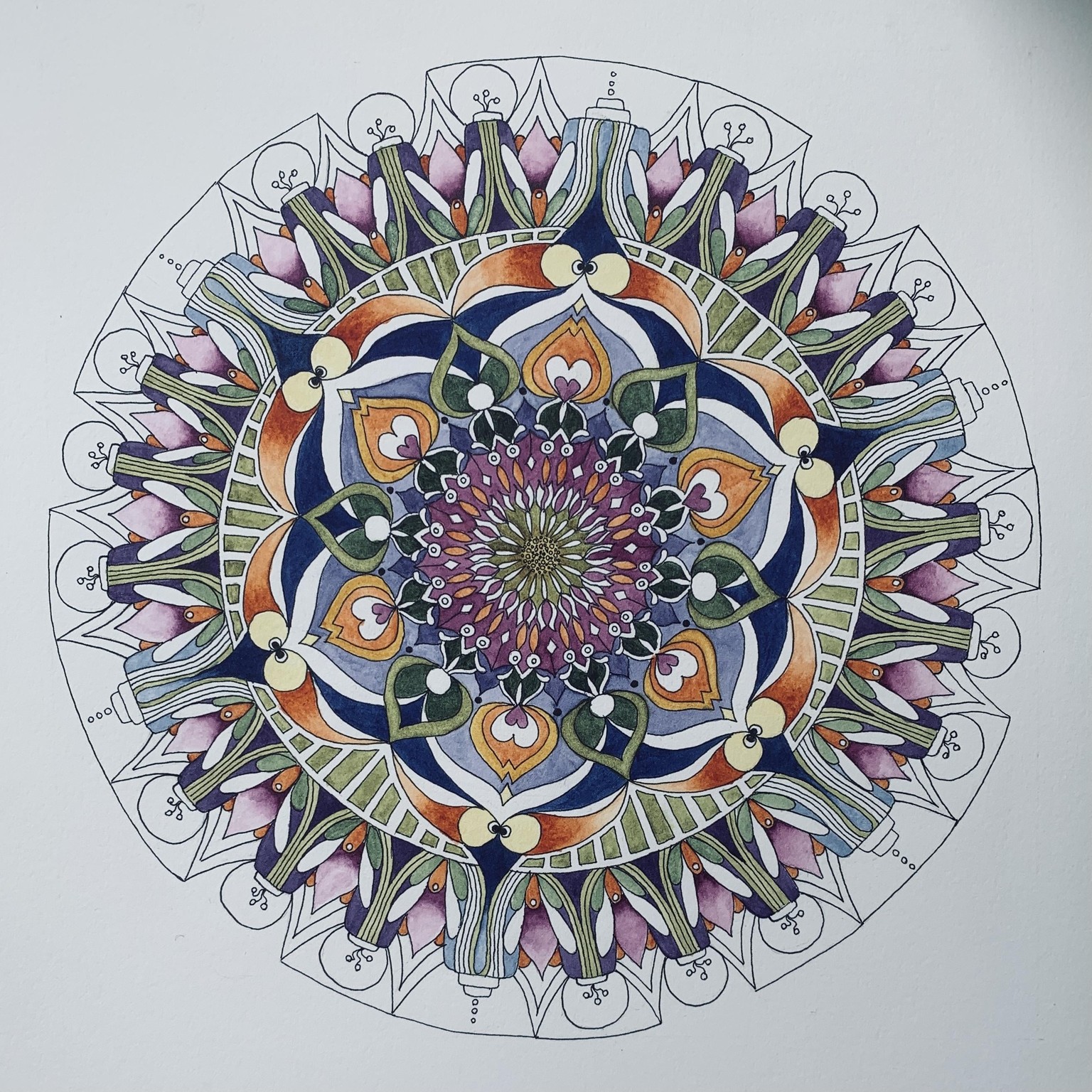
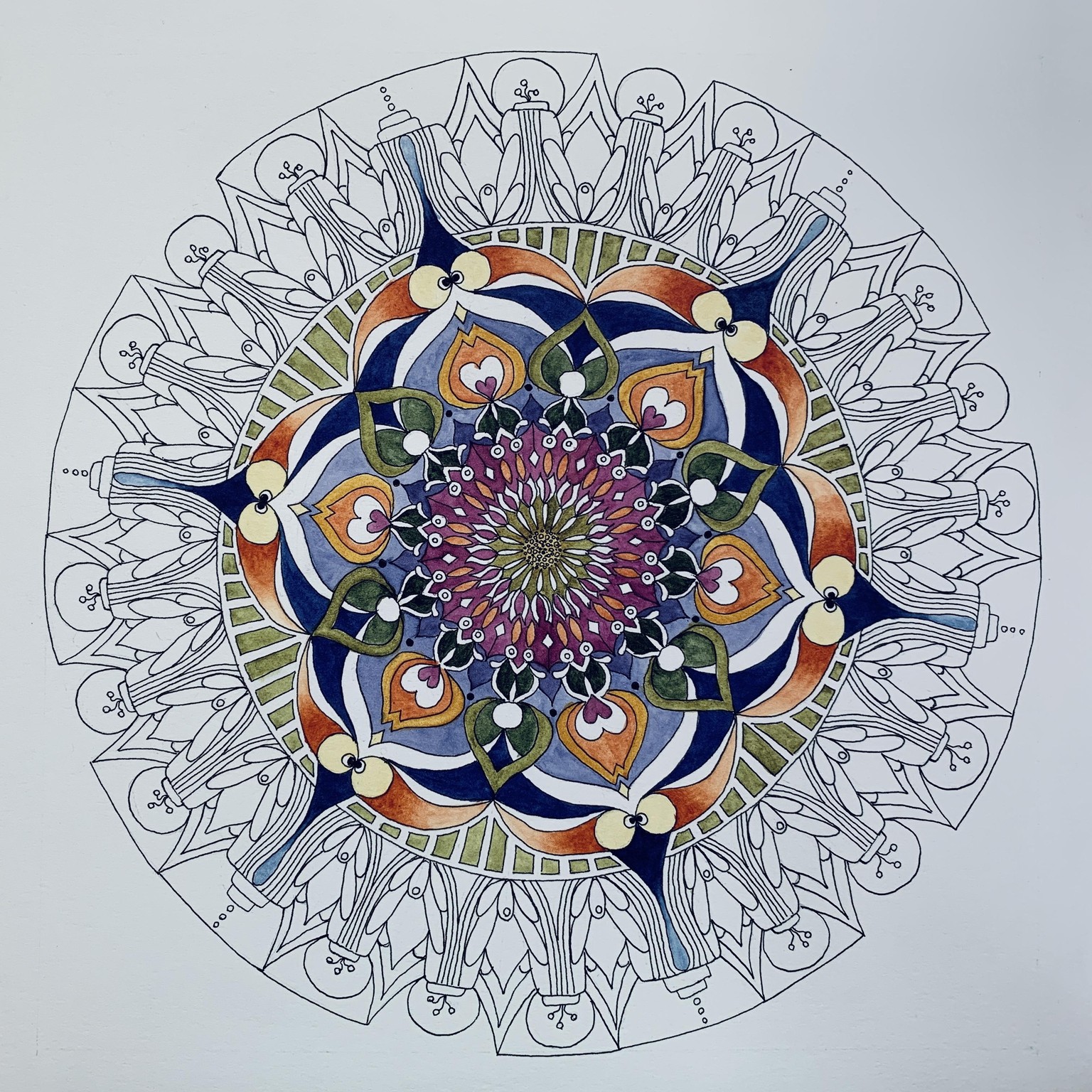
Mandala is 9” diameter, drawn in pencil, inked and painted. Stippling done after finished with painting. Thought it might be interesting to see the painting process as it developed. There are two other stages under the finished one.
The settings for color are not exactly the same for all three but you get the idea!
One thing that I really loved adding at the end was the stippling. It has such a sense of whimsy to it. I ended up using some extremely light washes with yellow to integrate things a bit more and soften the colors particularly in the center area which helped it integrate better with the outer band.
The black and white version feels well balanced and interesting to me.
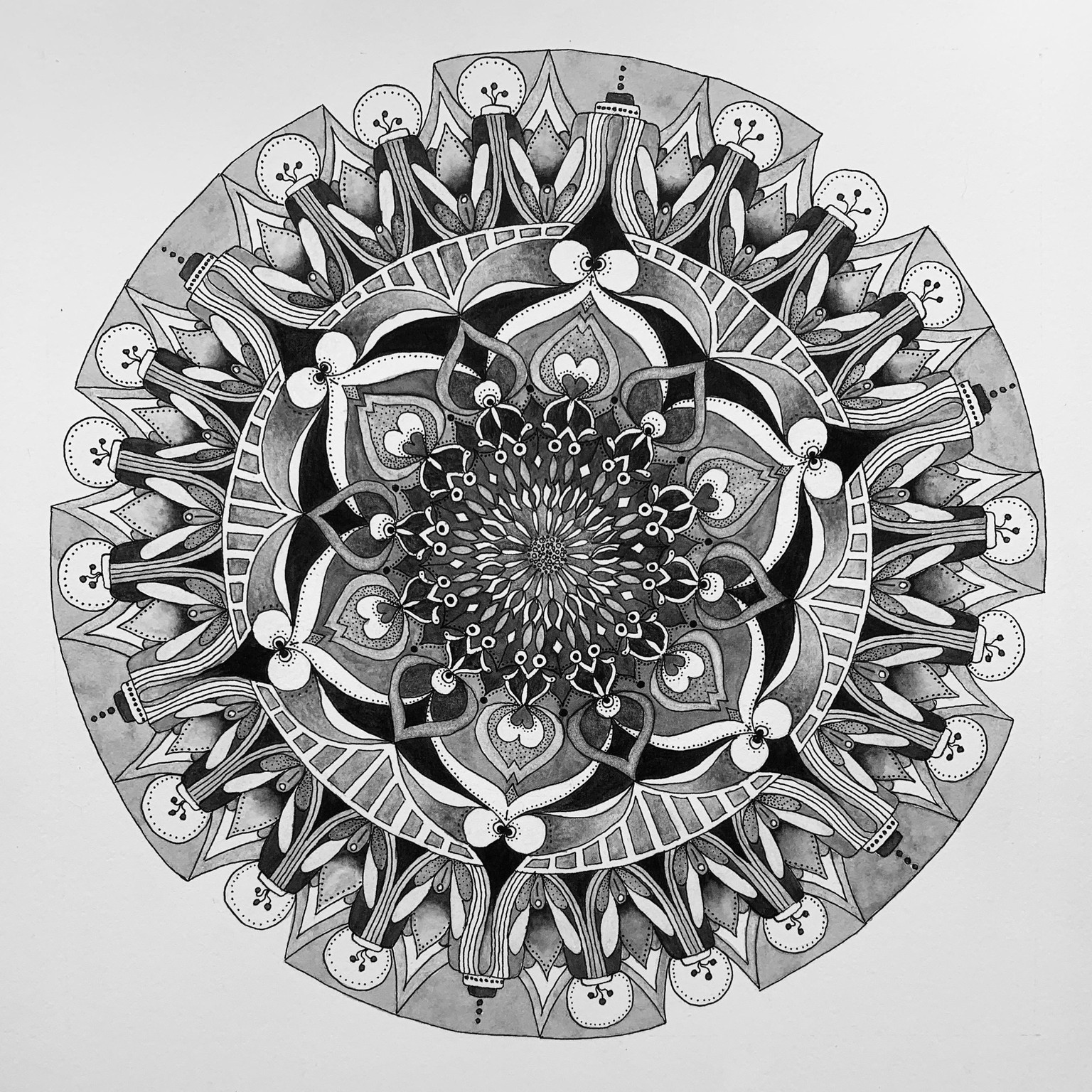
Wow, this looks positively dreary compared to the colors of the actual mandala. I will replace it in the morning when I can use natural light.
Colors I am using:
Warm yellow: Nickel Quin Gold, Cool Yellow: Hansa Yellow Medium
Warm Blue: Indanthrene Blue, Cool Blue: Phthalo Blue - red shade
Warm Red: Pyrrol Scarlet, Cool Red: Quin Rose
I am not very fond of this design. I deviated from my original painting plan and design. I usually have a feeling of “yeah, this is a cool design” but that never happened with this one which was interesting. I cam close to cutting out parts of it and simplifying but decided it wasn’t worth it.
Color mixing: I expected more neutral colors with this combo and actually mixed 4 different options to see what direction I wanted to go...that led me to question a few of the mixes that didn’t neutralize but I was expecting them to - or the reverse. I may post a question about this tomorrow with the color swatches.
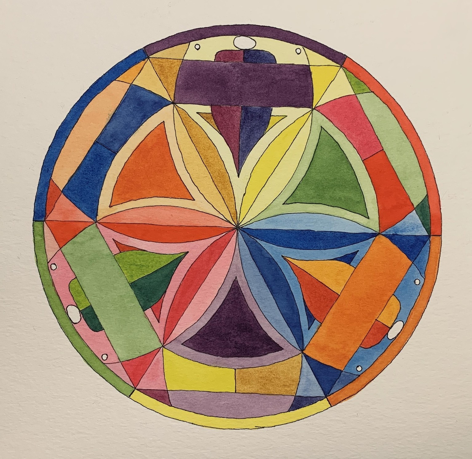
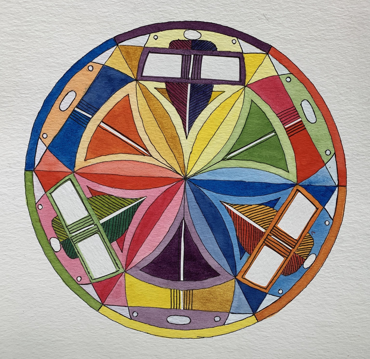
My “fixed” version of the above mandala. I wanted to have them one after the other so it would be more fun to see the difference.
I forgot to take another picture of the original one before I did these changes. Thanks so much for your feedback, Chris. I was so tempted last night to start cutting it up and am glad I waited until this morning. Both for what you had to say and also because I did an alternative to cut it apart into pieces. Knowing me I would have been shuffling all the separate parts for days!
It still isn’t quite what I want it to be but it is close enough for me to feel good about it now. I cut bits of paper and glued them onto the design and also used some white gouache to paint in some of the small circles and bits. Did some additional inked lines to break up the spaces.
The other thing I noticed is that I prefer the orientation with the other shape at the top, but I put it with the yellow on top for consistency.
SECOND FIX: All inner petals are the same value. My eyes no longer jump all over the place. What an incredible exercise!
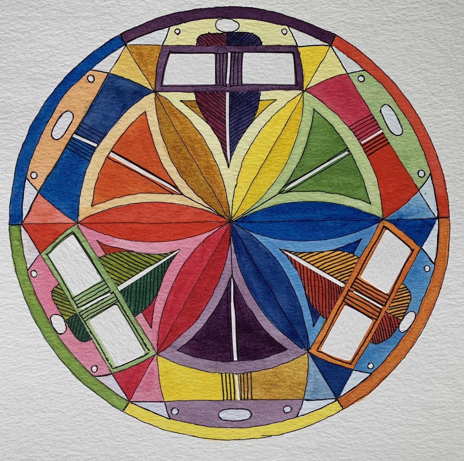
Colors used ~
Azo Yellow - cool, Quin Gold - warm
Phthalo Blue RS - cool, Indanthrene Blue - warm
Quin Rose - cool, Pyrrol Scarlet - warm
In this mandala I picked the main 3 primaries for the large triangles and used a lighter hue for the “cups” the flowers are in. In mixing the secondary colors I tried the various combos and decided on which one I wanted to use which for the most part meant picking the non-neutralized ones as I wanted the overall look to be brighter. Same with the tertiary colors.
I made a few painting mistakes as well as not realizing until I was pretty far into the painting that I didn’t finish drawing in a smaller element of the design. So that created a bit of consternation as some had the element and some didn’t. I fixed it but my plan for that element had to change.
I also was agonizing over the white in the petals. I almost painted part of them in but ended up (for now) leaving the background white as I like the rhythm it creates.
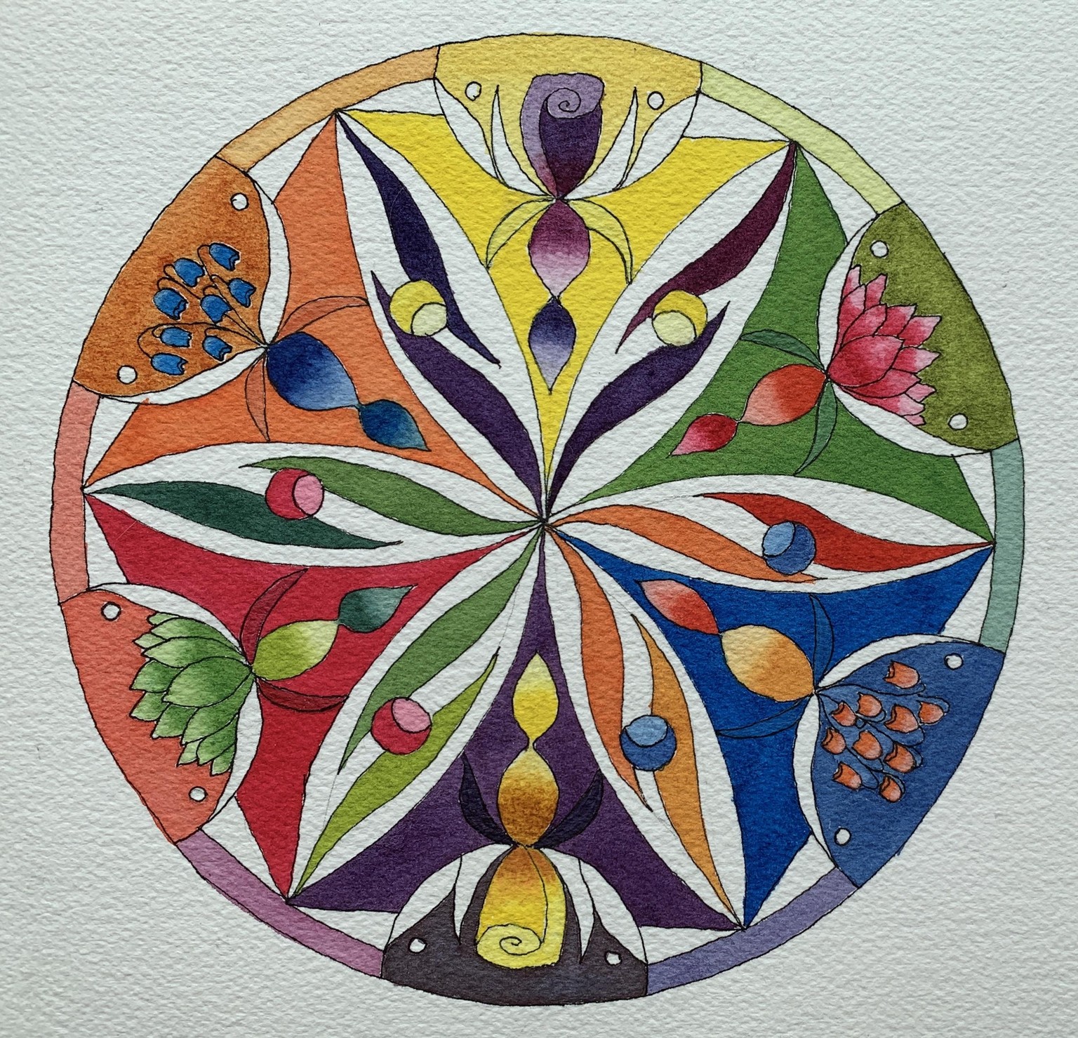
Well, it took a while but here is my next mandala. I have to say that somehow I missed the fact that I was not working with an odd number of sections and boy did that ever create a challenge...I am finding that having so many colors to work with is hard for me to make choices about how to organize things and as I said, having an even number didn’t help. I managed to include the primary, secondary and tertiary colors but it isn’t organized like previous color wheel mandalas. It was interesting when I was painting it that I found that small undermining voice talking to me about how it wasn’t working, etc. But I am happy to say that a stronger voice was that if I don’t keep experimenting, I won’t figure it out and it was okay to have some not work as well as others. So my pep talk worked and I kept at it. I had some fun getting out the gold to dress it up when it just seemed to be falling short.
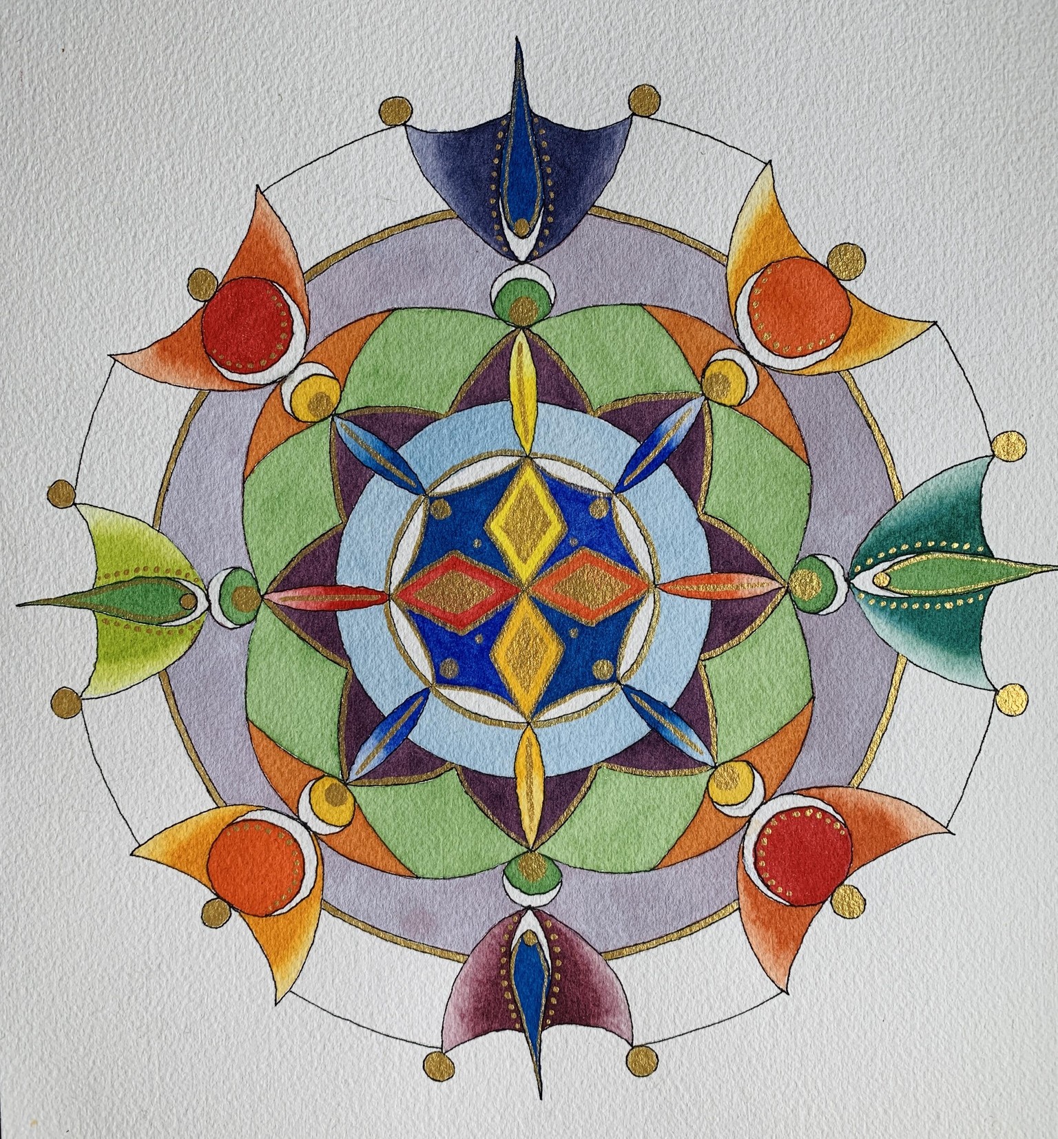
Here it is, although I ought to know better and wait for natural light to take a photo. Will replace it tomorrow as the paper really IS white and the colors are not so washed out. A much better picture...
Here is the above mandala in grayscale. Now I want to go back and do this with all of my mandalas!