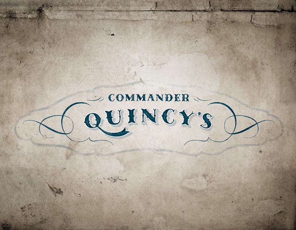
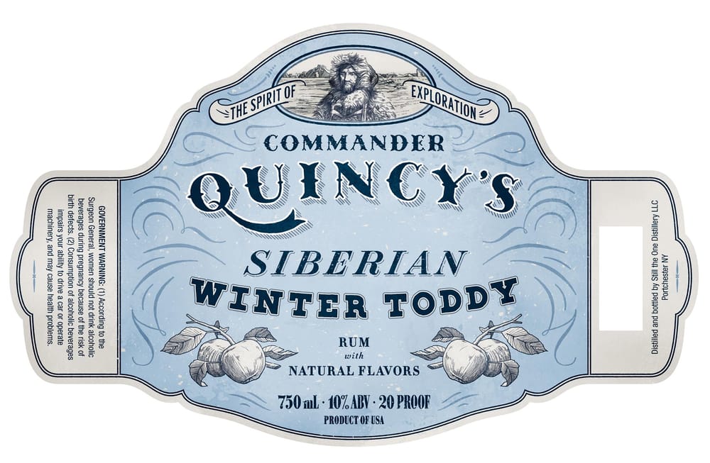
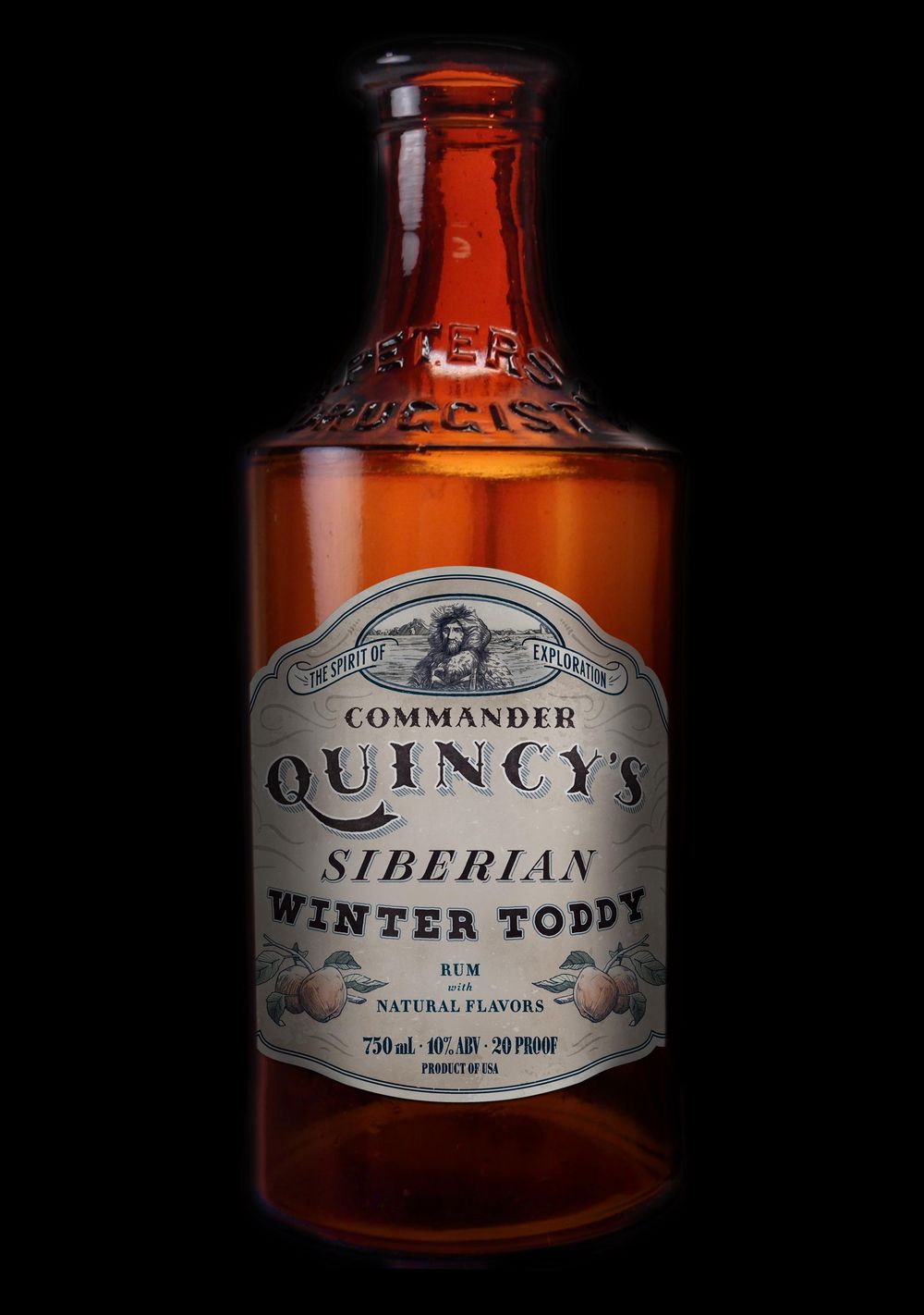
Commander Quincy's Siberian Winter Toddy
FINAL ROUND - MARCH 19
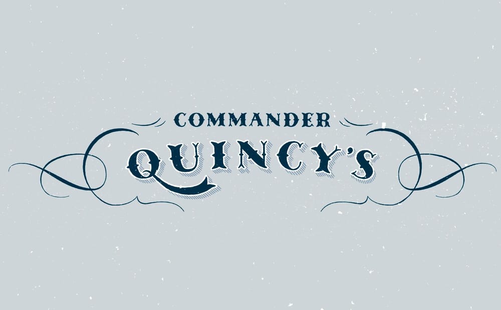
After some delays, other projects, life, etc. I've finally wrapped up the full label. Using the logo in an actual application required a lot of adjustments that I did not have to consider before including text sizes, decorative filigree placement, and the label shape itself. I also spent a decent amount of time drawing and redrawing the illustrations trying to get their look to fit with the feel of the text.
On the roughening/texture side, I kept the vector texture pretty minimal. I prefer the fine control Photoshop provides so I finalized the label there. Results below.
Alternate coloring and mockup:
-----------------------------------
ROUND 1 - JANUARY 26
Hi everyone. For this class I'll be showing the brand development for a new spirit based drink. Although the scope of this work is slightly outside what the class is covering, I thought the approach for the main typographic mark could benefit from Simon's lessons.
I hope the development is interesting to others and look forward to hearing solutions for some of the design problems I'm facing.
One quick note: this has been in the pipeline for a little bit of time now so I'm jumping into the class with a fair amount of work completed already.
Background
The client began research and development of a new alcoholic beverage. Working closely with a distiller, they settled on a rum-based apple drink that could be served hot or cold.
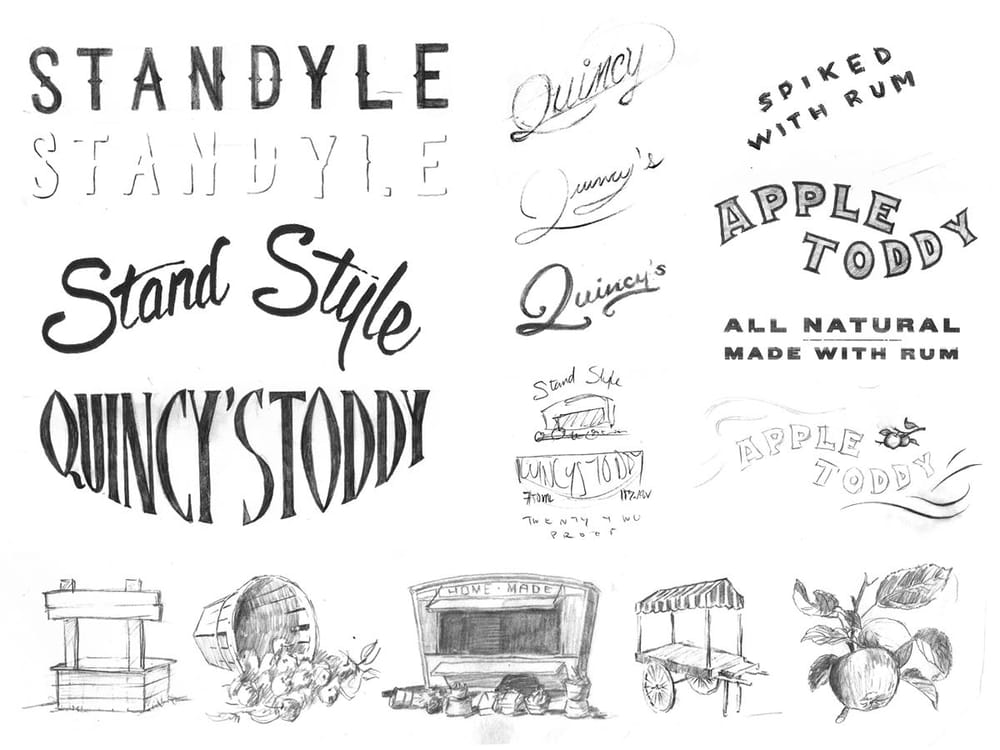
The original approach for the brand was for an overarching company, Stand Style distillers, to introduce a new line of spirit based drinks. This rum apple toddy is the first of those drinks.
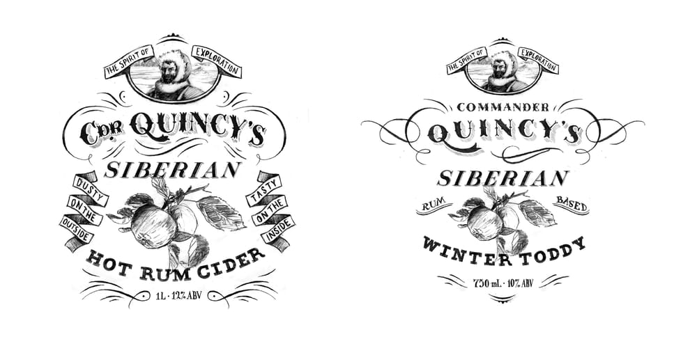
The Stand Style idea encompassed farm country, made in the back shed, side of the road sellers, old markets, and farm stands. The client also had a childhood desire of one day owning a liquor called Quincy's, so we began incorporating that name as well.
Initial concepts for this brand are below.
Change in Direction
After this first round we felt a lack of excitement. The aesthetic was interesting, but overall the brand was not quite captivating. The name was forgetable. There needed to be more of a story to rally around. After many discussions, the idea of Commander Quincy was born.
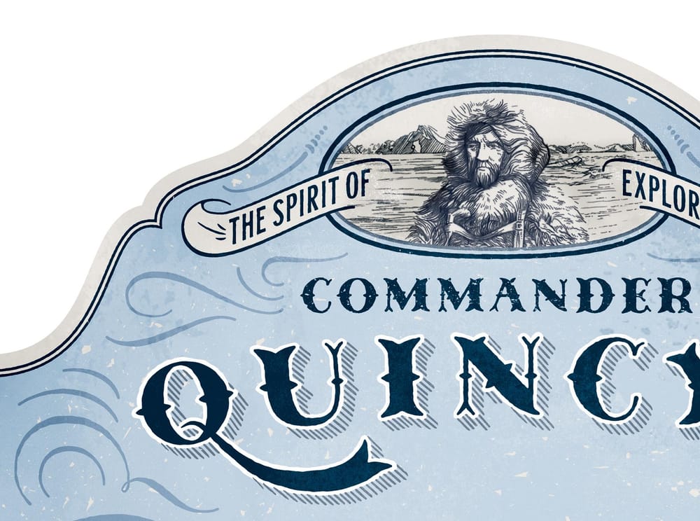
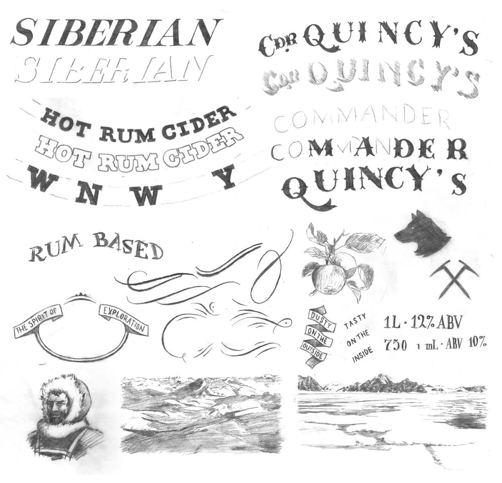
Commander Quincy is a hardened, wise, and thoughtful explorer of the world. He is a Shackleton-type adventurer, scouring the globe for exotic drinks to share with all. His first discovery: the Siberian Winter Toddy.
This back story set off all sorts of ideas for inspiration. Arctic explorations, 19th c. typography, ships, ice picks, huskies, carrier pigeons, maps, ice flows.
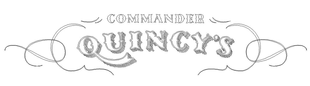
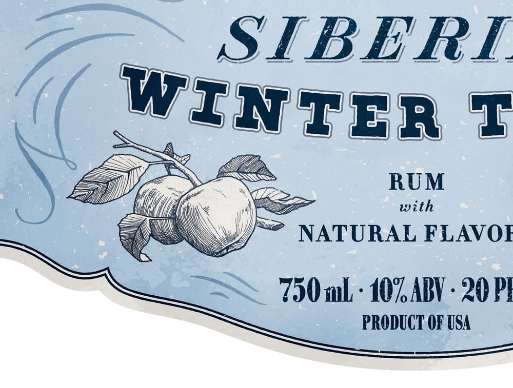
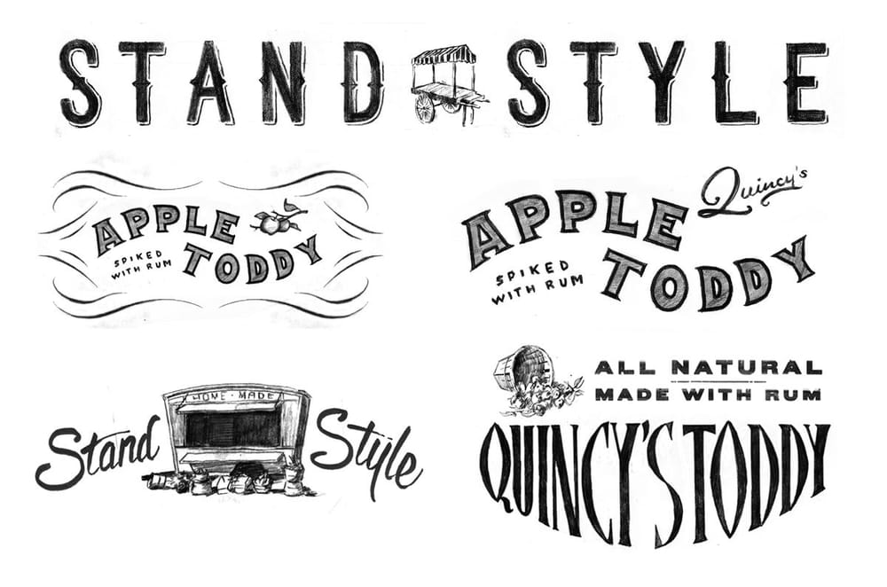
Luckily I had a clear direction in my head of how to proceed and made these sketches. There were a few elements from the previous round that I brought over such as the old typographic filigrees and the fruit illustration.
I'm very comfortable with drawing and sketching and prefer to develop the marks that way before moving into final lockups. I use Photoshop to layout the elements and make tweaks. These are the first two arrangements.
Commander Quincy Now
At this point everyone was happy with the direction it was heading. The next step involved adjusting the mark to fit a particular type of bottle and use finalized copy. This brings us up to the present day.
The main information on the label must fit within a 5"x4.5" box and the words 'Rum with Natural Flavors' must be used. This is where I ran into some trouble because with the size restriction, that phrase is not easy to split up using the previous design. Below are 4 variations.
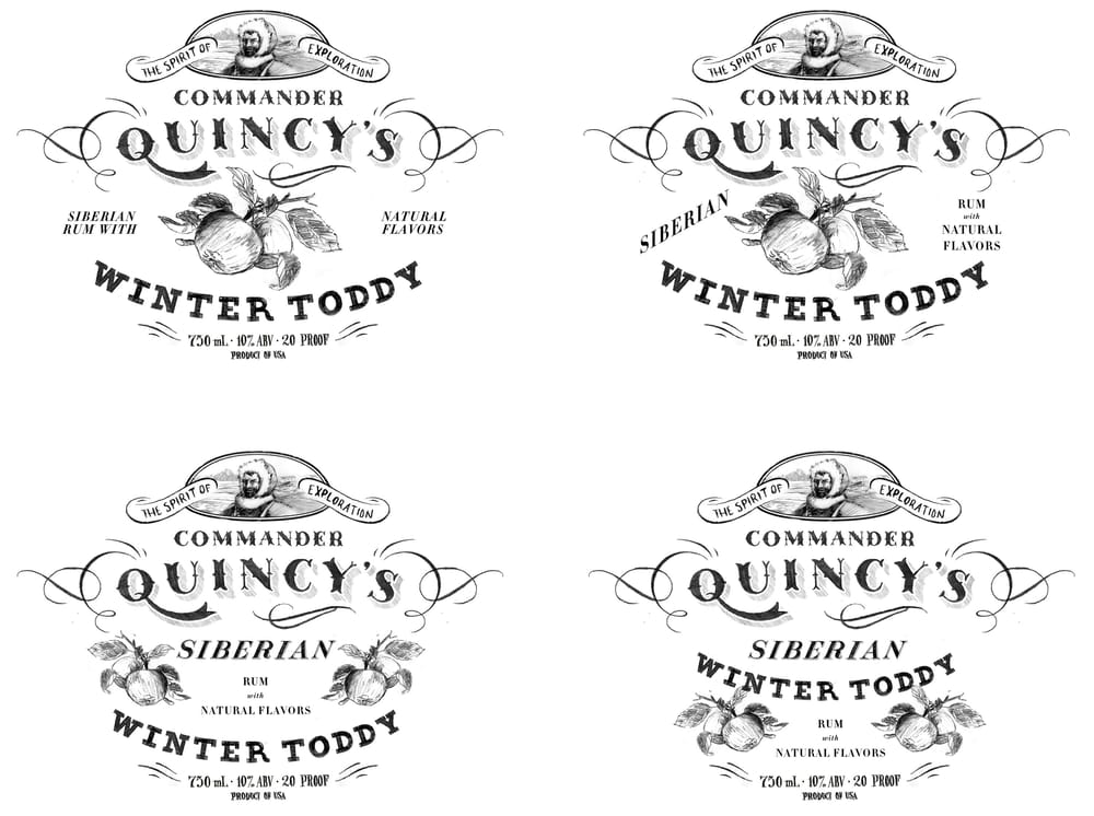
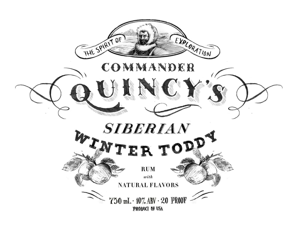
I think the bottom right is the most succesful, a larger version is below. A few thoughts:
- Not sure that the swash on the Q and little flourish underneath the name is quite right.
- Will add some decorative elements to Winter Toddy, probably an outline of the text
- 'Rum with Natural Flavors' is currently set in Didot for ease of testing layout options, this will be hand drawn later
- 'The Spirit of Exploration' is placeholder lettering and needs to be developed
-----------------------------------
ROUND 2 - FEBRUARY 2
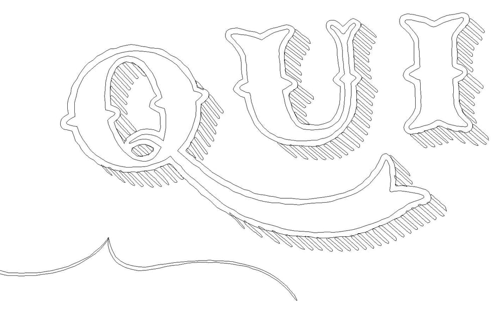
Man vectoring is time consuming... So not massive changes from before, I haven't even gotten to texturing yet, but I wanted to post up the vectoring process.
My first pass started with tracing the sketch using strokes. It wasn't very productive so I decided to work with guides. I used a combo of single width strokes and variable width strokes, piling shapes on top of each other to get the look I wanted. I also found using rounded caps and corners to be helpful.
Once I got the shape looking somewhat ok, I outlined the paths and then finessed the shapes. I kept letter components separate so I could use from letter to letter.
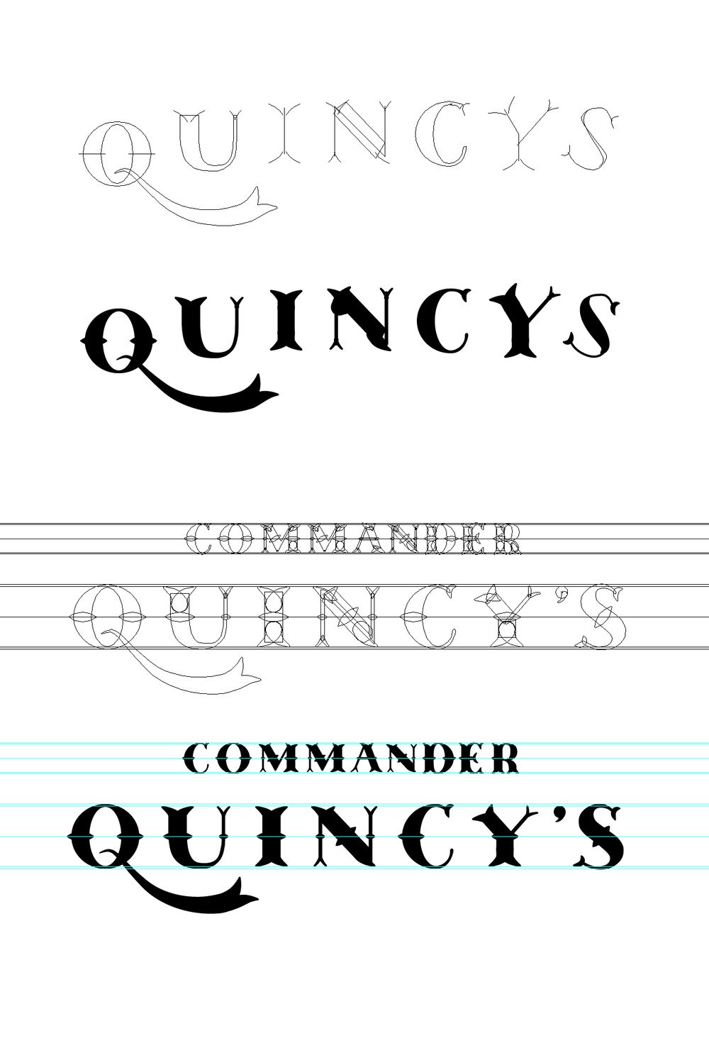
After I got the letters sorted out, I unified the major letter forms. I then setup new guides for setting the letters on a curve and to kern the mark.
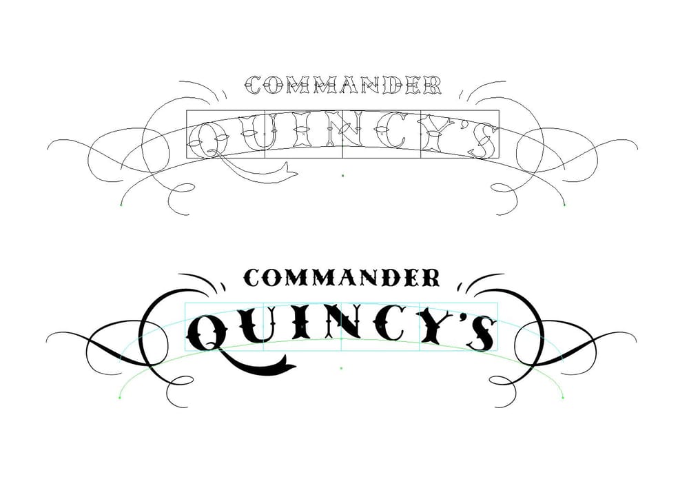
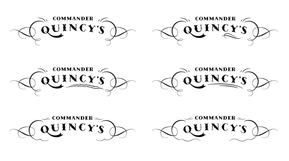
I still wasn't happy with the Q swash and some of the filigree elements so I tried a few variations to try and work something out.
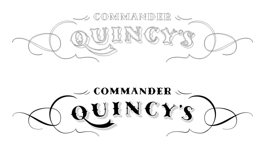
Finally feeling good with where it was headed, I added in the block shadow.
Next step is vectorizing the rest of the text... then finalizing the full composition and adding in texture.
-----------------------------------
ROUND 3 - FEBRUARY 9
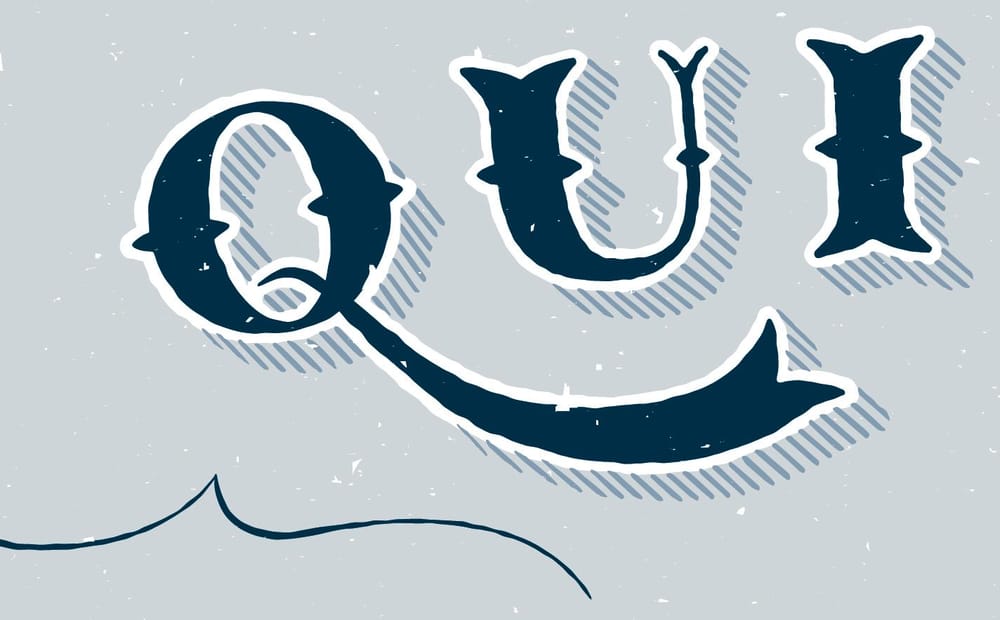
Spent pretty much the whole week messing around with the textures. Swapped out the block shadow with hatch marks, then had to individually tweak each one. Added a little vector texture, but did most of the work in Photoshop. On to the rest now.