Urban Nature Journaling: 7 Days of Artistic Prompts
Day 1: Color matching
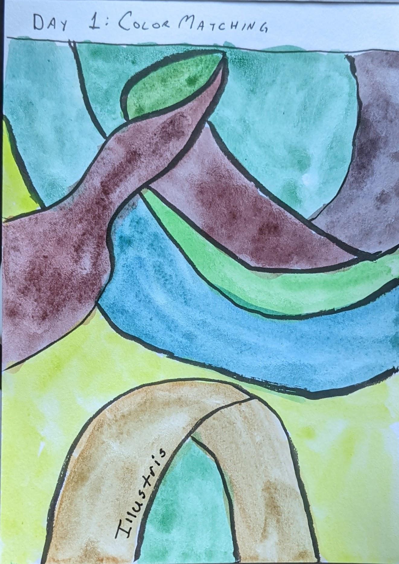
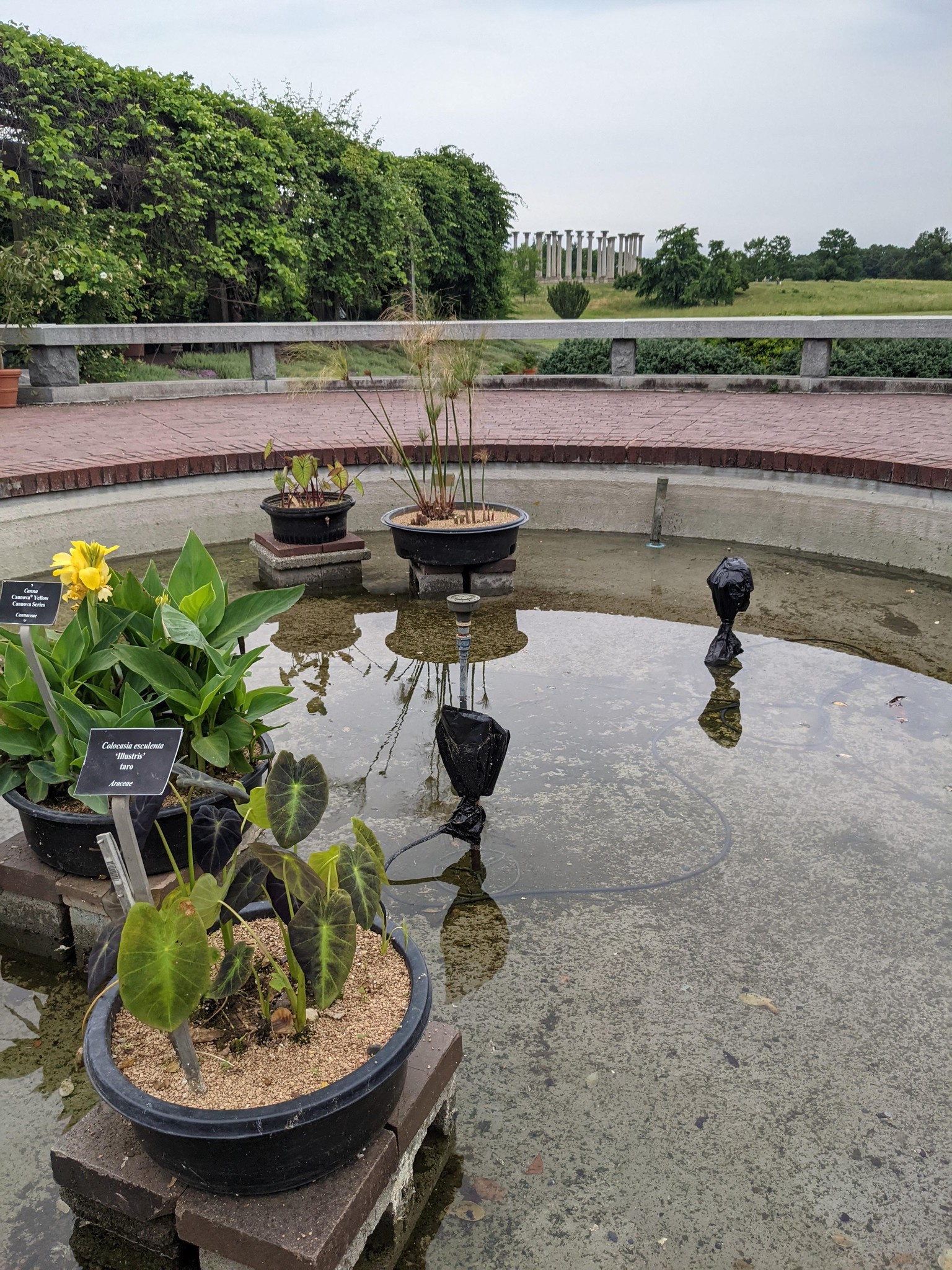
It's 100°F out so forgoing the walk and using a photo from a recent trip to the DC arboretum gardens.
Plant: Colocasia eculenta 'Illustris' taro
Takeaways: I could/should have gone much darker on the purples, they're nearly black on the actual plant!
Day 2: Texture Circles
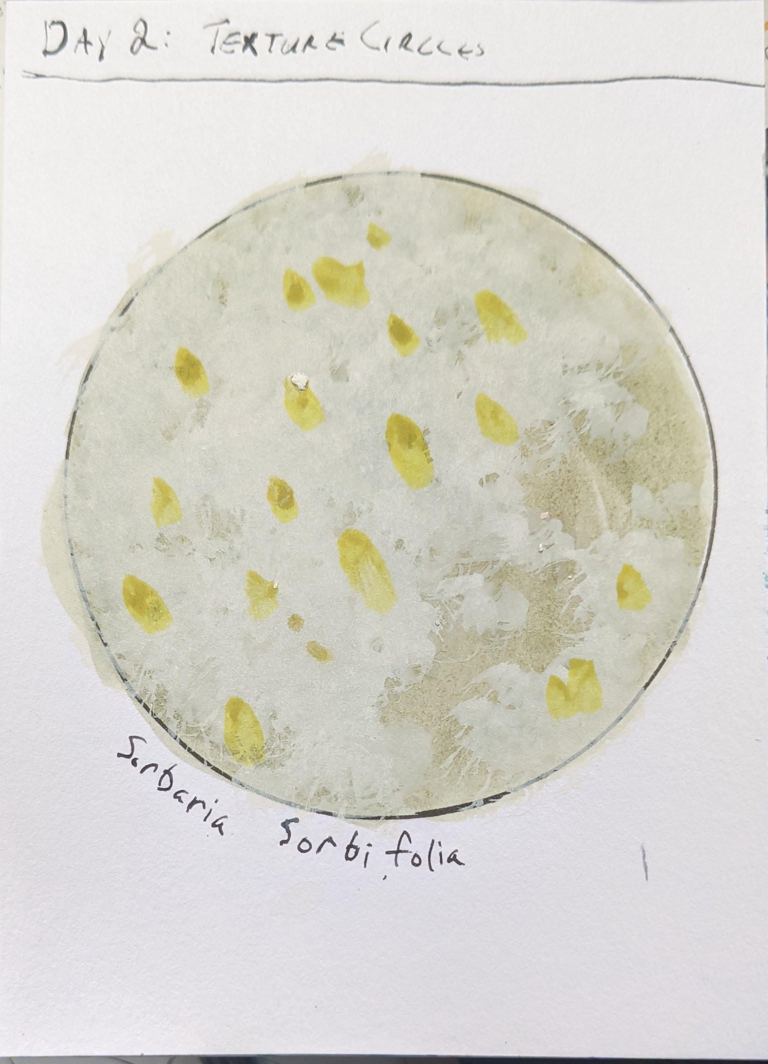
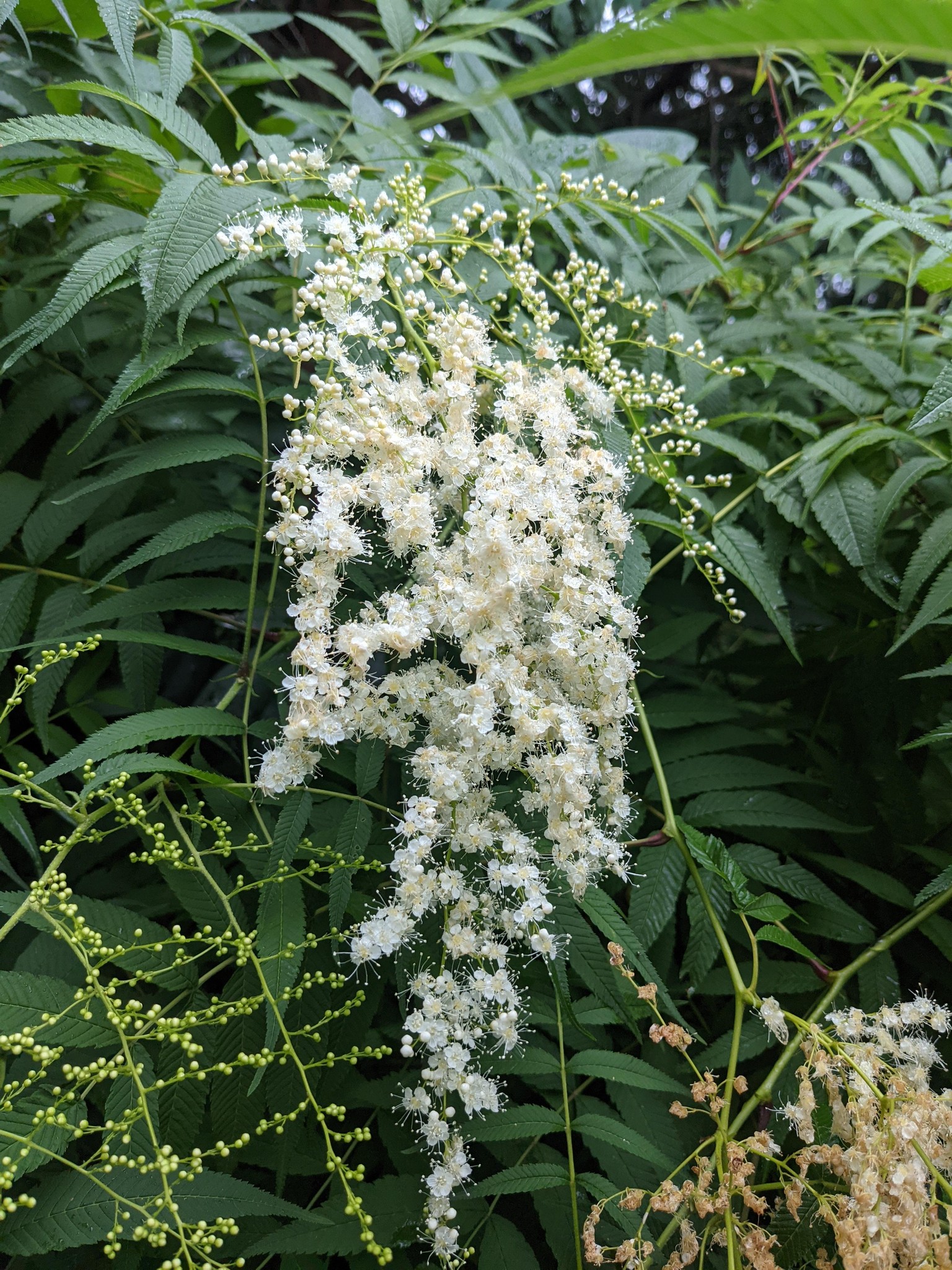
Beefed it on this one. Was trying to get that sort of "exploding"/"fluffy" texture of this flower in the yard but it just came out a bit messy. Also needs a higher contrast between the dark green background and main flower, and LOWER contrast between the small light-yellow core and the rest.
Day 3: Black & White
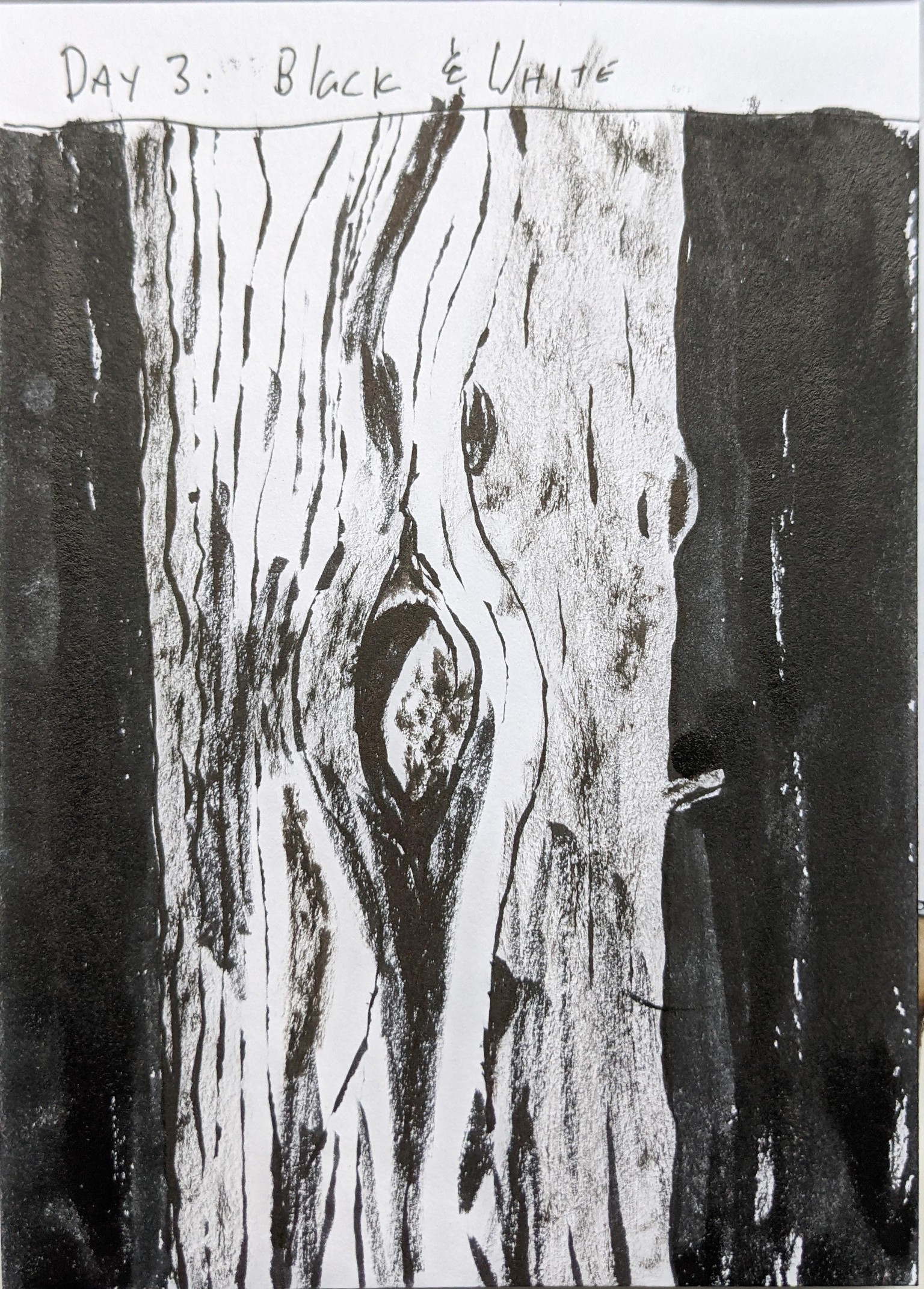
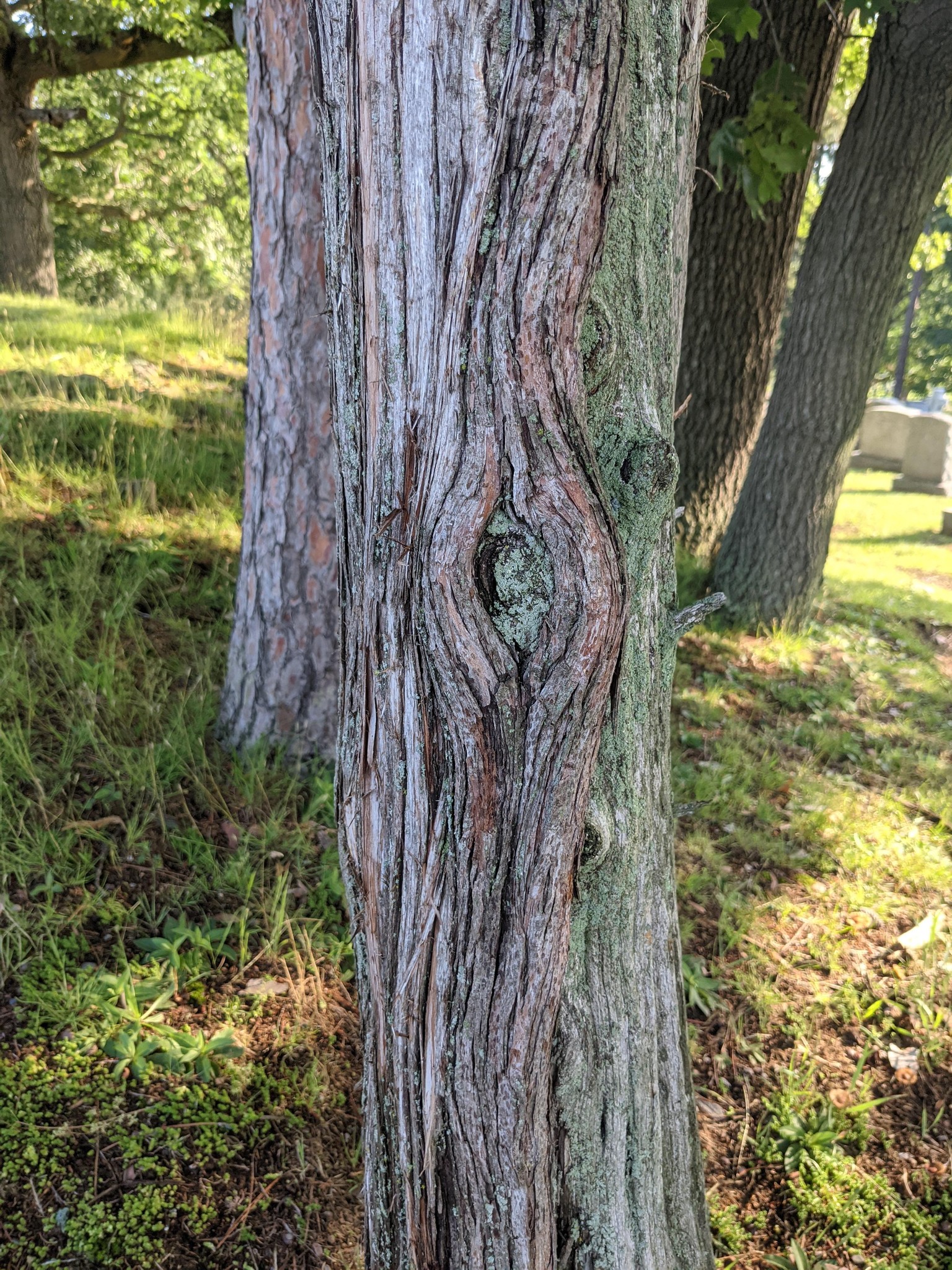
This one may have been better at a larger size to get more of those fine lines in. As it is the "grey" from the dry brush just looks smudgy. I do like that the differences between the two sides, one heavily vertically lined and the other kind of lumpy but less ridged sort of came through.
Day 4: Hand-Lettered Questions
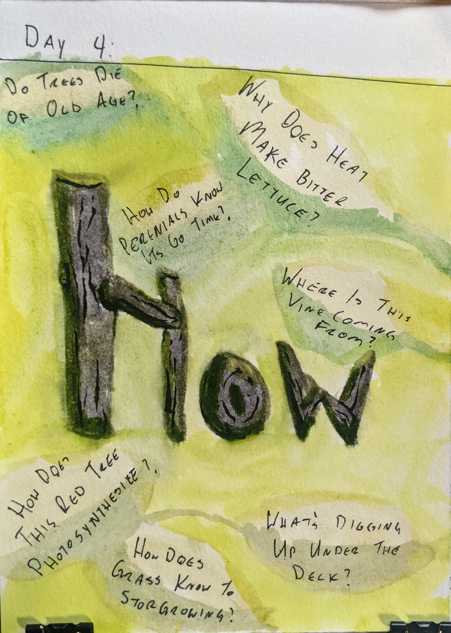
Day 5: Nature Patterns
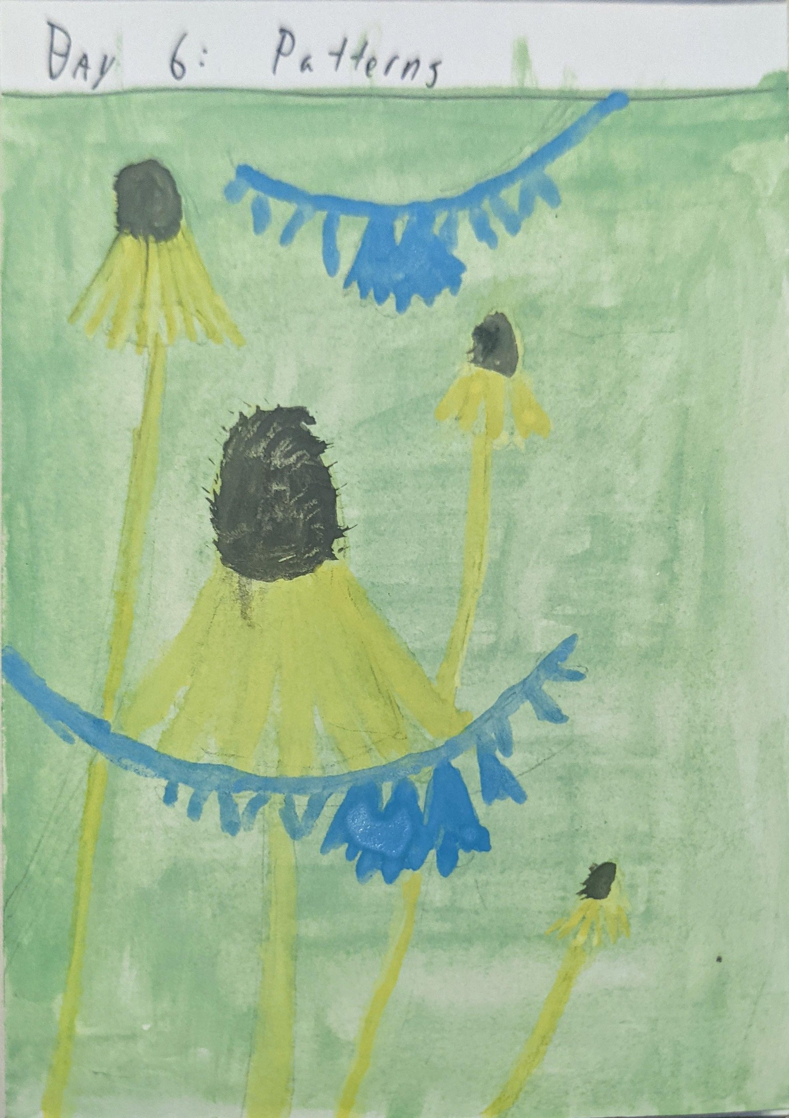
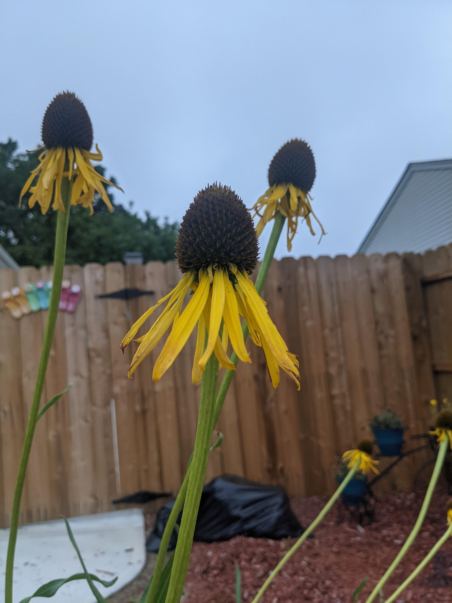
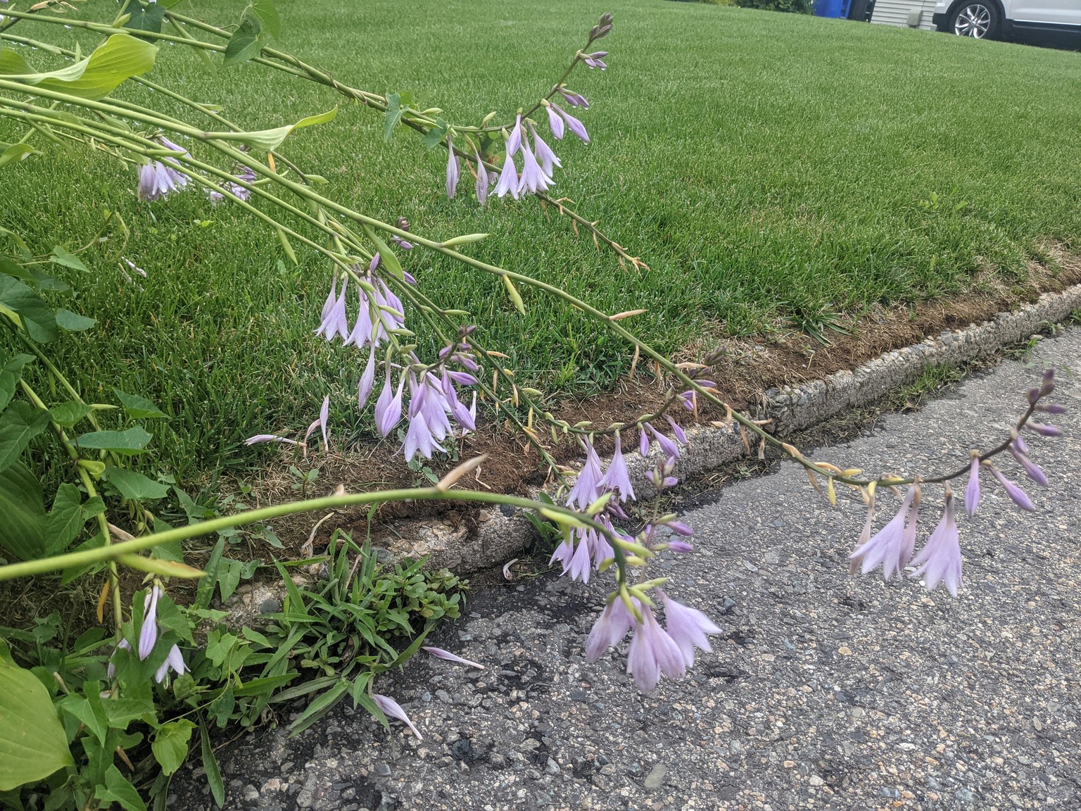
I liked the difference in "alertness" between these two flower types. The lazy curving pink flowers vs the yellows that almost look like rockets taking off.
Wanted to try the gouache trick Rosalie showed for this day, but didn't have ideal results. I was hoping the opacity would make the yellow stand a bit better over the greet, but I'm pleased with the overall composition. The actual shapes could have used a bit more sharpness, and the pencil marks def needed to be lightened more.
Day 6: One Meter Challenge
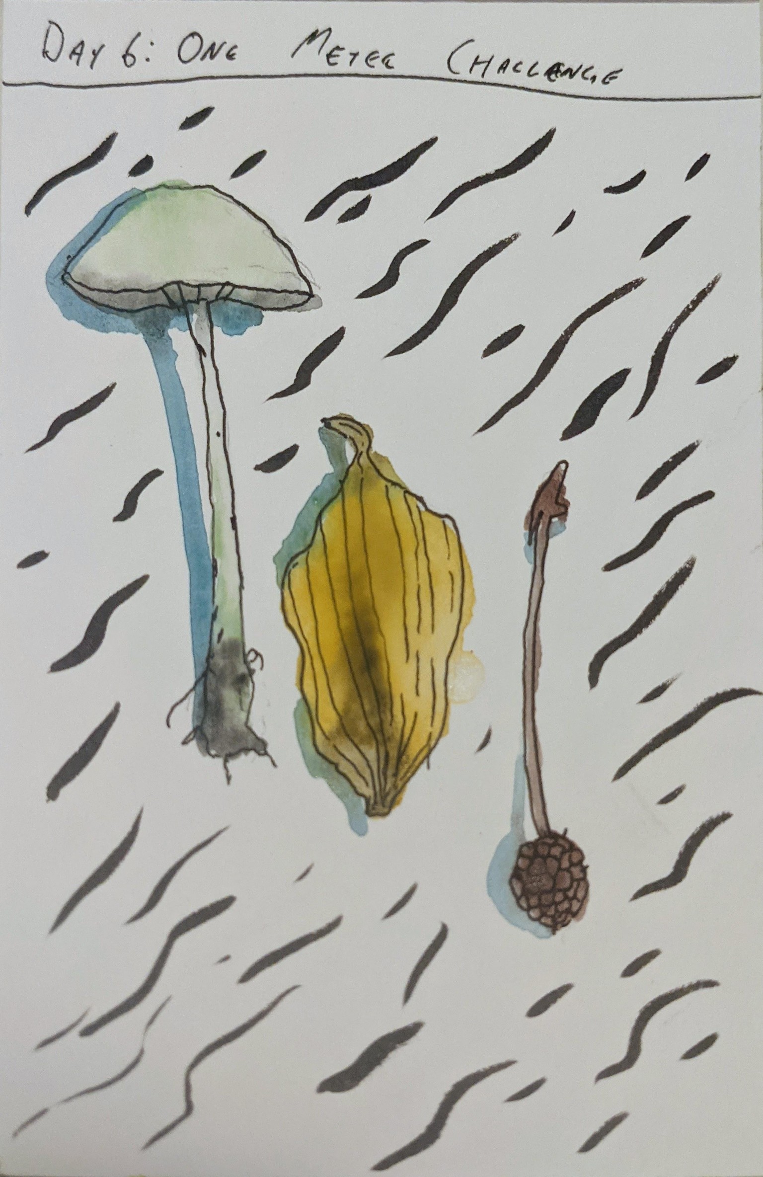
I'm learning that I really prefer having an ink outline when doing watercolors. It feels like its a lot easier to distinguish outlines (obviously, I guess) and makes my paintings a lot clearer. Maybe it makes it helps move it from a painting to coloring?
I have no idea what any of these things are!