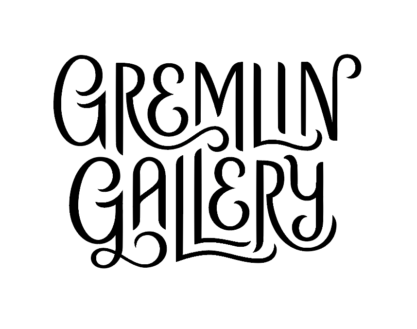
Gremlin Gallery Tattoo
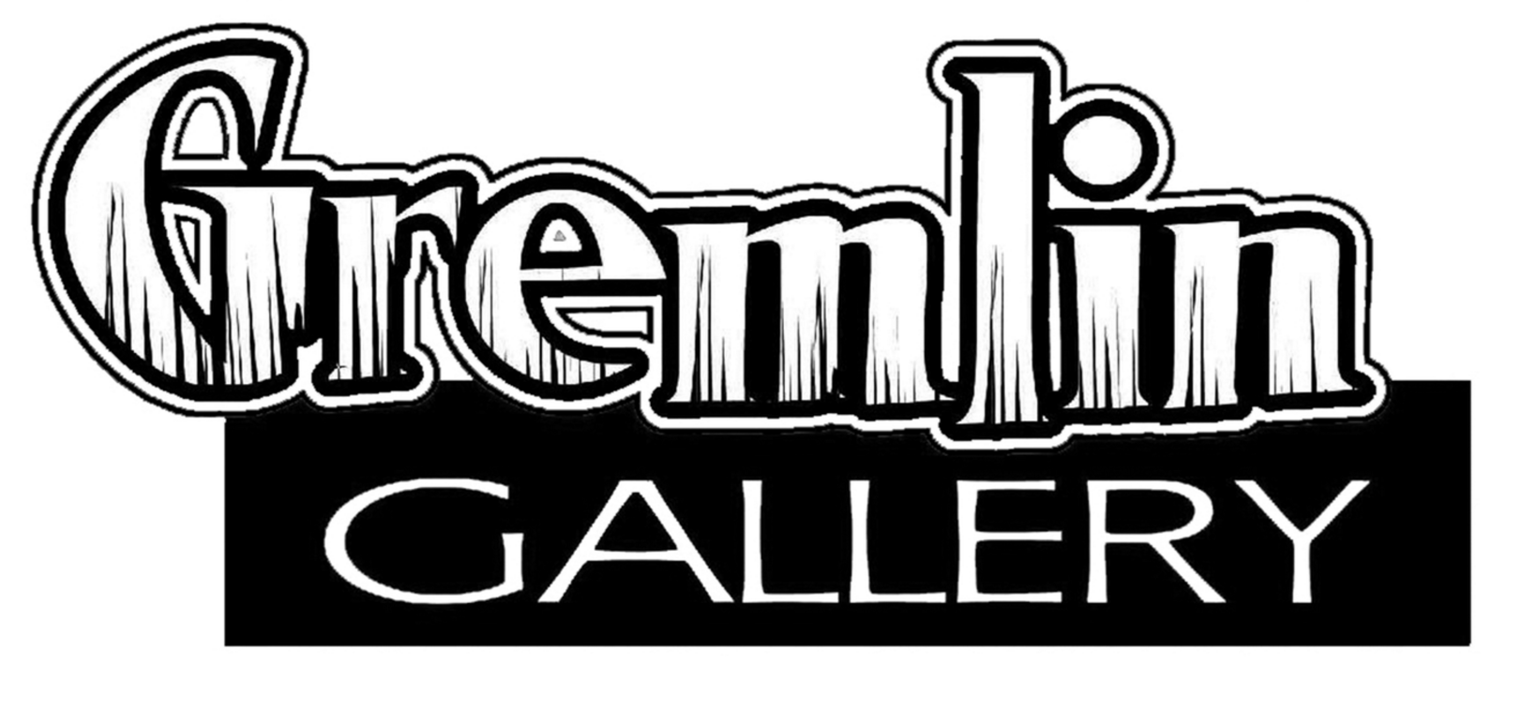
Wanted to do some lettering for this client project. Its a pretty cool tattoo shop that recently relocated to a residential area, where they completely gutted and outfitted the house to be way classier than their original space. Their old logo is pretty gross (matched the old location) but now they want to upscale the business a little, and they want to convey that they are welcoming, professional, and tasteful, but still want to stay familiar to their loyal base of tattoo enthusiasts (so nothing TOO hip/generic/friendly). I figured this lesson could help me help them. It did. Heres the gross old logo.
I did actually have a pencil sketch, but I didn't use it to trace, so I'm just not going to include it. It was very simple. This was essentially my first round. Monoweight, gremliny looking proportions.
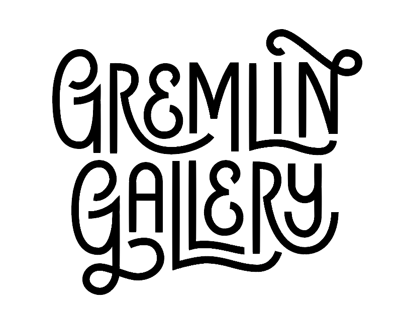
Then I went ape shit on the curlies. I liked this, but it was too funkadelic for them.
Would adding line weight variation help? A little I guess but its just busy and wayyyyy too goth for me.
I said fuck the gallery, I just like the Gremlin part. So I deleted it.
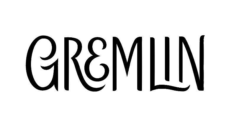
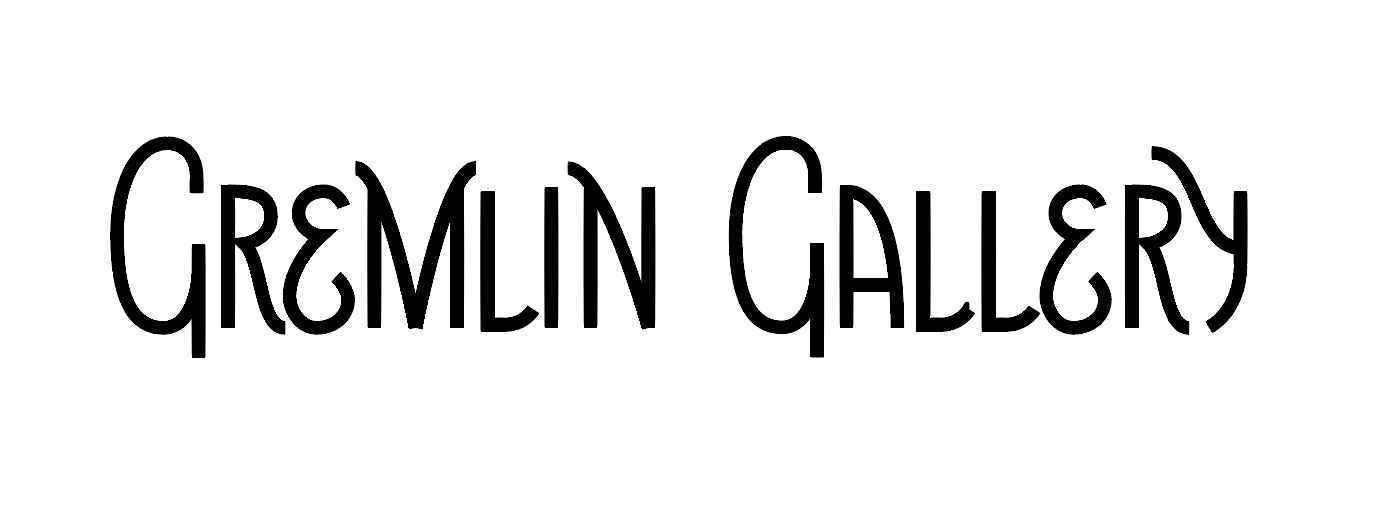
Whaddap serif town? I like how chunky you are, but lets see what happens if I make you smoother.
Yes to the smoothe. Its serious but still edgy and whimsical. The serifs make it look like a place my mom would be okay with, so I thought that was a good sign.
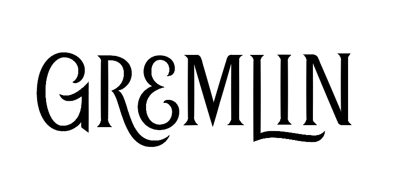
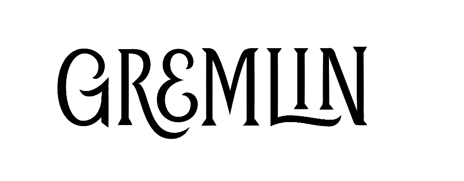
Arch it up because that looks neat.
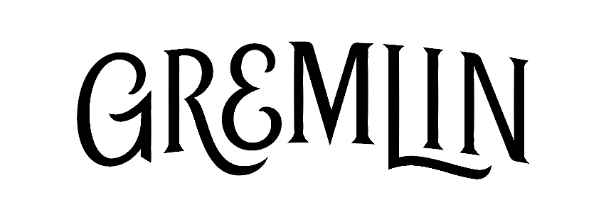
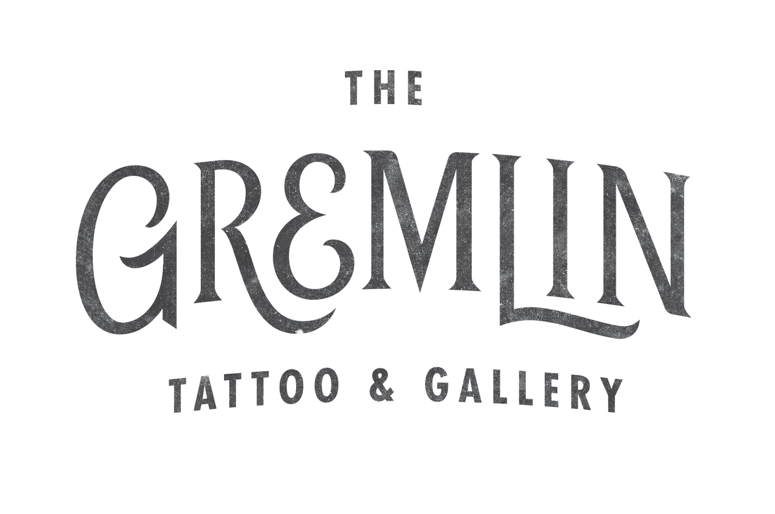
Toss some futura in there, diddle some texture stuff and here we are. Its obviously not done, but I'm tired and I like the way the main part turned out. Cheers!