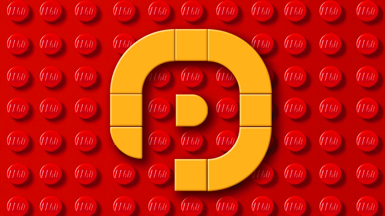
PO | My Personal Monogram
I did not create this class with any idea of what my own project would be.
I'm always Paul, never Mr. Oxborrow, so the P was more important than the O when designing my personal monogram.
I took a Graphic Designer's approach by first "sketching" some ideas, which is usually a slow process using Lego, but fairly quick and fun using modular parts. You can see they're all iterations of the first option.
Once I started on the O, the final idea hit me like a four ton truck and I immediately built what would be my final option.
I would use the negative space provided my the counter of the O in my surname, to build a P shape. To me, both letters can be capital or lowercase, depending on how you perceive and process them, so I feel its a monogram thats more playful than austere.
Since my monogram is actually just a simple monoline design made from only 9 parts, I could play with colour to convey different moods or modes.
Retro, DIY, Sport, and Winter.