Guggenheim Typeface (WIP)
Hi Guys!
I had a go at following this tutorial, and I must say, I am super happy with my results so far!
I chose this photo of the interior of the Guggenheim Museum in Bilbao I visited recently. The architecture of this building is mind-blowing, and I wanted to capture this in my design somehow.
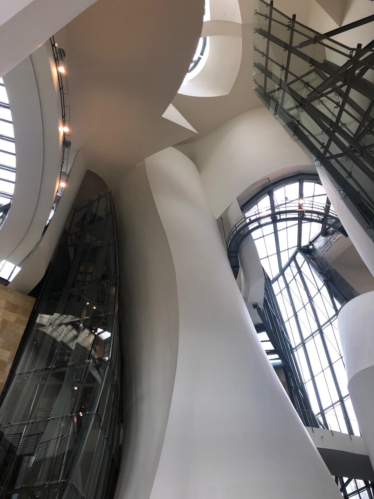
I really liked the mix of curved and straight lines in the design, it creates a nice juxtaposition and I wanted to show this in my final design. The tutorial I was following was asking for straight lines, but I really wanted to include some curved lines too to represent the curves of this interesting building.
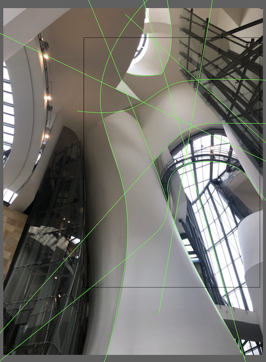
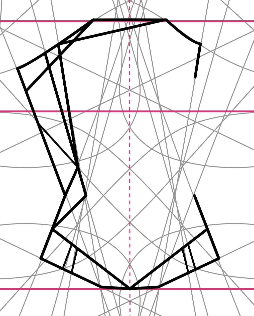
My initial grid saw very simple, based on the main lines I seen in the picture. I placed these lines carefully considering what feeling I wanted to achieve with my final product and I think I managed to capture the essence of the lines that were constructing this very interesting building.
After this, I removed the photograph and reflected all lines vertically and horizontally to create a fully symmetrical grid, offsetting the copy between steps. This has produced the below grid:
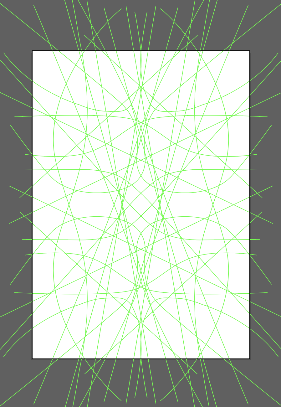
I really liked the shapes it was creating and I was ready to try and draw up my alphabet based on my grid.
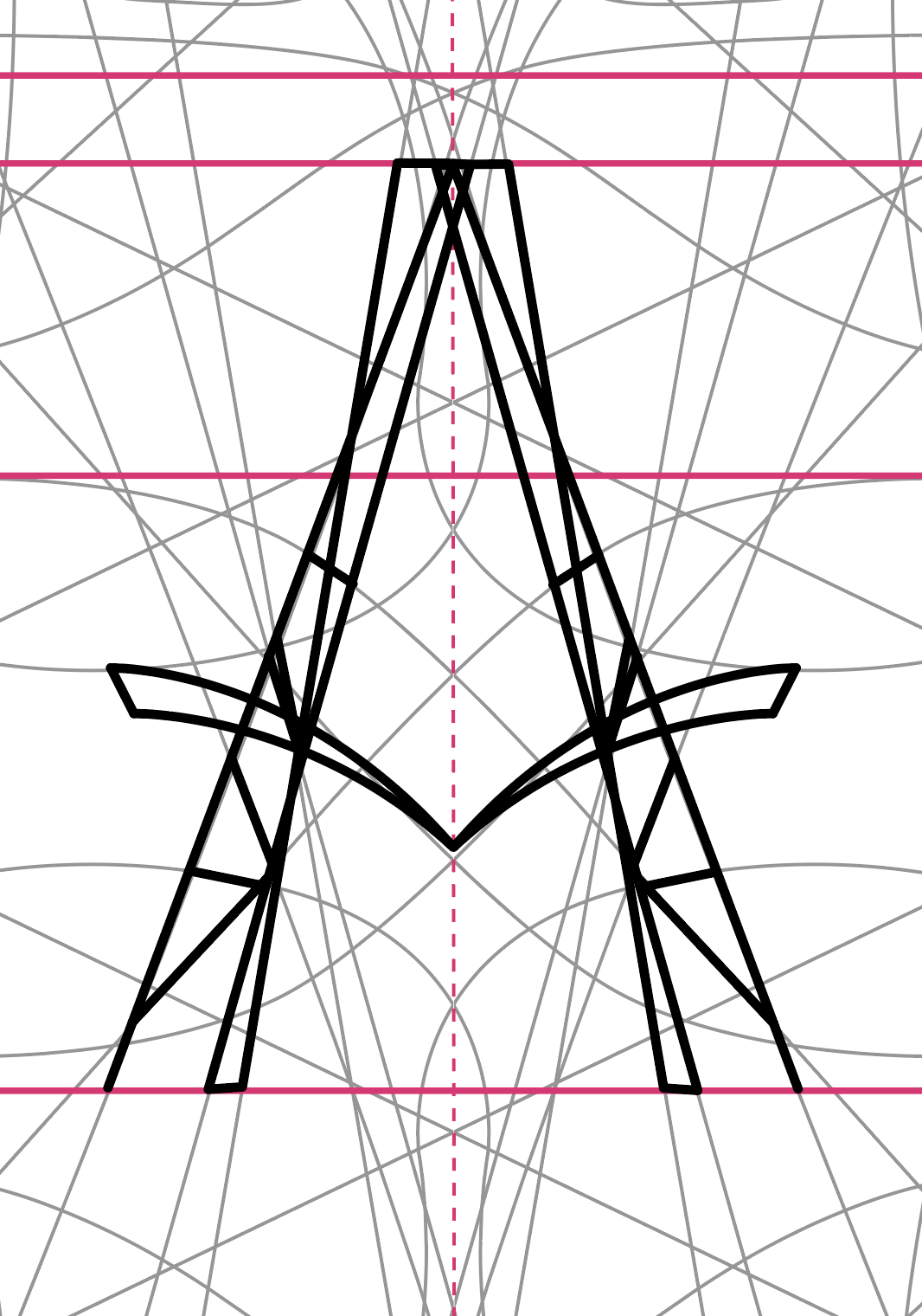
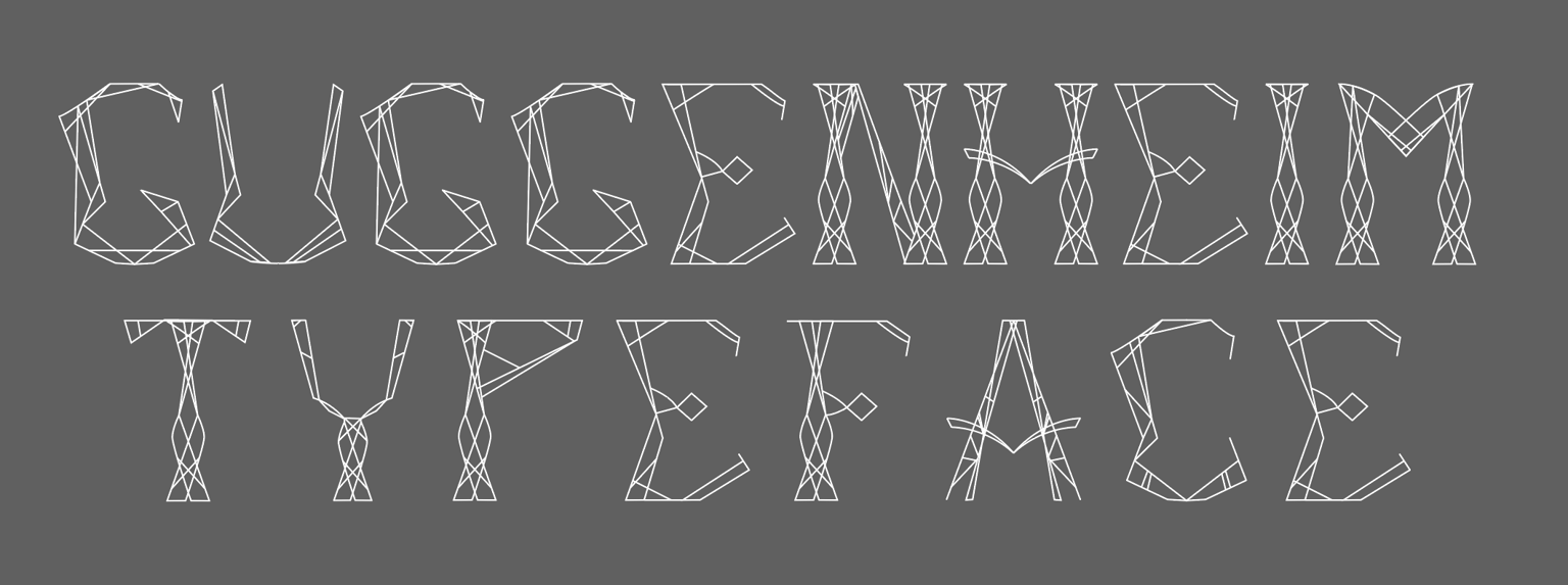
I've done this by carefully tracing my grid and keeping in mine the letters I wanted to create. The results were very interesting! I have never thought that I would be able to create characters like that! I was truly excited by the results!
Once I went through the entire alphabet, and some punctuation marks, I wanted to try out what my font would look like when I create some words with it.
This project is still in progress, but I wanted to share my progress so far!
Many thanks for the awesome tutorial, it really helped!