Playing with Greyscale Values
Collages to experiment with a three-tone limitation.
12-20-2020
Here is my first image, intending to represent the "foggy tree" photo as closely as possible:
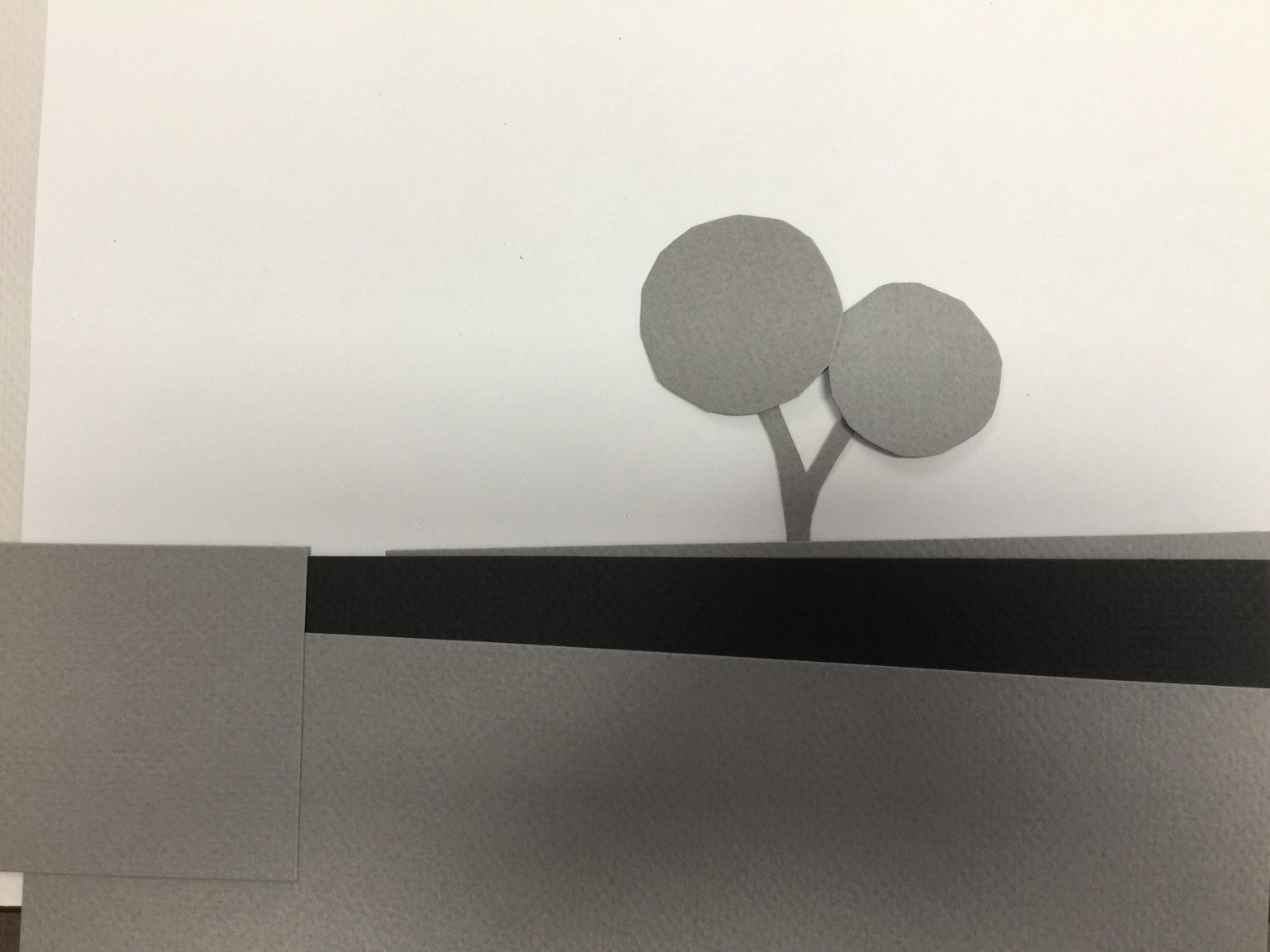
It was especially difficult rendering the foreground: do I merge the grass with the wall, and exaggerate the contrast between those tones? Or do I differentiate them, and make the foreground too light compared to the tree?
Second attempt:
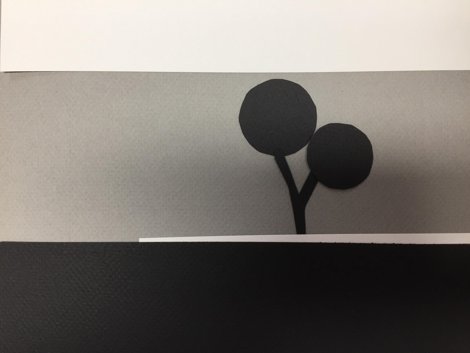
This one merges the wall and the foreground. Only the bit of land behind the wall is contrasted--but obviously it is too light to make sense here...
Third version:
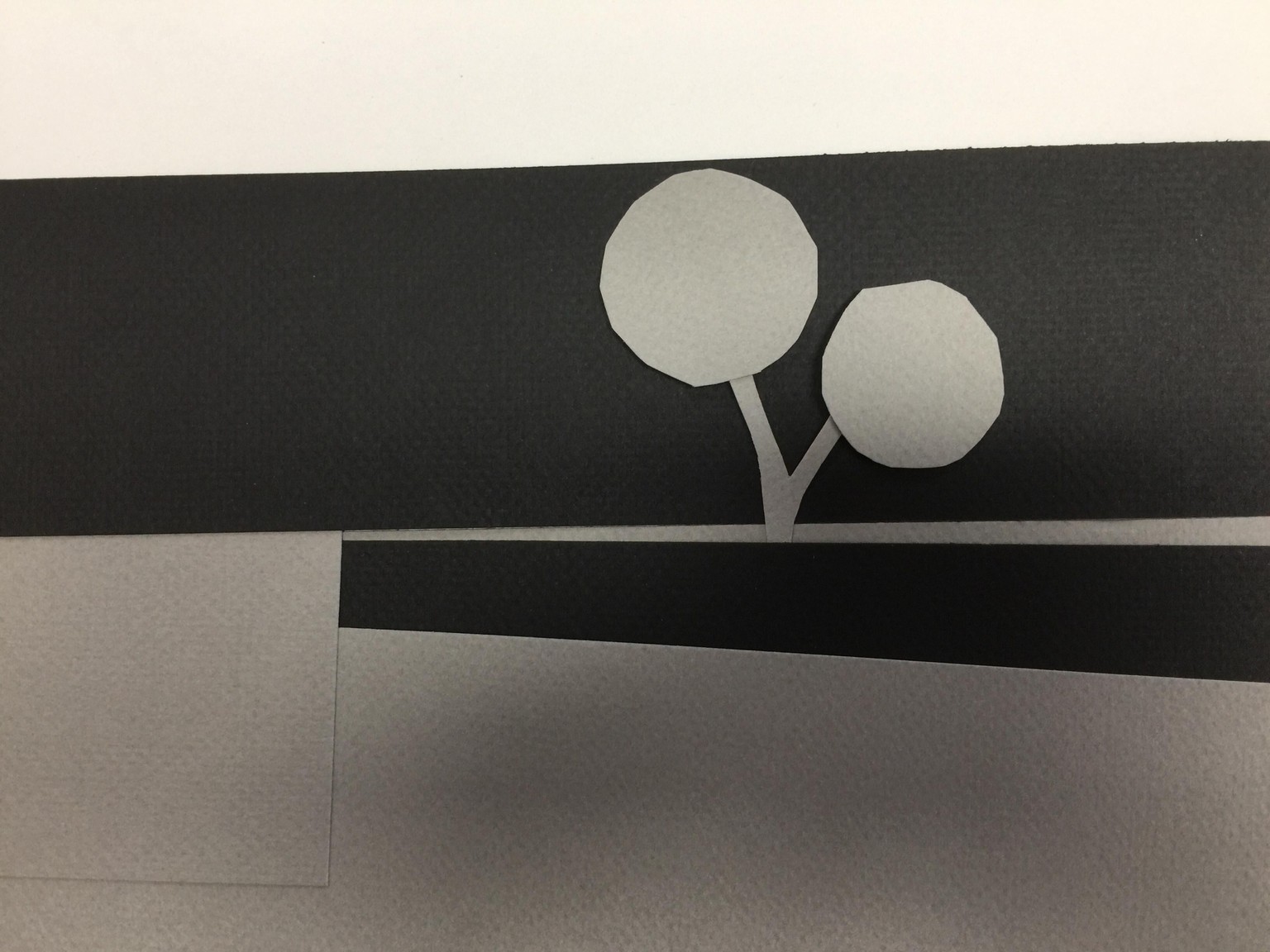
In this one I just played with contrasting values and shapes, with no view to duplicate the original.
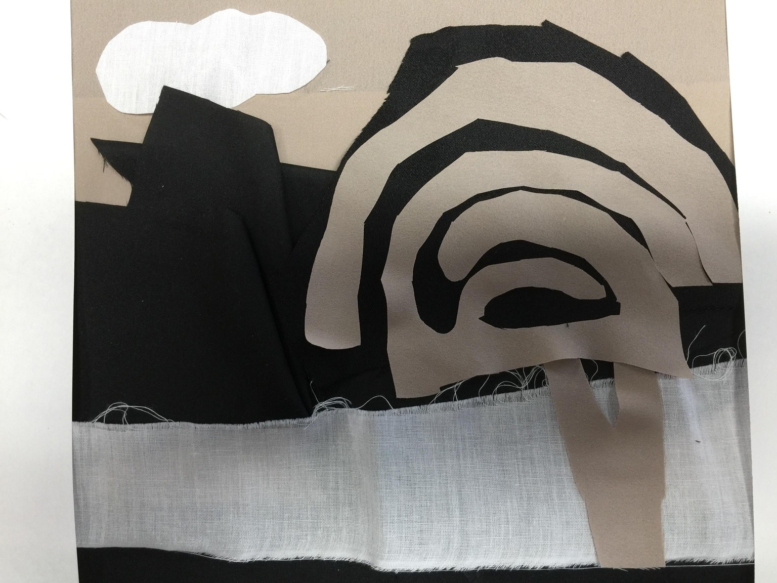
Bonus project:
I have no newspaper, so I improvised using leftover cloth, and the photo with the orange-colored tree:
First version, trying to duplicate the values of the original:
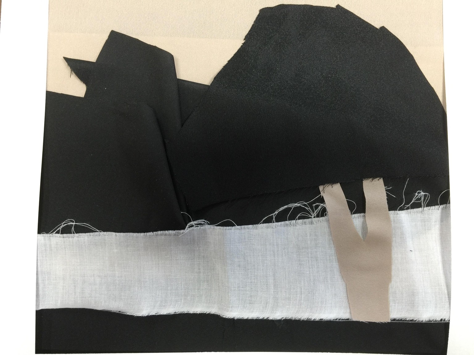
Clearly with this one, the tree disappears into the background -- but to me, the values of the foliage and its background were very close.
Here's a second version, with less concern about duplicating the photo, but trying to make the tree foliage stand out a bit:
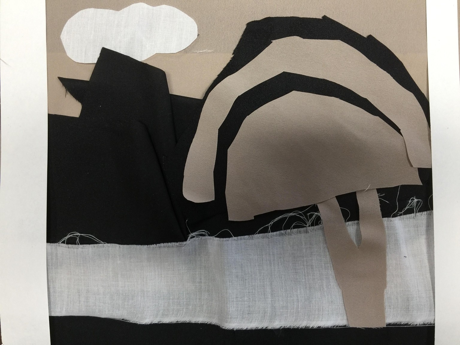
I added a white cloud, just to have some balance of white in different areas of the image. I thought the tree looked a bit too much like a mushroom, so I did a third version, just playing around with cutting curves into the fabric: