Photography: Props and Styling
Hey there!
First of all I have to admit that I’m a bit scared of photography. I always think they’re not good enough and end up not posting or relying on mock-ups but today I’m starting a 1100-day art/life challenge and photography is part of it.
I used this class to try to figure out what I like and I’m not even surprised that bright colors are totally part of it.
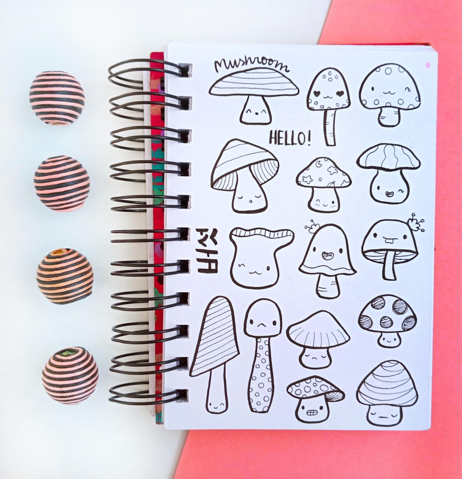
So here’s the first picture I took. 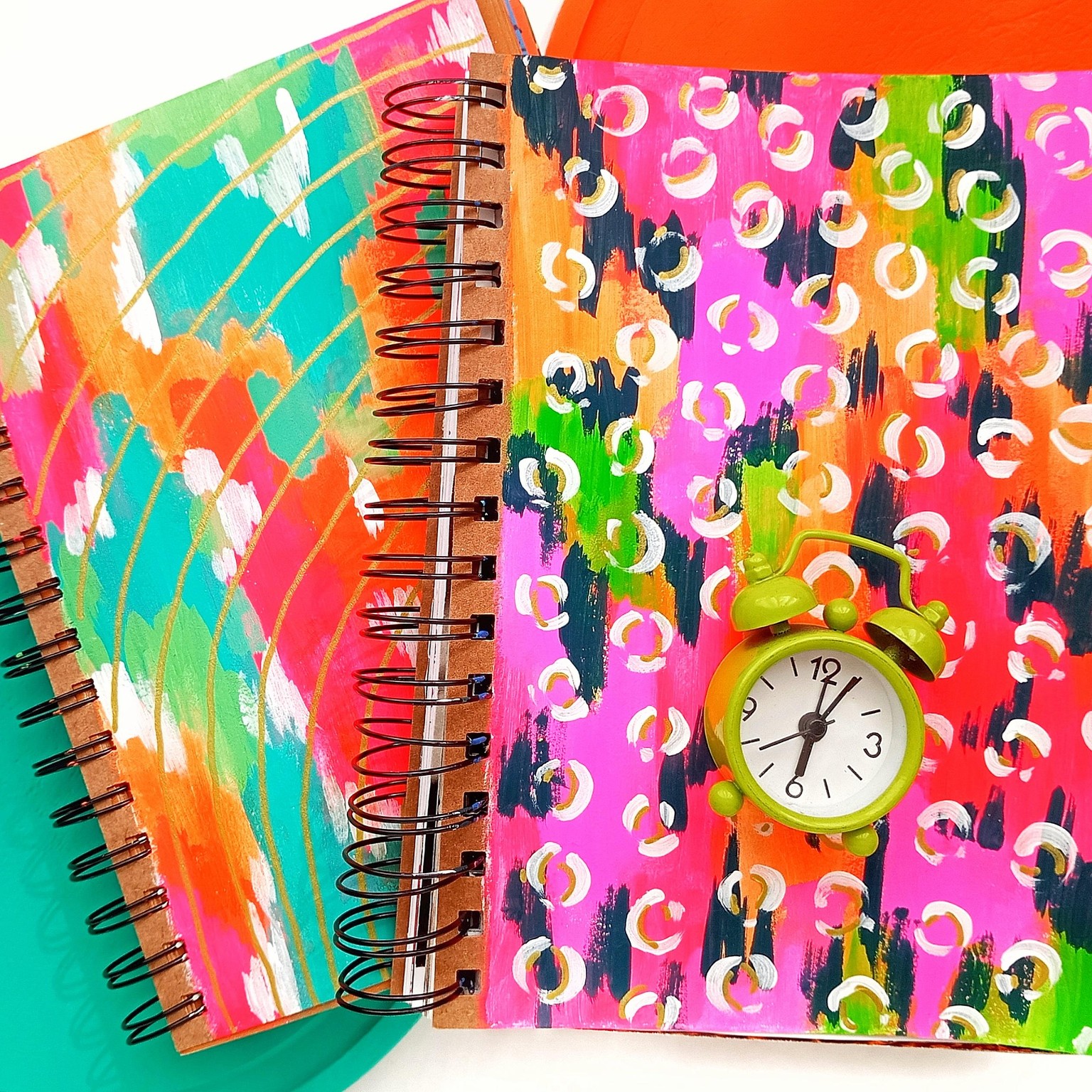
I thought that maybe it was a bit too much so I decided to use just one notebook. Looking at the picture I would change the background around so the pink of the notebook and the orange are not side by side but I didn’t notice at the time.
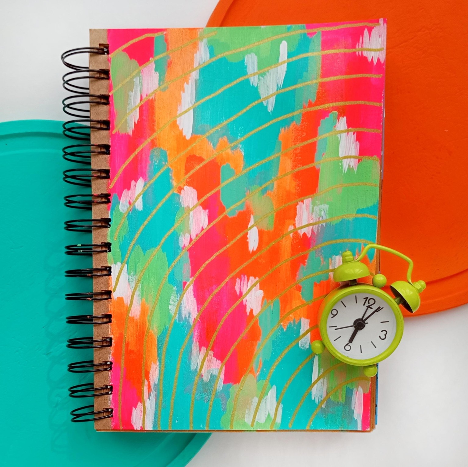
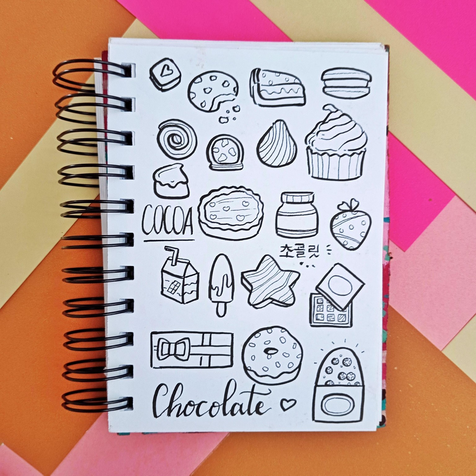
Then I decided to use an orange background and I know I should have used tape to make the page look flat. I promise to do that the next time.
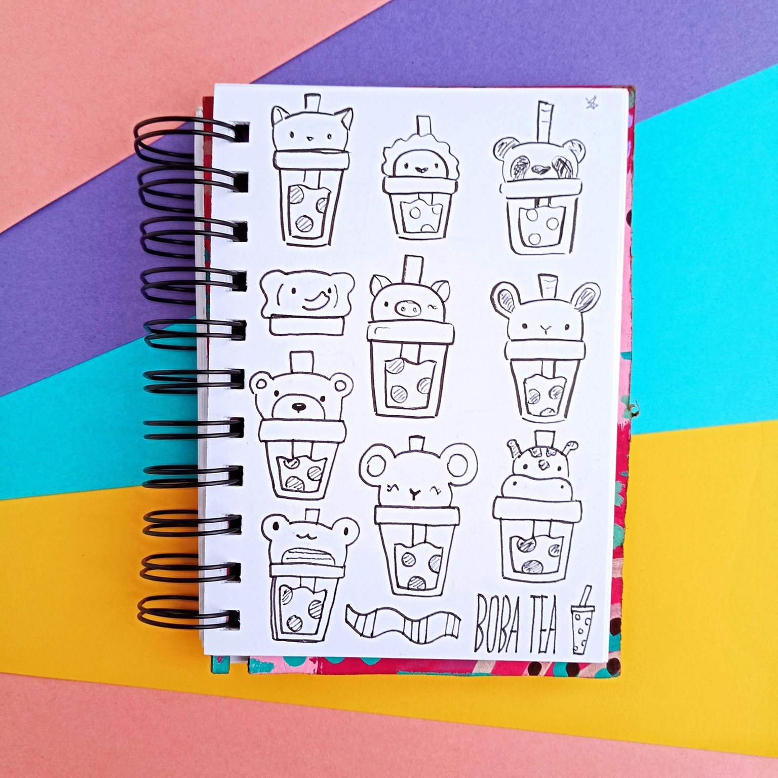
I only did overhead shots because I think it’s easier to showcase drawings (and partially because I’m lazy and didn’t want to do another Setup).
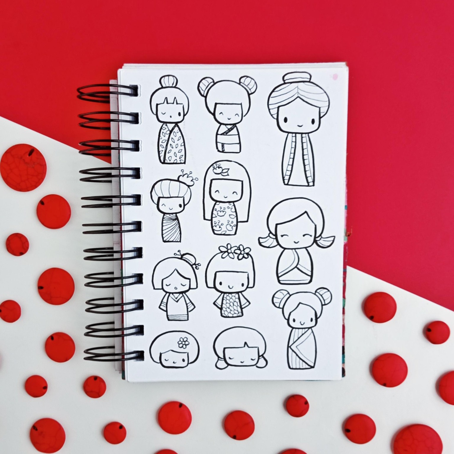
Then I went on and took a bunch of pictures that I didn’t really like…
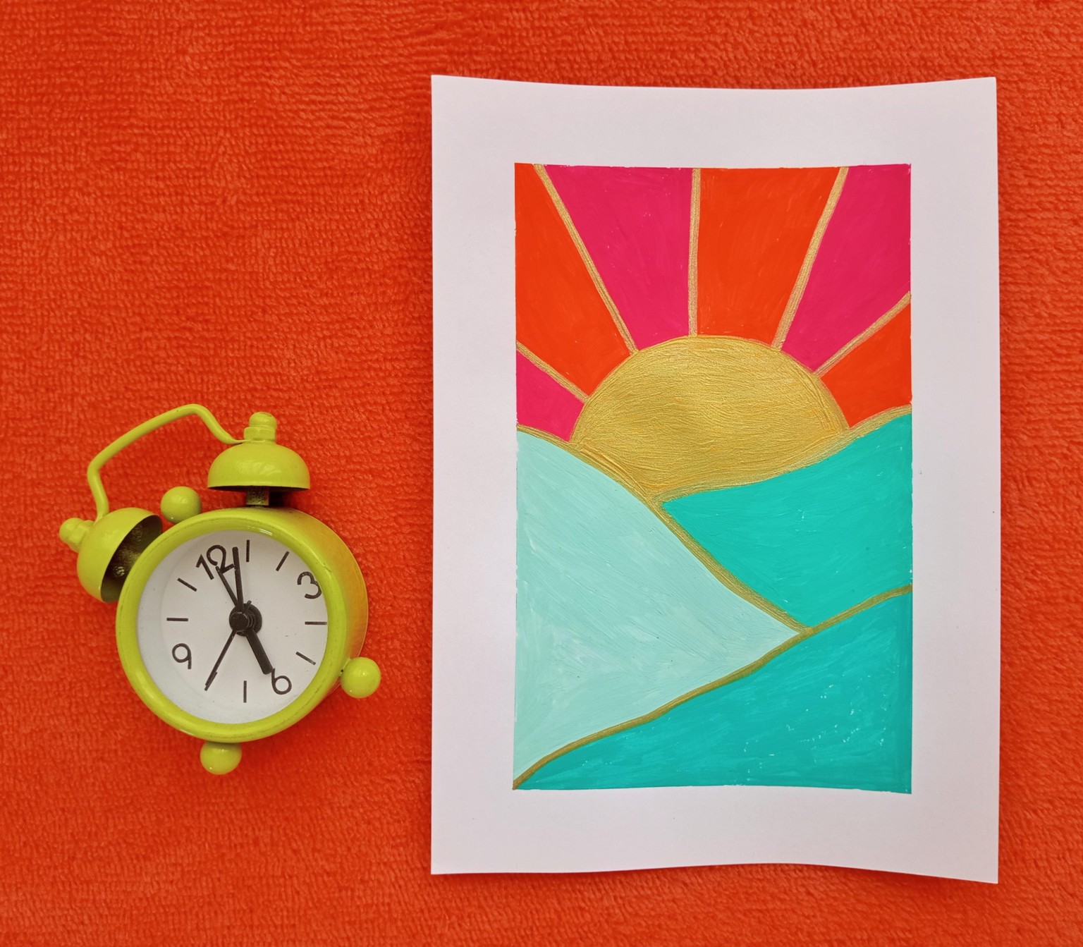
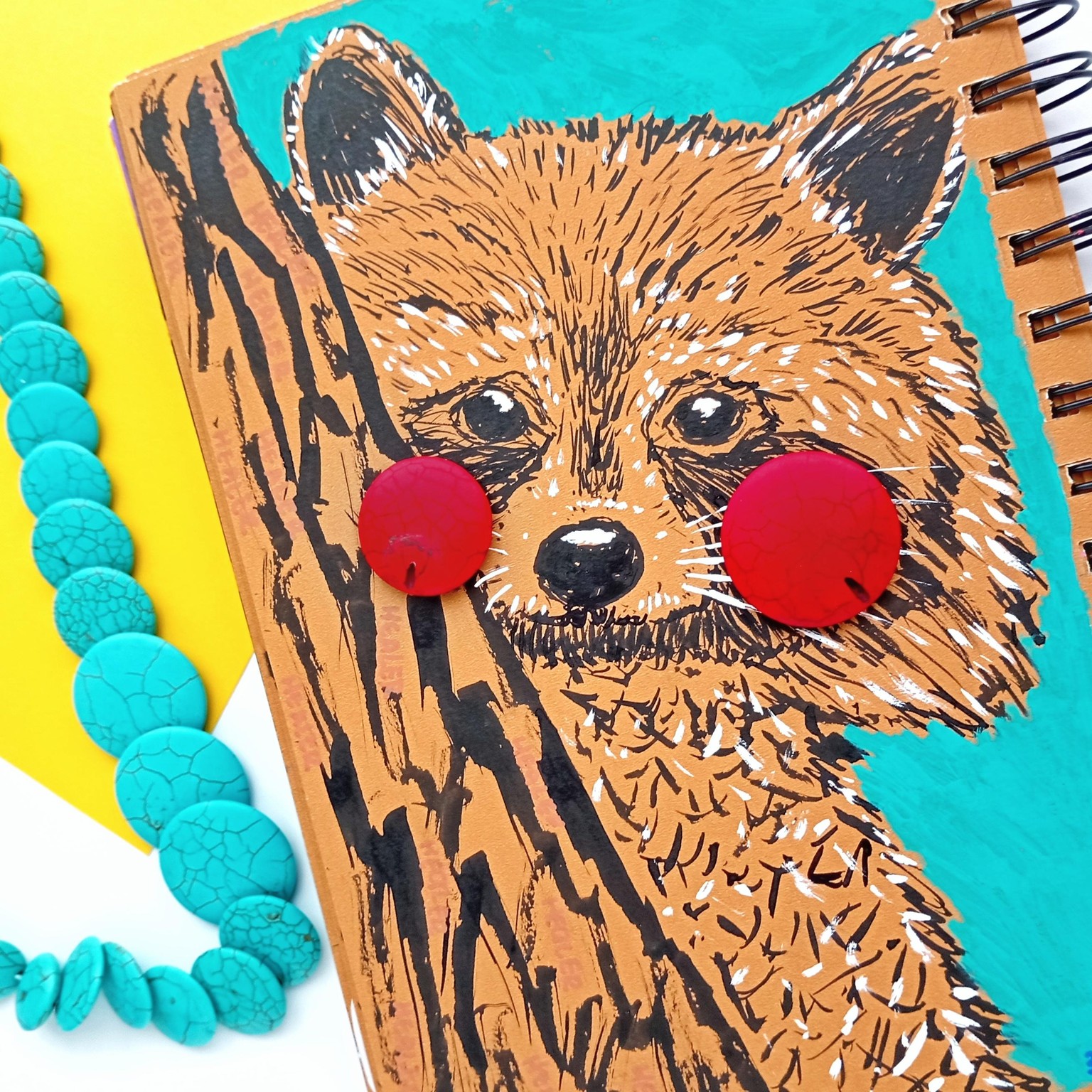
Through the process I discovered that color is way more important to me than the actual props. Also color blocks seem to get my attention so I decided to play around with it.
And while I was playing around I took this picture and now using props as part of my drawings is something I’ll probably be obsessed about.
I still have a looooong way to go but it’s okay.
I had lots of fun, thank you for the class!