Everybody Digs Bill Evans
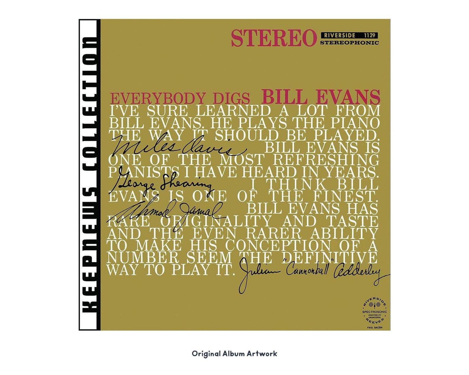
For my project, I designed cover art for one of my favourite albums, Everybody Digs Bill Evans. Below is the original cover art (actually, the original didn't have the "Keepnews Collection" tab on the left edge). It's interesting that this cover is a fully-typographic design. It's also unique in that the album title incorporates the artist name, rather than these being two separate elements.
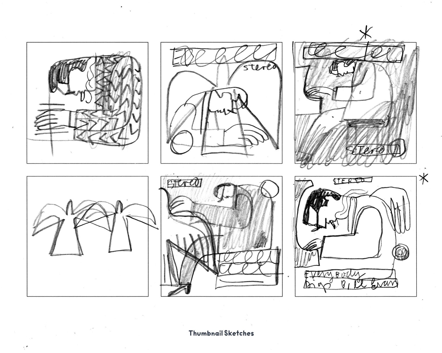
Below here are some of my thumbnails. There were many more thumbnails and looser sketches before them, but this page shows where I had two viable concepts for further refinement. I choose the bottom-right one.
I used the printable thumbnail template, provided in the class, for this step.
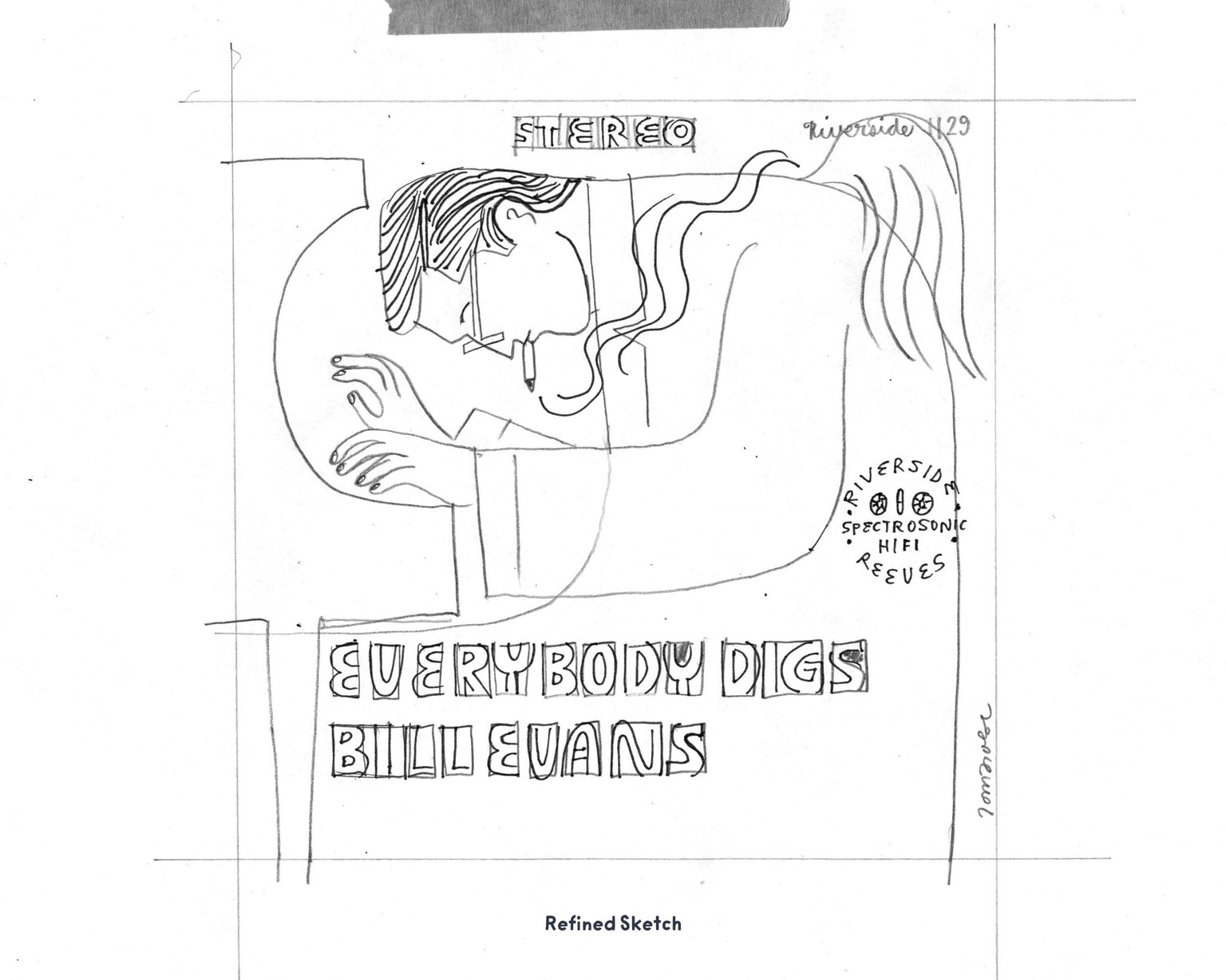
Next, after 2-3 iterations, I ended up with this refined sketch, below.
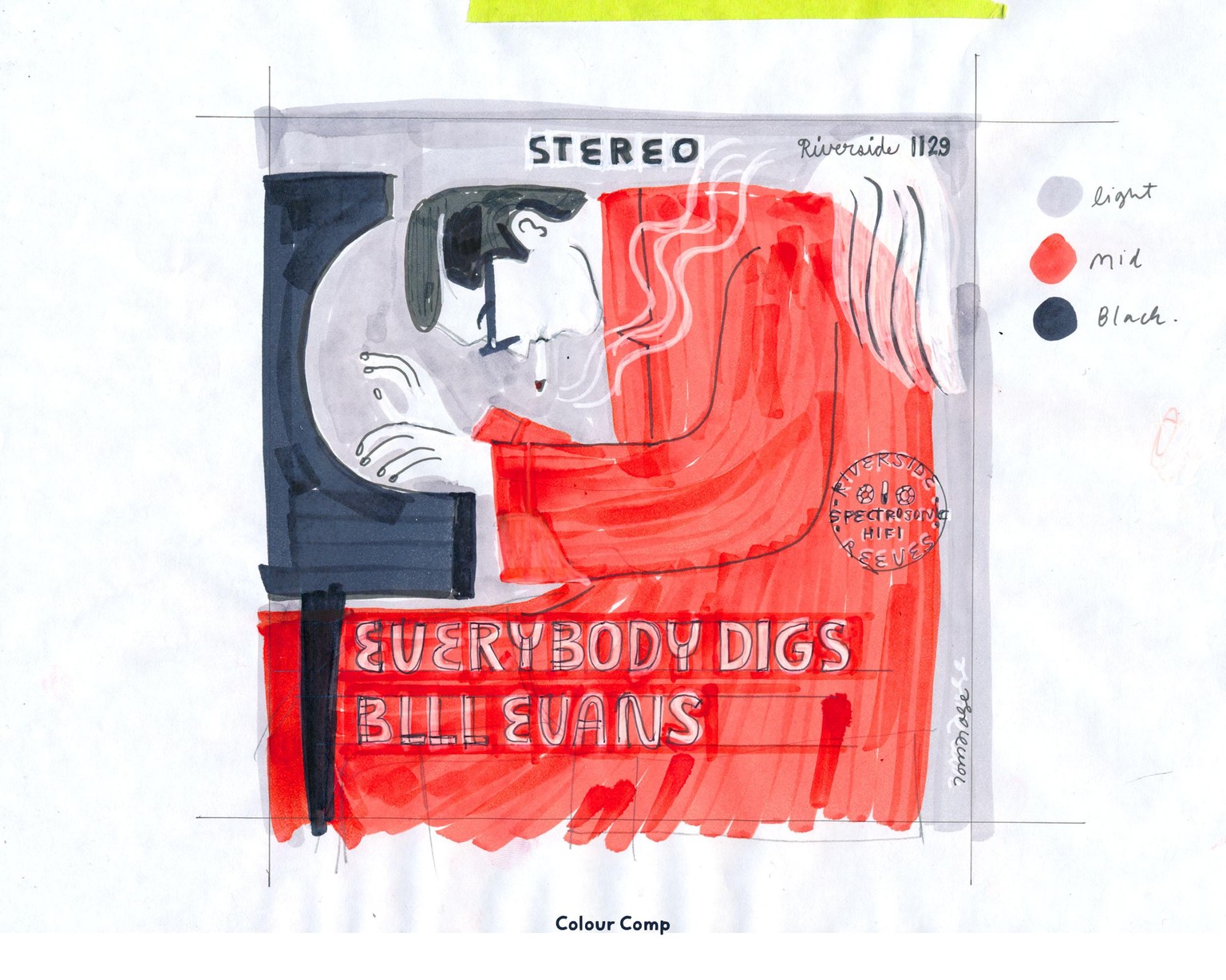
In my colour comp, below, I started to plan out how colours would work. I wasn't exactly sure of which colours I used, but having distinct values (lighter and darker tones) plus one hit of red made planning each separation easier. In this stage, it's a chance to use media that is closer to how you might render the separations later — e.g. various brush strokes, such as the smoke lines or details in the wings, micron pen lines for the finger details, and such.
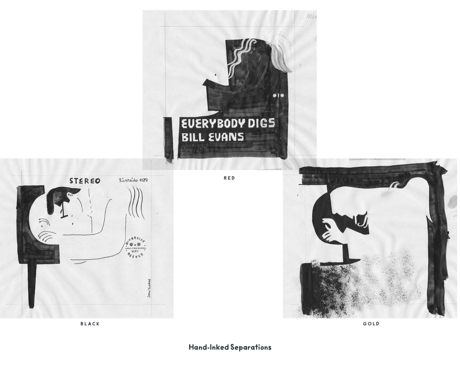
Next, I inked the 3 separations. I used a paint pen to start, and then filled in broader areas with india ink and various brushes. I added fine details with micron pens, and dabbed in some grainy textures with my spongey apparatus in the gold separation (or "plate").
You can see how the marker paper wrinkled from the moisture of the ink. This no doubt would've caused some distortion with the registration lines.
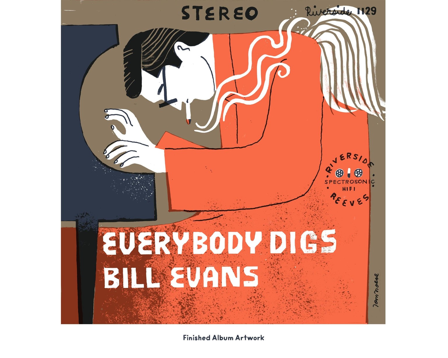
I didn't end up saving any early versions of the finished cover art (below). So this one shows the very final result. In Step 8 (spread over 3 videos in the class), there was a bit of a journey to get here!