Cuba Storm
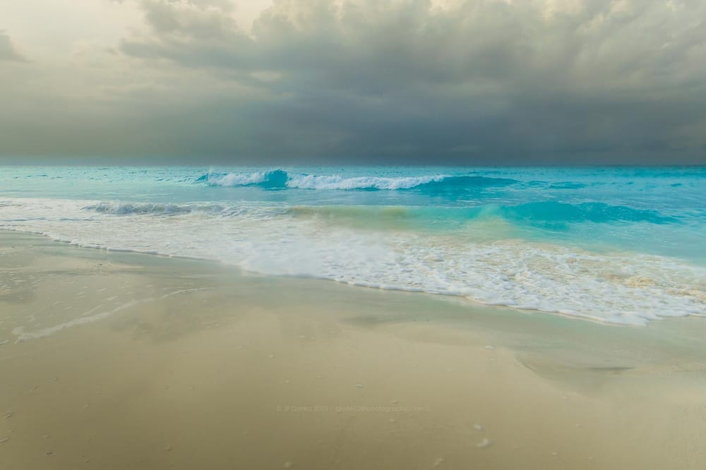
This is a photo of the beach in Cuba from our last family vacation. It was take during golden hour with a big storm rolling in off the ocean. I have tons of photos of the beach on sunny days or the typical Caribbean sunsets - but this is my favorite of the bunch.
When I started editing this photo - my goal was to accentuate the azure blue color in the water and contrast that against the warm golden tan colors of the beach. I really like the texture in the coulds and when I started working on them, I noticed that there were actually some tan colors in there too.
So, instread of shifting the sky to blue like I would normally do, I thought it would be cool to add a tobacco tone to the sky so that the colors in the sky mirror the colors on the beach.
What do you think? Is it too weird having a tobacco sky - or does it improve the mood and composition?
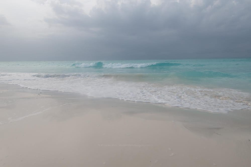
In case you're wondering - here is the original: