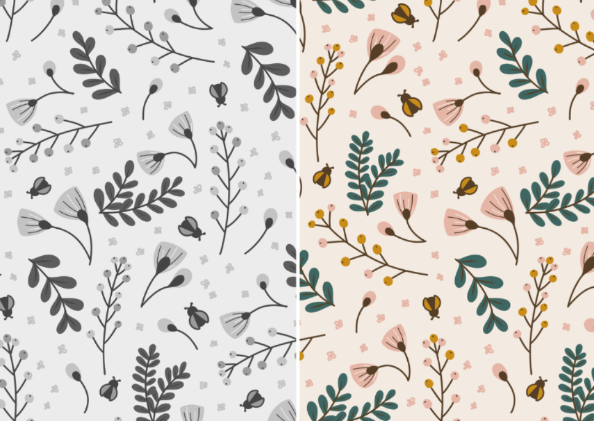
Country Cottage Print
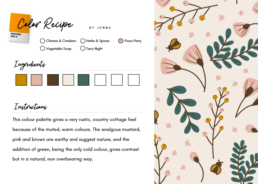
I thoroughly enjoyed your class thank you Kris. I've been looking through a lot of my old patterns and analysing the colours in a new light to see why they work, or what I can do to tweak them. For my project, I chose one of my country cottage style botanical patterns. I realised the palette works so well because of the analogous colours (yellow, pink, and orange - or in the pattern, mustard, blush, brown and cream) but the addition of the green for the leaves just works - it's natural (because we expect leaves to be green) but it's not over bearing or dominating.
I also loved seeing the pattern desaturated. There's great contrast in the palette.