Bits of Iceland
I tried to apply my new knowledge on three photos I took last week in Iceland. My main goal was to keep it natural but enhance the feautres of the picture but eh .... there's still room for improvement :)
Equipment: Canon 1100D, lense 18-55mm, tripod, Photoshop CS6
First shot the boat needed to get a little brighter, the mountains got a little darker instead. I used the correction brush in PS raw converter and reduced the lights to get a little more contrast in the clouds. But still I wanted to keep them faded to let them look more distant. Also we got some lense correction, rotation and a few tiny seagulls were edited out.
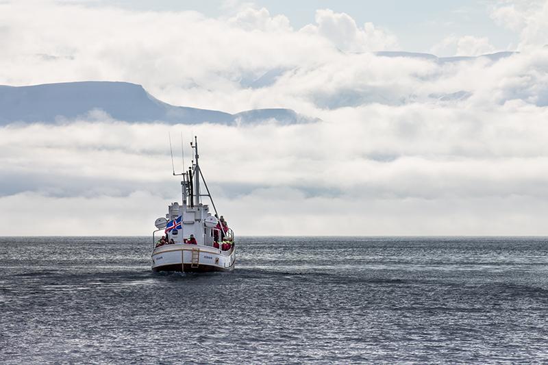
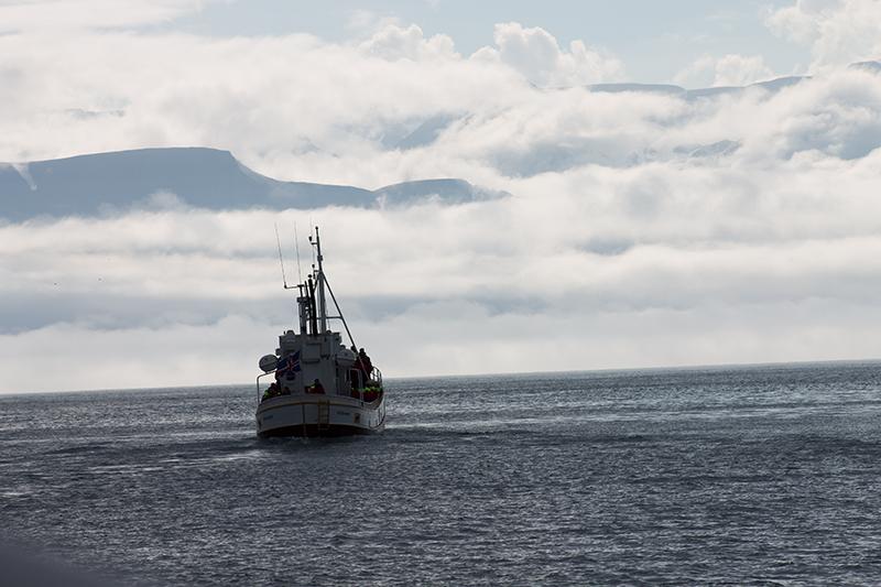
Original shot
______________________________________________________________________________________
Second shot I wanted most parts of the cave to be left in the dark to get a better feeling for the space we were in. The figure in the middle got brighter (exposure and lights added with correction brush), the stones got their orinigal red color back with some tweaks on the orange and red saturation, also I added dark areas to all corners of the picture to lead the focus to the middle of the motive. Futhermore, some dirty snow next to the guy has been edited out with the PS clone stamp.
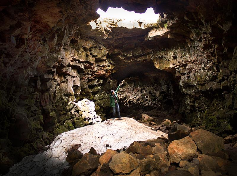
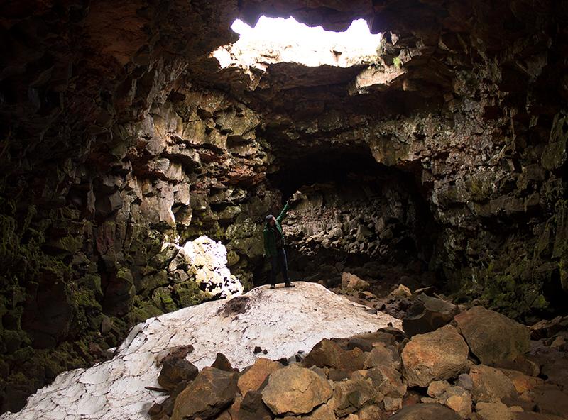
Original shot
______________________________________________________________________________________
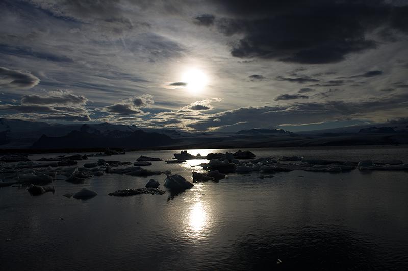
Third shot Compared to the original shot, I kind of went beserk with this one, haha. I took the not so well exposed version and wanted to see what RAW would offer when it came down to light correction and quality. So this picture got some contrast, exposure correction, two gradients for the sky (less light, more contrast to make the clouds look a little more dramatic) and the water (more saturation for aqua and blue) ... also lots of clone stamping since the cloud on the right was too heavy for my taste.
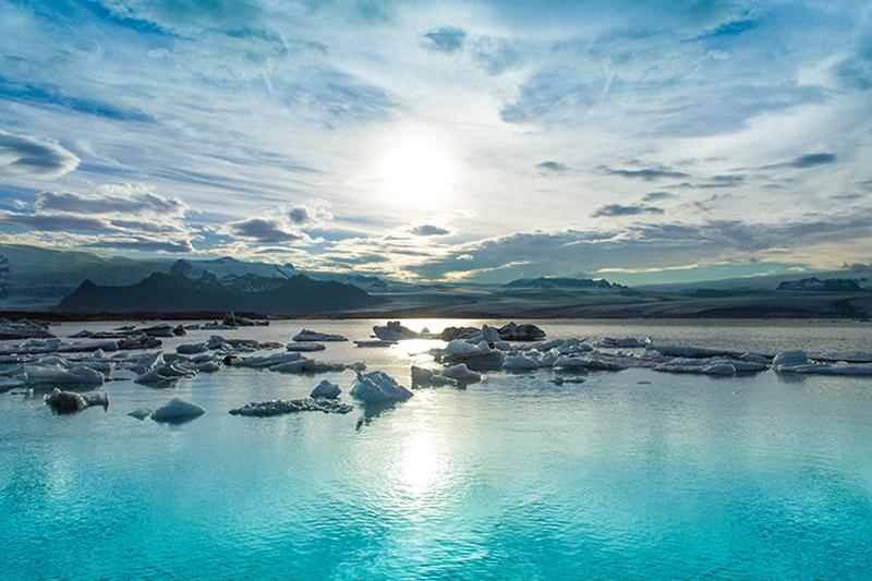
Original shot
So yeah, please let me know what you think or what I could improve :)
Anyway, thanks for the class, it was really helpful for a beginner like me.