Usability heuristic evaluation of the app “MarketingBlocks”
I chose to do a usability heuristic evaluation of the app “MarketingBlocks” which uses mainly AI prompt description to create custom banners.
For this usability testing, I made use of Jakob Nielsen's 10 general principles for interaction design. They are called "heuristics'' because they are broad rules of thumb and not specific usability guidelines.
1) Visibility of system status
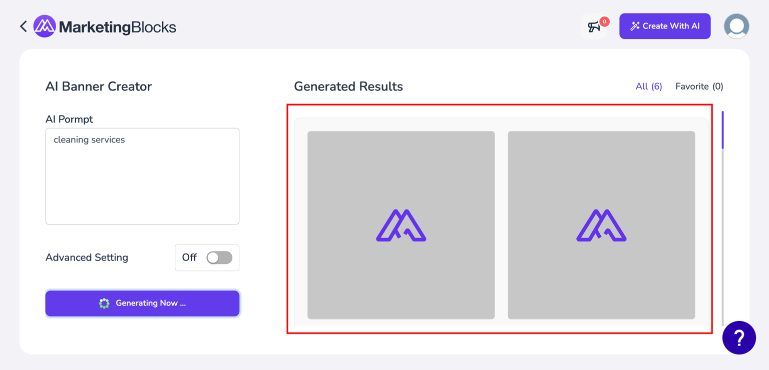
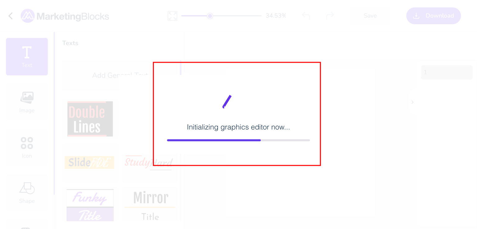
It states that the design should always keep users informed about what is going on, through appropriate feedback within a reasonable amount of time.
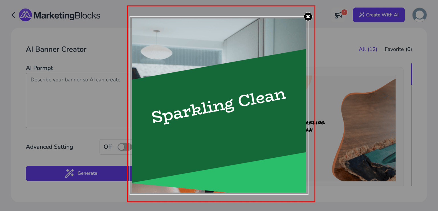
When the user types in an AI prompt and clicks generate, there is an animated logo that appears which shows that there is an action going on the app. We also see an effect when users click to edit a particular banner. As shown in figure 2, this tells the users that they should relax that their actions are being carried out.
2) Match between system and the real world
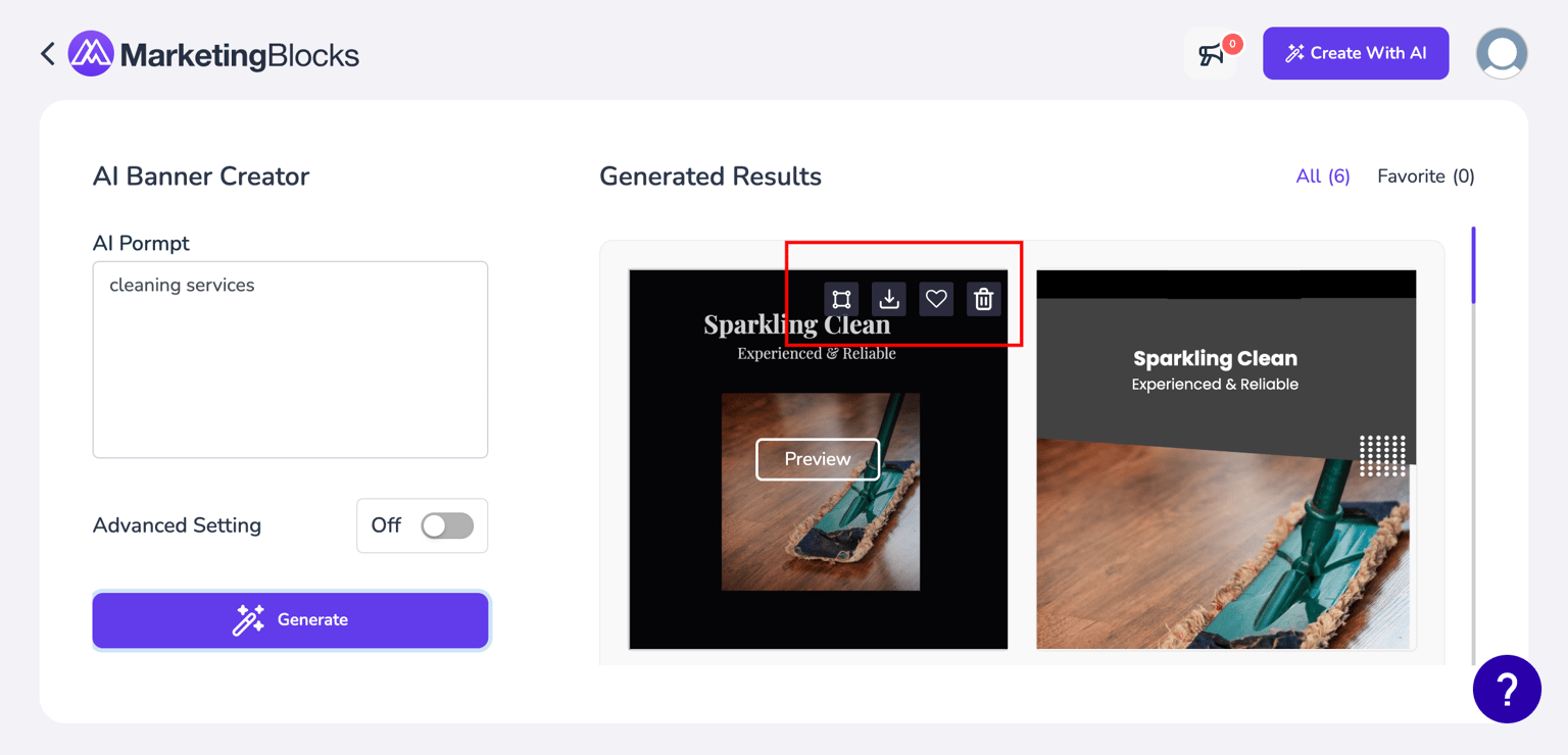
It states that the design should speak the users' language. Use words, phrases, and concepts familiar to the user, rather than internal jargon. Follow real-world conventions, making information appear in a natural and logical order.
By observing the icons on the banners, it is not very clear what they indicate because they are not labeled even though some of the icons are familiar. So to create more ease for the users. There should be a label on the icons to give more details on what they mean.
3) User control, freedom, and error prevention
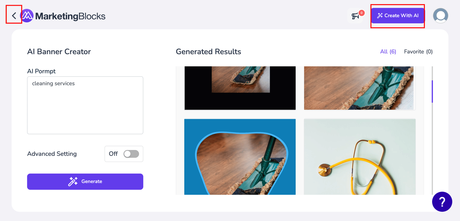
It states that users often perform actions by mistake. They need a clearly marked "emergency exit" to leave the unwanted action without having to go through an extended process.
The user has more freedom in the app because they can go back and front to edit or cancel a process. As shown above the user has the ability to go back to the dashboard or navigate to another AI tool by clicking on the create with AI in the top nav bar. For easy AI prompt input there should be a cancel icon at the AI prompt input box to make it easier for users to cancel out the entire input to write a new one. There should also be an option for users to cancel out generated results that does not suit them.
4) Consistency and standards
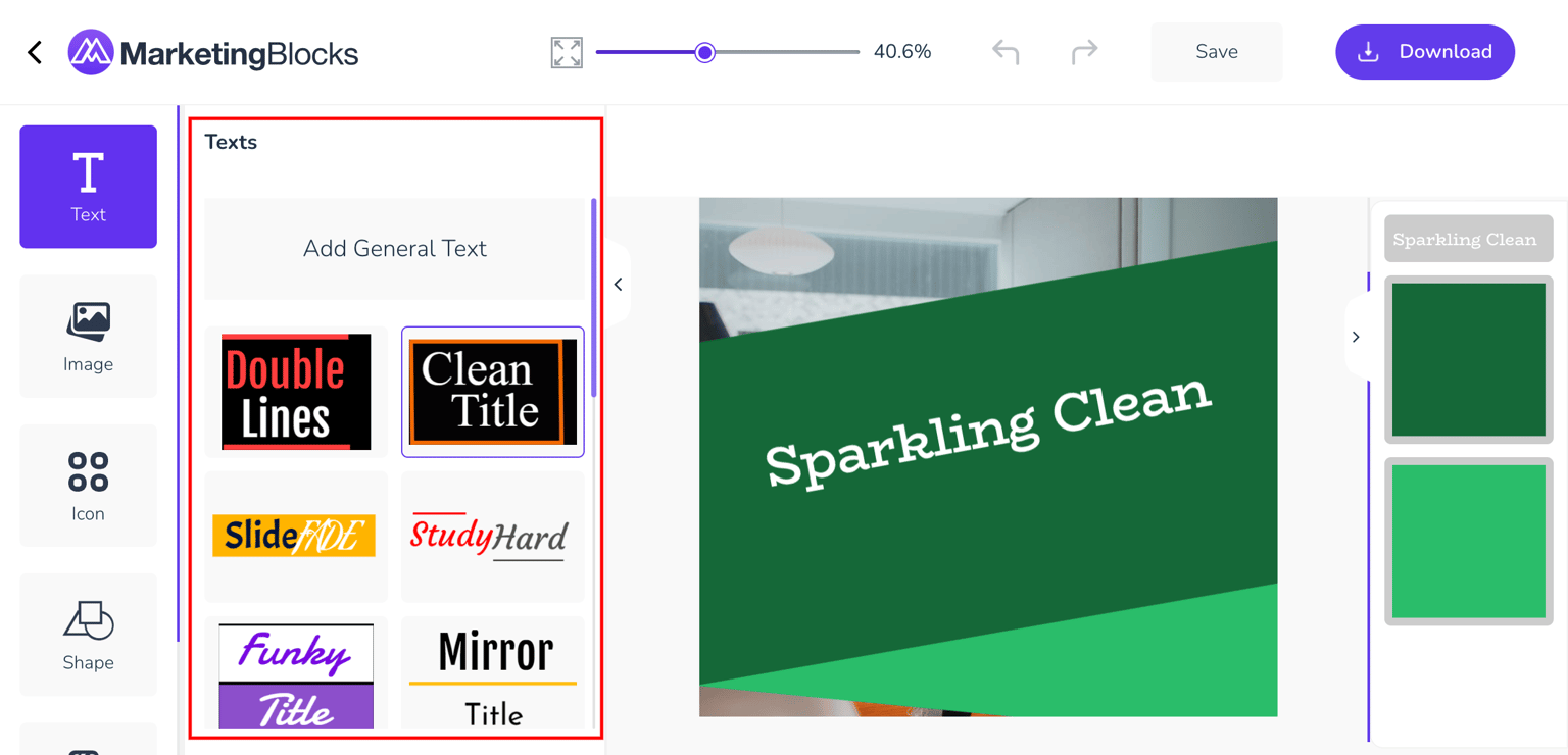
It states that users should not have to wonder whether different words, situations, or actions mean the same thing. Follow platform and industry conventions.
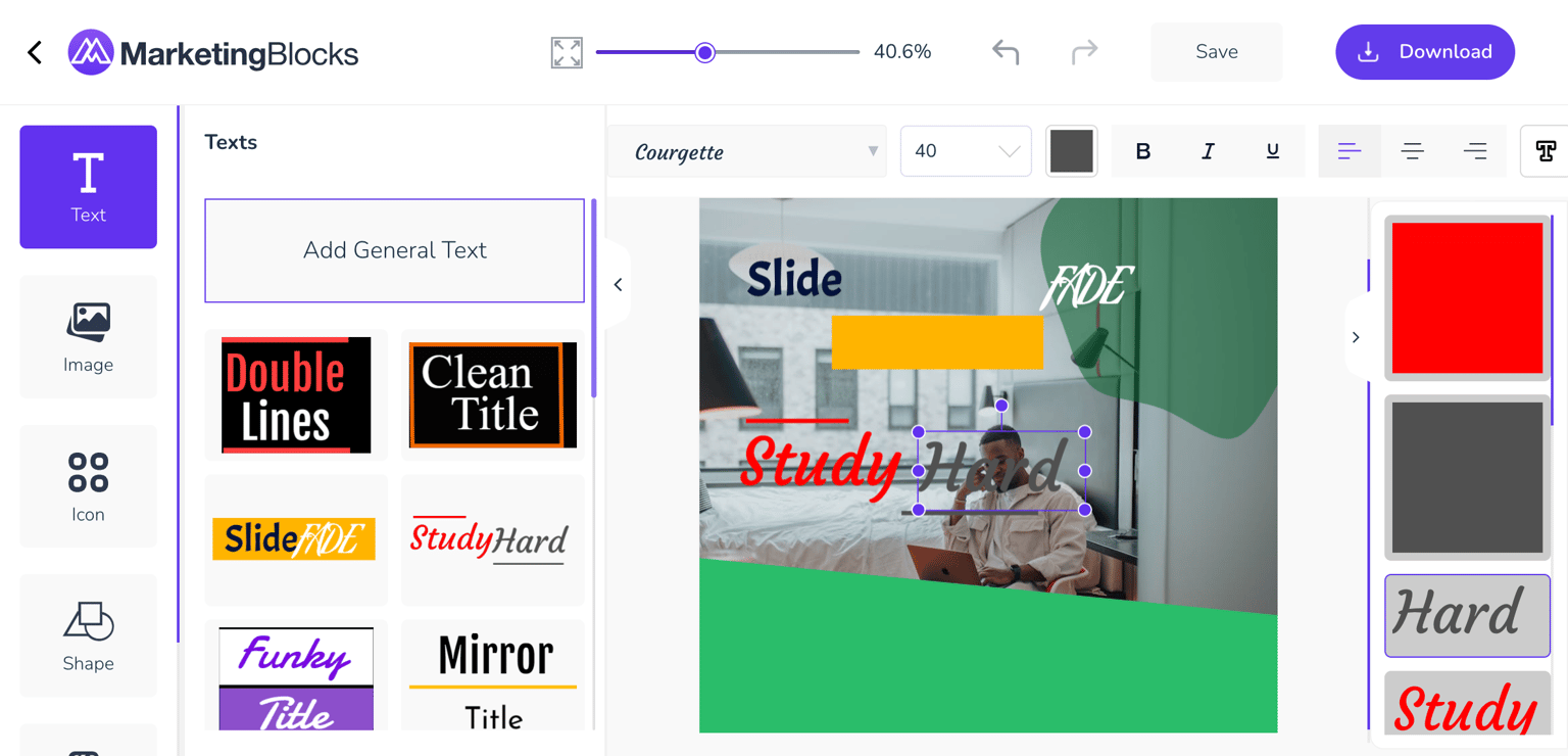
The add generic text seems a bit confusing. It makes the users think which makes the product not usable. At first glance, the users should know what the elements are talking about either by a little animation or info that pops when the user hovers on any of them. And another thing I noticed is that when I click on them with my text selected no actions are made except you drag them into the canvas. This should be complicated to the users to ensure efficiency in usability.
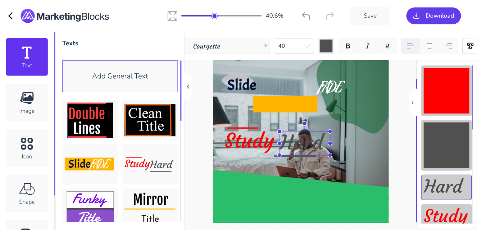
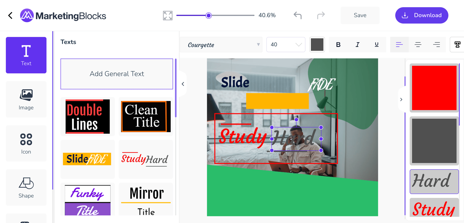
The figure 3 shown above, after the text has been ungrouped there is no effect or action that shows it has been carried out.
5) Aesthetic and minimalist design
It states interfaces should not contain information that is irrelevant or rarely needed. Every extra unit of information in an interface competes with the relevant units of information and diminishes their relative visibility.
The interface does not contain any relevant information which makes every relevant unit of information visible to the users. I will suggest that there should be a description option to explain what any icon in the interface means.