The Night Circus by Erin Morgenstern
DEC 4 - FINAL DROP CAP (VERSION 2)
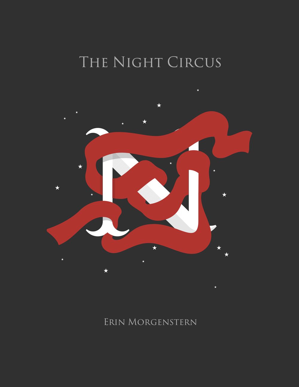
I created a version of the drop cap that had been haunting me since day one. In truth, it's nowhere near as intricate as I wanted, but hey, I do have a full-time gig so I cut myself some slack.
This is the more mysterious version, with elements of the story embedded withing the graphic. For the cover, I left off the title and the author's name; ridiculous for actual marketing, but I like how mysterious it is. Maybe the books only appear on the shelves after dark as well. :)
So one last time: which one do you like? Version 1 or Version 2?
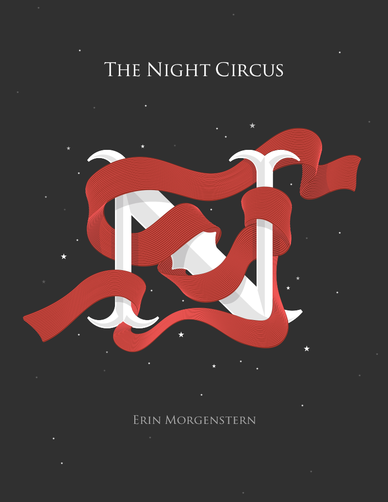
NOV 24 - FINAL DROP CAP (VERSION 1)
I finally had to stop noodling about and step away from what I believe is my finished drop cap. Hopefully it captures the tone/feel of this wonderful book.
Unfortunately, I have two versions of the scarf and am curious what everyone thinks of them. So, my first choice:
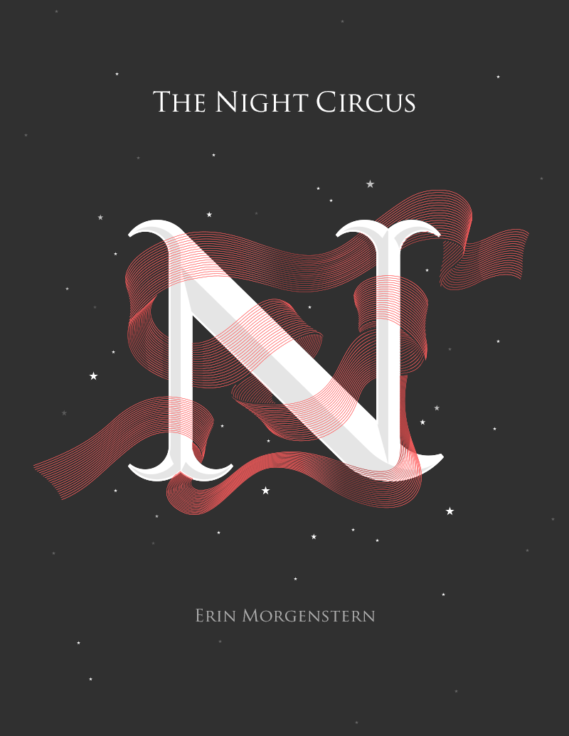
And, my alternate:
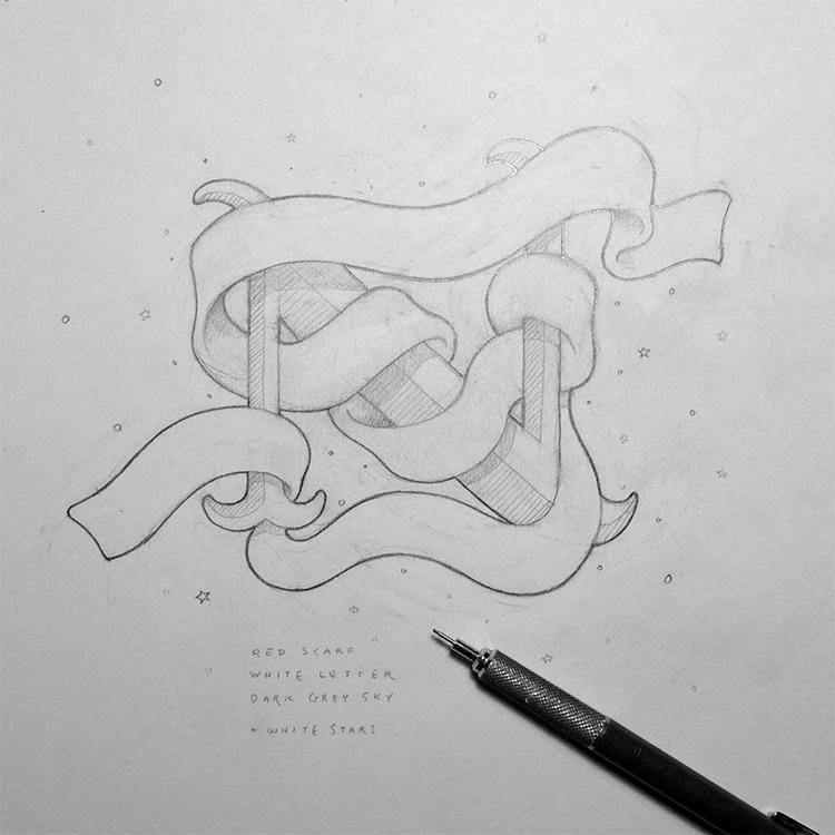
NOV 20 - STARTING IN ON ILLUSTRATOR
The top right of that N needs some help, it's too hidden. I'm also not entirely thrilled with the bottom part of the scarf. But this is just the start, and I'm happy in that I can see it moving in a good direction. What do you all think?
PS. Yeah, yeah, that IS Trajan. Weirdly, I kind of like it here. Will likely change it, though.
NOV 19 - AND MORE CONVINCING
This is direction #2 that I wanted to flesh out, see if putting some more work into it might sway me in one way or the other. I think I'm at that point in Jessica's videos where she points out that while you might favor one direction, the *better solution* might be a different one. So, yeah, I think this is the one.
Dark, dark grey background. Twinkling stars (the Night Circus only opens at night, of course). Bright red scarf wrapped around a white N. I think the letter itself will have to be more detailed, more like a traditional carnival letter.
I'm still going to finish my other direction just because I think it'll be pretty cool. A personal project.
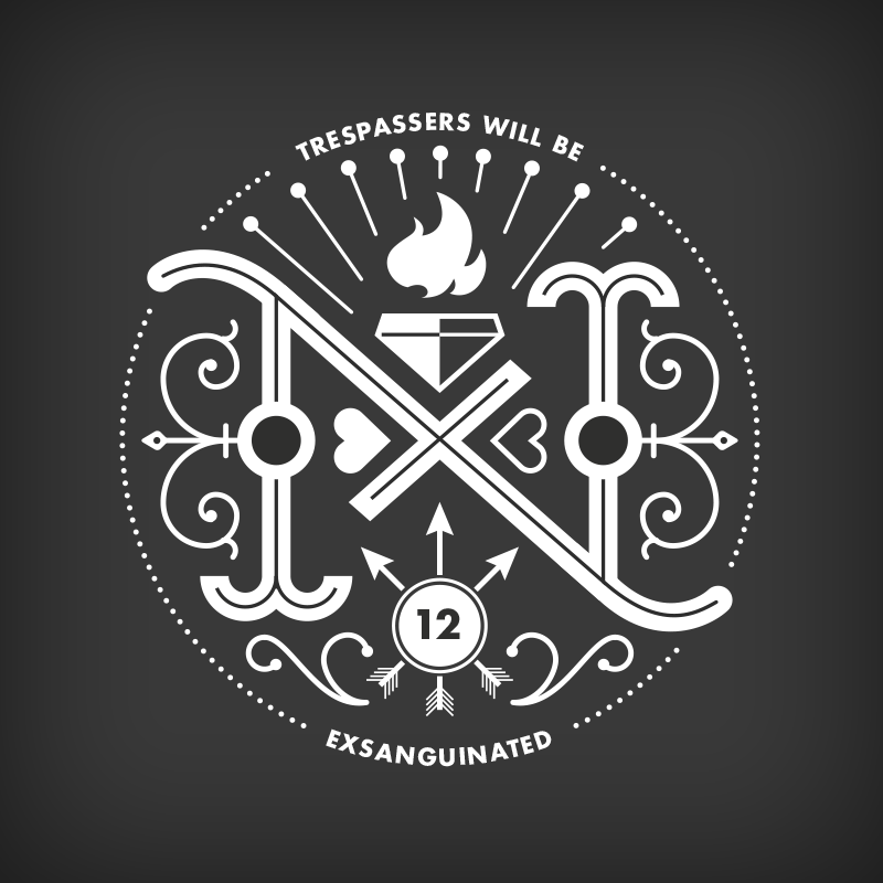
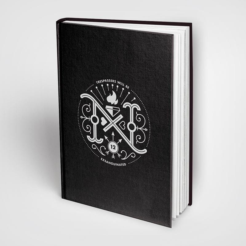
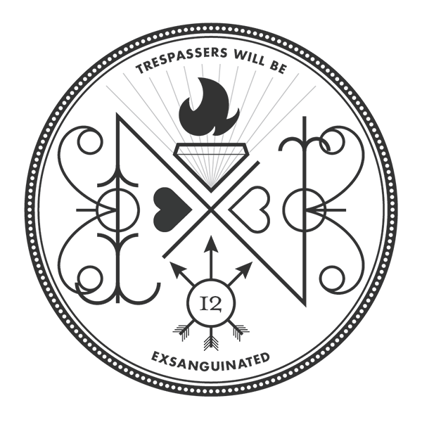
NOV 18 - CONVINCING MYSELF
So, this is me trying to flesh out the Cauldron idea as I had envisioned it in my head. I really wanted it to be intricate, dense with magical symbolism/detail (like the back of a playing card).
This is a super rough (my guides are showing and flourishes are overlapping) and maybe 40% completed. I'm kind of thinking it's starting to look less like a drop cap and more like an emblem. But it's so fun doing it...
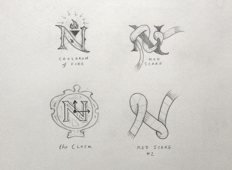
NOV 11 - BRAINSTORMING
After ripping through a bunch of ideas, I trimmed it down to what I thought might be the most viable which are:
- Red scarf
- Black & white
- The Clock
- After dark
- Bird w/broken neck (knowing your limitations)
- Duel (or "dual")
- Cauldron of Fire (w/12 arrows)
- Dinner party
- Circus tent
NOV 11 - CULLING
And, these are the ideas I'm kind of trying out. Admittedly, I think I'd like to try the bird with the broken neck, but I couldn't get it to work with the "N". Maybe another time. Regardless, here they are: