Stencils for Collage
The stencil on the left (in the cover image )was the "easy-peasy" with several colors. Predominately, you see green and orange, not the yellow. The image on the right was pulled from ink left over on the stencil.
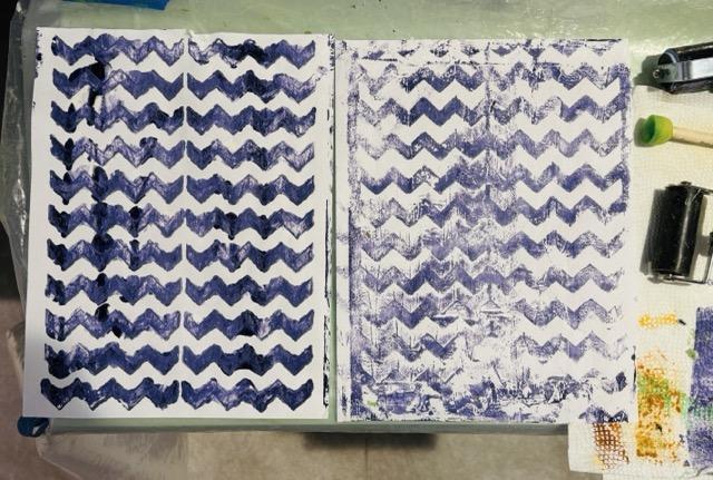
Black and white mixed in with purple, and the dark is visible on the left but not so much on the right where the white kicked in when I pulled the left over ink. The black make the stencil too dark in the first pull, IMHO, but I like the purple touched by white when I pulled the ink off the stencil top. The purple on the right shows hints of gray from the black and is lighter from the white. I need to work more with neutrals in the mix, I can see from this, but still, it was a surprise. Surprises can be fun!
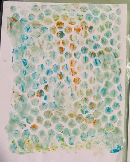
Pleased with this bit of blur from moving the stencil just a snitch to mottle the colors. I like the turquoise, orange and whatever else I put in that mix (green? white?). The blur mixes the colors just enough to make them more visually interesting.
This was a fabulously fun project. I was having a fit over trying to use stencils on my gelli plate, but watching your class was therapeutic! Thank-you for your great classes, Daniela!