Sidequest Café
A fictitious (for now) café, bar, and venue that is 100% submerged in video game culture. The café will host video game tournaments, concerts starring bands like Anamanaguchi, video game themed movie screenings such as Scott Pilgrim and Indie Game: The Movie, as well as classics such as The Last Starfighter and The Wizard. The décor will be covered with pixel art, chalkboard walls, and LED lights. This café will serve as a haven and a hub for video game enthusiasts from the late 80s up through today. Branding will permeate throughout all aspects of the experience, from packaging and signage to promotions, posters, and even special edition game covers.
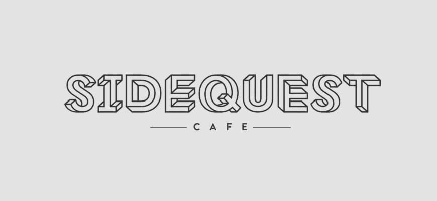
But first we'll get started with a logo. Putting up a preliminary mock up until further development.
DEMOGRAPHICS
I'd like the Sidequest Café to be a haven for video game enthusiasts of the 90s and today. So the demographics might be sort of split between two groups. The first is age 25 - 37, predominantly male, income level between $50,000 - $75,000, college education, and living in urban or suburban environments. The second group is ages 16 - 26, both genders, income level between $20,000 - $35,000, high school graduate, suburban environment. There is a definite set of old school, retro gamers who grew up with gameboys and the 8-bit / 16-bit era, but there is still a strong group of suburban new school gamers who are competing in professional gaming tournaments and championships, not to mention a massive emergence of female gamers in the past ten years or so. So, well, the branding needs to speak to both of these groups. Which, I think, shouldn't be horrifically difficult.
TYPOGRAPHY SWIPE
I took a look at a lot of type treatments given to some of the most notable video game developers, a few games that really take sidequests to another level, and some other things that are connected to video games (blogs, bands influenced by 8-bit, video game comic books). This is what I am left with. Supremely varied, but the groups show lots of similarities. The company logos are extremely simple, the game titles are much more flourished with serifs, dimension, texture, and more of a medieval "adventurous" feel.

CONCEPT SWIPE
There are a dozen different directions I can go into. Side quests are usually meant to distract a player from following a straight path to the end of the story in an RPG, and can achieve any one of the following: providing additional back story to characters or the created world, act as a means to gain additional experience, items, or weapons (sometimes exceptionally unique / powerful weapons and secrets that the characters would miss out on if ignored), and to allow for different gameplay mechanics to exist within the core system -- snowboarding mini-games, highly complex card mini-games, bounty hunting mini-games, etc. But for the most part, sidequest detract from the main quest, and that's an idea that can be carried on to this café - a way to detract from "normal" life, the daily regiment, etc. Going off the beaten path. Additionally, there is an idea of completion -- gamers will seek out everything a game has to offer, completing all side quests so they can soak up every bit of history buit in by the developers, and, really, to get their money's worth. A third concept can bridge old school and new school - bringing pixels to life, which is not a new concept, but could help provide a forum for the two very different generations to come together and discuss on common ground. Mix 2D planes with limited graphics like Mega Man with the vibrancy and scope of Mass Effect. Finally, I want to evoke the same feeling I got when I arrived at the Gold Saucer in Final Fantasy VII for the first time. It was a built-in arcade / amusement park inside the game that evoked awe and amazement, and I spent hours racing chocobos and playing submarine wars instead of focusing on the main quest.
Phew... um.... okay. A combination of two would work for the final branding, I think.

COMPOSITION
Yeah this one is tricky. I'm not 100% sure what I want here, but as I was going through different examples and images, I found a lot of lock ups that I liked and I think that's going to be a definite direction I'll be heading into, at least to try out. It would work to have several parts of the logo adaptable to different products within the café, such as branded coffee, pastries, beer, and paraphernalia. However, since so many companies and developers are simple type treatments, I'm going to keep that in mind as well. So..... we'll see how this goes with the sketching phase.

COLOR
So color in video games isn't a consistant palette, but it does show differences between old school and new school. Old school, primarily due to the limitations of the hardware, had a very, very defined and limited color palette. Mega Man's entire palette is five colors: cyan, dark blue, black, white, and peach. Today's characters have millions of colors that make them fully realized beings, with facial expressions, rusted armor, individual strands of hair that shine, and textured clothes and skin. Since this is a logo, I'll be leaning towards a more limited palette that panders to the old school, but adding elements of new school such as texture, making sort of a distressed, blocky look that limits the palette to just a few swatches.

/////////////////////////////
SKETCHES
So my sketching is usually super messy and disorganized and I have plenty that are in a dozen other places so this phase is still incomplete as of right now. here's a sample of what a few of my sheets look like:

The bottom right being just a test in medium (speedball pen) than concept. to make some of the ideas a little separated, here's some things i'm going to expand on before the next phase:

A few scant notes on the side of some of them, full size image here. I feel like i have around 100 more comps to make. But this is where Sidequest Café stands right now.
------
STAGE TWO COMPS
I'm a super finnicky person so I usually see a typeface that works, put something together, like it, look at it after a few days, and then trash it. So I won't do that this time, just for the purpose of showing process. I'll be following Gen's suggestions mainly moving forward, focusing primarily on the bottom three sketches on the left side on the image above. I wanted to do a simple comp of Macula OT and I actually really like the way it looks and fits in with what I want to go for.
We shall see how I feel about this in another day or so.