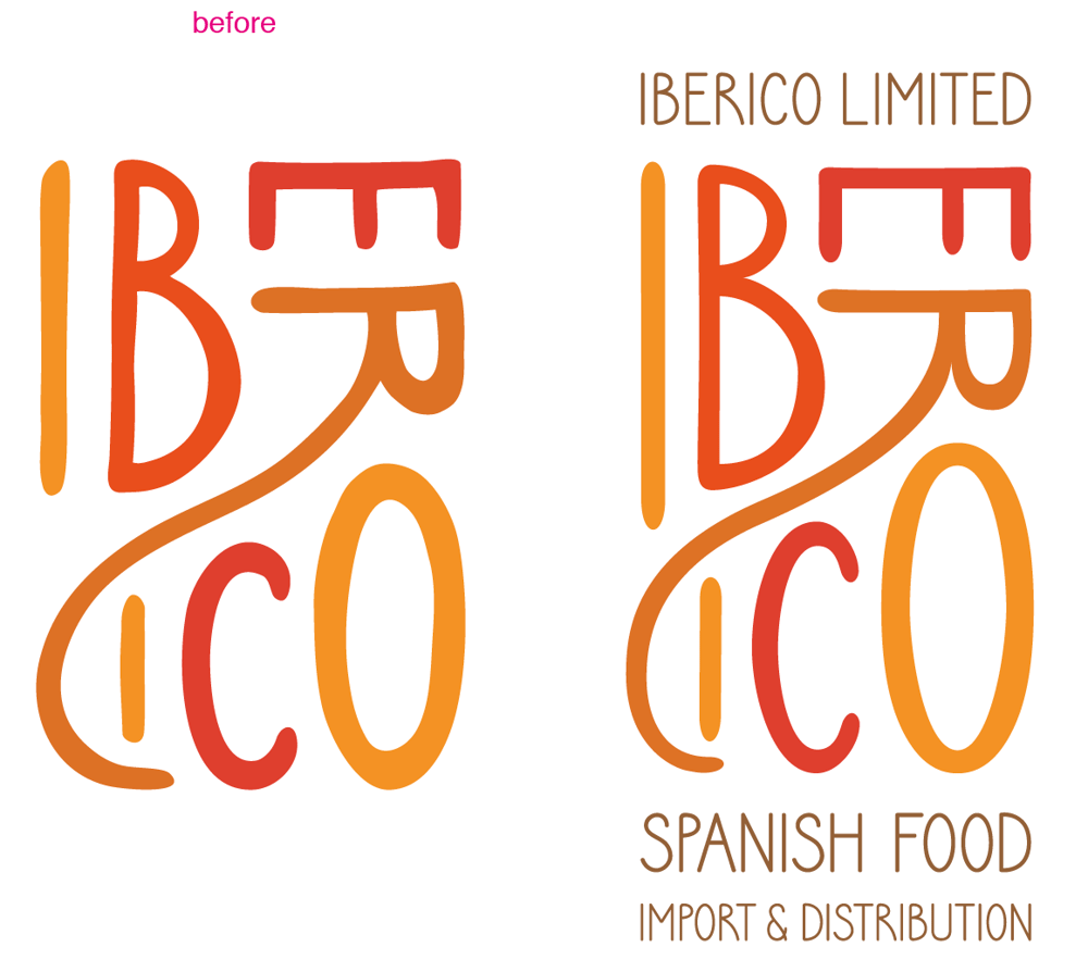
Logo for Iberico Limited
Logo for a spanish food import and distribution company based in Hong Kong, started by my friend. Right now, the company only imports cured products deriving from the Iberico pigs, but hopfully will expand to include a wide range of Spanish delicacies, eg. cured tuna roe, air-dried beef, canned razor clams, artisan jams... Apart from importing and distributing, they are also hoping to sell products branded under their own name.
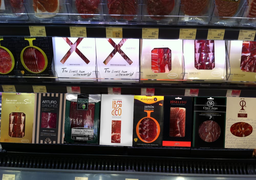
Iberico Limited is currently selling products to several mid-range to high-end restaurants in Hong Kong, with a few retail sales here and there in Taiwan, Japan, Korea, Singapore, China and Cambodia. They offer their products in the original packaging from the producers or hand-sliced into 100g vacuum sealed packages.
The cured meats that were sourced for this venture are from a small family-run farm in the Extremadura region in Spain. They only produce a very small amount of Iberico pig products compared to the other ham producing companies. Although their ham production is small, their products have been sampled by the Spanish royal family and was selected to be served in the Spanish Prince's wedding banquet. Iberico Ltd. is the sole company that is importing this quality ham into Hong Kong. The farm in Extremadura was very happy with their partnership with Iberico Ltd, as they have very little idea or resources on exporting their products. Iberico Ltd hopes that all their future products will also be from small family-run businesses that have great products but lack the confidence, knowledge or expertise to extend their business to Asia. Iberico Ltd's owner is very passionate about good food from his country and would love to share his passion with Asia.
The logo will need to appeal to the food producers as well as retail side clients.
Target audience:
Age: 30-65 year old
Gender: Female and Male
Income: average to high
Education: NA
Locale: urban
People who love good quality, hard to find food from Spain.
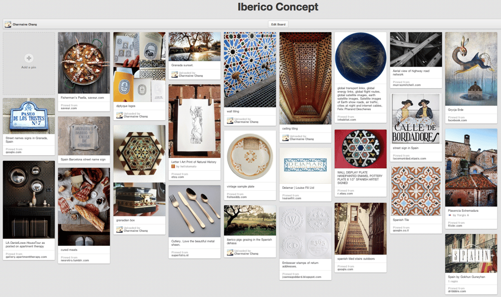
Concept
http://pinterest.com/charmainechang/iberico-concept/
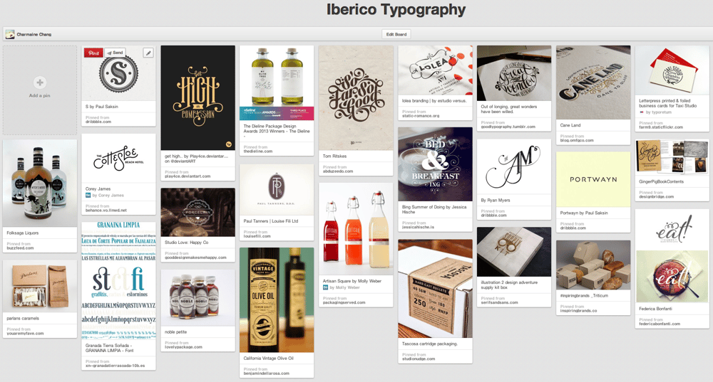
Typography
http://pinterest.com/charmainechang/iberico-typography/
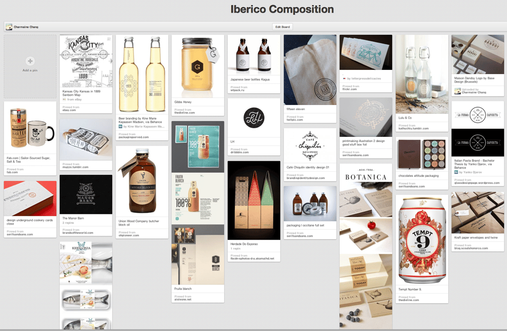
Composition
http://pinterest.com/charmainechang/iberico-composition/
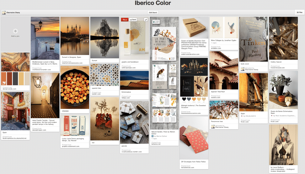
Color
http://pinterest.com/charmainechang/iberico-color/
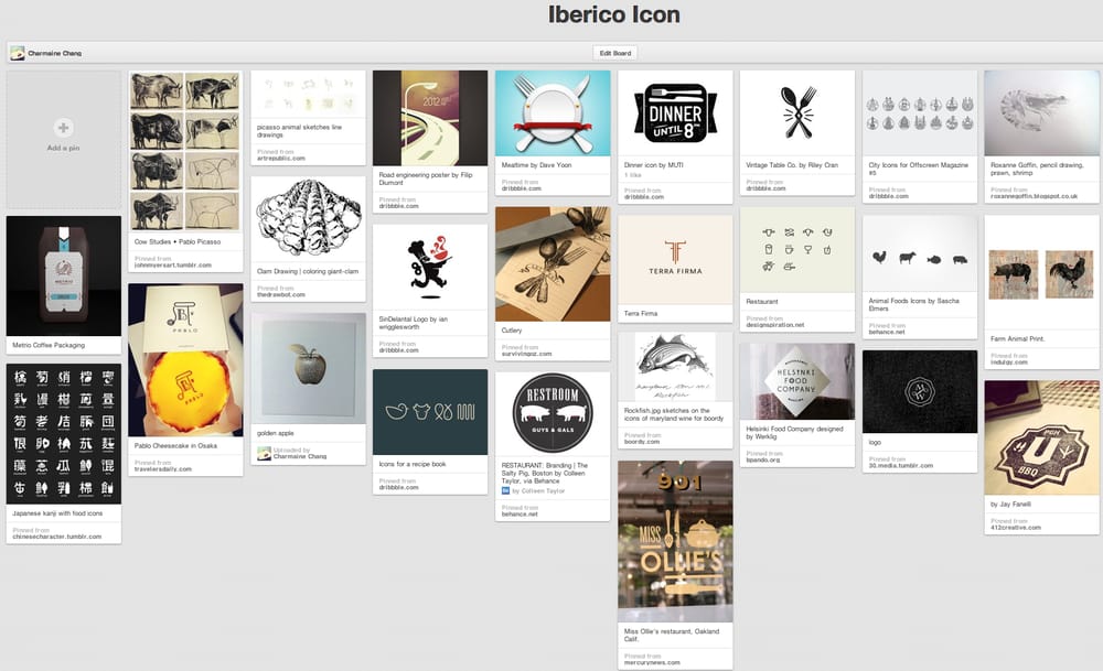
Icon
http://pinterest.com/charmainechang/iberico-icon/
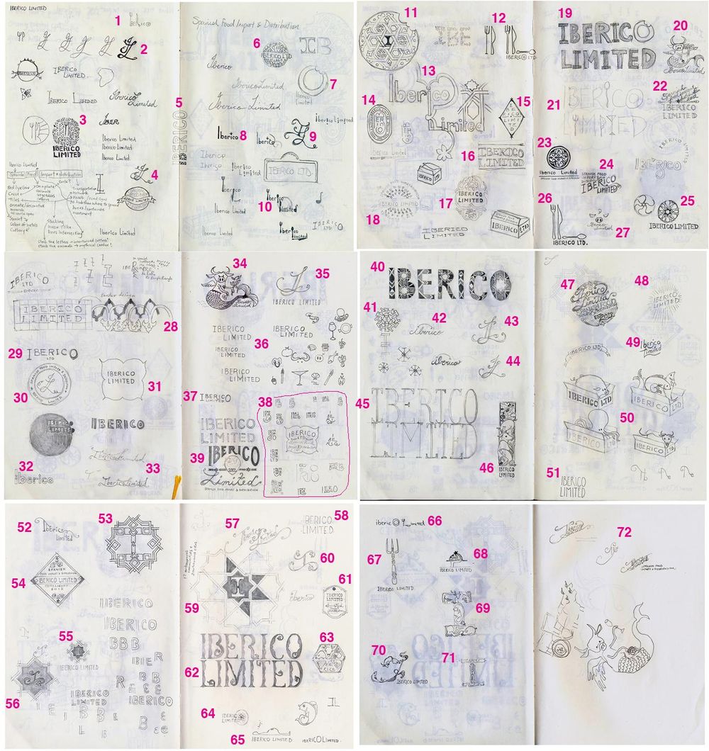
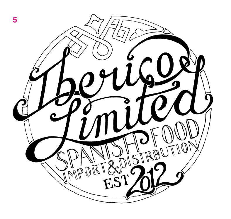
Sketches
http://pinterest.com/charmainechang/ils/
My Client's Choices
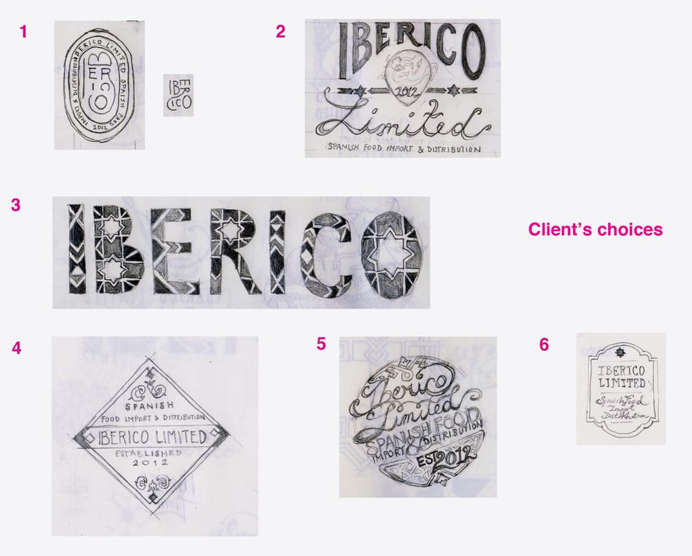
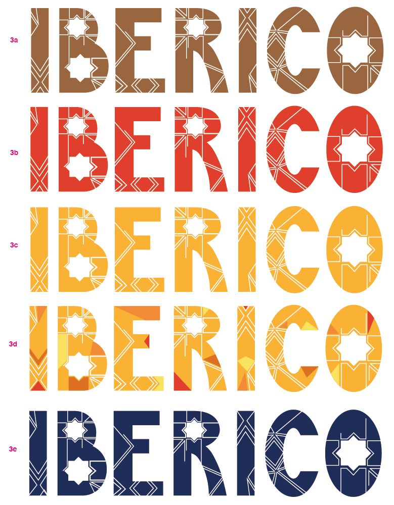
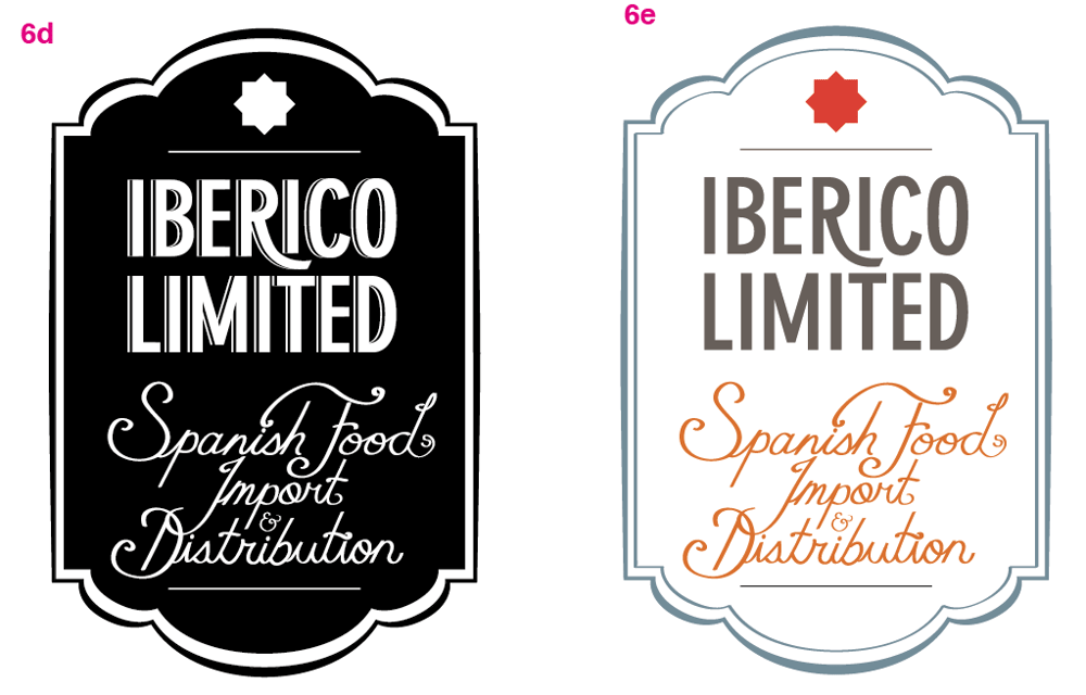
I showed my client the sketches again and asked him to pick out the ones he likes the most and also asked him to bear in mind his reluctance to display too much moorish influence while selecting. Apart from the fixation on the animals versions, he also picked these, which overlaps with some of Gen's choices. Although no. 3 is a tiling pattern commonly found on tiles and moorish architecture, my client likes it and wonder if a different color palette (from the usual tile colorings of burgundy, dark blues, dark greens and browns) might make it look less moorish.
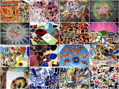
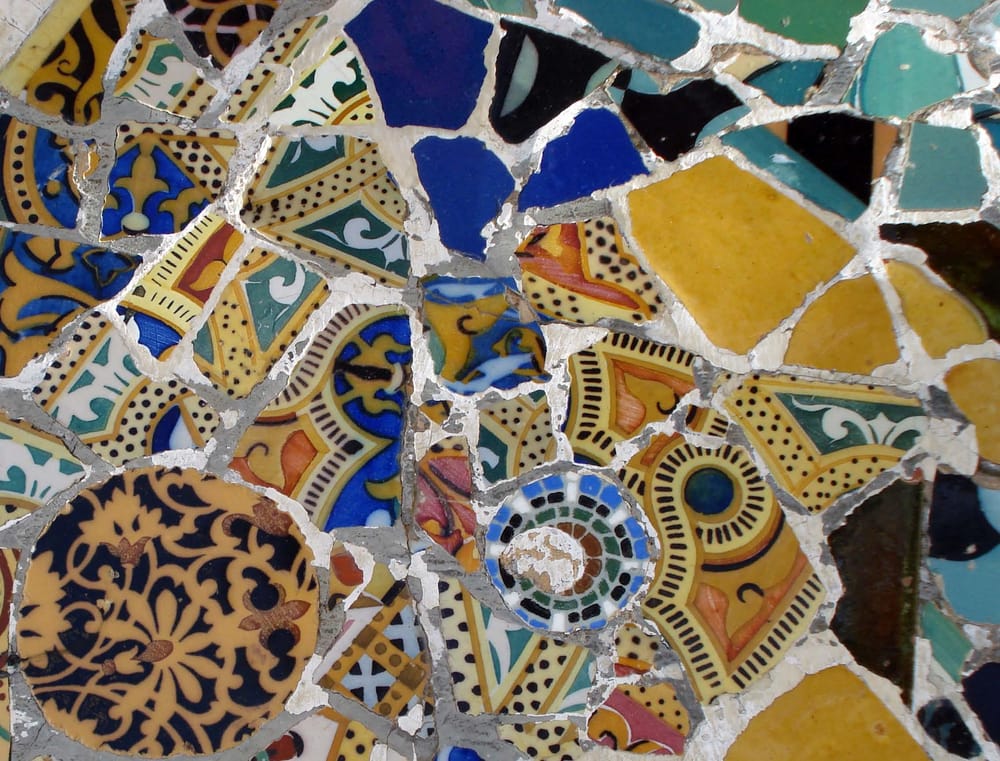
He also suggested something interesting. If I really want to use tiling patterns, he suggested using what he refers as "Gaudi tiles" (image attached below), he said those patternings are very Spanish, and somewhat avoids the moorish influence.
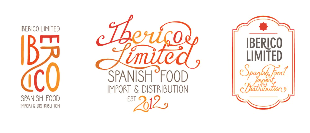
Rough Drafts
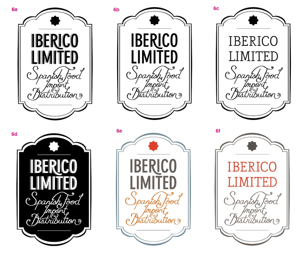
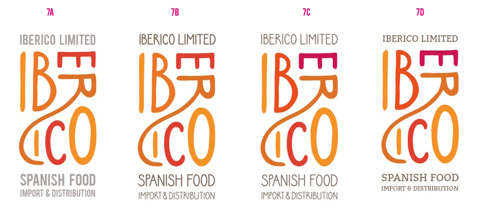
Tidied up the group of text below "Iberico Limited" a bit, took out the patterning.
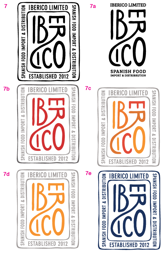
Incorporated the color scheme of 7b into 7a.
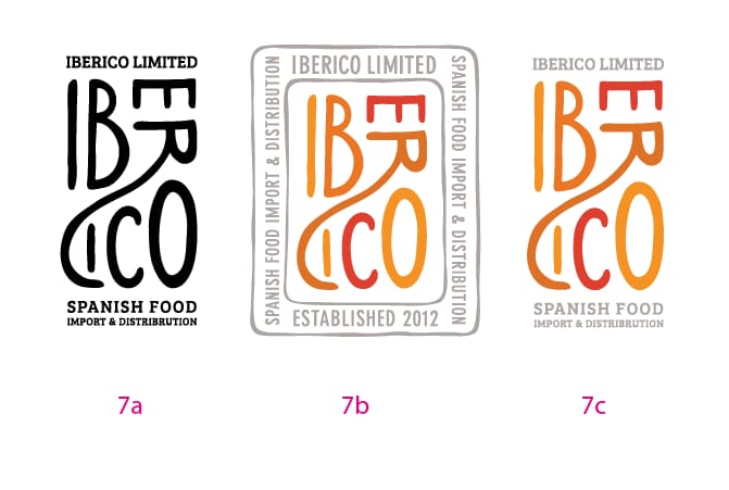
Changed the script a bit.
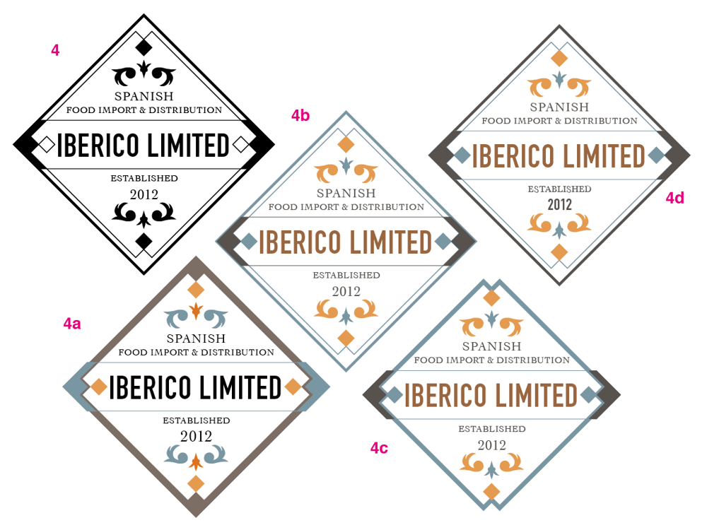
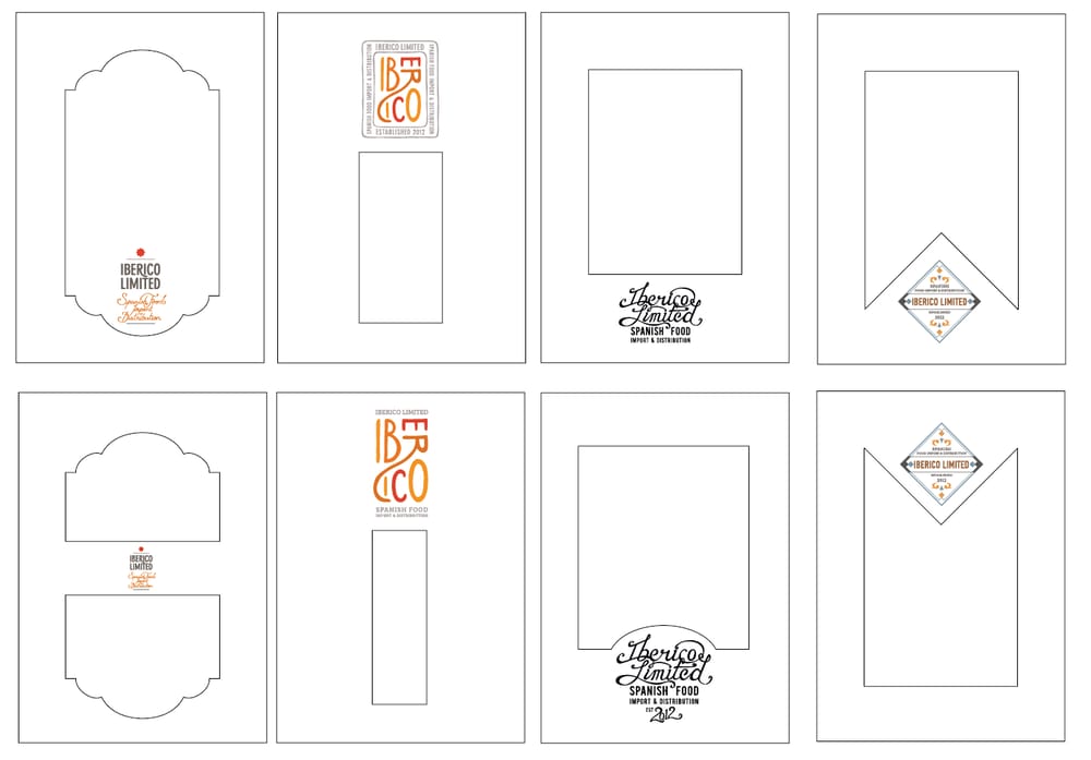
My client narrowed his choices down to these 4 sets, so I decided to stick them onto dummy packages to see if that helps him with deciding.
My client picked 7c in the end:
Font variations with the small prints in the logo.
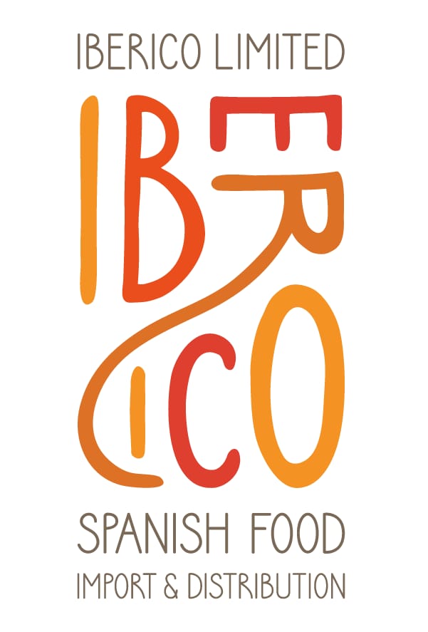
Final
what do you think?
I thought a little about using all the logos for different products, I don't know if my client would want to but I gave it a try, I used the same color schemes on them, do you think it works as a set?
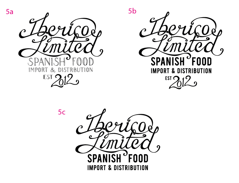
Tidied up the lines a bit