Transcripts
1. Hello!: Have you ever noticed
that everything around us is filled with
shapes and patterns? Whether we look at the
glorious architecture of monuments or clothes developed by fashion designers or simply elements in nature. We can see shapes and pattern inspiration
literally everywhere! And of course, it's no secret that all artists are inspired by
what they see around them, and they're always looking
for creative ways to include their inspiration
in their art practice. In this class that's
exactly what we'll be doing with a very observant, mindful, and easy approach. Hi everyone and
welcome to this class! My name is Ridhi
and I'm a filmmaker and a multi-disciplinary
artist from India. I love working with patterns, which probably
explains my love for the Zentangle art method and the fact that I'm a Certified
Zentangle Teacher. This class is a follow-up to my previous class over
here on Skillshare, which is a beginner's guide
to the Zentangle Method and it introduces you to
the terminology and the essential
framework of Zentangle. So if you've stumbled upon
this current class without having seen
the earlier one, then I highly recommend that you go back and watch that class first to help you get familiar with what
exactly Zentangle is. And don't worry it's a quick one! You'll learn the
basics in no time! And if you're someone
who has already seen that class, well, then welcome to this next stage of your beautiful adventure, where I promise
I'm going to make you fall in love with
patterns, for sure! This class is perfect for
Surface Pattern Designers and Illustrators looking to add new designs to
their portfolio. It is also a great class for Zentangle or Zen-
Doodle enthusiasts looking to level
up their drawings. You could even be a
complete beginner or a hobbyist looking to experiment with new
styles or mediums, and you could be a
digital artist or illustrator looking
for new ideas to include in your work. The best part is, you don't need any prior drawing or art
skills to take this class. But like I said, it is recommended to watch
the beginner's class first just to familiarize yourself with some of the
terminology that I use. Now in terms of the
class structure, we're going to begin with a few warm-up exercises
to improve our strokes, and then after that, we will learn how to
identify shapes around us. Then we will learn
how to convert those shapes into
patterns or motifs, which are also known as tangles
in the Zentangle Method. From there, we will move on to learning about tangle enhancers, which are basically
techniques to beautify or enhance
an existing motif. We will then progress
to working with tangle structures
and tangleations. And finally, we will be
working on a project to apply everything that we have practiced and learned
in the class. Now, one of the reasons why I'm packing in a lot
of information in this class is because of all the feedback that I have received from my
students over the years. My students always say that
when they go on the Internet, they find a plethora of pattern and tangle ideas
to take inspiration from. And then they actually
find it very easy to replicate those ideas
when they're practicing. But when it comes to
developing their own original, unique artworks from scratch, they feel a little stuck! A very common problem faced by most artists, don't you think? And well, everybody wants to develop patterns that
have never been seen before or patterns
which are unique and truly reflective of their
own individual style. Basically, in a nutshell, we're looking for ways
to develop art without having to depend on any
guidelines or framework. And that often comes
with the skill, ability and the confidence to develop your own unique designs. And I want to make sure that I provide you with all those tools and techniques for
you to develop those skills confidently. So that's what this
whole class is about, and I'm super thrilled to share all of my
knowledge with you. So let's dive in and start making some cool patterns.
See you soon!
2. Supplies: Before we get into the
actual drawing process, I wanted to quickly show you all the materials that you
can use for this class. First off, we will need
some practice sheets. Now this can be a good-quality sketchbook that you are probably
already using for your daily drawing practice or it can be something as
basic as copy paper. This is just for practice. Anything that's affordable and easily available to you
will work just fine. Next, we need drawing pens, which are sometimes also
available in art stores under names such as "fine
liners" or "technical pens". I generally use these
Sakura Pigma Micron pens that come in various nib sizes. The nib sizes help indicate
the thickness of the pens. Sakura Micron usually has
numbers written on it like 01, 02 and so on. Looking at the numbers, you can easily find out
the thickness and it actually mentions the thickness
on the pen body itself. Now, you can get
these pens in packs, or you can also get
them individually, loose, depending on the
brand that you are buying. If you're just beginning
your drawing journey, then you don't need to buy
an entire pack for yourself. You can just get
a couple of these in two or three
different nib sizes, and that should be totally fine. If you don't have
this particular brand available in your art store, or if you simply prefer to
work with another brand, that's totally fine too. We are basically just looking for good-quality
drawing pens. So any local brand which is
easily available to you, which is affordable is completely fine to
take this class. Next, we need a surface
for your final drawing, which is also going to
be your class project. Those of you who
are familiar with Zentangle method know that we usually draw on these 3.5
inch square Zentangle tiles. But for this particular class, I actually want to encourage
you to try something bigger. So in my case, I'm going to be using this 15 centimeter by 15 centimeter square
mixed media paper, which is roughly about
six inches in width and six inches in height but you don't have to work
on the same size as me. You can work with 8 inches or 10
inches or whatever size it is that you really
like working with or something that you're
most comfortable with. In fact, it's not even
necessary that you have to work on a
square format only. I just prefer to work
on a square format, which is why most of my drawings and sketchbooks are all square. But you're welcome to work
on a rectangle shape as well in a portrait or
horizontal landscape mode, whatever it is that you like. So feel free to experiment
with paper sizes, shapes depending on
your comfort level. I do want to quickly mention that the
thickness of the paper is important when
you're working with multiple layers of
ink and graphite. For this particular class, I would recommend paper
anywhere beyond 160 GSM. So the minimum being 160 GSM and you can go
as thick as you like, and preferably try to work with something which
is hot-pressed or which is a smooth surface so that when you're working with multiple layers of
graphite and ink, you can actually
have your pen and pencil gliding over
the surface smoothly. Basically in a nutshell, just try to look for smooth, medium to heavyweight paper, which can take on multiple
layers of graphite and ink. Of course now that brings
us to our next tool, which is going to be
a graphite pencil. The Zentangle branded
graphite pencils are usually made with HB lead. If you don't happen
to have this in your area, that's
completely fine. You can use any pencil with an HB lead from any good brand. You can actually also use
2B or 4B lead pencil. But I wouldn't
recommend going any higher than that if
you're a beginner, because then it gets a little tricky to control the pencils. If you don't have a
lot of experience working with graphite, then sticking to pencils between HB and 4B
range works just fine. Now, we will also need
a tortillon which is basically a small
rolled paper tool with a nice pointed top to get
into those fine corners of your drawing when
you're actually blending out the graphite
and doing your shading. As an alternate, you can use
blending stumps as well, which are easily available
at an art supply store. Now, as you all probably know from the
introduction class, that there is no use of an eraser in the
Zentangle method. This is because Zentangle art follows the philosophy
of no mistakes. Just like our life
has no eraser or a delete button we don't have an eraser in the Zentangle
tool set as well. Our so-called mistakes or
unintentional strokes on paper are simply an opportunity for us to make new discoveries. However, in this
particular class, I want to help you level
up your drawing by developing your own
individual unique patterns. And since you're not going
to be working with pre-existing patterns
and you're going to be ideating and
experimenting a lot, it does make sense
for you to have an eraser with you for
this particular class. This will help you
to fine-tune and polish all of the patterns that you're going to
be experimenting with. And so your artwork will end up
looking a lot more polished and finished with
an eraser by your side. So I definitely recommend
keeping one for this class. And so that's it for all the supplies. We are now ready to dive deep
into the world of patterns.
3. Tangle Components: Alright, so right off the bat,
let's start by doing a quick recap of what
exactly a tangle is. In the Zentangle terminology, the word "tangle" is used to describe the patterns
that we draw. These tangles have a
predefined sequence of the elemental strokes that are then
repeated to fill up the sections of the tile
created by the string. Now this is, of course, the explanation for
the word "tangle" as it appears in the vocabulary
of the Zentangle method. But to be honest, for all
intents and purposes, this definition actually
perfectly suits patterns or motifs of all kinds
that we as artists draw, not necessarily the ones who follow the
Zentangle method only. Now, in order for
us to become better at drawing these
patterns or tangles, we must focus on five
crucial components. First, is Stroke Practice, which basically means
focusing on drawing neat confident strokes that make our patterns look
polished and professional. Then, we need shape ideas, which are basically
the foundation of any pattern or motif
that we want to draw. Thirdly, we need
tangle enhancers, which are basically ways to beautify or enhance
a given shape. Then we need tangle or
pattern structures, which help us to identify
what's the best arrangement of the shapes that we have
developed and how to make a pattern or a
motif look its best. Finally, we need tangleations, which are basically variations to a tangle that
we have developed. We will be diving deeper into each of these
components one by one, and first up is stroke practice.
4. Stroke Practice: Do you remember all those
handwriting practice books that we used to own as children, especially those cursive
handwriting ones? Well, they were
all designed with the fundamental thought that the more we practice each stroke, the more confident we become
in writing those letters. The same principle applies
to drawing as well. One of the first few drawing
lessons we experienced as children is to draw standing
lines and sleeping lines, before moving on
to drawing shapes like rectangles,
squares, triangles, etc. Whether it is alphabets or
numbers or geometric shapes, everything that we see around us is designed with strokes. In the Zentangle Method, these strokes are known
as the elemental strokes. They are I, C, S, O and dots. Once you start
working with these, you'll realize that pretty
much every object that we see around us can be drawn using
these elemental strokes. For us to become
better at drawing, it is vital that we practice these strokes on
a regular basis. This is important
for two reasons. First, we will find out which strokes we struggle with
and need to improve on. Secondly, we will know our preferred
direction of drawing. Let's take an example
of the I stroke. The I stroke is basically
a straight vertical line. Now, I prefer to
draw it downwards, but you might prefer
to draw it upwards. Some people struggle with
drawing vertical lines, so they rotate the
paper and draw the same vertical
line horizontally. Again, you can do this left
to right or right to left. Now when I turn
the paper around, these are basically
vertical lines for me, except that I drew them in a method that was more
comfortable to me. But basically, what I'm getting at is that with this exercise, you will be able
to find out what your preferred direction
of drawing is. There are several ways to
practice your I stroke. Think of all the variations
that you can do with this. For example, try
drawing diagonal lines, and then do them the other way. Try doing a few zigzag lines. Try drawing a few triangles, squares, and rectangles as well. These activities may seem
really small right now, but the more you do
these practice strokes, the more confident
and aware you will become when working on
larger motifs and patterns. You'll find out your
strengths and weaknesses, and most importantly, you will find out what you're
comfortable with. For example, I have realized
for myself that most people draw a square with two vertical lines and
then two horizontal lines. But that is a little
uncomfortable for me. I prefer to draw my squares
with horizontal lines only. I'd rather move the paper instead of moving my hand a lot. This is my preference, which I became aware of when I started doing these practice
exercises regularly. I encourage you to
follow along and try these practice exercises for yourself and see what
you're comfortable with. Now, let's try the C stroke. We can write plump Cs, which pretty much look
like semi-circles. We can make them
elongated like so. We can reverse them and try
to create mirror images. Then we can also play with
the placement of the arc. For example, if I
make a fat arc at the top with a slightly
flat tail at the end, I can create a heart like so. Then if I do the opposite, I can actually create something
like a teardrop shape. This one has a more flat top end with a slight more
bulge at the bottom. Ovals and circles are pretty
much made up of C strokes. So practice the C stroke in
different ways to warm up your hand and to gain more confidence in
drawing these curves. The S stroke is an
extension of the C stroke. Because it's basically
two C shapes stacked on top of each other facing in the opposite
directions of course. However, the focus with the S shape is to draw
continuous lines with curves. We try to do plump
short S strokes. Then we try to do
elongated ones. Then let's try a few
horizontal ones as well. Then try to do a
reverse of these. Then let's do a few reverse
vertical ones as well. Again, doing all this will help you to get
an understanding of which direction is more favorable to the
comfort of your hand. You might also want to try making continuous
waves like this. Try some with very deep curves. A few which are not so
dramatic and accentuated. Basically, play around
and get comfortable. Moving on to the O stroke. Which is basically the
basis for circles, ovals and orbs of all kinds. You want to try these for
sure to see if you prefer clockwise movements or
counterclockwise movements. You also want to notice
how you close your orbs. Do you stop short
of closing them? Or do you go beyond the closing point and actually
run a little bit extra? Can you try to focus a
little bit more and control your movement and make them
stop just at the right point. It's a little bit of practice, right? But you'll definitely get there! Now try some elongated
orbs or ovals. Then try them
horizontally as well. Try some diagonal and
angular variations as well. Finally, let's try
to make some dots. We can make them scattered, or we can make
them in a cluster. We can make them in
specific patterns too. For example, try to
make a wave with them, you can also try
making the dots in an ascending or descending
order in terms of size. This is something
you've probably seen a lot in many ornate and
intricate patterns. Basically, don't
think that dots are just like a plain simple
blob on the paper. You can experiment a lot with
their formation as well. Alright, so that finishes our
stroke practice. I highly recommend
that you do this on a regular basis if you're keen to improve your
drawing skills. Believe me, I do this even now at this stage of my career, especially if I
have come back from a long vacation and have not
drawn anything in a while. These exercises are a
great way to warm up your hand and build up
muscle memory for yourself. On days when you don't feel
like drawing anything, or on days when you feel less inspired and don't have
any new ideas to work on, you must spare a few
minutes and at least do these stroke practice
exercises for yourself. That way, you'll have your
creative juices flowing again. And you will also feel a lot less guilty for not touching
your sketchbook in a while! Trust me on that. [LAUGHTER]
With that out of the way, let's move on to
our next lesson, where we will talk
about shape ideas.
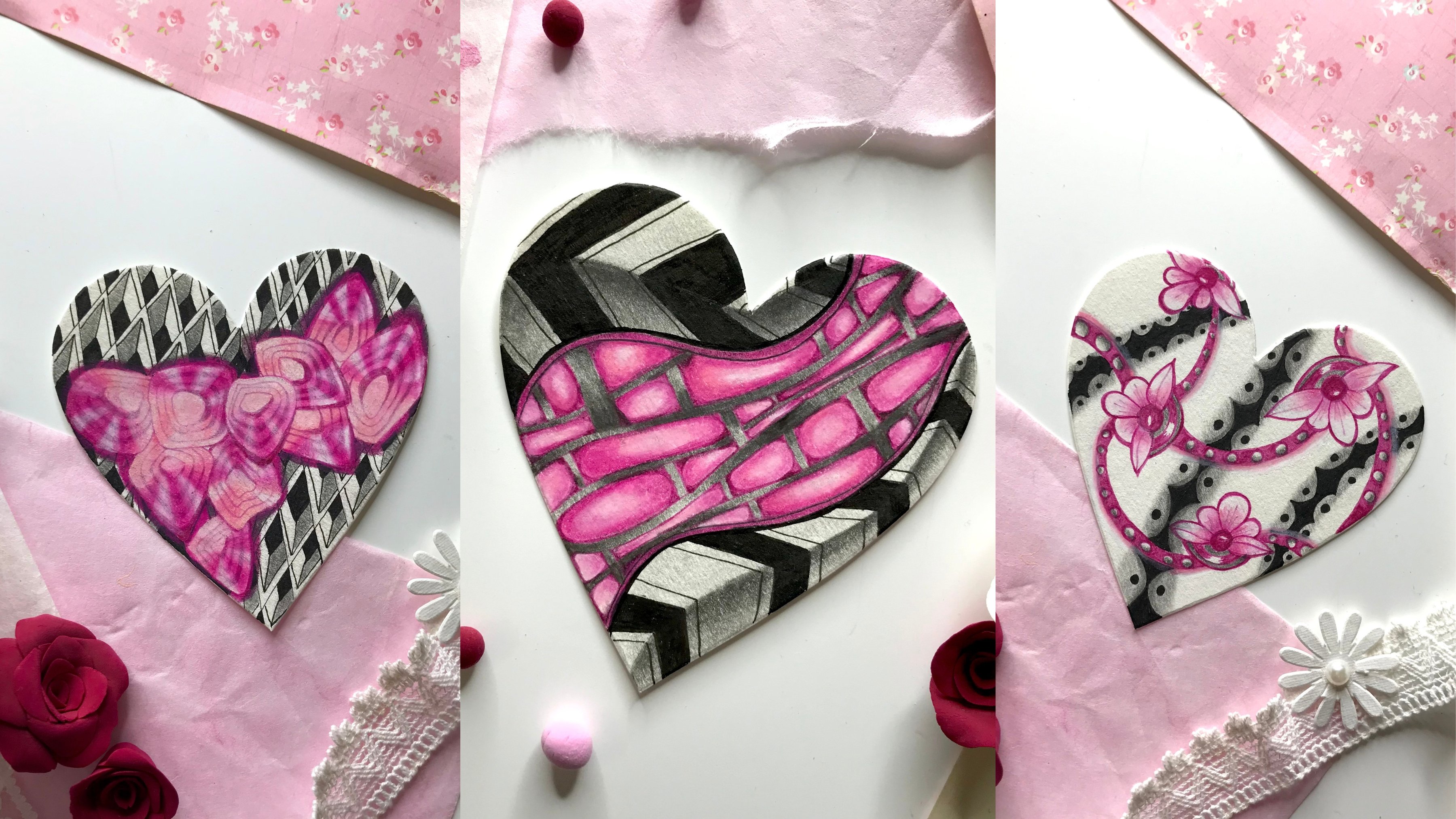
5. Shape Ideas: Gathering Inspiration: Whenever we observe
any pattern carefully, we can see that there is always a shape or a framework in it. More often than not, these shapes make up the
outline of the design or the pattern and then there are other details
inside that shape. But the truth is
that when we sit down to make patterns
from scratch, ideas often elude us. These shapes or
design ideas don't come to our mind
so easily and we experience a sort of, mental or
creative block. So what do we do? Well, there is a very
popular theory amongst creative professionals that you do all your creative work, either from observation
or from imagination. And guess what? The
more you observe, the more information you
will be providing to your brain to then fuel
up your imagination. In other words, observation is the first step to most
creative processes. So in the context of the
patterns in today's class, we will be observing
interesting shapes around us and then we will take creative inspiration from them to convert them
into interesting motifs. First, let's narrow down on the category or genre
of our inspiration. You can take inspiration
from nature, architecture, fashion,
and so much more. Within these categories, you can further streamline
your inspiration. For example, if you've chosen nature as your
broader category, then you can narrow it
down to only birds, or only flowers, or patterns found in
coral reefs, etc. Same way, if you're choosing architecture
as your main theme, then you can further narrow
it down to inspiration from Roman architecture
or Modern architecture, or even Mughal
architecture, and so on. Basically, we want to create a quick folder of
images for ourselves, from which we can gain
inspiration for shape ideas. For today's class, I thought it would be
fun and interesting to develop patterns
out of vegetables. And there's actually a
really good reason why I decided to do this today. That is because when
we're thinking of creating meditative,
beautiful patterns, people usually don't think of vegetables as a resource
for inspiration. And I actually want to
demonstrate that literally anything can be converted
into a beautiful motif, once you are aware of certain
tricks and techniques. Secondly, I have
personally not worked with vegetables a
lot by myself too, so as I'm recording this
class for all of you, I'm also pushing myself
creatively and purposely choosing a subject area that
I haven't explored much. So you will literally get to see
me exploring ideas with you firsthand and you will get a very realistic picture
of my creative process. So everything that
goes on in my brain, whenever I'm coming
up with design ideas, with all the mistakes and all the corrections that I'm
going to make along the way; you will get the most
authentic picture of how I go about approaching my creative design
inspiration process. And I feel like this is going to be the most authentic manner in which I can deliver
this experience to you. Now, coming to our
reference images, there are a couple of ways
in which we can do this. You can follow along with the exact same images that I have chosen for today's class, which I have also included in a document in the class
resources section. Or you can also choose your own set of images
and work with those. I'm working on vegetables
but your source of inspiration can be
architecture or fruits, or animals, or flowers, or anything else
that you'd like. The steps that I showcase
using vegetables as an example are applicable to any genre of inspiration that you
choose for today's class. You're definitely free
to experiment over here. Like I said, if you
feel like you need a little bit more hand
holding right now, then you can follow the
exact same steps as me with the exact same
reference images as me. This is totally your
choice depending on your comfort level as
well as your skill level. Now, for the inspiration images, you can either click
your own images for reference or you can visit a free stock photography
website like Unsplash and collect
some images from there. You can bookmark the images
on your browser window, or you can download the
images in a folder on your computer or your tablet or whatever device you're using. For example, I
have made a folder for myself over here
with some images that I liked from Unsplash
and I'm going to be transferring these
to my phone in a bit. I have taken a bunch of
different pictures that I feel have the potential to
be converted into patterns. But then again, I might struggle with a few
of these images. I don't know that
yet. We'll find out once we get into
the drawing process. Like I said, you
will basically get a very realistic picture of how I approach my
creative process when it comes to
making new designs. Now, I have all of these
various images with me, some of leafy vegetables, root vegetables,
cauliflowers, carrots, bell peppers, just a
random mix of images. So if you're following the
exact same process as me, then I have listed
the links to these in the same document that I
was mentioning earlier, which is in the
resource section. It is available for download. And if you're following
a different set of inspiration images that you
have chosen for yourself, such as architecture
or fruits or flowers, then I encourage you to
make a similar folder for yourself and keep that ready before you get
into the next lesson. Because that's where we'll
actually start drawing. I look forward to seeing you in the next lesson with all of these reference images
and let's get drawing.
6. Shape Ideas: Drawing Experiments: Alright, so let's get started
with some patterns. Now, I've got my images downloaded on my phone
over here with me so that I can zoom in and look
at the details and just try to extract some shapes and design ideas out
of these images. You are free to, of course, download the images from the resource folder
and keep it on a phone or an iPad or anything else that
is convenient for you, or you could even
take a print of these images and keep
them on the side. Now, we are actually
going to start with this cauliflower image and
try to extract some shapes. While I'm drawing the shapes, my focus is going to be
on trying to look at the outer form or the outer structure or
outline of the element. I don't want to
focus too much on the inner details because
those are going to be the enhancers
that we're going to be doing in our
upcoming lessons. For now, I just want to
focus on the outer shapes. Now, I'm going to try and keep this as simple as possible, because the goal
over here is to try and simply extract shape ideas. For example, over here
I don't want to do too many details
inside and I'm just going to add these curvy lines and just close that
gap inside like so. Now, one of the things we
also want to try and do in this exercise is to try and come up with some variations
on the designs. For example, I did
a version where the leaves are blooming
out like a flower, but this time I want to try a version in which the curves or the little curls and ruffles on the leaves are a little
more accentuated. I'm basically just adding
a little more drama and trying to just see if that's going to give
me a different result. Basically the idea is that
we take an image and we try to break it down into
simple steps for ourselves. We just look at the outlines of the shapes and we don't focus
too much on the details. If you feel like you want to add the details
just for reference, then you can add small lines the
way I'm doing it right now, just to imitate what I'm
seeing on the photograph, but this is not necessary. There is a high chance
that when I actually get into the refining
stage of the patterns, I might just actually skip those inside lines
altogether... the veins. So I'm just going to keep
that as a reference, but might not stick
to it eventually. Let's try a third version
over here and in this case, I'm not going to do the leaves independently the way I was doing in the first
two variations. This time I'm just
going to focus on the larger concentric, circular wavy shapes so I'm not breaking down each
individual leaf. Instead, I'm just focusing on this wavy concentric shape. Now of course, if
you feel you want to break it down into
small sections, we can try a variation
where there are certain lines going in
different directions like so. But then again, this is
just me brainstorming and just thinking out loud and just putting random
ideas on paper and not really worrying about
the outcome at this stage. And I think this is actually quite important when you're coming
up with your own patterns. You should basically
not force yourself to come up with a nice
outcome right away. I think it's important to slow down and just focus on
one shape at a time. For example, in my case, I'm just going to
probably not even use all of these
variations eventually. I might just use the middle one because that's the one
that I like the most. I might not end up using the first and the third version. But what I'm
basically getting at is that you shouldn't
really worry about how the pattern
is going to apply eventually or what it's going to look like eventually
at this stage. Now for our second image, I have this asparagus
which I had downloaded, and what I like about
this is that it has these little
stem-like structures, and then we can
build up the top, almost conical top with a
little bud of a flower. We can just keep adding these curvy triangular shapes
and build it up like so. Now, I can also just focus
on the top part and just do a version which focuses
on just that top element. Again, I'm just observing
the shapes right now and just doing loose
sketches of these. I'm not focusing on realism over here because at
the end of the day, I don't want it to look
like an asparagus. I want it to look like a completely new pattern or a design motif,
which is abstract, which is non-representational
and it should just look beautiful when it's paired with the other tangles
that we're going to draw. Now I'm just doing a version, which is slightly more curvy. This one, actually pretty
much looks like a bud of a blooming flower or one
of those stemmed flowers. I like this variation as well. So we have a couple of
these variations to play with and of course, I can only do the stem and skip the top section
altogether as well. I can just break it down
into sections like so, and just add these little curvy triangular
shapes alternating like so. So these are all the different
design variations that I can think of right now. Of course, once we get into the stage of playing
with tangle enhancers, we're going to come
up with more ideas, but for now these will
do for the outlines. Then let's move on
to our next image. This one actually, I'm
not sure what this is. There was no description
of this image, but it just happened
to appear on my Unsplash feed when I was looking for interesting
pictures of vegetables. I think this is a flower, I'm not too sure, but I quite like this
interesting design over here that was happening with these circular structures. It reminds me of those curvy
lines in a beach ball. I'm going to start with
that as my reference. With a circle, I'm just going
to add these curvy lines and break it into these
sections like so. Then of course, I can try
a version where I skip the outer circle
and actually try to focus on those little plump
rounded edges on the top, which is going to give
me a result like so. Now of course, I
don't have to keep that dot in the center itself. I can totally keep it off center and that's going to
give me a different result. Let's try a variation
in which I'm doing a circle as my guideline and then I will go back
on those top edges and add a little bit more
thickness to those borders, and that's going to give me
a slightly different result. That's just basically adding a little bit more contrast into the design and the outer edges are looking a little
more accentuated. There are different
angles to do this. Instead of doing
just circles, I can also try a version
which is in an oval. Here I can try to do
a version like so. Again, go back and make those
edges a little more plump. That's going to give
me a different result. Now again, this is just my interpretation and
understanding of these shapes. You might see these shapes differently and
you might observe some things which I'm missing. The goal of this exercise
is to basically look at these images and break it
down into easy shapes for us, which we can build
details on later on. If you're actually able to
come up with more ideas or different ideas than me
using the same images, that's actually pretty great because that way you will have something of your
own to showcase and something really unique
and interesting. Everybody views these
images differently and everybody's observation
is, of course, different. Feel free to experiment
with these images and basically just have
fun with these shapes. Now I have one more
interesting image, which I'm pretty sure
is not a vegetable. [LAUGHTER] But it
just again happened to pop up on my feed when I
was looking for vegetables. And I thought this was
quite interesting with those little triangular tops and just the way these
leaves are fanning out. Something very similar to tropical leaves
and something that you would see on a beautiful
island, I suppose. This really caught my eye and I wanted to try a few
variations with these. One of them is basically
just like a regular fan. Then I wanted to try a different approach
of drawing this. So I thought I should just make the lines first which
are fanning out, which are basically
the stems and then go ahead and add those
triangular tops. Now, of course, we can add
small lines there which can just fade out midway or they can go all the way till the end. They're basically fanning out or they're just spreading out
from this little center. This was another shape that
I really wanted to play with and I think these couple
of variations look nice. I think I'm going to
have a lot of fun adding details on these shapes. Moving on to our next image, which is this one. This is I think a muscat
squash or muscat pumpkin. I'm not really 100% sure. But the image had definitely the word "muscat" in
the description. So yeah, this is another
interesting image which I thought I could
play around with. Again, the idea is that we're just trying
to simplify the shapes. This also reminds me a
little bit of a beach ball, with those little
sections and partitions. But what I also
like is that I can actually go back on
those outer edges and give them slight more
curves on the top or this wavy design on the top which gives me a totally
different result when I do it this way. I can go ahead and
add those lines. Again, I'm not really
focusing on doing a very neat job right
now because the goal is just to understand these shapes and let my creative juices flow. I'm going to get into the refining stages when I
move to the tangle enhancers. Now, when I zoom
into this image, I actually want to focus on that one little section
or slice of that pumpkin. I feel this can give me
an interesting variation which might just look
something like a heart. It's like I'm focusing
on maybe a quarter or maybe even less than a
quarter of that entire circle. I'm just focusing on that one little tiny area and that might just give me a small element to play with. Looks like a heart, a chef's hat and a hot air
balloon all at once. I don't know. Sometimes
my imagination runs pretty wild
with these things! Anyway. Let's try a version in which we actually
don't focus so much on the outer shape being a circle or something
similar to a circle, we instead actually do an abstract shape
like an abstract blob. And if we basically just
try to now section this out and then give it curves on the top and then just bring in
those little veins... this will give us a
totally different result. I think I definitely
like the idea of keeping this off-center, because that way I can play around a lot more
with this shape. Once again, this is a great
example to emphasize and reiterate on the fact that tangles don't have
to be realistic. They actually are better when they're abstract,
and non-representational, because that way you
can actually create a beautiful Zentangle
tile and you don't have to worry about the outcome. You can just enjoy the process of making repetitive strokes. Feel free to have fun with
these shapes and don't worry so much about making
them look realistic. Now this was another image
which I found interesting. That was mostly because
I liked the idea of these single leaves as against that whole
cauliflower bunch that we had done earlier. Now there are
different outer shapes of these leaves that
we can play with. Some have a slightly more
rounded top with a flat base, whereas the others have a slightly more rounded
base and a wavy top. Basically, I'm just going
to play around with these shapes and see if I like the idea of keeping
the stems and the veins, or if I want to skip
them altogether. I think I'm leaning more toward the idea of just
using the outer shape and not really doing those
inner veins and stems. Just playing around with more
shapes and more structures. Just seeing if all of these can lead to another
design variation. I think out of all of these, I like this particular
shape the most and I definitely see
myself using this. I'm just going to add a
little tick mark over there. I know that I'm going to work on some design
variations on this. Now, moving on to
our next image. This was again an interesting
image, very similar to the cauliflower image that
we had worked on earlier. But what I really liked
about this was again, just the fact that
the outer edges were slightly different than the
earlier cauliflower image. So what I actually want to
do over here is use the idea of a single leaf
from the previous image, but try to add the design elements and the
curves using this image, which basically
means I'm combining ideas from two different images. For example, maybe
I want to have a single leaf look like
so with waves at the top. Again, this is just me playing with different design variations and just seeing if all of
this sparks any new ideas. Moving on to another interesting image that I found which has some broccoli or
sprout vegetable. I found this really interesting. It in fact looked
like a seashell to me when I first saw it, and then I had to
double-check and I realized that it's
actually a vegetable. I actually have a close-up version as well of this
particular vegetable. What I really like about this is the triangular formation in which these circles are
going in a curvy manner. They're ascending or descending depending on the direction
that you're drawing. You basically have
this wireframe or this outer structure. Then we have these
circles which are gradually getting bigger and bigger as they are
going downwards. Now with each circle, again, there is another round of
spirals which is starting. But I'm choosing to ignore
that particular element because that would mean just
adding too many details. Again, the idea is that
I just want to focus on the broader shapes instead of making it look like
a realistic sprout. I'm not doing an exact
replica of the image. I just want to basically get my creative juices
flowing and just getting the outer shapes right. I'm going to try a version
which is vertical as well. We can actually also
try a version over here where I skip
the outer wireframe altogether and just do the
circles going like strings, which also remind me a little
bit of fairy lights or little decorations at festivals and music festivals and so on. That's also something that
we can build further on. These are all the interesting
design variations that I've come up with so far. And I feel like these are
going to be great to build on once we get into
tangle enhancers. Now, of course, your variations might be slightly
different than mine, or you might have come up with more variations as
compared to me. That's totally okay. All we're looking at right now is just simplifying the shapes. And I feel like I've said that a
lot of times in this lesson! [LAUGHTER] But I do want to keep emphasizing on the
fact that right now, all we're focusing
on is just keeping things simple and just
extracting shapes. I promise I'm going
to try not to say that one more time because I
feel like you guys have got this. Moving on to the next image. This one was an interesting, Watermelon Radish image. What I really liked about
this image was, well, not so much the
outer shape because that's eventually like a circle. But what I liked about it
was these inner details. It reminded me of this little tie-and-dye
fabric technique. I thought that this
interesting radial pattern might work very well on a
circular structure like so. In fact, we can
actually apply this on any of our other
pre-existing shapes as well. For example, I can also apply it on these leaves that
we had drawn earlier. Basically, this is actually
an image where I'm focusing more on the details instead
of the outer shape. Because like I said,
the outer shape is pretty much a circle. What really fascinated me about the image was the details. Yes, so I quite like this design idea and so
I'm going to keep that. I might actually do one idea for reference
where I'm just doing that asparagus stem with this little pattern
inside of it. This is basically us combining two or three different images and just seeing what
they look like together. Basically, like I said,
feel free to experiment. There are no rules over here. There is no pattern police, which is going to
come and say, "hey, you can't mix two images!" Well, that's not the case. Lucky for us, we can mix
as many images as we like. Now, just for the sake
of demonstration, I'm going to do one more image which I found
really interesting. Again, I'm not 100% sure
what lettuce this is, but I do know that this
is some leafy vegetable. We are just going to try a
version where we are going to try and imitate the shape
of those leaves curling. I can actually play around with a circle as my base or an
abstract shape as my base, and then move around
the outer edge. Pretty much looks like
the base of a tulip. But then on top we have these
little feathery, curvy lines. I can actually try a version where I do the outer
U-shape first. The feathers meet in the center. And we skip that circle
inside altogether. Maybe I can actually do one where I can have the
leaves folding in a curve. Then instead of
making them meet at the center like I did in
the previous version, I can actually just add a few more ruffles
over here like so. Again, these are just different
types of design ideas. Now that I look at it, it
actually reminds me of those very beautiful Mughal
architecture flowers as well. I feel like this one has a really good
potential to become a repeat pattern on fabrics. This one is definitely something that I'm going
to play with a lot. That brings us to the end of
our exercise where we were looking at different images and trying to extract
shapes out of them. Of course, if you've chosen
a different set of images, then your shapes are going to be slightly different than mine. But that's totally
fine. As long as you have a base structure
ready with you, you will be able to add a lot more details on
it in the next lesson. Get your sketchbooks ready, take a quick coffee
or tea break, and I'm going to see you in the next lesson where we're going to start working with
tangle enhancers.
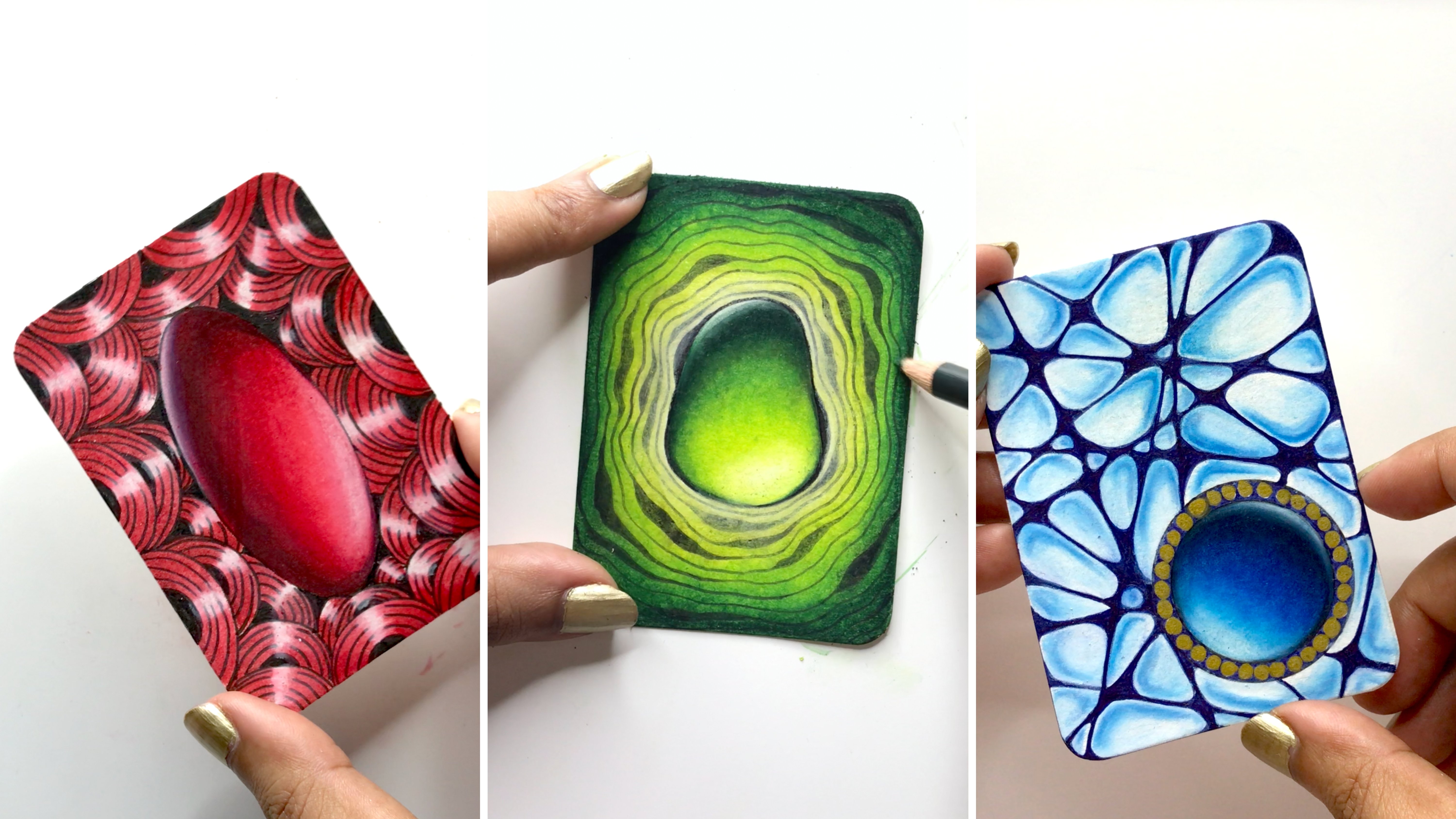
7. Tangle Enhancers: Aura: Alright then.
So let's continue on our wonderful journey of
creating unique patterns. Now that we have some basic
shapes with us to play with, let's look at tangle enhancers. As the term suggests, "tangle enhancers" are techniques to enhance a particular tangle. These help to bring
about variations in your drawings and they
also add a lot of finesse. In the upcoming lessons, we will be covering nine
different tangle enhancers. These include aura, coffering, dew drops, enthatching, perfs, rounding, shading,
sparkle, and weighting. Let's start with aura. Now, in the Zentangle method, a line tracing around
the outside or inside of a tangle
is called an aura. For example, let's draw
an oval over here. Now I'm going to draw
another oval on the outside, which basically becomes an aura. Same way, let's
do an inside aura. Again, I draw an oval, and then this time, I will draw another
oval inside of it. In both cases, I have
basically repeated a previously drawn stroke and that's what an
aura essentially is. You can also consider
it for parallel lines. For example, I have a
wavy line over here and then I will repeat that so that it becomes
an aura like so. Same way if you have a vertical line we can
repeat that like so. Now let's look at some of
the shapes that we had drawn earlier and try
applying an aura there. For example, let's try it on one of these
leaves over here. So I draw the shape. Then I go back inside and I simply repeat the
exact same motion on the inside of the shape. We have an aura like that. Then let's try it
on another motif. For example, this
interesting U-shaped motif is something that we can try. First I will draw out my shape and then I will do a partial
aura like so. The beauty of aura is
that you can choose to do it on the complete
shape or you can do it partially and simply accentuate or
highlight little parts of your design or your motif. For example in this variation, I'm doing the outer
aura on the U-shape of the motif and then making the
auras meet in the center. Now let's try another idea based off of the first
variation that we did. In this case, I'm going to make the petals go on the sides. Then I will close that
gap in the middle with a small arc and
give that an aura. Same way, I can also give an aura on the inside
of these petals. You can actually see that
simply adding the aura helps a lot in making the
design look so much more elegant and so
much more polished. It really enhances
the overall look and makes it look a
lot more detailed. Now, let's say we want to
add an orb over there based on the design ideas that we had
brainstormed earlier. I can add that and then continue adding multiple
auras inside of it. In fact, even on
this first design, I can add two more
lines like so. We can literally add auras
to pretty much any shape. Let's go back and look at the asparagus design
that we had done earlier and let's look at
the top of that asparagus. I can draw it over here like so. Now, once I have that
overall shape ready, I can go back inside and add the auras to each of
those petals like so. Aura is such a wonderful
technique because it is so simple and
it doesn't involve too many complicated steps and yet it manages to completely change the look of a motif
un very few simple strokes. Now, even with this
asparagus stem idea that I'm trying
out right now, which was based on the initial ideas that
we had played with... we can actually add so many more beautiful
details to these structures. So I can add the auras
to these sections like so and then when I go back and add those
rounded triangles, I can give them auras too. That just makes it look so
beautiful and so elegant. Like I said, we can add auras to pretty much
anything that we like. There's literally
no end over here, there are so many possibilities. Now that I'm looking
at these motifs with the intention
of adding auras, there are just so
many possibilities that are coming to my mind. For example, this muscat squash or pumpkin that we
had drawn earlier can also look so beautiful with a partial aura just
around the outer edge. Let's try that as well. I'm just going to draw out the complete shape of this first. And at this stage, we're
actually refining all our design ideas so
I do recommend taking your time and just
enjoying the process over here... making every stroke
with a lot more intention, with a lot more mindfulness, and just build the ideas as you're playing with
these new techniques. Now I'm just basically adding this aura all around
the outer edge. We can actually just take one
section or one fragment of that muscat squash or pumpkin, pretty much like we did
it in our ideation stage, and basically make that a petal. Very similar to one
of those heart petals that we had done earlier. Then I'm just going to add an aura inside of it, like so. Of course, you can always come back and add more details. Adding the tangle enhancer is in no way stopping you from adding other design variations, so feel free to experiment
with the shapes and designs. The enhancers are just
there to support you in lifting the overall
look of the design or the motifs that you have planned but that doesn't
mean that you can't combine it with
other design ideas or other detailing elements. Feel free to add as many
details as you like. Now with that, we
have seen plenty of examples of how aura works. So I encourage you to
try out auras on all the designs and
motifs that you have experimented with so far. Feel free to share your work-in-progress
images with me so I can keep giving you feedback and definitely keep experimenting and let those
creative juices flow. And in the next lesson,
I'm going to show you another wonderful
tangle enhancer.
8. Tangle Enhancers: Perfs: Alright then, welcome
back to the class. In this lesson, we're
going to be working with another tangle
enhancer called perfs. Now, perfs is a beautiful
tangle enhancer which consists of
tiny dots or orbs which can be used to fill
up a particular area or embellish any kind of spaces that we have
in our design. For example, I'm going to draw a couple of wavy
lines over here, and now I'm going to fill
this up with small orbs. And these are basically perfs. Now, let's look at some of our previously drawn
shapes and see if we can fill them
up with perfs. So I quite like this motif
that we've been building. And I'm going to draw the petals going inwards like so. I will also give these an aura. And now I can actually fill
up that aura with perfs. So that's the fun part
about tangle enhancers. You can combine two or three different
tangle enhancers and completely change the look of the initial shape
that you had drawn. So I'm adding perfs
on both the sides. And just like drawing the auras, even these perfs are
so relaxing to draw. And if you do them mindfully, if you just really focus
on one stroke at a time, you can achieve some
amazing results and you can get into a really
meditative state of mind. Now I can also add bigger
perfs on these inside areas, or I can go inside and
simply add another aura. So we can play around with
multiple things over here. Now let's try doing a version of the cauliflower design
that we had done earlier. I'm going to go ahead with the concentric circular
shape one that we had tried. And here, we can actually
have fun filling up the perfs on these layers. And we can actually go
ahead and fill them up on alternate layers. Now, again, this completely changes the look of the design. So now, when somebody
looks at this tangle, they will probably
not be able to guess that it came from that
cauliflower image. And like I said earlier, the beauty of tangles
or the beauty of the Zentangle method is that it's abstract and
non-representational. So it's not supposed to look
like a real life object or it's not supposed to be
representing something. The more abstract
it is, the better. Now look at that. It just looks so beautiful... and I can
actually keep going on and on and fill up
the whole page with just this beautiful pattern. Let's try another shape. I think this time I want to
try the tropical leaf design. I'm going to go ahead and
draw the stems first. Then I'm going to do
the triangular tops. Now I can actually
section these out and add the perfs on one
side of that section. And that just makes it look so 3D, and once this is shaded, this is going to
look so beautiful. So it completely
changed the look of the motif and it just looks like it has so
many cuts and facets, almost like an ornament
or like a jewelry charm. So this is another interesting
way to add perfs. And of course, we can keep
building it up the same way on the
other side as well. So for another example, let's go back and look at some of those
shapes that we had done. And let's try this leaf
that we had done. And if I actually add the
stem and the veins, I can actually create more
sections to put the perfs in. Initially, if you remember, I was actually against
the idea of using the stems because I thought I'm only going to use the
outer structures. But now at this stage when I'm playing around with
my tangle enhancers, I feel like the stem and these veins and the structures
that I'm getting out of this would be more interesting and I can pair them up with various
tangle enhancers. And I think this looks
a lot more elegant and a lot more polished
than just the outline. So yeah, these are some other interesting ideas that
we can play with. So with this, I hope
I've given you plenty of examples to play with perfs. Again, I encourage you to try it on the designs that
you've been sketching. And especially if
you've chosen to work with a different
set of pictures, then it would be interesting
to see how you apply these tangle enhancers to the designs that
you've sketched out. So go ahead, practice these out, and I'm going to see you in
the next lesson where we're going to work with another
beautiful tangle enhancer.
9. Tangle Enhancers: Coffering: In this lesson, we are going to be working with coffering. Now, coffering is a tangle enhancer inspired
from architecture. A coffer in architecture
vocabulary basically refers to sunken panels in the shape of a
square or rectangle, or an octagon, and so on and these are usually found in
ceilings and vaults. And you can often see them on domes of ancient
buildings and so on. For example, this is a
picture of a coffered dome. And you can see how there are sunken panels inside
each of those squares. And this basically gives a very
three-dimensional effect and it looks very layered. Similarly, here's another
interesting picture of a coffered dome. And you can see that because
of the way the light is falling at a certain angle, those sunken panels give a very beautiful
three-dimensional effect. And you can actually see a lot of variations in light and shadow, which makes the whole effect of the sunken panels
very interesting. So there's a lot of
contrast and there's a lot of dimension
going on over there. Now, let's look at
this technique in action when it comes
to making tangles. And let's try out a couple
of design variations with this. I'm going to start off by
making a polygonal shape. You can make a
pentagon or hexagon, anything that you like. Now we're basically just
going to give this an aura. Once you have that aura, we are going to go
to those corners and connect the shapes. Essentially, this is
the most important step of coffering because otherwise, it'll just end up looking
like a regular aura. And those cuts or those
connecting lines basically help you to make
it look like a sunken panel. Similarly, I'm doing
a square over here. Again, this is just
a regular aura. But the minute I
connect those corners, it looks like there is
a panel inside of it. And it makes it look
like it has facets, like there are facets
in a gemstone. Alright so let's go back and
look at some of the motifs that we've
been playing with so far. And let's see if we can use these sunken panels or this coffering technique
on some of them. So I think I want to start off with the asparagus stem because I
feel it has the potential to become a rectangle... like a long stick with sections; and then we can
actually create sunken panels. So let's draw straight lines
instead of the otherwise wavy lines that we were using
for the asparagus stem. And now instead of using
the semi-circles, I basically use the straight
lines to section out the stem. And then I'm just basically
adding the sunken panels, which is the
coffering technique. Same way, I think we can also play around with
the asparagus bud. And instead of making it rounded, I'm going to make the
petals with pointed tops. So one of the things with coffering is that it looks better when you do it with tangles that have straight lines
and straight edges. So it works better
with polygonal shapes... So triangles,
rectangles, octagons, pentagons, and so on. So in this case, instead of using the rounded
nature of the petals, I'm basically making
these triangular tops... and almost like a diamond shape. And so I'm just basically adding
the sunken panels now. Again, as a quick reminder, it's important to connect
those inside panels to the outside ones
because otherwise they just end up looking
like a regular aura. Now let's try another example. I'm actually quite keen to
see the effect of coffering on the leaf that we had
done, the tropical leaf. And I think I'm going to change
the way the center looks. So basically, I'm still
using the triangular top, but I'm not drawing all the
stems in the beginning. I'm going to treat this as a separate fragment or a separate shape and
then build on from here. Of course, we can still add that little section or
that line in the center, except that this time I'm doing it after I have
done the coffering. Then once we have that section, we can actually build more sunken panels inside
and just connect them with little triangles like so. Because the shape
outside is a triangle, so we're just building
further on it. Now if we want to continue building that fan
shape of the leaf, we're just going to
repeat the steps. I'm again going to start with that outer shape and
add the sunken panel. Then in the same way, we can actually keep
building this more and more. At this point, this
actually reminds me of a beautiful crystal bunch. It looks like those quartz
crystals or any other crystal actually that we get
in crystal shops... so it actually looks like a
beautiful cluster of crystals. Now looking at
some other motifs. I actually want to
experiment with that U-shaped design as well. But I'm going to actually
convert that into sharp lines. Instead of doing the
petals with curves, I'm actually doing it
with straight edges. Again, this is only because I'm purposely
doing this with the intention of adding
coffering as a tangle enhancer. Some of these tangle
enhancers might not look so nice on a particular
motif as we had thought. But the key over here is
experimentation and the key is to try out different
variations and see what works. So I definitely recommend
that you spend time and don't skip this
entire creative process... this journey where you're going to experience
certain failures, certain successful ideas, and you'll get closer to
your eventual design. So even in this now you can see that I've tried two
different approaches. On the left, I have done
an approach where I have just done coffering
towards the edges. But on the right,
I've actually done a completely sunken
panel inside. So keep revisiting your older
designs and see if you can treat them differently with the use of these
tangle enhancers. For example, in this asparagus stem
that we had drawn, we can also add perfs
inside those sunken panels. That is again going to give
a completely different look. Then same way on the square, I can add perfs on
the outer edges, and that is again going to give me a completely different look. So I can add it on just one side
or do it on opposite sides, or do it on all four sides. Each of the versions
is going to give me a new design to play with. So as always, I will
encourage you to try out this technique and this tangle enhancer on all the designs that
you have sketched out and build further
on your shape ideas. Try to combine two or three
different tangle enhancers and see where that takes you. And I'm going to meet you
once again in the next lesson with
another tangle enhancer.
10. Tangle Enhancers: Enthatching: So the next tangle enhancer
that we're going to be working with is
called enthatching. Now, enthatching is a
feathery hatching technique. So when you apply this technique, you will notice that
this is very similar to the hatching technique
often used in illustration. And it is done using fine strokes of the pen that you're using and it helps to add shades as well as texture to
any given tangle. Let's look at an
example of this. I'm going to draw a very
simple shape over here, very similar to a leaf shape. Now, I'm just basically
using my pen to create these feathery strokes which are fading out towards the end
as I'm lifting my pen, and it's helping me to add this little texture and
shade to the shape. So some of you probably already recognize this technique
from illustration. This is a very common technique, often used in all
kinds of illustration, whether we're doing landscapes, portraits, still-life,
or anything really. It's a pretty common illustration
technique and it finds its place in the zentangle method
with the name "enthatching". Now, let's look at some
of our design motifs and try and apply
enthatching over there. I think we can definitely
add some interest on this asparagus stem and we can just add a few
fine strokes like so. One of the things
that I really like about enthatching is that it brings a sense of reality to your otherwise
abstract drawings; so it's that perfect blend between realism and abstraction and you must have actually
seen this hatching technique being used a lot
for creating eyelashes, for putting textures
on clothing, or you must have seen
it in landscapes. A lot of illustration
artists use this technique for a lot
of different things. It basically helps to make
any object look real. But the fun part is
that when we use it in combination with tangles
from the zentangle method, it is that perfect
nod to realism, yet not being completely representative of
a real-life object. So it's that beautiful blend of realism and abstraction
like I was saying. So I definitely love this
technique for adding texture. And of course, if you are
someone who loves to play with light and
shadow and contrast, then, again, this is
a technique that you will definitely
enjoy working with. Now, I'm basically working on this cauliflower-inspired
motif that we had done. On the outer layers,
I'm just adding these tiny little
feathery strokes. We always start each stroke with a little bit of pressure, but then as you're about to
reach the end of the stroke, you gently lift your pen or reduce the
pressure contact with the paper and that leads to that feathery tail
ends of the strokes, and it creates this beautiful, naturally fading out or
naturally feathering out effect. That's the beauty of
working with enthatching. Now, this is just to
give you an example of what the entire
shape would look like. I'm sure you've got an idea
looking at me doing this. I am also going to apply
the same technique on the tropical leaf motif
that we've been playing with. I think this looks
really, really beautiful. You can definitely play around with the length
of these strokes, so you can have them
longer or shorter. Similarly, let's also try
this on the asparagus bud. Over here, since we already
have very tiny sections, I'm going to keep the
strokes very short. But I mean, look at
that, this completely changes the look of the design! Nobody would be able
to look at this and say that this actually came from an asparagus image that was used as a reference. We've definitely evolved
quite a bit as we've been sketching and we've
had a little bit of an evolution with
all these designs. Now, one more thing
that I also want to show you is making these strokes in the same
shape as the outline, which basically means
that we are making them directionally and accentuating
the shape of the motif. For example, if I
have a curvy leaf, I'm going to make curvy
lines over there. Basically, you can have
your lines or your enthatching going in
the same direction as the shape or the
outline of the shape to basically give it a contour
or a more shapely effect. You've probably seen a lot
of this contouring effect or this directional hatching in floral illustration
because over there, we have a lot of leaves and
petals to work with... so you've definitely or probably seen this on some of those illustrations. Let's also try this technique on the original asparagus bud. This time, I'm going
to make it pretty much in the same way that we had sketched
it out initially, which is with those pointy tops but sort of like an oval bottom. Now, I'm just going to go
in and fill in the details. Now, when I look at
it from a distance, it is giving such a beautiful
light and shadow effect, and it just makes the whole
thing look so much more three-dimensional and
quite real actually, even though [LAUGHTER]
we're working with an abstract form, but definitely a nod
to realism over there. One more example
that I want to show you of directional strokes or directional enthatching
is the pumpkin motif that we've been playing with. This particular motif has
a lot of curves and adding these little details is building up that
ink in the center, which is, again,
making it look very three-dimensional and
definitely adding to the contrast over there. Also, I'm quickly
repeating the fact that these strokes have to happen
in the same direction. For example, if over
here I'm doing bottom to top, then each stroke
has to be bottom to top. That's the way that we
can actually achieve a beautiful feathery
effect because each of those strokes is going to
start thick but end thin, so it's going to start with
the pressured nib and then as we're releasing the
pen from the paper or as the contact
is getting reduced, the feathery effect happens, and so the tails are
looking like a feather. Same way if I were to
draw an actual feather, and let's say I was
doing it top to bottom, then I would basically do
my strokes the same way. I would start from one center or one point and then gradually
feather those out. What we want to avoid doing is the back-and-forth
strokes because then the feathery
effect goes away, and then the whole thing just
looks very inconsistent. And the light and shadow play or the contrast
that you're trying to achieve doesn't
look as aesthetic. So that's pretty much
it for enthatching. And I hope that looking
at these examples, you've been able to think about where you can add these on your particular motifs or on the designs that
you've been working on. Definitely give this a go
and I'm going to see you in the next lesson with
another tangle enhancer.
11. Tangle Enhancers: Rounding: The next technique
that we're going to be working with is called "rounding". Now, "rounding" is a wonderful
tangle enhancer that helps you to create a rounded
effect on any tangle. There are multiple ways to
apply this tangle enhancer, and the most common
application is on the outer edges of
any given tangle. But you can apply it on the inside of the
tangle as well. Let's look at some examples to understand this a little better. Now, let's make a
square or a rectangle. We have these sharp
90 degree corners. Now we're going to go back
and create small curvy lines, or pretty much putting
an arc on those edges. We're just going
to color them in. That is basically
what rounding is. It helps you to take away the sharpness of
any given shape, and it also acts as
a connecting line or a connecting element
between two strokes. Now we can also try this
on other polygonal shapes, or in our case, we can also try this on the fan shape motif that
we've been playing with. I'm just going to
quickly draw that out once more with those
triangular tops. Once I have the outline, I can go in and just add these small arcs and
color that section in. So basically I'm adding
the roundings. Now in order to make
your rounding look inclusive and part
of the design, it's always a good idea
to nicely taper off those edges or to let those arcs blend in with
the edges of the design. Over here I'm letting
those arches or those arcs blend in or fuse in
with those sections. Then it doesn't look
disconnected or alienated, it just looks like
a cohesive design. Now let's look at other shapes that we
can experiment with. Maybe we can actually play
with this asparagus stem. I'm just going to create
sections with straight lines, very similar to what we did when we were working
with coffering. But this time instead of
adding coffering over here, I'm just going to add
those rounded edges. Over here they actually look
like little orbs or like little pebbles which
are encased in a tube. Very similar to how there
are peas in a pod. So that's the beauty
of rounding because it just makes it
look as if there is another object or
there's another shape existing inside an
outer boundary. Of course, with so much
ink going on the paper, it also helps to build contrast. Now, another very
useful application of rounding is to connect
two different shapes. For example, if you have a cluster or a
bouquet of shapes, like I'm drawing these
little orbs over here. You can actually
connect the outer edges of those shapes with
the help of rounding. It helps to fill that little gap between
connecting shapes. If you want to bring about a more cohesive look
into your design, this is a great way to connect two different objects or
two different shapes, or even two different strokes. Now, let's go back and also do some experiments on the shapes
that we've drawn so far. For example on this tulip, we can add rounding
on the edges like so. Now it just looks as if
it's part of the design, as if it's part of the motif. We can also do rounding on the outer edges
over here like so. This basically gives the
effect of a curling leaf or as if there is a
certain dimension to this, that there is an edge or a facet to that little
curve over there. Again, it looks
part of the design and creates a very
beautiful effect. One more shape that
I can show you for rounding is this
little shape that we had drawn earlier when we
were playing with coffering. I can go back in and add the
rounded edges over here. Now this sunken panel has a new character
to it, so to say. We can of course add
more details and more designs on the
inside of that shape. But just connecting
these little corners and just taking away
the sharpness of the whole shape or
the whole panel inside gives this a
completely different look. Same way I can also do it
for the square over here. Again, a great example
to show that you can combine multiple
tangle enhancers. Because over here we have
coffering and rounding, and of course the perfs were
already drawn on the edges. So we have three different
tangle enhancers on one particular shape or
one particular tangle. And I'm also going to add a
little bit of rounding to this design motif over here that we were
playing with earlier. Again, I encourage you to try out all these different ideas, and just play around with rounding on the
tangles that you have with you... on the shape ideas that you've
been sketching out so far. And just see what you
can come up with. It's definitely a
very useful tool, and you will see more
examples of it or more applications of it when
we get to our final project. But till then, I
encourage you to keep experimenting with this
particular technique.
12. Tangle Enhancers: Weighting: Ok. So the next tangle enhancer
that we're going to experiment with is
called "weighting". This is a tangle enhancing
technique where we add ink to a previously drawn
stroke and that makes it a little thicker
or in other words, it basically gives it
a little more weight. There are many different
ways to do this, and I'm going to show
you a few examples now. We're going to start off
with a curvy line like so, and I'm just going
to go ahead and add a partial additional stroke, which is then going to
be colored in like so. So basically what I've
done is that I've thickened a certain part of that line or a specific section of that wave, and that is one way
to do weighting. I'm just going to do that on another section
over here as well. Now another common way
to do weighting is to basically go back on the
stroke over and over again. For example, over here, I'm redrawing at the
exact same place. The difference between the first and the second technique that I showed you is the placement
of the additional strokes. In the first case, we did an additional
stroke slightly outside of the previously drawn stroke
and then colored it in, but over here I'm
just basically adding additional strokes at
the same exact place. With the help of weighting,
I can actually create thick and thin
variations on my lines. For example, over here, I'm just adding slightly
thicker edges on the top, which are gradually
fading out and becoming narrow towards the end. Now, let's also
go back and check out some of our older motifs. So on this pumpkin shape that
we've been playing with, I can actually add additional weight to
each of those sections, which is basically
going to help in segregating the sections
a little better. This is actually the
reason why weighting is most commonly used
in Zentangle... because it helps to add emphasis to a particular shape
or to a particular motif, and that can become
your focal image or it can help to enhance
particular details, which can then pop
out a little bit more than the
surrounding details. So weighting is definitely very useful in adding
contrast and emphasis. Same way, on this other motif that we were playing with, I can just make the
curves slightly thicker... so I can have them
gradually fading out... So I start with a really thick one, then with slight
medium thickness, and then a thin one. It's creating like a tapering
or fading out effect. Now, when I go back, this particular
technique actually would really apply well on this design that we had done where I really loved the little strokes that
we were playing with. For example, I can start with a really thick stroke and
add weight over there and gradually just take away that weight and make
the lines narrower. So if I do this in a
radial fashion, this would pretty much
look like sun rays or sun beams or a starburst, and that would definitely
give a beautiful effect. I can also add weight
on the outside of a particular shape when
they have an outside aura, and I can also do
it on the inside of a shape when there
is an inner aura. Again, it all depends on what we're trying to emphasize and where we want to
build more contrast. Same way, we can also add partial weight or
partial thickness to the outer edges of a shape, and that can actually transform
the look of the shape. So if you have edges
to any given shape, you can actually
play around with those edges and make your
strokes thicker or thinner. Now, even if this particular leaf had a stem in the center, I could totally start with a thicker bottom and have it gradually fading
out on the top like so. So it basically all boils down to redrawing the same stroke at the same exact place or adding additional ink around
the given stroke. That basically helps to make the stroke either
bolder or thicker, or basically just adds
more weight to it. For example, on this
cauliflower image that we were playing with, I can just go back on
those boundaries and make it thick and just add
more weight over there. That'll just make it stand out a little bit
more on the paper. Same way if you want to build more
three-dimensional images, and if you want to play with
a little bit more contrast, you can add weight
to sections like so. Alright, so that looks pretty good. Again, I would encourage you to try out this technique on all the motifs that
you've been sketching out and let me know
your findings. You are free to
post your work in progress images in
the Projects section, and I'd be more than happy
to look at your motifs. And I'm going to see you
in the next lesson where we're going to be working with another tangle enhancer.
13. Tangle Enhancers: Dewdrop: In this lesson, we're going
to be working with dew drop. Now the Zentangle headquarters spells dewdrop as one word. But if you try to search
for it on the Internet, you will probably find
some variations with dew and drop written as two
separate words as well. So don't get confused
by that because it basically means
the same thing. Now, a dew drop as explained
by the Zentangle founders is drawing a magnified version of a tangle within
the same tangle. Even though it's considered
to be a tangle enhancer, you can also think of it as a composition enhancer
because you can have multiple
different dew drops on your composition in
various sections, and it doesn't have
to be placed in a way where it's restricted
to just one tangle. You can even have it
placed at sections or areas where multiple tangles
are meeting each other. I like to think of it as a
composition enhancer as well, and not just a tangle enhancer. Now, moving on to how
exactly dew drop works, let's just do a quick
practice exercise for that. We want to start off by
sketching out a circle, and we want to do this in pencil because dew drops are
always drawn in pencil. Then once we have that circle, we're going to leave
a little bit of area white towards the top of it, which is going to
be the highlight. Then we make another circle
of graphite, so to say, leaving a little bit of a smiley shape at the
bottom, which is empty. This is just me putting
graphite very lightly. Again, we don't want to go
overboard with the graphite. The top edge of this
inner circle is going to be touching the top
edge of the outer circle, and then we just blend
it with the tortillon. This is going to help us define the highlights
and the shadows. We want to be careful not
to run into that highlight that we have left
empty on the top. This will require
a little bit of patience over here
in trying to do a precise job because we don't want to get into the areas
where there is a highlight. To make the
transitions smoother, it's always a good
idea to go outwards. Gradually just going
from dark to light. I'm just going to bring
in my pencil now, and I'm going to
accentuate the top area, which is the shadow that falls
right above the highlight. If you notice highlights
anytime on a real-life object, you will notice that
the area around the highlight is
usually the darkest, and so that's exactly what
we're trying to do over here. Then we want to give the
whole dew drop a shadow. We're going to come with
a pencil and create a shadow in the shape
of a smiley again, which is in the opposite
direction of the highlight. Again, we're just going
to blend this out nicely, and we're going to pull the
graphite outwards like so. It looks like I can smoothen out the inner section
a little bit more. I'm just going to bring
out my tortillon once again, and just blend it a
little bit better so that the transition
from dark to light looks a little
bit smoother. Now sometimes when your
tortillon is not very sharp, or if you've accidentally
done this in a hurry, then sometimes your graphite tends to go over the
line a little bit, and that tends to take away the illusion of the shape
that we're creating. In this case, a little bit
of my graphite has gone into the orb or the circle
that I had created. I'm just going to fix that
by bringing in my eraser, and I'm just going to
rework that area slightly. That looks a lot better now. As a final step, I'm
just going to bring in my graphite pencil once again, and just accentuate the dark
areas a little bit more, so that there is a little
bit more definition and contrast to the whole shape, and it looks a little
bit more realistic. Now when it comes to
placing these dew drops on top of patterns or tangles
in our composition, we always make sure
that the pattern stops, and then continues from
behind that dew drop, and then inside the dew drop, we create a slightly distorted
version of the pattern, so that it looks like there
is a little bit of water on top of the tangle or
a literal dew drop, which is sitting on
top of the tangle, and so the view becomes
a little bit distorted. How we basically achieve
that is by first, drawing behind the dew drop. We imagine that the
pattern is continuing from beneath or
underneath the dew drop. Then we come back and try
to connect those lines, but we purposely don't do a very good job of
connecting them. Over here we want
to try and make a distorted version
of the pattern, which means the lines are going to be slightly
more roughly sketched out and they won't be at the exact point where they're supposed to be
ideally in a pattern. Here I'm just
drawing a little bit higher than where the
pattern is supposed to meet. You can also draw
slightly lower... as long as they're not at the exact same place where
they're supposed to be. It's also a little bit
more sketchy and rough. You can see that I'm purposely not doing smooth
lines over here. Now another thing
to notice is that we never draw on top
of the highlight, so we always draw in the gray or the dark areas and we leave
the highlight empty always. Even if we had another
pattern going around like so, let's say we try and
draw Printemps. Again, I'm just going to
purposely make sure it doesn't meet the line, and so I will leave
the highlight empty and go around like so. Basically, this
all boils down to planning your
composition in advance. Very early on in your composition
or your drawing stage, you need to decide where your dewdrops are
going to be placed. You basically draw
out the circles very, very early on in your
drawing and keep them as placeholders for your dewdrops. Let's say we have a pattern
with concentric circles. We will leave the
dewdrop empty for now and we will continue to fill up our
tangles on our tile. Pretty much the way we've been doing it with a
Hollibaugh fashion. So we'll just pretend that
the pattern is going under that orb and we'll keep leaving the spaces empty imagining that they're connecting from behind the circle that
we have left out. As I was mentioning,
there can be two or three patterns
which are meeting at a particular point and that's where your
dewdrop can be placed. For example, over here, I'll try to do a flux pattern and let's imagine that this
is going behind from there. Now, once we have
the pattern sketched out and imagine that
your whole tile is done, we can come back and we can
start working on our dewdrop. Again, we'll start by
leaving the highlight, then drawing an inner circle, which is touching the
top of the outer circle, leaving a little bit of empty
space at the bottom like a crescent moon or like a
smiley C-shaped element. We'll just blend it out nicely. Again, I must mention
that you should put very, very little graphite, because there's
always going to be some residue on your
tortillon already, so you want to factor that in. Now I'm just going
to add the shadow. This is very, very important to lift the dewdrop from the paper. To give it that
three-dimensional look, the shadow plays a very,
very important role. We're just going
to blend that out. I'm just going to add a little bit of
graphite on the top. Now as a side note, I must mention
that you can leave your dewdrop the way it
is right now as well. You don't have to
necessarily have the patterns continuing
inside the dewdrop. You can consider them as
a decorative element, just sitting on top
of your composition, and that's totally fine too. It's a personal choice. If you want to make
it seem as if it's just a random drop sitting on your composition,
that's totally cool. But if you want to
continue your design, then we follow the same route. We'll leave the white spaces
or the highlights empty and we won't continue
the design in there. We'll just basically
continue drawing the design in the gray areas. We'll pretend that it meets
inside the shape like so. Again, the lines inside the
dewdrop are not very smooth. They're supposed to
be sketchy to create the illusion of a dewdrop
sitting on top of a pattern. It's totally okay if they don't align with the pattern outside, the lines don't have to match
up to the exact position. Now with that final circle done, we have finished
this little section. I do want to also mention the fact that
dewdrops tend to work better when you have concentric lines or straight
lines or wavy lines. Basically, patterns
which are simple and not very complex
in terms of detailing. If you have very,
very complex details, then the illusion doesn't really come out to
be as aesthetic and the patterns don't
tend to match very well on the inside and the
outside of the dewdrop. You want to use
simpler tangles and simpler patterns
when it comes to using dewdrops in
your compositions. Preferably something
to do with lines or basic shapes such as triangles,
circles, squares, etc. Also for your reference, I've created a quick
diagram over here indicating where
exactly the highlights are and where the shadows are. I have also included this in the class resource document, so if you ever want
to revisit it later on for quick reference, then you'll always have it over there available for download. That's it for dewdrops and we will now move on to
our next lesson.
14. Tangle Enhancers: Sparkle: The next tangle enhancer
that we're going to be working with is called Sparkle. This tangle enhancer helps
to produce a highlight by creating a small break in a stroke that you're drawing. Think of it like a small white space in a
stroke that you're drawing and it's just going to create a sparkling,
glinting effect, very similar to how we see
sparkles in ocean waves. As an example, I'm going to
show you some wavy lines over here and I'm going to purposely break the stroke in certain sections so as to
create a sparkling effect. Looking at this, you're
probably reminded of ocean waves and that's the
effect that we are going for. Now, we can also
apply this to auras whenever we are filling them
inside a particular shape, or if you're trying to do
lines inside a tangle. For example, if we want to create auras over
here in an orb, we can break the stroke
at almost the same point. It's going to create
a small highlight and it's going to
look as if there is a beam of light or a
speck of light which is falling on a certain
section of the orb, thus creating that highlight. Similarly, you can do this
in a directional stroke. For example, if you have a tear drop shape or something
in the shape of a leaf, then we can also do some
strokes over here like so. Now let's try applying this to the asparagus motif that
we were playing with and let's try to fill
that up with small lines. Now the closer the lines are, the more intense your
sparkle is going to look. If you have a lot of lines
closely put together, which means you have a
densely filled illustration or you have a densely
filled tangle with lots and lots of lines, then the highlight is going
to stand out even more. The effect of sparkle works very well when the lines are
closely put together, but you can, of course, do this on spaced-out
lines as well. Now, another way to do
sparkle is to create really dark accentuated
black areas and leave a stark
white space in the middle. Think of it like enthatching
with lots and lots of strokes put together with no
gap and then in the middle, we leave a white section
which is going to act like a highlight and that is also
another way to do sparkle. We can also do this on ribbons, or we can also do
it on wavy tangles where we can have lots and
lots of black inky areas. Wherever we have a little bit
of a curve or if the motif is turning or curving
at a particular point, we can highlight that
with the help of sparkle. This second approach of
working with sparkle gives a lot more drama and intensity
to your composition. In the 45-day challenge that I had hosted over
here on Skillshare, we had done an exercise in which we had used
a tangle, "Clob". And you can see that I have basically made it
seem pretty much like metallic tubes using the
sparkle effect because it just seems like there
is a beam of light passing through those
little wavy tubes. That's the beauty of using this intense sparkle technique, so you can also use it in
this particular manner. Sparkle doesn't
always have to be only on straight or wavy lines. You can totally do it on circular tangles or
radial tangles as well. For example, if you want
to do it on Printemps, which is a
spiral-inspired tangle, we can create a
highlight on that like so by leaving small
empty sections and we can just
close that like so. Similarly, if you have an abstract shape and you're going to fill that
up with auras inside, you can purposely
try to break it at exactly the same point so that it creates a little
highlight over there. This just makes the tangle
look a lot more elegant and it has a metallic
sheen to it. We can always play with
our tangles and create these small little
highlights here and there to create depth and
dimension in our composition. Again, let's say if
we have a rectangle, we can fill it up
with sparkles like so and this also helps to add a lot of
texture in your composition. Very similar to
how you would see these breaks in wooden logs or wooden planks and very similar to the elements
that we see in nature. Again, this is reminiscent of realistic
illustration techniques, but since we're using them in an abstract manner in
the zentangle method, they really lift up
your composition and make it look very unique. I encourage you to
try this out on all the designs
and all the motifs that you have sketched
out until now, and as always, I would love to see your
work-in-progress images. With that, we are ready to
move on to our next lesson.
15. Tangle Structures: In this lesson, we are
going to be working with different types
of tangle structures. What that basically means is different ways in
which we can arrange our tangles or our design motifs such that they look
appealing and aesthetic. Now, we are going to play with the motifs that we have
already sketched out. But this application
or this process can apply to pretty much any tangle that you'll see from
the Zentangle method. It's not limited to the motifs that we are
doing in today's class. You can apply this technique
to literally any and every design available
on this planet. Let's get started. Let's dive into it and you'll get a sense of what
I'm saying right now. The first technique
that I want to talk to you about is layering, which is also popularly known as the Hollibaugh
technique in the Zentangle method and
what that basically refers to is a sense of layering
in your design motifs. For example, let's say if
I have a stick like so, and let's say I put another stick going
behind it like so. I have basically created a layer in the sense
that there are some objects which are higher or above certain other objects which are in the background. This technique applies not just to sticks but to
pretty much anything. For example, there is a
very popular tangle in the Zentangle method
called Printemps, which is basically like spirals. If I draw it like so, then I go back and partially hide the other
spiral behind this one. What this is giving me is
called the Hollibaugh effect. Of course I can keep
going on and on. In this case, this one's
getting hidden behind this one and like so. Again, I can go like so and close it like that. Basically this is the
most common way to do the Hollibaugh effect
where we are layering objects one behind
the other and it can also play well with pretty
much any shape that we have. Let's actually try out one of the design motifs that we've been sketching out
all this time. Let's say, for example,
we have this leaf and I draw one leaf like so, with whatever detailing
that I want to do inside. Let's say the leaf
has a design like this and now I want to hide
another leaf behind it. I'm just going to go and draw another one and this is basically getting
hidden behind like so. Maybe another one can be
peeping out from here. Then another one can
probably come out from here. Then there can be maybe
another one like so. Here I'm actually
making the leaf go behind the Printemps as well. This is how we connect
different designs in the final composition so
that they all look cohesive. This is one of the
most common ways of creating structure
with your tangles, or basically just creating a design motif out of them...
and you must have definitely seen these kinds of designs in the surface pattern industry where you can often
see this on fabrics, on upholstery for curtains, bed sheets
and things like that. So this kind of pattern or this
arrangement for a motif is pretty common and it
helps to create layers. Now moving on to our second
type of arrangement, which is scattered tangles. Scattered tangles
basically means that there is no layering. Borrowing from the
same leaf idea. If I didn't layer them, but let's say, I just connected them on the same focal plane
and they would just be touching each other instead of hiding
behind each other, that would be considered
a scattered tangle. They're not hiding
behind each other, they're just connected
to each other. Even same way for the Printemps, if I had to do a spiral like so... then the second one
would be touching it, it would not be going behind it. What that means is that in
this particular approach, we have a lot of empty gaps. Like this is an empty gap. This is an empty gap. Let's say if I have
another leaf here, then this is an empty gap. We basically have empty gaps
in the scattered approach, but we don't have empty gaps in the approach that
we did earlier, which is the
Hollibaugh approach. This is basically
the key difference between both the approaches. In one of my other classes, which is the 45 day
drawing challenge over here on Skillshare, I have used this kind of an
approach to create this design which is inspired
by the shape of pills. Again, even this
approach works really well on fabrics and it is often used in surface
pattern designing to basically repeat the same
motif over and over again. Another example that I can give you of the scattered approach is based on the
cauliflower design that we had done earlier. Let's say we have an
outer shape like this. Then inside we have
the different layers, which is basically us
putting the auras. Then of course we
can detail this out. But then there could be another cauliflower just
touching it like so. Then same way there could
be another one like so. Basically we're just
joining the outlines of two different shapes and that's what the scattered approach is. Even with this U-shaped motif that we've been playing with, let's say we have one here, then we could have
another one like so. Again, I'm doing very
rough sketches just to see what the
motif is going to look like when it's
arranged like this. You can play around with
as many motifs as you like and get your creative
juices flowing and this is just to brainstorm and have a conversation
with yourself and see what motifs look
best in this arrangement. Now, one of the fun
things about doing your pattern or your tangle
in the scattered approach, is that you don't have to worry about the sizing of the element. You can have some
of the elements bigger and some of them smaller. Again, this is something that you will be able
to gauge when you experiment and try to do this
in multiple different ways. Over here, for example, I'm playing around with
this tulip motif and I'm putting this in
different directions at different angles in different sizes and
this approach gives it a very playful look and because of the way the
leaves are curling inside, it gives it a very fun,
playful, feathery effect. I might just use it in this particular manner when
we do the final composition. The third approach that we're
going to experiment with is called the ribbon approach
and in this approach, we basically have ribbons floating around in
our composition. These can be made
up of wavy lines or straight lines or zigzag
lines or anything literally as long as they look
like small sections or small bands which resemble
different kinds of ribbons. In fact, when you're
drawing these ribbons, they don't even need to be of consistent
thickness throughout. You can have some ribbons which are going from thin to thick. Then there can be
others which are going from thick to thin. Or you can even play around with thin-thick,
thin-thick, alternate. Basically just have fun. [LAUGHTER]. Now, that I have some ribbons
sketched out over here, I'm going to show you how
we can repeat a motif. Let's say we want to play
with the leaf shape. I can basically have
my leaf repeating in a ribbon like so. Basically what we're
looking at is a band and inside that band we
have the same design, which is repeating
over and over again. There is the same element
which is getting repeated. We can also do the
exact same thing with the motif that looks like tulips. Once again, these are
just rough sketches to imagine what your
design is going to look like when it's arranged
in this manner. You are of course, absolutely free to polish these at this particular
stage but I tend to just keep them
very rough so that I don't spend all my energy on
doing just these exercises, and I like to actually keep the creative bulk of my energy
for the actual project. [LAUGHTER] That's
just how I function. I like to do a lot of rough sketches and
then eventually do the final polishing
at the final piece. But every person has their own creative
process so if you feel like you want to polish
it at this stage, you are totally
welcome to do so. Now, within these ribbons, you can also play around with the orientation of
the motifs inside. There is no rule that
says that the tulips have to be all facing
in the same direction. Let's pretend that this
gap over here is also a ribbon and over
here I can have one motif going in this direction and then the other element
can actually be the opposite and so this is going to give a
completely different look. We bring the other one like so. Actually I quite
like this approach because the borders over here... like the outer
shape of the tulip, is becoming a natural aura to the previous one
that we have drawn. So for this particular design, I actually like this approach better than the previous one. Now remember this asparagus that we had played with earlier? This can actually become a ribbon very easily because
the design of it is like so. The sections can actually
go pretty much like this and so I'm basically just giving an
aura to the sections. Then we had that
little leaf thing going on, right?
So we can actually have it going like so. I think there was another one where we had actually
done it like this where we had them
going alternate. Again, what happens inside the ribbon is totally
under our control. We are basically just
looking at how we want to repeat the same strokes
because at the end of the day, Zentangle is all about getting into a meditative state of mind. It puts you in a very
relaxed state of mind and that happens when you are repeating the same strokes
over and over again. Because the repetition
of the strokes is what helps you get into that
relaxed state of mind. So we are basically looking
at different ways in which we can
repeat the strokes. Same way this version
that we had done earlier of the asparagus stem with
the coffering and the perfs... this can also become
a ribbon, and in fact, this is already a
ribbon because it has two parallel straight
lines going like so and then we have
the details inside. But this exact same thing
can be replicated in a wavy manner as well, where we can have the sections and then we can
have the coffering. The only difference
would be that in this the coffering would be along the outer
edge, which is wavy. Then of course we can have
the same details inside. Now the next approach that
we're going to look at for tangle structures is going
to be a stackable approach. Which basically means
that you are stacking the exact same motif
one on top of another. Let's say if I have a pebble
or like an orb like so. I'm basically just going to stack it one on
top of the other. The stacking usually happens vertically so we're
basically looking at creating a pile and it can happen for any motif
that you like. In fact, we can also do it for
our tulip inspired motifs. As I'm drawing this, it's getting pretty
evident to me that this arrangement
or this structure will not work well
for this motif. But then again, that's
the whole point of this exercise that
we basically look at our design motifs and try different
combinations with them to see what is going to work and what's not going
to work eventually. Now I know that this is not an approach or this
is not a route that I want to follow for this particular fragment
or this element. Now one of the
interesting things about stacking is that it
does not need to be in the exact same direction and it can have a certain
amount of rotation. What I mean is basically combining two different
approaches together, which is the scattered approach along with the
stacking approach. The way to a
successfully achieve that is by stacking objects, each with a certain degree
of rotation to them. Over here, all of these pebble-like structures are stacked on top of each other. But they each have
a certain degree of rotation so they're not exactly like ducks
in a row, basically. [LAUGHTER] They are
slightly here and there. Now that I'm looking
at this approach, I can actually experiment
with that tulip like shape with this approach and
see if it looks any better. Yeah, I think this kind
of an approach where I'm stacking but
also rotating them, this is working a lot better as a stackable option for this
particular design motif. Now the wonderful thing
about stacking it like this is that
it can actually work as a border to a design and it can work
as a vertical ribbon. We can have this
as a ribbon too. Let's say if I just have
borders going along like so, this can become a wonderful
pattern inside a ribbon. Again, wonderful
possibilities over here when you combine two or
three different approaches. Then finally, the last approach
that we're going to be working with is called
the radial approach, where we basically imagine
that there is a center. Then each of our elements
are going around, pretty much like flower petals
radially or like sun rays. If I have pebbles, they would go around like so. With this tulip motif, I'm going to imagine that
there is a center here. I will have this going like so. Actually in this case we can do four petals and
let's say I have it going like so and so now this becomes a
completely new element or a motif altogether. And this can be now your block which you can actually repeat on your ribbon... so fun possibilities
once again over there. Basically the radial approach is all about imagining
that there is a center and then you just
repeat the motif all around. Let's look at other examples. For example, we have that
asparagus stem, right? We can pretend that there
is a stem going like so. Another one going like so and so in this case
actually it won't be like a dot of a center... because the
asparagus stem was actually
like a thick stem. Then we can have the
sections going like so and then we can fill
whatever we like in the middle. Now, all this empty space that you have over
here in the middle... this can help you build
more designs further on it. For example, I can have maybe some leaves or
stems going like so. Or here I can fill
in the fan that we had experimented with... so
that fan can come here, which means we are combining
two different motifs. Basically you just have a lot of fun playing around and combining different motifs with different enhancers and
different structures. Each time you mix and match these motifs with enhancers
and different structures, you are always going to end
up with a different result. Each result is going to give you a lot more
variety to play with. Each result is going to help you build a collection
of motifs which are looking seamless and
it's going to get you closer and closer to identifying what kind of
designs you really like. Of course, in the process, because you're drawing
repeat patterns over and over again with
repetitive strokes, you are going to get more and
more confident and you're going to get more into a
relaxed state of mind. So have fun, experiment with these designs and let me
know what you come up with.
16. Class Project: Drawing: We're now ready to begin
working on our class project and I am ready over here with my 15 centimeter square,
mixed media paper. But as I mentioned earlier, you are completely free to choose any paper
size that you like, whatever is easily
available to you, whatever is most convenient
for you and of course, it also totally depends
on your comfort level on how big or small
you want to draw. We're going to start with the
classics Zentangle-style four dots on the corners and then we're going to
connect them with the borders. Now, I quickly want to mention that if you're an
advanced tangler and you're confident
in your ability to work with abstract
compositions, then you're totally
welcome to skip this step. But if you're someone
who likes to work with the classic
Zentangle method, then of course,
doing the dots and the borders is recommended. I personally like to use the dots and the borders even
now because I feel like it just helps me warm-up and
it takes away my fear of a blank paper and it just helps me to get in
the right frame of mind when working on an
abstract composition. So the next step in
the Zentangle method is to add the string, and for today's composition, I thought it would be fun to work with a triple-loop string. Of course, again, if you're
an advanced tangler, then you're welcome to choose any other string that you like; you don't have to work on the same string as me
and you're totally welcome to customize and personalize the project
anyway that you like. Now coming to the tangles, I definitely want to use
some of the tangles which I really liked developing through our creative process in
the last few lessons. One of the tangles that I
really liked working on was the tropical leaf
inspired design because it gave me a very art deco vibe and it has those nice
sharp straight lines. And, I, as an artist generally
tend to use a lot of organic designs which are very curvy and wavy in
nature, so this time, even I want to push
myself creatively and I want to use
something which is a little more rigid
and a little more structured than my
usual drawing style. So I'm going to fit
that in over here. Again, this is
actually a great way for me to show you that every time you want to put in a motif in your abstract composition, it does not necessarily
have to follow the string. So you don't have to squish your design or you don't
have to contour your design just to fit in that segment that has been
formed by the string. You can totally have it
randomly floating anywhere in your design and it does not have to follow the shape basically. Now, the next thing that I
want to do is definitely incorporate the leaf design
which I loved developing, and I'm going to use that
in a scattered approach. But even in the
scattered approach, I'm going to do a
slight variation and the leaves are not going to be touching each
other completely. I'm going to leave a
lot of empty space. They're almost like
floating leaves or like floating fragments. And in the background,
I'm going to put in another pattern or
another design. This is a great way to
layer your designs. Every time you want to have two patterns where
they're almost like juxtaposing or layering
one on top of the other, you can definitely
leave a lot of empty space so that both
of the patterns get enough visibility on your design... and you can always have
one standout more or pop out a little bit
more than the background one, by just using a little bit of shading
tricks here and there. So we're definitely going to see that happen with this design. Now for the section over here, I want to use something from that pumpkin design
that we had developed, so I'm going to use almost
like a half pumpkin design. And I'm going to take
it over this loop. This is also, again, a good example to show that these lines or the
strings that we put on paper are simply just guidelines and they're not restricting
you in any way. You can totally feel
free to skip them or just blend them or totally
ignore them basically, [LAUGHTER] if you
feel like doing that. You can totally play around
with the rules and have fun. Now, at the bottom over here, I'm going to treat this
whole section as a ribbon and here I'm going to put in that lettuce-inspired design, which eventually ended
up looking almost like tulips and I'm going to use
that in a ribbon style, with the motif going
alternate top and bottom. Since this is going to
be my final composition, I'm doing this with
a lot more intention and I'm focusing a lot more on my strokes because these are not rough sketches anymore and this is going to be my final design. Of course, we're not
working with a pencil, we're working with
a pen over here, which means we're not
going to be erasing this. So in the true Zentangle style, if I do end up making
a mistake or if I end up putting a
stroke somewhere, which was put in
unintentionally, then well, it's not really
considered a mistake because there are no mistakes
in the Zentangle method. The Zentangle method is very forgiving because
there are no rules, which means there
are no mistakes. Even if you do end up putting a stroke somewhere
unintentionally, you can always go back
and creatively fix it. For all you know, that might just lead to a new pattern or a new
tangle altogether. So do it as intentionally
as you can, but if a couple of strokes
go here and there, well, then don't worry, because that's the joy of
working with Zentangle; literally no mistakes
in this method! Now the next thing
that I want to do is fill up the top over here with those orbs
that we had developed, pretty much like fairy lights
and they had actually come from that broccoli picture and I'm going to
put them over here, almost like, pearl garlands, or almost like pearl necklaces, which are floating over here. Again, I'm just going to
ignore the string over here and just make this whole
thing into one big section for myself so that
it goes behind that little pumpkin motif that we had drawn and then it also touches the leaf
motif that we had drawn. Now this leaves me with that
little loop over there. I'm going to fill that up
with one of those leaves that we had developed looking
at the cauliflower image. Imagining that this is like a single leaf or almost
like a petal of a flower. I'm just going to put
that in over here with maybe one or two just
coming out from the sides. Again, this design
seems really simple, but eventually, if we go back, we can see that this
came to our heads, or this has actually landed
up on this project today because we saw that cauliflower
image as a reference. Every time we feed our
brain with a lot of visual ideas or with a
lot of visual elements, it becomes easier for us to
reproduce them on paper. Before you know it, these
patterns are just going to be embedded in your memory and they're just going to become
second nature. Basically that entire
creative process that we did over the
last few lessons, it never lets us down. It always helps to fuel our creativity in some
way or the other. Now before I fill up
the background pattern, I'm just quickly adding
in some details to the leaves and I'm just creating those little
stems with the auras. Then putting in little perfs. All the empty gap that I
have between the perfs, I'm filling them up with black ink because it
just helps to build contrast and it also helps to make the whole element
look very polished. The perfs also stand
out a little bit better when you color the
empty spaces black. Now I'm just going to speed up the video a little
bit just to show you my progress because the
process is very repetitive. I'm basically just
putting in the perfs and the stems in all
of these leaves. Once all the leaves are done, I am moving on to my lettuce shape design or
the tulip shape design, as we've been calling it. So in one of the tangleations, we played with the leaves going inwards and then we added
the auras to connect them. I'm just basically
doing that over here. You're of course
welcome to choose any of the other tangleations. This is just the placement
that I have managed to do given the composition
that I'm working with. But if you're working
with a different string or if you're working with
a different composition then your tulips would be
bigger or smaller than mine. Depending on the
scale of the pattern, you can totally choose the detailing that you
want to add inside. You can definitely skip the leaves if you feel that's
going to eat up a lot of space or if you feel
that you want to highlight the leaves
in a different manner then you are totally
welcome to do that as well. Basically just feel free to
use your own tangleations and work with all the design
possibilities that you have creatively
brainstormed so far. Now once I'm done
with those leaves, I am basically just adding some details inside of
those tulip motifs. I'm trying to add some
curly wavy lines similar to the lettuce-inspired
design that we have done in the fragment on
the top with the teardrop. I'm just basically imitating that effect on the
inside of the tulips. Again to just create
some design harmony. Then all that leftover gap
between the various tulips, which is all that empty
space between the auras. I'm just filling
that up with perfs. Again, just to basically
add some amount of detail into the
design and make it look a little more ornate. As always, you are free to
change these designs and you can totally skip
some of these steps or add some of your
own design variations. Just feel free to have fun
when it comes to the details. Again, this process of adding details is slightly repetitive. So I'm just going to speed up the video a little bit for you. Of course, if
you're working with different details
and if you have a slightly different
composition then you're welcome to pause the video and come
back whenever you're ready. Don't be in a rush. Take your time, and definitely don't go by the
speed of these videos. [LAUGHTER] Take your time and just do this easily, mindfully, comfortably and I can't really come up with
any more adjectives, but basically just do
it in an easy manner. Now that I've
completed my ribbon, I am moving on to adding the asparagus inspired
design behind the leaves, which basically now
takes care of filling up my entire paper and I won't really have any
empty gaps after this. I'm just adding straight lines, not 100 percent straight. I'm purposely trying to
keep them slightly organic so that they resemble
asparagus stems. Just making sure that they align from behind the patterns. Now I'm quickly
just going to add some sections over here
and give them auras. With that done, I'm going
to now use enthatching as my enhancer to liven up this asparagus
stem inspired design. Enthatching tends to
take a lot of time, but I find this highly
meditative and I find it very relaxing because
it's just putting pen to paper with
such mindfulness; you want to control each stroke, you want to go from
dark to light, and you want to go from high
pressure to low pressure. It's that perfect balance
of mindfulness with fun. I really love adding
this to my designs. Now once again, this is a
fairly repetitive exercise. So I'm going to speed up the video a little bit just so that
you can see my progress. But at the same time, I want to reiterate
the fact that you can definitely pause the video and come back whenever
you're ready. You don't have to work
at the same pace as me. You can work faster, you can work slower, and you can take as many
breaks as you like. Alright, so I'm done with the
enthatching, and now, the next thing that I
want to do is basically add some details to the orbs that we have
on the top left. I want to balance it out
with the elements that I have on the bottom
right of my composition. Since I have this very art deco inspired motif at
the bottom right, I want to add a little
bit of sharpness inspired from that on
the top left as well. I want to take those
triangular edges and put them on the
top-left as well. This is actually one
of the easiest ways to achieve harmony in
your composition. Whenever you have
different types of designs in your composition, try and look for
certain elements that can be used to
harmonize the design. Try and look for certain details which can be switched
around or which can be added to make the
whole composition look like they are part
of the same family. In this case, I'm using
the triangular tops from those leaves and adding them
to the orbs on the top-left. They look like connected
or related to each other. Now I'm going to continue
adding this to all my orbs. Of course, you can add as many details as
you like over here. But I'm going to do something with color
contrast as well. On the bottom of these orbs, I'm going to continue
adding some auras. But on the top of the orbs, I'm going to color them black. When I shade this composition, I'm going to shade
them pretty much like individual strings or like
ribbons in themselves. Each of those lines where
the orbs are increasing in size is going to be treated
like a separate ribbon. That's how I am planning to make this whole
thing come alive. Once again, since this is a
fairly repetitive activity, I'm just going to skip
ahead to show you what the final composition looks like on this section of the tile. Here, you can see that
adding a lot of black ink on the top definitely helped
me to build contrast. Adding those little auras at the bottom half of each
of those orbs helped me to connect it to the art deco tropical leaf at the
bottom right of the page. I definitely have a
lot more angular lines going on, on my tile now. Now, coming to this
pumpkin over here, I'm going to add
those little lines which were inspired by the
watermelon radish picture. I quite like the fact that
something just as simple as adding weight to the lines
can create so much impact. I'm going to use that over here in the pumpkin
inspired design. Now once again, just
a quick reminder that all of these little details
that I'm putting in are based on the
creative brainstorming that I have done in
the last few lessons. But if you've used a
different set of pictures, then you might have
different designs in your collection and a different set of details in your repository to play with. Feel free to customize
the design and feel free to deviate from
what I'm doing over here. Just basically have
fun with your composition and don't forget to
enjoy the process. Now again, this is fairly
repetitive and I'm just going to continue
adding this right now. I'm just going to
speed this up and move on to the next stage. Coming to this cauliflower
inspired single leaf that we had done with some
other petals blooming out, I'm just going to
add a few lines over here and just going to leave a little bit of
sparkle in the middle. Pretty much adding veins, in a very botanical
illustration style, but just leaving a little bit
of sparkle in the middle. That's the detailing that I like for this
particular element. Again, you're free to use any other details that you like. You can go with auras, you can go with coffering, you can add any other details
that you like over here. But I feel I want to add just a few more
lines over here to just make it look
like a feather, and almost like this
random fishtail element just floating in my design. Now coming to the
last one over here, which is the leaf
inspired design, I'm just going to add coffering. Pretty much like we
had sketched out that crystal bunch design earlier. Inside that, I'm going
to section it out with a few more angular lines, which again is a nod to
the top left corner of our tile, where we have done the angular lines
inside of the orbs as well. Now this basically helps to
make the whole design look a lot more cohesive and they look like they're
connected to each other. It just looks a lot more
harmonized, design wise. With this done, we are now
ready to begin shading, which we are going to
do in our next lesson. I would encourage you
to keep your design complete before you start
off the next lesson. If you're working on a slightly different design with different reference
pictures, then again, I encourage you
to take your time and draw this out peacefully and meet me in the next lesson once you're completely
ready with your drawing. Then we will start shading.
17. Class Project: Shading: We're now ready to begin shading our project and for that, we need to pick an orientation of our drawing
that we like best. Now the great thing about
Zentangle is that it is an abstract art form at
the end of the day and there is no right-side
up to these drawings. You can turn it around
any way that you like and you can decide
for yourself how you want to frame it
or how you want to hang it so you can decide which way is going to be top and which way is
going to be bottom. Just take a few seconds, just rotate your
drawing clockwise, counterclockwise and
just pick an orientation that you like best
for your drawing. I am going to use the
original idea that I had, where I had the orbs
on the top-left and this little
ribbon at the bottom. Now I'm going to start
shading the orbs first, and I want to treat
them as ribbons. The first thing I want
to do is go back on those original pencil lines
that I had drawn and I'm just going to darken them up
a little bit so that I'm adding a little bit of
graphite to the paper, and this is going to help me
when I start blending it. I'm basically adding
graphite to one of the sides of those sections. Now I'm going to bring in
my tortillon and I'm just going to lightly
start blending it in. Now with the graphite, we always want to go
little by little. You don't want to
add too much of graphite in the
beginning itself, because then the
whole composition tends to become very dark. We want to keep adding layers and layers of graphite if we want it to go darker, but we always start
with a little bit at first and then keep
building up from there. Now as I'm sharing this, you can see that I'm
purposely leaving one of the sides lighter and so I'm basically transitioning
from dark to light using my tortillon very, very gently and
just creating like a fading out effect or almost a seamless transition
from dark to light. I'm going to do the same on the rest of the
sections as well. I'm just going to
add the graphite and then I'm going to gently
start blending it out. Now we also want to be a little careful while blending
because there is already a little amount of graphite present
on our tortillon, which is the residue of the previous graphite
layers that we have drawn. Whenever you are
adding more graphite, you have to factor in the graphite which is already
there on the tortillon. That is also the reason
why we want to go little by little because the residue on the
tortillon is also going to add up to the
darkness eventually on the paper so we
want to gradually keep building the layers instead of adding it all at once. This is already looking quite three-dimensional at this stage, but I'm just going
to go back with my graphite pencil and just
darken out some of the edges, just so that there's a
little bit more contrast, and we can actually see those really nice black
details with the graphite. The shadows are
getting a little more accentuated and because of that, the highlights are also
getting enhanced so just making it a little
bit darker on those edges. I'm going to bring
in my tortillon and just fine-tune some of those areas and just
blend it all nicely. The next thing that
I want to do is this half pumpkin
inspired motif. For this, I want to
maintain a fluffy effect, almost a balloon effect. I'm going to add graphite
on the outer edges. Again, I'm just
going to gradually transition them into
the highlights. The darker you go on the edges
in this particular design, the more you will be able
to define the edges, and the more you will be able to focus on the contour
of the design. You also want to make
sure that you're using your tortillon in a
directional manner and you're going along
those outer lines and just retracing your path
along those outer lines, just so that the
blends are smooth and the transitions are
also happening smoothly. Now needless to say,
shading is subjective, and this is just one of the many different
ways in which you can shade a motif like this. If you feel like you want to try a different technique or a
different style of shading, you're totally
welcome to do that. Over here, I feel
like I've added a little too much
graphite and I think I've compromised the highlight
over there because of adding too much gray. I'm just going to come
back in with an eraser. This is a precision
eraser that I have, which is in the
shape of a pencil with a handy little
brush at the back of it. It helps me to create clean white lines in my
graphite or charcoal drawings. You can of course, do this
with a regular eraser too, but I just find the
precision eraser to be slightly easier to
work with and also slightly faster to work with
because it helps you to get really sharp highlights
very quickly instead of trying to maneuver your
thick eraser around the edges. Now I'm just going to quickly
do the other side as well. The process remains the same, the only difference is that
this time the shadows are on the right and then the
highlights are on the left. Again, this is completely
different from the conventional rules
of shading because we don't really have a
focused light source over here so we're putting
our shadows and highlights anywhere
that we like in a decorative manner rather
than a realistic manner. This is just basically
to enhance the tangle, rather than focusing on realistic light and
shadow work over here. Feel free to play
around and break the rules when it comes to
light and shadow over here. Just adding some final
touches with more graphite to accentuate those edges and
also to build some contrast. Next I'm going to work on the asparagus stem
inspired design. Here I actually don't really
need a lot of graphite because a natural shading effect has already been
created with the pen, thanks to the enthatching effect. I'm just going to use
very little graphite and actually rely more
on the residue which is already there
on the tortillon. I'm just going to create
these nice smooth blends and just lightly add graphite in
those stems here and there. The enthatching over here is
actually already lending itself to the design or the shading in
this case very well, because it's already
giving us a hint or a cue as to where we should
be placing our graphite. We already know that it's darker at the bottom and
lighter at the top. When we're adding the graphite, we want to make sure that
we are just following the same route and just creating a smooth
blend over there. I'm being very careful
over here so as to not take my graphite
all the way up in each of those sections
so I want to make sure that some of those top
edges still remain white, and so that we get a nice smooth transition instead of it being
completely gray. I don't want it to go
from black to gray, I do want it to go from
black to white and so I want to make sure that some of those highlights
are still showing through. Now the next thing
that we want to do is the perfs on these leaves. For this, I'm just going to add small smiley lines or strokes
inside each of these perfs. Then I'm just going to bring in my tortillon and just
blend it out nicely. This is just going
to give it almost like a very pearl-like finish. We have this slight shadow and then the rest of it
is like shining nicely. Let me actually give you
a closer look at this. We're just going to add the little smileys with
a graphite pencil. You want to make sure
that your pencil is very sharp over here. Because if the pencil is blunt, then you're going to
end up adding a lot of extra graphite unnecessarily. You want to make sure that
the pencil is nice and sharp. It's just going in a
very precise manner. Then we get the tortillon
and just blend it in nicely. So when you look at it
from a distance, these perfs are
going to look like metallic shiny objects
or pretty much like pearls encased inside
that shape of the leaf. I'm just going to speed
this up a little bit because this is a fairly
repetitive process. I want you to take
your own time in finishing up each of
these perfs nicely. This can probably also be an opportunity for you
to pause the video and take a quick little
break before you come back and continue with
your shading process. Do it at your own pace. There's no hurry at all. Now, once we are done
with those inner details, I'm going to come back to these leaves and
give them a shadow. I'm going to go around
the edges and just give them a nice three-dimensional
look by adding a shadow. Again, we don't really have a light source over
here for reference. I'm just going to
place the shadows roughly on the right side
of each of these leaves. Just make sure that the shadows are making them look elevated against the
asparagus design. For example, now that I'm adding the finishing
touches over here, you can see that they look
as if they're sitting on top or floating on top
of the asparagus pattern. Again, this is another style of decorative shading to
just elevate your design. It doesn't have to play by the rules of
conventional shading. We're just simply
enhancing the design here and there in an
abstract fashion. I'm just going around each
of the leaves partially and not going completely
360 degrees around them. Just making sure
that I pick a side and just add a little bit
of shadow over there. Now, let's work on this element which was
inspired by the leaf. Over here, we are going to do the coffering shading first, where I'm just adding
a little bit of graphite along the inner edges. I'm just going to
nicely blend it out and give it a
three-dimensional effect. For the inside sections, I'm not really shading them, but I'm simply in a
way coloring them. I'm just going alternate black and white over here
by adding the graphite. Again, just blending
it nicely to make sure that the graphite sinks into
the tooth of the paper. Then I'm going to
repeat the same steps for the other sections
of the leaf as well. Now the ribbon at the bottom is pretty heavy when it
comes to details. So I'm going to treat
this whole thing as one single entity. I'm just going to
go on the edges, add the graphite, and create a nice light beam in the center. I'm not going to
focus too much on the individual details when
it comes to the shading. Because there's already a
lot going on design-wise, and I don't want the eye to feel confused when we're
looking at the design. I think this whole band can just be treated
as one entity. I'm just going to create a
nice light beam in the center. Again, it will give it a very
metallic tube-like finish. This reminds me of
those beautiful metallic or gold necklaces that were worn by Greek
goddesses back in the day. Because of the ornate
details inside this, this totally looks like a broken jewelry element like a necklace or
almost like a bracelet. Definitely liking
the vibe over here. Last, but not the least, we are going to do that little feathery element over there, which was inspired by
the cauliflower leaves, but now pretty much looks like the tail of a Koi fish, I think. [LAUGHTER] We're just going to add a little bit of
graphite over there. I'm depending on the residue which is already on my tortillon. I'm not adding any additional
graphite over here. Just playing with the
pressure on the tortillon. Just accentuating that one little curve
with more graphite, leaving the sparkle white as we had originally done
it with our pen, and just adding some shades and highlights here and there. Basically playing with the
various degrees of gray. With that, we are finally
done shading this style. I am quite happy with the
way this has turned out. I'm also very happy
that I got a chance to do this with you guys and
show you my exact process. During the process of
filming this class, even I have been able to add so many new design
ideas to my collection. So I am very excited to see everything
that you have come up with. Don't forget to
post a picture of your finished tile in
the project section, where I'll be more than happy
to give you my feedback. If you have any questions
regarding the project, or if you have any questions
regarding tools or supplies, you can always put them
in the discussions tab, which is also right
below this video. With that, we are done
with this project. I look forward to sharing some of my final thoughts
with you all.
18. Closing Thoughts: Congratulations on
finishing the course and making your
beautiful project. I really hope that
this class was helpful for you and
that it gave you a little more confidence
when it comes to developing your own
patterns and motifs. Now, before we end the class, I want to share a few final
thoughts with all of you. First and foremost, if you're interested to take
your Zentangle journey forward and want to be in the loop of my upcoming classes, then I recommend you to click on the Follow button right
above this video. This way, you will
be subscribed to my notifications
on Skillshare and you will be the first
to know whenever I launch a new class
or a bonus lesson, or when I plan a giveaway and have other exciting
announcements to make. I also want to give you
a quick reminder to post your project in the projects
and resources section, which is below this video, so that I can give
you my feedback. I promise, I'll look at every single project
that all of you post. Next up, Skillshare is a
student-driven platform, and all your opinions
and reviews help teachers like me to continue adding more
classes over here. If you would like to see more of my classes and have
enjoyed watching this one, then please do drop a review
about this below this video. Reviews make sure that all my classes and my
presence on Skillshare continues forward and that I can keep building more
valuable content for you. That brings me to
my next point. So if you have any suggestions
for future classes, please do drop them in the discussions tab
below this video. I take all your suggestions and recommendations very seriously, and I love to plan classes
around my students' requests. Now the Discussions
tab can also be used to post any questions
that you have for me. They can be about the class
project, the supplies, any of the topics
in this course or anything else that you
feel like asking me. Now, if you're on any of these
social media channels, then I do request you to
follow me on my accounts. I post a lot of tutorials and information on my social
media channels as well, which is often supplemental
or complimenting to my Skillshare classes so I'm sure you will
find that useful too. If you're like me and love to share your work on social media, then I would love for
you to tag me and use the hashtags that
you see on the screen. This way, you will become a part of an amazing
growing community of like-minded artists
and you will get to meet other students
from my classes as well. Last but not the least, don't forget to download the class resources
document that has all the pictures that we
used in today's class, along with some additional recommended images from my side. These will help you
to practice further and develop even more designs. That's it for today,
and I will see you very soon in another
exciting class. Bye.
 Ridhi Rajpal, Artist + Film-Maker + Educator