Transcripts
1. Introduction: Hello and welcome to this course on using words Swag word Swag is an application that you can get for your smartphone or tablet that allows you to easily create social media, graphics, blawg, graphics and all types of other great graphics and images that you can use for your business, your brand or even your personal life. So if you ever struggle as trying to recreate some images of your own for your business, or you find it too time consuming or costing too much money to hire a graphic designer, I think you're really going to like this program. In this program, you will learn how to use the typography and text effects to create some awesome looking texts and type for your image. You'll see how you can import images directly into the application or even use their database of images. And we'll look at how we can also export this image out and shared on the social media platforms or even save it to your device. So if you're looking forward to a course that will show you how to easily create some great graphic design images than definitely check this out at the end of this course, I encourage you toe upload your image to this course so that both me and other students can see what you created in what you're working on. So without further ado, let's go ahead and get started.
2. Getting Started With Word Swag: Okay, Once we have the app installed and loaded, you will see the main page here, and it just shows some images at the top that you can recreate. And then we've got their logo at the bottom and there are two choices. We have both the little camera option, where we can pull in photos from our camera, roll on our phone, and then you have some Polaroid pictures here. And this is where you can go and choose pictures from picks, obey and other graphics that they have pre installed. Then at the bottom, you have a more button. You click on that, and it's just going to give you some more general information where you can follow them on Instagram. You can also see that the image search, powered by picks obey, and you can restore your purchases here if you've purchased in the past. In your reinstalling the application, there's some basic video tutorials information to get support or give feedback, and then they have another program here called video hands, which is kind of similar just allows you to do that with videos instead. So ah, well, go ahead and close us out, and then Whenever we're ready to begin, we can go ahead and click the camera. If we want to use our own photo, Um, I'm going to go ahead and select the Polaroid pictures so that we can choose a picture either from picks obey or from their gallery. So when I click on that, you can see at the top right I can against, like, the camera roll. I can search picks, obey images, or I can go ahead and select one of these images that they have preloaded. And they have some really great images. And they actually recently came in here and they went ahead and uploaded a lot of new images. So there's actually a lot of new content, which makes me believe that they're going to keep doing that in the future, which is great because, ah, there's just some really great stuff here playing things, abstract backgrounds from Boca, um, different colored things. So ah, lot of a lot of different choices to choose from, so we'll look at maybe a couple of different variations of this as we use this program. But this is how you get started in the program and in the next lesson will go ahead and will select one of these images and ah, we'll start creating
3. What is Word Swag?: So let's go ahead and take a moment to talk about. What word swag is word. Swag is a paid application that you can get either on your iPhone or I believe your android . I think they just released an android version, and what it does is it allows you to create these wonderful different types of graphics, and you can create inspirational quote graphics. I've created advertisements with them. I've created coupon images with them. For my courses. You can make just some basic, just typography and images that you want to share with your friends or your family. It really does a lot of great features. I I mostly use it for business so that I can create inspirational quotes or any type of advertisement or coupon codes. But there's a lot that you could probably come up with, and basically, you can see you go to the APP store, and it's called Word Swag, which is W O R D s W A. G. And it says cool fonts, typography, fee generator. And if you look down here, you can see some different types of images that you can create with it, and we'll get into these images and all the neat features of this program shortly. But here you can do a little preview and see a couple of different things that you can create. They have an awesome typography database and makes it really easy to put in different styles of text. And you can even randomize those texts, which I really like doing a lot. It has a big directory of different types of graphics and images you can use, and it also pulls images from Picks a bay, which is a creative Commons website Now any time that you're doing any type of images, I always recommend that you do your own research on licensing and just make sure that you're using the licenses properly. But you can see that I'm using the newest version here that was updated on April 8th 2016 and that is version 2.1 point one, and this is a paid for app. At the time of this recording, it is 4 99 It may rise or fall. Sometimes prices of APS do change within the APP store, and there are in APP purchases that you can get additional styles and fonts and different things, and I did go ahead and purchase thes. Also, you can see you can get all of them right now for a dollar 99. And so if I'm using any that you don't have, I do apologize for that. You'll still get to understand how the APP works in how everything looks and the way it functions. But I might be using some styles that you don't have unlocked, but I just feel like it's definitely worth it because the program is very easy to use. It has a lot of different, Like I said, typography, fonts, graphics, images and effects that you can use. And it makes it really simple for you to come in here and create these different types of inspirational graphics, um, and images and different things that you want to create. So without further ado, let's go ahead and dive right into the application and take a look at it.
4. Loading an Image into Word Swag: Once we have the word swag app open, we can go ahead and select our first image, and there's a couple different ways that we can do this. We can use the camera roll option in the top right hand corner, and that will allow us to select a photo straight from or smartphone. We can search picks, obey and picks. Obey is a online creative Commons website that allows us to use free images. And I do suggest that if you ever using any type of free images online that you do your own diligence and just make sure that it, ah, the licences allow you to use the images. But for this program, most of the images that they they present to us, we're going to be able to use with no problems. And then finally, you can use any of the images that word swag has in their database. So, for instance, I can come down and I can just select an image here. So I'm going to click on the wood planks in the middle, and that takes us to the editor screen with those wood planks in the background, and I'll show you how to use the editor in just a moment. But right now it's very easy to just pull in an image. And if I want to change out the image, I can just click on the arrow in the top left hand corner and that will take me back and I can select a new image. So if I make any changes to the text of the font and I'm not really liking the image, I can go back and change the image very easily. So I'm going to go back, and now we're going to use the picks Obey database to search for an image. So the way we do that as we just click on here and you're going to be, ah, you're going to need to be connected to a network so either through your wireless provider or on a wireless network, but basically I'm going to do a search. So I'm going to type in a keyword like beach and I'm gonna hit return, and it's going to load up all the images on the pics Obey website relating to Beach So I can just select one of these here and then once I do that, it's actually going to give me a couple different options. One. I can click and drag the image, and right now it's giving me a square crop. Ah, square crop, um, feature. So I can do a square crop, which is very common to use on programs like Instagram, and they were really good for Twitter and Facebook and all the other programs. So square crops worked really well and it just keeps everything nice and neat, and I can just go back and forth and choose how I want to do this. Now if I go back and I select a vertical image, it's going to do the square crop. But instead of going left and right, I will need to go up and down, since this is a vertical image. So let's go ahead, and we can just pick one of these images that we like and I can do the square crop. And by doing that, all I need to do is just click on the square crop button and it brings that image in and straight to the editor, ready to go now. If I back up, I can also not crop this image if I want to do the regular resolution. So in the top right hand corner, it says don't crop. And if I click on that, it will actually allow me to do the full with of that image. And, of course, if we're doing a vertical image, it will be the full length of that image vertically. So that is how we bring an image into the word swag application after this lesson will go ahead and start taking a look at how we can edit the text and do some fun things with this app.
5. The Design Layout: Okay, Now that you know how to bring an image into ward swag, let's go ahead and just look at the basics of the design layout. And then we'll get into each one of the functions individually in the following lessons so that we can dive a little deeper into those. But we'll just get a basic overview of how the design layout looks and how you can get around it. So the first thing I would do is go ahead and select an image. I can come in here and I can pick one of these images here so we'll just go ahead and select something simple like this. Ah, this nighttime scene. And when we first pulled up, you'll see some text. It says, Double tap me to change the text, and basically that's what happened. You double click on that and it's going to give us some text options, and we'll look at these a little more here in just a minute. So I'm just gonna close this out for now. Ah, with the text on the design layout, I can single, click and drag this around with my finger and move the text around. I can also use two fingers to scale, and I can also use two fingers to rotate. So if I want to rotate the text a certain way below that, you're going to see some options. The first is the typography options, so it's already selected, and we get some different types of fonts and styles and below the typography. You're going to see these numbers 12345 and they just give you some different variations using that same style. But just lately, it lays amount a couple of different ways. There's also a picture of some die that you can click on, and that'll do some random ization for us, and we'll definitely play around a little more with this as we do some design work later on in this course. Ah, the next option is the color options, and here you can actually change some of the colors and do some really cool things will take a look at some of the different color options that we have here, and then there's also transparency and you can invert the colors and I'll show you what that does coming up in a later lesson, and then finally we have image adjustments where we can change the look of the background image. We can give it more blur, and we can make it more or less bright. So these are the main features of the design layout. Again, in the top left hand corner, there's a back arrow that you can click on if you need to go back and change the background image out to something else. Um, then there is the done. When we're done and we want to export this out, we'll click on that and I'll show you how to do that. And then one more thing is when I'm dragging around, you see these lines pop up, and these are just some guiding lines to show you where the center of the design is and helps you get everything nice. And even if you're trying to get it directly in the center of this document, so this is the basic design layout of words swag and the future lesson will go ahead and take a look at some of these other features. Maurin Death
6. Using the Text Editor: Let's go ahead now and take a look at some of the text and typography options inside of words. Swag. So once you get to the design layout, the first thing that you're going to see is it says Double tap me to change text. So what we want to do is we want to just double tap that with our finger, and this brings up the text editor and we have some custom text options on the left hand side will take a look at some of those and then we can right in our own text on the right hand side. So if I tap the top right X, it'll clear this out, and I can type in my own text so I can say this is a word swag course. Now if I hit saving close, you'll see that it has added that text in. If I double click the text again, I can go in and change it. And below that is an attribution so I can basically say who said this. This is great for quote images, So if you're ah, talking about a quote from a famous person, you can actually put this in so because I said this. I'll just say Jeremy Degan and what it does is it just adds another line with a little hyphen mark showing who it's by and some of the different fonts and what have you will display this differently, but basically it's really great for inspirational quotes or any type of quotes where you want to say it's by this famous person. I'm gonna double click that again. I'm gonna head the X Before we look at some of the presets on the left hand side. Let me show you one other thing. There's a thing that says Auto line breaks off and that is actually turned, uh, on right now. I was getting so confused. Whenever I'm doing this, I usually just switch it back and forth until I get it the way I wanted to look. But basically, the way this works is if you look at this text here and I go back to the design, it's all on one line. Now if I double click that and I switched that little box in turn, auto line breaks on and save it. It'll actually break this up now. This isn't probably long enough to do this, So let me see if I randomize it. You can see that's broken up into a couple of different lines. If I go back and I turn it back off, it's going to make it all one line. So basically it's keeping it one long line versus allowing you to create breaks within the text. So if I come in here and see if this works and I put actual breaks in here, but I have it off, Uh, and, uh, seem like I said, this always confuses me a little bit, but basically what it's doing is it's it's creating the auto line breaks to either turn on or off automatically. Let's see how this looks if we just had a bunch of texture. Okay, this is all one line with no brakes, and it has broken it up into multiple lines. Let's turn it off, and it's giving me a warning that it's a long line attack strongly hit continue anyway and see it has put it as one long line. So that's what the auto line breaks is doing. It's either going to keep it as one long line or it's going to try to automatically break it up for you sometimes. Like I said, I got to come in here in manually, figure it out by switching this back and forth, and then I can put in my own breaks. If I turn this on and then put in my own break, it's gonna separate those into two separate sentences. So that's what that does now. In the left hand side, we have a bunch of cool presets. Thes are already some common phrases, words and quotes that word swag has put in this document. So, for instance, I can click on Classic and ah, here's a classic quote. Life is either a great adventure or nothing said by Helen Qiao Keller. And if I hit the little two arrows, it will randomize it so we can see another one here. The cure for anything, a saltwater sweat, tears or the sea said by Isaac Dennison. So we've got all kinds of different ones. Here we have the classics. We have things about truth. It's better to know and be disappointed, Never know and always wonder. Stay hungry. Don't wait for opportunity. Created. Getting height. Good morning. Best friends forever. Be mindful. Cheese please. And then quickies. Quickies air. Usually just one or two words. Just real quick things to say. So they give you some presets. So if you're trying to grow your business or brand and you just want to do some real quick , inspirational images, this is really quick where you don't even have to. They've already got people in here for you. If you're just trying to get your business, their brand out there, you can come in here and just start randomize ing some of these texts and quotes and putting in images and making these really, really quickly. So this is one of the powerful features of this application. Eso That's how that text editor works now. We'll look at some of the typography and fonts in the next lesson, so let's go ahead and take a look at that next
7. Choosing Different Fonts: all right. Now that you have seen how to use some custom presets and also how to change out and edit your own texts, let's go ahead and take a look at some of the different fonts and typography options that we have here. And this is where the program becomes really powerful because it allows us to easily create some awesome looking fonts and type. Ah, and randomize owes until we get what we're looking for. And it it's it's really great cause it keeps up with a lot of the latest trends, it or going on. So here we have this basic kind of stencil looking fun when we first start up and you can see you can change out the different fonts below, and we'll take a look at all these and below that we see numbers one through five and some dice. And all this does is this. Randomize is the way that it looks. So I'm just hitting these numbers, and it's just going to show different variations of this so that I can actually change this around and maybe try to get a feel for something that I'm going for, and then the dice is a true random ization where I click on that and it's just going to start making all kinds of different ways of displaying this information. So it's really simple to just come in here. Some of my best designs that I've done with this app has been me just clicking this random , but maybe 5 to 10 times. And so I see something that I feel was gonna work with the image or work with whatever it is I'm trying to recreate. So this is a great way to come in here and create some random, different types of designs and type and fonts and what have you. So let's look at some of these funds. So we have this cut out. Uhm here, uh, we have this one here. It's called September issue. And then we have this next one here Barbershop J concedes, a little mix of some, um, cursive type fonts with a little bit of Sarah of type fonts. Then we have wet paint where it looks like some what paint splattered has been thrown in here. And then again, with all of these, I can come in and I can hit these random buttons and get some different styles and looks and try to find what looks best or hit the day I die. I usually hit the dice more than anything. The 12345 I found a couple to be useful, but typically, I'm just hitting this random button over and over until I see something that I think just looks cool and works really well. And basically what I'm looking for is, you know, I'm using some graphic design theory. So I'm trying to find things that look, you know, show some contrast things might be bolted or certain words that I want to stand out. So this is, um, this comical one. The most effective way to do it and then in big, bold letters is to do it. So that makes you know a lot of sense for this type of quote. So let's look at some of these other ones. We have ones that are very cursive looking. We have some that have borders, so this actually puts kind like a square border around everything. This works really good also, especially when we gettinto using different colors and transparencies. We have some that might be a mix of serif and sans serif for cursive and Sarah for cursive in San Serif, we have some that are big and bold and, um, some that are small and thin. This is a really cool one. Ah, a buddy of mine uses this one a lot. I really like the way that this looks on block post in different things. We have this disco looking one, another border type. Some of these some of these air similar, but they'll have little different nuances about him, and it just kind of takes getting into the application and playing around with them. Here's another one that was talking about where it might bowled out some some words that I want it to, um, at least some other non voted, which I think is it. It's really great. Um, so here's one works kind of bold and non bold. I think that works really good punch out where it looks like some of the letters have been blocked out. And like I said at the beginning of this course, I might have some that, um then I might be using that you don't have access to because I've actually have bought the extra packs. Now ones like these are really cool when it's using arrows like this. I've used this for advertising and coupon codes before, so that I'm actually putting maybe the name of the coupon code in between the arrows. So it really stands out and says, I'll say like, you know, Ah, 50% off my course click this coupon code and then I'll put the name of the code and arrows . I think that works really great. This one's kind of training. It uses all kinds of different icons and graphics to get the point across. There's another one that used different types of icons and graphics in all kinds of unique ways. I like this one a lot. This is always kind of effective. It does this rotation thing with the words which I think looks really cool. This is great. If you're image has some lines in it, and you want to actually move these around now, you can also rotate these yourself. I can just double click and move these around, and I might find, um so I might like, take this mountain range here and maybe find you can see how the mountain is going up there , that dark Blue Mountain Ridge and I've got the most effective way that type kind of following that rage. So I think that's a great way of doing this. I might move this around and try to see if it works in different ways like that. So this is kind of cool where I've got the most effective way in the lining up with that back background ridge. But then, where it says, is to do it. It's kind of going opposite of the rest of the mountain ranges, so it's almost creating its own little mountain range peak. So different graphic design principles like that work whenever you're trying to make these designs. And again also just, you know, randomize ing some of these things now because I rotated the image. It's kept that rotation, and you can see how that works. This isn't a very legible font with this graphic, but you can see how it's still lining up with that mountain ridge. Let's get this straight again and some of these air nice and you want to choose a fund that's gonna work with the image. So if I have something that looks like waves or water. I'm going to try to pick a font that looks like waves or water If I'm using Ah, image that looks like Ah, chalkboard. I'll try to use a font that looks like chalk. Um, this is a great one. Also for coupons. I'll do this because it actually looks like a coupon. I like this one a lot. Um, and you're just trying to pick, you know, things that makes sense. So I don't know if I would use some of these hard angled ones like this one in this image, because this is a nature seen and, you know, it might work with the contrast of the hard edges, But this might work better if you were in an industrial setting such as a city scape or something like that. You know, this one is a little more. What do you call these things? Badges and ah, dollies where they call dollies. I think those will look good if you're doing maybe something that's kind of in the handcraft D i y tight space. There's his paper hearts where I actually put little tiny hearts around everything. So if you're doing any kind of love quotes and there's just a ton of these, so I'm just gonna not click on every one of them. But you can see we maybe have another 10 mawr, so I'm not sure how many there are total. It's got to be around, maybe 30 or 40 but there's definitely a lot of different ones that you can use. This one's called asphalt Looks like, you know, broken up asphalt text. So if I had, like, a roadway or some type of road seen or city seen on probably use this, so you want to kind of match the font with whatever the background image looks like also. Ah, I like these. That said the keys. If you're doing any type of, um, author or book writing, I think this always looks really good, especially if you're doing, um, you know something that's, um, on the beach or anything of that nature. So just come in here, play around with these hit the random button, try to get something that looks like it lines up Ah, and move it around your image. You can see I kind of take thes and I move them around and play some and see how they look . This doesn't might not look that good over here on the right hand side because of the contrast and the way the image looks. But if I move it over here on the left hand side, where is left justified, that looks real nice. So very easily you can come in here, change around the text, hit the random button, get some different fonts and try to find exactly what it is you're going for. And sometimes some of my best designs have just been random combinations of images and text where I wasn't even putting in the whole lot of effort, and that's what really makes this program powerful.
8. Using Color with Your Fonts: Now that we have looked at some of the text and font options, let's go ahead and take a look at some of our coloring options that we can use inside of the program. So to demonstrate this, I'm just gonna pick a plain black background so you can see some of the colors, and then maybe we'll swap out an image and take a look at some other things. But if I come in here and I'm gonna pick, we picked just kind of, ah, is the fun fun. We'll do this one. So we just got this basic kind of fun going on here, and we can change the color by clicking on the color button in the middle, and this gives us a variety of different colors. So here you can see that I can choose graze in black and we don't see anything. There's a color picker on the left hand side. I can click on that, and then I can move this around and pick the different colors that I want. So that's a nice way of choosing our colors, especially if there's something specific that we know that we're going for. And then I can also come in here, and it gives us all kinds of different styles. So some of these have this kind of eroded or dusty or scratches kind of look to it. And this is really cool because it just adds a whole nother elements to what you can do with this program. Now, these look good because you can see they're mostly white, with some gray and black scratches and dust and ah, erosion and different things. These next black ones aren't going to turn out too good because they're black, so we're not really gonna be able to see them. But we can keep going over, and now you can see some different types of patterns. So now we have these gold foil looking patterns and I really like these a lot. I think they look really great. I've created some really nice images with this type of fund before, and then we have some other patterns. Some of these different colors, these swirly colors and a mixture, different types of colors that you can choose in here. And then we have some fading type color. So we go from a dark gray to a blue at the top these look really good. And here we have, like a ah white paint to a blue and ah ah, yellow to agreeing these look nice. And then it just gives us some common color options and study color picking. We can easily just like some of these options in here. And then we have some pastels that we can choose, and it just gives us all kinds of different variations. And then we have, um, multicolored kind of variations, and you can actually randomize ease up. So it uses these three colors in between our text. It's only picking to at the moment. There we go. There's all three of them and they have these different kinds of combinations where you can change up the text different ways with different colors. So this is an easy way for you to come in here and pick different colors for your fonts in your text, and it works really nicely. And then the great thing is, we can maybe we find a color we want with our image. But we don't like the front. Well, we can go back, and we can actually change that and see the different types of variations. So let's take a look at these that actually use some types of symbols or a border or background. So if I come in here and I choose the color, it's actually going to change the color of the border, which is cool because it keeps the farm the same as the background. So that's, um, it's got transparency for the text, but it changes the color of the actual border background or symbol. So if we have say this pink and we pick one of these other ones, see, where is the badges like these? So this looks really good. We can come in here and choose these different types of badges and what have you and get some really cool effects this way also. And then again, the foils and those work on this also, which is cool so I can create these coupons that look like gold foil, and they actually turned out looking really nice also. Now let's go back and let's select an image so we can see what that looks like. So I'll just pick one of these. Um, I picked this color for one here, so we have this colorful image and As you can see, we're changing the color. And some of these will actually make the text opaque so we can see through it. So, like these right here, you can see it's actually, I mean, not opaque. They're making them transparent so we can actually see through and see the background. And I can still use any of these dust and scratches and what have you Let's go ahead and change this to a thick font. Find one of the sticker one so that I can show this here. Okay, Now what we can do is we can actually go into the coloring and if we choose us a solid color and then we select this invert bun in the bottom right hand corner, what it's going to do is it's actually going to take the background and put that as the coloring for our font. So this is a really cool thing to do, so I can come in here If I move the texture and you can see we got this pink Milky Way thing in the middle going on here when I released, you can see that Pete Milky Way going through the middle of our fun. So this is a really cool feature where I can pick like one of these wood plank graphics, and it will actually make that wood plank in that fart. And I believe this works for the badges as well. So here we go. We've got the wood plank font, the wood playing background and and because we haven't inverted, it's actually adding that to are, um, our fund that we have here and I believe it. It's only going to work. If you're picking some of these solid colors, let me pick up so we can also have. If we have inverted and we pick a solid color, it will actually change the background force also, which is really nice so we can get some really cool effects here, doing it this way. So this just gives ah, whole bunch different options that we can actually use, um, to make these images, and it's just a really cool program that allows us to do this very quickly, and I can come in here and find some different types of images and pictures and fonts to use. I can mess around with inverting it so we can take like these green leaves here and you can see those green leaves in the background. So Ah, and just it works really well and really easily. Let's go ahead and turn invert off. And then the last thing, of course, is that transparency. So we have this at 100% opaque, and as we bring this down, we can actually make the font in the text less transparent. So if you're doing some type of fading effect, you can do that also and let me see. We can also do less and more transparency of the invert, which is kind of cool. It has this cool kind of overlay which I think is kind of neat so you can have this nice mixture going on or some type of subliminal text in the background of this picture here. So just a whole lot that you can really do with this, um, application, especially regarding these different types of fonts and text and colors. Now, after this will take a look at how we can actually edit some of these images and pictures also,
9. Applying Filters to Your Images: the last thing that we can do before we export out. Our image is we can actually change the way that the pitcher or the image looks that we are creating in the background. So let's go ahead and search the picks, obey library. And I'm just going to type in beach again. I want to find an image that has some variety in it that we can actually use. Um, so let me take a look here. I think there's boats kind of a cool image. Pull that up and I can just do this. Square crop is fine for now, and we have our text, and I am actually just going to shrink this out of the way just for the moment so that we can actually take a look at this image. And if I click on the image button, we have some different options that we can choose from. So we have normal here, and then we have darken, and it's actually going to darken the image in the background. And then we have lighten vibrant, so it's really going to make those colors pop so you can see the difference between vibrance and normal, normal is a little de saturated, vibrant has a little more saturation to it, and it just gives us all these different filters that we can use that also makes this program very powerful and very great to use. Some of some really good images I've done in the past have been these grayscale images. So there's different kinds here. These that air just kind of saturated all around. Some of these that have high contrast but are also de saturated, and you can create some really cool effects by clicking on some of these filters on. And then there's some some of these color overlays, which I also really like, So we have, ah, the line and the velvet. So these work really good, too, especially if any of these kind of match your brand and you can use them to use toward your brand. Then, after that, let me go ahead and send this back to the normal. We have two more settings down at the bottom. One is blur, so as we move that slider up, it's going to get Maurin less blurry. And then we have brightness so we can control the brightness and the darkness ourselves. and these are, you know, other graphic design tips that you can use here is if I choose, let me choose the font. Make this a little bigger. Okay, so here we have an image with a lot of color variation going on. And so we have high and low contrast in values. Well, the problem is that the high values the white are actually there are fighting for our text and our typography here. So what we want to do is we want to create more contrast, and we can use it by using these filters in the number of different ways. First, we can pick one of these filters such as darken, which darkens the whole image and now makes our text pop. So that looks a lot better already. Same thing if I choose a different color. If I choose one of these, um, these colored overlays, except for a bright one like that. But if I choose one of these darker color overlays, it also makes our text pop. Something else you can do is you can blur the image any time that you have sharp edged text in a blurred background. When that image starts to become blurred. The text really starts to pop, so let me show you how that looks. If I take this blur cider and you can see the image is very sharp. And as I move this up and it starts to blow itself out a little bit, that text starts to become more and focus, and it's just a little trick. It's a little graphic design theory trick that you can use. It's still competing a little bit in the bottom right where it gets to the boat, so I may want to change the color of the text or maybe move it up here a little bit. But you can see that there's a dramatic difference in the text from a being blurred versus it being sharp, where it's definitely competing. So this is one way of definitely tricking the eye to make your text pop a little more and bring your text in the foreground. And then, of course, the other thing is changing the brightness and contrast. So again, if I make this image darker with lighter text, it's gonna make that text stand out. And the reverse of that is if I have a dark text, and I want to make the image weiter. It's gonna help stand out. And then same thing with the blurred. It's fighting here. But the minute that I start blurring this image, that text now starts becoming more in focused. So these are some of the tricks that you can just learn to mess around with your images and make your images look better. But once again, this is just another easy tool that word swag provides that allows you to come in here and customize your images and the way they look. And if I'm not mistaken, these do work with the overlays also in the, um, the color inverts. So let's see if I invert this so I I've over laid that pink on top of that image, and then I inverted it. So now we're actually seeing that pink boat image, um, inside of this text because of the invert that I have going on. And if I go back and say I blur out the image, it's actually going to blur it. So you have complete control of whatever is going on in that image, even though it is inverted within this text and you can come up with some really cool, different ways of doing some neat things this way, especially if you're using any of these types of ones that have these borders. So this is cool where I've actually have created this image and I can see the boat in the background. But I can still kind of see the text. I can still blur it out if I want to, or I can make it lighter or darker. So it works with these ones that actually have these, um, backgrounds and borders and badges and what have you? And I think that's another really cool feature of this program is that you still have control over everything. And then what's even more need about this is I can pick one of these. And if I don't like the image, I still can always go back and select a different image. So say I don't like that image, and I want to do maybe this crab instead. I can come in here and change out the image, get my crop here, and it saves everything out for me. So it it saved out the information, and I can go in and start messing around and see if maybe this is the better image for what I'm going for. So definitely a great way to come in and manipulate these images. Create images especial with all these tools and features. You have so much control over the fonts, the size, the rotations, the coloring, the images and just a lot of really neat features and filters after that. Well, maybe take a look at how we might set up one or two different types of images that we might use commonly, and then we'll look at how we can export those out.
10. Designing an Inspirational Quote: Now that you understand some of the basics of this application, let's go ahead and take a look at how we would actually create some of these images. Now these images I haven't created before. I'm just going to randomly pick some things and you're going to follow me as I go through my work flow and my way of thinking and my process of how I would create these images. The 1st 1 we're going to create is going to be an inspirational quote image, and this can either be your own quote, may be out of your book or your podcast or your blawg, or it can be just a quote from someone else, and you're using these images to help build your business and brand. So the first thing we need to do is we need to select an image. So I'm going to click on the photos here, and this will pull up the database, and I want to actually pick an image based on the quote that I choose. So I'm going to just select a black background for now, until I get the quote that I want, I'm going to double click on the text, and here you could write in your own quote if you wanted to. But I'm going to click on the classics and just use one that's already made up here for me Now if I hit the random, but in a couple of times I can look through these in fine one that I like. And for this tutorial, I'm actually going to keep one of these quotes small because I don't want to have a lot of text going on and having to pick that. So any of these really long ones, I'm just gonna skip through them and maybe find one that might work. So here's one that's attribute ID by Mohammed Ali says a man who has no imagination has no wings. It's nice, short, sweet, and I think it it, uh, it paints a good picture. So now we want to choose our image. So I'm going to hit the back arrow button and weaken its talking about imagination. And it's also talking about not having any wings, so we could try to find an image of maybe a bird without wings. Maybe we could use a turkey or something of that nature, but I think that if we use an actual short, soaring bird or fine bird that will actually be motivating and inspirational, and actually it will work for us. So I'm just going to type in it's type in wings and see what pops up here. So here we have, um, quite a few good images. I really like this one at the top where you can see this bird against the blue sky background. But then I scroll down and I see this kind of gold one with the bird flying out into the sun. And I think that's a very powerful image. I really like the way this looks now. I want to move the crop around since we're going to be using the square crop, and there's a couple different ways of looking at this. If we put this in the center, it's it looks nice. It's symmetrical, but it can be a little mundane because everything centered. So we used the rule of thirds, which basically states that if we divide this image up into three vertical sections, the third line would be running right through the bird right here. So this works really nice. It's pleasing to the eye and it gives us some negative space on the left hand side where we can put our quote. I could also move them to the other side and see how that works, and that's pretty nice. But I think I like the other side of this image better. I don't like the blue that's on the top right hand corner there, so actually like this. So I'm going to move this image all the way to the right hand side and hit the square crop button. Now the image itself already looks good. I might not have to apply any type of filter to it, but let's go ahead and find a better font. So I'm just going to start clicking through these funds and find one that works. Now I'll probably end up putting the text up here in the top left hand corner because that's where the majority of our negative spaces or in the bottom left hand corner, so need to decide how we're going to do this. If I do in the bottom because it's darker, I need a lighter front like this White. However, if we're going to go to the top, I need to pick a darker font that's actually going to work. So let's just stick with the dark for now, and we'll go through them. Will punch through a couple of these different fonts here, different typography and see what works now because we're dealing with waves and clouds and ah, Flying Bird. I don't want any type of rigid graphics such as this one has hard, sharp angles. I want something that might look a little more fluid. Maybe it has even this, even though this is a little, um, a little more rigid, at least has some some randomness to it, which kind of works, but I don't think that's gonna work out good in this particular image. So we can just kind of go through here, and all I'm doing is I'm just trying to see what maybe stands out with this image and also works with what's going on in this image so the hearts doesn't really work. It doesn't really fit the quote or what's going on the spring ones. Not bad. I'm not a real big fan of that fun myself. Let's go to the end here because they've got some of these that are kind of cursive looking that I think are kind of neat. So this looks pretty good. Kind of like the way this is working. I can align this up around the wings of the bird there, but the Mohammed Ali text gets a little buried, so that might not work too well. We might need a little thicker font, and I just start randomize ing some of these to see if I can find something that's going to fit the image. So this works good. Let's drop this down into the bottom and see if we can move it around. Yeah, see, the bottom is working a little better with our font color choices because we have a very dark background. So it's very easy for us to find something that works. However, we can always blur this image as we talked about or use the filter if we want to. Now, another thing we can do to is weaken, trying to match the color of that very bright son in the background, which is kind of this yellow, and that kind of brings in some continuity to the image and makes it look a little more uniform. So I can try to match the colors of that background, and this starts looking a lot better. Maybe we randomize this a little bit and see if we can find something that might fit this a little better at the bottom. Try another fun type and see. That's kind of cool. I've got it going, kind of with the way of the clouds and the waves there, but still not a big fan. And this is what's cool about this application is that you can kind of come in here and just start randomize ing some of these things and messing around with the fonts and see just if anything lines up that that looks good to you, um, to your eye and what what you would like to seeing those air usually better if there in the center. I think I liked either the asphalt or the note to self the asphalt a little easier to see his. It's a little bolder would be great if we had that flipped, so I think this works out pretty good. What I've done here is I've kind of kept the contours of the water and the clouds, so I'm trying to make the words kind of fit within the clouds and the sunset in the background. And I think this looks really good. So, um, here is one easy, simple way of creating a graphic. And I've chosen colors that match the background, and I've tried to make the typography and the font fit the background. Now again, I could come in here and I could change out the way the background looks. So maybe I play around with some of these settings, and I might find that just by changing some of the colors and makes the Funt pop a little more or stand out a little better for us. So if we did this light blue, we would want to pick a darker color for a background. And maybe we don't go with the, um, maybe we don't go with black, but we could definitely do a darker color. I'm not really liking this, though. I don't really care for the way that that looks and this is kind of cool. If you do something like this, it's a little a little different, but again, it's just just not doesn't seem to be meshing really well. I think the best thing is either one of these darkening filters or just keeping the image as it is, because image by itself already looks really good. So let's pick that yellow. I think that that works out really well. So there's one image will go ahead and take a look at, ah, one or two more after this different types of images that we can do. But that just gives you a basic workflow of maybe what you want to look out for whenever you begin creating your own graphics.
11. Designing an Advertisement: for this next example, I'm going to show you how you could maybe design an advertisement. Or maybe if you're trying to sell something where you have a coupon or anything like that that you would like to try to advertise, So I'm going to go ahead and select an image Now, this time I might pick my image first, cause I might have a product in mind. Maybe like, you know, if I'm selling coffee, I picked that coffee image. If I'm selling boots, I might type in boots into picks, obey and try to find something. But one of the ones that I really like that I use a lot is this black frame here. It's nice and clean, and it's easy to get something in there, and it looks like an advertisement. Looks like some type of sign that you would see. So I'm just going to double click on this and I'm gonna just type in, um, use coupon. Or let's just say, get 50% off your next purchase. Okay, I'm gonna hit save and it says not off style support special character. So I'm using the percent sign. There's a saying that some of the fonts that I choose might not actually work. That's OK. We'll find one that will work. Okay. And now I do want to try to find one that will fit in here. The first thing I need to do is change the color to something darker. Um, I can go all black, but I find the dark grey works good because the picture frame doesn't look like it's that perfect black. It does look like it's kind of Ah ah, low on the gray side. So I'll just come in here and I'll find one of these that seems to fit really good. I don't like the square cause I'm already using a square, so that doesn't really work really well. So let me see here. These work. Good. Um, I mean, that that kind of almost nails it right in the center for me and puts it in pretty well. I could probably just roll with that. And it's using some cool graphic design things going on here. So, I mean, just that right there would probably be good enough. I like these that have thes graphic design elements and symbols and characters. Um, now, one thing that I wanted to you is maybe highlight the 50%. So see, this one is highlighting the words often. Next. Those are big. Those don't make a lot of sense. I would rather the 50% be really big, and then maybe your next purchase be a little smaller. So maybe I'll just kind of randomize this until I can maybe find something that's highlighting that instead of those other words. Um, there's some other ones that do this to that work pretty good. This uses some different symbols. See what else we got here. These air cool. When they have these lines going in, it just kind of breaks it up a little bit. So this isn't This is nice. See? Says get 50% off your next purchase kind of breaks it up a little bit. Makes it a little nicer to look at and depending on what you're selling. I mean, if I were selling something that's a little more d i y I might use something like this. It's a little more handwritten or fluid, so it also depends on what you're selling. And I'm just trying to show some basics example. So I'm just going with generic here. This is kind of cool. It's changing up the fonts a little bit to show some variety, so that kind of goes with that 50% thing I was talking about. But I like it filling up that frame vertically a little more than the horizontal. And I could also do that myself if I wanted to click on this and put in my own breaks. So now I've got my own breaks in there and I can try to find something that will work that way. These aren't really going vertical, so I'm going to go back to where we were earlier. So these air working really good. I like I like how these air set up. Maybe I move your to the next line. See, let's move purchased by itself. See what happens here. Sometimes messing around with these line breaks works really good. See, now I'm able to get that 50% highlighted a little more like I was going for. Oh, there we go. That's what I was looking for. This looks good. This is using a combination of different fonts and styles and symbols. And just by putting this in this frame right here. It just creates a really cool kind of compelling image. I don't have to get crazy with the colors or the image, and I can use this as a little advertisement for anything that I'm trying to sell the office a little small. I might mess around and try to make that look a little better, but as you can see very quickly, I can come in here and create an advertisement for any types of products that I'm trying to sell, and this word Swag AB makes it just so easy to do.
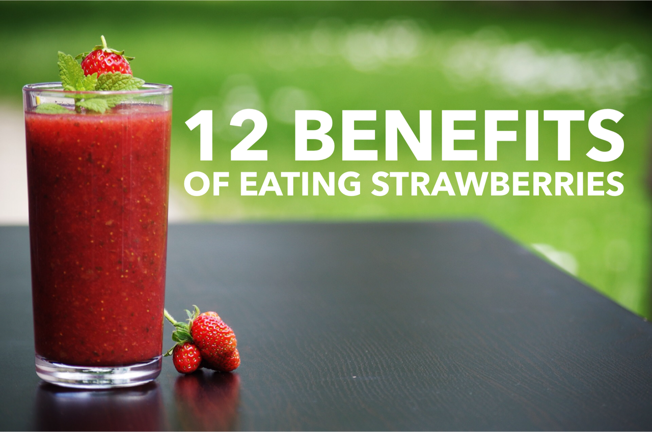
12. Designing a Blog Title Graphic: Okay, so let's go ahead and take a look at our final example. And in this example, let's say that we have ah, blawg and we want to make a block title graphic. One of those images that goes at the top of a block post and the image that you see whenever you start sharing it on social media. So we'll go ahead and we'll pick our image now with your business or brand, you'll have some idea in your head about what the block post is going to be about. I'm just making this up as I go. So let's just say I I I really like the health and fitness industry. So maybe we're writing a block post about eating healthy organic food or something of that nature. So I'm just going to go up here and I'm just gonna type in health and see what comes up. And right away we see some great images. Um, I'm looking here. I see an image of some smoothies. Everyone like this, this image of the smoothie here, let's click on that. Okay, so we've got a strawberry smoothie, and I think this is this is a great image that we can use. However, whenever we're making like a block title graphic, we don't want it to be a square crop. We want the full resolution. So that's got that nice horizontal, uh, with whenever we're sharing this on social media. So I'm going to hit the Don't crop button because we don't want to crop this image. Now I can go in here, and the first thing I'll probably want to do is change out the text to whatever the block Post is going to be. So I'm just gonna make this up here. Let's say 12 benefits of eating strawberry, since this is a strawberry smiting, okay, and this image looks pretty good as it is now. We could go into the image settings, and we may do a little bit of this more once we mess around with the text to see how it's working. But you may want to come in here and mess around with some of these settings. The vibrant looks good. Um, and I could like these looks that have this kind of X process look going on where it's kind of changes the colors a little bit. I think that looks pretty neat. I wouldn't go with anything that's overlay or a grayscale, cause you really want that strawberry color to stand out and these air really taking away from that. So let's just go back to the original image for now and just see how this looks. Now, I do want to find ah font to use and we've got some great, um, negative space on the right hand side. We don't want to cover up the strawberry smoothie because that's kind of the main image of our graphic. However, we have this great negative space on the right hand side. So we want to go in here and and try to fill that in over there now, because we're talking about smoothies and, um, health and fitness, we could do something that that looks a little more organic and cursive. I probably wouldn't go with anything that looks too rigid or hard edged. So these ones that look kind of like, um, these cursive funds, I think look really good. Now we'll probably need to change the color unless we come down here and the gray area. However, we're probably gonna end up putting it in the screen. So Let me just pick something that we can see a little better here. And actually, if we go either in the green or the black, it probably be best if we pick that strawberry color if we can see it. So we'll have to see how this looks. But let's go ahead and pick Red for now. And we might need to pick something a little darker. So, um, of course something that's a little on the bold side. And I'm taking a look here. Another one that I like that I would consider covering up the smoothie. Is this one that has this kind of, um, box around it? This one, I think, works really good. Whenever we're doing any type of blogged post, I think it has a cool look to it. So let's just see. So this isn't too bad. I kind of like this. Um, I'm not a big fan of it covering it up. However, if I were to use this, I would make sure that I don't go to the edges. We don't want to touch the edges and I don't want to touch the edge of the glass, so I would probably just push it right past the glass on the left hand side, and I could go with that. I think probably being in the center would be the best, cause I don't want to cover the top of the smoothie or the bottom where these strawberries are, so I could go with this in the middle. It looks like White would probably be the best contrast for this type of image. Or maybe a pastel color we could probably go with with that pastel pinkish color kind of works where we could go with a green. If it stands out, let's choose a different style and see if we can put it over on the right hand side, because I am not really a fan of going over that Smith the image. You know what I'm wearing here? Let's go back. Choose the white, see if we can find something else. It looks I like it up in this green area would just need something that's thick enough to where we can actually see it. So that's thick, but and it looks like we're actually gonna have a problem with the line breaking at the top . Let's go ahead and break this up a little bit. Okay, so this is starting to look better. So something like this, I think, is gonna work a lot better. There we go. Now, we've got a nice, bold, rich color against this background, and we can see the image I'm using the negative space. Um, I don't want to put it down here cause I don't want to cover up their strawberry since it's part of the image. But up here gives us some nice negative space. And let's see if we can change the color to that strawberry color, cause if we can keep the colors consistent, it will look good. So I'll just color pick it. It'll be easier and see if we can move around. So that works pretty good with the green. It might be a little hard to see, but it's not too bad we can still mess around and maybe see if we can find another font that it's a little bolder. Yeah, I think this looks pretty good. I see the white really stands out, though I think I like the white better. Just cause it it really helps make it stand out. We could go dark but I don't I don't know if I really like the darkest much the Reds, Okay, but it kind of blends in because it's at the same value level as the green in the back. So let's just go with the white and was going to move this around a little bit and see if there's how we're looking here. All right, I think that looks pretty good. So that's just a nisi way to create this block title graphic and just makes it really easy for us to come in here and make these really fast and again. You can sit here. I could play on this application for hours so I could just come in here and try some of the different settings. Um, this even this rich color works really good. So you could definitely just try some of these different overlays and shapes. Um, again, you could blur out the background, but I think it might take away from that smoothie. It doesn't make the text pop a little better, but I like the sharpness of this image. So I don't think I would do that. I couldn't maybe turn it down just a little bit to make the white pop a little more. Or if I wanted to, I could go a little brighter and then make that text one of those darker colors, and that's gonna make it pop out a little better. So maybe I could do that red color if I was going to break up the image a little bit. So that's how this would look. So this was the original and see how it's kind of bleeding into that green and just a little tricky to look. If I just make it a little brighter, it starts to pop out a little more. But I think I like the original images. It just works so well on its own. And the white color, I think, really makes it stand out and easy to read. So there you go. That's our final example of how to use this application to make a blood title. Graphic
13. Exporting Your Final Image: Okay, now that we have finished with our graphic design, let's go ahead and see how we can save out or export this image. So all I'm going to do is I'm going to click on the done button in the top right hand corner, and once it's finished, you will see that it says Pick successfully saved to camera roll. So basically what's happened is it's already saved this to our device. And that's great, because even if we close out the program, we still have a copy of it later on that weaken upload to our computer or text message or email to ourselves if we need that file. So I'm just going to cook close, and then you can see we can also share this so I can go ahead and log in to any of these platforms and share this out to Instagram, Twitter, Facebook, Tumblr and Pinterest. I can also automatically send this as a text message or send it out as an email. So ward swag makes it very simple for us to come in here and share out these images to these different platforms right away. I don't have to go in separately and do this, I can immediately post this straight to my Facebook or Twitter or what have you. At the bottom, you see some more functions. There's add logo or watermark. This will allow you to add additional text or an image, and this is really great. If you have, say, your logo saved out on your device or your phone, you can go ahead and go back into your image and add that logo separately. You can also add more tech, so maybe you want adding your website address in a different location and not have it with the main text. You can do that there, and then the re swag button is just another way for you to copy your last action. So if I went in and I added some text, if I hit the re swag button, it's just gonna add that text again and allow me to edit it or change it. So definitely some great options for exporting and sharing. And then, um so that's basically it. Very simple, very easy to use. And now all I ask you to do is go ahead and take the image that you've created and upload it to this course. I love to see what people create and what they're working on, and this is a great chance for you to show us what you've created and get some feedback and critiques. Maybe if you want some advice on how you can make your images better, feel free to upload those to this course, and I will definitely help you out. All right, so let's go ahead and wrap it up.
14. Assignment : Create Your Own Graphic with Word Swag: thank you for taking this course. By now. You should have a good understanding of the word swag application. I've showed you how to use the text editor and how to use different typography, effects and fonts. I've showed you how to import images straight from the picks, obey website or even use some award swags pictures. I've showed you how to edit those images with different filters and effects and cool things that you can do. And then finally, I showed you how to export that image out to your device or how you can share it on the social media platforms. Now, if you have any questions at all about this course, you can either asked me directly or you can ask general questions inside of the course. I find that by asking general questions in this course, I can answer that both to you and two other students who might also have that same question . But if you want to message me directly, definitely feel free to do so. You can find out more about me at www dot jeremy deegan dot com. Now that we have come to the end of the course, I do encourage you to upload your image to this course so that I can check it out and so that other students can see what you've created. It's a great way to get motivation to keep creating other images, and we can provide feedback or critiques on your image and let you know what you can do better in the future. If that's something that you would like so again, thank you so much for taking this class. I hope you learned a lot. I hope you enjoy it, and I can't wait to see you in future lessons.
 Jeremy Deighan, Online Instructor | www.jeremydeighan.com