Transcripts
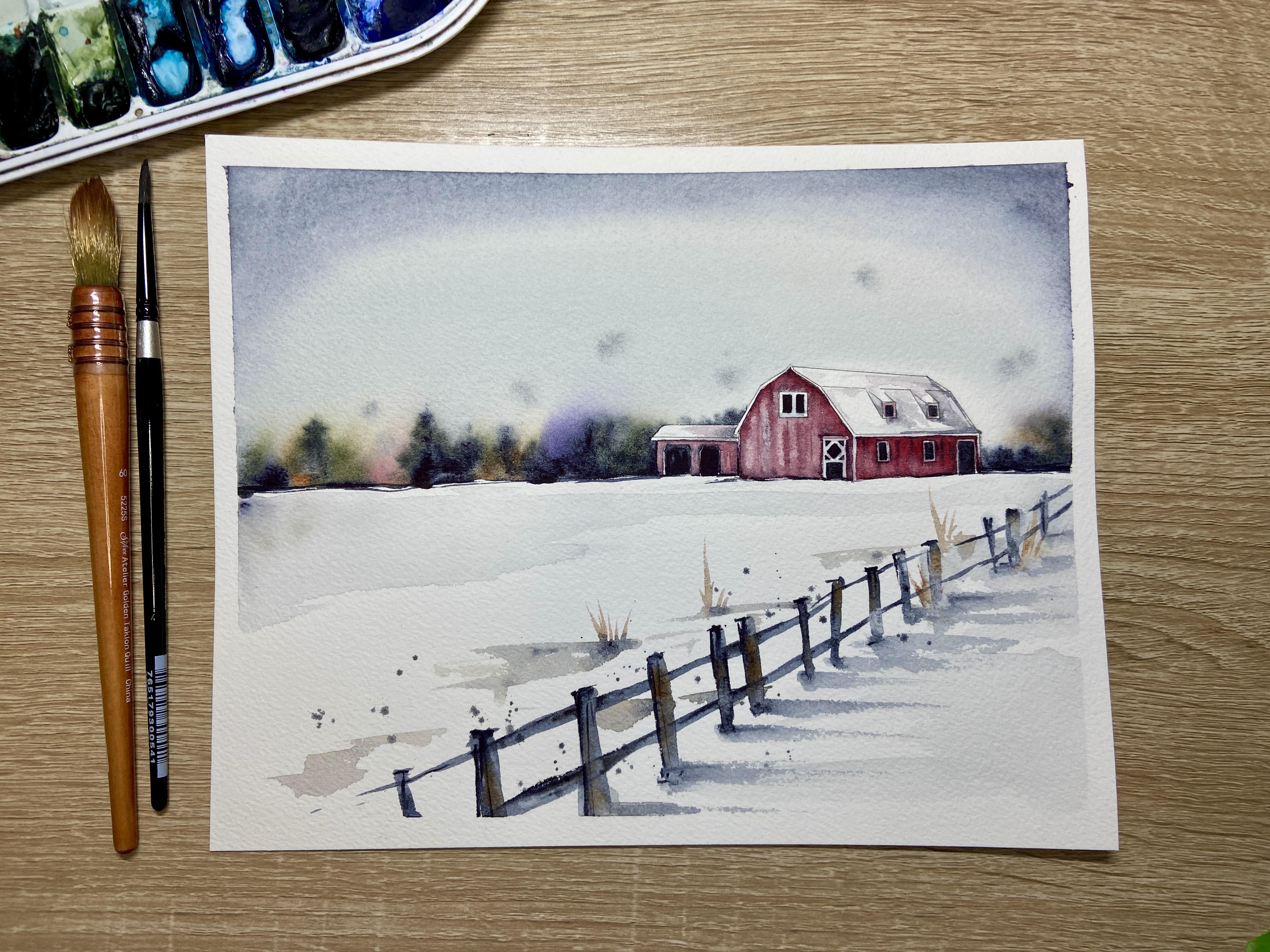
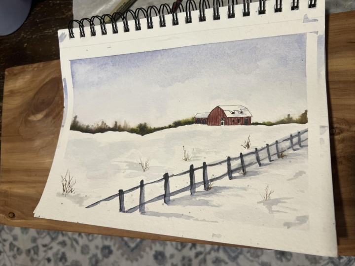
1. Intro: Winter Barn Scene in Watercolor: Hello, and welcome
to my home studio. I'm Emily, and in today's
Skillshare class, our goal is to relax and have fun while painting
with watercolors. In this tutorial, I'm going to cover a lot of different
watercolor techniques. You'll start by
learning how to paint a sky and a tree line using
wet on wet techniques. We'll then take a peek
on how to paint snow as well as a fence
using wet on dry. We'll also use some
specific techniques such as dry brushing and splatter as to how you can
enhance your piece. And then at last, we'll take
a peek at painting a barn. We'll look at dropping
in color, wet on wet, as well as lifting in order to create kind of
a weathered barn look. Now, as with all of my videos, you're more than welcome to use the exact same color
palette that I have here. There's a description below
on the colors that I used. Or you're also able to add your own colors to make
this project unique to you. As always, there is a
traceable template included in this tutorial for
you to either trace or print the barn directly
onto your watercolor paper.
2. Supplies Needed: Alright, so let's
talk supplies for painting this winter barn
scene using watercolors. So the first thing that's important to talk
about is your paper. I am using Arches
brand, 400 pound paper, sorry, 140 pound paper, and I am using cold
pressed paper. I did cut this piece
down to eight by ten. However, if you are
wanting to frame it, I would suggest
cutting it slightly larger than eight by ten so that your edge can can come right up to a mat if you
are choosing to mat it. To tape it down, I'm using green frog tape. You can also use painter's tape. Or washy tape, I do prefer
painter's tape, though. I'm taping it down to a
plastic corrugated board. However, you can also tape
it down to your desk. You can tape it down
to an artboard or to a really flat piece of wood, however you want your paper, wherever you're
gonna be painting. As far as the brushes that I'm using
throughout the tutorial, the large wash brush
that I'm using is a silver limited Atelier,
golden talcun quill. A large wash brush can work. Then for my medium size brushes, I am using black velvet, round number six or
round number four, just depends on
kind of the size, and I use these
interchangeably sometimes. And then you'll need a
fineer detail brush. I'm using a four
times zero brush. However, a size zero
brush will work. Whatever smaller brush you
will use for the barn. Next, you're going to
need a paper towel or some sort of cloth. You'll notice in my video, I am using a palette like this. My colors already
in my palette but the colors that I'm using
are all Daniel Smith. You can also find the names of the colors in the
supplies list below. Um for the sky, I'm using all of these colors. So around the edge,
I'm using indigo. I also added just a little
hint of Cerlean blue. And then for the tree line, I dropped in mostly indigo with undersea green,
carbazoviolet, a little bit of quin gold, also quin burnt orange, and then a little hint of
that anthraquinoid red. For the fence and the shadows, I used pretty much solely the indigo and the
Quinn burnt orange. And then for my barn, I was using mainly anthraquinoid
red, along with indigo. And then I use usually
two cups of water as I'm painting so that I
always have fresh water. Now that you have your
supplies together, let's get started to paint.
3. Painting the Sky: Wet-on-Wet: So the first step in my winter barn painting is I'm
going to need to tape it down to either my desk or
to some sort of hard board. So I'm using a corrugated
plastic board that I cut up. I found it in a poster
size from Michael's, and then I just cut
them down to size, some for my eight
by ten paintings, some for my five by
seven paintings. And then I'm using
some green frog tape to tape all around on all four sides
since I am going to be painting up to the
edge of the painting. And I'm just trying
my best to have an even edge all around my painting of about
an eighth of an inch. So before I start painting
on my final piece, I'm going to just
kind of do a little practice test of
some of the colors that I might want to use for
my sky and my tree line. So I'm taking a scrap
sheet of paper. This can be a student
grade piece of paper. I'm using a student grade
piece of Blick art paper. And I wet the entire
paper with water, and now I'm using just some different
colors from my palette and dotting them along the bottom edge of
the wet section. And I'm just noticing how
these colors are mixing. I'm um trying to decide really which colors I want to use and which colors
I don't want to use. So when I was thinking about
this painting in my head, I wanted the background of this painting of this piece
to be a little moodier. And I wanted the red barn to be the main color
that would stand out. But I did also want to use
a few highlight colors in the tree line so that it wasn't just indigo and a dark green. So I'm trying to add some colors that I
think would go along well with the undersea green and indigo that I know
I'm going to use, just to see which colors blend well and how much of
that color to use. So the colors so far
that I've tested out in this test strip that
you're seen on the video, aside from that indigo
and the undersea green, I also dropped in a little
bit of quinocradone gold, and followed by some Carbisol
violet, little halo blue. I tested what my shadow
violet might look like. Most of these are
Daniel Smith colors. I also tested out a
quinocradone burnt orange. And now for the sky line, I'm testing out what
it would look like with an indigo along the top. And then I also know
that I want to add some little pieces of grass
and for sure, some shadow. And so I'm going to test out what some shadow would look like with a
little bit of indigo. And so here is what an indigo
shadow would look like with a little bit of quinacridone
burnt orange as grasses. So this has really allowed
me to test out colors. I'm adding a little bit of red, and to finalize the color
template that I want to use. All right, so now I
have my final piece. Now, this is printed on
Arches cold pressed paper. That's 130 grams. If you are using
a different type of paper or a different
brand of paper, your dry times might be
different than mine. So this first step with the sky, I need to do the
whole sky section and the tree line all well
this top part is wet. So I have to do it
all in one take. Depending on the paper
that you're using, you might need to work slightly faster if your paper dries
a little bit faster, but that's why I'm using
a cold pressed paper to keep it a little bit wetter. So right now I'm using a
mop brush to paint using clean water all around my
barn and in the sky section. I'm taking a lot of
time here to make sure that I'm getting the water right up to the
edge of the barn. If you need to switch to
a smaller brush, do that. After you paint the skyline, you won't really be able to go back and fix this
section if you, for example, don't have your color coming all the way
up to the edge of the barn. So it's really important
that you take the time now to really edge along
that barn really well. As you can see, I
had a little bit of color left on my smaller
brush. That's okay. I'm not too concerned. I'm going to be adding
some color anyways. And then you'll notice
that I'm going to take my wash brush again
and I'm going to go back to the section
that I already wet and I'm going
to re wet it again. Now, how wet do we
want this section? We want it pretty wet. We don't want it to be
pooling anywhere, though. So I'm making sure that if
I were to lift up my paper, I wouldn't have
drips coming down, but I am wetting it enough and going over
it enough so that the paper I give the paper
time to soak up that water. Once I think I have a good enough amount of
water on my paper, I'm going in first with indigo along the top of the skyline. And then I'm adding a little bit of that quinocradone burnt orange just to give it a little
bit of a glow in the sky. And as you can see, I'm
I'm wetting my brush. I'm getting color on it, but
then I'm using my brush and I'm getting a little bit of the color out on my
palette. That's important. Instead of just
grabbing the color and putting it directly
onto the water, I do need to mix
it around first on my palette so that I don't
get too opaque of a color. Now, I also grabbed a
little bit of Cerlean blue to add to the center of the sky. If you don't have that at home, you can also use ath blue. Then as the color is
dissipating in the sky, I'm adding a little bit more of that indigo to the
very top of my sky. So now I need to work
a little quickly, so I'm going to let that set. And before it dries, I need to paint the tree line. So I'm going to start by adding some indigo along the
base of this tree line. Now, you notice that I didn't mix the indigo with any water. I'm just using whatever water
was already on my brush. And the reason I have
to do this is to keep that pigment along the
tree line at the base. If I have too much water
in my brush at this step, the indigo is going to be
bleeding way too far up. So you notice that
after I clean my brush, I might tap it on
my paper towel. That's going to release
some of that liquid so that I have mostly
pigment on my brush. That's really important to
keep the tree line in place. I'm going to switch colors and use a few accent
colors here and there. So the first orange that I used was that quinocradone
burnt orange. Once again, I cleaned my brush. I dried it on my paper towel, and then I switched to
use a little bit of carbazyl violet to add just
a little hint of color. I cleaned my brush, tapped it on my paper towel, and then I used a
little bit of red. Now, I am you can add a little bit of water
to these colors to help them bloom a little bit more if they're staying too
tight to the tree line, but just be very, very
careful and cautious. If you use too much
water, obviously, you're going to
push that tree line too far into the skyline. I am adding a little bit of undersea green to the
tree line as well, just to give it a
little bit of a browny green um, in the background. Then I'm going back to
the areas that I already painted and I'm just
blending however I see fit. I want these colors to
just blend effortlessly. Then before I let it all dry, I'm going to go back
with more indigo. As you can see, I'm making some vertical lines
across the tree line. I'm trying to represent some
some shapes of pine trees. And so it's starting
to dry a little bit, so my pigment isn't going to run as much as it did
in the beginning. And so this is a great stage of dry time to add a
few little details. I'm going to add
just a little bit of color above the barn, making sure to kind of outline
the barn a little bit. That's going to
help our barns to kind of peek through
the tree line. And then I'm going to clean up my tree line by lifting
wherever I see fit. So I dried my brush and I'm
using a dry brush just like an eraser to lift up wherever the color might
have gone too far. Now, I'm choosing to just very lightly splatter,
a little bit of indigo. Even in sometimes
your paint water might be dark enough
to do this, as well. Since my sky is still very wet, I can splatter a little bit and have it just be
reminiscent of snow. Of course, though, this
is an optional step. If you really like
the sky how it is, you don't need to
splatter at all.
4. Painting the Fence: Wet-on-Dry: So the next step is to start
working on the foreground. Now, I can't work on the barn yet because the sky
is still drying. And so if I were to try
working on the barn, the red of the barn is
going to seep into the sky. I'm going to work on a little
fence in the foreground. I'm deciding to make
my fence diagonal coming from the right side of the barn through
the foreground. So I like to always
practice this first because I'm not using
a reference photo at all. I'm just kind of doing
this off my memory and making up this landscape. So once again, I'm taking a practice sheet of paper.
It's student grade. So it's not I decided to continue the indigo
into the foreground. Using similar colors in both the background
and the foreground are going to help
tie them together. So for the fence, I watered
down a little bit of indigo, and I started painting
a train track shape, so two lines two
diagonal parallel lines for the cross beams. And then I'm painting the fence posts with
that same indigo. I did take a little bit of
indigo directly from my pan, so it's a little
bit more opaque. And I just drew on the edges of those fence posts to kind of
outline them a little bit. And now I'm adding a
little quinacridone burnt orange so I am going to practice this fence
again and I'm going to take into consideration now a little bit of perspective. As I get my water down indigo, I'm going to paint
my parallel lines. I'm going to start a
little bit thinner towards the upper
right hand corner, since that's going to
be the furthest away. And then I'm going
to press my brush down as I come towards
the foreground. Also towards the upper right
hand corner in the back. It's going to be a little closer together those lines are. And as I come to the
foreground to the forefront, I'm going to widen those
lines just a little bit. Now the most important
thing to remember while making this fence is that even though these
two parallel lines are coming at a diagonal, my posts need to
be perpendicular. After I finish outlining these diagonal posts with
a little bit of indigo, I'm going to go back and
paint my vertical posts. Okay. Once again, after I finish with the
watery indigo as the post, I'm going to come
back and just dip my brush into the indigo
without watering it down. I'm going to paint along
one edge of that post. If you can see I'm painting along the left edge of the post. That's going to just
give it a little bit of a shadow on that left side. You can do this on
the right side. It doesn't really matter. Then I'm also using more
of that opaque indigo along the tops of the post and along
the base of the post. Now, I'm also testing
out what it might look like to lift up a little bit of pigment from the posts
that are furthest away because I want to give into the perspective
a little bit more. And so when objects
are further away, they tend to be a
little bit hazier instead of so well defined. So now that I lifted up a
little bit of that pigment, now I'm going to
go on and test out some shadows and what that might look like for
each individual post. I'm using indigo water down. I might also add a little bit of thalo
blue or a brighter blue, like a Prussian blue,
something that is a little bit more
brighter than the indigo. And I'm using really quick
snaps of my wrist from the post outwards to create
these elongated shadows. I'll go back and I'll drop
in a little bit of indigo at the base so that it can spread and bleed
out a little bit. Now, the quickness of this brush stroke is the
most important part, continue to practice this
until it looks right to you. I'm also making sure
that these shadows are perpendicular to my posts. I don't want there
to be any sort of obtuse or acute angle. It has to be 90
degree perpendicular. While those shadows
are still wet, I'm playing around with adding a little bit of grasses
to some of the posts, allowing that
quinacridone burnt orange to just blend in to the
shadow a little bit. I think it's helpful
to work while all of these components are still wet so that they can all
bleed together a little bit. Then I'm testing out
what it might look like to add some grasses that aren't quinacridone
burnt orange. Here I'm testing out some undersea green to
see if I like that. And then I'll test out
what a few other shadows might look like on the
opposite side of the fence. I do want to add
some shadows there, not a ton, but I do need to break up that
whiteness a little bit. Now that I've practiced, I feel like I'm ready
for my final piece. You are more than
welcome to practice that fence multiple times. You can also change the
color of the fence. You can add more
browns to the fence, more blues, more purples. You can make it your own here. But I'm ready to work
on my final piece. Once again, I'm using
that watered down indigo. I have a medium transparency with this watered down indigo, and I'm going to make
those parallel lines first and then the posts. I'm going to continue letting this video play at normal speed. So you're watching me
paint in real time. I did not speed this up at all. So if you're trying to
figure out how fast you need to paint to do this
all while it's still wet, this is a pretty good speed, and you might have
even a little bit more time before things dry. So now that I'm done with
my watered down posts, now I'm going to go back with some indigo that I'm
not watering down. I'm grabbing that
indigo directly from the paint there
and from my well. I'm edging along one
side of the post, as well as along the top of the post and along
the base of the post. Remember, at this point, you can always add a little
highlight color. I'm using water down
coracodone burnt gold. I did add quite a
bit of water to my brush along with that color. I'm going to just add a
little bit of browns to my posts just to give it a little bit
more of a wood feeling. Then this is optional as well, but remember we can dab our fence posts that are
further away to lift up a little bit of that
color so that it's not so dark and it'll make it look like it's a
little further away.
5. Adding Shadows in the Snow: All right, so I'm ready for
the shadows on my post. Remember, I'm going to be
using the edge of my brush, not the tip of my brush. I don't have my brush
perpendicular here. Using the edge of my brush, I'm going to pull out some
quick flicks of the wrist. Now, because I'm painting
on a cold press paper, you're going to
notice more texture than on your practice
sheet potentially. And so it all depends
on what you like. I like that textured look so if you don't like
the textured look, you can add more of that
liquid to your brush. A more water down brush is going to give you a
little less texture. But I like this texture
dry brush look. And then once again,
I'll drop in more indigo directly at the base
of these posts, allowing that to bleed
into the shadows. So this is the point that we can add any grasses that
we want to add. I'm starting with
some quinacridone burnt orange directly
from my well, I noticed that there wasn't
enough liquid in that. I added a little
bit more liquid. I increase the amount of liquid until I get the
consistency that I want. If there's too much
liquid on your brush, you're going to have
grasses that are really thick and so you want
just the right amount of liquid so that you can get a fine wisp of grass
coming out of these posts. For the shadows on
the left hand side, I'm using some of the leftovers of the pigments
that I have been mixing. There's a little bit of
that quinacridone burnt orange along with indigo
and I'm using those. I'm keeping my shadows parallel to the other shadows
on the right hand side. I have all my shadows
on the same plane and it's a vertical or it's a horizontal plane,
going left to right. That's important so that your shadows all look like they're coming from
the same light source. While my shadows are still wet, I'm going to pull a
little bit more grasses out of those shadows, and then I can also drop in any indigo or any accent color, whether it's purple or red, you can play around
if you want to add a little extra
color to these shadows. Then I decided that it's looking a little bit too perfect for me. I'm going to add some splatter
on top of the fence here. I'm using indigo and water down indigo,
and I have my brush. I'm just hitting my brush
on top of my left hand, and that's creating a splatter that goes where I want it to go. I'm adding this splatter on
top of the fence to create a little bit of movement
to the fence area. It also is going
to look like snow. It gives it more of an outdoor
ambience, if you will. It's totally
optional for a step, but I think it adds a
lot to the painting, especially if you didn't
splatter a lot in the sky. Lastly, I can see that there's a big white space on the upper left hand
corner of my paper, so I want to tone that
down a little bit. I'm grabbing actually, it's just the dirty cup water and I'm grabbing my
larger wash brush. I'm trying to leave a
little bit of white of the paper just at the top
edge where that tree line is, but I'm adding a little
bit of shadow underneath. This is just going to connect the the foreground
to the tree line. Then while it's wet, of course, I can add in whatever colors I want to to accent that snow. The last step is
I'm going to take that wash brush and I'm
actually just going to use the wet wash brush to scrub out some
of the fencing. I'm going to go up to that upper right hand
corner of the fence, and I'm going to see what
it looks like just if I scrub out a little
of that section there. I'm just trying to
blur it a little bit more so it looks like it's
further in the distance.
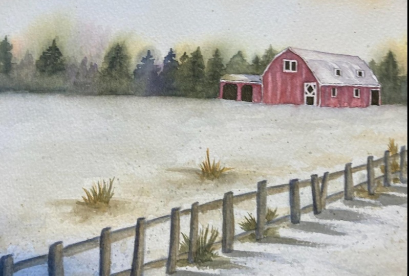
6. Painting the Red Barn: Alright, so we've made
it to the barn scene, the actual painting of the barn. So we've let the sky
dry a little bit. I already touched it and
made sure that it's more or less dry so I'm not getting any pigment off of my thumb. And we're going to start by painting the red
panels of the barn. Now, I mixed a Daniel
Smith anthraquinoid red, and I mixed it in that
kind of puddle of dirty indigo water just to tone down the
red a little bit. I might add I might drop
in a more brilliant red, but that first base
layer that I'm painting, I do want a little
bit more muted. Right now, I'm
painting wet on dry. So my paper is dry and
I have my wet brush. I did not wet the barn first. I just want a nice even wash all around these
windows and around the door. Then I can drop in some other colors after
I have this first layer. So now I'm going to
drop in some colors. I'm not going to wet the colors. I'm using my brush just how much water is on
my brush and I'm going to dab it into that red and use a little bit
more opaque red, more condensed red along
the top of that barn. Then I'll just dip my
brush into the indigo. I don't have a wet brush. My brush is fairly dry. It's not completely dry, but I'm not re
wetting it at all. That's important to keep
that indigo in place. If you're noticing the
indigo spreading too much, tap it on your paper towel to release some of that liquid. I'm painting some
vertical lines of indigo, and that's going to just
create a little bit of contrast from all of the horizontal lines that
we have in the piece. But it's also going to
make the barn wood look like slats of wood instead
of just one solid plane. Sometimes even I make mistakes I put some indigo
where I didn't want it. I washed up my
brush, I dried it, and now I'm using a
dry brush to lift pigment from the in between
these indigo slates. I'm creating almost
a weathered look now for this paneling. Of course, as I start
painting the siding, I notice that it's really not
bright enough red for me. Before it dries too much, just going to add in a
little bit more red there, and then I'll continue doing the same thing with
the side paneling. Once again, I'm painting the wet undry I'm painting a water down red
as my first layer. And then once I have that
while it's still wet, I'll make these vertical
lines using indigo. Now, I know that you see me using a round size
four brush here, but you are more than welcome
to use a smaller brush, around size two, round
size one, round size zero. Whatever round brush you
are most comfortable with, I just get so used to
using one or two sizes of brushes and then controlling the amount of liquid
that's in each brush. You'll notice that I'm continuing to use
the round size four. Then you also notice me going
back to that front panel. As it starts to dry, the way that the paint
dries changes how it looks. I'm just correcting as
the paint is drying. What you just saw me do,
I dried my brush off, and then I continued to lift
a little bit of color up. So I'm constantly
looking back at what I already did to kind of see if I need to
make any changes. And here I went over
a little bit of the white window sill and just used paper
towel and the end of my brush to kind
of dab it off. Make sure to always paint
with a paper towel, and that's going to
help to keep your it's going to act like you're
eraser to keep sections clean. So now that I have
my red paneling, now I can work on my windows. I'm going to paint the
insides of my windows using either a very concentrated
indigo or a black. So I'm starting once again
with that first panel just to make sure that I'm working in sections that
have already dried. And as you can see, I got frustrated using my
number four brush. I switched to a
smaller size brush for the rest of the windows. And I'm not mixing any of
this color with water. I'm just using a wet brush
and taking the color directly from the well there. Now, if this step is a little bit too challenging
for you to do, since it is a
pretty small space, you can also think about using a black micron pen to
color in the windows. Sometimes it's easier to use a pen versus your paintbrush. This is the only section of painting this piece
that I'm going to speed up only because I'm doing the same tedious
step over and over again, just painting these
dark black spaces. And then the last thing to note for this section is if you do end up getting some black over the white window pane edge, leave it and don't try to fix it while that black
paint is still wet. All you're going to do is
smear it a little bit more. What I would suggest
is waiting until it's dry and then you can
come in with a clean, wet brush and try to
scrub that area clean. Or if that's not possible, I also use white gel pens
quite often in my pieces. And so I would have no
problem when it's dry, adding a little bit
of white gelpen around the white window panes. Then when I'm
painting this side, I know it's not a garage, I don't know what to
call it for barns. But when I'm painting
this side garage area, I'm not leaving any of the
whites to shine through. There's really no frame
along that section.
7. Adding Snow Shadows on the Roof and Final Details: Alright, so we're
back to normal speed. So this is normal regular
speed of me painting. So we're going to start painting some of the shadows
along the roof. So we're remembering that our
light source is coming from the left hand side since our shadows on our fence
posts are on the right. So I'm going to try
to keep my shadows, especially near these
windows on the roof. I'm going to keep them
on the right hand side, and I'm using the
same shadow colors as I did for my fence. So a very watered down indigo. You can also add, especially in the roof, I'm going to be adding
just a little hint of red into this shadow as well after I have the base
of this water down indigo. And then just like
with my fence posts, while these shadows
are still wet, I'll grab just a little
bit of indigo that's a little bit more opaque
and I'll drop it in that, that, that near the
right hand side of both the garage and
then these windows. So at this point
in the painting, I'm noticing that the whites of my trims of my windows
are looking very, very bright in comparison
to the rest of the piece. So I'm just going to
take a wet brush and I'm going to just blend
those edges a little bit. And what that's going to
do is it's just going to dirty the window sills, that white frames
just a little bit. I just don't want them quite as white in comparison to the snow. I want them a little bit more dingy and dirty
since it is a barn. And then at this point
of the painting, you can take a peek
at your barn again, see if you want to add
any extra vertical lines using a red, just to add a little extra
crisp hard edge details since the first lines that
we did were all wet on wet. Depending on how yours looks, you can always add a few of these extra lines just to
give some crisp details. Then I'm going to add
just a little bit of red to the shadow
on top of the barn. I'm just adding a really
watered down red to certain sections just to blend in that red of the barn
with the rest of the piece. Then the very last step, I'm taking a fineer brush. This is still around size four, but I'm using a medium
transparency indigo, and I am painting a hard edged
line along the tree line. As you can see,
sometimes I'm having my brush up to touch
the tree line. Sometimes I'm leaving
a little sliver of white along the
tree line there. Your line doesn't have to
be perfectly straight. I'm also lining
underneath the barn. All I'm doing is I'm adding a little crispness
to the foreground. Since when we did the tree line, we did do wet on wet. And so I do want to add a little bit of a
harder edge there. Thanks for watching. If
you enjoyed this ertorial, please follow me
on social media, check out my website, and make sure to subscribe
to my YouTube channel.
 Emily Marie Watercolors, Watercolor Artist and Dog Lover