Transcripts
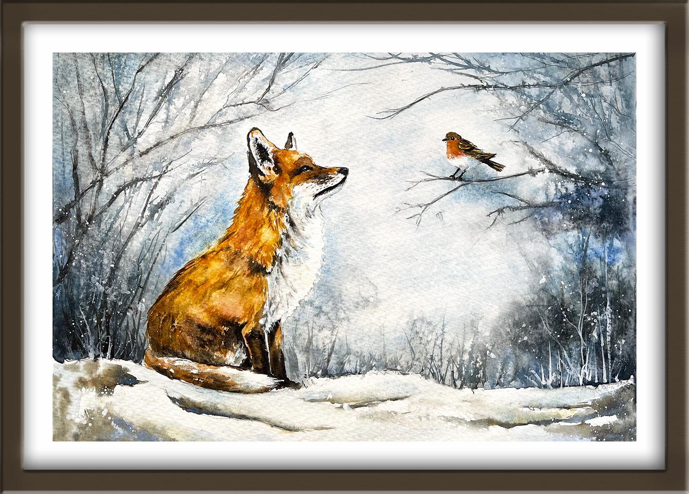
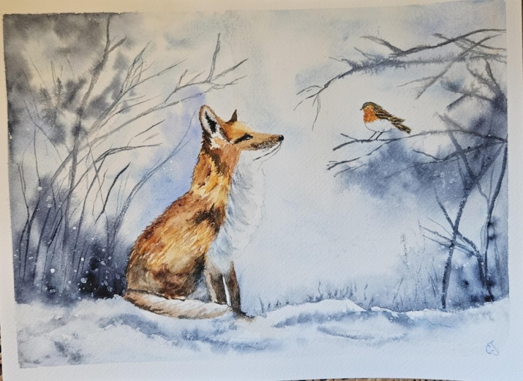
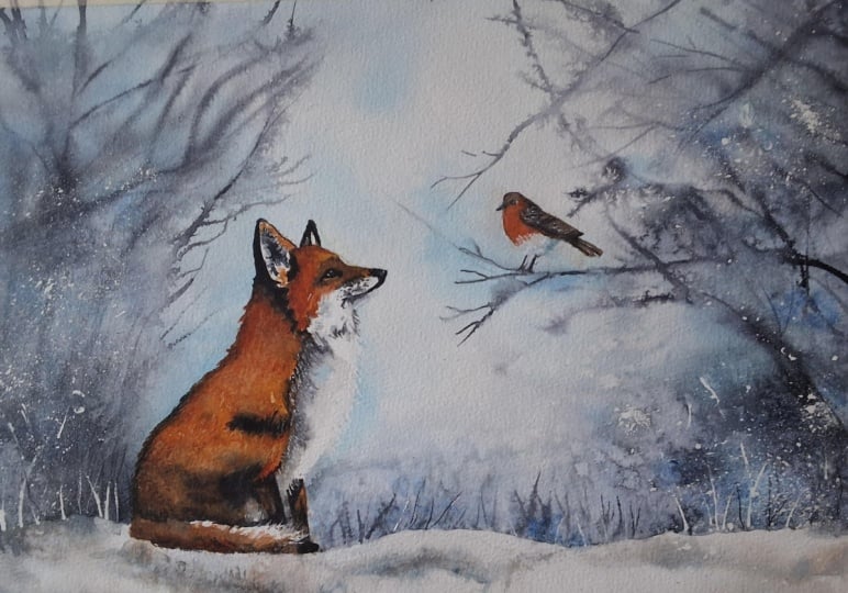
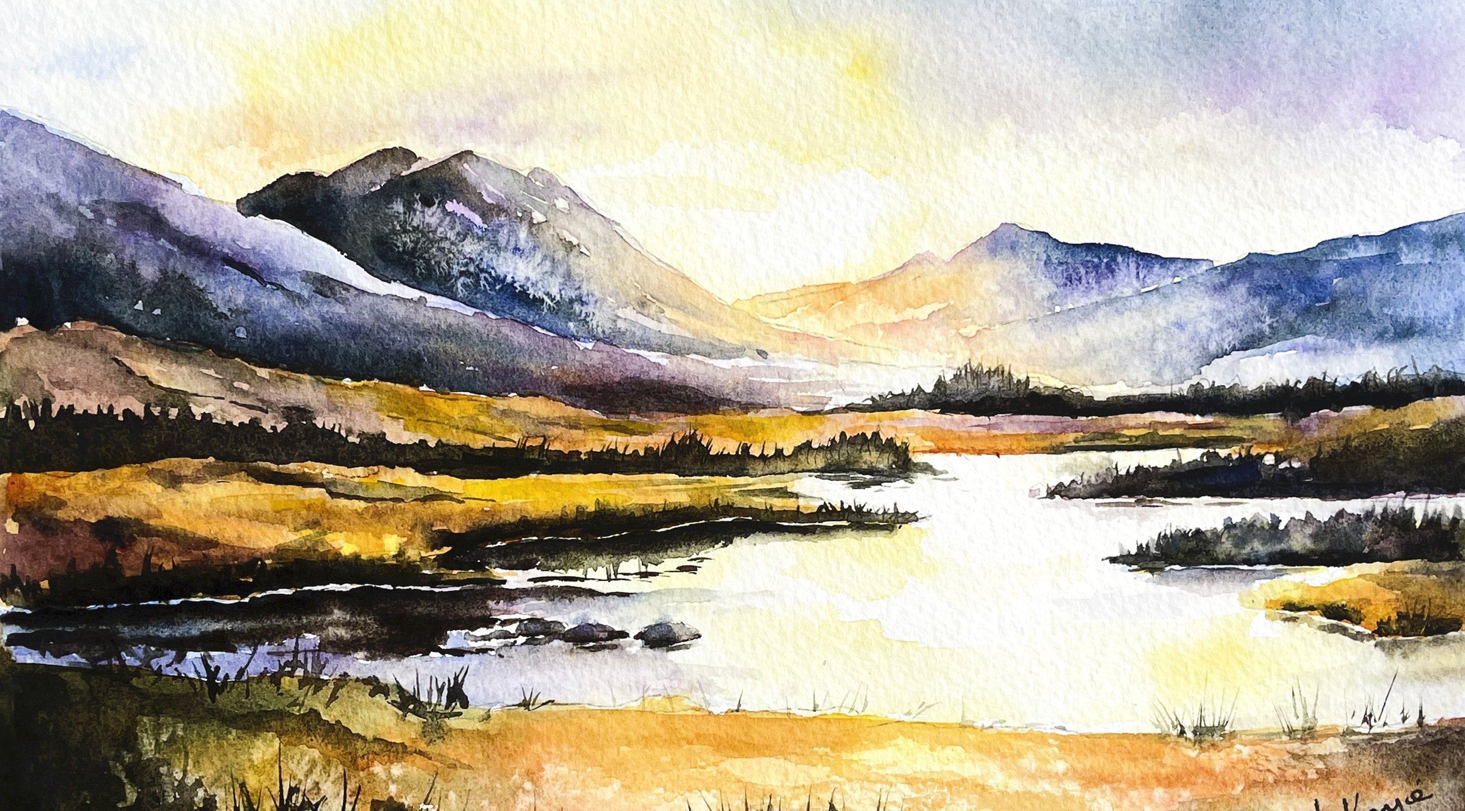
1. INTRODUCTION: Hello, and welcome. We're going to paint this atmospheric
winter wildlife scene of a lovely red fox and
Robin in watercolor. We'll build the painting
together in stages, beginning with loose
wet-on-wet washers to establish the sky and the snow before building form through layered
color and value. You'll develop fur
and feather textures and finish the piece with
expressive branches, falling snow and carefully
placed highlights. It's a great painting with mood, depth, and visual impact. You don't need to
be advanced for this class because I'm going to guide you every
step of the way. And I'll be sharing all
the techniques, tips, and tricks that I use in
my own professional work. I've included a copy
of the drawing in the project resources section so that you can download
it and trace it, and then not worry
about the drawing because this is a
painting class. I am a professional artist, author, and tutor,
and over the years, I've sold a lot of work
across the world and helped hundreds of people to
learn more about watercolor. You can see examples of
my work on my website. My style leans
towards impressionism and contemporary rather
than photorealistic. I like to explore loose approaches that
bring out the color, light, and essence
of my subjects. I've tried to
replicate this across all the many other videos
that I have on Skillshare. I'd love to see your
own finished painting, which you can upload through the project and resources tab. I'll give you some
personal feedback on it, and you'll be able to
see the artwork of other students and
get their support. At the end of the
class, you'll have your own beautiful artwork
to be very proud of. So let's swizzle our brushes and get on with the painting.
2. Materials, Drawing, Sky & Snow:
Materials overview and drawing. Wet-on-wet washes for sky and snow : I know you're going to love
creating this painting, and I'm sure it
will put a really big smile on your face, too. For this class, these are the colours and materials
that I'm using, but do feel free to use
any that you already have. For information on brushes
and paper, et cetera, do check out the basic
materials document that I've added to the
project resources section. Now you can see that I've
kept the drawing very simple, minimal details so
that we get a nice, loose free flow painting. And I've included a
copy of the drawing in the project resources section so that you can download
it and trace it, and then not worry
about the drawing because this is a
painting class. Oh going to start by painting a very loose
and atmospheric background, using the wet-on-wet technique. First of all, you
wet the paper with clean water and then
apply wet paint on top of the wet
paper and let it spread into the wet wash. Now, this results in a lovely
diffused effect with soft edges. And because the paint mixes into the wetness of the paper, the color is diluted
and the tone is paler. If several different colors
are used in this way, they will intermix and
blend with each other. So this is a great
technique to use for a nice soft loose
sky with soft edges. Now, as you can see,
I've been brushing the water over the
branches and twigs, but going carefully around
the fox and the little bird, because I don't
want the color from the sky to go onto them. When I drop the color
in, as I am doing now, that color will only go where there is water
for it to spread. In this particular composition, we've got quite a
large sky area. So I've pre wet just a
section of the sky area. I've wet the left hand side
and some of the middle. I've taken that water further than I want the color
to actually go, and so it will remain
wet there when I paint the other half and I won't get a hard line where it joins. If you're a very quick
worker, you could, of course, complete the
whole of the sky in one go. But once that underwah
starts to dry, you won't get the same
soft blend of colors, and that's why I'm doing it
in several separate sections. Now, I notice that I'm sort of dancing around with my brush, so I'm not dragging the
paint here and there. I'm literally trickling it in, letting the wetness of the paper soak up the color that's on
the tip of my brush. And I'm also not filling in the entire area with this cerulean blue color
that I'm adding in now. I'm leaving some white space as in between my brush strokes, and that will allow the paint to blend softly into these areas, and we'll get some light tones as well as the medium tones. While that cerulean
blue is still wet, I'm adding in some
touches of indigo at the base of this left hand
section above the snow line. I want to create a sort of vignette effect so that
the viewer's eye goes to the center of the scene with the Robin and Fox
looking at each other. So I'm adding some
of this darker color up the left hand side and along the top and a few little touches in
and amongst the branches. But I'm not obliterating the whole of the cerulean blue
that I've already put on. And then to add a little bit
of variety to the color, I'm adding some cobalt blue just here and
there and letting that color also blend and mix with the
cerulean and indigo. I've added a little
bit of extra color at the back of the fox because that's where it
will be in shade. And I've added a little
bit of black there also to really darken
that bottom left side. And because blue is the
complimentary color of orange, I've deliberately
placed some cobalt blue right next to the back of his neck
and top of his head. And that will give
me a really nice contrast when I come to paint the fox later on with
the orange and red colors. I'm repeating exactly
the same process over on the right hand side. So pre wetting the paper
with some clean water and going carefully around the little robin and also
the front of our fox. I'm using quite a large brush. I think it's a size 12. You're painting large
areas such as this. You don't want a
tiny little brush with tiny little brush strokes. The less that you can disturb the paper surface, the better. And then just as before, I'm dropping in some
cerulean blue, again, leaving white spaces in between to allow that color
to disperse softly, and then we'll get
some paler areas and almost white
areas in between. So we'll get much more light and airiness feeling in the sky. I'm dancing about,
but still going quite carefully around
my little robin. But no problem going over the
branches and twigs because they're going to be painted in later on in a much darker color. So it doesn't matter if
we go over them at all. Because I'm going to be
painting the fox and the robin in some
quite strong colours, some dark brown, some
oranges and reds, I need to have a contrast
with the central area, and so I'm deliberately
leaving the color very pale, almost white in some areas
in the central area. Tonal values are one of the most important aspects
of a successful painting. You need a mixture
of light tones, medium tones, and dark tones. Otherwise, the
painting will just look flat and uninteresting. So do be careful
to leave some of these pale light tones in
an amongst your sky area. And then just as before, I'm dropping in some of the indigo and a little
bit of the black. I've actually mixed the
black with some indigo in places so that it's not
too strong or black. I don't want some big
black blobs anywhere, because that would just be
too distracting to the eye. So keeping it sort of a blue gray color in
those darker places. And have you noticed that as I'm being very conscious
of light against dark, just underneath a little
Robin's underbody, which will be white, I've placed some
quite dark color to again get that contrast
between light and dark. Around his head and wings and the front of his chest
where it's going to be red, I've left that area
relatively pale. So you need to be
thinking all the time. If I've got a dark object, do I need to have
some light color around it so it stands out? If I've got a light object, do I then need to paint some
dark color so it stands out? So we want that contrast going on throughout all the different
sections of the painting, the different elements,
light against dark and getting that contrast
that makes the painting zing. At the moment, I'm mapping
all this out for you. But when you come to do
your own compositions and your own paintings, that is something
to bear in mind. Now, over at this
bottom right hand side, I'm imagining that
there's going to be like little bushes and
twigs and branches. So I'm using my brush to sort of paint those in
in a very abstract way. I don't want there to
be a lot of fine detail here because it would just distract from the
main main subject, which is the fox and the bird. So I'm keeping it all
very loose and just suggesting that there might be some foliage in
that bottom corner. And then to finish
this sky wash off, I'm just rewetting
the central area here so that I've got, again, some nice
soft blends mixing into the left and right
before I add my colors. Now, although I want it
to be pale in this area, the front of the fox, where I'm painting now,
is going to be white, isn't it white fur. So I do need to put some blue
colour right up against it, again to make it stand out. Remember that
watercolor tends to dry about 20 to 30% lighter than
when you first put it on. So when all this color dries, it won't be as quite as
dark as it appears now. I'm scumbling a little bit
of my blue gray color and indigo just along the top
of the snow line here, again, so that the white snow later on will really stand out. I'm just a bit concerned
that it might be looking a little bit too dark
in this central area, darker than what I wanted. So I'm going to show you a
technique called rag rolling. You just twist a bit
of paper towel into a long thin shape and then just roll it up gently
over the paint, and it will lift
some of it off into sort of a random effect. If I dabbed the paper towel on, it would lift too much color on. So this rag rolling
is much more gentle providing you apply
it in a gentle way, and it kind of leaves little
sparkles of light behind. Now at the front of the fox, where his white fur is, that won't be in
a straight line. It'll be quite ragged, won't it? So I'm using a very tiny brush. It's actually a makeup brush. It's used for painting
small patterns on nails. But I found it a really good little tool for
getting those very, very tiny, little brush strokes, which I'm just poking in
to try and get a sort of a more feathered furry effect coming down the
front of his breast. Before all that paint dries, I'm sprinkling a little bit
of household salt over it. When the salt dries, it'll soak up some of the paint, and that too will leave
little sparkles of light, which will resemble snowflakes. So ideally, you're just
trying to get that point where the paper is still
glistening but starting to dry. The paint does still
have to be wet. If it's dry, the salt
will have no effect. If it's too wet,
the salt will just clag Moving on to the
foreground snow area. Although snow is white, it will still have some color In the same colors that
I used in the sky, the cerulean blue
and the cobalt blue, and just adding some
little touches of those colors where there
are some dips in the snow. But notice now that I'm using
the wet on dry technique. The wet on dry
technique is simply painting wet paint
onto dry paper. It allows for more control, stronger color, and crisp hard edges
where the paint ends. The paint will only go
where the brush takes it. So because we've got soft snow, we don't want all of
those hard edges to show. And that's where another
little technique comes in the blending and
softening technique. To blend and soften a hard edge, you need to use a
clean damp brush to pull the paint away
from the hard edge and blend it softly until the color disappears into the white of the paper or the
underlying wash. You may need to clean and dry your brush and repeat
the process several times in order to get that gradual gradation of color until it disappears
into nothingness. And I'm reverting now to the wet-on-wet technique
because I want it to look as though there's
a little bit of maybe soil peeping
through the snow. So I'm adding some of my dark blue gray color into
some of those snow dips. So darkening the
tone here and there, especially over here
on the left hand side where it's more in shadow. But because the blue that I
put on first is still wet, that dark blue gray color is actually merging nicely into it, blending in with it, just as it did before when
we painted the sky. And with most paintings
that you complete, you'll be switching between these three techniques
intermittently. So you'll either be
putting wet paint on wet paper or wet
paint on dry paper, or you'll be softening
and blending a hard edge, which means that overall, we'll get a nice mixture of hard and soft edges
throughout the composition. And again, that will give us
the extra interest and umph. The harder edges are where you will draw the
viewer's eye mostly to and the soft blends will give the viewer's
eye somewhere to rest. Now, I think I need to
remember that this is snow, so I don't want to lose
all the whiteness of it, and I need probably to
stop fiddling now and move on to the next
part of this class.
3. Fox & Robin: First Layer:
Underpainting fur and feathers. Establishing light, medium, and dark tona: I I've got some light
yellow, some orange, burnt sienna, burnt umber and indigo in separate
wells in my palate, and they're all about the
consistency of milk or tea. I'm starting on the left
hand side with Mr. Fox and painting little
tiny brush strokes coming down with
the light yellow. So it's important to use the brush in the
direction that the fur is naturally growing to convey that feeling of the fur
coming down across his body. And I'm painting wet on dry, so wet paint on dry paper. And then over the top of that, I'm adding some little tiny
brush strokes of orange. I'm using a transparent
orange by Schminke because I want some of that
yellow that I've already placed to show through. Now, we are painting
the first layer, so you don't need to try and paint every tiny little hair. We need little clumps, really, of fur rather than
individual hairs. And he's not in
the far distance, but neither is he up close. So we won't see lots of tiny
detail in this fur anyway. And then down here at
the base of his body, I'm using some burnt sienna. Again, using little strokes and letting those colors mingle
with the orange and yellow. The fur will appear
a little bit darker here because it's
shade in the shadow. And then I'm taking the yellow and orange further along on the right towards the area
where his white fur begins. At that point where
the orange fur does meet the white fur, I'm just using the tip
of my brush to add some little directional strokes for that orange fur where
it overlaps the white. And then switching back
to the burnt sienna for this darker color at
the base of his body, still using these little
directional strokes. And it doesn't
matter if you leave some little bits of
white here and there. We're going to be putting
another layer on anyway, but a few little light areas
won't do any harm at all. I'm working my way now
around his little head, the fur will obviously be a
lot shorter in this area, using the yellow and
the orange in between, just as I did on his body to
fill in these areas here. Notice the direction
that the brush is taking now and
following the contours of his skull coming down over the nose and just
beneath the eye. There's a little tuft of orange fur just going in
front of that left ear, so just pop that
up there as well. And then I'm just going
to add a little bit of the orange with a touch of burnt sienna to the front
of both of his legs. Now, the paint that
I put on earlier, the yellow and the orange,
it hasn't quite dried yet. It's still quite damp, so I'm touching in
some more burtsienna. Now, because the paper
has dried a little bit, the birtsiena isn't running quite as much as it did before. So I'm getting some nice shadow
areas where the fur dips. You can see a definite change
in tone where it becomes a little bit darker from the back of his ear
towards his neck. There's another change in tone, about a third of the way down his body and obviously a lot of darkness in tone right
at the bottom of his body. And we are just doing the
first layer, so at the moment, we don't have to
go quite as dark as it is in the reference photo. If we did try and do that now, we'd obliterate all these
lovely orange and gold tones. So gently does it in
this first layer. Speaking of the orange
and gold tones, I do think that some of my orange has
actually disappeared, so I can just drop a little bit more in.
That's not a problem. Everything is still
kind of damp and wet, so I'm still getting
some soft blends, but I do need to inject a
little bit more color back in. Obviously, you need to have
a look at your own painting, see how the colors
are shaping up. And this does
sometimes happen as you're painting with watercolor. A color that you
thought was quite strong does seem to dissipate
under the wet wash. So just have a look
at your ow work, and if you don't need to add any more colouring,
that's absolutely fine. I picked up my little mini
nail brush that I used before, and I'm using it again now to
click a little bit of color from the fur outwards
going into the sky area. Do it want a straight line
going down that beck edge because fur doesn't look like
a straight line, does it? It's ruffled. I'm not sure ruffled is a
technically correct term, but I got to think
of a better one. I'm actually rather
familiar with foxes because I have a
very large garden. It backs onto some woodland, and right at the
bottom of the garden, I've got a family of foxes. In fact, the family seems
to get bigger every year, and they do wander up into
my garden quite a lot. The little ones
are very playful. They jump up and down on the plant pots and
the garden seats, turning everything over.
They are really cute. Unfortunately, they
do have a bit of a downside because they have
an awfully strong whiff. It's one of these foxes that actually did inspire
this painting? I'd been wanting to paint
a fox for quite a while, but didn't want to just paint a fox on its own
and couldn't really get an image in my head of how I would set the
fox into a scene. And one day, I was just wandering down to the
bottom of the garden, and there it was just sitting very quietly,
very peacefully. And it was just
staring at a couple of birds in a nearby tree. Now, I have to confess that
the bird was not a robin. It was actually a magpie. It would have been just too
miraculous, wouldn't it? To have seen a fox
looking at a robin. You can never get a
photograph that actually does exactly what you've
got in your head. But I do get robins in
the garden, as well, so I had the idea of transposing the magpie for
a robin because I thought the red of the robins
breast would tie in much nicer with the
red of the fox. And all I needed to do then
was add a bleak, snowy scene, pretty much from my imagination
or probably even when I've looked out at the garden
in the middle of winter. Finally, when I put all these
jigsaw pieces together, that's how I came up with
this particular composition. And you'll probably
find that yourself as you carry on painting. You'll see things
that catch your eye. It might be a group
of flowers or an old born or just a
sparkle in a river, but they'll evoke
some emotion in you, and you'll want to keep that in your memory
bank for later. And most of us carry a mobile phone these days
with an in built camera. So it's so easy now
to just whip that out and take a few shots of
something that catches your eye. There are also quite
a few sites now on the Internet with lots of copyright free photographs
that you can use. Obviously, if they're
not copyright free, you do have to ask the
photographer permission to use the photograph, especially if you're
going to sell your work. Now, you've probably
noticed while I've been waffling on that I've started to add some darker
tones using my burnt umber, it's a little bit thicker than the milk or tea consistency, probably single cream,
because I don't want that dark colour to run anything like as much
as the previous ones. And I'm also putting
the dark color, the burnt umber
around the edge of his ear and just coming down the back of that ear where
it is really very dark. And you can just
see a little bit of that dark colour on
the ear, on the right. There's also some dark
fur marking just at the left hand side of his eye, slightly
slanting downwards. And there's also
this funny little dark patch just on his muzzle. I need to soften and
blend that in a bit, don't it to stand out too much. It needs to blend in to
the white fur as well. I've just zoomed in so that
you can see a little bit more clearly what I'm doing with
the inside of his ear. So I've got a little bit
of indigo mixed in with my brown because it's very
dark in the inner ear. But it's surrounded by
some very white hairy fur. So I've got an
unwound paper clip, and I'm just going
to use that to drag that dark paint into the white areas to
get those very fine, wispy white lines, white
hairs, I should say. Don't worry if you'll lose
some of your white fur here. We can always add some white
gouache or ink later on. And while I've got
this very dark colour mixed in my pallor, I'm using my little
tiny nail brush to add this dark colour
to his little nose. Importantly, I haven't painted the whole of the nose black. I've left some little slivers of white unpainted paper
because we don't want it to look like a black
plug that's just stuck on. Just a little bit to
do on this section, and that's to add an underwh of colour to our little robin. So I'm using my yellow,
my pale yellow, just going over where
his red breast will be, his orangey red breast because they're not actually deep red. They are more of
an orange red and a little bit of orange
on the wing feathers. I'm not going to put any
shading on his underbelly yet because I don't want that orange and yellow
color to run into it, so I'll deal with that later on. Now I'm going to leave
everything completely dry before moving on
to the next stage.
4. Fox & Robin: Second Layer:
Building depth with shadows and detail. Developing fur texture, feathers: And for the first
layer of the fox, we use the wet-on-wet technique, wet paint on wet paper. Second layer, we're going to use what I call the wet
on damp technique. And as its name suggests, instead of pre
wetting the paper, we are just pre dampening it. And the reason for that
is because I want to add some more detail
to the fox's fur, using some more birtsienna
and burnt umber. But I don't want that detail to sit on top of the fur and
look as though it stuck on, but nor do I want it to blend in so it becomes
almost invisible. So by just pre
dampening the paper, we should get something
in between the two. As you can see, I'm using my very tiny brush to add some little
linear brush strokes, using burtsienna, again, coming down in the direction
that the fur is growing. The important thing here is
to make them quite random, so some are a little bit
thicker than others, some are a bit
longer than others. You don't want it to
look like a row of match sticks or row of
soldiers on parade. I'm using the tip of my
brush to kind of just smudge these little strokes
into the underlying wash. And then moving up
towards the fi, again, little tiny strokes going in the direction that
the fur is growing. And then we turn into the
lower half of his body, doing exactly the same thing, just using the bird
Sienna at the moment. I'm just going to summarize
this technique that we're using for painting convincing
fur with watercolor. Basically, we have to
layer from light to dark while strictly following the direction of
the hair growth. You need to start
with a base wash, a pale watery underpainting. In our case, we use pale yellow and pale orange to cover the white of the paper, and that acts as
a sort of skin or the deepest layer of fur visible
beneath the top strands. And then we can build
the texture with layers. Following the growth, we always
pull our brush strokes in the direction of the fur in the way that it
naturally grows. Using a small pointed brush for precision to create multiple
thin lines at once. It's important to
vary the strokes, stagger the placement, and vary the lengths
of your marks. Avoid straight rows which
look artificial and instead painting small
overlapping clumps. Use darker paint to
layer the mid and the dark tones to build contour and give the animal
some shape and form. And regarding this
particular painting, that last stage is
where I'm at now. I've switched to
burn tumber colour, and I'm using that to strengthen the mid
and the dark tones. I'm using the tip of my
brush to bring out some of the orangey brown strokes over the top of where the
white fur is growing. As I mentioned previously, we don't want a
dead straight line between the orange brown
fur and the white fur. We want a more ruffled, ragged kind of feel to it. Even though they've
got the same name, I am aware that colors can
vary between different brands. So if your burnt umber isn't as dark a brown
as you'd like it to be, then simply add a little
bit of indigo, and in fact, that's what I've done now to get a much darker brown at
the base of his body. I think I've got
enough detail on now and sufficient form
and shape to his body. So time to move on
to the little Robin. I'm using some burned
tumber and a black color that I've mixed with burnt
tumber and indigo together. First of all, I'm
using the burnt umber to go over his little
head and then bring in little tiny strokes with my tiny little brush over the back of his
body across that wing. Again, I'm using the brush in the direction that the
feathers are growing and leaving little bits of that underlying yellowy
orange color showing through. And then using my black color, I'm adding in some of the darker tones just underneath the wing where
it will be in shadow, just at the back of his head. And also on his tail feather, especially where it's in shadow from the overhanging wing. Okay. I'm painting his little
legs with my black color, and just be careful to have one leg at the front
going into his underbody, but the other leg on
the left hand side, that's going behind
the underbody. And then we want to tine
a little black line for his beak and a little dot
of black for his eye. If you can manage to
leave a little dot of unpainted white paper for the high light in his
eye, then brilliant. But don't worry, if not, because you can always
add it later on with a little dot of white gouache
or white acrylic paint. Now, I can't paint his
orange red breast yet, because that brown color
will just merge into it. So turning my attention
back to our fox. I'm using the same black paint
to define his eye, again, trying to leave that
little tiny dot of white unpainted paper
for the highlight in it. Take your time on
this because it is one of the main focus
points of the composition. So I want that to be as good
as we can possibly make it. And it's a very tiny area. I'm just strengthening the
black on the outer part of his nose and then adding the mouth line again
with that black color. To make sure that
that dark mouth line doesn't look just stuck on, I'm using a damp brush to just raggedly pull down some of
that color and soften it in. And he's got a few random black markings
just on his snout. So I'm just touching
those in again very loosely with my tiny brush. We're going to
paint the white fur now at the front of his body. Now, we know that
just like white snow, it's not purely white. It's got different color
in the shadow areas. I'm using a thin,
watery cerulean blue, about the consistency of tea and using little
directional strokes, just like we did before
with the tip of my brush. I've added a little
bit of indigo to my erlean blue to give
me a darker blue color. And I'm using that to
add some shadows in and amongst those cerulean
blue clumps of fur. The darker blue should blend
in to that lighter blue, but if it doesn't use a damp
brush and just soften it in with that blending and
softening technique that we learned earlier on. Whilst I've got that
blue gray color to hand, I'm going to use it to paint the underbody
of the little robin. So just at the base and just underneath the wing
where it is in shadow, just add a few little touches of that blue gray colour to
give that body some form. I'm just touching in
a little bit more of the cerulean blue to this shadow area where it
meets the orange brown fur. Okay, so now turning my
attention to the fox's legs, and I've got my very
dark brown going on the burnt umber and
also some burnt umber with indigo for
a stronger brown. And I'm going down the front of each leg with
those darker colors. I don't think I'm going
to make them quite as dark as the
reference photograph. You don't have to follow
a photo slavishly, and you need to think
about what's going to work better or best in
your composition. Hopefully, by now, you've
noticed the difference that the salt technique that
we applied earlier to the background has
made to your painting. I've got some quite nice
little sparkles of light here and also in the right
hand side of the bushes area. It's a very
unpredictable technique, so you can't guarantee what
your results will be like. So many variables, the thickness or the
wetness of your paint, the temperature in your room, the kind of paper
that you're using. But it is always a really nice surprise when it works well. Anyway, back to Mr. Fox. I'm just finishing off now, adding this darker
color to his legs, and I'm going to take a little
bit of that dark color out into the snow where his foot
is just peeping through. And then I think
I'm about ready to return to our little Robin and add his orangey red breast. I've added a touch of cadmium
red to my orange paint. Now, you can use any red colour, but try to make sure it's
leaning more towards the orange side of the color
wheel than the purple. Now, it's a very tiny shape. So again, I'm using my
little tiny microbush so that I can add
little tiny strokes. And again, I'm being
very mindful to place these in the direction
that the hairs are growing. I'm also adding a little
bit more blue gray shadow to the base of his underbody.
5. Tonal Balance & Impact:
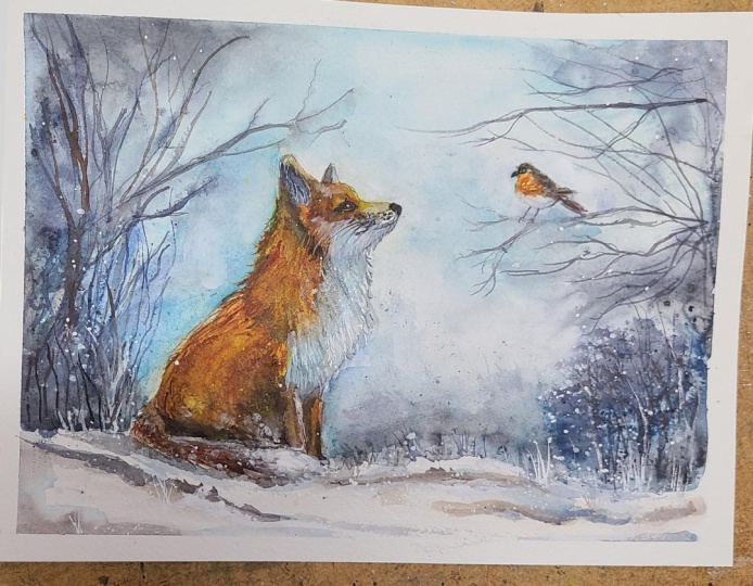
Assessing values and contrast. Lifting paint with a damp brush or magic spo: We're at a point now where we need to stand back and assess whether we've got
the right range of tonal values in our painting. Along with shape
and composition, tonal value is one of the most important
elements of a painting. It just simply refers to the lightness or
darkness of a color. But despite the simplicity
of the definition, tone can often be confused with color and quite
difficult to assess. By stripping out
the color through converting it to a
black and white image, you'll be able to
assess the range of tones much more easily. A good balance of lights, darks, and mid tones can turn a flat, lifeless painting into a much more exciting
and dynamic one. Looking at my painting, I needed to strengthen the tone, darken the tone a little bit more where the orange
fur joins the white. I've added a little bit of dark color to the
right hand side of the far ear so that that stands out against
the background. A few little muzzle marks
where his whiskers grow, and I'm just strengthening now the tone behind that near ear. You may not need to do any of these things
to your painting. It might be absolutely
fine just as it is, or you might need to make
some different changes. Another one for me
is that the color on my little Robin's red
breast has sunk a little, so I need to add a bit
more of that color. As well as darkening some of
the tones in my painting, I think I also need to recover
some of the light tones. Although you can use a brush and some water to lift off paint, I want to introduce you to
magic sponge eraser because this little tool works miraculously to remove
unwanted paint. You can use it to lighten
an area that is too dark or even strip the color
right back to white paper, depending on which color
you've used because some colors do stain the
paper more than others. Just tear a small
piece of the sponge, dip it in some clean water, then squeeze it to
just damp and rub over the unwanted paint until
the color is removed. Use a paper towel in between to blot and get the last
bit of paint off, and keep rinsing your sponge
out during use to keep it clean or even throw it away
and use a fresh piece. If you accidentally
get a blob of unwanted paint in the
middle of your painting, or you just want to lighten
the tone of an area, give it some highlights, this little piece of sponge
will become your best friend. Because it's normally sold as an abrasive
household cleaner, it does tend to rough up
the paper a little bit. So take extra care
if you're painting over the area that you've
sponged with another color. Going back to my dark tones, I felt that the area
around the tip of his bushy tail needed a
little bit more definition. So I'm just painting some of
my very dark brown around it and using the points of my brush to just rough up
that furry edge. Now, you could go
on and on forever, adding these final details
and subtle changes. But there does come a time
when you need to stand back, stop overworking it,
and leave well alone, so we'll move on to
the next section.
6. Branches, Snow & Final Highlights
: Painting branches & twigs. Use white ink, gouache, or acrylic fo: For this next stage, you
need to be a butterfly with fluttery wings and
sensible shoes because we're going
to have a lot of fun. I've protected Mr. Fox with some paper towel before
I use a water sprayer to gently spritz over
the left hand side where the branches and
twigs are going to be. Because I've used a
water sprayer to spritz the paper instead of wetting
it with a large brush, it means that
instead of the paper being wet all over now, some parts will be wet and
some parts will be dry. And the result of that
is that when you paint the branches and twigs
with your blue gray color, as I am doing here, you get these wonderful
fuzzy effects. If you're wondering about
which brush I'm using here, it's actually a Chinese one. I want the branches and
twigs to be relatively thin. But if I was to use
that tiny brush that I was using earlier, it doesn't hold a lot of paint, so I'd be continually dipping
it into my palette and not able to do these
larger sweeping strokes. Chinese brushes tend to have a larger belly which
holds more paint, but a very, very fine
point for the detail. And because the
hairs are longer, you've got a bit less control, which actually results in more expressive
sweeping strokes. I've masked my little
robin and doing exactly the same thing on the right hand
side of the paper. What I'm doing now is
quite intuitive, really. There's no set formula for it. I'm trying to create a
tangle of grasses and weeds, branches and twigs without losing all the lovely light colours that
I've got in the sky. And because they are
in the distance, and I don't want them to overshadow the fox
and the robin, I'm keeping my
strokes very thin, very simple and light. By making the far left
and far right sides of the painting much darker
than the central area, that again will help to create this vignette effect and
force the viewers eye into the center on the main focal points which
are our lovely fox and Robin. To increase the sense of
distance in the background, I'm adding a few more
branches and twigs this time in a slightly thicker
mix of the blue gray color. The paper should still be a bit damp from where I
spritz it before, but if you're a slow worker, you can always give it another
quick spritz if necessary. I need to resist
the temptation to carry on adding too many of
these branches and twigs, so let's move hurriedly over to the right hand side and add some more stronger colored
branches and twigs here. To continue painting
the branches that the little robin is set up, I need to remove my paper towel now so that I can get
to them more easily. This particular branch
does need to be in the stronger color
because it's at the same distance
that the robin is. So the tonal values should
be roughly the same. I'll just add a few more of these abstract grass
shapes growing behind the snow in the
central foreground. Now that I've added
all this dark color, I'm not really sure if I like all the darker markings
and shadows in the snow. So just as when I
use the magic sponge before to recover some of
the highlights on my fox, I'm going to do the same
with these snowy areas. So I've broken a little bit
of my magic sponge off, dipped it in some clean water, give it a good squeeze, so it's damp and
not sopping wet, and then just
rubbing over some of that color to remove
it in the foreground. And again, this might
not be something that you need to do
with your painting. Yours might be absolutely fine. It's very much a matter
of personal taste. There's a few different
options you can use to add white to a painting. For this painting, I'm using
some white ink by Dale Lowe. Especially like doctor PH
Martin's bleed proof white. That's a really dazzling white. You could just use some
cheap white acrylic. And a lot of artists like
to use white gouache. I have found, though,
with the gouache that it does dry a lot lighter, and I have to apply
it several times. The advantage of the gouache
is that it is water based, so you can reinvigorate it
and lift it if needs be. Whereas with the acrylic
paint and the ink, that's waterproof once dry. To paint the grasses
along the foreground, I'm using a very
small brush with a good point to flick up
some white grasses along it. And I think you
can see from what I've done so far is that again, helps to push that background
further into the distance. I'm also adding
some white spatter, so just flicking the paint
off my brush onto the paper. Because I'm using a small brush, I'm getting small spatters. But if you do get any
that are too big, just wipe them off with
a bit of paper towel. Now, I don't want it to look
like a raging blizzard, so less is more. I'm just adding a few of these little snowflakes here and there over the background. If any of the white
spatter is too white, you don't want it to detract
from the main focus, you can just gently dab it with your paper towel and
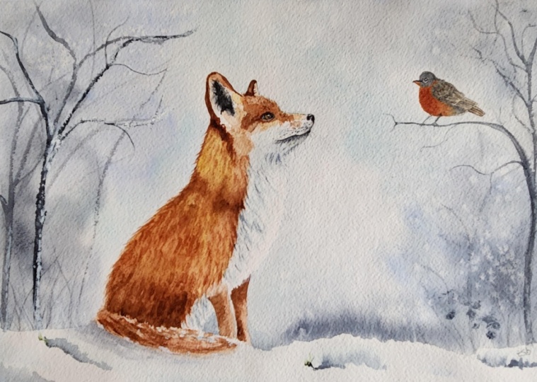
soften that color. Back to the topic
of the viewer's eye and where it will most
likely land in a painting, it will be where there is the
area of strongest contrast, particularly if it's
a black and white. In this particular painting, my blackest black and whitest
white is actually just around the fox's nose and
leading back towards his eye. That's exactly where
I want it to be. So I'm being mindful
that I don't have a stronger contrast than that anywhere else
in the painting, which I shouldn't do because
none of my branches or twigs are actually as dark and black as the fox's nose and eye. If you haven't got
enough white fur on the inside of fox's ear, you can use your white
paint to add it in now. If you didn't manage to retain that unpainted paper for
the highlight in Fox's eye, you can just add a little
tiny dot for it now. And you can do exactly
the same thing for a little Robin's eye. Although because it is a very, very tiny area, you might find that easier
with a white gelpin. All you need to do now is pop it into a mountain of frame, and you'll be amazed
how good it looks. I do hope you've enjoyed this painting and that
you've learned some tips and techniques along the
way that you can incorporate into
your own paintings. Now, don't forget to upload your own painting through the
project and resources tab. After all your hard work, I'd really love to see it, and I'll be sure to give
you some personal feedback. You can follow me on Skillshare to get to hear
about new classes. And if you could leave
me a short review, that would be really great. If you've enjoyed this class, it might encourage you to look at some of my other videos. I've got lots of lovely
subjects loaded with more tips and techniques to help you with your own
exciting art journey. In the meantime, thank you
for joining me, and I look
7. FINAL THOUGHTS: Well done on completing
the painting. We've covered quite a few
different techniques, as you've been following
alongside of me. Instead of just copying
the reference photos, we've used them in a more
loose and imaginative way. Use the wet-on-wet technique, putting wet paint on wet paper. We use the wet on dry technique, putting wet paint on dry paper, and we considered
the importance of tonal values in a
successful painting. We used a water
sprayer to sprint water and create more
texture in the branches. And we looked how we
could use white ink, paint or gouache to add
some final highlights. Now, don't forget to upload your own painting through the
project and resources tab. After all your hard work,
I'd really love to see it, and I'll be sure to give
you some personal feedback. And if you've
enjoyed this video, do have a look at my other
classes on Skillshare, which are packed
with more tips and techniques to help you
on your own art journey. If you click the follow button, you'll be able to follow me, and then you'll be the first
to know when you upload a new video or any
exciting updates. And if you could
just take a moment to leave me a short review, that also would be really great. In the meantime, thank
you for joining me, and I look forward to
seeing you next time. Happy painting. Oh
 Carrie McKenzie, creating painted visions