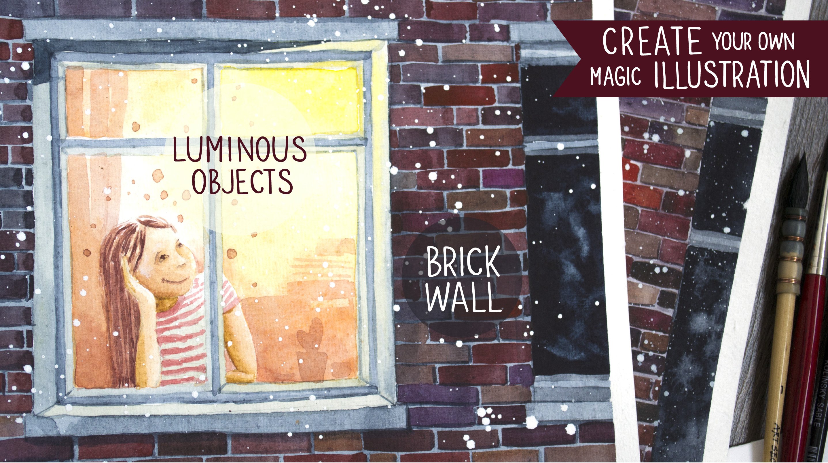
Transcripts
1. Intro: The magic of winter and
Christmas is truly timeless. In this class, we'll
explore how to take beloved traditional themes and transform them into unique
personal illustrations. We'll embrace the beauty of the white winter by working with the white
of the paper itself, letting it shine as a
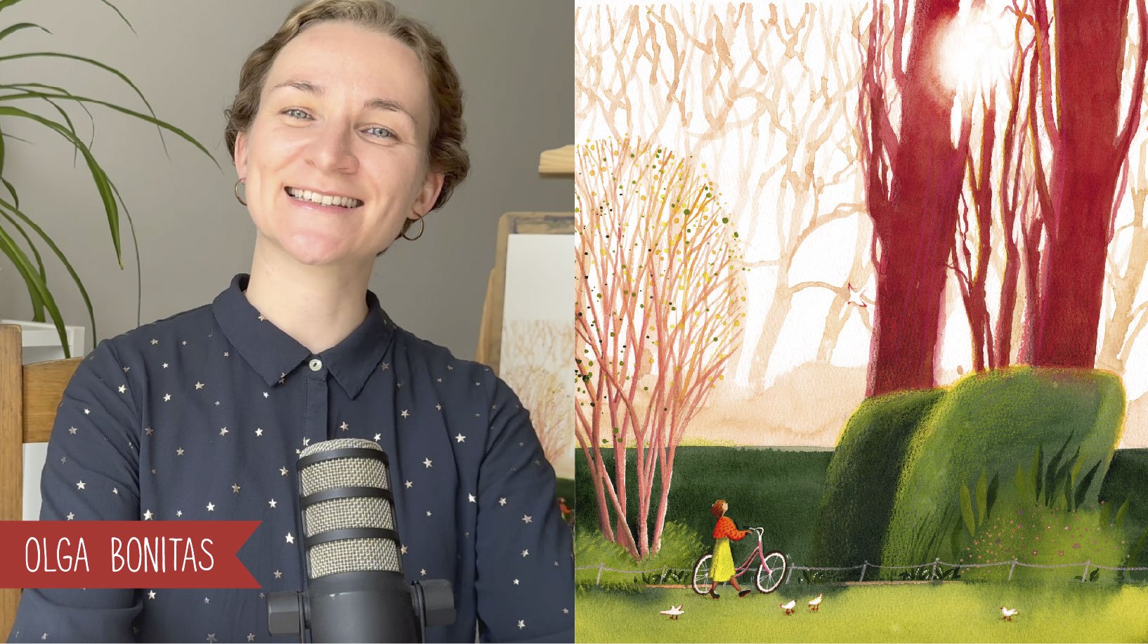
key element of our work. Hey, I'm Olgo Banitas. I've designed this class to be simple enough for
beginners while offering creative challenges for those of you who are already
confident with watercolor. Four delightful ideas
are waiting for you, each filled with charm
and inspiration. Plus, I'll share tips for
adapting and customizing them so you can create illustrations that
are truly yours. Get ready to immerse yourself in a snowy
creative adventure. Welcome to the white
winter wonderland.
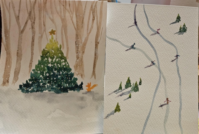
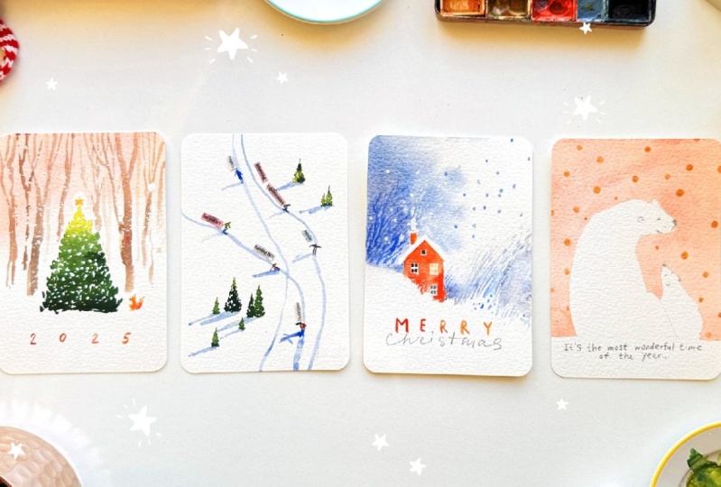
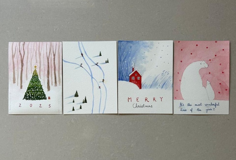
2. Christmas Tree in the Woods: For this class,
I'll be painting on these charming premade
watercolor postcards. They are such a
joy to work with. The back side has printed
lines for writing, while the front side is clean
and ready for your artwork. And look at these
rounded corners. It's such a small detail, but it adds a lovely
polished touch. Of course, if you don't have premade postcards,
that's perfectly fine. You can simply cut your watercolur paper to a
size that works for you. To begin with, let me
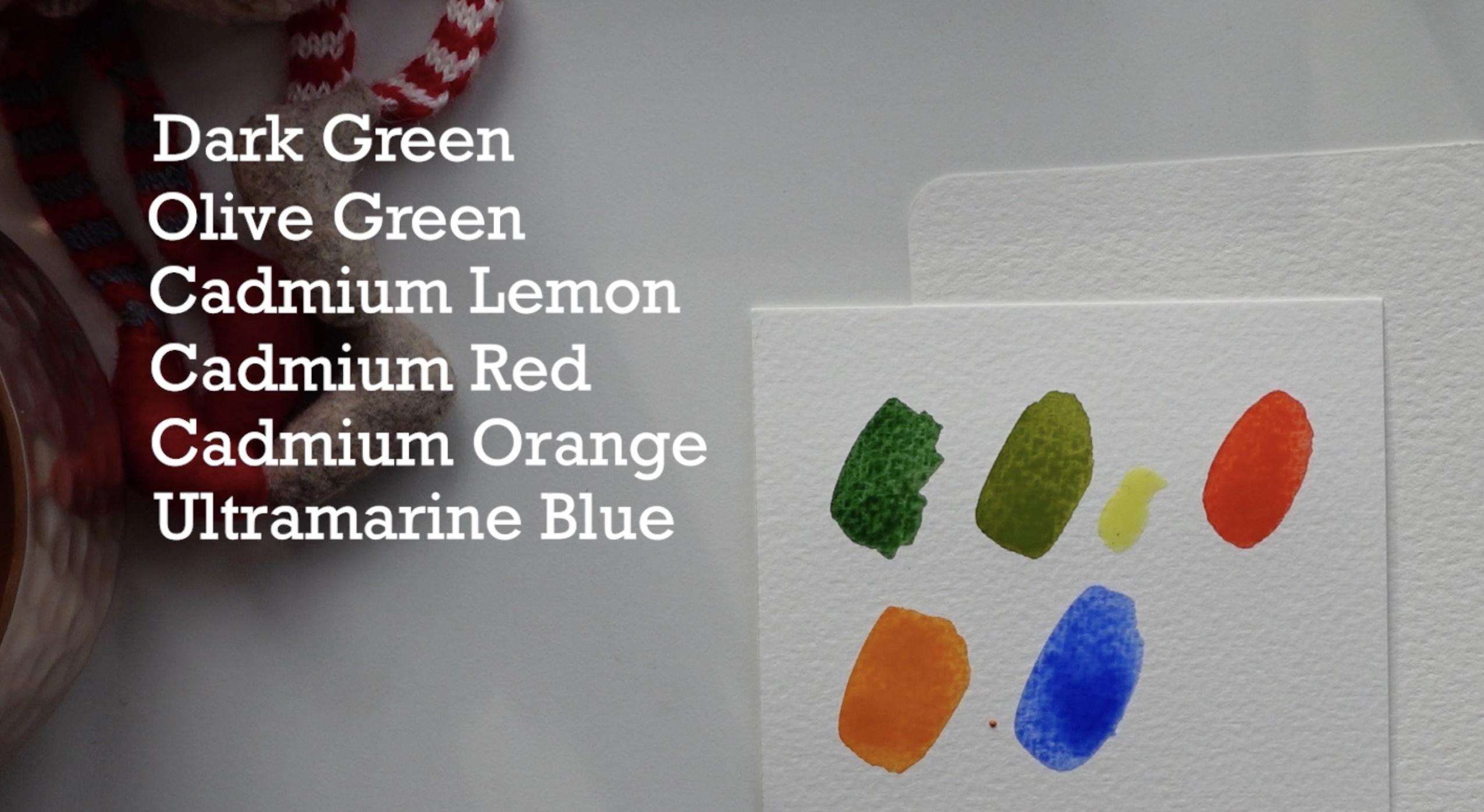
show you the colors I'll be using for all
illustration in this class. Feel free to use whatever colors you have on your palette. For this lesson, that's
absolutely okay. Here is my selection, dark green, olive green, cadmium lemon, cadmium red, cadmium orange, and
ultramarine blue. If you watched my other classes, you know, I use these
colors very often. Alright, let's dive in. When starting a small
illustration like this, it's tempting to use
a very small brush, but here is a tip. Whenever possible, try
using a bigger brush. It allows the paint to
spread more freely, making your artwork feel
loose and professional. Now I'm picking up
olive green and mixing it with cadmium lemon
to make it even warmer. Gently, I start painting
that Christmas tree. My brush is loaded with water, so the paint creates
these little drops, and that's exactly what I need. Next, I tilt the paper slightly to let the
paint flow downward. Then I pick up a more dark green and continue
shaping the tree. The warm green blends
beautifully into the ducaton. The wash isn't solid. I'm intentionally
leaving white gaps. This got represent
snow resting on the branches or light
peeking through the foliage. It makes the tree looks
airy and natural. As I work my way down, I add a touch of ultramarine to the green to create
a cooler shade. For the base of the tree, I leave it anvil to suggest
snow at the bottom. It's important to
keep the paper at an angle so the paint
can flow naturally, creating a smooth gradient
from warm to gutens. Now I'll take a
small brush and mix cadmium orange and cadmium lemon to achieve a warm
yellowish tone. This mix is light
and not too dense. I gently paint a
tiny glowing star at the top of the tree. Next, I'll prepare a highly
diluted mix of cadmium red. You'll need plenty
of water for this. Then I'm painting
the background. Make sure the paint
is very transparent, so it looks like the soft
hue of the sunset sky. I tilt the paper slightly to
let the paint flow downward, creating a smooth and
natural gradient. Carefully I'm painting
around the star, leaving the area around it white to create a
glowing effect. After that, I rinse
the pigment from my brush and gently feed
the wash into transparency. Be sure not to touch the tree, leaving a small white
area around it. This will enhane the
airy snowy effect. To finish this step, I dry my brush and use it
to absorb any excess water. And there we have it. The background is ready. Now I'll need to wait a
little while for it to dry. Once the paint has dried, I'll mix a brown tone. To do this, I combine the red on my palette
with the dark green. With bold, confident strokes, I'm painting the trees
behind the Christmas tree. They shouldn't be too dark. Remember, they are part
of the background. Don't worry about making
them look perfect. Trees come in all sorts
of whimsical shapes, so let your brush
flow naturally. Notice that all the tree are position tie on the paper
then the Christmas tree. This creates the
perspective that they're the back while the Christmas
tree is in the foreground. Some trees are slightly
lighter than others, suggesting they're farther away. Keep in mind that
with water cool, it's always better
to stop a little bit early than to overdo it. You can always add
more details later, but it's hard to take something
away almost impossible. Let's add a tiny fox here or
perhaps a little squirrel, whichever one comes
to life as we paint. When working on
something this small, it's best to trust
your imagination, letting it fill in the details and bring the character to life. Let your creativity guide you, paint something up to you here. Maybe you'd like to place
a gift under the tree, add another animal,
or even create a festive character.
Here read the trick. By adding this little one, we are also defining the
scale of the Christmas tree. If it is smaller, the tree will appear
taller and vice versa. Let's make our Christmas
tree extra festive. I'm using gold fabric paint, typically used for textile, but I love incorporating it into my illustration
for a decorative touch. Now I've protected
the area around my illustration with paper
tissues to add some snow. I'm using white gouge for this. As a final touch, let's write something
in the snow. How about 20:25? I want the numbers to feel like a continuation
of the tree. So I'll mentally extend one side of the
tree to write two, then extend the
other side to write five and place the rest
of the digits between. Outline the numbers with
paint for a bold look. If you think a brush feels
tricky, don't worry. You can use any tool you prefer, like a colored pencil or marker to make the process
easier. Mm hmm. Done. You can create this same illustration using a completely different
color palette, giving it a new vibe. Feel free to choose
your favorite colors. Whatever speaks to you. Have fun adding your
personal touch. Another idea is to paint this illustration on
the inside of the card. Here is how you can do it to create a charming
little greeting card. Once again, treat
this process like a creative adventure and enjoy yourself.
Have fun with it.
3. Outdoor Fun: Let's move on to our
next illustration. This time, we'll
create something airy, light, and full of energy, a snowy mountain slope
bathed in sunlight capturing the adventurous spirit of active winter holidays. We already have our
white background, the white paper itself. Now, all we need to do is to add a few thoughtful details to
bring the scene to life. Let's make it dynamic
and exciting. I'll start by painting
a few tiny trees here, just like in our
previous illustration, I begin with a warm green tone and then transition
to a darker shade. I'm using a larger
brush to avoid the temptation of controlling
every tiny detail too much. Let's keep it loose and leafy. The first tree is done, let's add another one next to it slightly smaller in size, and then one more. Imagine we're looking at
the scene from above, like birds soaring
high or people on a sky lift eagerly anticipating
the down the mountain. I'll add a tiny one here. Let's make them all
different sizes for variety. Now let's take
some warm green or even a touch of lemon yellow
to brighten the tea tops. Next, I'll add a few more trees in the upper part of
the illustration. Since the process is
exactly the same, I'll use the magic of editing
to save your precious time. Now let's bring our
untouched snow slope to life by adding action. I'm mixing ultramarine with just a touch of cadmium red
to calm it down slightly. Mm hmm. Perfect.
With a bold stroke, I'm painting a sky trial. Someone has carved their way
down this untouched slope. Maybe they weren't alone, but with a friend. Let's add a second trial. Don't worry about making
the lines perfect. Imperfections are
absolutely okay. And here comes a third trial. We can't forget the shadows from the trees since our slope
is bathed in sunlight. I'm sketching the shadows
lightly and loosely. The sun is shining
from over here. Just make sure the shadows
are parallel to one another. By the way, I have
a skill share class on painting white in watercolor, where one of examples
involves a step by step snowy landscape with
trees and their shadows. I'll put the link in the description if
you are interested. Notice how all the shadows
fall in the same direction. Instantly, the scene
feels sunlit and vibrant. Alright, it's time to add some people to our illustration, and this is where your
imagination can really shine. Maybe you'd like to paint a single scare enjoying the freedom of the
mountains alone. Keep it simple and schematic. Our minds will fill
in the details. I want to depict a few scales
gliding down the slope. If painting such tiny figures
feels tricky with a brush, feel free to switch
to a graphite, colored pencils or
any other tools that feels comfortable for you. You could also search for some reference photos to get a better sense
of scale poses. A quick tip make the
heads smaller than you might think a
tiny dot will do. You also might find it
helpful to start with the skis and then add
the border on top. And don't forget to add
shadows for the skies as well. It will ground them and inhale the sunny dynamic feelings. Our illustration is
almost complete. You could leave it as it is, and it would already
look wonderful. But I'd like to add a final touch to make
it truly unique. For this, we'll need a
magazine or advertising flyer on anything else similar that you don't mind
to cutting up. Look for words or phrases
that resonate with you. Words you'd like to
carry with you into the new year or share as a
wish for someone special. Once you found them, attach one word or
phrase to each skere. Let the energy and
freshness bring those intentions to you
or your loved ones. As you flip through
the magazine, you'll notice that your eyes are drawing to exactly
the words you need. In my life workshop, I often see how different
people browsing the same magazine find
completely different words, each discovering their
own personal meanings. Now simply glue the
words in place, and there we have it. Our illustration is complete.
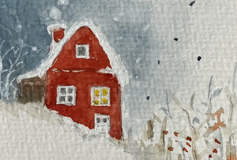
4. Silent Snowy Day in the Countryside: Our third illustration
will be all about the cozy countryside
with peaceful vibes. Let's start with a
cute little house. I'm drawing a simple classic
house just for the example, but feel free to take
it further and draw a special house that's
meaningful to you. Your family, friends or your dreams or one that represents a
place where you live. Here is a door and some steps. I'll keep it simple
and schematic, but it's up to you how
detailed you want it to be. Now let's move on. I'll paint the rest
directly with watercolor. I'm taking ultramarine and
mixing it with a touch of cadmium orange to
create a blue gray shade. Clean water is essential
for this step. Now we need to wet the entire
area around the house, everything except for
the house itself. This is why it's
important to make sure the water in your
container is clean. I'm carefully going
around the roof. All set, let's
remove excess water. I'll blow this area with the tissue to prevent
paint from running down. I need to create a soft wash
here with gentle edges. For this, it's important
that the paint is fluid with plenty of water. Depending on the
quality of your paper, the paint will
spread differently. Try to keep the edges
where the roof is clear, while the other edges of the
color stain should be soft. Let the wash reach
about halfway the page, leaving the rest of
the space white. Now let's remove
any excess water and paint at the
top of the paper. I'm doing this with a
squeezed out brush, which helps create
a soft gradient. Next, I'll soften the
bottom edge just a bit. Mm hmm. Great. Now, let's
focus on the house. Choose the color that
suits your style. Look, I'm going to leave part of the house at
the bottom white. Let's imagine that a lot
of snow has built up, creating a snow drift. So the house is pecking
out from behind it. This eval edge adds a sense of realism
to the illustration. It could be some
greenery covered in snow or something else in
the front of the house. Now continuing the imaginary
line of the snow drift, I'm feeling the space
around the house. Maybe there is some greenery in the garden or
something like that. I'll make sure the upper
edge is soft and blended. The paint should be very, very soft and transparent. Here, I'm imagining
tall grasses or bushes. I don't know what exactly. The goal is to create the feeling that some
sort of vegetation there. Now, I'm take ultramarine and add some snow
to my illustration. Oops, I forgot to
paint the chimney. Let's fix it. Next,
let's add the windows. I'm using a mix of
rich ultramarine and deep cadmium bread to create
a dark, brownish tone. I'll take a moment
to add a few details here to create a smooth flow
along this line of snow. Now for the windows, I'm leaving a white
frame untouched. It is very tiny detail. So if it's tricky, feel free to use a graphite pencil or any other
tool that works for you. I love the combination
of graphite and watercolor and use it
very often in my work. In this window, let's
have the light on. I'll use a soft warm yellow. Imagine the people inside
the house doing about the day tending the fireplace
to make it cozy and warm. While outside, the snow
is quietly falling. Look here, this is a perfect
place to write something. To center the word perfectly, I write the first letter on one side and the last letter
on the opposite side, keeping them equally
spaced from the edges. Then I add the middle letter and filling the remaining
space with the other letters. Valla now outline the
letters with bright paint. Let's wait for the paint
to dry completely, and finally add
the last touches. Very delicate
details. If you want, you can use the colored
pencil for this. By the way, I have
another skill share class on winter illustrations. It features three more
cozy water colo scenes perfect for Christmas
cards or illustrations. I'll include the link in
the class description. Clean any pencil marks with razor and we're done.
Do you feel it? The fresh air, a snowy day, and the delicious
countryside smell? I love all of that so much.
5. Cute Mommy Bear with Little One: The fourth and the
final illustration in this class will be
all about love. It will be a big mummy bear, a beautiful white polar bear. Here is your nose. And her ear. She's sitting with her
back turned to us, her head gently turned
towards her little one, and the little one is
looking up to her. You can choose any
other animals you like white rabbits, owls, maybe cats, tiny ears, little eyes and nose. Keep the silhouette as
simple as possible, ensure the animals are
easily recognizable. Now let's mix a very diluted
solution of cadmium red. Remember the background wash from the very first
illustration. We'll aim for a similar
level of transparency here. Using the soft and
transparent tone, I'm painting the
entire background, leaving the best untouched. Because this
illustration requires careful work around the itches, it's essential to keep the animal cleats as simple
and clean as possible, just to make the
painting easier. How to make a background
smooth and even. First of all, prepare
enough paint in advance. Make sure you have
plenty of paint mixed to the right consistency on your
palette before you start. Secondly, work quickly
to avoid the itch dry before you finish the
wash and use quality paper. The higher the percentage
of cotton in your paper, the easier it will be to achieve a perfect wash. Let's
leave it to dry. Look how soft and
delicate it turned out. Now I'll erase the pencil lines, but not everywhere only in places where they
aren't essential. Of course, I'll keep
the bears faces intact. Let's add some
decorative touches. For this, any gold writing
materials will do. I'm using gold gouache. Actually, it doesn't
have to be gold. White, pink, or orange would
work beautifully as well. Choose whatever
feels right for you. I'm painting a
polka dot pattern. Keep it slightly
random and irregular. It's all about the
charming imperfection. Done, the dots are
shining in the light. I hope you can see it
in the video as I do. And here is the perfect place to write something
kind and uplifting. Look at it. The sun came
out while I was painting. I think that's a good sign. I hope this mood and atmosphere come
through in the video. Please let me know if it does. It means so much to me.
6. Final Thoughts: Well, let's take a look
at what we've created. It seems we've
captured the magic of white winter white Christmas. I truly hope at least one
of these illustrations has inspired you to paint it for yourself or for
someone you love. And mind, if you are looking for even more snowy
winter inspiration, you're warmly invited
to my other class where you'll find three
beautiful ideas to spark your creativity. And please share your
work, your illustration, your unique style and creative
vision as a glass project. It is extremely precious for me to see your work,
feedback, reviews. I do my best to make this atmosphere
to share my knowledge, to encourage you to create. And if you do and
you feel the same, you feel connection,
you create something. Please share. And, of course, it's very cool to get support
from your fellow students. Oh, it's time to say goodbye. I wish you merry Christmas and a wonderful year full
of self freedom, self expression,
creativity, and fun. Bye.
 Olga Bonitas, Watercolour girl