Transcripts
1. Intro: Hi there! My name is Claire, and today we're
making this Whimsical Winter Illustration in Procreate. This is the kind of
class that feels like a cozy creative break
where we slow down, draw fun wintery things, and build a tiny collection
that's uniquely yours. In this class, animator
Giulia Martinelli and I joined forces to create a
unique winter collection, an illustrated scene
filled with warmth, whimsy, and
storytelling potential. Once your artwork
here is complete, you can jump into
Giulia's class where you'll animate your project
in Procreate dreams, bringing it to life
and turning it into a magical animated piece. In this class, we'll
explore how to create charming objects
using simple shapes and a limited color palette. As our design consists of
lots of small objects, you can pick and choose
what you want to add to your bookshelf
from the lessons. You can also add your
own objects or change the theme to another
season or holiday. This is a beginner
friendly project, and I'll explain how to
add things step by step. After you finish your
illustration here, head to the Procreate Dreams class
where Giulia will show you how to animate your
favorite objects in a few simple steps. It's honestly magical to
see your drawings move, and her process makes
it surprisingly simple. If you fancy jumping straight
into the animation part, head over to the Procreate
Dreams class where you could download my finished
Procreate illustration, so you can start
animating right away. We've also included a
Q&A video at the end where both of us answer your top questions
about illustration, animation, brushes, color, and general
Procreate wizardry. I can't wait to see your
winter collection and watch your artwork come to
life. Let's get started.
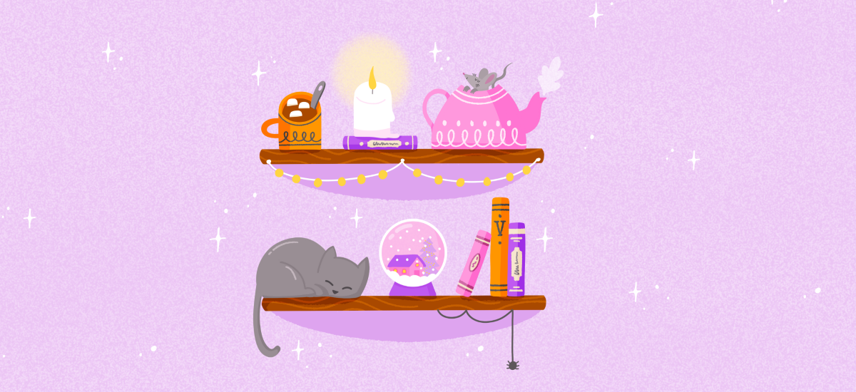
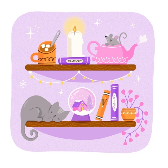
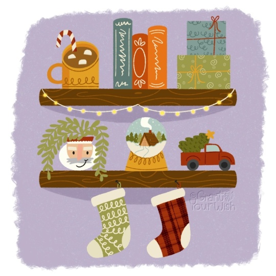
2. Project & Resources: For your class project, we're going to make this cozy bookshelf illustration together. It's a collection of whimsical, smaller objects that you
can pick and choose from. You can decide to
not do everything, make the smaller, pick from the lessons what
you want to create. You can also decide to
add your own objects here that match the theme of
winter and whimsical, perhaps something like
mittens, a scarf, more candles, a mug
with tea or coffee, a lantern or something
else with light, bottles with potions
if you want to add something whimsical
and much more. This illustration kind
of works like a puzzle, and you can add your
own pieces to it. Keep in mind that we're
going to add movements to these objects later on in Procreate dreams in
Julia's class after. So keep it simple and
separate your objects, make sure they all have their
own space on the bookshelf. In the resources, you'll find a color palette for
Procreate that you can use. Remember that it's
about the process, not the finished result. So you can share your sketches and your process in
your student project. You don't need a
finished illustration. You want to skip the
illustration part and go straight into
making the animation, go to Julia's class. You can download my design
there in the resources, and you can follow along
and procreate dreams. Julia's class is
in a description and in the notes on
the menu bar as well. In the next lesson, we're going
to start with our sketch.
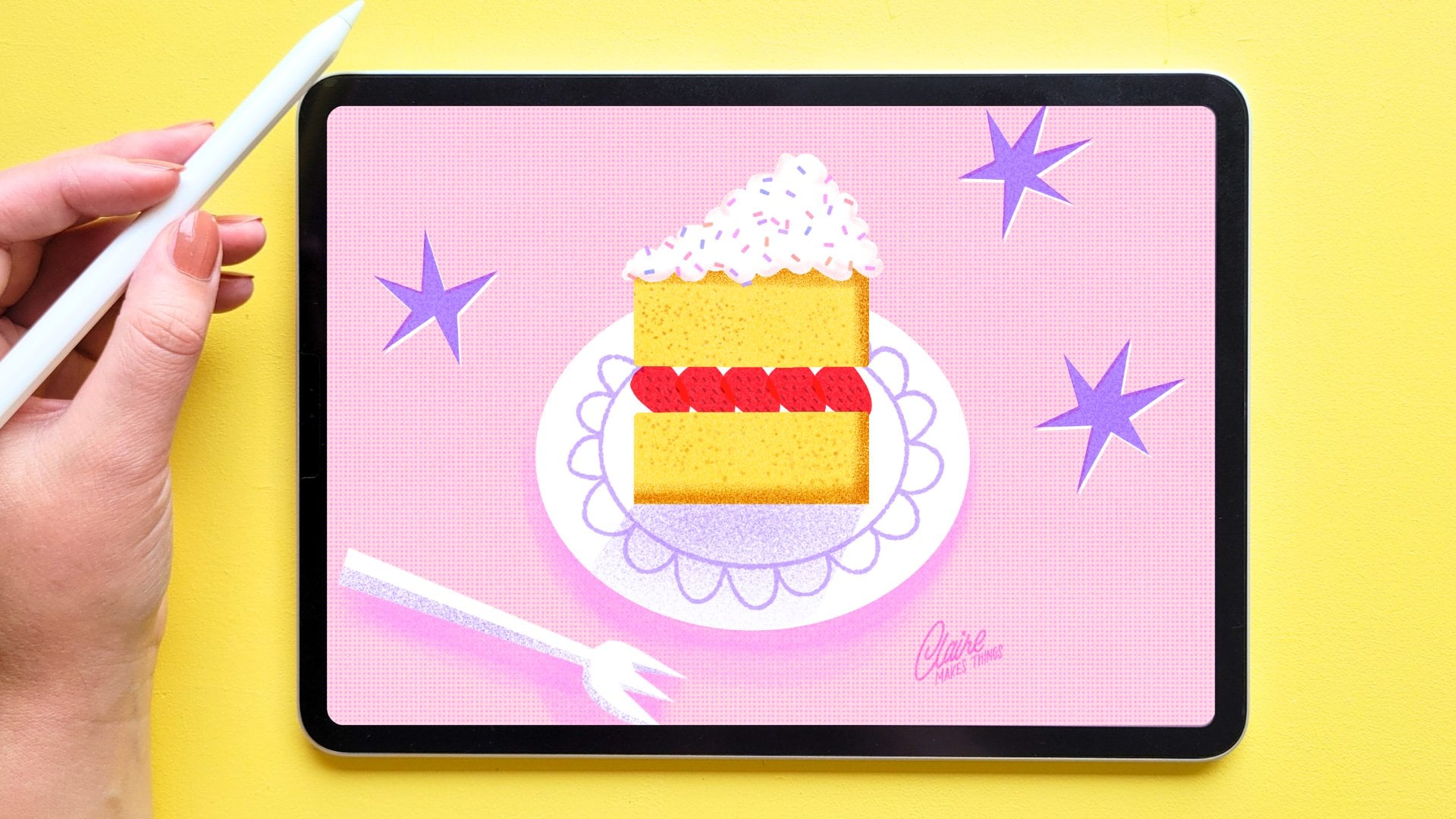
3. Sketch: Let's start with a new canvas. We're going to create
a square illustration, so 3,000 by 3,000 pixels. And if you downloaded
the color palette, this will shove up
in your palettes, either at the top or at the
bottom if you can't find it. And for the brushes,
we're just using two basic ones in the
Procreate library. This is from the 5.4 update. The first one is in the
basics, the JGR brush. This is just a
simple Mdline brush. We're going to use this mainly
for most of our coloring. To add a bit of texture, I found this Billy button
brush in the comics tab, and that has a nice
rougher texture, which would be good for a
couple of details as well. To be able to quickly
find your brushes back, you can pin those to
your reasons tab. We're going to start
with our sketch, and I'm just using
this sketch brush from the pencils tab. What we need firstly is
our two bookshelves. To make this easier, we're going to turn on a drawing guide. To be able to draw
those bookshelves as perfectly straight lines, we're going to turn on
drawing assist on our layer. Then when you draw
straight lines, you're actually following
the drawing guide. This is really
helpful. Just going to draw this first one
as a rectangle. Make sure to turn off
drawing assist as well, and you can use the select
menu to change it a bit. Let's duplicate this layer, and then I'm going to move that down. That's it. Now we've got our
two bookshelves. We can turn off
the drawing guide. Now we can start sketching
our objects on the shelf. I'm going to use something
brighter, this pink. I'm going to focus
on six main objects. I'm making sure they all have their own space
on the bookshelf. As I mentioned, make
sure that nothing is overlapping and everything
gets its own space. Let's start at the top. We're going to add a mug, so you can make that
circle a little bit bigger and that will allow us to show
what's inside the mug. And then let's add
a spoon inside and some marshmallows that will be floating in the
hot chocolate. You can change this as well for something like tea or coffee, but I think the marshmallows
would look really cute. And next up, something with light would be nice here.
I'm thinking a candle. I just to make it a
bit more interesting, you can place the candle on
top of a book, for example. With these objects,
we're thinking of size as well as
how to place them, how they look good together, and just to make the candle
a bit more interesting, adding something like a book, another color makes it look
a bit better, I think. Next up, let's add a
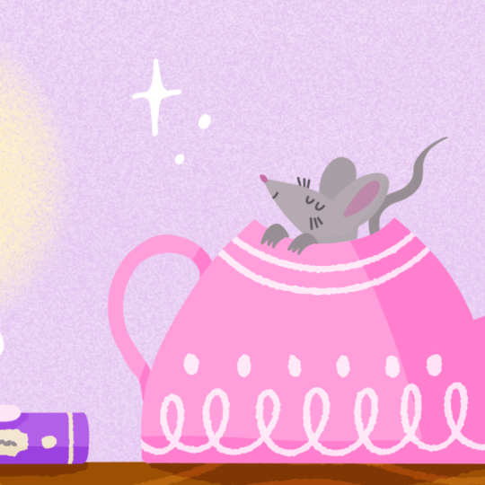
teapot and this can be a bit bigger so you can make this take up a bit more space. F. And by giving it all these curves and
making it kind of decorative, it really feels old
and nostalgic and I'm thinking of these old teapots with lots of decoration on them. And what could be really
fun here is to maybe add, let's say, a mouse
inside the teapot. So maybe with the paws sticking out and
then a tail as well, just to give a bit more life. That's the first shelf done. Let's go to the second one, and this is a bit
more complicated, but I would love
to add a cat here. I'm not very good
at drawing cats. I would love to see your
results in the student project, but I'm just going
to give it a go. It doesn't have
to be complicated and it's even easier when this cat is sleeping and I don't have to think too
much about the anatomy, it's basic just a big oval. Oh. Next up, to kind of go with the
winter cozy theme. Let's find a way
to add some snow. And we can do that by
adding a snow globe. So we can add a little house
and a tree inside of it. And then just some snowflakes. And lastly, it is a bookshelf, after all, so let's
add a couple of books. And you can add a couple
of details on the cover, maybe some lines and letters. I think what we need here
is a little bit more light. I'm thinking of these nice little Christmas lights
that we can hang up. And as we've got a little bit
more space here underneath, let's add a spider as well. Lastly, you can move your objects around
here a little bit, if you want to give a bit more
space or move them around. You can scale things
up and down a bit. This is our sketch. In
the next few lessons, we're going to draw
all of our objects. Let's start with
the bookshelves. Oh
4. Bookshelves: Let's start with our background
and then our bookshelves. Let's put our sketch on top
and then on a new layer, let's select our lightest
purple from the color palette. Then let's use our basic
brush, the Jakar brush. Instead of just filling the
whole canvas with our purple, draw a frame around
our bookshelves. This will make everything
feel a bit more cozy, which is what we're going for. This is completely optional, but I like to add a bit
of a noise texture to the background and
that makes it feel a bit more nostalgic
and it adds to the atmosphere of this cozy
whindgal illustration. Let's add a clipping
mask on top. With white, I like to
use a noise brush, but the new Procreate library actually doesn't have
any good noise brushes. What we can do is just
go back to your library. When you see all your libraries, just scroll down and then
the search bar appears. We can use this to find a
noise brush that we want. As you can see, there
is actually one in the classic library, which
is perfect for this. Change the size a little bit, we're just going to fill
this clipping mask layer. And then we can take
down the opacity a bit. Now you have a bit of a brighter purple and a nice texture on top
of your background. Let's continue to
our bookshelves. We're going to use this brown and then let's go back
to our Jakar brush. To make this a
straight bookshelf, just draw a line and
hold your Apple pencil down and then Procreate will make a
straight line for you. We can fill this and then duplicate it and
now we've got two. Let's merge these layers and
add a clipping mask on top. We'll use our textured
Billy button brush for this and try to recreate the grains of wood on top in our
lighter brown. Et's make this a
bit more subtle. So let's lower the opacity. And when you're finished, we can merge those layers. And lastly, let's give these bookshelves a
little bit of shading. So let's add a new layer
underneath our bookshelves, and then with our
slightly darker purple and still with our
texture brush, we're going to just add
some shading underneath.
5. Mug: Now that our
bookshelves are done, let's start with
our first object. We're going to start
with this mug. Let's go back to
our jagar brush, and let's use orange for this. We're really just
simply coloring. I'm just drawing these lines
and then filling them with the color fill to
make a solid shape. Next up, we want to draw our hot chocolate and an
easy tip here is to just add a layer underneath
the mug and then set your mug
layer to a reference. This way, on the other layer, you can simply use
the color fill to fill in that hot
chocolate part. Let's use our brand for this. Here you can see
you've got a perfect shape on a separate layer. Next up, let's add a
spoon as well in gray. Oh, yeah, and don't forget to turn off your
reference layer. Um, and let's also draw
marshmallows and white. Make sure that
they don't overlap and they all have enough space. Later on in Julia's class
with Procreate dreams, you'll learn how to make
these marshmallows float, which is super cute. Just adding a bit
of shading here. And lastly, to break
up that orange, let's add a bit of decoration
with our texture brush. Let's use a clipping
mask for this. A For some shading, we're going to use
a blending mode. Add a layer on top
of your mug to a clipping mask and set the
blending mode to overlay. This will make sure that if
we simply color in black, the color that we're drawing on is just a little
bit more intense. Here we can see the orange will turn into a more
saturated orange. We don't want it to
be quite as intense, so I'm just bringing
down the opacity. Now we can add some subtle
shading and you can use the opacity to make this as intense or as
light as you want to. Now we finished our mug, we're just going to select all of these layers to swipe to the right and turn
them into a group. This will keep all of
our layers organized.
6. Candle: Um. Let's draw our candle, and we're going to
use white for this. So I'm just creating
a simple shape first, and then just add a couple
of melted parts as well. We'll also add this
flame in yellow. I Then maybe behind it, we can add a bit of light maybe
a glow behind the candle, the noise brush we use for the background would
be perfect for this. It should still be
in your reasons in the classic library or use the search
function to find it. With this off white, we
can create a little glow. Perhaps it's not quite
enough contrast. So let's try something else. We'll use this,
duplicate that layer, and then turn that bottom layer to alpha lock and
fill it with white, and then turn that
top layer to Alpha lock as well and
fill it with yellow, and then just lower
the opacity a bit. And now it is just a little bit more
noticeable on that clo, so we can merge
those two layers. We'll use our pink
to just add a bit of shading on our candle. And we're keeping
it really simple, so that's it for the candle. As I mentioned in a sketch, just to make this a
bit more interesting, let's add a book underneath and that's why we can
add some more color. We can use our bright
purple for this. And we can add some details on top with our texture brush. Perhaps an off white. And some scribbles in gray. Lastly, we'll also add a bit
of shading to this book, just like we did with the mug. So merge your book layers, add a new layer on top, set it to clipping mask, and set the blending
mode to overlay. You can turn on the
opacity of this. And then with black, just cover half of that layer. And here you can see
with that blending mode, you get some shading
on top of all of those layers, not
just the purple.
7. Teapot: And and next up, let's draw our teapot. We're going to make this pink, so we've got a little bit of each color on the
first bookshelf. So lines first, and then
let's fill those shapes. Well, add some simple
steam here as well, so you can just use
white for this. And just like with the mug, we're going to add some
decoration on this teapot with our texture brush on a clipping mask on
top of our teapot. And I'm keeping
it really simple. You can make something
similar to the mug, so it kind of matches like these little dots
as well as an addition. The white is a bit intense, so you can bring
down the opacity and then merge those layers. The teapot is pretty easy, so the only thing that's left to do is to
add our shading, add a layer on top,
clipping mask, and then with our
basic brush in black, we're going to add
some shading again. As the teapot is
close to the candle, you can make that shading pretty intense because it gives
off a lot of light. That means the shading will
be more intense as well. Let's continue and
draw our mouse. Let's actually make it
a little bit lighter. And then I'm drawing
that ear behind it on a separate
layer and making this a bit darker so you can see the difference so you
can separate those. I'm not too happy with
the shape of this. I'm actually changing
it a little bit. And again, I'm not great
at drawing animals, but I would love to
see your results in the student project for
this mouse, to be honest. And then let's make
the tail a bit darker. Add that on a
separate layer. Okay. And a pause as well. And just some subtle shading. Well, let's see how that looks. Let's add some color
into this ear. And I think that's our
mouse done, as well. The only thing
that's missing from this first bookshelf
is our fairy lights. So that's really simple.
We can just use white. And then with yellow, just add these small dots,
and those are our lights. You can add those to
another group as well. And that's our first
shelf completely done.
8. Share your Work!: I would love to see what
you've created so far. Remember that you don't need a finished result to share something in
the student project. So perhaps you could share
your process, how it's going, some sketches or inspiration.
Everything is welcome. And remember that if you have
any questions or doubts, you can leave those in
your student project as well or in a discussions post. In the next few
lessons, we're going to continue with our
second bookshelf, but feel free to take a break or catch up on what
we've been doing so far. If you want something to
listen to, at the very end, there's a Q&A that I'm
doing with Julia and we're answering some questions and talking about Procreate
and Procreate tips. That might be useful.
Don't forget to share your process in the
student projects and see you in the next lesson.
9. Cat: Um. Let's draw Arquette in gray and we'll start with the outlines as always
and then fill in that shape. We're going to add some
subtle shading to this. Let's make a new layer
and turn out to clipping mask and I'm going to use
a multiply blending mode. Then with that same gray
in a multiply mode, we can add some shading to the sides and to
the back leg as well. And then we can add
some details on lines. Let's do that on
another layer on a clipping mask as well,
and multiply again. Let's add that
with some texture. Lastly, in our darker gray, let's add the nose
and eyes as well. Perhaps do that on separately or I forgot to do
that for some reason. With a slightly lighter
version of our light gray, you can add some lighter spots as well because it's quite
a lot of gray right now. Lastly, thinking about the animation
part of this already, the movement that
could be added here is maybe the blinking of the eyes. What we could do already is maybe draw the
eyes separately when they're open
and this will make it much easier later
on to animate this. Bring no the opacity and
then on a separate layer, let's draw the eyes
and the top of the eyes are exactly where
the closed eyes are. Just make sure that
they're in the same place. And behind the black layer, you can add a bit of white, so that will be the white
part of the eyes. And that's it for the cats. You can turn this
into a group as well.
10. Snowglobe: Now, for our snow globe, let's start with the outside, the crystal. We'll
make that in white. Let's change the size of
this, make this a bit bigger. If you draw a circle and
then hold your Apple pencil, Procreate will open up the quick shape menu for you and then you
could turn this into a perfect circle and
even use the nodes to make slight changes
to this shape as well. Et's add some snow to this. We want to give this
a background as well. Even though this snow
globe is transparent, we do want to make
sure that it looks a little different
than the background. Let's make a new layer
underneath our white. Then as we've used this before, turn that white layer
into a reference layer, and then on that other layer, let's select maybe
our light pink, see how that looks, and
then color fill that layer. And you've got a perfect circle. When you're done, you can turn off the reference layer again. Most importantly, here
is to draw our snow. Let's do that on a
separate layer, of course. You can simply create these dots by tapping your Apple pencil. When that's done, you can
deselect that for now, so we can focus on the
inside of our snow globe. We've got a tree and a house here and there are
quite a lot of layers, so we have to make clever use of the limited color
palette that we have. We'll start with that tree
and make that a light purple. Feel free to change up the colors here
if you want to. I tried to find a balance between the pinks and the
purples that we have. You can darken that
pink a little bit to use it as some shading. Then perhaps as a little detail, we could add some
lights in the tree. You can just create these circles the
same way that you did the snow by just tapping and you can
create these little dots. For another slightly
darker shade of pink, you can use the
multiply blending mode. And it's quite intense, so I'm just lowering
the opacity here. So. I think the background could use a bit of
subtle shading. And then a little highlight on top just to show that
this is a crystal, a glass like glossy surface. Lastly, we need a base. Let's actually make this purple. So it's not too bright, this shouldn't be the focus. And just a bit of
shading as well. That's our snow globe done.
11. Books: And before we start
drawing our books, let's create our spider first. We'll use our medium gray and you can make this a
bit more complicated, add a spider web, for example, but I'm just keeping it
simple by drawing this line. Then the spider itself, I'm actually adding
on another layer and this will make animating
later a little bit easier. That's it really simple. Just add this to a
little group and done. And now for our books, we've got three books here, so we can use our
three main colors. So that's orange,
purple and pink. Let's start with our orange. And then on another
layer, our purple book. And a third layer,
our pink book. And now we can add some
details to the spines. If you're feeling confident, you can just work
on Alpha lock and add your details right on top of the books or use
a clipping mask. For this orange, let's stick
to our medium or dark gray, just like we did with the mug. You have the same
color combination. Let's use our texture brush. Then on top of the purple, let's use our off white. And then with some gray
scribbles on the spine. For our pink, we can use
that slightly darker pink perhaps. Let's
see how that looks. Just like with our
other objects, let's use our overlay
technique to add shading. Add your clipping mask on top, set it to overlay,
then with black, add your shading to one side of the book, chop it in half. The shading for those books
are all essentially the same. You can just duplicate that
layer and add it on top of the other books as well and
then just move it slightly. The shading here doesn't
have to be realistic. It's more about breaking
up those bigger colors, giving it some depth, and making it feel a bit more cozy by making
it look like there's a lot of light coming
from that candle and adding some
shading like this, it makes a huge difference
in your illustration. And that's it. And then you can merge that shading layer when
you're finished with it. Let's add a bit more of that off white into that pink
book, actually. And then we can merge that
blending mode there as well. And now for creating our group, we can group it together with our other book to keep
things organized. So I'm just moving
those to the bottom. And done.
12. Finishing Touches: Now we have a few
more details to add. Firstly, I think it'd be nice
to add a bit more shading on the bookshelf underneath
all of our objects. Let's add a layer on top of the bookshelf and set it to
the overlay blending mode. With black and our
texture brush, we just add some shading
underneath everything. And then just lower the opacity. We can do the same
for our candle. So that would actually be
on top of our purple book, set it to clipping mask overlay and add a bit of
shading there too. O. When you see all the objects, everything together, it's also easier to see what colors might feel a bit off or something needs a bit more
contrast or less. For example, I think in the snow globe, I
think that base, even though we use
our light purple, I think we could change that
to something a bit darker. Then I think the
cat actually has a bit too much
contrast to my liking. I'm just removing some of
these heavier darker lines. Then I'm making the eyes a
little bit softer as well. Now, I was confident when I was drawing this and merged
everything for no reason. You can just put a
layer of gray on top if you have the
same problem and then playing with the opacity to make the nose and the
eyes a bit lighter. Then, of course, you want to do the same thing
for the open eyes, make those a little
bit lighter as well. As a small detail to
finish off this piece, it would be nice to add some filler elements
around our bookshelves. You can use White for
this and then just add some sparkles and dots. And this already
makes you feel also a bit festive and wintery and cozy. And that is it. This is our whimsical
winter Illustration done. Don't forget to
share your result in your student project. I am there to give you feedback if you want
to as well, always. The next lesson is a
little Q&A I've done with Julia and we'll talk a bit about how this
project started, inspiration, tips for
Procreate and much more. If you want to go straight into animating this piece
in Procreate Dreams, you can go to Julia's class. You can find the link
in the description. And
13. Q&A with Giulia: Inspiration, Procreate Tips & Animation: Hi, everyone. This is a Q&A
that I'm doing with Giulia, and we're going to talk a bit about how this collaboration started and answer questions about Procreate,
Procreate dreams. And any other
questions you do have, please post them in
the discussion post, as well, because we'll
be there answering. Let's get started. What
inspired us to work on this winter whimsical object illustration in the first place? I would say, first of all, we met through Skillshare
because we're both teaching. You are doing illustration,
I'm doing animation. And I think over the years, now it's been a
couple of years now, we've been collaborating
quite a lot, but mainly, let's say, Off screen, offscreen, collaborating for promoting or for taking each other's classes. I enjoyed this very much. I think that's my opinion, everything started when I
took one of your classes, which I did actually two illustrations because
I really loved it. It was with puns and I created one illustration was called Lift your Spirits
and another one with a vampire that says,
You are fantastic. Again, because I
really love the class, I made two of them
in that period, end of 2023 and Procreate
Dreams was launching. Of course, as an animator, I was super excited
about this new tool and I downloaded
it straight away. Then one of the key features
of Procreate Dreams is to be able to communicate
super smoothly with Procreate and to drag
and drop the project. Yeah. I just made these two very cool illustrations I
was super proud of, and I thought, let's try it out. And so the moment I
dragged the project that I made with your class to procreate dreams and I
started to play around. I clicked and I thought, how cool it would be
if we actually make a collaboration where
you teach how to make the illustration and I
teach how to bring into life. Yeah. Non I mean, two years now, and finally, we've done something like that. And I remember it must
have been around the same time that I found
you on Skillshare, and I took your sticker class, and I enjoyed it so much. I remember you sent me
some of your prints, your postcards, your stickers. We did some blog posts together. We recorded a long
podcast episode together about illustration
and animation. And I feel like it just kind
of snowballed from there. And, I mean, yeah, finally making it happen so. Yeah, I completely
forgot about the part. It's true because we already
been talking about how these two worlds collide and
how and when they can meet. I love this topic actually, because I find it super
interesting from the outside, from people not in the
industry, it's the same, you draw soillustration,
animation, cartoon, comics, the same. But, of course, it's not. And there are
subtle differences. In a way. So other aspects are completely almost opposite. Yeah. Yeah, I had this
also like here locally, I've been having
a co working with different creatives with
different backgrounds, and sometimes we really
sit down like, Oh, it's so crazy how some
things are so similar. So others are
completely different. Like one, I think we
also mentioned in the podcast we had on YouTube. Is how the animation world is very collaborative
and it's usually a team effort where
everybody has to need the other person in order
to make the film happen. Wild Illustration is
such a solo performance, and very often, there is the author
Illustrator and no need for extra
help or collaborator. Yeah, that's so true. And I never thought about that before when you mentioned
this that animation, because it is so
big, it requires so much that it needs
to be a team effort. This is just a given.
And illustration, it's a given to just work alone. And when it is a collaboration, it really people go out of their way to be able to
make that a collaboration. It's definitely not a given. So and, yeah, we talked
about this before. There should be
more community and skills overlapping and
people using both. And I think that's
the whole point with Procreate and Procreate dreams. That's why it exists, right? Like, we have to be
able to use both and put our skills and
our projects together. So yeah, it just made sense. And also, because so connected to the project we've done with this collaboration, it's very nice to bring
to life an illustration. And as we saw, it doesn't
have to be or as we will see, it doesn't have to be
complex animation in order to bring to
life a still image. And I believe everybody could
do it doesn't have to be a professional
animator in order to put a little bit of life and movement into an illustration. Yeah, and it's
really fun as well. So the way we did it, right, is we came up with
this concept together. I did the illustration, and
then handed it over to you, and then you did
the animation part. And then for me, to
see that animation later on is it was like magical. Like, I saw the thing that I
made moving, which is crazy. As someone who wants to learn
animation but, you know, finds it difficult from an illustration
background a little bit, or I'm still learning. That was, like, magical to see. Yeah, I really love
this process and we had a little bit
of back and forth in the beginning Brainstorming, what could move,
how could it move. I also to receive
your project and see how you imagine things, for example, putting the
sparkles here and there, and I was like, this could move. I was starting as soon as I
go through the the layers, I start thinking,
what can I move? What can I bring to life. Of course, in our class, we are encouraging students
to do the whole thing, to do the illustration and
then bring it to life, which I think is very fun and makes you create
your little world. But I also want to
give a hint or, like, suggestion that it
would be even cool if they would want to collaborate
with each other and, you know, start to animate
someone else drawing. It's also super fun, I think. It really brings two
people's skills together. Yeah. I think that it's always nice to open up
for collaboration, see how things evolve. Like, you would never make
the same project or have the same result without letting some other people
in and different inputs. Yeah, what was our inspiration for this particular style of illustration like this topic? I mean, we obviously
talked about this project and what we
really wanted to create. The most important
thing was something cozy and whimsical, but also lots of little
objects that are little animate that could
be little animations, right, little movements together rather than one big piece. But what I realized it really reminded me of and what I also love is hidden object books
and hidden object games. This is something that if you grew up in the
90s in the 2000, you might notice from books. These books that are a
bit like Wars Waldo, but you have to find objects
in a cabinet and stuff. Do you know what I mean?
I know the name in German because here it's very
common. It's Women build. Women builder, yes,
that's what it is, yeah. I don't know if there is
an English translation, but it's very common here. Kids kids to really have this whole picture full of details and it's not
quite like that, but I think the
whimsical feel of all those little
objects together in a piece, that's, I think, kind of the vibe that we
were trying to go for, and I really like that, especially with I think
the animation and all the little movements
add to that whimsical feel. It really feels like a sort building the small little
universe, I guess. Yeah, I agree. I
also thought it was a perfect project to test this, bringing bringing an
illustration to life with very small and subtle
and delicate movements. Mm hm. That's, I
think the best way. Like, first of all, is very
friendly for beginners. So there is no need to crazy animation
skills or movements. A not so much planning because
they are very small loops. And secondly, I also
thought it's perfect for social media and
for sharing it online. It doesn't require, it's
not a full animation that requires sound design
or it's just like a Jiff or, like, a subtle
animated illustration. Especially for a beginner
and animation like me, those little
movements are easier to understand. A big movement. I wouldn't even know
where to start with this, because they're all
different type of movements, small ones, it's much easier to understand where
to start, I guess. Yeah, y, and it's
definitely also easier to break down while
doing the animation, if it's a short
loop or short yeah, uh animation, you don't need, you know, so many
breakdowns and key poses. You just plan those two, 3 seconds and I like the fact that this could
be scaled as you said, it could be even more complex, but even more even
more little movements. But yeah, I thought
it was a nice snack to kind of let you think
of all the possibilities. Yeah. And I also like
how you try to build it in a way that there are different levels of difficulty
in the illustrations, and I did the same with
my class so that there are easier animations
or easier elements and then harder and harder if
students feel like they want to test something a little out of the comfort
zone or a little harder. Yeah. Yeah, what I
like is that even if, let's say you only
try one thing, so maybe the easiest one would be like the lights
or the spider, for example, you still
have a full design. Like, everything is still
done with a tiny movement, and you still have a complete illustration with
animation, you know? Exactly. I think that's also
the great part of having all these little elements that yeah, you don't
need all of them. Even one or two could work. How did we decide on
this color palette? Because this is something
we really did together. We had a sketch first,
and then I really struggled with color
because I started off like, Well, this is kind of
a cozy winter feel. So I was like, Well,
blue, 'cause it's winter. And they just didn't
work. Like, I tried a couple of
different versions, and then you gave
me some feedback, and we kind of found, I think, a palette that now works better. But the blue just felt
like really cold. And I think that's a
good to keep in mind if you are going for a certain
theme, for example, a season, you don't
always have to stick to those specific colors that you associate
with the season, but rather go for something
slightly different. You can still the
theme through color, but in a different way, I guess. So instead of going with, for example, blue
and a lot of white, you can create a
lot of warmth and still convey winter,
for example. Yeah. And it's also staying away from cliches and it's more, I think, as more impact, I feel like, first of all, very common to struggle
with colors for me, and it's fine, also telling students to
go back and forth and change your mind and
try different ones. And in this case, particularly, I think you were not
convinced in the beginning. And in my opinion, what I told you was we needed more contrast and
something more like poppy. And the final palette you
found is perfect, I think, because with this orange
that I mentioned before, and the purple really
works so well together. And I think for me, at least, working with three main colors
usually works well because three is enough to create
enough contrast and you have, you know, something
warm, something cold or a neutral color, and then, you know, a
pop color, one of those. Yeah, I agree. And it's also my rule kind of to have
a minimal palette. I always tend to create a minimal palette in which
I have a pop of color, something dark because I need for details and
something neutral, as you mentioned,
always very important. Yeah. That is not
everything bright, but also that you have
something a little more subtle, as you did with this
cream or white. In. Exactly. Yeah,
yeah do you need to be good at drawing to start
illustrating in Procreate? I mean, it seems
kind of obvious, like a rhetorical question, but it's something
that I think a lot of people struggle with
because they're like, I'm not good enough
for doing this. It seems too complicated. But I mean, it's actually
pretty easy, right? Like Procreate, just like
Procreate Dreams has so many great tools and
there's so much help. I think that's also why we
chose a project like this. It's not a full one piece
that's really complicated. You can decide with the
objects what you want to make. And if you actually isolate all of those objects,
they're really simple. It looks more complicated because you put
them all together, but they're all just really small little
things that you can add your personal touch to and you can make it as complicated
as you want to. I think this is valid for every technique,
not just procreate. First of all, one
step at a time, it always breaking down the bigger obstacle makes
things easier for sure. Anybody can also decide maybe, I don't know how
to draw a mouse, you can let it out or maybe
draw something else instead. Actually, the mouse
is a good example because it's the mouse and a cat that I really struggle
with because I'm terrible at drawing animals.
I just don't do it. But because it's part of a larger piece and there's more objects involved,
you can kind of hide it. So even if there's
one object where like, I'm not very good at this, but you can just try and, you know, the focus isn't
on just that piece. It's not like on
the mouse alone. I wanted to say,
and then practicing makes you more confident and will make you better and better at drawing mice
or anything else. Exactly. Yeah. Yeah,
this really ties into what you were just saying
about making it your own. You can really
easily do that with color as well. Yeah, I agree. The color palette
helps a lot to make the world looks like
one piece, right? In my opinion,
it's also a matter of textures and brushes. If you use the same kind of textures everywhere
in the piece, it really puts things together, and all the elements belong
together, right? Yeah. Yeah, yeah, yeah. That
really does help, especially because there's
so many objects involved, just sticking to maybe one or two textures, and that's it. Like, that's more than enough, but that does really help, yeah, just to have something a bit of a rougher texture or a noise brush or something
that ties it all together. And I find it quite helpful. I love using textures, but they do get lost
in all my brush. With the 5.4 Procreate update, it's easy to search
for those brushes, which I also did with finding
a certain noise brush. At least you can find them back. And that makes it
a bit easier to stick to one texture or find that one thing that
you're looking for. The last thing about making it cohesive, I always do this. I add those little dots or
stars around the piece, just to kind of
fill up the canvas, but it also helps to create
a bit of atmosphere. In this case, more like
a whimsical wintry feel. And so there, little
stars are perfect for it. And they just kind of if you
put them around your piece, it's kind of like you're
building a frame. Initially, I didn't have a
mind for those to be animated. But then you did this
little sparkles. It's just so beautiful. And now I want to
go back and, like, memorize the process because
I love that so much. I want to use that
in the future more. Nice. Yeah, I'm happy
that you liked it. And also because you mentioned
it's really like a frame, I think, it's a matter of composition and really
balance it in illustration. But it's fun now that you were saying this and the students, they will see it in
the other class. It's the same in animation. When I animated those sparkles, I had to spread those animations in the timeline
so that there is always one happening in
a different place so that there is never
an empty moment, right? Of course. It's very similar
and connected to that. Like in illustration, the
illustrator tries to balance the steel image and the animator tries
to balance the time. So I had to kind of shift this
loop in different moments. So there was always something
going on in the sparkles. It really adds to
the whimsical feel. I really, really like that. Also, a couple of
tips to keep in mind are to save your brushes. I usually say this when there's a lot of
brushes involved, just because when
brushes get lost, you might want to go
back to something, and, like, your texture
might be different. You want to make sure
that you save those. Luckily, in Procreate, you can just tap pin them
to your reasons. And that will keep your brushes. But if you're using loads, you can also, copy them,
make a new library, which is really handy
in the 5.4 update. You just duplicate them, make a library for your project, or even saving them in a
layer, like, whatever works. In this case, we only use three brushes and two
that you really need. So the JGR, one, which is just like a
basic monoline brush, and the Billy button,
I think it's called. So that one is the
one with the texture. So that one is really
important to keep because there's no other brush that has that specific texture. So it's important to
keep that in mind. In the beginning, I
just really wanted to add a noise texture
to the background, just so it doesn't feel so flat. And I knew there was a
noise brush somewhere, which is actually in
the classic library. So you can just go
to library search then search noise, and
it will show up for you. It was actually, it's a
default procue brush, but I also have a bunch of noise brushes save that I made, and I made a bunch of
duplicates and just left them like noise brush
one, two, three. And when you use the
search function, everything shows up,
which is very handy. Super useful for people who are maybe not super organized, and they can find
their stuff back. Easy to lose brushes. Yeah, it can be hard
to stay organized. And the thing is, if you want
to be able to, for example, change your colors
later or, like, import your work into
Procreate dreams, you need separate layers. It's just hard to keep track of everything and
make sure you're organized. So it's just important
to keep in mind, keep as much as
possible separate and that will make it
easier to make changes. For me, that was really handy. Well, for us in this project, that was really handy because we were changing the colors
up a bit as well, and then using
stuff like clipping masks instead of drawing on top of each other
and then merge them later if you want to if you're not going
to make changes. It's keeping things open
for adjustments, for edits. Yeah, exactly. When setting
up the illustration, we were very organized, kept in mind that, you know, we have separate layers
for everything. But what is, in your
opinion, a beginner mistake, something to avoid when setting
up your Procreate file, especially if you want
to animate it later. So this is a little bit
of a common almost a joke in the animation world
when you have to animate something coming
from an illustrator. Not everybody knows
how to do it or how to um to prepare a
file for someone else. And first of all, I want to say, it's not just about
animation or illustration. Whenever you collaborate with someone and you exchange files, it's very useful
to rename layers. Yeah. Imagine if you would have to collaborate with
another illustrator and they send you this
project with 200 layers, and they're all called Layer
one layer two layer three. Happens. In order to find
the one layer you need, you have to switch on
and off everything. So the very first organize
the layers in a clear way, maybe also with groups
and rename everything. And this is
particularly useful and important in this
case in Procreate, because the moment we
dragon drop the project, the tracks will automatically rename with the
name of the layer. Of course, you can rename things in the procreate
dreams as well, but it's much easier to
do it in advance and reorganize the project before. And secondly, the second part is the actual
division of layers. So Another common
mistake is, for example, to not have a
complete illustration behind the elements. Mm hm. Let's say we have the
teapot and the mouse, but you just did
the illustration in a way that the moment you turn off the mouse or you
move it, behind the mouse, there is no
background, let's say, maybe you see how the brush strokes end and
there is something missing. This is also very common and Illustrator
is good to think, what do I want to move? You could even test
it. I like to do it. In the Procrit file, you can just switch off the layer or even move it
and drag it around and see, here, this will move this
way. Is it possible? Yeah. In this way, you as an illustrator, but
also as an animator later, you can figure out
if you created the conditions or the
structure in order to move it. Another thing is are the elements in the right
or in the right position? If I want the mouse to move underneath or behind
the teapot, of course, the layer of the
mouse has to be below so that it can hide the animations very important
if we want to move it. The moment we dug it
down, it disappears. So, yeah, those kind of things. And I think in order to
think as an animator, you can just literally try in Procreate to
move those layers. So you can select the old layer and move
it around and see, can I actually make this happen? Yeah, you can kind
of, like, animate it yourself by just
moving the layer, right, and just kind of,
like, seeing how it goes. That's essentially how
Procreate dreams works, but the layer actually moves. Yes. Yeah, exactly. Yeah, I think it's a
good test to see also. Did I draw everything
behind the elements or as an animator later or
you can already do it as an illustrator if you're animating your
own illustration. If you don't need
to move something, you can just merge all those
layers so that you have less tracks or less busy
timeline in procreate dreams. For example, you gave
me all the books, let's say, I don't remember if they were all separated.
Maybe they were. It was very nice, as I said, because I appreciate the
since we are collaborating, the freedom to
decide what to do. But if I had to animate
my own illustration, I would be thinking,
I'm not going to move. Books are still, so I'm just going to merge
them all in one layer. And it's not going to move, it's there, it's in
the background, fine. I could even a one
big background. With all the things that don't
move, for example. Yeah. That's a good point. Yeah. But as I said, because
we're collaborating, it was even better
that you left. Liu gave me all the layers, and I could think, Okay,
this I need to move. I let it be a floating layer and the others that I
don't need to move, I can just merge and have a block that will
not bother me later. So back to the
naming the layers, was it okay then to actually
put stuff in groups? Because the layers
itself most of them were not named because
the groups were named. Is that still okay or is
that still confusing? I think in general, it's
okay, as you will see, and the students
will see also in my first lesson
where I go through your project and I kind of
do this thinking out loud. Some of those I had to rename. Oh, yeah. But it's fine if
you just name the group. And let's say, if you
know that the group is never going to interact
with anything else, you can just have it
a group sometimes until you sit down and start
thinking about animation, you don't realize things,
it happens to me as well. Then I start to work on
my own illustration. And then I'm like,
Oh, I forgot this. I have to go back and
add maybe something. Yeah, yeah, that's
part of the process. Yeah. I think that's it for now. If anyone has any
more questions, leave them in a
discussions post. Any questions you have, whether it's illustration or animation, whether it's related to my
class or Julia's class. We're here to answer. For the rest of our questions, we're going to talk a bit
more about animation, dreams, and you can
watch in Julia's class. For the second part of the Q&A I, we see each other there. Exactly. That way. Yeah. Yeah.
14. What's Next?: Thank you so much for joining me in making this cozy Winter illustration. You now have your
own collection of winter objects and a workflow you can use over and over again. You can turn this
theme of objects on bookshelves into multiple topics like a summer collection, a Whimsical Halloween
collection, and much more. When you're ready, head over
to Giulia's class to animate your artwork in
Procreate dreams and give your illustrations
an extra bit of magic. This class is perfect for beginners as every
object is going to have its own little
animation process and it is really easy to follow. As someone who is a total
beginner in Procreate dreams, I could follow along
really easily. Don't forget to upload
your project so we can see your winter
creations and feel free to share any questions
that you have either in your project or
in the discussions post. Both Giulia and I are on Skillshare and happy to give you feedback
whenever you need it. If you haven't seen it yet, check out our Q&A
where we answer your questions about Procreate
and about this project. Before you leave, don't
forget to leave me a review. This really helps me to make
more classes in the future. If you enjoyed this class, I think you'll enjoy
my other course, Illustrate Vintage
sardine tins. This is also a project
where you can pick and choose the objects you
want to add to your design. I would also like to recommend
some of Giulia's classes. She's really helped me to understand the world
of animation and it's been so much fun working on the projects
that she created. Thanks again for
joining my class. Don't forget to share your project and I will
see you in Giulia's class! :)
 Claire Makes Things, Illustrator | Lettering Artist