Transcripts
1. Intro: Hi, I'm Kimber Shook and I'm a digital artist and
teacher here on Skillshare. In this class, we're
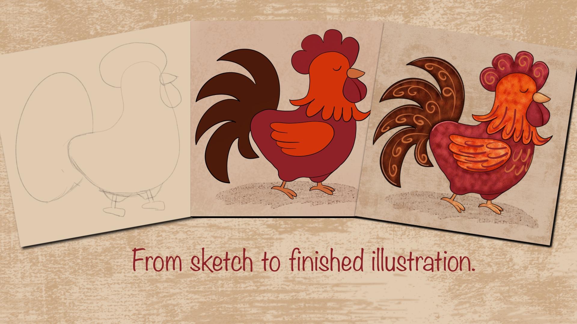
going to create a whimsical rooster digital
illustration in Procreate. I'll be using my iPad, the Procreate app,
and Apple Pencil. If you ever wanted your
artwork to feel more fun, expressive, and full of personality, this
class is for you. Whimsical art is all
about exaggeration, playful shapes, bold colors, and letting go of realism. I'll walk you through exactly how to do that in Procreate. Together, we'll
explore what makes an illustration feel
truly whimsical. How to design a rooster using
simple exaggerated shapes, how to add personality through pose, expression and linework. This class is perfect for beginners or anyone
who wants to loosen up their style and you don't
need to be great at drawing animals or anything about roosters to follow along. By the end of this
class, you'll have your own whimsical
rooster illustration and a better understanding
of how to apply whimsical style to any character or animal you create
in the future. This class, I'll
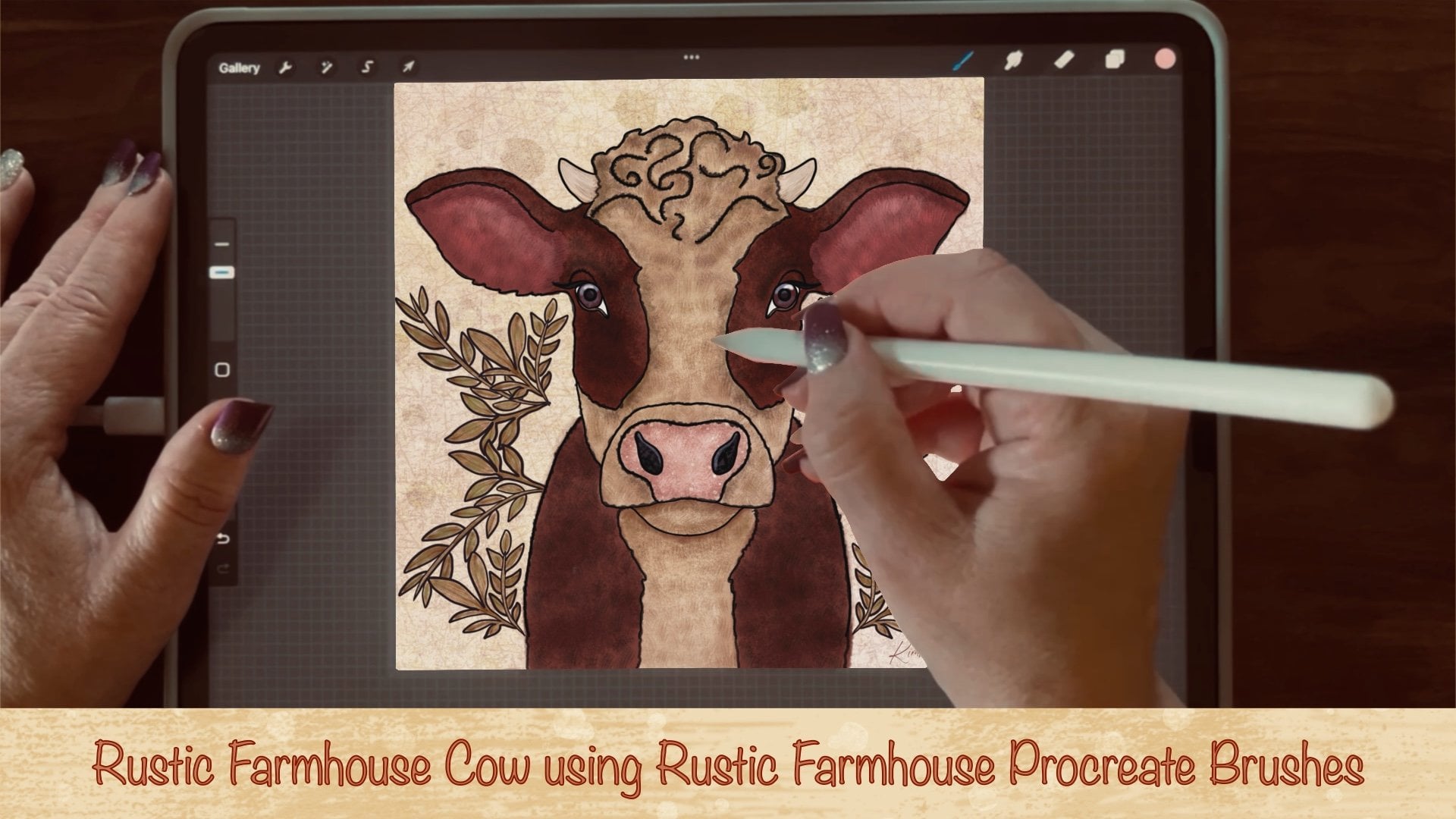
be using some of my Rustic Farmhouse
Brushes that I created and is available here on Skillshare. But
there's no worry. You don't need to
purchase the brush set. I've supplied some paper
texture as well as background grunge stamps
that you can use in place of what I'm using from my
Rustic Farmhouse Brushes set. I'll also suggest several
Procreate install brushes that you can use in place of the Rustic
Farmhouse brush set. Grab your iPad. Open the Procreate app
and let's get started.
2. Class Project: For the class
project, I would love to see the steps you create from sketch to finish under the
project section of this class. You'll find it here on the Skillshare web browser rather than the Skillshare app. In the next lesson,
we'll go over some free resources that
I supply for this class.
3. Free Resources : Be sure to download the
color palettes as well as the appropriate brush set that I provide for this class. Within the brush
set, you'll find three background grunge stamps that you can use
for the background, as well as three paper textures. You'll be able to use these when creating your whimsical
Rooster illustration. I've also included a variety of color palettes that
you can choose from. I'll be using the whimsical
rooster color palette. I've also included a whimsical
color palette that has three limited color
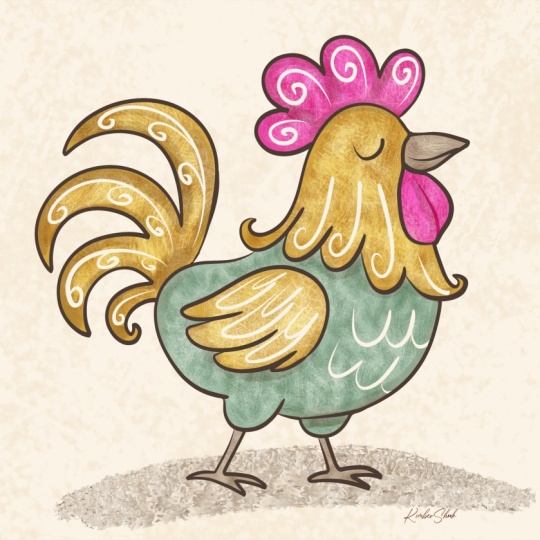
schemes that you can choose from like dusty sage, muted mustard, rose blush, warm top, creamy
linen, soft espresso. There's also golden
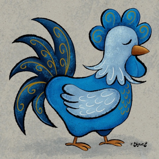
yolk, warm cream, coral comb, soft sky blue, barn brown, and charcoal ink. Or you can choose teal
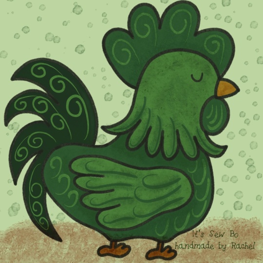
splash, poppy red, sunny lemon, lavender plum, midnight Navy, or inky black. Since whimsical charm
can be bold, bright, or pesto, I want to encourage you to use your own
color palette as well. In the next lesson,
we're going to discuss some whimsical
characteristics that you can consider for your
rooster illustration.
4. Whimsical Characteristics : What makes an
illustration whimsical? Whimsy is about playfulness,
over perfection. It feels imaginative
and charming, like something magical
right out of a storybook. Some core feelings of whimsical art could
include light hearted, expressive, imaginative, slightly exaggerated
or unrealistic. Joyful or humorous. Whimsical art doesn't
try to be correct. It tries to be delightful. Here's some things
you might want to consider when you're
creating your whimsical art. Focus on exaggerated
and playful shapes like rounded soft shapes, oversized or
undersized body parts, uneven or asymmetrical forms. Just simple silhouettes
that read quickly. Some examples could be an
oversized fluffy chest for your rooster,
tiny skinny legs, large swoopy tail feathers, a big head with a small beak or even an extra curly comb
at the top of its head. You can also think about
an expressive personality, draw some clear emotion
or an attitude, maybe a slight tilt to the head or raised
eyebrows shapes. Think proud and sassy
or sleepy and confused, overconfident farm
boss, shy but colorful. Consider if your rooster had a voice, what would
it sound like? You want to draw to
match that personality. Consider simplified details,
minimal feather detailing, pattern shapes instead of
realism, suggestive textures. For whimsical, color palette
can play an important role. Whimsical color is
emotional, not realistic. So you can consider bright
or pastel palettes, unexpected color combinations, maybe limited with just
three to six colors. High contrast for charm. Also, for whimsical, you want to consider loose,
imperfect linework. A slight wobble in your stroke, a varying line weight, a hand drawn feel, lines that taper naturally. These are some great
characteristics. Another thing you might
want to consider when braiding your whimsical
art is playful texture. Texture adds warmth and charm. You can consider grainy
shading, soft paper texture, even chalky or crayon effects. And visible brushstrokes. And last but not least, whimsical illustrations feel
like a moment from a story. So it can suggest
a narrative has context or even
minimal, feels alive. So with a rooster drawing, you could consider
a rooster sunrise or singing loudly on a fence or guarding a
coop like a knight. In the next lesson, we'll
go over a canvas setup.
5. Canvas Setup: So you want to open
your Procer app, tap the plus symbol top right, and tap this plus here. Here's where you're going
to choose your Canvas size. I'm going to use 3,600
pixels by 3,600 pixels. I'm going to stick
with the 300 DPI. This gives me a
maximum of 140 layers, which is plenty to use. First off, let's start
with a sketching pencil. I'll be using the
scratchy sketch. With Procreate
brushes, you should be able to find a great
sketching brush. Either from pens or the pencils, maybe something
in the charcoals. There's also a sketching
brush set that you can choose something
from that category like this one here, six B. In the next lesson,
we'll sketch out our rooster using simple shapes.
6. Sketch: Before we start sketching, you can grab your
own reference copy if you need one
for your rooster, or you can take a
look at this image here that I downloaded
from Unsplash. Here are some key
characteristics of a rooster that you can choose to use in your illustration. We have the comb at
the top of the head, we have the wattle, or
I like to call beard. You have eyes, a beak,
it's chest, wings, tail feathers, Neck feathers, legs, toes, and spurs. And since this is a
whimsical drawing, just remember some key features, rounded soft shapes, oversized
or undersized body parts, uneven or asymmetrical forms, like an oversized fluffy chest, tiny skinny legs, large
swoopy tail feathers, a big head with a small beak, maybe even an extra curly comb. I want to start off
with some loose shapes. Maybe something
like a kidney bean, don't worry, it
doesn't have to be perfect right now this phase. We're going to adjust it later. If you want to just boost
this up a little bit, you can go to the wand, liquefy and just push out and
adjust the shape as needed. Again, since this is
a sketching phase, this does not have to be
perfect by any means. I'm just trying to get
a loose enough shape. I just want to
adjust this and give myself more room for the
rest of the features. So I'm just doing a kind of like a half egg
shape for the comb. Let's add a rounded
triangle for the beak. We're gonna do a
little egg drop. Let's give another large
egg shape for its feathers. I just want to adjust this
just a little bit more. We're just going to add
some tiny rectangles here for its legs, and I'm going to do
a rounded triangle. Looks like a candy corn
shape for its feet. I'm just going to extend this down here for the
rest of its legs. So there's pretty much
the shape of the rooster. So I just want to tap
this, rename it sketch, and I'm going to change
that to multiply and lower the opacity so this way I can
do a more refined sketch. I just want to bring
that layer down. And here, I'm just going
to go over and add a little bit more
details to this sketch. So for its comb, I
just want to give it some little petal
like shape there. Maybe move the head
up a little bit. I do like the beak. I'm just going to round it out and extend it just a little bit. I'll whiten that beard up. Going to go down and swoop
and add some neck feathers, just to give it a little
bit more whimsical flair. Maybe I'll add a little I'll
add a little eyelid there. And all I'm doing is just
perfecting my sketchwor but still keeping it loose and imperfect. If that makes sense. We're going to add
some toes here. Because this is a
digital illustration with a whimsical flare, we're not going to focus on realistic characteristics
as much as we are some key
characteristics that make it recognizable
as a rooster. If you want to add some spurs
to the back of its legs, you can do that cause roosters
are known for its spurs. Just want to finish
this foot up. Let's add a wing. I didn't add that in my
shapes previously, but we do want to add a wing. Now we're going to work on feathers for its tail feathers. It doesn't have to be
perfect, some swoops. Maybe something
like that. I'm just going to go back and fix
this one up a little bit. That's a little too skinny. I think that looks pretty good. So I'm gonna turn the
original sketch layer off. So this way, I can
clean this layer up, fix it where I feel like it
needs just a little bit more I just wanted to
share a tip here. Silhouette testing is when
we fill our sketch with solid black to see if the
shape is strong and readable. I duplicated my sketch layer
and filled it with black, turning off all the sketch
lines just to see the shape. If I can tell this is a
rooster instantly, we're good. By doing this right
after sketching, it helps you catch
awkward proportions. It shows if shapes
overlap too much. It forces you to simplify, it strengthens exaggeration, and it prevents over
detailing too early. Silhouette testing
helps us focus on the big shape before we get
distracted by the details. Just a reminder, now would
be a great time to upload your sketch under the project
section of this class. In the next lesson,
we'll perfect our sketch and create
some linework.
7. Linework : So now we're going
to work on linework. And here's where you can choose whether you want
it to be a little bit rough of a linework,
some tapered linework. You can choose smooth. The liner brush here
has a nice tapered end. Maybe even a sketching brush
again or if you want to go to the inking that
gives you some texture. That gives you a lot of texture. Syrup is a good one. Does
give it a smooth edge, but it also gives
it a tapered edge. So I'm going to take this
sketch layer, low the opacity, go to change the blend
mode to multiply, and I'm going to add
another layer and just move this sketch layer
above everything. And I'm just going to
rename this sketch. So I'm going to
rename this linework. It's also appropriate
installed brushes in the calligraphy section. Script is a great
one to use as well. I'm going to loosely line
over my previous sketch. And it's okay if
it's a little wonky. I am going to bump
this up just to tad just to give it a little
bit more smoother lines. If you swipe the
brush to the left, you can duplicate this
so that way you can keep the original settings
of the original brush, tap this and it should go
into the brush studio, go to stabilization
and just bump up the streamline and
the stabilization. This gives you just a
little bit more control, and that may be a
little bit too much. Let's go back and just bump
the stabilization down. That looks pretty good.
This is to your own liking. Choose however it
feels natural for you. I tend to be a little
bit more shaky. And I just wanted
to smooth it out, even though I want this also to look like a hand
drawn illustration. So if you want a little bit
more of a rounded curve, you can hold it and
touch the screen, and I'll give you
that nice clean arc. I'm just gonna take
some time here to draw over my sketch. So I'm just erasing the overlap. If you tap and hold the eraser, the brush will change
to your current brush. Again, I just want to emphasize this does not have
to be perfect. I just wanted to clean this up. And here, I just want to make my toes a little
bit more rounded. Sometimes the shape doesn't come together until you get
to this linework phase. At least I've discovered that. And again, I'm just
finishing up my linework, still trying to keep
my lines loose. Sometimes when you rotate
the screen to draw, it also gives you
a better advantage of drawing some of
those curved lines. You want a nice clean
arc, you can hold. Sometimes when you can't get the shape going in one
specific direction, sometimes if you go in
the opposite direction, sometimes it all comes together. So this is all about seeing what strategy works best for you when you're drawing
your illustration. So I'm going to turn off
these sketch lighters, group them, and I'm going
to move them to the bottom. We no longer need
them right now. And I just want to
take a moment here to just erase some of these
overlapping lines. I also want to make
sure all my lines are connected because we're going to use the color drop feature, and we'll discuss that
in the next lesson. Um, just double
checking my linework. All right. Gonna add a layer and move that
down below my linework. In the next lesson, we'll add some color by using the color
drop feature in Procreate.
8. Color Drop: I just want to use
this light color here for the background, and I'm just going to
pull that color down and just fill it
the entire image. Let's start with this
orange or again, you can choose your own colors. I want to tap linework and
tap that to reference. And you want to make sure you're not on the same layer
as your linework. Choose another layer, pull down, and you want to just
adjust that threshold to where it fills in the shape, but not the entire image. Well, that looks pretty
good. I'm going to tap continue filling. I
want to tap that wing. Let's grab another color. Whoops. You don't want
to do that either. I'm going to add a layer. Now we can pull this color down and we'll just
adjust the threshold, tap, continue, fill, and tap the areas that you want
to be filled with this red. Or, again, the color
of your choosing. Gonna add another layer, and let's go to this
brown and I'm going to pull that down for
the tail feathers. And we're going to add another layer and I'm going to go for this
lighter orange, and I'm going to use
that for the beak, continue filling,
and tap the feet. So just like that,
the coloring is done. So color drop is a great, easy and quick method to
fill your illustration. So I want to do some
groundwork here, so I want to add a layer
above the background fill. And before I do anything, I need to turn the reference
layer off on the linework. Go back to that layer, and I want to choose his brown, and we can use the Procreate installed
brush from creative and we want to use
the Kingfisher. I'm just going to add some texture for the groundwork underneath his feet like this. This is just give
him some grounding, so he's not floating in the air. And next lesson, we'll add some whimsical charm by adding some swirls to
your illustration.
9. Add Swirls: So let's add a layer, and I'm going to use
this orange here. We're gonna go back
to inking and we're going to use Baskerville, and we're just going to do some swirls in different colors. I'm just going to lower
that down to about 25%. So if you need to adjust
your brush again, just to give it a more smoother, but still imperfect swirl, you can head back to the previous lesson to adjust your brush
setting, if need be. I'm just taking some time
to add these swirls. This just gives it a
little bit more character and whimsical flare. So, again, you can add whatever pattern
shape you want here. I like it. So let's
go to another layer, and we're gonna change
the color to this red. And I'm just gonna
add some swoops here for its neck feathers. And for its wing. Es So here you can just play around to see what method or what
looks right for you. I kind of like that. You can also add some more
swoops to its chest. And I just want to
clean this up so it doesn't extend
past the image. I think it's beard needs
some more definition. So I want to add a layer, change the blend
mode to multiply. I'm going to grab this red. I'm just going to
do a line down. Just to give it more dimension
unless it's a flat shape. Go to the bottom and I'm just going to add some texture
to the background. By holding your finger down, you can pull that
color from the back. I want to change the
background to multiply, and I'm going to go back to my rustic farmhouse brush set and choose a background
grunge stamp. But you can choose one of the grunge background stamps that I supply for this class. Tap it and it just gives
it some more texture. Now I want to go to the top, add a layer and I'm
going to change my color to mid range gray. I'm going to change
this to multiply, and I'm going to use one
of my paper textures from this same
appriate brush set. But I've also supplied several paper choices that
you can use for this class. I just want to lower
the opacity down. Now I want to choose
a orange here and I'm going to go with
another paper texture because I love the speckled
look and I'm just going to change that to linear burn and I'm going
to lower that down. With the paper texture
brushes that I supply, you may need to
adjust your colors, your opacity scale,
or your blend mode. If you want to take a look here, this is what I
used exactly using the paper texture
and gonge stamps, and this is what I
have the settings at just so you can
see that you can still achieve a similar look without purchasing
this brush set. I just want to lower that
down just a little bit more. Okay, we're going to add a layer and we're going to move
on to the next lesson. In the next lesson, we're
going to start adding texture.
10. Texture: In this lesson, we're
going to add texture, my favorite part
of illustrating. Texture makes digital
art feel less digital. I'm just going to
move that added layer down below my paper texture
and under my linework. I'm going to be using
the haystack brush, but you can use the polygon in appropriate
supplied brush set. I want to change my
blemo to screen. This is just gonna give
me some nice contrast, as well as some great texture. It also lightens it up. And it kind of
provides that depth, without making it realistic. Texture works best
on large flat areas. And I'm going to add the lighter texture
here to the wing. I'm going to add a layer. I want to turn off those
swirls for right now. So I'm just going
to find them here. I'm going to group them. And turn them off. Now I'm going to go
back to my layer and add some more of this
haystack texture. The harder you press, the bolder and brighter the color is. I might change that to add just to add a little
bit more brightness, and I'm just going to clean this up so it doesn't
extend past the wing. Just because it's a
different blend mode, it'll stick out more. Now I'm going to go to the head. You can take your time and play around with the blend modes. If this is too bright for you, you can change it
to screen so that way it doesn't add
as much brightness. I just want to
clean this up so it doesn't go past
the neck feathers. See how much of a
difference that makes. Gonna add a layer, change
the blend mode to screen, and I'm going to
go for this brown, and I'm going to do the same with adding texture
to the tail feathers. I'm not trying to
go with realism. I just want to go
with fun, whimsical, but also adding some really cool texture
to this illustration. I don't want to overpower
the illustration. As you can see in
the bottom right, I'm doing a similar texture, but I'm using the polygon, so you can see you
can still achieve this same overall appearance. So I want to add a layer, choose this red, and I'm
going to go over its comb. Maybe some hero on its beard. I'm gonna go for
this light orange, and I can use the same layer, and I'm just going
to lower that down just so I can do the beak here and the feet. I I want to grab these layers
and group them together. Add a layer. We're going
to add more texture. I'm going to be using
the blotchy brush. Or you can use appropriate
supplied brush. I have one mentioned
on the screen. Change my color to brown. I want to change my
blend mode to multiply. I just want to add some shadows and some more depth along
the edges of this linework. So I'm going to go around
the tail feathers like this. And you see, it just
adds a nice shadow. I like adding texture,
shadows and highlights. So I'm going to grab the red, and I'm going to do
the same thing around the back leg here and
underneath its belly. Underneath the neck feathers. Underneath the wing on its beard and above its head in the comb separating each
petal like part of the comb. I'm going to grab
the darker orange. And I'm going to go around
the neck feathers like this. This is just subtle. Just a tip. If everything is
shaded, nothing stands out. Maybe on the wing here, add some more depth. In the next lesson, we're going to add visible brushstrokes with shadows to give it a lot more depth and
whimsical flare.
11. Visual Brushstrokes with Shadows : And so I'm going to add a layer, change the blend
mode to multiply. And I want to use my distress brush in the
Rustic Farmhouse brush set, but you can use the
copperhead brush that's installed in Procreate. And I'm just going
to tap the areas, do some maybe crisscross, some Xs, do some more tapping. And this just adds
a lot more texture. And using the
multiply blend mode, it just makes it more of a deeper darker tone than
the original base color. I'm going to grab
the red and go over the body of this rooster
in the same fashion, doing some taps,
some crisscross. It doesn't have to be perfect. All I'm doing is adding some
variants in my texture. I can even use this color on the tail feathers because it's still dark because
it's in multiply mode. It's not going to
stick out as much as a full fledged bright red wood. So again, just tapping
here and there. I'm going to go back, add a layer and I'm going to
change this to screen. In the next lesson,
we're going to add visible brushstrokes again, but with highlights to give
it some contrast and charm.
12. Visual Brushstrokes with Highlights: Using the same method as I had done previously,
we'll move on. Here I'm adding textures with highlights because this
isn't a screen mode. The texture is going to be more highlighted, more
vibrant, brighter. This way, it contrasts with the background as well
as the multiplied mode. You can see several
different variants with this using the same
method, taps, crisscross. I noticed I did not do
the multiply mode there, so I will go. Let's go back and
using the same brush, I just want to add some more
shadow texture to this area. I'm going to go back
to that screen layer, and I want to use the
brown and I'm going to use this for
the tail feathers. I do want to make
sure I use the brown because it gives the
highlights more of an orange look again topping. So swipes here and there. Again, I'm not focusing
on perfection. Just want to add some depth. I'm going to grab the orange, I'm going to do the same
thing for the wing. You can go ahead and
use the same layer. It doesn't matter this way
it saves you some layers. I'm going to finish up here with the head and the neck feathers. Then I do want to grab
the lighter color for the beak and the feet. Just going to lower that down. Maybe do some across
like that for the legs. I love how this looks. I want to add some
more highlights. I'm going to go with
the lighter color here. I'm going to use the
cotton stem brush from the Rustic
Farmhouse brush set. But you can use Procreate
supply brush on the screen. I want to add a layer. I'm
going to change that to add. And all I'm going to do
is do some highlighting here on the edges like this. Again, sometimes it helps if you go a different
direction when you're drawing or when
you rotate your image. It just seems to go a
little bit smoother. I'm gonna do the neck feathers, just adding just a
tad more contrast. Same with the wing. The back end, and
the tail feathers. Maybe even the toes. And there you go. So let's go back
and add our swirls. I want to move this group up to the top but below the linework. This way, it's above
all that texture. In the next lesson, we'll discuss color checking your
whimsical rooster art.
13. Color Check: In this lesson, I
just want to show you how I do the color check, and this is just
to make sure that there is enough contrast. So I want to add a
layer to the very top and I'm going to change
the blimoe to color. Now I'm going to grab
a mid range gray, and I'm just going
to pull that down. And if this visually looks
appealing when it's all gray, that's when I know I
did a pretty good job. You can double check
if your layers need adjusted by turning
them on and off, and you can really
see the difference. And you can just turn that layer off and there you go.
Whimsical Rooster. In the next lesson, I
want to give you a thank you and express my gratitude
for watching this class.
14. Thank You: You did it. Thank you so
much from the bottom of my heart in watching this class, and I hope you enjoyed it as much as I did in creating it. If you enjoy this class, make sure you leave a review. It helps other students
find in this class as well. Just to recap, we discussed some whimsical
characteristics that you can add into your own
digital illustrations. We sketched out a rooster
using some loose shapes. We refined that sketch
and added some linework. We used the color drop
feature in Procreate, added some whimsical swirls, added a bunch of texture, as well as some visual
brushstrokes that we emphasize with some
shadows and highlights. Also give you a brief overview of the color check method that you can use if you choose to
use your own color palettes. We also use a bunch of Procreate installed brushes that you can use in your next
digital illustration. We also use some of my
favorite brushes from my Rustic Farmhouse brush
set here on Skillshare. I'll leave a link to that the
About page of this class. In case you want to
check that out further, if you'd like to continue practicing this
whimsical charm method, I've included a link to a coloring page with a
rooster sitting on a fence. You can find this link on the
About page of this class. Don't forget to add your
finished illustration to the projects and resource
section of this class. I can't wait to see
what you've done. Thank you again for
watching this class. Don't forget to hit
that follow button. So you didn't get notified
of my next class. I can't wait to
see you next time.
 Kimber Shook, Artist | Designer | Creator | Teacher