Transcripts
1. Watercolour techniques to beautiful nature landscapes: Hello and welcome to the
course watercolor techniques, to beautiful nature landscape. My name is Ava Moradi, and in this course
we will show you how to paint beautiful artworks. You will start from the basics, how to blend different colors without leaving any harsh lines. You can use any watercolor brand In this course we
will pinpoint, which colors you can
use at every stage, which suits all
watercolor sets Together we will learn do's and
don'ts of watercolor. And then we will find out
what mistakes to avoid. Let's have fun learning about
colors and how to mix them. Then you will learn how to apply the techniques you have learned
on different topics such as painting trees
and branches to get ready for the next steps
Our practices lesson will improve your
technique using white gouache or how
to create light and shadows in your
paintings and how to combine them with this course
signature techniques. When you have learned
all the main techniques, it's time to paint complete
landscapes and figures. You will learn different
techniques such as wet on wet, dry on dry, wet on dry, and how to create artworks that you're proud of. In this course, you will also learn how to paint Floral contemporary style. Also in your project, you will get access to
free additional resources, including outlines
of the painting, as well as grids, to assists you in your watercolor
learning journey. This course is for
beginners to advanced level for everyone who loves
fast medium paintings, then what are you waiting for Come and join this class and let's paint beautiful nature
landscapes together.
2. Fun watercolor warm up: Hi everyone, welcome to the very first lesson
of this course. Today we are going
to have a lot of fun with watercolor
and get ourself familiar with the color
names a little and how to mix them and how to warm
up our hands actually, before we dive into
other lessons. So as you can see,
the color that we're using is for the sky color. We're going to use cerulean blue and are applied
from the top part. As you can see, we
go on a few times, the cat my hand and
how I'm actually involved in it and
mix the colors. Now, we're going to
use an orange color. You can see, you can use any
brand of colors you have. So right now, if for instance I say a certain
name of the colors, it doesn't mean that you
have to use those to. You just can use any similar
color on your watercolors. You can use Winsor and Newton, or you can use our teaser. We do have lots of
brands out there. If you have any
questions, please do. Please do send me
the brand names. I can guide you The
what colors they have and let you know that which one is good and which
one Like, for instance, for beginners, intermediate,
or professionals, we are using the
yellow color almost, and then a little moves
towards more orange. Notice how we fade the color we apply from the dense color. Then wash the brush and
dry it a little bit. So look how I'm using the
tissue here is very important. And how I'm adding the colors. Add some orange
in-between just the earlier that you saw.
Then keep washing. The brush actually moves
out of the screen, is on washing it. And later on, I will
show it to you. How exactly you should do it, how much you have to apply
water on your brushes. But right now,
we're just getting familiar with the
colors and having fun. So this is the very first
lesson when it comes to the second and so on. Like other lessons that
we have in this course, we kinda go through every
detail step-by-step. So just get yourself
familiar and get the fear out that always
watercolor, it might be hard. Just follow up my hand woven and mix the colors
that you have. Look at the brush movement, how we are actually fading
the two colors in between. As I mentioned, you
will see a lot of these real methods in
the next tutorials. So just have fun. Mix your colors. Blue to yellow to orange. See how they mix even
if they are good. The today's purpose
is they experienced the experiment that you're
going to go through and learn how to do this stuff. So as you can see, We have started using
smaller and angled brushes. We call them dagger brushes
when it comes to watercolor. However, if you
prefer to call them dagger or actually
angled wants like it's completely
depends on you see how we are actually
mixing the colors, two of them together. This is a great practice, so you learn how to fade
two colors in between. And it'll water first. Then with cadmium red, deep hue, you can
see all the colors, names on the screen. So if I miss to tell you one of them are mentioned
one of the colors to you. They have all the colors
names on the screen. Some of them, they
have a mean matched. So if you don't have
a certain color, that's still okay,
don't worry about it. You can ask me what color
you are you can replace. For instance, you
have a certain brand, or you have a very
simple watercolor that is not unlike
from a famous brand. I'll tell you how to do it. I'll give you a trick that you get those colors that
you need very simply. So we're still failing
the colors in-between. These wash and dry the
brush is quite important, so wash it, dry it, then add the paint
onto your watercolor. Have a look, but
we do have a hint of like water and S on it. Have a look. Have you are mixing the colors. Again, wash it. Go on it again. My hand movements keep doing. This is not really
professional of paving it just for the very
first tutorial. So if you are familiar how to fade two colors or even
three colors together, you can actually skip this lesson and move
on to the next one, which is a little more. Towards from intermediate and then at the end towards
advanced level. So don't worry,
you don't have to. If you feel like this
is very simple for you, you can obviously
skip this part. However. I like
mixing colors myself. So it just, it's really warms up my hand
for what is coming actually feels like
I'm preparing myself to dive in suddenly and grew through a very nice and more advanced or
intermediate features that we can actually learn
through the next lesson. So just let's warm up our hands. Mix the colors, how to fit
the colors into each other. And also, this is another
important practice because you are experiencing different colors being faded. Like here, I like the
blue, yellow, and orange. You see that? If you like the combination. And if you don't
like the combination because you have
already experienced it, you want to read that
on your, for instance, on your model, your example that you're drawing
or painting next time? Or are you going
to say, Oh, it's pretty, is really pretty. I'm going to use it because sometimes we mix
a lot of flowers. You will learn how to do flowers with lighter colors
are darker colors. However, you might not want to make some certain
colors with each other. Again, you can see all the names of the
colors on the screen, like how we use rules
wildlife previously, and then use lemon,
orange colors. How to make them watery? Some of them becomes our
favorite colors like purple lay. This is a corner as you get
familiar with the colors. If you don't know what colors
you have on your palette, is going to be really hard to do and very good painting later. So as I mentioned, it's not just a warm-up hands. It just for you to get
familiar with your palette, to get familiar
with your colors. You're you feel more confident
what colors you have. I did, I do have a loss of actually students that
they don't want to start a certain like painting because
they are not familiar with the colors is unknown to them. So they're like,
I'm not going to start because I don't
think I can do it. It's just, you're going to learn all the techniques
in this course. You will know all the
names of the colors. You will get familiar
with how they look like, what are the colors
and how to mix them, and how to apply certain like mixed
techniques with each other. So it's just matter
of practicing. As you can see, sometimes
we use a lot of watery paint and
sometimes dense paint. It smells like more colors
with less actually water. So it's more the pigments
of the watercolor there, as you can see, for instance, now this is more dense. And then keep wiping out
your your clean brushes. After that, have a look. How left to right. I go through the colors, fade them with each other. Now, does it another
color, blue. We have used this
previously in the, when it came to the
first, I'm example. Now, I think at least a darker, one. More intense blue. It's kinda feel like indigo. Indigo is kind of my
favorite blue color, even when it comes to color
pencils or oil painting, I use this color a lot. Very useful one. How many times I
actually wash it. I never had to leave my brush without actually cleaning it up, making sure you have
enough water on it. You will really get familiar
with everything we're doing. It's just a matter of
luck. You practicing. Look how I'm mixing it with a little red slash orange color. So have a look at
my hand movements, how I'm using a much darker one. I'm mixing them. It's good. Okay. Some of the colors really don't go well
with each other. Now you can see that if you like them or you can
use them later or not. More mixing and more fading, that these two colors
perfect with each other. Like comparing to
the previous one. I can see like these colors that go well much better
with each other. Now using much darker red. And then with water, I'm just fading in-between
the lines between the colors. So we eliminate that obvious
line in-between the colors. Here. Keep washing and dry the
brush to fade the colors. Applying even more. Now, using more
dense, more colors. This is how you can add on
top of colors on top of each other to create a more
vibrant color look. The pigments further like
absolutely beautiful. I like the mixture of like
orange and red can come out really beautiful in this set, like the first one, blue, yellow and kind of mellow
orange is my favorite. And also the previous
one we just did. The combinations
are really pretty. I really look forward
to see what kind of colors that you
actually come up with. If you do this kind of
mistakes like splash water. Don't panic, just take
them off BD or tissue. So don't worry about it. As I mentioned, I like, I look forward to receiving your experience and
your practices so I can guide you better through this part of your fun practice. So we do have a lot
of lessons coming up. I hope you have already warm up. You're ready for us to go
through some techniques. And then after the techniques, you're going to start really some artworks and
how to do Atmos, like landscape and nature. So I'll see you in
the next lesson. For now. Take care and bye bye.
3. learn watercolor techniques : Hello everyone. Welcome back to another lesson
of this watercolor course. Right away, we can dive in
and use our water spray, which is my favorite tool
and like spray our paper. And right away you can
see I started using the wireless paper and how
I'm using an moving my hand. If you spray too much, as you can see, you won't be
able to shape the flower. Actually the excuse, excessive amount of water won't
let you do that. So unlike that Vin, the amount of water is enough. We can shape the
flower and we can move our brush in a
way that we like. But if the surface
gets too much breadth, we cannot do anything.
Look at the difference. The first one was too much water and the second one
was much better. The same is true about the C, drive for us as the ocean sea and drawing the sea or the sky, no matter which, if you
apply too much water, we won't be able to control
the colors on the paper. While if the water is enough, we can easily control it and even we can add
another color onto it. So look what kind of
other colors I've been using wireless as
cerulean blue hue. And also I can add another color specified to shape and color
this guy, like the clouds. As I mentioned, if
you spray too much, it will get messy. So why did I just
dive in straight away onto this technique? Because it's a very
important technique. Water use, pray, you use a lot of spray and then dive
into land is technique. If you need to control the
excessive amount of water. The second important point is to consider is that, for example, if you have some flaws, do not try to rob them with the brush because it gets dirty. In this case, you should
just leave that part and go to another place or just leave it for a few minutes
until it dries out of my hand. Just leave it too
much right now, whatever you do is kind
of get like muddy. I have to say the array. So leave it alone. Stop touching it or some
reason for some time. Now another point to
consider is that when you want to use some color
just after each other, such as wireless or black, or brown after yellow, which are dark colors
on lighter colors, you should consider cleaning your brush completely
since a yellow color is, is likely to get dairy. For example, if you
are supposed to apply wireless after yellow, we should be careful and
it is better to keep a distance even while
washing the brush. After that, we fade the
colors by tapping movement. Look at the colors
I'm using right now. Use cadmium yellow, pale, and then use another
color just to show you the difference between
them and how to fade these two color
into each other. This next point is about
grabbing the brush. Although we should grab
and hold it like this, we never stick our
hands to their paper. Like this, wild growing seed, Django sky or anything else. We never do this. So we do it using tapping
movements with our hands. No matter what it is, it can be sky or
flyover, anything. Now using Prussian blue, one of my favorite ones. So as I was mentioning, our hand is we have to put, are lifted certain
way that you can see. We should mention the point that everyone in every occupation
has their own guest. Sheriff had imagined
a baker using hand gestures like these
are form of the breadths. Or even when you use
a computer, every, all of us, we have a
certain hand, gets shares. So you have to realize
it's OK, how to do it? It's very personal. You can do like this
is like a bread. When you do it, you tap the breadth when
you're cooking it. However, if you've got typing the computer,
it can be different. Everyone has a certain cache. It just, you have to really get familiar with brush
and how to move it. That's why I'm doing it really fast for you guys
to get familiar. When you want to do
watercolor painter, you should not your Move brush
like a certain movement, but the way I'm actually
showing it to you, and you should hold your
hand completely freely. Just like as I mentioned, a baker maybe in
different directions. And you need to practice this cashiers and I'm
teaching you right now. So fear is, you're actually
NME watercolor painting. If you're scared
and act like layer, you're scared or your artboards kind of become a little messy. But if you move
your hand freely, it's going to be a
complete success. So now let's move to warm colors and the spray water on the surface right
now, keep a spring. The cat, how I'm
using lots of spray. Imagine this line. We're going to start with
this warm red, violet color. Pigment, which is a
very beautiful color than app and we're going
to apply cerulean blue. This is quiet. I know
it's very beginner, but it's really good. You get yourself familiar how to actually to do this
and mix the colors, especially this is like a filler App Galaxy sky that
we're doing like the Aurora. But we are trying to mix different colors together
and practice here. So make sure you do the same. Experienced the colors,
whatever you have, it doesn't have to
be this certain purple or that certain purple. It just whatever I just
want you to get the fear of not having enough tools or
lack colors away from you, get that away from
you like yourself. I don't have it so
I cannot paint. Obviously, you can just replace even another pigment
and other color. The paper's still wet. I'm using my brushes,
quite important. We're going to keep
using indigo and violet. Look how I'm doing. I've put the tissue next to
me and I keep going around. Asked, have fun,
just do it fast. Don't slow yourself down. You need to have fun when
you're doing watercolor. That's when you actually
fill the real technique. I know that a lot of
instructors do it slowly, but I prefer to do it
quite fast for you. So you really get yourself
familiar with this. The techniques of watercolor. Now, we did the light ones first and brought the
darker ones on it. Look happier doing this. The ad, the surface of
the paper is still wet. These parts are
half a aesthetical, I have to say the main
point is about Sky, which are going to be
telling you about. So if you don't want to
like draw them in blue, just do them in any color
you need to have to have, such as sky that we need
to let it dry completely. If you want to add more. Let's try to create
a galaxy out of it. Now, if you want to draw, you don't have time to wait. Maybe you can use hairdryer. This is another technique. Don't bait. If you have a small hairdryer, just use it on dry. I look at my hand how and from what distance I'm
holding it and how much I'm holding on each
area to do this. In the next few terriers
whenever you are getting into intermediate and actually applied the Real Techniques. And not just having fun. I'm going to actually teach you how to do this with
different colors, with different,
different models. I have to say as well. Have a look at how the
color is quite different. It was much, it was brighter. Now after the
strike is so faded. This is another part
of our watercolor. You need to add a lot
of layers to get help, to bring out that
color brightness, to get that y brand
color that you need to. Because watercolors, they
fade away really quickly. And you need much
more layers in order to achieve the
results you want to. Now we're going to use
Gouache, this white gouache. So you will see a lot of these white gouache luck
technique that I'm going to use. I know that this squash
can have lots of pronounciation like
British and American, like my apology, I hope it's the ones that you
actually say it as well. However, we will use this a lot in different
techniques that you're saying. This is only creating stars. And you can read a little water. And also some pigments from
the white goulash creates this and just splash it
like how you sought. You don't have to do
it too much in order to create a messy surface. Now this part is only for, for you guys to understand how a really dark area kinda
looks like when we do. So, you can use a
darker like indigo, really purple colors and create those small details
on your paintings. I'm just doing it
really quickly. However, this is just for beginner levels for you to
understand how to use brush. So just try to follow and understand the tip
of your brush to understand how to
create and trees, like how I'm doing, like how I'm holding the
brush is quite important. First this way, and then
turn it around this way. The tip of the
brush, I'm using it. We're going to go through a lot of different entry texture. So wait for it and you'll see how to create
more realistic style. So we're almost at the
end of this lesson. We just learned
how to have a lot of mixing the techniques
that we know. Next tutorial is also
more techniques. So while you're, you have
your papers and brush ready, let's click and go to the
next tutorial and practice.
4. Do’s and Don’ts of watercolor: Hello everyone and welcome
back to another tutorial. Are we ready to draw a
lot of different style of skies and see what are
the do's and don'ts. So now it's time to
go through that. However, you have, you can see a tree
example on this one. We will get to that later. But now, first, let's go through different sky drawing and the sky painting here
with our watercolor. Any brand you have
would be fine. I'm going to take you
step-by-step how to do this. While you saw I put some tape on the paper so you
won't get confused. Look at the brushes
that I'm going to use. When it comes to square drawing, skies usually drawn
with an angle like dagger brush or natural. When they have
natural hair brushes, you can have all the
brands that I'm using and the examples and then names on your
downloadable resources, depending on the model and the type of artworks
you are doing. So you are going to use a lot of angled or daggers brushes. So you can see how
they look like. The tip of the brush
is a little like. It feels. It's been we have
different types of sky today. We are, which are usually
drawn with, as I mentioned, with angled brushes
depending on the model. And now we're going to put
some water on the beat, our spray, my favorite ones on the paper with yellow color. We put some yellow color on your palette
and wash the brush completely and dried it because the paper
already have whiteness. The cat, my hand
mobile employees and go through the first layer of the drawing or painting. Yellow career should not get
dirty at the very beginning. So be careful what
colors you're using. The cat, how I'm
holding the brush, how much I'm putting
in the angles, I'm actually moving the brush towards every time you
use a darker color, like a cobalt blue
hue that we're using. You can see the color gets dry, so you can actually spread
the colors as well. Either spray on your
watercolor or the palate. So as I mentioned, you make
sure you clean the brush, wash it, and dry it, and then move onto your paper. This is an important,
important technique, guys at a very, the
first tutorial, which was very fun. I told you how to do mix
and match and have fun. Now we are actually implementing that technique even
though it was one, but now it's a real
technique is sky technique. We are going through
a lot of my students, they have a lot of
problems with this guy. So now it's time to
get rid of that fear. If the paper gets dry spray, not too much, just the amount that gives me
on the screen today. As I get a lot of discretion, which color should use. Darker ones are lighter ones. I started with lighter ones and slowly brought the
darker ones onto it. So we need, as you can see, this spray water techniques, quite important to know. Sometimes you need the
paper completely bit, sometimes a little bit, and sometimes completely dry
depending on your model. Says like wet on wet, wet on dry and dry on dry. We're done with the
first example that was our promised dues wants. Now we're going to go
through don't want how not to mix two
colors with each other. So we had a perfect color
combination at the beginning. Now we're going to go
through another testing. However, what I'm using is
correct technique, however, over how they are being combined with each
other is incorrect. So have a look at
my hand movement. It is important to do this. Wash the brush
completely, then dry it. If you don't do it,
That's a don't. Now, we are having
another color. And how much I'm going to add until now is it's kind of okay, but now it's not okay anymore. So you really have to
understand your colors like how the previous example
we did perfectly. Now it's too much. This is a technique should
be darker from lighter, but it's coming
out like too much. And it's like going onto the blue surface a
little Ray too much. If you look at the
previous example, you see how moderate views. And now we didn't put too much like I have to say,
emphasize on it. So again, I'm trying to
create that dense feeling. However, the placement
of them is incorrect. See how I'm doing it than just mixing it as being
too much now the overlay. So overdoing it,
sometimes it's not good. You have to actually
make it like less color or not to put too much effort
on it is actually better. Have a, you need to
know the techniques like how we did that
first this guy. And go ahead, go back
and pause the screen, watch it for your time
and applied again. Just my hands moves way too
fast for some students. So it's good that you
actually pause the screen, watch it a few times,
and then move on. Now, let's go through
this effort example. Again. Spray the paper. We're going to use light blue
or sort of cerulean blue. I have to say, Look at my hand movements from the
top part of the paper. Slowly tap the paper. Look how we are doing it. This is a beautiful technique that we're going to use a lot. Wet, then again, wet-on-wet. And the tapping technique, which is very important. The way I actually use the display and how fast I use
my hand is very important, is just not I'm trying to move fast is a technique
because watercolor, you need to be fast
in order to create the textures and good techniques that
you'll want to create. Just get use of it. Gets your eyes like feel like used to moving
a little fast. It's a fun practice as well. Unlike other techniques like, like pencil, colored
pencil or oil painting, this is quite a very
enjoyable technique that you can move fast and get a
really great results if you know all the techniques. So you can see how
plucky combination different colors
with the shoulder. You can create a very
certain beautiful sky. Have a look at my
hand movements, how I'm actually
placing the brush onto the paper where I'm adding their own fading and where we
need to reduce the colors. So cleaning it up. Before moving to
our next example. We're moving towards
the next example. We just saw how to do a correct
version of a sky drawing. And next one still
another correct version. However, the last one is
going to be the incorrect and the don't version
of our sky drying. I'm just getting prepared. Make sure you wash your brushes. Clean water, like put a lot of like spray water onto
the surface model. Not too much that this is
enough. You see what I'm doing? I'm just splashing like going
with very clean brush onto the surface before
actually applying the cadmium yellow
pale hue here. This is guy is like
more towards sunset, whereas the previous one has some pinkish and light
blue ones on it. Now cadmium orange hue. Look how I'm going to fit them. Again. If you go back to the
very first lesson, the tutorial that
I mentioned to you is quite like for fun. Now we're really applying those techniques.
At the beginning. I just wanted you to have fun. Not the thing like
any of these can be useful at some
point, but they are. So just make sure you experience and you experience your colors before
actually applying them. Now, we're fading three colors
together and in-between using the same colors to
create that we need to. Now mixing colors. Some ivory black is, you have to be
extremely careful guys. Just a hint of it on our indigo or any blue that
you use would be enough. So before this we actually created the background surface. You need to do that.
The background surface like a combined three colors. Now we're going to
bring a darker color to create the Cloud
space in-between. Look, I'm using almost tip of the brush and then with the other side
of the brush be fade. Those parts. Have a look how I'm using it. Now. Look at the movements is like sometimes
it's like tapping, sometimes circular,
to fade down. Sometimes you only the T, the sharp part of the
brush, you need to do this. Not all the way. Tried to really watch
onetime twice, three times, and then make sure that
you pause the screen. Watch it a few times, is okay. Because this is a
very short video, maybe like 1012 minutes. So if you watch a few times, it's not gonna be that long. And then try to apply it at the same time so
your eyes really get familiar with how I
got rid of that point. You will get a lot of like maybe dust or dirtiness
on your drawing just, you can just get it out of your, from your paper with your brush. This easy technique,
we're just done. See how beautiful, how easy
it is to create a sky. Now for the last technique, for the last example, we're going to go through a little incorrect
version of this guy, the previous guy that we did. Let's see what we are doing. Not all the techniques
I'm using the wrong, it's just they're
not properly done. Now have a look,
how am I starting? Still you can practice. It doesn't mean that you
should not practice. It is good then you'll watch it now to do some parts of it. Moving from the
side of the paper. This is the standard, is okay to do this, we should not really start
from the middle of the paper. Now using some cadmium
yellow pale here. However, now look at the difference between this
one and the previous one. It just the technique
is correct, but the way we are
combining and fading them is incorrect. Too much. You have to start a
little lighter and then slowly add up onto the colors. Layering is very important guys, like layer by layer, making sure that how they are being placed quite essential
part of our drawing. And then suddenly brings
such a dark color without having a certain
background is completely false. So make sure you have
a certain light, nice background so
you don't like, looks like more like a
loss of like colors with dark background without
any aim onto your drawing. This technique that I'm using, it is correct. You can use it. It just wash your put
some water on your brush and then you can lift up
the paint from your paper. However, please do not add a lot of this blackness
like this on your papers. And we are done
with this drawing. So I'll see you in the
next tutorial and buh-bye.
5. Applying techniques to trees and branches: Hello everyone and welcome back. As promised, we're
going to learn a lot about trees and
branches drawing. We are going to mostly
use round brushes in size 12 or in-between them half of the sizes or
even 0 sometimes. For the colors you can
use burnt sienna or burnt umber or something
we can use even black. Have a look heavier
during this time, we are not going
to wet the paper. Starting with burnt umber. You're going to start drawing the branch at the
very beginning. We don't need to put our hands like this or color it this way. Our hands should be
completely free to be able to paint like this. So look at this word. You need to apply
more water to make it sufficient for the
rest of the work. For the FIN part, Look at my hand movements. Have you're doing it? How we are going
from more towards like holding our hands
above the paper, rather than just putting
our hand on the paper. My paper, how delicately
we are doing it. It's extremely important
you draw and make sure you practice this one because
we are going to use this technique a lot
in different places. Look at the movement
of the hand. How are all the parts
are drawn by one brush? This part is thicker than the other parts that you
saw, the middle part. And when it goes up, it should become thinner. Look how we use. We should
put and then lift the brush. For example, as
you can see here, we need a thicker branch. May leave some parts on touch. So even though it's like if thick part
but some part of it, it should be like a little lift the brush so it becomes
thinner in-between the, the main part of the branch. Added appears. We
are free to form the shape based on what we like. For example, here we have
a very feature branch. In the very beginning. Look at my hand movements. How pressing a little harder at the very beginning,
and then slowly, gradually lifted up
then in-between, put more pressure than
reduce the pressure is all about your hand movement
and hand pressure guys. So make sure you understand how to use the tip part of the, how to use your brush precisely. So we really don't need to
use the tip of the brush. We must use the tail
end of the brush by pushing it a little
bit harder to form the figure parse and use
the tip of it to draw the inner parts of the branch by throwing the broad brush. In different possible forums. Like this. You should get dryer when you're actually moving towards
a female parts. So after this, we're
going to move towards a little more
complicated drawing and coloring from branches. We're going to go
through how to do a complete tree drawing and we're going to go
through different versions. In order to draw a tree
and actually coloring it. We still need to have branches. So it's good with an H pencil, a very light one to
maybe sketch it out, but do not use a very like
HB or two before we pencils, that's going to leave marks. So make sure you use like very light pencil May and
also what are about brushes, views, please pay attention. Support this kind of
drawings and coloring. We use natural hair brushes. Let me show you the brush
that we're going to use. Natural hair brush. You can see with
different brands, the cat, they, how
it looks like. Try to, when you're buying it, look at the description if
they are saying what kind of things and do not get
a very bad quality ones. One good quality,
brush, it worse. Really worse like
ten bad quality ones because those ones
can I get ruined? Now, I'll talk to you
about brushes later. Let's move on to their pains and what Russia's we are using. So we shouldn't apply
too much water. Instead, we're spray water on the watercolor
paper two or three times to provide a smooth
surface for the brush. Now we want to use a brighter
green color, olive green, as you can see at them with tapping movements of the brush
instead of drawing lines. With our brush on the paper. Even be put some empty
spaces while applying the color like leave
some white spaces, negative spaces, we call them. If you have gone through
my other courses, you should know about
negative spaces, but negative space, it
means like you need to. Leave some white parts in order to create some
dimension, some depth. So after that, we combine
the green color with last, the green color than
I mentioned to you. Then same is goes
towards a brand color. We mix it with the previous one. This way we can bake the green color in order
for it not to look wrong. So it's like cooking or baking. You just have to make sure your colors like stands
out and they don't stay in a very general way
than with a tip of the brush, with tap it and
create more layers. Look at the way we are. This tip link technique
is being used here. Again, we continue tapping. Please notice that
our hands should not touch the paper so you
use your hands freely. Again, we are going to use
dancer color and darker color. As you can see, we need to apply the darker
colors to some parts, such as the beneath parts, which makes it should be darker. When it comes to brand
chance and the shadows. So one certain point
that we can actually, just by looking and see what kind of brushes
and sizes I keep using. And how, where I
put more colors. And very, very top. Like, when is the right time to use a smaller round brushes, like right now, because
we are creating a certain lack branch part. It's good that we use like
such a small thin brush. So please understand wet on dry technique and
sometimes dry on dry. Because when we are
applying the branch, I'm not saying it should
be completely dry, but we need to have at
least a little dry surface in order to add those branches. Otherwise it's gotta be
too muddy and it's going to go everywhere the colors
are everywhere they want to. And as we said, we should apply colors
from lighter to darker, which means from
water ear water, base to denser colors using a natural hair brush with
a tapping movements. You can see this is
an angled brush. So it's better to use it for the tree because the angle part of the brush is sharp and
helps us in the drawing. Now we spray water
a little bit here, then apply the colors
starting with water, like what our parts
and lighter colors. Olive green is our
lighter color. Here. We draw the sharpest of spots on the
top part of the pine tree. Look at it again. Slowly. Follow my hand. Woman's, we put it like this. This movement needs to
unless our practice guys, so don't get discouraged. If it doesn't look like this, then we add the risks on it. This is the second layer, applying the tip of the
brush before it gets dry. So that's why I have
to be very fast. Because look at the
hand movements, how I'm using from
left to right, but you have to do it fast, otherwise, quickly
it can get dry. And then you're going to
lose the chance to create the beautiful color that you want to create and fade
down with each other. Sometimes we might even have to wash the brush
to remove the color from the painting and make
it wider or even darker. Make this darker like this. Now let's look at
these steps again and notice the movements of
the hand one more time. Here, the sharp parts
of the tip of the tree, the movement of your
hand must be like this. We are drawing it a little
bit slower for you to easily be able to follow a
category share on my hand. They're going to apply
darker colors on it. The second layer,
very easy to look at the tip of the brush, olive green plus burnt umber. As you can see, we should use the tip of the brush or a width. Or it's based on the
shape we want to draw. If you want to apply
some modification, we can add some lines like this. And to show some lights. Of course, these lines should be interrupted and not continue. Like like tapping. Since we need to draw some parts lighter
and other than part. We'll imagine that we
don't want a treat to have such an empty space. And instead to look
denser, fluffier, I'll have to say to
me more interwoven. They call it, It's
quite hard to come up with this kind of adjectives. But to do it again, let's use our natural hair brush and continue
drawing, looking at, look how I did the beginning, the first layer of it. Very easily. Now,
just going around, it's such a big brush
I'm using either. If you don't want to buy such
a big brush, that's okay. Throughout this course,
you will understand what kind of brushes
you really need. And you can make a decision. Let's have a look. Let me
give you a few examples. So for those of you wants
to save a little money. So let your paper draw completely and you
can use back of it, but make sure you really tape
it properly on your desk. I'm going to go
through proper taping in the next few lessons. But when it comes to our
artworks, right now, I'm just going to show
it to you how we are taping it because this is not our we're not going
to use lots of better water surface
on this one. That's why it's okay
to have this amount. But it's going to pop out if
you don't tape it properly. Look at my hand movement of it, our medium round brush. Again, start with the
beaker part of the tree. Be a spray water on it. Then we're going
to start with the, again natural hair brush and
create this space like this. This is the same what
we did in the, before. We didn't have enough space, so I wanted to do it here. So you can see properly. Now, this is a proper
wet on wet technique. As you can see. Make it denser color like
a bolder color here. Stippling technique. Keep adding my hand
woven some parts. Put more pressure on my brush. Some parts, some
parts lists pressure. Now adding even a third layer, but this time more towards like the top part of
the areas that we need. So we create some
Caribbean roundedness onto the tree parts. It's very fluffy, so we have to make sure that
the fluffiness of the trace taste
hair so it doesn't have that much white space. But we do have
highlights on our plot. Highlights would be
considered the y and the lighter green color
that we have used. Again, my handlebar and keep
tapping, keep cleaning. Then dry it with your
kitchen towel. I would say. When it comes to the tissue, it's good that you
use Kleenex or like any normal tissue or
even a bathroom tissue. But I prefer kitchen towel
because they are very thick and they they just make sure the t-shirt doesn't enrollment and you can
keep using it over and over until it's completely
ruined and red. So it is a good, good one. If you have to kitchen
towel, kitchen tissue, that would be a good
one to use locale. I created the branches that
I've taught you previously. Now on those imaginary branches, you're going to add
more layers with a bolder green color.
I'm adding them. Hopefully this one is less rushed and you can see
properly how to do it. It can be much drier. So we are past the
wet on wet technique. Now we are adding
mainly the top part so you have to make sure which areas like we have
different levels here. One devil, second, third layer, and each one, the
top part is darker. Keep adding fourth, fifth layer. You can see how easy it
is it just how to create the layers and
what brush to use, what colors to use. Those are the
important elements. Small details that I'm creating. The small like dots. Drawing parts which
you create them with your dry brush can be like, can become very natural when
it comes to trade drawing. Now let's go through
another example. A little wet the paper
with your spray. If I'm not really wrong here, I hope I'm not. If you think you
know it exactly, let me know in the
comments section. However, this is
a Japanese tree, bonsai tree. If I'm not wrong. So hopefully, you know which
one we're talking about, but I'm going to
draw it for you on calories so you get
familiar with it. However, I'm using a much thinner round
brush going around. This is completely different
for the previous one. We put the layers at the beginning and then
apply thinner branches. Now this time we are
putting the branches first and then going to apply
the greenness on it. Look how we are applying it. It's really cannot
call this wet on wet. Dry on dry. But you need to have
some, of course, water, otherwise,
pigment won't work. So we're using the
natural hair brush to draw the floppy
parts. Like earlier. We do it with tapping
movements of the brush and applying denser color. Since we are applying
the dark ones, we go on is some parts
of it and even apply more to create those shadows. The shadows, look at it. How we are doing now is
like the darker ones. As some parts. Easily
you can create, you can draw really beautiful
trees, flowers TO step. This step we're going to go through all of them and you'll learn a lot of techniques here. We're adding more
details on the sides. Keep continuing around. So this is the three
of us talking about. So I hope it looks
familiar and I will dry. Now let's add the
branches we drove before and make sure
they are these people. Again. One important thing, that's the reason I
started with having fun at the beginning of this course was like you need to
have one menu draw. You need to get excited
when you start doing it. It's not just all about like techniques and make sure
it comes out perfectly. Just have fun and while
you're watching it, try to practice afterwards. So it's kinda fresh on your mind and you can follow along so it
becomes more exciting. All what kind of papers
you need to use, what kind of brush
you need to use? All of them, they're available on your downloadable resources. Obviously, sometimes
I use Fabriano, sometimes certain brand that I'll find in the UK and I'll buy it from Amazon online or
from the local store. You can find it
anywhere as well. So they are quite accessible. And we do have similar papers. So this is another one, the third one on this paper
that we are going through. A little different, kind of
like a small short ones. The short height. It lots of branches and leaves just like
before to draw it, we start drawing the branches. You need to minimize
and then maximize your hand pressure and
use the brush freely. This way you can shape
the interwoven parts. Have to say like this full of branches.
Look how I'm doing. If my apology, if you cannot
see some parts of it, but this is how you
should hold the brush. This is the right
way to hold a brush. So we keep adding the
branches and then like layer, layer, the branches add
more colors onto them. Just like what we
have done earlier, we apply colors from pail of water air color to
darker, denser ones. Then after that, we can
draw some fluffy Perez, some details the leaves onto the trees,
onto the branches. The reason i'm, I'm
moving really fast, you need to work on it
before I'm actually at the color on your
brush to get a dry. You draw some shading on top of each parts with a darker color. It's the same techniques, same method. It just repeat. What's different
is just what kind of color you want to use and how you should move
your hand and brush. So the way I'm moving my hand is quite different
from the previous one. This is wet on wet technique almost because the
previous version, like the previous layer, didn't have much water. So it got dry really fast. Now this one is like mainly dry on dry because this
part of the branch, the the parse here that we are going
through been really dry. See how I'm tapping the paper. I'm getting the colors
straight from the are not even palette
from the main box. And apply it. Make sure you clean
it while moving to another color or when you want to fade the colors in between. So I hope you have
enjoyed so far, we have another one more example that we are going through. This is the last tree drawing. Less lethal, put some
water to our paper. We have prepared
the paper already. This one, this tree that we're going to draw is more
exposed to the light. First we are going to spray of water as you saw this part, and then use yellow ocher
on the on the surface. Look at the difference. I used yellow ocher as our highlights. So highlight can be, can have different definition. Can be whiteness of the paper. Can create whiteness
actually by lifting up the colors with your brush, with your red rash
from the lagers, from the surface, or actually using lighter colors
as highlights. So there are lots of
highlight definition. There are older
mediums the same, either oil painting or color
pencil or even pencil, which we do have
all other courses. If you want to
check them out and see what other
courses I do have, you're more than welcome to go through them if you want
to learn another medium. So now we're gonna
go through them. It's your decision, what kind of green color and you use here, whatever you have, do not
limit yourself on today. Do I have this color or
I don't have this color, so I cannot draw this, I cannot color this
one. That's not true. So we try to leave some
white spots in some parts, make sure that you
leave them out. That's the beauty of it. Makes our artwork more
beautiful later like this. I'm not going on to all
of the white parts, the whiteness of the paper. Look what, which brush I use. Now, I'm using much
thinner brush, which can be one or 0. Good fruit down versus stuff. Read the branches, then I'm
going to apply more here. Darker color. If it's hard for you,
you can pick up a brush. So it depends on your
personal preference. They tell more brown
for some parts. In some parts, you have to show the movements of the light. So how to do that with
much darker colors? Even if it's brown. So don't be afraid
to use it like this. We have again, we have
left some parts wide, so please do not go
on to those parts. This is basically
the main techniques of how to draw the trace, but this is just the
beginning of what is coming. So you're really getting
familiar with the techniques, how to use your brushes, and how to use different
layers onto each other. So I hope you really enjoyed this tutorial practices and make sure that you send me your
assignments for now. Bye bye.
6. Fruit watercolor techniques: Hello everyone and welcome
back to another lesson. Today we are going
to learn how to draw fruits using watercolor. So as usual, let's
use our H pencil, which is very light
in order to draw. Any parcel would do as well. We're going to start
drawing the fruits outline. Well, other things
we should do here. We have to realize the
importance of the pencil. Because if it's like too much, the sketch gonna show underneath your watercolor
because of watercolor, pigments are very faint. So we have to make sure we
realize how much pressure we put on the pencil when we're sketching out the initial layer. If you do it too
much, That's okay. You can easily lift up the pencil sketch with
your kneaded eraser. Kneaded eraser are perfect. I use it for most of the courses that we have and
is quite useful. So you can see we're almost complete with our blueberries. This is a great practice before we dive into our artworks in the next tutorial to
get more familiar with a little more
intermediate drawings. Like how previously we did like more beginner
and techniques. Now we're into intermediate, and then we're going to
move to our artworks. Different landscape,
different subjects. How to draw on how to apply
only watercolor techniques. This one is watermelon, a piece of it in
a triangle away. So make sure you
understand how we are. Brian, get if the
drawing does sketching part is fast for
you. Don't worry. You have all the outlines within your
downloadable resources. You just have to go through them and download
them and you can easily draw from
them or trace them. Or the best way is
to watch this on the screen few times and
draw them right away. We're just going
to add the details here for the motor metal. When it comes to the
drawing process, when we saw like
a coloring them, we will need round brushes. So however, what brush
or what paper you use, it is a personal choice because after a
while you will get used to what papers really
your partner is preference. You prefer to use it. What kind of watercolor
brand you want to use them? You can use the simplest one
that is good for beginners. Or you can go a little further
and buy like a good price, like means are uneven
or our T cell wants. However, we do have really
expensive ones like Shameek. They're quite
expensive, even I don't prefer to buy them
unless I do have them. But then doing like commissions
or artworks for someone, I tried to use that, but
when it comes to practice, any brand would do so. Don't worry about what
you have or what you have in hand and power
when it comes to brushes, I advise you from the
beginning and get a good one. Now, slowly, we're
going to start going through our coloring part. What we have, we do have tissues which I prefer to
have kitchen towel. We do have glass of water. At the beginning of an NA wants to bring a fresh glass of water. So it's non-linear. It doesn't have the pigments
from their previous work. Look hmm, I'm actually using it. The color names are available
for you on the screen. But again, I have
mentioned it so many times in this
course that you don't actually have to
use this once you can experiment and
see what you have and figure out the best color on your palette before actually
applying it on your model. So try to understand, try to teach yourself about
the colors that you have. Created a reference
on a separate paper. By those reference, you
understand that how they should look like and how you can mix different
colors with each other. So now we have to clean our brush then with
the lighter blue, such as cerulean blue, we're going to start
the first layer of our blue color and
blueberry coloring. Please follow my handlebars. I'm using a theme,
but not too much. Maybe you can use a
number two or four. Brush, round brush, and go
through the first layer. Here is important
that you move fast, making sure that you don't leave lines in-between and
fade all the colors. Going to go around. It's quite easy to do. Now you will see
how we layer up. After this is important
that we added details where we're going
to add the second layer, where we're going to
add a third layer where we have to put more
color and less color. So which part should be
like dry on dry technique. Wet on wet technique, which we're going
to go through them. A little darker blue. Here. We have to go
around the details. So I cannot say this
is a wet on wet. It's almost like
dry on dry part. Peripheral the details. I have to say coloring
fruits like a piece of cake. The only thing you should
do is draw the sketch, then fill up the
colors and shades, some parts with a darker
color to show the light. In the next stage,
we're going to apply denser and less water colors. So now this is a second
layer we are going through. Make sure that you've
watched the brush and then dry it and then
fight the inside. Completely. Shading more. Keep washing and
drying technique. So you can apply better
fading techniques as well. Whenever it's needed. We shouldn't apply darker or
lighter colors. Like this. Adding more details down my hand Lopez and
apply the layers. You do have all the papers
names and also the brush names and the links where you can
purchase the correct ones on your from your
downloadable resources. Slowly. Or they even a
third layer. Keep watching. And then you see sometimes the brush goes out
off the screen. It's only because I'm drawing
it with the tissue here. Keep cleaning the brush. Try to avoid mixing wrong
colors with each other. Careful when we're going
through the outlines. Here near the line of
us should be darker. This rule applies to
everything else we do, either as pencil
or colored pencil. It's the same. Alyssa spray spray,
the this part. Just to create some
width surveys. Can see that I'm not applying a darker Prussian blue all over the sum parse and
living blue highlights out. Then we should wash the
brush and dry it in order to be able to fade down. Keep cleaning the brush. You see the event of a
divorce or am I apologize? It goes out of the screen. It means I'm just drawing
it with the tissue. So we're still on the
second blueberry. And sometimes you can
even have spray on your palette because the color is kinda get drier some point. So if you don't want
to bring more colors, you just spray them and they tell the colors become watery. Again. Expertise and
easily can use them. So you can see that how easy it is to color a fruit. Very easy. So don't be afraid to actually
sketch it out and try using different colors on them and see how
it's gonna turn out. Just make sure you follow
the hand movements and apply the same techniques. And always draw a wash
and dry your brush. So please have a locale
fading in between the lines. Going around. Make sure
you wash and dry it. I'm just going to let you to watch right now
how we are doing. If you realize I took out some paints from the surface
just because I'm easily the surface is still
wet so easily you can take off some of the colors from your subject if
they haven't dried out and you have done them
in a not correct way. So keep fading the lines. Now we're going to apply
more colors, as we said. So we're going to solve it. The water colors. And to the dentist
and darkest one. And then it's time to fade down. Like this. Fading is a very important
part of the process, makes your work look more
professional and beautiful. So do you remember
the fading method? We are going to remind you one more time how
to practice it. So have a look how you start
from the very darkest color. Keep washing it,
Dr. Peter tissue, and then slowly go
down. Have a look. It's very important
to your practice this one a few times. This is exactly the same
thing we are applying onto this onto
these blueberries. To do fading techniques, we need to apply
a very dark color and then wash the
brush and then let it dry a little bit and
start fading is from the top to the bottom part. Or hear from the bottom
to the top parts because the fruits has that middle
part that all of them, because they get attached
to each other and quiet. It should be a very dark. Now it's time to do very, very dark colors and
apply the details. This is dry on dry. This part is not about like
knowing the techniques. It's about luck,
actually watching the handlebars and
try to practice. After that, I have
changed the brush to a smaller one because
the brush that you use for the actual surface of the blueberries needed to be thicker ones, a bigger brush. However, for this one, we need to use the same
brush that we have used in the previous
tutorial for the branches. So how we create those
details quite easy. You just have to look at
your subject and practice. It may be fuel tanks with
a pencil and then apply it here next to the live because it's a very
dry on dry technique. After that, we have to use some fading techniques
so they don't stay dry. So the same technique that
they use on their right side. You have to apply here. So from really dense color, darker, we go through
the lighter ones. But don't fade the
whole thing completely. This is only to
create some depth. Here. Like here. Apply a little darker
parts details. Now we're going to
use another brush to apply the green parts around the, around
these blueberries. We can use angled
brush or we call it dagger brushes.
Look at the hammer. You cannot use rounded
brush for this one because using a dagger brush, going to look more natural. Look hmm, actually
shaping the leaves here. Again, the color
names I'm using here, you can find out a certain different colors
you have on your palette. Just try to create yourself as reference that I
showed you earlier. You can my hand movements
hail from right to left. I start and finish
in the middle. Now you can use sap green is really not one
of my favorite colors, but when it on its
own specialty, what when you mix
it with other ones, it's kinda come up nicely. But personally, it's better to combine the green ones and not just apply them. I spelled. You can see the color from the first layer to the
secondary or how different it looks like just by
adding the darker green. Some point and some parts I add more color and some
parts I add less color. So let's pay attention
like beach area. The hand moves in a
certain direction. Now, these are the details of the leaves that we
have to put the wines. Does use them with
the angle part or the T part of the brush. This is finished. However, if you want to
go one step forward, you can use white
gouache and go on them and create the
ultimate white highlights. Because I advice, do not
use any white watercolor. It's going to come
off really bad. So just ignore that one. Don't use your watercolor
and white ones, even in order to
brighten up your colors. I'll teach you how to create lighter colors with just
the colors that you have, but it's better not
to use white ones. Now, you're almost
done with this. After that, we're
gonna go through the watermelon and certain
colors that we have. Make sure you always
clean up your palette. Just you saw how I did
spray the pallets, make them watery, and then take off the colors
with your tissue. Makes sure that you have
everything next to you so you can apply
them really quickly. The reason I have the palate, the main box of their colors, and the glass of
water next to me, because watercolor
needs to be very fast, is a fast medium. You need to apply
them before it dries. It's if and sometimes
quicker than acrylic when my
students asked me. So first is like watercolor. We do have pencils,
but when it comes to realistic pencil
drawing is quite slow. But this is quite a
very enjoyable media for those people who doesn't want to
spend so much time on creating a complete artworks. For instance, the artworks in the next tutorial I'm teaching you is being done in one hour. If you want to do that bit, oil painting is
going to take few, a few days to do it. Now, let's go through this
with the very straight part. We have to hold the brush in a straight way and
create the outlines of the watermelon in order to make sure the outlines down
properly without being shaky. Subparts that you
can see there are white and the whiteness
of the paper. I have left them
deliberate on purpose. So make sure you do the same. This technique I'm using is the same technique
that I've taught you like few seconds ago. From very dark ones. You go through the lightest one. That's how you should
apply this slowly. The Kathy, how I'm holding
the brush and from which part I started like creating them and which part
I reduced the pressure. Now left to right LSL. Washing and paid em at
drawing your brush. Now after this, we have
to use some green, such as emerald green. Use any very happy campers. Sap green, emerald, I
still prefer Sap green. Rather than this
one is quite rare. We get to use emerald green because it's a very
weird color for, especially when we
want to use it for forest area or Django
and anything green. It's not going to lose
some really realistic, but it's perfect for watermelon. Wash dry and fate. The colors wash dry and faith. If you get used to
this technique, is going to be extremely
easy for you to keep painting and fading. Fading in-between the colors and your artworks become more
natural and natural. Now we are using elisa
sap green on it. Make the color to
feel more natural. With the tip of the
brush we are doing this. You have to take your time from when it comes to
this part because it's really kind of dry and dry while the surface
is thought that dry, but it shouldn't be water. So how I look at
my hand movements, making it a little thicker. Please continue fading the area slowly added and then goes
towards the highlight part. Using the dagger brush because it has this very sharp teeth. So you can see just
how easy it is with just a few certain
brushes and some. A few colors. We can easily create beautiful subjects
with them with black, either either Black or
normal black that you have. Just go through the details. And that would be it. We're almost done with this one. I got my hand movements, how moving through the details. We are mixing the green parts. Well, the techniques we're
coloring in the next subject, this is a pearl or the
same as the others. First, let me erase these
areas and clean it. The best way to actually
learn is Observe, practice, and keep practicing. Even Venice comes to cleaning your palette or what
kind of water you use. You'll have to make sure
that you have them prepare. So we're using a very
clean water this time because the previous home had some dark colors,
visually green. So we should not have it with our yellow mixed because it's
going to become very muddy. Look Javier, using the
lemon yellow color here. We have the sketch
already ready. Make sure you have
your tissue next to yourself or
even in your hand. You're going to apply very watery yellow for
the first layer. They can my hand movement, we did dagger brush. After this, we have to
mix a lighter green onto it before it dries out. So try to be very fast
when you do the colors. Hint of green because green can be very dominant
color on yellow. You have to be careful
when using it. Any dark hair color can
become too much dominant. So how you control it
and how you apply it, it all depends on your practice. So I put a tissue next to me. So this time you
can see every time I wash the brush and clean it, this is y and this is how we can actually fade the
colors onto each other. In order to create depth. To create depth and dimension, we're adding a
little red as well, because when it gets
combined with the yellow become more
towards orange, they really complement
each other. Make sure you keep looking at your model if you
have a reference and understand which
color they are, and then apply them not
just out of nowhere. Look at the details I'm adding. I just want you to
take it very easy. Venus comes to smaller
subject drawing and coloring. Because as long as
you get yourself familiar where and how to place the colors
and how to fade it. And then later add the details. Your work, they'll become
more beautiful easily. We have done the first, second, or third layer and mix colors with each
other for destroying. Let us repeat, because the
orange was not enough. We have to wash the
brush, dry it again. We put a half of the brush in orange and the other half
in green to draw the leaf. And just like that, you
will have to color. And drawings. Have a
look how I'm doing it. Half and half. Look again. How we can do to color
at the same time. Very enjoyable. When you actually
do it yourself. Look how beautiful it came out. You can even do it two times. And you don't have
to actually mix two colors with each other just one time and that's enough. Make sure you're happy
with everything. Just add a few hints
of drops here, drops there of colors. And I see you in
the next tutorial, which we're going to
actually start drawing and coloring our landscapes. So practice until now
whatever you have learned. So you're prepared for
the next few lessons. I hope you enjoyed this one, this tutorial, and I'll see
you in the next for now. Bye bye.
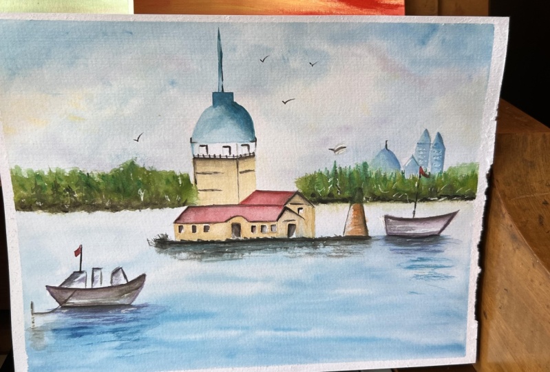
7. Woodland Mountain Landscape: Hello everyone and welcome
back to another tutorial. Today we're going to
work on this model. And this model, there
is a landscape in which we want to dry the sky. The sky and the landscape
itself are made of lots of BV, diverse and lively colors. So as you can see, let's start the first step. We should actually have our watercolor on
their paper board. So I'll show it to you from the very beginning how we
should do this stuff. Look at my God, tape. Cut it like exactly the
size of your paper. If you don't know what is this? These are the tapes
that with water, they become very glowy. So they will hold your paper
without letting the water. And the watercolor pigments
makes your paper to pop out. So they're very useful if you don't have them,
it's quite alright. You can use any other tape. However, use a tape
that is not going to get tripped up by water. So have a look at
my hand movements. You can do it with
either a tissue, put a vegetative tissue. How I'm doing as we're preparing
the frame using a napkin and rubbing it on the glossy
part of the tape like this. And then we're going to
put it around the caviar, going through this one. Tissue, put it on
the other side. The glossy part
because there are, there's one part that is a non glossy and one
part that is glossy. When you touch it, you'll
now it is quite obvious. It's not a necessary tool
for you to purchase, so don't worry if you
don't have it at all. I have to find this one. If I don't have this
one, then I cannot draw. This is wrong attitude
towards drawing. Whatever you have
around, you can use it. So we're going through
the last part. I usually never skip this
part in my tutorials. I'll let you to watch it. So starting with the
outer part, slowly. In this course, this is the first real artwork
we're going through. So far we have learned
all the techniques and everything else. How to use the brush, which brush to use, how to mix the colors,
the techniques. And we went through some fruits, subjects to get you ready. Now, we're ready to jump
in and start this one. This is the second to
start doing with our tape. We put this scotch
tape maybe a few millimeters from the gum
tape on the paperboard. Here, as the paperboard
is larger than the model, we need to make
the space smaller. So we need the tape entitled to go higher. But that's okay. Now after using the tape, we are going to fix the paper. Using a dry nap in
gently and lightly. We must clean our
palette as well. And you can see, I have a very, very busy palette right now, but make sure you
take your time and clean it up. Just a spray it. Sometimes it's spread the
colors as well so I can use it. If you cannot see some of the colors being picked
up, don't worry. It's not a big deal because all the colors are being
mentioned on the screen. I usually try to do my watercolor tutorials
in a real time. So you won't have
to force yourself to see it in a fast version
because watercolor itself is a very fast media, fastest than any other medium versus watercolor or
acrylic than others. So you can see it just
cleaned the palate, the parse has been dried
out, is quite hard. So if you want this happen, just clean your palette as soon as you have done with
your artwork and practice. But otherwise it's going to
stay on your palette and I'm really hard to get it off, but it's not it's
not impossible. You just can use any any tools to get
them out. Now we start. You're going to draw a disk guy, use a wet on wet technique. We need to make the
paper completely wet. To do so, we're going to
use a natural hair brush. We wash the brush as well. Then we're going to prepare the required colors and
put them onto the palette. Look at this guy that
we are going to use. You have seen and learned is this guy in the
previous tutorials. So if you remember, now, we can simply apply. Sky onto here. We're going to use light
blue color from this guy. Cerulean, blue would be okay, Analytic pink, bit
of pink or purple. And here we can see a
little warm violet. So either purple or wireless
would be sufficient. You can mark your, if sometimes your colors
looks the same, they're all looked like
bluish or black on your. When you open up,
you just have to number them and have
your reference ready. Now slowly, look how I'm
moving the brush on it. If you cannot see which color is being used, again is okay. So we're going to use the little reddish of our
roommate pigments here as well. It just because watercolor sometimes can be a
little expensive, maybe between ten to 15 or
depending on the brands. So it's good that use whatever left on your
palette, natural hair brush. Now, you can see how much
the paper has been bred. I tried to show it to
you before moving. And when you sprayed, just make sure you go around and spread the water out
of my hand will mess. I'm not trying to move fast, but you have to move like this. My hand movement
from where I start and where I tap more and tap less is quite important
for you guys to create the sky and the
clouds that you need. Or you can see on your model. Just better always
analyze your model and reference and see where it has
more color and less color. Now from the other side. The reason we spread
the water is to make the surface even. We need to move the water using our brush and try to
spread it to all, all, all over the parse and the paper equally to make
sure every spot on the papers equally,
we get started. We can, uh, you can
see I'm leaving some spots, just white. We need to move freely
at a high-speed. We're going to start, we started with a blue
color and applied the other colors
later because blue is kind of our light color. That's why we started with
that at the very beginning. So don't forget
the technique for drying your brush and
washing it with water, and drawing it with tissue
in order to fade the colors. That technique you
have learned already. So I keep doing it. You look
at the tissue in my hand. I always have it in
my hand and clean it. And then again, clean it, put water on it, then
you can clean it. Now having a little darker blue. What blue you have that is similar to this. You can use it. Do not limit yourself
for the certain names. I keep telling you you have
to use this one or that one. So we want to remove the
color here to be white. Look how we are doing. This is a technique
that you need to learn. You just lift it up. Do use the napkin to clean up
because you don't want to, even though they are
like small dots. But the colors should not stay on your mountain bonds wise. Since we are going to have
very bright colors on it. Now stage, we need to use a hairdryer to draw
the and dry the paper. You can either use this
one or you can wait. If you want to wait
a few minutes and make sure you little without
putting too much for us, just tap the paper to
see if it's dry or not. But I prefer you to
use a hairdryer. See how easily we draw
the sky and colored it. Now we keep drawing this part. I don't want to actually move it fast because it's
good to see how long are using on the sky
and how many times I go left to right.
It's quite important. You see all the
process. Keep drawing. This is the distance that you need to keep it from the paper. Do not grow really close to the paper
because you're going to, I'm not saying you're
going to burn the paper, but you're going to ruin
the colors. Add drying. When it comes to
if you asked me, what should how warm
or cold should be, do not use too cold or too warm when it's because sometime the hairdryers
can get really hot. I suggest you go
through bars, medium, medium towards cold rather than the really hot
version because you don't want your colors that you put so much effort on your
paper to get damaged. You see how much
or how many times? It's like around two to
three minutes or even less, maybe one to two minutes,
you have to draw it. Or you can wait for 15 minutes. So it's your decision
which one you choose. I can see from here
that the paper is dry, it dried or not. You will see two when you have, when you're doing
it on your own. But I promise you this is
faster than oil painting. So now we are done. We are happy with their part. And let me show you to explain some points to you
again before starting. In most cases, this guy is
drawn wet-in-wet Technique. It means that we need
to make their paper completely wet by
spraying the water on it. But it is not always the case. It means that sometimes we
need to leave some spots, try to keep that part
of the paper white. Look how I'm actually doing it. For example, if we
wanted to apply yellow, we must use it. First of all, have a look, look at the hands. Move rent. We shouldn't drag our
hand but move it like this using the tapping method. Look at how I'm moving it. Then we must wash the brush
and then draw it like this. Then we're going
to start painting the sky with these sweeping, flicking, motion with the brush. Plus cleaning the floor. Now if there are two colors
such as yellow and blue, we need to start by
using yellow first. We apply the blue color
to this n to some parts. Not all of the parts
do not overdo it. Look at here with a tapping
movement, just like clouds. Drag the brush just
with tapping movements. Then we'd wash and dry the brush again to be able to
fade the colors. That's a very
important technique, guys, as you can see here. So keep practicing
lactase and you need to practice a lot to do this practice makes
perfect, as you know, if you couldn't actually create the same effect
at the very beginning, don't worry, it
just is kinda come to you after a few
times practicing. Well, that was a point which I was going to tell
you about this guy. Now, we have to go through the mountain and need to
show you the details. We should not use
the previous method. It means that we don't make
all parts of the paper wet, but we need to make
the brush wet and shape the mountains
in those parts. Let me show it to you
how you should do this. As we want to work
on the details, we might use a little bit of
water sprayed on the paper. But the point is that we
must apply the Kotter. It's a brush full of water, and then apply it like this. Have a look how I'm getting
it from the palette. Then look at the
brush one more time. Maybe even using the tip
of the brush by you. By putting down and
picking up the brush. Just like creating the stains. We create the texture
for mountains as if there is a snow on them. Even in some parts, we need to wash the brush and
dry it to be able to fade the end of the end of each
part. The details look. Now I'm doing it.
Just fade the color. Just slowly, not too much, just to add the depth. So keep looking at
my hand movement. See how fading the colors. And we can apply the same
ones onto our main model. Let's get proper.
Keep your tissues. Next you pull the tissues like this. If you have thin tissues, make sure either you get a
kitchen towel which API care, or these ones. To tissue together. P soft tissues. Now you have to make your environmental like
pleasing, comfortable. So make sure that you have your reference, you analyze it. So you're, you're kind of More relaxed when you
start actually drawing it. So you have, you know, like which part is darker color, which parts lists colors? And we do have a little pink, a little, we call it x1, brilliant, brilliant and pink. So to make the
color combination. Now, getting ready with
the colors around, just bringing some water. We should combine
some pink burrows, want Marvel cutters to make some color combination
for the parts of the mountain in a
very light pink foot. Do it guys, to be honest. So you don't have to
have the rows Marvel or certain pink. Just make sure it's
quiet light as you can see how I'm going to
use it right now. So keep looking at
your reference, making sure that you realize you understand which part
that you have to leave empty and which part you need
to put more pink a color. And also the hand move n
is quite important here. You're going to solve it a
light color, the combination. Then we use a brush full
of water and create the stains with a tip
of the brush like this. Hand woven here, guys is
very important because I cannot say this is
completely dry on dry. But how we put the element
at the details here, going to the turbine and how natural urine
is going to come out. Now, you have to fit around
them with the same brush. Because the first that you did was like very
obvious colors. Now you have to go
around them and feta with the same brush. This is the fading technique. Slowly. Make sure you use enough. I'm color. Don't overdo it just enough
that the color is visible. This course have a
little bit of violet. Even when it comes
to oil painting or a color pencil. Drawing, snow. We use lots of purple and greatness in order to
create the colors. This same thing goes
for watercolor. But don't leave the
color just like that. Make sure you fit
them with your brush. The lavender blue if you
have one and a little while at so if you don't
have lavender blue, whatever you have similar to the ones I'm using
right now, use it. You want to apply the
lamina blue on these parts, or we call it blue-violet. So in this part makes
sure that you have a more bluish on your brush. And your brush is completely
wet to convey the feeling of this snowy blue
color on the mountain. So be applied the stains, the colors like this. And how we have to mix
the colors together, we have learned is that
the very first lesson that we had fun together. I asked you to mix the colors. Now we're almost going through
the same technique here. Hint of it. It's okay to go here, but please do not overdo it. Look how in a delicate way I just added some outliers for
the tip of the mountain. Or these areas, you need to
take your time and apply it. But our watercolor tech time is quite different
from oil painting. Even in this medium,
everything's quite faster. So we're going to use another color in order
to go through this. Natural the greenness
of this area. Some parts lighter, some
parts daughter, a dark hair. Between green and brown. We need to create these colors. Again, I'm using my
natural hair brush, not the, add the darker ones. You can see for the
previous one I use the angled brush work for
this one I'm using round, you can say, but
it needs to have this amount of thickness. So from here is quite
important to see how I'm using my brush onto the paper. Use just the tip of the brush. You can use like colors
such as burnt umber, burnt umber, burnt
sienna, or sepia colors. These colors actually
my favorite colors in all kinds of mediums, like either in oil
painting or color pencils that I'm doing on
those courses are used. A lot of these colors as well. Became tough. Like
who care green. The grain that
you're using here, it should be not light
or very fantastic color. It needs to be a mature green. The green or sap green would be very good
ones for this area. Using the tapping movement, make sure you leave
some part white. The whiteness of the
paper is needed. And also whenever you
change the color, make sure you've watched
the brush completely and used a tissue and feta
colors onto each other. Does our signature techniques, I hoped you actually
memorize it. Here we are using
the combination of the green color
and a little olive. But it should be darker
because we are using and some dots in order to
create that depth. And don't forget to spray the water to be able to
show some faraway trees. That's one of the very
important techniques. If you don't have water
and just use a dry on dry, It's not going to
come out correctly. This part, even if
you want to do with on wet technique for
the faraway trees, you need to use less color. So the event looks further away. Still varies in tapping
brush, movement. More towards a brownish. You can see I'm using smaller round brush
to fade the colors. Then slowly add even more
visible brown colors onto them. We let them to dry a lethal, but it's not completely dry, so it doesn't show
in an obvious way. So while we are moving
on in some parts, you can create some white spots using the lead of the brush. This is actually the
lead of the brush I'm using is actually a technique. As you can see, we
create some lines or stains on the
drawing like this. And create like fine lines without using something sharper, that's going to
tear off the paper. So whatever you
have, it's useful. I always use the use
my hand in order to avoid spraying more
water onto other parts. So make sure you shelter, right? Raise your hand. Now, we have to use some, maybe olive green since L or sap green because
it's, they're lighter. We want to use the colors from
lighter to darker colors. You can't feel this is fresher
colors that we're using. Lots of water and creating more pre feeling just by tapping onto our paper
in a certain direction. Then we have to use
Alyssa P care colors. And to increase the
density of our color. This area, you can see
my hand movements, how I'm adding the
olive green here. I have to say actually
in a very forward Bay, just freely use
your hand and let it go instead of
like force yourself. But make sure you look at it
and see where I'm placing the tapping movement and how do I get It's
not as I'm doing it. However I want. I have analyzed the reference
and then applying it. What's a white spots out? Sometimes you need to spray
and sometimes I get on it. So I'll show it to you. Which parts you need to
spray on which party done. Right now, we are going
through the T cells for now. It's okay to change your mind at some point and make sure like, where are you going to add
less water or more water? You're adding more details. It this technique, wet on dry technique right now. Go through the
entire forest area like the greenness
next Tuesday mount. And then again, with
the same technique, we delete of the brush. Just create some lines. Do you see how I'm lifting it? So don't throw away
your brush leads. Now here is done. Now let's slowly, we're gonna
go through the field which has a lot of like ocher, yellowish greenness
next to each other. After we write the place,
we're going to go through. Rest. Analyzing which areas needs to have same colors and which area should not
have the same color. You can see that we're
going to start with a light color and
then gradually move towards the darker
color in order to create first-year
colors won't get dirty. It won't get muddy. And then this is the best way to show the
dimension, the depth. Changing the tissue. Make sure you always have a lot of tissue
next to you so you can keep changing it and also replace the
water that you have. I have to say well done so far if you are practicing
at the same time, which is why I always ask my students to practice
at the same time. And so you can go through
this journey together. Now, this clean everything,
clean your palate. So a clean palette, clean tissue, and
also clean water. Now we have to start using the
wet-on-wet technique here. Now the spraying the paper. Again, cover it in order not to splashing on
the other parts. Just enough that
spread out evenly. With a dagger brush that we have my handball that's from where I start and
how moving some parts, it has more thicker, darker corner because I'm adding more like here and
some parts lists color. So you create the
correct dimension using the tip of the brush. It's almost like tapping, but how I'm using it from left to right and
give it some angle. That's quite important. Using sap green here. Any kind of natural occurring
you have would be fine. As long as the cauda is similar. You can mix it with some lighter grains such
as olive green, combine the colors
with each other. Or even darker
wants to go on it. The more you add onto the colors the dark
hair day become. You can see we need to add more water because water
gets dry really quickly. But don't overdo it plays combination of the old
care and also Sap Green. Between sap green, olive green, and ocher, you can
create the field. You can also sometimes
use a burnt umber. If you need a darker brown. Make sure you have the white
parts. You leave them out. The way I'm moving
the brush and how which part I'm using a Slack sometimes the
tip of the brush, sometimes like the
direction of the brush, changes are all intentional. So I would be really
grateful if you can follow the hand
movement and also the direction of
that brush movement. Adding more color
onto it layered up Thomas spreading the sap green here is because I
just watered it. Spread the paper.
So I have more. It's easy, easier. You can move the brush
onto your paper. Now these are the
details. Bit more color. With this straighter
line, you go on it. This is only first few layers. And when it comes
to the details, you have to use a
little darker ones. But with the same color. You can use the same ones because the other
parts dried out. That's why I added a little onto the previous areas
that we have done. Mainly lines and
dots technique here. Look how I'm
spreading some areas. You have to cover it
using burnt umber. Next to the cottage
that we have. Do not go to the cottage yet because you don't want to mix the colors
in a wrong way. So we are actually coloring
our artwork based on our model by tapping
movements are certain. A handful beds. I have analyzed
it before going around so I know which area
you should have a certain movement and
beach area should not have. When it goes further away, I added more details, however, came a little forward. I added more on wet technique in order
to show like close up. Now I'm going
around the cottage, making sure I'm using
the tip of the brush, moving certain direction
and apply more green onto the previous color. You have to notice that
we shouldn't apply green color a little
faster on the paper. Before we actually dries out. I just let the whole area to dry out and then added
some of the trace. But with the same
technique that I taught you in the
previous tutorials, how to draw the trees. I'm doing the same
and is left to right but in a certain direction which is going to go down. Now, this is like issues, like at tiny little
details, details here. You also need to pay attention how and when I'm
changing my brushes, which ones I'm using
round brush and which ones I'm
using dagger brush. Look at my hand movement. Does adding more greenness. Later you can make, do a
mixture of brown and black. For some of the dark spots. I keep using the same
colors. I haven't changed. So you can see with some
few certain colors, you can create a very
beautiful artwork. Don't think like you
need like thousands of colors in order
to actually color. To do a watercolor painting. Just tiny cell. Feels like branches
we are adding. This is the same a movement. I'm just making sure to add
some reflection as well. The colors. So you have to pay attention where
we put sharper lines, which would be near the
trees and some further away. Now fading the colors
with with our brush. And if you don't like
it, you can take, take off the colors with your
tissue before they actually draw out our burnt umber, we're going to go around. Any kind of middle brown that you have would
be fine for you. Here. You can see we applied
a certain dots, start to make some soil with the burnt umber for the edges. Now here with the round brush, with a natural hair brush, we're going to go around, apply darker, denser colors. Look how the brush looks like. The reason I said natural
because they actually, you can add a lot of
details with that. Because of the tip of
the brush like this, you just can make sure that your brush has a certain love, looks like it here. And then you can add
lots of bush here. Lots of different
green technique is like a cheating technique, but it's a good one. How we are adding them. I didn't some spray
water on them in order to create a
little wet on wet. But don't overdo it. We have to wash the brush at some point and fate,
the colors beneath. This area. So it's the same techniques
like wash the brush, use the tissue and
then fade the colors from this certain area that
we started and going down. It's the same
technique that I use. You just have to look from adding the T-cells
and follow along. So if we keep going
back and forth between brownish
and green that we have can be olive green and CPR or it
can be all care ones. We did it and these
are burnt umber. So it depends on you,
which one you are using. Make sure you use different
hand pressure here. Do not have the
same hand pressure is not going to come out nicely. And then especially reduce
the pressure on the edges, parse and fate the colors. Here. We can save it. Lighter color I'm
trying to fade as well. And how I'm bringing
it into color. I want to add the details a little bigger here because
it's really for work. You need to see
the details here. Look how and where we are
adding more of this technique. If you can see it,
is the same one just from bottom to the party. Unless it's like you're
throwing the strokes, the lines, creating
a metal here. You have to create
the atmosphere. It's just not growing and
applying the technique. You have to make sure you understand the colors,
what it's like, what kind of colors you have is either cold or warm colors. And not just the colors like how you're applying
the techniques and means to bring out the
feeling on your paintings. This is what we are trying
to achieve here as well. You need to enjoy actually
paint and coloring it. Now we have to continue. Again using the elite of
the brush going around. You can now see a little better how the highlights
being created. Keep adding enough, but
do not overdo it as well. Like here, you can see that
you create highlights, but it is a perfect
tool for this. You already bought it so you don't have to buy another tool. It just, it comes naturally
with your brushes. So make sure that when
you're buying the brush, they actually have lids on. Since we are moving towards
the end of this painting, we have to add more details
to make it prettier. So look at my hand movements, what colors we're
using, splashing color. We have taught this
when we are doing the galaxy techniques.
You have learned it. But for this one, you have to even pay
more attention not to overdo it just few
lines, if you will. Like tapping would be
enough. Have a look. Slowly do it like this term, aim, where you're
actually tapping it. Clean the areas that
you didn't want the tap and the dots to go. You still have the
chance to do it because it's very easy to do it. Since there are still wet. Now we have to
splash some water. You can see how your splashing. Just make sure you don't
splash the areas that still watery because it's
going to be a disaster. Water on water, it's going
to go all over the place. You do this technique,
be careful of your sky. Manually. We are adding
some of the delta as well. So since we have some of the splash around,
we just took it out. It was easy to do it
because it's still wet. Now we are happy with
this area. It's done. Now. The areas that we
actually created the highlights because first
we created the background, then we created the
highlights with the delete, the brush lead. Then you have to go
actually on them. You cannot leave it just the
way they are in order to create more natural feeling around it spatially,
around the highlights. Do not try to go onto them. If you are going onto them
with even a smaller brush. Again, like the other parts
that I mentioned to you, we should apply enough
but not overdoing it. You have to you have to
actually move your hand freely, but understand where
you're adding them. Fill up this space even more. A little more details onto the area before actually starting some orange colors, warmer colors to go around here. Just not too much to the
orange color you're using. She'd be more towards brown. So it's not like a fantasy
because some orange, they're so bright is not used
and useful for this here. Please pay attention
if you're doing it with a smaller round brush. For some of the highlights, you can even use
some white gouache around if you need to. And it depends on your model, if you have them or not, make sure you also
clean your brush here. And then use it on the white
garage for these areas. Again, like the previous ones, do not overdo it. Just a little bit. I'm going to use the brush, the same whiteness, but
just a hint of it around. Sometimes horizontal
asymptotes, vertical, depending on where
you're placing them. Very, you can't see it here. After this, we have to
add more outlines around, more details around the field. Either with like lines or
certain and darker colors. Now we'd lighter blue, either a light blue
or a cobalt blue. We're going to go around.
And there is a river here, but we don't want to
show it too much. So it should be very subtle
because if you add too much of it is going to
look like a natural. Like how I'm moving
the brush hint of it would be a
sufficient here. And therefore this
area a little more, we will add more
blue color here. Corralled, fill up the areas
that you left a white. It should be around the edges
so you could fade down. Now with the same
color, a little ad. You have to add the second
color. It go around. Again. We are using a round brush
in order to fade away. And try this area
with your hairdryer. Make sure it doesn't stay wet or you can wait for
it for a few minutes, that's still okay as well. Why drying? I'm just
making sure to fade some of these areas so
they don't stay too raw. It's good sometimes to do multitasking while drawing
to add some colors as well. You don't have to search
and layer to do this. You can actually draw
it and then do this or actually do add more
details and then draw it. But from experience that comes, I prefer to do it like this. I do more brown layers around. At the same time drawing
the middle part, especially the green
part in the middle. Let me add that had lots
of wet on wet technique. That's why we keep holding
the brush on those areas. Now we're going to go around. For the last part. We're going to work
on the cottage here. Starting with occur. It's going to be a
wet on dry technique. This one is quite
hard to explain every detail technique
that we are doing. The most important
part that you watch and follow the hand movement
and the brush movement. Using darker brown here. Easily you can see how easy it is to actually
draw the details. With fever like brushes,
strokes, few colors. You can create a
small cottage here. So slowly. We can add the rest of the wall and the roof of the the cottage. Here. You can see my speed has dropped because
I'm going around the very delicate and the
roof of the cottage here. So making sure the
outlines won't go inside the the roof
of these cottage. You have to keep, add,
drying your brush, get to tissue, and then fade the line and then bring it down. You have learned this technique previously when we
are going through their fruits tutorial is exactly the same technique
that I taught you there. If you haven't gone through
that one, please do so. Slowly. Give some textures. Now, just going through the
techniques that we're using, I'm just going to remind
you one more time. Now. Let me remind you again how we could draw a very sharp
pointed pine tree. We need to combine the
green color and olive green with a little sepia to
create a very mature color. We add these two
color in order for this combination and
not to look wrong. Now, look at my hand
Maupin home adding them. It will be great
if you could watch one time and then
repeat after me. The floor away and
then the ones closer, slowly, left to right, left to right in
a certain angle. Duties. So many times, it has so many different
techniques on it. It has a certain hand movements. Then tapping movement is wet, on dry, and then layering. How you do all of them. A combination of those
will give you the tree, even though it looks
a little easy, but it requires practice, guys. So I hope you enjoyed
this tutorial and I see you in the next
one. For now. Bye bye.
8. Seaside harbour landscape: Hi everyone, Welcome back
to another tutorial today, I'm going to teach
you how to do it. This beautiful seaside
harbor landscape. Look at the AR model,
how it looks like. We're going to learn
lots of techniques and landscape that
includes water, sky, faraway view, and
also some buildings. Before we begin,
we need to think about everything such
as starting point, the colors we must
use, and so on. You need to actually
dedicate your time and consider all these points
that I mentioned before. I actually start drawing
it and color and get the techniques we're going
to use a lot of wet on wet, then add dry on wet
and also dry on dry. We're going to use all of them. For this guy you have actually
learned before what to do for this guy is a lot
of wet on wet technique. We talked about before. And I have taught you how to do this guy in the
previous tutorials. Then it comes to the sea
and the fervor landscape, and finally returned to the
building and the details. So this is almost for most
of the landscape that I do. I usually follow this. However, it all
depends on your model. Make sure you have everything
you need around yourself, like all the colors
in your palette, clean your palette before
starting, because the colors, the previous colors
that you have used can actually go on
to the new colors because watercolor gets fresh after you use some
water on them. Now, make sure you put
some spray water on them. Plenty did your tissue
and then voila, you have a very clean palette. And now after you claim you have to understand the colors
that you are going to use. I have already
taped the drawing, our paper onto this
it a certain tape. I have taught you
how to do it in the previous in the previous lesson. So you know how to do it. After you've made sure that your paper is not
going to get away, run away from our from us. But we have casted so so much like I used to
tapes on this cardboard. And then after that you can use kneaded eraser and go on the model that you
have drawn before. So the models that we draw
usually takes a long time. I have actually, all the outlines are available for you to download on your downloadable resources. If you go onto your
assignments and projects, you will see all
these outlines there. I put two. They exist
in, uh, in two ways. One, the grid version and
one the outline itself. So you can either print it
out and gets held from it. Now, I'll tell you made
sure the why we use kneaded eraser on the on our pencil is
because the Panthers should not really show a lot underneath the watercolor
as watercolor colors, pigments are not that strong. They fade away really quickly. Now, after that, we're
going to start Our with a round brush and a
dagger or soft brush. We're going to start the
disk guy with unread. So we have two As always, spray the this guy which
I have done it even if it didn't show in the previous tutorial I showed it to you or how we
should spray it. We're going to use some
yellow, cadmium, yellow, pale, and some blue
mixture of them. Now it's important to see which color I'm
going to use first. Again, I'm just going to
refresh the water spray ones. Make sure you're even it
out if they are not even. Now, look at my round brush. I'm using such a
big ones so quickly before actually be let
the paper gets dry. We have to go on it. Our sky is a little bit sunny. So here we can use yellow color or even occur. For some parts. Are scarred, needs to do paper needs to stay
really wet for this area. Now, let's see how I'm
gonna use the yellow in-between palm of
my hand movements, using them and how I'm
going to fade them away. After I put some pigments, some yellow pigments on them, I dry the brush with the tissue. I keep drawing it.
You see then feta. So this is the same technique
like clear your brush. Use your tissue, then
fade the colors. Now you can go around the edges and fade them
more onto each other. So I'm going to teach you
another technique here, which we didn't learn it
in the previous tutorial. Look at the second layer of
the blue that I'm using here. Now because we have such
a wet on wet color, I'm gonna use my
cupboard and actually kinda let the paint to
actually move itself. And they go to the
complete left side, is going to become so
natural and more beautiful. Have a look house.
We are doing it. Keep moving your cupboard. Keep it like that.
With a clean brush. Make sure that you're fed. Never. Use the previous pigment. Keep holding it like this. Please. Pay attention how long I keep the corporate
lactase and then clean the edge because all the color is going to go towards that
area with your tissue. But be careful you
don't overdo it. Let it let little slight more. So that part that you use with
tissue doesn't stay wide. Our sky almost finished. We're just going to
go with either purple or violet at certain of have to save the shadow
feeling onto the sky. This look at it, how it
looks like. Going around. Just, just tapping. And then you have to
read a clean brush. You have two feta. It's quite easy to draw. I did receive a lot of comments, a lot of requests from
my students that they needed to go for watercolor course and also
a sky wants especially. So most of the artworks
I chose for this course, they do have sky. The next one, the
last few turtle will have a certain different fame. So look forward to
that one is white, I kinda, kinda one
of my favorite ones. Now. See the last part for this guy. Little add more layers onto it to make it
more distinguish. The reason I cleaned
the plane around it because those water drops can actually go on
to your paintings, so you need to be
careful of that. So after we made sure
that is strike out, either you have
to wait for it or do I fit your hairdryer? We're going to go through
the the sketches, making sure all the
sketches are done quiet according to our model. And then make sure if
there are two visible, you can use your kneaded eraser
random. Now have a look. We're gonna go
through the C part, the water part of this area, making sure that
the spray enough evenly you can draw to see with both angles
are natural hair brushes. So here we are going to use a natural hair brush to work on the bottom parts and
the angled brush, the dagger brush for the top
to play for the next layer. So we have to you
have to make sure the brush is wet a little less than when we did for this guy. We use the same
ultramarine blue color as we had it for this class. Well, since this guy and
to see their reflection, as we have had it, we all know we have to have a little yellowish
color as well. Their first we are going to apply a little yellow
color to some parts. As you can see, this
much is enough. Then start with ultramarine because that would be too
much because cerulean blue, we want to show the
reflection of this guy here. So you could have
used cadmium yellow, pale yellow, the blue, and then apply it with free hand movement,
completely free, watery. The column, just
getting rid of some of the too much colors
with my tissue. Again, we grab some
color and apply it with this hand movement that
you can see on the screen. Notice that this part is also
part of the sea. This part. So follow the lines and try not to lose them while working. We must also pay attention
to the sketch as well. Make sure you don't
lose this sketch and very everything she
should have been placed. Now we're going to combine the colors and apply
them from Boulder, a little darker color
to a lighter color. You can use indigo, ultramarine depending on
what kind of color you have. Coulomb doing is like completely wet on wet technique here. See how it's actually they
get mixed with each other. The previous layer and this one, how I'm using my hand and brush movement is
quite important here. I hope you can follow at
the same time I'm practice. In the last stage, the
color should be thicker. In fact, further we
process the denser, the color should become. Even. We don't need
to put the brush into the water anymore
for this area. Just the color itself
would be sufficient. You can see I'm getting
it directly from the from the set. Me moving my hand. I'm not applying all over to some areas living
some highlights out. The highlights means the
first blue layer that we did. It shouldn't be white,
but it's the blue layer. When we actually clean
the brush, we can, this is the technique
that I hope you understand from writ
on wet technique. You want to have some
white highlights. So you keep cleaning your
brush with a dagger brush. You just take it off like this. Very easily. Have a look one more time
to create the waves. Make sure you do the same hand
movements in caribou base. Again, the reason I clean, I don't want those
splashes to go on to the painting later. So we keep adding
layers where necessary. You can see Venus
comes more forward, especially the bottom part. I'm adding even more color. We can still make it bolder, however, I think
that's enough for now. Now, drawing some parts
using the hairdryer. Now, after this, the next stage that we are going to
work on a should be a far away landscape. So that's quite important. We have done this guy, the sea area, the water area. Now we have to go through
the details and a far away to create a distance. So we are going to
use olive color. We spray a little water from the distance before
actually starting. So make sure you're know which
color you're going to use. And that you are going to
apply this play sprayed without making it too
much onto this guy. Now, we have some, we can see on our model which
area we have to use. This area we have to start with the same
natural hair brush like a very big one. I'm going to start,
you have learned this technique in the
previous tutorial. See how I'm actually tapping. Look how uncovering
to see with my hand. Tapping war should be
from light to dark. So we are going to place the first layer leaving
some white highlights. And then we're going to
add more layers and add darker layers on
top of this one. Keep applying, going around, making sure all parts cover. Look how I'm mixing
the colors together. Now. This is almost
a second layer. After we are happy
with the first layer, do not add too much at
dark color sepia just to air as long as you
mature the color, make it look less. Raw. Minutes comes to
these kind of actions. We have to really do it fast before it dries
completely dries out. Mixing the color is
quite important. So do it as fast as you can. But when I say through
it as fast as you can, it doesn't mean like
through it however large, it feels like it's
good that you've watched the video and make sure. Follow where I'm
putting the colors. Now with the tip of the brush, I'm trying to add a certain
kinda pine tree feelings. Look how I'm holding the brush. These brushes to be used, they're available and one of the best brushes
for dagger brushes. So if you get one good one, you can use it for a long time. Just make sure that you wash
it and take care of them. Whenever you're finished with your artworks, especially
oil paintings. Because I do have courses,
oil painting courses. And one thing I advise to my students is to take
care of your brushes. The reflection is quite
important as well. Make sure that before it's
completely dries out, you bring down the
colors a little. Now we wait until it
gets a little dry. Then add some darker parts, such as the stains and lines to create the feeling of the trees from far distance. Here we just need some
like dot feeling. You'll see the dots
are the stains. What I mean, Like this one. And some smallest strokes lines. We have to make the border
line Elissa darker after this in order for it
to be more visible. But again, let's not
overdo anything. Slowly going through
this smaller part. It's better to do all of them
at the same time because when you let the colors dries out and then you
come back to it, it gives you a different feeling when you start drawing them. So it's good for a certain area. You complete that
area and then move to another one or have a risk. However, since one
art board is gonna take like one hour
to draw and color, I suggest that you actually
create that time for yourself so you can finish
your drawing in one sitting. You can handle went home, going through the
rest of the details. Because the area for
the buildings, Dr. B. And we have to add
lots of details. We need to have a dry surface. You can find this outline from your assignments and
projects and download them. So you can see at
building more precisely, I have placed the
reference there. Back to the blue
that we use earlier. I changed the
approach to smaller, one round brush,
but much smaller. So I can create the details, but it look how I'm going
through the outlines. Some areas, I add some lines, and some areas are
just leave it out. So they look more natural, especially from a distance. Whoever is really interested
in line drawings, or I have to say like architecture
and building drawings, either refine liner
or watercolor. I read, I do have those
courses. You can take it out. Or if you don't know
where to find them, just message me directly
and I guide you to the right course so you
can watch those as well. You can see, I'm not using
a lot of color just as much as needed in order
for them to be visible. This is the shadow area with a lighter blue and a darker
blue completely I'm creating the distant building to
carry part of the roof. I suggest that, um, I hope I'm not wrong, but I believe that this
is landscape in Turkey. If I, if you recognize
the landscape, do let me know various it. Say I will love to actually tell my students which area they
are drawing and painting. Now let's add the details
with some white gouache. So I'm using the white gouache. You have to make sure
that you clean your brush before applying the white ones, white details because we
don't want to mix them. And even after you're done
with the white gouache, please clean your brush as well. See where I'm actually
applying down the details. Follow and placement. Now, just change the brush. You can see I keep
exchanging the brush, the one that has the white
quash and then one doesn't. It's only because I
have few brushes. If you have one, only
one or two testifying, like one decides, one, add the natural brush that I'm
using for the bigger area. What would be
sufficient for you? So you don't have to buy like
ten brushes for yourself. Now, let's go through this area. Since we are done
with this pond, the right part covered, bigger hand spray it. So it doesn't go to the link and the right side of the artwork. You can see how many
colors I'm using. Basically it's like one yellow, two blues, and two
green. That's it. For now. You can
obviously use more, which I'm using a few more. However, if you had those
colors, that will be enough. Continue the same way that
we did on the right side. We sprayed first
from the distance of brush can move
smoothly on the paper. And again, starting from
the light and watery color, I started applying the olive. Now we're going to mix it and keep using tapping movement. It's exactly the same technique
we did on the right side. Don't forget to
leave some white of the paper for some
highlights to remain. So this is the next
stage that we are adding the details around. Look at my hand movements, but I'm adding even
some small parse that I'm just going to
mix a lot of difference, especially when
you're looking at it from a more near side. So again, you can do
the board and align with the white gouache
if you if you have it. If you didn't have
it, just leave it out and you didn't have
the white gouache. If you had it, please do so, but it's better not to
use any white watercolor. I don't suggest acrylic, white acrylic, but that can
be an alternative here. Let's go through the
reflection onto the water. With these movements,
especially with a dagger, brush is the best. So it's up and down, then left to right. That creates the reflection slowly than we have
to use the hairdryer to dry the green areas or
you can wait for 20 minutes. So it's really your decision
which one to go through. Both. It's both would be fine. We will have more visible
reflection later. Really wanted to teach
you how to do a lot of reflection while
doing this artwork. So after every drive the
artwork with our hairdryer, I'm going to draw two boats. They have a very good
visible reflection for you to see it. So now, if you're ready, let's go through more details. One here, and one
would be more in the middle of the river area. This area, I'm a pushover, is this so let's have
our tissues ready. Us make sure that
it's like few layers of tissues so it
doesn't break easily. Put it next to you. Our main
signature technique for fading the colors would
be wash the brush, clean it with the
tissue and feta colors. It's good that you
memorize that you keep it. We just going to refresh
the colors with our spray. That's another technique. It's like these tips
and hacks like gonna really makes your
worst to go faster. Now, let's go through
the first small boat. Here. Hi, I'm gonna point it. I'm just put the reference
next to me so I could see where exactly I have
to paint consistency. Sketches are gone. So I have to redraw down
with just straight away with our brush but with
smaller dagger brush. The signature technique, dry cleaning with the tissue.
And then fate the colors. White brush. We can grow on it to reduce some of the colors. So while we continue, unfortunately here
the camera didn't record the reflection
of the boat. However, we have one
more both reflection that I'm going to show it to
you how you should be done. So while we are going
to complete this part, please look forward
to the other boat. However, this go through
the details of this one. Straight line. You can
see that I just put like inconsistent strokes after one each other
and small red flag. Still using the
same brush so far. Now let's go through this one. Without actually moving forward. We're going to watch
the whole process. Here, just following the
handle Benz, quite important. I'm putting the outlines
and also how coloring it. Slowly, clean the brush, fate, the colors. Combine down. We've got the white
gouache and I'm going to use the reason I use it, I need a more solid base and more texture wise
base for this one. These are all Tips and Tricks. The reason that I
prefer to do lots of art rocks and then
apply all the techniques onto those rather than just teaching you
the techniques is just why looking at where
those techniques can be done, It's better than just doing
the techniques on its own. You're going to fade it
even more like a what for, for this watercolor painting. And also to add more
shading onto it, as we did previously. More watery color here. Now let's look at
the reflection, how we did the previous
one that we couldn't see. Let's have a look here with much darker color and
in different areas. I tried to create
the reflection. Don't forget to keep some areas out in order to
have the whiteness, the high last left
more naturally. Use, I'm going to use LSL,
ultramarine blue here, darker blue are the
details of the boat. I usually don't like to exactly do a replica
of what we are having. So it's good that you
have your own touch, your own ways of drawing there for I really looking forward to seeing
all your practices, to see how yours is
going to look like. Please do send send them to me so we could go through
your progress. And the paintings that I've done with the techniques
that I'm telling you. The details here is
quite hard to explain because you need to look at the hand movements and they're exactly on place in the colors. So let's follow a lock
and repeat after me. At some darker lines around
here, the second layer. And the line, the borderline
between the bottom part of the boat and where the line
actually meets the water. Having more details
on the sides. We have to continue drawing
the details like this. I keep using the
same and dark blue. So you need to have
enough color and enough water onto it in order
to create this density. How holding the brush is
quite important as well. Using some white
gouache on areas. Just give some highlights. Create some highlights here. Look how it looks like now, it looks more forward because we are using
lighter colors. Comparing to the other boat. Is either indigo or
ultramarine blue. Both would be fine for this one. Just choose one and
keep using them. We have to do more fading. Now we need to dry
this part of the cell since we need to
put our hand here. If you need to hold
a part of the paper, and it's been already, you have used watercolor on it. Really lucky. Few seconds ago. You need to draw it out and then put your hand
or if you need to. So why did we are
getting to move to the middle part of the building, the main part of our drawing, actually, you're going to
use some different colors. So let's look at the colors
I'm going to mix together. You can either use
some cobalt or indigo. So this is again, wet-on-dry technique because our
watercolor is very, we put some water on it and we're applying it on
a very dry surface. Make sure you do it in the
most delicate way possible. The lines drawing is very important if you really
need to practice it on a separate paper and then
applied on your main models. So your hands being warmed up while doing
those broken lines, while you are drawing
those broken lines. And to beginning, this is
a good point actually, I did, I forgot to
mention at the beginning. So if you really not
sure about some parts, about the amount
of colors you are bringing onto the
subject is better that you try it on a
separate paper and then actually apply it
onto your model. Now the right side
has more darker color and the left should fade away and goes to
our lighter color. In order to create the
dimension we need to. Whenever the model
has some stains, we need to create those. You've watched the
brush completely and then going to apply it here because we cannot
bring so much blue here. At the beginning. You can see some yellow ocher color on this side of the
building as well. Decide. So let's see how and what kind of
colors we can, we can mix. So this is like the final stage. We can see how easily
in half an hour we achieve so much. So far. You can do the same
it just if you watch the video a few times and
practice at the same time, you will achieve
the same results. We have apply some
watery surface, but we have to go and we're
going to draw in a more dry, a bit more color. We can hear the colors. Make sure every time you
are applying a new one, you wash the brush. Pride and faded colors. Just hint of luck. Dark indigo add the darker
blue that we're adding here. The line should be very thin. Don't bring it too much
color for the pen lines. And the broken line
technique again, given for these areas. You can see I'm just mixing some of the colors
at the same time, some dark blue ones
and a hint of green. You don't have to make
as few colors together. Just one darker blue
would be enough as well. And going through the windows, some areas needs more detail. Just with those
simple, broken lines, you can create a lot
of beautiful windows. So you didn't need to actually
draw crazy windows in order to create them
on your painting. So keep looking. Which part
I'm adding the details. First. I have to determine
which where are they and then go back onto them
and color more if needed. You how to use the end and the tail and tail of
the brush sometimes. In order to draw the
details like this, look, there's no need to put is completely
into the water. Just keep using what you have. When it gets a little drier. We will add darker spots here. This is almost a second layer
of details that I'm adding, trying to go on them and
slowly add more value onto it. This kind of line drives
very important because the turbine between an
intermediate or an advanced level. He has, he has spent like half
an hour on the whole area. Does the sky, the green parts, the distant building,
and the C part, an hour just on the building. So see how much time
I'm actually adding, putting for this building, adding more value
onto the lines. And if you put too much, you can also clean it
up with your tissue. Take off some of the pains. For this part, again, we are going to
use some ocher and yellow colors using better
wet and dry technique. Going through the first layer, then next to it we have
to apply some scarlet, red or darker red
in order to create the roof for the rest
of the building. Here, after we have either use ocher or a mixture
of yellow color here, we have to go
through the outline that is close to read. Any brownish, yellowish
pigment that you have. Fading the colors. Because when you
put a certain color that it has some value on
it and it's very bold. You need to go on in and
faded away like this. This painting is
quite important guys, like make sure you actually
apply it and work through it. It keeps fading. So now we have to
choose the roof area. What we are using, a mixture of like
maybe burnt umber, cadmium, orange, either scarlet, red or a light read. All of them would be fine. And the colors that I'm mixing, I'm hoping that you can figure
out those colors by dy, the brand that you have. If it's the same
brand, it's perfect. It's the color has
been mentioned here, but if it's not, don't worry about it, just try and experience your colors. You also have the reference. Hopefully you have drawn a paper with the colors
on it as your reference. And you can go through with it. You can look at it and
see which color really closest to the
ones we are using. Start with a faint yellow. Just to cover the whole
surface area for the roof. So it's just between like very
dark and highlight orange. Keep combining the
and the colors and create the textures
now onto the first layer. Now I'm just creating some
parts from my own imagination. You really have to
follow what I'm saying. I think it just after a while, you can ignore your preference
and to do some creativity, but that's comes after you
have gained some experience. Now faded details
with your brush. Hint of blue, not too much. It just enough that make
your outline more visible. And it does reflection, a color reflection of what we have on to this
and this building. Putting some darker spots with either black or a dark brown. If you're new to watercolor, I suggest don't use black, just use darker brown so you can have better control on it. Even a lot of
instructors they advise, and darker brown
rather than a black. Especially when it
comes to beginners. It can be controlled better. Now, keep adding the second
layer and faded colors. We need to shape
the whole parts. If you add too much. So if you have to understand
how much water and how much likely pigments we
are using on to these areas. To shape it. I'm going to create some details. Some spots, more or less. You can see it there's a divide, a carry divider onto the roof. These little details very enjoyable when you figure
them out and you draw them. While actually I set this
part is very enjoyable. I am looking forward to hear which part of this
drawing it's enjoyable. Is it the water parks,
this guy parts, the green parts, or even
the building that you really enjoy to draw and
you want to continue. Because and if you let me know, I can create more tutorials for you guys and add it onto
the course for you. Or send you a more links
towards other tutorials that I have made sure. If this is your first time
doing a complete artwork, you'll keep washing
your brushes. Don't bring the previous color because it would be really
hard for you to control. You have to apply the
dark horse gradually. On one level it
should get faded. Unlike the other part. Also, you should get dry
because if it's water and water is going to go all
over and it looks messy. Starting drawing the
windows like this. Fade down. Whenever you draw, make it, make a habit
out of it a certain way. The line being drawn, you need to fade it after that. Do not let it stay
there very wrong. At least give it some
dimension with fading it, I'm not saying fate,
the whole thing. It just gives some fading
feeling onto it, such as here. I have to continue this process and show you the
rest of the details here, how we are going to complete the other
side of the windows. It just have a triangle
with two lines. You create them. Then you have to fit them with
a cleaner brush. Make sure that you put it. You clean it with your tissue. Your hand movements
is very important. How from dark cutters you go to the light colors
and how we wash, dry the brush, and
then continue fading. It is very important
here as well. So please follow all
these techniques, all these tips and hacks. Actually that you
can all find it unlike all of these
techniques in one lesson. So I try to teach you
how to do the sky, to see how to lift the
highlights with brush, how to fade down. Just like all the
watercolor techniques actually exists
here, except the, except one actually,
which I'm going to do it in the next
TO terrier for you. So please look forward to the next tutorial
and our final one. And so we're going to
continue this one. Add more color
value to the door. Window. I cannot
say door or window. You can see I just refresh the watercolor pigments
with our spray. You can see how careful I am going through the
reflection of this part. One more time. Let's
practice a repeat. Another reflection that
we did for the previous, both anti-A first proton. You actually couldn't
see my apology for that. I got my hand movements. Have to grab a
little denser color, darker color, make
these edges dark. How to use while they
become a little bit dry. So the moment that
you placed them, they can become dry. So don't worry about that. You can add onto tomorrow at hint of blue
around it as well. I'm holding the brush. This way. I have the most
control over a desk, a fading parts, especially
I'm using very dark color. Not doing more details around. So far, we are using the colors on the palette to
draw the color. The details has been
mentioned earlier. We are not going to follow hyperreal method and draw
exactly as they model. So it's good to have
some creativity, some points from our own region. So let's draw the details
based on our own taste. For example, we can use
lethal white and fill different parts and put some stains like
I like this here. Good at the beginning
to actually have the reference
and follow it, but you can actually follow
from your own taste. I always like to
add some highlights with the white
gouache that we have. Slowly go around. That's going to add some
of those since I have the brush, I'm
going to go around. So you reach parse
really needed an add those little details of the whiteness that
we need to have. We have to look around to
see what else remained. Again, we're going to use add some darker color to put
some dark spots here. You should do it very gently
and carefully this area, because if it's too much, now if we have the
overall shape, but if you do too much, it's going to looks like it
is not going to look good. These are the last
details that I'm adding. We are almost done
with this artwork. So, so far I hope you
really enjoyed if you have any questions when
it comes to any of the parts of this painting, please do text me
and message me. I'm always online
to answer you guys. And it would be lovely
to see your project, to see how your
assignments being done. So we could follow and
see what can be done. What's an expert app painting we should go through or the, the results coming out. What can we do to
make it better? This is the really
important building part that we're going to draw. I'm going through
the Lighthouse, which would be the main the
main part of this drawing. Some parts it has a
darker yellow or red, and some parts it
shouldn't have. Just following the color
mix that I'm using. And they hand drawing. I dare I say lantern
or a lighthouse here. We, first, we have a little
occur from light to dark. It doesn't matter if we
cover the lighter parts, bit darker hair because the
dark color can cover them. This is a wet-on-wet method. The inside of it, we have
to make sure we fade it. Like here. This is how
to create a highlight. Wash the brush and dry it
again, and then you use it. Any kind of event occur here or yellow
dabbing, okay, to use. Now we're using some
white gouache on it. Let's have a closer look at, look at this line is not continuous but interrupted,
less shaky lines. It's not really shaky lines, It's just interrupted lines. We had that on all over
and this is actually a good method even in the
future. I use it a lot. So you will see it more
in other examples that we have added some
remained green colors. We don't have to do
it, but it's good to add the areas that we want to. This is the very last details. I'm adding. The lines, especially the faraway wants, needs to be interrupted lines. Your brush barely touched
the paper right now. In a little while,
we're going to, after doing some
more reflection, we're going to draw some
cute birds on this guy. So how to even to draw birds? Let's have a look. You should have the Arab
use the tip of the brush. Again, my hand movement,
I'm gonna do it. You have one chance to do this, so make it right. That's it. Let's do one more, smaller one. When I'm drawing, I, my, my voice gets even lower
because lots of focus. So I hope when it
comes to this part, you do have loss of black patients and take
your time doing it. So I hope I see you in the next lesson and
enjoyed this tutorial. Any questions do let
me know and I'll see you in the next lesson
for now. Bye bye.
9. Spring blossom door: Hello everyone, Welcome
back to another lesson. Today we are going to teach you this is beautiful
spring blossomed door. So we have our model here. You do have access to all these references on your
downloadable resources, either projects and assignments. We're going to use bet on red and also dry
on wet techniques. Not just those,
I'm going to apply a lot of very new
techniques today. So now let's start. So all we need to clean
the palate and remove any possible amount
of extra water on it. Because if it's too
much or too less, it might really affect our
main artworks drawing. Since this is very
advanced level, we have to dry the brush with nice dry brush at the beginning
and clean it completely. We are going to use an angled either every call a
sword or dagger brushes. It depends on the website you're going and then use
it on these areas. And also we are having a
natural hair brush as well. You will find out
all the color names that I'm using on the
screen because sometimes I'm moving fast and you need to move fast when
you're doing watercolor. So I advise you while
I'm moving fast, you guys move your hands as fast as this as if as possible. So let's go through
the water spray. I'm gonna just evenly water
spray the whole area. And let's start how I'm
going to use my hand. This is wet on wet technique because I just put a lot
of water on the screen. It is called tapping, but I'm just going to
fade everything away by our signature
technique, your cheese. You have to wash your brush, clean it, and then
fit their colors. You should be familiar with
these techniques so far. We've got the part
of each part of the, actually the brush I'm
using is quite important. Now you focus on the details, all hand movements, brush
movements, and placements. I'm going to leave some parts white and we make some
parts are lighter and some parts darker and try not to make the door looks dirty. So if you have too much color, just without knowing
the reference is not going to look natural. Look, I'm using them. You can see it on some areas. I put denser, more color and some parts I'm just going to
fade those colors. Have a look going from sometimes from bottom to top and
also left to right. Because this is
such an old door, we need to actually
create that feeling. Classic, old-fashioned
door with like kind of very rusty colors. We need to create
those feelings. Now we have passed, we know all the techniques,
we have lockdown, few landscapes and lots
of different subjects. So it's time actually creates
the feeling of the subject. And our model. Look from where I'm using my, now I'm just a spray
of water but I lock going onto the door because I don't need that
part to get a bit for now. I'm just putting collars quite important
where I'm adding, moreover, I'm adding less. We have to work in
sequence by segment to be able to create this feeling
a dark and light space. So of course, this
is the first stage in which we use this color. Now we have moved to a
little another color. You can use burnt umber or sepia depending on
what color you have. Make sure you're
satisfied with the color. We are going to tend to keep
that some of what parse. So I'm going through
the line details. Look how I'm holding the brush. Please. Hold a dagger
brush like this. This creates the broken lines. I have to say there is
not a consistent line and just bring out the color a
little towards the right. So we draw this part in
a more, add more color. If I say a thicker
color is means we are adding more color off the
same color in a driver now, because the previous layer, a layer is almost dry. It didn't have that much
water on the underneath. Now I'm just adding
a little towards the the line is a little broken. The left part, you
have to make sure that you create that
dimension on it. So the drawing of this
is quite essential. All the drawing parts
available for you to actually go through
them, download them. You can see that I
use lots of tissues. And then you can even pick up the colors with your tissue
and create that feeling. You apply the brown color, either sepia or burnt umber. In a linear form. Look even so far started
have a receiving the feeling is getting that feeling of old features
that I'm intending. That I feel like it
should be done this way. Adding more colors, same areas. We need to create more
textures, more and more. Because now we are in
that level to do this. So have a look
in-between the lines. I'm just faded colors
and create more depth. You apply more colors. If you can see it's way dark is because now it's
almost on dry. Layer is not wet anymore. I have to say when I said
a wet on wet on screen, it was actually wet on
dry because this part is not with that much anymore. It has some feeling of it. I'm not gonna say it doesn't, but it's almost past that part. So it is between wet
on wet and wet on dry. You can see the color gets
a little goes around. It's not a 100% dry. So we need that moment. So it's not that dry,
is not that pit. As you can see watercolor, when you're actually advancing
through this medium. It really depends
on timing as well, because you know the technique, you know how to use the colors. You know how to
everything combines. And however, since done now is just your hand movements
and the timing, because in just few minutes, if you forget about
an area is going to dry and it's not going to give you the feeling
that you want to. So you have two widths, that area again and in might, you might need to
add more color. So the color you intended at the beginning is
not going to be like that. So the timing is quite
important and essential here. Creating more texture
as creating more lines. Different hand pressure
here, sometimes, a little more,
sometimes not even. So it feels like a broken line. We have I have taught you how to do broken
lines previously. I'm still using
the dagger brush. I just cleaned it because
it had if you read it, I'm pretty sure you
realize the brush the Bristol parts like
kind of far apart. They need to come together
for some areas in order to create a certain neat lines. Like now at more spray. So it becomes wet
on wet technique. You can see how because
the surface is Elizabeth, how the color spread
around, but not too much. This is exactly the same
thing I was talking to you. Now we're going to fade
the second line here. And then go towards
the first-line. Again. In order to
fit these colors, you need to dry your
brushes than ever. You need to fade down. Let's first of all, apply the color one more time. Redo, redo the color. You can see it's kinda
spreads around just because the surface
a little wet still, but it's not too much, so it goes around a lot. Again. You're washing, drying the brush in
order to fit this here. So you just didn't see it, but I clean the brush on my water cup and then dried it with a tissue and
then applying it here. So every time I'm doing good, I'm gonna mention
that I'm doing it. So when I say off, I'm fading a certain color. It means you have to
do the same thing. You don't have to,
but you'll see the result is going
to be different. So it's good that you're
actually experienced both doing it and not doing
it and the difference. So we spread the surface in order our color to
go around a small pair. Slowly, are very old blossom
tourists coming out. The colors getting there. It should be, this area
should completely be read. The whole brush is nice to
have lots of color on it. We have to apply darker color. Usually, almost every time we apply light colors
first and then dark ones. So if he asked me which ones you should put first, of course, the light layer,
the lighter layer, the first layer
should be lighter. Now we go on it again. My hand movement from which, which part of the
brush I'm using, how many times I actually redo the colors and putting
it on my palette API we really create that you
could actually draw and practice and color at the
same time, if it's possible. If you want to start and you
don't know how to start, I'll just ask me, I'll guide you through the
brand you want to add to why. The first step that
you're going to try, even if you want to watch. Before I start doing it, that will be lovely as well. You can watch it learned
and then asked me, Okay, Now we are ready
to buy the medium. Which one should we go for is, are the ones that I have, is sufficient or not. And I'm just gonna guide you step-by-step through
this medium. I do have lots of other
admires watercolor techniques. So many different examples. Like if you do have
botanicals, like just flowers, landscapes that's focused on water landscapes
focus on forest. If you actually looking forward to learn a certain subject, just text me and I will guide
you through those videos. So have a look now
and continuing it. Redo the colors. I'm using a smaller brush. I'm not sure if you
noticed or not. However, another dagger brush, but a smaller
because these areas, the previous brush, was a little bigger and it was hard to
control it for smaller details. You need a smaller such as
like number 12 or four. Depending on what
brand you're buying. Each brand has, their number
actually can be different. Not all the one brush number
of ones are the same. So please still have a look at my hand woven as
how I'm using the colors, still using the same colors. One of the points that I'm
trying to follow every time you are doing
a certain painting. I tried not to use
lots of colors. So if your color palette, if your watercolor paints it
doesn't have much cutters. You still can actually
go through this. You just have to be a little
more creative and use a certain colors to get
close to these colors. So previously, we
finished the area, now they have to
actually dry it up. Make sure that the way you
are holding the hairdryer is close but not too close
in order to burn the paper. Do not use too much hot air. But just a medium,
one not called, not really too high. If he, if he could do a medium. This is actually very, very cheap hairdryer that I got it as a present
on a shopping mall. So anything you have
and you can use it. Okay. It's fly. I literally didn't buy this one and I got it as a present. So I'm still happy to use it. However, at some point theory, some of my courses
actually stopped working. So I don't have this. In the next step. You should apply the same
color with a higher density. We spray a little water
here and we're going to use burnt sienna
and raw umber. Mix the colors on our palate. Then we're going to apply
the also using yellow ocher. If you didn't have yellow
ocher, does finance value. You can use any kind
of all carer or a light brown that you
have from your set. So make sure you have
your tissue next to you. So you can clean the brush
and fade the colors. You can see how perfectly
the colors are being faded. Now I'm just going to add a little more colors in-between the app, like the colors to some parse. So it becomes a shading feeling
to create more texture. The texture is
quite lovely here. I'm very happy and I really look forward to
seeing your assignments. I'll have a look here. I'm just going through making
sure everything's nice. Everything's a place
correctly and fate, anywhere that is needed. You can use burnt
umber or Sienna. Slowly just retouch the areas we distill with our
small dagger brush. Because the area is quite dry. I just need to spray a lethal even though
we have dried it, but we need some powers
to have the feeling. So I'm not just a spring, too much justice area. So we have to wash
the brush here. You can see it has a
little more water on it. I cannot bring the COP the water cup underneath here is
quiet like a very crowded. So I put every
time I'm doing it, I'll let you guys know. Now I'm just using
some water again. At some point you will realize yourself and you have to add some actual water from your
cup. So have it pooper. Now I'm actually
coloring in-between. It feels like we have created this space,
the correct space, the correct area for us
to actually color in, like how we used to do
when we were little k. So now we actually
created that area. Now Richard Susskind
to go in and color it with different density, with different hand pressure. So the middle part, you can see what's darker
and venue in today. Right side, it was less dark. So we change our brush to a round brush in order add some details that they
will feel like dots. And actually we could
blend them better. We have better control
over this one. On these areas comparing to
the sort, the dagger brush. Have a look how I'm
just adding some color, some parts, more,
some parts lists. And I tried to be a little
playful with the colors, a little messy around. So like here, we create
that old color feeling. Adding a little more cutter. Maybe it's sometimes
hard to play. I'm just trying to have
fun on these areas. You need to have fun
when you're drawing. So some parse add
more, sometimes less. Do not put pressure on your oldest part needs
to be exactly like this. Now it's wrong because
it's not like that. No, just try to have one. Even though I have
the model next to me, I'm really not
following it that much. Just a followed the
essential point that is going to
turn out correctly. But when it comes to the
creative part or parts, the way the amount
I want to put it, I'll just do it from
my own imagination. So you can see which
part is lighter, which part is being
done darker so far. Makes sure that you
go before here, you wash, dry the brush, and then go to this
area to add details. As I mentioned, you
have better control over these little details we are adding right now with
your round brush. I'm just adding a
lethal pressure. You can see how much
cutter came out of it. A lot that we need
this very dark brown, so don't be afraid to use
such a dark color after, because this is almost our
second layer or third layer. So it is time that we go onto it and apply this
amount of dark color. Just if you know you have the
right color and rice brush. And you have already
placed the previous layers because you need to build
up so it doesn't look RAW. Now it's time to
add the dark ones next to the line, dark hair. And when it goes
out of the line, further away from the line, it should be lighter. So far I'm really happy with the progress. We
are getting there. One thing I would love to
mention so many times, and maybe I've almost told all my students
in the top patients, you need to actually
have the patients, even the watercolor
is a fast medium, but it doesn't mean you
have to do it so quickly. Some areas that we
are doing quickly is because before it gets
dry, we need to do it. But for you guys,
I would love it, especially when it comes to the drawing part is the
very first outline. Take your time and make sure
it's done pretty similar. So when you color
is not going to look a little weird
and distorted. We can slowly move to the next part and I'm
quite happy with the area. Let's stop here
and began to dry. The area. Starts drawing,
coloring the blossoms and the lips around it. So they all have
the same technique because when you are doing
these blossoms anywhere else, like another model, you
have to apply the same way. So what we're gonna do it, the first layer we're
going to apply, which is like not
too much details. We're going to draw it and
then we're going to apply more darker color onto it. Now let's, let me show you
to how it should be done. Look at first. First of all, we have
to actually clean our palette because
I'm going to start drawing very bright
colors such as red and very bright green. If you are doing such a bank, you need to actually
clean all the brown, blue away from your palette because it's completely
destroy the painting. Just make sure that you
analyze your colors. And Ryan speech part is darker, Beach part is not, for instance, the color of the blossoms, the flowers, some
areas, very dark areas. We have lots of
highlights on it. As always, prepare your tissues, make sure that you
have them next to you. Double or triple layers would be much better or
use a kitchen towel. Now, we have to clean this area. Just make sure it doesn't go
onto your painting easily. Get all the colors. Because simply especially if you're going to go
and draw a sky, I really advise you to use very, very clean and making sure
that the color has been dry because a little pigment left on your palate can destroy
the whole sky painting. Making sure the
tape still there. Because if you don't
take it properly onto your either desk or board, it's going to pop out and it's not going to
actually looks good. However, I'll tell you
more about papers later. Let's now start
using the colors, the red colors that we
have. More similar. When you have red, you need
to add maybe sometimes a little orange or
making it much lighter. Now, what I decided to do, I'm going to use much lighter
bread for the first layer. You're using natural hair brush. Now, we have to create the combination of pink
eye color mixing rose, madder, or any other. A little bit of scarlet. Red color you have
would be fine. So don't worry about it. Now what's important is
like my tapping movement. The **** I'm going to add them for the first layer
is quite important. Even as the first layer
you have to go through it. The color should be very light, but still it needs to
create the texture. Now fading the colors. So tapping placement, I
painted at the beginning. Now I'm going to fade down. You just need to make sure
that your brush is dry and fate the colors containing
the first layer. Making sure that every
time you want to fade, you clean the brush and get
the water away from it. You can see I sprayed a
little because these parts, I'm not using a lot
of colors so they can get dry really quickly. We can see when I
go further away from the middle,
the center part, the color reduces
and it gets lighter. While we are progressing
with the tapping movement. You have to make
sure that you place your hand in
different direction. So it looks more
natural like this. You can see how I'm
changing my hand. Now. Spray one more time
so I can fight the fight them a little more. You have to keep it a little red because the same color
that we do with the leaves, it has to have the same feeling, the fate feeling before
the second layer. This one is a little
different from the blossoms because please pay attention that I'm
doing good with the, first of all, the dagger brush. And I'm using the
tip of the brush. First of all, it
looks elicit smaller, bit more detail because our focus would be at
the blossom power. So I don't want the
greenness to get away the focus of the
beautiful red flower. So you have to moderate
while you are placing these colors and little wet
the paper epidural spray. It's quite essential
to hop is spray. I know some instructors,
they don't have it. However, all my
watercolor courses, I use this water spray and
you can use it for years. One time buying it if you
actually don't break it, which sometimes I do
because I can drop it. So make sure that
either you don't burn your hairdryer or
don't drop your hair spray. So if you don't do this thing so you can keep them for
a really long time. Now I'm just gonna go ahead
and dry the first layer. You can see like a spread around so beautifully
for the first layer. Really happy with it. Now if you're getting to apply
even more color onto it. And the reason I haven't done the door parts is because I need to make sure how much color I'm adding for the risk lover. So according to that, I'm adding how much blue
I'm adding onto it. I really looking forward
to seeing you guys frame, painted this one and frame this painting and send it to
me so you can either having it on your
home or giving it to France or your loved one's. Just make sure that
the paper is wet. Slowly. I'm getting ready to
go through the flower parts. I'm going to spend quite a time on this because this is the, the main point of this
drawing, of course, is the blue part of
the door as well, but these flowers needs
to come out correctly. So the amount I'm going
to spend on this part is going to be around 1520 minutes that
I'm going to spend. So I assume that you
guys do the same. Let's spray this part. Now it's ready to actually, to go through with this
it the tapping movement. However, if you notice,
I changed the brush. So make sure that you brush, your wash the brush and repeat this action
that I'm doing. Now you can see it's because the first
layer, it's bright. It's kind of like I'm
not saying dry on dry, but we don't have much
water on the red pigments. So that's why they
look like this is kind of like dry
and dry technique. Now adding actually more
water onto it and cleaning good to use the
fading techniques. So every time that
you want to fade out, make sure you have your
tissue next to you. And we need to keep
some white areas. When I say a highlight area, it means like the
previous layer had some parts that it's going
to be very bright red. That's gonna be our highlights. Never just apply the dry
on dry and let them go. Please dr. Please fade down
and bring the color out. Now I'm going to add even more. We're going to add few layers. The first layer that you saw, this is the second
layer that gradually I'm going to add
little by little. So one thing that you
have to be careful, you have to wash the brush, fade them before it
becomes damp and dry. If the corner, for instance, even the dry on dry because the colors have
some water onto it. You have to actually feed them with food before they
are completely dry. And this needs to
be done quickly because as the surface
didn't have much water, so they can dry quickly. Adding more of my hand direction
here is quite important. Like sometimes right
parse, sometimes left. It's like dancing
with your brush. So I assume, like you enjoy
actually this hand movement. You go right or left, right, in a certain direction. This is actually
the same direction. I draw different
trees and leaves. You can see I keep growing the, getting the pigments from the brush and then
fade the colors. Now, add some water from
the cobe, cleaning it. So getting the sum
of the witness away from the I was about to say platform
from your painting. Now slowly continue. You can see even my
tapping movements gets more delicate when I get away from the center
and moves towards this area. So this is how we reduce it. You can see the hand movement, just fate even more. These, these kind
of fighting this to continue until we are
happy with all the parts. Notice a maximum I'm using like between three to four brushes. However, you can maybe use
two brushes if needed. For instance, I really didn't need to use this one for now. Little spray the paper for. In order to go through this. The leaves, the second
layer of the layers. We can use either sap
green or olive green. M for here, maybe olive
green would be better. Since it's a very warm color, makes our painting
more vivid and lively. You can see just a covered
the whole area just needed a certain green areas to be wet. So I didn't spray
the red area yet. Now we have to add maybe
a lethal sap green or any maybe who care greens light. Slowly. If we repeat this, handle message on
around the bowl areas, I am not going to
keep repeating or talk through some areas that
I have already explained. Because now the hand movements, the amount of color I'm adding, everything is the same. It just a certain our layers are we adding on top of each other is very important. Make sure the center part darker and when you get away
from it gets lighter. You can see I'm trying
to spread the colors. These are darker green bonds. Again, I clean the brush and
it'll add some water from the cup and wiped it 50 tissue quickly and
start a fading the colors. This is exactly the same process with the flower blossoms, except that the details
for the leaves there are tinier than the red ones. Solely using the
natural hair brush, which has the rather round one. We did lighter
green, olive color. Just create the
feeling of the leaves. They don't have to
actually looks like lips by because they're
quite abstract on our, from our model that we observe
directly from the palette. And I bring the colors. I'm not, I'm not prone to
paella, sorry, from the set. In order to put a really dark
green ones on the corners. You can see they're
almost the same. They have the same
dark green colors. On to have some
more angled leaves. You can add some water, spray water onto the surface, and then use your brush on it to create the green
background surface on them. It needs to have between
green and blue laser. But if you didn't want to
add blue it as fine as well. Now these are the details. Let's watch it in real
time as I'm going through. So if you want to lift
up some of the colors, you can easily do it. Wilder read with your tissue. Again, make sure that you cover the areas that you don't want to spray with your hand. And use a different
green for here. And then spread it
out with your brush. Feta, almost all over the wall. Now we're going towards
the left side of the wall with the same color. Slowly reduce the color of it. It goes towards the edges, left to right, spread evenly. Now straight from
the, the color set, we're going to add some
color onto the green leaves. Look how I'm just changing
the direction of the brush. Sometimes the rise sides, sometimes using the left side because both sides will have pigments and it will be
good to use both sides. Now spray a little more. So we could start
with another layer. You can use like a scarlet, violet, different kind
of read that you have. Mix them. And it's a very good
amount of density. Like bring it over. See how much. It's very red now. Slowly, especially
near the green parts that they have lots of colors. We're going to add
even more red colors. It's better to create
different red feelings around. So not all of them
the same colors. Some parts elicit
darker sound parts and little less darker. The reason we're going very
slowly and we'll handle this. I want you to look at
Mount of like blossoms, the flowers that I'm adding, even though they are not
really hyper-realistic, of course, have lovers. But we have to be accurate when we are
actually putting down. In their places. You can fading from right
side onto the left side. Slowly going down. Always paid to be there. Dryer brush and reduce both hand pressure and
your brush pressure. If you go down here, when you start actually
practice it on your paper, you will see how fun it is to actually put the colors
next to each other. At more pigments, less pigments. The feeling of it,
you're getting it right is quite amazing. So I really looking forward
to hearing your experiences, looking at your practices. The past few artworks that we have actually done together. They can be all framed really nicely or you can
actually either even sell them on Etsy or different platforms if you want to create a courier out of this. So if you needed any help, please let me know because these artworks and landscape
we are going through, they can be like
get printed out. You can use them on
different platforms. I actually started
making some money. So the good thing about art courses is that they don't
have to be just for fun. It can be for art therapy. It can be for you make
a career out of it. And I defer it says
start drawing them on cops pillows as different prints or even sell them
as actual artworks. And tell you're like
around girlfriends, families showed up so they can even introduce you
to other places. So I really hope you are, if you are not looking at it as a hobby, your career pixel. For these courses. If you need to go through
so many different examples, look at all the watercourses, watercolor courses
that have done to see which subject
really interests you, for you to pursue it
as a career path. Slowly, if I fade
them away as well, you can see I'm holding it so it doesn't spread
around too much. But enough. Just
in their places. Every time I start fading it, I'm doing cleaning it
with the water cup, using the tissue really quickly
and then fade the colors. That's a given. At some point. I'm not
going to repeat it because I'm definitely doing it. Like here. It's been cleaned and dry it with the
tissue and then use, I'm using it on today as
the fading technique. You can see we don't
have much color. Now. We got some denser
pigment for here. You can see the, actually the colors becoming
alive, much brighter. So many different
life highlights. From dark to light. Spent enough time for this
area before moving on today. The door Part. One important thing that you should know is like
how much to add, then actually to stop. Stopping the right time is quite important,
not overdoing it, because if it keeps adding
and adding red ones, you might actually overdo it and it's not going to
come out correctly. So daimon of time,
I'm actually putting the amount of layer
is completely enough. Please. If you're starting
this as the watercolor media, follow exactly the layers
and the amount I'm adding. But of course, if you are more experienced and you're learning
new techniques over this, you can use your
experience as well. You have to use the sharp
part of the tip of the brush and make sure the outlines of the flowers there
are clear here. Distinguished either the
flower or the leaves. So obviously the first layer is, it shouldn't be distinguished. You'll just have to
place them correctly. Life blossoms shape. However, the second layer becomes more visible
and the third layer, it has to be very clear
they are what they are in indifferent red
colors and green color. And for the green parts, do please do use some
combination of green and blue? This first because the the wall, it's, I don't want
to say it's rotten. But when flowers actually
grow over the wall, we do have some crazy
colors onto the wall. So we are actually creating
those feelings by adding some blue and green around the
flower and the leaves. You can do this
either with this in this direction or little more, both horizontal and vertical. But this is better
because we need to show that the the wall, it has some angle. So I'm going to spend
a few more minutes, maybe like four to five minutes
on the red flower parts. Add some more layers. You can also use
scarlet or another, a red color if you have them. All, we'll go back
to your reference. And if you have learned and practice your watercolor France, you have done it, which I really advise all
of you to do it. Once I place, spreading
the color even more, fading them, they become the color feels
more mature here. So sure that you
actually dry your brush. Going to use a hairdryer
to go through this area, making sure that all the parts they're not going to stay wet. After we have dried it, we will notice that we want
to add more red color on it or we want to move
towards the door area. The reason is that because when you use the hairdryer or anyhow, you wait for it for 15 to
20 minutes or half an hour, you'll wait for it to dry. You will realize the real color because when it's wet,
They are brighter. They feel like, oh, wow, there's so
much color on it, so I don't need to add hover
venue completely dried out. The real color is
going to show itself. So after you have
seen the real color, you can make a better
decision to add more layer or actually
move on to the next part. Some instructors that will
advise hairdryer, that's fine. So it's completely
your decision. I don't want these
medium to become a very fast medium for you
using hairdryer really, really fast and your speed. You don't have to be like 20
minutes for the area to dry. And sometimes it doesn't event. However, naturally. Letting some paint to dry
that event beautiful itself. So it's completely
a personal choice. Which one you're gonna do? Now? Let's go through
the white gouache because the color is quite nice. So I would like to ask some
real white highlights on it. I am using a smaller brush because maybe you
won't see the effects, but the areas that I'm using, the highlights is going to really leave some
beautiful highlights around and make the
work looks shiny. If you are ever confused, which kind of brand you'd want you to buy if you don't
have them already, please do ask me. I can guide you
better so it's better like you find a
certain brand and say, Can we buy this one? Or do you think this is a good brand older
and they can guide you or send you another link to say, this might be better. Just kind of really small dots. I'm applying this. White highlights on. We can also even add some
yellow, yellow highlights. It's not that necessarily what you can do it and it looks nice. It will become more
attractive and especially in dark areas
when you add them. After that, you
have to make sure you wash your brush before actually going to apply
the and other areas, especially when you
have yellow or red, when you use it on
blue for access, the color is completely
going to change, is either going to turn
into green or purple. So be careful of the content. Complimentary colors. These little details, the color combination, either
yellow and red in-between, is the difference
between a very good work and I'm an excellent work. I hope you that you spend
more time and add details. Now, look at my hand movements, how and what I'm gonna do. I just applied tape on the area that I'm
just being careful. The blue colors not going to go on to
the the brown color. Use the tape, scotch tape. Stick it to the door parse. Just make sure you try to take before actually applying it
on your main model. Because some types, they are so strong that when you rip it out, when you take it out, it just
can rip up the whole paint. So careful of the strong
ness of your tape. That now depends
on your reach tape you're using and it's
so strong or not, this is a very normal
one that is not going to destroy the paper
nor the colors. Now I have my brush is clean, prepared and the tissue, the tissue is next to me. Going to clean the palette. However, a more confident
here because it's blue. So it's such a dark
color and it's not as delicate as the red ones. You can use different
colors such as blue or a certain color here that you can see on the screen
that I leave their names. Don't want it to be
completely even. I'm adding some parts, a little more and some parts lists. But we should not leave any
certain line in-between. What I mean by that is just
when you draw watercolor, if you're not careful
with the amount of water and the pigment
that you use. You can leave some
marks in between and we don't want to leave
some marks in-between. Now, here is quite important. I use the tip of your dagger brush and
add inconsistent line. First, very light pair
of painters line, and then you will go on it
and add the second layer. If you're not confident
that your lungs can come out straight,
use a ruler. I have done this so
many times that I'm okay not to use a ruler, but if you need one, please do use one. Or any kind of device or tool that's going to help you to create this inner straightaway. You can see there are
completely interrupted lines, inconsistent, but still they have to
be on a straight line. Try my best to be as
straight as possible. If you want to become
better at this, I advise you with one
practice, with your pencil. Start drawing so
many lines and it's consistent line that
they are quite delicate. And then
 Ava Moradi, Art and Design Instructor