Transcripts
1. Welcome! : Hello, I am victory. And this is my very
experienced assistant, Toby. I am a portrait artist and in this class I will
show you how to draw it. Very, very easy, flush or watercolor style
paintings in Procreate, this class is best
suited for beginners. The class will be broken down into very quick and easy steps. And I will guide you through
the entire drawing process. We will go through
all the stages necessary to complete the story. We will begin by creating
a color palette. You may either
create this with me. We'll use the one
that I have provided, which includes all the colors I have used for each of
the three drawings. We will continue by drawing
the base layer of each fruit. I will show you how to
draw highlights and shadows to make your fruit
drinks appear realistic. And they mentioned,
we will be going over the entire drawing process from the very first pencil mark
down to the very last. So it would be
amazing if he could join in and withdraw the
portrait with me Asda, we are working on it together. I am confident that after
this class you will not only be able to draw
these free fruits, but create other basic
art in procreate. I hope you find this
class very informative, but I also wish she
find it enjoyable and relaxing and have
fun while learning. I am truly delighted to
present this class to you. So let's begin. See you in the first lesson.
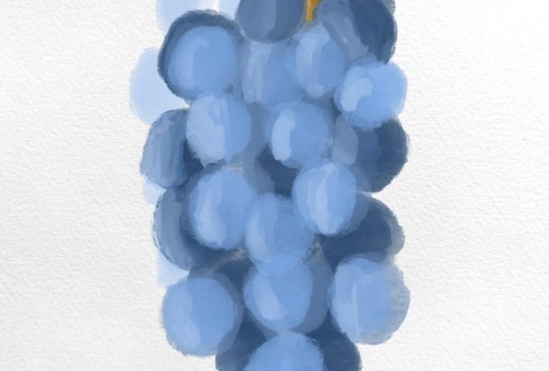
2. Grapes : Hi students, Welcome
to the class. In this lesson, we
will be drawing grapes to make this drawing look
like it's done with gouache. I am using a watercolor paper as a separate layer and destroying in the projects
and resources tab, I will attach this paper, so just download it and
import it to Procreate, this paper will show
through slightly and we'll create a beautiful
realistic effect. We create a new layer
and we will create a color palette for blue grapes. We are looking for a few
different shades of blue, a dark, a medium,
and they light blue. Let's start with
dark blue color. I'm selecting one from here
and I will just create a small.in the
bottom left corner, let's make sure the
opacity is all the way up. So we have a new layer selected
and with a gouache brush. So this is the, this is
in the painting category. It comes pre-installed on the Procreate app so you don't
need to download anything. So here we are creating
a dark blue dot. And with this brush
you have to draw a few layers to get
the darkest tones. So just pick up your
brush from the canvas and put it back down
and you will see how each layer is darker. It also helps if you apply
more pressure to the pencil. Now we are looking for
a medium blue color, and again, we are
creating a few layers. Now, the lightest color. The reason why
we're creating this as because once we are painting, we can result back to
this color palette and we don't have to
search for the color here. It just simplifies
the drying process. But it feels like we have
a real premixed palette which makes the drawing
feel even more realistic. Let's not forget the branch. We also have to premix the
brown shades for this. So we're scrolling to the reds here and picking
a dark brown color, again, creating a dot
here on our palate. And we do the same with
a light brown color. We can build layers
with this brush. So even though we have
only a few colors, we can get so much more
value out of it by applying some colors
thinner than others. So this is our complete palate. We have a light
brown, a dark brown, a light medium, and dark blue. Now we can move on
to the drawing. So we're going to use the
select tool over here. And we're going to take it all the way down to the dark blur. Because when we start
drawing grapes were going to the underlayer first, which is the darkest grapes. So let's make sure
our opacity is all the way up and make the
brush a bit bigger. We are creating a new layer and we're going to select
the darkest blue color. And we will just stop
by during the grapes. And this is going to
be the underlayer. So the darkest grapes
that are in the shadow, We're drying them first because
the ones that are on top, they are exposed
to more sunlight, so they will appear lighter. So we are drawing the
darker grapes fast. And we really want this
to be a very dark layer. So let's make sure we draw
a few layers of this. Play with this until you click
off and then come back on. It doesn't add more color. So just make sure you
pick up your brush. While you are
building the layer. As you can see, it looks
like a real paint. The opacity of the
brush is quite low, so the paper shows
from underneath. And it looks like a
convincing effect as though it's a real
gouache painting. So we're just during
quiet big blue dots. They are scattered
around pretty evenly. And we are looking for
a rough current shape. Now let's use the
sample tool again and pick up the
medium blue color. And we will start working on
the second day of grapes. So again, a few layers of this and I'm applying
it over the top of the dark blue grapes and I'm doing it in a way
that I'm trying to fill in the white gaps
in-between the grapes. And now we will use the sample tool and pick up
the lightest blue color. And we will create a final
layer of the grapes. Again, we're just placing
them so that they are covering the white gaps
in between the grapes. And it's unknown
here at the bottom to make the shape
a bit more off, a bit more realistic, amazing. So now the grapes are
pretty much done. And now we are going to draw
the branch of the grapes. So let's pick up a
new layer again. We're going to sample
the dark brown color fast and we will decrease the size of the brush because the branch
is quite thin. So lets him all the way in. And let's start by drawing
a small dot at the top. And let's drag it down. We're going to pull
this up a little bit because I want the branches
to be a little bit longer. And now I will take
the light brown, zoom all the way back in again, make an even smaller brush
and add some detail. Here. We want it to look like the
branches snapped over here. And we want to add
a highlight to the left side to make this look a little bit
more three-dimensional. Now what we're going
to do is we're going to hide the branch
behind the grapes. So let's hold down this layer and then we're going to pull it
underneath the grapes. And as you can see, it is hidden behind the grapes. If we want to, we can
maneuver it around whether you want it to
be shorter or longer. Also something we
can do to add a little bit more of
a realistic effect is use this blue color and find an even
lighter version of it. And will increase the
brush size again. And let's build a
bit more highlight. I felt like the grapes
look kinda flat, so I want to add some highlight early to
the lightest blue grapes. And we're keeping them to
the left side so that it appears as though the light
is coming from the left side. So the grapes on the left
will be a bit lighter. As you could see
on their branch. We did it in a way that
it looked as though the sunlight was coming from the left side and we want
it to be consistent. So yes, hey, we're just adding some highlights
to the grapes. And let's not forget
to add this color to the color palette. So the groups are
pretty much done. So we did a dark blue
layer of the grapes. We did a medium blue layer
and a light blue layer. Then we drew the branch and the highlights on top
of the lightest grapes. Now feel free to remove
the color palette, and this is how
our drawing looks. Thank you so much for watching. I hope you enjoyed and I will
see you in the next lesson.
3. Raspberries: Hi students, Welcome
to the class. In this lesson, we will be
drawing the raspberries. We begin with a
fresh new canvas. We go to Photo and we import the watercolor paper that I have provided in the Projects
and Resources tab. We click on a new layer. And on this layer we will
create the color palette. So we go to the colors and
we slide over to the pinks. I'm going more towards the reddish colors because
it's more of a reddish pink. And again, we're going to pick a dark medium and a light color. For the dark color.
Let's pick this one. Make sure we put the opacity up and work within 11%
or so size brush. Again, I'm just
creating a circle of the scholar so that
we can sample this. And it's simplified
for us to draw. Now we're going to
draw the medium pink. What we're doing
is just creating a lighter version of
this previous color. And again, we draw a
few layers and then pick the lightest version. You can scroll around,
see what you like. So this is the lightest
color I chose. I think in addition to this, Let's also make one
very, very light pink. And this one will be
great for the highlights. And we will make one more
very dark color as well. So let's select this shift up to make room for the dark color. So this one is almost black. And it will just creating a draft of this
right in the corner. This is for the
raspberries and we also have to draw the
branch and leaves. So again, we are doing
dark, medium and light. So look for a green
color I like when they fall more into
the yellow hues. So we are first getting our dark green and then a medium green. And of course the
lightest green. I would like to create a more yellowy shade just to pull the
highlights and leaves. Alright, so these are all the colors I'll be working with. We can make them a
little bit smaller. They don't need to be so big. Okay, So now let's move on to actually join
the raspberries. So we create a new layer. And we're going to draw two raspberries
hanging from one brunch. So I will begin with this dark color second
from the bottom. And we will just draw a very quick outline
of the raspberry. We don't need this to
be high divisible. We just want to create
the rough shape. And what we will do is we will just create one
raspberry for now. Because for the
second raspberry, all we can do is
duplicate this layer. And it's just a little strategy
to save us a bit of time. And I will just draw one Reisberg and duplicate
it to make the second one. So we're going to draw all the little dots within
the raspberry. And let's start with the button. I'm even going to increase
the brush size a little bit. And we really, really want
this to be a dark layer. We're creating these very
rough shapes just one-by-one. And they cannot be overlapping. They are alongside each other and they are
kind of squished, but they are not overlapping. They're also not
perfect circles. Almost imagine them as little balloons squished
in one very tight space. You just keep on making these
one-by-one very slowly. And don't worry about the
gaps in-between the berries. We are going to fill
these in in a moment. Okay, so this is what
I've asked today. It looks like. Now what we
will do is we will sample the third from the bottom color. This is the medium pink. We will start here
on the left side and just fill in shapes. So we essentially
just filling in the shapes just to
build some dimension. Okay, so now we have this
shape and we will take the light pink color and we really will focus
it on the left side. So we are now going to
imagine that the light is coming from the
left side like this. Essentially what would happen is the light would be focused on the left side and this right side would
be a little bit darker. So when we apply
the lighter color, we focus it on the left-hand side
because this is where it will be more apparent. So it will be most
apparent on the left, a little bit less
apparent in the middle. And the right hand side will be almost entirely
in the shadows, so there'll be very
little highlight. So this is a light
color we will be using. And we'll start to
build the highlight. So we're starting on the left. And again we're just
going over the shapes, focusing it towards the
left side of each shape. Like this. So now we're coming towards the
right side and we're just going to apply
it very thinly. We're adding just
little touches of it. And we will add some
more of it here on the left side to just keep
on building the highlight. So maybe now you can
slowly see that we are gradually building
some depth that the right side looks
like it's a bit darker than the left side. And we will amplify
this effect even more by applying
the lightest color. So this is the very
light pink and we will just focus it on the highlights. We'll make the brush size
a little bit smaller. I'm working with about
five per cent brush size, and we'll focus this on the
left side of the berry, leaving this color in the
middle of each theory. So you can see how this berry is starting to look a bit
more free dimensional. And now what we're going to
do is we're going to fill in the white gaps in between
the shapes of the virus. So we are selecting our darkest color and we
will make a new layer. And we will drag this all
the way behind the berry. And we're going to
bring this one under the berry with a
pretty large brush. We are going to fill this in. Now the buret is starting to come together
because of this. We are drawing a few
lines of this so that the gaps are
really, really dark. Now it looks like all
of these little shapes are connected and you can really see how
big of a difference this makes when we remove this, it almost completes
the very end. Make it look like the
shapes are all attached. So now we will start drawing the leaves on
top of the barrier. So let's create a new layer here and select the
darkest green color. And let's decrease
the brush size again. And we start by
forming this shape. Almost like a teardrop
shape I'm building. And create more layers to
make this a solid color. I do a circle and a pointy
shape coming out of it again. And I was so cool. This one's going to
be carrying down. Let me do one more over here. And a final leaf here to
the left side. Great. And next we will pick up
the lighter green color. So this is the medium green. And we will start to build
the shape of the leaves. So I'm just applying this into the inside of each leaf to
separate them from each other. I'm almost trying to
emphasize their shape. Now for the next stage, we're going to pick up
a light green color. And we are going to draw
it in a way so that it's lighter towards
the left side where the light is coming from. Because remember, we
drew the buret in a way that the sunlight would be coming from the left side. So we have to be
consistent with this. I'll just add a touch of this
to the leaves on the right. And now let's make the
brush much smaller. We're using about a 2% size. And we are going to draw the line that runs right down
the middle of each leaf. So this is the same
light green color. Okay, and now what we're
going to do is we're going to duplicate this barrier so that we can draw
the second one. So what we're going to do is
we are selecting the layers. And let's make sure
that these three layers are next to each other. And we click on the top
one and click Merge Down. Then we do the same thing
with this one and merge down. And now when we
move these around, they will all move together. We go into this layer
and we are going to slide it to the left side. And we're going to
click Duplicate. So now what happens is
we have two berries. So we're going to select the bottom layer and click
this arrow here on the top. And we'll go into, move it to the left side to
create our second Barry. I'm rotating it a little bit. And I'll also make
it just a little bit smaller so that the two berries are a little bit different
from each other. And we want the one in
the bacteria appear as though it's a little bit darker because as you can see, they merge right here. So we are selecting the
darkest pink color. I guess this is a burgundy. And we'll just go over
the barrier over here. And we're doing just
a thin layer enough to separate the berries
from each other. And now you can see
that the various kind of a pay separate. Now we can also go into this magic pencil button
over here at the top. And we will select the hue saturation and
brightness at the very top. I'm going to drag down
the brightness scale. And as you can see,
if we drag it down, that changes the brightness. So we're going to just
make a slight hint darker, just by three per cent darker. And then I'm taking
this Barry and I will make it just a
little bit lighter. It's just a tiny difference, but it really helps in separating the two
raspberries from each other. So we are creating a
new layer and we're going to draw the branch that
connects the two berries. So let's select the
darkest green collar, zoom all the way in. And essentially we want to
connect from this point, this point into the top
of the branch over here. So we drag it down, create a slightly curved line. We're going to go
over this a few times just to make
it quite thick. And we're going to
do the same thing with the barrier on the left. Connect them at the very top, and make this quite
dark green color. Now, we'll go into sample the medium green color and we are going to make the
brush a little bit smaller. And we'll start to build
highlight on the left-hand side. We remember that the light is
coming from the left side, so we need to be consistent. And now let's take the lightest green
color, zoom in again, and we're going to just draw one more stroke to enhance the highlight
a little bit more. And this is pretty much done. The only thing we have left
to do is we want to add a hint of yellow and we will
add some final highlights. We make this brush
really small and add some final highlight again
on the left side branches. We can also add some to the
very tip of the leaves. We are focusing this
on the left side because this is where the
highlight is coming from. And you will also complete
the very top of the branch. So I am adding some
highlights here. This is pretty much done. This is our raspberry
during complete. So now what we will do
is we will merge all of these layers and we can get
rid of our color palette. We can move it around. However we like it. You can increase or
decrease the size. And that's it. This is
our Turing complete. There are some
additional things he can do if you want to. You can go onto the magic pencil icon again and play around
with the brightness, see if there is any
effect you prefer. You can make the darker likely. You can change the saturation
and the hue of the berries, make it a little bit more blue
or a little bit more red. And what you can also
do is you can go into the color balance
and you can play around with each color, see if there's
anything you prefer. And this is our
raspberry drawing. I really hope you enjoyed it. I know I did. I hope you learned
something useful and I hope you loved the drain. I will see you in
the next lesson. Thank you so much for watching. Bye.
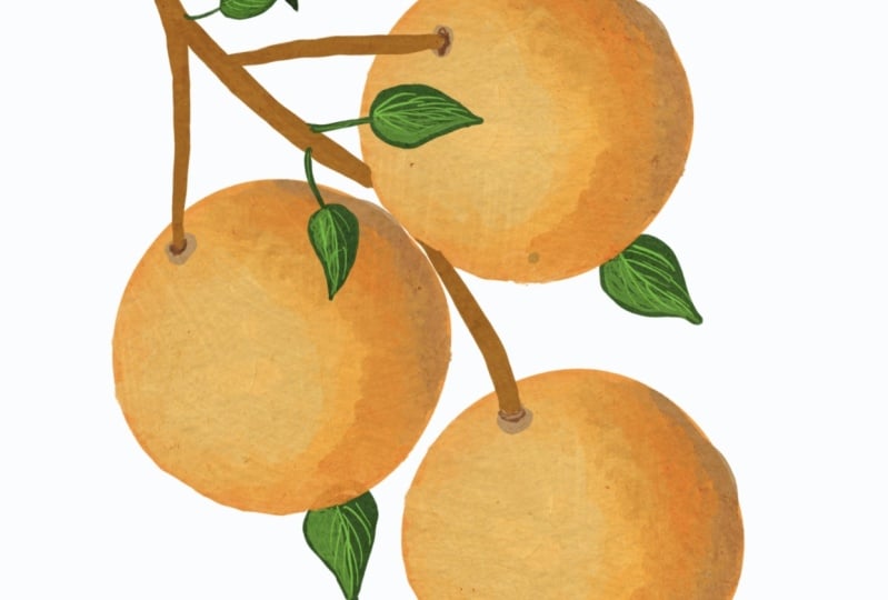
4. Oranges: Hi class. In this lesson we
will be drawing oranges. So again, we start with
our watercolor paper. We're going to start by creating a new layer and we will
build our color palette. So again, we are using
the gouache brush in the painting category
and make sure the opacity is up
and pick the size. So let's start by picking
the colors for the oranges. So this seems like
a very good column, and this is going
to be the mid tone. Now we need a darker
version of this color. So this is going to
be the shadow color, then a very light orange
for the highlights. So we've got all
the way to the top and we pick a light
orange from here. Let's see how that looks, and let's just make this
a little bit smaller. We also want to draw the
branches and the leaves, so we're going to
need a green color. So we slide over
here to the grains. And I picked this one. I always like the ones that have a slight yellow hint to it. Again, my type a few times to make sure I have a
really thick layer. And now we need a lighter
version of a scholar. And I suppose we can start
with drawing the oranges. So let's make a new layer. So let's start by sampling the Smith turned
orange over here. Let's use a pretty big brush. Essentially, we just want to
draw the free large circles. So I'm just making this into a very thick layer
also has a trick. If you draw a circular
shape like this, connect the two
and hold it down. It will make a nice
Sacco NFC tap. It will create a perfect circle. So you can use this as a guide. So when you are creating
a shape like the orange, you can use this trick to create the perfect orange circle. Say Hey, we just
draw the circle, hold it down, and
then we color it in. Let's make this one
a little bit bigger and now onto our final orange. And now what we will
do is we will add shadows to the oranges
to create depth. So we sample the darkest color. And we're going to imagine that the light is coming from
the top left angle. So if you picture this, it would be lighter at the top left side and dark
at the bottom right side. So we're going to focus all the shadows towards the bottom right
side of each orange. And when we draw the
branch later on, we will also focus the shadows onto the right side and the
highlights on the left side. We are making essentially
this half-moon shape. And we can use this pointing, the finger icon over here. And we can essentially use
this as a blending tool. So we just blend these colors together to create a
very seamless blend. So why don't we
repeat the process over the remaining two oranges. Also, this orange will be slightly behind this
orange over here, so it will cost a small shadow. Again, we use our blending tool and we work these
three colors together. And I keep my opacity
at about 60 per cent. It's quite a strong brush. As you can see. If you
have a low opacity, it just gives you
better control over it. If you just bring
the opacity down, it's much easier to control
the brush this way. So now we're going to sample the lightest orange color and we'll pick up a bigger brush and we will start to
rebuild the highlight. Again. Remember we are
focusing this towards the top left side and using layers to build
up the highlight. And every time I
create a new layer, I make it a little bit
smaller and I focus it in a smaller part of the orange. Again, by creating
a layer pretty much around the entire orange
than the second layer. It's bit smaller. Then the next layer will be even smaller
towards the center. So even though we are working
only with three colors, which seems like a
very limited palette, we can use layers to
create more times. So what I'm going to do
is I'm even going to sample an even lighter
shade of yellow. And we'll just focus it right in the very
center of the orange. And of course, we have to add
this to our color palette. So as you can see, these oranges look
kinda 3-dimensional. Because we drew
the shadow towards the bottom right and the
highlight was the top-left. Sorry, it's very consistent. The light is coming
from this direction and it looks a little bit
more realistic this way. Okay, so next we're
going to draw the branch that connects these oranges that sample
the darkest orange color. Before we do that, let's
just move this layer down a little bit so we create
room for the branch. Okay, So we sampled
this brown color and let's make sure we are
working with a smaller brush. I'm using about a
five per cent brush. And we will try to connect these three points
to each other. Let's make a lighter shade
of the brown for the branch. And we will essentially add
highlights to the branch. And that's not forget to add
this color to our palette. And I would also like to make
a darker version of this brown to add some more shadows. So I am just focusing it towards the
right side of the branch. We will also add some darkness to the very tip of the branch, so that's a bit more distinct. What I would also like to do
is is this lightest color and use it as a
highlight to the branch. So again, I'm using a
small brush and I'm focusing it on the left
side of the branches. And now we can finally move
on to drawing the leaves. So let's pick up this
dark green color and let's draw a leaf over here. And let's use just a
slightly bigger brush size to help us create a
nicer shape of the leaf. So essentially I'm creating
like a teardrop shape. And I'm going to fill this in. And let's create
another one over here. And let's also
create some leaves coming out from
behind the oranges. So let's create a new layer and let down behind the oranges. So you hold down the layer and you put it underneath
the oranges. So let's have this
one over here. Now what I would like
to do is I would create another version
of the screen. I'm creating a darker color just so we can add some
depth to the leaves. So let's add this to our
palette in case we want to use it after we go back
to our oranges. And remember the light
is coming from the left, top left side, so
the shadow will be focused towards
the bottom right. And again, we can use
our blending tool to make this blend a
bit more seamless. So now we're going to sample the light green color and we're going to add the highlights. Again. We're focusing them towards the top left side because this is when
light is coming from. And of course we have to add it to these two leaves as well. And now let's use
a very small brush with a light green color. And we're going to create the line that runs right through the middle
of the leaves. And this kind of follows
the curves of the leaves. And we will also draw
the little lines. Why don't we know,
merge these two layers together so we click on the top layer and make sure that it's
above the leaves. We tap on it. We click Merge Down, and now it's all one layer so
we can move it all around. Then we want to connect to
these leaves to the branch. So we're going to use
our darkest color. Make sure we are working
with a thin brush. And we're just going to
connect them like this. Again, we have to kind of
go over the line a few times to make sure
that it's dark enough. And we want this
line to be connected to the light green line
that runs free to leave, if that makes sense. Now for the last step, we are going to sample
that green color and we're going to focus in on the left side of these little
branches that we just drew. This is the finished drawing. We can now take up
our color palette. You can resize it
however you like. And that's it. I really hope you
enjoyed this class. Thank you so much for watching, and I will see you
in the next lesson. Bye.
5. Final Thoughts & Class Project : We made it to the end. Congratulations for
completing the class. This was not a simple portrait, so I would really
like to praise you for finishing all the lessons. To summarize, we
drew free fruits. We started with the grapes
than the raspberries, and finally the
beautiful oranges. We began each drawing by
creating a color palette. Then we draw the basic
shapes of the fruits. We followed by creating the
highlights and shadows. Finally, we finished off by drawing the branches and leaves. I hope that by breaking them, the drawing into
these four sections, we managed to
simplify the drawing and give you more confidence
to create on your own. That being said, for
the class project, I would be delighted if you attempt to this drawing with me. It would be amazing if you
created all three fruits with me or perhaps pick
just one you like the most. So follow the class
along and the draw with me as though we are
working on it together. You will find all of
the project details and the drawing references in the projects and
resources tab below. I welcome any questions
you might have. If you would like me to clarify something or explain something, father, I wouldn't be
truly delighted to help. I would like to thank you
again for joining me. I had so much fun
creating this for you. I found the drawing very
relaxing and hope you did too. I have a passion for teaching, so truly thank you
for being here. Here's my Instagram
account on my website if you would like to see more
of my work and support me. I also create
portraits of people, animals, and other landscapes. So if you are curious
to see those, that's where you'll find them. I also have more pastel
classes here on Skillshare. So if you enjoyed this
course, please have a look. That is all I am
very excited to see your project and answer any
questions you may have. Thank you again
for being here and a big congratulations for
completing the class. Bye.
 Wiktoria, Professional portrait artist