Transcripts
1. Introduction: Beginners in watercolor
often struggle with these mistakes: watermarks, bleeding, and muddy colors. But are those really mistakes? Well, if we strive for a perfectly-rendered
piece achieved through a lot of experience, knowing the medium, and therefore having
control over the paints, yeah, those might be
considered mistakes. However, what if
we're getting to know wet mediums by letting
loose completely, going with the
flow of the water, and painting without
hesitation before we approach, gaining control over it? Hi, my name is
[inaudible] and I'm an illustrator at which and treasure hunters
from the Baltic Sea. I've been working as an
illustrator for three years now and in the beginning of
2021, I went full-time. Since I started, I worked
for a government county here in Germany for a
youth work campaign, and also did follow our projects
for their voluntary work as programs as well as
commissions from private clients. Alongside that, I'm constantly working on personal
projects which people from around the
globe have purchased prints and postcards from
over on my Etsy shop. Online, I'm mostly
known for my semi realistic animal and
nature paintings as well as my art and life
side channel on YouTube, where I share my everyday life
as a full-time artist and some behind the scenes of paintings and business projects. Up until now, I've
been drawing and painting almost
exclusively traditional, and most of my projects are
done in watercolor and inks, which are my favorite mediums
alongside colored pencil. But when I started, I easily got frustrated over the before
mentioned mistakes. Only when I let
lose completely and started painting without
thinking about the end result, I finally understood
how my paints work and could use
them to my liking. In this class, we are
going to let loose voiles, and go with the
flow of the water, figuratively, as
well as literally. You will learn how to paint beautiful pieces with watercolor and ink simply by embracing
their randomness. To get there, we're
going to approach these wet mediums like we
would learning a new language. First, we gather some
basic principles and useful tips which make it
easier to get started. Just like you would
learn some phrases in the local language before
you're going on a vacation. The second part, we
are going to get our dictionaries out and start
learning our vocabulary, stringing words together without thinking
about semantics. You will give yourself
only one direction, one word or theme that you pick. My demonstration piece, it is
going to be the word river. Using the popular wet
on wet technique, as well as fun and experimental materials like sea
salts and pipettes, we are going to
paint for the sake of painting and observe. Then in the last parts after we got around
with just words, we're going to
apply some grammar to have actual conversations. Meaning putting some rules
to our painting process. Not to make it
stiff and less fun, rather to set intentions and use the floor to our advantage instead of just drifting around. For the demonstration
of this part, I'm diving underneath
the water surface and show you how you can utilize your observations
of the medium from before to create color washes, soft gradients, and
depth through layering. But before starting, let's talk briefly about your
class project.
2. Your Class Project: For this class project, I invite you to paint
alongside with me. You can either
recreate the pieces I demonstrated by copying or
following my guidance loosely, or you create your entirely
own thing. It's up to you. This class is about
exploring and discovering the properties and behavior of your specific
watercolors and inks, the outcome doesn't
really matter. I highly encourage you to share your work in process and the different stages
of your exploration. I cannot wait to see
all your creations, especially read about what you have discovered
while painting them. Without further ado,
let's get started.
3. Before We Start (Wet Mediums Tips): Before starting the
fun stuff in paint, I want to give you some very crucial
basic knowledge about watery mediums like
watercolors and inks. I know I said that this
class will only be playing around without
rules and mistakes, but there are some things you
got to know before you dive in and hit your
head on an obstacle that could have been
avoided easily. For those of you who already
tried watercolors and inks some of the stuff
I'm going to tell you will be old news for you. But I still encourage
you to watch this lesson because there could be some hidden gems for
you to discover. The most important thing when working with very watery mediums is to have this somewhat
right paper. That's all. That's the only thing
I entrust in you. Get some decent
wet medium paper. But what do I mean
by somewhat right? Well, even though the
right paper is necessary, that doesn't mean
that you have to go and get the most expensive, luxurious hot press
watercolor paper out there. When I started, I
knew nothing about paper and to be honest,
still don't really. I just went in and grab the first mixed media paper
block I could afford. There are tons of different
paper variations for different purposes and that
could be pretty overwhelming. The only thing I
advise you to look for is mixed media or
watercolor paper that has a thickness of
at least 300 grams per square meter or 140 lb. If you'd like to
investigate further, you can look for a certain
type of structure. Cold press paper
gives your pieces the very significant
watercolor structure, whereas hot press paper is very smooth and allows
soft renderings. That's basically it. The only rule I entrust on you, get some paper with
a thickness of at least 300 grams
per square meter. All that's following now is just optional and for
inspiration only to be honest. Let's talk a little
bit about paints. I bet every one of you knows these watercolor sets for school like these big boxes with a lot of colors in
them and the white, in the separate tubes. These are often very cheap, of low quality, and frowned upon among
watercolor artists. But that doesn't
matter for this class. I created beautiful
pieces with those before, so you can too. They are affordable and
they work perfectly fine. If that's what you
got, you're good. Just keep in mind that
these might not come out as vibrant as in
my demonstration, and they often look a little grainy and
chalky when dried down. If you want to upgrade
your paint situation, but don't want to spend
a whole lot of money, I recommend buying a
very small palette with maybe the primary
colors and the brown in it. Back in 2019, when I got
back into watercolors, I purchased this little
thing and I used this for the upcoming
one-and-a-half years exclusively. They weren't the
cheapest paints, but still pretty affordable, and they still serve
me very well in combination with my more
professional paints. Another paint that I would like to introduce to you
and which I will go into use for the
demonstration pieces in this class are water-based inks. Mine are actually pretty
cheap writing inks, and not entirely
opaque when applied. They have basically the same
properties as watercolors, only that they are liquid already and don't come in a pen. I think that supports
my claim that you won't need super-specific
materials for this class. Let's look at some extras. To have fun playing, water-based mediums
are the best to manipulate and mess around
with in my opinion. They flow, cover, bloom, and reactivate when they
come in contact with water. But applied on dry surfaces, they can be as bold and vibrant
as for example, acrylics. Some fun gimmicks, I like to
use are a little pipette, mostly to add water to my paint, either to activate
or dilute them and sometimes I drop
directly onto the page. The last thing I
highly advise you to try out in this
class is sea salt, the rough crystal kind. It's great if you
have a grinder too, so you can vary the size
of the crystals a lot. Lastly, I have some other
great tips for you. We are going to make a mess
with paints in this class, so it would be wise to
protect the surface you're painting on if you mind
getting it stained. Since I am an art YouTuber who has convertible backgrounds
for her videos, I've got this easy-to-clean
acrylic sheet. But that's nothing a normal
person has laying around. You could use an oil
sheet or an old shelf. I wouldn't recommend using
newspapers because the ink in the newspaper will
react with the water and therefore stain
and ruin your pieces. Washi tape and painter's tape is great for taping
down your paper, which keeps it in place and prevents the paper from
waiving that match. Your piece also gets a
neat white frame from it. Maybe you have a
marker or a fine liner nearby if you'd like to draw
in some details with those, instead of using a brush. My holy grail, a white
gel pen for highlights. With that, you don't
need to use the white of the paper which requires
much planning and precision, which we aren't here
for in this class. Now finally, we're
going to get into it.
4. Making a Mess: Then let's get into painting. Before, I wanted to give you a quick tour of my workstation. I've got my inks ready, a blue one and the green one. That's all I'm going
to use for this piece. Two glasses of water, one which stays clear, it's for diluting the paints
and wetting the paper, and the other one is for
cleaning the brushes. Then I have a
variety of brushes. Broad ones, thin ones, thick ones; it doesn't
really matter, only thing that's important is that they are all really soft because they have to
contain lot of water. Then I have a cloth or a towel. This is my designated
painting towel, but you can also use a tissue, if you like, or nothing at all. My pipette and a
little mixing palette, although I'm not going to mix
a whole lot for this piece. But I want to dilute
my paints with water which I obviously
can't do in the vial, it would damage the paints. I also don't want to dip in my brushes directly
into the vial, because that would
higher the risk of tipping them over and
making a huge mess. Lastly, I got my
salt in a grinder. I have taped down my
sheet of paper already. I'm working on an A5
format for this piece, and using the Canson Mix Media 300 grams per
square meter paper. You can go bigger or smaller, this totally depends
on what you like. As I said before, I am just going with one way for direction
which is the river, and that's why I have my
green and my blue inks here. You can follow me along, I very much invite you for that, or you can choose a totally different theme
and colors if you want; this is totally up to you. I also wanted to mention
that this is not going to be a real-time painting lesson. I might skip over some
parts here and there, for example, letting things dry, and here and there I
will fast-forward, so you know what to
expect from this lesson. Then let's start painting. I'm starting by
preparing my paints. As I said before, I don't want to use
the paint as it is, I want to dilute it a little so I'm putting it into my
little mixing palette. Cleaning the pipette in-between
is very important so you don't mix your
paints accidentally. Then I put in some clean water. Now, I'm going to start
by wetting the paper. That means loading my brush with clean water and put it on there. Don't be afraid, use a lot of it. Your payback can take
it as long as it is 300 grams per square meter. I'm going to some more
forming little pallets. In this case and for that
piece in particular, it's also better to have
more water than too little. Spread it. So I think I've got enough. What I'm doing now is I'm
taking my pipette again, I'm taking on some of the ink. You can start with
whichever color you like, I'm choosing blue for
no particular reason. Then I just start dropping pretty randomly. Now I'm going into the green, see how it blooms as it
blends with the water. Some more blue. If you don't have a pipette
that is totally fine, you can also take a pointy brush like this
one like for example, and loaded with water so
that it's nice and wet, and then you can
take your ink and just spread it like this. Nice. By now having this brush, I'm going to spread the
pigments a little here and there just so I can cover the whole white
of the paper with ink. Taking a little
bit more of blue. I'm not particularly mixing the colors here on the paper, I just push them towards each
other so that they blend into each other but
not make a till tone. We have to work a
little quick here, otherwise the paint will dry and then we miss out our
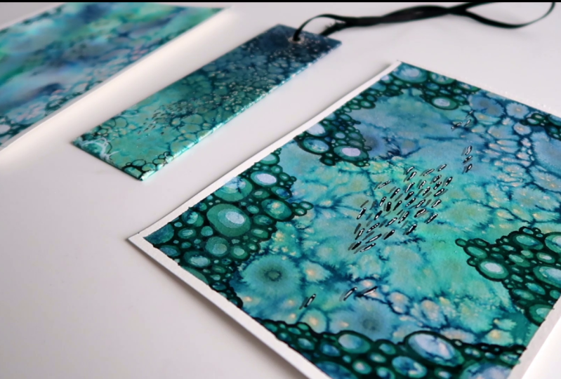
opportunity to use our salt. This is so beautifully
random, I love it. That's it. I covered
everything in paint. Now, I'm doing to drip a
little bit more water for this water mark effects
that we actually want to avoid when using a lot
of control over watercolor, but today we don't care. While this is still really wet, now the salt comes in handy. I have it in my grinder here. I'm going to sprinkle a
little here and there. You can take a lot
or just a little, depends on how you like things. You can already see the effect the salt
has on the wet paint. This is so fun, being
like a little kid just making a mess and call
it art. It is art though. I want some bigger
salt crystals on here too just to have a variety, and I put them where there's a lot of
water on the paper, awesome, towards the edges. Once you've done all this, Don't touch it, this
will take awhile to dry. I also wouldn't advise using
a hairdryer here because the salt needs it's time to absorb the color
and work its magic. What you can do
instead is observe what the paint and the water
is doing to your paper. Look how it waives the paper, and where there are
puddles of water where the colors bleed
into each other. Look what the salt
does to your paints. I'm going to leave the
camera rolling for a little time-lapse so
you can see what I mean. It's beautiful; isn't it? I love working with salt when
painting with watercolors. Depending on which pigments
your paints are made out of, some will even change
the color a little bit. I know from experience that my green ink contains yellow, and that'll show in some spots. By the way, this is
the perfect time to snip some work in progress picture for
your class project.
5. Let's See What We've Got: [MUSIC] Now that this
is completely dry, we can gently brush
off the salt. Not all of the salt
will come off. I'm using a dry brush
for this by the way. Not all of the salt will come off and that's totally fine. We just want to get rid
of the very big crystals. Also, the biggest salt crystals now look really
cool because they absorbed a lot of
paint and they are now looking like
small little chimps. Be careful not to rip
your paper when you do this because some of
them are pretty stuck. [NOISE] As I said before, now you can see which pigments your paints
are made out of. The green I used here has
yellow undertones and the blue ink has some purple and pinkish tones
in them as well as yellow, although I don't know
if the yellow inside the blue is coming
actually from the green. [LAUGHTER] Painting is also a little sparkly now with
all the small salt grains. That's an effect that
you, unfortunately, can't see when you scan it in later like I do with
all my paintings, but the originalist is sparkly. [LAUGHTER] I'm going to clean this up now here so that the crystals won't bother
me in the process, and then we see what we can
do with what we have here. Shall we? Doesn't that look
like a sparkling river? Yours probably looks completely different and that's
totally fine. That's the magic of the
salt and the flowing water. Maybe it looks more
like a reef or some oil spilled in a
paddle or an aquarium. Maybe also to move away from
the water thing completely, it looks like a metal if you use more green than
blue. I don't know. I'm very curious to see in
the project gallery though, so make sure to post it. But whatever you see in yours, let's flush it out a little bit. On my painting, as I said, going with
the river direction, and I think that especially these parts are like the
sun reflecting on the water and now I'm thinking
of what can I see when I look onto a
river and that's rocks. I'm going to paint some
rocks here and there. For that, I'm going to mix a little bit of my
blue ink with the green so that I get a slightly darker than my
background painting, teal tone, and I also want that the
green and the blue of my background are very distinguished against the color of the rocks that
I'm about to paint. I also diluted a
little bit with water. Which brush should I take? [NOISE] This one is
a pointy soft brush. [NOISE] Without much thinking, I'm just starting
to paint my rocks. Rocks are clustered
and pretty random, so it doesn't really matter
where you paint them. [LAUGHTER] That's the beauty of it because you don't
have to think about it, you just paint for
the sake of painting. While you're doing this, try to observe how the paint behaves on the already
painted paper. I have the feeling that my paint distributes way faster on the already painted
paper than it did on the unpainted paper. Just really fascinating, is if the background
painting hat has softened the paper
structure a whole lot, but now the paint
is easier absorbed. I also have the feeling that my background painting took away a lot of the
structure of the paper. You can really work on
this as long as you like. There's no too much or too little [LAUGHTER] when it comes to rocks in the river, just remember there's
no right or wrong here, just exploring the paints. Look at how the lines
flow into each other, where they're still wet. See how the paint behaves. What happens when you re-wet
layer you have painted? What happens when
you draw on top of the little salt crystals
that remained on your paper? In my case, it spreads the
paint in a little fuzzy way [LAUGHTER] if you would put paint on a tissue paper. You can also [NOISE] dilute your paint a
little more with water, or you can add even
more paint if you want the lines to be darker
and more opaque. I think my lines are
pretty opaque and ready. Let's see how this, not a big difference, but here on the lighter parts
it is a big difference. [LAUGHTER] Also, fill
in the little spaces in-between the rocks because I feel like there
wouldn't be any light, so these little spaces
are in the dark. If you feel a bit silly
by now, that's fine. I assure you you're learning your watercolor vocabulary
here without even noticing, and especially, without
the distraction of thinking about the outcome. [LAUGHTER] To be honest, if you're doing what
I'm doing here, you're just basically
painting circles. [LAUGHTER] Most important
thing is that you internalize the behavior of your paints which you can then use for other watercolor
and ink paintings. Maybe when you want to
think about the outcome and go into a
specific direction. Also, don't worry about any watermarks
you're doing here, like the paint
spreading in a way that you didn't intend it to do, it's all part of the process. Talking about watermarks,
it's actually pretty nice to know how much water is actually necessary
to create them, [LAUGHTER] otherwise,
you wouldn't know how much water you use to not create
them if you want so. The same applies to bleeding colors or mixing
colors and make them muddy. How much do you have to do it
so it turns out like this, and then you know
the boundaries. I think that I'm done with
the rocks. Am I though? I think I'm going to apply
some shadows here and there, and for that, I'm going to dilute my paint a little more. [NOISE] Just go in and paint some random shadows. This don't have to be realistic shadows or anything
like that because I'm not determining where the
light source is coming from. I just want to give
it more depth. I can now see the difference between the diluted paint
and the undiluted paint. Maybe this rock is
completely in shadow because the other rocks are higher and I can also see how much the
background painting is shining through the diluted paint
or not, it's really opaque. I think I'm done with the rocks. I'm letting this dry now, and then I'm going to add another layer to create
even more depth.
6. Winding Up The Play Session: [MUSIC] Now that the
rocks are dried, I said I wanted to
add another layer. I was thinking about
what else you can find in the riverbed
and it's pretty obviously plants and water
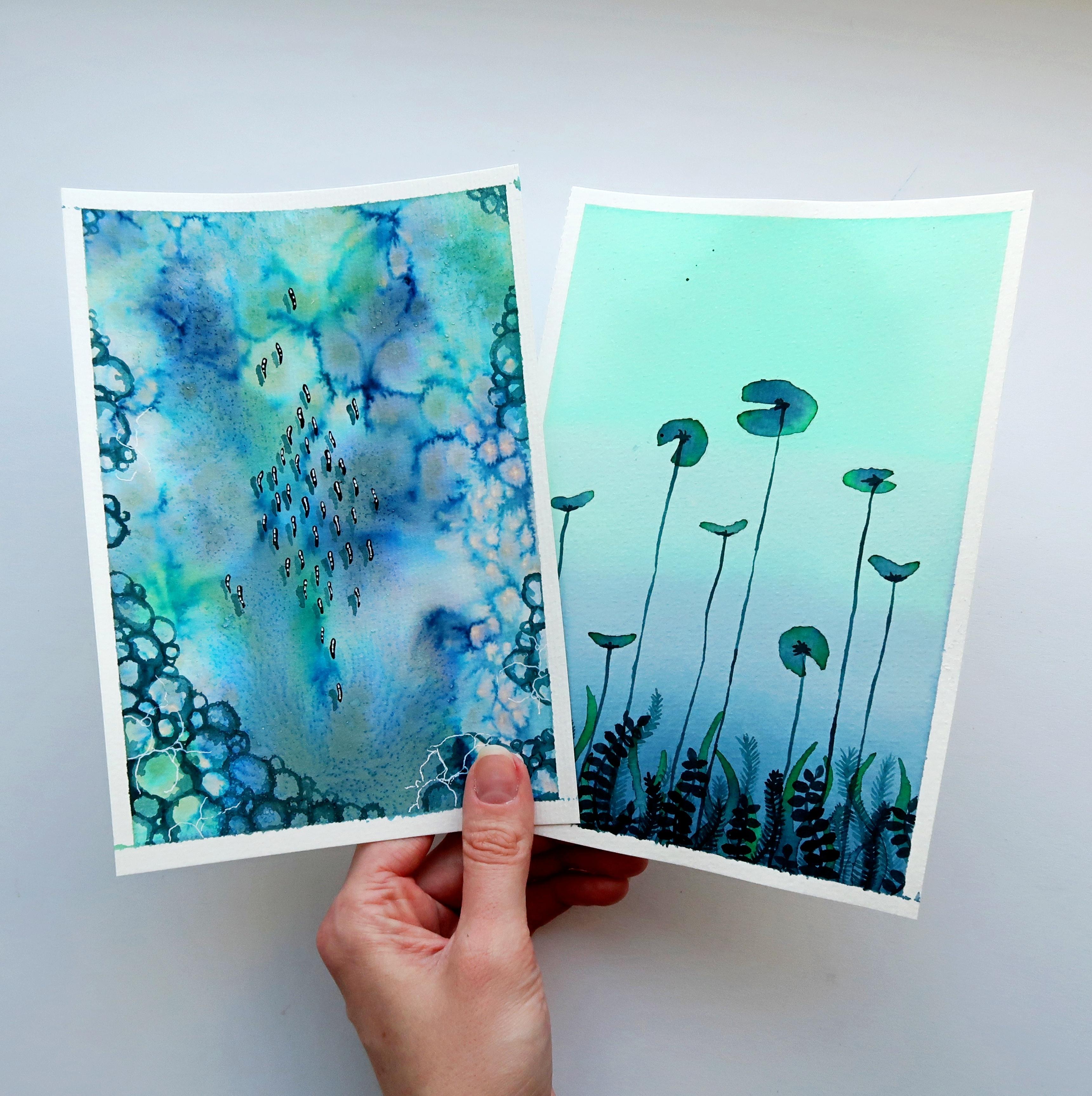
lilies, insects maybe. But I decided to do a little fish swarm
because I live right next to a river and
I really like when they scatter and spark
in the sunlight. For this, I'm not using
my blue and my green ink, I put these side for the second. I'm going to use a black
acrylic ink for this. You can use your black
paint or a marker or a fine liner if you want or black watercolor works fine too. For black details, I just
really like my acrylic ink. This one is not reactivate
tuple. Is that the word? You cannot reactivate this
with water so it's permanent. I also have a separate
mixing palette for this because as you can see, this stuff is permanent
[LAUGHTER] [NOISE] For this, I'm taking the smallest
brush that I own [NOISE] and then just start. Where do I start? Here. I'm not drawing fully fleshed
out fish here, more like elongated drops [LAUGHTER] simplifying
them a lot. This is going to be a little diamond formation in the middle of the water here. Maybe you noticed that although we are painting
still very loosely here, we went from really
messing around to a bit more direction to
small little details now, which is at least for me my regular watercolor process when I'm doing more
fleshed out paintings. Trying to make them
not so uniformly. I think they are a little
scattered here and there, two of them are a bit slower. This one is rebellious
[LAUGHTER] as this one. Let's add even more
depth, shall we? These little fish
are swimming about in their riverbed [NOISE] but they are also
casting shadows. Therefore, I'm
getting my dark teal back and my smaller brush. There's really no
witchcraft about this. Just that I'm take the
diluted paint and now I'm deciding that the light
comes from this direction, from the right so that the
shadows the little fish are casting are on their left. I'm just trying to imitate
their little shapes. They don't have to be identical. My shadow isn't identical to me. If you want to add this layer, just make sure that your shadows are all on the same side. We're obviously not going for a realistic look here but in nature there are some rules that we need to apply so
it is convincible. That's at least what I think. You can go about it
however you like. Maybe in the world
that you are creating, there are two suns, therefore two light
sources, I don't know. [LAUGHTER] I think I got every little fish
a little shadow. This one is a bit too light. Also a good trick, if you think you've put too much paint down
or too much water, you can use a damp
brush and go over it and the brush will take up all the excess
paint and water. Yeah. I think that's it. Now it looks like
they're really swimming above the ground of the river. Now that that has dried, what about some highlights? In the lesson about the
materials and tips and tricks, I talked about my holy grail, the white gel pen. People, I'm sharing top secret watercolor artists secrets here, so
listen carefully. When you think your piece
lacks depth and you did all the shadow stuff and all the details stuff but you still think there's
something missing, put in some highlights
with white paint. I promise this makes everything looks so
fresh and put together. I'm going to add
little drops here on the fish because they have scales and scales are
sparkly in the sun. Many watercolor artists
will tell you that you should use the white of
the paper for highlights. That is true in some
extent but it involves really much planning and
sometimes the highlights are so small that you just cannot
avoid to paint over them. For example, when
you're painting eyes, I struggle a lot with leaving
the white in the eyes. The paper wide and I rather go in with my
gel pen afterwards. The gel pen is also
really opaque, especially on black, that's why I use
this one rather than white paint or acrylic ink because I figure
it that this one will make the most
visible highlights. I forgot one. [LAUGHTER]
Highlights are really much fun. If you really want to
explore further with this, feel free to add some
reflections on the water, maybe near the riverbed there is some foam created
from the waters flow. Maybe it's a very speedy river, so there's definitely
form on those. There's pretty much
nothing to overthink here. I think I'm going to make some, they're called ripples where we loose correct lines here, just adding little more
texture to the water, if water has texture. Our water does, doesn't it? That's it. I am very happy with mine and I hope you
like yours too. But let me show you something. I have painted this
concept multiple times by now and they all look
different from each other. Isn't that amazing? But not that we played around, what about setting
some intentions and see how that works out?
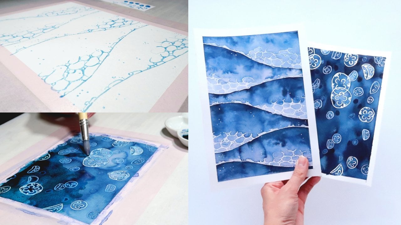
7. Setting Intentions: Now that we have played with our paints and
explore their ways, what about taming them a little? Let's apply some boundaries but not to make it
stiff and less fun, rather to start intentionally using the flow to our advantage instead of
just drifting with it. For this demonstration piece, I'm staying with
the water theme. You are again invited to join me or do your own thing.
It's up to you. But this time, instead
of looking from above, we are actually dive
in under the surface. I'm the queen of analogies here. As I said, we are going
to apply some rules, but keep in mind that
these are your rules, so you can loosen, break, or change them
however you like. I also think that it would be more
appropriate to call them intentions rather than
rules. Let's see. I want to paint an
underwater scene but I'm not as snorkler or
diver by any means, so I don't really know how underwater plants look
like from memory, and therefore I'm going to
look up some references. For references in general, Pinterest is a
really good source. You can just type in
what you're looking for and add the
keyword reference. Underwater scene reference. Then it gives you a whole
lot of options here. I already created
a pin board with water references which I'm going to link in the resources. They also collected some nice underwater
plant scenery here. This is also a great feature
if you see something that is appropriate for you, but not quite the right thing, you can just click on it and
it shows you stuff that's similar to that what
you searched up. Great, I think this
one is pretty cool. With that I set my
first intention, which is I want to paint
an underwater scene. The second intention
I figured out is that near the
ground of the water, it's darker than at
the surface obviously because up here there's much light down here,
there's no light. Cool. Let's start with that. I'm still just using my blue and green inks and
I'm going to dilute them. Dilute them a whole lot, rather more watery because this time I don't
want to go in with some very vibrant
and opaque tones because we're starting
out with the background. Next thing is actually a very popular thing to
do with watercolors, and that's creating
a soft gradient. I'm loosely determining
where I want the water to get darker and it's slightly
beneath the middle line. I'm doing the blue stuff down here and I'm starting
up here with green because I figured
I would like to have it that the blue is the
darker tone then the green. The first thing I'm doing
is as I did with the river, I'm putting a whole lot
of water to my paper. I want to have it really wet. If this is your first
gradient you ever create, don't get frustrated. It's really difficult to master, but that's what we are here for, practicing and observing and seeing how we can manipulate the paint
to do what we want. Great. Now instead of dropping the paints down and
see what they do, I'm taking another
broad brush here, wet this one really good and I'm starting with the lighter
color on the top, which is the green. I'm starting to
apply it on the top of the sheet of paper. I bring it down nice and evenly if that's
what you're going for. If you want it splotchy
then go for it. I'm going all the way down. Just we're wetting the
paper with the paints here. Now, while this is
still pretty wet, I'm going in with the blue, but I start from the bottom, not from the middle line
because we are now pushing the paint upwards so that it
creates this soft gradient. If you think that the
line here is too harsh, what you can do without mixing the colors
too much together, you can clean your brush, add a little bit of clear water, go over it again and drag
the pigments up and down. Not going too much up. What you can see here now is actually a great "mistake that I made" while the paper is really wet and the pigments
haven't settled down yet. When I'm going in with clear
water in the green here, the clear water will lift
up the green and create watermarks and white
streaks in-between. I don't really
care about it that match in this piece
particularly, but if I would have
cared about it, I would have let the green paint settle down first
before adding the blue. Just so you know. I think that looks
great already, but I really like to go a bit
darker with the blue ink, therefore adding a bit more ink to my mixing palette here. Now with the dark blue, I'm creating a gradient in
the blue hues themselves so that it goes
from light to dark. Let's go over it with
some water again. See what I mean,
that the clear water lifts up the pigment
here where I went over it with the brush because it hasn't settled yet. I think I like this a lot and I'm going to let this dry now.
8. Using Our Observations From Before: Let's see what we got. Did you achieve a
smooth gradient? I think I did. I mean, it could be better, but it can always be better, so that's not what
we concentrate on. Next thing. Are there any watermarks? As you can see, I have one here down in the left
corner of my painting and what you can do now is not fixing it because
that is not possible. You would ruin your
whole painting if you try to achieve that. But thinking about how
much water you used in that particular
area and figuring out what it made too much
if that makes sense. Remember those aren't mistakes. We are just observing
the effects and that results in your better
understanding of the medium. As I said before, it's like
learning a new language. You need your vocabulary and
grammar in order to speak. For painting, it is
that you need to know how your medium behaves
in order to use it. Now that I have my
background down, and it's all dry, I'm going to put on
some more layers. Therefore, I'm going back
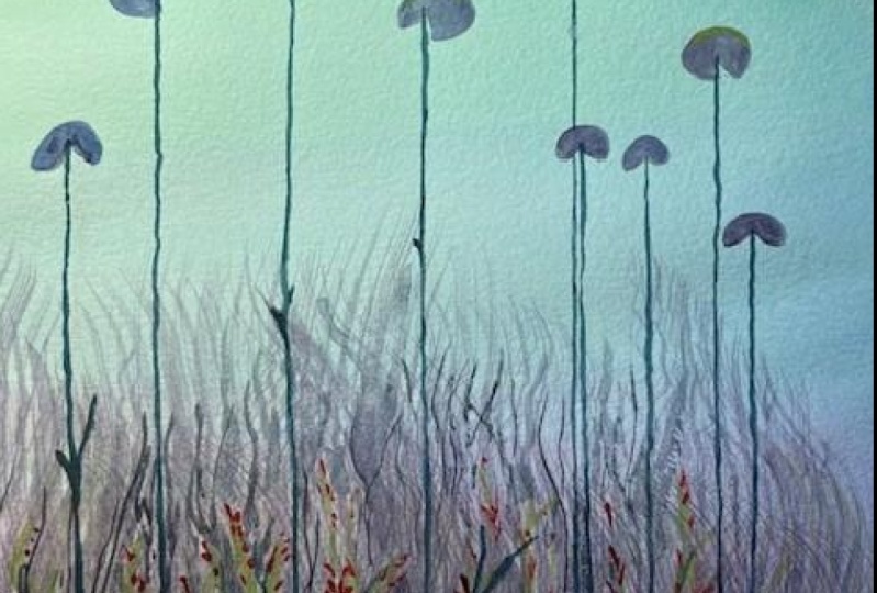
to my reference first. As you can see here, the water and lilies
stick out pretty much and near the ground
there's much more foliage. I'm a very anxious painter, and I rarely paint
without sketches. If you feel like that too, just feel free to sketch
out some things here. That's totally awesome
and really okay. I'm doing it myself, and I'm starting with some
of the water lily leaves. I'm doing it very loosely
and light so that there won't be any graphite
marks afterwards. I'm varying them
and size to create the illusion that some of them are further away than others. They can also
overlap each other. I'm just doing the leaves
here because I'm adding the stems last down here. Those are still growing. Great. With these
little sketches we set the direction that
we're going for here and, now it's all about
the color flow again. In Lesson 3, we drop
the colors randomly on the page and see where they're
flowed into each other. Now, we put on some boundaries in form
of our little sketches. It's basically the
same principle, we just put the outlines there. What I'm doing now is, instead of wetting
all the paper again, I'm just wetting leaf by leaf. That's really fun to see here. I dropped a little too much
water for my liking on this. Then I wiped my brush on my
cloth and just continued distributing the
water that I have here inside the sketch lines. Now, I'm going to
start with green. What you can do here now is, as we did with the gradient, go from light to dark, and when you look at
your reference again, you can see that the leaves get darker in the middle
where the stem connects. The light green I will
do on the outer edges. Just drip it in here
just like that, see how it flows. Great. Then just putting
some more green in here. Then I'm going into my darker
color, which is the blue. I'm dropping it here in the middle where
the stem connects. [NOISE] To fill out
the whole leaf, I'm just going to push the pigments a bit more so that they will
flow together but not mix. That's the first
water lily leaf, and that's basically
all I'm going to do now for the rest of them. It's really easy
and really much fun because now you're starting
to control your paints, and it feels very empowering. Also a good tip is to work or start working from
the opposite side of your prominent hand. I'm a left hand, as you can see, so I'm starting on the
right side of my paper. You also don't have
to do it like I do. As I said, with the darker parts where the leaf
connects to the stem, you can just do it
randomly if you like. If you don't want to waste
brain cells and thinking about realistic stuff
like that, totally fine. It's your painting
and your process. To achieve this look of the sharp edges
around the leaves, it was necessary to let the
background dry completely. Otherwise, the
fresh paint that I applied here would bleed
into the background. That's another thing
every watercolor artist would tell you. Be patient. I'm not very patient myself, that I had to learn
it with this medium. That's also great to
get breaks in-between steps of painting because then you have a
fresh look on it. When you're re-wetting parts
of your background painting. You can also see how in my case, ink we activates and gets lift up from the paper and the
white is going to show again, decided to go in on some of
the other leaves, again. As long as they are
wet, this works great. If they had dried up
like this one here, I will not go in again. I mean, I could, but that
would make for a hard edge and the watermark probably which I'm not in the mood for today. Adding a bit more pigment here. Let's see what we can do
while these are drying. I think I'm going
to start out with the foliage down here and do the same thing that I did with the leaves of
the water lilies. But I'm going to
make some algae. I'm just taking
clear water and do these little swirly
patterns here. I'm doing this without sketches because I
don't want to have graphite marks on
my page so much, and then I'm just adding some pigment here,
and down here, some blue, and I'm
pushing it with the water so that it
flows into each other. Those can also overlap each
other because it's foliage, and it doesn't grow
in a neat row. I accidentally dropped some
water there. That's fine. Wiping my brush and take it off. This would definitely
create a watermark. Now we learned that you should be very careful
with your wet brush not to drop water on your page if you want
to avoid watermarks. [MUSIC]
9. Putting On The Finishing Touches: What about diving even deeper? I'm going to put another
layer on top of this, which is going to be darker
than what I've done so far. Therefore, I take my
dark teal tone that I mixed for the other
demonstration piece, and this time I'm not
working wet on wet. I just take my brush and I'm
going in [NOISE] and then I'm going to add some more foliage down
here near the ground. You can add as much as you want. For me, it creates
just some more depth. [MUSIC] This and I'm going to apply some spiky
leaves onto this one. [MUSIC] The more layers you add, the more depth you are creating. Especially with loose
pieces like this here, you can't really overdo it. [MUSIC] Now, let's do something
very radical, shall we? What we haven't done before, at least not in this class and during creating these
pieces is using our inks or watercolors all by themselves
without diluting them. For the last layer
of this piece, [NOISE] I'm going to do that. Well, I'm taking a little
bit of my blue ink. I think I'm going to mix
it a little bit [NOISE] with my green ink so
it's not just blue. For the last layer, I'm taking my very thin brush that I used for the
fish swarm earlier. The first thing that I'm
going to do is connecting the water lily leaves
with the ground. It doesn't have to
be straight down. I'm just making sure that I put the stem where it belongs. Halfway through I have to
get some more paint because it's fading too much
for my taste, at least. This is a great way to explore how much pressure
you have to put on your brush to create a certain
thickness of the line. You also get to know how wobbly your hand motions are
or aren't. It depends. I have a fairly still
hand day-to-day. In my case on some days, I'm shaking like crazy. Doing outlines on days like
this is not a good idea, at least in my style of paint. Now, all that's left, at least for me, is to create more depth
down here in the foliage. I'm just going to paint some of these spiky leaves
that I did before. They're the same kind
but they're a little darker which creates
the illusion that they are closer
to my point of view because I can see
them more pronounced. But I don't only want to
do these spiky leaves. I also want to add some more illustrative ones with these very
classic leaf shapes, like small little
almond-shaped leaves. If you're following
my lead here, I hope you noticed by
now that I did not pay much attention about how
realistic something looks. I'm just breaking
it down through the most easy to paint
shapes because all this exercise is to explore your paints and
learn your vocabulary. I, for example, notice now that these inks tend to dry with a kind of outline, they get darker to the outsides. I know from
experience that these reactivate with water
[LAUGHTER] fairly easy. Even touching this painting
with, for example, damp hands would cross in you having the ink all over
your hands [LAUGHTER]. That's just a new
unique property of my particular paints. Yours can be totally different. I have inks that dry and
have a shiny finish to them, which is really interesting. If I put them down real thick, they're drying with
a glossy effect, which is great to know if you want to have it or
want to avoid it. Because I don't
always like to have shiny finishes on my
watercolor paintings. [MUSIC] If you like some fish swarms in
here too, go for it. I think I'm done. Cool. Then let's remove
the tape, shall we? Great [LAUGHTER]. It will look messy
down here because as you already saw the tape lifted here a long time
ago [NOISE] but I don't really care [NOISE]. That's it. [MUSIC]
10. What Do You Think?: Now it's your turn. I cannot wait to see
all your beautiful and maybe a bit messy creations in the project
gallery down below. Also, if you have any
question about this class, hit me up in the discussions
and I'll get back to you. But before you go, please give
this class a good review. It not only helps
me as the creator, but also makes it easier for other watercolor
beginners to find. Even a simple thank you for this class in the
comments section will totally make my day. Make sure to follow me here on Skillshare and my
other social media, so you don't miss any upcoming watercolor classes or other crafts that I'm doing
that might interest you. Lastly, thank you for taking this class and see you
in my next one. Bye.
 Ellia Fabia, Artist, Illustrator & Content Creator