Transcripts
1. Introduction: Introducing watercolor
workout basics and beyond the ultimate course to elevate your watercolor paintings
to new heights. Whether you're a beginner looking to master
the fundamentals, or someone with a bit of experience seeking to
level up your skills. This course is designed
to guide you step by step toward creating vibrant and
captivating watercolor art. In this course, I've carefully crafted three main sections to ensure a comprehensive and
bridging learning experience. In the first section, you'll
delve into the basics. Understanding the transparent
qualities of watercolor, mastering layering techniques,
and learning how to use mixtures effectively to bring depth and richness to your art. You'll also gain
valuable insight into the inherent value of hues and complete
an assignment that will reveal how well
you see their values. Moving on to section two, you'll explore the fascinating
world of light on form. Discovering how to paint three dimensional objects on
a two dimensional surface. Starting with the impact of
values on basic objects, you'll gradually advance
to more complex subjects, honing your skills every step of the way, But that's not all. The final section is where
the real magic happens. Get ready for a series of exciting projects
that will challenge and inspire you from simple beginnings to
more complex paintings. These projects will
push you to use specific watercolor techniques to achieve stunning effects, ultimately helping you paint stronger, more
expressive artwork. When you enroll in this class, you get access to hours of self guided
instruction videos, access to all of the
demonstration examples, and answers to any questions
you may have along the way. Hi, my name is Robert Joyner. I've been painting full
time for over 15 years. I absolutely love watercolor, but more importantly, I love sharing that passion with you. I've been very fortunate along my artistic journey to work with popular brands such
as Carnival Cruz, the Kentucky Derby,
National Pastime Museum, CBS sitcoms, and
a whole lot more. So what are you waiting for? Sign up now and start flexing
your watercolor muscles. Let's embark on this artistic
journey together and unlock the full potential of
your watercolor artistry. See you on the inside.
2. Getting Started: Hey there. Welcome to the course again. I'm Robert Joyner. I want to thank you for
being here and taking an interest in what I
love to do for a living, and that is paint
and of course teach you guys everything I've
learned along the way. Now, before we get
into materials in the first series of lessons, I just want to let you know that the first module
is for beginners. I'm going to cover some of the watercolor
characteristics, some of the basic skills that we will be using
throughout this course. For those of you that are brand new, don't be intimidated. Just simply watch the videos, take them in, and then do
these demos on your own. Each lesson really is a project. I encourage you to watch it and then break out your
paint paper and brushes. And then do the same thing I do and then post your project. Get that thing going
as soon as possible. That way you're up to speed. And as we move to more
intermediate and advanced ideas, you're not left behind. You don't feel like
you're in the dark. So again, a workout to
me is about building those core foundational
principles and skills. But also it's about
learning new things, taking on ideas, styles, subjects, et cetera, that
we've never tried before. So I hope in this class I
can present those to you. I don't know any of your backgrounds or what you have done with
watercolor painting, but I am just simply going to
really do a lot of research and take on subjects and
ideas that maybe perhaps, and hopefully you haven't tried. I know some of the styles and subjects I'm doing this
course are brand new to me. So not only are you
getting a workout, but I'm getting one as well. Thank you for making
me learn and get outside my comfort zone
once in a while too. Hopefully, you know,
this is a 30 day course. I'm going to release lessons
Monday through Friday. I take the weekends off,
That's family time, but you can bank on two to three lessons every day
until the end of February. Now, if we are a few weeks into the course and you're curious, if you can get started,
of course, you can. You can join this class and start learning at
your own convenience. So I'm not expecting you to be up to speed with everything. All the lessons are basically there for you
to take in and to absorb. And they will always be here on skill share for you
to go back and watch. So long as you're
a member again, I look forward to sharing
these ideas with you. I can't wait to get started. And let's do that with
materials, see there.
3. Materials: Welcome to materials. Before we dive into
all of the fun, I just wanted to cover the
supplies I will be using. If you do not have all of these brushes or
paints, no worries. If you have questions, just leave a comment in
the discussions. And I will try to respond
to you as soon as possible. So I will cover recommended
paint, my favorite brushes, paper quality drawing materials, and then my basic paint set up, which is how I'm
painting in the studio. For brushes, I have
a pointed round, this is a golden natural
by a silver, A number ten. I will have a mop brush of Princeton, Neptune number eight. I will also be using
a sword brush. This is a three eighths
Princeton Neptune sword. I also have a needle brush. Now you don't have to
have a needle brush. If you only have
a sword brush or something that can put down
some thin lines in detail, that should be just fine. Again, those are my brushes. Let's dive into the
next fun thing. And that is paint
I use Hole bine. I've always used the brand, I've always had good
results with it. Here is another tube
of cobalt blue, but I do recommend
artists gray paint that is a John Pyke palette. On there I have neutral tint, cobalt blue, ultramarine
blue, burnt sienna, new gamboge, Cad, yellow, lemon, alizarin, crimson, pyrol red, and then cadmium orange. So those are the colors I
will be using in this course. A couple of water reservoirs is recommended near my reservoirs. I have a couple of towels
rolled up that will help me dry off my brush and
remove excess water. Some masking tape
will help for paper. I recommend artist grade paper. This is 140 pound cold press. It is a Blick premium brand, But good paper is going to have a huge impact
on your artwork. Of course, this
is a larger sheet which I will cut down to smaller sizes later on when
I get into some of my demos. So you can fold it in half and then fold those in half
and then quarters. There's an example
of one of my demos. You can see I use that paper
and just folded it in half. Also, I recommend having
some drawing paper handy. I use 24 x 18 drawing paper, but print paper, any
sort of paper you had, the drawing is fine. I recommend having a couple
of 4b2b graphite pencils. Either one will do.
Maybe I needed eraser. I have a piece of foam core there that I use for my artwork. I will just put a
piece of tape on the back corners and then
adhere that to the foam core. Underneath the foam core, I have a towel. You can use a block
or whatever you have handy so you can see I will just roll
this up several times. I will put my foam core, which is in my
watercolor backboard, then put that at the
top of the board, and that's going to give me a downhill run for
all of my washes. Again, I do recommend
having that board elevated. Lastly is some paper
towels because, you know, painting is messy and they're pretty good to have around now. As far as my set up, I am right handed, so I keep my palette On
the right hand side, I have my water reservoirs, most of the time sitting on
some paper towel or napkins. And then I have another
series of towels there. Again, this is two of them. I will take that and
then roll them up, and then once I have that, I will put it right there. The water reservoirs that way, whenever I need to remove excess water from
my brush paint, whatever, it's pretty
handy to have it there versus trying to figure out where I put it
last time I used it. That's pretty much my set up. I will go ahead and put my foam core board down with my towel underneath it
and then a little demo there. Just so you can see my set
up, whenever I'm painting, I will have this
set up for all of my demos and that way
you know what to expect. Again, this video cover, my preferred
watercolor supplies. Whether or not you use any of
these is totally up to you. But just an FYI thing, I thought it would be good
to let you know what I'm using for my
watercolor painting. Then lastly, I
showed you my set up and how I like to
paint watercolors.
4. Transparency and Layers: This lesson I will talk
about transparency, a common and very important
watercolor characteristic. I will do a transparency demo. I will discuss mixtures, avoid too many passes
and make sure it's cool. So I will start this one using my number ten golden natural pointed round brush by silver. And I will add a
bunch of water to my well on the top left
hand side of my palette. So you can see here, I'm dipping in some fresh, clean water. I need plenty of paint
to do this demo. I will be using burnt sienna. Feel free to use any
hue of your choice. What I am mixing
up is a T mixture. A T mixture has a lot
more water than pigment. So whenever you mix yours up, just make sure you have
plenty of water and then use just a little
bit of hue to mix. Now the paper is 140
pound, cold pressed paper. It is cut down to
about 11 by 15. I am putting in a kidney shape. As I paint the kidney shape, I want to be sure I don't do too many passes into the
paint I've already put down. If you're unsure what
I'm talking about, the goal here is to put the paint down and
leave it alone. The more you fudge with it, the more chances are that you're going to create
some watermark or you'll end up with
an uneven wash. What I just did
right there was bad. I went back into it too
many times and I actually remove too much pigment and you're better off
just to leave it alone. If you go in and try
to fix it even more, then chances are
you will disturb the paint which is already
starting to stay in the paper, and you will end up with
a very uneven wash. So again, try to put
the paint down with as few strokes as possible and avoid going back
into it too much. Now I've put a hair dryer to work and I've
dried the paper. Very, very important if you
use a hair dryer to allow it to cool before you
paint onto the surface. And that's because the paper
will actually be warm, so it's going to retain
some of that heat. And that's going to cause whatever layer you're
painting to dry quicker and sometimes even
create some unwanted marks. Now you can see I'm only using the same T mixture I mixed
up in the beginning. I'm not adding any more
pigment to these layers. So I painted the first shape. I used the hair dryer to
dry it and I let it cool. I came back over it using
the same T mixture, and I painted another one. Again, very, very few passes. It's so easy to even take your brush
and rub into the paint, Dry paint a little bit too hard, and what you're going
to do is disturb the paint underneath so you
will actually reactivate it. The goal here is to use
just the right amount of pressure and don't rub
into the paper too much. And again, avoid
too many passes. Even burning your brush
back and forth over. The wash will again cause some unnecessary results that you may not want
in your artwork. You'll see here as I
add another layer, Again, everything
underneath is dry. I'm using light pressure, just enough to get the
pigment on the surface. And then once I put it
down, I leave it alone. Again, I'll take a hair
dryer to it dry it. I will let it cool,
and then here we are. Everything is 100%
dry once again. And now I will paint my final layer again using the same technique
and the same paint, Very little pressure
into the surface again. Don't fudge with it too much
so that you end up with a nice even series of washes. Note that I was able to do
about five series of washes. Perhaps you can even do six. The key here is to end up with even washes for each layer, and then to be able to see
that transparent quality. So one layer stacking
on top of the other. In this lesson, I introduced
you to transparency, a common watercolor
characteristic. I did a transparency
demo using a mixture. Again, avoid too many
passes for best results, Put it down and leave it alone. Again, if you use a hair dryer, make sure the paper
has cooled before you add the next layer.
See you in the next one.
5. Transparency with Multiple Hues: Welcome to a three color
transparency demo, very similar to
the previous demo, but this time we will
use three colors. We will again use that mixture
avoiding too many passes. And then note how we will make the secondary hues by layering
one color over another. So let's get started
for this one. I will use my golden
natural silver number ten pointed round. And I will use a little bit
of water on the palette. So we will use the same sort of mixture as we did
in the previous demo. So be sure you have a lot
more water than pigment. The hue is cadmium
yellow, lemon. I opted to use the lightest
yellow on my palette. The key, again,
is to put the hue down and don't make
too many passes, cover the paper and
then let it dry. I will be using a hair
dryer off camera to dry it. And once it's dry, which
it is now, I let it cool. Now without adding any more
pigment to the mixture, still the same T mixture, I will add a second circle. I will leave a little bit of
the initial circle showing. I will basically
have two circles, or one ring around the
one I just painted. All right, so you
can see it there. I've allowed that to
dry 100% and of course, cool down a little
bit of pigment on the palette And now a
lot of water into this. I am going to be using my a
lizard crimson for my red. I will add a second
circle beside the yellow. Obviously I'm overlapping
them as well. When I overlap them, I'm overlapping both
circles of the yellow. Again, put it down,
leave it alone. Then I will let that
cool and then dry. Before we add the next one here, I'm just adding a little
note there to say, hey, avoid too many passes. Because as soon as
I start to paint, paint the red over, the yellow is so easy to
disturb the yellow underneath. Even though that's dry, you can certainly
reactivate it with water and some
vigorous brush marks. Again, 100% dry here and cool. Now, I'll add my second
mixture of red to the circle. Again a light pressure. We don't want to press
too hard into the paper. And then just a few passes
there to spread it around. Now you can see a little
bit of orange peak through where the red and
yellow are starting to overlap. Now I am going to use
ultramarine blue, again using the same technique that we've already discussed, light pressure, and avoiding too many passes over
the previous layers. Let that dry 100% Now you're starting to see a
little bit of violet and also a little bit of green. Where the blue is
mixing with the yellow. And of course where the
blue is overlapping the red, the Alizarin crimson. You're starting to
see some magenta and purple here we will
have a look at the finished art is dry and you're going to notice
all of the secondary colors. Transparency, again, is a common watercolor
characteristic. To achieve them, we have to make sure we apply
the paint evenly, avoid too many passes, and of course, rubbing
into the surface too much. In this lesson, we again
talked about transparency. I did a three color transparency
demo using mixtures, avoiding too many passes. And the result is you get
those secondary hues where one color is layered on top
of or underneath another.
6. Fusion and Gravity: In this lesson, we'll
talk about water again. This is a common watercolor
characteristics. We will look at water as fusion, and then also how
gravity can do the same. We will also do a demo where
I will pre wet the paper. So we'll do a test on how
water works there as well. And then a conclusion
so that we can wrap our head around all
this wonderful stuff. Now I will begin this demo
with my silver brush there, still using my point it around, mix up a little mixture there, nice and thin, and then
do a little swatch. I'm putting this
down on dry paper, there's my little
swatch of blue. No big deal. But now as I mix up the next one in
which will be orange, my orange, if you've forgotten, is over there in the corner. Again, a mixture there. And I'm going to add a
swatch below the blue. Now water is fusing
these hues together. Water is very much an important component in
the water color medium. Remember, my board
is at an angle. We're also dealing with gravity. The water will fuse
the hues together. Then of course, gravity, things running down hill will also move the pigment
and blend them. Here I'm adding another
swatch of yellow, again, noticing how the orange
will flow into the yellow, and that is happening by water. Then of gravity, I'll go in and now mix a green
just using some of the Coba, blue and yellow, lemon. I'll make that a
little more green just so this can be nice and
pretty when I'm done. And there you go again, water fusing these
hues together. Understanding how wet beside wet works when you put down a wet wash and then you put down another one
that's a different hue. When they're both wet,
they're going to fuse. Unlike what we did before, just above it where
we layered colors. But when we layered them, we let them dry and then
we added another one. You're getting the fusion, but it's more of a transparency. The colors aren't
necessarily merging together as much as they are in the demo
I just completed. Now I will do another demo and I'm going to
pre wet the paper. I will put a really good
amount of water down. Hopefully you can see that
it's starting to puddle up. Now I will take a little bit
of a lizard and crimson. I will mix up, let's
say, a milk mixture. So quite a bit of pigment. Maybe a little more pigment than the T mixture because
the paper was pre wet. As soon as I drop the
pigment into it, again, the pigment will disperse into
the wetness of the paper. Anywhere where there
is water like that, you put pigment into it. Then obviously the
water becomes a conduit and it's going to move
that pigment around here. I will do another swatch. Again, just pre
wetting the paper, but not as much as the first
time I did this example. I will use the same amount
of a lizard and crimson. Now notice because
it's less wet, I'll put less water
then the first time. It's going to bleed or
run into the water, but not as much. All right. Depending on how
wet your paper is, will oftentimes have a
direct impact on how much the water color of the pigment is blending into
the wetness of the paper. In the second example where
the paper wasn't as wet, it didn't quite bleed
and run as much. Now in this one it's
going to be even drier. I use less water than the
previous two examples. I'm going to add the same
lizard crimson mixture into it. Notice again,
because there's not as much wetness into the paper, then it's not going to bleed as much into the water itself. Very important thing to
understand about water color. Water is a key component, obviously to the medium, but whenever you're dealing with a wet surface and you
add pigment to it, then it's going to
run into that water. Anywhere the paper is wet, that's where it's going to
go to a certain degree. It just depends on how
much paint you put down and how thick the paint is. That's just a
really good lesson, I think to understand. I'm going to talk
about this a little bit more down the road. But before we wrap this up, I have one more demo
to show you here. I'm going to pre wet the
paper as I did before, and I'm going to
put a good amount down Before I get paint, I'm going to remove the
excess water from my brush. Now I'm going to
dab directly into the Alizarin crimson and then touch that into the wet area. I just did notice how the
paint doesn't disperse as much when you use thicker paint like that
into a wet surface, know that the water isn't
going to dissolve it. It can't penetrate it as
easily as thinned out paint. Just really good stuff to know. And again, a very
important characteristic of watercolor painting
as a recap here, water can fuse colors together. It can easily blend one
color into the other. Gravity is an important
thing to note. When your board is at an angle, know that it's going to
run in that direction. Also know that if you are
working with paper that is wet, the water color is going to disperse into the
wetness of the paper. And remember two, that
when you're dealing with a wet surface but you are also applying much
thicker paint, it's not going to dissolve
into the water as much. Understanding how paint
responds on a dry surface, and of course how paint responds when painting over a
dry layer is important, as is understanding how to
deal with a wet surface. Knowing that water is going to continue to dissolve and
move your color around, then also the thickness
of your paint is going to determine how
much that pigment moves.
7. Stroke Speed: Welcome to stroke speed. So we will look at slow strokes, we will look at fast strokes, We will look at the effects
or impact that has on the paper texture and then why wet paper cancels
all fast strokes. So I will start here with some ultramarine blue and mix up maybe like
a milk mixture, so slightly thicker than tea. Once I get my mixture
right, I will do a swatch. The first swatch I will do, I will use a slow stroke. I'm going to cross the paper
very slow as you can see. Taking my time, notice that it pretty much
covers everything. Perhaps towards the
edges of the rectangle, you can see a little bit
of that paper texture, but in the middle of the
triangle, everything is covered. Basically, when you use
a very slow stroke, you get a very even wash. You will not get any
texture of the paper. Of course, if you're
painting on hot press paper, you're not going to have
any texture anyway. This exercise wouldn't
even apply to you. Now note that fast stroke as I whip the brush across
the paper like that. Notice how we're seeing a lot of that texture and
it doesn't matter if you go left to right or if you do
circles, vertical strokes. If you're using a
very fast stroke like that, very aggressive, then it's going to reveal
the texture of the paper. So long as you're using cold
press or rough press paper, you're getting a
lot of that noise from the paper texture
when you do that. If you're looking to
get that reflection or that vibration of
the texture there, then know that your stroke
speed has a lot to do with it. Okay. Now what I'm writing there is this doesn't work
on a hot press paper. As I mentioned before, hot press is always going to
give you a smooth stroke. The last example I give you
here is a pre wet paper. Now this could be yellow paint, it could be blue paint, it could be red. Doesn't matter. The deal is we're dealing
with a wet surface. Now, watch the fast stroke.
It doesn't work, does it? And that's because
what we learned before is that water is
going to dissolve it. Water is going to penetrate
pigment and disperse it. You're not going to get any of the texturing that you had
before with the dry paper. If you're again looking
for that texture look, you have to do it
on a dry surface. Any wet surface like that, especially if it's really wet, is simply going to dissolve it. You're not going
to get the results after just some FYI here
about stroke speed. Very important stuff to think
about because these are all tools and resources we need
for good watercolor painting. In this lesson, we looked at
stroke speed, slow strokes, fast strokes, and how to get the paper texture
to reveal itself. And then we looked at how
wet paper will pretty much cancel any sort of
texturing that you may want.
8. Water and Hues: In this lesson, we'll talk
about water and hues. So we will use water
to thinner our hue. As we thin the hues, notice that they will
get lighter in value and we are looking for
gradual shifts in value. And I will do a
eight swatch test. There we go. Let's get started. So I have a small piece of 140
pound, cold pressed paper. I am not skimping on quality. I am using the same paper I showed you in the
material section. I am going to mix up a rather thick amount
of Alizarin Crimson. You can think of this as
like a honey mixture. So it's got a lot more paint
and very little water. Now for each swatch, I'm going to dip my
brush in the water. And then then the paint again. Clean the brush,
dip it in water, and then add a little bit
of water to the mixture. That's going to be a
little bit thinner. I will do my swatch, clean the brush, dip in water, add the water to the pigment. As I do this, note how each
time I create a swatch, it's lighter in value. The color is going to shift
a little bit as well, but obviously I'm not mixing
any other color with it. It's still going to remain
a lizard and crimson. But again, the transparency is starting to show up
as I add more water. And then of course we're
getting a much lighter value. We have gone from a very rich, deep burgundy red to what
will ultimately be a pink. Good to know, these are great resources to have for
your watercolor painting. As I get to my
last swatch there, I was actually able to do nine. If you do it right, you should be able to
get at least eight. But if you can get 910, even 12 swatches without one swatch looking too
much like the next one, then you've done a
great job with adding the right amount of water and not too much or not too less. Notice as I write here too, the colors on the left hand side are darker and more opaque. And when I say darker,
I mean darker in value. You could also think
about it darker in tone. As we get to the right, they become more
transparent and lighter in value or tone. That
was so much fun. I will do it again, but this time I will use
ultramarine blue. Again, very little water and
a lot of pigment to start. If you start too weak, then you're going
to run out of room. Make sure that first
Swatch is nice and thick. I wasn't quite thick enough. I added a little more paint
and that should do it. That mixture right
there should be a little bit sticky like honey. Now, I will add a
little bit of water to it and then make sure
you clean your brush. So I'm going to get that
paint off, dip it in water, and then go into the paint, Do my swatch, clean it, dip it in water, and then
back into the paint. Rinse and repeat, really? I didn't mix up
enough paint there. I got myself in a
little bit of bind. Even though this is a
very simple exercise, it's more challenging than
you think to come up with eight to ten swatches
where you have a gradual shift from
one hue to the other. It takes some skill.
You have to know how to manage your water, of course. How to manage the pigment
as well. Not too bad. I'm going to have to go into these swatches a little
bit and paint over it, because then there wasn't quite a good enough shift
from one hue to the other. There you go. Just because you've been painting
with water color for a while doesn't
mean you're going to master this exercise. Here we are again. You
can see the swatches, so a little bit clearer now, A little more up close
Again, water and hues. Using water to thin hues, more water equals
lighter values. And also I didn't note
here more transparency. We want to do gradual shifts
in value and or hues. And if you can do a
eight Swatch test, then congratulations,
I think you have passed this part of the course and it's
time to move on.
9. Random Painting: Welcome to the
lesson. And this one I will do some random painting. This is a great exercise to do. It really just helps you gel with the characteristics
of watercolor. The goal here is to do
three small studies. I will demonstrate how to
scratch into the wet surface, a technique we haven't
really looked at yet. We will explore in many
ways and just become more familiar with water color and how it responds in
certain conditions. This will help you
gain experience. As I mentioned, we will look at thin and thick paint
and then a conclusion. At the end of this video, I'll start out just by adding three random shapes
For my studies, this is a half sheet. It's roughly, I think 11 by
7.5, something like that. I'm working fairly small. I'll start with a
little bit of orange. And again, this is
random painting. I'm not trying to paint
anything literal. I just want to fill these three shapes with some random colors,
some random marks. The purpose of this is, especially if you're new to watercolor painting or even if you've been painting
water color for a while. And you find yourself just
being real rigid and not being able to let the water
color do its thing. This is a good way to do it. You just basically fill each shape with
random strokes and colors and you let everything
mingle in that way. When you get to a painting where you're trying to do
something more refined, you're not surprised,
you're not in shock by the way
watercolor behaves. And you really have to get
over the fear of water color. It's really when you
accept the medium for what it does good and
what it does naturally, that's the point
where you start to embrace it and you say, okay, well clearly we can control a little bit of
water color Sure. But there's a lot of it, especially this wet
into wet technique, which is you're
going to do a lot of these washes where they're
one color touches, the other things are wet and
they're going to mingle. But for the most part, it's not really a
medium to be controlled 100% If you wanted to do that, you will get into oils, acrylics, mediums that don't work and have the same
characteristic as watercolor. Again, when I'm
doing these strokes, I'm just putting strokes down
in different directions. I'm leaving a little bit of
the sparkle of the paper, if you're not sure what
I'm talking about. That's the white of the paper. Cold pressed paper has a texture to it when you
run your brush across. If you do it really
slow like we did before when we did
the speed lesson, the brush speed, if
you do a super slow, then yeah, it's going
to fill all the cracks. But if you start to put a
little bit of speed behind it, maybe you're just aware of
the white of the paper. You leave some of that
texture in the paper. It gives the painting a
little bit of a sparkle. Once that white is gone,
you can't get it back. That's another one
of the challenges of water color painting, is understanding how
to deal with white. Some subjects may have white objects in the
composition or design. You have to understand,
where's that coming from. There's a Chinese
white water color. But for the most
part, we don't really use white in this
particular medium. But there is white in the paper. There has to be some planning
for that in advance. Planning is something
we're going to talk about quite a bit once we get
past this beginner module. Again, this is just working
with very thick paint. Now I've got my sword brush. I basically just dipped
right into the yellow. Basically, you can think
of this yellow as right out of the tube and
just dropped it into some of the red dots that
were on the page here. Working with some cobalt
blue wet into wet. Just letting those colors mingle but I'm
going thicker now. I'm putting thicker paint over thin paint, adding a few marks, but at the same time trying to adhere to what
we've talked about, which is, hey, don't try
to go into it too much, don't make too many passes. And I'm trying to let the bulk
of that wash do its thing. And I'm just going back and fiddling with some
of the white area, adding a little thin line, adding some thick paint into it, and letting it dissolve
and run a little bit. These exercises are so valuable. I remember when I was
learning watercolor, I guess not trying
to be weird here, but we're always
learning the medium. You never really know it so well that
you had the luxury of taking things for granted. It's a challenging medium. It will always be challenging. It will always give you and do things that you
didn't expect. How you deal with
it is important. If you go in and you try to correct it too much
and you try to force it to do something that you
just simply have to have, then that's when I think
the medium will start to become even more
challenging for you. The good watercolor artists know how to deal with mistakes, and they know how to deal with those accidents, I should say. And say okay, well if
it wants to do that, then let it do it. And then I'm going
to go with it. I'll put a tree there, I'll put a car there, I'll put a person there,
and I'll go with it. I'm not going to try
to mess with it. That's the key. Now, right here, what you saw me do was
scratch into the paint. As long as the
paint is still wet, you can scratch into it to
reveal the white of the paper. Here, I'm using an Exacto knife, but you can use your fingernail. You can use like a
Swiss army knife. Now you can see where
I'm scratching now into the top part of that painting
that was still very wet. If it's too wet, then what's going to
happen is the paint is going to back run into the scratch and that's
going to just leave this little scar on the
artwork, which is fine. You may like that for texture, or it could be a twig or
a branch or something. But you'll find that
if you start to experiment with
different wetnesses of the paper and paint, you'll find that right point where you can scratch into it. And it'll hold the
line a little bit. It'll hold the white of
the paper just enough. It's going to backfill a little bit because
it's still wet, but it's not going to do it
as much as if it were to wet. That's it. This is just all
about random mark making, not trying to do anything
acute or finished here. This is just getting real familiar with the medium and
letting it do its thing. Again, this is familiarity. This will help you when you get to a painting and you won't be startled by what the medium
is going to do on its own. Pretty much do it for this demo. Let's have a look at
the finished artwork, if you want to call it that, but you can see all the techniques and
different things on the page. In this lesson, we talked about just doing some random
painting studies, how to scratch into
a wet surface. Just explore and become more
familiar with the medium. The more you can do this
without putting a lot of pressure on yourself
to create finished art, especially if you're new, the better off you are. This will give you a
lot of experience. We've talked a little bit about that thin and thick paint. Remember thin paint is going
to dilute more and water where thick paint isn't
going to dissolve as much. Okay, So that's that. I will see you guys in the
next series of lessons, which will be some
easy landscape demos.
10. Hue Transitions: Welcome to huge transitions. We will learn to
mix hues gradually. This is a great way to
discover color variations. We're looking for
subtle shifts in hue and we'll basically go
from one hue to another. I will begin by pre mixing a little bit
of ultramarine blue. We can pretty much use maybe a milk like mixture,
slightly thicker. Then T I will put a swatch down, maybe that's a
little bit too weak, but we're going to
go with it for now. Again, we've got a little bit of ultramarine blue to start now. I'm just going to
dab a little bit of a lizard and crimson
into that mixture. I'll add a little bit more, just a little bit at a time. Notice how even on this third swatch that the
hue is starting to shift. I will add that now we're
leaning more towards a violet. Now, obviously it's important to mix the two correct
hues if you want violet. I talked a lot about this in my easy watercolor
paintings course. We've talked a lot about mixing colors and how to get the good violets and
things like that. I am using ultramarine blue
because it has a red bias, and I'm using a lizard and crimson because it
has a blue bias. The two of those mix
really well together. My paint is getting
a little bit dry. I'll just add a little
bit of water to it. As I'm getting into
these final swatches, I am basically getting into
pure Alizarin crimson. And look at all those
lovely variations in between those lovely
blue violets. Then we get into
those pure violets, and then we get into
those magentas. And then finally, a cool red. Again, you can mix any
two colors together. And do this, you will be amazed at some of the hues
you can come up with. Now I'm doing hues
that are more obvious. Like I mix the ultramarine blue and the zarin crimson to get the violets in the middle here
I will start with yellow, lemon and then mix in a
little bit of coba blue. As you know. The blue plus the yellow will
give us a green. Then ultimately we're going
to end up with a blue. I will completely mix these spotches until I
get to the point where there's just simply no
yellow left in the mixtures. Those subtle variations is what we're looking
for. Of course. We're looking to control the
amount of paint we put in. Paying a little bit closer
attention to gradual shifts and I guess more detail oriented in how we
approach this idea here. We're getting into
some lovely teals, those lovely greenish blues, and now we're finally getting
into some more pure blues. As I get into these
last two swatches, ran out of room there. I'm going to do one
more swatch below. Even this swatch here has a
little bit of yellow on it. I could have probably pushed that even more with one more. But anyway, there is the demo. So you can see those changes. But again, burnt sienna,
ultramarine blue. Try Umber with bread. I just try a bunch of different colors and see
what you can come up with. A very interesting
exercise to do, and you will discover a lot about your palette
for our recap. This was hue transitions. Mixing hues gradually. This is a great way to discover color variations when
you're mixing two hues. Subtle shifts in hues are what we're looking for and we're basically will end up with
going from one hue to another. Hope you enjoy the lesson. I'll see you in the next one.
11. Value and Color Test: There are many challenging
things about art, but understanding value
and color is one of them. Basically, how well do you see color and value
When you see color, can you see the actual
value of the color? If you were to gray scale it, what value would that be if you can get
your values right? Believe me, painting
becomes a lot easier. We will talk a lot more about
value as we move forward, But in this lesson, we're going to do a test. We will start with
a gray scale chart. And we will test
one hue at a time, whichever colors you
use on your palette. And the goal is we want to
match the gray scale values. This will tell you or reveal how well you see the
value of a color. Now at the end, I will
show you how well I did. We will take my test that I'm going to
show you right now. And I will gray scale it. So that will reveal how well I understand
value and color. Now if you remember, we did these simple sphere
and cube demos. I started with a gray scale, so the black and white
version at the top. We're going to use a similar gray scale
for this exercise. I will start with
a piece of 11 by 15 paper and I will
add my gray scale. Now I'm not pre mixing my grays. I am using neutral tint. It has a fairly cool bias
to it, so slightly blue. If you do not have a gray, you can just simply pre mix it using the technique I
showed you earlier in this course that was mixing
your three primaries, blue, red, and yellow. That should give
you a decent gray. If you want it to be
cooler or warmer, you can just always add
blue or red accordingly. Once I get my gray scale in, and I want to be pretty
particular about it, I want to make sure that
the gray scale gives me at least six values from dark to light on
the right hand side. Once I have that down, I'll go ahead and draw some columns. What I will do is take
one color at a time. You can see my palette there. I've got 123456 thing eight colors and I'm going
to start with my cat orange. Sorry, that is not
in the picture here. I wanted to bring it in
a little bit closer. You could see the spotches
versus the mixing. I'm mixing it the same way
we've talked about before. I started with a
very weak mixture, so lots of water. Then as I move left
towards the darker values, I'm simply just cleaning
my brush and adding a little more pigment
to the mixture. Again, what I'm trying to do
is look at the value scale, the gray and white or
I'm the gray scale. I'm trying to mix an
orange that would match the gray above
it. And we'll see now. I determined that
the orange wouldn't get as dark as the
swatch on the left. Some hues just simply
don't go that dark. That was my thinking. I left out a Swatch
for that end. I'm not mixing colors now. I can mix orange or red with another color and
get a darker value. What I'm trying to do is just
work more with pure color. For now, then that will give me a good idea of
where my weak areas are. Typically, people will either see blue or red incorrectly. When we get to the
end of this video, we'll see if that
holds true for me. You can see on this red
swatch that I'm doing now, This is pyro red. I started with the dark value. I went far left as
I thought I could go and then work my
way to lighter values. You don't always have to
start with the light value. You can simply start with
the dark and work backwards. But I encourage
you to mix it up. Maybe start one at the
light value and work dark. And then on the
next one, maybe try starting dark and
then heading light. That way you don't get
into a rut and you're constantly bouncing back
and forth between these. This is Alizarin Crimson. Alizarin Crimson is
a very dark color. I'm going to see if
straight out of the tube there will be as dark as that neutral tint
straight out of the tube. I felt like that
color I could get a little bit darker
than the pyrol red. Now, I'm dealing with a cadmium
yellow light, or lemon. And I will start with
the second Swatch there. That's going to be about as dark as I think I can go again. Am I correct? I don't know. We'll see. I'll get my
light swatch in there. Then maybe lift a little
bit of that there. Then let's see. Well, yeah, I just went
with the two swatches. Now I've got three more colors, or actually four more colors. This is my new gamboge. For those of you that
don't have new gamboge, you can just use yellow ochre. Yellow ochre is very similar, or you can a little bit
of red into your yellow. Yellow ochre is just a yellow with a little bit of red in it. Now, I started with the darkest value that I
thought I could go. That's pretty much out of the tube with a little bit of water. Now I'm working towards my lighter values.
Those are my yellows. And now we can
move into a brown, which will be burnt Sienna. Making a few adjustments there. With this one, I will start
with my lighter value. You can see that burnt
sienna is really yellow with quite a bit of
red in it. That's all it is. It's just a warmer
yellow, obviously. You can think of it as a brown to starting pale obviously. And now working towards my darker values that's
not quite dark enough. You'll see me add a
little bit of pigment to that. That's okay. You don't think he
quite nailed it. Add a little more pigment
or add a little more water. Whatever you have to do to
match your values constantly. What I'm doing is I'm looking
back up at that gray scale. I'm trying to look at
my colors and say, yeah, I think that's at
this value, and so on. So it's a very interesting
challenge again, I think, to see gray
scale and to say, okay, well that's a light value, that's a dark value, that's
pretty easy for us to do. But once you start
adding color to the mix, then it becomes
more challenging. You'll, when you get to your swatches, gray
scale, desaturate, It probably find some flaws in your color theory and how well you see the value of color. You may find a
pattern where you see darker values better than
lighter values or the opposite. You may find that your
reds are throwing you off like consistently, too light or too dark
on your reds and blues. Maybe your yellows are too dark, you'll see those
patterns reveal itself. And then when you get to
painting an actual piece of art, this is going to come
in handy because value is very important
for the artist. Really probably one of
the most important things right up there with
good drawing skills and just understanding
your medium, which is a lot of what we
have covered at this point. The characteristics of
watercolor painting. Understanding what
the medium does well and how to use
it to your advantage, and how to control
it to some degree, and then of course, when to
let it do its own thing. That's the beauty of water color is that you
have to balance the two. You have to know that you're going to be able to
control it a little bit, but oftentimes it's going to have a mind of its own and
you really have to let it do its thing once
you start dealing with wet and wet washes and certain conditions as
we've talked about so far. All right, finishing up, my cobalt blue, the blue
above that was ultramarine. I'll just make an
adjustment. There it is. There's my swatches. And now let's look at
them side by side. What you're looking at there is the color version I
did on the right, the one you just saw me, Don on the left hand side. It's the same exact one, but I took it and
I desaturated it. That's going to remove all the color and show me
how well I see values. If we start at the top,
remember I had orange, red, and then a
lizard and crimson. As I look at those
top three rows, my reds, I can tell my light values are probably
a little bit too dark. The mid tones aren't too bad, and then the dark tones are probably a little
bit too light. That's just something
I need to work on. When I look at my yellows, I had Cad, yellow, lemon. And then I had my yellow
ochre or my new gamboge. I think the light was good. I think Swatch was okay. It looks like Cad yellow
lemon is just not going to be able to get dark enough to
match that second swatch. But all in all, not too bad on the yellows. My burnt sienna swatches
actually look pretty good. I was happy with what I did. Perhaps the first swatch, the lightest value could have
been a little bit lighter, but not too shabby. I thought the ultramarine blue turned out really well.
I was happy with that. I like the cobalt blue. I think with the cobalt blue, I probably could
have pushed that to the darkest value and been okay. I probably could have gotten
maybe one more out of that. But anyway, there is your
value and color test again, the characteristics of
watercolor painting. Starting with the
gray scale chart, testing one hue at a time, the goal is to match
the gray scale values, and it will reveal how
well you see color values. Good luck and have fun.
12. Project Silverware: Now that we've talked about all those wonderful
watercolor characteristics, here is a wonderful
project we can do. I will use good technique. Hopefully, I will combine
slow and fast strokes. I will use thin and thick paint, and I will share a few tips on how to remove unwanted paint. I will start, of course,
with my silver pointed around and I will put
down a little bit of water and I'm going to pre
mix a little bit of gray. I will do that using ultramarine blue and of
course the other primary, so I can use a little bit of my gamboge nova and
then my pyro red. As you mix your gray, you can shift the overall hue. If it has a biased that's
leaning towards a red, you can just add blue. If it's leaning blue, you can just add a little bit of red or perhaps a
little bit of yellow. Mixing grays is pretty easy, I think the key here is to have it either a cool
gray or a warm gray. If it's just in the middle
where it's not warm or cool, sometimes it may
come across a little bit muddy. All right,
so there you go. I'm adding my basic wash there. Notice when I put it down, I left it alone. Just like in the very first
lessons we talked about. We don't want to go over
it with too many passes. What I'm doing now is I'm
using just water and I'm going to take a stroke all
the way down for the handle. Remember water is a conduit. It's going to pull that pigment that I have in the top of the spoon
down into the handle. That's a good way to create variation and interest
in a wash like this. Now I'm going to remove a
little bit of that paint. Just use water and
let that drop into the wash. Now notice I just
put the brush to the wash, the tip of the spoon,
and I left it alone. I pressed it into it, which is going to remove
some of the paint. It'll leave some of the
water as well that I had. Now, I'm going to
drop a little bit of more saturated color into the left bottom hand
quadrant of that spoon, and then drop a little
bit into the handle. Once that dries,
it should give it the illusion of a reflection and a little bit of
a shadow as well. Notice what I'm
doing on the fork. So I started with a darker wash there for the base of the fork. As I paint the points and the
times I'm just using water. Some strokes will
start at the base where I added the dark
and pull upwards. And other strokes, I'll just start at the tip of the fork or the point and come back down into that dark
area of the base. And the water is going to
pull it in both directions even though we're
dealing with gravity and the water is going
to flow downhill. And remember, my
border is at an angle. That color is still going
to move upwards as well. Maybe not at the same degree as it's moving downwards
because of gravity, but it's still going to
pull that pigment upwards. Again, that's just using water as a way to spread pigment. That's the characteristic
of water color painting. These are the things,
the very basic skills, that you need to understand
about the medium. Here with a knife,
I started with a thin like mixture of hue, then I'm using a slightly
darker hue for the handle. And now I'll use a little bit of that darker hue
that's still on my brush and just drop
that into the blade. And then I'll just
give it a little sense of reflection or shadow. But notice how I
didn't force it. I put it down and
I left it alone. Because I want that
watercolor feeling. I wanted to look
very transparent. I wanted to look very watery. At the end of this, I don't
want to look like a piece of silverware that I copied
out of the magazine. I wanted to look like a
silverware that was painted with water color and really showcase
the beauty of the medium. Now, that stroke I just did for that spoon was very quick. When you do a very
quick stroke like that, it's going to leave. Yes. Right. Some of the
texture of the paper. I'm showcasing some
speed there as well. Now, I'm lifting and removing
a little bit of that paint. When you do that, make sure you don't have too much water, but you need enough that's going to dissolve some of that paint. The key here is to
get in and get out. Don't try to fudge
with it too much. Again, if you do too many passes and you start to try to push it. Too much, farther
than it should go, then it's going to start to ruin that fresh
watercolor field. Now for this fork, I'm
trying it differently. I started with the times, now I'm using a
very weak mixture for the base of that fork. I know because we understand the characteristics
of watercolor, that the hue that
is in the points of the fork are
going to run down into the base of that fork. Again, just really trying to showcase the effects of water and how it really
impacts your art. How you can use it to
move your pigment around. How you can use it to fuse
colors and things like that. Even though we're doing a very simple gray scale painting here, it's still fusing the
different values of gray. Another light value blade
and a nice dark handle. And I dropped a little bit of that darkness into
the tip of the blade. That's it. I'll drop a few little dots there of dark and then leave
it alone. That's the key. When that dries, that's
going to reveal that nice, transparent look and it's
not going to look too muddy. Now for that spoon
I'm doing there, I use a very quick stroke around the outside
edges of the spoon. Also use a very quick stroke
for the handle of the spoon. And that's going to
reveal texture, right? We've talked about
that and now I'm using that in this little study. Again, hopefully you can see
that I'm trying to really push the idea of using those
basic skills in this study. And it's so important to understand and master
these basic skills. Just removing a little bit
of paint here and there, and now you can have a
close up of the piece. Simple, easy, but again, the goal here was to show
you how we can use water, those quick and slow strokes
to reveal texture and so on. For our recap, this was
the silverware project. Again, the beginner
module where we are learning the watercolor
characteristics. Hopefully, I was able to
demonstrate good technique, a combination of slow
and fast strokes using thin and thicker paint, and then tips for
removing paint as well. Not mentioned here is water, The impact water has on your artwork and how you can use water to manipulate your washes. All right, another project
here in silverware, but this time I will
use good technique. We'll again use those
slow and fast strokes. We'll use thin and thick paint, but the difference is
we're going to blend hues using water and
of course, gravity. So instead of working with
just a gray or one hue, we're going to work with two. All right, so we'll kind
of get that feeling of that silverware that has that little bit of
a gold look to it.
13. Project Abstract Squares: All right, this one we
can let the hair down and loosen up a little
bit. Here, have some fun. We will still be
exploiting the same idea, using water and gravity for
fusion, using multiple hues. This time instead
of just one or two, avoid too many passes. Again, we want that clean,
crisp watercolor look. And of course,
we're going to have a ton of fun exploring color. The paper is 11 15, starting with my silver
watercolor brush, Again, my pointed round. Now I'm going to pre
wet some squares. They're not going to be perfect
squares, some are tilted, some are big, some are wide, some are skinny, and so on. But again, this is just exploiting and getting
familiar with the idea of water as a way to move and
spread the pigments around. I'll mix up a little
bit of cadmium yellow, lemon, then onward
into the first square. That yellow had a little
bit of red in it, that's already on the palette. I'll continue to put a
little bit of that red down. Notice I'm not painting every
single edge of the square. I'm getting close to the edges, but I know the water is going to disperse and pull pigment from
where I have put it down. Over time, that water is going to spread
the paint for me. All I have to do is just put
down enough and get it in the general area and the medium and water will
do the rest of it for me. All right. Just using
different hues. A little bit of
Alizarin crimson, a little pyrole red
for that red swatch. Now moving back to yellow, which has a little
more red in it than the previous two I put down, you can use any colors you want. Obviously, there's
really no formula here. I encourage you to
explore colors, mix it up a little bit. This one I'm thinking
I'm going to start with the lighter values at the top, and then as I get
towards the bottom, I'm going to use more blues and violets and a little
bit darker hues. Now notice on the second
set of squares here, I'm not pre wetting the paper, I'm just putting the paint
down on a dry surface. Again, just mixing it
up and just having fun exploring the two
different ways. It's good to just
push paint around sometimes without a lot of stress on yourself to do something magnificent or
really, really tight. I find these projects
are great for that because pretty much anything goes so long as you stick within the comfort of putting
watercolor paint down. We've talked about those things. I've mentioned it several
times, many times. Actually, you get the idea. Now while the paint
is still wet, we can drop other hues into it. Now, again, notice I'm
just dropping it into it. Every once in a while
I'll do a stroke, but you won't see
me blend too much. I'll just put it
down and then again, let water and gravity
do its thing. Now as I'm holding the board, my foam core up in a little
more of an angle there, that's going to encourage a
downward run of the water. That's just something I'm doing. Move the water down a little bit more into those wet washes. Now I'm using thick yellow
paint in that red square. Notice that thick yellow
paint isn't going to break up as easy as
the thinner washes. Again, we talked about that
in the very beginner lessons. And how thicker paint doesn't dissolve as easily
as thinner paint. The water can't penetrate
that thick paint that well. It can penetrate the
edges a little bit, but not the entire thing. At this point, I'm going to start to think about
changing hues a little bit. I want the colors to be crisp. Oftentimes, if your palette
started to look like mine, it'll just start
to get muddy and all the colors will
start to run together. And then next thing you know,
all your colors look the same because they're all
blending with each other. I'm looking at how the water is puddling up in the squares
I've already painted. As I paint these squares here, I'm going to touch a few of those places and
notice how gravity and water is going to fuse
that previous square. The colors are going to
basically drip down into. The square below. As I
paint these squares, again, I'm just trying to make
as few passes as possible. Sometimes I'll go back
and correct things. Maybe move one corner
like I did there, so it's touching the other one. But I'm trying not to disrupt the washes that are in there. If I do, I'll just drop
color into it and try to avoid making too many passes
or rubbing into it too much. Because again, I want this
to be nice and crisp. When I'm done moving
into some magentas here, a lizard and crimson, a
touch of ultramarine blue. More red than blue for this. And again, continuing the same theme and
letting that water beat up. And then touching a little
bit of a new color into it, a new square, and letting that those colors just merge
and run together. That's the beauty
of water color. And any time you can incorporate this idea in your painting, it's great because it really showcases the beauty
of the medium. When it dries, it has that nice, transparent look to it. And it's just you get some really good
color combinations, some good transitions from
one color to the other. Water and pigment and gravity are doing all
the work for you. In order to think, harness the power of watercolor, you have to be able to showcase a little bit of this
stuff in your paintings. If not, then you may as well be doing acrylics or oils, right? These are the things
that are unique about watercolor painting. And oftentimes artists,
especially even I'm guilty of it, I'm not just going
to pick them on beginners here and
experienced artists, we just fudge with it too much. We don't get the result
we're after or we just don't do a good job
of planning a painting. Therefore, we had this vision of what we want the painting to look like when we're done. And then along the way,
watercolor is going to do its thing because we don't
really plant it that well. And really look at
our subject and understand where the
light values will be, where the darker values will be, And get a good plan
for how we're going to start this painting and bring these ideas forward
through the process. Then we start to get in trouble, and we're going to
touch on that a lot. As we move into the intermediate
and advanced sections of this workout. I'm going to go quite
a bit into planning. We'll go into some landscapes, maybe some still life, where we have to put more thought into how we're
going to layer things. But for now, we're
just having fun, enjoying the characteristics
of watercolor, Letting this medium
shine and do its thing. We're understanding gravity, we're understanding
the effects of water. All of those things that I've
talked about. All right. All of the washes are still wet. Every square I've painted
is still fairly wet. Obviously, the ones I
did in the beginning are wetter at this point. It's a good time to
drop color into it. Sometimes they call
that charging, where you have a wet wash
and then you come back with another color and
you drop that into it. Now, I can also lift paint. I'm using a clean brush there
and just going through some of those and lifting it
when I lift it again. You want a clean brush? You just want to put your brush to the
surface a little bit of pressure and maybe create a stroke and
then get out of there. Don't try to go back into
it too many times, okay? Now I'm using gravity to push the water in a
different direction. I'll flip the
painting upside down, and now I'm going to
use some darker hues. Again, lightly charge it or drop it into some
of these wet washes. Again, don't try to create a
lot of brush strokes here, you're just think about
dropping into the pigment as opposed to using your brush and creating
too many strokes. If you do that,
you're going to lose that organic blending that the water and gravity
are creating for you. But I do want to
stress that as I charge or drop paint
into these wet washes, I'm using very light
pressure with the brush. I'm putting it in a few places but trying to agitate all
of the washes too much. We don't want to put them in a dryer and blend them all
up and tussle them around. You just want to drop in a few
places and then let it go. Let it blend and bleed into the wash that
was already there. Again, you'll find that
if you end up with squares that are too muddy and they just
look really flat, then probably chances are you just rubbed it too
much and you just did a little try to work it more than it probably should have A little bit
of lifting here, a very clean brush, a good one sweep in
there and then get out. There you go. Here's my piece. Hopefully you enjoy the project.
These are a lot of fun. You can do these on
a really large scale and use them for
art for your house. And again, you can use different shapes or whatever
your heart desires, but. And this one we did
some abstract squares, again, using water and
gravity for fusion. We're using multiple hues. We want to avoid too many passes as we've stressed
quite a bit so far. And then just have
fun exploring color. This is a great time,
as I mentioned before, just to push paint
around without any pressure to do
anything exciting. We're going to do much more
complex subjects later on, but now is the time to just get familiar and
have fun with it. And that way later
on when we start to do more advanced projects,
you're less intimidated.
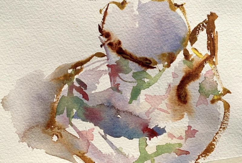
14. Project Silverware Variegated: All right, I will just do
this below the previous demo. I've got my gray still mixed up. I'm going to start
the same idea. I will again try to use
as few passes as possible and paint with as few
strokes as possible. The tip of my fort now
run my handle downwards. A nice fast stroke there. Hopefully when I'm
done and maybe it will reveal some of that
texture of the paper. Now I'm using new gamboge, a little bit of Cad, yellow, lemon, and some water. I'll just thin that
out a little bit. Now I'm just dropping
into the paint. I'm not really brushing it on the paper so much as
I'm just dropping it. Just enough to let
some of that drip down and run into the
gray paint there. I started with yellow and
then I did a stroke of gray. Now I'll just run a little
bit of gray into the yellow. Again, the key here, and I think the theme
you're hopefully very aware of now is put it down
and leave it alone. We're trying to avoid
too many passes. All right, In the end you will have something that's got
that crisp look to it. It won't look for, it'll
be very transparent. The water and gravity
will do its thing, leave you with that
unforced free watercolor look that I think
hopefully you would want and desire in your
watercolor art. All right. Started with a dark spoon there and then a
light colored handle. Again, mixing up my
golden yellow here. And I'll drop that into the spoon a little
bit into the handle, and hopefully not fudge
with it too much. I've got that yellow. Now
I'll just start with yellow. And just running some paint for the base of
the fork and then into the ties and the points, and then down into the handle. And now I'll reverse
it and then drop a little bit of gray into that. I'm not putting it everywhere, I'm only dropping the gray in certain places.
It's more random. I'm not trying to force
it or trying to come up with an exact replica
of what silver. I'm not even using
a reference image, I'm just doing this
out of imagination. I've seen things like this on
Pinterest and other places. I thought it would be
a great project to use for this demo and these characteristics that
we're trying to learn. All right, that's moving
along pretty good. We've got five down, maybe one more to go here. I'll start or end with my spoon. I'll paint part of the spoon and then finish with the yellow. Now I'll probably
have a little bit of gray and yellow in my brush, so they're starting
to mingle again. Trying to do as few
passes as possible. You really, at the
end, when this dries, it has that watery
look that I'm after. Very transparent. Again, I want this to
be crisp and clean. The goal here isn't
to paint award winning stuff we're going to present in the next art show. It's just really to hone in on those watercolor
characteristics and the skills we've been
working on so diligently. Let's have a look at
the finished art. This is dry and you can see how that water color and those
hues blended on their own. We'll have a little stroll down Memory Lane here and
look at the first demo. Then we're getting into
the second one here. But notice those fast strokes reveal some of the
texture of the paper. We have a nice soft look. Hopefully, I was able to use good technique
in this project. Showcase some slow
and fast strokes using thin and thick paint. And then of course, blending hues using water and gravity. That's it. I hope you
enjoyed the projects. I will see you in
the next lesson.
15. Project Simple Landscape: Welcome to the landscape demo. This will help you
test your basic skill. So all the things
we've covered so far is a simple landscape. We will use the
characteristics of watercolor to the
best of our ability. We're going to keep it loose
and keep it transparent. We're going to try to reveal and save some of those white
sparkles of the paper. We will use wet and wet, and of course, wet
and dry layering. And a conclusion, at
the end of this video, the paper is roughly ten by 8 ". I will use two or four B
and just draw out my edges. And then begin right in with the sky dry surface so I haven't pre wet
the paper at all. Notice when I did that
first mark revealed a lot of the white sparkle of the paper because of
that stroke speed. The fact that it's 140 pounds
coal press press paper is going to do that now. Just using water to dissolve
it in other places. Just running a little bit of Cadielo lemon and a
little bit of the yoker mixed in with it or
the new gamboge. Just let it do its thing. All right, so that's the key, we want to put it down
then let it rest here. I'll start to work
with the land. I'm leaving a
little bit of a gap there where the land will
meet the sky, but not much. Some places are bleeding
into each other. But I've got a little
bit of the white paper there as well here. I'll add a little gradation. I'm adding a little bit of a darker blue to that
sky and letting it run. Notice I'm not trying
to control the water, control where everything
bleeds and that's the key. That's the things
that we've talked about many times so far. Here I'm using a hair dryer and I just want to dry it off. As I dry it, how much lighter
the painting becomes, it's going to lose about 20% of the value in that first wash.
That's what I'm left with. This is 100% dry. Now I'm stacking layers. I'm putting one layer
over top of the other. We did that first when we started to learn
about transparency. We did the three colors, we did the yellow, the red, and then the blue. We stack those circles
on top of each other. That was basically
painting wet over dry and then using
layer stacking them one over the
other as I'm painting. This magenta purple is
going over that yellow. That yellow is going to
give that purple a glow. Had I put the purple into the yellow when
it was already wet, obviously the lines
would be much looser because they would
be bleeding into the sky. You wouldn't get the
same glowing effect. That's again, the beauty
of the medium that makes, I think what our
color so charming is that lovely glow,
that sketchy look. You can really get to this when you're working
quick, confidently, and just letting things, letting the medium do its work for you. But you can see in three
or 4 minutes time, this painting came
together really quick. But really the medium did
a lot of the work for me. Here I'm mixing up a
little bit thicker paint, adding some thicker hue to the mountain area distance
a few places and that's it, just a few dots here
and there just to give it some detail and it's just not so flat and
boring is all I'm after now. We will have a look at it here. I took this image
which is coming up if I can ever finish drawing my little square
around the piece. I took that in natural light so you can get a feel for it. But it's simple, but
I think it really shows off a lot of what the
medium is intended to do. And that's to be transparent, loose, and that had that
carefree look about it. In this demo, we did a
simple landscape using the characteristics
that we've worked on hard and diligently
to this point. I was able to keep it
loose and transparent. I kept the white sparkle of
the paper here and there. We did some wet and dry layer, allowing the
painting to dry 100% and then we came and layer over top of that. Then I'll do it. I included a template
for this demo. If you want to do
something similar, you can feel free to use the template or you
can just simply look at my artwork and just
draw a few lines. And it should be pretty
quick and easy to do. Good luck with this
one, and I'll see you guys in the next landscape demo.
16. Project Intermediate Landscape: Welcome to landscape demo two. Again, we are testing
your basic skills, your basic knowledge of using the watercolor
characteristics. This one we will look at a
simple gradated sky wash, a layered foreground, a
layered middle ground, a dark vertical, and how to lift pigment. And
then a conclusion. At the end, you can
see the set up there. The paper is the same size, working fairly small there. I've got my pointed around, that's still my silver
pointed around. I'm going to pre wet the paper. When I pre wet it, I'm going to leave a few places
of the white of the paper. You can see I've got
places in the sky, I've got a little area in the middle ground on
the left, a triangle. And a little bit in the
foreground as well. Now I'm using some co ball blue, starting a little bit darker
at the top of the sky. Now just the water to dilute it, again, the water is going to
fuse these colors together. We've got a bunch of different
shades, tones of blue. Even though it's just one color, it's going to dry
and then have a, a nice random look to it. And it's going to be gradated, meaning it's going
to be darker in some areas and
lighter in others. I use a little bit of ochre
and a touch of the cad, yellow lemon for the foreground. And now I'm tilting the paper in various directions to
allow that wash to run. It doesn't run all downhill. You can tip your page sometimes and let the water
run the opposite way. Of course, you can tip
it to the side as well, that I'll keep the wash from
looking too predictable. There you go, look at that simple sky and
gravity did everything. I just splashed down
some hue I made. I controlled how dark
it was at the top. I wanted it a little bit D, I let the medium do the
rest of the lifting. For me, this is just a little bit of the magenta and purples I had on my palette. Mixing that with some blues and yellows and just graying
that out a little bit. Again, this is 100% dry. Now everything I do is working
over the dry first layer, we're getting that
transparent quality. So we're getting the
glow of the yellow from underneath coming through
the layer I just put down. All right, now using
a little bit of ultramarine blue, a
little bit of a lizard, and crimson, I will mix up a little bit of purple,
eggplant purple. A little more blue is probably
a little bit too red. I'm going to do a little swatch. I have a piece of scrap
paper there just below my art that helps
me test the color. Before I put it down, I put a little bit
of yellow into that. A little more water, just to
thin it out a little bit. Now using the side of my brush, the point of my brush. And it's dragging it along the surface with a little
bit of pressure and that's going to reveal some
of that white sparkle now. Because a lot of this
area I'm working on now, that top left hand side is dry. I'm going to negative space
paint like a feeling of some grass maybe coming up and meeting these
purple bushes. Negative space painting is
a great painting technique. We're going to have
a whole section on negative space painting
because I think it's really, really important for
your art skills. A painting technique
that I think you'll like and you can use in
many different ways. Now, a little bit
of neutral tent, a little bit of burnt sienna. I'm going to borrow
some of the purple as well and come up with
a nice dark here. I'm looking for a good dark vertical, it's
going to be a tree. Just dragging that brush
along the surface and there. I just did a quick flick to reveal that the rough
texture of the paper. I'm sorry, my hand
is in the way, but I'm using the
tip of my brush. This is the point to
draw out some branches. Just make sure the branches
aren't all in one direction. Make sure they're
different sizes. Some long, some short, some going out sideways, some going sideways and down, some going more angled upwards, just so you have good variety. There's really no
image I'm using here. This is just random painting
in terms of a subject. And Playing with the medium
and just coming up with some simple demos
and ideas you can do fairly easily with
your watercolor. That will help you test
a lot of the skills. Put those things
to work for you in a real painting
versus just doing swatches and studies and
different things like that. Now using my paper towel, I'm going to lift
some of that paint. So you can just press it into the paint and
then just lift it. Then that's going to remove
some of the wet paint. Now I've got my sword brush, which is more for details and doing a
little splattering there. And then adding just
a few small stems and twigs to the tree here. Again, using the sword, the tip of it just to
indicate some grass. That little bit of texture. Moving down into the foreground, just really connecting
the foreground into the middle ground is
all that's really doing. Just something to pull your
eye up into the painting. My camera is certainly blowing that out in
terms of the light. I'm not sure what's going on there, but I'll look into it. But now I want maybe one more small tree back off here just to give
it some distance. Having a large trunk
there in the foreground, contrasting against a
lighter and smaller tree in the background gives
that illusion of distance. That's a little trick you
can do with painting. We'll talk a little
bit about composition, things like that
too, in this class. But for the most part it's just, again, a quick easy demo. I'm going to lift a little bit of that there, a
little bit too dark. But again, another quick
easy landscape demo you can do and test your basic skills. There's a finished
piece, nice and dry. Hopefully you can see some
of that loose quality, some of those care free strokes, and not trying to control
the medium a whole lot, letting the gravity water in the colors do
the work for you. Again, a simple graded
wash in the sky. A layered foreground stacking, one wet layer over a dry. Same thing for the
middle ground. A nice strong vertical. Just to add some interest
to the composition, I showed you quickly
how to lift pigment, which I've done a few times
and so far in this course. So you should be pretty
familiar with it. As long as the paint is wet,
you can easily do that. And then I'll wrap it up so we got one more easy
landscape to go. And I'll see you
in that demo next.
17. Project Challenging Landscape: All right, welcome to easy
landscape demo number three. Again, testing
those basic skills. We'll create another
simple landscape using the same characteristics
we've talked about, keeping it loose and transparent.
Timing is important. Wet and dry layers and
all that fun stuff. Same size paper, and
nothing has changed. So these are fairly small demos using my silver pointed round, starting with a little bit of
coba blue and a little bit of neutral tint
mixed in with that, I'll go right into
the sky that is dry. I haven't pre wet the paper, I'm working wet into
dry paper here. Just quickly dragging that
brush along the surface again, trying not to go back
into it too much. Letting that color remain as fresh as possible is the key. Like I've mentioned before, you start going into this a
lot and it's going to start to flatten out and become real boring looking.
We don't want that. We want to keep
those colors fresh, keep the strokes
fresh, and so on. Again, basically the same colors but just a
little bit darker here. Just adding a little feeling of some hill or something
in the distance. That's a fairly easy beginning. I will take a paper towel and lift a little bit
of that water and pigment that was running
towards the hill. I want to keep that separate. I don't mind a
little bit of dark in the top part of the sky, but I didn't want to mingle too much with those grayish
blue hills I put in. Again, those hills are
real soft, feathery, wispy edges because I let that run into
the wet of the sky. I did that on purpose
because I wanted that to be fairly weak edge quality wise. Now I've got a pale
grayish green and letting that mingle and
spread across the foreground. Again, it is using my
brush in different ways. So running it right to
left, flicking it up. Just so I get a variety
of brush strokes, Not everything is
worked horizontally. Some strokes are horizontal, other strokes are flicked
up at an angle and so on. That's going to help give the brush the art a little bit of character to it versus
being real stiff and flat. Also put a little bit of burnt sienna into that
mixture right at the end. And just splash that
across the foreground. Obviously using a hair
dryer here to dry it off. Notice that when I'm
using the hair dryer, it's nice and smooth
across the paper. I'm not trying to wiggle it
back and forth too fast. Sometimes that will
push the water in the wash in ways that you
may not like too much. All right. Again, as you
know, everything dry. Notice the white
sparkle of the paper. I left a lot of that in there. The horizon, the
mountain line didn't exactly meet the foreground
and middle ground perfectly. I left some little sparkles and little gaps in
there of that white. Here is just a
brownish red gray. It's a much darker value
than I've used so far. But notice those brush
strokes were nice and loose. I didn't try to control that. I wasn't painting
individual trees or bushes. I had an idea of what I wanted. I attacked it in a way
that I wanted it to be spontaneous and free looking here I'm mixing up
a thicker mixture. Burnt sienna, ultra
marine neutral tent. Perhaps even a touch of a
lizard and crimson in there. I've got my pointed around and I'm going to do
that quick flick, the brush stroke speed up and notice that sparkle of the
paper on the tree trunks. We've got that texture
exposed which is good. Now I'm going to switch to my, my sword brush and do
some small branches, but notice like almost calligraphic loose
strokes happening there. Just working back and
forth, having fun with it. And then there's an alarm
that goes off and says, all right, all right,
that's enough. Let it go. We don't
want to do too much, you just have to have that
alarm clock that goes off. That reminds you
that you don't want to go too far with
it and they're just splashing a
little bit of water into the wash. That water, as you know, is going
to fuse things. It's going to dissolve
and dilute paint. It's going to do some work for, it's going to bring
a little bit of variation to that
heavy wash. Again, working with some
sienna grays here, adding a little more body and hue value to this foreground. Some of those strokes
are still wet, so we're getting a
little bit of bleeding. I'll just use that
same color for the foliage in those trees
in the middle ground. Notice how quick I put that in. I wasn't painting
individual leaves or trees, I just ran that across
and did almost all of them at the same
time. That's the key. That's when, you know, you're in that zone for watercolor where you're not trying
to control everything, you're just getting
the gist of it down. You know, the medium is going to do a lot
of work for you. It's going to come back
in there and fuse things together and start to make it look a little
more interesting. A little bit thicker paint
here towards the end. Just a few more little
sticks and branches and some nice loose brush work there that should pretty
much do it for that part. Now I'll go back into
the foreground here. A few verticals maybe
poking up here. Maybe some grass or little
sticks or something there in that pathway here. My brush is fairly dry, but it has a little
bit of pigment on it. But I'm working
those quick strokes across the paper just to indicate some foliage
on the big tree now, mixing up a yellow green and adding a little bit
of a green foliage to that tree as well. Just so we have
some brown leaves in the middle ground on
the trees on the right. The trees that are
closer to us here has a little bit of
that green leaf to it. We get some variety
in there here. I'm using my exacto knife to
scratch into that wet paint, you're familiar with
that maybe a few twigs in the middle ground as well. Pretty easy. Again,
just relying on the medium to do a lot of
the work for me, hopefully, when you look at this piece, it's not about trying to create an award winning landscape that's going to be
in the next show. It's about really embracing and harnessing the beauty
of watercolor. And letting things
mix and mingle, and bleed, and gravity and
all those wonderful things. Okay, again, this will be the last landscape
in this section. Hopefully you are excited
about giving this a shot. I have the template which is
included in the resources, so feel free to check it out
or you can use my painting as a template as well that
I'll do it for this one. I'll see you guys
in the next lesson.
18. Intermediate Strategies: All right, well, congratulations on finishing the
beginner module. Those are just some of
the watercolor techniques and characteristics that
we have covered so far, but very important for us to at least get those
things on the table. There are a lot more
basics we could talk about and perhaps we
will as we move forward. But for now, we're
going to simply build upon those ideas. We're not going to
forget or abandon anything that we have learned and we're going to add to it, and we're going to use those
ideas in other subjects. Of course, we're going to talk a lot more about how we can manipulate and strengthen some of those techniques as well. In this next section, the
intermediate strategies, we're going to begin
with light on form. Basically trying to
understand how we can maximize our subjects and make them look more
three dimensional. They're going to be very
simple objects at first, and then we'll make them a
little more complex as we dive a little bit deeper
without any further ado. Let's get started with those
intermediate strategies and look forward to sharing
the stuff with you. Thanks.
19. Value and Form: Getting back to the basics. Here we're going to
look at value and form. Capturing light and shadow. We will look at a
five value scale, light and shadow facts,
softening cast shadows. Timing is very important using, or should I have said,
stacking layers. And then the conclusion
in this demo, I'm going to use neutral
tint for my gray. But as I've mentioned before, you can always pre mix
your grays if you wish. Again, I'll go do
that one more time. Ultramarine blue, a yellow, and then a red. Then depending on if
it's warm or cool, you can add blue or red. To shift the temperature
right here, I'll do a Swatch. I'll add a little
bit of water to it, which will reveal it,
it's temperature. Then I want to add a
little bit of blue. So I'll make that a
little bit cooler. And then a little bit of
water to that as well. You can see that's
just a touch cooler and a little bit
cooler even still. I'll do my Swatch, add a
little water. There you go. That is a good, an
easy way to mix your neutrals if you don't have a neutral tint or any gray. But again, for me, I'm just
going to use my neutral tent. Now, I'm going to
create a simple scale, starting with a dark
and then adding a bit of water to each swatch. What that's going
to do is give me a scale that starts
dark on the left, obviously, and then lighter
as it moves to the right. I'm going to use that
scale for this demo. A little touch up
there on my swatches, maybe those were a little
bit too light and we should be good to go
using my four B graphite. I will draw my
sphere, then my cube, where obviously for a
layout drawing like this, try to use light marks if you don't want the
pencil marks to show. Sometimes I don't really care about pencil marks and I'll
let them show in my artwork. But for this demo, I'll try to keep
it somewhat clean. I'm using that underhand grip which will allow me to
use lighter strokes, Just some clean water
to wet the sphere. Okay, so I'm painting
on too. All right. A wet surface. I will add my light source, which is coming from
the top left hand side. Now when you have
a light source, it's bouncing in all directions, but it's also coming down, hitting the surface and bouncing up underneath the sphere there. If you squint at the
image on the right, you're going to see
some reflected light that is nothing more than
the light coming down, bouncing and then hitting
underneath that sphere. Also the light is
hitting our subject, which is on the top of the ball, the sphere right there, where it goes from
light to shadow. That is called the core shadow. You'll have a little bit
of a light value there, but then it'll get really dark. Typically, the core shadow is
the darkest of the shadows. Again, if you squint your
eyes a little bit at the sphere on the video here, you can see that I'll include this sphere in the
resources as well. You can have a
look for yourself, and of course, I
know you want to try this project on your own. You'll have that resource
using a very light value. Pretty much the first
value on my scale. I have a five value scale there. I'm going to paint the
ball and the shadow, and also the sides. I can do this because I'm
looking at my subject. I can see there's a top of the cube there
that is fairly white. And then there's a
little section on the ball that's white too. But everything else, I can paint this light shade of
gray from there. I can just use darker layers
to add the shadows there. I'm softening the shadow. A cast shadow will have soft or diffused
edges on the outside. As a shadow moves away
from its subject, it's going to get
softer and softer. And typically it'll be somewhat soft or
blended on the edges. I just use some clean
water to diffuse that. Now, I'm going to
remove a little bit of that paint for the top
of that sphere now. Everything is good to go, but I want to start to add
the next value to this. Now this is still wet. Again, you have to remember, water is a conduit
for the pigment. As I paint this, I'm going to allow a little bit of
spreading of that water. I want the top left hand side of that ball to be
somewhat light in value, but I know that pigment is going to run into it because it's wet. But I'm going to come back enough to allow for
that extra movement. Okay, Again, this is
just where we're trying to understand and respect the fact that
there's water there. The value is going to move. The pigment is going to move. Now, timing is important. As I get to this next layer, I'm going to start to
add the core shadows. I don't want it to be dry if I wait until it's
completely dry. And then I'm going to have to blend everything
I'm trying to do, this sphere wet into wet. I'm going to wait until
that sphere and which I've done is almost to that
point where it's dry. But I know I can
still paint into it. Now as you paint into
a surface like this, again, timing is important. If you wait too long, then sometimes you'll
get watermarks. You'll get those cauliflowers. Other tim, if you don't
wait long enough, then of course all this dark
pigment is going to run into the white of the sphere
where we have our light. I want to, again, keep that
fairly light at that point. At this point I should say.
I'm going to let it rest. I'm actually going to remove a little bit of pigment there
for that reflected light. Again, this is still wet. Okay. So I have to allow
for that movement. I know the water is
going to dissolve that. Now, I've let this
completely dry. It's 100% dry. And you can see where an
object contacts another one. There's typically a
very, very dark shadow. I'm going to put that shadow
in and then blend it. Now I'm adding the dark
side of the cube here. Again, that side of
the cube is 100% dry. And I'm just adding a slightly darker layer over top of it. Again, trying to get
those clean strokes and trying not to fudge
with it too much. Now where things contact
on the ground like that, I'm going to soften that edge that way it
doesn't look too stiff. Let's have a look
at the demo here. Truth of the matter, the shadow on the sphere is probably
a touch too dark. The core shadow could be a
little bit lighter in value, but all in all, I think it
gets that feeling of form. So it has a three
dimensional look to it. Hopefully, we have learned a
little bit from this lesson. In it, we covered a simple five value scale light
and shadow facts. Softening cast shadows
so that outer edge of a cache shadow
timing is important. Really, understanding
the wetness of the paper is a valuable, valuable stuff for watercolor
painting using layers. So how I use two layers to capture the darker
side of the cube? And now you should
have, hopefully, a little more information
on how value impacts form. So getting your value
placements correct is the key to capturing a
three dimensional object.
20. Value and Form with Color: All right, this cover
another ball and cube here. By this time it's a red ball. We have two different colors
we have to contend with. We're going to discuss
some reflected light. Same thing, softening
cast shadows. Timing using layers. And then a little recap here at the end. Let's get started. I will use my same four B pencil there to put the
layout drawing in, This time using a
standard tripod. Hold on the pencil but still trying to get some fairly
light layout lines. There you go, got the shadow. Now we're ready to roll. Now I will do a Swatch test. It's always good to
test your colors. I just want to understand where I will use
for my darkest red. I will add some water to that
to get that middle value. And then maybe one more for those lovely pinks
that should do it. I'm not really trying to
match the red ball exactly, I just want to get the idea. The goal of this lesson is to understand all the techniques we've talked about,
working wet into wet. Understanding how water is
a conduit for the painting, dealing with gravity and so on. I did add a little bit of
magenta or ultramarine blue to that for my shadow that I'll use that shadow
for the red ball. Here is just a simple gray
scale I will use for the cube. I'm going to use water and
pre wet the sphere again. If it's too wet you're
going to lose control. As you can see, the red ball has a little highlight
right in there. So I'm going to remove the
majority of that water. And I will do that again, depending on how
wet your paper is, how much water you use
will determine how much this water color moves
and invades that space. Whenever I paint around it, I try to leave maybe a little more space
than I think I need. I tend to come up short
most of the time. So I look at my tendencies, you may come up, your tendencies may be a
little different, but again, we have to allow for that water to diffuse
and move the pigment. And now I will go in with a slightly darker color
there and start to paint some of the main shadows
around that highlight. We still have the
bounce light effect. If we squint down on the ball, you can see it's
just a little area there where the light will come up and hit the
bottom of that red ball. Then also, we're still
dealing with a core shadow. When we squint down, we can see where that light disappears
and the shadow begins. That's going to be
that core shadow area and that's going
to be the darkest. I haven't put that
on the sphere yet. Now I'm going to use my
grays for my shadow. I know those reds are going to bleed into
it, which is great. Anytime you have two objects near each other and there
are different hues, you're going to have color that bleeds into
the next object. If you look at the shadow of the red ball on top
of the white cube, you can see a little bit of
that red on top of that cube. The red is reflecting
into the white. Now, I'm not trying
to get it perfect, I just need to know before I
begin and acknowledge that. Okay, well, there is
red in the shadow. There's a red ball,
there's a white object. The ball is sitting on top. Therefore, I can
almost guarantee there's going to be some
red in that shadow. That's light works
is how color works. Any time again, you
have two objects like that that are
touching each other. Look for that reflected light. It may not be a big
deal, honestly. That's not anything that I
incorporate in my artwork. I don't really allow
for reflected light. But for this demo, I thought it would
be good to just acknowledge it. It exists. Again, I'm trying to
use this workout as a way to do things that I
don't ordinarily do either. It's not only for you,
but it's for me too. There's my Swatch where
I'm using my core shadow. A little bit. Just a
clean brush there. A little bit of water on it, and I'll just move that pigment
around just a little bit. Again, I'm not using
harsh strokes. Here is very light
pressure into the surface. That way it doesn't disturb
that wash too much. I didn't really mention
it in the introduction, but we're still trying to
obey the not too many passes. Anytime you do that, it's going to certainly do things that you
probably don't want to do. Less is best. Now where the ball contacts
the top of the cube, there's a little bit of
a hard shadow there. I'll just allow for that. This is dry, this is 100% dry. I can go back into that just a little bit and
put that shadow in. Then here I'm adding a layer to the back
side of that cube, which is slightly darker now. I don't know what
happened there, but a little bit of
a mistake there. I forgot to paint
the cache shadow. It would have been good to have that cache shadow painted
with that first layer. But hey, no big deal. I can still go back in now
and paint that cache shadow. But again, if I were on
top of my game here, I would have put that in before I allowed that drive to dry. Now where the cube
meets the surface, the table surface, look how
dark it is right there. What I'm doing now, I'm
actually going back into the white on white study. I'm also doing my cube study. I'm adding a little bit
of a dark line there. If it diffuses a little
bit, that's fine. If you really look
at that shadow, it's fairly soft anyway. But typically where the objects will make contact with
a surface like that, you'll get a hard shadow, especially on the side
that's in full shadow. Anyway, that's that, I'll soften that shadow and we'll have
a look at the demo there. You can see a
little bit of that. You can see that red of the ball bouncing into the
surface of the cube. We'll look at the
first demo I did. Now we've got the second demo, but notice how we still
had that little bit of a reflection on the ball there. I was able to get that even though I was
working wet into wet. There you go. Value and form
demo two using two hues. We talked about that
reflected light, so the red bouncing into the white softening
cast shadows, which I did okay there. I didn't really do my
shadow great in this demo. I apologize for that.
Timing is important. As always, using layers. You saw me add the shadow on
the back side of that cube. I allowed that first
layer to dry and I came back and stacked a
layer over top of that. And then hopefully what
you've learned is that value is very important again
to capturing form. Getting those value
placements correct or at least somewhat correctly
placed is key. If you're off a shade
or two, that's okay. But the main thing we have to acknowledge there
is that value is important for capturing form and a three dimensional
feel for our subjects.
21. Form & Edges: Form and edges. These are intermediate watercolor
painting strategies. In this lesson,
we'll talk about, or we will paint,
a simple object. We will apply the hard and
soft edges we have discussed. We will look at
value placements. We will also look at light on form in order to create a
three dimensional object, which we have looked at also
in the cube and the sphere. We will apply
fusion and gravity, which you're familiar with, and transparent layers which you're familiar with as well. Then at the end of the lesson, we'll have a little conclusion, then it will be your turn
to give these ideas a shot. As a reminder, I will show you the lesson we
had the very first one about transparency in our little kidney
shape up there. We applied one layer,
very thin layer, and stacked them, and then
values got darker and darker. We did a similar object with the circles using dry
layers one over the other, and to create different hues. Then we did gravity, where these colors blend,
merge, and mingle. And then we had an important
lesson here about water. Depending on how
wet the paper is, will determine how much
the water color disperses. And of course, how
thick your paint is. So thicker paint doesn't
disperse as much. You also remember the
sphere in the cube, how we looked at value. And this was an introduction to understanding value.
Placement is important. We have to not only use the watercolor techniques that are characteristic
of the medium, we also have to get our value placements in
our hierarchy correct. In order to create form, there's a shape,
which is a square, and then there's a
cube, which is a form. A form has multiple sides, It's not a flat shape. I've got a simple object
here which is a chair. I pick this chair because it has both hard and soft edges. I will apply a very light value for the cushion,
the back cushion. And then the seat cushion will be a lighter value
obviously, than the legs. But also I'm going to use a different technique
to create form. Even though we're looking
at this as a chair, we want to break it
down into shapes. The back of the chair is
basically a square or rectangle. The seat of a chair is
also square or rectangle. In this case, we can't see the entire seat because
it's in perspective. But we can certainly create form by applying
value correctly. I've got my basic
shape there for the cushions At this point, if I try to work directly
into that really wet paint, then what's going
to happen is it's going to disperse too quickly. Just as you have a guide here, my light source will be coming from the top
right hand side. The side of the cushions
both up the back and the set itself are
going to be in shadow. But I don't want that shadow to have a hard edge
like the legs. The legs are very square,
they're very geometric. What I have to do is
get my timing right. If I work into that too soon, then what's going to happen
is that shadow is going to bleed too much into the
rest of the cushion. And it's not going to really
give it that good form. Again, we're going to talk about timing because we have
to time that wetness of the paper in order to control
how much that paint flows. We don't need a
really thick layer, we don't need to be too dark. So we're going to
use a very thin, transparent layer in order to get our hues somewhat correct. Now in the meantime, I've used some burnt sienna and yellow ochre
to paint the legs. Now I just use the idea of a one stroke and one
hue because I know, as we did in the little
kidney shaped action, that I can layer
over top of that. Once that dries, I can come
back with another thin layer, probably the same exact mixture, and create a darker side. Now I'm going to
do a little sketch here in the upper
right hand corner. Reminds you that spheres
have blended values. When you have a round object, the transition from light
to shadow is very soft. Unlike something that is square
or has geometric manmade, usually those things
are hard edges. For the most part, where one side is hitting light and the other
side is in shadow, you're going to have a
very distinct hard edge, or it's going to be very noticeable when
you compare it to a round object that tends to have a much
softer transition. This chair is a good example
of having to apply to painting styles to get or techniques to get what
the look we're after. Now, at this point, the cushion in the back of the chair
have started to dry. I can consider
starting to mix up a hue that's going
to be just dark enough to indicate that shadow. I will apply that and then
you know the drill now. We're going to leave it alone. And then remember that the less passes we
have, the better. I've got my cushions
in and it's not a perfect drawing or
anything and that's okay. It still looks like a chair. And that's all we're after.
Now, here's the deal. The front of that seat cushion that I'm pointing
to right there, It's going to be lighter than the left hand side
that's in the shadow. That's because it's closer to the light source
Planes are important. You have the shadow plane
of the seat cushion and then the upright back of the seat cushion
that are in shadow. Those values are
roughly the same. But the shadow I'm putting
in now on the front, should be a little bit lighter. Because again, that's going to get a little more
light because of the angle is closer to the light source and it's
catching a little more light. Then the left hand side
of that cushion here. I'm just going to remove a
little bit of that bleeding, but I wanted that brown of the legs to bleed into those
cushions a little bit. Just so we have that
watery watercolor fusion going on in the end. Now I'm taking a
hair dryer to it. I'm getting the
legs nice and dry. Now that the legs are dry, I can mix up a darker value
which will be burnt sienna, a little bit of ultramarine, a touch of neutral tent. And I'm doing a
little swatch there at the top just to
check my colors. On the left hand
side of those legs, I'm going to create a darker
shadow that's going to give the illusion of that light
source hitting the legs. Now that back leg, it looks like it has two
light sources on it. But I'm not going
to worry about it. I'm going to keep
the light source coming from one direction. Just so at the end, I've got a chair that looks like it's
getting one light source. And we can see the form of it. We can see the
squareness of the legs. And we can feel the softness of those cushions because
they have much softer edges. This is a really
good exercise to capture how hard or
soft something is. Also it's a good exercise
on understanding and learning when and how to apply these basic watercolor
characteristics and techniques. Again, here is the image that
was taken in natural light, so you get a good
feel for the colors, and hopefully you get something
good out of this lesson. And I look forward
to, of course, seeing what you guys do as well. Again, for this one, we
did a simple object. We apply both hard and
soft edges accordingly. It was very important to
understand value placements. Then we looked at light on form. So we want to use light
and shadow to create form. We used our fusion and gravity. We also use transparent layer. So we stacked one thin
layer over another. And that's going to do it again. I hope you enjoyed it. And I'll see you guys and the next one.
22. Form and Edges Continued: All right, and this lesson will again continue this
form and edges. We will paint another
simple object, a chair. We're going to use all
the techniques and ideas we used in the
previous chair lesson, but this time we're going to add a little bit of texture easily. We will again look
at value hierarchy. And then we'll look
at this idea of cross contour lines in order to add form
to our subject. Let's get started here.
It's a white chair, so not much to it. I'll just mix up a
very, very pale gray. And I'll start with just getting the basic frame, the bamboo. I'm not sure if that's
fake or artificial, but it doesn't really matter. The goal with this one is to
really utilize that bamboo. And we're dealing with
this white subject that has a darker background or a darker back to the chair. But for the most part,
the, the chair itself, the frame is very pale when
we're dealing with something like this where
you're not going to get a tremendous range in value. We can easily use some other
tricks if they're there to help us show the shape and
form of something, really. Again, a very pale gray
to lay in the legs. Once I get that,
then we can start to just give that sense of as much light and
shadow as we can. I'm going to use the same
light source as before. I think these chairs are, as I mentioned before,
have two lights on them. But I'm going to
put my light source coming from the top right
hand side as I did before. I will keep it that
way for this one. And that's going to help me
imagine the light and shadow. And again, I'm not trying
to draw a perfect chair. This is really more about
capturing the form and then capturing the characteristics of the techniques we've talked about with watercolor painting. Now everything is pretty dry. I have added a little
touch of darker gray to the left hand side
of those round forms. Because these legs and pretty much all the
frame, it's round. I got a little bit too much dark and some of that
color spread towards the front of that, those shapes. I'm having to lift some of that hue with just a dry brush. It's not dry, it's damp, but it doesn't have
any pigment on it. Very important if you
have pigment on it, obviously it's going to
bleed into the color. It was good to use that just to, again, lift some of it so
you get that subtle feeling. The left hand side is a little bit darker than the
right hand side. Now that cushion needs to
be a little bit drier. The cushion is soft. I don't want a hard edge. There really aren't any hard
edges at all in this chair. I'm going to mix up a very pale, bluish gray, but the
cushion is slightly wet. Okay. Whenever
you're working with water color that's still
slightly wet like this, you have to be very
careful not to have too much water
on your brush. If you have a lot of
water on your brush, it's going to bleed
into that wet paint. So that paper is
going to sponge and extract all that
moisture off your brush, and the next thing you
know, it is going to be running into your cushion. Now also notice I used a damp brush just to
soften those edges, but I didn't press hard into the surface and I kept it
a very light pressure. The chair is a light value. When we look at the frame of
the chair and the cushion, it's a light value which I
just indicated in that swatch. Now let's just forget the color for a second of the backing, like a weave going
on with the backing. That value is about here. It's about a mid range gray. I want to make sure
whenever I mix up my brown, which I'm using yellow, ochre, burnt sienna, a touch of blue, I want to make sure that
it matches that value. So I don't want that
brown to be too pale. And it will be easy to go
in with a very pale yellow and it ends up being almost the same value
as the chair itself. Again, this is all like value hierarchy trying to
find your lights and darks, and in this case,
again, that backing. Is going to be the darkest. I will add all of that. I know there's a lot of texture, there's a lot of detail
happening on that chair, but I'm going to simplify it. I will add my first layer of
brown. I have to be patient. I have to be patient to
take it to the next step. The next step is going to be
to add that texture to it. Now, I forgot to add
these little crossbars. I'm going to go
back in it now with that pale gray and just
lightly indicate those. I'll get a little
bit darker shadow here to indicate
underneath the shadow. And then the left
hand side, again, I'm going to rely on
a cross contour to help me indicate
form on those legs. We'll do that in
just a moment here. I'm just adding a cast shadow, a very subtle blue, so a little bit of cerulean, a little bit of my
grays and yellows. We'll just accentuate that
color a little bit there. I totally forgot the shadow on the little brace there on the right, but
that's all right. This is more about
understanding light on form, trying to capture
hard and soft edges. In this case, we're going to
do a little bit of texture, taking a hair dryer to
the back of that chair. Now, I'm not going
to get it fully dry, but I would say
it's about 90% dry. And I will use a darker value. So I want something darker
than what I had before. And I'm going to also switch to my sword brush because it
has a really fine tip on it. You would want to
use a smaller brush. In this case, I want
to add a feeling of those textures and that weaving of going on in that chair. But I'm not going
to study the chair and count how many
holes there are. I'm just going to look
at it and then just give the impression that it's there. I'm only trying to
indicate texture. I'm not trying to paint
it exactly there. I'm using a paper towel just
to lift some of those marks. I will take a hair dryer to it now and get
it nice and dry, and then we'll start to
look at cross contours. Notice the chair, I
have it enlarged there, but it has these joints where the bamboo sections
meet each other. And they're not straight lines, they're actually curves
that go around the legs, the braces, and the back of
that chair. Those are good. We can easily add a feeling
of those and that's going to help represent the
roundness of the leg. We have a little
shadow there going on, a soft shadow in most places. But anytime you can use these cross contours as
a way to indicate form, there are a lot of fun to
add into your subject. In this case, I'll
add all of them, but you could easily
just add one or two and people would know, okay, that's probably a
bamboo chair or oh, that definitely shows the curve and the roundness
of that object. I'm going to add a
little more shadow to the left hand side and
underneath some of these, the frame, now I've got my liner brush because it
can create some fine lines. I'm going to work how
I create those curves. A smiley face almost, but it curves a
little bit more than that around the legs
in a few places. But notice how that immediately tells the viewer that there's
something around there. That that object has a
roundness to it and is no longer even an
option to be square. The left hand side of that back, those tubes are running up and then this tube is
running away from us. But notice how the direction I create those curves, again, cross contours are
a great way to indicate form and a little bit of subtle detail
on your subject. Any time it's there, use a little bit of it and see
how that helps your painting. That's that. Let's have a
look at the finished art. Hopefully you can
see those soft edges and the roundness
of the legs and how those cross contours help
the backing of the chair has that feeling of texture like some basket weave
going on there. And that's that in this lesson. Again, it was a simple object using all the wonderful
techniques we've talked about. We added a little bit of
texture easily and we looked at value hierarchy and then we also looked at
crafts contour lines. That's that. I hope
you enjoy the demo. And then the next
lesson we're going to start getting a
little bit looser and a little bit sketchy with
these chairs and having a little bit more fun slinging our brush and seeing what
we can come up with.
23. Form and Edges Loosely Painted: Welcome to the lesson
Form and Edges. Four intermediate strategies. Again, painting a simple
object so that we can really understand and harness this
idea of light and shadow. But then we need to infuse that lovely water color feel that the medium
has to offer. We're going to
begin the painting with dribbling
water on the paper. I will allow water
and gravity to mix. Hughes, as we've
discussed before, we're going to loosely
capture light and shadow. We're going to look at
the lost and found edges and then a conclusion
at the end, which we will take a look at
the artwork and hopefully wrap it up and give you a
nice solid lesson here. First thing I need
to notice is I'm going to dip my brush and water and I'm going to dribble
the water on the paper. I'm splashing it
and hit and miss. I'm not covering every single
square inch with water. Some areas are dry, some areas are wet. And that's going to
create this lovely, hard and soft edge
feel to the piece. There's my inspiration. I pick this one
because I really like the lines of the
fabric and I think they give a really good shape of the form of the
cushion, I should say. Now I'm going to use a
little bit of yellow ochre, burnt sienna, a touch of
blue draw with my brush. As we've talked about before, I'm thinking more
along the lines of drawing here and not painting. Looking at the wood forms, how they're coming
down into the legs. Then the seat comes out and then we had this
perspective going on. That front corner
is closest to us. The back corner of the
front is further away. That's going to give us
our basic perspective. Notice though, the
bleeding going on. Some areas of those strokes are bleeding into
the wet surface. Other areas are holding
a little bit firmer. That's going to give
you this lovely, again, lost and found, or hard and soft edge quality
from your brush strokes. It's just an interesting
way I should say to approach your painting
sometimes if you're struggling with just painting
loose in general, you know now that water is going to make that pigment
move around the page. If you have some areas
that are hard or dry, then of course that pigment
isn't going to move as much. It's a nice way to do it because you get these random results. I think as we've
talked about before, watercolor is conducive
to random painting. Yeah, you can get in there
and paint tight and do these illustrations
type of artwork. But I think the
medium is best used, and I think represented through these lost and found edges, hard and soft edges
and this drifty, carefree look to me, if you can use water color
that way, it takes some skill. It takes some experience
and some knowledge. But I think it's really
worth the investment of time to learn it this way. When you start to tighten up, then you're going to lose out on all these lovely watercolor
characteristics there. I'm dropping a little bit of
blue into those warm washes, and that's going to cool
it off a little bit. Here I've got a little bit
of a mix of blue and red, ultramarine, a little
touch of my red in there. And painting some shadows on the right hand
side of the chair. Notice that's all wet. So of course that
paints going to bleed a little bit into the
yellow I painted before. I've got a little bit of
this gray leftover paint on the brush and I think
that's going to work well just for adding a
pale value cushion here. I'm going to use a little
bit of my Cad Red. Just a very weak
T mixture there. And just drop it
into the, the study. I don't really care
where it landed. It could have landed on the leg. It could've landed on
the cushion like it did. And it just so happened to land on some
dry parts of the paper. It also landed on some
areas that were wet. Then of course, that water
is going to start to eat into it and spread it around
my boards at an angle. Gravity is going to
do its thing as well. But I just love how those colors really start to mesh and mingle. Here I'm painting the shadow, but notice how I went
right over that leg on the lower right hand side and it almost dissolved that leg. So you're getting this lost
and found action going on with the back right corner
of the leg of the chair. All right. Now I'm going
to take a hair dryer to it and dry it off. That's going to put the
control back in my hands. Okay. Because now
that everything is dry, I've got control. But let's look at
those quality look how everything is bleeding
and running into each other and we're getting watermarks and all these
hard and soft edges. That to me, is watercolor
painting at its best. I think that's again, how I like to teach it and
how I like to paint with it. Whether or not you like that
loose idea is up to you. You may prefer to rein it in a little bit and painting a little bit tighter
and that's fine, but the goal of this lesson was to just teach you
how you can use a slightly different
technique and then combine it with this idea
of light and form here. Notice how the pin striping
as it goes over the chair. The cushion of the chair. Look how it gives it volume. Look how that arc and curve of lines make it feel
like a nice soft cushion. It gives it that padding. Look, I'm sorry for
all the moving here. I'm not sure what happened, but I thought it was an interesting piece
to share with you. Again, you can't really
copy anything here, but you can use the technique. That's what I want
you to try the most is to think
about that technique and dribble the paper so you get these hard
and soft edges there. I'm just drawing with my brush. Very light value
there to indicate corners and different parts of the chair that were
lost. But there you go. There is the finished
piece again. Image taken in natural light, hopefully you can really see
that loose watercolor feel. Again, I've worked
a lot, wet and wet. We dribbled water on the paper. We had some wet, dry. We allowed water and gravity to mix the hues
and do its thing, which we've talked
about quite a bit. The idea was to loosely
capture light and shadow form. And then of course, had those lovely lost
and found edges when we're done, I
hope you enjoyed it. I look forward to
seeing what you do with this idea.
Thanks for watching.
24. Form and Edges Painterly Style: Welcome to the lesson.
Again, we're talking about form and edges light on form. Again, these are
intermediate strategies. We will paint another
simple object, which will be a chair. We will learn how to
draw with the brush. We will use caligraphic strokes. We will also combine
that with fast strokes, which we have talked
about earlier. The goal here is to paint
with a little more freedom to really harness the
qualities of watercolor. Let it be loose, let it mingle, let it do its own thing. Okay, I will begin
with my sword brush. The sword brush is more
conducive to drawing. It has a little bit finer point. That's what I want to go with. I want to use my
brush to draw now, I could have easily grabbed the pencil to lay in the chair. But sometimes it's good to learn how to draw
with the brush, because again, this one has a really fine point to
it. It works really well. Drawing with the brush
is a good way to add the calligraphic strokes
to your artwork. Now you don't have to draw
every single edge you can see. I'm just going around
drawing a few details. But you know, I'm not trying to capture every single nook
and cranny on the chair. I'm just, I'm
pretending, you know, I had this sort of
pencil in my hand and I'm trying to just understand the
perspective of the chair. Now notice the strokes
I just put on there. They were the dry stroke
like I just showed you. So that's creating a fast stroke down the surface of the paper. And again, this only
works if you have hot press or cold press paper. It does not work on hot press. Now I'll go in and add
these little crossbars that support the
structure of the chair. And you can see this has a nice loose feeling by changing
your mentality of like, okay, I'm going to
paint this chair. Just thinking in terms of
more of just drawing it. Then you get a really
care free look about it and all the colors. As I'm mixing the paints, I'm using different shades. You can see I've got the yellows and they're bleeding
into the grays. Here, I'm looking at this webbing detail work on
the backing of the chair. But I simplified it, I just simplify it into diagonal lines, vertical
and horizontals. And now I'll go in and
touch some of the joints and some of those aren't
even placed correctly. But the goal here is to get
the essence of the chair. But more importantly, to try to embrace the medium
I'm painting with. I try to work with those
wet and wet techniques, allow the colors to bleed, use the texture of the paper
by using those fast strokes. Of course, I'm mixing in a
little bit of that drawing. Now I'm going back
in and adding a, I don't want to dry too flat. I'm adding just a few
dark hues to where I feel like the shadows would be here. I'll just add something
there for the cushion. Again, you can't even
see, it's a cushion. No one would know that there
was a cushion on that chair. But it doesn't really matter. At the end of it
all, I'm painting a chair and I'm practicing
these calligraphic strokes. And more importantly,
like I mentioned before, this is about harnessing the lovely characteristics
of water color and letting the
medium do its thing. We're not trying to
control it as much as we did in the previous
chair demonstrations. Here is a piece, the image
was taken a natural light, so you get a better
feel for the colors, but you can see nice and loose
and very water color ish. Okay, in this lesson, we painted another
simple object. Introduce the idea of
drawing with a brush. I also, you can think about calligraphy and
making these long, wispy lines across the page. We use some fast strokes to accentuate the
texture of the paper. The goal here was to
paint with more freedom. And that is really all
about letting water color, gravity fusion, all
that wonderful stuff we learned in the first section of this course. Do its thing.
25. Form and Edges Quick Strokes: All right, welcome to the demo, I promise This is
the last chair we're going to paint. This
is number five. We're going to, again, look at how to loosen up
the idea and of painting a simple object
and really embrace some of these expressive
watercolor techniques. So we're going to
splash some hues. We will use a variegated wash, which we've used before, I
just haven't mentioned it. Some fast strokes, some hit
and miss on the details, and then a conclusion
at the end, which we will look at the finished artwork
as we always do. And then give you a little
recap on what we learned. Starting with a little
bit of neutral tint here and a little
bit of yellow ochre. I'm mixing that, a very
thin like mixture. Water color is thin to thick, so we start pale and we go a little bit darker as we
get into the painting. A little bit of
cerulean blue there. With that, just looking
for a neutral gray, slightly on the warm side. It's going to change
it up a little bit. I painted that in the
wrong spot on the paper, so I'm going to have to bump
that over to the right, so I'll just wipe that off and I'll get right
back to business here. Starting with the
warmish neutral here, Warm gray painting, the
back braces of the chair. And now I've got the yellow
ochre I use for the seat. From there I'm just going to use a wet brush and whatever's on the brush and just drag
that down into the legs. And now I'm putting
some pigment there. I'll just clean up
that little bleed. I've got a wet leg there. I'll put a little
bit of a shadow on it just by splashing a
little bit in there. Building on the confidence
I've had so far. I've used quite a few of
these techniques so far. I'm getting familiar with the chair and very
comfortable with it. So what I'm going to do now is splash some
cerulean blue around. I don't care where it lands, so long as it's on the paper and anywhere else and a
little bit of red there. Just drag that into the wash. While it's wet, I know those
colors don't belong there. If you look at the
inspiration image on the upper right hand corner, obviously none of these
colors really exists. But if you try to match color, you're going to lose
that battle every time. This technique, the
approach I'm using is letting the colors having
more freedom with it, Letting a little bit of
that cool blue mix with the yellows in the seat area. Letting those reds and
blues mix in with some of the lighter washes I have for the base of the
chair, the back, and the legs. Now I'll let you just see those colors for a
while and see how random those colors are mingling and how they're
just doing their own thing. I'm not trying to force
it or control it. The goal here is to
really harness that, those exercises we did early on where we did the
abstract squares and letting the water and
the colors just run back and forth to a degree and, and just try to
bring that feeling, that freedom into
an actual subject. That's hard to do, but I think you have to
go there first. Like we did in the beginning
of this course, this class, now we're going to see if our brain will
let us get away with it. When we actually paint a
subject using a dryer here, I'm just getting the majority of the moisture off the paper. I want this to be nice and dry before I start
adding the next layer. I mentioned in the preview of the lesson that we're
painting the light to dark. I'm going to start to come back with some darker hues now, but I'm also going to start to capture just some
of the details. I'm not trying to paint the
chair as it is obviously, but I want to capture
maybe some of the woodwork and some of the interesting edges
that are on it. But I'm not going
to get all of it. I just want bits and pieces. If I get bits and pieces, then the viewer can
fill in the blanks. What I have left out or
didn't really capture. I've got this leg on
the far left here and it's got like a little bit
of a reflection on it. I'll paint that leg and then
run it up into the top, which has this detail to
it, this nice woodwork. I'm a farmhouse style chair. Now, I've got a nice dark color to work with for the
black of the chair. But I'm not going to
go too black yet. I'm going to still work
in those mid tones. You can see I'm using water to lift some of these reflections
that are on the chair. There's a little bit of a
shine to that paint here. I'm moving a little bit
thicker now I'm going to go with some ochre, some crimsons, ultramarine
blue, some neutral tint. And come up with
something watery, but more pigment than water. I want a little more control
over what's going on, so I want to drop some
darker colors into this. I want to capture some of
the details of the chair, but also just a few more darks
where I start to see them. Now I'll just some water
and I'll drag that water right into that dark pigment. And over time that's going to slowly bleed into that
side of the chair. Maybe at the end of it,
I'll have a feeling of a reflection hitting the
back of the chair, the wood. But if not, then it's okay. Then I still have something
interesting to look at here. I'll just go back and shape some of those features in
the back of the chair. Again, not trying to get
fussy with everything, but just a little
bit here and there. A nice quick stroke there. Look at that, how it
left some of the color underneath those
lovely washes I used. Now, I'll do the same
thing on the front. It's nice to see those
yellows and Alizarin crimson, those pinks and blues and
different things underneath that dark wash that I'm putting in for the
base of the chair. There's a little reflection
here and there on the wood. And I'll just leave a
little bit and I'm just using a wet brush and blending
that in a little bit, all techniques you're
familiar with. The thing I'm doing here is just looking at the
chair for inspiration. A few details, but really I'm just trying
to harness the magic of watercolor and let
some of these washes and gravity and things like that do its thing for
me and be the art, let that be the thing and
not try to impress people with an award winning
depiction of the subject. I'm not trying to
create an illustration that the company may want to showcase all the
lovely detail of the chair. This is more about
using the chair as a way to show off the medium. That's what it's all about. Something is we all have to pick our own lane when we
start to paint and decide we're going
to go loose tight, where we're going to
go with our style. But for this one,
obviously I picked the lane that was nice and free. But again, my thought
with water color is that's at its best. And you can see
now just splashing some blues in there
into the shadow. And just trying to let the
color live and all that stuff. Just let it really
be spontaneous, energetic, but not over painted, quick, loose, random, fresh. Okay. We don't want
to push it too far, that's a hard thing to do. But it's something over
time we can get used to. There it is, there's
a finished piece. Again, if you were to put the inspiration image beside it, it would certainly not
look exactly like it. But as far as a nice loose
watercolor sketch of a chair, I think it works really well. Painting a simple object, we splash some hues. Just slinging the hues on the paper and let it mingle
into the wet paint and water. We use that variegated wash, so you can see the blues in the yellows of the seat,
all that's variegated. So it's not just one hue. You got multiple hues
in those washes. You can even see some of those pinks and reds
and things like that. Living inside that chair, we use some fast strokes, hit and miss on some
of the details. In the end, we get a nice
loose expressive piece of art. That's it. I will see you
guys and the next one.
26. Project Comples Barn Wet in Dry: All right, we've painted
a simple object, let's call this one a
more complex object. We're dealing with things
with more details, more angles, and so on. But the goal here is to use
some wet and dry layers, which you're already
familiar with. Some variegated washes
which we've tapped into. But we'll elaborate on a little
bit more in this lesson. I avoid details in the shadows, suggest other details, then
a conclusion at the end, which of course, you will
have a good pick of the demo. And then I'll probably just go over a few things to wrap up
the lesson as I always do. All right, so I've got some
pre mixed colors here, reds and grays on the palette. I'm going to use a
touch of orange, a little bit of Cad, red light, a little bit of
blizzard and crimson, throwing the kitchen sink worth of reds at
this, but very thin. If you remember our
lesson where we worked with using water and hues. And basically starting with
a dark, opaque almost layer. And then adding water until we get to an almost a
transparent layer. We're dealing with a thin
mixture there of that red. Now ditto that for the roof, we have a gray roof
on this thing. Metal roof, again, very weak. Letting these things mix and
mingle a little bit is fine. Adding a little
gray into the red, a little red into the
gray is going to be fine. It's just going to create
a little bit of harmony. And you're going to
avoid stiff edges. If you remember our lovely
exercise we did with the abstract squares where we're letting those colors
run and mingle a little bit. That's what we're after, but with a little
more control now. I'm going to take a
hair dryer to it here, try to, speaking of control, get it back in my corner. As you know, when
water color is wet, you're going to
have less control. But once it dries, you regain that control. Now you have a better chance in creating some
hard edges, right? Because, you know, when
you're painting wet into wet, you're not going
to get hard edges. I mean, that's more conducive to painting round and
smooth objects, blending and so on. But when we're painting over dry paint or a dry wash
like I'm going to do now, everything's nice and dry. We're going to have the option to create
some nice hard edges. Going back into my Cad red light and a little bit of
ultramarine blue, I should get a decent
color to work with here. I'm not trying to color
match the image at all, that's not what I do, but I
am paying attention to value. Value is how we're going to create form is how
we're going to suggest shadows is how we're going to suggest a
three dimensional object. If you start getting
into color matching, you're going to lose
the battle number one, because you're not ever going
to be able to match nature. But if you think more about value and just
get it in the ballpark, you'll be fine there. I'm just splashing
a little bit of water into that wash here. I'm just adding some
nice rich blues into it and just blending
that around but not too much. Remember I just hit
it and got out of it maybe a little bit darker under the eve there of that roof. That should be pretty close to getting us where
we need to be. Again, variegated wash is when you have more than
one color in it. I felt just using the one red shadow color would have been a
little bit too boring. I think it would have dried flat by adding a touch of that blue and even dropping a
little bit of water into it is going to
give me some variation. So it's going to
take that dark wash and make it more interesting. The dark color I put under
the eve on the right, the side that's in the light that was more of an
ultramarine blue, but it's going to
blend and bleed into that red shadow that again, is a variegated wash.
You're getting more than just one color in the wash. Anytime you do that, again, you're going to have a more exciting wash if you
don't do it, I should say. Then a lot of times
the wash just becomes real flat and dull
when it dries. There's no contrast in it. There's no warm, there's
no cool or anything. I wanted the wash to be this warmish blue
color or red color, but I also wanted to break that up a little
bit with a cool. While that's still wet, but not completely saturated. I added some rich grayish
blues there to suggest a door and maybe a little
window or something up top where they toss out the bales of hay
and all that stuff. I'll just suggest a little
bit of grass in there. And I did the same thing
in the background. But notice how I'm letting
everything mingle and mix. I'm not trying to control, I'm just paying attention
to values is all I'm doing. And paying attention to some of the things I've
learned over time. Like don't paint too many
details in the shadows. When things are in shadow, you're better off
to leave it quiet. Don't try to obsess and
put every single window, every single little nuance in shadows because then it's
going to ruin the light. It's going to become very distracting when really
things are in shadow. You just want to tone them down and let them be
quiet in the image. Okay, now I'm using my sword brush and I'm dropping a little bit darker
pigments into the windows. I'm using it to draw some lines. I'm pretending they're
texture on the roof. That also helps
with the contour. It helps with the
shape of the roof. But notice how I'm real
loose with the colors. I don't ever put something
down and just leave it flat. I try to drop a little
bit of dark hue in it, a little bit of, a
little bit of cool. And just mix it up a little bit. Again, that's how you create these happy accidents and
that's how you get that nice loose care free feel that we like so much
about water color. Very quick demo, but
at the same time, I was paying close attention
to values and trying to manipulate the medium and allow it to do
what it does best. And that's to create lovely fusion and a
transparent quality. Hopefully, when you look
at this image right here, you can see a lot of the things we've
talked about so far. Plus we have nice three
dimensional shape. Now we're turning this cube
idea into a rectangle. Now we're turning
it into a barn, but we're still maintaining that free spirit of watercolor and encouraging it and allowing
it to do its own thing. We're not trying to control every little bit When you
really look at this piece, the magic and the feeling and
any sort of quality you may like is probably
in the accidents and how the medium is
allowed to do its thing. And it's not controlled on every single square
inch of the paper. In this lesson, we used a more
complex subject or object. We did wet and dry, so we did a layer and then, or wash. And then we
allowed it to dry. We came back over it
to get those nice, crisp hard edges
that we need for those sort of manmade
square objects. We talked a little bit more
about a variegated wash. Remember to avoid too many
details in the shadows, and we only suggested
details everywhere else. Okay, so hopefully you enjoy the lesson and I will
see you in the next one.
27. Project Complex Barn with Layers: We will look at forming edges. And we're going to use a
barn as our muse as well. And then we're going
to look at the values. Planning values is important. We'll look at layered washes, avoiding too many details
in the shadows again. And then a little wrap up. At the end of this video, I will start with
my pointed round and the goal here is to
just prewt the paper. But again, I'm not going
to do too much water. It's just a matter of getting
it wet so that can get a nice a loose wash to this. Now, when we look at value, when we look at our subject, we always want to take a moment and look
at value structure. Where is our light, light, where the dark, dark, where is the light coming from? And that's going to help
us plan our water color. Water color, as we've
talked about before, it's probably best use
painting light to dark. Now, I don't want
to put rules down, but in this demo, that's how I'm going
to focus on it. I'm going to think,
okay, the barn is relatively one color, this cool yellow or red rather. Whenever I'm thinking about approaching the subject and painting it, I'm
like, okay, well, how come I can't just
use a whole wash of the faded red on the
entire barn and that can come back over that and add darker values accordingly. Just like our very
first exercise where we did the kidney shape, where we just layered
very thin mixtures one over top of each other
to get a darker value. That's the same idea, we get back to those
very simple basics, understanding how layers
work and how we can stack one layer over another dry layer and it's going to give
us a darker value. That's what I'm after here. You can see I put down a very thin mixture of
Alizarin Crimson water down. Alizarin Crimson is
going to give you a very cool red,
a pinkish color. That's what I opted to go with. I'm going to make the barn a little bit smaller
now so we don't have, it doesn't obscure
or hide the palette. I'm going to add a little bit
of yellow ochre into that. Now I'm going to paint
the entire barn. And I can do that because I know the front of that
barn is in shadow. Taking that wash all the way
through the barn is fine, and I can start to
dry that off as I do. I'm going to pre
mix a little bit of yellow ochre and a little
bit of burnt sienna. And I'm going to water that
down quite a bit because that roof is a very
light value as well. I don't want that roof
to come across too dark. Whenever I'm painting, I
may look at my subject. In this case, I am for colors, maybe some guidance on
the hues I should use. But I'm letting
value run the show, I guess I'm alluding to is I don't want to
try to color match so much as I want to
make sure I get the right value in place. Because if the values are off, it's simply going
to ruin the light. Now I'm going to
take a little bit of a lizard and crimson and some ultramarine blue and mix up a pinkish, magenta color. And everything is dry too. I was using the hair dryer
there to dry everything off. I'm stacking layers. I'm going back to more of a tight way of
painting water colors. When you work wet into wet, you get that lovely fusion and the random mixing and mingling of colors, somewhat
random anyway. But when you start to
stack layers like this, things are going
to be a little bit tighter because you're not
going to get as much of that. A good painting has a
little bit of both. It's going to have
some wet and wet. It's going to have
some wet over dry. A painting needs a little
bit of detail in there. If you do everything
wet and wet, sometimes it just comes across. A little bit too loose
and you can't really get your edges and your
shapes down as much. Now, when I picked out
that hue right there, I had to keep in mind that water color is
going to dry lighter. We've talked about
that before too. It was important
for me to do that. It may come across a little
bit strong at first, but you always have to consider things are going to dry
a little bit lighter, then they go on again, taking my hair dryer to it, Now I'm going to get it dry. And then hopefully
you can start to see how just a simple, very basic painting
concept of understanding values is the key to
painting light on form. It's the key to making your subjects stand out no matter what
style you paint in. You always have to
consider value hierarchy. So take a moment and look at your lightest
lights, your darkest darks. Know where they're going to be and then plan it accordingly. Since I didn't go too dark
on the front of that barn. I can come back now with a slightly darker color and
just indicate a few details. Again, I don't normally like to put a lot of details and shadow. I recommend be very
sparse with the amount of information you put in
shadows because that will start to ruin your
light and shadow. You can start to see now that
the barn has taken shape, just getting again the
value right is important. But then also remember
we were able to use that layering on
mixture over another. In this piece, we
still end up with some transparency
when you look at the, the barn, the shadow side. We still have plenty of
transparency in that dark area. I took a brush right there. A wet brush, a damp one, and removed some of that black, some of those hard edges. Just so we didn't
have all a bunch of hard edges and shadow. Just to finish this off, I mixed up a little bit of green with a little
bit of my yellow pail, a touch my ochre gamboge. I'm also going to make
this one angle on the barn a little bit lighter because the angle of the
top of the barn, because there's two angles
there that's going to be more direct and sun, it's almost as flat
as the ground plane. The ground plane is going to be the lightest value
besides the sky. The sky is where
your light sources. Unless you're dealing
with a very cloudy day or some atmospheric
condition, the sky can be, is generally lighter, the lightest in value then
the ground plane, then your angle,
like the roof angle, and then your verticals. Verticals tend to be a little bit darker
in value as well, especially if they're in shadow. We won't talk too
much about that. This course really
isn't about painting finish so much as it is about bouncing around
between the techniques. The watercolor
characteristics Painting a variety of subjects, working on a multiple
topics you get all around education and experience
with different things. Yeah, just painted a
few trees back there, a little cast shadow and
there's the finished art. Hopefully you can understand
a little bit more getting back to those basics of stacking dry layer
over dry layer, keeping that transparency, making sure we
don't go too dark. Allowing for that
watercolor paint to dry a little bit lighter in value than when we put it
down about 15 to 20% Again, just minimalizing the
details and the shadows. If you get them too
hard, too stiff, you can always do what I did, which was use my brush to lift
some of those hard edges. There you go a little bit about planning your values,
the importance of it. Sometimes if things
are too dark, you have to scale them
back a little bit. Don't paint them quite as dark, sometimes
they're too light. You have to paint
them a little bit darker to make them work. Anyway, I hope you enjoy this demo and I'll see
you guys in the next one.
28. Project Complex Barn with Variegated Washes: All right. Our last
little barn here. Again, forms and
edges, light on form, trying to capture a realistic
idea on the page for light, understanding that some
edges have to be hard, some can be soft and
blended and so on. So we're going to work
with wet and dry layers. Again, we will consider our values and then a
little wrap up at the end. All right, there is our barn. It is consider the golden hour, right as the sun is setting
or possibly in the morning, early morning as it just is
breaking the horizon there. And this one, to me, I picked this image
because I thought it was a little more challenging when you're dealing with these
really heavy shadows. Because the sun is
so low in the sky, you're not getting a
lot of reflected light. The front of that barn that's in shadow looks very
dark because of that. When the sun is
higher in the sky, the whole sky is illuminated. Even though something
is in shadow, it's receiving reflected
or bounced light that's coming from the ground even though it's in
shadow. All right. Just in terms of my technique, what I did is wet an area
where I knew the barn would be whenever you wet
things like that, pre wet it and you
put pigment into it, it's going to dry even lighter. That's because it's
dissolving into that water. As opposed to loading
your brush with pigment and just painting
it on a dry piece of paper. Again, we pre wet
the paper like this, it's going to dissolve
it a little bit more. And we talked about
that in one of our very first
series of lessons. Where we let the paper, we drop paint in
it and we watch it disperse into the water. This is getting back to knowing a little bit about
those basics and then exploiting those
ideas a little bit. Now, I'm going to take a hair dryer here
in just a second. Anyway, once I draw my little
rectangle around our piece, I'll dry it off again, You're going to get quite
a bit of a drop off here, especially because I
pre wet the paper. As I alluded to
you a minute ago, that's going to work to our
advantage because right now we have all that
Alizarin Crimson. We have yellow ocher. A little bit of new gamboge, that side that has
light on the barn. It almost reads too dark. But you can see as
I'm drying it here, it's already starting
to fade a little bit, quite a bit actually. Now that is dry, I'm going to draw a little swatch
there, square around it. And now we have to
consider that shadow side. This is where things
get tricky because the roof is darker than
the front of that barn. Okay? So we have to leave a
little bit of wiggle room. The common mistake here is to go too dark on the
front of the barn. And so when you do that, then you have nowhere
else to go for the roof. Now, I'm going to remove
the image for a second, just so we can focus on
the mixing of the paint. I'm using a little
bit of ultramarine, a little lizard and crimson, a little bit of burnt sienna. It's good to have some
test paper Again, you have to consider, we're painting on a dry surface now. We're no longer
painting on wet paper. Everything I do now will be on the dry surface
of the paper. I'll do a little cast
shadow under the Eve, and then I'll go
into the front of the barn again whenever I
picked out the color here. And as I was mixing, I had to keep in mind there's
going to be a drop off. But I also have to keep in mind that we're going to
have a very dark roof. That's going to be our
darkest dark here. I'm just dropping in a little
bit of a lizard, crimson, a little bit of blue,
lifting it in a few places, then you have to
get in and get out. Right. If we go around and
we get too fudgy with it, we're going to lose that
lovely, crisp watercolor feel. Now, just for giggles here, I'll just connect the
fence to the house here and make a little bit of a scene that I'm not really trying to paint a finished
landscape here. I'm just adding a few details
here and there because, you know, I love the paint,
just like you guys do. And it's hard to stop, right? Get a brush, loaded brush in your hand and hair dryer
and the other one. And I'm going to town here, I don't know when to stop. Basically I do. My
wife will tell me. All right, it's your time's up. Get in here and help
me with the kids and get some dinner going or something that
she's not like that she's really relaxed anyway. So now I'm going
to dry it again. We'll see a little drop off in value on the dark
side of this barn, but the main thing you have
to know here is that this is about leaving yourself
wiggle room, okay? You got to have
enough wiggle room to add the really black
roof that's on it. That's what value
hierarchy is all about. It's about taking some time to look at your subject just to see where those lightest
lights and dark darks are. And then you may have to
make some decisions on, okay, I need to scale that back, or I need to scale that
up in terms of value now, just a little bit
of ultramarine, a little bit of neutral tint. I even put a little bit of yellow ochre in there
just to warm it up. And, but I always
want to keep in mind, I don't want to go pure black. I don't want to go super
thick, super opaque. If I can always maintain some transparency in my
washes, that's fine. Sometimes I will use color
straight out of the tube. When I do that, it's
generally more of an accent than it is a wash. For my washes, I like to keep a sense of transparency
to it. All right. So maybe a little
bit hard to tell here because we have a
little bit of a glare, but you'll see when this dries and I'll show
you the image. When I'm done it it's
going to come across darker than the
front of that barn. Promise. All right. Now, still that dark
there on my brush I will use considering just bouncing that dark around a little
bit in a few other areas. We've got a little detail
of the barn there on top. I'll just suggest that I'm not going to get fussy
with it, I don't think. Now, just going into some
lighter values here. We call those mid tones. You have your lightest values, and then you have the mid tones. The bulk of a painting
is generally a mid tone. A lot of the work we do is going to be in
that mid tone area. You're going to have splashes
of light, lightest lights, and you'll have your super dark. But for the most part, mid tones are where the bulk
of the painting is. All right, now again, I can't help myself
here just adding in some scribbles of tree
branches, tree trunks. Again, I wasn't
really planning on trying to do anything
finished here, but I thought just
do a few details just just because
it's fun to do. But the main goal here was
to focus on that hierarchy. The challenge there
is understanding how water color dries and
how thick is your pigment. If you're dealing with super
thick attitude pigment, you're not going to
get much drop off. But if you're diluting
it with water and you're putting it
down into a wet surface, there's always going
to be that drop off. That's adding a few darker tones into the tree for branches. A few little details there. A little cast shadow from the fence and maybe
a little barn door there and maybe a roof
on the other side. Eking out there a little
window for the top. Yeah. Hopefully, I think
you can see now too, how that roof just reads a shade or two darker than
the front of that barn. But I left a few gaps there. I left a little bit of that original ocher
color on the roof. I think it's good to do that. My perspective is that
rooftop roof line should have been
angled downwards and I didn't quite
get that right, but I'm a little
bit rough around the edges when it
comes to that stuff. I don't really paint
for perfection so much as I like to
just end up with something that's fun to
look at like imperfections. But anyhow, that is
where we're at now. Little cast shadow
on the barn there. Maybe another, a tree
back behind the fence, slowly but surely
coming together. Hopefully you're starting to
understand a little bit more about your value planning. Just taking time to
look at your subjects, which is key if you
don't do that part. If you don't get
your values right, then nothing else
really matters. You can have the best flow, loose fusions and
stuff going on, but when your values
aren't there, a lot of times that
will ruin it just because it doesn't quite ring
true to you and the viewer. That's that. Let's have a look at the finished piece here. I'm just going to
take a moment and I'm just going to dry it
off at this point. And then we should
be good to go. So here it is in all its
glory. Nice and dry. Again, I take my images
and natural light, indoor lighting is going
to give you a yellow tint. So hopefully this will give you a more accurate depiction
of what we got. Again, painting a
more complex subject but removing a lot
of those details. Working wet and dry, sometimes even wet and wet, value planning people,
that's where it's all about. I have to always understand
those lightest lights and darkest darks and plan
accordingly, that's that. I'll see you guys
and the next one.
29. Drawing with The Brush: Welcome to the lesson.
We're going to explore some
painting techniques, different ideas we can do
to put paint on the paper. This section will be
drawing with the brush. We will infuse watercolor characteristics
all along the way. We will mix light and dark
values, avoid details. We're just trying to get
the general idea down. And then a lovely conclusion, wrap it up at the end, Type a talk so that we hopefully get the most
out of this lesson. Now you know you can
draw with a pencil, which I'm demonstrating there, but also we can
draw with a brush. Some people just think a
brush is for painting only, but it can be used
similarly to a pencil. I have my sword brush and then I also had this
small pointed around. Both of those are
conducive to making good, thin strokes, long strokes, which is what I'm going to
demonstrate in this video. Whenever you're drawing
with your paint brush, it's probably best to have a thin or milk like
mixture of paint. If it's really thick and dry, you're not going to
get a very long line. In this case, I'm
going to pre mix a few colors and there I've
got my inspiration image. I'm going to bounce around. We've got some buildings, we've got some cars. And so on the, I believe it's a taxi
towards the right hand side. I'm going to explore
that one first. You can see this
image is gray out. I'm not focused on color here, I'm focused or I'm
not focused on, I'm thinking more
arbitrary colors. And when I use a gray image, I think it helps me get away from the actual color
of the subject. Even though these cars may be
yellowish or yellow orange. In real life, I'm
thinking more arbitrary. I've used some thin blues, grayish blues and
purples as well. Notice that I'm keeping that idea of letting things
mingle and mesh a little bit. Working wet into wet, letting the color do its thing, not trying to
control everything. If I get a little bleeding
or a little drip here and there that maybe
was an accident, I'm not going to sweat it out. I'm going to let it be here infusing a little bit of
yellows and different things. You want to find that
drawing or just having the idea that your drawing is useful in painting,
especially water colors. Because you get to
a certain point in a painting and you may
have to add some details. You may want to do some
line work and all that. Having the experience
of using your brush as a tool for drawing
is very useful, honestly, painting is drawing, there really isn't much of a difference between
the two of them. One is you have a brush and
you're putting down color. The other one is you have a pencil and you're
putting down some gray. It could be a colored
pencil and so on. But they're all the same. Brushes come in
very thick sizes, different shapes
and all that stuff. And pencils tend to
come with a point, or maybe you're using
vine charcoal that has a wider base to it. But in any case, the goal here is to just find some freedom with the idea
of drawing with your brush. When you're doing this, again, we're not trying
to draw picture, perfect images of
what our subject is. We're just trying to find freedom with using
the brush so often that it's easy to get super tight when you have
a brush in your hand. But if you use it in
a calligraphic free, letting it explore
and roam around way, then it's just a really
good experience to have. It gets you thinking a little bit differently
about your art. Again, this is a very
important thing as you will see as we progress through this drawing with
the brush section. How useful this will
be when it comes to infusing it with the idea of painting blocks
of color and shape and so on. So as you can see,
very imperfect, but very nice, and that we're getting
that watercolor effect. That's what we're after here. I will bounce around to the next one and I'm going to do the
taxi in the left hand corner. Again, not putting down, trying to color the taxi itself, I'm not adding any
blocks of color. It's just more looking at
it and then saying, okay, if I had a pencil in my hand, how could I scribble around and doodle and draw this thing? Just trying to keep
it nice and loose. That's the flow after anyway. And letting things run and mingle and all that stuff is a vital part of
this exercise too. Cars are interesting, they can be a very
challenging subject, but they're basically
rectangles. Or I guess you could say
rectangles that are hovering above ground level
and then the tires connect that rectangle
to the ground. When you have a shadow, you just had this shadow underneath the
floating rectangle. I don't know if he can
envision that or not, but that's how I see them. And then of course, the
rectangle is chiseled out into angles and shapes that
help make the hood and the windshield and so on. But continuing that, I'll
add a little shadow there, coming across again for
this stage in the game. That's all it needs to be. Again, just finding that
freedom with the brush to draw. Giving my brain,
my body a chance to the idea of
drawing with a brush. It's all part of it. Going through those
physical motions and then mentally training yourself that you can easily a draw
with a brush is important. Now, I will look at the
building in the back. Some a public building looks
very important, doesn't it? I'll start with just the
top and then the steeple, and then work my way down again. Just hit and miss on certain
areas of the building. I'm not trying to get
completely absorbed with everything that's
involved in the building. Just looking at it, trying to get a few shapes down, trying to get a
few details down, and then letting the rest
settle back a little bit. Even at this stage,
I'm trying to keep that random painting
feeling going, but this time just thinking
more about random drawing, like sitting around
sketching and doodling, versus trying to render picture perfect
drawings of things. It's good. This is
a really good way to get familiar with your brush. It's a good way to create
thin lines, thick lines, dry brushing lines where
you get quicker strokes and you start to
get a little bit of that paper texture showing through some lines
like I'm putting in. Now, I'm using my other brush now. Actually, no, I'm sorry. That's still my sword brush, but just using the
tip of that to create really thin feather
pencil like lines. And then of course, as I
press into the surface, it's going to spread the
bristles out a little bit. I'm going to end up with
a much thicker line. A really good exercise to do. We'll do this quite a bit
just to feel it out here. I'm just playing
around with one of the figures standing there. And again, not trying to pick a color or hue
that should be there, I'm just randomly
dipping my brush in the different areas of my palette and
getting some paint out. All right, moving along
here and getting into It looks like the building. Again, I'm going to go back to the building in the background there and play with that
some of those shapes. And just takes a moment to just observe the building and try to see things that I wouldn't ordinarily see if I were just simply glancing at it. Hey, it's a background so I don't need to really
worry about it, just needs to have an
interesting shape. And I'll move on here. I'm taking a little more
time just to notice how things connect
and fuse together. And of course, just
trying to keep it loose and playful with the execution when
you're doing this. To just take note if you have
weaknesses and perspective. If there are certain challenges
with drawing figures. If you find there are certain
things you're attracted to, you will do this and
you're like, man, I really enjoyed
working with the cars. Or maybe you want to draw
the trees or the shrubs or the rectangular buildings
in the background. It's good to know as an artist
we have most of the time. Anyway, paint and
gravitate towards the things that we
find interesting. In a landscape like this, where we have figures,
trees, buildings, things of that nature,
you may get ten people, ten different watercolor
artists to paint it. Each one will feel differently
about each part of that. Some may be more inclined
towards the architecture, Others may be more
fascinated with the car or how the cars are connected with the
bushes and the trees. That's good things to know
because that's where you start to develop somewhat of a style. You start to find out the things you're
interested in painting. Just because you're
interested at looking at something visually like, oh my gosh, that sunset or that mountain scape
is just phenomenal. It doesn't always translate
into a good subject for you. If you take this idea and
you start drawing fruit, you start drawing tea cups, you start drawing
different things, then you may find
that you know what, I enjoy drawing tropical fruit. That's just something
that for some reason when I paint it or draw it like this, I'm really gravitating towards that as a subject
and as an artist on that creative level
and maybe you never really knew that something that would
appeal to you. You all the while making
these connections that become very important as an artist to your
work long term. So easy to fall into
that trap and like, oh, that's a really cool
image, I'm going to paint it. Then you lose way for
a variety of reasons. But sometimes you
lose your way just because there's not
enough excitement there. There's nothing that you can sink your teeth into as an artist that you're
excited about. You're like, wow, You're
like, well, what's going on? I enjoy looking at the image, but for some reason it's
just not connecting with me on an art level. I don't. Just something to
keep in mind there. All right, we'll have a
look at the piece here. Again, drawing with the brush, This is your breaking
the ice with this idea. And you can see
nothing is really colored in, it's all outlines. And hopefully it's going to do us some good and use some
good as we move forward. Okay, so we were
drawn with the brush, infuse the watercolor
characteristics. So we're looking
for transparency, bleeding dry brush, all those wonderful things
that we have talked about. We're mixing light
and dark value. So you don't want everything too watered down or light and value. You don't want
everything too dark. So just mix and match. It doesn't have to be dark or
light in any specific area, just whatever you feel
like putting down. Again, avoid too many details. Don't get too caught up in
things that don't matter. Just get the general
idea down like you're sketching and doodling
and move on. There it is. I'll see you guys and the
next one we're going to add to this wonderful idea of
drawing with the brush.
30. Blend Drawing and Painting: Welcome to the lesson.
We're going to explore painting
techniques again. Again, these are various ideas. We're starting out with
drawing with the brush. Here we're going to blend the idea of drawing
with the brush, with the idea of painting. So we're going to block
in some color, again, minimal details using
thick and thin paint. And then the wrap up at the
end mixing up some paint. Here, I'll go with my yellow, little bit of touch of
orange and read into that. Get something substantial but
maybe a little bit thicker. I'll put down a splash and then I'll put in a little
punch of red. Even though you can't
see my palette here, because I'm bringing
in the image, the goal here is to
think about like a variegated wash. We don't want to dry flat
like we've talked about. It's good to have a little
warm, a little cool. Just whatever you do, don't, don't just use one. He don't mix up a
batch of orange. If you want to do a
yellow orange taxi and just use that same
one off to the side, you can put a little more
red in it off to the side, you can put a little
more yellow in it. Over there, you have a wide range of similar hues that would
work for the taxi. That way when the wash is done, it's interesting
to look at versus something that is
going to come across. Again, weak and timid look in. We wanted to have that carefree feeling of water color that we worked
so hard to get there. We really work that idea in that last section
where we worked with chairs and we painted the
barns and stuff like that, where we hopefully took
a very simple subject and let water color
be the focal point. Instead of letting the chair, it's how we paint it that
becomes interesting. That's when art, I think, takes on a much more, what's the word I'm
looking for here? I think it when it becomes
a little more engaging, when the style and the
way something is done is as interesting or more interesting than
the subject itself. That's when I feel like, you know, you're on
the right track. Now, let me kind of backpedal
here where I'm working now. Remember I put that down and
I let it dry a little bit. Allowing it to dry
a little bit is going to reduce the
amount of bleeding now. It's still really wet. When you see the image here
at the end of the video, you're going to
notice that there is plenty of bleeding
and fusion going on. But if I did that a
little bit too early, then maybe there
would be too much. We wouldn't get a
good separation of the values and stuff. I let that dry a little bit. I'm still blocking things in. I'm getting a few colors down. I want to put color down.
I want to block it in. But I'm also taking
my time about it. I'm working back and forth. I'll put a little splash there, mix a different color, put some blue one in, put
a little splash there. Let me go over here to this area and work a
little bit over there. I tend to bounce
around a little bit. I don't get too caught up in one area of the painting there. I use a little yellow
for the head light. Notice how all that fusion is really starting to
become important now. Now I'm going to start working in eventually some
strokes there. You saw that was drawing, that was drawing a circle
around the headlight. I'll add my little shadow here to start to make this thing sit down on
the page a little bit. Shadows have a
tendency to do that. Then I'll start and a little bit of drawing as we get a
little bit deeper into it. Just dropping a little bit
of color here and there. Again, this is about
random painting, right? We want to hold onto that idea a little bit even at this stage. Of course, nothing is
perfect and that's fine. There's a green bush
behind the taxi. I'm going to use that to negative space
paint a little bit, which we haven't talked about. Putting that green
behind that car allowed me the option to make
an edge on the hood. And define the left
hand side of that car, the front, left hand side. Now just some water
on the brush there. So I clean my brush and
I put some water down. I'm going to bounce around
now to the building. Now, the goal here isn't to create a finished
piece of art. This is to use that idea of drawing
and painting combining. You'll see now I'm drawing
more than I am painting. Bouncing around,
hitting a few edges, hitting a few lines that create the shape of that building. That's the fun part
about this exercise is you paint a little bit
to block in something in. Then you pull back and say, okay, well I don't have
to really paint that. I can almost draw it. Put a line there and
draw and it'll be fine. I'm going to negative space
paint around this taxi in the background just to create the shape to define
where the top and the sides of
that taxi are now. Just putting in a little
bit more saturated value there and all fun stuff. So at this point,
mostly painting, I've started the
drawing process, but I would say I'm still
more painting then I am blocking things in that
I am drawing and that's because everything
is still wet, right? Go in there and I
start putting a bunch of line work around, then it's just going to bleed too much into
that water color. So that's where
timing is important. So we don't want to
rush the line work. We have to be somewhat methodical and
careful about when we put it down and then once
we go for it of we're going to really go
for it. All right. Now, just removing a little
bit of paint on that hood. Just a napkin. So there's my line
work coming back in, adding details with that line
here, drawing that tire. Now I'll get in, I'm testing
that underneath the grill. And now I've got my
small liner brush there and I drew a few lines
to represent the grill. It was probably a little bit too early because that
dissolve pretty quick. I was hoping that would hold
form a little bit better, but didn't quite get it all. We'll pause right here and I will see you guys in part two. So all of this is
still setting up, everything still fairly
wet on the paper. I'm going to take another
little section here and toy around with that
building in the background. You saw me lift a little bit of that paint on the
orange swatch there. And just removing some of the
moisture so I can get into that area and paint it a little bit sooner
than later. All right. I've got a smaller brush now. This is really small
pointed round. I want to dry off some of
these areas so I can start to infuse some drawing into it. I want to get to that point here adding a little
block of color there. And I'm going to
do a little bit of negative space painting
around this car, again, just to play with it. Again, this exercise is
still random painting, just playing around
with this idea. The goal was to always keep
that playful thing in mind, but we want to add some color to our subjects
and then of course, come back and draw into it. We get this line work that
becomes part of the subject. It's as if we're again holding a pencil and drawing into it. That's the attitude you
want to have with it. But again, the
drawing is going to come in shortly once
things get dried off. But here and there, I'll
add a line in there and I'm thinking I'm drawing it.
I'm not painting it. I have a pencil in my hand
and I'm simply drawing it as if I was just using a drawing
paper and a pencil there. Again, just a little
negative space painting. Playing around with that
little taxi in the back. Playing around with
colors, arbitrary colors. For the most part, I know those deep
mahogany looking color, they don't really exist much
in the photo I'm using, but Just exploring and having fun with it. This is pretty dry. I added a just a
wild mark there. Now I'll get into this
idea of drawing in a few details of the building just to give it a finished look, to give it this
playful, sketchy look. I mean, there's a lot
of artists that do these line and wash techniques. I'm not crazy about
putting a line around every single square inch
and edge of a subject. I like things that are
more random than that, less predictable I
guess, than doing this. Draw a coloring book thing where you put a line around everything I like
to hit and miss it. That's what I'm
after here again, I'm in that mode
of I'm drawings. You can see the
really fine lines and I'm basically drawing
out my subject now, which I will put
back up for you. But I'm not really paint it. I'm like, okay, how
much information, how many lines or how much
drawing do I have to put down to get a sense
of my subject here? I just used very few lines, didn't just a few
around the columns. And the little
triangle pitch there. A few for the steeple
as it reaches up. And now I'm going to
take a little bit of sky blue and detail the rest in. I'll do some negative space painting around the
top of that steeple. If I were doing a landscape
and I needed a sky, or if I wanted to paint this, that's all I would have to do. I'm learning like, okay Robert. Hey, a little splash of color. A few lines here and there. Hit miss on the drawing. A little blue around the edge. And you got yourself a cool
building, a nice playful, care, free, not force idea. There's a lot of discovery
going on with this thing. Now here you can see
I'm drawing a lot more. Instead of putting down
a big batch of color, I'm going in with
my small brush, adding some details here, and attacking this example
with more of a, of a drawing. To begin with, I like the idea of putting
down color first, but you can mix and match
however you want to do it. Now that was more blocking some color in getting
some color down, but using my small
brush to do it. But look how cool that
looks when you start combining this random idea of painting and drawing and bouncing back and forth
between those two ideas. Super cool, fun way to approach your subject and
to approach applying paint. These are all
painting techniques, things that are going
to hopefully get you to think a little bit differently about your
subjects and how you, instead of doing
things in an ABC way, you have multiple
ways to play with it. So here I've got my small
brush again and I'm drawing, I'm drawing a few lines around the sign on
top of the taxi. Drawing a few lines
on the back of the taxi to create the trunk, adding some dark hues
into that for the tires, creating some cool
line work there. I'm going back into the grill
so you can see it's funky. It's not really anything that is somewhat
close to the subject, but the image is just a means
to paint. That's all it is. It's a, hey, look
at me, I'm cool. And then that's it. We take it from there and we
put our own twist on things. We add our personality and
our way of putting it down. In the end, I think it's just, it becomes a little
more creative. There's a lot more freedom, more room for error too. But it's so much better than painting in a cookie
cutter fashion. Look at all the drawing I'm
putting in on this one taxi, nice and free with it. And you'll start to see how this can become an
addictive way of painting. When I'm painting, honestly, I like to infuse the two ideas. I find myself always
picking up a crayon, a piece of charcoal,
or even my brush. I draw with my paint
brush a lot to. I carve my subjects out through painting the
blocks of color values. And then I use the brush
or whatever else to, to draw some of the details and edges and things like that that need may be a little
more attention anyway. Yeah, you can start to see how this combination is starting
to help out a little bit. I've got a little bit of
leftover paint on the palette, and I've got a little time here and I got some
paper leftover too. So I'm going to
fill this thing up. I can tell you when
I was painting this, I just had a ton of fun with it. I did a bunch of them. I'm only showing you this one, but I have a stack. I really got into the idea of it and just
really embraced it. And I did a bunch of different
things that I did with it. Maybe at the end of the
class I'll show some of the stuff that
didn't make the cut. It's just that you don't want to hear me say the same thing over and over again. I just try to get
the ideas out there. And then I figure if what I have out
there is good enough, then I don't need
to repeat myself. And you guys don't need
to hear me repeat myself. All right? Now, just
blocking in color. So just kind of random painting. Random drawing, right? You can see me drawing
in the head lights, drawing in different details
of the taxi, the wheels. I'm running out of space
down there obviously, but I'll get in what I can. And again, combining the two, which is a lot of fun, and
of course you could do this with any subject. I thought this would be cool because a scene like this
has a lot of detail, there's a lot of options. It gives us pretty much
everything we need. We've got some manmade object, we things in nature of
the trees and stuff. A lot to choose
from there in terms of how we can bounce around. But of course you can use
images from your beach, vacation and fruit, whatever. I'm going to do
some tropical fruit with this idea in the
next few lessons. Starting out with some
cars and building, I'll show you how we can take it and blend it
with something else. And hopefully that's enough of inspiration and information
for you to run with it. Now notice the
strokes I just put down that was very much
drawing with my brush, that you don't always have to use thin,
transparent watercolor. Sometimes it's nice
just to dip into that thick paint and just
put a little bit of water on it and go rich and put down
those big accent colors. Pop it on a few places
here and there. It has a nice look
to it as well, Especially if you can infuse really thin washes
with those washes. And then give it some of that
nice thick paint as well, more opaque, that honey
mixture, there it is. There's my study infusing
painting and drawing. I'll bring you in a little bit closer so you can see
some of the paint. And see some of that
thicker texture and stuff like that that I use. Again, fun, fun stuff. That's the way it should be. Should be fun. You
shouldn't be stressed out, biting your fingernails and sweating out the
next masterpiece. Just have fun with it, people, the masterpieces will come
so long as you're enjoying the process and learning
how to use the medium. Okay, so again, blending drawing and painting
using various techniques. Minimal details, thin
and thick paint. And you saw the picture there, so have fun with it. You guys run with it and I'll
see you in the next lesson.
31. Going Bananas: More painting techniques
and drawing with the paint brush This time
we're going to go bananas. We're going to draw
details with a brush, some outlines, some shapes
volumes, things like that. We want to maintain
that watercolor look. We're going to blend some cache shadows so they
don't look too stiff. And then of course,
a little wrap up at the end where we will
check out the artwork. And then give you a few more tips on how
you can use these ideas. There is the inspiration image. Again, drawing with
a pencil is common. I'm just going to
demonstrate it here. I would think about
this more in terms of a sketch playing around with it. Not trying to do a photo
representational drawing. Just working quick and
looking at angles and being a little more playful versus being a little bit
trying to be realistic. As I mentioned before, we take that same idea and try to replicate that
with a paintbrush. I'm going to use
some yellow ochres, some burnt sienna, some neutral, some different colors
that are on the palette. I, I encourage you to be loose with the colors
when you do this exercise. Because if you don't, then
you're going to end up with a drawing sketch
painting that's going to completely be free or the drawing isn't
going to be visible. When you use the
arbitrary colors and you put a few dark values
in the light area, a few light values
in the dark area, then those marks tend to hold
up throughout the sketch. All that second drawing there, again, just drawing
with the brush. And here I'm going to add some hue to the
volume of the banana. Now notice is hit, and miss, I didn't cover up
every single inch of the white of the paper. I'm being loose, but I'm, I'm letting the colors mingle and fuse a little
bit on their own. That second hue was
just a little bit of burnt sienna with that. That was just a little
bit of dark blue. Since the banana is a
dominant warm yellow, I thought it'd be good to add a little bit of
coolness to that. That's just like
the chair exercise and the different
things we've done so far to break up a flat wash. A flat wash would
be if you only used one hue and everything was warm or everything was
cool and when it dries, it just looks flat and boring, even though there's
no blue or green. Perhaps in the
inspiration image, you have to remember
that the picture or the photograph is what it is. As an artist though, we have to make things look
interesting on the paper. Now, if you had a
job and your job was to create an illustration
that represents the photo, then of course you wouldn't have the liberty to do these things. But if your quest is to create a nice
watercolor sketch and to have to portray and to have that sort of
loose carefree feeling, that water color is so good at that sort of
randomness, right? Happy accidents. Then we have to take some liberty to
make some changes, okay? And to have a little
bit of fun with it, I'm there, I'm just doing
a little bit of lifting. So that was a damp brush but
had very little water in it. It was just damp enough to
extract some of that paint. But it was important to note
that I got in and I got out. I didn't sit there and fudge
and mess with it too much. I had a job to do. I
decided how I wanted to do it and I did it and I
left it alone. All right. So now I'm going to work a
little bit of cash shadow into the banana
there on the bottom. And I'll do the same here
for the banana on the left. Just creating some hard edges. When you paint wet into wet, obviously the colors are
going to fuse and blend. But as I do the hair dryer here and things start to dry and they become a little bit
lighter in value as water color does when it dries, then I can come back
and make a hard edge or two just to show the shape
and volume of that banana. All right, here I'm using
a little bit of red, a cad red light in with some burnt sienna and
doing some drawing. All right, adding details. By drawing and not
so much painting, that's where drawing
can really be fun. If you are an
illustrator and you like to do these things and you
like this idea of drawing, use this in your illustrations
because it's really a great way to have a nice
playful look to the artwork, everything that it needs. It gives it shape.
It gives it form. You can start to feel
where the shadow is. You can start to feel where the darker sides
of the banana are. Here, I'm just doing a
little more drawing, just using some more of those hues that are
on the palette. Creating that peel and trying
to make it look decent. The goal is to, again, it isn't to copy the image, it's just to create a
capture the essence of it so that when you
stand back and you look at it from a normal
view and distance, you can see it's a banana, so you don't have to sit there and scratch your head
about what it is. But then as you get
up close to it, it starts to fall
apart a little bit. All these hues and these
lines and everything, they start to pop out a little
bit more and you start to see that playfulness right
now as I go into this banana, I'm using much thicker paint. This is almost straight
out of the tube paint. A lot of people don't
use watercolor that way, that gets back to
that milk and honey. Tea is very thin,
watery, and transparent. Milk is very transparent, but not so much as tea mixtures. And then honey is a really
thick out of the tube paint. You can use it that way. It's okay, it's perfectly fine. You don't have to have
the entire watercolor sketch or painting
to be transparent. I personally feel you want
a little bit of each. You want that light transparent
wash. You want that thicker milk wash. You want
those opaque areas too, like for accents and
things like that. Whenever we look at this
image, when it's done, you'll be able to see
those thicker areas that I put in. That's fine. It's almost like
painting with acrylics, but you're getting the
best of both worlds. You're getting those
transparent, watery mixtures. And then you're getting
those thick strokes of almost texture paint there. I painted the banana
first and then I came back with the shadow. I'm letting that shadow bleed into the yellow and the
gold in the banana. Whenever you're experimenting
with these ideas, mix it up a little bit,
paint the shadow first, and then come back
and paint the banana. Paint the banana,
then do the shadow. Draw some outlines
first and then come back and fill it
in with some color. Put some color down
like I'm doing now, just random going back and
forth to the shadow side, the light side, and then come back and add some line work. That's what it's all about.
You don't want to get stuck or get in this habit of doing things the same way
all the time there. The beauty of this
doodling and sketching, and hopefully this whole class, is to introduce
you to the basics, the characteristics, and get
you to embrace that first. Then to teach you some
ideas on how we can exploit and have a little bit of fun with it and not
be so stiff about it. All of these techniques
can be combined. You can use this idea of
drawing like I'm doing now, and combine it with different
things that we've covered, different subjects,
things like that. You can see now I'm going back
in with some line work and all of this is still
not really wet. But you can see that
bottom left banana has a lot of sheen to
it, that's very wet. But I've got another
little area here. I want to cover this page with bananas again, just
playing around. Now I find the more I do this
and the more I get into it, the looser things become, the more ideas start
to circulate too. That's why it's so important
to do these things. Finished art is good, but it's just simply a. Measuring stick of
what you already know. You're never going
to do your best work when you're doing a
finished painting. It's like a performance, a ballet dancer,
actor or whatever. When they do rehearsals or
whatever, they nail it. Or when they're in there
practicing on their own, the nail it. But when you're out
there in front of the audience and the music's
on, the lights are on, we tend to give it
about if we can do 80% 75% of what
our capability is, we're lucky, that's the way it goes and that's
how finished art is. But when you're in here
and you're doing these doodling and you're
care free about it, there's no pressure anymore. So you're not stressing
out on having to paint something awesome that you can post on Instagram. You have this, okay? I'm
going to experiment. I want to play and
I want to learn. And I want to push the
boundaries of what I know. If I sit there and paint
what I know all the time, then what's the point? This stuff, what I'm
showing you now, mindless sometimes maybe or may seem like what's the point? What am I after?
But for artists, for those of you
that spend time, you do this, what it's
going to teach you, and what you may
already know is that it starts to develop a style. You start to find things
that you latch onto. There's other things that you may not latch onto
that you may say, well, but that isn't
quite what I'm after. Maybe I don't want to
pursue that angle. But the goal is to do things in a way that you
wouldn't ordinarily do them. And you find discovery. You start to see
things differently. And you start to develop these signature brush
strokes, these color mixing. And approach just the
attitude alone that, hey, I can approach my art in this very carefree way and
not stress out about it. Or I can sit here
and knuckle down and hold the brush
tight and clench my teeth and do something very forced and stiff
and predictable. We don't want to do that. Art
is once you start learning the medium and you start
getting comfortable with what its ranges are, then it comes down
to your signature. What is your art like? And how can you put your personality, your style and energy into it? And this is what this
stuff teaches you. If you do it over and
over and over again, you're going to start to develop that personal connection to
the medium and your subjects. And unifying your own voice, your own way of doing things. Hopefully this video helped. I thought it was
pretty good there. I'm just removing some paint
so you can see the shadow. But yeah, that was a lot of fun. I totally enjoyed this
exercise of painting and drawing and working with a simple subject
just to find my way. But in the end, I thought
it was a great piece. I mean, I would
probably take that hang in my kitchen. I love
stuff like that. But anyway, so drawing
details with the brush, varying the hues and values and the
thickness of the paint, we want to maintain that care free water color look in different ways that
you can blend, cast shadows, working
wet into wet and so on. So hopefully you enjoyed
it and of course, I'll see you in the next one.
32. Project Melons with Fusion: All right, similar
to the bananas, we're going to do the same idea. So we want to draw a little bit, but this would be more of
like a minimalistic drawing, just adding a little touch
here and there, again, varying the hues and values, maintaining that loose
watercolor look. We'll do some wet and wet
fusion to get some gradation, fuse shadows in the object
and then a conclusion at the end so we can have a look at the artwork and a little recap. All right, so using my
small pointed around. Going to start with this drawing
of the top of the melon. If you're looking at the melon inspiration there on the right, I'm doing the one in the
top left hand side now. I know I can come right below that with
some darker green. I mix that green with a
little bit of cobalt, a little bit of lemon yellow. Barely touch it. When
barely touch it like that, it's going to blend. We're going to get that fusion. The green and yellow
will start to mix, but also the yellow that
I put down was thicker than the green I'm putting down now because it's a little
bit thicker paint, that this thin wash that
I'm doing with the green on the shadow side isn't going
to invade it as much. Just a little thing
about using that thicker paint is going to, again, allow the moisture to be a little more
resistant to it. But it's still going to blend a little bit like you see here. You notice if we look at the inspiration image and
compare that to what I'm doing, they're not really close. They're similar perhaps in the perspective and all
but color matching, looking at the
exact places where it's light and value and darken
value and all that stuff. I mean, there's imperfections when we compare it to the image, but you can't be too
concerned about that, okay? I mean, if you stress
out about that stuff, then that's where
you're going to ruin the watercolor
feeling all here. I started with the shadow side. I took the green, the darker green in first. Here I'm adding some
yellow ochres and some siennas and
dropping that into it. Now I'm going to go super
thick on the yellow. This is in between
honey and milk. So a nice thick mixture. We this is the skin or the rind and then I'll
just wrap that around. That was a nice drawing
line by the way. Although it was
just a thin stroke, I treated it as I was drawing
that edge right around. I'll get to that
yellow in a minute. Apparently, I'm going to do a little gradation
here. I know it's wet. Okay. So I can take
a darker mixture of the green and run it
along the bottom. And now I just let it mingle. I'm not going to fuss with it. However it dries is fine
with me as long as I get a little touch of
that darker hue towards the base of
the orange where, where it's fading away from us. That's all I wanted.
A gradation from a lighter shade of green to a darker shade of green when we go in there and we
start messing with it and go, oh, it doesn't look
like the picture. It's look like that picture. That's when we start
really getting in trouble. We just want a depiction of a melon and a sliced
melon and that's it. If you're after a photo
representational um, piece here, then honestly you
probably should be doing oils or
acrylics or something more conducive to that because you're
really going to lick your paint so much that it's going to lose that
watercolor look about it. And what's the point
of using watercolor? If you're going to force control to not really do
what's best designed to do. It's like buying a Ferrari and going 10 miles
an hour everywhere. You know, if you just
want to put around, then buy yourself a little
Hyndai or something here. I did the inside green of
the melon and now I'm going around with a ochre and some burnt sienna and adding
the feel of the rind, there was a little bit
lighter value on that area. That's hitting sun,
hitting the light rather. And I know that's going to
blend and bleed a little bit. That's okay. That's what
it's supposed to do. When we start to get in the way of that is when we
tend to get in trouble. Water color is like, hey, this is what I'm designed to do, oh, well, I'm not going
to let you do that. All right. Now I'm going to mix up a nice dark shade here, a dark value, I should say, where some of this
is starting to dry. Now I can start to go back into it where that rind is now. It is probably still damp, but it's starting to
dry a little bit. I'm going to get some
bleeding but it shouldn't bleed as bad as it would have had I did it as
soon as I painted it. That's just a matter of timing, being a little bit
patient with it. I'm dropping a little
bit thicker and darker paint there at the base where
it's touching the ground. That's going to anchor it a little bit more so it doesn't feel like
it's floating there. It's good to have
that little bit of a contact shadow in it here. Just more of a
neutral gray there. Not as much color
in that shadow. You can see it. All that
green is still very wet. All that's bleeding
into the shadow. But that's what I did and I think the natural
instinct would be to try to try to fix that instead of letting it
do its thing when it dries. That's going to be
interesting to look at, just as interesting as
something that maybe is painted a little bit
better or more accurately. It's those accidents really that are a big part of what
are color painting. But unfortunately, our brain doesn't like imperfections,
especially us adults. We try to correct
things to death. I'm going back in
with some darks now, starting to just
put some dots down and draw some little
shapes of seeds in there. And speaking of
drawing, as I said, this is more of a
minimalistic drawing. I'm getting the bulk
of the painting down and then I'll
come back and do some sketchy lines later on. Now I'm using thicker
yellow paint to capture the light
hitting the slice there. That top part of the slice, it's going to show
the thickness of it. That's all starting
to look good. I like how everything is
starting to fuse together. I'm using a little
bit of Cad red, a little bit of burnt sienna, some neutral ultra marine
as well, into that. And coming up with
the wish dark color and mixing that a little bit
with the greens as well. Now I'm going to add
some color first, but add some seeds or a
little shapes that could be the seeds in this part
of the melon at the end, The viewer to look at it,
they could care less. They're not going to see
the inspiration image, they're just going
to look at it. Oh yeah, those are
sets. You only need to draw one or two or have
one or two defined. The rest just can be little
dots are done really loosely because they're going to envision or make up the
rest of it in their mind. Once they see one,
they'll see a bunch more. That's the beauty of
loose abstract painting. Now, using my dark hue here, a little bit of
this grayish color, grayish blue that's
on the palette, and adding a little cast shadow, That yellow is still wet, so the rind of that,
and that's okay. I want that to run a little bit of enticing the water color
to give me some magic. Right? Not trying
to avoid it here. I'm starting to draw, now. I'm drawing some lines, some edges and some angles
and stuff like that. Details that I missed out
on when I was painting it. But when we paint wet
into wet like this, you know, you're going to
have a lot of soft edges. And now I can come
back with this brush, my small little liner here, and just draw some details. That's all I'm doing here. You can see I'm drawing
the, the wedge on the top. Bringing that line
down into the Rhine. Drawing a few seeds and just bouncing around
a little bit there. Using some blues, more
of a blue green here. Playing with color, trying to
see how far I can push it. Again, minimalistic drawing,
but drawing nevertheless. Again, this will be a lot of fun to do for some illustration and different things like that where you want to
look like the object, but you want to add a
little playfulness to it. But anyway, there it is.
Hopefully you liked it. So some minimalistic drawing
and painting, again, varying hues and values, keeping that loose watercolor look little wet and
wet for fusion. And using Fusion, of course, for the shadows and the object, everything is nice and
loose the way it should be. I'll see you guys
and the next one.
33. Exploit Drawing: This demo, we're going
to exploit drawing. We're going to keep
the washes thin. We will look at
variegated washes, adding perspective
lines just to give the piece a little more depth. And we're going to
use minimal details, which could be an ongoing topic as you probably know.
And then a conclusion. At the end, we'll have a look at the art and a little wrap up. There's my inspiration
image in the right. Even though this is an
off white building, if you squint down, it should remove
some of the color. You'll realize how
dark that building is. The mistake when doing this, this type of artwork,
I should say, is either to go too dark or too light when you're dealing with a light
subject like this. If you just compare the
building to the sky, you'll see it's
definitely a mid tone. You have to take into account, you want to lose
about 15 to 20% of the value of the color because we are dealing
with water color, there's going to be that
drop off as it dries. What I'm doing now was just
using a mix of some neutrals, some yellow ochres in there. You can see there's a
little bit of blue as well that is considered
a variegated wash. You're not using one hue, you're actually
using multiple hues. We've done this before,
this is nothing new, but a variegated
wash is suitable. Even though we look
at this building, we could easily just pick a pinkish off white and just paint the whole
building that color. You have to know it's just simply going to
look very flat and dull. The goal isn't to reproduce the image and do an
illustration of it, is more to use it
for inspiration, for creating some art. Something that
resembles water color, that has the
characteristics and so on. Here I'm dropping a little
bit of yellow in there. And I just want to make
sure again that we have an interesting wash
when all of this is done. Now we don't want to
fudge with it too much. That's just simply going
to dull the colors. Even if you add
warm and cool hues, you're just going to basically
rub the paint to death and all the crystals and things like that are
going to rub together. And then you end
up with something that's flat even though
you use multiple colors. All right, so as you can see, as this is drying, it's getting much lighter. I think for this example, I wanted to do two
versions there. I'm just showing
you my sword brush. So I'm going to get mix up. Any of gray, slightly warm, slightly cool in some
areas, water down. But we can't go too thin or
the line is not going to show up over this mid tone that we've put down
for the building. But we don't want
it too thick either just in that milk mixture area. Something like that.
Should work pretty good. I don't like using
the same color. I'll mix up a little
burgundy, a little blue, and then maybe a gray
just so that when, when I'm painting, I
get multiple colors. Again, this is a
fairly dark version, probably a little too dark, but we can still work with it. But we have to think about and plan things as we do our art. Let's say you wanted to
do a style like this and exploit some of the drawing techniques that you've learned, then you have to
start to think in terms of layers and say, okay, well if I put down this
darker value building, what's that going to leave me? Then I'll have to go
even for the detail. As you see, I'm adding details. I'm drawing, all
this is nothing but me pretending I have a pencil on my hand or a
piece of charcoal, and I'm drawing those windows and the other details
in the building. But again, so you have
to say, okay, well, if I have to put a darker layer down for some of the details and then maybe there's another layer of dark that I'll
need to put in for, maybe even more details. If we look at the windows, the windows are very dark, then there's the detail
inside the window. If we want to add a little
hint to that stuff, then we have to
plan accordingly, so we have to knock
back the value a little bit or
sometimes just again, it depends on what
you're painting. In other cases, you
may have to go too dark or a little bit
darker. It just depends. But again, this is
just thinking about a little bit of what you want to do with the art
before you begin. You can see that
little green blob that's on the end
of the building. I just did a few little
drawing marks around that, just to say that's a tree, it's very playful,
it's very simple, and it's got a really
nice look about it. I think it or lends itself well to watercolor
painting here. I'm going back in
and just adding a few dots, a few lines, some drawing strokes
in there just to give the painting and building a little
more depth here. I'm using really thick paint so the windows that I painted in earlier have already
started to dry again. They're going to dry
a little bit lighter, so now I can go in with thicker and darker paint
and add a few more details, a few more accents just to make it a
little more believable. But again, I really
like this sort of look, this idea of combining
drawing and painting. It's just a lot of
fun to work with. And when you get a, a subject that has a lot of details
and information like this, like a building, then you
can really have a lot of fun with it and take
it to the next level. But I'm going to pause
right here and I'll see you in the second
example of this demo. In this example, I'll
use the same image, but I'm going to knock the
value back a little bit. The building itself is
going to be a midtone, but I'm not going to go as dark. That's going to give me a
little more wiggle room. That's, I think the, the challenge with watercolor
painting is when you want to do this layering
thing and all that, it's just really trying
to get your washes the right value because
it's tricky to see. That's exactly why
I put the value challenge early on
in this course. Because when you're
looking at colors, a lot of times we're enamored with the yellow or the
blue or whatever it is, but we don't really see
the true value of it. That just takes a little bit
of time and then of course, you factor in the fact that water color is
just going to dry. Lighter depends on how wet the paper is when
you put the paint down. As far as like, how much of
that pigment is going to get absorbed and blended and
washed out by the water. All those things matter,
It takes mileage. But I think those
are the things that many artists get frustrated
with and they move on to acrylic or
oil or whatever. I think if you can start
to harness and some of the mystery of it or
some of those particulars. And I think the medium is going
to become very enjoyable. And it's really
imperfections and everything that make the medium so charming and so
much fun to work with. But again, if you're
new or if you've been doing it for a
while and you're just approaching it the wrong way and you're trying to control
everything, Then of course, you really struggle with it because you're trying to use it in a way
that in my feeling, an opinion that it's just
not really intended to do. All right, so look at the drop
off we're getting already. You can see with the
hair dryer there, that hue is really starting to lose a little bit of value. That's it, that's
the characteristic of the medium that we
have to contend with. But when we start
to compare that to the value that I'm doing now to the
building on the right, you'll see I'm a couple
of shades lighter. That's going to, again, give
me a little more wiggle room to use a little bit
lighter lines initially. Then my detail, my final marks. I don't have to be
as dark as well. If they are as dark then
they're going to pop a little bit more,
even at this stage. If you compare the
lines I'm doing now to the lines that are
on the first version, you'll see they're
lighter in value. I'm not having to opt for
a much darker value to get this first layer of detail and drawing in,
that's what this is it. That's what I'm doing,
right, exactly. What's happening is I'm using my brush as
a drawing device. That could be a piece of
charcoal, crayon, or whatever. I'm basically drawing in a lot of those details in
the building here. I'm just decided to spontaneously
add a little figure. I'll lift a little bit
of that paint there, put a little skin tone on it. Perhaps we'll just make
something a little bit more out of this sketch
here, out of the study. I also left a little
area there to add a car. We're turning this one into
more of a painting almost. But again, that's
not my intention, just letting the creative
spirit take over a little bit. I've got my windows, obviously. If you looked at the windows,
if you measure them, proportions and all that
stuff, I'm way off. But I just simply
trying to paint a building that has windows and some
architectural interest. The image is just simply a way, means for me to do that. I'll glance at it once
in a while and extract a few details and then
I do my own thing. It's a lot of fun. All
of this dry marks too, we're getting that texture. Now, I'll go back in and add a few more details
towards the top. Again, I'm not
counting the windows trying to get them perfect. I'm not looking at
every single detail on the building as well. All of that is,
it is what it is. But I want the art to be different than
the actual building. If I were hired by
the person who owns the building and they wanted a piece of art
that resembled it, then maybe I would tighten things up a little
bit and do something that was more of a depiction or more accurate of
the building itself. But since this is art, I've got freedom to exploit
it however I want to do it. And I tend to always
take that again, look at all these lovely little drawing marks
here and lines, having fun with some of
those features and details. And that's what it's all
about, the variegated wash, adding that little bit
of yellow and blue to that wash initially
on both of them, that really makes
a big difference. That takes a flat, boring color into
something more exciting. Yeah, you can't look
at the building and say it exists, because
it really doesn't. But when you look
at the art though, you can tell it looks
more alive and it looks more interesting
and all that stuff. I'll add a little shadow to
that side of the building. Even though, again, that
shadow really doesn't exist. I thought I would go ahead and make it a little
darker just so it has a little more a shape
and volume to it. I'll use the napkin once
in a while just to lip the little paint so
the wash doesn't, again, become too flat and similar all the way
in the shadow area. Using my hair dryer here, I'm drying it off a little bit. I'll lift a little bit
here and there just to break up hard lines
and that sort of thing. The main thing is we
always want to leave out more than we add to it. I think that's a good rule of thumb to think about
in terms of details. Again, you don't want to add every single detail
that's in the image, or then it's going
to lose that fresh, playful watercolor look here. Working a little bit thicker now a little bit darker in value, adding a few details. Now I'm going into
the windows to add the little lines and stuff
that are in the windows. But hit, miss, hit and
miss get a few of them, a few go hit a few
of them, let go. It's a balance game,
but at the same time, you have to know what it is you're working with and what
it is you're trying to do. This is all about exploiting drawing and infusing
more drawing into it. The drawing is, as you can
see, ideal for details, adding texture, adding information to
the building itself. Any outline, like I did with the tree or something
like that is a plus. This is a really good
way to go outside and do plane air studies and
things like that as well. This quick line and wash
thing, line and wash. I think most artists, when
they use that, they'll They tend to put a line
around everything and then just fill in some color, which I think is a
little more interesting, a little bit
different than that. These are just
perspective lines. I'm going to pretend
this is a square, we've got these big stones
or whatever on the ground, but it adds a little
Perspective lines even pulls you in towards
the building a little bit, but those are always
fun to put in. I can see there's some
cobblestone or something going on on the street in the piece. I just changed up
the stone type and decided to do a little
bit different here. Throw a few figures into
the piece on the right, that's really thick paint that's basically added the tube stuff. You don't want to go too weak
over dark paint like that. It'll really start
to look washed out. Look what happens once I add the shadow on this
first version. Things really start to get dark. Now that there's anything
wrong with that. Maybe you want to pop it
against a blue sky or maybe there are some white cars or some figures
wearing white shirts. And you want to
accentuate all of that by having a
dark background. Of course, you can
do all that too. I'll just throw a little
figure here in the foreground. Just for fun, notice the quick little
drawing strokes there. Nice and easy. This
is just a wet brush. Nice and clean,
no pigment on it. I'm just going to lift
some of that paint. When you lift it, just make
sure there's times where we don't want to
disrupt the paint underneath and there's times
we want to disrupt it. It just depends on
what you're after. I was trying to remove paint, Obviously, rubbing a wet brush into that would lift it here. Mixing up a little
bit of a dark green, throw a little shadow on
that tree. A lot of fun. And this is just a
tremendous amount of freedom to paint this way. And think about your brush
as a drawing tool sometimes. And just study your
subject and try to get an idea of how you want
to use lines in the work. Just experimenting,
which is what this is. Again, doing studies like this is more important
than doing finished art. All right, let's have a
look at the piece here. There it is. Taking
a natural light. I'll bring you in a
little bit closer just so you can see some of the detail, some of that nice drawing
work and how that blends nicely with
the subject itself. Anyway, I hope you enjoyed it. In this lesson, we
exploited the drawing. We kept the washes mostly thin so that we could draw on the lines and we wouldn't
have to go too dark. We talked about
variegated washes. I showed you a quick little
tool of how you could use perspective lines by adding
some little squares or just something like
that on the ground to pull you in towards the
building. Minimal details. Again, leave out more than you put in and you should
be good to go. I hope you enjoyed it. And I'll see you guys in the next one.
34. Project Introduction: Now it's time to move on to some projects In this section, we're going to back
pedal a little bit and revisit some of the exercises or similar exercises
that we have done, but we're going to add a
level of complexity to them, so you're going to
see some things that are familiar to you. But again, they're going
to be a little more challenging because
the subject requires perhaps a little bit
better drawing skills or a little bit better handling
of your brush and so on. All right, so I hope you
enjoy the projects now. We'll see you when
you're finished. Bye.
35. Project Ice Cream: All right, welcome
to the project. Three scoops and a cone. So wet and wet techniques
working with thin washes. We're going to use the background
and do a little bit of negative space shaping
and painting details. So we're going to use drawing
to add some of the details. And then a little
wrap up at the end using my mop brush here and
just a little bit of water. And I'm going to
draw out loosely, three scoops of ice cream. Again, leaving a little
bit of the white of the paper or the
dryness of the paper. I'm not covering every single
little spec of the paper. So just roughing it in, similar to what we did
with the metal pots. Now a little bit
of green on top, so maybe a little mint chocolate
chip or something there, a little pistachio action
for the top scoop. This scoop can be a little
chocolate or something. Little salted
caramel. My favorite. Anyway, I love that salted
caramel. Can't beat that. Now, working with a little
bit of Alizarin Crimson just really thinned out a little strawberry or
something on the bottom. We got that roll in there, there's our three scoops. Notice I'm using scrap paper. I'm going to use a
dark background. I thought it'd be fun to use
a little sheet like this. If you had the quarter sheets or little scraps sitting around. They're great for these
fun little paintings. And I don't know, there's something about painting on a piece of paper
that's not stark white. That just relaxes me. So I'm not stressed out like, oh my God created
something awesome. So it's like it's just
a scrap piece of paper. I can go for it.
What's the loss? The bottom, there was just a
little bit of yellow ochre, a little burnt
sienna for the cone. Notice I'm slapping
the brush down, I'm getting these
little splatter marks on some of the cones
and stuff like that. Just adding to the fun. This is a super easy subject. It's not like we have to stress out about painting
figures and cars and things that require more
effort and drawing skills. These are just
simple shapes now, just working with
thicker paint here. Okay, And just dropping it into the ice creams that the scoops that
are already there. That's all I'm doing
is just adding a little bit of
thicker paint into it, allowing the fusion,
allowing it to go. I want the bottom of the ice creams to be
a little bit darker. The bottom, each scoop, then that top left hand side
to be a little bit darker. Light source, say coming
from the top left. Using my hair dryer here, I'm going to dry it
off a little bit and remove some of that moisture. See, it is really
starting to puddle up. I guess I'll use my napkin there to remove a
little bit of that pigment. Probably remove too much. I'll remove a little
bit on each side of the scoop of ice cream just to give the illusion
of some light. Again, just my small liner brush now and
I'm drawing, okay, I'm using my paint brush
as a drawing tool, as if I had a pencil
and just drawing in the texture and the
detail in the cone. That's another good
way to go back, take a little stroll
down Memory Lane. Remember, the drawing with
the brush is a lot of fun. It adds detail. It can take something
that was just a blob of yellow and brown and make it into a cone just with a
few diagonal strokes. Now I'm going to tilt the board and encourage a little bit of
back running with the wash. Instead of it all running
in one direction, I'm just going to
have it run uphill a little bit just to mix it up. That's it. You can see
it's starting to dry, it's starting to get a
lot lighter in value. Remember, you're
always going to have that 15 to 20% drop off. That's just the way it is
now for the background. I don't want to be too thick, so I want to maintain
some transparency. I'm going to use a little
bit of ultramarine, a little bit of burnt senna, a little bit of neutral tint. As I go around the ice cream, some areas I will overlap and
we'll get that transparent, those layers that stack
over top of each other. Then in other areas, I'm going to leave the
white of the paper. I'll steer clear of painting
over any of the ice cream or the cone that's just going
to create some white edges. The background color, it doesn't have to overlap
all the ice cream. So you're getting
some areas that are some areas that are layered. Hopefully in the
end, it'll just be an interesting shape with the background.
That's all I'm doing. Notice as I did the cone, I'm trying to get that
texture of a cone. I use the lines to
create the diagonals, but if you were
looking at the cone, it would be like these
indentations of that texture. I just tried to indicate
that real loosely, wasn't stressed out about it, was trying to do it perfectly. But I thought, well, using
the negative space painting, using that background to short it up a little
bit and just to add a little texture is always a good idea real quick here,
painting a lot of fun. I'm going back into the cone
a little bit just to add a bit more of the texture. Some of that just faded
a little bit as a dried, removing a little paint with
my napkin as I go here too. Nothing really to see here. Just eight times real speed drying it off and there's
a finished piece. A lot of fun. My daughter has
already claimed this one. She wants this in her room. Here you go with this one. We again work wet into wet
using mostly thin washes. We use the background
for shaping. So to shape the ice cream, to shape the cone, to
give it a little texture. And that's about it.
So I hope you enjoyed it and I'll see you
in the next one.
36. Project Lipstick and Makeup: All right, welcome to the demo. We will do some
perfume and lipstick. Working with wet and wet
again. Thin and thick paint. Try not to control the
fusion and gravity and minimal details and a little wrap up at
the end. All right. Using my small detail brush, I'll start out with just, well, it's a neutral brown. A little bit of
neutral gray with some yellow ocher
and burnt CN in it. And I'll touch a little bit of darker in that as
well just to get it to bleed and blend a little
bit so it's not flat. Now I'll draw the case
starting out very simple here. Just maybe a little canister or a little make up thing there. A little eyelashes or
whatever it is, it could be. And lash makeup, I should say. And then we'll start
to get into some color and some more
exciting stuff here. But now moving in
with some color, I'll start with some yellow. That's got a yellow ochre, A little bit of
lemon yellow in it. And I'll remove some of that, so we start to get that
thin, very transparent look. I'll mix in a little bit of red, that's probably a little bit
of a lizard and crimson, a little touch of
orange in that as well. And starting to get
that fusion going on. Nice blending and bleeding of hues into each other
that we love so much. And a little bit
thicker paint there for the top of the bottle. I guess it could be a little
bit of perfume or something. Now, I'll move into a
little bit of thick yellow, that really thick paint again, it's going to be hard
to penetrate that for a thinner wash. Now I'll use a little bit
of neutral tint there. You'll see that yellow on the top is bleeding
down into it. But again, that dark hue there isn't going to be able to penetrate that
thick paint as much. Now, I'll just touch that on to the right hand
side of the bottle. It'll look a little
bit too dark at first, but over time that's
going to bleed and dry. So it's going to
look a little bit lighter once it's all
said and done. All right. Now I'll move in with
some watered down, thinned out Alizarin crimson. And I'll take a little
bit of straight cad, red medium there and just
drop it into the pigment. You'll get this pink under base and then the
red fusing into it. It's hard to pick it
up on the camera, but I think once the
demo is over and I'll show you the artwork, you'll see a subtle
difference there. I just lifted a little bit on the right hand side
of that bottle. Just give it a little
bit of a boxy look. The other objects
were more round, they didn't really have
a square look to it. I wanted this one to
have a square look. This is all random. I've seen art and different
things make up. My wife has it and my mom
had it and all that stuff. Just making things
up a little bit. I've seen little sketches like this on Pentrast
in different places, just working out of my head. But just really the goal here is to let the watercolor
medium shine, really encourage those
happy accidents. Do these easy things
so that we can remember and remind
ourselves how important it is not to control every single brushstroke and every single area
of the painting. That's why these easy objects like this are so
important because there's more room for freedom
for some reason when we start to do
the simple things. Then when we start to do
things that are more complex, what we're hoping
for is that some of this carefree attitude
and tolerance that we've learned with these things will bleed and blend
into our fussiness. And hopefully we get more and more tolerant
and lenient as we go. All right, a little
bit of lipstick there, started with the bottom
that ochre and then added some reds and crimsons, even thicker paint
there at the top. Here. I'm starting with
the lipstick itself, starting with the
intense reds and now changing into a black
base for the bottom. A little bit of dry
brush there going on, and you can see that
bleeding nicely into it. And that's what
we're trying to do. We're after this goal
of just allowing the water and gravity
do its thing, to allow the colors
to mingle and mix and not get in the way of it so much
control the values, control the thickness
of the paint, control what colors we put
down and all that stuff. But once we start working that wet into
wet and letting things, that's where we have
to get out of the way. We work with what results
we get versus say no, no, that's not what I was after, that's not going to work, That's not where I
wanted it and then we start fighting it a little bit. That's why I put a lot of these projects into this course. Because I wanted the memory, the physical activity of, and mentally allowing
these things to go and be versus the other way where we do very complex subjects
and the next thing you know we're fighting it. Even the complex subjects can have just as much
freedom and we want that. But again, you're stitching
together backgrounds, middle grounds, foregrounds, and you're trying to compose
and all that stuff. That's a whole other bag of
tricks you got to pull out. I'm going to do a course next on composition design
for watercolor. I think that's going to
help a lot in terms of finding the freedom in those
more complex subjects. But it does require a
little more planning than just painting these simple objects,
but very doable. And something we're going to work on a little bit
more down the road. I was going to work
that into this course, but I thought it was just
a little bit too much. I wanted this course to be about embracing the randomness
of water color, allowing it to be random. Trying to show and illustrate
the things we can control, the things we need to
control like value. And trying to get our forms
to have light and shadow, to look decent and define that happy medium
with our subjects, with the water color itself. Hopefully, by the
end of this course, you will have embraced that. And you won't be a slave to
all the details your subject and everything throw at
you because they are. It's going to continue to hammer you and tell you you
have to paint this, you have to paint that, You
must include this detail, you must include that
branch, but you don't. That comes over time with practice and just
putting the miles and visually seeing your art in perhaps a more
unfinished and raw state. Of course, the
exercises help too, because it gets you in
the mood and it teaches you that you don't have to
have all of those things. Less can be more here. Just lifting some of that paint. Very little water
on my brush now. Damp. Nothing else really
on it but just damp, bristles and trying to
lift some of that pigment. I thought maybe a good idea to do a little
label on that one, since I haven't really
drawn into any of these. Maybe at the end I'll do a
fancy label on that one. Now I'm dropping a little bit of dark values here and there. Everything is still pretty wet. So I can start to time
things a little bit. If I see something that needs a little bit of a darker value, I can drop a little bit
into it. All right. Another little purple
hue wash here. Putting that down nice and
thin, very transparent. I'll probably have to let that dry before I go too
much further with it, but I'll add a little top to it. Then I'll come back in a moment and add a
little detail to that. Just dropping some
warm in that as well. It's not all cool, even
though these are simple. I try to put a little
bit of warm in there, sometimes add a little bit
of cool into it as well, just to balance things
out a little bit. A little bit of color harmony. You can see even
though I've worked diligently to lift that label, that pigment is still very wet. The paper is very wet, so it's back filling that
area. Not a problem. I can come back and lift
a little bit of that now. I'll take my hair dryer to this a little bit and slow
the bleeding down. But also the bottle on the left here that is that purple color. I want to get that nice and Dro, I want to add a little
layer over top of that. That's all drawn
off pretty good. I'm going to drop
a little bit of dark value into
the handle there. Probably a little
perfume bottle. We will be off to the races
to do a little bit more. Again, this is not dry yet. Probably getting to
that 70% dry stage, I'm just dropping a little
bit of color into it. Again, you have to
be very careful here that you don't have too
much water on your brush, because if the water is
dominant, the paint isn't. So if you don't have like
a good milk mixture thing going on or even thicker, then that water is going to disperse into that
original wash, and that's where
you start getting the cauliflowers that
we don't really desire. All right, here's a little
bit of drawing for you. Just making up a little
label there into it. Just to add a little
bit of drawing, add some of that,
those techniques we worked on earlier
in this course. Maybe one more to go here. Again, work in these pinks
and magentas and violets. I'll just keep this one
simple lipstick here, a faded slate gray with
some very light pink. That pink is just water down
a lizard and crimson lizard. And crimson is a great color for finding pinks that
was very thick yellow. You know, now that
really thick paint, it's going to get
penetrated a little bit, but it's not going to dissolve
like the thinner paint. Now, I'll add some darker
touches here and there. Maybe some lighter
touches if it needs it. Maybe a little bit of
drawing a little dot and it's bouncing around and adding some interest
to some of these. But we want to be fresh, and loose, and imperfect, and we don't want these things to look like we
labored over them. We want to look like we
had our feet kicked up, sipping on some ice tea and
watching TV at the same time, like it was no big deal. That's how we wanted to look. If it looks like we
were sweating bullets and gnashing the teeth
and all that stuff, then we let the medium get the best of us and we
didn't embrace what it can do. So well, that's a
random painting. Happy accidents and all the
things we've talked about. Anyway, a little extra touch
here on that one in this. Go ahead and have a look
at the artwork here so you can see the piece a little more saturated
then probably the video camera can pick up on, but very loose, very
free and very colorful. Again, this will make a nice little gift or a little piece for your bedroom
or bathroom or something. Anyway, it's a good exercise
for us as a learning tool. Again, working wet into
wet, thin in thick paint, trying not to control fusion and graby,
let it do its thing. Minimalistic details. That's it. I'll see you guys
in the next one.
37. Project Metal Pots: All right, welcome
to the project. This one is metal pots. So we're working
with a minimalistic palette similar to what we did very early on with
the spoons and forks, but we're going to use
mostly thin washes. We're going to add touches
of thick paint for detail. We're going to go
over removing paint from a wet surface
and then of course, minimal details,
since we're just trying to get the
gist of the subject. Now what I'm using is
my large mop brush. And I'm using that one
because I know it will hold a lot of water and it should be able to unload enough to do the entire shape
of my metal pot. Now what I'm doing is I'm basically drawing
with the brush. I am going over this, I'm going to bring it
up close to the camera. I'm getting the
basic shape down. But notice the
little white areas, the dry paper that I'm leaving. That's important
because once I start dropping paint into this, those little areas, they're
not going to get covered. That's going to make a little
more sense as I start pre, mixing my paint here. I'm going to switch
now to my small brush. As we learned early on, water is a conduit
for wet paint. If you use the tea and milk like mixtures and drop it
into a wet surface like this, so long as your
brush isn't too wet, it's going to extract the
pigment off of the brush. Notice as I do this,
it's spreading, but the areas that I left dry on the surface are remaining white. It's a really
interesting technique, a little bit different
than what we've tried, but it's basically
the same idea. Again, just bouncing
around a little bit using mostly neutral
tint about my colors. I do use neutral
tint on my palette. You can pre mix a gray. I covered that earlier
on in this course, but I'm adding just a touch of yellow ochre in some areas, also adding a touch
of burnt sienna. And there's probably
a little bit of blue on my palette as well. I don't do a good job
of cleaning my palette. I do that on purpose because
I like using neutrals and a little bit of
randomness to it. I don't like starting with a clean white palette mixing area, but mostly clean. Alright, so you can see now I'm starting to
drop paint into it. This paint, it is a
little bit thicker. I am using my small
detail brush, so that is just a really
small pointed liner and good for getting in these little bits and
pieces of the pot. And now I'm mixing in a little bit darker mix
here, again, neutral tint, and just adding a little
more color to it, a little more of a darker value
to the bottom of the pot. This is very random. I wasn't staring at an inspiration
image or anything. I just wanted to
paint this idea of simple gray scale pots and just really focus more on the technique
of removing paint. Working wet into wet, pre wetting the paper like I did in the shape
that I wanted, letting the paint do this thing. And it's not really
about the pot itself, it's more about the
approach to it. And a lot of times that's
what art comes down to. It comes down to not
so much the subject, but how was done and the
approach you take to it. Here, I'm doing the same thing. I'm using my small detail brush
this time because there's a few more little
nooks and crannies in this one I'm pre wetting
some of the areas, some of the masses of the shape. But I'm also leaving
some of those as well. I say leaving some, I'm leaving some of the
white of the paper. I'm leaving it dry. As this one progresses, you're going to see it's got some of these stripes that are coming down
the front of it. Those stripes are getting
wet and then the rest of it is staying dry again. As I add water to the surface, I'm trying to leave random
areas where dry again. Once I add that, pigments going start to circulate and spread
through the water, that's then the
areas that are dry. Should remain the
white of the paper. All right, Working again
with a T mixture here, very thin but the neutral tents got a good amount
of stain to it. It's going to do a good job in adding some
value to this area. You can see already that
as soon as you start touching pigment
into those areas, it's going to spread. That's the cool thing
about this technique. I want to say no,
it's not as random as we did in some
places where we did the chair and we splash
water in random places, and the results were
less predictable. This one is a little bit
tighter than that because we're paper in the shape of
the subject that we're doing. But again, some areas are dry so we're not
wetting everything. You can see mostly neutral tint. I've got a little bit of
that ochre in there as well. I think it's good to add
just a touch of warm into the gray just to break up that
coolness and the monotone, monochromatic look about it. I'll make the lid on
this a little bit. I'll keep the bottom this
very faint shade or value and then I'll keep the top part of the top a little bit
darker and a little bit war. I have a bit of a ocher
and burnt sienna in that. We've got this one working
pretty good all the while. I'm going to work into
these things a little bit. I'm trying to get
my timing right. You see me going back
into the first pot. Now, remember,
whenever you go back into a wet surface like this,
you have to be careful. I think this is
where accidents will happen if your brush is too wet, if you don't have enough pigment and you have mostly water, you're going to start to get
those ballooning results. You may or may not want those. I don't know, but I'm going to assume you're
not going to want them. Just be careful about
having too much water. Just make sure if
you're mixing up paint, dry your brush off really
good and then go back into your mixture and load your brush and then
drop it into it. You don't have excess
water on your brush? My water that I'm using to clean my brush is starting to get a little bit of
contamination in there. It's got some of the grays
I've been using on my brush, which is good now. As I pre wet the paper
and pre wet the shape, you can start to see
it a little more clearly what's going on. Again, wetting it, but leaving some of the
white gaps in the paper, which you can see a
little bit better here on this third version. Now that these other pots are starting to dry,
timing is everything. You have to wait for
things to set up. I want to work wet into wet. I don't want to dry
completely and then go back into it because that's going
to create those hard edges. And I want these to
look blended and really have that fusion and gravity look about them that
I love so much. Hopefully not overworked. Now I'll bounce back to
my third pot here that was very thick paint
and notice I did a quick stroke along
the surface there, left a little bit of that
texture of the paper mixing in a that fast stroke
in there as well. Dropping in thick
paint in places and then more diluted and
thinner paint and others that when it
dries it's not flat. It's interesting, it's
enjoyable to look at. It wreaks the water
color effects and accidents and stuff that we have worked so diligently
on in this class. I wanted this last series
of lessons to be a recap. But I also wanted to
make them a little more challenging so that we're not, we're adding a kind of a
layer of complexity to it. I'm trying to make them similar
but slightly different. That way you got a little
more of a challenge, but also you have some
really good reminders. And sometimes you can try to do too much and it starts
to get overwhelming. I wanted to make sure this
course was bite size, it had plenty of content
and information, but don't ever feel like
you're overwhelmed. I think a big part
of learning process is building upon what we, what you already know and
adding to it that way. It's not like you're constantly throwing new things
at you all the time. Hopefully this project, in
the way I'm painting this, my approach to it,
you can see that it's a little more
challenging, but very similar. Hopefully, it'll be learning. Another tool, I should say, in your water color arsenal. And you can whip it
out whenever you want. We could paint
anything like this, bottles landscapes,
it doesn't matter. You can always pre wet
the shape you want to do and then let the water color in the fusion gravity
and all that stuff take over. So here's what
they look like. Dry. So again, these
images are taken in natural light so you can get a good feel for the real
color and everything. Nice and loose and easy. Nothing spectacular here,
but a good playful stuff. And I think it's just a
great learning exercise. Again, a minimalistic palette, mostly thin washes, but
we did add thicker paint. As the piece in each
pot progressed, we were able to remove
paint with the brush. Again, make sure
your brush isn't too wet so you don't leave a lot of water and water marks
minimalistic details. Okay, that's it. I'll see
you guys and the next one.
38. Project Slotted Spoons: All right, welcome
to the project. This one will do slotted spoons, very similar to what
we did with the pot. So a minimalistic palette,
mostly thin washes. We're going to preserve
some of the white space, very small details of
little holes in the spoons. And of course we're
going to allow water color to do it magic, starting with my pointed round. I'm going to pre wet
some of the spoon, but I'm also going to leave
a little area that I want to have some white dots
title this slotted spoon, but there's really small holes
that are in the utensils, but I'll use a similar
thing here, again, in pre wetting the paper, getting that close to
the shape that I want. I'm a little bit off screen
here, but no worries. I'm going to adjust
that in just a second. There you go, So you'll be
able to see everything. I still paint myself
off the screen here, but just basically putting that shape down for the handle. And now I'm going to pre wax mix a little bit of yellow ochre and a bit of burnt sienna,
mostly yellow ochre. And that, I'm going to drop
that in a few other places. Just a little bit in the
handle and then a bit in the, the spoon, or it could
be some cake slicer. I don't know what these are, I just have seen them before and I thought
it'd be fun to do. Again, this is very
similar to our forks and spoons We did earlier
similar technique, but we're trying to use
this wet and wet idea. But also we're trying to do a little more elaborate art here because we're trying to reserve a little small circles
in the, in the utensil. We're having to do a little
more detail for that reason. I'm using my small
pointed around. I could have used
my sword brush, Whatever small brush you have. Just come up with a nice
little design there to indicate some of
those little holes that we see sometimes. Again, this is all
about controlling it, dealing with water,
dealing with accidents. As you do this, some of
your holes will get water. We'll just pull up around
them and then you'll have a breach and the water will just run and back fill
them. That's okay. This is where you should know by now that those
things are going to happen. You can't control the
majority of water color, especially when
you're working like this in this wet and
wet environment. That's great, that's
what we want to do. We want to surrender it. But there's also a
certain amount we can control things like value, controlling how wet the
paper is or how dry it is. Those are the things that
we can do on our own. But for the most part, we have to always expect the
unexpected with this medium. And when it happens, go with it. And that's the beauty of it. The, the mistake is to try to correct it
and over correct it and beat it to death
and try to fix it. Then you're left with something that looks
fussy and overworked. I don't want to be a
broken record there, but that's the way it is. Just that's the nature of the medium and that's
the nature of us. Humans is to try to match
everything we want. And we see vision,
especially as artists, we have this idea of what we
want to do that may be fine, but water color is going
to have its own agenda. And how well you
get along with it, how well you coexist with it, is what's going to make
the difference, okay? And you will, if you
start to go with it, let those mistakes happen. Almost encourage them. You're going to find
that the mistakes are much more interesting than sometimes our
original idea. That's what really
is the beauty of it. The beauty is in
the imperfections. Once you start letting it go
and letting it do its thing, embracing it, things are going
to take on a much easier. I think agenda for you to
do it's a much easier task. Now, I'm not saying be sloppy about it and be
careless and just, oh, well, I'm just going to throw whatever at it and
it's going to be fine. Because Robert said the mistakes will work themselves
out to some degree. We still have to manage
the piece and we have to, you have a decent drawing, we want decent control
over the values. We want the value
hierarchy to look decent. But in pieces like this, we don't have to stress
about that too much when we're doing landscapes
and things like that. Where we have to get our values in the ballpark or the painting just
doesn't hold together, then that part becomes
more important. We have to be on our game there. But anyway, you can see
I'm putting a darker value now down and I went really dark around
the holes because I wanted some good contrast. I'm using thicker paint too. In between milk and
honey is where I'm at and dropping a little bit
of that into the handle, blend it a little bit
where I'm at now. And I've got a little hair dryer going there just trying to speed up some of the drying process. We
have to be careful. The whole goal here is to start and finish
these wet and wet. We don't want to completely dry it and then layer over it. We don't want to
paint wet and dry. The goal here, again, is to go wet and wet,
beginning to end. When you use a dryer, sometimes it'll,
it'll dry too fast, so just be very careful with it. Don't hold your dryer too
close to your artwork. Remember, a dryer will
warm the paper up. Sometimes, even when
you turn the dryer off, it's still going to dry
the paint pretty quickly. Because the paper is so warm, it's drying the paint for you. You have to allow things
cool to cool a little bit. Sometimes too, if you do that when I'm using it in this
environment like this, where I'm want to
work wet and wet, I tend to hold it back from
the art work quite a bit. About 8 ", 10 ". I don't get close to it and that helps me from
getting ahead of myself. Here you can see
I painted around the wet area or the area where
I wanted the holes to be. Now I'm dropping in and
splashing in a mostly water. There's a little bit of
pigment on my brush too, that water is going to disperse. This is the part of it that
you can't control once you splash water in
there and you encourage it to balloon and get
these water marks, then you have to leave it alone. You can't go back into it
and start to push it around. Put it down and you
get out of there. Just mixing in a little
bit of warm there. You can see there's
really no rhyme or reason for that or why I'm the warmth in certain areas
and why some areas are gray other than I'm putting
dark around the holes. Just because I'm trying to
accentuate that part of it. I'm trying to really show that contrast
between the white of the paper and the darker
values around it. All right, so you can see
a fairly dark value there. So I'll just spot
it splattering, I should say, into it. And I'll take my towel
and just touch it in a few places just to lift a little bit of the pigment
so it doesn't, when it dries. It's not all one value. You don't want area,
you don't want an area, any area of the
spoon or the handle, that's too much of
the same value. You want each little spot like we had a dime size or a dime size cut out in a paper. You hover that over your
art and you move it around. You want variation within
that little cutout. You don't want to
hover over too much of an area and get
all the same value. You want that variation
all over the place. Even in an area, where's
a lighter value mean? We can have infinite degrees
of that along the way. We want to keep it interesting by making sure there is variety. All right, so the
holes here will be working around in an oval. I guess this will be more
of a spatula then a spoon. But I like the name
slotted spoon. I guess this will be
a slotted spatula. Slotted spoon just rolls off
the tongue, a little bitter. You can see just drop in the darker value
up towards the top here and that's just
a wet brush there And just running it
along the bottom and let whatever is pulling up that bleed down into the
bottom of the spatula there that was that thick
straight out of the tube thick. Now I ran a little bit
up into the handle and I'll drop some darker value into it and let it do its thing. It's just like a
little river there of water color running down the stream or whatever
and doing its thing. This looks easy,
but when you start to have certain areas
that you want to keep white of the
paper is tough, especially when
you're working wet and wet and you're doing this and you've got these
little details of the white of the paper, the holes, not easy
to preserve them. I think you're going
to have fun with the challenge with this project. Again, if you lose some of
them, it's not a big deal. You don't sweat it out. I'm going to clean my
brush off really good. Get some nice thick
paint there and then touch that into the
top part of the spatula. You can see that where the handle was where I dropped
that darker values already started running down into where I had that
thick yellow paint. But I'm going to lift that
in a second and you're going to see how that thick paint still holds its
own. There you go. I'm going to lift
that little wash and look how that
really thick yellow, it's still there, doesn't get diluted even when
the water color, that thin wash runs
over top of it. It's like hitting a
little speed bump and that thick paint and
running over top of it. Another trick you can do there. And I knew probably that
was going to happen. That's why I use that
really thick paint. Because I knew I could come
back and and lift on it. If gravity did his thing
there and covered it up, I could get it back. All right. So you can see taking
a hair dryer to it now this is we've got
some pretty wet areas, so I'm just going to remove
some of that moisture, add a little bit of value here on the spatula to get a
little bit of a shape there. All in all, you know,
it's pretty good. Again, it's a little more
challenging than it looks to preserve those little holes in that white space
of the paper. Again, especially working with this wet and wet technique. Adding a little bit
more of a challenge to then than what we had before, but certainly
something you can do. And when you're done,
you'll have yourself a nice little painting and
study to work with here. And maybe even a
nice little gift to give yourself or one of your family
members or loved ones. There's a finished
piece all done all dry. Let's go ahead and
have a look at both the pots and the
spoons. There you go. Hopefully you enjoy
the techniques. You've got some more
fun ideas to try out. Again, minimalistic palate,
mostly thin washes, preserving that white space. Working wet and wet
again. Nine, easy. But I know you can
do it, allowing water color to do its thing. Okay, I'll see you guys
and the next one, bye.
39. Project Tea Cup: All right, here's a
simple project that will certainly be a
little bit challenging. We're going to pre
wet the surface. We'll do some wet and wet
washes, thin and thick paint, adjusting hues and lighten
shadows so they have a little more of a realistic
quality to them. All right, I'll begin
by taking my wet brush, so it's got a pretty
good amount of water. Slap the water down
in various places. Some parts of the paper are wet and some part of
the paper is dry. Hit and miss, I'm not wetting the entire area that I'm
going to be painting on. Very important. That's
going to give you a nice random look where you
have hard and soft edges. But you didn't sit
there and plant it. I think this is very conducive
to watercolor painting, that random painting, right? A little bit of yellow ochre, a little bit of yellow, lemon, and a little
bit of orange. I'm going to get these squiggly lines that represent the rim
of the tea cup. I'll do the ditto
that for my saucer. It takes a little
bit of vision there. You have to have some confidence to do this without a drawing. But if you wanted to
put in a drawing, if you're not comfortable with it, then certainly do that. But for me, I wanted to wing it. I didn't want to put
the drawing down, because then I felt
like it would go against the whole randomness
of this technique. But again, you have to
be comfortable with your drawing skills to
pull this off that. And just imperfections
you have to realize when you're free hand drawing this like and painting
it at the same time, You're not going to nail it. But it's those imperfections
that I think that, combined with the random results you get with watercolor anyway, that make it good. But there is a line
that you can cross where the drawing just really lacks and just
doesn't hold together. You're losing that
believability factor. But I think if you can pull
it off and get this wet and dry beginning that
random splashing of the water we did to begin it, you get some really
wonderful results. When we tried this technique
with the chair earlier on, the chair is a
little bit easier. You're dealing with mainly legs and squares and rectangles. When you're dealing
with a coffee cup, you have more round shapes. And of course this coffee cup, we're looking down at it. Our eye level is above it, so we're getting some
perspective going on there. Spheres, oval shapes,
anything like that, tend to throw artists off
when they're in perspective. You just have to go with it. If you find that you're
trying this technique but the art itself just
isn't holding together, then just fall back and
grab a pencil and paper and draw some as if you
were holding a paint brush. And see if you can
find your errors. Of course, if you've never
taken a drawing class and you know your drawing
skills are lacking, then of course you have
to shore those up because painting is an extension
of drawing and it's only going to be as good as
your drawing skills. There are four drawing
skills I look at. There's the ability
to draw accurately, and then the ability to
sort of draw gesturally. So to exploit and kind of go
with more of a loose style, you have to be able to
know how things are constructed before you
can deconstruct them. There's value, you have to be able to do good value studies. There's also
composition and design. That's something
that's very important. Those are all very important drawing skills you
have to master. If you bypass those, then it's going to show up. Getting back to the artwork, what I'm doing now is I'm
splashing in a little bit of the details in the cup. But notice how I'm using dark reds and burgundies
and the shadow a little bit thicker paint then where it is
catching more light. I'm trying to thin
that paint out a little bit with water
so I get a lighter value. Those get down to those very beginning lessons
that we talked about, using water to hues and
also to reduce the value, but it's very subtle as
I'm picking my colors. As I'm doing this,
I'm very aware of the value and the color
that I'm putting down. I'm trying again, to come
up with a hue that's either going to be lighter or darker according to where
I want to place it here. I'm just going to strengthen
the shadow a little bit. I'm keeping this very
drifty and transparent, nothing too thick and intense. It'll be a few places where I'll go a little bit
thicker paint at the end. But the hard part here
with a painting like this, in a style like this,
is to not go too far. I think that's something
we can all agree on. It's so easy to go too far, Keep it light, keep it easy. And don't try to stress out on capturing every detail here. I'm using a little bit of burnt sienna mixed
with some reds. A little bit thicker,
yellow ochre. Just touching a few shadow areas in the gold trim of the cup. And again, just hit and miss, I mean, that was
probably somewhere else. I did leave it out where
there's a little bit of a watermark there where
smearing into the gold. Now I like that imperfection. I like that happy accident. So I didn't put any
shadow over and there, purposely because I wanted that to remain part of the art. Let's have a look at the
finished piece. There it is. I think all in all
it turned out well, I think it looks
like a coffee cup, even though when I
first showed it to my wife, she thought
it was a crab. Go figure. Anyway,
with this one, we did a simple tea cup. We pre wet the surface. We use mostly wet
and wet washes. Thin and thick paint. Mostly thin though adjusting hues for the light and shadow. Darker hues in the shadows. A little bit lighter hues
and value in the lights. That's it. I'll see you
guys in the next one.
40. BONUS Project Galloping Horses: All right, I thought
it'd be good to add some animal paintings
to the course. Something a little different then Maybe the style might
intrigue you as well. To take this idea and use it for some other animals or
whatever the idea is, we'll just do a bunch of
like galloping horses. I did something
similar to this in my abstract animal
painting workshop, but that was with acrylics, collage and mixed media. I'll just do some
horses here and again, we'll just do maybe
a series of them galloping across the page here and keep it nice and loose. We're going to embrace
that watercolor feel. Let those characteristics
of watercolor shine we extend that one
a little more forward. That's really the goal.
We want to always keep that medium in mind. This looks like a tiger. Let me pin those ears
back a little bit. May do another one here. Maybe going up, maybe
a smaller head. Uh, you can mix and match. Your design doesn't have
to be anything like mine, it can certainly be different. I encourage you to
make it a little bit different once you
start drawing them. I think they'll start to get a little bit
easier as you go. I'm saying that more
for me than you. We'll do another one in here. What we're going to do
though when we paint them is we're going to use layers. So we're going to start that
idea of working light to dark there some maines. Forgot about the manes, the lighter horses, they'll
be more in the distance, the ones in the very back. Then we'll get darker as
they come towards us. But we're not going to be
like dogmatic about it. We're going to do it, but do it very loosely. Of course, maybe we'll
do one down in here, sort of with his head down. See, truthfully, drawing
it out is probably going to take more time than
the actual painting, but that happens, We'll
do one more in here, maybe another one head down, do the mouth open. And maybe a leg back in here. Another leg back in here. Man back in here. Let's do one sort
of going up now. Well, staying pe going on, maybe a little something in
here. Let's sort of do the. I think that'll work. I'll
use a sword brush for this. I've got my small and medium
neutral tint is down here. Again, starting very pale, I probably should take a
picture of this so I have a template to share with you. Again, I would encourage you to mix and match a little bit. You don't have to do
horses like mine. Also, I'm going to do
mostly gray scale. I'm going to do a touch of these ochres and
browns in there. They're already on my palette, so they're going to
be in there anyway. Once I put water on the stuff, it starts reactivate everything. I'll get a little something
down here and then I'm going to get a little
more neutral tent. A little bit of a
lizard and crimson, a little bit of yellow ochre there. I'll do a little more. I've got some darker hues here. As I add features and
different things. I'm going to put
some darker hues in there and just let it bleed out, mix and mingle on its own. This one leg going
off the page there, maybe we'll do a little man maybe the head is more
on the brown side. You can leave maybe even some markings indicate
a little eye there. Good. And I'll do
another one here. We'll move into this one. This is the mom with a really small head touching
some darker stuff into this. Now, pretty much everything with these really thin washes, you know, leg
extending out here, Maybe I'll make this leg
a little bit darker. Then of course we want to
let them touch and mingle, throw a little splash
in there and now really pale back to my weak mix here. I'm going to do this one because I'm going to go back and
do that a little bit. I can go right into this. I know they're going
to bleed into each other because I'm
working wet into wet. I don't want it to be brown. I'm going to get a
little more neutral tint here on the palette. Make this a little bit
more on the gray scale. Guy's got a big bunch of
drool there, dry it up. Probably made the body
too small so I can make that adjustment
as I get into it. I'll go a little bit
darker here for the leg. Just a little bony leg there. One more back in there. This be connecting in
here a little bit. Now I'll go to one, maybe a little more on
the brown side there. I think I'll even make it a
little more brown crimson. A little bit of
these neutral tents. And just dipping my brush
and water off camera. This is mainly water
I'm using and just diluting what I have. And now I can go much thicker
and draw on some legs. Now I will go almost into
that real thick paint. There you go again. Maybe dark there. Drop a little bit in
there for giggles. Go ahead and do this one. Yeah, once you play
with this a little bit, maybe take some
cows, kitty cats, whatever excites
you and see if you can come up with something
on your own there. I'll add maybe a few
more of these over time. This course will always grow. I just think it's got some
really good content in there, I think embraces the
character of water color. And there's a lot more we can
learn from those lessons. And I want to try to make that possible through more content. We'll get in here and
touch a little bit of a dark into those
while it's still wet. Let's get this one here, belly there, Let them blend
and bleed a little bit. We're keeping it fresh, put that hue down and let it do its
own thing. Okay? Don't try to control
it too much. So this is like
pure pigment here. I'll do some little ears
drop a little dark there, get into some of these browns. I think I'll switch to
my small brush here. I'll do a little outline here. Very little pressure there
into the surface again, letting these mingle
a little bit spine. So I'll do this one really pale and it's leaving little
whites in the paper. They could be eyes or whatever, but the viewer will make that
decision for themselves. We indicate sometimes you don't necessarily have to
paint everything. You can just suggest things and the viewer knows what it is. By now, they can look at certain details and whatever
they want it to be, something you have to know
exists so you don't have to draw and paint
everything for the viewer. Let them do some of it. Let them use their imagination. A little bit of a
lizard, crimson, a little bit of yellow ochre, and maybe a little more
yellow ochre into that. Now, I'll just come in here and strengthen some of these hues, Not all of them, so we don't
need every horse to be dark. But I mean, I think something like
that's pretty good. I'll just go pure black here and just drop it into this one. That's good. So I'll just
leave it dislike that. I'll make it official here. Maybe put a little
gradation into this, letting that color again. Maybe a little black
there. I'll do it.
41. Recap and Projects: Congratulations,
you are finished. I hope you enjoyed the watercolor workout
basics and beyond. It was a pleasure to
bring this to you. I hope that you were able to embrace some of the
watercolor characteristics. Remember that watercolor
isn't a perfect medium. It's not really intended to be done in a
very realistic way, although I know some artists
enjoy painting that way, and that's perfectly fine. My approach is to use the
medium for what is best for, that's happy accidents,
fusion, gravity. There are times when we
need to control things, but for the most part, water color is
intended to not be controlled so much or at
least not all the time. I want to thank you for
checking out the course. I have other watercolor
classes you can check out. Be sure to leave your comments or any questions you may have in the discussions. I'm always here to answer
those for you. Of course. I hope that you were able to dive in and
complete the projects. Every single lesson
was a project. It was done with the
intentions of you watching the video and then rolling your sleeves up and doing
the same thing I did. If you didn't do that, then I would recommend
that you go back, start with lesson one, and do all the exercises
that way you get the most out of this online
learning experience. Again, my name is Robert Joyner. I want to thank you for your
interest in my courses. I hope to see you again
real soon in another class. Take care. Bye, bye.
 ROBERT JOYNER, Make Art Fun