Transcripts
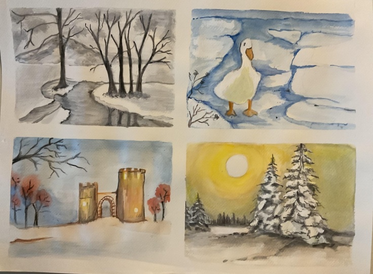
1. Introduction: Watercolor winter
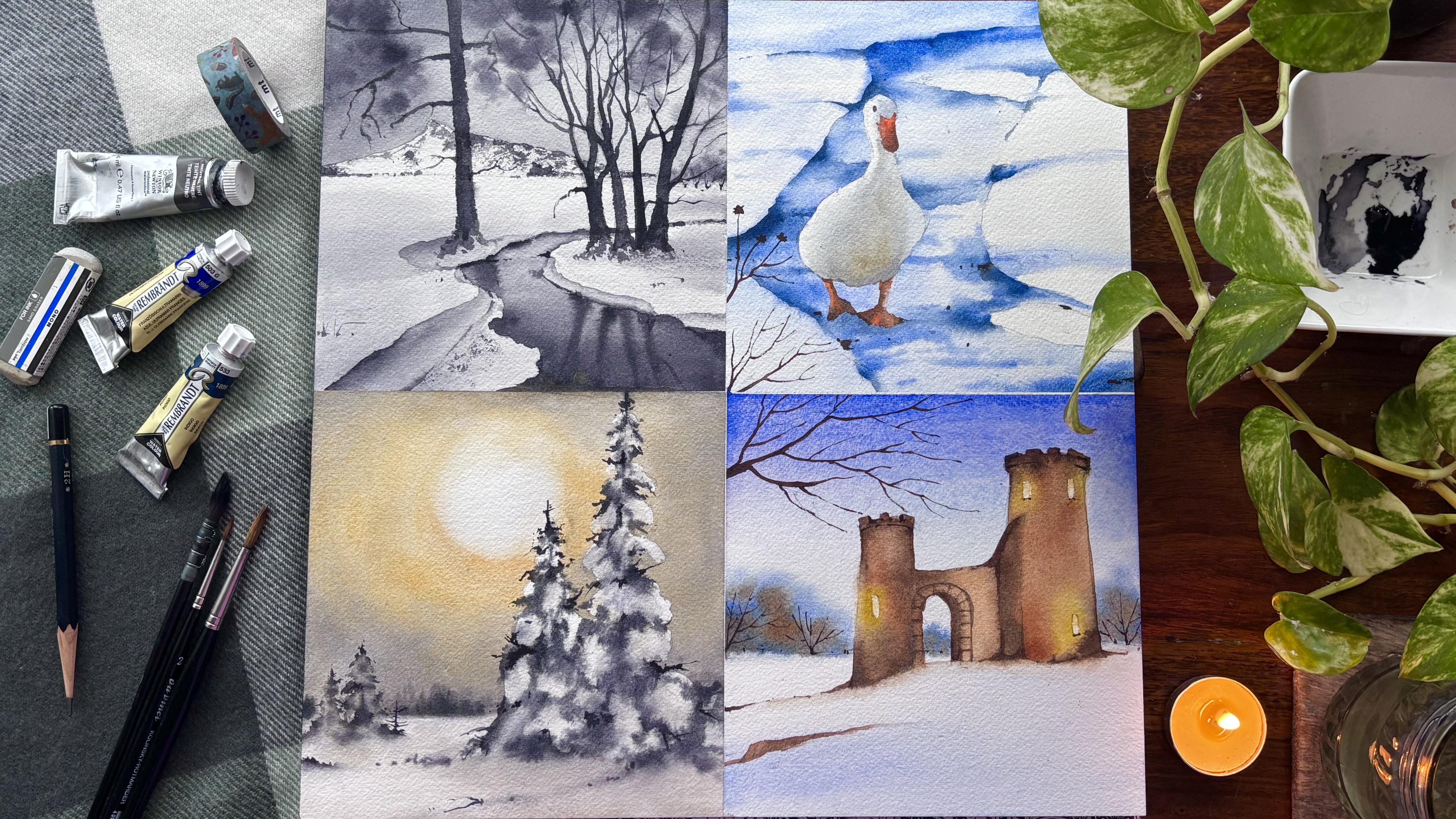
mood pot is all about visual collection
of images, colors, textures, and ideas inspired by winter and painted with
watercolor medium. Refers to soft blended, slightly transparent
painting style, gentle colour gradients,
light airy feels, soft edges, natural textures. And if you are looking to develop your own
winter collection, this class is the
right place to start. Hi, guys. I am i gana, an artist, instructor, mother, Sushre teacher or brand owner
of vibing parcels where we not only manufacture online
sketchbook cartage wpings, brush floats, and much more, but also have options
of participating in workshops or lifetime access to Babies classes across
on www.vibingparcels.com. Winter is a season
of slowing down, and this class reflects
the same calm rhythm. All the projects are
designed to be slow paced and are divided
into three clear stages. Before we begin the projects, there is a detailed techniques
section to help you understand the basic watercolor
methods we are using. For better clarity,
this section is thoughtfully divided
into two parts, one covering the techniques needed for the
first two project, and another for the third and the fourth projects
so that there is no rush or confusion
as you learn. All winter paintings are broken down into
three steps first, understanding and sketching
the drawing, second, applying the initial washes, and finally adding the details. Every project is
shown in real time, allowing you to paint
at a steady pace. If you are someone
who wants to embrace winter through monochrome
or limited color palette, simple strokes and playful
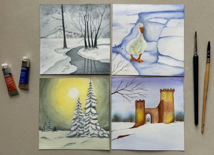
watercolor techniques, this class is perfect for you. There are four
projects in total, each independent of each other. It's a stress free
watercolor experience designed to gently
enhance your creativity.
2. Materials Required: Let's have a look at
all the materials which we need for completing all our four paintings
from the winter mood pot. I'm starting out
with my brushes. Now, these are all
Linc kolinsky brushes. I have size two, size four, size six, and size one. All of them are not needed. You can also have just
three. This is quite enough. I'm keeping pre brush for myself and a wash
brush is very important. Three to four brushes
is all you need. All these paintings, sometimes
just for my comfort, I keep extra brushes. This is the tissue is
very important for all the paintings
because if you have any backgrounds or you want
to pick up some colors, et cetera, this is the
best way to go about it. I will just have a look at
all the four paintings. This is done on arches, 100% cotton, 300 GSM, watercolor paper, and this is cod pressed paper which you
are observing over here. This is 12 by 12 inch and hence each of the paintings
is six by six inch. You can have separate papers for doing all these paintings. I have two different
types of ceramic palette. One is for single color, neutral tint and the other
one is for multiple shades. Two jars of water, one for fresh supply, and one for washing
your brushes. The next is all about colors. Now colors you can
have of many types. I've kept multiple
colors over here. I don't need all of them. I will give you an entire list of colors which we are using, but mostly it's limited palette that you have in this series. I have a masking fluid. It is basically drawing gum
and I would be covering my duck with the masking fluid and some of these parts
with the masking fluids. If you are someone who
doesn't have a masking fluid, you can also go ahead with
masking tape like this. I would be also using masking tape to mask
out a few areas, as you can see, these
are the lines which I've masked out before I went ahead with each
of the paintings. That's it from the
materials perspective. Let's go ahead and start out
with our techniques section.
3. Techniques - Part 1: We are starting out with
the techniques section, and this particular
section is going to help you understand the painting
one and painting two. Now, painting one is absolutely different
compared to painting two, hence the techniques will also
be pretty much different. You're starting out
with the gradient wash. The darkest of the value
is placed at the bottom. This is basically ultramarine, and I am adding the darkest
value going towards the top, it would become
lighter and lighter. I will wash my brush
every time and then pull the paints
towards the top area. As you see towards the top, there is hardly any
paints that is there. Only water is going
to do its work. This is a simple
easy gradient wash with one single color. You can have gradient
washes with two, three, four different
kind of colors. So feel free to go
ahead and experiment with different colors for
your gradient washes. What is wet-on-wet? Now, wet-on-wet is a technique which all of you have
used in the past. You are going to employ some
water on top of the paper, and then the wet paints
will automatically move on its own because of the water that's already
there on the paper. And it would give you blooms or very soft edges that
looks like clouds. As we are experimenting with clouds in this
particular section, or you can say in this
particular wet-on-wet method, I am again going ahead with
ultramarine and they are going to spread at different
places as you see over here. Wet-on-wet watercolors
really are magical. You are basically
collaborating with gravity, water, and pigments and
they have opinions. Why it feels so enchanting? Soft looms and gradient colors melt in each other
with zero hard ages, happy accidents, back runs, cauliflower effect,
feathery spreads. They often act as
better than plant. Atmosphere for days. Perfect for skies, mist, galleries, underwater
scene, and dreamy florals. How to lean into magic. Paper matters the most. Pre wet your paper evenly
as we did over here, drop or just add your
paints as dots over here, and then tilt your paper. Do not try to drag the colors, pause, let it dry
before fixing things. Many effects appear.
As it settles. This is basically for
wet-on-wet techniques only. Of my go to subjects
for wet-on-wet is night sky with indigo or
some splatter of stars, et cetera, forest fog, where I use lot of
paints gray Sab green, as you might have seen in
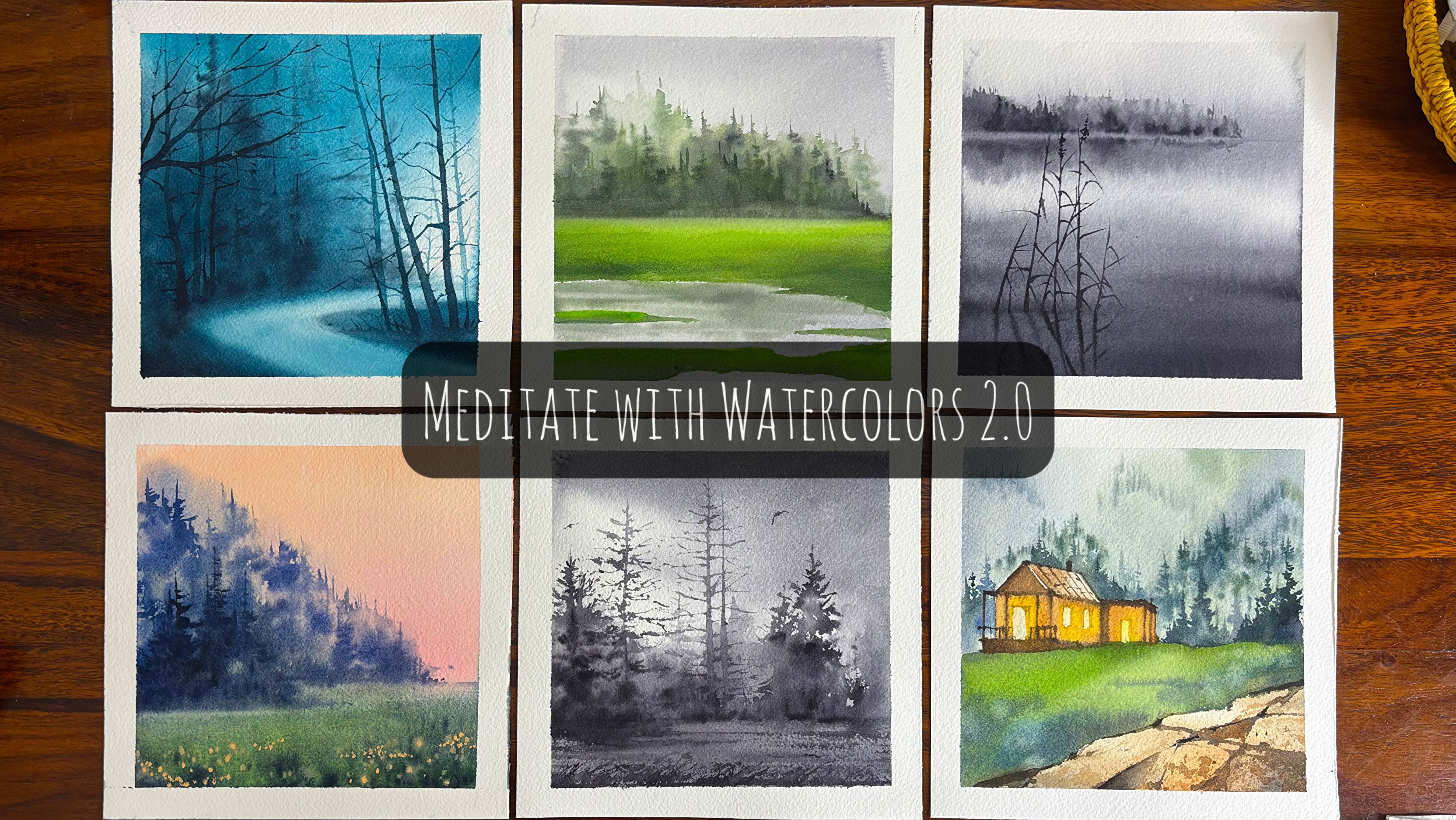
one of my previous classes, which is meditate with
watercolors 2.2 florals by dropping some colors in the loose petals when you
are doing loose florals. This is how we go about it. Okay, let's move on to
the next technique now. Let's move on to the
rewetting technique. Now, why I say it as re wetting? I am just applying
an even coat of paints gray wash. You
can also go ahead with indigo or any other
color that's a bit on the darker side on this
part of the paper, and then we will
do the exercise. Rewetting means adding
clean water back onto an area that has already dried to make the
pigment mobile again. Now, you can either activate
the pigment that is already there or add some
amount of new pigment. For our painting, we will
be adding new pigment, whereas you can also
activate the old pigment. You can pick it up. You can
also use that pigment to your own advantage and all those things can also
be done in this case. What's rewetting task? Soften hard edges, turns sharp lines
into gentle fides, lifts or lightens the color, especially with a damp
brush or paper towel, reactivates pigment, lets you blend, push
or reshape areas, creates texture, blooms,
clouds, mist, glow effects. How it behaves on cotton paper, pigment often wakes up
smoothly and cooperates. On cellulose paper, pigments can lift patchy or get muddy. Now, even when you are
adding the new colors, it may not be the best
on the cellulose paper. That's one of the reasons
I always stress upon the that your paper
should be very good, which should be 100% cotton, 300 GSM, arches or
fabriano or any of the mold made papers
that you get in the market with
staining pigments. The staining pigments is something which cannot
be lifted much. Hence, you should be very
clear about the fact. What are the pigments
that you are using like quinacridone or
you can say Talo? These are some kind
of pigments which have a lot of staining
effect in it, and hence to pick it
up becomes very tough. Common ways to re wet
is clean, damp brush, gently circle or stroke the areas like we would be applying a clear layer of water, and then we would be applying some of the colors on top of it. The next would be
dropping the water and the soft wash over dry paint that reactivates the
layer underneath. By the way, before we go ahead with the next layer
of re wetting, let's go ahead and make
some loose leaves. I did apply some clear
water on top of the paper, and now I have gone ahead
with a thinner brush. You can say this can be
size two, size four brush, whichever is available
with you and start dropping in your paints. Some of the paints towards the top should be more
plums and they should be lighter in value
compared to the ones that you apply towards
the bottom area. This is Los Lee's concept that we would be using
for our first painting. So be sure to just have an understanding
about it as most of these techniques
have been used over the next two paintings that is painting one
and painting two. You will also find the usage over painting three and four, what painting one and
painting two specifically depends on all these techniques that we are going
to learn over here. This is a reflection technique. I am going ahead and applying some colors towards
the bottom area. I have made a horizon line. Now, this horizon line is
just a very ordinary kind of horizon line which basically separates the land area
and the water area. I would be drawing
some of my lines. Now lines means they are
basically going to be trees. And then my water is wet, I would go ahead
and start adding some of my pigments
into the water area. Slowly and steadily, I would be adding no rush, do
not think much. It's just a learning process. So be playful, I would say, because playful is something
that I always always tell to each student of my that when you are playful with
this particular medium, you will get a lot
more understanding compared to if you
are very strict with the medium and just going to understand each and every
technique with the flow or just do it very
manually rather than just loving the process
and going with the process. Overall, I must say that I have taken a very thin brush at this moment and started
with very dark pigments. The paper is still wet, and when I'm trying
to the pigments, it's spreading a bit. It's not spreading a lot, which is what I
want at this stage. That's one of the reasons I
did leave out this space for one or 2 minutes when I was adding the trees on top
of the horizon line. Right now, my paper
in the water area is moist rather
than it being wet. Now, moist is very different
than it being very wet, where actually, if you
are even adding lines, it would become blooms, whereas in this stage, they will still remain
lines and would have an impact on
the water part. It would seem like that, yes, there's a reflection, and this is more like a still water. Though I would be
adding some lines, as you see over here
with the help of my flat brush itself. And hence, I would bring in some movement into
the water area. I will now go back to my
re wetting technique, which I have already
explained earlier. It is going to be
very simple process. I'm going to apply one
more layer of water and then some darker values
to show you that, yes, once you have even applied
one layer of clear paints, you can again go over it and paint with some more
of your darker values. After this, we are going to
work upon the tree part. That is basically
once you have painted the loose leaves and the
paper has dried off, we are going to add the
tree trunk and branches. I have picked up a very
dark value on my brush, and this brush is size
two or size three, whatever you want to
take, you can also go ahead with size one brush and then start adding the tree trunk and the branches for the trees. I have added more branches. You can also go ahead
with lesser branches. I would leave that
decision up to you. After this, we are going to discuss about negative painting. Now, negative painting is
something that I have taught earlier also in many
of my other classes. But yes, over here,
we would be briefly touching upon it as our
second painting is a duck, and the duck is the main
subject in the painting, which we would only touch once we are done with
the backgrounds. So negative painting in
watercolor is an art of painting around your subject instead of painting the subject itself. You let the paper become
the shape and you define it by darkening
everything around it. It's a brain twister at first and super satisfying
once it clicks. What it looks like, light shapes appear because the
background gets darker, forms often overlap and
feel layered and luminous, great for botanicals, forest, feathers and abstract patterns. How it works, start light, lay down a very light
wash over the whole area, define the first shapes, paint a slightly darker wash around the shapes, build layers, let it dry, then go darker
again, increase contrast. Gradually, the magic comes
from patients watercolor, light steps, and not jumps. Okay, tips that saves sanity. This is something you must
know in negative painting. Quint often to see the
shapes, not objects, keep washes clean, mud shows
pass in negative work. Let layers dry completely to
avoid cauliflower blooms. Limited palette helps
like two to three colors, which we are going to use
in our second painting. Light pencil guidelines
are totally okay at first. Common bign mistake that usually I've seen going
too dark too soon. Once watercolor is
dark, there is no undo. Soft layering is
your best friend. Let us now allow everything
to become very dry. And once it is done, we will just remove the
tape pattern angle. And once we have removed
the tape pattern angle, we will have a final look at all the techniques
that we have done, starting with the bottom area, which is wet-on-wet, gradient
wash, then loose leaves. You have rewetting technique, reflection, negative painting. We will go ahead and
start with Project one.
4. Monochrome Winter Landscape - Part 1 - Drawing: Drawing is an important
step before painting with watercolors because
it provides structure, planning, and confidence,
all of which are especially valuable in a
medium that's hard to correct. Here's why it matters,
establishes composition. A drawing helps you decide where everything goes before
you commit to paint. Since watercolor is transparent and mistakes are
difficult to fix, having a clear layout prevents awkward placements
or crowded elements. Defines shapes and propositions. The drawing acts as a
roadmap for your washes. Accurate propositions
and clear shapes ensures that when
the paint flows, it reinforces the image
instead of fighting it. Guides, values, and light. Through drawing, you can plan
where the lightest areas, shadows, and focal
points will be. This is crucial because
watercolor relies on preserving white
paper for highlights. It reduces overworking. With a solid drawing, you can paint more decisively. This helps avoid excessive
layering or scrubbing, which can damage paper and prevent you from adding
any muddy colors. Builds confidence and flow. Knowing your structure
is already in place lets you focus on color, water control, and expression rather than constantly
correcting the forms. As we are working with
one single color, light colors depend
a lot on planning. Watercolors work
from light to dark. If your drawing is way, you may accidentally
paint over areas that should remain
white or very light. Helps control the washes. A detailed sketch acts like a roadmap guiding
where washes stop, blend or stay sharp. This prevents color from
bleeding into areas which you want definition or where
you want some definition. Saves time and reduces dress. Knowing exactly what you're
painting lets you focus on color value mode instead
of figuring out shapes, make painting important because watercolor dries
up very quickly. Improves compositions
and proportions we have discussed
it earlier also. Detail drawing ensures
correct placement, balance, and perspective before
color distracts the eye. Support layering and glazing. When you already
know where shadows, textures, and details belong, you can apply transparent layers more confidently
and effectively. Let's now see how
we are going ahead and adding all our lines. I did first apply
my horizon line, which is basically create the horizon line and then
go ahead with my mountain. Once I'm done with
my mountain area, I have defined the area
where there will be water. The whole of the process
that we are doing over here will take
about 12 to 13 minutes. Now, I could have skipped this process to a
greater extent, but when we are working
with watercolors, I want you to go through this and know that there is a lot of importance that is attached to detailed drawing rather than only working on
the coloring part. If you see the definition
of watercolors, it means that water comes
first compared to colors. Hence, controlling the water is sometimes very difficult
in watercolors, and if you do not have
refined drawings, you may act upon it very
soon or pretty late. That's one of the
reasons I always stress a lot upon the
drawing portions, where the values
would be stronger and where the values
would be lighter. I will add some more trees
and branches on the left, as well as on the right. Now since there are a lot of trees which I am
adding over here, you might think that it is
a very detailed process. But overall, I feel
that drawing is equally meditative just
like we do watercolors. Hence, try to go with the flow and try to add the
darker tonal values as these are the branches
which needs to be in darker tonal values compared to the other parts of the trees, which would be in
lighter values, like the leaves, et cetera. Et us go ahead and add
one more detailed tree. Here, there are cluster of trees that we are going to
observe together. Hence, there might
be a difficulty in branching it out whenever
you are working with it. See how I go ahead with
it and take it slow. Now, slow is something
that I always say. Do not rush into the
process of watercolors. This is a mood board for
your winter paintings, and I'm pretty sure about it. You're going to love
it once you finish it. I have selected the
colors starting from your only one single shade that is monochrome
to multiple shades. And as you progress, you will see that
winter paintings do not need lots and
lots of colors, value changes, et cetera. It's only a few colors
that can be used. It can be a limited
palette painting, too, and you will get an outcome
that you fall in love with this brings me to
an important discussion. A limited palette defines
most wetter paintings because winter itself reduces color in the visible landscape. A artists respond to both the environmental reality and the emotional
tone of the season. Here are a few of the main
reasons that I could list down for having fewer
colors in a painting. Nature in winter truly
has fewer colors. Snow, ice, bare trees, overcast skies
dominate winter seeds. These elements
naturally compresses the color range into
white off whites, cool blues, grays, muted
browns, and blacks. With vegetation dormant
and light less intense, saturated colors
almost disappear, making a limited palette the most truthful way
to depict the sea. Light is weaker
and more diffuse. Winter light is
lower in the sky, often filtered through the
clouds cooler in temperature. This soft indirect light
reduces contrast and chroma. Artists limit their
palette to maintain realistic atmosphere effects and avoid unnatural brightness. Snow reflects and unifies color. Snow acts like a
giant reflector. It picks up subtle hues
from the sky and curadics. It blends colors
together visually. Using too many pigments
can break this unity while limited palette preserves the cohesive quiet
harmony snow creates. Emotional and
symbolic association. Winter is commonly
associated with stillness, silence,
isolation, introspection. A restricted palette
reinforces these moves. Fewer colors communicate
calm restraint and sometimes melancholy
more effectively than a vibrant wring. Strong value structure and
matters more than colors. In winter scenes, values, light versus dark does matter most to the
work of an artist, tonal relationship, subtle
temperature shifts, warm versus cool grace. A limited palette helps maintain clear value control without
color distractions. Artistic tradition
and influence. Many painters,
especially in realism, impressionism and landscape
tradition developed winter palettes to study atmosphere light
and tonal units. Once established, these
conventions became part of how winter is
usually understood in art. In short, winter
paintings are limited in palette because Winter
itself is limited in color. A artists use
restraint to capture its quiet light unity and
mood more convincingly. While you continue to
paint with watercolors, I would like to tell
you why I am adding all these darker values with
my pencil at this moment, you will have multiple
washers and watercolors. Because of these
multiple washers, sometimes the graphite
that you add in a painting during the drawing
stages do get washed away. And hence, it might be
difficult for you to follow exactly where you are placing your darker and
lighter tonal values. Hence a drawing that has quite a lot of darker
values at this stage, which would be in
the darkest form also when you are
painting or when you are adding the value is important to highlight and
make it possible, so that when you are working on the third layer of the painting or the second layer
of the painting, there are no way that these graphite
marks become lighter, and hence you can work through the layers of
painting pretty easily. I'm almost in the last stages
of the drawing where I'm detailing some of
the final trees, and then I can also add upon some of the darker
values here and there or maybe mark area
where I would be adding some extra
number of trees, et cetera, but that's all up to you how you want to do it. Let's just go ahead
and finish it for now, and I will meet you in the
next lesson where we are going to go ahead with our
first and second washes. I will also tell
you how glazing is very important for
a window painting. Hence, be around, and I'm
pretty sure about it, you will fall in love with
the mood board that we are going to create
for this winter. Et's move to the next lesson where we are going to work with one single color which is neutral tint for this
entire painting.
5. Monochrome Winter Landscape - Part 2 - Initial Layers: Let us just talk about layer one that we are going to
apply in this painting. First, I would go
ahead and just wet the entire area of the paper. And then once I have actually
added all the colors, I would go ahead with
my neutral tint. Now, this neutral tint is from the brand,
Winsor and neutral. You can go ahead with
even black if you don't have the neutral
tint variable with you. I usually don't have any
blacks on my palette. That's one of the
reasons I go ahead with the shades like
neutral tint et cetera. I would take my wash
brush initially and then go ahead with
my aquaton brush. This is from the brand file, and it is a great one to
start your paintings with. It's not very
expensive in India, as I always say, and I think it's pretty much in
the affordability range. As well as this gives you a great outcome as it
can hold a lot of water. Going with my sky area initially and then
the bottom part. I'm not applying the
colors everywhere. It is only in a few areas I'm going ahead and
applying the colors. Just watch me how slowly I
am adding all the colors and then create the confidence that you all can literally
do watercolors. Believe me,
watercolors is a very, very simple and easy medium, that you need some amount of patience to work
through this medium. While you work through
this layer one, I would like to tell you some important
facts and figures. Why do we actually emphasize
a lot on layer one? Though it's already time
for layer two of my sky, you continue to
observe me and add it. In the meantime, let
me actually take you through all the points that I have gathered together
for my layer one. It sets the value structure. Watercolor is a
value driven thing, establishes the light, mit, and early dark values, determines where the
whites are preserved, prevents a flat or
over painting later. It defines the mood
and atmosphere. Layer one usually carries the overall temperature and
feeling of the painting. Warm versus cool,
calm versus dramatic, soft versus high contrast. Later layers refine details, but the emotional tone
comes from the first wash. It unifies the painting a well planted first layer,
ties everything together. Shares undertone across
different areas, consistent light
conditions, visual harmony. Without this unity, later
layers can feel fragmented. It preserves
watercolor freshness. The first layer is where
washers are clean, colors are transparent,
brush work is confident. If layer one is weak, artists tend to over layer, which dulls the color
and kills luminosity. It establishes edges and even the shapes such as
soft and lost edges, separates big masses,
blocks in major shapes, like we are now having one
single layer for our sky area. Some places may be in dark, some places may be
in light values. It all depends where exactly you want to
place your colors, how exactly you want
to work it out. But this is a large block that
we are painting as of now. It controls later layer limits. That is watercolor paper can
only handle so many passes. A strong layer one reduces
the need for correction, preserves paper textures, keeps colors from
becoming muddy. It encourages commitment. Layer one forces
decisive choices, where the light is,
what matters most, what can be left suggested. This commitment is essential to an expressive watercolor work that you are going
to do right now. You can see, even
in the sky area, I have created some
lighter and darker values. Now I'm going ahead with
one of my smaller brush to add some of the darker
values towards the right side. This is basically the tree
area that I would be adding, and it is in the faraway land. Hence, it would be
very small areas that you have to paint. As I'm painting wet-on-wet, it is giving me some of the areas that are
more in a bloomy way. This is not sharp edge, and I really don't want sharp
edges too at this moment. Some of the areas
which are not like, which are not so well defined or maybe the blooms are a lot more than what I
would have expected. I can pick up the colors
and again, add the colors. As and when needed. It all depends upon the moisture that is
there on the paper. If the moisture is higher, then the colors
that you add will become lighter or they
will become bigger blooms, whereas when the moisture
on the paper is lower, there will be more control
blooms that you will get. Whenever you are going ahead
and watching your painting, if you allow your
layers to dry off, they will become a
lot more lighter than what you have
added initially. And that's absolutely okay if your water content is higher in the mix of water and the
colours that you are taking. Of course, the colors
will fade away a bit, and that is what we want from
our layer one layer two, as we are going to go ahead with some more of
the glazing part. I would just add smaller
lines to show that the trees exist in the
background and wherever needed, I just tap it with the help of my ficus so that the sharp
lines become more blur. Another thing I must
say is that think before you apply your
colors at this stage, because you can wait
for 1 minute or a few seconds before you go ahead and apply your
colors of the mountains. It is more of a dry
brush technique that I'm going to use at this stage and just
elongated on the right side, the area would be
way more darker. And on the left side, it
would be a bit more lighter. Once we are done with
the mountain area, we have to go ahead and define the area of the horizon
line in a bitter way. For me, Horizon line
has always been a very, very important
defining component as it anchors the
entire painting. Establishes eye level
and perspective. The horizon line represents the viewer's eye level,
defining it early, controls how spaces, recedes, determines whether
we are looking up, down or straight ahead. Keeps building roads water and figures in
correct proposition. A displaced horizon instantly
makes a scene feel wrong. Separate sky from land or water. In watercolor washes
often flow and merge. A clear horizon
prevents the sky wash from invading the ground
or water unintentionally, helps control wet
into wet transitions, allows intentional
soft and sharp edges where the sky meets the earth. As we are now going ahead and painting the
water component, you will see that
this particular area I am adding in a very
dark value as it is closer to my eye compared to the other values that appear pretty far away from my eyes. Lastly, as I say, control
value and color shifts. Sky and Lang usually
differ in value, color temperature,
level of detail. The horizon line marks
whether these shifts happen, helping you plant clear
and readable layers. A you can also switch on to a bit bigger brush. If you're comfortable with it. I am using the same size board or size two brush that I've been using for my faraway area of the water that I
needed to define, and then I'm extending
it on the right. The colors are more darker
towards the bottom and the colors will become lighter
as I go towards the top. Not all the areas will have a similar value of
watercolor, as I always say. Watercolor changes
in terms of value, creates a lot more perspective when you are into any kind
of watercolor painting. Let's go ahead and apply one more layer for the
sky area as I want to add some of the leaves that
is important for the trees. Now, these are more in terms of blooms as it is winter season. Most of them will be very hard to see through as there
is a lot of mist, then it is more blurred. The atmosphere is in a way that you cannot see each
one of them clearly. We will continue to focus
on these blurry leaves. And once done, let's see what is there
in the next layers, as I am very, very excited
to teach you through the entire part of
this mood boat. Mood boats are very
important for winters, for springs, for summers, for every part of wale. You can create moodboard. For your travels, you can create moodboat for any subject
that you are in love with. Hence, if I am in love
with watercolurs, I would love to create moodboard for a particular season
with my watercolors. Ever I think that
I have overworked, I would go ahead with a
wet damp brush and pick up the extra colors from
that particular area. Applying some more
colors in darker values, as you see over here, everything that I'm adding
is with my smaller brush. The size of the
painting is smaller. It's only around six inch, and that's one of the reasons whenever you are going ahead
with smaller paintings, you will need smaller brushes, compared to the paintings
where you are working with larger brushes
and larger paper.
6. Monochrome Winter Landscape - Part 3 - Glazing & Detailing: While I continue to
work with watercolors, it's important to cover winter monochrome
watercolor mod boot. Overall mood, quite still, introspective, cold, but soft,
minimal and contemplative. Thinks silence after
snowfall rather than dramatic wind
strong. Color direction. Choose one base hue and
explore its full value range, like we have currently
chosen neutroten. You can also go ahead
with pains gray, indigo, blue gray maybe an ultramenine
plus burn Siena, CPR. So these are the
usual colors that I usually pick up
for my winter boat. Visual elements to include bare trees with delicate
branch pattern, snow covered grounds
with soft value ships, distant hills, simple cabins, fences or pools, small,
solid tree figures. You will see that these
shapes are simple and large, wet-on-wet skies for
snowfall and fog, dry brush for tree barks, grass poking through the snow, soft edges near the horizon. Hard edges only in
the foreground axon. Let granulation and water
movement do the work. Light and values,
high key overall, lots of light paper, strong dark accents, using sparingly gradual
value transition, minimum mid tone clutters. Contrast is emotional
here, not decorative. Composition ideas, high horizon, for intimate quiet scenes, low horizon for
past empty skies, asymmetry for natural stillness, plenty of negative spaces, emotional keywords,
silence, breathe, pause, distance,
solitude, cold air, early morning, or late dusk. What to avoid when you are working on a mood
board in winter. Over detailing too many layers,
hard outlines everywhere, overworked shadows, monochrome winter watercolor
thrives on restraint. If you are someone who
is in love with winters, I think moodboard is
a way to go always. I am currently working on the other areas that I did
mark out earlier where this particular view
of snow as well as the snow which
is reaching out to the water can be seen. Some of the areas, I will again wet out and
then apply some of the darker values of color compared to what we
have already applied. This is basically
the middle ground that we are going to cover. Many people or many artists have this idea of moving
from top to bottom. Though we will also
be covering in other paintings where we
move from top to bottom. But for this
particular painting, some of the middle tones where I feel that there has
to be more colors, I would go around it in my second or third layer compared to what
I have done Odio. Let's focus a bit on glazing and understanding
why we are glazing. In the meantime, you
can continue to follow the steps as I work
through the painting. And have an outcome that looks exactly similar in the
way I'm doing this. You can use any other
black that is mass, black, lamp black, whatever
is available with you if you do not
have neutral tint. Let us understand glazing. Glazing in watercolor is a painting technique
where you apply a thin, transparent layer of paint over a completely dry layer of. What glazing actually means. Each layer is
transparent, not opaque. The paper and earlier colors should show through
the new layer. Colors are built up gradually instead of being mixed
heavily on the palette. The previous layer must be fully dry before you add the next one. The next most important
question that I have always come across when we are working
through any workshops or classes is why glazing is
important in watercolors, creates depth and
richness of color. Multiple transparent layers
make colors look luminous and gluing something watercolors
is especially known for. Allows color control
and correction. You can slowly deepen or adjust a color without
ruining the painting. For example, glazing blue over yellow creates a natural
rain without muddy. Maintains transparency
and freshness. Mixing too many colors at once can make watercolors look dull. Glazing keeps colors
clean and vibrant, adds shading and form. Light glazes help
define shadows, volume, and mod without harsh lights, enhances realism and detail. Artists use glazing to build subtle color variations
in skin tones, skies, water, and landscapes. Example, first layer,
yellow wash for sunlight. After drawing a blue glaze
over parts of it result a glowing green with depth that looks more natural
than pre mixed green. In short, all I can
say is glazing is important because it collects watercolor artists build color, depth, and light slowly and transparently preserving the
unique beauty of the medium. That is watercolors. Let's go ahead and now add some darker colors for
this part of the tree, which is basically
my foregrounds. Foregrounds are meant
to be always darker and more detailed compared to the backgrounds or
the middle grounds. Hence, we are going to work on the foregrounds in a much more detailed manner compared to my background
mountains as well as the other middle tones which we have applied for the snow area. Let's not focus a bit
more onto the values. Now, why I'm focusing
on the values? We are working with the
deepest color at this moment. And this deepest color is for the tree branches and
for the tree trunk. In monochrome watercolor, value refers to
the full range of ness and darkness that an artist creates using only one color. Since no additional
hues are introduced, values become the
primary tool for visual expression,
structure, and realism. Understanding values,
value describe how light or darker color
appears, not its hue. In monochrome watercolor,
value changes are achieved by varying the
ratio of pigment to water. Layering transparent
washes, allowing the white of the paper to
act as the lightest value, which we have done over
here for the snow. This produces a value scale ranging from white of the paper, that is the lightest value, very light washes, middle tone, dark or concentrated pigments. Rule of value in
monochrome watercolor, creating form and
three dimension light. Without multiple colors, object rely entirely on
value differences to show shape and volume. Gradual transition
from light to dark suggests curve planes and depth. Establishing light and shadow. Values indicate the direction
and intensity of light. Light values
represent highlights, while darker values
represent shadows, helping the viewer understand where the light source
is coming from. Developing contrast
and visual interest. Strong contrast between light and dark
values create drama, emphasis, and focal points. A painting with
weak value contrast often appears flat or lifeless. Strengthening composition, create value organization helps guide the viewer's eye and
gives the painting structure. Even a simple subject
becomes compelling when the value are well balanced
training observation skills. Monochrome watercolor is often used as a learning exercise because it forces the artist to focus on value
rather than colors, improving accuracy
and discipline. Techniques for controlling
values, dilution. Me water creates lighter values, less water creates
darker values. Learning, successive
transparent layers deepen value gradually. Lifting. Removing paint while wet
or damp to lighten areas, preserving whites, leaving areas unpainted for highlights. Example, light wash that
is sky or distant forms, middle tones, trees and land, darker values, shadows,
foregrounds, and focal areas. Values in monochrome watercolor
are the variation of light and dark created
from a single color, and they are essentially
for conveying form, depth, light, and mood. Mastery of values allows
an artist to create expressive realistic and visually strong
watercolor paintings even without the use
of multiple colors. That is basically
the conclusion from the whole fact that
how you can create values and how it adds up to any artists dimensions
and focal point. Uh, Now it's time to create a variation even into the water body
that we have painted. As the water body is
quite still, hence, there will be some amount of reflection of the
trees that will come. I would go ahead and
first apply some of the darker values in
and around the sides. This is basically to
show that there is some amount of reflection of the snow which is
falling into the water. Some of the darker values
which I have applied for the water area will be blended with the help
of my blending brush. That is the aqua soft
brush which I have from Rafael and then going
ahead with my reflection. Now, this is the
reflection of the trees into the water area
as you see over here. Some of the trees are thinner
compared to the other ones. I'm only drawing the branches, or you can say basically
the tree trunk, not even the branches
to a greater extent. As the space is really low, hence we are sticking to more of you can say realism
as well as how I see any kind of photograph or painting or any particular
area where I go to. An artist always
depicts what he or she sees from their own eyes rather than depending on what is
actually present over there. Every painting is basically
how a particular artist perceives that particular
area where they are drawing or how they are
perceiving a photograph or even how they are perceiving a particular scene
where they are present. So all of these put together, it's how they want to
represent any particular area. It can be with the
softer values. It can be with the
detailed values. It can be any way that
they want to represent. I'm making a few dry
branches or grasses, as you always see in
any kind of snow area. These are smaller in
shapes and sizes, nothing much and continue
with the tree trunk, as well as the
branches of the trees. This would be more of a repetitive and
exhaustive process. It's also meditative,
I would say, as you are doing a single
thing over and over again, but don't not lose
your patience. This is the space where you
need a lot of patients, as we have lots and
lots of branching and lots and lots of tree trunk getting watercolor paints on it. Hence, keeping
your calm and just going ahead with paints is
very important at this stage. As I always say,
patience is the key in watercolors because the
medium rewards slowly, thoughtful laying,
careful timing, and respect for drying stages. When an artist works patiently,
watercolor remains fresh, transparent, and expressive,
revealing their true beauty. Let me explain you a
bit more in detail. Watercolor depends on timing. Watercolor behaves
differently when the paper is wet, damp or dry. Wet is colorbled
and blend softly, damp edges soften,
but stay controlled. Dry edges remain sharp. Being patient allows the artist to work at the right
stage of moisture, which is crucial for predictable
and pleasing result. Layer must be dry completely. Watercolor relies on
transparent layering that is basically glazing. If a new wash is added before
the previous one dries, colors make unintentionally
paint lifts or backgrounds, the surface becomes muddy. Waiting ensures clean
layers and luminous colors. Mistakes are hard to fix. Unlike opaque mediums,
watercolor is less forgiving. Patience helps you
plan better painting, apply light washes first,
build values gradually. This careful approach reduces errors that are difficult
or impossible to correct. Preserving light
and transparency. Watercolor gain, their beauty
from light passing through the transparent washes and reflecting off the white paper. Rushing often leads
to overworking, which does the
painting and destroys the freshness that you can get out of a
watercolor painting. Control over values and detail. Patience allows slow
development of correct values, subtle shadows, delicate detail. Rushing to darker tones too quickly can overpower
the composition. Lastly, it is all about
emotional discipline. Watercolor teaches the artist to accept unexpected effects, pause and observe, respond
rather than force results. This mindset leads to better artistic judgment
and more confident work. Uh, This is the stage. We are almost done with most
of the detailing that is creating the branches or even small small
dots here and there. Now you should step back, relax, take a small break, come back and see if you are overworking
in your painting. Though this painting took
us a bit more longer compared to the other paintings that we are going to do next. Another reason I wanted
to take it slow is, this is the first painting. Every step becomes very
important at this stage. The mood board is all about
creating different kind of paintings that we
usually observe or see during the winter season. It is inspired from various
different elements. Some of them can be your colors, some of them can be
your scenic beauty. Some of them can be
your landscapes or even drawing simple animals
or birds like duck. Areas where I think I will
need some more glazing. I'm just applying
some clear water and then will go ahead with some darker value of my brush as the paper
will remain wet. Hence or you can
say it is moist, the colors will blend
or they will become bloom rather than
only becoming small, small dots, et cetera. I always like to keep
window atmospheric, as well as more intuitive
rather than it being assertive where we are defining
everything step by step. After adding some of my darker values in
case I am not happy, I can always go ahead
with my flat brush and remove the extra
colors very soon. This part of the
paper is also wet, hence I'm going ahead and adding some reflection of my tree
trunk into the water area. Wherever you feel the
branching is still needed, go ahead and apply
the branching. Or if you even want
to keep it as, just leave it as is. I sometimes add the
branches and then, again, pick it up with the
help of my flat brush. I hope you are enjoying the
painting to a great extent. I would now mask out my
other painting area. This is with the help of the
washi tape, which I have. You can also use a washi tape or masking tape or
a carpenter tape. Now, I practically did not
use a carpenter tape in this painting or in
this series altogether, as I was running very close
in terms of the border. I did not leave any space. It is basically a winter mode, but I am moving
from one painting to another very
quickly and easily.
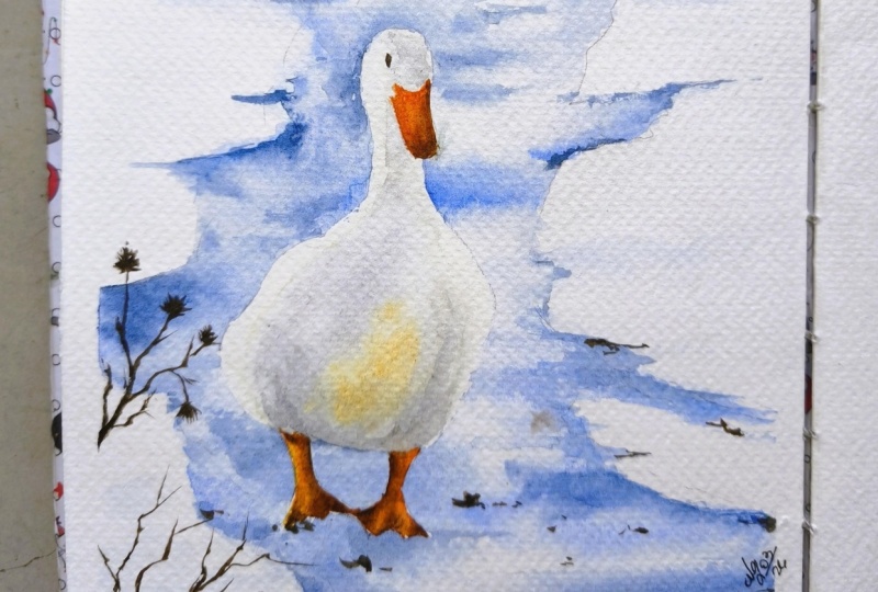
7. Winter Duck - Part 1 - Drawing & Masking: This is a very important step
for drawing, as you know, that this time we are
going to attempt a duck, and it is walking in between a small pathway which
is defined by snow. We are going to
start out by marking the area where you will
be painting the duck. It is basically a straight
line that I'm marking so that I know exactly where
I would be placing it. There are two oval circles
that you will see, and these two oval
circles is going to just determine the
body shape and size. Though this is not
the final one, you will see more changes
as we go forward. The first step for
drawing any kind of a bird is gesture
and posture. Begin with a light
gesture line to define the duck's
direction and posture. This is what I have done. Add a slightly curved
horizontal line to suggest balance and thrown, which is basically
where I would draw the feet and the other
parts of the boot. Though, this is a very, very rough sketch,
and right now, you cannot say that
this is going to be one of the final paintings or how the final
paintings would turn out. Hence, go with the flow and add the lines for the
background in a better manner. As we progress, we will define
our duck in a better way. The whole of this
part is going to take you about ten
to 11 minutes. Believe me, it's not
much that you see in the process of creating
watercolor paintings. If you are more focused
on the drawing, it becomes very
easy when you are going ahead and painting. Hence, I always try to focus a lot on the drawing for at
least the winter moon pot, as there are lots of different paintings
that we have covered, even in a small stretch of
four watercolor paintings. You will see a lot of differences in
what we are painting. The first is landscape. The second is an animal. The third is a dawn or a dusk, whatever you want to
go ahead and make it. And the fourth ones the light in the castle that we usually
see in the evening time. Though all the paintings are really done on a
limited palette, and you will not see
lots and lots of colors, as winters are usually
having a lot less colors. Hence, I have tried to imitate the same even
in our paintings. You will see the
background lines are very crooked and have a few
lines here and there. I'm just trying to make
a very rough sketch of the pathway on which
this stub is moving. Overall, you cannot really
see a very defined subject, background, et cetera
at this moment. But as we progress, you will see that everything
will fall in place. And when you paint over it, it is going to give you an outcome that is
up to your liking. I did erase out
some of the spaces. The whole subject or the
framework is already defined, and now it's time to add
more details into it. It's not that this is
the final details. You may find a bit of changes even when you are
drawing or painting. So when you are drawing more, I would say, in a
detailed manner, it becomes easier
to paint upon it. And hence my only idea in
this particular series is to give a lot of time to the drawing portion and then
move on to our painting. I have less to explain
at this stage. All I can say is that you need to connect your
head to the body, and this is more in
a curved manner. And once that is done, we will move on to the
beak and eye construction. Lastly, the legs,
though there are no wigs that I'm going
to add in this painting, but if you are someone who has done detailed
duck paintings, you, of course,
know that there are wings and you can
also construct them. This is an optional thing, but in our particular this part of the painting
in the winter moon pot, we have not
considered any wings. And if they are there also, it is in the back, which
cannot be seen properly. I will ask you to go ahead and use an B or a two edge pencil. The reasons are
balanced hardness, edge means hard
and B means black. B sits in the middle, so it's neither too
hard nor too soft. Light cleans lines. That is, B pencils make light marks
that are easy to erase. This is important for sketching
and construction line. Good control. It allows smooth
controlled strokes, big nurse and professionals. Both find it easy to handle. Does not smudge easily compared to soft
pencils like two B, four B, HB smudges less, keeps the drawing neat, especially during
the planning stages, which is currently the stage
where we are going ahead. Idea for outlining. After rough sketching, HB is perfect for final outline without marking lines to dark, save for watercolor and ink. Now this is something
that I want to stretch upon or stress upon HB lines don't show strongly under watercolor
or ink washes. Now, watercolor is a very, very transparent
medium and hence it is very important
for all of us to understand that watercolors
can be dealt well only when you have lighter marks
or you do not have very, very strong smudges
on the paper. That can happen if you are using a two B or
a four B pencil. If you are using a two
edge or an HB pencils, it's easier to erase
and work upon it. And to make the feet
and the legs now, this is the area
where some portion of the feet is inserted into
the snow as they are moving, hence you will not observe
the full part of the feet. Go ahead and make it
in a similar manner. I will also mask out some of the areas that is majorly
the duck portion. If you are someone who has not done or don't have
masking fluid, you can always go ahead, use a masking tape over your
duck and cut out the area. Which is majorly the snow part, and then go with
the duck painting. Another way to go
about it is just do not paint over the
duck, go in and around it. Masking is basically
done so that you can preserve the white spaces
and work upon it later. If you're someone who doesn't
have a masking fluid, do not stress upon it. Just leave out the area of the duck and keep
painting the background. Once the background is done, then you can work upon the duck. It might take a bit more longer compared to
what I have taken. That's the only difference. Oh Go ahead and finalize the
background lines now. Once the background
lines are finalized, then we will leave out some
of the areas which are lighter in value compared to the areas which will
be darker in value. Slowly, you will have an idea
how the whole thing works. You will also get this whole painting in
the resources section. It is already uploaded. You can download it
from that space and then go ahead with the
individual painting. It would give you
a better idea on the drawing as well as
the painting portion. While you find things
are drawing a bit more, I would like to take you
through the masking fluid part. Now, since we will be using
the masking fluid over here, which is basically to protect specific areas of the
paper from paint, reason for using masking
fluid preserves white areas. Masking fluid keeps part
of the paper white, and this is important
for the highlights. Light snow, reflection, light, feathers or water
sparkle over here, it's the bird, et cetera.
Allows pre painting. It lets you paint bold washes without worrying about
covering important details. You can work faster
and more confidently. Creates sharp edges. Masking fluid produces clean, crisp lines when removed. Useful for fine details
such as branches, cracks, and ice or feathers. Layering made easier. It helps in building
multiple layers of colors without
losing highlights. Time saving. That's a very,
very important thing. You don't need to carefully
paint around small areas. This makes complex
paintings easier to manage. Add texture and detail. When removed, it can create interesting textures
that looks natural. I'm using PiBo natural
latex masking fluid, and this is milky liquid extracted from the
sap of rubber trees. In masking fluid,
this latex forms a rubber like layer
when it dries off. Flexible protective
layer, easy removal, strong resistance to water and
better rip over the paper, but some of the people are
allergic to natural latex, so be sure when you are
selecting your masking fluid.
8. Winter Duck - Part 2 - Layering & Glazing: A background wet-on-wet wash in watercolor technique used to create soft flowing blend
backgrounds with no hard edges. What it means, let's just understand a
bit more in detail. You apply paint on paper
that's quadri wet. Hence, we have to go ahead and first apply water on top of our paper on the entire six inch size that you have taken, and the colors will spread very naturally once you have
water on the paper. This is great when you
are making backgrounds or skies mist, water,
atmospheric depth. For anything, this
kind of I mean, application of paints is great. The second part that is
how to go ahead and do it. First, this step, as I did
tell you is to wet the paper. The paper should be even
the damp not puddling. Hence, you should always, always know that there should not be lots and dots of water that's there on top of the paper or else they
will move here and there, and hence the colors will also
move to a greater extent. Drop in the colour,
touch the brush to the wet paper and
let the paint spread. All the paper to guide
the flow if needed. Now, this is not required for this particular
part of our painting. Hence, we will go
ahead and just start applying the brush
to the wet paper. Build gently. Add more color while the paper is still
wet for smooth plants. Avoid overbrushing, let
the water do the work. Let it dry completely. Don't touch it while drying unless you want
blooms or textures. This is a very, very important part when I say
about blooms and textures. If you are someone who
really like textures, then this particular painting is not somewhere where I
would like to experiment. I will give you more paintings
where you can experiment, understand dry brush
techniques, et cetera. Which can be applied to or maybe some amount of
salt effect, et cetera. This painting is going
to be way more simpler. I'm going ahead with
a lot of ultramarine, and then you can also keep indigo or Prussian blue
for your reference. Now, these are the two
shades that I will use for adding the cool
tones to the painting. Simple, easy, yet very flowy, and it's going to give you an amazing outcome once you
finish it, as I always say. At this moment, you
cannot judge a painting, so just go ahead, go with the
flow, enjoy the painting. I want to go ahead and pick up my colors from some
of the spaces. You can go with a
clean damp brush as I'm using over here and then pick up the colors from the spaces where you want
to keep it more white. Now, watercolor is a transparent
medium hence keeping it white in few places
is always a great idea, as you will be using the white spaces of the
paper rather than using wash or any of the other colors
like Chinese white, et cetera. Pick up the colors from the places wherever
it is necessary, as this portion needs
to be more and white compared to the blue that we have applied for the pathway. Overall, you will need
some time to develop this, and that's one of the
reasons this middle part, or you can say the part two of this particular painting is longer than the part
one and part three. As you observe, my
paper is moist, which means that I don't have a lot of water
on top of my paper. Moist and having a lot of puddles of water
is very different. Hence, when you are
working with watercolors, you need to understand
the puddle, then the wet, and
then comes the moist. What does moist helps
you to determine? Misters help us to understand that we can apply
the colors and there would be less of blue or
even the colors will move way more lesser than what we have already added earlier. I'm trying to pick up my
colors with the help of my flat brush from
the pathway area, as you can observe over here. I usually keep a
tissue by my side. Whatever colors I pick up, I just take it off
on the tissue, and one or two times in between, I will go ahead and wash
my brush so that I can get some clean areas with the help of the clean brush
that I have picked up. In the meantime, you can use your size two or size bu Brush, whichever is readily
available with you, you don't need to think much when you are adding
these colors. Mostly the colors, as you see, are only two shades that
is ultramarine and indigo. You can also keep uh blue, et cetera, any color that's
available on your palette. Believe me, this class is
not about colors or palette. It's all about the cool
colors of blue and a simple duck that would
be moving in between. We are using limited
palette for this painting. Most of the paintings
are done in limited palette in
the winter season, as you already know, because winter
colours are pretty dark and they are
softer compared to what we usually see that is warm and bright during
the summer season. That I will continue to work through these
spaces of the pathway, as you see over here, though I have removed some of the colors in few of the areas, but still there is
a reason to add the colors in some areas
too with the darkest of the values because few areas
needs to be shadow and few area need to have
more light on top of it. That is the sun is falling on top of
this particular area, and that's one of
the reasons that particular area of snow
is shining bright. So many of you might
have this question. Why do we layer wet-on-wet
in watercolor as you see me picking up the colours and then again going ahead
and layering over it? Because it allows artists
to achieve effects that cannot be created with dry
brush or single washes, especially soft transitions, atmosphere and natural movement. To create soft plans
and gradual transition, wet-on-wet lets color flow into each other
without hard ages. Laying this way helps
build smooth skies clouds, mist, fog, water, gentle
light transitions, which we are doing over here. To build depth
without hard edges by layering while the paper
remains damp is vetted. Artists can darken areas without losing
softness, backgrounds, distant landscapes, atmospheric perspective
to preserve natural and organic effects. Water moves pigment
in unpredictable way. Laying wet-on-wet embraces this, creates natural textures, avoids stiff or
overwork passages, adds life and spontaneity. To gradually increase intensity. Instead of dropping
in strong pigments, call at once hardest layer wet-on-wet to slowly
intensify the color, maintain transparency,
prevent muddy mixes. This is especially useful for subtle color shifts to
suggest mood and atmosphere. Repeated wet-on-wet layers
help establish soft lightning. Emotional tone weather effects
to unify the painting. Laying wet-on-wet allows color
to bleed into each other, visually connecting
different areas of the painting and
creating harmony. Watercolor is itself fluid,
luminous and expressive. And for actually capturing
all these effects, it's important to go ahead and work in layers
that is wet-on-wet. My paper has already dried up. This is one of the areas
where I'm adding some of my dry colors and using my blending brush to blend
it across the pathway. This majorly gives depth to the snow that we have
added on the left, as well as on the right. This is more of an
iterative process. As I go forward, you can just follow it and
see how I work through it. Watercolor is iterative because the medium depends on
transparent layers, drying stages, and
constant visual adjustment rather than one
decisive application of paint. Each step responds to
what happened before it. Transparency requires
gradual building. Unlike opaque media,
watercolor can't easily be corrected by
painting over mistakes. Artists must start light, observe how the wash dries, add another layer to deepen
value of color that naturally creates a cycle of paint
dry, evaluate, and adjust. Water changes as it dries. Watercolor behaves
differently, wet, damp and dry because drying
alters color intensity, its softness and texture. Values are built in stages, strong, dark and depth, usually require multiple passes, muddy colors, loss
of luminosity. Overworked paper happens
if you just build all together on the dark side with one signal pigment at a go. Iteration preserves
light and control. Unpredictability
demands response. Water moves pigment in semi unpredictable way blow,
granulation, soft blood. The artist reacts to this
result in next layer instead of forcing
a fixed outcome every time in one single layer. Color mixing happens on paper. Many watercolor mixes optically through layering rather
than on the palette. Now, this requires testing, adjusting temperature, refining harmony over
multiple layers. Decisions become clear
only after drying. Now this is very,
very important step. A wash often looks
perfect while wet, but weak or uneven when dry, strengthening areas, correcting balances,
refining focal points. Watercolor favors
observation over control. Watercolor rewards
patience and adaptation. Artists learn to respond
rather than dominate, adjust rather than erase, build rather than carver. It's time to draw some
rough dry branches, and this is basically by
using the color like sepia, Mont oper, or any of the darkest value or brown that's available
on your palette. I will go ahead and just
start branching it out. This is very important
step at this moment. Why? I would say Because mostly now we are
finalizing the painting. We are not going to touch
each and every space of the background as well
as even of the foreground. The foreground is more detailed. Hence, we need to be very
clear when we are adding these details onto the
front part of these plants. Lastly, I would go ahead and add some dots and
detail with the help of my CPR color even on top of the snow area wherever I
think it is necessary. Once all the areas are done, go ahead, let the paper
dry off, and then again, get back to painting
the last part of this whole winter duck painting. Yeah, and this part will be majorly about going ahead and
painting the winter duck. But before that, I have to
remove my masking fluid, which is absolutely dry. But make sure that the colors that you have applied on paper are also completely
dried off before that. Meet you in the next lesson
where we are going to remove the masking fluid and
draw over this duck area.
9. Winter Duck - Part 3 - Final Details & Duck Painting: This is the last part
of our second painting, which is winter duck. I will go ahead and remove the masking fluid with the help of the
masking fluid eraser. If you don't have a
masking fluid eraser, it's absolutely okay. Go ahead, use any eraser
that's available with you and start removing
the masking fluid. The duck is also wet-on-wet. I'm going ahead and applying
the water in the left side, and then I would make
sure that I have started applying some
of the darker value. Now, this darker value
is neutral tint, and I'm going to use traces of naples
yellow, naples yellow, will be in the middle while I continue to work through
the other spaces, too. You will see that I'm
using some amount of blue. This is the smallest brush which can be sized to size one, whichever you are
comfortable with. Trying to just extend
my colors on the right, as you see over here
with some naples yellow, and then again,
letting it dry slowly. Everything that we are doing over here is slow and steady. We are not going to
make it quickly. That's one area which I always
always say to everyone, Watercolor is a slow medium. Do not try to fast
forward the process. If it takes time, let it take its own time before
you finish it off. Step back and relax if you
are losing your patience at this stage because you are almost about to
finish this painting. You have nailed it
till this level, and I don't want anything
to go wrong from here on. Okay, in and around the beak, I'm trying to paint, as you see over here. Some of the spaces,
I might go ahead and even pick up the colors
to make it more white. As you will see that I will
continue to work upon it, even if I have applied
some darker values, we'll go with some
clean brush and then just paint with
some of the blues, making it absolutely organic
while you paint through it. Removing the colors from
some of the spaces. As you see over here, I want to maintain a curve kind of structure in this duck. Hence I'm going to remove a bit of colors from
the right side. Now it's time to add some shadows in and
around the neck area. Though I like to keep some of the areas in absolute white, you will see that you really do not need to paint
each and every part when you are working
through snow or any of the other
atmospheric landscapes. Atmospheric landscapes is
actually mostly wet-on-wet, and it calls for more softer use of colours compared
to the ones that you usually use in hard edges or drawing
any kind of fruits, et cetera, where
you want to show the light and shadow
in a stronger manner. A Time to paint the beak, I will take a mix of my sinelia orange and some
amount of naples yellow. You can also go ahead with yellow or whatever color
is available with you. Then add a bit of brown in it or bun sienna to create again, the shadow part, compared to the light part which you
create with the orange. This is very simple
and easy step, but only do this once the colors in and around the
beak is oddi dried of ls, the colors will move
and become bloom. Add a small eye, and if you see while I go towards the
bottom part of the beak, I have made it more and more darker compared to what I have added towards the top part. I will do the same process
even for the legs and feet. Some of the feet is
inside the snow, as you know, it is snow. Hence the duck is also
moving in the snow pathway. Some part will be immersed in the snow which
we usually see, and then we will start adding some amount of
brown or CPI into it, whatever is available with you. At this stage, I'm only
using my thinnest of the brush as I don't want
the colors to move a lot. I have already done mostly
wet-on-wet for my backgrounds. This is majorly the foreground
area that I'm working on, and hence the foreground
needs to be more detailed compared to the ones that I have already done
for my background. Let's move on to
the other feet now. As you see over here, I'm using, again, the
thinnest of the brushes. And once I have
added the orange, I would go ahead and use my CPR to add the colors on
the other spaces. I if I'm not happy with any of the portion, I usually pick up
the colors from that place with the help
of my flat brush as you see over here
and then make it a bit more lighter as the
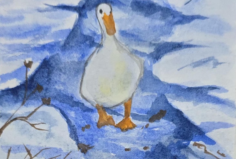
light is on the right side. I love how this whole
painting has turned out. If you see the colors are mostly from the limited palette. It's in blue and
the cool sheets. Only this highlight of
orange stands out and this duck stands out from
the whole of the painting. This is majorly the
subject for our painting. Make sure that whenever you are working on these
kind of paintings, you concentrate on the subject and make the background
more wet-on-wet. Let's move on to our
next painting now, which is equally exciting.
10. Techniques - Part 2: Techniques is all
about painting sun. Now there are many ways in
which we can paint sun. I would tell you three to
four different ways in which you can paint
sun very, very easily. One is not going into the sun area and doing
a wet-on-wet technique. The second is, again, not going into the sun area and doing a wet on dry technique. And the third is masking out the sun area and doing
a wet on dry technique. The fourth one is all
about lifting technique. Now, this is something
which can be used even in other spaces or in other
areas when you are painting. Let's have a look at
the masking pap sun. Now this is basically I'm
masking out the sun area, and then I will just cut
out the exact sun space. I will again stick it back to the paper and then
start painting over it. This is a very easy exercise
which we are going to do, and you will see how
quickly it can be worked. You can also use masking fluid. If you don't have masking tape, it does the same job, but you need to allow your
masking fluid to dry off completely before you go
over it with your pains. How do we make a
soft glowing sun, pre wet the paper
with clean water, wetter circular area
where the sun will be, and a bit beyond it. Now, over here, I'm going
to wet the entire paper, and then I will go in a circular motion
to create the sun. In and around the sun, it would be more darker, whereas the sun, I
will keep it in white. Now, build the glow outward, add slightly stronger colors
around the edge of the sun, which basically means if you
want the sun as a contrast, the white can be kept, and in and around
it, you can make it a bit more orangish yellow. But it depends. For me, it is more atmospheric
and because it is atmospheric and
the season is winter, I would keep it really
light glowing sun. And I would be
picking up the colors like naples yellow for
creating this sun. Towards the extreme corner, you can add more of yellow like HlainO you can go ahead
with Indian yellow. Now, this is
basically to enhance the contrast that we
have even said earlier. Less pigments is equal to
more light is all I can say, because this part is majorly soft sun and when it
is a soft sun for winters, you have to always understand the colors that
you are applying right now on wet paper needs to be softer and it has to
be lighter compared to ones that you usually do on summer evenings or during the
summer mornings, et cetera. Wet on Dry sun
technique is very easy. Start on a fully dry paper,
light pencil circle. Now this is an optional one. For me, I always go ahead with this and then only
start out with my son. I'm starting out with, again, the lighter value that
is naples yellow. Slowly steadily, I
would be adding the Indian yellow and
Olean, if required. Build the glue around it. On the dry paper, add these
colors like Indian yellow, or you can also add orange. It all depends on the choice of colors that you are making. For us, it is mostly
lighter shades of yellow as we are going ahead with the winter season that
is more atmospheric. The reasons for teaching you three to four kind of
sunnes that you understand, we can create one single thing with various
different techniques. You can always go ahead and learn any one of them
or pick up any one of them rather than you picking up only one particular kind that I will show
you in the project. Having a knowledge of all
will help you to even decide what to pick up for
your future projects that you attempt on your own. Many of you asked me why
I save the center part, which is basically the
white of the paper. White of the paper always
shows you the strongest glow. As you cannot replace
the white with any gauge or any other
colour of your choice, hence keeping or
saving the white of the paper is always a
great idea in watercolors. Avoid any scrubbing at
this stage, corals, also lifting and repainting, which we don't want for
at least the sun area. I will show you the
lifting technique with one of the paints that is
ultramarine later on, which you can, of course, build up for your
future paintings too or use it in your
future paintings. Rather than using the
lifting technique, it's always great to
save the area of white, even when it is a
wet-on-wet technique. We have lights of the castle. Now, lights of the castle is the light would be white and in and around
it would be yellow, moving on to your
burn sienna and then CPR or burn tumble or any
of the darker values. You can also add blue and mix with some amount
of burn sienna to get two or three
values of darker brown. If you mix it on the paper, you will have more
colors coming up. Now, since these paintings
are not very big, hence, I did not make a choice to go with your blues
to a greater extent, but if your paintings are
really big and you want to add or show more colors
coming up the blue, but a French ultramarine is always a great idea
to go ahead with. Right now, everything might feel yellow, but as you go and as you
progress with painting, you will see more of
your burn sienna, burn tumber or CPA adding up, and then you can add your door in the darkest value with
the help of ultramarine. I wanted to show the
effect of ultramarine. That's one of the reasons I wanted to add the ultramarine
for the door area. The top area is, again, in the darkest of the values as it is away from the light. The more you go away
from the light, the values will become
darker compared to the ones that was there in and around the light,
which is more lighter. I'm adding some French
ultramarine for the door part and then
extending it a bit on the left, as well as on the right. Mix some more colors
that is majorly your darker values of your brown and mix it with
the yellows that you have. You can also add some more
of burn sienna here and there because it really shows
lots and lots of yellows. You can always bring
it or tone it down. I would leave that
decision up to you. This is, again, a very small
area which we are painting. Hence adding your colors
is a great idea or to experiment with your colors is always a great idea
at this stage. Experimenting and
having fun with paints is something that
I always always feel is very important when
you are practicing your techniques section because when you are moving to
the project section, you would never like to
experiment a lot at that stage, as you are just finishing
off a painting or you are just finishing off some final
details here and there. And if at that
stage you go wrong, it might affect
the confidence and your whole understanding of the painting to a great
extent, which we don't want. It's time to build some
confidence with your brush. You can start drawing some straight lines from top to bottom or from bottom to top. If you're drawing it
from bottom to top, it's basically the tree
trunk that we usually draw. After gaining some confidence, we will start out like this, as you see on the paper, branching out from the
right and on the left. There will be different kind of branches that we
are going to add. The bottom part would be more thicker as we go
towards the top, it would become more thinner. You can always keep adding more and more branches on
the right and on the left. More branches, the
better the painting is. And Finally, once you are done with the tree, we will move on to the
lifting technique. I would be using the
color French ultramarine, as it doesn't have any
staining technique in it or it doesn't have
any staining color in it. Majorly, the staining color comes from Tal or quinacadone. If you are using
those kind of shades, make sure that you
really want a very, very soft and not so I would say contrasting
kind of a sun. In that case, it can be a
real soft glow which appears. Here we are going to do
watercolor lifting technique. First is the soft cliff. That is, paint is damp, not wet. Rinse the brush, take out
all the extra pigments, touch the area, and
pull the pigments away. That would give you
a very soft glow. Dry brush lift.
Paper is almost dry. Use a stiff or old brush, lightly scrub in small motions, lift with tissue or team brush. That is majorly or
dry brush lift, which is controlled highlights. Tissue or paper towel lift. Gently press, do not rub, twist slightly for
organic shapes and sizes. This can be used for many of your grasses or other textures
that you want to add. Cloud shapes, glowing centers, reflections, all of
this falls under this. The last one is a hard lift. Now, this is best when paint is fully dry.
How do we do it? It's a stiff brush
plus clean waters, crab gently, bolt immediately, but this can risk your paper to a great extent and
leave fuzzy edges. So that is something
you should keep in your mind when
you are working with your soft edge for lifting techniques in
various painting of yours. Now, what matters
is most important? That is the kind of pigments
that you are using. Ultramarine blue is
great for lifting, erleium burn sienna,
Elsere and crimson. Now what is something that I don't like when I'm using is to blue or some staining reds,
maybe quinacrodon indigo. If it has some staining
pigments in it, it becomes really tough to actually go ahead and
lift out those spaces. Hence, the kind of paints
that you're using in your painting is very important and it plays a major
role in your watercolors. I will name all the
techniques which we are using right now in the
painting over here. The lifting one, of course, is one of my favorites, but there's no
space where I could actually name it hand side
and name it on the left side. Okay, erase out any
extra pencil marks. If you have any, take out the masking tape which you did a for the sun and then go ahead, remove the tape at an angle, name the techniques if you want. Finally, we are going
to start out with our Project three
and Project four. All the paintings will look amazing when you have four
of them in one single sheet.
11. Evening Glow - Part 1 - Drawing: M this is the third painting from our series that is
watercolor mood board. And here we are going
to paint a pine tree. Now, this is a snow
clad pine tree. Let me tell you how
I go step by step. Like guidelines that
is draw a tall, narrow triangle to set
the tree overall shape. Now, since I am someone who already is aware where to
start and where to end, I would rather skip this step. But if you are someone who is
new to drawing or painting, I would say you can always
go ahead watch this part at two X speed and then start with your drawing of the
final pine tree. I would start out with some of the areas where you see these
are mostly crooked lines. That is the snow is settled
on top of the tree. That's what at this moment, I can only look forward
to and trying the trunk. What is the trunk? The sketch, a short vertical line
at the bottom center. Keep it thin pine trunks. Usually hide behind
the branches. Now, the point is,
in this stage, what we can see is there is no trunk that are seen anymore, as the whole of the pine tree
is completely snow clad. Hence you have to also
keep this in mind that there is more of darker and lighter values
which you would be applying. Some of the areas would
be shaded and some of the areas would be as
light as possible. The color of the sky
will be reflected on top of the snow and hence we would only need to go ahead with the snow part which is basically
the white of the paper. Now, white of the paper, keeping it intact is very important in
watercolors, at least, because there is no way you
will use gouache or any of the other translucent material
rather than transparent. Watercolors is
transparent itself. And something like white gouache many people have used in the
past to create the snow, but I just want to keep
it absolutely natural. White of the paper
we are going to use. Now, go ahead and shade a few areas where you want to add the
darkest of the values. Basically, let the snow overhang the branches edge a little, vary the thickness so
it doesn't look flat. So some of the areas
would be more of snow and some of the areas
would be more of shadows. Another reason for
leaving the white spaces, it sells the cold,
fluffy feeling. Yes, I would say that
is absolutely true. Whenever you are
drawing a winter scene, you will see how this whole
picture is going to turn up, and I'm super excited to teach you the whole
of this painting. In three parts, of course, it's being divided.
First is the drawing. The second would be basically your backgrounds and some
part of the foregrounds. Moving on to the next, that is mostly the pine trees and final detailing
of the painting. Overall, this is easy, simple, yet very enjoyable painting
that actually draws a lot of attention from any of the persons who is
having a look at it. This moment, the process
might look very iterative, but as we progress, you will see how the painting is coming together so
quickly and nicely. Sketching also forces us to
really look at our subjects, improving overall artistic
ability over time. So there is another level of accuracy and realism which is being given as sketching helps lock in correct forms before adding color and detail. Hence, the overall perspective
of not overworking, again, with your colors and keeping
some time material as well as your energy also being saved in the
pole of the process. Okay, let's just add one
more tree in the background, and then you will see how the total painting is coming up. Though in the first war, I really did not
like the painting, and I want to paint more. But over time, I have
realized that this is one of my favorite
paintings from the class. What kind of mood
board. And hence, this remains always
always special. Now we are onto our
background trees. And here, I'm starting out with a smaller tree because this is quite far away from the place where we have
placed our larger tree. Which is basically
the foreground. So this tree is
basically behind it, and hence the perspective will come into effect
at this moment. You will start
with the top area, which would be more in a
triangular shape as you see, from top to bottom, the whole of the pine tree
looks more like a cone, or you can say it's
like a triangle. Here, the whole
play is of values, which is majorly the
darker and lighter values. The darker values are the
shadows and the lighter values would be the snow and that's how we will
be playing with it. This whole painting is more detailed at the moment in
terms of drawing because these are the two major
subjects that we have placed out of which
the foreground tree is majorly your whole of the subject that will make all the sense once
you start working with it. Once you are done
with the foreground, we will move on to
the background part. The background is majorly a horizon line that
we are going to draw. You would see that I would
move from left to right. And when I move
from left to right, this area will be a very, very small space above
which there would be the sky and below which
there would be the snow. Now, this particular tree that you see in the
background, again, has become more and
more smaller to show the work of perspective
in a better way. This whole painting has a
lot to do with perspective, and I will place my
son somewhere in the left middle part
as you see over here. But let's mask out
our tree before this. As we mask up the tree, I would like to tell you how masking fluid can be a
huge win in watercolor. Why masking fluid is great in watercolor preserves clean
whites, as you all know, save bright highlights,
parckles on water, eyes, reflections, et cetera. Keep pure paper white without planning around it,
mentally the whole time. Freedom to paint, lose thing. Wash boldly and fast layer without fear of
ruining highlights. This is especially
helpful if you like expressive or wet
and wet techniques. Sharp details when you want. Fine branches, lettering,
architectural lines, stars, snow, foam, et cetera helps
in complex compositions. If a painting has a lot
of overlapping elements, masking fluid reduces
cognitive though. Let you work background
to foreground mainly. Great learning tool
builds confidence, teaches value control, encourages experimentation
without panic.
12. Evening Glow - Part 2 - Background Wash: There are only two colors
which I'm going to use. One is naples yellow, and the second one
is neutral tint. The naples yellow is going to be the one which is for
the lightest value, and the neutral
tint is going to be the one for darkest value, which we are going to add. You already know how to play with your values from
the first painting, we will be using
the same knowledge for this part of the painting. Let's start out by
adding the water in the whole of the
part of the sky. You can also add it
on the land area. There is no stopping in terms
of the snow, et cetera, as we have already masked out
the area of the pine tree where we do not want to enter
or which space you can say, I want to keep ***. You don't have a masking
fluid, it's absolutely okay. Just preserve the space of
this particular area of your tree and let just go ahead and paint
on the other parts. It's not a difficult idea, just that it is easier for me to think it the way I'm going about it right now as then I do not need to see much
what I'm doing, how I'm doing, et cetera. I can enter any space
and work wet-on-wet. If you are someone who
has even masking tape, you can cut it out
with the help of your cutter by placing it on top of this paper and then
start out with the painting. I will go ahead and add the naples yellow on the
top part of the painting, and from the bottom part, we will start adding
the neutral tint. You will see there's
a beautiful mixture of yellow ochre
that I see usually, and this looks a bit
like yellow ochre. Of course, it's
not yellow ochre, but the darker value of the neutral tint works well
with the naples yellow. Wet-on-wet is perfect for background washes in watercolor, soft atmospheric and forgiving. Let's have a deeper
look into it. Why wet-on-wet works so
well for backgrounds, creates soft transitions, no
hard edges, stealing, focus, feels natural and airy, pushes the background
back in space so that subject pops
great for skies, abstract color fields,
foliage, mist, and light. Step by step, wet-on-wet
background wash, you have to use
100% cotton paper, the tape or stretch the
paper to prevent buckling, as we have done, wet the background area
evenly with clean water. That shines good, but
there are no puddles, which is too much of water. Mix enough paint, make a generous juicy puddle
before you start. Though this paper is
really small and hence, I am not thinking much
about making lots and dots of paints in terms
of the background washes. Drop in the color, touch the brush lightly
to the wet paper, as we have done earlier. Let the paint spread on its own, work from top to bottom,
or light to dark. Use fewer strokes, et
watercolor, do the job. Control the flow, tilt the board to guide the
color if you want it. Now, since I wanted to maintain the circular form of my son. Hence, I did not
go ahead and tilt my paper much let
it dry completely. Walk away. Don't fix
it while it's drying. This causes blooms. You can glaze or
add details later. Now, there are a
few common mistakes which I have seen
people doing it, sky gradients, blue
to warm light, which is really not possible. Soft foliage blobs,
behind flowers, abstract color wash,
behind portraits, mist or fog with a lot of
water and little pigment. Some of the tips
that I must tell you work fast but be very calm. Fewer color is equal to cleaner wash as we are
doing it right now. If edges dry too soon, lightly re wet, just the edge. Practice with monochrome
washers first. See the colors are
turning really light, you can go ahead and apply
one more layer of the color or just add some more of the naples yellow
and neutral tint. The water is there, which is basically your wet
background and hence, it can work better if you even add some more of
the darker values. Now, the color that would
appear after this would be one or two shade lighter compared to what you
observe right now, hence be ready for it. If you think that this
is the perfect shade, then you must go one or two shade darker
compared to what you are right now adding to your it's all about
blending at this moment, so just go ahead and
blend the colors. There are only two
colors or two shades, which needs to be blended, which makes the whole of the
painting even more easier. There are no muddy mixes, nothing as difficult as you will observe when
there are multiple colors, go ahead and start adding the darkest of the value
near the horizon line and make it lighter
and lighter as you go towards the top area of the sky. From the sides, I've also added
some of my darker values, and then you can blend it
with the Niples yellow. I have less to explain
at this stage, so please go ahead and start with the blending part
easily and quickly. Once this is done, we will move in and around the horizon
line where we need to make faraway bushes or you can say faraway trees that looks very atmospheric and
lighter in values, which doesn't have any
shape and size altogether. It would be very abstract
way of showing the whole of horizon line in perspective or in a way that
it looks darker. And yet the horizon line is far away from the place of
the foreground trees. I guess I am happy with
how it is turning out, so let's continue
to work around with it and then have a look at the final part of this total sky area
once it is dried out. It's always important
to clean up the watercolor that
stays on top of the masking fluid or else they may get into the
painting later on, and you will see that
there are darker values, which is really not needed for this part of our tree area. This is a common practice
which I have been working upon for many years now. And once you clean up the areas, you will automatically see
that there are no colors that will move into
the white spaces of the tree or any of
the areas where you have preserved your whites
with the masking fluid. Okay, let's go ahead and make some amount of
naples yellow with the neutral tint
and start adding some of it in and around
the horizon line. You will see that I am trying to make some straight, small lines, which is basically
far away trees, and this is very small
in size and shape. Y Let's go ahead and start adding some
more of these lines on the right hand side
wherever you can see some of the horizon
line added there, the whole of the paper
is about to dry. Hence whatever you are adding at this moment will not move a lot as the background
is already becoming more dry compared to what
we did apply initially. Wet-on-wet, where you
will see a lot of blooms, et cetera in the
initial part has changed now to become
really small areas with one or two drops
of the darker values that I keep adding or showing
the background trees. Okay, guys, I guess this is it. We are now allowing
the paper to dry off. I do not want to go ahead and keep touching the
paper every time, blending the bottom area with
the help of my flat brush. We have done this process
even in the other paintings, and I'm going to
repeat it over here. I didn't allow my paper to completely dry off,
as you can see, and there are some backgrounds
which I have observed from the top going ahead and blending it with the help of
my blending brush, first adding some darker
value of color and then just blending it with the flat
brush as you see over here. This is a bit of not
so good experience, which I can say many of
us had even in the past. Though I'm more experienced to handle these kind of
situations, but initially, it was very difficult even for me to see there
are so many blooms or difficult at times where there have been
cauliflower effect, et cetera, even in my painting. Over time, I have known how
to actually correct these. Go ahead with a similar
shape that you have applied order and then blend it
with a flat blending brush. Now let's move on to the final subject that
is painting the trees.
13. Evening Glow - Part 3 - Foreground & Detailing: Oh masking fluid can
be weirdly stupen. So here are some
tried and true tips to get it off cleanly without wrecking your
paper or painting. Before you remove it,
make sure everything is 100% dry paint and paper. If it's even slightly damp, you're risk curing or smearing. Don't wait forever.
Masking fluid can bond more tightly
over weeks or months, especially on softer paper. Rubber, cement, pickup
or masking fluid eraser. This is a gold standard. Gently roll or dap, don't scrub. Clear dry fingers works surprisingly well
for small areas, light pressure slope,
soft white eraser benign. Use carefully and lightly avoid colored or gritty erasers. Crepe rubber, great for delicate
paper and detailed work. Techniques matter. Roll, don't drag. Let the fluid ball
up and lift up. Work from edges inwards
to avoid curing. Support the paper with your other hand so that
it doesn't buckle. Thanks to avoid fingernails
or sharp tools, removing while paint is tacky, cheap masking fluid
or low quality paper, heat Pro tips for next time, use 100% cotton, heavier paper, apply masking fluid with an old brush dipped
in soap first, dry colored masking fluid
so you can see it clearly, test on scrap paper
before committing. By the way, for the
foreground trees, I have started
adding clear water, and once I have added
the clear water, I will start adding
some of the colors. You can see I am using
only two sheets that is naples yellow,
and neutral tint. I have made a very
light mix of it and applied it on a
few parts of the tree. Just follow how I
continue to apply it, and then you can work through the other parts of it
for the background. That is a bit away from the one that is absolutely
in the foreground. Both of these are snow laden. That's one of the reasons whenever we are
attempting this painting, you have to make sure
that slowly you approach, some of the parts would
be a bit more moist and some of the parts
will be more watery. And when you are applying color on the watery part,
it would become blue. When you are applying
color on the dry part, or you can say on the parts which are more moist,
it will stay there. We will come slowly to
each of this process. Let's not rush and
just follow along. I have picked up a very thin
lineup brush at this stage, and I will start applying
the colors accordingly. With the help of
this lineup brush, you start out with the
top area of the tree, and slowly you move
towards the bottom. You can see the whole of the painting moves
from top to bottom, which is usually the way most of the watercolor artists
approach their painting. Wherever I'm
applying the colors, they are becoming blooms. Hence, you should be very
careful at this stage. This is the last
final detailing part, and most of the
painting that you have done for the background
has turned up very well. We will go slow and not mess up any part of this
foreground tree. Patience is the key in
watercolor painting, and if you have the patience, you can move really slow
and get the painting according to how you would have imagined or how you
would like to see it. Many of you might have this
question that I'm adding the colors as well as I'm picking it up in
few of the places. Now, this is quite
an experimentation, which I do for most
of my paintings. It's not that everything
is a foolproof method, or I have come with a
particular idea in my mind. Every painting that I do needs to go through a bit of
iteration in my mind. And sometimes, if I don't like the paint
that I have added, I would pick it up with
the help of my flat brush. You will see this more
happening in this part of the painting as my colors
are becoming more blooms, which I don't want, and
somehow the moisture on the paper is higher compared to what I
would have expected. These small small things do keep happening
in watercolors. So always go with the view that there can be bit of differences from what
you have imagined. But overall, once you
start or go with the flow, you will be in a
position to achieve what is there in your mind or what you have
thought through, and there can be the
shadows and the light, which we have imagined
for this tree painting. Initially, I started
with the top area, but as I see that the top area
is really small and hence, whatever I'm adding,
they are becoming bloom, which I don't want
at this stage. Hence, I've moved
to the bottom area where there are more of
shadows and they are bigger in size and shape compared to the ones that we are going
to add in the top part. Okay, let's go ahead and
start adding some more. Keep experimenting, and
I'm pretty sure about it that you will fall in love
with this final painting. I have been reiterating the point you need to keep
a lot of patients with watercolor because
watercolor are basically liquid
chaos with feelings, and they only behave
when you slow down. More seriously, patience matters with watercolors for
a few key reasons. Water has its own timing. You are not just
painting pigment, you are negotiating with water. Washers need time to
settle, flow and dry. If you rush in too soon, colourble where you don't want them and you lift
paint accidentally. Dry time is equal to control. Many watercolor techniques,
layering, glazing, criss edges only work when the paper is at the
right level of dampness. Too wet, muddy mess, too dry, hard edge
you didn't plan. Waiting lets you choose the effect instead
of fighting it. You can't easily fix mistakes. Unlike acrylics or oil,
watercolor is transparent. Overworking or
repeatedly correcting areas can damage the paper
and darre the colors. Patience helps you pause, observe and decide where
something truly needs fixing. Colors change as they dry. Watercolor often looks darker when wet and lighter when dry. If you rush to adjust too early, you can overshoot and end up with washed out on muddy areas. The magic happens
in the waiting. Those beautiful blooms, soft gradients, and
organic textures. They happen when you let
the paint do its own thing. The more patient you are, the more control
and beauty you get. You can see that I have
preserved some of the spaces for the smaller tree in white, and some of the spaces are
in the darker shadows. I will use the same method for my larger tree and add
the color over here. I would like to tell
you why painting the main subject last in
watercolor is an advantage. Now, this one is for watercolor rules that
sounds backwards at first, but makes a lot of sense once
you feel it in practice. Painting the main subject
last is an advantage because watercolor works best from light to dark, loose to precise. You protect the lightest value. The main subject usually has the brightest highlight
and cleanest color. By doing the background first, you preserve the white of the paper where the
subject will be instead of trying and failing to paint light on the
top of darkly. Cleaner edges and better focus. When the background
is already dry, you can paint the subject with
sharper intentional edges. This naturally pulls the
viewer eye to the focal point. Crisp edges is equal
to importance. Less mud, more globe. Background washes often involve lots of water and
broad color mixing. If you paint the subject first, those washes can bleed
into it and d the color. Painting the subject last
keeps it fresh and luminous. You can adjust the
subject to the scene. Once the background is finished, you can tweak the
subject values, color temperature, and
contrast to make it pop. If the subject comes first, you are stuck trying
to work around it. Confidence over caution. Early layers are
loose and forgiving, saving the subject for the
last encourages bolder, more deliberate brush strokes, fewer hesitations,
stronger shapes. Depth happens naturally. Soft, less detailed
background receipt, detailed high contrast
subject come forward. Painting in this order builds
depth without forcing it. Bottom line, background first
is equal to atmosphere, subject last is equal to
clarity, control, and impact. I usually work with two brushes. One is the blending brush, and another is the liner brush. Blending brush will
pick up some of the colours or add some
moisture onto the paper, whereas the liner
brush will keep adding the darker values
wherever it is needed. At this moment, I'm stepping back and
relaxing and thinking the glow of the sun or the evening looks
amazing on the people. Believe me, this is one of
the best paintings that I could have thought about
as there is so much light, yet the light is so subtle. I just acts as a glow for
the trees in the foreground. Hence, whenever you are thinking of any
kind of a painting, always go with the
thought process. It may turn out that way, it may not turn out
that way, but still, the outcome that you get
would be something which makes the scene look more
life and up to the mark, more aesthetically
pleasing to the eye. This is all that I can say
from my own experience. Yes, it takes time. Watercolor
is a time taking medium. You cannot control the water, as I did tell you earlier, the moisture on the paper
also cannot be controlled, so it's a trial and error. Hence, there are
so many components which is more about trial and error rather than
you controlling it. Hence, the whole of the painting
will only start falling in place once all
of these potential, I would say, causes
tie up together. At this moment, most of the
tree area is already done. Some of the areas have
become a bit more darker, but that's absolutely okay. The shadows will not be equal. Hence, there will be some of
the areas of the shadows, which would be lighter
in value compared to the other areas which would
be more darker in values. All these value
changes should be in your mind when you are
working through watercolors. It would really help you to ace through your painting
in a better way. Now I'm going ahead and again
re wetting the bottom part. Now, there are some of
the areas where I want to add one or two drops
of darker values here and there so that it is just appropriately blending
with the snow that is there for
the foreground. I would become the darkest of
the value now on my brush, and this is my line of brush added drop by
drop on my paper. And you will see
that this is a very, very small dotted structure
that will come up. It would look more
like the darkest of the shadows that is
appearing on the trees. Some of the leaves of the pine are sticking out the heads, I would add one or two lines
here and there. That is it. Once this part is done, we will go ahead
and just step back, relax, and see what
more needs to be added. Do we really need to add a
lot or there is something that is very minimal that's needed to finish
off this painting? Mm. Moving on to the foregrounds and this foreground will have one or two dots as this
part is still not so dry. It has some moisture on it, and I'm just adding one or
two lines here and there. These lines will look good, but I was not very
sure about it. Hence, I did blend it with the
help of my blending brush. Whenever you're not sure or you want to pick up the
colors, go ahead, use your blending
brush to blend it and then pick up wherever you
think it is necessary. Okay, let it dry off
a bit and then again, you can start with some of
your darkest of the values. This is mostly to do with
the shadow area, lines, et cetera, and I don't have
much to explain over here. It's basically just
finalizing your painting. You can step back, relax, and not even do this. I would leave that
decision up to you. Once this part is done, we will go ahead and just
remove the tape at an angle. Have a final look at the painting and I'm
pretty sure about it, you are going to fall
in love let it dry off. If you still want to add a
few lines here and there. That's absolutely okay. Make sure that this mood board speaks to you to a great extent. For me, mood boards are something
that really helps me to motivate and paint
during the winter, spring, any kind of season, and I like to explore as many
subjects as possible in it. It has subjects like trees, duck dead castle, et cetera, which appears in
the winter season. You can have bridges, et cetera. I would say anything
under the sun is possible when you are working
through your mode pod. Finally, I would
say it is all about organic imperfection,
uneven washes, granulations, soft edges, make the cold feel
human and gentle, not harsh or sterile. Great for storytelling. I would say this is something
that you can always explore cosy seasonal
branding book covers or poetry visuals, fashion or interior inspiration, slow living, mindful themes. For me, this is more about slow living and mindful things. I do have this tendency of
retouching in many areas, and believe me, there
are times where I do try to stop myself still. Yes, I like to continue to retouch one or two areas where
I think it is necessary, but believe me, at the end, it is not necessary because
already your painting has taken shape and it looks
seriously beautiful. You can have your coffee, you can have your
water break and then come back and see into it. I always love to add
some dry branches. Without the dry branches, I think none of my
paintings are complete and hence those one or two
simple dry branches is neat. Now have a final
look at it before we move on to the
castle lights. But
14. Castle Lights - Part 1 - Drawing: We are on our last
paint thing now, and this part is
basically the drawing. For drawing the castle, I will make two straight
lines as you will see. I tried to make this
castle once before, but I really failed
at it, and it's okay. I wanted to tell you
this that we also fail. We also do not get the
exact results sometimes and hence if you are also walking on the same path,
it's absolutely okay. Just go ahead with two wedge or an HB pencil so that the
lines are not dark enough. And it is not shown once
you apply the watercolors. Watercolors is a very,
very transparent medium, and hence you should know how you want to work
around with it. I'm going ahead and
making an oval. Once this oval is done, you will see that I start adding some lines on the top
of the castle pad. Is not the class
where we are going to explain a lot about
two point perspective, then invisible point, et cetera. If you are looking forward
to something like this, you can go and check out my
other classes where I have given a lot of understanding about
buildings and how you paint your buildings. You can go and try
those classes. Over here, we are trying
to make simple castle. The right part of the castle is like taller compared to
the one on the left side, and we will slowly draw
two slanting lines to make it look more like
castle as you see over here. Yes, having said that, I will always mark my horizon line where
exactly I want to place it. Now, this is a very, very important step to
understand that the backgrounds will go
deeper and then yes, the foregrounds
will be a bit more, you can say detail compared
to the backgrounds. Many of us can't get a straight line at
one go, and hence, if you are someone like me, initially, I used to
use a lot of scale. You can also use scale
for the line drawing. This is something that I've lot. Over time, you do
improve your sketching. But on the first go, it
might take some time. Let's continue to
make the wall now. As you see, I'm going from the right and
moving to the left. And then, again,
I am just trying to draw this line from below, as well as from the top, giving it a shape and size. Of course, when you see on the first time or
just the first time, you will not realize
that this is going to be something like a monument
or like a castle. But as we progress, it would take the
shape of a chasm, going ahead and
just trying to make a small area which basically shows the
gate of the castle. You will see use of
a lot of circles, then ovals and straight lines along with slanting
lines for castles. Now, this is something that I've learned over time that these are the basic shapes and sizes which are used in any kind
of castle painting, along with the triangular ones, which has the top dom area, which is more triangular
in shape and size. So if you are good with only some basic few
shapes and sizes, you can practically nail any of the castle painting
that you want to show. Secondly, when you
observe a castle, it's very important to
understand what are the basic lines and structure that you are going to
capture in your painting. You're not going to take
everything that you observe from any photograph or at any location
that you are in. You have to only take those which you think will
be the highlight of your painting and which
can practically show that this is a castle painting
that we are trying to make. Let's move our lines
to the left now and try to finish off
this castle part, though you will see
that I will need only ten to 15 minutes
maximum for this sketching. Believe me, any kind
of sketching that you do will not take
you much longer, as this is really small paper, and we are focusing on
one subject at a time. I do not want
clutters and hence, I do not focus my
whole energy on various subjects
that you usually see in any kind of a painting. Yes, there are artists who focus on detailed paintings
each and every day, but I usually focus on one single subject
and then move on to the next painting
where I will again, focus on one single subject, whether it be flower,
whether it be casso, whether it be snow or some barn, winter barns, et cetera. So these are how I
approach my painting. You might have a different
way of your approach, but as we all start
as beginners, I think this is a
great way to start any watercolor or any kind of medium that you
are interested in. I will now list down a few
more important reasons of why should we focus on subject
at a time in watercolors. Watercolors rewards,
controls and understanding. Watercolor is transparent
and reactive. When you focus on single
subject, for example, skis, flowers or portraits,
you learn water, pigment, paper, interact
specifically for that subject. This helps you predict outcomes instead of
fighting surprises. You build muscle memory
faster, repeating simple, similar shapes,
edges, techniques, trains your hands and eye. Painting the same
subject multiple times lets you improve
brush control, learn how much water to load, get confident with timing, wet-on-wet or wet on dry. This kind of repetition
is hard to achieve when you jump between
unrelated subjects. It reduces cognitive overload. Watercolor already demands
attention to values, color mixing, timing,
paper moisture. By limiting the subject, your brain can focus on
technique rather than constantly solving new
compose compositions. Mistakes becomes clear lessons. When you repeat one subject, you can clearly see what
changed between attempts. You will know where an
improvement came from, better water control,
color choices, brush work rather than guessing. You develop a visual library. Painting one subject deeply helps you internalize
common shapes, typical color shifts,
light and shadow patterns. This makes future paintings
faster and more confident, even when you eventually branch. Confidence grows quickly. Seeing visible improvement over a shorter period is motivating. Instead of feeling inconsistent, you begin to feel capable, and confidence is
crucial in watercolor, where hesitation often
leads to overworking. It leads naturally to a
personal style and voice. Now, every person who is working with watercolors has
a voice of their own. Style emerges from familiarity. When you work repeatedly with one subject, you
start simplifying, exaggerating or emphasizing
what you find important. This is the foundation of personal watercolor style or the voice that I've
been talking about. In short, all I can say is
focus on one subject at a time turns watercolor from a guessing game into a
beautiful learning procedure. Once the fundamentals are solid, expanding the new
subject becomes easier, faster, and far more enjoyable. H at this moment,
we have reached the last few minutes of rough sketch, especially
for watercolor. The goal is clarity, not detail. At this stage, you are
preparing the painting, not finishing the drawing. Usually, only a few
things are needed. Correct placement
and proportions. The subject is well
positioned on the page. Major shapes are right size
related to each other. Obvious proportion
errors are fixed. This is the last
chance to correct these points before you
go ahead and paint. Clear major shapes, big shapes, overlapping forms, directional
lines that guide the eye. Indication of light and shadow. Here we are making more
of a watercolor painting, which is an atmospheric one. And hence, light and
shadow doesn't matter to a greater extent except
the lights of the castle. Edges that matter, clarify
where the edges needs to be shot and where the
edges needs to be soft. And hence, the edges which are soft should not be
lost in the process. Focal point emphasis,
slightly strengthen the lines around the focal
areas, important features. As you see over here, I'm strengthening the
lines for my castle part. Remove distructions. Erase unnecessary
construction lines, simplify buy lines, avoid
adding any new detail. Hence, I think this is
the stage which you can say is almost near
to the finalizing one. I will now go ahead and mark out the areas where masking
fluid needs to be added. I'm using my Pebo
masking fluid for this castle part window
and letting it dry off. Once it is dried, then only
we will start with our paint. Some more stronger
and bolder lines for marking out the areas where
exactly I would be painting. I will meet you in
the next lesson where we start with
our watercolors.
15. Castle Lights - Part 2 - Background & Castle: Let's have a look at our colors before we paint all wet-on-wet. Go ahead with tram royal
blue, purple, Prussian blue, burn sienna, or you can also
use any cool tones of blue. I will go ahead and wet the entire background with the help of the flat wash brush. Once I have applied water
on the entire paper, then I will start out
with my painting. Now, this is wet-on-wet process, as I did tell you even Audio, even for the castle part. The backgrounds are
also wet-on-wet and the foreground
is also wet-on-wet. Background wet-on-wet,
we will go ahead with multiple
colors of blue. If you are someone who
loves to paint with blue, I think this is the
painting for you. I will start out with
some outtramarin initially and then go ahead
with your Prussian blue, indigo, or any other color that's available
on your palette. Do not get fixated on any shape, size, et cetera, or even the colors that
you see over here. Whatever you have as a palette that can be used
is good to go ahead with. This is royal blue
or erleum blue. Now, any blue that's
available with you, I always give you a
lot of choices and options because I know as newcomer or as a person who has hardly any experience
in watercolor painting, it might be difficult
for us to start out with various shades, shapes, sizes, et cetera, of colors, blues, the pinks and I
have done that initially. I have invested
heavily on my colors. But over the years, I'm still
using those same colors. I have not invested anymore
on any new shades, et cetera, except a few maybe ultramarine
Burnsen et cetera, which I have been using pretty regularly in many
of my painting. Except that it's good to go initially if you've invested
a lot of money like me. I don't go ahead with any more investments
on watercolors. I just love to
only have the ones that's available with me and just to repeatedly
work with them. I have used ultramarine, then irelum blue, purple, then some amount of your indico or you can also go ahead
with Kobal blue, et cetera. Okay, great. I think
now we can just focus on the fact that the snow will be more lighter
than the sky part. Yes, the colors of the sky
will only be reflected on the snow and hence I would add
that for my snow area too, but I don't want
to overboard it or I don't want lots and lots
of colors on my snow. I want to keep the white of the paper and use
it to my advantage. So many of you have asked me
why do we lift watercolors? Now, this is basically
lifting watercolors for control or we want to
correct some places, enhance the painting and not just to fix the
mistakes overall. Let's see something more in
detail to recover light. Watercolor works
from light to dark. If a light area gets covered, lifting is often the only
way to bring it back, which we have done in this
part to correct the mistakes. Lifting allows you to soften hard edges, remove
excess pigment, fix shapes or proportions, reduce areas that
become too dark. To control values. Sometimes a wash dries
darker than expected. Lifting helps rebalance
light and dark areas, create smoother
value transitions, prevent muddy overworking. To create textures, intentional lifting can
produce cloud shapes, foliage highlights,
hair strands, light on grass or waves, to guide the viewer's eye by lifting around the focal point, you can increase contrast, simplify background areas,
reduce visual noise, and it also keeps
the painting fresh. I have added some amount
of blue for my background. This can be a mix
of ramie, indigo, Prussian blue, ba blue, whatever is available with you. I have used the wet
background to my advantage. I told you that this painting is going to be
mostly wet-on-wet, and that's what we
are doing over here. Now going ahead with
some burnt sienna and adding a few
drops here and there. This is with the help
of my size toothbrush. You can also go ahead with whatever size is
available with you. Again, the idea is to
not get stuck with the brush sizes or the kind
of brushes that I have. The idea is to just
go with the flow. I will now allow
the paper to dry off before we start
with our castle. I will wet my entire castle
area with simple clear water, and once that is done, we will start with
our painting part. Now, the painting in and around the lighted area or
the lifted area, you would say, would
be more yellow, and after that, it
would turn bun sienna. From Bn Siena, you can
move to CPM or you can mix indigo with it and get a shade that looks
more like CPM. Once you have evenly
applied water coat would complete part
of this castle, then we will start out
with the lightest value. In watercolors, we move from
lighter to the darker value. So that there is a way
we can fix our mistakes. Since watercolor is
more complicated in terms of getting back to a
lighter shade is difficult. Hence always going from yellow to burn sienna
to CPA is a good idea. I would go ahead with any
yellow that's available. It can be Naples yellow, it can be indian yellow, any yellow that's
there on your palette. Then applying the burn sienna, once the burn sienna is applied, we will go ahead with CPR or indigo to get
the darkest value. This soft wet-on-wet method, you will only find
in the castle area. I did not wet out
the entire area. I have first painted
my background, and then I have come to my
foregrounds for the castle. This is a choice that I
have made for myself. Many people to go with backgrounds and
foregrounds together. They also paint the
Kasso with first layer and then move ahead with
the second and third layer. All I can say is individually artists have a different
approach to watercolors. Hence, you should
try out new forms, new styles and see what
works best for you. As the paper is still wet, you will observe that the
colors will move on their. Now since they create
blooms or you can say the water actually leads to the way the colors
blend on their own, I love this process
of blending on paper compared to blending
on your palette. Now why I say this, you get various different shades when you are blending on the paper, whereas if you are
blending on the palette, you will get one single shade. And hence blending on paper
is always a better idea for watercolors
compared to if you are working with
any other medium. Mostly the other mediums that you might see where
the blending happens is acrylics or some others
like quash, et cetera. The blending over there
is very different than the blending that
we see in watercolors. This is more atmospheric, relatable, as well as aesthetic. It's pleasing to
eyes of any person who is looking forward to working with watercolors
is all I can say. Wet-on-wet is one of my favorite
methods to work on with, and I always want to introduce the same
to each one of you. Let's continue to
paint in and around the light areas of the castle. Once that part is done, we will just let the people dry off and then move on
to the other areas, which is basically
to make the painting look a bit more pleasing
for anyone who is watching. There are some
branches dry branches. As you know, it is no
hence we should always add that to the parts of the painting wherever
it is necessary, going with the darker values. And I guess, yes, I'm pretty excited about how the whole painting is
turning up at this moment. Please continue to
paint along with me. And once that is done, allow your paper to dry off. We do observe some hard dishes at the bottom part
of the castle, and to make it bit more even, I have taken a damp brush. This is basically
my damp wash brush, and then I am blending
it with some water. You will see that how the colors just look so much more
organic with the snow.
16. Castle Lights - Part 3 - Final Detailing: Before I go ahead with any of the detailing in
the other parts, let's just add some
more details to our castle and then only
allow the castle to dry off. I will now add some of the
darker and lighter values in some of the areas of the
castle to show the contrast. Light effect always has a
great impact in a painting, and that's one of
the reasons I also try to add it to all the
paintings that I do. Let me try to get a bit more in detail in a watercolor
castle painting. Light and shadow are what
give the stone structure, depth, mood and atmosphere. Because watercolor
relies on transparency, the effect is subtle
but very powerful. Planning the light, choosing a single light source that
can be your moonlight, just like the one over here. Light areas are often left
as white on the paper, whereas the other
parts are dark. Decide which wall tower and roof faces the light and which
falls into the shadow area. Painting light areas use warm
diluted washes like yellow, naples, yellow, or any of
the other lighter values. Apply with soft edges to suggest sunlight
washing over stone. This is, of course,
not sunlight. This is the light of
the castle lights, and hence, they are showing
off the soft edges. Let texture appear
naturally by using dry brush on rough paper
for stone highlights. This can only happen
when you are having a really big one in terms of painting more
in depth or in detail. It really doesn't apply to us, but having a knowledge of it
is always always helpful. Creating shadows, shadows should be transparent and
they are never flat. Mixing the cool colors for the shadows like ultramarine
plus Bern sienna, I told you it would
give you CPR, and that kind of color always
shows the shadow areas. Hard versus soft
edges, hard edges, cast shadows under
battlements, window recesses, arches, soft edges, atmospheric shadow on distinct
walls, and in misty light. Let water do the work till the paper to soften
the transitions. That's what we have
done over here. We might not have
tilted the paper, but we did allow the
paper to work wet-on-wet. Depth and perspective,
foreground shadows darker and warmer
background shadows, lighter and cooler mood, through contrast, high contrast, dramatic medieval
cinematic feel, low contrast, peaceful
dreamy storybook castles. Common watercolor mistakes
that you often do when you are working in this kind of an environment is using
black for shadows, overworking light areas, losing transparency
by muddy mixes. Remove the masking fluid from these areas where the
white is appearing now, and once that is done, we will go ahead and start applying some lightest
value of yellow. The lightest value of
yellow is something that I've always always
loved to work around with. You can see how the lights just appear bright and
beautiful in these areas. Let us choose some burn sena and start adding it
on the wall part. This is in the bottom
part of the painting, as you observe over here. Very, very small stretch, which is basically the
final details now that you observe for this whole
part of the painting. Final details in watercolur
must be done slowly because watercolur paper and the
medium itself are unforgiving. Rushing this stage is most common reason a painting
loses freshness or depth. Watercour paper is sensitive. Watercolur paper absorbs
pigment quickly. Once paint touches the paper,
it spreads immediately. Slow controlled strokes
prevent blooms, back runs, and unintended edges. Details are high
risk, low margin. Final details sit on top
of the finished layers. A single rush stroke can break harmony,
create harsh lines, pull up dry pigments, slowing down your place, each mark exactly
where it belongs. Preserve transparency. Watercolor beauty comes from light passing through layers. Fast repeated strokes scrub the surface causing
muddy colors, chalky texture,
slow application, keep layers clean and luminous. Paper surface can be damaged. Overwing while the paper is still damp can roughen fibers, create fuzzy lines
instead of crisp detail, waiting and working slowly across the paper to stay intact. Edges detail quality. That is, final details often defined window, stone, figures, foliage. These require deliberate
edge control, like you are now defining for this small area of the gate. Speed removes edge control
and patience restores it. Helps you know when to stop. Slowing down forces you to
pause, step back, evaluate. This prevents over detailing, which can flatten a watercolor. Watercolor rewards
confidence, not speed. Slow doesn't mean hesitant,
it means intentional. Each stroke should be confident, loaded once and
placed carefully. Practical tip that
I can give you. Does this mark add clarity, depth or focus is something
that you should always keep in mind before you
add it on the paper? Step back and relax
always before you are adding any smallest of the detail on this
part of the painting. Right now, it's the time
to add the foliage. I have already made a structure
during the drawing part, and hence the only time now, which is left for
the work of my brush is to go ahead and make these
smaller lines as details. You can go ahead with any
brushes of your choice. It can be one, two, three, four, five, whatever
brush is available. Believe me or not, I am
a person who doesn't believe on brushes,
paints, et cetera. Yes, I do believe
on a very good, high quality watercolor paper. It really gives a beautiful
edge to your painting. As you grow in your
watercolor journey, try to accumulate
the other resources to get a painting that looks something amazing
in future when you put all of these resources
together and work on it. Final detailing of
dry tree branches in watercolor is all about resistant timing
and brush control. These marks often sit
on top of the painting and can easily overpower
it if it is rushed. Timing paper must be bone dry. Always wait until the
paper is completely dry. Damp paper causes branches
to bloom and lose sharpness. Touch the paper with
the back of your hand if it feels cool or wait. Brush choice matters. Use a small round brush
with a fine 0.022. A good point is more
important than a tiny brush. Natural or soft
synthetic brushes give better line variation. Color mixing for dry branches. Avoid pure black. It looks dead and flat. Dramarin plus burn sienna
gives a color that is neutral brown or
CPR plus pains gray, burn tumber plus Azarin that is warm highlights.
Stroke technique. Hold the brush higher up the handle for loose
natural lines, paint branches with
one confident stroke, not sketchy lines. Tip, belly, tip motion
for organic tapering. Let branches break, overlap,
and change direction. Line weight variation. Thicker lines knead the trunk. Thinner lines are
branches extend outwards. Light and shadow on branches. Branches face light,
lighter or warmer tones, branches in shadow,
cooler, darker tones. You can lift tiny highlights
with a damp brush sparingly. Suggest more than you describe. Few branches is equal
to stronger painting. Final touches add only
a few sharp dark axon where branches cross or
attach to the trunk, step back often and branch should support the
scene, not dominate. Like there can be a few
other important areas which now you can look at once you are done
with the top part. It is basically the
faraway bushes, and I have added one or two small light
branches over there. Overall, this
painting is something that I have absolutely
loved doing. I hope you two like it and
then have a final look at the complete winter mode bot that we have painted over here.
 Dhritikana Nath, Watercolor Artist and Instructor