Transcripts
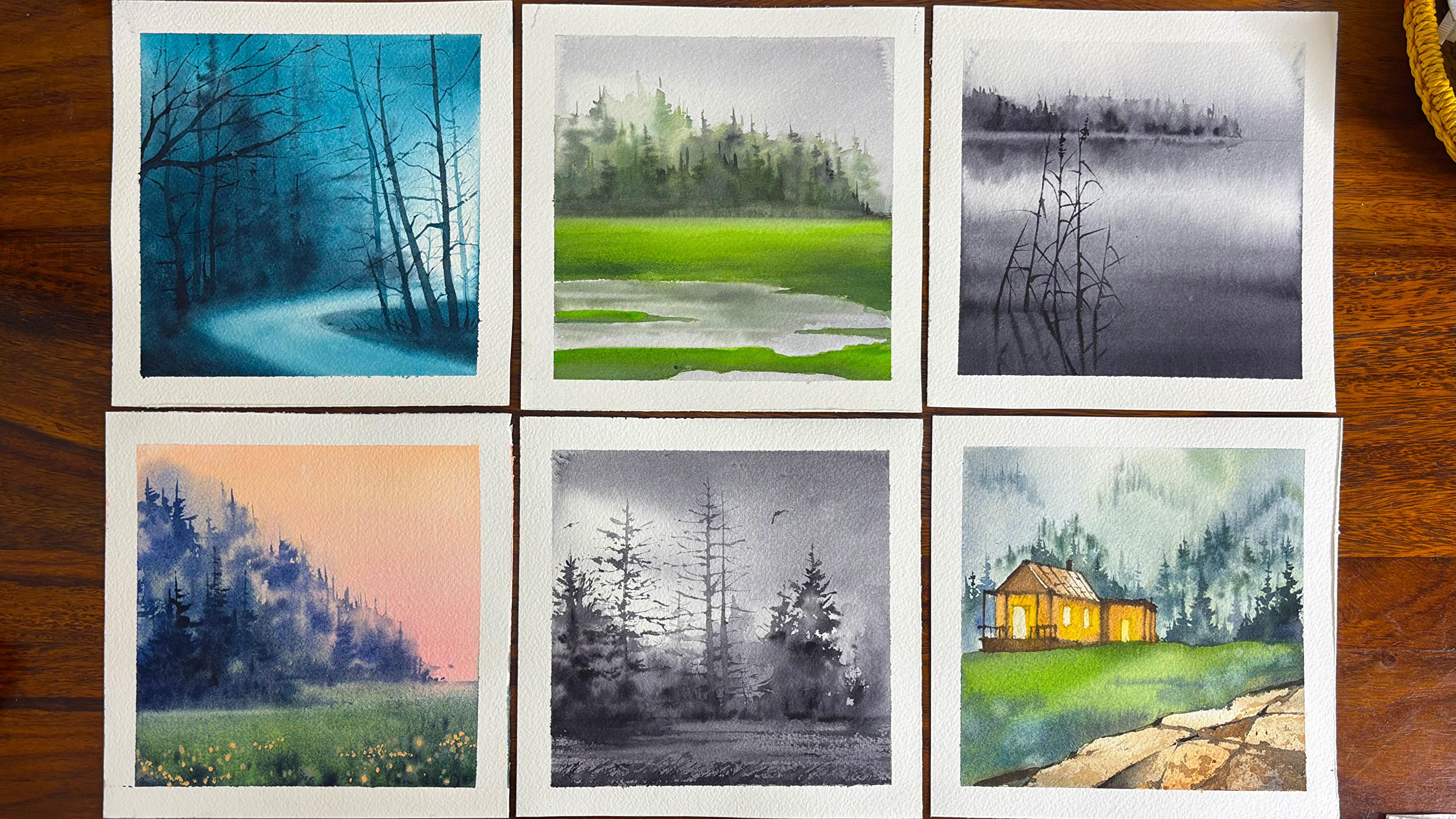
1. Introduction : Meditate with Watercolors is a casul creative way of
describing the calming, mindful experience that all of us feel while painting
with watercolors. As per my experience, it has helped me to slow down, letting go of all the control, relaxing my mind
to a great extent, and creating without
any pressure. Therefore, I have created this class to offer the
same magical experience to all watercolor
enthusiasts. Hi, guys. I am ith gana, an artist, instructor, mother, Sushre teacher or brand owner
of vibing parcels where we not only manufacture online sketchbook,
artist wrapins, brush rolls, and much more, but also have options
of participating in workshops or lifetime access to various classes across
on www.vibnparcels.com. We start with the basics, getting to know our materials and practicing brushstrokes, which are the foundation for every artist from beginers
to advanced learners. Then we move on to
the techniques we will be using for the
first two projects. These watercolor techniques act as a helpful framework
that guides you and helps you perform at your best once you start
painting on paper. Since watercolor is
such a fluid medium, beginning with a single
color that is monochrome is a great way to understand
values, depth, and perspective. It's the perfect
starting point for anyone beginning their
watercolor journey. Furthermore, the monochrome late and Evocative
Landscape focuses on building the basic skills of working wet on wet
and wet on oist. These techniques make it much easier to move
into the next projects, which explores limited palette and then multicolor paintings. We will be completing a
total of seven projects, and each one has its own
unique voice and character. In the monochrome and early
limited palette pieces, we rely on the white
of the paper to create the atmosphere,
distance and perspective. As we progress into the
limited palette stage, we start using lighter values
to achieve the same effect. And when we reach the
multicolored projects, we bring in warm
and cool colors to be depth and move
in a similar way. This class is a
perfect starting point for anyone who loves the flow, moodiness, and character
of watercolors. Come join me and let's meditate with
watercolors together.
2. All you need: Look at all the
materials which we need for completing
the painting. I am having the vinci size
wall brush, size two brush. You can also keep size one, but practically, this
is not of much use. Either you can select
size one or size two, and then you should
have a size six brush. The size three by zero, you have an escota, wash brush, and a liner brush. Believe me, if you have a
good size two brush, always, you do not need the liner brush, but just for your reference or if you're bigner,
it's good to have. I will tell you, these are the major four
brushes which I'm going to use in completing
all the paintings I have kept two pencils. This is basically
two edge pencils and it will not leave any
mark on the paper. An eraser, which
is very important. Then you have tissue role. Now tissue roles are very important whenever you are
picking up the colors, or if you plan to
have any kind of brushes being you wash the brush and then pick up the extra
paints on the tissue. For that, it's very, very handy. Arch's 300 GSM 100%
cotton cold pressed paper is something that I always always love for
all my paintings. The size of the paper is five inch and this
is a bit bigger. You can see this is 7.9 to 7.9, but I just wanted to show you the kind of paper that
I would be using. There are two palettes kept. This is a palette which I haven't used and this is a
palette which I have used. The first two paintings out of the nutritent which
we are going to use. Hence, you can see this palette
has been used very much. I will have two jars of water. You can see this water
is a bit cloudy. This is only because I have
washed my brushes in it, and this water is pretty clear. So that's all from the side of what all we need in our painting for completing each
of these painting. As well as just keep a
masking tape pretty handy. I'm using a simple masking tape. Now, what happens
in these kind of masking tape is sometimes
water gets through it. If you have a better option, that is a washy tape,
which is better. This is a empty washy
tape, which I can say, but the other stock
of minus over, so I have to get the new stock. But yes, these are very handy and they don't
allow water to seep in. For all my practice exercises, I would be using the same paper. Now, it's very important to use the same paper that helps me to understand how the colors will
move for my brushstrokes, for my techniques, as well
as for my final painting, I would be using the same paper which I'm using in
the project section.
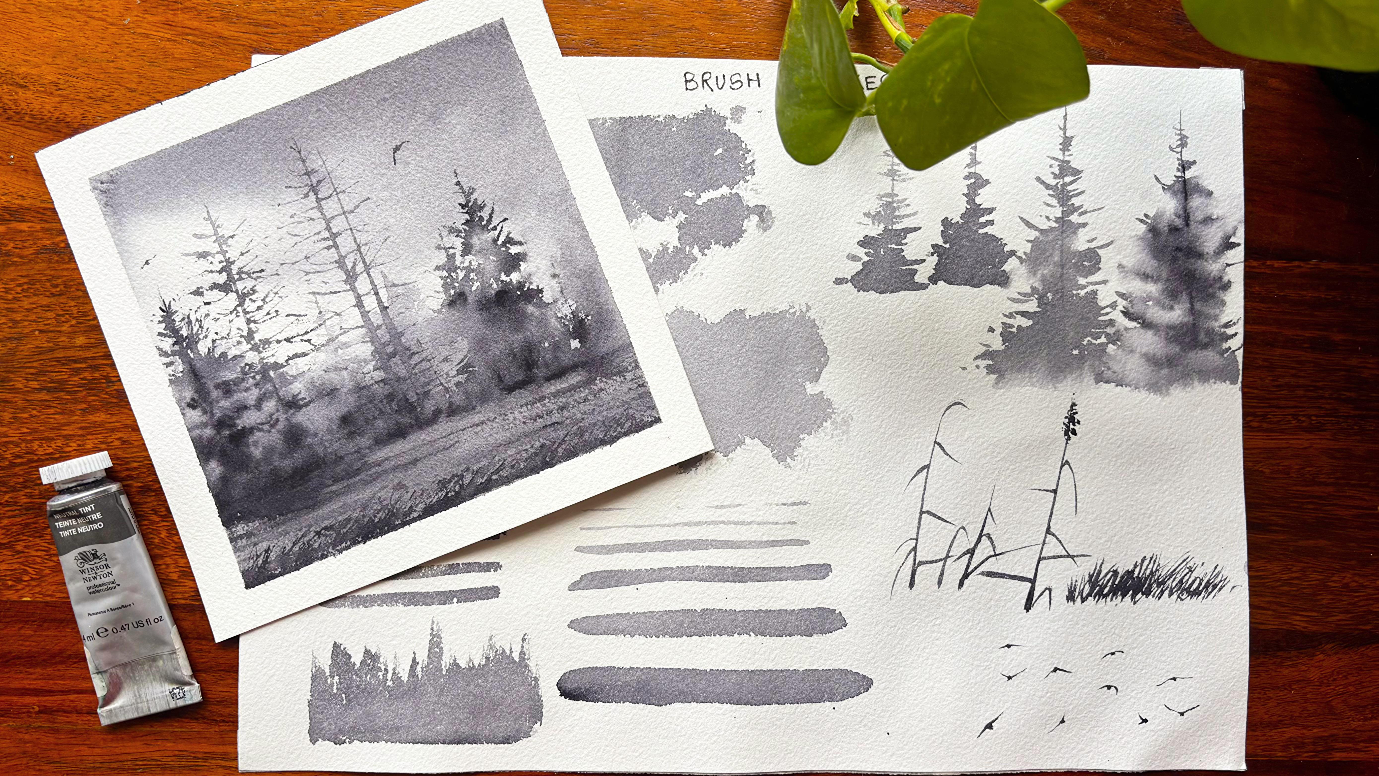
3. Brush Strokes: Mm why are brushstrokes
important? In watercolor painting, brushstrokes are more
than just marks on paper. They are the language
of the medium because watercolor is
transparent and fluid. Every brush stroke carries
emotion, texture, direction. You can't easily erase
or cover mistakes, so each stroke matters. It records the artist's
intent and confidence. Let's explore why
brushstrokes are so important and how they shape the look and feel of your
watercolor work. Let's start out by using a brush that is of size
eight or size six, whichever you choose
and have a nice tip. I will be using
some horizontal and some vertical strokes to
define how to apply the color. These are mostly
thinner strokes, and it can be used for creating trees, branches, et cetera. If you lay your brush more flatter on top of the
surface of the paper, you will see that you will
get some thicker strokes. Now, since we have less
water on our brush, hence the strokes are dry
and may need some layering. I will again load my brush with some more paints and start out from the
bottom to the top. Now, when you use this
technique on wet paper, they will give you
blurry background trees which will set the
mood of the painting. But for all the blood
and the atmosphere, you need to have a wet surface, not exactly wet, I would
say, it should be moist. We will have a look
into it further as we progress with
our next exercise. We started out with the
slow and controlled strokes which basically describe
calmness or precision. Was the quick sweeping strokes
that you see over here now will basically show
the wind waves flowing clouds, et cetera. We will actually lay our
brush more flat on top of the paper to create these kind of strokes
as you see over here. When this stroke is
applied on a moist paper, this will give you clouds or atmospheric
cloud like effect. Now we are moving from
quick sweeping strokes to slow controlled strokes. This is a great exercise for
creating movements in water. As we are towards the
bottom of the water, there would be more darker and they would be more broader in terms of the
strokes that we apply. But as we go towards
the horizon line, they appear far away from us, and the movements also appear
more plow and thinner. Hence, this becomes a very, very important
exercise and very, very important understanding of perspective as you move into any kind of
watercolor painting. It's time to create some trees. What I will usually do is
dry brush on rough paper. That creates the
trees very easily. I will mark a line
in between and then extend it more and
more towards the bottom, extending it less
towards the top. I will basically use some horizontal strokes
to create this mine tree. We will refine it
further as we progress. I am again repeating
the same process. I will go broader as I
go towards the bottom, and then towards the top, it would be less broad. I am making it more
and more blurry or I am not giving it a lot of edges towards
the bottom area. Towards the top, I will
keep it pretty light, and there would be less number of leaves
that I add on it. Let's go ahead with
another piece of the tree where we are going ahead and defining the
tree in a better way. So loose strokes as well as some detailed
defined strokes. This would help us to define the top area
in a better way. We are also going to work around with some water.
Now, how do we do? I will apply some
water with the help of my flat brush and then start applying the
color on top of it. This would help the color to diffuse and blend automatically, and there would be less number of bold
strokes in between, whereas towards the side, there would be more number of bold or highlighted strokes. That is because
of the dry brush, which you apply
compared to in between, where we have already
applied the water. Now let's go ahead
and paint with water first and then start out
with the brushstrokes. These are different
ways of creating trees. You can use any one of them
for your tree creation. I love to explore each one
of them in detail so that it is easier for
you to go through it and understand what to use, how to use, where to use. This one can be majorly used in far away trees effect that you create in any kind of a soft background
monochrome tree painting. You can always go
ahead and layer over it with some more of
the Daker values, dropping some dots
here and there, and then you get a hold
over it once you create it. The value study, of course, becomes very, very important factor in this
particular painting. Some of the spaces
would be more darker, some of the spaces
would be more lighter. It would create
highlights in your trees, and the final painting is
going to be super amazing. I have been using this technique in not only this
particular painting, but even in our future painting, you will see that there
are many upcoming classes where we are going to work around in a
similar perspective. Let's work on the
foreground the grasses, and this is going to be a very, very important exercise for our first painting that
we are going to do. Every painting is being kept
small so that it's easy, non time consuming, and you can go ahead with
it pretty quickly. It can fit into your daily
routine of exercises. And if you are also doing
art as a side hassle, it would be something
that you can look forward to every day. These kind of finer details are also called as
Caligraphic strokes, which basically
defines your branches, stem, and fine details. By changing the pressure, angle, and water amount, one brush can create
many textures from crisp lines to
soft fading washes, as you can see over here. We are using the same brush
for all the exercises. We have literally not changed
the brush to any extent. Let's repeat this process again to create
the finer details. The final or the most
important tip that I really want to give you
with every brushstrokes, it really shows how well you manage the balance between
water pigment and timing. Too wet, the strokes
spread uncontrollably, too dry, paint looks
shocky or patchy. Just right color flows smoothly
and close on the paper. That control or
deliberate loss of it is what gives
watercolor its magic. Let's continue to repeat this process to
some more extent. I would go ahead and create some loose strokes
one after another. These loose strokes
will create the kind of lines that would appear as
grasses for our foreground. We will be using this technique
for our second painting, and you will see how
often it can be helpful for any of your future paintings or any of your projects
that you attempt. Let's go ahead and
paint a board. Now, bird is a very, very
important line item, I would say, in my
paintings, for sure, because I love to add
birds anywhere I feel that the painting looks empty or it is not going with the mood. I love to add these
birds to fulfill it or to make it
more focused in some of the areas where I want my spectator to just
focus more often. I will use some
brushstrokes that are more towards the top and some brushstrokes that are
towards the bottom, I will make a middle dot
and then move to the right, left and create these birds. But
4. Techniques Part 1: Learning watercolor
techniques isn't just about mastering the medium. It's about understanding
how water pigment paper, and timing interact, so you can paint
with freedom and confidence because
watercolor is delicate, fluid and often unpredictable. Having technical
control actually gives you more creative control. Let's start out with a wash
brush and wet a small area. This is a wet on
wet technique which I am going to help
you understand. Once the paper is fully wet and we have done
a cross swatch, I'm going to go ahead with my neutral in and apply the color. On the top, as well as on the
bottom part of the paper. This is usually used for
creating backgrounds or even washes for any kind of
moody or atmospheric effect. Mix some water with a
Neutral Tint pigment and then load your brush with a Neutral Tint and start applying from the top
to the bottom area. You can see this can
give you cloud like or any other effect that
you are looking forward to. You need to let your paper dry before applying the next layer. Let's go ahead and apply some more color towards
the bottom area. This is either a size six or a size four brush that can be used for this exercise. I have deliberately kept the
speed of the video at 1.5 x. You can go ahead and decrease
the speed of the video or increase the speed of the video depending upon your requirement, either you want to practice or just have a look at
each one of them. I start with a lighter
value, and if required, I will add somewhat darker
value wherever need be. Let's get back to understanding how technique builds
your control. Watercolor is unforgiving. Unlike opaque paints,
watercolor is transparent. You can't easily
paint over mistakes, learning techniques like wet
on wet, glazing, lifting. Edge control helps you predict
how paint will behave, prevent muddiness
or overworking, fix mistakes gracefully. When you understand
how water moves, you stop fighting the medium
and start painting with it. Let's go ahead and work
on the reflection path. I will start out again with a small area and apply
some water over it. Once I have applied the water, we will understand how
exactly the pains need to be applied so that the reflection are consistent and
they don't look over. Another most important
aspect of technique is when you know what your
brush and pigment will do, you can paint more decisively
with fewer correction. Confidence leads to freshness and freshness is the
soul of watercolor. You spend less time fixing
and more time expressing, which helps you to build confidence and speed
in watercolors. I'm going ahead with my size
four or size six brush, whichever again you choose, and then start out
with my reflection. I go in the middle
or just a bit above the middle and apply or
duck a value as you see. Then I am going ahead
with my wash brush to pick up any extra pigments which is flowing
towards the bottom. I have removed the
tape which I did place earlier just under
my watercolor pad so that the colors move
and they move towards the bottom area because
there is gravitational pull. I am just applying some lines, as you see, to create
the background trees. Alter the values to even create depth in the
background trees. I will go ahead and
leave a small line at this stage and then start
out with my reflection part. It's a very simple process. I have already
applied some water, which is still there, and hence, going with the reflection
becomes very easy. Keeping a small line really helps you to
differentiate between the background trees and the reflection which falls
into the water area. I will now try to
add another layer of these trees towards the
bottom area as you see, so that the values of the
trees that has come on the top area become similar
to the one that we are also creating in the
area for the reflection. Again, it's important
to lift out the colors. If you see that, yes, the colors are moving
into each other for the reflection and the actual
trees of the background. In this techniques, part one, we are only focusing on
five different techniques that are important
for our Project one and Project you will
go ahead and understand some more new
techniques as we go ahead with Project
three and Project four, and multiple colors will be
used in the Project five, Project six, along with a
bonus lesson that comes in. As this is an extension of the earlier class Meditate
with Watercolors, a 14 day watercolor challenge, you will see that many of these techniques are a bit
repetitive or iterative. If you have already
taken the class, then you can start out with
the final projects too. If you are new to watercolors, I would request you
to go ahead and understand at least the
techniques before you attempt the project at any speed of your choice so that
the final outcome is consistent with the
one that I am also creating in this of the class. Let's go ahead with
our background. I have started out with very light wash in
few of the areas, and now I'm going ahead
with another darker layer. This is basically to create atmospheric or
cloud like effect. If you are new to watercolors, you might not be knowing
how to create these clouds. These are basic lines or you can say round
like structures, and it comes with the brush. We have to understand a bit
about brushstrokes before you go ahead with
any background bet on bet or reflection. Hence, that brings me to the
section of brushstrokes, that's the explained Audio. If you see right now I'm trying to pull the paints
towards the top, I start from the
bottom and then again, move my brush towards
the top area. I move from the top
towards the bottom. This is an iterative exercise. If you want to add some more darker values for
visual display of depth, then please go ahead and apply
it in a way that I'm doing right since we are
already building up on the techniques and
we have built upon a bit, I would just go and touch
upon the composition. You can see that the
background is created, and now I am trying to
build in some of my trees. Once technical skills
are second nature, you can think about
storytelling, composition, light, color,
harmony, and emotion. Good techniques frees
your mind to focus on creativity and not
just only mechanics. For creating the
foreground or you can say the trees
in darker value, I had to wait now techniques teach you
basically the timing, the heartbeat of watercolors. Watercolor painting
is about when to act. Paint too soon, colors
bloom uncontrollably. Waiting too long, you
lose the softness, and it would be more about
creating hard edges. Practicing techniques, sharpen your timing
and observation, so you intuitively sense
the right moment to add, lift, or blend your colors
wherever necessary. Another thing that
I must tell you, though all of us have learned the same
kind of techniques, and I teach similar
techniques in every class, but everyone uses
them differently. Some favor loose
expressive washes, others use tight
control layering. Your mastery of technique
becomes the foundation for discovering your own
personal watercolor voice. In simple words, what
is watercolor voice? It's your own unique style of
expression in watercolors. Let's start creating
the movements. Now, the water, I go from
the bottom to the top, you will apply the darker
layer towards the bottom area, and then as you move
towards the top, it would become more
lighter and lighter. We will create some
line like effect, as you see over here. This is consistent with the first painting that
we are going to do. You can have a
look at it and see how I have created
movements in the lk. As the colors move away
from our eyesight, or you can say the ripples that move away from
our eye sight, it would become lighter
and thinner in layering. This part is also
explained pretty well in the
brushstrokes section. So go ahead and have a look at it before you try
this techniques part. Et's paint some pine trees now, and this is very important
for our second painting. We are going to go ahead with
some dry brush technique. I would add a straight line. You can practice it in the
brushstrokes section and come back to this particular painting by using the tip of your brush. Then you apply some clear
water towards the bottom area. Start applying your brushstrokes again in a left right movement. These are basically tots. You can adjust the
speed of the video if you want to have
a closer look at it. Create depth by
changing the values and you have a pine tree
ready for yourself. I will also show you two or three other ways in which we are going to
paint our pine trees. Usually, trees in nature
appear in clusters, and hence, whenever you are trying to
build upon a composition, whether it be pine
trees or any of the other tree like structure, make sure that some of them
are adjacent to each other. Some of them are more
scantily placed, and some of them have
more leaves on it. Let's start out
with another method where we have
applied water first, and then we are going
ahead with our tree area. I have started out by marking a line from
the top to the bottom, and then consistently,
I will move my brush towards the right
and towards the left. There are less number of branches or you can say leaves
on this particular tree, which I want to show
as it is nature, and you know nature
is never consistent. So use your creative
minds and play with the colors, your, depth, then applying the water, making it softer or darker
wherever it is necessary. Let's continue to finish it. In the meantime, the
most important tip for watercolor techniques is it saves you from frustration
and encourages growth. Many beg ners struggle because watercolor
seems unpredictable, but with proper technique, it becomes playful
instead of stressful. You will start to enjoy the medium spontaneity,
not fearing it.
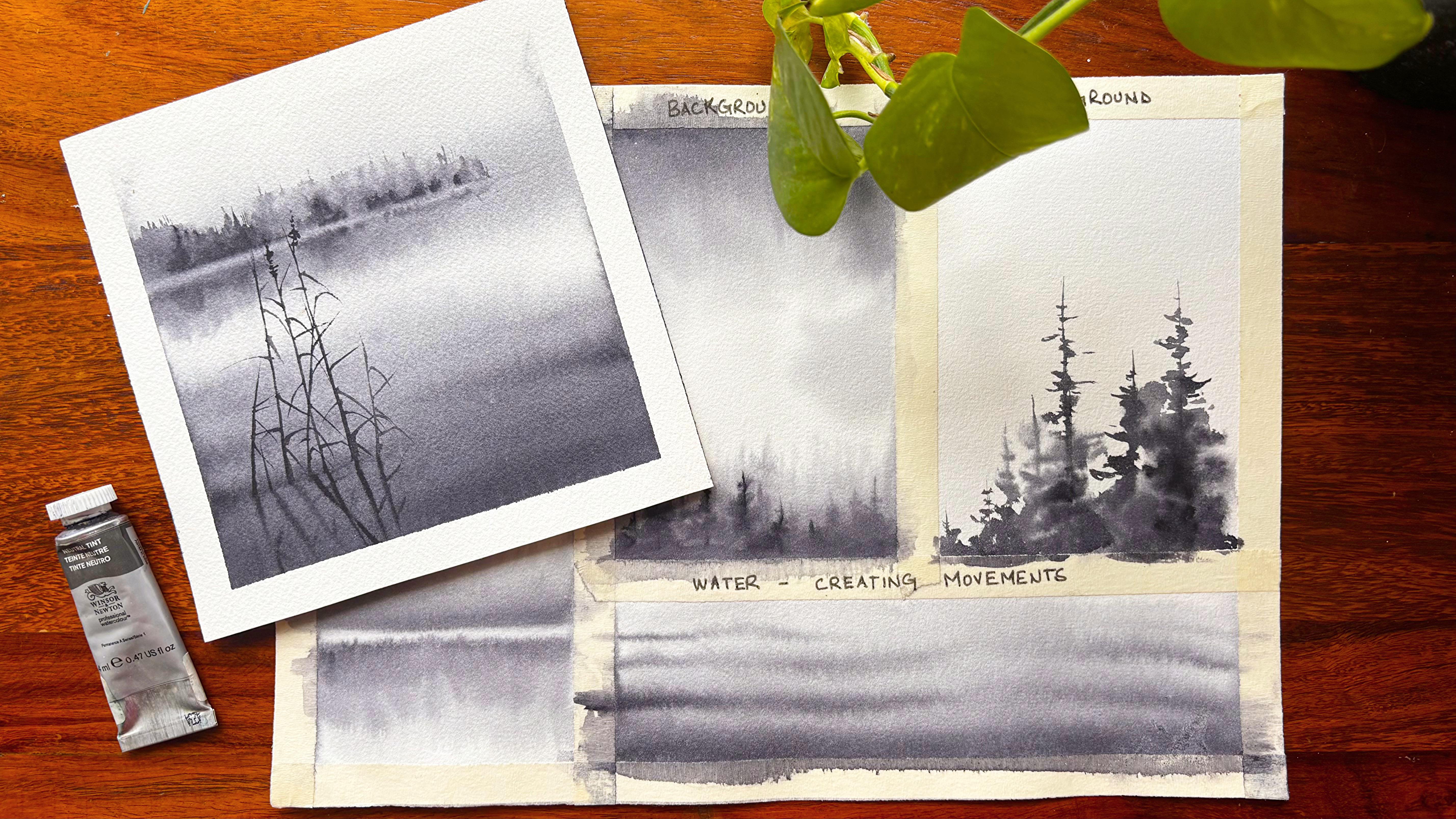
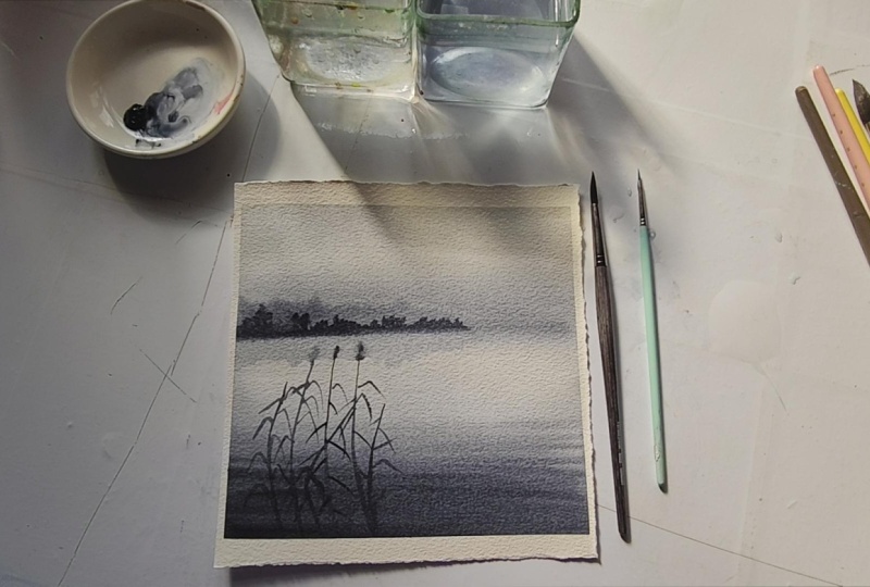
5. Project 1 - Monochrome Lake: There are many popular pigments
for monochrome studies. One of the most used out
of them is neutral tint. It is balanced and subtle for realistic shadows and light. Not only that, we will be also working on this small
painting of about five inch to understand how we can create different kind
of value studies, as well as how it can be
used to capture the mood, atmosphere, as well as the
composition of the painting. Let's start out by
taping down our paper. And once we have
taped down our paper, I would just draw
a horizon line. It's going to be a
very simple painting. You don't need to think
much when you go about it, add water to the
paper and then use a wash brush to do a crosswatch. I will start out with
a crosswatch with a washbush of size
around 0.75 inch. It is a bit less than 1 ". Even if you have 1 ", it's good to go ahead with. I'm starting out with
the darkest value, but since there is a lot
of water on the paper, I can just add it as you see
over here with bold strokes. For this bold strokes,
you would, of course, need a bit of your
thicker brush, like the one I'm
using over here. It is a mop brush. You can go ahead with any
eight or ten size brush, whatever is available with you. Though the most
common subjects for our monochrome paintings can be architectural sketches
or still life, but I love to go ahead with
landscapes which are like foggy or you have any kind of
mist that you want to show. This class is basically an
extension of my earlier class, Meditate with Watercolors,
a 14 day art challenge. Many of you have already taken this class and have
fallen in love with it. This is a more
simplified version compared to the one that
we have done earlier. Here we are starting out with
one single color that is one single pigment and later on going ahead to
multiple pigments. The most important
reason for using one single color is to
avoid any kind of chaos. We all know as bigners there is a lot of chaos in
terms of sketching, painting, colors, et cetera, and I really wanted
to avoid all of it. Limiting the color can create
a strong emotional effect, serene, dramatic,
nostalgic, or moody. I always love to take out all the extra water that's there on the side so that
there is no backgroun. Now, many of you have already known this
concept of backrun, but background is basically
when the water from the sides or from the tape
moves into the painting, it will create a
cauliflower effect which we do not want
in this painting. You can see a darker value moving from the bottom
part to the top part, which is basically
the lake area. Now in and around
the horizon line, I would be creating
some trees to show the horizon line in
a better way because of which you will see that we have added some amount of colors
even in and around it. I keep wearing the intensity of the colors that we
apply over here to basically capture
the complete mood and atmosphere of our painting. I don't think much when I'm
applying all the colors, the paper is still wet
and I can work upon it. For all my exercises, I have considered the same
paper which I am using for my final painting that really helps me to understand
the paper well, as well as capture
the smallest elements without thinking much and
just going with the flow. I am using my size four brush
to apply all my colors. Whatever brush is available with you, it's good to go ahead. There is always a
great question, which I have been asked
pretty regularly. Why do we work on small
watercolor paintings? It's actually a great question. Now, watercolor is a medium that has all my
heart, to be frank, and this medium is
very common in artist, as it is fast, fluid, and less time consuming. Let's go ahead and understand
exactly how it behaves. Now, watercolor is a very
unpredictable medium. On smaller surfaces, you
can work more easily before the areas dry out
or bleed uncontrollably. It lets you control the timing, crucial for techniques
like wet on wet, blending of soft edges, which you would be
seeing very often in all the seven paintings that
we are going to do now. It's easier to
experiment and learn. Why I say this, the smaller
paintings are perfect for practice because you can try ideas quickly without
using a lot of material. Mistakes do cost very
less time and paper. You can do multiple studies to explore composition,
value, and color. Artists I have seen often make very small thumbnail
kind of sketches and do try a lot of techniques like we are doing right now with lifting our watercolors from few of the spaces where we
think there is extra, I'm using my clean wash brush for this particular exercise. I'm retouching the lake
area with small lines, as you see over here. Now, this is basically to show
the movement in the water. If you are someone
who likes movements, I think this is one
great way where you can show nice movements which appear in any kind
of lake or water. Lake is usually quite stagnant. They don't have lots
and lots of movement. That's one of the reasons
I'm also trying to create some movement rather
than creating, like, a river flow, which
has lots and lots of movement as the water keeps flowing from
one end to the other. Bloody watercolor trees,
I would say this is one of the most beautiful
choices that anyone can do. It looks gorgeous
and atmospheric. They often are used to suggest mist, distance, or movement, rather than showing
every leaf or branch, this soft impressionistic look relies on control of
water, timing, and edges. Let's break it down further. I have applied some
of the darkest value, that is the neutral tint, but I would like to use
my wash brush and apply the water over the area which
is above my horizon line. The softness comes from
the wet on wet painting, applying pigment to a
damp surface so that the paint spreads and
merges naturally. I would also change the value right now somewhere I'm
applying the lighter value, and in few places I will
apply the darkest value. Instead of sharp outlines, you will get diffused form
that suggests trees in fog, rain, or background distances. Over here, we are
trying to show fog, and hence I am going ahead and applying the
water initially, which will keep the paper
damp for quite some time. Then you can go ahead and
apply the colors on top of it. In case the paper is
getting dry again, you can go ahead and apply some more water with the
help of your wash brush, repeat the process,
and then again, go ahead with the same
amount of colors on top of the paper to create the blurry trees
for the background. Let's have a deeper
understanding into it. I will break it down into
three particular steps. First is the light wash
for the background. Wet the paper with
clean water using a large brush as we
are doing over here, add a soft light wash of color for the sky or
misty background. You can also mix it up as we are going ahead with
the background trees. Let it settle for a few seconds. The surface should be slightly
damp, not glossy wet. This is a very, very important point if you are
adding a lot of water. It is not moist, it becomes wet, and we are looking
forward to moist areas. Create soft tree shapes, load your brush
with diluted paint, and touch it to the damp
paper where you want trees. The pigments will bloom, blur, form organic
tree shape naturally. Suggest trunks and canopies
with loose vertical strokes. Let water do the blending. The wetter the paper,
the bloodier the trees. If it's too wet, the colors
will spread too far. If too dry, you will
get heartaches. That's what the whole
point is all about, and hence we will
need a damp surface, not dry, not wet. I want to keep the bottom
area absolutely wet so that it looks like completely diffused with the lake area rather than showing
the hard edges which comes from the trees
as there is a lot of mist and hence it will
move into the water area. Now it is more of an
iterative process. You can always go ahead
and use some kind of darker trees in few of the areas and some of
the lighter trees. The paper will become drier as you continue to work upon it. The layering, of course, can create a lot of
depth and distance. Soft background,
crisp foreground. That's what you have
to keep in mind. The foreground where we will be painting on top of the
lake area will have more hard edges compared
to the ones that we are creating right now in
and around the horizon line. Lifting out and blurry
effect is one of the most important techniques
that you are going to use in any kind of fog that is being painted or any kind of mist which you want to paint. Hence, always, always try to lift out
your colors in few areas. Background and the mist
looks similar to each other. You will see that there
is no definite line or no definite trees that you
see above the horizon line. We are going to
create a similar kind of effect even towards the bottom area as the reflection of these trees
will fall into the water. If you are someone who is
struggling with watercolors, I can give you a very, very important practice tip. One is the value studies, and this can be done with the
help of three techniques. One is very wet where there will be less of forms, et cetera. It would be mostly something really blurry that you
are going to create. And then the second step
is moderately damp, which we are working
right now with. That is having more of damp area once you apply water with the
help of a flat brush. The third is mostly dry. You will have hard edges, which we are going to do next as we do it on the lake surface. This is very close to
our eyes, and hence, definite shapes and sizes
are very well visible. Now getting back
to our painting, we will even change
the values of the reflection which falls
into the water area. I always love to do
some pencil sketches, even if I'm working
on my foregrounds, as it helps me to
understand where exactly I want to place mine
grasses or bushes, whatever subject I have thought
for my foreground area. It acts as a framework
for most of my paintings, and hence going ahead
with or drawing is always a handy exercise for beginers or even for advanced starters. Now I will touch upon a
very important concept, that is the foreground
should be the darkest. Depth through
atmospheric perspective is a very, very
important concept. In nature, distance objects appear lighter and
blur because of the atmospheric haze
or you can say it can be also because of your mist, fog, et cetera, which
you are depicting. Nearer objects have
stronger contrast, richer color, and sharper edges. So in watercolor,
light background, which is basically the trees in the background altogether, as well as the blurry effect
of the area above my lake. The second is mid
tone middle ground, which is basically the lake
area that we have painted. And the third is the
darkest foreground, which we are doing now that
gives a sense of depth. Now this is basically known
as anchoring the composition. That is, the darker values in the foreground act
like a visual base. They ground the painting. They stop the view
or I from sliding out of the scene and
lead it inwards. Focus and contrast, higher contrast naturally
attracts attention, placing your darkest
dark near a focal point. That is any kind of tree
or any kind of plants, et cetera that we
are adding now, rock figures. It
can be anything. Brings it forward. The last and the foremost
most important concept for a foreground is how to
strengthen your watercolors. I usually do it by picking
up the darkest value, which I'm doing
for this painting, but there is another
method which is basically layering or glazing. Let's look at the
first one that is load your brush with thick
creamy mix of paint, which has very less
water content in it. Like I do over here, you can also get the darkest
value in a similar way. Layering or glazing is that
you are building it up. You have applied one layer, you have added the
lighter value, then you go over it with another layer and
make it darker. Basically, your painting
becomes a visual hierarchy. The eye moves naturally from
light to dark, far too near. I will continue with the process of creating this grasses. You can have a closer
look at it over here, how I go about it, and then continue
in the similar way. I'm using my size one
or size two brush, whichever is available as the size of the paper
is really small. Hence we cannot go ahead
with bigger brush to create these smaller
or very thin lines, which is there for
the foreground area. Now it's time for the final
touches in your painting. Step back first. Look at your
painting from a distance. Ask where exactly your eye is
going and what is missing. Do you really think that there is anything that is missing? Like over here, I
may go ahead with one or two more lines for my grasses or make one or two more strokes
here and there. I'm not going to add a lot, as it would bring in chaos and
overwork into my painting. You have to understand
that at this stage, every mark should
be with a purpose. Do not, do not overpaint. Use minimal water. Most final touches, use thicker pigments or
dry brush for the control. Lastly, as I always
say, know when to stop. Overworking can kill freshness. If you are unsure, stop, take a break, go for a water break or
just have a cup of coffee, revisit it with some fresh ice that would really help you to understand whether
you should continue to work upon it or
leave it at that stage. Let's have a closer look at
the last few final strokes, and then we have to also
get the reflection of these smaller bushes
or you can say plants. That are there or coming
up from the water, there has to be some reflection
which we need to create. There is not much movement
which you see in the water, hence the reflection
needs to be there. Apply some clear water with
the help of a flat brush just below the area
of these plants. Once done, we will start out
with a thin brush and then start applying lines like the ones which I am
creating right now. They are going to be really blur as we are making reflections. Hence, this is also done on a moist surface rather than
it being done on a wet one. I can see more control
over my brush, paints, water, et cetera. Final thing which you should go about before you finish a
watercolor painting is, does your focal point stand out? That is basically
focusing your plants, et cetera, over here. Are the lightest lights and
darkest dark in balance? Whether you have the darks and the lights pretty
much in focus, you exactly know where you have placed your darks and where
you have placed your lights. Do my edges vary? That is, some of them is sharp, some of them is soft. We will try to keep the
composition balanced, not too heavy on one side, not too soft on another side. Does the painting still
look luminous and not over? If it is overworked, you may not like it
as you progress. Knowing exactly if your painting is overworked or not is an art, and it comes with an. Practicing more with watercolors will definitely
give you an edge. Now let's move on to
our second project.
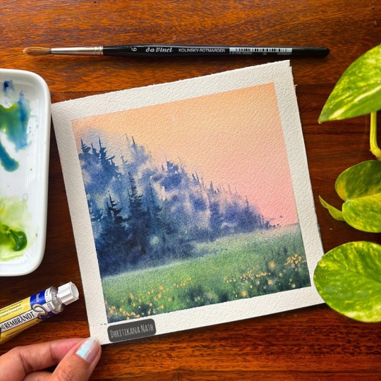
6. Project 2 - Evocative Landscape: Advocate of landscape or
atmospheric watercolor landscape are among the most expressive and poetic forms of
watercolor painting. They capture not just
the look of a place, but its mood, light, and air. The feeling of miss distance or quiet stillness,
watercolor transparency, and softness makes it perfect
for creating atmosphere. What is atmospheric landscape? Let's understand? Mood of the painting needs
to be captured. Hence, we will go ahead and
just apply a clear layer of water and then start
applying our colors. Soft transitions between
sky, land, and distance. So usually you will
not see much of a difference between the
initial values of the sky, the land or even the water. Subtle values and colors, depth created by light tone, not by hard lines. Right now I'm adding some
water to my color that is nutriten so that I can
apply it on the paper. This is basically a pouring
effect that helps me to create the land as well
as the sky very easily. You have to just move around this sheet or the acrylic
board and your work is done. Gravity will do a
lot of work in this. You might have to again go
ahead and apply some colors. It all depends what exactly
and where exactly you want to place your moody effects
in this painting. By the way, our
first two projects are based on one single color, which is basically
your neutral tint. And as we progress, you will see I will add
more and more colors moving on from monochrome painting to limited palette
to multiple colors. Let me tell you why
I have actually included this pouring
effect in watercolor. This is one of the
most exciting, spontaneous and luminous
techniques you can try. Watercolor pouring
allows you to let pigment flow freely
across the paper, creating organic transition
unexpected blends, and you can also work in layers. Though we are not working in layers in this
particular painting, we are just creating the
first atmospheric effect. It is less of control that you have and more would be chaos that is guided by
you rather than it just being organically
grown on its own. Okay, let's now add some more of the colors
towards the bottom area. The top part is lighter in value and the bottom part is
more darker in value. You will see that I keep
the acrylic board in my hand and move it accordingly
from left to right, top to bottom so that the colors can move into each
other pretty freely. Now it's time to layer
the top area or apply some more colors for the
atmospheric effect of my sky. I'm starting from the right and leaving the left,
as well as you can see, there are some gaps
which are mostly in white that we are going
to keep in our painting. Let your colours flow. The paper is still wet. Hence working on
it is pretty easy. I will give you a few tips
that I use for my evocative or you can say more expressive
or atmospheric landscapes. Timing is everything. Watch
your pop moisture level. That's how you control
your atmosphere. Less is more suggest forms
rather than define them. Vary edges, soft in the distance and sharp
in the foreground. Leave whites,
reserve light areas for mist or reflected light. That's your air. I will just pick up my
colors with the help of a clean brush,
and that is it. Once this is done, I will let the paper dry off and the colors might move
a bit here and there, which is absolutely fine. Let it flow and
have a look at it. I will start by marking the horizon line and then
move on to the painting. I will load my size
six brush with the help of Nutrite
and then start applying just in and around the horizon line
as well as below it. This is a dry brush
technique where I don't have a lot of
colors on my brush. I take out all the extra
colors on the tissue and then start by making these lines which are
like dry patches. This is basically
the ground area which we are creating
for our project too. This is a repetitive
and iterative process. So continue to do it. We will even just
change the values of the color so that you can
see the depth that comes in. While we work with the
dry brush technique, let's understand a
bit more about it. Unlike most watercolor methods, drybush uses very little water
and a pigment rich brush to create rough textured
and controlled effect. It's perfect for suggesting
textures, light, and finer details
for the foreground, and it gives your painting a beautiful contrast to
soft and fluid washes. Just exactly the way we have
created for our backgrounds, and now we are working
on our foregrounds where we are including
the dry brush technique. I There are many other subjects where you can use this
dry brush technique. Let me give you a quick list
tree bark and branches, rough textured bark with natural irregularity,
grasses or reeds, like the ones we have
over here, fine, lively texture in
the foregrounds, rocks and cliffs, greeny
and weathered textures, water reflection, broken
shimmering lines on still water, animal fur, layered
texture and highlights, old buildings that are
aged and weathered. Et us now create
some crisp grasses, with the help of a size two, size one, or even a liner brush. You can see I will start from the bottom and
they get it to the top. This way, I will create
one after another grass, and this is basically in
the bottom area altogether, as that is closest to my eye, hence I can see it very clearly. Again, it's a very repetitive
and iterative process. You just need to go
ahead and follow my way of adding these grasses, I move from the left
to the right with thinner lines on the top and
broader lines on the bottom. That's what this
painting is all about. I will just put on some
music so that you can enjoy and keep painting
on the grass area. I will now change the value
of the dry brush technique. Now, why I do change
the value over here? It gives a sense of depth. Some of the areas are darker and some of the
areas are lighter. We're not going ahead with one flat color variation
of your textures, then change of your values. All of the create a
harmony in your painting that looks super amazing to
anyone who is observing it. I would go ahead
and start applying a small patch of dark value
towards the top area. Once this is done, we will start out with our tree region. Now it's time to make
some blurry pine trees. There are different varieties of pine trees that
appear in nature, but over here, we are going to do a very, very simple kind. I would first go ahead and just apply some clear
layer of water. As you see, I always
have two jars of water, one for washing my
brushes and another for adding the clear layer
whenever it is needed. As you know that this basically captures the mood and
atmosphere of the mist, distance or early morning fog, whichever you want
to show over here. The key to the painting, each one of them lies
in moisture control, layering, and timing,
how much values you are changing while you are adding these kind of colors. I'm going from the
bottom to the top just by making these
kind of smaller lines. I am not going to add much some one or two
lines that go to the top, and some of the areas will vary in terms of that is
smaller, larger lines, that's we have done this exercise earlier for
the background trees, and you are pretty
much aware of it. I would give you three to
four tips which are very important for the success of
these background pine trees. For me, there are
around four of them. The first is that
timing is the key. If it is very wet, it would become very blurry. If it is damp, then it would become
really soft and nice so that the colors
bleed into each other. But in case the paper becomes
dry, it becomes crisp. We will make it the crisp
ones also for the foreground, but for the background,
keep wearing the colors. Why? This is basically
tone and size. Now, what is varying
the tone and size? Lighter, smaller trees
in some of the areas, and darker or larger trees
in some of the other areas, as nature is always
random and we will never get similar heighted
trees in all the places. Less detail is equal
to more atmosphere. Lastly, it is don't overwork, Let layers dry and
build gradually. Do not try to keep
working upon it. Just allow it to
dry in a few areas, vary the tones in
some of the areas, and not think much about how
the shape and sizes look. It's absolutely fine. These are background atmospheric trees which we are painting. Even some random shapes and
sizes will look like trees. Now is the time we are going to define a few of the trees. So why is this
definition important? We have already done
our background trees. This is more about
texture and detail. So once your first
wash is completely over and you do not want the
paper to dry up completely, I want to keep some of
the places pretty moist. Use a smaller brush with thicker pigments to add
crisp edges to the branches, leave clusters,
trunk and details. Maintain contrast, vary
your brush pressure, use flicks for sharp leaf edges and dry brush for
the bark texture. Now, over here, we are not
showing the bark much. We are just going ahead
and adding some details. As the paper is still wet, the colors will move, and they will create
a very soft bloom. That is something which I'm always in love with and hope you two would find it very interesting when you
start working with it. This is how we are
going to complete this part of our tree area. And once this is done, we will move on to
a parallel tree. There will be few trees
which will have more of branches and less of leaves, et cetera, and some of them will be having
a lot of leaves. There will be varying sizes. As I always say, nature is never constant. Some of them will be larger, some of them will be smaller. That's how we are
going to add it. I'm going with the
second tree now. There is less to
explain at this part. I would just make some scanty
looking tree over here. Some of the lines on the left and some of the
lines on the right. I'm making a bit more
lighter compared to the one that I've
already added on the left. This is very important, as it is atmospheric
watercolor landscape or evocative landscape, which means it has to capture the fog and the mist which
appears in the atmosphere. Hence, varying the
degree of your values is very important so that the
depth can be seen by anyone. The focus, of course, will be in the middle, which is mainly the trees
that you are painting. We are not trying to keep
the focus in the sky. It is simple, easy. Even the grounds have just the grasses and a
bit of texture, rest. Mostly, we are focusing on each and every tree that
we are going to paint. As I did tell you even dio, that this would be
scanty leafy kind of tree which we
are going to add. At this moment, there
is less to explain. So just follow the
brushstrokes and hope you are enjoying the whole of this project to let me continue to work upon it and
you have a look at it. I will put on some
music so that you can continue to enjoy
the watercolor trees. A the third tree is all about balance
and atmosphere. This is basically a tree that
appears in the background, and hence I have keep the
foliage really light. I have added a lot of water into the paints which I'm using. And then I would go ahead
with a parallel tree where we are going to add some
more of our darker values. Always always try to vary the values for whatever
area you are painting. This is a really small painting, and hence we are going
to take less time. It's about five inch. You can also go ahead with
something a bit bigger. I would leave that
decision up to you. Having said that, doing on a smaller paper is always easy. There is less time
that is taken, and you can have a
quick final outcome. When you go ahead and paint
these vertical lines, the brushstrokes
where we have learned how to draw the vertical
lines comes really handy. Now, this is all about practice, and you will also
take some more time. Do not break the lines. That's something I
always always say. Try to have a continuous line two parallel continuous line
will help you to understand how exactly you can add trees as well as they look
absolutely like pine trees. Now, pine trees are always
erected from the ground. As you can see,
they go straight up and move into the sky area. The top, of course, part is, like, smaller and
the bottom part is broader. It looks more like a
cone sheap and we are also going to show the
same in this part. As we are painting
the pine trees, let me tell you a bit
more about pines. There are about 1:20 recognized species of
pine trees in nature. Though the exact number
can vary depending on how botanists classify certain
subspecies and hybrids, here's a quick overview of
how they are organized. Genus is pins,
family is panacea. And the sub genre is pins, which are hard pines, usually with two to
three needles per bundle and storbs
which is soft pines, typically with five
needles per bundle. Global distribution
is all about pines that are mostly appearing
in the northern hemisphere, including the North America, Europe, Asia, and
parts of North Africa. You can also see pines appearing in the upper side of Himalayas, as I belong from India, and I have seen
these kind of trees whenever I am traveling
to the northern side, that is a Majal Pradesh, Ora khan or any of the
other northeast parts. While I go towards the end, I will just blend it with the help of any
blending brush and apply some colors or you can also just
blend it with water. I would leave that
decision up to you exactly the way I
am doing right now. The bottom area is
usually some thickly populated or more of
bushes, et cetera. And hence, I make it
darker compared to the ones that we have
added for our tree region. Okay, now, what do we mean by painting continuously
with watercolor? This is a very, very
important concept. You have seen that I
have not waited for my layer of the background trees to get dried up completely. I did start out immediately. Painting continuously is beautiful and fluid
approach is all I can say. It emphasizes low rhythm
and connection rather than rigid steps or
waiting between layers. The result is a moist
living painting with both flow and form. I will go ahead and paint with water now as my paper has
completely dried off. You can see that most of our
painting area is wet on wet, or you can say wet or moist, even for our foreground trees. We did see it how you paint with water during our
techniques section, as well as in the
brushstrokes part. Hopefully, if you are
new to watercolors, then you can get back to those sections,
have a look at it, and then come back
to this painting and start with your
painting again. I always always say
practice is a great way to improve upon your skills
or to brush upon your skills. It can help you to achieve the required outcome
pretty quickly. I love this soft yet crisp kind of pine tree that is
similar in looks, and size, et cetera, to the one that we did attempt
first on the left side. For the adjacent that
we're painting now, I will vary the color or you can say values
of this color. Now, this is to particularly
show that one of them is a bit more closer to our eye and one of them
is a bit more further. Now we come to the
most beautiful stage, which I really want to talk
about the final details. This is where an atmospheric
watercolor painting truly comes alive, but also where it's
easiest to lose the softness and mystery
that makes the piece sing. This is how I
usually approach it, pause and observe before
applying anything, step back and study
your painting. Where does the eye
naturally grow? We have also done this
exercise in our first project, identify where it needs more
clarity and more atmosphere. Not every part needs detail. Often just one focal
area should be cross and the rest stays
soft and suggestive, which is what we have also done in this part
of our painting. At selective contrast,
deepen shadows or mid tones and focal areas
to anchor the composition. Use a small damp brush
with thicker pigments for precise dark tree edges, or you can say
leaves, et cetera. I would say what is
usually the final thought that I think when I'm trying to complete any of these
atmospheric landscape paintings is often stop just
short of finish, which is like that it is yet not finished,
but still finished. It's the hint of
incompleteness status. It is really not
complete, a bit of mist, vague trees for the background, some vague horizons,
if you want. This keeps the painting
alive and breathing. While you continue
to complete this, I would let you know a bit
about the next two projects. It's all about painting
with limited palette. Either it be two or three
or four colors at Max. We are not going to
use multiple shades. So sit back relax and enjoy
each of these painting. Hope you are Audrey
doing in the meantime, let's finish this
painting with some birds. The bird painting technique
is the same as what we did discuss earlier in the
section of brushstrokes. We will be adding more of
the techniques part as I progress to my painting
three and painting four. Before every two paintings, there is a section where
you get all the help in terms of understanding brushstrokes or
techniques, et cetera. So do follow it before
heading to the final project.
7. Techniques Part 2: Let us talk about
a few techniques, which is very important
in watercolors, and this is basically
techniques part two. I hope you have Ady Achen
techniques part one. The first part is all about wet on wet blending and
wet on dry blending. I would like to tell you the
difference between the wet on wet and wet on dry blending
rather than telling you, Okay, what is wet
on wet and what is wet on dry, as
you all know that. Now for wet on wet, it is a wet surface
that you need, and on top of that,
you can apply two or three colors depending
on the requirement. And then it will produce some diffuse soft edges with less control
over the paints. They will move on their own. You might have to
move your pad or the acrylic sheet where
you did stick your paper. Accordingly, depending
on the fluidity of the watercolor medium, the paints will move
into each other. The speed of the video is 1.4 X, and you can always go
ahead adjust the speed of the video if you want to take
up this techniques part, I would be more than
happy if you take it up because this is
a great way to have simple exercise practice in the beginning before you
jump on to the final lesson. What is wet on dry blending? This technique involves applying wet paint to a surface
that is completely dry. So it is a dry
paper that we have. This will result in either crisp or sharp edges
or controlled brushstrokes. Now, I would have more
controlled brushstrokes per se because we are going to just apply colors one after another,
blending into each other. Here you have more control. Of course, because you are only putting
your brushstrokes, you will have more control. But having said
that, there would be no diffused edges in this case. There would be more of manual blending which would be needed compared to
the first case where we had more of natural blending between
the fluids itself. Rather than us doing more work, water was doing
more work for us. Having said that,
both the methods are absolutely used by
all kinds of artists. The first method where there
is wet on wet blending, you have to work pretty quickly because your
surface is wet. And till yourself as a wet
till then only you can work, whereas the next one, which is wet on dry blending, you can work at a much slower
and more deliberate pace as the paint do not
spread very rapidly. You are the person who
is basically controlling the whole of the paints area, and hence, you will only decide the pace
of your painting. What is glazing in watercolor? Glazing is a process
of applying a thin, diluted and transparent
wash of color over a completely dry
previous layer of paints. Having said that, the
transparency in this is the key because the top
layer is very transparent, the underlying color
is still visible. Light passes through
the new layer, hits the white paper beneath and reflects back through both
the layers of the color, creating a new vibrant hue
through optical mixing. Purpose to gradually
build up tone, darken the values,
unify color harmony, and adjust the hue. The golden rule of complete drying is very
important when you are glazing. Now, why I am going
through this part more in detail because it will not
take us much time to glaze, but it is important to
understand the glazing method. Wait until bone dry. Now, this is the
most crucial step. The underlying
layer which you are applying with the
help of the te green, that has to be completely dry. That is 100% dry before you go over it and glaze
with a new pigment. The paper should feel
room temperature, not cool, not damp. If you are someone who uses
hair dryer more often, go ahead to speed
up the process, dry it, but I usually don't
use it as I don't want the colors to somehow
feel more lighter. I have seen it for a
few of the shades, sometimes they become
lighter in value compared to if that is dried just in open. So those are the aspects which I keep in mind when working
with the glazing part. I have three important tips. One is using the
transparent pigments working light to dark and use large brushes for
creating these kind of washers. Now, these are really helpful throughout the complete
journey of watercolor glazing. Now, glazing can be
used in various ways. Over here, we would be using
a glazing for our grassland. That is the next project
which you are going to do. This is a third project, and it has all these techniques
which we are using right now. Of course, I have given you two options for wet
on wet and wet on Rye blending as I
want you guys to know both of them
before you jump on to any conclusions
of using only one or using this is
a better method, or that is a better method. Whichever you think is more suited for
your kind of style, you use it in your
future projects. Softening my edges, I would
just apply some darker value. You can make some amount of your sub green and nutriten
for creating this wash. You will see that
every time I'm taking a broad brush to create or to work around with
a larger surface, I would first apply the colors
and then soften the edges. You can soften the
edges with the help of a clear water or
else you can also soften the edges with the help of any kind of lighter colors. You want to move from
darker to lighter values. That is also possible. If you want to just soften
the edges with the help of your like clear water, that is also
absolutely possible. I would leave that decision
up to you. We have done this. For both cases, you can go ahead and see it as you
progress in this journey. Of course, the first two
projects were monochrome, the next two are
limited palette, and the last one
which we are going to use is basically
multiple colors. Please go ahead and
try all of these. Hope you are enjoying
the class till now. Go ahead and just check out the next project
where you are going to use or the techniques as I did
tell you even earlier.
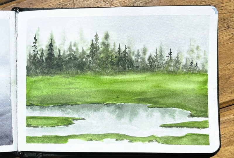
8. Project 3 - Limited Palette Forest: This painting, we are moving
on to a bit more complex, and this is limited
palette forest. The colors are paints gray or neurotens sap green
and palo green light. We are going to start up by marking our horizon
line, and below it, there will be the
areas which are for the grasslands
and for the lake. Though we are going to start out with one of the
darkest values, that is your paints gray or neutral tint,
whichever is available, I personally love
the neutral tint, and I'm going to
use a neutral tint to complete this painting. But in case you don't
have neutral tint, you can keep pains gray
as another option. I'm going to wet my paper really well with
the water first. I will do a cross
punch with the help of my wash brush once
my drawing is done, my darkest color here is
pains gray or neutral tint. But I'm only going to use it as the first wash to build
a background atmosphere. Usually, what we have seen, we will never touch
these darkest colors. But when you tone it down
by adding a lot of water, it can always act as a base
layer or a starting point for creating the mist and the atmosphere which we really
need for this painting. Before we jump on to our limited palette part and
start mixing our colors, let me tell you what is the exact meaning
of limited palette. Limited palette is using
a small selection of colors that is two
to four paints to create your entire painting. Here's the idea if you
see in simple terms, you pick up only a few
colors to work with. You mix everything you
need from those colors. Because of all the mixes coming from the
same small group, your painting looks
more harmonious, balanced and cohesive. It also helps you to get better at color mixing and
keeps your setup simple. For my big nerve
friendly classes, I always love to keep or choose a limited palette as I don't
want much of confusion. By the way, as I keep explaining you about
limited palette, let's also see that there are no backgrounds or cauliflower
effect into the painting, which usually happens
in case there is a lot of water that is there
on the sides of the tape, exactly why I was
always cleaning up the sides because there has
to be no cauliflower effect. I want an absolute harmonious, beautiful, cohesive kind
of painting at this stage. I'm applying the colors
only in a few places, and the colors will
be at least one to two shade lighter than
what you absorb over here. I will also pick up the
colors from the areas of the green because I don't want to add a lot of
undertone into it. The green needs to be bright and the Teo green light is an
amazing colour which can help you get the desired color of the light green pigment which
we want in this painting. If you don't have
the Teo green light, you can go ahead
with any light green that's available
in your palette. Now it's time to lift out my watercolors in few of the areas wherever
it is necessary, you will see that I will go
ahead with a damp brush, pick it up on my tissue, and then again start
out by lifting out the area where there is
basically the grassland. It is a really hard
technique to be frank. It doesn't work initially. You need to know the ability of the pigment in
terms of whether it is staining or non staining. If it is non staining, then only you can remove it. If it is staining, then
it's hard to remove it. Now, since we have
applied a very, very light shape of this color, that is either be it pales
gray or even the neutral thin, it is a bit more easier
for us to work around with it rather than just thinking
about not to work around. Why we lift watercolors is
something that I want to tell you why we work this out
to correct the mistakes. Supposedly, I don't want the colors in the
grassland areas, and hence, I would
like to pick it up. To create highlights. Sometimes
it's important to create highlights like the sun rays or the reflection, et cetera. And for those things, we do create highlights
to soften the edges. Now, this softening of edges is highly used when I'm doing any floral kind of composition. To add textures that is
basically the clouds, ripples wood grain or
any other texture, you will see how we will
create more texture into the water area of the lake with the help of picking
up the color, lifting out of the colors. To shape or to
redefine, that is, lifting also helps you to actually carve the
shape or the areas. Like over here, you can define the horizon
line in a better way. Once this is done,
we will start out by applying some clear
water for the tree area. And this tree area, of course, is for the places where you
will see far away trees, and mostly it is pine trees
that I have kept as of now. These are small paintings, and believe me, it can easily fit into your
daily schedule. Only an intent should
be there to start out. I have mixed my sap green, along with this shade of neutral tint and
started applying it. You will see that I will vary those shades to a great extent, which means that
I'm creating depth. Some of the areas would
be lighter in value, and some of the areas
would be darker in value. I really don't care
much when it comes to the shape and size that
I'm making at this stage, it's just colors which I'm
applying in the form of trees, and this is far away trees. I'm mixing now my darker
and lighter values, as I always told you earlier. You can pick up the
color on your brush, then go ahead with the tip of your brush for adding
the tree like structure. It's a simple faraway tree, so there has to be only lines, one or two lines
that are crossing. That's it. And
then you are done. We will continue to iterate
this process again and again, and that's one of
the reasons I always say this is meditate
with watercolors. Meditate with watercolors
means that we continue to grow or continue to work in a similar pattern again
and again and again. And really try to ace it with every painting
that we are doing. Well, many of us do
fear watercolors, but I have few reasons why you
should not fear it at all. Watercolors are less
forgiving, we know, but I would say that
watercolors are not so less forgiving either, because you can
lift, soften, layer, glaze to fixed many of the
things that you have dita. Even mistakes often turn into beautiful textures or effect. The paint wants to help you, so it helps you to
work as a partner, rather than you
treating it as one of your enemies or
difficulty level that you usually see in watercolors
is not what it is. Watercolor naturally creates
bloom, soft gradient, and organic texture
that would be hard to get intentionally
in other mediums. It works for you,
not against you. Believe me, that's the truth. You don't need a
lot of supplies, as you always see water, brushes, and some
paints is good enough. Even a single monochrome
paint can help you. The paper is the most important
aspect in watercolors. If you can get that right, then everything is good. It teaches you to let go of. Now, let go means you have
to let go of your control. Once you stop
fighting the paint, you start enjoying the
surprises it gives you. Layering builds beauty. Now, every light,
transparent layer, you create depth and richness, so you don't have to get
it right all at once. You will see this same thing
as we work on the grassland. And lastly, every attempt that I make is basically
teaching me something. Every wash, bloom, unexpected edges or even
cauliflower effects, et cetera, is making me learn a new thing that I'm
exploring in watercolors. Hence, it is more fun because
of its playful nature or because of the water and the fluidity
that comes with it. And that's one of the
reasons I feel very, very soothing or meditative when I'm working
with this medium. Now the time to add some more of the darker
values for my trees, you will see that
background trees which I have created
are way more lighter in value and
the foreground trees would be darker and value. Always, because it is
closer to my eyes, anything that is
further away from my eyes will become
lighter because of the mist or atmospheric effect that we usually
observe in nature. The next technique
that I would be using is softening the
edges in watercolor. We have discussed
this even earlier during the techniques part two, but let's just understand in real life scenario
how it works. Now, why real life scenario? Because we are working on a
landscape that demands this. So this is basically a technique
that is used to blur or gently fade the transition
between two areas of paint. Now, it helps to
create more natural, relaxed and realistic look, especially for
things like skies, shadows or distant landscapes. I have been using it very often for most of these
landscape area. Now, since we are dealing
with landscapes over here, I'm not getting into
other things like your petals or your
florals, et cetera, though I have many classes even on that, but
this particularly, I am now working on on the landscape areas
where I use this technique. Okay, somewhat darker values I can only add when
my paper is wet. Always know that till
our paper is wet, we can work on any kind of distant arteries or bloody
areas which we want, but I'm not going to work
upon it once it is done. Now, why is it? What do
I mean by it is done? It is basically once it
is dried off completely. I will now use my
Teil green and start out the areas of the grasslands. Now, the grassland areas
are really, really amazing. I am super excited to
actually teach you this part. I am very happy with how
this has turned out. Believe me, with only very simple and really less
number of paints, you can always create magic. So never think
about the fact that you cannot create magic if you do not have so many colors or 12 shades or 15 shades
or 18 shades or big, big, you can say watercolor, um, different kind
of sets with you. Initially, as a bigner, I did purchase a lot of
sets, but over time, I have realized they
are not of much use, and whatever now
I like in colors, I go ahead and purchase
those as individual tubes. I will also use some of the
Sab green in few of the areas as your colors will
look flat if you only use one single
color and just work with the tonal values of it as the color is pretty
warm over here, compared to the cool
shade which you can be used from
the sub green area. Now, sap green really
gives that kind of depth in this painting, and that's one of the
reasons I love to use sap green in many of the areas. You can also mix it up with a bit of neutral
tint if you want. I would leave that
decision up to you. I will be also using
a bit of neutral tint wherever necessary
or if not necessary. Just avoid it. Go
ahead and avoid it. Once I've applied the colors
on the grasslands, I would go ahead and just blend my areas of the darker values into the lighter
values that is there in the bottom area
and then just create some of these stuff
as you see over here. The darker is the sab green, and then the lighter would
be the To green as you see. As you see me apply
some darker values, this is also called as
wet on wet blending. Why I see wet on web blending, I body apply the lighter value
of the green on the paper, and now I'm applying
the darker value. Why I would say
that wet on wet is a very amazing technique because it creates
smooth gradients, gives soft, dreamy transitions, perfect for skies, backgrounds
or atmospheric effect. Let colors mingle in beautifully in a very,
very unpredictable way, which we cannot really
say that, Okay, this is the best
way to go about it or this is not the best
way to go about it. Let them do their own work. We are not here to judge
it how it turns out. There are a few tips that I
usually want to give you when you are working with watercolors
and wet on bed blending. Keep the paper evenly wet. That is use the paints
that aren't too thick. More water helps them to flow, or you have to work
on areas where you have fluidity of the water being worked out along
with the paints. Built your board a bit
for the color movement. Now, this is very optional
if you are working on moist, of course, there cannot
be much movement. And hence, you have to let
it as it works on its own. Let the paint do
the work. The magic happens when you don't overwork. That's something which is very, very important at this stage. Do not overwork at
any point in time. Let the colors play
their own role and let them work out the magic on their own rather than continuously
working it out. I am again adding some water for the forest areas and
then again adding some more darker value towards the bottom area as it has
turned more of white, which I do not want, and it should be
completely softened. We might have to go ahead with
another layer of glazing. I will tell you how we go
about it for the grass tends, of course, with
the lighter value rather than being
the darker value. Some of the areas I'm
again retouching, where I think it is still
wet and I can go work along, as well as it will not
give me really hard edges. Of course, there are few
hardages which I want, and you have seen that we have done a mix of hardages
and soft edges in this painting rather
than only going ahead with some soft edges
or some hardages. So that will always remain. If it's a good mix, you will see that the painting comes together very quickly, and the final outcome
is super impressive. Now it's time to
create the reflection. Of course, in a very
simple and easy manner. Whatever be the
colors of the forest, I would be using the
same in the area of the water and just
creating some blooms, not adding a lot of, I would say, movement,
et cetera into it. And I would also
lift out some of the colors from this
particular area of the water. You will see how and
exactly the movements that is created because of the
lifting out of the spaces, of course, which
were darker with the help of my flat brush. So that's a very, very
good and important aspect which we will be showing for creating the
movements in the water. After lifting out, you can see how the movements are
in the water area. I have genuinely kept
a bit of space between the top area of the grassland and the reflection that is there in the water. This is for the same
reason that you can identify that this is the grassland and this
is the water area. Let's go ahead and glaze. Now, what do you
mean by glazing? Of course, it is going one
layer over another layer, and that's what we
are going to do as this layer has gone really light compared to what I
initially thought. Hence, going with the lightest
value of To blue and then adding it over the
colors that we have already added will
be really helpful. The next painting is going to be super interesting, so be ready, and let's jump on very
soon to the next one.
11. Techniques Part 3: This is part three of
the techniques section, and what we are starting out is a very interesting concept. Many of you might have
already worked through it and actually know
exactly how to do it. But for me, I think this is very important for each one
of you to have a look at. And before we progress
with our next painting, I would go ahead and just apply some sabren on the left
side of the entire paper. This would be more
like a flat wash. You can go ahead and apply a lot of water or have one particular pool and
then only start applying. I would leave that
decision up to you how you want to go about it. We are going to
create some textures, and these textures
become very important in our next painting where we are trying to create
the foregrounds. Now, why the foregrounds
and backgrounds are something that we
have always focused on. Now, the backgrounds are in the cooler tones
that you would find, whereas the foregrounds are
mostly in the warm tones. Now, if your foregrounds
are in the warm tones, it gives a and feel that it is closer to you and
it is more brighter, whereas whatever is far
away from your eyes, it would be way more
lighter in shade or it would be more cooler and shade so that you can
see the distance. This particular concept actually refers back to something
called a perspective. I know that many of you
are already aware of it. You can see I'm using my
sap green from the senalar. Yes, I use all kinds of brands, whether it be Rem
Brand, PWC, sap green, from the brand senalar, and there are many
other brands which I also refer back
to now and then. Pick up some clear
water on your brush and start splattering it as
I'm doing over here. You can also go ahead
and splatter some blue that will give you more
colors and more textures. Though you know that since we have already
splattered the water, if you splatter blue over it, then it might get more
dispersed as a pigment, whereas if you are
doing it as a first, it might only be limited
to a particular space. I would go ahead and again start applying these colors
on the right side. Over here, I want to
show you how I mix my first two colors that is sap green and
French ultramarine. Once these two colors are
mixed with each other, you will know that two
cooler tones have come together and they can
make a great mix. We will be using this mix
even in our next painting. This next painting is a
mix of all the techniques, colors, theory, everything that we have
learned till date. So that is the one
which I kept for last, and it is also broken
into two different parts, just like the fourth painting, which we have done, which
is Illuminated Pathway. If you haven't tried the
Illuminated Pathway, I would request you guys to go ahead and check out
that painting now. This particular part of techniques might look
as really small, but it is very important in our overall techniques section as we are learning how
to create textures, which usually we
haven't done till now. This particular
technique is a bit advanced compared to the ones that we have done till date. Hence, it is placed at last. I have a seventh painting, which we are also going to do. It's basically a bonus lesson, and I'm super excited to
also teach you the same. It's more about
the misty forest, moving leak and much more. Let's go ahead but
first concentrate on this part of the
techniques section. I can now again
splatter some water on the left side as the
paper is still before we go ahead with the final part or the final understanding
of how to apply the warm colors
on the cool background, it's important to create
a smooth blend of shades that is your
ultramarine and sabrene. In the bottom area,
we are applying the tramne and in the top area, we are applying the sap green. You can go ahead and
take any liner brush and start applying smaller
dots on the wet surface. If it is too wet,
the colors will move a lot and the pigments will get displaced to
a greater extent. Hence, you need to keep
in mind that there has to be a bit
more reinforcement that needs to be done once it is in a semi dry kind
of a condition, or you can say it's
a moist condition. Moist condition is where the
colors don't move a lot, and if your colors are moving, as I am showing you over
here on the left side, you can go over it
when the paper is moist and apply one or
two dots here and there. This is a very, very important concept
for the wildflowers, which you are going to
add in the next painting. While you continue
with the process, I would like to give
a short description about the next painting
that is misty grassland. It's a white stretch
of open earth when soft grass ripple beneath
a blanket of drifting fog. The world feels
muted, colors faded, sounds softened and everything wrapped in a quite mystery. Euclings to every
bleed of the grass, and the air smells
fresh, cool, and earthy. Locals say the fog
is alive that it remembers every traveler
who passes through. Hence, the painting
has so much life that I am super excited
to teach you the same. Along with it, you can see
that I'm trying to add some splatters of clear water so that it can
create some texture. Let this dry off completely, remove the tape at an angle, and have a final look
at the painting. Small exercises are great reminders for
beautiful outcomes.
12. Project 5 - Misty Grasslands: Let's have a look at
all the colors for our Project five, evening glow. Nine number two or peach Opera, French ultra Mary, sap
green, neutro tint. If there are any further
sheets that I can include, I will let you know
in the process. There are a few new techniques which has been explored in this, and some of them is all about
splattering, et cetera. You will get a hang of it from the techniques
section part three. Go ahead and check it out
before you attempt the project. I'm going ahead and
applying a lot of water on the surface
of the paper, and once I've applied the water, I would go ahead and just remove all the extra water
by tilting my part. This is the acrylic board that I have been using for my painting, and I'm clearing out
the sides of it. We will start out with the sky. Now this is basically a very warm kind of
colors that I have set. It is my warm
tones, you can say, that is the energy and
sunset warm that I want to show through this painting is something that I really love. And without sunsets or sunrises, I don't think that any of
my projects are complete. Having said that, it has got
a pretty atmospheric look, which will also come together when we are applying
the cooler tones. Okay, let's go ahead and add some amount of
white yellow tone, which is basically my peach called John Brilliant
number two. Whatever is available with you, you can also use naples yellow in case none
of this is available. Go ahead with some opera and just start applying
it below that. Once you have applied the opera, we will add some
green and the blue, this is my French ultramarine. You know that I am someone who is in love with
French ultramarine, the granulation of
French ultramarine. Hence, I have been using this color in many
of my paintings. And you will be really happy to see that
this color can create so much magic in our painting that some of the very
great artists or, like, very known artists have used it from
the olden days, and that's how the French tra
marinee has become a part of watercolors or many of the other beautiful
oil paintings, too. Going ahead and mixing
some amount of sabgreen into the blue and just
creating the bottom part. You can see it is
about one third. I have not defined any
horizon line over here. I have gone
completely like that, not thinking much about
defining, et cetera. It's a very loose
and nice outcome that I'm looking
forward to Okay. I'm blending my colors. Once I have blended my colors, I would go ahead and apply
some more amount of blue. I'm using my broad brush. This broad brush again, is like a wash brush. This is the VNC size zero brush. You can go ahead with any other wash brush that's
available with you. It can be Rafael.
Rafael is a very, I would say affordable brush that's available even in India. If you are someone
who wants to try it, I think it's an aqua
soft or aqua tone brush that I've been using for
quite some years now. And it is really good. It is way more cheaper
than D vinci Casaneo. And hence, I do refer it
to most of my students or many of the other who have been asking
me about the brushes. Devinc having said that Dawnci
or you can say Escodas, these are more on
the expensive side, but they last really long. And hence, even if
you are adding money on these or spending money
on these from your kitty, I think it is going
to create a lot of happiness when
you are painting. Okay, let's go ahead and just apply some more greens and
blues on the left side. You can see that I would
be creating a landscape. It's a very simple landscape. At this moment,
there are nothing in terms of shapes,
sizes, et cetera. We have just defined very blurry effect
for our backgrounds, and then we will go
ahead and slowly start adding our water first, I will let the paper dry off. I don't want to touch
it when the paper is wet because that might create some issues or I'm not very confident
about how the colors, tonal values, et
cetera, will hoof. I would really need
some softer tones, and I would need some blooms, et cetera, some dry
brush techniques. So overall, when this
is the situation, I'll let my paper dry off and
then only start by wetting some portions of the
paper which I need for creating my trees exactly
the way you see over here. I'm mixing my tramin
and some amount of my nutrten to create a tree
like structure that you see. I'm using my size four
or size six brush, whichever you are more
comfortable with, since this paper is smaller, so I'm going ahead with
my size four brush. You all know how I
create my trees. So continue to build
up on this process. Some of the spaces are already wet and hence those spaces, you will see lots of blooms. I will slowly add
some more colors over there and then pick up some
lines as you see over here. Add the right side
or the left side extended making some lines
that looks like pine trees. The next thing is, about
multicolor watercolor landscape. What is there multicolor
watercolor landscape? Though many artists do say
about four to six shades are also you can
say limited palett. But for me, when I'm using four to six shades or
maybe five shades, I usually call it multicolor landscapes or
multicolor paintings. Now, there are very meaningful
reasons for which artists always do these kind of things to capture the
beauty of nature. Nature is never just one color. We all know yes, we define it with
one color so that it's easier for our
prey to process, to understand the tonal values, to understand the depth. Having said that, when
you add more colors, the sky shift from yellow to pink to blue as
you see over here, forest mix greens and then
your blues, et cetera, the water reflects many shades of the sky or of the
forest of the trees. All of this put together makes a multicolor landscape look more poetic in nature and natural variations look
much more realistic. That's how I look at it. Second is to add
depth and dimension. Atmospheric perspective,
distance object, whatever is at a distance, you will find it more cooler, which means that
right now what we are adding in blue is a cooler look. Whereas whatever is closer to our eyes that you
will see later as we work on our foregrounds
for our grass part, you will see that there
are more warmer shades, like I would be using
the peach color, which we have used earlier, or maybe you can also use the yellow Naples yellow or any of the John Brilliant
num two from the brand, I think PWC or no, that's from the rand hole beam. So these are the shades
that I have been using quite often in my paintings
for giving the warm. Layered spaces that guides the viewer's eye and contrast that makes the
painting feel alike. So this really brings
a lot of contrast. Having said that, yes, you can
get contrast in many ways, even with one single color, you can create contrast. But with time, when we start
adding more and more colors, I think the overall painting
looks much more realistic and it's closer to what we usually observe
in a photograph, or if we go live at a
particular painting, we will see all those
shades appearing in nature. To bring the mood and emotion. Now, this is something
that I always always say. Warm tones bring
in so much energy. So this particular painting, I would say, is
so much balanced. The warm tones of the
skies look so amazing, along with the cool tones of the trees that we are
creating for our background. Overall, the whole
painting comes together with only the warm
and cooler tones over here. Another thing that I have learned with time
is color harmony. Now, color harmony is using the colors that are
adjacent to each other. Or you can say analogous color rather than going with
complimentary colors. Though it's not that we haven't gone with
complimentary colors. I'm someone who loves to use complimentary colors in
many of my paintings. But with that, I do
also love to explore different set of my watercolor analogous parts
so that it looks very, very harmonious
when you actually seeing any kind of
transition like from here, when you use a Jon Mellin number two and an opera makes it gives you a nice peachh pinkish
kind of look for the sky, which is warm, as well as
that looks so pretty overall. Now I'm lifting or
blending my colors, as you can see over here with
the help of my wash brush, yes, this is my wash brush. You can keep even a round
brush for your wash brush. I always love to keep a regular flat brush
for all my washes. The next would be to enhance
the visual interest. The human eye loves
a lot of variety. A landscape with
multiple hue spill feels at least very rich,
dynamic, and engaging. If you are someone who is looking like who is looking
forward to having colors, I think this is
the best way to go ahead and express yourself. The expressive scenes that we get from using the
multiple colors is, of course, beyond imagination, and it's all how you go and see a particular painting
or it's how you go and just show the whole painting with your own eyes or with the artistic
eyes that you have. So more darker lines
that I want to add into my painting
because this looks really blended in terms of the trees that I see
for my background. While I come down to
the ground level, I'll just blend my
colors with the help of a blending brush and take
it to the bottom part. Now it's time to work
on our foregrounds. Now foregrounds is
basically the ground area. You can see already
the granulation of the sabrene and the ultramarine
looks pretty amazing. I'm super excited to show you how the colors
blend into each other. I would be adding some
more darker values in some of the areas, and some of the areas I
would leave just like that. I would be touching, dropping one or two drops here and
there, and that's all. You don't need to
actually go ahead and make lines or
cover the entire area. We are not looking
forward to flat washes. Flat washes is something
that would make the painting look one dimensional and we are looking forward
to multi dimensional. I will take a thin brush and
start loading my brush with some ultramarine and
neutral tint and then add it in terms of some lines
and dots here and there. Once we have added these
dots and some lines, they would look like
grasses for the foreground. Along with it, I want to
add some beautiful flowers. Believe me, this is
something that I always, always love to add
to my paintings. It's not that I always
experiment a lot, but yeah, whenever I experiment, at
least adding the flowers or the birds make a painting
looks very interesting. Okay, let's just
platter some water onto the area of the grassland, as you see over here,
that is the bottom area. Though I don't see much of an effect that has
come as of now, But yeah, having said that, just continue to work because grassland is something
that we are yet to detail. And you can already see that there are some patches
which are darker. There are some patches
which are lighter, which gives the texture that
we need for the foreground. My paper is still
wet wherever I have painted my trees and they
are becoming more blood. So it's important to just
define it a bit more. I'm going ahead with
my thinner brush just to add some more dots and lines wherever it is necessary and give the
structure of pine trees. This is a pretty
iterative process, and there is less to
explain at this stage. Once you are done
with this part, then we will go ahead and add some beautiful florals
to our foregrounds. Now, that part is very, very interesting, and you would also fall in love with it. Once you know the process, you can create it for any of
your future paintings, too. Lets us understand a bit
more about foreground, why we do so much
of detailing in our foreground in
watercolor landscape. It creates depth and
perspective. You all know. It makes it more
three dimensional, puts the middle and
the background further away and enhances the
atmospheric perspective. Then next, that is a very, very important point is enhances
realism, and therefore, it will also help you
to believe the reality, which means that there are rock structures or grass
structures, maybe some trees. Like we are adding right now. Though these are
background trees, but they are a bit
more in the foreground compared to the ones that
we have added further away. And the most important
point which I feel is very strong or balances, the whole of the painting
is having a loose, soft background and controlled
or detailed foreground, which makes any of your watercolor painting
looks so interesting. And it tells a story of its own rather than
focusing everywhere, it helps or you
can say it guides a viewer's eye to one of the particular
areas in a painting. Et us just check our
foregrounds before I go ahead and start applying
my peachy color. Yes, this looks
very interesting. The color altogether
looks so nice. I will start with some
smaller dots here and there, as you see over here, from the right to the left. Some of the places are still wet where these dots
are becoming blue. I'm so happy it is
naturally happening. Otherwise, I would have
wanted to add some water or maybe just a layer of light wash and then
go ahead with it. You know, what happens when
some of the parts bloom on its own and then you add
a soft dot on top of it, it looks it adds more dimension
rather than having a single dimension
into the flower. Okay, continue to add on
the left and on the right, some of the spaces will have more of the flowers together, and some of the spaces
will have one or two. You do not want to make it equidistant or you
do not want to place one after another
in a mechanical way. Nature is random and randomness
really needs to prevail. We will continue to add
some more of these. You can use your size
two, size one brush. Whatever is available with you, I would leave that
decision up to you. Some of the spaces
where I want to blur, I'm going ahead and touching
it with the help of my fingers and then
allowing it to dry a bit. Once it is dry, I would
go ahead and apply some more of my peach shade on
top of it and make it glow. Super happy with how this
whole painting has turned out. The next painting is going
to be a bit more detail, and it would be broken again
into two different parts, part one and part two. Of course, the idea
is not to confuse you or to not get
over in the process. We will have some part where we are working on the
backgrounds, foregrounds, et cetera, and some of
the parts where we are working in the drawing
and the backgrounds. So yes, overall, it's going
to be very interesting. See you in the next lesson. And do try to attempt
the techniques section one for all the paintings before you go ahead
with the final project.
13. Project 6 (Part 1) - Winter Cabin: Sixth and the last
project is Winter Cabin. Let's go ahead and see what are the colors which we need for
completing this painting. Sap green ramarin yellow
burn Sienna sepia, John Brilliant number
two, and Neutral Tint. I would be suggesting
alternative colors in this multiclored project
as we progress in it. Hi, guys. I'm back with
these six from the series. Meditate with Watercolors 2.2. We are going to first start
out with the drawing plot. This is going to be a bit longer than what we
have done earlier. I'm going to draw a
house at this moment, or you can say at least
a cabin in the woods, and we are going to
add a cross line and then going to slowly
develop into a small cabin. I first added a small
square structure, and above that, I would
be drawing a triangle. On the right, I would be
extending it and then again moving on to the left where
I will create some lines, follow it, and I'm pretty sure you're going
to nail drawing. As you follow me through the drawing before
doing watercolors, let's go ahead and
understand a bit into the technique and
the creative part of it. Establish structure
and proportion. Watercolors are transparent and difficult to correct
once applied. A pencil drawing
acts as a roadmap, helping you to place
the subject accurately, get proportions and
perspective right. Avoid guessing while painting. Reduces mistake
during the painting because watercolor
is unforgiving. Color stains, edges, dry quickly and lifting
paint is limited. A solid drawing prevents
misaligned shapes, awkward composition, changes made painting,
overworking the paper, trying to fix errors, support confident brush strokes. Me fluid brush strokes, better control of
water and pigment, less hesitation, which helps keep the painting
fresh and vibrant. The fourth one, which is very, very important, this helps
plant light and shadows. Though this particular
painting doesn't have a lot of light
and shadow area, but still we have some
light in the cabin, which we really wanted to show the areas that
need to remain white, which means that we
might go ahead and mask very small areas, shadows and value placement becomes very important in cases where you have light
and shadow effect coming up to a great extent. That is you're painting
any kind of object, maybe just a mushroom where one side is light and
another side is dark. So these kinds really help
you to prevent any kind of losing highlights or accidentally darkening
important areas. Those things can
really be prevented. And finally, it simplifies composition decision
like layout, balance, negative
spaces, visual flow. So all these things can also
be expressed pretty well. A preliminary drawing
forces you to observe its shapes,
textures, and details. So when you paint, you already understand the
subject structure. This leads to more expressive
and confident watercolors. Finally, if I need to sum
up while you are drawing the windows and
some of the doors, I would like to say
that drawing before Watercolors provides
clarity, reduces errors, and enhances artistic control, allowing the watercolor medium, natural beauty,
soft transitions, luminosity blending to shine. So these are the important
aspects which I feel is very, very important even before you start out with watercolors. Though the whole stress of this particular class
has not been on drawing, it has mostly been focused
on your painting aspect. But still, the last portion, I would request you to
focus a bit more on the drawing compared to
what we have done eard. Once we are done with
a rough outline, it's important to just
finalize the drawing and focus on some of the
important darker areas, which is going to really
help us focus on simple, simple aspects of a
watercolor rather than focusing on a lot more
difficult aspects. And this is purely to highlight a region where there
is a door or a window or maybe the roof
of this whole of the wood cabin that
I'm adding right now. There are a few trees that would be there
in the background, and in the foreground, there is a small, I would say rocky area. The whole painting is
not big enough and we are trying to move
from top to bottom. You will see that we are
starting out with the top area, and then we will work
through the middle grounds and then the foreground
or how we go about it. There might be a
bit of change or a bit of shift in
the whole painting, and that is absolutely okay. All paintings do not
in a similar way, which means that you will
not have a movement from top to bottom or the way you
have always worked earlier. Hence, every painting has a
different kind of demand. Some of the paintings we
do as negative painting, some of the paintings we are doing as very different
from negative painting. So overall, the paintings are
different from each other, and hence we have to
treat it differently. This painting is going to be a bit longer as I did tell you, so it is divided into two parts. This is the first part
that you are following, and you have to also move
on to the second part, which is way more smaller
than the first part. But still, there is something to follow up
on the next part too. I will go ahead and mask out these smaller areas of the windows and
the doors because that is exactly my light source. You will see how
it turns yellow, and the nearby area will also turn kind of yellow
and burn Sienna in nature. You need to allow your
paper to completely dry off before you touch any of the areas in watercolors
because if you touch the area of the masking fluid with
watercolor brush, sometimes this masking fluid
can also touch your brush, and all the expensive
brushes may go for tos. That's one of the reasons I
always always say that let your paper dry off completely before you go ahead
with the painting part. Okay, I'm applying some
water on the top part of the sky or the forest
area, you can say. So this is not exactly sky. Some of the forest area
is visible from the mist. These will be basically the trees that are
appearing on the mountains, and that's how I go about it. I will use the top area
above the cabin only. And around the cabin, I'm not going to use
any of the other areas. Mm. Once the area is completely wet, you can go ahead
with some sap green, along with even
some ultramarine, if you are a fan of
ultramarine the way I am and start
applying the colors. I would also go
ahead with some of my neutrtin that I
have used eardo. I'm going to mostly use all the colors that
has been used in the process and place my acrylic board in
an elevated manner. I'm going ahead and
slowly applying some of my ultramarine mixed with sap green onto the paper
as you see over here. This particular
area is wet enough, and hence you can always
go ahead and start applying more colors
wherever it is needed, as well as you move
the colors from the spaces where you think
that it is overpowering. My layer one of watercolors is usually very light as
you always observe, because if I apply
any darker values, what usually happens
is coming back to the lighter values
becomes very tough. Hence, it is important to go ahead with real
lighter values in your first wash. You can
always go ahead and make it more and more darker as you
progress with watercolors. Now time to apply some
colors on the rocky area. This can be the same color
that you have used earlier, which is major Le Beach or
John Brilliant number two. Whichever color is
available with you, these are the two
sheads from the brands, white knights and another one from the brand
Holbein watercolors. They all serve almost
in a similar way. They may serve a
bit differently, but their pigment composition
might be similar in nature. So always check your pigments and then go ahead
and buy your colors. I'm now mixing some amount of bird sienna into the sheet
that I have already added. On the bottom part
and then adding some amount of my
most beautiful shade. That is ultramarine. Though ultramarine cannot be seen very well at this moment, and that's absolutely okay. You do not need to worry much. I'm using the same
colors that I've used in previous all my
paintings till now. Hence you might feel that, okay, the shades are not appearing
so well or we cannot see it. The whole of the palette is not as clean as it was earlier. That's absolutely fine. Do
not try to waste your colors. Try to use it as
much as possible. All the pigments are very expensive that's
available in the market. Hence, using it to the
full capacity becomes a very important component in watercolor or in any of the other mediums
which you are using. Let's start drawing our trees for the background mountains. Some of them will be
lighter in value, and some of them will be
darker with value depending on which exactly and how
exactly I want to paint. Yes, I usually try
to keep the mist vary as you see the fog and mist varies
in different areas. And hence, when
you even paint it, you have to work in a way that
there is a varying nature, which can be seen in your mist. I will go ahead and use the similar process in
the other areas too. Continue to build
on your background till you are satisfied. You see how we are blending the colors and moving
it into each other. The whole of the
process is done with a thin brush so that
you can have a control over your strokes as these are supposed to be lines which will represent the background trees, which may be your pine trees, mostly as it is a wooden
cabin in the extreme woods, or you can say into the
hills or mountains. This particular process
is really iterative and watercolur often feel like
meditation at this moment, because the way
watercolor behaves naturally encourages a calm, attentive and present
state of mind. There are a few key reasons that I would like to list down. The first is watercolor
forces you to slow down. Watercolor dries and
stages, as you all know. You wait, observe, and respond. This pace prevents rushing and naturally shifts you
into a slower rhythm, similar to breathing
exercise in meditation. You relinquish control. Watercolor blooms,
bleeds, mixes, and sometimes surprises you. Accepting these uncontrolled
elements mirrors the meditative practice
of letting go of expectation and embracing
the moment as it is. Repetition becomes
ritual. Laying washes, building gradients,
or practicing strokes involves
repetitive, gentle motion. Repetition without pressure
can induce a flow state. Your mind, quiet, your body
repeats familiar gestures. Focus on subtle details. Watching pigment
move through water, noticing shifts in value or responding to soft edge
requires mindful attention. This deep sensory focuses in a very similar
way to focusing on the breath or mantra
that you are usually chanting during any
session of meditation. It engages the body
in a soothing rhythm. Your hand moves lightly, your breathing steadies,
your posture relaxes, the entire body falls into
a soft rhythmic pattern, much like meditative
movement practice, such as walking meditation. The process is more
important than the result. That's actually the final catch. Watercolor rewards
exploration, not perfection. When you treat each
day as an experience rather than a step towards
a flawless outcome, you naturally slip into
a meditative mindset. Present engaged,
but not grasping. These are some of the
important aspects when we continue to
work with watercolors, and we have been following the same practices in all
our paintings till now. I hope that you have been
nailing all your paintings to upload your paintings
in the project section. I would be more than
excited to have a look at it and understand
where you have gone wrong or I can even provide my valuable feedback in case
it's of some help to you. After adding all the lighter
values as my paper is still wet and it is in a
position that I can work upon, I continue to work with some
more of my darker values. I have mixed some of my sabgreen
into the ultramarine and you can see how I am
building up my painting now, along with the trees that
appears in the background. I would add some music at this
moment so that you can go ahead and continue to work
upon the background trees. And then we will work on
the foreground parts, which is majorly the rocky area that you observed on the
lower right hand corner. For distant pine trees or fir trees mean to stay soft and blurt
in the background. Here's a simple, reliable watercolor approach that I
did tell you even earlier. So paint tall, narrow triangles or uneven spikes as you
see me doing over here. Avoid any branches. Just suggest the silhuts. Vary height slightly so
that they don't line up. Why I say this Because
nature is about spontaneity. It is uneven and hence we should also represent
in a similar way. Some of the spaces
should be left moist, as I say that all and everything that you
paint should not be even. The colors that usually go well, which I have seen for my
surface are tromarin gray, plus sav green, paints gray, and a touch of green,
cobal blue, plus Bnciena. These are some of the
great colors that are amazing for your trees
in the background. The farther the trees, the lighter cooler and
grayer they should be. A small tip for
edge controllers. If the edge spreads too much, the paper is too wet. If the edges are sharp, wait for a few
seconds next time and till the paper slightly
so trees blend downwards. So this is all about what I have learned from
my own tip centric. You will see that
sometimes I also apply some clear water before making the trees that way they get blurred towards
the bottom area. I would keep adding the
trees more and more. It's a very meditative process. I have been enjoying
the process for many years now and hope you
two fall in love with it. While you continue to paint, I must say that whatever we are painting right now
is soft watercolor. Soft watercolor is often felt as the ultimate beauty because it speaks to how we naturally see, feel and remember the word, not in lines, but in
atmosphere and suggestion. It mirrors human perception. Our eyes don't see
sharp edges everywhere. Distance, fog, light,
memory, all softened forms. Soft watercolor captures
the truth effortlessly, especially in backgrounds
and distant landscapes. It invites the viewer in soft edge leaves space
for imagination. When details are suggested
rather than stated, the viewer completes
the image emotionally. This quite
participation is deeply satisfying for anyone
who is observing it. Light feels alive. Watercolor transparency
allows light to pass through layers, not sit on top of it. Soft washes flow
rather than shut, creating a sense of air, mist, and breathe. Emotion
over control. Hard edges feel assertive, soft watercolor feels gentle,
vulnerable, and honest. It embraces chances, looms, bleeds, and subtle transition, which often leads
to poetic result. No other medium can achieve. Time and memory. Soft watercolor
resembles memory itself. Edges blur, colors
played, moments blend. This is why soft landscapes often fm nostalgic or peaceful, even when the subject is simple. Nature favors softness, fog, clouds, distant trees,
reflection, shadows. Nature rarely draws outlines. Soft watercolor aligns perfectly with these natural phenomena. Mastery through restraint. True softness isn't weak. It's control without force. Knowing when not to touch the paper is a high
level of skill, and viewers instinctively
sense that quiet mastery. Soft watercolor doesn't
demand attention, it earns it on its own. If you are someone who is in
love with soft watercolors, I would say all these paintings is going to win your
heart altogether. I know many of you
might get bored at this moment because we are working with a thin
watercolor brush. So I would like to
tell you a bit more about why I'm using this
thin watercolur brush. Now thin watercolor
brush does take a lot more time and gives back a lot in
quality and control. Precision without heaviness. A thin brush lets you please paint exactly where it's
needed, small branches, distant trees, grasses or subtle axins without
overpowering the softness of watercolor. Naturally restraint because
it holds less water and pigment a thin brush prevents overworking
and muddy colors. Each stroke becomes
intentional, better layering. Tin brushes are ideal for
building depth slowly. Light glazes,
delicate shadows and atmospheric details
stay transparent and luminous as you see
me using over here. Small brushes respond
instantly to pressure changes, giving you lively
calligraphic lines, perfect for twigs, mine, silhts and distant details
as we are doing over here. So expressive line
quality is what we are taking away from
this particular point. Stronger composition, working slowly encourages
you to think about spacing, rhythm, and balance, which leads to cleaner and more
thoughtful paintings. Perfect for background control. In backgrounds, thin
brush help keep form light soft and understated, so they don't compete
with the focal point. Quite confidence.
Using a thin brush builds patience and
observation over time, your hand becomes steadier and your decision
more confident. If you are using a thin brush, you will understand how easy
it is to paint with it, though it is usually a
time taking exercise, but the final result
is something that is really expressive and
atmospheric to your eyes. I have gone ahead and
added some small, small details on the rocks
with the help of my brushes. This is basically
going ahead and adding these dots in a
very random manner with the help of my brush. Either you tap the brush
on top of it or just try to use your fingers to
get these smaller dots. This is absolutely up to
you how you want to get it. You may have different methods. People have followed various
methods for this part of the painting or to get the
textures of the rocks. Now I'm adding
some darker values to my rocks, as you can see. Again, I'm using a very
thin brush for creating. The whole of the
composition is done on a very small paper because of which we have to continue working with smaller
brush strokes. I might blend a few
areas, as you see, and make it more darker to show that those areas have some
crater like structures or those are the
darker areas where the rock is a bit broken
and it is uneven. None of the rocks and none
of the nature things can be even hence showing it
uneven is very important. The textures also gets more
highlighted in this way. Mm I'm using the sabgreen from the brand
sennelier and going ahead and adding some of the
colors towards the top area. As you see over here, slowly I will blend it as I
go towards the bottom area. I'm not thinking
much at this moment. Believe me or not, I'm using almost the similar colors
that I have used even for my rocks and then some blue details
towards the bottom alum. There is not much that
I need to explain. You just need to follow
as I'm painting over here and see the final
outcome of the painting, believe me, most of
the work is quad done. We are just blending some
colors, adding some darker, lighter values to make the grassland look nicer,
prettier and cooler. I will continue to add some
more colors in the grassland. A few of the areas have more transparency because
the colors are lighter, and some of the areas I'm adding some blue to
make it more darker. None of the spaces are even, as I always say, and hence keeping it as is
very, very important. There is less time
now, which is left. I would say we have to just
work on the house after this and that we are doing in
part two of this painting. Part one was all about
creating the backgrounds and the foreground rocks along with the grassland part
that is a very, very important aspect
of watercolors, at least for this
particular painting. All the paintings do not demand the same kind of an outlook, watercolor brush strokes that are smaller in size and shape. Overall, yes, I know the painting has
become a bit longer, but the final outcome would be very satisfying
to your eyes. So let's just
continue to work on a few more strokes
of the pine trees, and then let's have a final
look at the painting. I'm pretty sure about it. You are already in
love with it and you are going to nail this
painting completely. You just need patience. Watercolor is all
about having patience, letting your layers dry
off, and then again, work back on top of it if
you are working in layers. In case you are not
working in layers, then also a particular
part gets dried, then you work on the next part. So that's how we go about we try to create the blurs,
softness, et cetera, for the atmospheric
landscapes or at least for the meditative landscapes like these evocative atmospheric. So all of these are more
blur, soft, nicer, cooler, and hence they just touch me more compared to all the other
landscapes that I paint. Et's move on to the next part where we complete this painting.
14. Project 6 (Part 2) - Winter Cabin: We will now work on
our winter cable. Many of you might be wondering why have we taken
this subject at last? It is a natural consequences
of how the medium behaves. What a color moves from light
to dark. Water color can't. Easily be corrected or
lightened once it's dark. By painting backgrounds first, you protect the
lighter areas and keep the subject
fresh and limos. The subject must stay clean. Early layers are
loose and watery. If the subject is
painted too soon, it often gets blooms, backgrounds or muddiness
from the later washes. Waiting keeps edges crisp, color pure where it
matters the most. Gepth is created by sequence,
painting background, midground, a subject
mirrors how space works. The subject painted last naturally comes forward
through contrast, clarity and stronger color. Decisions become clearer. As the painting develops, you understand where
contrast is needed, how strong the
subject should be, which details actually matter. This prevents over
detailing too early. Edges need control. Subjects usually require
selective hard edges. Those are easiest to achieve when surrounding
washes are already dry. Focus stays intentional. When the subject
is safe for last, it becomes a conscious
deliberate act, not something buried
under correction. Watercolor rewards
patients unlike opaque media, watercolor
values timing. Waiting teaches you to work with the medium, not fight it. In watercolor, the subject
isn't built first. It's revealed at the end. If you like, I can walk you more through
all these points. But right now, it's important
to just go ahead and add some colors for the grasslands, as you can see, the
grassland was still wet, and hence I could work on it, I did go ahead and apply
some darker values of blue, mix it with paint gray or Bersiena whatever is
available with you, and then add the darker values
towards the bottom area. The top area, I have kept it
more on the greener side. We are starting out with the lightest value
for the subject, and it is mainly
the yellow shade. I am going ahead and applying
the yellow shade in and around the areas where
I did mask it already. I have masked just the
windows and the doors. If you are someone
who doesn't have a masking fluid,
please go ahead, use your masking tape and
cut it into smaller pieces, apply it on this area. It is great. You do not need
to always go ahead and mask out any particular area if you don't have the masking
fluid altogether. Though I would say that masking fluid has a lot
of hues and watercolors. And if you are someone
who wants to go ahead and continue watercolors as a hobby or maybe
as a side hustle, it's important to purchase
one of the masking fluids. I have purchased a lot of
masking fluid, but recently, I have gone ahead with Ebo drawing gum,
and it is amazing. It is cheaper than all
the other drawing gums, and it stays great for
longer periods of time. I have gone ahead with Windsor
and Newton and Senier, but for some reason,
after a while, they become more
thicker and it's difficult to apply
it on the people. I'm going ahead and blending the colors with my burn Siena, you can use a small size two brush or size four
for working through it. I'm always very excited
when I blend my colors, and then once this part is done, we will start adding
the darker values. Adding the darker values is also something that needs
a lot more precision, and hence I will only apply it once I am confident about it. Confidence usually comes
with a lot of practice. And that's why I always say to everyone that
you need to practice. You need to practice. One painting a day
is very important. I also try to follow
the similar approach in my own cycle of painting. Even as an artist, I
love to paint every day. Though there are
times where we have our own challenges and we may not be in a position to paint, but usually at least four
to five days a week, I always follow for painting. I'm going ahead and using either CPR or else you can go ahead with
burn humber or any of the darkest values
of brown for creating this shade that
you see over here. The paper is in a semi
wet kind of condition or moist condition and hence the colors are not moving a lot. I'm using a thin brush to
apply the darker values. That's how I go about it. And I continue to paint
this small house. As you see over here, it's littered and
it looks beautiful. Once you remove even
the masking fluid after it is
completely dried off, you will see the magic
happening on its own. Let's go ahead and
apply some colors. Even on the white
part of the roof. You can make it
lighter compared to what you have applied
on the left side. You do not need to always
have the same colors, the blends, et cetera. You can go ahead, blend your
color, add some more water, though the space is really
small and it might not be a great idea to go ahead with various various
colors, but, yes, light and dark variation
can always be there, water it down, water it more have more of
colors, less of water. So all of these are
the things that you can play with even
on smaller areas. Now we are left out with
only the darker values that is going to be
added in the house area. You can see that the
paints have not dried out. Basically the yellow
and the burn sienna. It's giving me the soft edges, and I really, really
love this part. I'm going ahead and again, adding some of my lines, using a very thin
brush to make it look even and so that the colors
don't move around a lot. That is very important. You can mix some amount
of neutral tint into the Bern sienna color
and get a shade that looks similar to the one which I am using right over here. I will just add a
fence in front of the gate area and making a few lines and then
joining it from left to right with the
help of a horizontal line. You don't need to actually be very specific when
you are doing this. It's a very, very
simple way of adding softer blurr kind
of image over here. Some more textures that I'm going to add for
the rooftop area. Again, this is with the help of a thinner brush only
that you can add it. I'm exceptionally happy
with my Vinci brushes. If you are someone who is
looking for good brushes, please do consider this
as one of your options. Oh Now it's time to step back and
understand where you want to add some more lines
or find your details. This is the time where
you get to realize that this is where
I want to achieve, or this is what I
want to achieve. I do not want to overwork
on my paper or painting, and the final outcome
has to be expressive exactly the way you might have
thought it would turn out. This is the last painting
from our series, Meditate With Watercolors, 2.2. Though I know that there is one more lesson which
I would be uploading, and that is the bonus lesson. It's going to be super good. And we will again use
only a few colors in it. I'm not going to use
majority of colors and it's going to be a simple lake
with a bird and mountains, along with some misty pines. I think most of us love mist, and the great way
to express it is with the limited palette
I have always realized that limited palette work
great when you are working on any kind of an atmospheric
or evocative landscape. I hope you guys have
liked the class. If you all have liked the class, please do leave a
feedback as it is very encouraging for any teacher
to know what you like, and if there is something
that I can improve upon, I would be more than happy
to have a look at it. Do upload your projects
in the project section. I'm eagerly waiting to
see each one of them, though there are times
where I might not be in a position to give a
feedback or something, but I do try to get along or if you are also
tagging me on Instagram, usually, I try to put it on my stories or have a direct
interaction with you. Wherever you are more
comfortable, do let me know, and I would be more than
happy to guide you through the processes in case there is something
that you want to know. You can also write on
the discussion section. I would get back to you along
with any solution which I feel can help you to ace
through these paintings, but now let the paper dry and have a fine
look at this painting.
15. Bonus Lesson: Is the last bonus
lesson from the series, Meditate with Watercolors 2.2. You can see all
the colors that we will need for completing
the painting. I will also keep
some ultramarine for my background wash. Go ahead and just add a simple line as
I am adding over here. This is basically to
define our horizon. Above this will be the forest, or you can say the area where
we will have the trees, miss, et cetera, and the bottom part would
be basically the lake. It's kind of similar to
the one that we have already done in monochrome
and with two colors, but this is basically with multiple colors that
we are going to do. I am pouring some water on top of my paper and then applying my washbush to just evenly add it on top of
the surface of the paper. Always do a crosswatch and in
case you have any puddles, please go ahead with a clean tissue and just remove the excess
water from the sides. I'm now mixing my ultramarine
and some amount of neutral tint along with the sap green that I
already have on my palette, adding it to the top
part of the paper. This is basically my
aquatone brush from file. It holds a lot of water, and it's easier for me to actually move the colors
in all the direction. You go ahead and make some
more colors and add it towards the bottom part
above the horizon line. You can see I went ahead with
a lighter value initially, and now I'm going ahead with some of my darker values, too. Everywhere the mist
is never seen, hence having some white and dark spaces is
very important. Watercolor is a very
transparent medium, and hence leaving
out a few spaces to just show the white of the
paper is always a good idea. I have already added this point that why
painting watercolor mist is always a good
or great practice for being no watercolor artist. But let's go ahead
and understand the core watercolor skills
that usually is generated when you are doing any kind of exercises that involves your
watercolor miss practice. I'm going ahead first
with the koba tren to the bottom area and then
adding the other colors, mixing with some turquoise, as well as some of my sabtre
towards the bottom area. Let's continue to paint this. In the meantime. I
will tell you what is the most important
outcome that I had while I started out with watercolors and
painting miss was a very, very important
subject initially. Mist effects really on
very graduated pains. Big nurs learn how much water
versus big win do you use. What happens when paper
is too wet or too dry? How water spreads
naturally on the paper? The second is
encourages soft edges. Miss doesn't have
sharp outlines. Painting it helps
big nurse practice. Wet on wet techniques,
blending colors smoothly, letting edge fade naturally, reduces fear of mistake. Mist is very forgiving. Uneven washes can
look intentional, looms and backgrounds
often enhances the effect. There is no need
for precise detail. Builds understanding of
layers, light washes first, gradually darker washes on top, learning to wait
for layers to dry. Develop value
awareness because Mr. Sutter Wigners must focus on
light versus darker tones, creating depth
using value instead of detail, improves
observation skills, painting mist trains artists to notice how distant
objects fade, how contrast decreases
with distance, and how atmosphere
affects color. These skills apply to landscape, skies and nature painting later. Builds confidence
with minimal tools. Miss can be painted with one or two colors
and a single brush. This keeps practice
simple and accessible, helping any beginner to focus on techniques rather
than the materials. I'm now going ahead and
applying my turquoise color, as you can see towards the
bottom part of my painting, and this is basically the area underneath my horizon line. I will go ahead and
blend my colors with the help of my flat
brush as well as remove the extra pigments from anywhere I feel it is
necessary at this moment. The paper is semi
moist and hence, you can see that there will be some blooms that
would appear if I go ahead and start applying
water on top of my paper. As you see over here. Again, I'm using my flat
brush to blend my colors. I'm not sure right now how much more colors I would be ding on top of the layer that is there towards the forest part and how much more color I would be arning
towards the bottom part. You will always see
the colors that I add will become at least one
or two shade lighter. If you are using a
student red paint, of course, it would
become way more lighter. Always go ahead with
paints that are artist weight so
that you can get the vibrant outcome
that you see over here. There is a bloom like effect
even in the bottom part, which is majorly the lake area. And hence, I have
to go ahead and again blend my colors
with the help of either a flat brush or
a round brush depending on whatever you are using
for completing the painting. So more of the sabrene
to show the depth that is basically lighter
and darker value. Some of the areas are in the
Neutral Tint and the blue, which is basically the
ultramarne over here, and then the few of
the areas will be in the darker or I would say more water down value
of the darker pigment. I'm again painting my colors, and the blend has to
be absolutely natural, as you have seen even Audio. Using the same brush, that is my round brush, or you can use flat brush, whichever you are more
comfortable with. In this whole painting,
I would say blending has a real huge part to play. If we do not blend well, the colors don't merge
into each other. You will have spaces
which will not be even. And that's one of the
most basic reason for going ahead and
applying the colors way more evenly and
working on layers even for blending rather than going ahead with only
one single layer. I have allowed my paper
to dry off completely, and now we will start by adding some water on the top
part of the paper, which has majorly
the horizon line. This is clean water. As you can see on
the right top side, I have two kinds of water. One for washing my brushes
and another for just applying the clear water on top of the paper
whenever it is needed. I'm just adding some
of my sap green into the neutrtin and pen using my size four brush to start
out with the pine trees. Now pine trees are very
simple and easy to make, as you have also seen in my instruction video earlier or the techniques
section earlier. If you have gone ahead with
any technique section, I would request you to go
ahead and have a look at this section before jumping
onto any fine glassons. The bottom part is
way more watery and hence the colors will bloom and merge
into each other. That's the major idea. As you can see, I'm extending
my tree on both sides, some of the places on the left, and some of the
places on the right. This is simple, easy, and I'm going really
slow at this moment. I do not want to fast
forward the process. As the process is simple, we are not going to add
lots and lots of trees. Some will be darker,
some would be lighter to add the depth into the
forest, and that's all. You don't need to focus
much about what trees, how the trees has to be placed. They will be uneven, spontaneous and let your
creative juices flow. Now you can see over here as the pins are
touching the surface of the paper towards the bottom
part above the horizon line, the colors are automatically
moving in a bloom shape. I don't need to do much for getting any kind of
tree shape or size. Oh. Let's make another tree with the tree that is
there on the side, and I will make it smaller than the size which I have
already added earlier. As I've told,
randomness is the key, and hence making random trees is very important at this stage, ordering the heights
according to your needs. I'm adding some
more darker colors that is my nutriten
towards the bottom part. I always create
these soft edges, and that really helps me to make paintings
look more natural. In real life, very few
edges are razor sharp. Soft edges mimic how light air and moisture blur
forms in nature, giving watercolor, its
signature fluid, organic field. Guides the viewer's eye. When everything has a hard edge, the eye doesn't
know where to look. Soft aches act like
visual quiet zones allowing you to emphasize the focal point
with sharper edges, let less important ideas fade
gently into the background. Suggest rather than describe watercolor excels as suggestion. Soft edges allow the viewer's
brain to fill in details, making the painting
feel more expressive and alive rather than
stiff or overwork. Lastly, it improves the color
harmony when edges soften, colors naturally blend
into each other. This reduces harsh separations and creates smoother
transitions, making the painting
feel unified. Hence, I would say that whenever you are working
with watercolors, try to create some
soft edges in few of the spaces so that it looks
airy and atmospheric. In the meantime, I have
started creating some of my watercolor pine trees
in the background, and they are with
much more toner down values compared to what I have achieved right now for
my forest in the foregrounds. So foregrounds and background, of course, will have this thing. They would be more bloody
for the background, and it would be less blurry and more focused for
the foregrounds. I always keep a
blending brush by my side to blend the
edges in the bottom area. This is a very, very important
aspect in watercolors. I don't want the trees to be very detailed every
time it has to be less detailed as we have always considered
in our foreground, as well as for our backgrounds. Fluidity of watercolors
is the key. Let it flow, let it enjoy, and you work less, whereas water will
work more for you. Once I'm done with
my background trees, I will start focusing
on my fgrounds. But then now I have used
almost a similar kind of color for creating
all my background trees. Yes, there might be a bit of
change here and there but mostly a similar kind of
shape that has been used. In and around the horizon, I will create some more
darker values with the help of the Neutral Tint and sabrene as you
see over here. The paper is wet. I have applied some
clear water again. You can see that I have a clear jar of water always
readily available for myself. I have started creating some of my darker value trees
which are really soft. It's not that you have to always continue to create softer trees. But yes, having said that, if you can create a few, it has a different kind of an effect on your
whole painting. Let's go ahead and
soften the edges. That is towards
the bottom area of my horizon line with the
help of my flat brush, as you see over here. I will pick up the colors and just tap it off on the tissue, which I have on the right. I will do a similar process two to three times before
I'm convinced that, yes, my horizon line has now
become really soft and easy. Let's start focusing
on our bottom area, which is basically the
area of the bottom. I'm starting out with
my cobarren just underneath the horizon
line using my round brush. This is a round mob brush from
the brand that is Raphael. It is aquaton and one of the best brushes that I've
come across in India, it is pretty decently priced. And hence, I would say, if you ever get a
hand on this brush, do buy it and use it. I think you will
fall in love with. Going ahead with
somewhat darker values, as you see, there are more
trees on the right side, which are darker in
color, and hence, I'm going ahead
with my turquoise to just show the reflection of the same into the water area. Though my water is moving and I have not gone ahead
with calm waters, hence, an exact reflection of the trees will
not be visible. Still, there will
be to an extent, I would say the reflection, which is darker and lighter
compared to what you usually observe as hard edges when
the water is completely calm. I'm cleaning some of
my edges in and around my horizon line so that
it looks more organic, as well as there's a difference
between the forest which is there above the
horizon line and the water that is there
below the horizon line. Et's continue to create a
watercolor pine tree jungle, which really looks
very convincing for any new artist as we are always working in
layers, soft pitches. There is a lot to do with
value control to suggest depth and density without
painting every tree. Hence, I start out with my foreground
and background trees. As you see, keep the shapes very simple with some tall,
triangular or vertical. Kind of trees in
the foregrounds. And for my background, I go ahead with
really light values, which focuses more on the lighter or bloody effect
rather than working through the entire smaller smaller edges and making the
painting look more hard or it is not so organic or not so fluid
or not so atmospheric. I love to keep it
fluid and atmospheric, bloody, soft and natural. H for any kind of jungle, you can actually have three kinds of trees
that you can make. One is the background trees, one is the midground trees, and one is the foreground trees. Now, what do we mean
by background trees? Background trees will
always be soft in edges, whereas the midground
trees will be broken edge, and the foreground trees
will be hard in edge. Though we have combined
the midground and the foreground trees to
make it look more organic, as this painting is
really small and hence, I did not want to go ahead
with all these kind of um uh, additions in terms of
different detailing that has to be done for the foreground background
and middle ground trees. I have added some sabran towards the bottom area so that
it looks very organic in terms of the greens that
are getting reflected from the top part of the jungle
into the water area. The painting is still wet. Hence go ahead and just
add a few lines with the darker value of green and make it look
like rippled effect. You already know about
the ripple effect. You have already studied it. If you are someone who
is in love with water, I have a lot of classes
specifically dedicated to water, whether it be
watercolor ocean waves, 1.2, watercolor
ocean waves, 2.2. You have other kind of
paintings too where we have gone through 15 days of
working through only water. And different kind of paintings that are
in and around water. I have classes on boats. So whatever you want to
go ahead and approach, you can just have a look at
it and enjoy the paintings. At least you can
enjoy the paintings. Even if you are a beginner, you do not need to always
continue to create. You can just go with the flow, enjoy how it's been painted, and have a look at it, gain
some knowledge, and move on. As I always say, you do not
need to do every painting, whereas there is some amount of practice that is very
important for any artist or anyone who wants to
actually pursue watercolors. Watercolors, if you do not
practice will not give you the effect or will not give you the kind of paintings
that you want to create. Practice is the key, as I always say, heads,
continue to create. You can watch all
of these lessons at a two speed and then come back
and paint at one g speed. Stop wherever you want to, drop your brushes, take a quick break and then
come back to the painting. Do not lose your
patience that is very, very important in watercolors. Patience is especially
important in watercolor because the
medium works with time, water, and gravity,
not against them. Hence why patience truly
becomes the key to successful watercolor
painting is water needs time to do the work. Watercolor isn't just paint, it's paint moving in water. If you rush, colors turn muddy, edges bloom uncontrollably. Layers lift unintentionally. Patients allow the water to
settle and pigments to flow. Watercolor has clear stages, wet, damp, and dry. Or you can say wet,
moist, and dry. Paint too early, creates chaos, paint too late, hard,
unwanted edges. Layers must dry completely. Watercolor is transparent. If you don't let layers
dry colors mix when they shouldn't values lose
clarity paintless and damages the paper. Patience preserves freshness and luminosity
in watercolors. Fewer corrections
and better results. Unlike other mediums, watercolor doesn't
give constant fixing. Overworking weakens the paper, colors dull quickly. Values develop gradually. Great watercolor depth comes
from building values slowly. Rushing darks too soon
flattens the painting, patient laying, creates
richness and atmosphere. What does exactly patience
gives us or teaches us? It helps us to study
light and shadows, judge colour temperature,
decide what not to paint. Observation improves
painting more than speed. Matches the nature
of the medium. Watercolor rewards calm control. When you slow down, you stop fighting the paints, you allow happy accidents, and the painting feels
alive and not forced. Let's go ahead and continue
to lift out the colors. In the meantime, this is the last bonus lesson
in our whole series. Hope you have enjoyed
the series till now. The six major paintings have different kind of palette
approach that we have taken and learned a lot in the process
not to create muddy mixes or go ahead with only one
single color for the calmness, richness, and understanding of how to work with monochrome. There is so much
that you can work and absorb in any kind of
a watercolor monochrome, limited palette painting
that you really learn more in those kind
of paintings rather than only focusing on
multicolored paintings. I would always ask you to focus on simplicity of watercolors rather than making it complex. Finally, I would request you
to upload all your projects in the project gallery and go ahead and leave
me a feedback. If you have really
liked the class, then let me know what call where the higher points that
you like in the class. And in case there is some
improvement point to leave a constructive
feedback so that I can work upon them in
my future classes. Finally, yes, again
removing some more paints. I'm really not happy. Anytime I continue
to work upon this. I will just add few more
trees for my foregrounds, if need be, and the small bid. This is a bird that you
see in the foreground. And this is one single
bird that I want to paint. I don't want to add a real
layer of flocking birds. It's simple, easy, keeping
the whole painting, I would say to the point and
making it really precise. I will leave you with
some final thoughts on soft watercolor
atmospheric painting. Soft watercolor painting
is less about control, more about trust,
timing, and restraint. The beauty of softness comes from allowing
water and pigment to work together rather than
forcing detail too early. A successful soft watercolor
relies on simplicity, such as shapes instead
of defining them, let edges dissolve
when forms meet light. And remember that what you leave unpainted is just as
important as what you add. Soft tesses create
atmosphere, depth, and mood, qualities that give watercolor, its unique voice. Patience is essential. Waiting for the right moisture
level, letting layers dry, and resisting the urge to fix everything keeps your
painting fresh and luminous. Overworking is the
fastest way to leave the softness or
to lose the softness. More importantly, soft
watercolor painting is about feeling,
not perfection, embrace gentle transitions, unexpected blends,
and quite areas. These moments invite the viewers in and allow the
painting to breathe. Finally, as I always say, less is more do follow
in watercolors. I would say you are going to near every kind of watercolor painting that you want to
paint in your future projects. Cheers and see you very soon
in the next class in 2026.
 Dhritikana Nath, Watercolor Artist and Instructor