Transcripts
1. Introduction: We've all heard the saying, never use black paint. Well, how else are
you supposed to paint wonderful animals like these? By taking this class, you can learn how to
paint black animals without ever picking up
a tube of black paint. Hi, I'm Lyndsay Newton, a watercolor wildlife painter. As a pet owner and
former zookeeper, animals have always been
a huge part of my life. It's no surprise
that they entered my creative life as well. Art has been a part
of my life for years. I've worked in other mediums, including quilling and needle felting in both
two-dimensions and in 3D. When watercolor entered my life, I enjoyed taking my artist's
eye from these mediums and applying it to my paintings. It's my pleasure to share
what I've learned in my explorations with
other artists like you. What is it about black animals that makes them so
challenging to paint? While you should
never say never, there is a good reason to avoid using black paints
in your artwork. Pre-made black paints
can come across as dull. When you create black
paint by mixing colors, you create a rich black color that can bring your
watercolor animals to life. You can also create
warm and cool shades to liven your artwork
even further. On top of all that, it's just plain
fun to mix colors. This class is for beginners who have worked with
watercolors some, but are still looking to grow
their color mixing skills. It's also great for
anyone who wants to see what they can accomplish
with just two colors. To achieve this, I'll cover some basic color
theory plus a few extra tips. We'll see what color
combinations we can use, and we'll practice mixing colors on both the palate
and the paper. We'll adjust our mixes to
get warm and cool shades, and with all of that
under our belts, we'll paint a simple but
lovely watercolor orca. Let's get started.
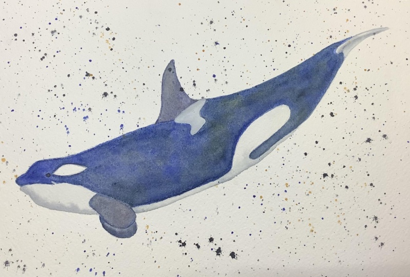
2. Class Project: Hello everyone and welcome back. In this lesson, we'll take a closer
look at the project that we're going to
do for this class. At the end of the class, we'll put our new knowledge
and skills to use by painting a watercolor orca
using just two colors. Well, I will be using
transparent pyrrole orange from Daniel Smith and phthalo, blue, red shade from M Graham. You should feel free to use whatever two colors
you think would work best after trying your
different color mixes. To create this painting, you'll need an
outline of the orca, a piece of watercolor paper, some brushes, your
two chosen paints, and some other basic
watercolor supplies. I go into the supplies in more detail in the next lesson, so be sure to review that
before getting started. We'll mix up a couple
of neutralized colors, which you'll learn
about in Lesson 7. We'll take the orca
one step at a time, starting with the
white and gray areas. Moving on to the fins, and finally painting
New York as body. Well I'll explain my
choices as we go along. I hope you see those
as just suggestions and not a set of rules
that you have to follow. I encourage you to make your own creative choices as you see fit. To get started, check out
my next lesson on supplies. That way, you'll be sure to
have everything you need and you'll be ready to make
the most of the class. With that, I'll see you
in the next lesson.
3. Supplies: Hello, everyone,
and welcome back. In this lesson, we'll take
a look at the supplies you need for this class. First, let's start with
more general supplies. You want at least
one cup for holding water and I recommend
that you have two. The first cup can be used for rinsing the bulk of
paint off of your brush, and then the second cup
is used for clean water. You can also give
your brush a rinse in this second cup to better
clean it between paints. If you have pets at home, I also recommend using
a lid on your water when you're not using it
and that will help to keep curious pets from
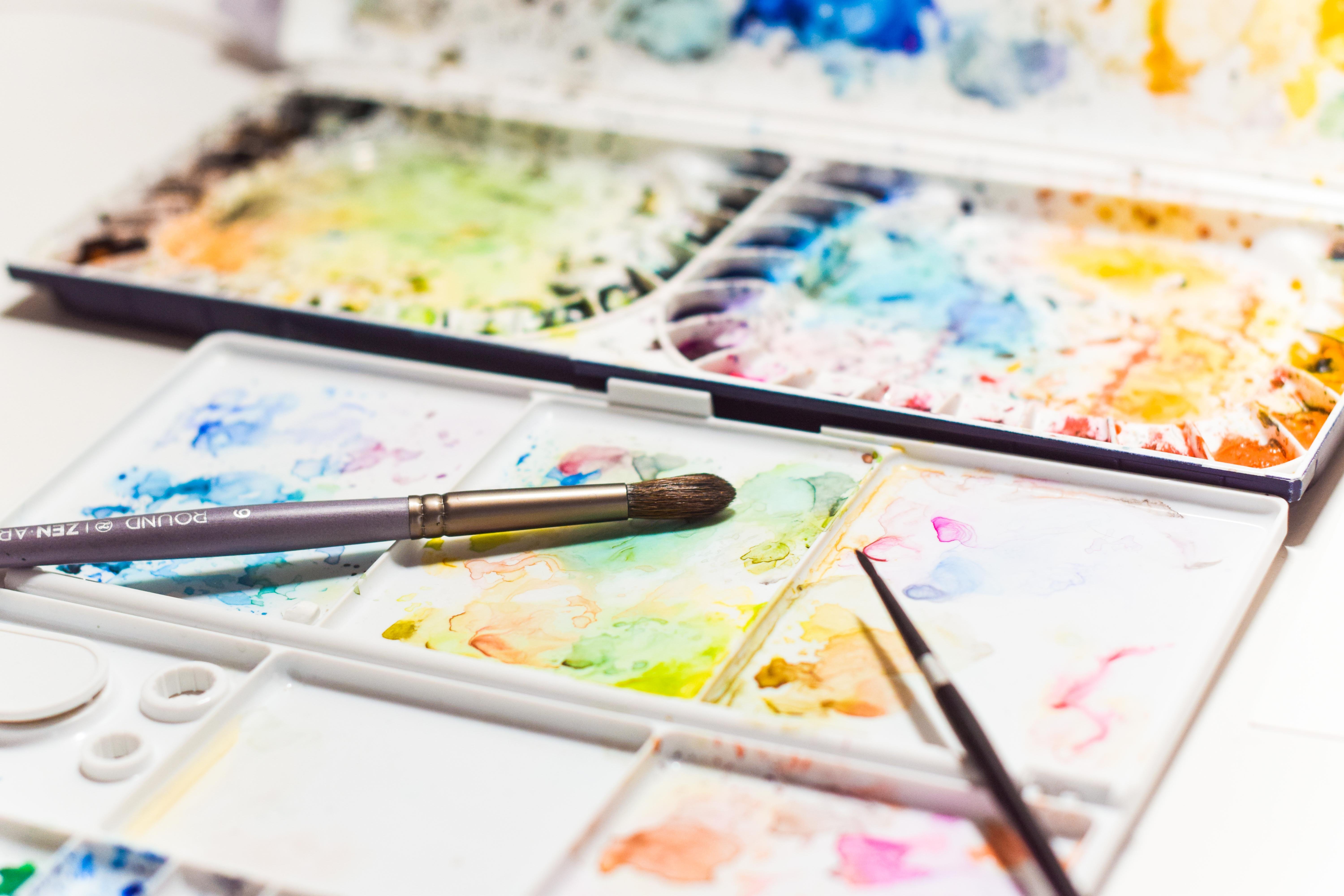
drinking your paint water. You want a palette for
holding and mixing colors. I enjoy this Mijello 18-Well
palette for holding colors. I personally prefer
to mix on porcelain, so I also have this Richeson flower porcelain tray
for color mixing. Also want a rag
or cloth on hand. It's great for getting
most of the paint out of your brush so you can keep your water cleaner
and lasting longer. It's also helpful for getting the right amount of
water on your brush. Paper towels are also an option. You'll need a pencil to
transfer the outline of your orca onto
watercolor paper. You have a few
different options. You can get a pencil
such as this one, this is an F hardness I find that it provides
a nice light outline. A mechanical pencil is going to provide you a darker outline. That's what I use for this orca, since I want you
to be able to see my outline really well. Having said that, once
you've made your outline, you're also going to
want a kneaded eraser. That's going to be to
help lighten the outline. It's going be very important on the areas where it's
going to be white, since you'll be able to
see things very well. We won't put any
dark paint there, and so that outline is
going to really stand out. But where we're
going to be putting black like around the
back, this back fin, and other black areas, it's not going to be
as much of a big deal because that black is going to cover up the outline
that you have there. To transfer the outline, you can use graphite paper or you can use a
source of light, such as a light box
or bright window. You can even draw it
freehand if you'd like. Finally, there is the
three big supplies for watercolor: brushes,
paint, and paper. I recommend that you invest
in quality supplies. While you don't
have to invest in the most expensive
supplies out there, keep in mind that low quality supplies
can work against you, which makes painting
frustrating instead of fun. From my personal experience, it was decades before I enjoyed painting because I kept
going for the cheap stuff. Once I invested in
some quality supplies, painting became a pleasure. Let's start with brushes. While some artists have enjoyed working with relatively
cheap brushes, I recommend that you look
out for brushes that specifically say they're
made for watercolor. Watercolor brushes come
in a variety of formats, including natural hair
brushes made of squirrel, sable, and Kolinsky sable, many types of synthetics, and synthetics that
mimic natural hairs. I have found that I
enjoy squirrel brushes, such as Princeton Neptune, which is entirely synthetic, as well as Silver
Brush Black Velvet, which is a mixture of both
natural and synthetic. These are very soft brushes. You may find you prefer a brush with a
little more spring, such as a sable or
Kolinsky sable, so use whatever suits you. I recommend having at
least one larger brush and one smaller brush. I will be using Silver Brush Black Velvet in a
round 8 and a round 2. If you have it, a second larger brush can be convenient
for softening edges. I will have a Princeton Neptune round 8 on hand for this. If you don't want a third brush, you can rinse and use the
brushes you already have. Next, let's talk paints. If you're looking to save money, you can try some
quality student paints, such as the Winsor and
Newton Cotman series. Since I live in
the United States, my personal preference is to buy paints made in my country. It means that there
is less travel, therefore less pollution, and it generally means that the paints are
cheaper as well. I have enjoyed Daniel Smith, M Graham, and Da Vinci paints. If you live outside
of North America, you may prefer to choose brands that are relatively
local to you. When it comes to paper, I recommend 100
percent cotton paper. My personal preference
is for cold press, and I have found
it easier to work with than hot or rough. My favorite watercolor
paper brands are Arches and Winsor
and Newton Professional, the latter of which I
buy in large sheets and cut down to size. On top of these supplies, there are several things
that I will provide to you. You can find these on
the Resources page. These are a list of the
specific supplies I'm using, a copy of the
reference photo which comes from Amaury
Laporte on Flickr, information on credits and
licensing for images and music used in this class, including the licensing
for our reference photo, an outline of the
orca that you can use if you prefer not
to draw your own, and a photo of my
final painting. With this, come join
me in the next lesson where you'll learn a few
basics about color theory. I'll see you there.
4. Color Theory: Hello everyone and welcome back. To begin our adventure in mixing the lively
black and neutral colors, let's start with a few
basics of color theory. We're going to keep
things simple and focus just on the traditional
primary colors. Those are red, yellow, and blue. You probably learned about
these in elementary school. Similarly, you're
likely familiar with mixing two of
these colors at a time, red and yellow make orange, yellow and blue make green, and blue and red make purple. These three colors: orange, green, and purple, are
known as secondary colors. Why do we see the
colors that we see? Well, colors are made up of different wavelengths of light. When we're looking
at an area of paint, what we're seeing are
the wavelengths of light that that paint reflects. When we mix red and yellow, we now have two paints absorbing more
wavelengths of light and reflecting a smaller range of wavelengths that
we see as orange. That's the same when we mix
yellow and blue to get green, or blue and red to get purple. What happens when you mix
all three primary colors? Now, each of the three paints is absorbing a different set
of wavelengths of light. With these three colors, the three sets of absorbed
wavelengths overlap. Essentially, no light is
reflected. Leaving black. This is a very simplified
version of what's happening, but it's all we need to
understand how to mix blacks. Having said that, it's
annoying to try to make three different colors
together and get the balanced just right,
so you get black. How about mixing
only two colors? Remember that red and
yellow make orange. If you start with
an orange paint, you're essentially
already absorbing the wavelengths of
those two primaries. All you have to do now is add blue to get
your third primary. Same for yellow and purple
and for red and green. Notice how in each
of these pairs, they are across from each
other in the color wheel. These three pairs of
colors are referred to as complimentary colors. Now you know how to make
black and neutral colors by mixing complimentary
color pairs. Before we move on
to the next lesson, there's one more thing I
want to discuss so that things will make a bit more
sense as we're continuing. What I'm going to
talk to you about now is warm and cool colors. Red, orange, and yellow are often
referred to as warm colors. If you think about
it, we often think of a warm fire as flickering
with red, orange, and yellow. On the opposite side
are the cool colors, purple, blue, and green. We often think of
cool blue water, cool green grass, and purples can
mimic cool shadows. There's so much more to color theory than
what I just covered. But this is the basics
of what you need to know to be successful
in this class. With that, let's go
ahead and move on to the next lesson.
I'll see you there.
5. Tips and Tricks: Hello, everyone,
and welcome back. Now that we've covered a
few basics of color theory, let's talk more about some other things to
consider when choosing exactly which paints
you're going to use to mix your
blacks and neutrals. The first is granulation. Granulation is used to describe the uneven settling
of paint pigments. Small pigments tend
to settle out evenly, leaving a smooth paint like
in this Quinacridone Rose. Large pigments, on
the other hand, tend to settle out of a mixture, leaving
unpredictable results. You can see a great
example of this in this Green Apatite Genuine, which is made from the
mineral green apatite. It's beautiful, but it's not a great pigment to create
an even black mixture. As a general rule, you'll want to avoid
granulating paints to avoid pigments settling
out of your mixture, leaving you with bits of pigment in clumps that still look more like two colors
than an even black mix. The next tip is to avoid
multiple pigments. Take a look at these
two pairs of paints. You can't tell by looking
which one is made with a single pigment and which one is made
with three pigments. In both of these cases, the single pigment of
the pair is on the left and the one using three
different pigments is on the right. Looking at the Aussie Red Gold, you can probably tell that
it has yellow and red in it, but did you realize it
also has purple in it? This Undersea Green, obviously, it has
yellow and blue in it, but it also has an
orange pigment in it. Now, it's not quite as
important in mixing blacks as it is in
mixing other colors, but just like with
granulating paints, mixing paints with
multiple pigments can yield unpredictable results. For example, what if we take a green paint that is made
with yellow, blue, and orange? Will we get a neutral
color by adding red? Or if we add red, will we end up with an
orangish brown that needs to be further
neutralized with more blue? You're more likely to
have success mixing a single pigment
green with a red. Also, consider soft
versus strong pigments. Soft and strong are my
own terms and I use them to refer to how the paints
interact with other paints. For example, Hansa Yellow
Light is a soft paint. It doesn't take a lot of blue or red to overwhelm the yellow. Here I have one dot
of Hansa Yellow Light and a roughly equal
amount of Phthalo Blue. Let me go ahead and mix
these two together. I do get a green, but it's a pretty
blue-leaning green. It's a very pretty color. However, if I wanted
more of an even green, what I can do is add some
extra Hansa Yellow Light, I think it needs about three times the amount before you start to
see it even out. Get everything
nice and mixed up. Now you have a green that's
a little more middle-leaning and not quite as blue as
this beautiful green is. Yeah, it does take
quite a bit of Hansa Yellow Light
to start to get a change in the green when mixed with something powerful
like Phthalo Blue. When you have strong
pigments like Phthalo Blue, they can easily overwhelm other pigments as
you've just seen. You have to be careful to add just a little bit of a strong
pigment to other pigments, unless you're adding it to
another strong pigment. A great example is mixing Pyrrol Scarlet with
Phthalo Blue Green shade. Both of these are
strong pigments and you can mix
them about equally. In my experience, mixing two strong pigments
results in deep blacks, and mixing with one
or two soft pigments produces shades of gray. They each have their purpose
in watercolor painting. For this class, we'll focus on the strong pigments to
get those vibrant blacks. One final thought, when trying out mixes to make
black and neutral colors, feel free to test out all
most complementary colors. Here's a black mixture that
I have painted out here. It uses a red and a blue color, which we normally wouldn't think of as being complementary. This is Pyrrol
Scarlet, Phthalo Blue, so these are two
strong colors and that's why it makes this
really nice, rich black. I was able to mix them about
equally to get that color. However, even though
they're not complementary, this red leans orange, which is the complement of blue, and this blue leans green, which is the complement of red. Even though red and blue
typically make purple, this mixture is a nice, deep, lovely black color
with just a hint of purple. In the end, don't hold back
when trying out color mixes, jump in and have fun. With all that under our belts, let's see what color pairs
we can choose to create some of those wonderful
mixes that we can use in our watercolor orca. I'll see you in the next lesson.
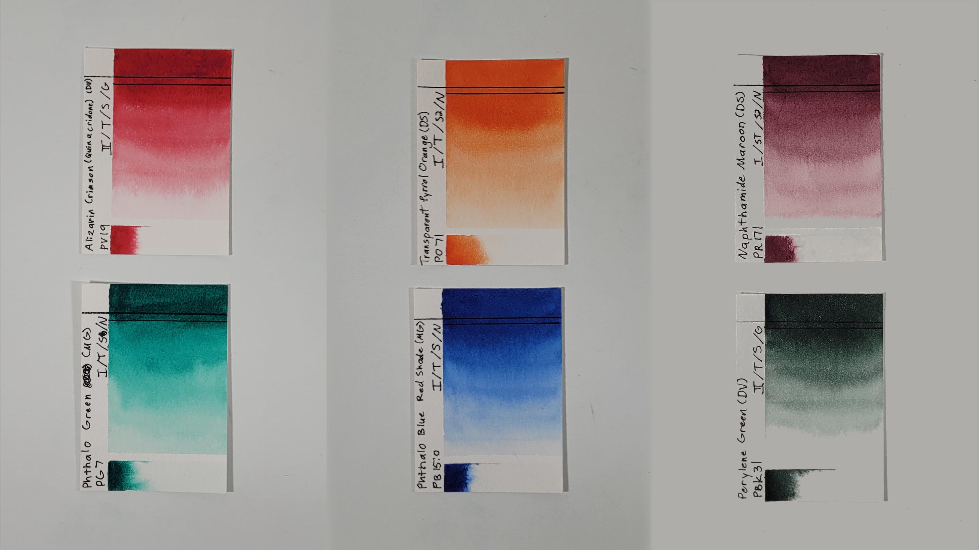
6. Example Combos: Hello, everyone,
and welcome back. We know our complementary color
pairs and we know what to look for and what to avoid
when choosing our paints. Now let's look at some specific color
combinations that we can use based on some of the colors I have in my
personal collection. First, let's quickly look
at yellows and purples. Yellows are often softer colors, so it can be challenging to
mix a deep black with them. You can get some interesting
grays and browns with them, so feel free to try some mixes. Just consider that
they may not be the best choice for this class. Next are reds and greens. These reds have
different strengths. Starting with the
Pyrrol Scarlett, you have a very strong red here. Moving to Alizarin Crimson, you're moving to a cooler shade and this is also more
moderate strength. Moving even cooler, we
get Quinacridone Rose, and this is a nice soft red. So it may not make
the best blacks, but it's great for grays. Then Naphthamide Maroon, it is leaning
towards the purple. It still neutralizes really
well with these greens, so I'm keeping it in the red and it can make some really
nice dark blacks. Moving on to the greens, we have Phthalo Green, which is a very
bright strong green, makes some wonderful blacks. Perylene Green,
interestingly enough, even though it looks green, it is actually a
black pigment, PBK31. That does mean it
makes some really great black colors and it mixes really well with the
Naphthamide Maroon and the Alizarin Crimson. Then just to be complete,
I've got Prussian Green here. It's very similar to the Perylene Green,
not quite as dark. Do keep in mind
that it does have two pigments unlike everything else that
you've seen here. It has PB27 and PY97. But since blue and yellow make green as your primary pigments, that shouldn't be as much of a problem as it would
be with some of the other multi-pigments that
we'll see in this class. Our last traditional
complementary color pair is orange and blue. Here I have red-orange
by Sennelier. Note that it is an
orange and a yellow, so it is one of those
multi-pigment paints that you may want to avoid. I have made some
good mixes with it using the Anthraquinone Blue
that I'll mention later. I have Transparent
Pyrrol Orange, which is a nice single
pigment orange. This Quinacridone Deep Gold, it could also be
considered a yellow. I felt it looked more
like an earthy orange, so I decided to include it here, and it is also a mixture of an orange pigment and
a yellow pigment. Moving onto our blues, we have this Anthraquinone Blue. It's a very nice, deep, dark blue, very strong, and it can make
some lovely blacks. We also have French
Ultramarine here. I use it for mixing some grays, not so much the blacks, but it is something
nice to keep in mind. Phthalo Blue Red Shade. I'm actually going to be using this combination with my
Transparent Pyrrol Orange. Again, a nice single
pigment blue for mixing some of those
strong blacks. Moving on, we're getting
slightly cooler. We've got some
Cerulean Blue Deep, which I enjoy mixing
a neutral gray with. We have Phthalo
Blue Green Shade. This is a little more
green-leaning as opposed to the red
shade, so cooler. Then we finally have
Turquoise here. I have mixed some interesting
neutral colors with Turquoise and some
of these oranges, but again, keep in
mind, this is my only blue that I have here
that is multi-pigment. It has a blue and a green. Again, it might not
always be the best choice for mixing those neutral colors. Not traditional, but you can get some good neutral mixes with
Earth colors and blues. Perhaps the most
classic is to mix Burnt Sienna PBr7 with an Ultramarine such as Ultramarine Blue or
French Ultramarine. In fact, Daniel Smith even has a pre-made mixture of
those two pigments. I also enjoy mixing Terra Rosa with some of these
blues and in particular, this Cerulean Blue Deep. It makes a really deep, dark, rich gray. Not necessarily a black that you'd want to
use for this class, but it really is a lovely color that I
encourage you to try. If you don't have Terra
Rosa from M. Graham, you could also try
using something like Indian Red from Daniel Smith. Just keep in mind that this
is a bit more granulating. I have still been able
to make a good mix with the Indian Red and the
Cerulean Blue Deep. Now that I've covered
some potential mixes, grab your colors and
make your own mixes. I encourage you to pick at
least five combinations. I suggest that you
start off with one of each complementary color pair: yellow-purple, red-green,
and orange-blue. After that, add an
Earth red with a blue. Finally, a wildcard, something that might not be a traditional
complementary color pair, but something you'd like to try. Don't feel restricted
to this list, though. If you have an extra orange
blue pair you'd like to try and you're not really interested in the yellow-purple, by all means, swap them out. If you can't pick just
five combinations, do as many as you like. This is time for you
to have fun with your colors and
see what happens. Once you've picked your
color combinations, paint them out on your paper. Putting one color on the left, its complement on the right, and then the neutral
color in the middle. Feel free to mix your colors on the palette for this
exercise so you can get the balance between the two colors just right
before you paint it out. When you're done painting, feel free to share
this exercise in your project gallery and
let us know what you learned from this exercise and what your
favorite colors are. After that, hop on over to the next lesson where
we'll practice warming up and cooling off our
black mixtures. I'll meet you there.
7. Mixing Warm and Cool Shades: Hello everyone and
welcome back. Now that you've tried out some mixes and found some pairings
that you like, it's time to see what we
can create by leaning our black mixture towards
warm and cool shades. Remember that warm
colors are reds, oranges and yellows, and cool colors are blues,
purples, and greens. When mixing
complimentary colors, you will have one warm
color and one cool color. By adding a little bit extra of one color or the
other to the black, you can lean your
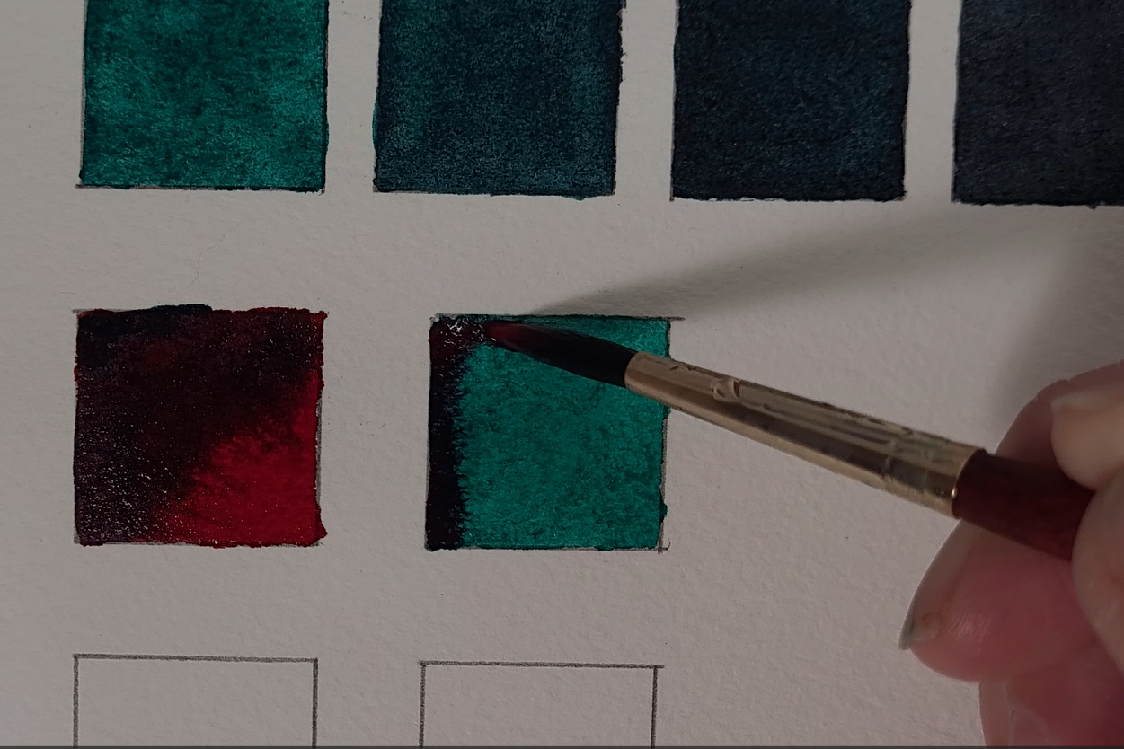
black color into a warm black or a cool black. Here's an example.
I have a couple of mostly even black mixtures made of alizarin crimson
and phthalo green. I've painted one of these out. But then I'm going to add some extra alizarin
crimson to this mixture. Now you can see that
this black looks warmer. That is more red than
the neutral black. If I go to the other mixture and add some phthalo
green to it, now we lean towards
cool, towards the green. This is very helpful when
painting black animals, because often you will see warm and cool blacks
in the animal itself. Even if you don't see these warm and cool blacks
in your reference photo, you can add some interest
and life to your painting by using both warm
and cool blacks. In addition, we can neutralize either color by adding just a little bit
of its complement. Adding a little phthalo green to Alizarin crimson still
leaves us with a red color, but one that's not as
bright as the original, one that has a bit of a
gray or purple tinge to it. You can do the opposite by adding a bit of Alizarin crimson to phthalo green and now you
see the neutralized green. Now that you've seen an example, here's an exercise
for you to try. For each complimentary
pair that you try, paint seven different
colors on your paper. On either extreme, paint, the pure color from each paint. Next, paint the most even black you can
paint in the middle. After that lean
your black color a little bit towards
your warm color and paint that next to the black on the same side as the warm
color that you started with. Repeat that for the cool color. Finally, paint a slightly
neutralized warm color between your warm color and your warm black, and then repeat
that with your cool color. I recommend that
you try this with your three favorite pairs
from the previous exercise. This will help you see
what the range of colors is that you can use in
your orchid painting. Once you see this range, you may find that you have a new favorite
complimentary color pair. Again, when you're finished, feel free to share your
exercises in your class project. There's still a little
bit more mixing for us to do before we get started
on our class project. Come join me in the next lesson, where we'll put our palettes to the side and start
mixing on the paper. See you in the next lesson.
8. Mixing on the Paper: Hello, everyone,
and welcome back. Let's do a quick practice of mixing our colors on the paper rather
than in the palette. This will allow us to make
use of wet-on-wet painting, which can let watercolors
flow at random to create unexpected but
beautiful patterns. This is simple to do. First, lay down your warm color. Then, where you want the black, add some of your cool
complimentary color while your first
layer is still wet. You can blend this out
a bit such that you have a nice black where you initially laid
down your paint, but it fades into a
neutralized color as you move away from that area. You can also just let
the colors flow wet on wet and see what
your colors create. Repeat this, starting
with your cool color. Do this three times, once with each of
the color pairs you used in the previous exercise. As before, I encourage
you to upload a picture of your results
to your project gallery. We've got one final lesson before we turn to
our class project. Next up, edges in watercolor.
I'll see you there.
9. Quick Intro to Edges: Hello everyone and welcome back. Although a review of edges isn't a part
of color mixing, it will be helpful once we start painting our watercolor Orca. Let's take a look
at the types of edges we'll use in this class. First, the easiest types of
edge to make is a hard edge. By loading your
brush with paint and water and applying it to paper, you are forming a hard edge. There is a clear
line where the paint ends and the unpainted
paper begins. Next is a soft edge. There are a few different
ways to make a soft edge. The method I will use in
this class is to take a damp brush and wipe
it across a hard edge. You'll want to do this
while the paint is wet, but not overly so. I find that I usually need
to wipe the area as soon as I can unless I put a lot
of liquid on the paper. some papers will absorb the
paint faster than others. This is one reason why I like Arche and Winsor and Newton
professional papers. I find it easier
to make soft edges with these two brands
of watercolor papers. Finally, kind of an
edge, kind of not. Let's discuss using wet on wet. Wet on wet means that
instead of putting a brush load of paint
and water on dry paper, you're putting it on wet paper. There are varying degrees to
which the paper can be wet. I suggest aiming for
a wetness that has a sheen but still shows the texture of
cold-pressed paper. When you put wet paint
on this wet paper, the paint begins to flow
away from where it's most concentrated in a somewhat
unpredictable pattern. If the wet paper goes out farther than where
the paint can flow, you'll get a nice soft edge. This will be our goal for using
wet on wet in this class. Be aware that if paper reaches
the edge of the water, you'll get a hard edge. For this lesson, practice making all three types of edges. For your hard and soft edges, you can use the
same area of paint. Just leave one side hard while
you soften the other side. Keep practicing the soft edges until you know what level of wet works to get the results you want with your personal
paper and paints. For wet on wet, practice
until you can keep your paint from flowing to
the other side of your water so that you can keep
those soft edges. Again, when you're finished, feel free to share your
exercises in your class project. With that, it's time to
start our class project. Come join me in the next lesson, where I'll plan how
I'm going to paint out my Orca before I
put brush to paper. I'll see you there.
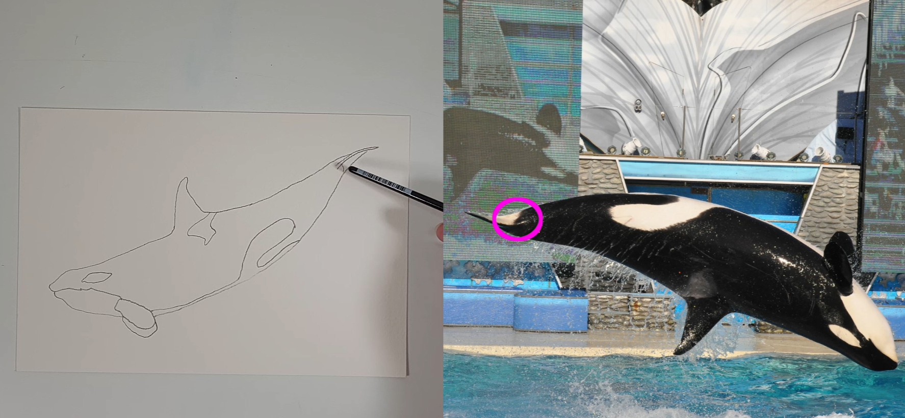
10. Plan Your Painting: Hello everyone. Welcome back. Before we start painting, let's take a look at
our reference photo and make some decisions now, so we can go into our
painting with a plan. First of all, let's consider what we're going to
do with our colors. Keep in mind that cool colors
recede on the painting, and warm colors come forward. On this outline, what is going to be the
thing furthest from us is going to be the
midline of the orca, both on the underneath
and on the back, as well as this back fin. So we won't want to
put warm colors there. This side part of the orca, if it were in 3D, that would be coming out at us the most. So if you want to
use both colors, I would recommend using
your warm colors here, and then you can have your
black along the midline fading towards your warm
color at the center, and then use your cool
color underneath. I personally I'm
going to be using my cool colors for
the entire orca, because I like the cool colors. So I have a very
muted cool color, probably a cool black
rather than a blue for the shadow underneath. Then I'll make sure to
have my blacks along the edge fading towards
that blue in the center. Another thing that you could
consider if you wanted to, is, again, I would still keep
with the cool underneath. But you could also
think of your orca as being heading towards
the surface like that. If you do that, then you can think of this as being a good area for warm, and fade that warm down to
your cool color at the tail. When it comes to color mixing, the colors that I'm going
to want to be fairly even, I'm going to mix on the palette. That's going to mean this muted, probably cool black
again, underneath. This is a light gray, so mix that on the
palette as well, so I can make sure I get the
right color that I want. But for the bulk of this
black area on the orca, I am going to be
mixing on the paper and that way I can get
black on the orca, but still have some of
that blue come through, and then I'll get that nice, interesting wet-on-wet edge as I'm going to be
painting that out. So consider where you
want to use wet-on-wet, or do you want to have it
a little more controlled, and you can mix everything on the palette rather
than the paper. But I think it is fun
to let the colors do what they will on wet-on-wet. Another thing to consider
is going to be the edges. We're going to have
some mostly hard edges. Right here, of course, where the black meets the white, for the most part,
that's a hard edge. However, if you look
at this area here, especially here and here, it does look like a softer edge. There seemed to be
some softer edges around the gray as well. So I'll probably
keep those softer. This is also a little bit
of a softer edge here where we get this white
underneath the flukes. Those are just some suggestions
as to what you can do. Definitely take the things
that you like and keep those. But if you want to do
something different, by all means, make this your own project. Just take a moment
to think about what you're going to
do with the orca, so that you have a plan before
you go into your painting. Before you start your painting, just keep in mind that
you'll want to pre-mix some of your colors. I'm going to premix and
even black mixture, as well as a cool black, a warm black, and partially
neutralized colors. I don't know that
I'll use all of them, but I'll definitely have them on hand for whenever I need them. I also recommend that you test these colors on
your paper first, so that you know you like them. Make sure that you
have an outline of the orca on a piece
of watercolor paper. If you don't want
to draw your own, feel free to use my outline
in the reference section. There you have it. It is time to put
paint to paper. Come join me in the next lesson, where we'll start with the
lighter colors of the orca. I'll see you there.
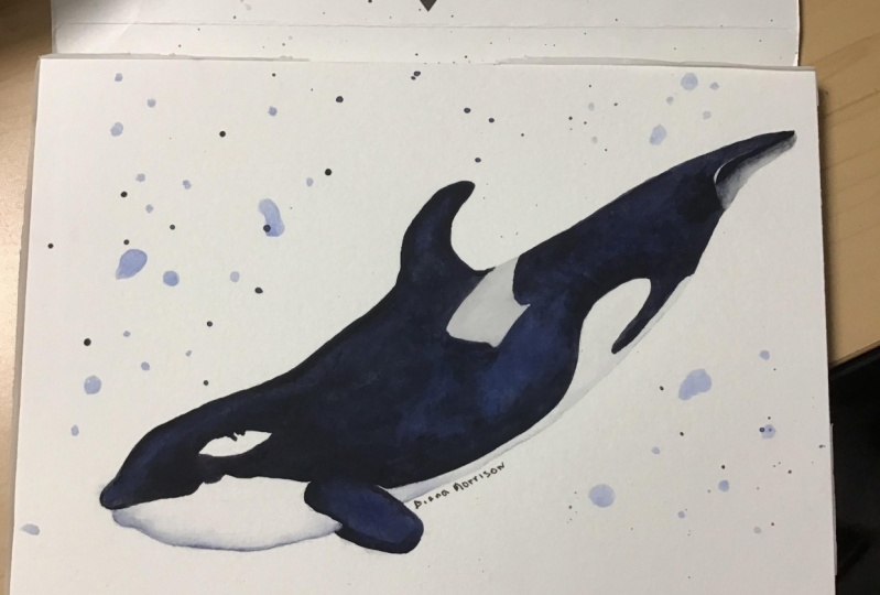
11. Painting the White and Gray: Hello, everyone,
and welcome back. We'll start our painting
by adding color to the white and gray areas. This is important
because we don't want to accidentally brush
up against the black while painting these areas and get a little bit
of black to bleed in. Even if the paint is dry, there's still a risk of reactivating the black
with a wet brush, and it will be very obvious on these areas since we
will keep our colors light just enough to add some edges and
definition to our orca. Let's paint. The first thing we're going to do is
paint this jaw area. I'm going to cover the
whole area with water, and I'm going to make sure
that water reaches up to the edge where
it meets the black. That way I don't end up with any unusual hard edges if my paint should travel
farther than I expect. I want that water to have a nice sheen without
having any puddles in it. Once the water is down, I'm going to grab
a little bit of my cool black and put it
underneath that chin. I'm going to put just a
small amount of paint down and then let it flow wet-on-wet. For this next section,
it's very thin, so I'm going to
rinse out and use my round 2 in order to
get those thin areas. Once those thin
areas are finished, then I can go back to my Round 8 and go back into
the bigger area. I have plenty of water
in this bigger area, so I'm actually going
to dry off my brush a little bit and then
just move around the water that I already have. Once this area is ready, I'm going to grab
some cool black. I'm going to use a little bit
more than I did on the chin because this area is a
little bit more shaded. I'm letting the paint
flow wet-on-wet and I really liked this
little segment here. I think it's very cute. I do think the frontmost area is a little bit
darker than I want. So I'm going to go ahead
clean off my brush, come back, and then I'm just
going to push this paint around to help it be
a little bit lighter. Then I keep in mind that it will dry lighter than it looks now. Then our last bit of white
is going to be here. Again, pretty small area, so I don't mind really
using my number 2 here. One thing that's
different about this area is that because of the flukes and the sunlight coming
from this direction, the dark is going
to be at the top of the white rather
than at the bottom. I'm grabbing my cool black
and applying it at the top. Then I'll just help
to pull that color down to make sure there's a little bit of color in
this entire white area. For this gray patch, I am going to put
down water even though I'm not going to
use wet-on-wet techniques. The water will just
help me to keep the gray dilute and not
let it get too dark. Since we're not using
wet-on-wet techniques, I don't have to
get the water all the way to the edge of the gray. I can wait until
after I've added the paint and then
pull that paint to the edge when it's
a little bit easier to see where my
water and paint are. I'm going to be using my
neutral black here rather than the cool black that I've been using for the rest of the areas. All we need to do now is
make sure that our paint is dry so that we can move
on to the next step. I'll see you in the next lesson.
12. Painting the Fins: Hello, everyone,
and welcome back. Let's move on and
turn our attention to some smaller areas. In this case, we have the
pectoral fins at the front of the orca and the dorsal
fin on its back. Filling in these
small areas can help boost our confidence
before we move on to the larger areas of
the orca. Let's paint. To paint the fins, we will
be using wet-on-wet again. That way we can mix our
colors on the paper. For this pectoral fin, when we put down our water, we don't need to reach
the edges all the way. We're going to be lining
those edges with paint. I'm also going to try to leave the front edge of
the fin lighter to help with the contrast against
the darker fin in back. Once I have my water laid down, I'm going to lay down
the blue paint so that it will be the
predominant color. Whatever color you
want to dominate in this painting is the one that
you should lay down first. Once I have my blue paint down, as it's still bleeding into
those wet white areas, I'm going to add orange. So add my complementary color. That way the colors
can mix on the paper. I'm just going to dot
the orange color in and allow the paints
to flow as they like. That way they'll create some really pretty
unique patterns. Because I want the blue
color to be stronger, I'm going to add a little
bit more blue to the areas that appear to me to be
a little bit too orange. At the end, I'm going
to come through with my two round to pick
up a little bit of the paint so I can have a lighter edge at the
front of that fin. Now I can see a white
spot in the fin where the paint didn't
finish bleeding in, I'm going to leave it
alone and see what it looks like after it
finishes drying. I might like it, I might not, but it's something I don't
need to fix right now. While the paint is still wet, I can use my two round to smooth out the edges of the fin. We're going to paint
our dorsal fin next. Our front pectoral fin needs
to be dry before we paint the back one in order to avoid paint bleeding between the fins. As before, we're laying water down over the bulk of the fin, but we don't need to reach
all the way to the edges. After the water is down, I'm going to start placing blue down along the edges
of this dorsal fin. Ultimately, I want a dark front edge with a
highlight just behind it. Since my blue is a little light, I'm going to use my
neutralized orange to try to balance the blue and
not go too orange. Because my blue is
a little light, the orange is a
little stronger than I'd like it to be,
and that's okay. I'm just going to come back and dot in some blue into this fin. Once I like what I've got, I can use my two round
to smooth out the edges. This gives the paint a
little bit of time to dry. Then when I go back to pick up the paint out
of that highlight, it's a little bit easier, it's not quite so wet and crazy. I want to get that front
edge darker than it is, so I'm going to go over it
again with my two round with a little bit of blue and then a little bit of orange. That way I can get a nice, relatively thin
line back up front. As expected, that fresh paint bleeds into
our highlight a bit. I'm going to go ahead and
pull the paint out from that highlight one more time before I call the
dorsal fin done. Now you may or may
not need to go over your fin multiple times. Your fin is going
to look different from mine and you
might want to make different creative
choices to get the colors just
as you want them. Now I need to check
this pectoral fin. You really need to make sure that it is dry, dry, dry. If it looks dry but it feels a little
bit cool to the touch, it is not dry and it
is dangerous to paint. Dangerous in the sense of you getting something
that you don't want. But if it looks dry and it
feels the same as this paper, this temperature,
then it's fine. I can tell just by feeling it. It looks pretty dry, but it definitely does have a little bit of that
coolness to it, a little bit of that bump to it. So we're going to
give it a few minutes before we come back to it. Now I'm going to paint
the flukes in the back with a very light neutral black. This is because as the
sunlight hits the flukes, there's going to be
a highlight at the top and back of the flukes. I don't want this highlight
to be pure white, so I'm going to add gray just to tone it
down a little bit. To keep it toned down,
I'm even going to use a cloth to pick
up the excess paint and water so that this fluke is as light
gray as it can be. Once the front
pectoral fin is dry, we can work on the back one. I'm going to lay down
water for my wet-on-wet. Then it doesn't need to reach the top edge because that's where I'm going to
put paint down. As long as it's pretty close
to the edge, it's fine. I'm going to start
with blue paint along the top edge
of the back fin, and I want it darker here to contrast with the lighter
edge of that front fin. I had a bit too much water, so I'm using a brush
to pick up the excess. Now I'm coming back with paint
on my two round to give me a bit more control
and get the bulk of the paint right up
against that top edge. When I have it how I like it, I can add the orange to let
the paints mix on the paper. Now I'm just going to
finish that fin by evening out the line of paint. Since this pectoral fin is dry, we can also start on the body. Actually, we need to make sure that dorsal is
dry, too, and it is. I'll go ahead and I will meet you in
the next lesson.
13. Painting the Body: Hello, everyone,
and welcome back. Now we'll move on to the
main body of the orca, and we're going to start
with the head area. Now, ideally, what we want to do is wet the head and
part of the body, and then when we
finish the head, the body will still
be wet so that we can extend that wetness
into part of the tail, then do the body, and then the front of the tail will still be wet so that we can extend the wetness
through the rest of the tail, and you do it in one fell swoop. Having said that,
it's pretty easy to have some area dry out
before you mean for it to. What I'm going to be doing is I'm going to be doing
it with that extension, so wet the body, paint the head. The body will still
be wet enough for me to continue painting
towards the tail. Then even if my tail is
wet enough to continue, I'm going to stop and let
it dry so that you can see what you need to do
in case your tail dries or your body dries. You approach it the same way. You'll get to see
that in this lesson. With that, let's paint. To paint the head,
I'm going to be laying water down in the area. I don't have to get
the water all the way up to my edges because I'm going to be coming through
and putting the paint exactly up against those edges. It'll be easier to see
what I'm doing once I have color on my brush rather
than clear water. I'm going to extend this
water past the gray area, even though I intend to
stop my head area somewhere between the pectoral
fins and the dorsal fin. As I begin to paint the head, I'm going to lay down
my blue color first. I'm going to get pretty
close to the edge with my round 8, but I
don't have to worry about getting exactly up
to the edge until I come back with my round 2 and
smooth out those edges. Once I've got my
blue paint down, I'm going to switch to
my complementary color, that's my orange, and I'm just going
to drop it into those blue areas and let the paint mix
together wet on wet. Once my colors are down, I switch to my number 2
round to even out the edges. Now that I'm finished
with my head, I can see that my body
has a matte appearance. This means that it's too
dry to continue painting. If we try to wet the body
and add paint at this stage, we will end up with blooms
and other unwanted effects. So I'm going to let the
body dry completely to show you what to do if
your next segment dries out too much
before you are ready. I'll show you how to
continue your painting into a wet area when I
finish the body and I'm ready for the tail. It takes a lot of patience to wait for all of this to dry, but it is dry and
now we can continue. Now we're going to go ahead and we're going to put
water up to here or so. So as we start to
add paint here, it's going to go this
direction as well and blend in so you don't get hard edges. But we don't want it to
turn into a muddy mess, so I'm going to use this
Neptune that I have been using. It is a very soft brush. It's really good for
being able to do that. Then I'm going to do my
body until about here, and then I'm going
to do the tail, but I'm going to
pull into the tail this water so that
hopefully I can show you how we're going to move when it hasn't
dried out too much. When you're laying water
down over a painted area, be very gentle so as not
to disturb the paint. It's okay if a little bit of paint reactivates
with the water, but for the most part, we want to keep
the color patterns that we've already created. With our water laid down and extending partway into
the head and tail, it's time to add paint. As before, we'll lay down our dominant color and then
our complementary color. With the gray on the back, we'll keep hard edges
on the backside, but we'll have soft edges
on the front and bottom. We'll leave the large white
pattern at the bottom of the orca with hard edges
just to keep things simple. If you'd rather not have any soft edges on the
gray pattern on the back, that's fine. Just skip the step where
I soften the edges. To make sure my tail stays wet, I'm going to add a
bit of water to it, then come back to dot in my
orange paint on the body. I'll finish up the
body section by smoothing out the edges
with my two round. I'll come back to
soften those edges in the gray section after I let the body dry while
I paint the tail. The front half of my
tail is still wet, so I can safely add water to wet the remaining
areas of the tail. I will not be wetting the fluke, as I will paint that separately. Once again, I will lay down my blue paint and then
follow it up with orange. Now that the body has
had some time to dry, I will add a soft edge to the front and bottom
edges of the gray patch. Use what you learned in
Lesson 9 to make sure your body is dry enough
without being too dry and use a lightly damp two
round to soften the edge. Similarly, when the area is the right amount
of wet and dry, I will add a soft edge
where the black of the orca meets the white
area under the fluke. Now what we have is
this is basically done. I do need to come back and
add some black to that fluke, and then I need to
look at my colors when I'm done and say,
what do I need to do? Do they need to be darker? Do they need to be more
blue, more orange? Whatever fits my
personal desires and whatever fits your
personal desires. So what you and I are going to do is going to be a
little bit different, but you should be able to
take what I'm doing and adapt it to what you'd
like to see in your orca. With that, meet me
in the next lesson.
14. Adjustments: Hello everyone and welcome back. Now it's time to make
our adjustments. I'm not going to show the
details of every step because the pattern is the same. Add water, then add
your dominant color, then your complimentary color, and adjust as needed. So with that in mind, let's decide what to do. I think this orca is very beautiful with
interesting patterns, but I do think it
is a little light. I'm going to go through and
darken each area of the orca. First, I'm going to
paint in the fluke. I've decided to go
with a cool black. As I add the black, I am
careful to leave a sliver of light gray at the top of
the fluke for a highlight. Next, I'm going to
deepen the colors on the front pectoral fin
and then the dorsal fin. I will go back and make sure my highlights on each
fin stay lighter. I will go over the entire
body with additional color. One thing to keep in mind, you can always use your
neutralized colors rather than your pure colors if you just need some
light adjustment. Neutralized colors are less likely to over adjust your mix. I will also re-soften
the edges on both the gray area and
the area under the fluke. Your painting is going
to look different. What you want is going
to be different. You may like having a lot
of excess blue and orange. To really play up those colors, you might prefer for
things to be more black, and if that was the case, you can always come back
through with your neutral black and come a bit more
along the edges using that wet on wet technique and letting it bleed
into the center and have minimal color. There's a few different
things you could do, but that's just what I've
decided to do with this orca. I hope this is helpful for
you making your own decisions as to how you're going to
make your final adjustments. With that, it's time
for us to wrap up and I'll see you in
the next lesson.
15. Wrap up: Hello everyone and welcome back. As you continue
your art journey, keep in mind the main principles that you've learned
in this class. They are pair complementary
and near-complementary colors to mix black and neutral colors. Choose non-granulating
paints and paint with only one
or two pigments. Choose strong colors
to create deep blacks. In the end, don't be afraid
to try out something new. You never know what
you're going to discover. One final thing before
we wrap up this class. I'd love for you to leave a
review for me on Skillshare. When I hear from my students
about what they did like and didn't like
about a particular class, it allows me to make changes. Changes that benefit you and other students as I create
future Skillshare classes. To leave a review, just click the word "Reviews" underneath this video
and to the left, then the "Leave Review"
button on the right. Once again, thank you for
joining me and I look forward to seeing you in another Skillshare
class. Bye-bye.
 Lyndsay Newton, Wildlife Artist in Watercolors and Felt