Transcripts
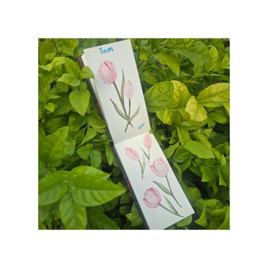
1. Class Introduction: These tulips look good. They're soft, they're simple, but it feels like something
is missing, right? It's not the color,
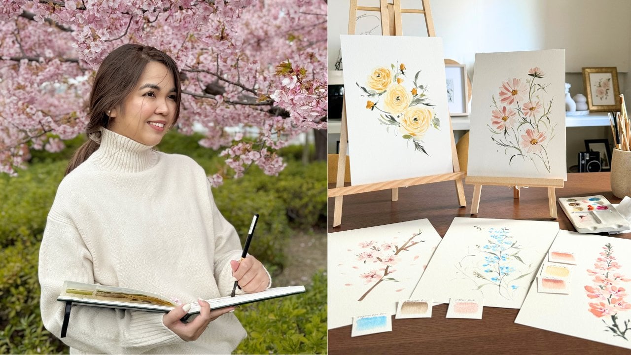
it's not the shape. It's this shadows and texture. Hi, I'm Jenny Flores, an artist, creative mentor, and a top
teacher here on Skillshare. I've taught thousands of
students around the world through my online classes
and in person workshops. On Instagram, I share my work
with over 81,000 followers, and I've been honored to collaborate with
brands to create classes and design products that inspire creative
and purposeful growth. And this class we'll
focus on painting tulips, but our goal goes beyond just
getting the shape right. We'll explore how to
add soft shadows and gentle textures that gives our floral some mor
soul and emotion. You'll learn how to create depth with layering
and soft shadowing, add natural texture that elevate your florals and
balance looseness and control with confidence. This class is perfect for
beginners, self taught artists, or anyone whose florals sometimes feel too
flat or lifeless, even when the colors are pretty. So if you're ready to give
your tulips some life, pick up your brush and
let's get started. Thanks.
2. Supplies: In this section, we'll discuss the supplies that we'll
use for the class. First is paper. For the paper, I use my favorite Bao
Hong watercolor paper. This is cold press 100% cotton. The size that I am
using is seven by 10 ", but you can use any size
that you have with you. Next, our brushes. First is the silver crystal
pointed oval brush. I am using size 34. Some brands call this brush
Filbert, but basically, any brush that has
round tip like this would be sufficient
for the class. For the details, I'll be using round brushes in
different sizes. One in size four. This is the ultramni
brush from silver brush, and I love this because
it has pointy tip, so I can add very thin details on the tulips with this one. I also use the size eight
black velvet in some parts. Let's now go over with paint. I'd use the following colors for my paint SchminkaPotters pink, White Knights hematite mist, Holbein Japanese Bush Green, Daniel Smith Undersea green. I always tell my students, you can definitely use
any color that you prefer as long as
it's watercolor. For other supplies, we'll
be ing a cup with water, a mixing palette which
can be either ceramic or plastic and rug or tissue
for cleaning your brush. That's all for the supplies. I can't wait to teach you how to paint. See you
in the next video.
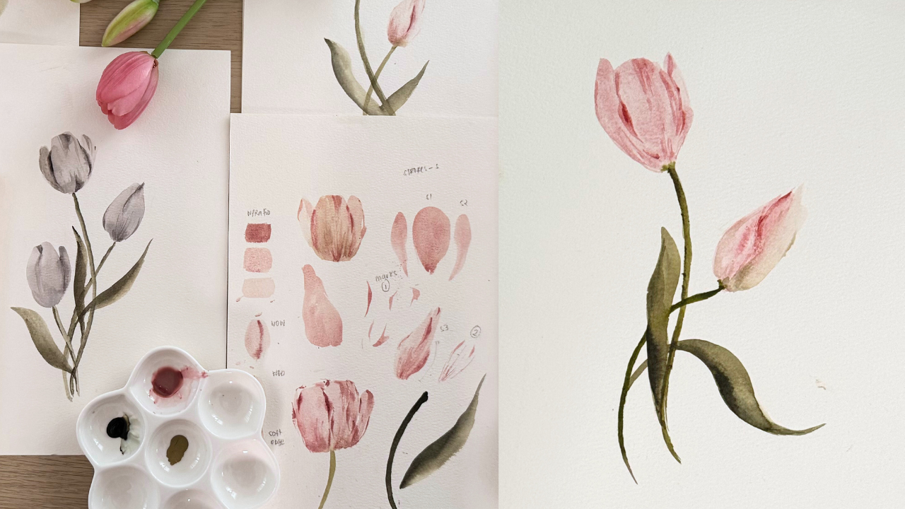
3. Shadows and Texture Why it Matters: Oh let's pause for a moment
and look at this tulip. At first glance, it
looks good, soft colors, recognizable shape, but it still feels a
little flat, right? Like something is missing. Now, compare it
with this version. It has a touch of shadow
and a hint of texture, and suddenly, it feels more
dimensional and more alive. This is the difference
that we are focusing on this glass that small shift from pretty and simple
to dimensional and alive. Together, shadows and
texture bring that life to your florals gently
intentionally and without the
pressure of perfection. Shadows are what makes your florals feel
like it has form. They don't have to be
dramatic, and in fact, in loose watercolors, shadows are more about suggestion
rather than precision. They hint at curling petals or overlapping layers without
spelling everything out. And that's what actually
makes them beautiful. You don't need to stress over the perfect light source or
technical lighting rules. We'll use loose
shadows, soft, muted, placed with intention to help your viewer's eye understand the form while still keeping that dreamy looseness
that we love. Texture is emotion. It can be a gentle
streak left by a slightly dry brush or the subtle lines that follow the flow of the petals curve. Sometimes it's as simple as letting a bit of the
paper show through. These little marks
may seem simple, but they're what
invite the viewer to feel the piece, not just see it. Texture creates
contrast and adds life, and it also balances
out the softness, so your painting doesn't
look washed out or flat. Even the lightest texture can add a lot of feeling
on your painting. The beauty of watercolor
lies in softness, but if everything is soft, it can start to feel empty. That's why we balance it
with just enough shadow to give it form and
just enough texture to give it some heart. Together, these two elements
help your tulips go from plain to poetic without
needing perfection. In the next lesson,
I'll show you some simple
watercolor techniques to help you apply
both shadows and textures with
confidence while still keeping your floals light
loose and full of feeling.
4. Essential Painting Techniques: For the painting techniques, I know it's important
for us to quickly discuss them before we dive
into the painting process, so you get to be
familiar with them again before the
actual painting. So first, we have the
water and color ratio. In watercolor, the intensity of your color depends on the amount of water you
mix with your color. The more water, the less
intense the color will be. To identify the intensity that we need to use for
a certain stroke, easily, let's name and categorize them into
three intensities. The first one is butter. Butter is the most intense one. It has a very little
amount of water, just enough for the paint to
glide smoothly on the paper. And then next, we have milk. Milk is still pigmented, but more watery
compared to butter. And this one flows
easily on paper, but it's not too watery that drying time is
delayed already. Finally, the tea mixture, it's very light and
watery mixture, almost just a hint of
color that we want. This is perfect at the base
of our flowers later on. Again, these are just guides, and the reason why we
are naming them so that later when we paint something
like the base of the flour, it's easier for me
to tell you that, Okay, in this section, we are going to use tea mixture. In this section, we're going
to use butter mixture. So again, these are just guides. This is not a definite mixture that you just need to follow all throughout
your creative journey. So let's try it again
in another color. This time, I'm using the hematite mist from
white knights. Now that we are familiar with
the water and colour ratio, let's move forward to the
watercolor techniques. First is wet on wet. Let's say we paint
a base like this. And while it's still wet, we added a bit of shadow
as the second stroke. You'll notice that the second
stroke dissolves slowly, creating a soft shadow. And on the other hand, the second technique that we
have is called wet on dry. In this technique, we
paint the same base. But instead of adding the
second stroke immediately, we'll wait for the
base layer to dry up first before we add
the second stroke. You can wait for it
to dry up naturally, or you can use a hit gun or a blower to expedite
the drying time. Once it's dry, we'll
add another stroke, and notice that in
this technique, the second stroke is
crisp and not dissolving. For you to see it more
clearly, let's try it again. So this is the wet on wet. And this one is the wet on dry. Now let's move over
to brush strokes. Tolips have rounded tip petals, so using a round tip
brush is such an ease. For the base petals, one of the strokes that we'll
use is called flat stroke. Just snap your brush
from top to bottom, and then you create
something like this. The width of your stroke will depend on the size
of your brush. So if you'll try
a smaller brush, so let's switch the
smaller brush here. As you noticed, the stroke
is the same, but in here, the width of the
stroke that I did is smaller. It's
just easy, right? Now for the next stroke, we'll call it side stroke. With this one, we'll just
turn our brush a bit, and the same way
the flat stroke, we'll snap it from
top to bottom, and you can slightly
turn the direction from one side to another
to create variation. You can also make it from
bottom to the top, if you like. And in this pace, I just want you to explore
and get to know your brush. If you want to twist it a little bit,
that's totally fine. Your brush won't get
damaged with that. And I think it's
very important as a beginner to get
to know your brush fully before you
dive into painting an actual flower so that you can be more confident
in using them. For the next stroke, we'll
use a different brush. This time, we'll explore
the round brush, and I'll use the size
eight for the demo. The first stroke is
thin stroke wherein we'll create thin lines
using the type of a brush, as much as you can
add less stress on your brush when doing this
to avoid thicker lines. And then the next one is
what we call thick stroke. This is where we
slightly lean or brush so that we can create
thicker lines like this. Using a round brush, we can also create strokes like this, which looks like leaves. And actually, they
are the strokes that we'll be using later on when we create the
leaves of our tulips. For the next strokes,
we'll switch to our small detail brush, and we'll just create
brush markings like this, maximizing the body and
pointy tip of a brush. You can start with the tip
and slowly press it to have wider stroke and
then lift it again for another pointy
tip at the bottom. Basically, this is
just the same as the leaf stroke we did
earlier with the round brush. It's just that we are using
a smaller brush this time. The petals of the tulips
have folds and crease, so we'll just practice creating thin C shaped lines
like this so that later we are more confident
and our hands are more light when we create crease
for our petals later. Again, let's do a recap of the brush markings
using a detailed brush. Before we move on to a recap of the whole lesson that
we have in this video, I have two last techniques
that I want to share with you, and these are called blending
and lifting technique. So let's paint the base
petal of the tulip. And for the blending technique, it's basically like wet on wet. So we paint a brush marking like this and with our wet brush, soften the edge of
that stroke like this. As you notice, it's creating
that beautiful ombre effect. So I want you to try it on the base petal that
we did earlier. As you notice, it created a beautiful shadow
effect on our tulip, and it instantly
added dimension. So I'm going to fill
this tulip with more brush markings in different mixture
for my next demo. Okay, now that I'm done with
all the brush markings, I'm going to show you
the lifting technique. So I'm going to wet my
brush and clean it, and then I'm going to lift some of the colors that
I did in the tulip. This technique is perfect if you feel like you made a
mistake or you want to change something or
you want it to be a little bit more cleaner
and not overdone. So lifting technique is the perfect technique that
you can do on that situation. But again, you have to ensure that the base layer or
the layer that you're lifting is still wet when you do this technique because
if it's dry already, you're just going to
lift the paper itself, and it's going to be obvious when someone
looks at your painting. That is it for a review of the different
painting techniques. So we have the water
and color ratio, which are butter, milk, and tea. And then we also did the wet and wet and wet
on dry technique. And then we also went through
different brush strokes and brush markings
that we need to learn to create a tulip. And then we also practice
the lifting technique and other basic techniques that
you need for the class.
5. Painting Tulips: And it's time to
paint some tulips. I'm using a big Filbert brush here and create
two side strokes. I'm using a tea mixture color so your base will be light
and soft in the eye. While the base is still wet, I'm changing into
a detail brush and add a curvy line as my shadow. I'm using milk mixture
here, by the way. I'm switching my brush
again and this time, my size ate black velvet. This is the perfect
brush to create the stem of tulip
because of the size. Make sure your stroke is
steady and consistent. By the way, I use
tea mixture here, then reinforce it with milk
mixture of under sea green. Let this layer dry up. And once it's dry, let's
add another shadow. But this time in butter
mixture of paint. This looks a bit light, but this is butter mixture. Butters pink is
really just light, even if it's concentrated. Now with the same brush, let's add some texture. By the way, this color is in milk mixture because I don't want the texture to
be overpowering. I would also dilute some using
clean brush to soften it. Okay, dry it up once
again, and that's it. One more time in another shape. Base layer again using
the Filbert brush, then sides the two sides. The thing about tulips
is that you can literally decide what pace of
bloom are you going to do. You can do the close one like the first one
that we did or a blooming one like this or an open tulip which is
close to withering already. I'd like to add a bit of
shadow at the bottom. Sometimes while the
layer is still wet, this makes the
connection between the flower and the
stem more realistic. Once it's dry, I'll add
super subtle shadow again. Just light so we won't
overdo the first layer. Starting light gives
you more opportunity to layer up later on. Remember, watercolor
can't be eras, so we have to be careful. Now, let's add the hard shadow. I'm using the color potters
pink from Shmenka once again, and this is granulating
watercolor. So meaning on its own, it already has those
textured finish, which creates a beautiful
efec on your strokes. Adding a bit more texture here. See, it's just subtle lines, but as a whole, it creates a beautiful effect. Let's separate these
two petals, too. Now, add the stem. Again, steady and consistent. Okay, let's try another one. Start again with the base. And then we're going to wait
for this layer to dry up. While waiting, I'll
add the stem already. Using wet on wet
will add shadow. We want it to bleed a little, so this is intentional. Even though it's bleeding, it also creates shadow
and texture on our flour. That's why we intentionally
want to add it. Okay, we're going to dry it up. And now it's time for wet
on dry shadows and texture. Another tip I can give you is to pause and look at your
painting from a distance. You'll have a different
perspective when you do that. You can also put your phone or your phone camera
in front of it, and it's going to be
another perspective too. I'm telling you,
it really helps. So let's do more intense
shadow this time. Oops. That's a bit harsh,
so I'm going to soften it. I'm sure you know this already, but watercolor is unpredictable. I don't expect your work
to be exactly like mine, water and paper will behave differently every time we paint. So as you paint more tulips, be patient with yourself, get to know your
paint, your brush, and water, and explore.
Enjoy the process. Time to add the leaves. I'm going to deepen
the stem first, and then I'm going
to add some leaves. Let's add some
leaves here as well. And also here, you
can start from top to bottom or bottom
to top for the leaves. But remember, tulip leaves
are long and a bit wide, slightly curvy,
but not too much. And that's it for
our tulips practice. Hope you enjoyed exploring it, and I'm excited to create a simple composition with
you in the next video.
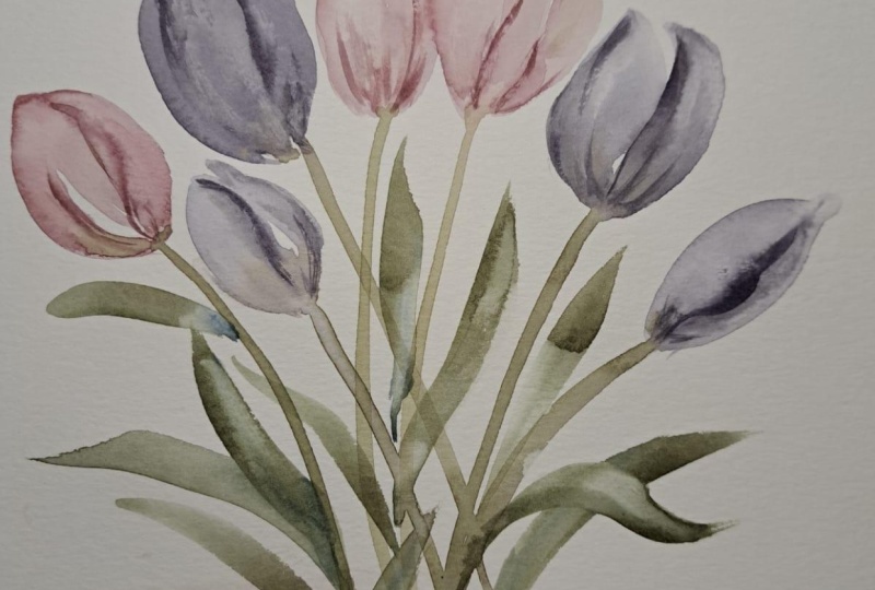
6. Dreamy Tulips Composition: Et's start with the
base of our tulip. I'm using a tea mixture here. Again, you can make another
shape of your base. You don't need to literally
copy the shape of my flower. And also, feel free to check and look for your
own reference photo. Let's dry it up. While waiting, you
can tilt your paper a bit and see how the
pigment settles. Now for my first shadow, I'll be placing it here. And then I'll also add a
bit of extra in this area. And then here as well. Now, I'm going to add
darker shadow here, then soften it a bit, see how our tulip is
slowly getting into shape. Let's add some
more texture here. I really love to add
a bit of texture at the bottom part because as
you notice in actual tulips, there are so many curves and texture in
this area as well. Let's add more division
between the petals. I love how my tulip turned out, and I hope yours is
looking good as well. Time to add the stem,
slow and steady. Make the width consistent
but slightly curve for it to be more
realistic in appearance. You can also pause
and take a look at your petal shape by now. Do they feel balanced? You can always deep in some shadows or sop in
some edges if you need to. You can also add
some more texture. The flour will slowly
take form as we layer, so make sure to
enjoy the process. I super love my tulip, so let's create another one. This time, I'll be
making a closed tulip. So we are starting again with the tea mixture of my color, which is pottery pink. I love to add a bit
of a shadow here. Of course, I'm using the
wet on wet technique. Slowly distributing the colors. And I'm going to add the stem again, steady and consistent. Now to our shadow, I am going to add
this here first. For the closed tulips, the shadows are a bit
fewer compared to more open tulips since the
petals are not yet open. And this is a good time
to pause and check if your shadows are
too light or too dark. You can always go over
some areas again, especially when the first
layer feels too soft. I'm going to add
some connection here for the stem and
the flower itself. So we're gonna let it dry. Gonna add darker
shadow here since the first that we made was
a bit faded already. Now it's a perfect time
to add some texture. Again, use milk or tea
mixture only for the texture. No harsh lines, so it
won't be overpowering. And it's now time to add
the leaves long and curvy. Don't be afraid to
add the leaves. They are there to complete
the look of your painting. And I love adding
a bit of shadow on one side of the stem
as well as the leaves. This adds dimension and
character to our painting. And that is it for our
tulips composition. I hope you enjoy this
simple yet dreamy project, and I can't wait to see
the look of your painting. So make sure to upload them in a project section so I
can check them as well.
7. Final Thoughts: Mmm. We started this class with just one goal to bring more life and death
to our tulips. Not by making them look perfect, not by chasing realism, but by learning to use
shadow and texture. Sob subtle and
full of intention. Because even the smallest touch, a gentle shadow or a few texture can turn flat painting into
something that feels alive. So if your tulips
feel more expressive today than when you
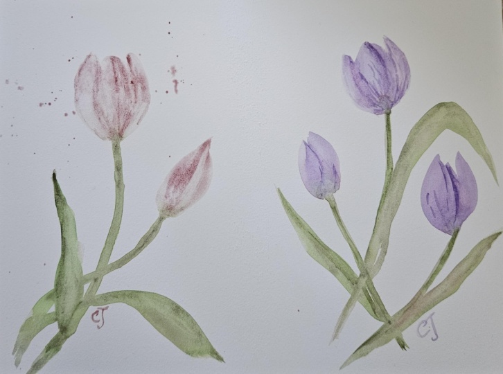
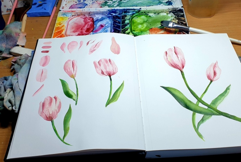
started, that's good. I'd love to see what you
created in this class, so please upload
your tulip paintings to the project gallery. And if this class
help you in some way, please leave a quick review
in the review section. It means so much,
and it also helps some more students discover this space that we
have built together. If you want to keep
learning from me, I have more Skillshare
classes on florals, mini composition, and
loose watercolor painting. Just visit my profile
to simply explore more. Let's also connect on Instagram. Tag me at Jenny
Flores Art Skillshare at Skillshare when
you share your work. Plus, we are running
a special giveaway that I am sure you will love, so visit the discussion
section for all the details. Once again, thank
you so much for joining me in another
wonderful class. It's always a joy to
share what I know, and I truly hope
that you walk away with something new today.
I'll see you in the next one.
 Jenny Flores Art, Top Teacher | Watercolor & Gouache