Transcripts
1. Welcome To The Class!: Hello, everyone. My
name is Will Elliston. And today, we're painting
a joyful field of tulips, although you're free
to let the blooms become whatever flower
you like them to be. This class is all about
artistic license, vibrant color choices, and smooth transitions that
let the paint do the work. We'll keep the shapes
simple and elegant. Then explore how to shift hue, temperature, and saturation
without losing harmony. There's plenty of room for
spontaneity with splashes, drips and loose foliage, while a few clear silhouettes
keep everything readable. It's welcoming for beginners, yet still a playground for experienced painters
who want to loosen up. I've been a professional
artist for many years, exploring lots of different
subjects from wildlife and portraits to cityscapes
and countryside scenes. I've always been entranced by the possibilities of watercolor. But when I started,
I had no idea where to begin or
how to improve. I didn't know what
supplies I needed, how to create the
effects I wanted, or which colors to mix. Now I've taken part in many
worldwide exhibitions, been featured in magazines, and been lucky enough
to win awards from well respected
organizations such as the International
Watercolor Society, the Masters of
Watercolor Alliance, Windsor and Newton, and the SAA. Watercolor can be overwhelming
for those starting out, which is why my goal
is to help you feel relaxed and enjoy this medium
in a step by step manner. Today, I'll be guiding you
through a complete painting, demonstrating a variety
of techniques and explaining how I use all
my supplies and materials. Whether you're just starting out or already have some experience, you'll be able to
follow along at your own pace and improve
your watercolour skills. If this class is too challenging
or too easy for you, I have a variety of classes available at different
skill levels. I like to start off with a free expressive
approach with no fear of making mistakes as we create exciting textures
for the underlayer. As the painting progresses, we'll add more details to bring it to life and
make it stand out. I strive to simplify
complex subjects into easier shapes that
encourage playfulness. Throughout this class, I'll be sharing plenty
of tips and tricks. I'll show you how to turn
mistakes into opportunities, taking the stress out of
painting in order to have fun. I'll also provide you with
my watercolor mixing charts, which are an invaluable tool when it comes to choosing
and mixing colors. If you have any questions, you can post them in the
discussion thread down below. I'll be sure to read and
respond to everything you post. Don't forget to follow
me on Skillshare by clicking the Follow
button at the top. This means you'll be the
first to know when I launch a new class
or post giveaways. You can also follow me on Instagram at Will Elliston
to see my latest works. So, let's get started and turn simple blooms into a
celebration of color.
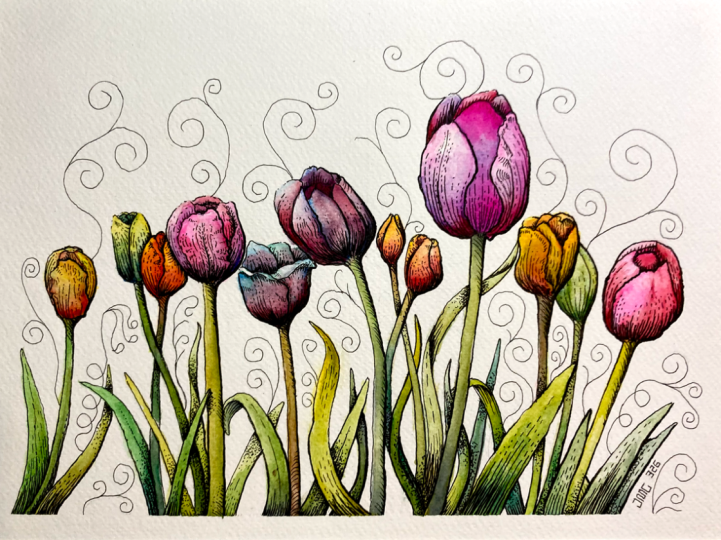
2. Your Project: Thank you so much for
joining this class. I'm very happy that
you're here today. Your painting can be as simple or as adventurous
as you like. Treat each bloom as a
small colour experiment. One petal can glow warm, another can drift cool, and the transitions in between are where watercolour
feels most alive. Stems and leaves are just gestures that support
the rhythm of the flowers. Not a place to get
stuck in detail. You can paint fewer blooms for a calmer composition or fill the page for something
energetic and playful. The aim is to enjoy the process, trust the medium,
and learn how to keep bold colors
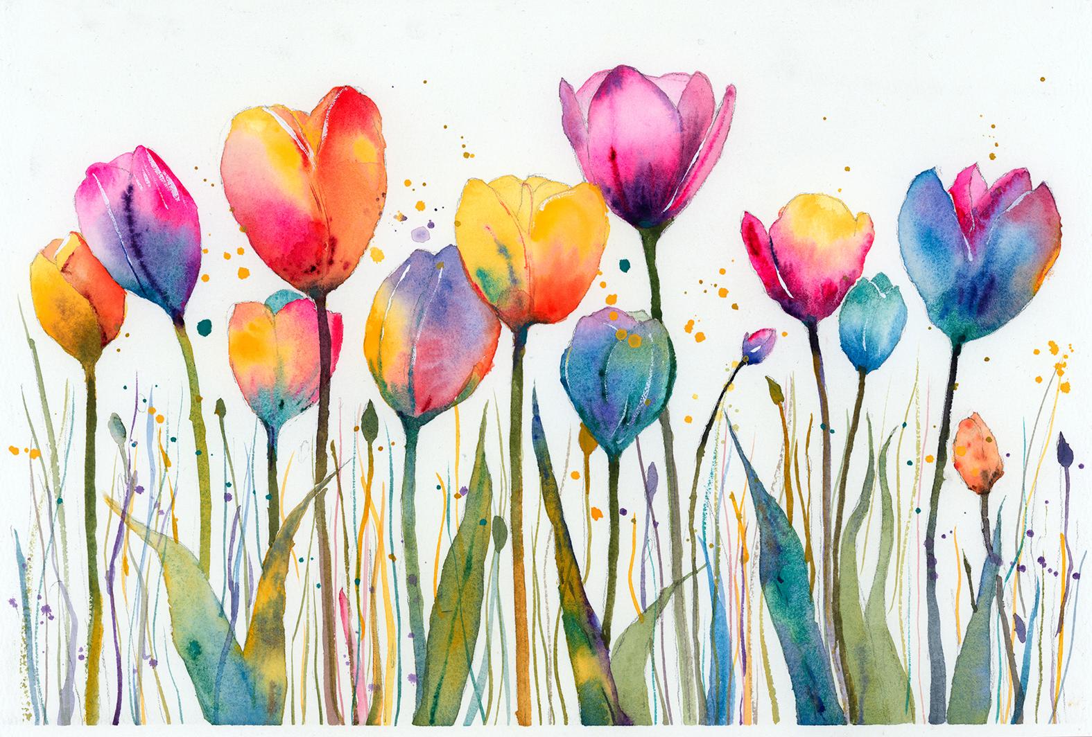
fresh and luminous. In the resource section, I've added a high
resolution image of my finished painting
to help guide you. You're welcome to
follow my painting exactly or experiment with
your own composition. As we're going to be focusing on the painting aspect
of watercolor, I've provided templates
you can use to help transfer or trace the
sketch before you paint. It's fine to trace when using it as a guide for
learning how to paint. It's important to
have the underdrawing correct so that you can relax and have fun learning the
watercolor medium itself. Whichever direction
you take this class, it would be great
to see your results and the paintings you
create through it. I love giving my
students feedback, so please take a photo
afterwards and share it in the student project gallery under the Project
and resource tab. I'm always intrigued to
see how many students have different approaches and how they progress with each class. I'd love to hear
about your process and what you learned
along the way, or if you had any difficulties. I strongly recommend
that you take a look at each other's work in the
student project gallery. It's so inspiring to see
each other's work and extremely comforting to get the support of your
fellow students. So don't forget to like and
comment on each other's work.
3. Materials & Supplies: Before we paint these tulips, let's go over all the materials and supplies you'll
need to paint along. Having the right materials can greatly impact the
outcome of your artwork. So I'll go over all the supplies I use for
this class and beyond. They're very useful to have at your disposal and we'll make it easier for you
to follow along. Let's start with the
paints themselves. And like most of the materials
we'll be using today, it's a lot to do
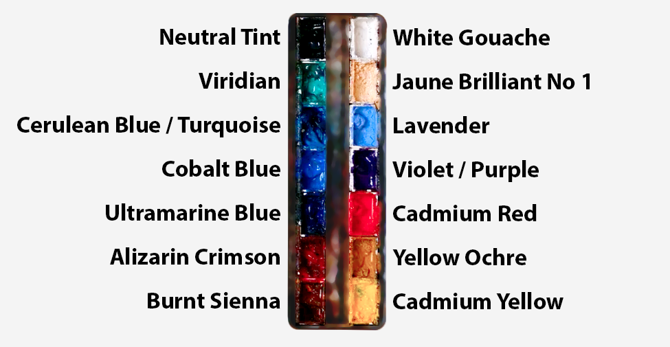
with preference. I have 12 stable colours in my palette that I
fill up from tubes. They are cadmium
yellow, yellow ochre, burnt sienna, cadmium
red, alizarin crimson, Otramarne blue, cobalt blue,
serlean blue, lavender, purple, viridian, black, and
at the end of the painting, I often use white gouache
for tiny highlights. I don't use any
particular brand. These colors you can
get from any brand, although I personally
use Daniel Smith, Windsor and Newton
or Holbein paints. So let's move on to brushes. The brush I use the most is
a synthetic round brush like this Escoda Purl brush
or this Van Gogh brush. They're very versatile because
not only can you use them for detailed work
with their fine tip, but as they can hold
a lot of water, they are good for
washers as well. They're also quite affordable, so I have quite a few
in different sizes. Next are the mop brushes. Mop brushes are good for
broad brush strokes, filling in large areas and creating smooth
transitions or washes. They also have a nice tip that can be used for smaller details. But for really small details, highlights or anything
that needs more precision, I use a synthetic
size zero brush. All brands have them,
and they're super cheap. Another useful brush to have is a Chinese calligraphy brush. They tend to have long bristles
and a very pointy tip. They're perfect
for adding texture or creating dynamic
lines in your paintings. You can even fan them
out like this to achieve fur or feather
textures as well. And that's it for
brushes. Onto paper. The better quality
of your paper, the easier it will be to paint. Cheap paper qwinkles easily
and is very unforgiving, not allowing you to
rework mistakes. It's harder to create
appealing effects and apply useful techniques
like rubbing away pigment. Good quality paper, however, such as cotton based paper, not only allows you to rework
mistakes multiple times, but because the pigment
reacts much better on it, the chances of
mistakes are a lot lower and you'll be more likely to create
better paintings. I use archers paper because that's what's available
in my local art shop. A water spray is
absolutely essential. By using this, it
gives you more time to paint the areas you
want before it dries. It also allows you to
reactivate the paint if you want to add a smooth
line or remove some paint. I also have an old rag or t shirt which I use
to clean brush. Cleaning off the paint
before dipping it in the water will make the
water last a lot longer. It's always useful to
have a tissue at hand whilst painting to
lift off excess paint. Also, you never know when an unwanted splash or drip might occur that needs
wiping away quickly. I also have a water dropper
to keep the paints wet. When you paint, it's
important to have them a similar consistency to what
they're like in the tubes. This way, it's easier to
pick up sufficient pigment. A hair dryer is useful
to have for speeding up the drying time and controlling the
dampness of the paper. And lastly, masking tape. And this, of course, is just to hold the paper down still onto the surface to stop it sliding
around whilst painting. Also, if you plan on
painting to the edge, we'll allow you to create a
very crisp, clean border. And that's everything you'll
need to follow along. I encourage you to explore any color or tool that you want to work
with in this class. Now let's draw out
the tulips first.
4. Preparing The Composition: So to sketch out these tulips, I'm starting off with a
nice soft lead pencil. It doesn't have to
be a mechanical one. You can use any soft pencil,
just light pressure. And I'm starting off by drawing
lots of little circles, and these will be
the flower heads, and they're quite random, trying to keep them well
balanced, but not symmetrical. Then after I'm happy with the arrangement
of those circles, I can start adding the stems, and at the moment, they just
look like little lollipops. And maybe the ones in the
center are more vertical, and as they go to the left, the stems bend a bit
over to the left, and the ones on the right bend over to
the right a bit more. Then we can suggest some leaves as well
down at the bottom. Now I switch over to my
finer mechanical pencil. So the lead is very sharp and you can use a
regular pencil for this, but make sure you sharpen
it so that you've got a nice fine point so that we can start defining
these shapes a bit more. And this is the way we draw
things no matter the subject. You start off with
basic simple shapes just to map out
the spatial areas, and then we go back and refine. And it doesn't matter
whether it's a face, an animal, a landscape. We always break things down into simple shapes and
build on them first. And this will be our outline and guide for the
painting. So let's begin.
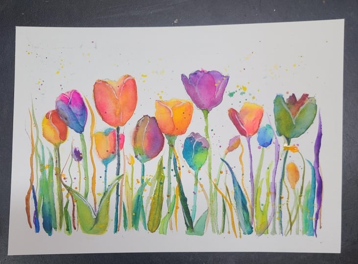
5. The First Flower: I'm going to start off by painting these
tulips one by one. And yellow is going
to be the base color. But before I add any pigment, I pre wet the area
that I'm painting. So using pure water, I wet the paper,
and then I can just drop yellow pigment into there. I'm using cadmium yellow, and there's so many
different types of cabina meellow from
different brands, and it doesn't really
matter what kind. It's all about your
personal preference. You can experiment like I
have with different brands, and in fact, I use a whole different range
and it's not important. So whatever color you feel suits your message or your
preference is perfectly fine. And then we can start building
on more pigment gradually, dropping in and letting
the water do the magic. This is a nice little flower to get us started because we're not going to experiment
with much color. We're just using a
simple cadmium yellow, and then maybe we can work in a little bit of
viridian green at the bottom, more so to give it a bit of a darker tone because yellow doesn't
actually go that dark. So to get that feeling
of volume and shape, and how it transitions
into a stem, we can add a bit more
color down at the bottom, using a bit of burnt
sienna as well now whilst it's fully wet. And we don't need to
agitate it much more. In fact, sometimes to
achieve my greens, I don't use viridian green. I use the blues on my palette. So I just use serian
blue and mixed it with cadmium yellow to make a
natural looking green. And now we can leave that
alone because we don't want to agitate the pigment too much. We want to keep it organic and allow the water
and the pigment to create that feeling that
makes watercolor so special.
6. Playing With Yellows: Let's work on the next one. I'm deciding to paint all the yellow based
ones to begin with, and then we can play around with other colors the further
we get into the painting. So again, starting
off the same way, pre wetting the flour with water and then
dropping in yellow pigment. But this time, we can be
a bit more experimental. Notice how I'm not painting the flower directly
next to the one we just painted because if we're going to have multiple
yellow flowers, we want to space them out a bit. We don't want them
all on one side because I want to
balance them out, especially if we're
going to paint some blue ones or
red ones, pink ones. Once I've filled out this area
with a medium consistency, so the pigments not too
thick and it's not too thin. It's like a medium
wash. And it's, of course, still very wet. And whilst it's wet,
I'm going to drop in this rich red
pigment, cadmium red. Cadmium red is a
very potent pigment because as you can see, you don't actually need
much of it on your brush to influence the
rest of the colors. I've got a very diluted
red on my brush, but when I drop it
onto this yellow, look how bold it
looks in comparison. So it usually overtakes
whatever color is on the paper. So if you're doing a painting that requires a
bit more control, you have to be careful
with the potency of red. But in a painting
like this, it's very freeing because it doesn't
matter if we overdo the red or really
overdo any color because it's all a kind
of expressive palette. We're not being faithful
to tuips at all, really. I've even blotted in some viridian green
on the other side. And I'm working on these flowers whilst they're wet on wet. I don't want there to be any
hard edges at the moment. Just fun transitions, exploiting
wet on wet technique. Adding more pigment at the base, so it's darker at the
bottom, lighter at the top.
7. Yellow and Red: Now we can move on to the
next flower here on the left, arguably the largest
flower head, again, pre wetting the flower. And I'm starting off
with that yellow again. Because I think yellow will
be one of the main colors. At least that's a good
starting off point. Then we can incorporate other
colors into it as well. Because this painting
is really an exercise in exploring colors and how they interact with each other without being strict about any
rules or any color theory. This is less of a botanical
study of flowers and more a celebration of color and how this color can
drift through form. And the tulips are just like little lanterns of
color and light. And each one's going
to be very unique. Think of each one as
a little exercise to experiment
something different. Don't want any of
them to be the same. We want to push ourselves, and maybe some of them
can be more abstract, maybe the other ones can
be a bit more controlled. Allow yourself some
freedom without judgment and without
being too self critical. Now I'm adding some
alizarin crimson into this side, this left side. Let's see how we're blending it out because it's already wet, so all we need to do is
use the brush to slightly agitate and create that
smooth transition. The colors we're using
aren't trying to be literal. We're expressing a feeling a bit like stained
glass in sunlight, creating that feeling
of luminosity. So far, we've just been using warm colors, reds,
yellows, oranges. Of course, we have a
bit of green in there, and later on we'll
incorporate more cool colors. So the magic really
comes from letting warm and cool notes
share the same petal. And we can experiment
with that contrast. Maybe keeping some
petals purely warm, some petals purely cool, and then a few petals
warm and cool. You're free to experiment with everything and
every possibility. And that's what will make
your painting unique, and that's also
what will help you learn the watercolor medium
most efficiently and fast. Because if you were to copy exactly the way I'm doing
things, first of all, it would be impossible
because I'm allowing the watercolor to do
most of the work for me. So I'm not even doing it and it's quite possible to
replicate that exactly. And then secondly, if you're following exactly
everything I'm doing, then you're not allowing your own intuition to work out things and
create your own voice.
8. Pink and Yellow: Onto the next one. And now
we're onto our fourth flower. We can go directly
with the pigment. There's nothing
wrong with starting with pure water to begin with. I do it many times in
most of my paintings. But if you want a faster result, you can skip that and
go straight to pigment. You just have to
work a bit faster because there's a lot
of dry edges there. And as the water does dry, the edge remains hard and gets rid of that
fluid transition. So if you don't wet
the paper beforehand, you have to work
just a bit faster. This flower, I'm using
a bit of opra pink. It's a nice vibrant color. Notice how I keep my opera pink in the
same pan on my palette as my lazarin crimson because I consider it the same
family of hues of color. When mixing yellow
and pink or red, of course, usually
achieve a orange color, much like the other two flower heads we've
already painted. But this one, I don't
want to achieve orange despite using
this pink and yellow. So a way to avoid
that is to allow them to transition into a
lighter color in between. So I've allowed the whiteness of the paper to come in
between the yellow and the pink as they transition so that it doesn't
actually go orange. So they're not actually
transitioning into each other. They transition from yellow, white, and to pink. Now at the bottom, I'm adding
a bit of violet or purple. But again, you don't need to be
strict about these colors. It could be blue because blue on top of this pink will
create purple anyway. Dropping in some
more pigment there. And this little bud at the
bottom, a smaller one. It's not the center of
attention at all these ones. So I don't need to add too much detail just quickly filling it out
with a neutral tone, maybe dropping a
bit more pigment at the bottom to suggest
that volume and form. Keeping it a very well, quite a muted color
compared to the other ones. The other colors
are very vibrant and yellow and pink and red. This one's more
of a brown color. It's intentionally
less eye catching.
9. Cool and Warm Colours: Let's start being a bit
more adventurous now. So so far, we've painted all these flowers in one
single wash, basically, and we've used different tones
to imply different petals, but they're actually all
just one single wash. But this one I'm painting now, I'm going to do in
two different layers to imply different petals. And the advantage to painting
things in layers is that we can use colors that have
high contrast together. This is a turquoise green, slightly bluish green and the complimentary color
to that is orangey red. If we add this green
as an underlayer, and then use a warm color on top of it, it will really pop. And also, we can control
our edges a bit more. So that little green
bit at the top will have a hard edge to
the petal next to it, which will make
more sense when we come back to it later on. But at the moment, we're just laying
down the first wash. Using pure pink for this
flower at the moment, starting at the
bottom and then using water to draw a shape down. And control the strength
of the pigment, really. Because if it starts
to get too weak, I can add more
pigment if I want. But if it's already
strong enough, I can just keep on drawing the pigment down
and spreading it across so that it
weakens it a bit. And then at the
bottom, dropping in some thick pigment
of serlem blue. And one of my
favorite things to do with watercolor is to drop heavy pigment into an
area that's already very wet and then just
allowing the water. You can see right now how
the water just sucks it and spreads it across without
me having to do anything, and it creates a
very organic feel. So I'm just dropping
that pigment in there. And the fun part is waiting and allowing to see how it ends up. Oh it's going to be a mystery because I'm just allowing it to do
what it wants to do, and that's part of the magic, and that's what makes
watercolour intriguing. I also want to quickly
add notice how I'm not mixing most of
these colors on my palette and where I
have used my palette, that's more to get the right consistency rather than actually mixing the colors. Sometimes I want my brush
to be a bit more diluted, so I have to use my palette to mix the water into my brush. I have to use the
palette to do that. But a lot of the time, I'm just taking that thick
pigment directly from my palette and mixing the
colors on the paper itself. Again, using the purple right
now and going straight from the palette to the paper,
keeping things simple.
10. Complementary Colours: And once I have a few
colors on my palette, and usually there's a
lot of water in there, that's where I get
my water from. I don't actually go to my water container
to get the water. I use the water that's
already in my palette, and because there's some
color obviously in that, it keeps all the
colors harmonized. And, of course, it helps to know a bit of color theory because if I have a blue in my palette, and I want to mix a green, I can just take
some green pigment and use the blue already in my palette to create that green. So now we're working on this
second layer of this flower, and I'm keeping a
hard edge at the top. I'm not blending it
into that green, and then I'm fading
it out at the bottom. Using a nice potent pink here and see how that hard edge against the green
really makes it pop. Now that we've painted
quite a few flowers now, notice how it stays
harmonious because a lot of the same color families are repeated across
different tulips. So a pink appears in one flower and then echoes
a little bit in another. Likewise, the yellows are
spaced around some of the reds. We have a little bit
of blue on the left, so I need to think
about incorporating that into some of the other
flowers as we go ahead. And this makes the whole garden, so to speak, feel connected. So you can experiment with
whatever colors you want. But when doing so, try to
think about how you want to balance and spread
those colors around. So it's distributed in a
way that's harmonious. With each of these flowers, the last thing I do before I
move on to the next one is take a very thick bit of pigment as if it's
straight from the tube. The pigments in my
palates are as thick, if not thicker than
straight from the tube. They're not that watery at all. And I like it like that as the very last thing
to do because I can just paste this pigment
onto the petal, and then the water will
dissolve it a bit. And the granulation will
be very interesting. I'll create an
interesting effect. And that's what I'm doing
right now. Quite subtle. I'm not trying to
be bold with it, a few touches of thick pigment. And you can see on each of
these flowers, I've done that. On the left, I've done
it with the purple, red and the flower above, a bit of green in
that central one. Just a tiny few lines
creates that magic.
11. Colour Combinations: Now we can start working on
this flower that's behind. And we've got to think
about what color we want as it borders on to
the next flower above it, because if we use yellow, it'll just look like,
it'll be too similar. There will be no distinction. So I'm using yellow
on this side. But as it connects to the
flower on the other side, I'm going to create
a transition, and I think the most
exciting color to use will be yellow's complimentary color because it'll be in
between two yellows, and that is purple. So I'm mixing a little bit of
purple here, serlean blue. I do have purple
already in my palette, so I can use that as well. And I can use a bit of precision to make sure I
don't cross over that line. So there's a nice hard edge line going down to separate
the two petals. And then this purple
wash can just touch the yellow
that's already wet, and then the water again
will blend it itself. You can see that's a common
thing that I'm doing. I'm allowing the water
to blend where I can. Because as soon as we
start interfering, that's when the magic
gets lost unfortunately. There are times
when you have to, especially when you're
doing something detailed, not so much in a
painting like this where we're exploring
expression and looseness. But if you're doing something
a bit more detailed and realistic where you have to force the exact
transition the right way, then the spirit of watercolor doesn't come out as much, but you get more control. I'm using this orangy red color
just to paint the border, and then we can fill
it out and connect it. The good thing about
wet on wet is, as soon as we connect something, it kind of transitions itself. And it's also fun to have
these happy accidents. Like if there were inconsistencies
in pigment and you create these kind of
blooms or back runs, I think I accidentally dropped
a little bit of water in there that was unintentional. But if you think about
the texture of flowers, sometimes it has that naturally. So it achieves its own
likeness magically by itself.
12. Control vs Surrender: Let me expand on
that idea I just talking about because
we often start watercolor thinking the goal is to control everything.
I know I certainly did. It's perfectly normal
to feel that way. Perfect edges,
perfect gradients, tiny little details. That's totally understandable. We all want security in this medium that feels
very unpredictable. The problem is that if
we stay in that mindset, control becomes a crutch, and we end up tightening and
tightening until there's no room left for the very thing that makes
watercolor magical, the way water and pigment
move on their own. So the real skill is not about forcing
the paint to behave. The real skill is
learning how to cooperate with it,
how to set things up, how to nudge them gently, and the and then know how to step back and let the
medium do what it's best at. And this is why this exercise can be very useful
because it allows for those happy accidents that
freedom to explore this without worrying
about fine detail. Basically, within that border, within the pencil
lines that we drew out, we can do anything we want.
13. Blue and Pink: Of course, detailed is what anchors our eyes when we
look at the painting. So we assume that that's what the most important
thing about a painting is. But after a while, you'll understand that you only need a few
details to anchor it, and the rest can be
quite expressive. And those blooms, backgrounds, accidents scare us, and, of course, we grab for control. And at a certain point, it's useful for beginners because it gives us
familiarity with our tools. We know we need to learn how to control it before we
learn to break the rules, but we certainly don't want
to stay there forever. And often, it can be better to learn how to be expressive to begin with, so that we have that
habit from the beginning, so that we don't
stay there forever, so that we never give the
paint a chance to surprise us. Of course, this is
a unique thing to watercolor because opaic
paints like oil or acrylic, they don't have so much
a life of their own. We generally or traditionally
do everything manually. Whereas with watercolor, pigment particles
float and separate. Water can creep into damp areas, edges soften and spread. And if we try to
fight all of that, we're actually fighting the very nature of the medium itself. When we allow some of those
natural behaviors to happen, that is when we get
glow, soft edges, textures, transitions we could never have designed
with a dry brush. So it's quite a subtle
difference in mindset, but it's quite an
important one to be aware of, even as a beginner. In the early stages, we think, how do I control this wash so
nothing unexpected happens. And then later on, we can start
to change that and think, how do I guide this wash so that the right kind of unexpected things happen
in the right places? Because we are still
making decisions. You still choose where the wet
paper is or how wet or how damp it is and how much pigment use or how thick or
thin the pigment is. But once the water is down, we're willing to let it flow rather than hovering over it, correcting every little edge, allowing the pigment
to do what it wants. We're manipulating
without force. And to do that, we have to improve our understanding
about timing and moisture well enough so that we can nudge
it the way we want, because if we set up the
right circumstances, it can be a bit
more predictable. We know what happens when the paper is very wet and
we add thick pigment. We know what will happen if the paper is almost
dry and we add thick pigment and all the
different stages in between. We're surrendering, putting
faith in the medium and ourselves by influencing
the outcome, but we're not trying to micromanage every
single drop and stroke. And that could be
a useful practice to just allow yourself just
for one painting, at least, if it's very
uncomfortable for you to try not to intervene and allow it to be a muddy mess if that's
what it should become. It's better to go through
those muddy messes and then reel it back in later than
always be too reserved.
14. Being Loose: There's another side of this
coin because we don't want the painting to be completely
loose and messy altogether. So looseness is not
the absence of skill. A loose and
expressive watercolor can look as if it was done
in a few careless minutes. But actually, it's usually
built on a lot of experience. A loose petal that lands
beautifully or even seems inevitable usually comes from someone who already
understands value, edge, timing, even
if they're not even thinking about it
consciously in that moment. Of course, there has
to be a balance. We still need control
in some areas. For example, the drawing, the mapping out of the
actual composition, that's where the control and detail really matters because you're setting up the stage, you're giving yourself a guide, a map to basically allow yourself to be free
in the painting process. Also, having a basic
value structure, that's something we can control and the focal points where
we want the attention to be. Luckily, in this painting, as it's a bit more
of an exercise, everything's pretty much even. We want to be clear around the things that matter
the most, usually. So the eyes in a portrait, the main car in a street scene, these tulips, the heads of
the tulips are going to have much more detail than
the flowers and leaves. And maybe there'll
be one or two of these flowers later on
that I'll purposely add a bit more detail to highlight
them because this contrast of tight against
loose is what makes the looseness feel deliberate
rather than careless. Maybe on some of these flowers, you can purposely try to
create a bloom or a backwash, intentionally make a mistake
to see what they give us. Maybe on the next flower, you can let two colours meet on the paper and resist the
urge to stir them together, see what happens,
see what they do. I've intentionally made most of these petals
warmer than cooler. As you can see, there's
only a few cool ones like this one we're
painting now, which is blue, green. We've got another bluish one
on the right hand side and a few bluish influences
on the left, as well. The main reason for that is that the stems and leaves are
going to be a cool color. They're going to be greens
as well, and blues. So to integrate warms and
cools into this painting, I decided to make the flower heads a bit warmer in general. But there's actually a
whole spectrum of colors. I think we've got
every color family in the wheel the color wheel, we've got yellow, orange, red, purple, blue, green. Pinks, violets, turquoise, browns, even,
absolutely everything.
15. Turquoise Flower: Let's paint this
last flower now. Same principle as before, just with different colors. This time using that
turquoise green at the top, that Faridian kind of color. A nice mid tone. Nothing too dark, not
too light either. I painting round about
halfway. Clean my brush. Then with pure water, dilute it a bit, then start from the bottom
with that thick pigment. It looks dark to begin with. Of course, I want it slightly darker at the bottom anyway. But when it touches that
water of the wash above, it lightens up a
lot, as you can see. And that's how quick it can
be if it all goes to plan.
16. Dynamic Details: Now it's time to go back over some of them to
add a second layer, make it a bit more dynamic. It's not necessary if you don't
want to take it that far. But it's fun and adds a bit more intrigue
to the painting. So starting with this
one on the left, I've gone with a
pure red, which, of course, on top of yellow
will look like orange. And I'm just painting a little petal within
the flower head. To make it feel a little
bit more intricate without too much complexity and taking some dark pigment,
thick pigment, actually. It's not necessarily dark. It's dark only because
it's so thick. And then when I just rub
that into the paper, I just release it on there
rather than blending it, the water will do that for me. Over time, as it dries, it will create a nice
soft edge there. And that orange color
contrast lovely with the blue with the
flour overlapping it. It's a bit too strong there. So I'm taking a thirsty brush, and by a thirsty brush, I mean, a brush that
isn't dry but isn't wet. It's not full of water. I've used my sponge
or tissue to dry it, but not completely, so it can still absorb that
water through it. You can also use a tissue itself to draw out some liquid
if there's a lot of it. Another trick you can do, what I'm about to do right now is use pure water
over some areas, which you want to lighten, allow it to reabsorb
into the pigment, maybe agitate it
a bit like this. And then get a tissue and just
dab it scrub away and you can just take away that pigment and make
it a bit lighter. It I'm using the tip of my brush just to emphasize where these petals overlap.
Not much detail at all. This is what I mean
by it only takes a few simple marks of the
brush to imply detail. And now I've got all these
colors dotted around. It doesn't matter
what I pick wherever. It's more about the tone,
adding a bit of tone at the bottom of these flower heads as they connect to the stem. O.
17. The Central Flower: Now moving on to
this central flower, which is arguably the
most detailed one. And starting off
using that same pink, Alizarin crimson kind of color. But very diluted, basically
just wetting the area that I want to paint in and
gradually as before, dropping in that pigment. This painting has to
make sense tonally. So we can decide what colors we're going to
use, have fun with that. But when we've made
the decision on that, we've got to make
sure that the tones of that color make sense. Of course, it doesn't
take much difficulty for it to make sense when we're being quite
abstract with it anyway. Basically, we want it to be darker at the bottom and maybe the edges around the petals
can be a bit darker just to differentiate them
from the other petals. Because we're using these tulips as containers for
color experiments. So the main goal is just
to have fun, practice. Each little bloom is a little Think of it
as a laboratory for experimenting with warm
and cool transitions or neighboring colors
on the color wheels. It looks wild and vibrant,
but actually underneath, we're still thinking about or exploring and having
fun with harmony, repetition, and
temperature balance. We're certainly not trying to match nature with this painting. We're using nature as an
excuse to play with color. And maybe you don't need
to paint as many tulips. But every tulip is
a chance to try a different pairing or maybe trying a different
pigment that you want to exp. A different way for
pigments to meet and mingle because to be
good at watercolor, well, any medium, you have to know what your medium can
do, the potential of it. And specifically
with watercolor, every single pigment,
every single tube that you buy, has a
different nature. Some of them are a
bit more transparent, some of them are more opaic. Some of the pigments or granulation has a
different nature to it. So by doing these exercises, we can explore what makes
each pigment unique, how strong some of them are, how weak some of them are, because, as I said
at the beginning, red is a very potent medium, and you can explore that
strength in this exercise, and you'll notice how it
overpowers other colors. How cobot blue maybe isn't
as powerful as that. It helps to think of color families rather
than individual pigments. I know when we go to a shop or an art store or even online, they have so many exotic names that I don't even know
how to pronounce, like quactroblue or
Magenta or Thalo blue. Lots of exotic names
that excite me, of course, and I definitely want to buy
them and test them out. But at the end of the
day when I use them, I'm thinking more about
labels like the warm family, oranges, reds, warm
pinks and yellows, the cool families, blues, blue greens, even violets. And then neutral colors
like neutral tint, pain gray, earthy greens
for stems and shadows. And if you're ever not sure
about what color to use, we can simply just choose
one warm color and one cool color from our palette and then let
them meet on the paper.
18. Starting The Leaves: So now we've finished
painting the flower heads. We can start painting the
leaves and the stems. And actually, the way
watercolor works, we could have painted this
the other way around. We can paint the leaves and
stems first if we wanted to because we all have it mapped
out of the pencil lines. So it's your choice which
way you want to begin. The leaves and the stems are actually going to
be easier to paint because we're going to keep the color almost
limited to green. And we're going to use these
stems and leaves to explore the full potential of green
and every single kind of green you can achieve. Just to create a bit
of fun, variety, and green is such a
interesting color because it's a color that we
see very often in nature, but we have well, at least I do, when
I was learning, found it difficult to take natural looking greens or the right kind of
green for the purpose I'm using it for because
we can have greens that are affected by all the other colors,
loads of colors. So we can have a bluish
green, a yellowish green, a brownish green,
a grayish green, a turquoise green,
a vibrant green. And then within those, we can explore the
complimentares, which is red, so mixing red with green until it basically
becomes a gray. So that's what we're going to do with these
leaves and stems. We're going to figure out
every way to make a green we can so that we can
have it in our arsenal and use it as reference
for future paintings. So so far, I've used my
Varidian to use green. Now I'm putting in
yellow ochre and mixing that with cerrillan
blue to make it green. And sometimes there's
such subtleties that when a green
transitions to a blue, when does it stop becoming
green and then become a blue or when does it stop becoming a green
to become a yellow? There's a kind strange kind of transition where
it's a blurred line. It's not necessarily so clear.
19. Colour Experiments: And much like we did
with the flower heads, even more so in fact,
with these leaves, we can really experiment with texture because
we're just filling out this space and then pushing the texture
as much as possible, splattering pigment on there, applying pure water at
different drying stages. It starts off like quite
a flat wash like this. That's the kind of muted feridian green I
just used there. But then we can
start dropping in pure cadmium yellow and
switching that about a bit. That makes it glow a bit,
gives it a bit more warmth. Because green is certainly not just blue and yellow
mixed together. Green is its own little
world by itself. And each different type of
green has its own mood. Whether it's a
fresh spring green, a kind of dull olive green, a deep shadow, a blue green, a minty kind of color, a mossy kind of color. Green is not necessarily color. It's got a whole
spectrum within itself. And they are very
sensitive greens because they can look very
artificial very quickly. Luckily, in this painting,
we're having fun. We're almost pushing
the boundaries of it, so it doesn't matter if
they look artificial. But you wouldn't
necessarily want these colors in a painting that's aiming for realism
or representing reality. Greens are affected by light and the surroundings,
so they shift a lot. H and out of all the colors, it's the one that most
easily looks fake or flat, which is why this
experimentation now deserves extra attention. And when I began painting, and I know a lot
of people do this, we buy a tube of green paint. I certainly did, and well, I thought that that would
just solve my green issues. But those types of greens that we buy in a tube
we can't use everywhere. We have to learn how
to mix our own greens. Blue with a touch of
turquoise gives a very cool, bright, almost
tropical green color, a bit like we have on
the left leaf there. Cobalt blue with
the same yellow, gives a more softer
natural foliage green. So if we were looking for
something more realistic, cobalt and yellow would be
the one that I would go for, and I wouldn't even touch
aridian similar to ultramarine, but that has ironically a
bit more warmth than cobalt. Maybe a bit more muted. It's good for shadows. Then we can start playing with
different yellows with blues. So a lemon yellow, which is much more vibrant
gives a bit more freshness, spring like, maybe
even slightly cooler. And then if we take a deeper
yellow like yellow ochre, that makes it more richer, a kind of earthy leaf color. That's already so
many variations just simply with
blue and yellow.
20. Green Variations: Maybe adding a
touch of magenta or purple into some of the greens
can knock it back a bit. If the green feels too bright, rather than adding black,
add the complimentary, you can add a bit
of red as well. Maybe a little bit of burnt
sienna or burnt umber. That can warm a green up or make it a bit more
earthy, as well. But the reason I use
natural tint rather than black is because as the title
suggests, it's neutral. It doesn't change the
tint so much or the hue. So it keeps that greenness but
just brings it down a bit. Another tip when
working with greens, whether it's a landscape
or anything, a still life. There's rarely a
flat green color. When you look at
something that is green, it's not just a
flat green color. There's variety
inside that shape, that stroke, a pattern. Maybe there's darker hues at the base and then
lighter at the top, or there's a cooler
side and a warmer side. Or you can play around
with any kind of variety, maybe a bit more yellow, where the light
catches the tip or a bit more blue where
there's shadow. You can experiment with loading
the brush with one green. That's basically how
I'm doing it here. I just fill out an area
with a base color of green. This is a kind of classic, slightly muted green color
I'm doing right now. And then I touch it up
with a second color, and it's quite spontaneous. I'm going for a bit of
blue now, serlean blue. And as you pull the stroke, the color naturally shifts
along the length of the stem. And like I said,
light and darkness has an effect on the kind of
green you may want to use. So the lighter side of the
stems will be more yellow. You use more dilution, so more water, less pigment
for the lighter value. And then at the bottom,
the shadowy sides, it's going to be a
bit more blue or earthy and darker pigment. A
21. Painting The Stems: So we've finished with the
leaves now, pretty much. Maybe I'll add a few
more later on once we've applied the stems, which is what we're
going to do now. But it's a similar process. But as these stems
are quite thin, there's a little less
space to play around. We're basically just
painting in these lines. And this can help us
practice brush control because we want to basically
use a single stroke. And the more pressure, the thicker the line will
be the less pressure, the thinner it'll be basically. So practicing our line weight. With a lot of these stems, I'm starting off with a single
stroke and then just using water or a very diluted
wash to continue it down. So there's a nice
little transition. On this one, it starts green at the top and then goes to yellow
ochre at the bottom. These stems actually
add a feeling of stability of support
because they're very upright. There's a lot of
vertical energy. And then there's a
subtle little shift on the left, this one. It bends around because
it's on the left hand side. And likewise, on the right side, we're going to have them
just bending across there. So there's a kind of
outward projectory. Oh I'm not trying to have any two stems
exactly the same color. The same way in reality, no two leaves in a
garden are identical. This can feel a bit
like a fiddly part of the painting because we're just painting in a
small little line here. But it's necessary
part because it does add a feeling of stability and
reassurance to the viewer. I do suggest using a similar brush size
to what I'm using. I won't give you a
specific number because all different brands have different measurements
for their numbers. But you can roughly see
what kind of size it is. This is not a tiny brush,
and it's not a big brush. The problem with a tiny
brush is it would take much longer because you
ain't going to have to go back and forth and
refill it all the time. But this size brush still
holds a lot and keeps a point.
22. Overlapping Elements: Some of these stems overlap
the flowers, and of course, you've got some flowers
that overlap the stems, and this creates this
illusion of depth, and it's not too
difficult to achieve. If we've drawn it out that way, we can just follow
that as a guide. Because we've been following the pencil marks
quite faithfully, there is some sort
of rigidity to it. Of course, within
the pencil lines, we've had a lot of
expression and freedom. But the outline,
the silhouettes of these shapes are quite similar. There's not much variety in edge because they're all
hard edges, these shapes. So after we've
painted these stems, we're going to have to
loosen up some of them, maybe add some splats, which gives it a
feeling of atmosphere, of movement because they feel quite rigid and
still at the moment. Of course, this painting is making the most of
saturation and vibrancy. But there'll be
times when maybe we don't want to paint
something that's so vibrant, and maybe even when
you paint this, your style doesn't really want to be vibrant,
and that's fine. A lot of the times,
neutral tones are more classy and
timeless than vibrant ones. And it's easy to overdo vibrancy because they're
very intense colors. So sometimes it's overwhelming. In an ideal world, outside of these exercises, we want a mix of high
saturation notes in a few key petals, some softer more
diluted versions of the same hues elsewhere, and then almost
colorless neutral tones to give contrast
to that vibrancy. A painting actually feels more colorful when there is
a range of saturation, not when everything
is at full volume. So when it comes to
adding the splatters and some of these stems like
this one right now, there's not much
saturation in there, and that just helps the rest
of them pop a bit more. Bit like the tulips themselves. We've kept a few of them
very juicy and vibrant. And there's a few of them
that are a bit quieter, a bit more pastel or earthy. We can experiment with the different thicknesses
of these stems as well, especially with the small little tulips like
I'm painting now. This adds a feeling
of depth as well. And that feeling
of variety Oops, I accidentally went
past the line there. So if you make a mistake like
this, it's quite simple. Just very quickly
get a tissue and blot it out before
it stains the paper. And then that's it, you can go back over it. And no one would know.
23. Grassy Bits: You may have heard of the
idea of color harmony, but not really being able to figure out what
exactly it means. And basically, it comes down to repetition and echoing
colors across the piece. So the red we use
in one tulip might reappear as a small accent in a neighboring bloom
or even a leaf or stem. It doesn't necessarily
have to be the same thing. If we use a brown somewhere, maybe we can use that brown for the little
splatters later on. Maybe a color that we
use pure like some of these yellows can appear mixed into a different
color somewhere else. So it doesn't have to be pure. It could be mixed into another
one and remain harmonious. Because every time we reuse
a color in a new place, we're in fact tying
the painting together. A bit like in poetry, you have the rhymes, that
word that connects it. Even a tiny little echo, a little stroke of
the same blue in another flower can somehow make the whole row of
flowers feel united. So in other paintings,
as you go forward, rather than reaching
for a new color for each tip or whatever
you're painting, you can ask, which
color have I already used in this composition
that I can revisit here? And if you use a palette, you can just look at your
palette and see what you have there already mixed in. Also, we can think
about compliments without creating that mud. I love working with
complimentary colors. In fact, most of my paintings are based around the use
of complimentary colors. If you look at my classes, I try and arrange the
whole composition around one or two colors that are complimentary because it's
just such a powerful effect. They give a beautiful vibration if we mix them the right way. Sometimes mixing them
together can work, too, because they create
beautiful neutral colors. And we have some play here. We have warm oranges next
to near blue petals, yellow tips near
violet neighbors, a soft green stem connecting
to a red bloom, pink bloom. Lots of times we think
about complimentary colors side by side rather than
stirring them together. When they're next to each
other but not connected, they create a really
striking effect that demands attention. But as soon as they
intermingle and blend, they cancel each other out
somewhat and become neutral. And we can use both of those options depending
on what outcome we want. And again, this class is an opportunity to explore
that and how they work. I'm really excited to see the student project gallery and how many
different variations because I know you all have so many different insights and backgrounds and come from different places
and preferences.
24. Small Buds: To create a feeling of depth, I'm just going to quickly
add a few more stems with tiny little buds on
at various sizes. In amongst all those
little grassy areas. As we are coming to the
end of this painting, you might be aware of
the differences in your paintings and the other
ones in the student gallery. Maybe mine is more chaotic or
maybe mine is more gentle. But yours, mine, whoever's, both are completely
valid because you're discovering your own
personality in this. There's no mistakes
in this exercise. We're not trying to actually
paint a pretty picture. We're trying to explore the
potential of watercolor. That's what these
classes are for. If you tend to be very precise, this is a great subject to practice letting go
of things a little, allowing edges to run and
colors to mingle freely. And if you're
already very loose, you might challenge
yourself to place one or two more
deliberate shapes or dark accents than usual. Of course, there's nothing wrong with matching paintings here. We can use that to
help us learn as well. But if you tend to have
a habit of doing that, maybe we can practice planning a rhythm self
that's quite unique, but follows the same concepts
as what I'm painting. Experiment with controlling
water, trusting soft edges. And the more we repeat
a subject like this, a painting that encourages experimentation with low stakes. The more personal your
variations will appear. And you might find
that you always tilt your two lips a certain way or favor certain color pads, and then you'll know that
for future paintings, you'll get a feeling
for what you like, maybe more vibrancy, maybe
you like more muted tones, maybe you like more texture. Maybe you start off too heavy
and have to bring it back. Maybe you start off too light
and have to add much more. Everyone comes from a
different place in terms of their understanding and
what they want to achieve. Maybe instead of one big
composition for this project, you can split it into
three or maybe draw a line in thirds and do each
section in different styles.
25. Fun Splats: Now here comes the fun
part, the messiest part. So sometimes it can
be intimidating. If you're unsure
about adding splats, you can use a towel or a
few sheets of paper to cover up the flower heads so
that we don't damage them. But I'm adding a few
splats above there, actually, because it adds
a bit more atmosphere. The key to using
splats is to use a brush that has
very soft hairs. You don't want a brush with
rigid hairs because you need that flexibility to
flick that water off. And if the hairs are very rigid, they'll just go everywhere
because you'll use too much force and you'll
have less control. So you can see I've
changed my brush. This It's a very cheap brush. It's not even a famous brand. I just saw it in the store, and it has the
thinnest bristles. So if you want to do
splats, that's the key. And that took me a long time
to figure out, actually. I always used to
mess up my slats. They used to be uncontrolled
and go everywhere because I was using the same brush as the
rest of the painting. And when we talk about these
background splashes here, we're really talking
about all the little extra marks that make the painting feel alive
without turning it into chaos. These splashes are doing more than just decorating the page. They help break that
emptiness of the white. They add a bit more energy, and we can use them
to link colors across the painting
like these yellows. And we're not doing much. I've already finished,
and now we're adding on the highlights. But those splats, they stop the flowers feeling
like stickers on a flat background and instead pull everything
into 1 atmosphere because they had that depth. And, of course, we can't
really see pollen. Well, we can see pollen
from other large trees and things like that
and maybe some flowers, but I don't think you would
be able to see pollen, especially not this thick, but it kind of alludes to that. The placement of these splatters live around the flowers
and the upper stem. It's basically where
the energy is. And they kind of disperse, they get quieter and less
frequent as we zoom out. Although I'm applying
these splats to dry paper, you could even experiment with
wetting the paper first in some areas and then adding the splats onto damp,
almost dry paper.
26. Bringing It All Together: You can think of
these flowers as simple cylinders or cups, slightly lit on one side and a little darker
on the other. And then that tiny value
shift helps them feel round. And when it's darker at
the bottom, as well, gives it a feeling of
light, unified light. Notice how the stems and
grasses are creating a kind of vertical texture that balances the larger horizontal
band of flowers. O we're building contrast
in three ways at once here. We've got value contrast, warm and cool contrast, and soft edge against
hard edge contrast. And that's something we can take forward into any painting. And the white paper around the flowers is just as designed as the flowers
themselves, really. Those empty shapes are
part of the composition. Even though we haven't painted them, we've painted around them. By repeating a color at different
strengths, for example, a strong red in one flower and a pale pink echo in another, we create harmony without
everything looking the same. But we could paint this in a
much more limited palette. Maybe we keep all the
flowers in between red, orange and yellow and just experiment with all the variations
that that can bring. You can, in fact,
take the color wheel, draw two points, and
just experiment with all the colors in between
those two points. Right now, I'm just looking
for a few places where a slightly darker note or maybe a small highlight can help the whole piece
click together.
27. Final Thoughts: Welcome back. And
congratulations on completing this watercolor class on
painting expressive tulips. We focused on clear,
simple flower shapes, meaningful edge variety, and colour transitions that
create glow without fuss. These ideas travel beautifully
to poppies, sunflowers, wildflowers, any bouquet where color and gesture
lead the story. Remember, watercolor painting is not just about technical skills, but also about expressing your creativity and
personal style. I encourage you to continue
exploring, experimenting, and pushing your
boundaries to create your own unique
watercolour masterpieces. As we come to the
end of this class, I hope you feel
more confident and comfortable with your
watercolor painting abilities. Practice is key when it comes
to improving your skills, so keep on painting
and experimenting. I want to express my gratitude for each and every one of you. Your passion for
watercolor painting is so inspiring and I'm honored
to be your teacher. If you would like feedback on your painting, I'd
love to give it. So please share your painting in the student projects
gallery down below, and I'll be sure to respond. If you prefer, you can
share it on Instagram, tagging me at Will Elliston, as I would love to see it. Skillshare also loves
seeing my students work, so tag them as well
at Skillshare. After putting so
much effort into it, why not share your creation? If you have any questions
or comments about today's class or want any specific advice
related to watercolor, please reach out to me in
the discussion section. You can also let me know about any subject wildlife or scene you'd like me
to do a class on. If you found this class useful, I'd really appreciate
getting your feedback on it. Reading your reviews
fills my heart with joy and helps me create the best
experience for my students. Lastly, please click
the follow button Utop so you can follow
me on Skillshare. This means that you'll be
the first to know when I launch a new class
or post giveaways. I hope you leave this
class eager to be more experimental
with your palette and free in your brush marks. I look forward to seeing in future classes until
then bye for now.
 Will Elliston, Award-Winning Watercolour Artist