Transcripts
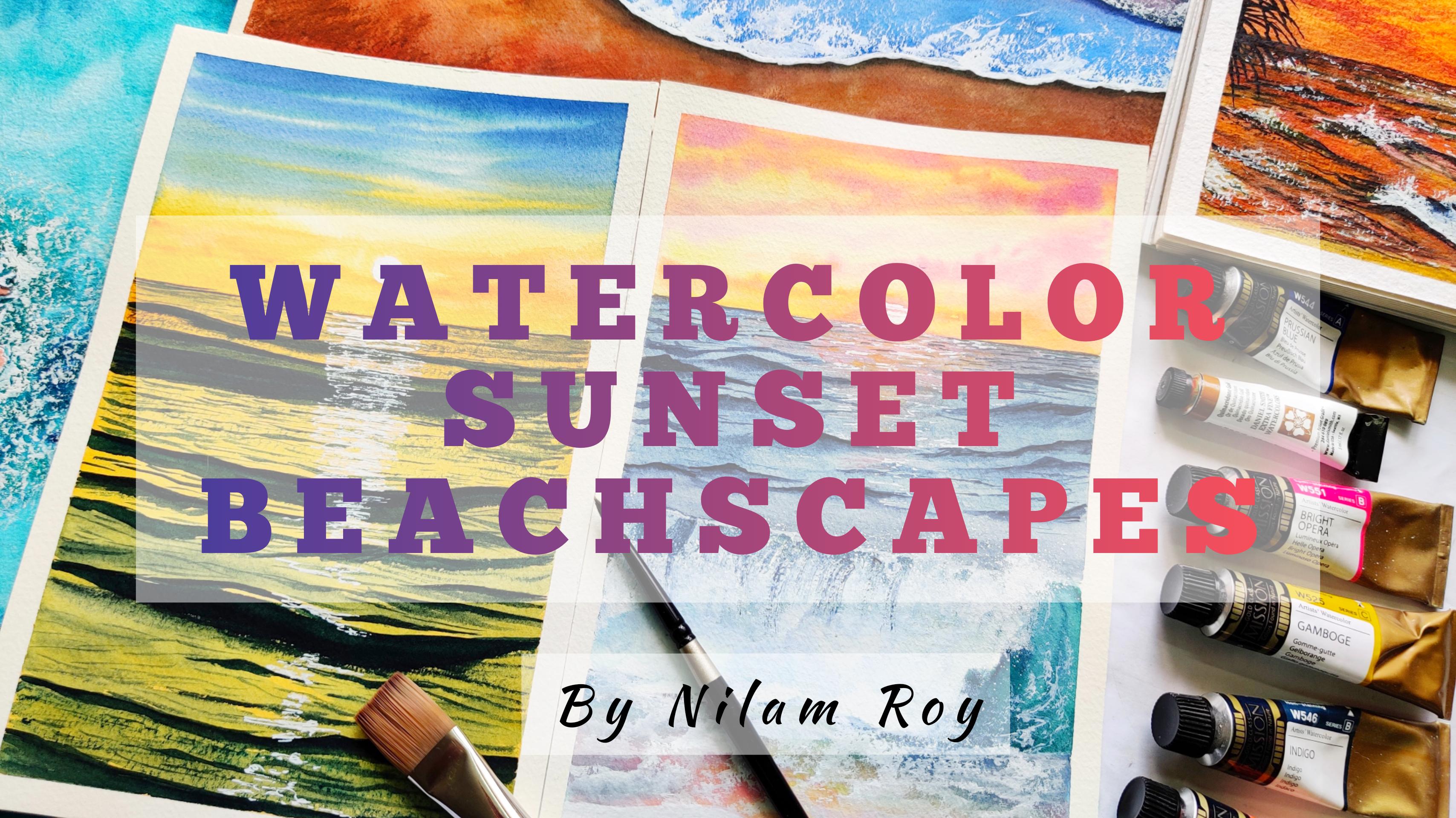
1. Introduction: Isn't it absolutely mesmerizing to see sun going down for the night near the ocean, where the waves dances along the shore with those pretty shapes. So beings orange and blue are you must morays because I am definitely mesmerized. Hello lovely people. This is the lambdoid and watercolor and gouache artists based out of Bangalore, India, who loves traveling and loves to paint sun kissed oceans and beaches. You can find me on Instagram and YouTube by the handle name Neil's RC Cole. Welcome to my very first Skillshare class. If you are a person who loves beaches and sunset, then this class is just for you. In this class we are going to be in this beautiful sunset see escapes with watercolors. I'll be taking you through all the different techniques required to create projects. By the end of which you will be able to create. Here, sunset see escapes. We will go in details about all these techniques that we are going to be using for painting our projects in the project section itself. Are you excited? Because I am definitely excited to teach you this beautiful sunset see escapes. So come join me and let's learn together to create this beautiful sunset see schemes.
2. Materials Needed : Now let's quickly take a look at the materials required for our class projects. So this is a 100 percent cotton paper and this is from Fabriano. Now 100 percent cotton paper has three different textures. One is fine green, the other is medium grained and rough greened people. So this one is wrong, Fabriano, and it's fine green, which is a 100 percent cotton paper with the 300 GSM thickness. Use any paper which is a 100 percent cotton and has at least 300 GSM as its thickness. Now next is watercolors. I love using this white names, and I also stick around with Magellan Mission Gold floods, watercolors because they are such vibrant and creamy colors. Now, these are the brushes that we are going to be requiring for our project. This one is a liner brush from Princeton Neptune. This one is a silver black velvet size number 4 round brush but the pointed tip. The other one is size number eight round brush from Princeton, Aqua laid series. And this is a wash brush. I would choose from Princeton again from the velvet does Series 3 by 4 inches, It's a flat brush. Instead of this, you could use a Hake brush also, I will be using a ceramic palette to mix my colors. You could use any palette that is available with you. Now next we are going to be using a flash. So phase, this is a non-absorbing flat surface typically made up of glass. You could use any flat surface that you have which is not an absorbent. Again, you could use any raw materials that are available. Redu is not necessary to go by the same brands that I have specified here. See you in the next lesson.
3. Basic Watercolor Techniques : Part 1: So you're in this section, we will quickly go through all the basic watercolor techniques that we will be using to create our class projects. So let's go through each one of them and let's get started. Let's have a look at the very first technique, which is the wet-on-dry technique. For this technique, I will load my wash brush with wet paint. So I'm here using a Princeton wash brush, three by four inches, so I will load my damn brush with the wet paint. So your weight is the paint and dry is the people. So we will be loading our layering our wet paint onto a dry surface which is up people. So this is what is wet-on-dry technique. This technique allows you to have more control of the paint on the people. And hence you have very well-defined edges, thereby finding its use in detailing. Now let's take a look at the next technique, which is wet-on-wet technique. And this technique, we apply wet paint with a brush on a wet paper. So we lay down water, clean coat of water on the people. And then with the help offer damp or wet brush, we lead the people with the paint. So this technique allows the paint to flow with the water on the paper. So it's a very beautiful technique and is mostly used for painting large background. Our, for creating beautiful background washes. Your recent example of how you can create a beautiful gradient wash of two colors. Now since I have used two colors, I will go over again with the blue and mix both the colors blended thoroughly and obtain this beautiful gradient wash. Now let's move on to our next technique, which is water control. Now, this is the most important aspect when painting with watercolor as a medium, because with the right amount of water on your people and your brush, you can achieve the desired results more effectively and more easily rather than having an uneven coat of water on the paper and layering, layering that area with the paint. So that will result into a very lumpy and uneven background. So in the next example, I will show you how you can achieve smooth gradient, water colored background, and what is the right amount of water that you should have on your people? Apply the water uniformly and spread the water with the help of your brush as much as you can. The war on the people, this will result in the paper to have a uniform and clean blend of water. So when you lowered your paint onto this wet surface, the play, the paint will blend into the background much more uniformly then that when you have pools of water on the paper. Here is an example of how you can have that right amount of water. I have quartered the paper with water uniformly and now I'm loading my brush with paint and spreading along the wet surface. As you can see, the paint is spreading along the surface uniformly. Now next what I'm going to do is I'm going to gently, gently dab my brush on or tissue towel and Lord, the paint again, the same or darker, more concentrated paint. And I'm just gradually spreading the paint. I get darker to lighter transition of background. Now I will drop my wet brush on another color or a pinned. And I will try to achieve clouds here, but I have too much of water in my brush. As a result of which I am getting this blurred kind of looking cloud, which is not the right way of doing a cloud. So I dab my brush into this tissue and it absorbs all the water that is there on the brush. And then I load the paint onto this background and see the difference that it produced when I had the right amount of water on the paper, on the brush and on the paint.
4. Basic Watercolor Techniques: Part 2 : Let's take a look at the next technique which is bleeding. Now this technique is often missed out by the beginners and they feel to understand what exactly this technique is all about. So your, I have loaded my brush and would paint, and I'm painting a shape out of this and I will show you what exactly does it mean the bleeding of paint. Now, when, as a general theory, when your pin touches of its surface, the paint will automatically expand into that wet surface rate, even if your paper is dry, you are wetting it with the help of your wet paint. So urine, this technique, as you can see, when when my pain that though with surface it expanded into that wet surface. This this is known as feathering of the paint and this is war leading technique is all about. Now. This feathering technique is extensively used in floral illustrations where beautiful soft effects are rendered by age using this technique. Now let's learn about this technique, which is the lifting technique with the help of two examples of staining and a non staining paint. Now, I'll paint can be a standing and non staining. This details can be found on the tubes of the paint. So please check the tubes of the pink when you are using. And for further information, you could also browse the website for the bean details. Now, I am using this indigo and Prussian blue as the two examples for this lifting technique. Now indigo is a non staining paint and Prussian blue is a staining bend. So let's take a look at the lifting technique. Now this technique is very much dependent on the type of paint and the people that you are using. Some papers are more absorbent than the others. And in that case, the paint pigments get easily absorbed by that paper and this trapped inside the fiber of the people. So as a result of which, the lifting technique will not work out because he will not be able to lift out the paint from the papers since the paint pigment is already trapped into the fibers of the paper, irrespective whether your paint is a staining paint or it is a non staining pigment. Here I have quoted my paper written uniform amount of Prussian blue, which is a staining pigment. Now with the help of my clean damp brush, I will try to lift the paint out of that area. But as you can see, the paint has left some bluish mark on the paper and is not clearly lifting out. So this is the difference between using a staining and the non standing pigment. Even if I tried to tried to lift the paint of the paper, it doesn't come off easily. So next we're going to see this lifting technique with the help of a non staining pigment, which is indigo pigment. Now I have quoted the paper with the generous amount of paint. Now, with the help of clean, damp brush, I will try to lift the paint of this portion. As you can see, my paint is clearly getting lifted out and I'm getting the white batch on the people. So this is the difference between a staining and a non staining pigment with the help of a clean, damp brush, you can get the leg back. Glazing technique is a fundamental watercolor technique and is also known by the name as layering technique. So you're basically, we are layering on a lighter shade of a paint, darker shade or on a lighter paint, a darker paint. So I'm demonstrating with the help of VIV. So I have quoted the wave with the lighter paint and I am, I'm dropping in darker shades of green to demonstrate that depth, this is what is known as glazing. Let's take a look at the last and the final technique, which is a dry brush technique. We will be using this technique too frequently for our class projects because this is one of the main technique that we would be using to build our waves. You're in this technique, we will dab, are damn brush on a tissue, paper or towel so that it absorbs all the water. And we will code it then with the paint and we will get this kind of texture on the paper. I hope you guys are all familiar with this basic watercolor techniques. And we will be using some of these techniques for creating our class projects. See you next in my class project.
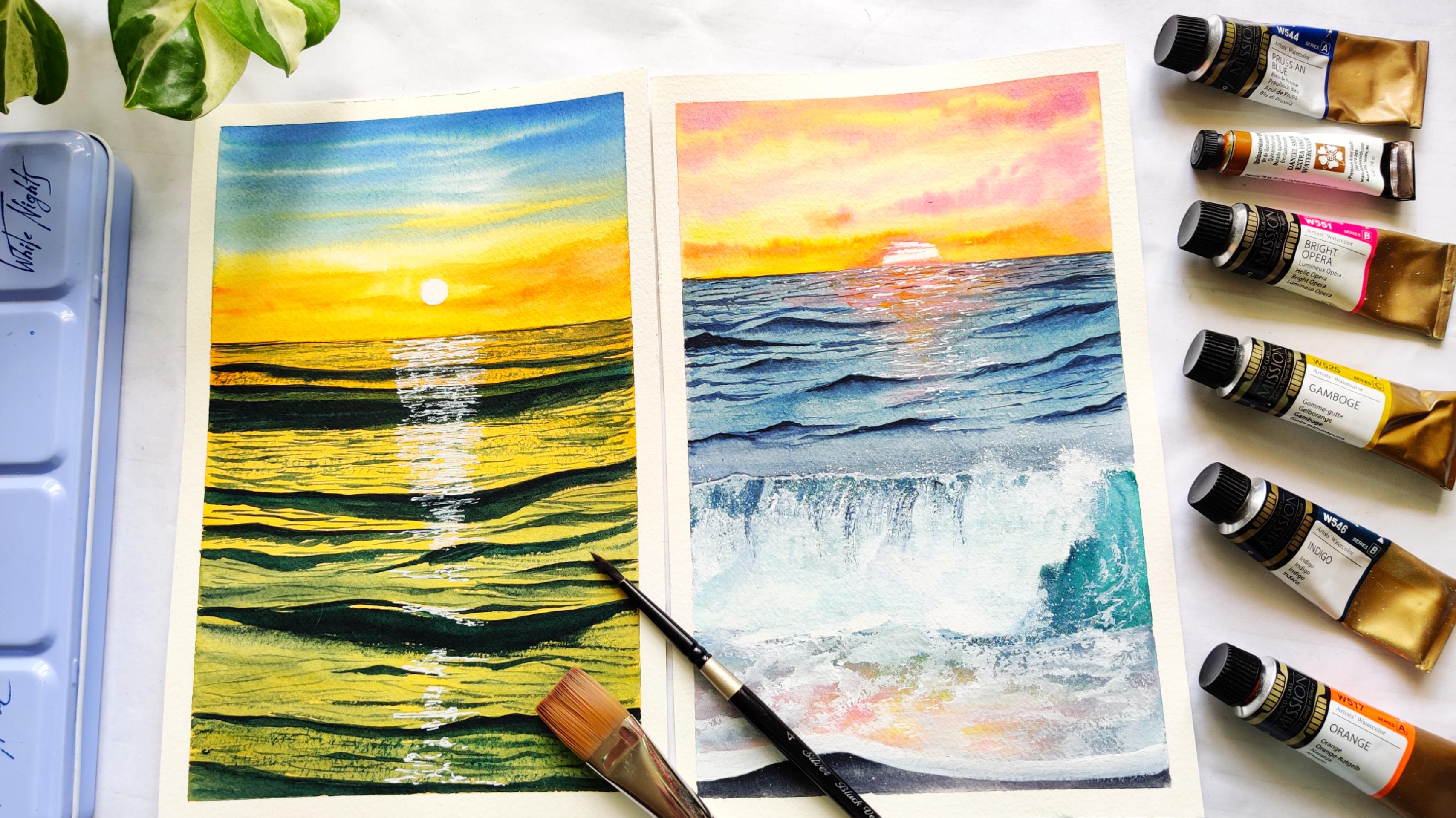
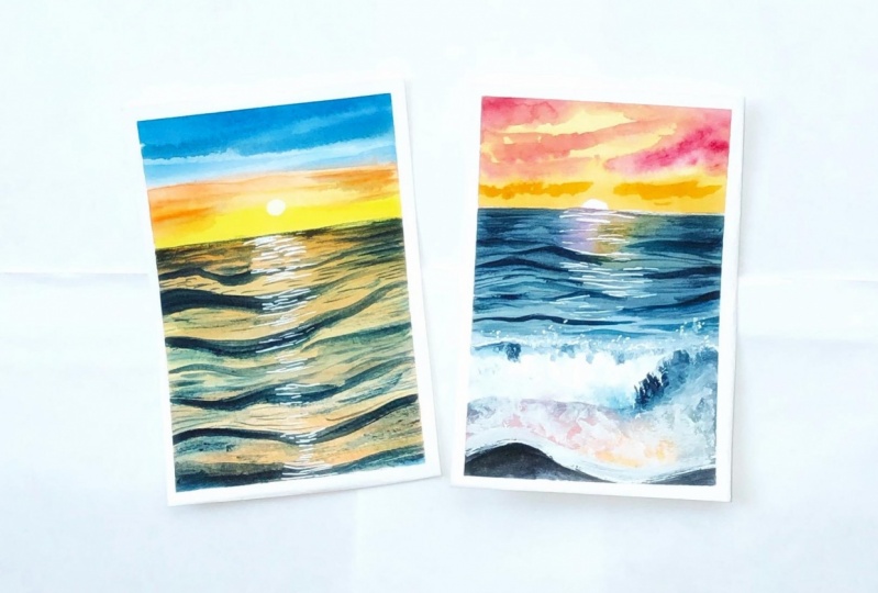
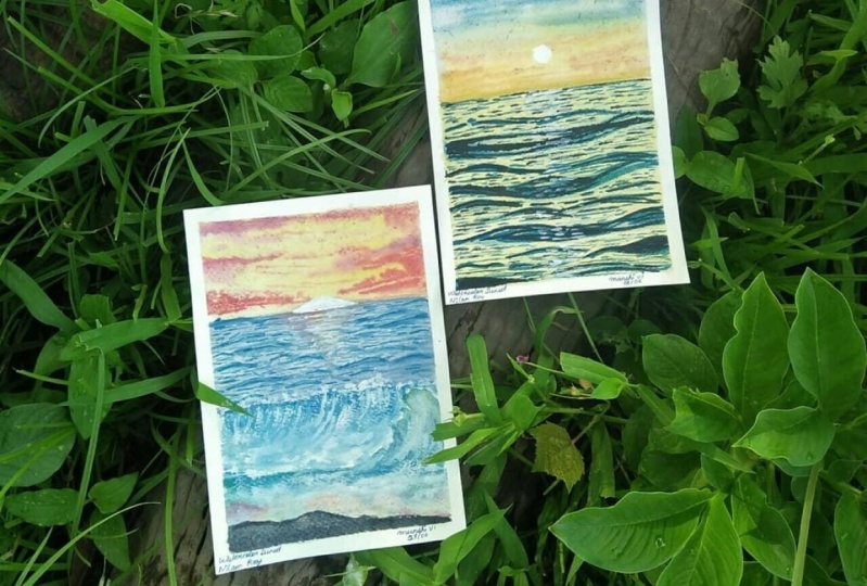
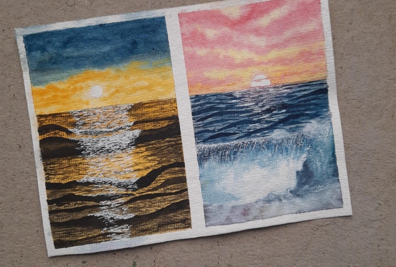
5. Class Project 1: Golden Hour By The Beach- Part 1: Let's get started with the very first project. We are going to be into this beautiful golden hour by the beach. And for that, I have divided my nine by 12 inch Fabriano paper into two halves. That is the size of the people that we are going to be using for this painting. Let's quickly take a look at the colors required for creating our project. I will be using two colors, mainly for creating this project. One is quinacridone, gold color from Daniel Smith. You could use raw sienna or Indian yellow as a substitute for this. Or you could use gamboge yellow. And the other one is indigo. This is also from Magellan Mission Gold Class watercolors and two jars of clean water. Let's begin by dipping down people on a flat surface with the help of our masking tape. I will be pinning down the paper on the board with this deep on all four sides and then gently tagging it with the scale so that the people and the masking Davis fixed on the board for me. Next, with the help of a scale and a pencil, I'll be outlining the horizon line. I'll be drawing a street lane about 1 fourth of the people. And I'll be separating the sea and sky area, and I'll be drawing our sun at the center of the people. Now, I will be starting way sketching, receiving gifts. Now remember to do this part with a very light pencil strokes or shapes because you do not want very dark graphite on lead marks on your paper. You could always use kneading eraser to take off those extra dark marks of your pencil. Okay, Now I'm almost done with my sketch. Just a little more waves on the front near to the shoreline. And we will be soon starting out with the coloring of the sky. We will be going on wet-on-wet technique for the sky. For that, I'll be using this wash brush from Princeton. I will gently dip it in water and the paper with clean water uniformly. And I will make sure that I do not read the full area. I will go around the sun. You could use masking tape, cut it out in a so-called shape ora masking fluid. Masking fluid is always easier if you have it. I didn't want to use it since many of you guys may not have. So I'll just go around the sun and do it in this way. I'm loading my brush with quinacridone gold color. Now don't worry at all. If you don't have this quinacridone gold color, you could always choose some shade which is very close to this color, like permanent yellow, deep or raw sienna or Indian gold color. You know, the combinations are endless. Or if you don't have any of these colors, then you could mix little bit of cadmium, yellow and orange to get this similar tone color. And I'm painting around the sun area. You could either do it in this way or use a masking tape or masking fluid to preserve the area. Or you could use whitewash or white watercolor paint to paint over the area. I'm leaving some gaps in between so that I can later on for literate some Docker Cloud. Next M washing my brush and loading it with beans gray and sorry, this is not feigns grid, this is indigo and I'm mixing it with Prussian blue because this indigo from Magellan mission is very close to that of Payne's gray. That's where I got confused with beans grid. So I'm now starting with the top portion of the sky and leaving in some gaps in between to have cloudy white loud effect within. And I'll slowly, with a gentle movement, tried to fill in the gaps in between the yellow, but this pollution and indigo mix, I'm layering the top layer with another darker dawn of Prussian blue because that's a general rule with watercolors that when it dries, it dries a shade lighter, so don't dock and out the sky to merge. I wanted to have a very bright field of the sky. Okay, so I think that song, I'll be done with this area. Now. I will be painting some flowers with a little bit of darker dawn of quinacridone. And I'll just use a round silver black velvet brush to paint some clouds near to the setting sun and the horizon line. You can see my people has already started drying up. So now your, I'll be showing you a trick where you could avoid having these dark edges once this paper has started to dry out. So you could dip your brush in water and slowly with the gentlemen movement of your brush, you could ease the layers. You're going to slowly blend in the layers into the background. The paper has not fully dried, so I'm able to do this. Okay, So the trick, how do not get those hard dark edges? 12 people has started to dry out. Always use a 100 percent cotton people.
6. Class Project 1: Golden Hour By The Beach- Part 2: My sky area has dried completely, so with the help of a flat brush, I'll be starting out with the sea area. I have loaded my brush with quinacridone, gold color. Use the same color tone that you had applied for this guy near to the horizon. The same color we would be doing for the entire see as a background. Because we are basically painting water and the sky is generally getting reflected on the water. So that is why we are using this quinacridone gold color. And also, if you have so noticed, I am, you're doing the wet-on-dry technique because I do not need the paper to be wet to add my details that, you know, prolong my waiting time in order for the paper to dry completely and then to add the wheels because I want my waves to look sharp. And that's why I have selected this wet-on-dry techniques reading, I should not be waiting for far too long for the paper to dry and thereby going ahead and weaves. I hope now you are able to understand why I have chosen this wet-on-dry technique to being those seat. My people have sufficiently dried out because we had earlier gone with the wet-on-dry technique. So I'm starting out with the Vive structuring. I am, I have mixed indigo along with Prussian blue. And with the help of my silver black velvet brush size number 4, I am going to be bending waves one by one. I'm going to trace along the lines of the pencil sketch that we had done earlier. And I'm just going to keep adding layers one by one. This is more of a glazing technique that we would be observing your eye will be just glazing the layers of indigo on the top part to give it a realistic look because that is how the depth and the shadow will come to play in this waves. And the bottom part of the wave will be darker. And topmost part also since it is behind the sun, but the bottom area is docker. So that is how I'm going to just keep on adding layers one-by-one till the shoreline. And this is a very monotonous and repeated process. So you need to keep on adding layers after layers. There is nothing much to do here other than just keeping on adding the details out your pose. This, we will be adding the smaller wave-like structures in between those bigger leaves. So just keep watching this well, process video has been fast forwarded into a two week speed. So you could always go to the navigation bar menu and increase or decrease the speed as per your liking. So keep watching till we keep on building the layers. Now I'll be starting with this smaller waves. Keep on adding the leaves closer to the Big O VBS. And make sure when you are adding this waves closer to the horizon lane, the waves much smaller because it is a very far distance from you. You really can't see those waves properly, so it will be very tiny or my neutral smaller. So use model brush stokes for Drew doing that. I'm a person who loves painting and actually a person who loves sees and beaches. So painting waves and this kind of beat scapes is like therapy to me. I find it very therapeutic. But if you are not a person who is so patient enough, you might fast-forward this portion. There is nothing much to explain, but as you can see, I'm still continuing the same motion off my brush and adding this weaves one by one. So I'll just keep layering them one by one and pleasing them. So it gives more realistic look. And I know it's a very tedious process of creating this waves. But if you're feeling tired and wanted to take a break, please stop campaign and just go for a cup of tea or coffee break and come back and resume this painting. There is no hurry or Russia at all that you need to do it. Go. I, myself had taken a break when painting this way because it is so like continuous and monotonous painting these leaves. So just take your time and feel free to go for a short break and just come back. Have a look at the painting and see what can be done or the DDS can re-add it. But always made sure that when you are feeling too much, screeners take a break and come back and have a look at the painting and see if you are satisfied with the painting or you need to add in more details. That is always a trick of not overworking and dreaming of painting. So I also do the same. I always tend to overwork some paintings and drew in it ultimately. So I think I'm good and I'll be stopping with this now. Right now, it does almost taking shape properly, but they'll prefer Jelly Roll pen. Now I will be adding in the reflections from the sun. So finally, we are almost towards the end of this class project that in rekindled, add reflections from the sun. Here you could also use the dry brush technique that we had seen on the technique section. So you could go ahead and use a white gouache or white watercolor paint any offered which is available video. And do this dry brush technique. I will show this dry brush technique on the next project. So for now I have selected this Jelly Roll pen and taught to show you that. This is also a way that we could add in these details. So keep painting this reflection's we are almost towards the end and just be a little bit more patient. We're almost done. And he will be satisfied with the overall look of the painting. Sometimes the satisfaction is all that dictates after being doing four hours together. The entire look matters so much and you feel so happy and content that everything has come off well together. But if it has not, never do worry. Now it's finally time to be loud our masking tape, this is the most most satisfying bar. Don't have any BMD, the end part of peeling the Dave and finding that you have guard smooth and clean edges and debate does not run out or sieved into the masking tape. So one side is more than clean. The second site is also more than 13. Now comes yes. This is also fine. I hope the last one is also fine. Yes, it's perfect. See how beautiful the painting is on the agenda. Okay. That's all for this class project will see you at the next lesson.
7. Class Project 2: Pastel Sunset On Beach Part 1: We are on our final second project. And in this project we are going to pin this beautiful piece still seascape. And learn how to pin that roaring and gushing vein. So what are you waiting for? Come join me. For this project. I'm using a 100 percent watercolor cold press people, which is fine grain texture. This is from Fabriano and the sizes little bigger than that of an A5 size. Feel free to use any watercolor paper which has fine to medium green, too rough grain texture. But make sure you use a 100 percent watercolor paper to fetch you the best results. As you can see, I have already taped down my people onto this flat surface. You could use any flat surface, but makes sure that you are using a non-absorbing flat surface to tape down your paper. I am already starting with my rough outline that separators the sky and sea area. And I'm doing this pencil sketch very lightly because I do not want any dark lead or graphite months because that would give me a very muddy and darkish kind of look to my painting. So always avoid using very deep pencil marks or very dark graphite or lead marks. Or you could always have a kneading eraser handy. I generally prefer to go very light with pencils. So your, I'm doing a sketch of the rolling wave that will be her link towards the shore. I am distinctly outlining the roaring wave because this would help me to preserve the white areas that I want in the painting. Because once I start with the coloring of the background as well as the wave, if I do not mark it correctly, I might be missing out and creating an uneven look to the paintings, so it's better that we do it this way. But if you have a masking fluid handy with you, you could always go ahead and mask these areas with the help of that masking fluid. And later on when it dries, you could start painting over it. And in this way you can actually be quite our calculus, you could say, Are, you get for free when you are painting because you need not be always cautious and be thinking of maintaining those white spaces that you want to preserve. Okay, so I will be outlining it quickly. And also, I am always very fascinated about painting this crashing waves. So I thought, why not give this a try for you guys. I have never actually painted are crashing VIV on a fine grained people. This is the first thing that I was bidding on, such as mood fine-grain paper, I hope that it can give me their desirable effect that I'm looking for. I, it's fun to experiment and explore. Let's see whether this is a success. So we are almost done with the sketch. Now, very soon, we will be starting out with painting. And as you can see, I have clearly outlined the shore area and for media where hurling waves are creating the forms. Okay.
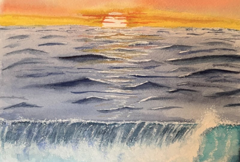
8. Class Project 2: Pastel Sunset on Beach- Part 2: Let's begin painting by applying and even coat of water or not people. I'm applying water onto my sky area. I'm using this wash brush from Princeton. This is three by four. And to wash brush, you could use any flat brush or any round brush with the fat bellied to do this step, it is not absolutely necessary to own a flat brush or an wash brush from the same brand that I'm using here. After quoting though people uniformly with water, our next step is to start painting this guy. For this guy, we will be using cadmium yellow light from White Nights. You could use any yellow that you have. Do I want the sky to have be still kind of flux. So if you have deep yellow, you could always makes a little bit of white in it to have obesity shade of yellow. Here, I'm using my silver black velvet round brush size number 4 to do this step because I want a pointed tip to help me do the outline of the sun as well as being the area above the horizon. I wanted it to be clean and smooth. As you can see, my paper is already started drying out. So I am again quoting clean coat of water onto my surface so that I'm able to keep my people wear it for a longer period of time. Now, this is the most important part that you have to understand that when we are doing wet-on-wet technique, it is of prime importance that we keep up with it for a longer period of time. Orders we will not be able to achieve the desired results because I am bending your sky with clouds now for the clouds to blend into my background colors, I need my sky. Do we read the paper or the surface where I'm painting the sky to be read for a prolonged period of time rate for the colors to blend smoothly into the sky organs what will happen is we will be developing some hard edges of the colors that we are layering on the background. I have loaded my brush with an orangeish yellow here. I'm using the lightest shade of yellow, deep Kahlo. And you could use any cadmium yellow, cadmium orange, mix it together and use a lighter tone of the color and applied to the top section of the sky. Because I want to achieve a gradient wash and a very soft sky. That's why I am not very inclined in using too dark and deep colors for the sky. Now I be ending the clouds. For this, I am using the very pretty a rose quartz color from the white names. This is a very pretty peaceful shared and you can achieve stunning combination of colors by mixing this basal pink color with little bit of orange and you get that beautiful beach looking color. Now if you do not have this beast in pink or the rules called Scholar, you can go ahead and mix a little bit of white gouache or white watercolor paint and turn any color into a peaceful shut. This is the trick. Lake you would like to know how to create based on she'd colors. So this is the trick behind it. Just makes her dabble white color and make this pretty looking a basal colors. Now I'm layering on top of that basal color a little bit of bright rose colors so that my sky is not to paste and done, but it has some bop of colors in there. We are done with this guy. Now we will let the background to get dried completely and then we will be starting out with dark ocean. But please make sure that lead to your sky get dried completely and then only you start with the ocean part artists. What will happen is if the horizon area is still wet and you start applying your weight wet paint on the sky area, it will slowly start moving towards the horizon lead, thereby kind of ruining the look of the sky. Okay, So we do not want that to happen. That's way we will wait for it to dry. And then started playing a clean code of water and making a background wet for the ocean. I fixed my uneven looking son by painting some clouds passing through it. Now, it's definitely looking lot better than what it was earlier before. Now for the ocean, here I have created a very grayish piston looking color. I have mixed a little bit of Prussian blue, a little bit of ultramarine blue and Payne's gray, along with some whitewash to get this beautiful pasted looking color. If you have bins grey with you, you could directly use this pins gray color with some white and achieves beautiful result. Now if you don't have Payne's gray, you could always mix a little bit of ultramarine blue and black because you would obviously have a black water color as the primary watercolor in your watercolor set. So use that black water color and a little bit of glue along with whitewash and you could create this beautiful looking shade. It may not be the perfect shade that you want to get, but it will be very close to this. So as you can see, I have led the ocean with this color. And now I will be starting out with my Vive. So for the wave, I will be creating a sense of depth. So when we want to create a sense of depth, we will be using darker tones of colors. Now, if you have so observed, when the weavers rolling the underneath part of the wave has always that darker shade of bluish green kind of color. So we are exactly doing the same. We are painting that part along with those pencil marks that we had sketched earlier. We are going ahead and drawing those shapes and filling out this shade of color. And slowly, we will be darkening the underground. I'm sorry, not underground. The bottom area of the wave because at the bottom, because there is no light passing through, that will be the darkest region. I'm trying to blend the two layers that has formed. But since we are doing this wet-on-dry technique, it's not blending properly. So in this case, what we can do is we will go again and pores are being dark emerald green area again with some fresh wet paint. So the two layers will then blend harmoniously together. If you want, you can go ahead and do this step using the wet-on-wet technique. You go debate this ADR previously with the hell buffer round brush, and then go and layer over two distinct colors, that is the emerald green and at the bottom portion, Payne's gray. In that way, you will be able to paint and blend these colors together a more efficient manner. This step could also been done with the help of a masking fluid. And you could have gone ahead with the wet-on-wet technique since I did not use a masking fluid to mask my roaring VIV area, which I want to preserve Invite. That's why I have gone ahead and painted this with the wet-on-dry technique. Now if you have masking fluid, you can feel free to go ahead and do the step using the masking fluid, masking over those VIV like structures.
9. Class Project 2: Pastel Sunset on Beach - Part 3: With the help of my wash brush now, I will be lifting off the colored in the same direction that the wave is rolling up and crashing. So I want to create an effect of light and shadow. I want the bottom part to be darker than the upper part. That's why I have lifted the color off. Because if you have so observed are crashing wave, that is how exactly it looks. Now I'm reapplying water onto the surface near the shore so that I can go on with the wet-on-wet technique and blend these colors and darkening the edges beneath that we've more efficiently. I am using the same mixture which we had used earlier to paint the background of the sea. This is a mixture of ultramarine blue, Payne's gray and the white quash. Now, if you have so observed, I'm painting from the corner to the center, leaving the center area to be white. Because I want to, I want my son color and the sunset colors to be reflecting here on this part near the shore area. Because the wave is just bending and crashing towards the shore. I am now trying to lift off some colors from the ADA because I want to pin the reflection of the sun, the sky here. So I'm doing this process. So if you want, you could do the similar way or you could just avoid painting in that area and go directly with the paint. You're in this area. I will be reflecting the sun along with little bit of the sky colors. So I'm going ahead and doing some dry brush pattern with base two, pink and some oranges shade. Okay, but I do think this is looking great at the moment. Let me see if I can fix this up. No, I'm not liking this at all. Maybe I'll scrap this idea and I will go over it. Over then. Wash of water so that the colors can blend into it. So in both the waves, it will give me the effect that I wanted. So I will be darkening the colors more year and bending short waves. They're detailing of dough. Vms will start from your using a liner brush. I'm painting small size leaves here, and I'll be using slanted motion of the brush to show the direction of the wave. Okay. Now towards the horizon I will be painting short waves with the help of my liner brush. Make sure that you use a need detailing brush to do this process. This entire area will be covered with small, small weaves because it does add a distance. You really can't see those waves. So we are being doing it in very small. You could also go ahead and do dry brush strokes on those areas. But since we have applied water and blend it out the colors that tray am going ahead with this small strokes with my liner brush. So I'll be filling the entire EDR with this mall and bigger and medium-sized weaves, I'm using a slanted motion of my brush to do this technique because that is how the waves are moving and rushing towards the shore. This is the same technique that we had applied for a previous project 1 when building those waves in the sunset background. So similarly you are do we are doing the same. Only difference is the colors you are. We are using a softer tone of the color instead of going with the darkest and concentrated, don't make sure that you do this step while your people is still wet over that section because you want the leaves to blend into that background smoothly. That way I had applied that coat of water so that might be burdens wet for a longer time. Now, after this step, we will be adding some more details by highlighting the weaves. We will be using the glazing technique to do so far. Now, we are just trying to create this weaves and rubles. We will be highlighting this waves that we have created now towards the end of a project for now, we will be creating this small, small, tiny ripples and waves throughout the ocean. Doing this, it will make RC appear much more realistic. Then it is looking right now. So for now, we will just keep on adding these layers and blending it into the background. Now with the help of my silver black velvet brush, size number 4, I'm now starting out with the ruling VIF. I'm gradually filling though the outline of the wave that we had made earlier with the darker paint, the background color. And I'm starting to fill the color in the wave. I'm using the dry brush technique and the lashing wave comes usually forward. So I'm using the streets slanted motion of my brush to create that lashing effect on the wave. Keep doing this until you fill the entire area and make sure that you do not apply this dry brush strokes near where crashing waves is actually crashing on the shore because we want that ADR to preserve, to be preserved as white. I'm applying darker tones of the same background color that we have used earlier to create a more realistic looking effect. Now for the help of my just a damn brush, I will now try to smooth out and create volume to the waves by doing this. So because the vendor water is crashing, it will always take up the mod understand that is there present along its spot. So that is what I'm trying to achieve out your I'm trying to add that depth and volume of the crashing with by just layering it would solve damn brush with and diluting the colors and softening the edges of those strokes that we had applied. My see background has dried up to be a lot lighter, so I'm just going ahead and using my silver black velvet size number 4 brush and just generally glazing it with more paint. But my paper is still wet, so it will blend into the background smoothly. Make sure that if your paper has dried already during this step, you again apply a fresh coat of water the very lightly with a light hand and then go ahead and start filling in the colors again. So this will be the background. My little more darker, the NDVI that we wanted to look. Make sure that when you do this step, you do it in a very light handed manner. Because if you apply too much pressure with your brush and your rendering your brushes damp, you can lift off the colors from the background. Now, we are starting to be in the sun's reflection and the skies reflection on to the area near to the shore and the crashing wave. So I'm filling up with the pink color and yellowish orange color. I'm trying to blend them smoothly into the background. So if you want, you could read the background. Yeah. But do not apply too much water, just the right amount of wetness would help you to achieve this blend. I am. You're doing more of leg wet-on-dry technique over your I'm trying to blend it out with my red paint and the brush. So I'm just trying to achieve clean and smoother. I'll keep doing this until the idea is looking very soft, unpleasant. So that's it. I'll wait for the atria to dry and then we will start with the shore.
10. Class Project 2: Pastel Sunset on Beach- Part 4: We are almost towards the end of finishing Lviv. This crashing wave is already looking so beautiful. Now it's time to add in some more details by applying the dry brush technique, which we learned in the basic techniques section, and also the splatter effect. So I am using this white gouache from White Nights. You could use any white gouache or watercolor, white watercolor paint that is available with you. It is not necessary to use a guage for this of white watercolor paint will also fetch you the same results, only that the differences in white watercolors, you'll have to do multiple layerings to get the opaque finish to doping team. So we are creating form now beneath though we've, this form will be now throughout the Aviv and towards the shore. So we will be doing that with the help of dry brush technique. So keep watching. Hello. I am still continuing to make some more detailing near Bordeaux crashing part of the leaves. Because the more details you add to this waves, the more realistic it will start appearing and it will make the final painting look much more realistic. So keep on adding these details until you are satisfied. Actually, there is no end to do this detailing part. The more and more you try to create these detailing, the more realistic it will appear. But make sure that you do not overdo the realistic, this dry brush patterns because it will look then do patchy. So just you need to know where to stop. So if you are feeling that you are okay and your viva is already looking much realistic, then you could stop doing this dry brush buttons in the crashing part of the Vive. Now, with the help of my fingertips, I am creating that splashing effect, that misty effect that the waves will generally create when it is crashing down to the shore. So I'll be creating that with the help of my fingertips. Just going and dabbing it with my fingertips to give it a smooth transition. Now I will be creating the form near the shore, so I will be using the same dry brush technique. Now for the dry brush technique, make sure though brushes not loaded with water because that will not fit you the result that you want to desire. So make sure you dab the brush on the tissue paper or tissue towel. And then go ahead with this technique. Just load the color, the white paint onto your brush and just glided across the people. If the paper is more textured, the more better results you will get since this paper is cold pressed paper but fine-grain paper, I have to go multiple times with the same. But if you are having a medium green and the green textured paper, this dry brush technique is best suited for those kind of paper. Since my people, it is a cold brands people that way I'm still able to get the same dry brush technique. If it was a hot press paper or to people without texture, it would have not been possible for me to achieve this kind of textures. So now I'm painting the shore lane, so I'm just dabbing little bit of pink and I will add pins gray along the shore land gently. I'm trying to give your contrast between the ocean, the shore, and the crashing waves that tray selected Payne's gray for the beach. If you want, you could select any other color. But now we will be doing the form. Do this step only when Europeans ghrelin has dried out. And with the tickers consistency of white gouache paint or water galloping. Do this step. Hello both manager literal, Ben, I'm creating this sun's reflection on the water. So you could also use the dry brush technique using a smaller sized brush. I find doing this technique with my Gelly Roll began to be much more easier and comfortable in that tree. But if you feel that you have more control with a brush, go ahead and then use a brush. Now it's time to finally do those flattering effect. So I have covered with the help of people, my sky and sea area. And now I will be using a white diluted wash brush. I will be splattering paint all over crashing wave. This will give that misty effect that the VIF produces when it is crashing on the shore. So keep doing this flattering effect and you are satisfied. I find this the most satisfying part a, we've, I'm trying to add still some more highlights near the crashing part of the wave. So the more highlights you are, the more prominent and the distinct layers or the wave come out more vividly. So this layering is important and I'm trying to do the same by highlighting the structures. Now, I will highlight though waves in the background near to the horizon and near to this bigger wave. So with the help of a liner brush, I'm just darkening the top edges of the wave and I'm diluting and smoothening out the dark colors with the help of the other brush so that it clearly blends into the background. So similarly, I will be doing this for the rest of the wheels until it really comes out lightly. You could do this step by using any detailing brush or a liner brush if you have with deal, I am yard using a liner brush from Princeton. I'm almost done adding highlights to the background VBS. Now I'll be adding few more leaves and adding highlights newer to the Big O with and I think I'm done. That's all. I really love how this painting has turned out to be. Now it's time to remove off our masking tape. I will gently start peeling out my masking tape from all the four directions. Do this only venue people has dried out completely and pull always Boolean masking tape at an angle to avoid the chances of ruining our ripping off your paper along with the printed parts. Peeling of the masking tape is always very satisfying incented guys. We are almost done peeling out down masking tape. And here, our final painting, it is looking so beautiful. I am really loving it.
11. Bonus Lesson: Bird By the Beach- Part : 1: Hello, guys. Welcome
to the bonus lesson. And in this lesson, we are going to paint again, a beautiful sunset by the beach with a little
bird over there. So this is the
reference picture that we will be using to
create a project today. Now, I'm taping down my
nine by 12 inch paper, which is cut into two, like we did for our
other projects. Now I'm taping it firmly to
a piece of flat surface. Now, you could use
any clipboard or any kind of flat surface and
tape down your paper with the help of a masking tape and run your fingers through it so that the tape paper and the
board is fixed or read. Okay, so now we have all the four sides of the paper secured with
the masking tape. So now I'll be starting out
with the pencil sketch. So I have just sketched
out the horizon line, which is around one
quarter of the paper, and I'm drawing some hillocks or mountains in the distance. Now, this paper that I'm
using here is from fabriano, which is 100% watercolor paper
with 300 GSM as thickness, and it's a cold press paper, so it has a little
texture to it, which will help me to create some textures
in the painting. I'm almost done with my sketch. So as you can see, I'm outlining the wave and the shore area too, and we are doing
this so that we have a clear idea when we are starting to paint
it with colors. So we are almost done. We will soon get
to the painting.
12. Bonus Lesson: Bird By The Beach- Part: 2: Let's begin with the sky first. I have taken here
bright clear violet as the color to do my clouds. Now, you can go ahead and use any color combinations
of your liking. If you have collected reference
photos of the sunsets, you would be able to observe
and notice that generally, the sunset colors
are predominantly in those shades of blues and
oranges, yellows, pinks. Violets, purples. So go ahead and collect reference photos where you can
observe the sunset colors, and you could use colors
of your choice here. I'm going here with those purple orangish
tones and pink tones. I will be going ahead with
the tones for the sky area. Now, since with the
earlier projects, we have already painted yellow and blue
combination skies and then pastal
combination of skies. I thought that let's go ahead and paint something
bright and beautiful. Once you have a hang of the basic techniques
of the watercolors, you can go ahead and create
such beautiful paintings just by observing because once you study your
reference photographs, you will have a clear idea how to proceed on
with the painting. So as you can see here, I wanted my area, the darker section of the clouds to look very sharp and dark. So for that, I went there
with wet on dry technique. Now for the bottom
and the verb area, I want my sky to
have a soft look, but yet a vibrant look. So I'm going here with the
colors like orange and yellow. So I have mixed a
little bit of yellow, Gamo yellow and orange lake
and created the colors. You can also slightly try to modify the sky by adding
in any other colors. You could go totally orange
and red combination of a sky or yellow
combination with pink. And violet. So it's up to you how you want to go with
the color combinations. But yeah, this is the
overall technique. As you can see, I am here now going with a little
bit of opera pink. Now, since my background
is already wet because I had applied here
wet on wet technique. So I can blend in those colors smoothly on the paper
itself without any problem. Okay. So now let's fix the sun. So I'm going here with
yellow orange deep and just spreading the colors
around the sun to have that warm glow of the sunset. So do this tape when the
paper is still wet enough. And now I'm trying to add some highlights
to the clouds here. Now, this tape, you could
do a little differently. I'm here trying to add a mixture of white
and gamboge yellow. Onto the upper area
of the clouds, but you could avoid
doing this step, and instead, you
could, you know, just retain when you are
just painting the sky. You could just leave
some white gaps in between to represent that
highlight of the sky. So either way you could do this. I am now going ahead to the area closer to the horizon line
where mountain ranges are. So here, since it is just
beneath the sun setting sun. So I'm here trying to give
that glow of the setting sun. I have given their shade of
yellow, orange, deep, Now, you could also go
with any color, which is closer to the shade, cadmium yellow, mixed with a little bit of cadmium orange,
will also do the trick. And for the mountains, you could go with a red brown color. Now, if you do not have
a red brown color, you could mix some of your burnt sienna with
a little bit of red. You could use quin
red quinacrodon red or Carmine also
will do the trick. So yeah, that's about
it with the mountains. And now I'm here trying to
do the layering technique, you remember from the
basic technique section. So I wanted my background of the mountains to have
that orangish glow. So we went ahead and
painted with that. And now I'm layering it
with a darker version of the violet so that it looks much more vivid
and gives a contrast. Now, make sure that you do
this mountain ranges only when your background behind
the mountains is dry. Mine is not dried yet,
and as you can see, the colors have started
bleeding into the sky. Don't worry about it. I'll show you the
trick, how you can fix it before your background
is dried up completely. I am now trying to
darken those clouds. Since my background
is still wet, I'm trying to achieve
those soft edges. I'm just going ahead and with my damp wet brush and gently
with a very soft hand, I'm trying to blend
out the colors. Try not to put too
much pressure. Otherwise, you will take away all the background
layers with you. I'm going ahead and doing some retouches
around the sun and the mountains area because there the colors had
bled into the sky. So I'm trying to blend the colors back into
the wet background. So you can do this with
the help of a damp brush. Now, just bear in mind that you should do this step only
when your background is wet enough and with a
wet damp brush with a very soft hand because if
you apply too much pressure, you will lift off
the colors from that area exposing the
white layer of the paper. So try to do this step
with a very soft hand.
13. Bonus Lesson : Bird By The Beach- Part: 3: Now, we start with the
beach or the sea area. We do this only after the
sky part has dried up. Otherwise, the colors from the mountain will start
bleeding into the sea, which we don't want to happen. So I'm going here with
the lightest tone of violet shade that
we were using earlier. So here I have diluted it
by mixing it with water. So we need to
ensure that this is the lightest shade
because we want to give some color to the
background of the sea. And then we will be going
ahead and adding ripples into the sea like we had done
earlier in the projects before. So this bonus lesson is a combination of all the two
projects that we had done earlier so that you can get
an idea on how to implement the techniques that we
had learned earlier and try to paint a
reference out of it. Now, with the help
of my liner brush, I'm adding the ripples
in the sea area. Now I'm going ahead and adding this darkest value of
purple that we have. Also remember that here I
chose the background color to be the lightest shade of
purple because eventually, when the paper dries, the color tone gets
a shade lighter. That's why I wanted to add
some color to the sea, but not too much of
that bright color. So I went ahead and added this lightest shade of purple to the background of
the sea so that when we add the darker
shade of purple, the ripple stand out on its own. Now I'm going ahead and painting the reflection of the
sun's rays onto the shore. I'm here using the combination of orange and yellow to do that. I will be using
the darkest shade of violet to do this waves. Now, I am using a
slanted motion of my brush and going
horizontally towards the sea, so that it creates a sense of depth as well as creates
that bulge of the wave. Now, as you can
see, I'm going with the horizontal motion of the
brush and I will try to pull the colors into the
sea and just by adding a darker tone underneath the waves will
create much more depth. And create much more
realistic looking waves. I'll be doing this
for the entire area. And for the background
of the sea, I'll be using the
dry brush strokes to create the patterns. Now, you could also add in some darker tones of purple
and create small ripples in the sea by just moving along the brush and
creating shorter strokes. But for the majority of the sea, we will be going with
the dry brush technique. I hope you remember how we did the dry brush
technique earlier. So I'll be going
through it once again. So dab the brush in a clean water and add the
color that you want to create with the dry brush
technique with and drab the xis paint from
the brush with the help of a tissue or a towel
and then scrape the brush onto your paper to create that dry
brush pattern. That is how we are going ahead and doing our entire s area. I will be using this
pro strokes for the entire part of the s now, please do keep your patience, don't be in a hurry or in a rush to finish this painting
because this is going to take some time
and adding details into this painting will create
much more lively painting, and also it will look much
more pleasing to the eyes too. Now, if you're a
person who is very keen on adding more
details to the painting, now you could go ahead and add those ripples instead of those dry brush technique
that I just demonstrated. So you can go ahead and add shorter strokes or lines
with the help of your brush. Now, that is going
to take some time. So the easiest way to do
the shortcut that you could say is the dry stroke that I've just done for
the C background. And similarly, you could
create the same drier stroke. For the second wave, which is crashing
onto the shore. Now, this is a kind of
very calm looking shore, not like the earlier
project that we had done the roaring and the gushing wave crashing across the shore. With the help of a damp brush. Now I'm trying to smoothen out those dry brush strokes just to have some effect in the wave because this wave
is closer to the shore. That is the reason. Now we
will be doing with the shore. I have applied a
little bit of paints gray and burned sienna into it, mixed with a little orange
to give that effect. Now I'll be going
ahead and diluting the color by adding
some water into it, and I'll try to
lift off some areas because that is where we will be painting that bird
and its reflection. We will let the area
of the show to dry. So in the meantime, we can
go ahead and fix a sun. I'm taking here white
gouache to do the sun. You could use either gouache or any white paint
that you have. But remember, if you're
using white watercolor, you might have to go
multiple layers to get the desired opaque
that you're looking for. I'm going ahead and adding some more darker values of the violet to
the waves to bring the waves to life
and also creating that realistic pattern or
effect of the wave ripples. Now, as you do this, you always remember that
the more details you add, the more better it will look, but don't go overboard with
it because then it will look to clustered and it will not give such eye
pleasing effect. Our show area has got dry. So now we will be
going ahead and adding that bird silautte. So it's a very simple
bird syllatte. You could either sketch it
out first with a pencil, if you're not very
confident about it, if you're confident,
you could just directly go ahead like how I'm
painting it here. I think I have
messed up the shape a little now there is
no way of fixing it up. So if you want, you could add this
bird silautte with a pencil first and then go
ahead and fill in the colors. Now I'll be adding the
reflection of the bird. Now the reflection of
the bird needs not to be the ditto copy
of the bird alike. So this can be a little staggered and just a
rough outline would do. Initially, I had thought of
going ahead and painting some human like figures
onto the shore area. But then I thought, let's not complicate the subject because this is already
a bonus lesson, and you must have already been started feeling
a little overwhelming because this is a little bit trickier to do than the
other lessons that we tried. So yeah, now we will add
some more details onto the shoreline by adding
some dot like structures. Now I'm going ahead and trying to do the glazing
technique that we had seen before with the
help of a dry brush stroke, my brush is not too wet. So I'll be going ahead and doing some splattering effect
to create that grains and stone like
structures that are usually lying around on
the beach shore area. So just keep on doing that, and I think we are pretty
much done with a painting. Okay. My painting has
dried completely, and now it's time to
remove the masking tape. Now, do the step very
slowly and pull it out at an angle because you
don't want to rip off your paper after
so much of hard work. So yeah, definitely, this is the most satisfying
part to see all the ends coming out smoothly without any paint blotches. So, that's it. And we are done with a
painting. Do give it a try.
14. Final Thoughts: Conclusion: I hope you have enjoyed painting this beautiful sunset
seascapes along with me. We have gone through
various techniques and implemented them
into our class projects. I hope using these techniques, you can learn to paint
your own seascapes. I'm waiting eagerly
to see your projects. Please do upload your pictures in the projects gallery section, or you could upload
them on Instagram and tag me Neils Art
C underscore Cove. I will be happy to
reshare your projects. If you have found
this class helpful, please do leave a review for me. Your support really
means a lot to me. I will see you then in
my next class till then, stay safe and happy painting. Thank you for watching. Bye.
 Nilam Roy, Art Instructor