Transcripts
1. Welcome: [MUSIC] Hey, I'm Denise Love and I want to welcome
you to class. Let me show you what
we'll be doing today. In this class, we are
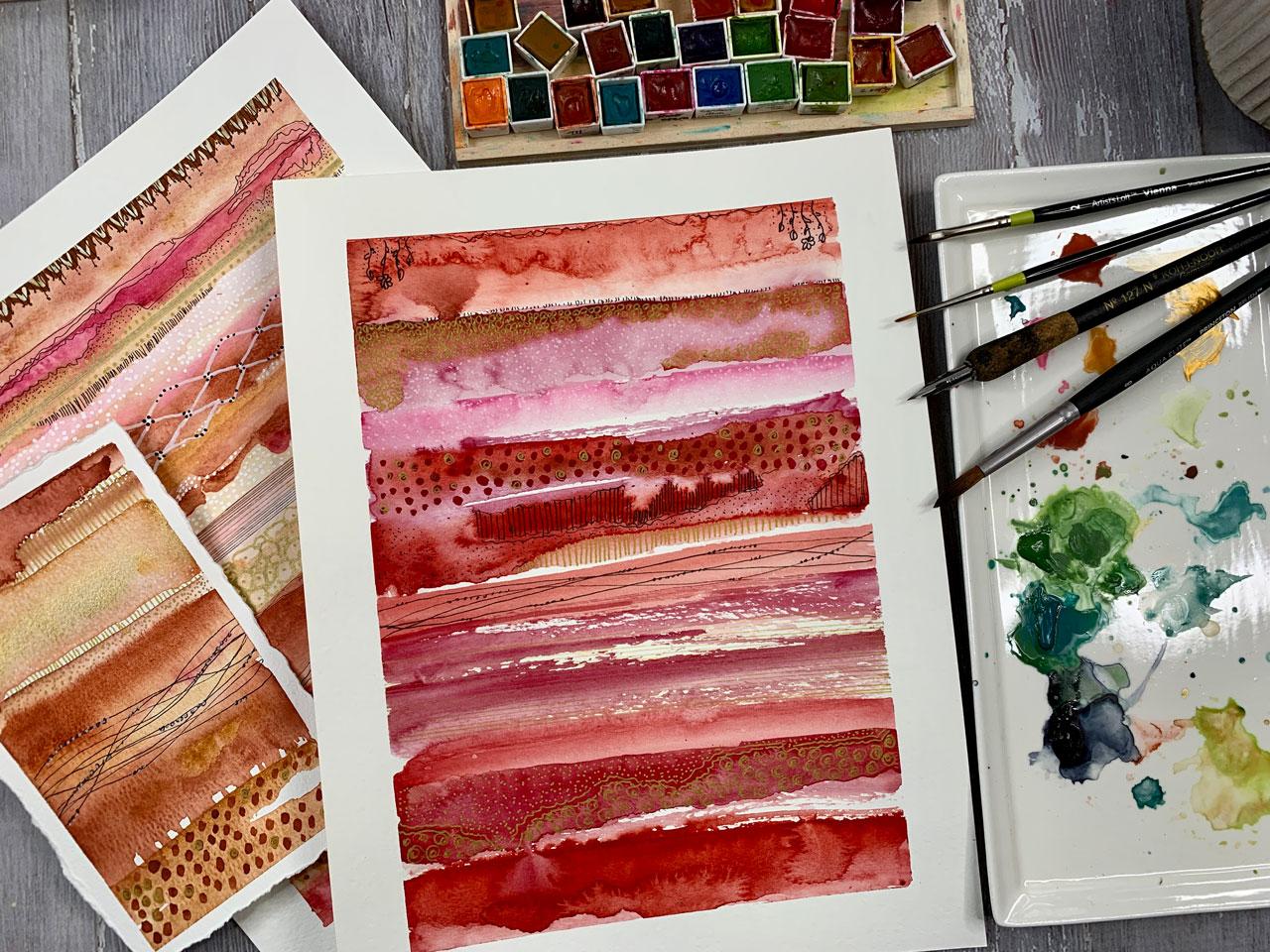
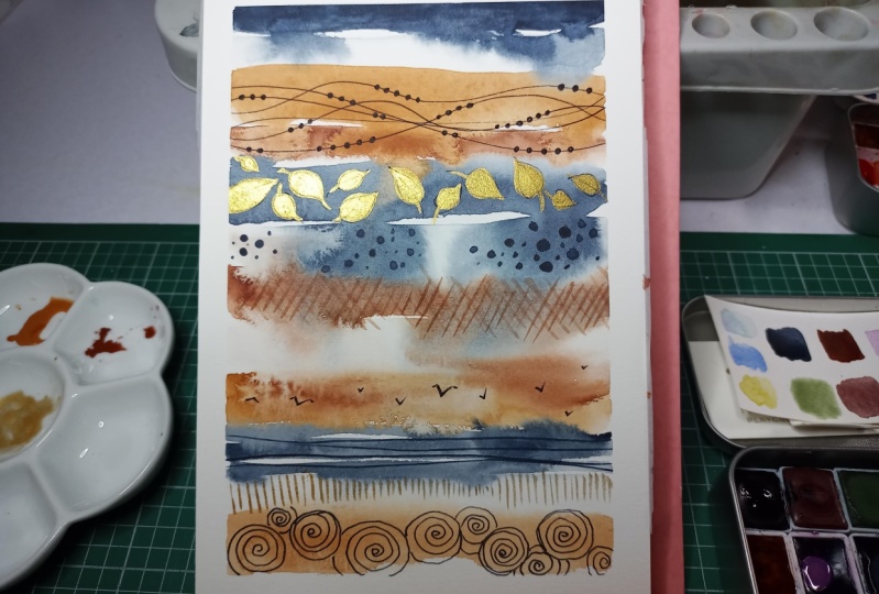
going to learn how to make these really beautiful
striped samplers and I've got one that we're
going to do in class, and then several
that I have done just for myself as
prior pieces of artwork that we can use for inspiration for our piece
that we'll be doing in class and we're
going to start off small because I think
it works really nicely. If you start off small and
you work your way up big. We're going to start off with
some yummy small squares. Or you could do
something like this where I did some
circles and created different patterns on top
of those circles and we do these to experiment
with color palettes. Figure out what color
we might want to try, how the paints work. Each one of them,
how they separate. How they bloom if we
add more water to it, if we add color to it. This is where we experiment and figure out what we
might want to use in our larger pieces and then
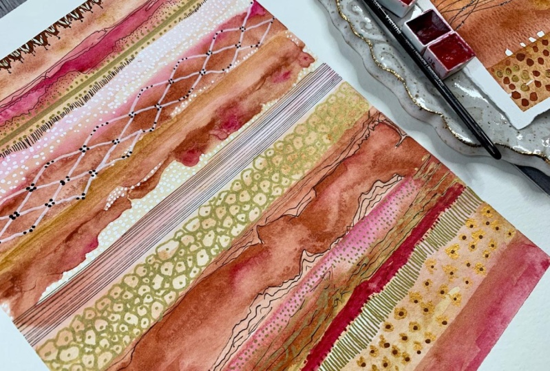
we'll go from these to some really beautiful
smaller striped samplers. Look how pretty these are, these are just working
on our sketchbook and getting a feel for
how we want to create our stripes
and our patterns that we're going to
build into our pieces, and then that's how
we work our way up to the larger piece. It's going to be really fun to create and on a larger scale, you really get to see the
beautiful things that the watercolors and
the patterns do. I know you're going to love the different things
and elements that we're doing in this class and I can't wait to see what you
end up creating. I'll see you in class. [MUSIC]
2. Supplies: Let's take a look at
our supplies that we'll be using in this workshop. I've got a variety
of things here. The first thing that we're
going to do we'll be using our sketchbook and you don't have to use a sketchbook
if you don't want to. But I do like working in
sketchbooks because it allows me to just get my ideas together and
figure out what I want to be working on when I
get to a larger piece. These are by Artesia and they're 110-pound watercolor paper and what I like about them
is it's a nice size. I think it's about eight
by eight. Let's see here. These are eight by eight, square like that
size and they've got a nice pocket here in the back if you wanted
to store something, so I've been using
these quite a bit. It's 110-pound watercolor paper sketchbook that I'm using. Any 110-pound
watercolor sketchbook would be great if you have that. If you don't, then just go
straight to watercolor paper, it's not a big deal. You could do some of
these projects just on regular watercolor
paper if you wanted to. For the regular
watercolor paper, I am using 140-pound cold
press watercolor paper. I encourage you to experiment
with the watercolor papers. There's cold pressed
or hot pressed, there's rough press
and each type of watercolor paper gives you a really different
look to your project. But for these different samplers and things that I like to do, I usually just have a pad of 140 pound, nicer quality paper. Sometimes I will use the
really nice Arches paper. If I feel like I
have made my way to the projects that
I want to really create and maybe frame
or sell or give away, the very nicest paper that I like is the 140-pound
Arches paper. While you're learning
and practicing, you might go with a
less expensive series, a nicer paper, but not
the cheapest you can find because paper quality really does make a difference
to the piece of art. Then if you get to the
point where you're like, I want to sell these,
they're beautiful, I want to create on a really
nice paper then the Arches, 140-pound cold press is the one that I usually
go to for that. Those are papers I have some painters tape
that I'll be using. You can use painter's
tape, artist's tape. I probably would
avoid masking tape. I liked the painter's
tape because it lets me stick down to my paper,
nice and secure, but then it releases
from the paper later when I'm done and I don't want to
have a nice clean edge, so I am using painter's tape. This one is the three-quarter inch painter's tape I believe. It's not super small. It's more like 5/8 inch, so it is almost an inch. I do like this larger size because on some of these
that I've done previously, you can see how nice that
border is around this piece, I like that larger border. I'm going to be using at least
that one inch size tape. I have a variety of watercolors
here that I like to use. Some of these are ones
that I've pulled out of my Sennelier and my
Daniel Smith's sets. Then some of these
are ones that I have made from my own pigment. I have different things that
I like there and I also have a couple of my favorite
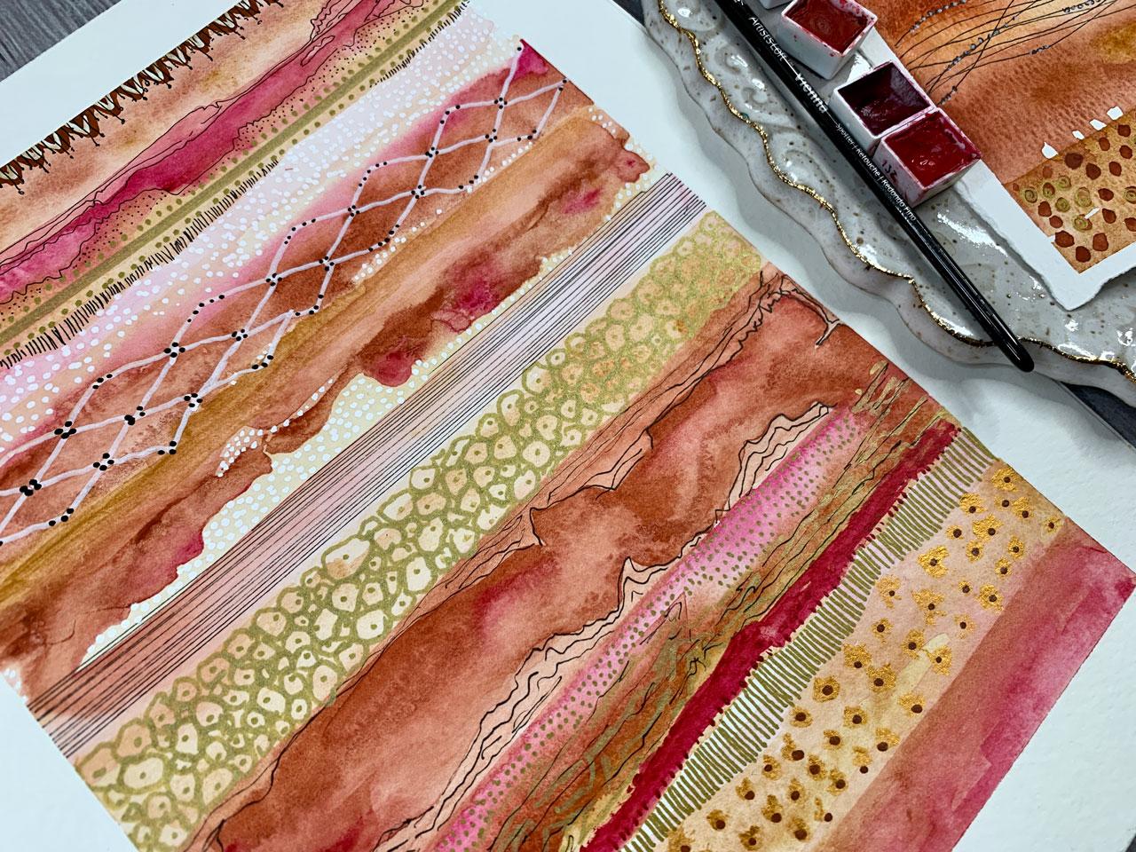
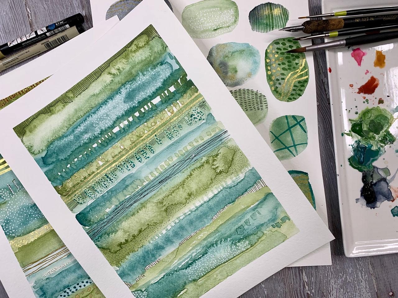
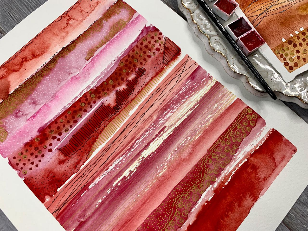
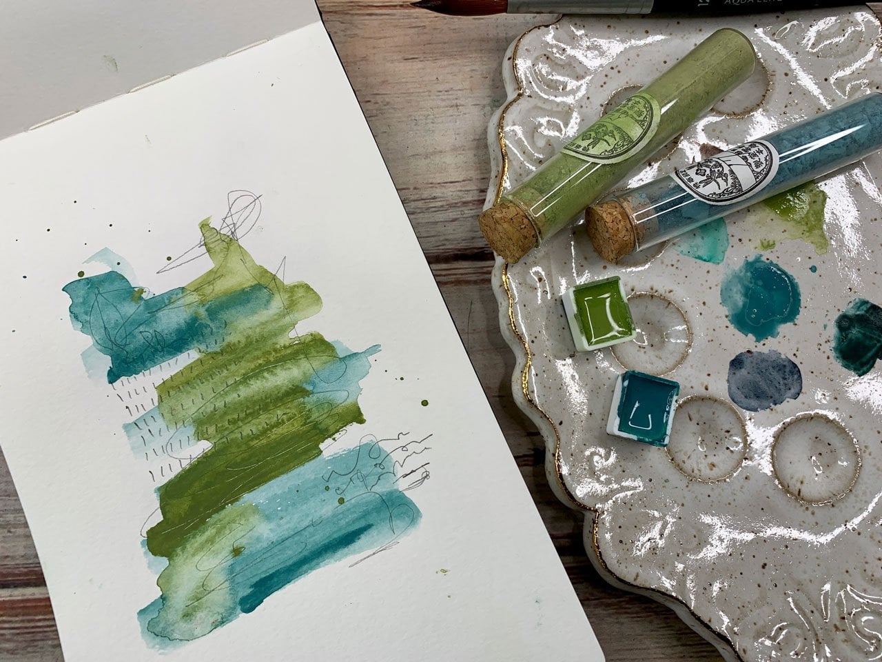
colors and the Sennelier-A, the Payne's gray, chromium oxide green, and this cobalt green. I really loved this blue-green. On a piece like this one
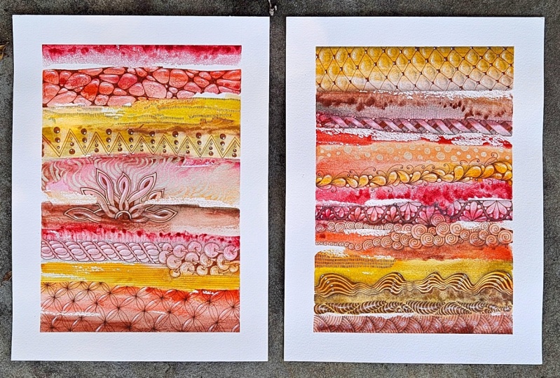
that I had done previously, the blue-green color combination
is one of my favorite. This is also another one
that I've done previous to the class and this is the
Payne's gray and the green. I really loved that
color combination. Also like on this one
that I've done before, different shades of orange and
pink and possibly reddish. Those are some colorways
that I particularly love. I encourage you to experiment
with the watercolors and play with your
color palettes and just see what do
you end up loving. We will do some
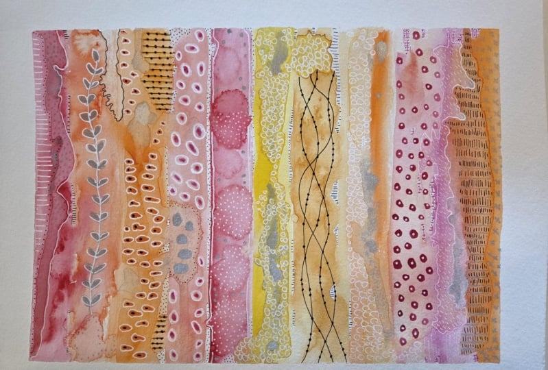
little sampler sets similar to this one that
I had done previously. Just experimenting with color and experimenting with
your stripes and then, some are going to work out and some might not work
out and that's the beauty of doing different
experiments like these. Also, we'll be using
perhaps some of the Windsor Newton
ink in silver and gold and I'll be using
those with a dip pen. I really liked that over
a paint pen sometimes because they shine really vividly compared to the paint
pen which sometimes soaks into the paper and isn't such a vivid gold
or silver shine. These are just fun to give extra details in
golden silver with a dip pen for some
extra shine and I also use these with some
little tiny brushes. If you don't have a dip pen, you could do some tiny brushes. I've got a 10/0 which
is super-duper fine. Let's see if we can get
these to focus for us. I like that 10/0, it gives you a nice size to do, dots and little lines. Also, have this number 1, and then I also
have this number 2, and I use these for fine
details in line drawings. Just some tiny fine
detail line drawing type brushes and these are just the ones that
I got at Michaels. I've got to it's
called a spotter, a shader, and around. A spotter is the one I'll
do little dots in details. The shader is one I'll do longer little lines
with sometimes. The round is just an
extra detail brush that I don't use as much
as these first two. Do have couple of brushes
and addition to awkwardly, which is I think Michael's
brush in the number 8, just because I'm doing
different stripes and stuff and that's the size that I have been playing with
and really liked. Then I also have a few
mark-making tools. Now here is where really
anything that you can imagine to mark with that you have and want to play
with you can use. But I've been playing
with 10-12 B pencil. It's really bold,
heavy lead there. I have some favorite
Castillo in the gold. It's okay, it's a gold, artists pinned draw lines
and dots and details. But it's not my favorite. My favorite is the posca in the gold ultra fine tip and I've actually
ordered some of these in silver and white and
black for myself also because I already used
the fine tip posca pen, which is one of my
favorite paint pens. Then when I realized I had
the ultra fine in the gold, I started using that and
then it's my favorite, even more than the fine tip. I can't wait for the ultra-fine
other colors to come in, because on a project like this
where you're doing details and different
mark-making and stuff. It's a really nice tipped pen and the color is nice and vivid. You still see some of that yummy gold or
silver coming through. Then I like the fine tip, white in the post get regular pen and I like
to make dots with that. It's not so vivid in the lines. If you need really
heavy white lines, then you might try the
Windsor Newton white ink with the dip pen perhaps. Or you might try the ultra
fine pen if you've got any of those and I'm going to play with
those when I get them. I also like mark-making with the micron O5 Pigma pen. They make fine lines when you're working on them like
this right here. They make this real
pretty line here on that. I love that. Then I'm also got
a favorite Castiel silver. These are the things
that I've pulled out, you're not limited to anything really in
this type of project. If you've got pencils or different colored pencils or anything like that that
you want to work with, this would be great for
something like that. If you want to use your pastels or other markers or pins or anything
that you've collected, maybe your neocolor to crayons, anything that you might
decide that you want to mark with would be great. These just happened
to be what I pulled out in playing on these
different projects. I hope that gives
you some fun ideas on what you might consider using for some of your projects and I'll see you back in class.
3. Inspiration for pattern ideas: [MUSIC] I wanted to give you a couple of book
ideas that you could use for getting ideas
on things that you might doodle within some of
your striped sampler sets. If you're looking
at these thinking, I don't know if I have
enough ideas to fill in the stripes of
what I'm going to do, this is one of the
things that I go to as a resource for
ideas like that. Some of these are around zentangling and I don't know if you've heard
of that or not, but zentangling is doodling patterns basically
in little squares. It's perfect for something
like we're doing. It's doing it in literally
little square piece of paper. But we're going to look at this as inspiration for creating patterns across our stripes or our little reference
library or something. This one is called
Totally Tangled by Sandy Steen Bartholomew. What I like about it is, it has specific patterns and it shows you how to draw
that pattern from scratch. You can look at it instead of looking at this completed
pattern thinking, no, how did they get there? This's actually showing
you each part of how to create each
of these patterns, which is really perfect for something where we
were to say creating a pattern in one of our stripes or as part of our
overall design. That's really going to help you come up with some good ideas you might not have thought of. This book is fun for giving
you certain patterns, very creatively showing you how to use those and create
those from scratch if you're not feeling very
comfortable or don't have enough ideas in your mind that you think you
will get stuck. This book is fun.
I love that book. Another book that I've got
is Zentangle Untangled. There again breaking down what
goes into a pattern block. Again, that's super helpful for something like we're doing. Lots of ideas for say borders or patterns
within a pattern or different shapes
and it shows you how to create these
from scratch. I just love how we
can get in here and find something that we like and then they've shown
us how to create it. Super fun, this is
another really good one. Then the third book that
I've pulled off my shelf, and these are ones
that I've just had for quite a long time. I haven't looked on the
booksellers lately, but I'm sure if you don't
find this exact book, there will be some
type of book on zentangling that you'll be able to find that you
can get ideas from. I was interested in doodling and zentangling
at some point, which is why I'm sure I have these in my random
creative books. [LAUGHTER] What I like
about this one is it actually takes say a whole little pattern of color and it's creating a
pattern in that color, which is exactly what we're doing in our different
sized stripes. We're creating some type of
pattern in a block of color. How perfect is that? This has given you some
really nice ideas for that. Like this right here,
this flower pattern in a stripe would have
been really cool. This book is fun and it's
got all kinds of designs and ideas in it to get
your juices flowing. Then as we go further back, we also have
different edge ideas, lots of different fun doodle things that maybe we
just didn't think of. This one right here would
have been really nice in one of those stripes,
so would this one. Even some of these
little ziggy lines. That would have been pretty. Lots of fun ideas. I just wanted to give you a
couple of books to consider. This one's Creative Doodling and Beyond by Stephanie Corfee, Zentangle Untangled
by Kass Hall, and Totally Tangled by
Sandy Steen Bartholomew, three that I just
happened to have in my library of books. I didn't go out and buy them
special for this class, but they are perfect for getting ideas for the things you might
create in your samplers. Give those a look, maybe
hit the library and see what type of zentangled books or doodling books they have. Maybe hit the bookstore
and look around and see what current books are available and get some
good ideas out of those. You might even look on Pinterest
for zentangle patterns just to see if
there's some that may be a free resource
for getting ideas. Hope you like looking
at things like that. I'll see you back
in class. [MUSIC]
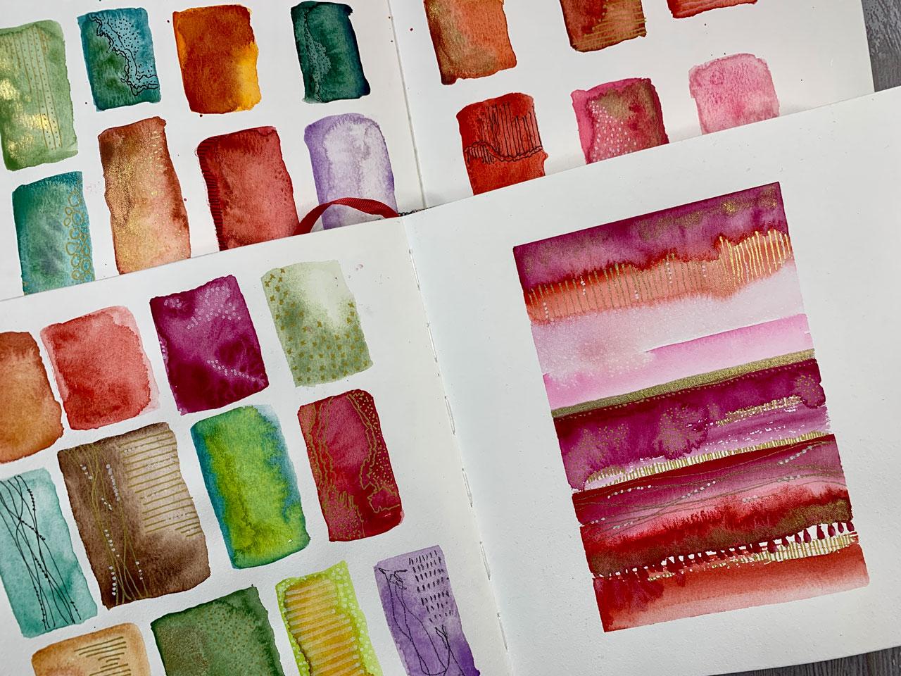
4. Creating small reference samples : On our first little
project here, we're going to
experiment with color, color palettes, mixing
the watercolors and trying to get interesting
patterns in the watercolors. Then we'll start building a little library of
different marks and pin mark-making things
that we like and we'll experiment with
whatever different pins that we happen to be using. Then we'll come up with
our own little library of ideas so that when we go to
be making larger projects, we'll have good ideas to refer
back to when we get stuck. I'm doing these in my
watercolor sketchbooks. I also did some on
larger watercolor paper. If you don't want to work in a sketchbook and you'd rather do your project on a
piece of paper, you can do that. Just to give you an idea of some things that I was
experimenting with, I was mixing color. I was dipping in some of the metallic and dipping
in water and trying to get different variations
there on my circle or square. Then I was mark-making in different ideas with
different materials. I was dipping in extra
paint and gold stuff, drawing in dots
with my paint pens. Experimenting with
circle on circle lines. All kinds of little ideas for us there to refer back to later. On the ones I was doing
in my sketchbook, I picked squares
instead of circles. You could do squares or circles. I was mixing and experimenting
with color to see, how do these mix? What happens when I
add extra water to it? How can I get some of
these blooms, and blends, and really interesting
things for my stripes? Because some of the ones
I've done in the past, what makes some of the
stripes so interesting is not necessarily the extra
marks that we added in, but the color variation
and interest that we get in the stripe itself from the way that
we add water and color into our line of color. You don't even have to really heavily mark these up
with different marks and pins if you have
enough interest in your watercolor blooms and
stuff there with the stripe. We'll just be doing some
of these and seeing, how does the watercolor
react with more color, with water, with other
color dropped in? Then what can we do on top of that to finish
the piece off? Our first piece, first project
that we're going to do is to start laying some color
here in our sketchbook. I'm actually going to go
ahead and turn a page or two in my sketchbook and I'm going to hold the
pages down with these bullfrog clips and
then we will get started. The object here is not to
go as fast as you can. The object here
is to experiment, and play, and just not go so fast that you're not
enjoying the process. Part of this is process-driven. What can I do? What can I add? How can I change it up? Then I'm going to
put a little bit of watercolor out on my
little palette here. I collect ceramic palettes for paint and stuff. I have several from
artists that do palettes. But look at this
fun one that I got. This is actually just a
serving platter that I got at the Cost Plus World Market
and it was only $5. This is my favorite
ceramic palette out of all of them that I have. It was the cheapest
and they are in stock. How fun is that? If you've seen people with the pretty watercolor
palettes and you thought, I want one of those, you can get an inexpensive
one at the World Market. I've got a little bit of the green and the blue down already. I like this green and this blue. I want to play with that. I'm just going to put some
of that on my palette, and then when they dry, I just come back
and re-wet it with water and it works great. Then I also like, it's probably more than I
needed to put out there, but I use these colors so much that I'll keep
coming back to this. I'm going to put a little
Payne's gray out here. Then the other colors that
I've got over here are just different shades from
Sennelier and Daniel Smith. I like the reds, and the oranges, and the blues. Then these are some
colors that I have mixed myself from natural earth paints and some other colored pigments. I just sprayed those down to
activate them and get them ready for when I'm
ready to experiment. I'm going to start
over here on one page. I might actually
just move this over. I was trying to get
it where I can have the whole thing where
you could see it. There we go. I'm
just going to do on the one side different shapes. I picked squares and I'm going to continue
with the squares. You can certainly
pick the circles if you'd rather do something more like an egg shape or a circle. You could do
rectangles, triangles. Your preference there. I'm just going to start
off by just building different sized
ones and mixing in some extra water and then maybe coming in and dipping
the water on there. Because what I'm wanting, I'm not wanting a
perfect square of color. I'm wanting different
things to bloom. Maybe we'll take some
of our gold ink and dip that in there and
see what that does. The ink is really cool
because it's water-soluble. You do have to shake
it up every time. Let me shake that
a little better. It's water-soluble
so your brush wash, it washes off with water just like it does with
watercolor paint. I've shaken that up pretty good. Let's just grab some of that
and maybe dip that in there. The goal here is just to
make interesting squares with colors that we might consider using later
in our projects. This is our time to experiment and narrowed
down what do we like, why we like it. How can we get our watercolor to move in ways that it might
not normally think to do? I'm not looking for perfection. I might take some color and dip other color in
here while it's wet and just see how those do. The goal here, again, we're just playing
with color palettes. Light versus dark. How we can get the color to
bloom and do other things. See, look what that did. That just really bloomed
out when I did that. That was cool. Then I'm going to let
these dry naturally. I don't necessarily
will come over here to some of
these other colors. This is raw earth green, which looks like the same
color as this one here, which was the cobalt
green basinilie. This is a Daniel Smith color, but it does look like the
exact same color. How funny. I'm going to dip
some other color in here and just see what we got. This green that I dipped was chromium green oxide. That's actually the same as the other green
algae is and how funny I'm just drawn
to the same shades. Well, that's funny. I'm going to use
this one over here, which is a terracotta color. You could do all your one-color different experiments,
mixing them up. This is the Sennelier 623. I'm not sure what 623 is, but that's what color
this pretty rust is. I'm just dipping some
water and then I might dip some of this yellow, which is a raw sienna. That raw sienna I
think is Daniel Smith. Then another thing I might do on this one is dip some golden because I think gold
and that sienna color, that rusty color would
be really beautiful. Let's go ahead and get our gold, and dip some of this in here, and see what we can get. This is just planning
for future stripes, or designs, or ideas, is what I'm going for here. This is a Mayan red. I'm just experimenting towards future ideas is
what we're doing. I might try dip in
and look at that. Let's add some more
water and see what we can get. That's pretty. That was quinacridone fuchsia. I love that. I love
what that's doing. That would be pretty
with some gold in it. Let's try dip in some gold. I've done so many without the stuff dipped in
it that now I'm like, what else can we do here? Let's dip some
other stuff and see what we get. Look at that. That'll dry pretty. See, some of these that I'm doing the little dip of color
in are going to be real subtle on the original one
over here that I've done. You can see where it shines, how pretty that is. I like that shimmer that you get in the light as they'll shine. Let's see what else we've got. This one over here
that is all sea, red gold, which is a really vivid odd
orangey color. Oh my goodness. That is vivid. Let's mix in some of this
Quinacridone fuchsia. Look at that. See now
I'm almost liking that. As a colorway that I
have not done before, that might be one experiment with in our projects
here in class. Then I've got some
handmade paints over here of different things. This one, I don't even
have a name on it, but it's a pretty red pigment that I had found somewhere,
Japanese pigments. I don't even know
that I knew the name, but it's a random one I had
found in an art store online. Just play with all the
colors you've got. This is an LEA that's 623. I'm just going to mix it in there because this is not
really about what I'm using. This is about using
colors that you have. This is another one
that's even more red. It's 076. I'm not sure what color
that is. Let's say. This is Perylene Scarlett. I like reds and oranges
and pinks together. I like blues and
greens together. When you get to thinking about color palettes that's what this is fun and
interesting to do. Let me grab my color palette and we can talk about
it for a second. I have a lot of different
little color palettes. What I like to do is to try to experiment with
colors that are either side-by-side or colors
that are opposite each other and I try to play with complimentary, split
complimentary. Analogous colors which
are blue, green, yellow this or over
here with the red, yellow, orange, and that family. Those are where I tend
to play and experiment. But I do like having a color
wheel to reference to say, well, how can I make
this more interesting? Maybe I could do
blue and orange, or, maybe I could do
violent and green, so violet and green. I like to play with the color
wheel and experiment with color combinations that
are really interesting. If I'm struggling
and I'm thinking, what else can I do here? That's usually where
I will go to be like, let's experiment with this
thing that I have not experimented with before.
Look at that color. That is meridian. That might be Daniel Smith. Any of these might
be Daniel Smith or they might be Sennelier. Some of these were tubes of paint that I have as
a duplicate and I had gotten some of this paint
out of big sets that I had. Let's see. Here's
a purply color. The reason why I
pulled those out is because a while back
I went through, that's ultramarine red, so it's a pretty purple. A while back I went
through and I was color swatching and playing
with the different colors. Then I was like, wow, here's the ones
that I really love. Let me experiment
and play with these. That's how I came up with the little selection of
colors that are out here. That's probably the oranges, orange ever, and took very little of me
dipping my brush in it. I think that says chromium
orange hue number 220 but that's a solid. Nothing's getting through that. I'll be honest and tell you, I actually like colors that
are a bit more transparent. I would use that very sparingly, and maybe not at all. Then once I've got a page
or two of color like this, you can keep on go and undo. Just even more. Once I've got these where I'm like I think I know
how these are working, how I want to
experiment with them, I'm going to let
these completely dry, and we would come
back to them later. I hesitate to use a
heat gun because, what color was that? That was quinacridone,
burnt orange. I hesitate to use
and I'm going to mix in something else with that. Just because maybe
this Mayan Red. I hesitate to use a heat
gun because I like the way the color moves and
tries and combines. When you let it sit
there and maybe you let the colors run
back and forth and you create new lines
and new blooms and new different things
that maybe you weren't going to create any other
way letting that run down and then dry naturally and coming back and
moving them again, you're going to get different
lines in your watercolor, like you can see right here on the screen when we've
got a line forming, I'm looking for those. This project in my mind works better when you have all
those different variations in your colors so that
some of your stripes then get all these
little details in it that we're not really
getting any other way, and I like the organic
field to that. There's just no way to create that if you're painting
it and you're forcing it. Might just go ahead and do a few more of these and
then I'm going to let all of these dry and
then we'll come back in and start a little library of mark-making and things
like I have done previously or will have than a bunch of really beautiful
ideas to work with. I'm going to go ahead and
paint some more squares. Then I'm going to let these dry. I'm going to move some
around so that I get extra edges is a good
way to call that, I guess I get edges and things that I just
wasn't expecting. I'm not going to try to run the color off like
I just did that, but this is my sketchbook. It's not a big deal if you
have things like that. This is not a big final project where you've just
ruined your project. This is your reference
page for ideas later. I'm going to go ahead and paint
some mortal squares here. Just different paints and
pigments that I have. How pretty that is, it's
like a yellow ocher. Then we're going
to let these dry. Then we're going to come back
and add mark-making on top. Then this will be
a little library of ideas for ourselves. Some of finished
paintings are going to dry and I'll be back.
5. Adding marks to our reference samples: [MUSIC] I've painted
some more squares just from some of these handmade pigmenty one just to see and then I want
you, when you do that. I want you to pick it
up and let some of these colors run around so that they create some of the
interesting pattern and differences in there that maybe they're not
normally going to create. If you're not getting any
extra water to do that, you might take your paintbrush
and add water to it, and that will then give you a
little extra to run around. I want those differences. I want the interesting things it creates as the watercolor dries, recoats itself, dries,
recoats itself. Look at everything interesting going on in that viridian color, and the more I do that
and then let that dry, the more interesting
that's going to be. I can already see over
here in this orangey one, different color things that are happening that are
really interesting. Move these around, let them
continue to dry naturally, don't hit it with a
heat gun if you can resist [LAUGHTER] and then we'll get back to these
when they're actually dry. All our little
squares have dried, and that favorite one up
there, that green one. Look at all the
different layers and color variations
that we got on that. I love that one, that's that terra
verde, I believe. I love on this one how
we've got color variation. We've actually almost
got spider lines in there two different
colors that we blended. I love how we also got that on this one with the
green and the blue. Let's see what else. I really love some of these. The pattern and the design
that we got on some of these. I love this one, how I
have the gold in there. It goes from really
dark to really light, and we can see visible
lines of separation. I actually love this
pink one and the way that it's separated with a
little bit of gold in it. I love the two tone of this, the way those colors blended. One thing I'll say which
I did not personally do, if you make these and you think I'm not going to remember
what colors those are, you could take a pencil and just right under each one
as you paint it, what colors that you
used in that recipe. Because if you come back
to this an hour later, you may not remember what
it was that went into it. If you come back to
it a month from now, you definitely won't
remember and so if you're wanting to really get down and have this as
a nice reference for yourself on different recipes
and colors that you used. Then just take a pencil
and write underneath these as you paint on
the colors that you did. I particularly love this. I feel that rust and yellow and gold in my
future on one of these. So at this point, we've let these dry, and this is where on my inspiration page that
I had done previously, this is where we're now going to take our different
pens, pencils, pastels, crayons, anything that it
is that you want to mark, make with and do interesting
little marks in our boxes. I like lines and dots with
the Micron Pigma pen, lines and dots with the
gold pen, lines and dots, and I don't know if you can see the little white dots that
I even did on those lines. But I really love that. The ones that we had
some gold dipped in, I did some gold lines there, some pretty dots on that one where the gold was
dipped real pretty. You'll notice on some of these, say if I do dots, I'm not putting dots
on the whole thing. I'm letting that little
bloom of color be my guide as to where I put those dots and then leaving the rest of
it without the dots, and maybe this was where the
gold paint was dipped in, and I'm letting some
of those blooms of color dictate what I might do in that box to
illustrate on top of them. So that's what I want those different variations
of color to do. Here I've got little gold x's that look a little
bit like little stars, but it's not on the whole thing, it's just on the bits and the lightest bit is
left without the stars. I want to let those
watercolor blooms of color dictate what I
might put in that box. For instance, let's pull over my little stash of
stuff that I'm using. [NOISE] I like the
posca ultra fine. This one here is one
of my favorites, and I think I'm going to do the little x's just
in this top part. So I want you to get creative
in dots, stripes, x's. I've even got a
little cheat sheet up here that I've shown you in some other classes of just interesting
marks that might inspire me for later
little dashes, circles, lines, x's,
little leafy things. I just save different
interesting patterns that I might consider using
in a project like this, and then I'm going to
go ahead and use some of those in my little boxes. So I have my own little
reference library of things so that
when I get stuck, I can look back at this and say, oh yes, I love that. See how pretty this is. Where I just put little x's in the very top lightest
color of the bloom, and I can see as I tilt
it towards the light, the way that the gold
that I dipped in shines and really makes that an interesting
little square. Well, as a stripe with
different shading like that, it would be just as
interesting, and this one, just to give you an
example, this one, I might just put something in this lighter part and let the
darker part do its thing, and so maybe on this one, I'll go in with some stripes. I'm just being real
careful letting the darker edge of that
bloom of color be my guide. The goal here is
not really to go as fast as you can go on these, the goal here is to be a
little more thoughtful. Maybe we'll put a little
dot at the end of these. The goal is to be a
little more thoughtful. Don't get real sloppy. You want to be deliberate, in some of the marks and
the interesting lines. That's fun there. Now I want to just
fill all these up. So another one that I might do could be with the Posca pen. Maybe over here
in this pink one. Maybe I want to do
some white dots because the white and pink
would show up really pretty. But I'm going to let this
be my guide as I go around. Where the darker and
I'm not going to put dots on the darker part. I'm just going to put it on
the lighter part, and again, I'll let this line here be my guide of where
to stop those dots. See that's really pretty. I love that one, and let's see. If we want to play
in, say, our inks, just to give us an example of how the inks could
work for us. [NOISE] How pretty this one here, this is so pretty
right over here. Maybe I want to add some with
my little tiny paintbrush, and on this maybe I
will do some dots. But what I like about
these dots versus the posca pen is these
have a much more shine. When I go over in the light, you're going to see
every single dot. Let's see if that'll focus. You'll see every
single dot that I do. Whereas when I did those
on the upper orange one, they don't shimmer
quite the same way as this bottle of ink does. If you're looking for
the extra shimmer, then definitely consider that
Winsor and Newton gold ink. You do have to
shake this one up. Even as you're using it, if you feel like you're getting less metallic color
on your brush, you might need to
shake it and then if you get a dot that's bigger than all the others and I'm just not going to
worry about that, just keep going because overall in the big
scheme of the pattern, I don t think it's
going to be a big deal. But if it really bothers you, you can take a
tissue and dip that off and then see
it blend right in. That's fun, I like that right there and then that
stuff is water-soluble, so I just rinse my little brush off and then let's see what
else do we want to do? I really like the
light-colored blooms with dots because even though it's really light and you
almost have to look close, it adds an extra element
into that lightness and you realize as you get closer that there's
something going on there, it's not just flat. When a lot of those, I have done just white dots for that extra little tiny bit of movement there in that color. Like some of those
blend right in almost to the point where you're like, "Is something there?" But then you see it come
through on the other parts. You'll see it just barely and it adds just a tiny bit
of interest into that. I want you to take
your different tools, whatever you've decided to
use for your mark-making, whether it be the Pigma pins or whether it be the posca
pens and I want you to start doing some of these different ideas
and lines and marks. I'm going to do this one. I really like lines with dots. In like in this, we actually have
enough color bloom to guide us into just
this one color. We have enough of that
peachy tone to keep the lines in the peachy
tone but not over there in the yellow and then we
can come back and add some yummy little dots. See look how pretty that is. Super pretty, love that. Then we might, on some
of these, let's see. Like on this one
we could actually, in the darker part, get creative whether
you do it in the light part or the dark part. In the dark part, we might come back
and add some lines. Or we could do dots too, but then it always have to be in the lighter portions like I
was doing on some of those. We could do these in
the darker portions too and follow that
line with a darker, with some little lines in it, something like that,
that would be fun. I want you to somehow fill up all your little squares
with different ideas. Just to show you a few more
than I had thought of, I've got where I did
watercolor lines, where I dipped that
little shading brush into some watercolor, so we could do that too. Let's go ahead because I
just thought of that and maybe we'll do whatever
this oranges over here. That's a custom one
that I've mixed, but we could come back and with our little bitty shader brush, we could draw in some lines. We could draw in
some cross marks, we could draw in some dots, some x's, some hashtags. You can do all kinds stuff here. What I like about using a watercolor like this is
you're using the same color or a color that's close
or something that you've picked and then it's like
color on color, tone on tone. Then to take that
one step further, you can then come in
with a pen, posca pen, whatever and then
maybe we could put dots in a different color, silver, gold, white, black down those lines because sometimes this
is about layering, layering the patterns on top of the layered watercolor
pieces that we created. It's the interest,
it's the movement, it's the color
variations that we're creating that makes some of these pretty stripes
samplers so interesting. Look how pretty that is. See now, that one's
really pretty. It's a color on color with some stripes and
they're really pretty. Another thing that
we could do with that shader brush and say
that same color is we can come back with
some circles or dots and then we could leave it like that
or once that's dry, we can even draw on top of
that with say like the gold. Like we could do a gold
circle on top of these. That would be pretty and then we would let that dry while we were working on another one. We could take, say with our
gold. Well, let's do that. Maybe we'll do that with,
we could take, okay, so let's look at this
one over here with all this yummy pattern
on it and we'll come back to our dots there
when they're more dry. But we could follow like if we have a color variation
like we do there, we could follow that with a jaggedy line and
then we could decide, do we want to do one thing or another thing on
the jaggedy line? Do we want another
layer of lines like we could do another
layer of lines in there following the
line of the watercolor. You could follow that
with a layer of dots. Another little line
through there maybe. That's fun just to add an interesting road in
there of that. I like that. Then I like that the color got its own interesting
thing going on, on each side there, so I don't feel like
I need to add lots of stuff into that if I don't want. I could add some dots
into that light part. Some of this is about the
layers and embellishing and taking a moment to look and
see what could I do there? Just not be in such a hurry. This is meditative if
you're doing this and maybe the TV or some music song in the background and just see, you know, what can I create in those different
areas of variation? Love that. Here on this
one here is my posca pen. Maybe I want some stripes in this lighter part and
I'm not using a ruler, so I'm not trying
to be really exact. But if you want to
be really exact and you can definitely get a ruler out if you think you want to
see how exact you can get, but look how pretty that is. Maybe some stripes down these
lines. That's real pretty. I just followed the lighter
colors in that square. It's not like I
have the lines and the dots on every part of it. I love that variation. Another thing that we
could do is circles. Maybe, let's see here. Maybe we'll do some
circles on this one. Again, I'm just following the color that's
along the outside. I'm not necessarily going to put these on every part of this, just following maybe one color in this variegated section. Maybe I'll do some gold
dots around those. I like that right
there. That's pretty. Just some circles and dots. You could have done that in
any color that we wanted. This one over here
is almost dry. I think on the dry ones, I'm just going to
do a little spiral to show you what we
might could do there. There's one or two
that are still wet, but the rest of these are dry. But look at this if we just
do some spirals and we could even not even have to do
spirals on the whole thing. We could just pick and choose. Look at that. Pick and
choose what you want. The spiral on in which you
want just color, super fun. [MUSIC]
6. Finishing up our reference samples: [MUSIC] On this one, let's see. I love this one so much. I almost hate to even
touch it with anything, but we could maybe do some black dots in one of these areas just for
one extra little layer. Then I might let just
the watercolor do its thing there. Look at that. See that tiny bit
of area with a dot, totally made that box for me. [LAUGHTER] I love that. I might go back with my bold pencil and maybe in this orange
one which now that, that orange when dried and
has such interest in it, I really love it. Maybe I'll come
back and do some of my dash marks in this orange
one with my bold pencil. Again, I'm just letting the watercolor pattern guide me and I'm doing it
in the lighter bit. Look how fun that
is. I love that. [NOISE] Let's see. We've
almost gotten these filled up, but let's just see if there's anything else we
want to do here. Let's try the silver pen. This is the perfect place to experiment with all your pens. I really love all
the color variation here in this green one. But maybe I want some type of stripe in here
maybe and in that stripe, we could do some lines. Because this is
the perfect place to experiment with
your different pens. Some of the pens I've put
on a piece of work that was important and I've been disappointed
because whatever it was doing just blended
right in with my paint is soaked in and
that usually is with the white Posca pen doing
a line [LAUGHTER] that it does that and I
was so disappointed that the color didn't
do what I expected and it was on my real piece of art, not my piece of experimentation, like what I use my
sketchbooks for here. I'm experimenting with the different pens
and how they work and how they soak in and what they look like
on different colors. Then now that I did that, I know that I don't
really like that. [LAUGHTER] That's a
good thing to know before I get to my
final piece and think, wow, did I like that or not? Just to show you what I was talking about with
the white Posca pen, let's just do it
over here on this red and just see, do we like it? Do we not like it? Did
it blend into much? Did it soak right into
the paint and disappear? When maybe that soaked into
the paint barely there white is the look that
you're looking for. But I almost would want it to be more vivid sometimes when I'm
doing it and on that one, it actually looks
really good so maybe on the darker color is
where I save that for. Let's just see if
there's anything. Let's take our pen. Maybe I want to, on this one, just follow one of these little blooming
things with my black pen. Then maybe come down. There's another bloom
in that bloom that we can almost see right
here and then it lets up, but in my mind, I'm like, let's follow
this with a line. Then it stops. We could come back over here
and add more if we wanted. Maybe I'll do a dot at the
end of each of those lines. Because I could come
up here with lines in the lighter part and
let that be my guide. If you like doing Zentangles, Zentangles have a lot of yummy patterns in it that
would be perfect for these. You could consider each
of these little lines or boxes or stripes or whatever it is that
you end up creating. You could treat those as littles Zentangle areas and do different patterns
in different areas. I've actually had a
little Zentangle book on my bookshelf that I
should pull out and use as inspiration for these and see what other different
patterns that we could come up with so let me go find that and I'll
be right back. Yes, I found a couple of
little books in my library, so I guess I'll do another video talking about the
different books, but I like Zentangles and
I like creative doodling. If you get stuck thinking, what else could I do in my different stripes
or boxes here? This is where you could find
additional inspiration. You could do any of these
type of pattern things in your boxes or your stripes to make really
interesting patterns. It even shows you here up front, how to get started and how they created the different
patterns which I like. Sometimes you'll look
at something and think, I can't draw that,
how did they do that? But this kind of little back-and-forth line would be perfect in some
of these stripes. These would be perfect. These little triangles built-in almost looks like flowers
when they're done, but a whole stripe of these little triangles
would be perfect. This would make a
really pretty stripe. These little lines with
the loops, really pretty. Take some inspiration from
some of the books and things that you can find
out there about doodling, line drawings, zentangling. These little dot loops here would be really pretty
in one of our stripes. That might be really pretty here on one of these that I haven't
finished yet actually. Maybe we could do
some circles with some little lines in it and some little stripy
things. Let's do that. This is Creative Doodling and
Beyond by Stephanie Corfee. These are just
random ones I happen to have on my bookshelf, Zentangle Untangled
by Kass Hall. This one is Totally Tangled
by Sandy Steen Bartholomew. Just some different books and ideas to get your
creative juices flowing for patterns and
designs that you might consider putting into
our different stripes. I'm going to refer back to
some of these may be as I create and these are
really nice for ideas. But now that I just spotted
that idea and I know I still have something here that
could use a pattern, maybe I'm going to do that. I'm going to do some
little swirly guys. Then we could come in with some little dots. See how pretty that is. They didn't have to be exactly like what you saw in there, but you could just add
a nice pretty pattern, something in your little
square or your stripe that you weren't thinking of before. Now that we have a lot
of our stripes filled, I've showed you a lot of
my favorite little ideas on things that you could maybe put in those squares so I want you to go ahead and
finish up your yummy boxes, then we will use these
as some inspiration as we go into our next project. I will see you back
in class. [MUSIC]
7. Sketchbook Stripe Play: [MUSIC] On the second
project that I want to do, these are some small
strikes samplers that I did in my
sketchbook and I did them right there across from the original squares that I
was doing because I wanted to test out some of the
colors that I had been using over here
on the squares. I wanted to try out the
blues and the greens on here and I wanted to
try out on this one, the different reds, and oranges that I was playing with in some
of these boxes. These are my inspiration, going into larger pieces. Then you'll notice as
we get a little closer, you can see how
in some of these, I've left the watercolor
be the stripe without really changing it up. Then on other ones, I've
done dots and lines. There was some color
dipped in on this stripe. I've got some lines and dots. I've got some dots working in the light color here just
to add some extra pattern, but it's not super
jump out at you. It's real subtle. Then I've let the watercolor do its thing on these two lines. Then I've got some
yummy little xs. Then the watercolor doing
its thing up there. On that one, I'm letting the watercolor
do some of the work, and then my ink pen doing some
of the work and coming up with some interesting pattern as we go up and down the
peace and the same with this, I've got some areas where
it's just watercolor. I've drawn in gold lines, I've dipped in gold paint
while the paint was wet, I've done the lines and stripes, different lines in
different areas, but not on the whole
stripe on this one. Here I've got the really
light faint white dots that's almost, you're not sure they're there
until you get real close. I like that little surprise, more lines and more paint dipped in as the watercolor
was wet and I'm letting the paint do some
of the work there making these as
interesting as we can. The first thing that I want to do is take some of these down. Here's my inspiration
pieces and I've got some other inspiration
pieces in this book here. We'll just see what is
it that we can create. I'm going to flip this over. Then our goal here is to
create at the minimum one, but as many as you feel
compelled to create. [LAUGHTER] I tell you I feel
compelled to create a lot of these just because I love them. I'm going to create
one with you. Then you'll definitely
want to come back over and over and play in your sketchbook and create larger pieces
because these are so pretty, I can't wait to have a few
of them framed and hanging. I'm just taping off a nice
box because my favorite part of making the piece of art
is peeling off the tape. [LAUGHTER] I'm just going
to make sure right around this edge where the
water is going to be touching the tape that I push it down really
good because you'll notice on the one in
the first book here, there's actually bleed
through and underneath. It wasn't nearly as
careful as I was on this one where it's all
nice and straight and even. I prefer this because when I get the bleed-through it's annoying. [LAUGHTER] I've got my
books open for inspiration. I'm going to set this
one up in front of me so that as I'm painting, I can look at it and see what it is that I'm wanting
to accomplish. I really like these ocher
and rust-colored in here. I'm going to try to play in the red and ocher
family, I think. Pick out some of your
favorite colors, then just give it a go. I've got my brush over here. These are not necessarily
as wet as they were, but I'm still going to
go with it and if I had written down what those colors were on
my inspiration piece, I wouldn't have to wonder
what those colors were, but I'm randomly going to go
over here and try out one of my handmade terracotta shades. See, that's exactly
what I wanted. When I'm painting the strike, I want some dark area, I want some light area, I want some area where
I have missed the page, and I even want some extra
water dipped on this a little bit so that I'm going to get
those weird color blooms. Some will come back and
dip on top of that. That's how I'm going to
start off making my stripes. I want some of the color to bleed and some of the
color to not bleed. I'm just going to
judge it as I'm going. This one here is raw sienna. I'm going to not be
super fast about it. I don't have to be in a hurry. I'm going to let some of
these bleed together and create some bloom
of color coming down into it and some of these, I'm not going to do that. I'm probably going to add
a little extra water to each stripe [LAUGHTER] because I want as much change in color weirdness going on
as I can possibly get. I do want the stripes to
be as stripy as possible. I don't want them to be
where jags going down unnecessarily unless it's just color-blooming and then they're
bleeding into each other. I am trying to be fairly
straight with the color. See like this one, I'm actually
purposely blending in. That's going to give me a really pretty
hopefully ombre look. Add some extra water on there. Maybe on this stripe also we
could even dip some golden. I'm going to shake
it up real good, come back with my brush, just dip it in there, and I've got a lot of water on this at the moment
and that's going to be perfect for this dip
in this gold right in there. Then just seeing what
that'll make for us later. I will say when you're
all done and you're getting really impatient
for it to dry, resist with all your might using a heat gun because the heat gun I've tried this
before because trust me, I get how impatient you can get when you're
waiting on this to dry. [LAUGHTER] if you're using a heat gun while the paint is still wet
in a lot of areas, it will make your page buckle a little bit
and it will pull the tape off of your page and that's how you
get some of that bleeding. Not only do you want
to make sure you press down this edge with your finger, you don't want to
use a heat gun on it because that edge will pop up and then you'll have watercolor
bleed out underneath the tape and you won't have that yummy edge that
we were going for. I'm just going to continue taking my time thinking
about it, saying, "Okay. Do I want to add in some of
whatever random color we happened to pick
out on our thing that wouldn't quite
what I was intending, but now that I had dipped one little thing, and
it will keep it." [LAUGHTER] Yummy,
little surprises. This is that brighter. We'll just go ahead
with that too. Let's just do this. Then you can see too, I mean, we can go back and dip a little. If we added a color that we
weren't quite intending, if you'll go back and dip that color in some other areas, that will look on purpose. [LAUGHTER] Then two, while we've got water
puddle build up, after it dries a little bit, I want to start letting that
water run back and forth, and creating different edges in our watercolor
as it's drying. That's how we're
getting a lot of the interests that
I'm hoping to get. That's more brown than
I thought it would be. That's number 1.0, she is burnt sienna. That's a lot more
brown than I intended. Let's come back on
with this bright color that I made from a handmade
pigment over there. I don't even know if
I've got the color. This is a Venetian red, and this is a natural
earth pigment, so it's one that I've made from my natural pigments from
the natural earth company. Oh, there we go. I want some areas that are doing some different things,
not necessarily. Let's do some little
dots in there. Oh, no, I did get it over here on the side,
but that's okay. [NOISE] After your stripes are dry, if you think, "Oh, I
don't have enough of whatever," you can come back and continue to
add paint strikes. You don't have to
stop at the one try. I don't know if this is
going to be my favorite. I think what I'm going to
do is do a second one. I like having multiples
of everything that I do. [LAUGHTER] Let's go ahead
and do a second one. At the same time, I'm just trying to hold
those out of my way. But I do encourage
you to paint in many colorways as many
stripe ones as you can, and then let them all dry. This is not straight. [NOISE] Then the next time that you come to
visit the pieces, they'll all be dry, and you'll have a whole
bunch of things you can do because you're working
on a bunch of dry pages. I think on this one, I'm
going to do the blue-green because I do love
that blue-green. I've got the blue and
the green out over here, so I'm just going to
get started lying some color and lines. Some of these I
want to be light, some of these I want to
be really vivid and dark. Maybe brushstroke,
you like that. Oh, yeah, there I loved that. Maybe we'll come back
and add dark on here. Come back and lay water in
here so it really runs. Look what that just did. Oh, my gosh. Look
what that just did. [LAUGHTER] That was a
moment right there. Oh, my goodness. Look how
beautiful that moment was. Oh, that was pretty. Then I'm just going to
work my way down here. Let's add some green
into that stripe. The stripes can be
different sizes, and they cannot touch,
they can touch. It's your own creativity here
into what you want to do. Maybe while we've got
some of this going on, we can throw some gold in, shake up our gold. Get the row some other colors. I'm stick into just
a few colors when I'm creating these collections. But if you want to come in with three colors in
your stripes and more than just say the two that I was using in the different
reds and oranges, I like three or four or
five different reds and oranges to play with and do. We could even come in
here with some Payne's gray and change it up a bit. Because I've not done a
stripe in here with the gray on any of the ones that
I have done in the past, so a nice gray
stripe might be fun. I'm starting out here on these smaller stripes so that we're building up
to our bigger pieces, which the bigger pieces to me really give you the room to be creative and to add
lots of details in. They give you more
room for this color to be doing something crazy. Let's add some extra water, maybe some extra pigment. I like for there to be room for these to be crazy and
be doing something strange. I don't want them to
just be beautiful, straight lines of
color personally. Now, your goal may be completely
different than my goal. Just decide, as
you're doing these, what do you like and
what do you not like. What do you prefer? What are you looking for? Let's put some gold down
here in this green. [NOISE] We're going to let this one dry, and we're going to
let this one dry. Then as they're drawing, I want to go ahead and be moving this wet water around
so that we create some other interesting patterns in our watercolor
as it's drying. The same with this
one as it's drying, I want to move that water around and let it create
some extra stuff. We're going to have
to let these dry, and then I'll be back when we can add some patterns to these. [MUSIC]
8. Sketchbook finishing touches: [MUSIC] Our sketchbook
pieces are dry, and so both of these are dry. Now we can refer back to
our sampler pieces as we're going and think what is it that I want to create
in each stripe? Do I want the stripes to be just like it is because
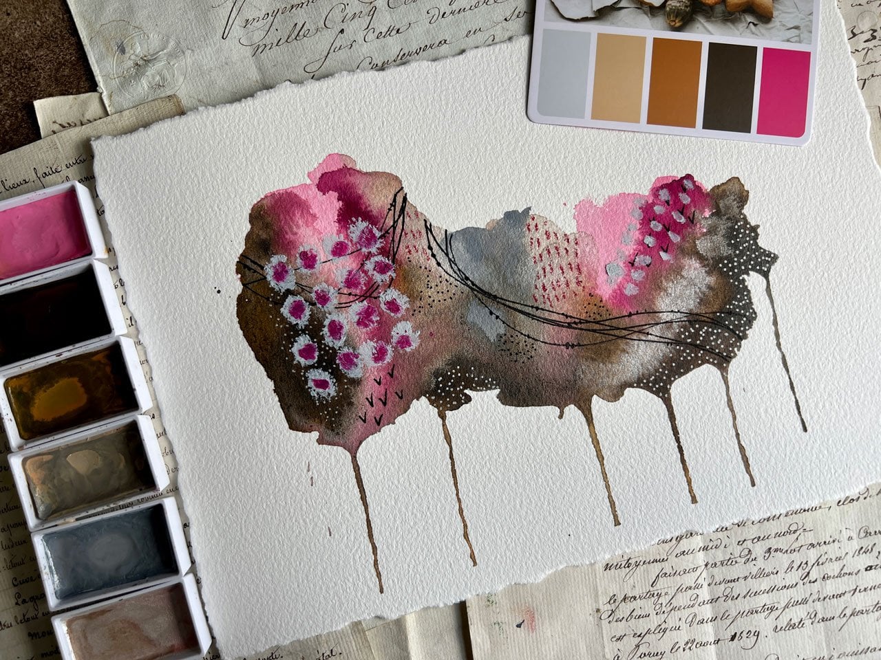
it's very interesting? This stripe right here,
very interesting. Just like it is. This one. The stripe at the top,
very interesting. I do wish there was a little
more separation in this one, but we're going to go ahead
and see what we can create. I really like what I have
going here with the dots, the lines, the little x's. I like these lines
with the dots. I like the little circles
with the gold on top of it. Let's start with this one. We've got our other piece
up here for inspiration, and we'll just see what it is. There we go. I'm trying to make it where you
can see it but I guess [LAUGHTER] it's just going to be in the
way. There we go. I'm wanting to see what
can we create here. I really liked the
dots with the color. With the little dot swirlies
that we had over here. This with the dots of
color in the swirly. I think I'm going
to create on one of these stripes some
dots and swirlies. I'm just going to
pick a color that I think was one of the colors
like this one right here. This Venetian red. I'm going to go on and decide. Maybe I'll put these down
here. It's close enough. It's not the color that that is, but it's a complementing color so we're going to go with it. [MUSIC] Here we go, we're going to let that one dry before we come back and
draw on top of those. Let's see what else do
we want to do here. What are we finding inspiring? I really liked
this bloom up top. It's really pretty just like it is but I could come
back with some gold. I'm going to use the posca gold. We could come back with some lines in this lighter part and I'm letting that lighter
in that darker guide me. You can see there the darker
and the lighter and the line that separates it. I'm letting those guide my lines and I'm
doing a freehand. You're welcome to get real exact and use a ruler if you
don't like freehand lines. But I do like the lines, they look uniform enough so that when you're far back
they look good. Then we might come
over here and do that on this side also. Just in the light area. We could even come back
through on the other side of this and do that in
this white area. It really is these
extra details that make these little striped
samplers look so good. Then we're dry enough down here on this set that I
can come back now and do some little
swirly pieces. It's not a 100 percent dry, but it's mostly dry. Then here I could decide, do I want it on all of it? Do I want it on some of it? Do I want it real
heavy on one side and really light on the other
side like they're fading out? Yes. I love that. It's just enough to add some interest to get
in there and add a difference to make you go
what's going on in there? Then I've got my
white posca pens, so we might come in
here with some dots. Maybe I'll do dots around the gold center section that
we've got going on up here, so I'll let that be my guide. I've got the gold
up there and then below and above that I
could do white dots. I love that. I'm really
feeling now maybe some of these lines, maybe with the
little dots in them. Feeling that right there. Maybe I'll do that right
across the center section. Then let this darker area in this darker area be my guide. [MUSIC] Once we get
enough in there, then we can come back with
some pretty little black dots. [MUSIC] I like that a lot. You'll see I did where
long lines of dots and then a couple of
little three-dot things, and so maybe we could vary those up and do
that right there. Then we could also
come back with some white dots on those
dots if we wanted to. If we wanted it to be a little bit of a white dot
on top of the black dot. I could have just done
white dots on top of the line but just another
layer on our layers. Bond, bond, bond. We could do gold dots, I had those gold. We come back on top of that
with gold if we wanted to. [LAUGHTER] Now that
I said gold dot, I do think I want some
gold dots. Let's see. Maybe on this section
where it's darker, maybe I want some gold dots, or maybe right up here where it's lighter that would be fun. Let's do that. [MUSIC] Another thing I might do on this one that I've
not done on others, but I was inspired with
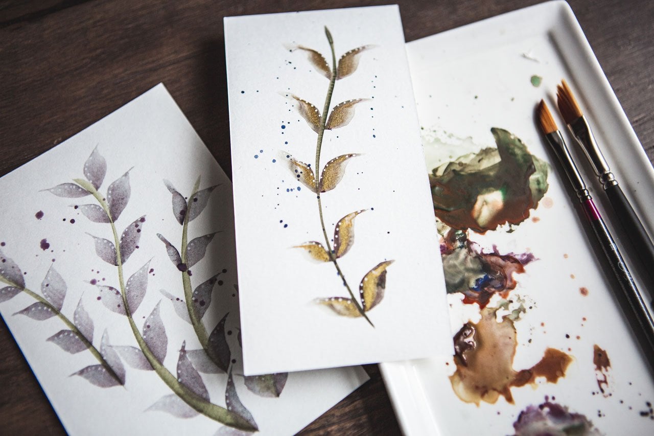
our doodling books, I could have some vines with some leaves coming out
this top section here, which vines and leaves is
one of my favorite things. It was on my little
sample sheet that I had [NOISE] showed you. I've got the little
vine with leaves here. On the backside, this little
line with leaves here. That is one of my little
go-tos that I like. We could put some vines in here and just let
them be interesting. Or you could do little flowers, or you could get
creative there and what you want to have up there. It doesn't have to
cover the whole thing, like we could just have it cover one side and just let it be
its thing just on that side. Showing up a little bit
less than I might hope, but I do like it there. Let's do one more right here. We could actually come
back with another pen. I actually have a pen that's
darker than that pen. [NOISE] These deco brush pens, I've got this in this
metallic red gold. If we're not happy with
what we did up here, we could come back on top of
that and add another detail. Now that I've done
this, I think I liked the way it originally was. [LAUGHTER] It's good that I'm doing that here
in my sketchbook 1, so that I know that
maybe this pin right here is not going to do
really what I wanted. That's why I do these
in a sketchbook. It lets me know what
I'm going to like and not going to like before
I get to my final pieces. That's really
pretty, I'm actually liking what we have
going on there. I like that this stripe has
a little bit of movement. I like that this
stripe is solid, this stripe has that gold in it. We've got the other
little thing, it's going along
with them in there. That's actually really pretty. I like everything
we've got going. I think for the moment we back up and I will pull the tape off this
and see how we did. I wasn't careful, so I did
get paint out here beside. But let's just say
that you really loved a piece in
your sketchbook. You could trim these
down and you'll notice now the tape is pulling off nice and easy and I've
got a clean line. I did not use my
heat gun on this, because the heat gun would
have heated up the tape and would've made the watercolor
go up under the tape. Man, now that this
is peeled off, look how pretty that
is. Oh my goodness. See. Now, this is why you
can't judge the stripes. If you wanted to frame that, if you liked it enough
to be like, oh my God, I want to frame that, you
can just cut these out. You see how pretty the strike border still is even though I got paint over here,
it doesn't matter. I can trim it right off. Look how beautiful that is. I was actually
questioning whether I was even going to like that
as I was painting it, which let me tell you,
seems to be my MO. I seem to question every one
of them as I'm doing them. [LAUGHTER] But that
looks amazing. I hope you loved that
as much as I do. [LAUGHTER] Let's go
to the other one. Hopefully, we'll think it's
amazing when it's done. Oh my goodness, totally
just made my day. I love it when I peel those, and whatever I get is just
better than I even hoped. Let's go ahead with
our second piece and do some decorating
and see what we can get. I'm probably going
to decorate this and speed it up for you so you're not watching
the whole thing. Let's just see what I get. [MUSIC] Let's take a look
here at some of these yummy different
lines that I came up with. I went in and got some gold dots around the gold
dropped in paint. I let this one as it was, because this whole
stripe is very interesting, just as it is. It's got some craft paint. It's got some paint that's loose and paper
shining through. I've got a gold stripe. I've got some leaves
that I drew in, some lines with gold dots underneath the gold
dropped in paint. A little bit of a black line where the paper shows through, little diamond pattern
and some dots, and then our painted dots with
our little swirls on top. Super fun. I like
where this is going. I'm going to peel the tape off and we'll see if we like it. Once you peel your tape off, you can keep adding
to your lines. But I do like where
this one went. Look how pretty that
is. Really pretty. Now I've got two stripes
here in my sketchbook. Look how beautiful those are. That makes me excited to go to our bigger striped pieces because if you do a piece this size and you
think it's beautiful. This is the perfect thing
than to make it larger. You'll know you love the colors. I want you to do
several of these in your sketchbook and
then move on to larger pieces in the colorways
that you really loved. Hope you enjoy
sketchbook practice here with our samplers, and I will see you
back in class. [MUSIC]
9. Large Piece Painting Stripes: [MUSIC] I'm going to
go ahead and create some striped larger pieces too while I'm letting
my littler pieces dry because I want to
do a bunch of these and then play an
experiment as I'm going. I want to show you two different
ways to apply the paint. On this one, I actually wet the
whole piece of paper and then started
putting stripes on it. You'll notice how everything
runs together and it's not real clear, it's
foggy-looking almost. That's with wet paper
and wet watercolor. After I did it, I was like, "Oh, definitely not the right technique for this
particular project." I encourage you not to
wet the paper beforehand. I like it with the dry paper. The dry paper allowed me
very defined stripes. They blended together where I might have wanted them
to blend together, but the whole thing
didn't blend together and create a big mess that
I wasn't wanting. If you want it atmospheric and more blendy than what I do, wet the paper first
and try that out. That might be the look
that you're going for. I'm going for more
defined stripes, things that have more
separation in it with the color that I can
get in there and some little defined areas. I'm just showing you
a different ones that I've done with some
different colorways. Look at that one, real pretty. [NOISE] I actually liked this so much that
I made this pair. I love that. This was a pair
that I had made for that. If you want to have a pair of things that you can hang up, then you might do
two of color way, and then you'll have different pairs to frame
and hang together. I like all the differences
that I get between the two because like here you have this stripe that has all
of these blooms in it, and here you have this
stripe that doesn't. A pair would compliment each
other beautifully hanging. While looking similar,
they would look different enough
to be interesting. Each one have its own interests. Then I like the greens and the reds and the gold and stuff. I think on a bigger one, I might play with. This is one that I had
done that I didn't get to finishing yet. But maybe a pair. I'm going to tape these off. We'll do one in class, and then I might do the
other one later perhaps, but I just want to tape these, and then I like to
just tape the edge, not tape it all the way down, like there's a little
bit of tape leftover if I want it to be taped down, but I'm probably not going
to leave it taped down, and that allows me to
pick it up and set it on the floor to dry while I'm
working on something else. I really love the taped edges because when we peel those off, we get something really cool. I'm just making sure that we're nice and taped in
the center there. Then if I'm going to
do more than that, now I can move it to the side or set it on the floor
and let that dry, and I'm ready to
create my next piece. I do a lot of these where
I paint a lot on one day, set each one in the floor behind me because it's a wood
floors here in my studio. [LAUGHTER] Then tomorrow
when I come back, whichever one I'm
inspired to work on, they're all down there dry, ready for me to start creating. [NOISE] We've got
some taped off paper, and now we are ready to create. I'm going to pick
oranges and reds. I'm just going to do a
variety, nothing exact. These are larger, so I might be painting more on an angle
that I can get by larger. I'm not trying to go
as fast as I can. I'm trying to create
interesting stripes. Maybe add some more
water in here. Maybe dot them in to really get some interesting blooms
and those colors moving. Then I might move
on to the next one, and I'm just picking
a random color there. [NOISE] Might dip another
color into this color. [NOISE] I think that was perylene scarlet and
quinacridone fuchsia. You might make yourself
a swatch card of colors. If you're not sure, if you're going to
remember what colors you used and you think,
"Oh, my goodness, I love it," you might make
yourself like a swatch card of different colors and that was a little brighter
than I expected. This is one of those paints
that I made [NOISE]. Make yourself a swatch
of colors and keep that so that later you'll be
able to look back and say, "Oh, that's the colors I used," or, "Oh, I didn't like that." [LAUGHTER] I've now picked
up that color three times. We're getting a great big
stripe out of that one. There we go. Let's just
add this one instead. Again, if you've got a
color in there that you weren't expecting
to where it was, you can come back and dip
your color in other places, so it makes it blend in better. I really like some of what
that's doing right there. It's making these
little blooms of color come down in that pretty. I want some of this
color in there. Let's go ahead and
just create some area. [MUSIC] You can skip around like you
don't have to have everything going on
there at the same time. You can skip your stripes around and do some
other stuff here. Then we can come back
and add to those. This is the perylene scarlet what looks almost identical to the color I handmade,
so that's interesting. Add some water in there. Then if you get stripes
that you've made, and you think tomorrow, oh, I don't love this,
then you know what? You don't have to use
it. You could come back and make
another stripe one. That's why I like
doing several at a time if there's
something I don't love, I can work on that, change it, pitch it [LAUGHTER] and try again tomorrow or the next day
with something different. I like doing different
colorways and testing them out. Don't give up on your stripes
though until you've added in different mark-making
and just see, because maybe the stripes
themselves you don't love. But, for instance, like
this one I'm like, do I love it? I don't know. But then when I added in
all the lines and things, it became much more interesting, and I'm like, oh, I
really do love that. Don't stop here thinking, I don't love the stripes. Try adding some patterns in and see if that doesn't bring
it all together for you. We painted one, I'm going
to paint a second one. I may like one better
than the other, but I'm going to put
this one to the side. Don't forget to move
them back and forth, maybe add some extra water, and just see what you like best. I'm just going to try
a different layer of the stripes on this one. Instead of just going
straight down the page, maybe we can work
coming down up. Maybe start and finish
with the same color, perhaps to pull it together. Normally on different paintings, I'd be talking about say, composition in different
color and stuff, but when you're
talking about stripes, what is the composition? Maybe on these, I'm thinking of color weight,
lightness versus darkness. Did I get enough
light areas versus enough dark areas
for there to be interest and movement
in the piece? That's something that
we could think of. This is quinacridone magenta. Even though I said I'm going
to use the same colors, maybe we could experiment
a hair here and add some other colors working in and see if we
like this better. Then I could come back and do a second one of this
if I liked it better. I'm just experimenting,
layering different colors, not really paying attention to necessarily the color
I've picked up. You could be real deliberate, you could be serendipitous. You could be real
exacting in the color that you want to put down and
where you want to put it. It's in your own
creative moment. What you decide, what
you're thinking. If you're like, oh,
I want more of this, or I want more of that, or what if I dot
this color in here? What if I do wet on wet here? What if I do this?
What if I do that? What if I add some
little dots as we go down and watch
that color balloon into the color above it? You see how fun this can be. This is addicting. This is very meditative. Let's see what this color is. This is quinacridone
pink. Let's try it. That's a little brighter. Yummy. This is pinky pink. This is one that I made. Just might see what that
looks like as a stripe in here. Look at that. Let it bleed in there. How pretty that is.
I did like that. That's fun how they
blended right there. You could definitely get real exact or real serendipitous in how you plan
out your stripes. I guarantee, the
more of these you do the more you'll want to plan. I'm going a little
more for serendipitous today just to see
what I come up with. Don't think I'm getting
these all back in the right container,
but that's okay. Then we'll let this one dry. We'll look at this one,
is there any more that we can make the water move
a little bit more? Definitely got some really
interesting color things going on here. I almost like this
range of colors a little better with the
more magenta tones. Now, these, I'm
going to sit aside, and I'm going to let them dry overnight before I
come back to them. You might go ahead
and do several of these bigger striped ones. I'm using that 140-pound
watercolor paper that I had shown you. This is a nine by 12, which is 22.9 by
30.5-centimeter size, 140 pounds, which is the
300 gm squared paper. Just a good-quality paper. You don't want the cheapest
paper because really the art looks much nicer on
at least a decent paper. This is the size I'm using. I do have a bigger size
too that you could go even bigger if you were wanting
to really do large sheets, but I would work your
way up to the biggest. This 11 by 15 is so big it doesn't really fit
on the camera screen there. But I would work your way up. That's why I started
the class with the little squares and then the smaller stripes and then
the bigger stripes. Work your way up to the bigger pieces so that
you don't get frustrated, and you don't quit, and you don't get into a hurry. Part of this process
is letting the watercolor moves and bloom and do the things
it's going to do, which is what makes it so fun. Another thing I just
happened to think of that I didn't do on here is I might add in some gold
before we completely lose our opportunity to have it blend in with
some of these colors. See if I get it
while they're wet then we have the
opportunity of that to just get in there
and do its thing. I love that. Might add some up here in these. That's pretty. That's going to shine really pretty
later. I like that. Then we could dip other colors, and you can be creative
in what you're dipping. But I do like what we
have going on here. I'm going to let these two
dry and then we'll be back. [MUSIC]
10. Large piece adding details: [MUSIC] These two
pieces are dry and I'm having a hard time deciding
which one I want to finish. I really like all
the color blooms and blending that
we've got in this one, but I liked all of the
maroon in this one. I think for class, I'm going to finish
this one with all the blooms in it and I'll
save this one up here with my other random unfinished
one that I have ready for me to sit and do
one day to match this piece. I'll set that up there
to work on later. That's what I like about these. You can create a bunch of them, have them ready, come back to them
when you feel like you're ready to create. Maybe we'll put that
one on the floor then continue drawing. Like all the color blooms and the weird things
that we've got going on with the watercolor
on this one, let's just jump into this one. We're working on a larger size. These are much bigger than
our sketch books sized ones. I've got quite a bit larger
in size, you can see. I'll grab the other one just so we can take a look at them. Here we go. You can see how
much smaller these are. Then the great big
one that we did. The bigger you get, the more
room you have to do things, which is why I like
doing this small one, but then scaling up to
the next size and seeing what we can do to get
to that next level. On these, I like having
this as inspiration, and I like to be able to
look back at our squares that we've finished
as inspiration. I'll definitely be
personally referring back to those and getting
inspiration from them. But let's just go
ahead and jump in and see what we want to create. One of my favorite things
is the lines with the dots. Here's a stripe that doesn't really have
too much going on. Maybe I'll just go ahead
and fill this in with the yummy lines and add
three dots in this line. It looks like jewelry when I do this with the
dots and the lines, I think that's why
I like it so much. That's really pretty. We'll just keep on
building from there. We have so much
more space to fill up that we are definitely
going to have to think on each layer
like what is it that I want to go
into this layer? This is one. It'd be
really helpful to have your little
library that you've created of patterns and designs, doodles, or the xin tangle
books for inspiration. If you get stuck, look at some inspiration
on Pinterest. You can look up xin tangles
on Pinterest, I'm sure, or doodles, patterns,
or anything like that. Then on these bigger ones, I'm really letting the light
and the dark be my guide. I'm not necessarily going to do the whole pattern on the stripe. If there's a variation on
the stripe that may can say, don't put the dot
here [LAUGHTER]. I'm actually doing the dots
on the lighter area on purpose just to add
interest in the lightness, but not necessarily to be so dramatic that it's
jumping out at me. I just want the interests there. Then as I'm looking at it, I might be thinking, never mind, I want the dots
everywhere [LAUGHTER]. Then you can see where it
goes from light to dark. Then we'll see that
there are dots there. Don't be afraid to think it
out first and then think, that's not really what I wanted. Then what's really cool
about this section here, is now that I've done
the dots in this pink, it blooms on up into here. I'm thinking, do I want to balloon the dots up into there? Or do I want to do
something different? Just something to think
about as you're going. Where do you actually want to stop one pattern
versus the other? I think it's fun to stop it. Or a color makes you
stop, kind of thing. Obviously we went
up into that color, but this is obviously different. Stopping it at that natural
stopping point. There we go. Look how fun that stripe is
in the middle with the dots and then stopping the
dots at the other color. I love that. Pretty stripes. I`ll go back with
my gold posca pen. Let's see, what do
I want to do here? I really like this
random area right here, I might do some lines in that little section
of just read in there, that would be pretty, I think. On some of them, I'm just
combining white and gold, some of them I'm doing
white, gold, black. Your choice there on how you
want to combine your colors. If you've got pins and different
colors and you want them say to be red stripes in this red area, you
know, go for it. That's pretty. I
think on this one, I'm going to follow this yummy weird line
that we've created. These watercolor blooms. Then do similar to one of our inspiration pieces
where I did lines and dots. I think I'm going to
do that here. [MUSIC] I think here on this top one, I'm going to just draw
some little doodles. A few here and there, it doesn't have to be a whole
whole or the whole way. I do think it'll be fun to have some over here [MUSIC]. I think I will take one of my rulers and draw some straight gold lines in here just to give
me some difference. They can be straight. Of course, I should've
started where I really wanted to start rather than
where I want it to end. I like using a clear ruler
for stuff like this, because I can see here from
the line over here at my tape how straight I am so
I'm not guessing. Am I straight? Am I way off? I can eyeball it and judge, if I got straight
because the ruler is clear and I can see the
edges there with the tape. I just want this to be a real fine detail that
maybe you don't even notice till you get
up close and then you see pretty little
gold lines in there. It's very, very
subtle but really pretty in there. There we go. [LAUGHTER] You can just very subtle but you
can still see it. I just wanted the
subtlety in there. I can go back and add another
pattern on top of that. This is about layering
in different patterns and doing some
different things here. We could keep adding onto that. I think I'm going to
add onto this with little gold swirls
in this dark red. That's a pretty stripe, I like that a lot. I think on this one I'm going to outline the watercolor
and put some stripes. Maybe in this like
I've done before, it maybe going up into the dark color [MUSIC]. I'm serendipitous in what
I do here in my stripes. But after you do
enough of these, if you decide, man, I
really loved doing this. I love this whole technique. You might plan out different things in
your stripes and make really deliberate decisions on what you'd like to have
going on in there. I think I'm going to go
back with some watercolor. But you might start
planning out your stripes and being real deliberate
about what you put where. Now, these painted ones
that I just put on or dry. While that was drying and
I went up here and added [LAUGHTER] lots of
little gold circles here around there because I
thought that would be pretty. Then I'm just going to
come back on here and add some little gold
detail, little swirls. Just every once in awhile. It can be on every single one, it could be on every few. You could just have to
decide on your pattern, what it is that
you're wanting to create when you do
something like this, where you put a color
over another color. That's fun. I think I want a
more frequent than I got it. There we go. I like that. That's really pretty. Then we'll just have to
step back and take a look. Do we have everything
that we want? Do we want to add some more? Don't want to peel the tape
and look at it and decide. I think I want to peel the tape, it's always my favorite part. Because I am at a point where
I think I've got enough in the stripes that I like it. I'm just very carefully
pulling the tape at an angle. When I pull this off, make sure your fingers
are clean so you're not touching your white border. I'm at an angle and I never have trouble with this ripping my paper if I do
a real carefully, not too fast, and at that angle, look how pretty this is as
we're getting this tape off. I don't think I'm going
to call this one done. Look how pretty that is, I love all the
different stripes and texture that we've got
going on in this one. I want you on these two. When you start off, try to get as much movement and layer and texture as you can
in the stripes themselves, so that when you go to
draw your patterns and your textures and your
designs into each stripe. The color itself is part
of the design element. I really like that
feature about it. This is the one that
I've done previous. Then you can see
from the undone, and I might not even
be done with that. A lot of times I
like to peel it and look at it and see what I got. This one is another one
in the similar color way. I could hang that as
a pair. I love it. But you'll notice on this one, I actually have a lot more in my stripes or maybe a more vivid or maybe there's a lot
more going on with white. I didn't use any
white really as much on this one here
besides the dots. You can tell, there's just a different amount of
pattern and design going on. You need to practice and decide what you want to do on each stripe
and plan it out. If you want to do like me and be serendipitous and think, here's what I'll do in this
stripe now that I'm to it. Great. If you'd rather
be more precise and plan each stripe out based on
previous works that you did. That's always fun too. I do like having a pair of these because if it's
something that I wanted to sell, I could
sell it as a pair. If it's something
I wanted to hang, I can have it framed as a pair. You can see how that
pretty shine is and that pretty shine that we're getting right
there in those stripes. That's that Winsor Newton ink. It's not the Posca
pen or the other pins that Winsor Newton ink really
shimmers in the light. Whereas the pens, shimmer but not quite as much. I do like these, I might use
that as my pair [LAUGHTER]. I'm going to have a few
that I've still can finish. The one that we did in class and this one that
I've done prior, I like having pieces
that are already prepped and ready
for me to create. I hope you enjoy creating
larger stripes samplers. These are really
beautiful when you're done and I'll see
you back in class. [MUSIC]
 DENISE LOVE, Artist & Creative Educator