Transcripts
1. Introduction: Spring is often called the
season of new beginnings, because it marks a time
when nature, people, and societies experience renewal after dormancy of winter. Just as plants start
having new leaves, people also start to see spring as a time
to set new goals, develop habits, and
start projects. Today's class is
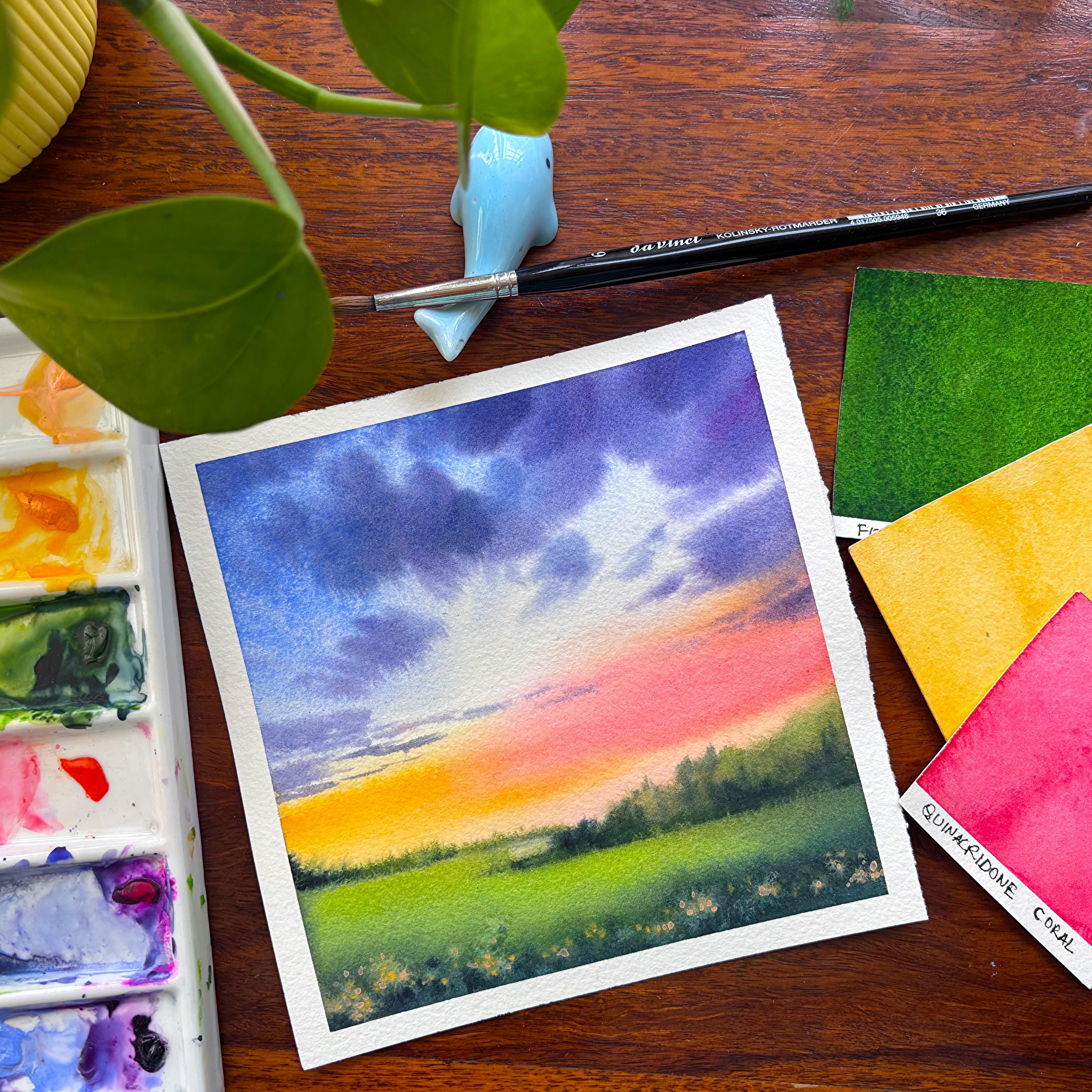
all about creating a small 15 centimeter
square painting to celebrate the beauty
of spring season with vibrant colors. We will begin by exploring the materials you need and then move step by step toward
completing the final project. Along the way, you will learn
simple techniques to bring fresh spring energy and
colour into your artwork. So grab your paints and brushes, come and join me and let
St. Spring together.
2. All you need: Look at the materials, tissue, three brushes, that is 246
size and a wash brush. That is three by four inch. I have a washy tape, pencil, eraser, arches, 300
GSM, 100% cotton paper. This is 15 into 30 centimeter. I would be taking half of it, two jars of water, and you also need a
square eclic board for taping down your paper. On the left, I have listed down all the colors which we will need for completing
the painting.
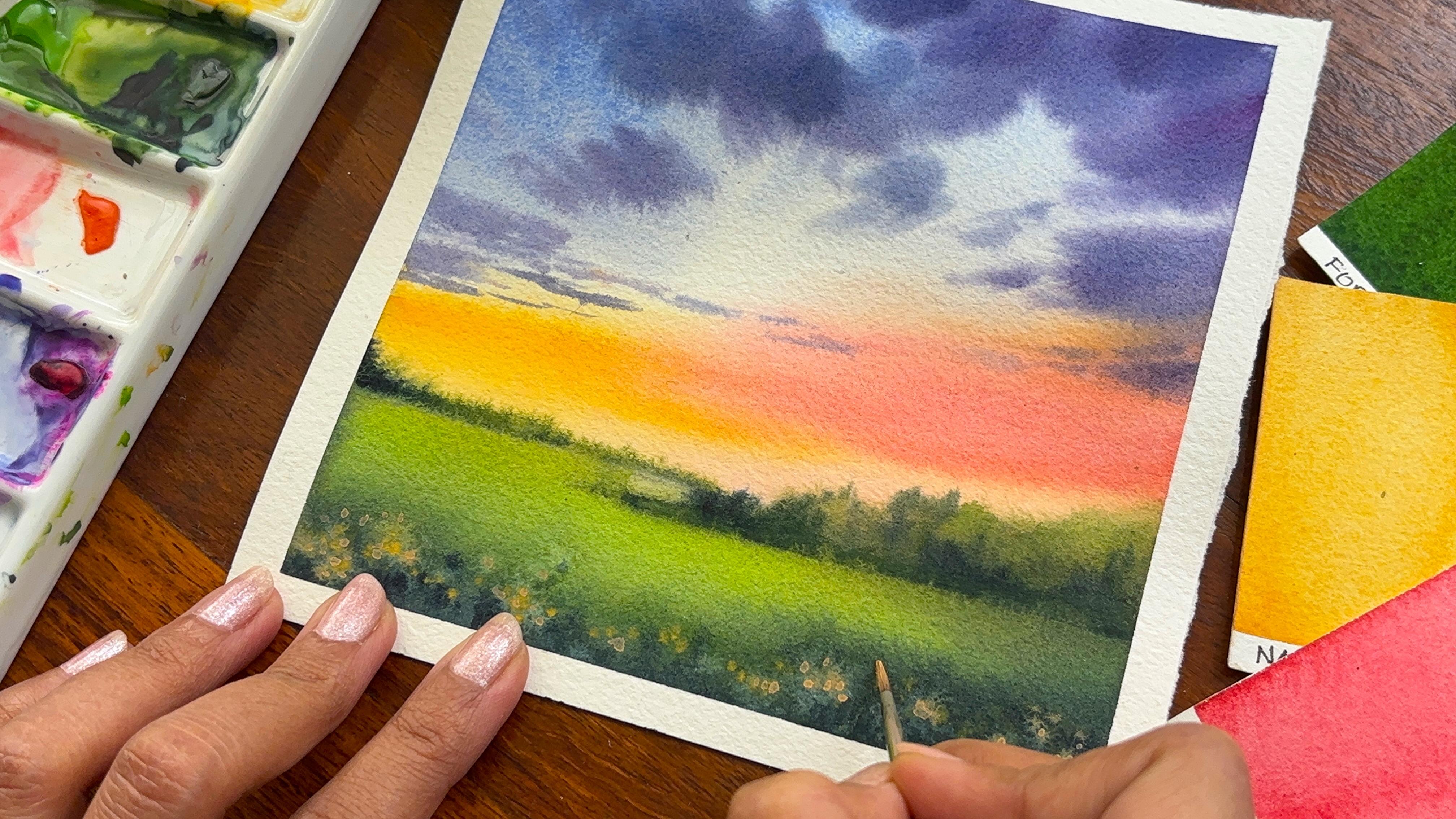
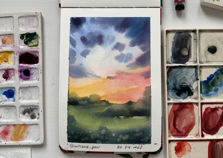
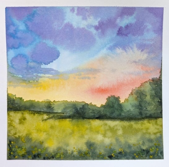
3. Project - Sunset in the Spring Meadow: A peaceful spring meadow
scene with a glowing sunset. There is a gradient for the sky, which we would be creating, moving on to the soft clouds, then the rolling meadow
and wildflowers. These are the four
components that we are going to add
in our painting. But first, let's just
mark our horizon. Apply one layer of water
on top of the paper. This is a size that is
around 15 centimeter. You can go ahead with something smaller or
even something larger. I would leave it up to you. After you have
applied the water, there would be a shine
like this on the paper. I'm starting out with
my lightest value, which is my naples yellow, and then there ominent yellow, and it looks a bit like orange. You can also go ahead with the color like indian
yellow from Cenavior. These are just the
pigments which have different names with
various brands. Now add some amount of your
quinacridone coral or orange. Both of them works fine. The speed of my video is 1.2 x, hence you can go
ahead and reduce the speed before you
paint along with me. I am again adding some of my
permanent yellow over here, as you can see, applying it from the left
towards the right, and moving it close
to the horizon line. My paper is really small. Hence, a size board
brush is good. If you are using a bigger paper, you need to go ahead and
change your brush size or else your paper will dry up quickly even before you
finish your painting. I would be using a
beautiful lavender color from the brand
Migo Mission gold. If you don't have
this, you can also go ahead with erbium blue. Now, both the colors are great, and this is mixing
some amount of my bar blue along with
the iridium or lavender, whichever is available with you. Kobarblue is from
the brand sennelia and this also has some
kind of texture in it, which is basically giving
me a beautiful outcome. I will go lighter and lighter towards the right side
and the left side, I can also go a bit darker
compared to the right side. This gradient wash is something
that I've always loved, but creating the
kind of movement for the clouds is very important for this particular painting. Though you can always have a gradient wash
that moves from top to bottom with various colors like we have done over here, but since we had
a cloud movement, so we are adding the blue in a way that moves
towards the middle. I would try to keep my paper wet for a longer period of time, but all I can say is, since it's hot or spring
season already in India and in the
southern side of India, which is majorly Bangdor, you will see that this
is the peak summer. Because it is peak summer, my paper starts drying
up very quickly, and it becomes really tough for me to continue working on. Right now I am mixing
some amount of my mineral violet into the
cobalt blue that I have. Then again, some
amount of my indigo or your ontrine blue to
create these clouds. While I go from the top, it would be more darker and while I go towards the bottom, it would be a bit more lighter. You can see since I am mixing some of my
colors on the paper, the shade of the blue keeps changing and I really
love that part. I will only work
on the spaces of the clouds that are still wet
or the paper is still wet. I will not work in the area
which is not wet anymore. In case you are
facing a challenge with paper like I am doing, you can also go ahead
with 600 GSM paper. I have taken 300 GSM
arches, cold breast paper, but you can always choose
a higher GSM paper which will keep your paper wet for longer period during
the summer season. While I move towards
the horizon line, the strokes will become smaller. You will see that
near the horizon, the clouds are smaller and
thinner in size compared to the ones that really you
observe towards the top area. This is how your
perspective works. In case you are looking for more detailed classes
about perspective, you can go ahead and check
out my other classes, which talks about
vanishing point and how the whole of the
nature of doubts work. Till then, let's
continue to use the tip of our brush to create
further clouds. I am not going to
go ahead and add a lot of them towards
the bottom area, since this part will
be again green, and we will be creating the green once our paper
is completely dry. You can see I have given
the time for my paper to become lutely dry before I go ahead with any
of my green shade. Adding some yellow
because I just wanted to make my
painting more brighter as it is the spring
season and spring calls for more colors and
brighter shades. I am using my olive green. You can also go ahead
with sap green. Now, sap green is a great shade in case you are in love
with or the tones. As my paper is wet, hence, whenever I'm trying to add these colors, they
will become bloom, and it would be more softer
in nature compared to the dry brush strokes which you will get if the paper is not. I love the brush chokes that
we have created over here. You can mix some amount
of your indigo and then start adding these darker
shade towards the bottom area. I'm using a size to
brush to do this. You can also go
ahead with any of the other sizes that
is available with you. Using my Dewncy brush, I am in love with this
brush in case you are anytime thinking about
investing on good brushes. You can get the
DewncKlnski series. They are excellent in terms
of the tip and works fine. I have been using it pretty extensively for most
of my paintings, and I'm pretty happy with it. Okay, adding the top area, you can see the soft nature of distant trees that
appear over here. I love the fact that we are mixing the
colors on the paper, which gives us various shades for our distant trees
near the horizon. Let's continue to work
even on the left side. But first, let's finish
the right hand side. The most important aspect
of watercolor is what you choose if you are
choosing a soft beauty, then you have to continue
to add clear water. I always keep two jars
of water with myself, one for cleaning my
brushes and another for in supply whenever need be
like we are using over here. I'm using some of
my darkest value, again, which is
basically indigo, mixing with the sap
green and coming up with one or two simple
dots here and there. This is helping me to create
the illusion of distance, finally getting towards
the bottom of the paper, and this is practically
the yellow green which you get from
Mijello Mission Gold. You can also go ahead with other greens that is
lighter in shade, avaiable on your palette or mix some amount
of yellow into your green to get
a color that is closer to the one which
you absorb over here. I see the colors on the left bleeding a lot more
than I would expect. And hence, I'm going
ahead and using my flat brush to just
clean up the space. Once this is done, I would again add my sap green
towards the bottom area. I'm really excited with how this whole painting is
looking at this moment. Frankly, you can also
stop at this stage, but I wanted to create
the spring meadow. So went ahead with some
loose floral fields. You will see that as I make some amount of blue
into the sap green, the color will turn a bit more darker than what you
have seen earlier. You can also mix some amount
of bar blue along with indigo to create this color that you right now
see on the paper. All the shades are
warm in nature as warm shades to mark the spring
season to a great extent. And as I have done it
on a smaller paper, it really leaves us
with a lot of time. I have become a mother
for the second time, and I have a seven d cold in my house hence really
can't take out more time. It is ten to 15 minutes
that I get in a day to work on any kind of
painting or project. I'm again going ahead
and adding some more of my blue shade into
the bottom part. I would be using my
John Brilliant number two for creating the meadows. You will see how I
work through it. This particular shade
is from Holbein, and I have been using it
in many of my paintings. This color is also known
as peach in white knights, and in Holbein, it
comes as naples yellow. I first create the
florals with the help of my naples yellow
color from senala, and then on top of it, I would be using my John
Brilliant number two. You have to continue
working through it as this is a shade, which is not exactly
transparent. It is a bit translucent
compared to the ones that we
have already added. I'm also adding a few dots of darker value of green
towards the bottom area. This will really show the
loose grass that we have, though they are more like
blooms as the paper is wet, but still it sets the
texture of the field. Flattering some clear water, and then mostly I'm done. I do not want to go ahead and complicate the
painting much more. I would go ahead
with dots on top of these floral
fields that we have created and make
it look a bit more detailed as it is
closer to my eyes. Now, adding these dots is
more of an iterative process. You can continue to
just have a look at it, let your paper dry off a bit, and then add more of it. You can also use
your fingers to just pick up the colors
wherever it is necessary. Finally the best part about a soft watercolor
painting is the beauty, delicate flow of colors that
blend effortlessly on paper. The transparency of
watercolor creates light, airy layers, giving the painting a dreamy and calming feel. Soft watercolor also
embraces happy accidents. The gentle bleeds, gradients and subtle texture make each piece unique and full of character. It feels loose, natural
and expressive, allowing the painting
to almost create itself as the water
and pigment interact. If you love soft
watercolors as much as I do and have created
this piece along with me, please upload your projects
to the project gallery. I truly look forward to seeing each piece created
by my students. This class sparks some
creative inspiration in you. Please consider leaving
a review or a feedback. Your feedback means a
lot and encourages me to create more classes
like this in future. Happy painting, everyone. I hope you truly enjoy
the process of creating, experimenting with
colors, and letting your creative flow
freely on paper. Remember, every brush choke is part of your unique
artistic journey, so don't worry about perfection. Just enjoy the
experience and have fun.
 Dhritikana Nath, Watercolor Artist and Instructor