Transcripts
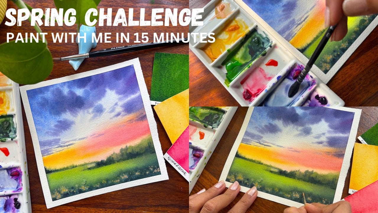
1. Introduction: Spring is the season
where flowers blew, but it fills our heart
with a lot of choke. If you two are in love
with the spring season, then this easy watercolor
challenge is failed. Hi, guys, I am Gara,
an artist instructor, mother, brand owner
of Fibrin parcels, and Top teacher on Skillshare. If you do join me
for the first time, then find all my works
on Instagram by the name Watercolor T Illustration et as well as on YouTube
for the same thing. I give out videos on
YouTube every week, and this ca n Skillshare class. As people say, you should always take some time out from your busy lives and
smell the flowers. In the similar way, I want to
give you this challenge of working with one of the most exciting mediums
known as watercolors. We are going to work on small pieces of paper,
a postcard size, and for next ten days, I'm going to paint ten different spray paintings
along with you. All the projects that we are going to do are bigger friendly and usually the time is
around 52 painting minutes. We will start with
our basic materials that I have used throughout
all these paintings, moving on to some
basic techniques like variegated washes,
lending, et cetera. Then moving on to our
first project that's going to be a real time project
within 15 minutes, which you can work it up. So come and join me and let's work through this entire
challenge of spread.
2. Before we start the Class: Before you start this class, I would like to tell you
a few important things. All the paintings are done on a smaller size of
paper, which, in turn, can help you to not think
much about the colors, paints, et cetera, and
just go with the flow. Enjoy painting and
enjoy this watercolor. Along with it, I
would ask you to watch it on a picker
screen so that if there are even spacial details like blending or some
cauliflower effect, which I did it and give
a good mix later on. These kind of smaller
mistakes that I'm fixing through the entire painting
can also be seen in a cod. Would request you all to
go for 100% cotton paper. Though I have used s185 GS, 100% cotton paper, but
as I know in India, the dramatic conditions have changed to a greater extent and a 300 GSM paper might be of much more use than
a 185 gSM paper. I will request you
guys to see as per the glatic condition what
suits the most for yourself. I'm mostly using
very limited brushes three to four in all paintings. You can go ahead
with any brushes and any colors that are
available with you. Most of my paintings
are done with escota and silver velvet brush, but you can go ahead
with any brushes that are available with
you and any size. You can also paint this on a bigger size paper if you are more comfortable
using a bigger size. All of these lessons
are bigger friendly, so anyone can take it. But before you start out
with any of these projects, please do go ahead with the technique
section as that will help you to elevate and
not make any mistakes, which we usually do in Boakles. Start by knowing
all our materials.
3. Materials Required: Understand what are materials we need for completing
all these paintings. You can see that I have a
16 by ten centimeter paper. This is close to a
postcard size paper which you can go ahead
and have for yourself. I have made all my
paintings on these. L et me tell you the
paper which I'm losing. This is arches, 185
GSM, 100% cotton paper. Now, why I have taken
185 GSM paper now. I have really small paper which I need for
all my paintings, but 100% cotton is very, very important and therefore, I have used only 100% cotton
paper for my paintings. I would prefer you guys to use 300 GSM paper in case you
are staying in any place which has really extreme
climatic conditions like as it is going
on in India now. Keep a pasta marker
with yourself. If you don't have a
Posca marker like this, you can also have a Jery
row pen like this one. This is not needed in
all the paintings, but for a few of the
paintings, you might need it. A black pen, then a pencil. And eraser, you need a
small tape like this. For taping down your paper
from the top and the bottom, I will keep a wash brush, which is size ten, the inc, then a silver black
velvet size six brush. Silver black vet
size four brush. If you are not using silver
black velvet size six brush, you can alternate it with
your scada optimal brush. Keeping a very small
and thin brush for yourself is always great and something like this can be really
good like zero, zero brush or any of the
thinnest brushes size one, et cetera can be good
for all your buildings. These are all from the brushes, which I'm going to use. Let me tell you
about the colors. I have a palette for myself. I will be using a few
colors from here and maybe some extra colors from
the set that I usually own. I have some loose
tubes like these two. I use the colors even from here. Every penguin will
have its own set of colors given in the
beginning of it. Keep a ceramic palette handy for actually going ahead and mixing your colors or putting
your colors over there. Tissues are very,
very important. I would say tissues are
always your best friend. If you have tissue by your side, you can lift up or you can just use it to dab
off extra pains, clean up the edges of your tape. This is a very, very
important thing that I have used throughout my
entire watercolor journey. I'm keeping a white ah. This is basically a bleed
proof white pH matin. This is opaque in nature
and hence I'm keeping this. If you have white ah, that's great to go ahead with. If you have opaque
white watercolor like titanium white,
that's also great. I have two jaws of water, one for taking off the
extra colors and one for just a fresh supply of
water whenever it is needed. I always keep two jaws
handy for myself. This is it from whatever we need from the
materials perspective. Next, let's go ahead with our first lesson where we are going to learn everything
about arb techniques.
4. Techniques Part 1: There are a few basic
techniques which all of us need to know for
progressing with the class. I'm starting out
with the basic one and it is wet on wet that
I'm using right now. I will apply a clear wash of
water on top of my paper, and then I will go ahead with
two colors for blending. There has to be a
seamless blend. Seamless blend is easier
to get in a wet on wet background rather than
in a wet on dry background. We will be working on wet on dry as it is a smaller
piece of paper. Both part size papers
are usually very small. It is four inch, so nothing big as such. Four by 3 " usually the
size or a bit smaller. Hence, going with my Naples yellow no for the bottom
part and towards the top, it would be in acrodon coral. Whenever you are blending, just keep in mind that
we should not have any lines or patches
that appears in between. If you have this simple
idea in your mind, then I think you will
have a seamless blend. When you are taking the colors, you will take the colors from the lighter values to
the darker values. That way you can really
save in terms of your lighter value colors
or else the colors might move from your darker
values to the lighter values. How it usually
happens if you have more pigmented colors and
they are darker in value, like the pinacrodon
coral over here, it will flow into the colors
that are lighter in value. Hence the colors will
mix up with each other and not giving you or not leaving any kind of space for your Maples yellow that you have applied
towards the bottom. You can go ahead with any
of the other yellows. It doesn't need to be
Naples yellow altogether. Whatever is available
with you is great. Just that the blend should be seamless as you
observe over here. I am pretty happy with
how it has turned out. If you want a natural way of
the colors to move around. This is a way you can use your board and just allow
your colors to move. Now there's a small
catch over here. If you have colors on the sides, they might also move
into the paper. I mean, if there
are any colors that are there on the pape, et cetera, they will
also move around. That's the only thing you
need to keep in mind. The second one is a bit more I would say different than what we
have learned earlier. This is the blending, which we have learned first. You all know about flat wash. It is a single color wash
on top of the paper, which is you create a flat wash. There is another, which is
known as variegated wash. Now, variegated wash is very simple. It is just to go ahead with the colors of different I mean, either you can have
one, two, three, four, how many ranges of color
it's absolutely fine. You do not follow any pattern. You may not apply all
of it at one place. You can have a blend like this. Then go ahead as
per your choice to apply the darker lighter
values wherever you want. Some of the places I
will add some dots, some of the places I will
make darker lighter values. This is a variegated wash, which I'm doing right now. On smaller pieces of paper
or on smaller backgrounds, when you are doing
variegated wash, it will give you loose
field like structure, which we are going to create in one of our future projects, and hence this becomes
very important. I will drop in a few dots and just follow me for
adding the darkest of the value towards the
bottom and then making it more lighter as we
co towards the top. That's how I follow it. You can also have lighter, dark light, I mean, whatever colors you want to add. You can have bigger
pieces of paper. You can go ahead with more
experiment in a way you want. I am putting in more of
dots here and there. This is more of a change in the variegated wash that you usually might have observed. It's like 23 colors together. They come and then you
get various sheets, et cetera on the paper, whereas over here, we are having a more
controlled approach, even if you are doing
a variegated wash. I will go ahead with my
yellow and leaden mix with the green that
we have already applied as the green is pretty dominating
in few of the places, I will like it more natural. So I'm again going
over the yellow space, which we did create initially. With the help of
our Indian yellow and create something which looks more loose and beautiful. This is all with experience that I have been working with. You can do it this way. You can also do it any of the
other ways like wet on wet. This can be also
known as a wet on wet technique that you must
have followed earlier. There are various ways of
expressing a same technique. So I might have one. You might have learned something else. It's absolutely okay. Going with yellow and
green towards the bottom. This will help me to actually show you how a
splattering effect works. Splattering effect
is great for getting textures in the
grounds that we create In our painting, I will
go with some clear water or any kind of water
that's available with me. It can be the same
water which you have used for
washing your brush. Once you have the colors
laid over your paper, just platter the water
of the brush into it. That's the simple way
of going over it. This is the
splattering technique. But I will take you to
a bit advanced level of splattering technique
where we are going to use some white ash to create
beautiful florals. I will show it to you in the next part where we are going to create
some loose florals. I will just go
ahead and cover up the area on the top side, because I don't want the
platters to reach there. I'm going ahead and splattering
clear water on this part. You can see how the water is allowing the pigments to get displaced from that
particular part, creating a loose
texture like effect. This can be used even
for the grounds, or else it can be used in any of the other paintings like
grasslands, et cetera. It has got multiple uses, even in skies, doors, windows, et cetera,
whatever you want to paint. It has got a use in it. I will go ahead
with my last part and that is all about
painting my loose florals. This is just the technique. The final painting is very different than what
you learn over here. It might be a bit
more controlled, et cetera, and I might go
ahead and change my brush. I don't need such a
bigger brush over there. Just adding a clear layer, and then we will go
ahead with some of our clear water on top of it
to create some splatters. Now, these platters,
of course, are great. You can see how I'm creating
splatters over here. Once the platters are created, you have to go ahead with some of your white
ash that you have. Go with a thinner brush as we don't want the
colors to move a lot. It's time for adding some of
the whites into our paper. Now, this white will also flow. I usually touch the areas where I did add the
water splatter. You can see how the
colors move and how beautifully they
appear like loose florals. The similar approach will be
taken in our first painting. There we are going to
create white lilies. For the white lilies, I would be using this
kind of c techne. Overall, I would say
that you need to leave some small
dots here and there. Do keep in mind to
leave those dots too. Everything will not be loose and everything will not be precise, like wet on dry method. Some will be wet on wet and some will be wet on dry to get the correct balance which we
are trying to get over here. Now I will see you in the next
lesson where we are going to apply all these techniques
for creating our painting.
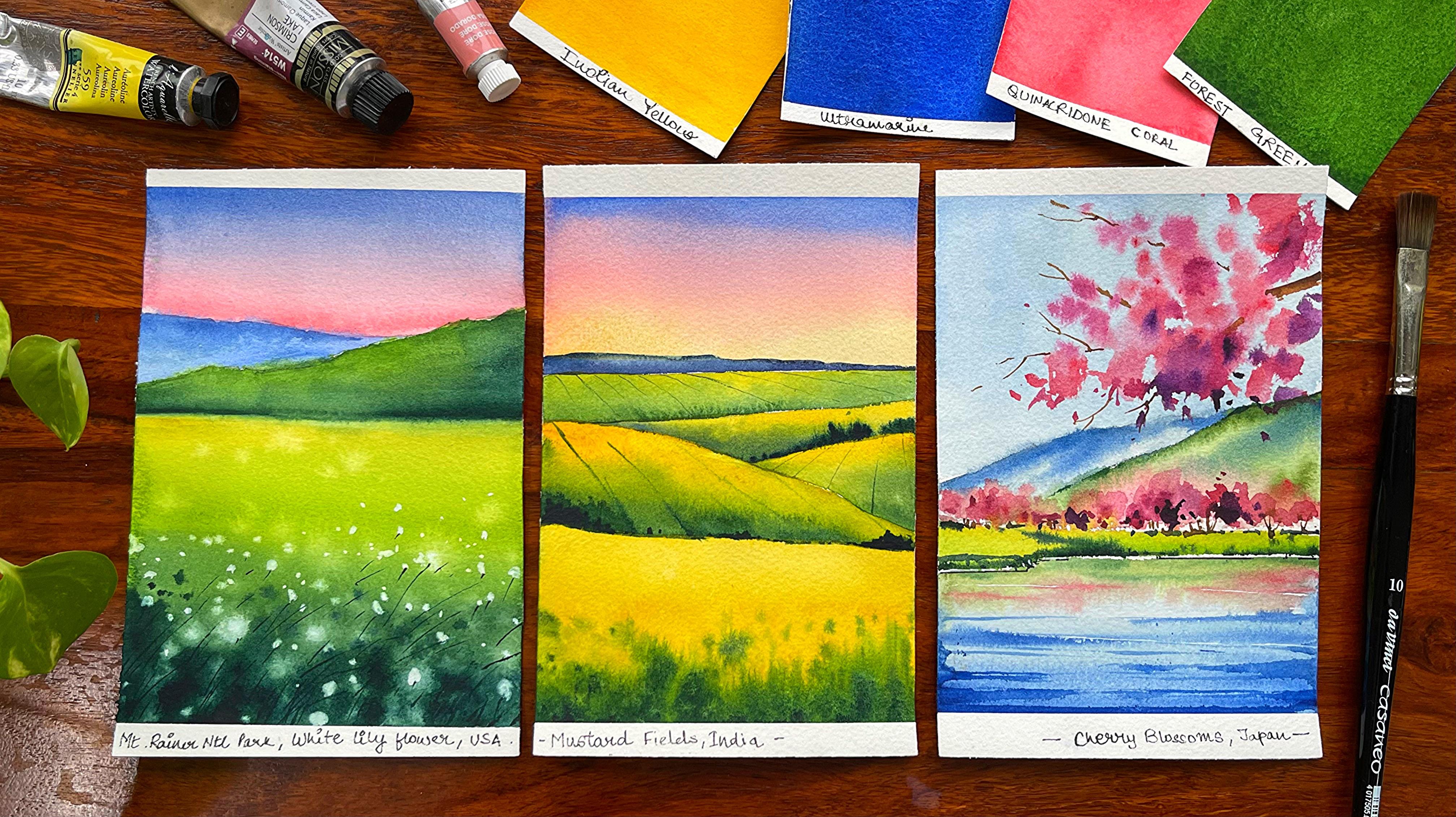
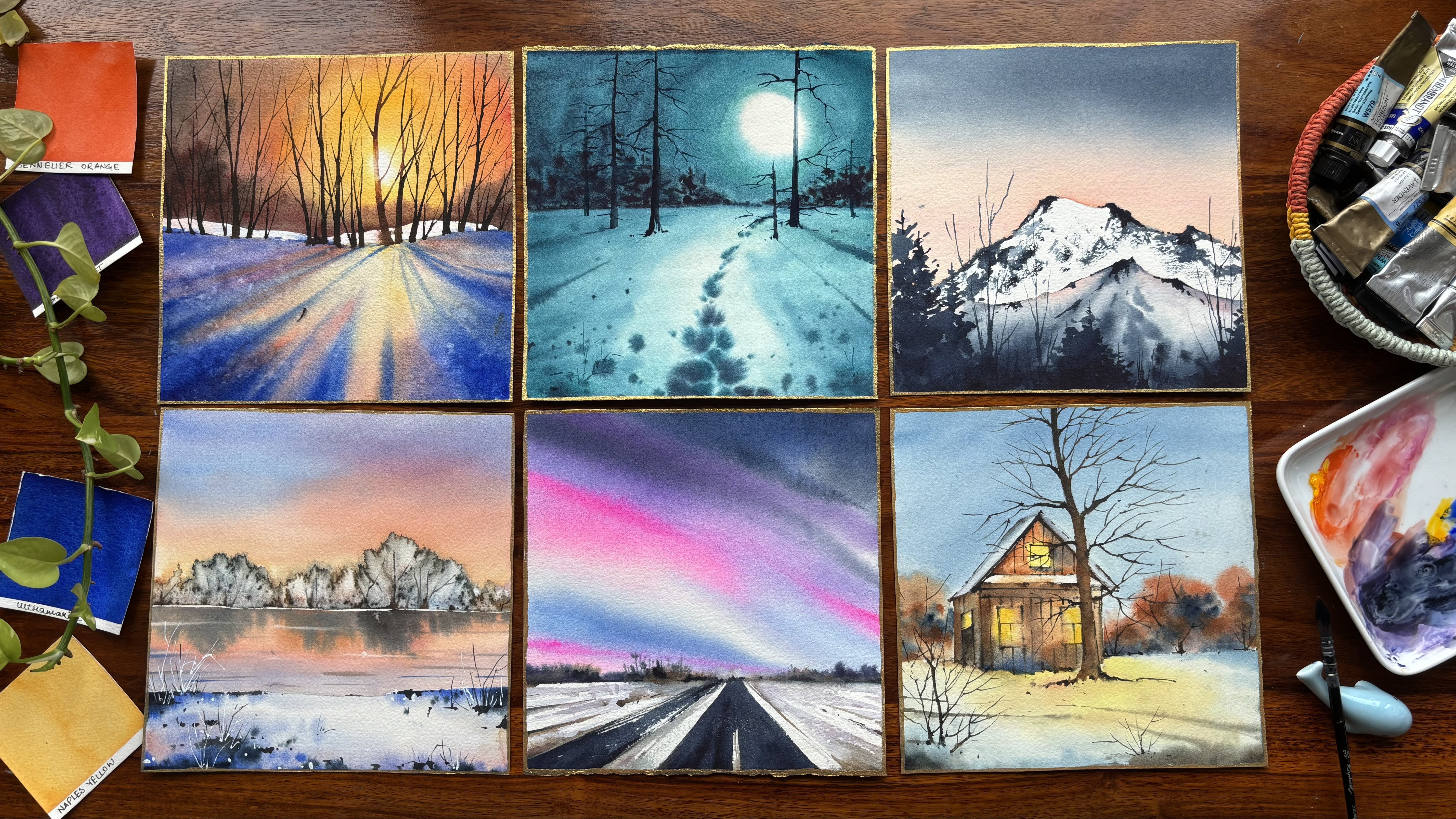
5. Day 1 - Watercolor Lily: Let's have a detailed
look at our colors. It is quinacrodon coral,
ultramarine blue, don three blue, yellow green, hookers green, sap green, or olive green, burn
Ciena, n dike green, or any of the darker value
of green like forest green, which is available with you. Let's start with our first postcard spring
challenge painting. I am going ahead and marking
out my horizon line. You have seen that I will never mark my horizon
line in the middle. It's bit towards the top. And then we will mark a small
hill towards the right, as well as towards the left. It's a very, very
simple painting. Just follow along, and
within a few steps, you will get a beautiful outcome with watercolors that
has white florals in it. Going ahead with my
Quin Acrodon Coral. This is one of my
favorite colors from the brand, Daniel Smith, and then I will blend it with my blue shade
towards the top. You can use any blue
of your choice. For me, it's always
been ultramarine. I am already in love
with this shade for I don't know
how many years now, and it just makes the painting
come to life very quickly. The blending is the
key at this moment. You can see that there is a simple gradient
wash that we are creating from the blue to
the quinacrodon coral, or you can move from
quinacrodon coral to blue. If you move from
quinacrodon coral to blue, you might get some colors
of purple here and there, but that's absolutely okay. Whenever you are
blending your colors, you may get different shades if the blending
happens on the paper. Go ahead with some of my ultramarine that you
see on the left side. I have picked my size for brush from the
brand the silver vevet. I'm going ahead with it and just painting my first hill that
is there in the background. The foreground here, which is a bit towards the front compared to the one that
I have on the background, will be something that would be way more darker than
what we have right now. I'm adding a bit more of
darker values here and there. But all I can say is that you
cannot make it very dark, so some of the places
will be only dark, and some of the places
would be really light. Going with some more of
my blending over here. And then we will pick
up our green shade. You can go ahead with any
green of your choice. It can be olive
green, hookers green, or else, even some of the
other shades like Sap green. I don't have any particular
color in my mind. It's just a lighter
value of green rather than it being a darker
green at this stage. Though we might
go ahead and make it way more darker
as we progress in our watercolor with
this small hill that we have painted over here. I'm blending it with
some darker values of green as we go
towards the bottom area. This blending is, again, a very simple blending that
we do on top of the paper. It's not being done. You can say on the
ceramic palette, and then we take it over here. It's just starting on
the paper and then working through the blending on top of that particular area. I have make some amount
of my ultramarine into the bottom part as
well as towards the right part of
the green area. Ultramarine has a very
good granulating effect that makes the painting very beautiful or
any particular area, wherever you are adding
this ultramarine, there will be some amount of
granulation which happens, and that granulation really
helps the painting to have a edge over any of the
other parts that you paint. I'm going ahead with my
yellow green and then blending it with some of my
sap green hookers green, any shade that you
have of your choice. This color is very pretty, which I have as of now, and I am already
in love with it. If you actually
blend some amount of your burn Ciena into this hookers green
or your sap green, even Ove green is great, but olive green actually has
some amount of burn Ciena, which gives it way
more darker value compared to what you
usually observe. This particular painting is
pretty bright and vibrant, though all the other
paintings that you would be doing may not have
the same kind of an effect. I will go ahead with some of my ultramarine as I go
towards the bottom, and the middle part, you can see we have added
some of our forestry. Forestry is from
the brand cenar. I have been using this
green very often. You can also use
vent dike green. That is one of the very
dark shades of green. Now I am splattering some amount of clear water on
top of the paper. This is a very beautiful
textured effect that we can usually observe when we are doing any of our floral fields. I have been using this technique very often in many
of my paintings, and this particular painting, I am using it more often so that we can get
floral like outcome. You will observe it as we progress through this entire
part of the painting. But before that, I
did splatter some of the colors on
this small hill, and I'm just going over the shades again
to just blend it. These kind of accidents do keep happening in my own
watercolor journey. And I just go ahead and fix it. I will use a bit of my white quash and
let it spread on top of the areas where I did
splatter my clear water. I am pretty happy with
the outcome as of now, and I might have to touch
it in few more areas, as you observe me doing it with the help of my size six brush. Now, this is from the
brand silver Velvet. I would be using
very few brushes throughout the entire series. It is size six size four size
ten flat brush and one of the 00 brushes for all kinds of detailing
that we are going to do. Almost the painting is set in terms of the blooms
that we have to create. Now I am adding
the darker value. Now, this particular green is on the left side,
as you observe, and I'm just going
ahead and adding it on the wet surface,
which is there. To be precise, my paper stays wet for quite some
good amount of time, and I'm using that
time to my advantage. You can't do this exercise. Your paper is p Detroy. So do avoid it if you
have done it. It's fine. If you do have your paper wet, you can continue
with this exercise, or else just leave it as. I will show you another
painting where we are going to paint sub orange,
beautiful florals, and I have used
another technique in that particular place to add the darker values
towards the bottom area. Add some dots here and there. You know, these dots really acts as leaves or loose grasses, and it really gives you a lot
of edge into your painting. I will just blend a bit
on the right side and add some of the darker
colors if it is necessary, orals just blend
the colors as is. Some of the areas needs to be in a bit more white shade as there are white,
beautiful florals. Now these can be white flowers, it can be daisies. For us, it is white lilies. So you can go asper your imagination and draw any kind of white
flower of your choice. Some people may even like
to paint white poppies. So it's up to you what you
imagine and how you paint. Towards the top area
as you progress, it would be smaller dots. Anything that is
closer to your eyes, as per perspective, they would be bigger in
size and shape. Anything that's far away from your eyes would be smaller
in size and shape. That's how we go about it. I will add a few more
dots, and then it's done. You can observe that I have got a coliflower effect
towards the top area. Now, this califlower
effect is really not very healthy for any
painting like this. And hence, we might have to go ahead and blend the colors a bit more with the darkest value of the green that we
had on the palette. You can use any brush of
your choice to do it. I'm using my Size six brush. Size six size four brush
are good enough to work on a postcard size p. All of
these paintings are rear time, and I have taken about
15 to 20 minutes to complete most of
them, except a few, where there are some
kind of houses or small detailing of
fields, et cetera. It might have taken
a bit more time. Having said that, the
easier paintings will pave the way for a bit more
detailed paintings. I am blending some of my blue
color towards the top area, and now I have taken some
of my indoor train blue. And then blending it
with some clear water. I always use a damp brush
to blend my colors. Now, this is a great way to
actually blend your shades, or else, what happens is that your colors will move
into each other, and they will not give you the exact shape or
the exact flow as we did end up getting a
cauliflower effect on the right side of our hill, we may even get it
again on the left side, which I really wanted to avoid. Okay, great. It's time to start out with some of
our detailing part. O paper is ted towards
the bottom ere. And it's time to just
draw some slanting lines. And these lines are basically the particular white lilies
are flowing in the air. I will go ahead and start
making some more lines. This is more of
detailing at this stage. We have detailing to a greater extent now compared
to what we did earlier. I am going ahead and making some more lines as
you observe over here. Some of them will be smaller, some of them will be larger. They will give you a sense
of the breeze that is flowing in the wild
flower garden. Or it's not a garden. It's basically
playing grassland, and there is hills
that you can observe, one of the most serene paintings that you can actually paint. And something that I have
always fallen in love with. It's pretty natural
how you get it. You really don't need to do a lot in terms of going a and
only painting with white. Most of it you have created with textured effect of water
and going over it with some white to make it look
loose, nice, and pretty. I will continue with
the process of adding more and more lines
as we progress. And then I will meet
you at the end, where we'll just
do a quick recap of what all we did
in this painting. While I continue to fix
the top part of my hall, which you may not also do
and just avoid the step. We will do a quick recap of what all we did learn through
the entire painting. First was all about
the gradient washers and the various colors you may achieve while you are doing a gradient wash with
two different shades. The bottom part, we again did a gradient wash with three
to four different colors. It was more of a arcated wash rather than it being
gradient wash. The third was all
about splattering water onto the field area. And the fourth one
was all about what we did about fixing our
effect of Coli flower. Using my flat brush to give
a precise edge to my hill.
6. Day 2 - Mustard Fields: Dato is here. Let's
learn all our colors. It is in in yellow, hookers
green or sub green, ultra menin blue or done
three in blue, violet, naples yellow, composed
opera, or quinacodon Cora. These are all the sheetes that
I've used from my palette, but whatever is closer
to these colors, you can use those for
completing the painting. Let's start out with
our sketch now. I will go ahead and first mark my horizon line as you have
learned from your dig one, that the horizon line is somewhere towards the top
or towards the bottom, it's never in the middle, and we will follow the same over here in
this painting too. I'm going ahead and
marking a few more lines. This is basically the area where my foreground mustard
fields will be there, and then there are further more background mustard fields, which I'm going to paint. I continue to build upon
it slowly and steadily. Aw if I am confused or I don't like the idea
much of the sketch, I will go ahead, erase it and again go over it
with one more round. Okay, great. I
guess it's simple. You have to just
drop in a few lines, and once this is done, we will start with our basic
watercolor painting in this. I have again, kept the
dat as a simple one. Most of these
paintings are simple, but yes dat two is a simple one. So let's start out with
our Indian yellow. That is the lightest value, which I am going to
apply for my fields. I'm starting with my
foreground fields. So many of you like to
move from top to bottom. As we did in our last painting. But for this painting, I will go a bit area wise. I will let a particular
area dry off before I actually touch the
adjacent areas. Okay, great. I will go ahead and continue
to add more of indian yellow towards the bottom and then
add some amount of my green. Now, green can be any green, it can be hookers green, yellow green, or any of the other greens that you
want to apply right now. I'm applying my yellow
green over here. With that, I will
just go ahead and apply some of my hookers green, and then you can even mix your ultramarine into it
or burn Cena into it. If you want more of di colors, then it would be burn Cana. If you want more
brighter colors, then it would be more of ultramarine that we
will go ahead with. My paper is di wet, or the area on which
I am painting is wet because of which
my colors will flow. Now, whenever you are going
with a more pigmented color, it will move into the areas, which is less pigmented. So you will see that my colors will easily
move into the yellow, all the greens that I'm
applying right now. You continue to add a
few dots here and there. And once those dots are done, we will add some of
our darkest value. This can be forest screen or mix some amount of
ultramarine into it, and you will get a
shade that is very, very dark towards the bottom. I'm using my size
four brush right now. You can go ahead with
another brush over here, which I've introduced, and it is my escudo optimal
size six brush. It has got a very nice
tip because of which I just thought that I can swap it with the size six brush of silver vevet, and
use it over here. Most of these paintings are done with three to four
brushes. That's it. We have a really needed
throughout all our painting. So yeah, I am now going ahead and just dropping in the
darker dots here and there, mixing some amount of my
ultramarine, as you can observe, making it darker and adding the darkest of the values towards the bottom area
of the foreground. Now, why the bottom
area of the foreground, that is closer to our eyes, and some of the detailing, if we are even adding, should be only added there
as we can see the number of flowers or the detailing
in a better way of This whole painting has
done pretty much loose. There is less of detailing, which I have added
in this painting, which makes it even
more interesting. I would say, for
at least myself. It was very, very interesting. It was breaking my
own way of painting, and I like to be a bit precise
in most of my paintings, but here, when I was
painting a loose, I just went with the floor. There was nothing that I wanted
to stop myself with Okay, adding some of my hookers
green towards the bottom, and then just blending it with the yellow towards the top. Now, this is Indian yellow from the Brands in gar,
as you dain know. I have been using this
Indian yellow for many, many years now, and hence, you guys must be used to it. Okay, great. I guess I'm
happy with how it is, maybe a bit more of blending. Now, this blending is easy. It is more of a gradient
wash that you were doing. Darkest value towards the bottom and lightest value
to with the top. While you were painting
the bottom area, absolutely of the fields, it was more of a
variegated wash, where you are not
going ahead with a clean way of
adding the gradient. Some of the areas
are way more darker, some of the areas are lighter. And we did even add, a few dots here and there, which is making a way in which the painting looks more
like the mustard fields, and there are more
detailing into it. And you can see some of the
greener areas, et cetera. Towards the top area, you can go ahead
with lane or you can even paint it with the same
yellow shade which you have. Olan is a beautiful shade
from the brands and alla. This is an alternate color, which you can also use. One thing that you
need to only keep in mind while you're
using lane is, len actually moves a lot with water or any of the other pigments that
you're using with it. And that's one of
the reasons you may skip this color rather than using this
color altogether. Again, I am pretty happy
with how it has turned out. Now going ahead with
my shade of the sky, which is a very,
very beautiful shade and my favorite that
is Naples Yellow. Once I have added
the Naples yellow, I will go ahead with some
of my Quinacridone coral. This is a very pretty shade
from the Brand Aniel Smith, as I did mention even
in the last painting. Either you may go
ahead with this or else you can
also take car mine. I would leave that
decision up to you whatever is available
best with you. Go ahead with that shade. And then towards the top, it's the blue color train. Simple gradient washes is
what I'm looking forward to. I don't want to complicate
my sky at this stage. It is majorly we are concentrating on the
fields that we are painting. It is springtime, and I want the feeling of
spring to be here. Once your paper is dry in and
around, as I did tell you, you will go ahead with
another field area and then blend it with the
green towards the bottom. This is what we have been doing, and we will repeat
the same process in all the field areas which
you are going to paint. Great, Let's make some amount of our hookers green or even you can add some sap greens or olive greens that
is available with you. I would leave that
decision up to you. You can always experiment
with watercolors. Watercolors is a medium that should be
experimented with or else you will never get a beautiful final
outcome, as I always say. Continue to work with it, and then your colors are
moving into each other. You can see that the colors
keep moving into each other. So a bit of blending may be required with the
yellow towards the top. Having said that,
the green is highly pigmented and it will move into the yellow
that we have added. It is less pigmented color as well as it is
in lighter value. When the colors are transparent, they will always move
into each other. If your color is opaque, then there is a possibility
that they are not actually going ahead and
mixing with each other easily. You have to keep that in mind when you are
choosing your color. Every shade that
you choose comes up with their own
various options, like what pigments
they are made out of. What is the light fastness
of that particular pigment? Can it be lifted or not, how much sinedness it has, as well as the opacity. If it is opaque or not
or if the semi opaque, the kind of information is always available on
every tube that you buy. I will go ahead, pick
up a very thin brush. Either you can go ahead with your 00 brush or else you can also go ahead with
your size six brush to do this exercise. I have a very nice tip of this Size six brush,
which is optimal. I've been using this
for many years. You guys have seen me
using it in many of my paintings that I have given
as classes on Skillshare, and I'm packed with this brush. Any good brush that
you buy actually stays with you for at least
five, six years or more. Um, I have been using this brush for about
four to five years now, and still it is a
very beautiful brush. I keep adding new
brushes to myself, and that I mean, to my whole collection
of brushes, of course. And it gives me a lot more I would say options
to use what I want, but this brush is frankly my comfort brush,
and it has always been. Adding some more lines. These lines are basically feel like structures
that you may see in any painting that you do or you may see in
direct photographs. Okay? Whenever you are
observing photographs, you will see that
there are a few lines, these are basically the
spaces in which the people walk and they lay these
mustard fields, et cetera. Okay, fine. I guess I will continue with this process of
adding these lines even on the left a bit and then add a bit of darker colors
towards the bottom, just to show that there
are a bit of bushes. The paper is still wet. That's one of the
reasons I can do it, or else you will get
a bit of dry patches. Not exactly patches. It can be your dry brush
strokes that you will get or something which is not soft enough like
what you see over here. That's also okay.
We are not behind something that has to be
absolutely wet or wet. It can be wet or dry too. Go ahead with some of your blue and start adding a blue hill at
the background part. Now, this is a very,
very small hill, which we are going to paint
in the background area, and then extend it to the right. I'm using my size four brush. Again, it's silver
black velvet, size, so you can go with
any brush that you have of size four to do this. It should just have a
nice tip so that you can get thinner lines, even when you go
towards the right side. The middle part is still
empty. You can see. I'm using a bit of violet. I will leave this
decision up to you. It's a very, very small area. If you want to
explore with violet, you can or else just please. The middle area, which
is still in white, I will go ahead with some
of my greens and then add my yellow towards
the top area. I can see that my color
did flow into the yellow. So yes, I had to actually
manage that particularly, then go with by yellow
on the top part. Once this painting is complete, you can see that
we have worked out with basic technique
like gradient washes, mostly and just adding the darker value in some of the spaces to create
that elusion of feels. So while there is a bottom
area of this particular hill, you can see we did paint
it in the greener part. And then while it goes towards the top, it is again yellow. That's how we manage the
lighter and darker values. Then just created the
illusion of fields. It's simple, easy,
and let's have a quick recap of what all we
did in our painting today. L et's do the recap. It is
first is gradient wash, and this time, it's three colors gradient wash that
we did for the sky. Then is the varicated wash, which we did for
the bottom area. The third is basically creating
an sion for the fields. It is changing the values. Some of the bottom area would
be darker for the fields, and the top area
would be lighter. And again, we will repeat the same process for
all the fields that you see appears on this painting as we go away from the foreground
fields to the background. The last one, it's
about painting loose. Now, painting loose is something that I have
learned over time. It doesn't come so handy. We are always had a position where we want to
have all the control and we want to paint precise. But painting loose is a very, very interesting concept
when it comes to watercolor. Hence, we did only
apply some green values towards the bottom to create the illusion of
grasses and flower.
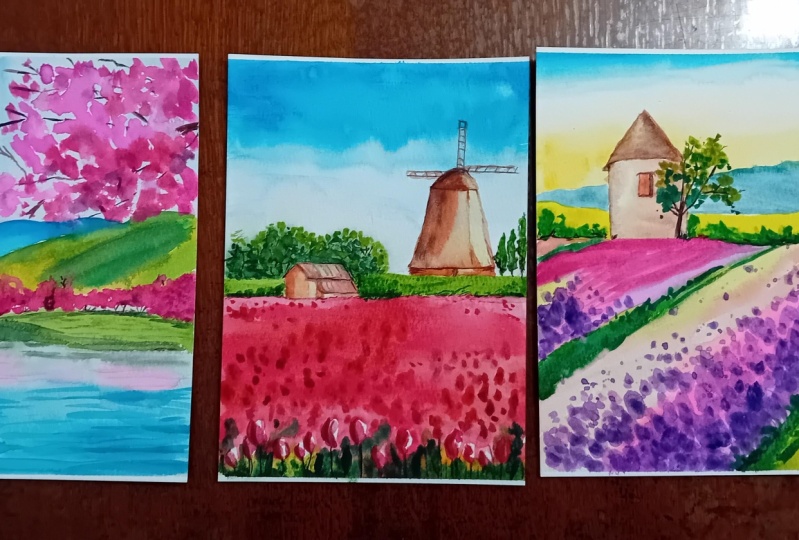
7. Day 3 Cherry Blossom: Day's painting is all
about cherry blossoms. Let's start out with the colors. It is Qin acrodon Coral,
compos Opera purple, French ultramarine, don three, royal blue, yellow,
yellow green, and in **** green. You can use colors that are closer to the ones
which I am using. This whole painting is
inspired from Japan, that is basically the cherry
blossom t over there. We are going to go ahead and
paint very loose painting. I will start out by
marking my horizon line, and then go ahead
with another line, which will majorly show a small area that is in between the water
and the mountain. And then we have to mark
our mountains over here. Once we have marked
our mountains, one would be a
background mountain and another would be a
foreground mountain. That's how we go about it. Again, if you see I'm going with a very light wash of the
shade that is ultramarine. I have this shade from the
brand incent and Newton, and have been using it
for many years now. This is one of my
favorite shades. It's french ultramarine. You can also go ahead with it
and start out the top area, mix a bit of royal blue if you are someone who likes
more lighter values, and you will get the
granulation that we are looking forward
to in this painting. Using my flat brush to add
all the colors over here, and you can see how the
colors are getting blended. It's a flat wash that
I'm trying to create. Though you can have
even darker and lighter values or blending or
even gradient washes. I would leave that
decision up to you, but keeping it simple is what I think is the best for
this part of the painting. You can make some dontre
blue or indico into your ultramarine and then blend the colors exactly
the way I'm doing. Here it is size four
brush, which I have taken. Or else, you can also go
ahead with size six brush. I would leave that
decision up to you. Two, two, three
brushes is usually what we need for completing
all these paintings, as I did tell you, in the
initial materials part. Once this background
mountain is done, the foreground mountain would
be more greener in shade, and I am very excited
to paint that one. We will be changing the colors. Now, here, what we did was, we did change the intensity, or you can say the tonal values, whereas when we are coming
to the foreground mountain, we would be changing the
colors that is yellow, green, and down green
that we are going to use. Changing the colors really adds a lot more depth
into the painting and something that I have always enjoyed while working
through watercolors. Add a clear wash of water on
the fork ground mountains. Once you have added
the clear wash, we will go ahead by applying
some of our green shade. You can see that
I'm adding a mix of my hookers green
or olive green, whatever is available with you and start out from the top area. As I go towards the bottom, I'm not going to
apply it everywhere. I will apply it in
some of the areas, and some of the areas would be lighter darker or just
blending it with clear water. These are the ways in which
you can always create, I would say, intensity,
depth, darker, lighter values, as well
as it helps you to give the perspective that some of the areas
have some ridges, and some of the areas are
more covered with forest. So all of that
comes together even with these simple things
that we continue to do. Can go ahead with a
very beautiful shade that is quinacridone coral. If you don't have this shade, you can mix some amount
of your pink into the red and create a shade that is closer to the
one that I'm using. Since my paper is wet, what has happened is some of the colors have flown
towards the top, and that's how you are getting this kind of
color mix over here. I'm happy to go ahead with
these values, I would say, because it is very bright, nice, and this gives the painting
such a beautiful outline. Go with some yellow, you can either use Olan
yellow or Indian yellow, whatever yellow is
available with you, and then blend it
with some green. Either it can be sa
green hookers green in green that is available with you while you go to the bottom. The areas that are far
away from us will be more lighter and the areas which are more closer to us
would be darker, as well as the areas
which touches the water. That particular area is
a bit more darker than what we usually have
seen in the other parts. Because that particular area is being always hit by water, and there are some
or other algae, et cetera deposits or rock deposits that happens in
that particular zone. So yeah, making it a bit more darker is point is
always helpful. I am just adding a
darker value over here and blending it with
the already applied color. Now you can go ahead
with forest green add a few drops of it here, and then make some lines, and this will look
really organic. Some of the areas
will be darker, some of the areas would
be lighter as we have always done throughout all
our earlier paintings too. This particular painting
is a bit more advanced compared to the last two
paintings that we did attempt. The reason altogether
we have I would say, the kind of detailing
over here is a bit more than what we
have attempted earlier. Going with some of our royal
blue and then blending it with some of our beautiful tram. But before that,
you know that we need to create the
reflection that we usually see on the top area
even into the water part, and I will go with a very, very simple reflection
wherever needed. I will just pick
up the colors on the tissue and then move ahead with some of my darker values of the
green that I observe. This is basically a mirror
image into the water area, and I always like to add the mirror image of it so that the painting
looks more real. Adding some of our
quin acrodon coral because it's mixed
with a bit of green, so yeah, it might
look a bit darker, but you can always
go ahead and pick up the extra colors from your brushes and then
go ahead and paint it. The p is not wet anymore, so I need to blend it with some clear water as
you see over here. I'm using some of my
ultramarine again and adding the darker values over
here from the bottom area, and we'll move to the top area. Oh. We need to create
some more lines to show the ripple effect
that we have and then allow the people
to dry off a bit. But before that, we need to
complete this ripple effect. So some of the as, of course, would be
even wet on dry. So most of them is wet on wet, but the S few areas. You have to work with
both of these techniques, as I have understood
from my own experience. Some of the areas
can be wet on wet and some of the areas
can be wet on dry. Though the last two
paintings were more on wet on wet kind of technique
and it was more loose. But as we have a
bit more detail, you do need even the
wet on dry method. I'm going ahead and
mixing some amount of my composed opera purple into the mix that
I already have, and then just sopping
in a few dots here and there to show my cherry blossom, of course, flower
trees over here, one or two dots, and that is going to
complete our painting. Let's go ahead and just
use our flat brush. The top part is already dry. What I would do is
I will just apply some clear water from
the clear I mean, the particular jar, which I have that has the
clear water in it. And then start applying
some amount of pipe quin acrodon coral now
this quinacrodon coral, when you apply on a wet surface, the pigments will
automatically move. And you have to do very
less job at this stage. Most of the job will
be done on its own. I'm using my size brush
to do the same activity. I will go ahead with a
bit of darker value now. Either it be my opera
or quin acodon, like the darker value by mixing some amount of compose opera or even some purples
into it to give those same similar kind of color that we have applied
for our background. Again, this is basically a branch of the
tree that's there, and you can see it. It's
completely blossoming. These brighter total
values or the colors adds so much vibrancy into the whole painting that
I really can't tell you. Try using all transparent
watercolors at this stage, and even throughout watercolors
are more transparent. If you come across
even watercolors, which are a bit more opaque, I would request you to not use those for all
these paintings. I would only go ahead with transparent watercolors for
these kind of paintings. Going with my thinnest brush, which has got a very nice
to tip, I would say. The top area is having
a great tip in it. It is the size six optimal
brush from the brand Escoda. I have used this a lot of times and many of my other
paintings, too. I am again, using it just
to create these ripple like ef as you have seen in the main painting
when you started off, you have seen, like how it is. This is a very good brush for anyone who is looking for
a long term investment. I think this is one of the brushes where
you can invest on. Going ahead and making
a few more lines and keeping with it,
making those lines. This is something
that is so beautiful. I really can't tell
you how excited I am to complete this painting, taking some brown and
just adding a few lines to show the cherry blossom
trees of my background and even adding some
of the lines for this particular
branch of the tree that's there in the top area. You will see that
slowly, steadily, even a few dots
will do the work. Every time you do not need to continue working with a
lot of lines, et cetera. A very loose aspect
of drawing it can really help you nail
any kind of a painting. I always like adding
a few loose dots, even for my trees, and here I would be
doing the same with my purple violet for any of the other shades that's
available with you. From the purple range, if
you don't have purple, just go ahead and make
some amount of pink with men or any other blue and get a shade that looks
similar to this one. Using my jelly roll
pen to draw the line, but this jelly roll pen is
really not very effective. And hence, I did not get the white line that
I was expecting, so you can always go
ahead and even try your bleed proof white PH
Martin color or else white ash, whatever is available with you. Even titanium white is
mostly opaque in nature, and hence you can even use that rather than using Chinese. Bit Chinese white is not opaque. It's mostly
transparent in nature. So yeah, while you use
the colors just know a bit about the colors or the setes that you're
going ahead and using it. I'm adding one or
two smaller lines of white, as you can see, this is a very thin brush, which I am using right now
for adding these lines. I'm to create the branches
of the trees simple, easy, going with
some of my browns, and then using it over here with the help
of my thinnest brush, you can also mix
a bit of blue to create the darker
value into the brown. This I have taught, like in much more detail in one
of my audio classes, which was voyage into the sea, where we did mix a
lot of blue into our burn Ciena to create
various shades and colors of darker and lighter tonal
values rather than only going ahead with a dark brown
or vent dike brown that's available with us. Adding some more of the lines as you can observe over here, Time to go ahead and add more of our black
into the painting. Now, this black is basically adding a bit more detailing
into the painting. Nothing much. Small
lines here and there. You can use a scale or you
can also use any kind of, small card to draw
these kind of lines. Remove the pattern angle, have a final look
at the painting. I'm sure about it, you will fall in love with it. Let's now have a final meet you again tomorrow
with a new lesson.
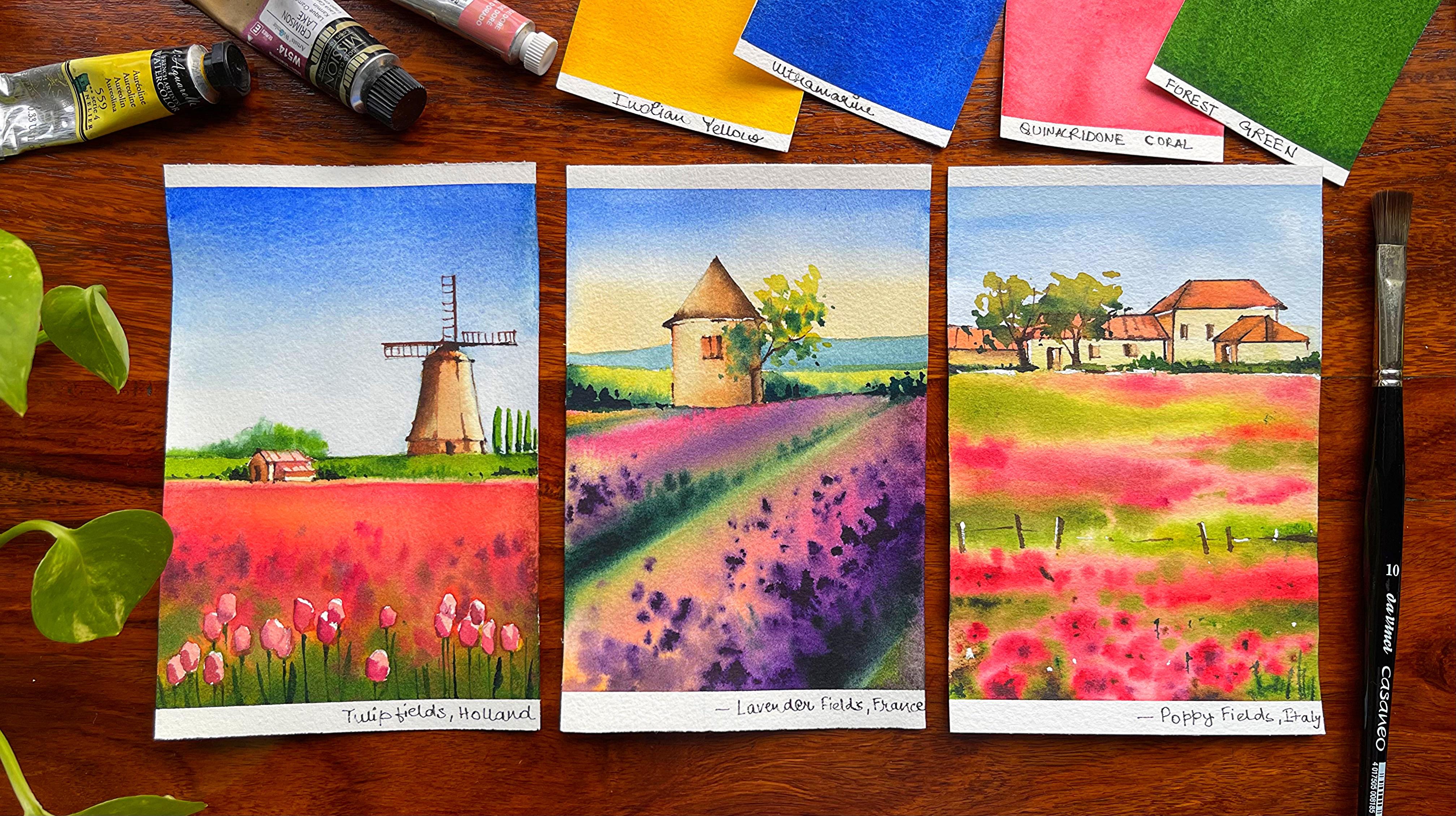
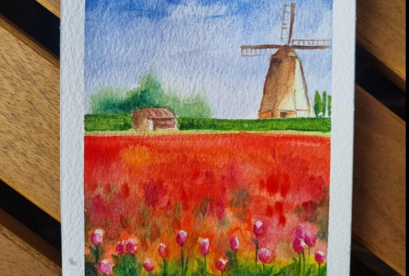
8. Day 4 Tulip Fields: Let us talk about
all the colors. It is ultramarine,
Qin acrodon, Coral, burn Ciena, k brown, yellow, green, forest green, olive green, purple, crimson, and keep a few more colors, whatever you think you need
for completing the painting. Let us start by making
a horizon line. We have done this in the
past three paintings, and we are going
to start out with the same thing even in
this particular painting. We will add a horizon line first and then go ahead
and add a windmill. This one is a bit
longer compared to all the other paintings that
you have done till now, as there is some amount of
sketching, which is involved, though it is again a loose style tips that
we are going to do, except the fact that yes, there is a bit of detailing that we are going to add on it. Okay, let's make a
small slanting line, and then I will make
even straight lines. Just follow along
and add all of this. You can also go
ahead and just see how I have added smaller details into it by watching it on
a bigger screen, as I always say, the paper
size is really small. So you might have to go
ahead and watch it on a bigger screen to get all the details that we
are adding over here. Added Zoom in a bit more so that each of these
smaller things can be seen. This is a really small paper, and I can't do more than this actually to show you how we are adding each and every
smaller details. This is a small house art or
whatever you want to say, small construction kind of a thing that's
there on the side, and there will be tule
fields in the front. Over on the right side, you will observe that
I will add a wind. The bottom part,
which is majorly your tule fields is not
exactly in the middle. So basically, the horizon
line is never in the middle. As I always say, I follow
the rule of thirds and according to which I never placed my horizon
line in the middle. Either it is a bit tilted towards the bottom part or a bit up either in the first half or in the
second half part of it. Now going ahead and
adding a small windmill, as I did tell you earlier. This is a bit elevated one. As you can see, I have added
one more layer of line. Towards the middle part again. And then I would go ahead and
add my windmill top area. With that, I will add
the bottom area too. Small things do actually make a lot of difference
like this one. Over here, if I make
the windmill too big, then the rule of perspective
would be spoiled. That's one of the reasons when I'm even adding the windmill, I do make sure that it
is small, not big one. Go ahead and adding
some of the few lines on the left side as well as
on the top right hand side, and then adding three lines
for showing the windmill. It's not that I'm
very confident at this moment how this painting will turn out, but believe me, as you progress
with the painting, you get to understand that this painting you
can nail completely. You can also just mark the darker areas by shading
that part as you are going to add lots and lots of darker values in
those areas, too. There is a small door,
which I want to add in the middle part and
even shade that area. You can see that my pencil
is actually the long one, which has a long, sharp edge towards the top or a longer graphite
part because it helps me to go ahead and add these
details in an easy way. Sometimes I do
erase a few paths, which I think is not
necessary or I don't like it. And then again, I go ahead and mark the lines in a
similar way only, you will see me
marking all of it. But yes, it just adds a bit
more confidence for me. And I just feel that that really helps me to
understand that did I create something in a good
way or is the perspective not correct or is something
not exactly to the point. Though, you can see
over here what I did add now was similar to the
one what I did add earlier. But yes, there are a few things that I continue to
do as an artist, and these things will
remain the same. You do not need to
raise anything. You can surely go ahead with the one that you
did add initially. Adding a few trees
on the right side. So just making four
or five lines, it would be an abstract random way that I would be adding. For even the top area. I did just mark a bit of area, which I would be marking in the darker values and
shading the areas, as I did tell you, even earlier. This is the area which will have darker values and darker values. Once you apply the darker
values over this area. This whole graphite
mark usually goes away, and it does show off. Watercolors is a very
transparent medium, but darker values takes over these graphite
marks completely. It's time for adding
these huge lines or you can see the parts, which is basically going
to be the windmill. This is the traditional windmill which you can observe over here. I've always seen that the
sketching part is a bit tough, or it takes a bit more time than our final painting part because we are painting
everything pretty loose. So when you are painting
things, you lose, which means that you are not thinking much and
just going with the flow. But there are a few areas
where you are detailing, and those things
that you will be detailing needs to
be even marked well. It acts as a framework for you, and it gives you a
lot more confidence, as I did say even earlier. It boosts our confidence. It helps us to go in
a particular flow. It really helps us to nail
the painting completely. Going with small rounds towards the bottom
part, you can see. These are basically the
small small tulips, which I want to show. I have not gone ahead with
any kind of particular tulip, size, shape, et
cetera in my mind, as it is not going
to be detailed. So I have this in mind always that I'm not going
to detail it completely. Though the last few were
more on a lose side, this is not exactly
a full lose one, but it has an aspect, which is bit detailed, whereas still it keeps the whole idea of
painting loose intact. Continue with a
few more of these, and then we are going to go
ahead with the painting part. I would go with my
favorite shade, that is quin acrodone coral. I will start with my
Qin acrodon coral and slowly steadily mix some
yellow or orange into it, as well as some compose opera. If you don't have
quin acrodone coral, you can go ahead with
any red that you have, like permanent red, et cetera. That's also good
to go ahead with. Some more orange. This blending
I usually do on paper. Why many of you might ask me. The blending that you
do on paper gives you way more shades or values of one particular color also on paper rather than if you
do it on ceramic palette, it will only give you
one particular shade, and that only you will apply. So it's more like a flat
wash, whereas over here, it comes out more like a variegated wash
and a mixed shades, colors, et cetera,
that comes up. The only part that's going
to take you some time is I did not mask out these
smaller round parts. Because of the simple fact, I really don't want
to go ahead with any kind of masking on small
piece of paper like this. I can go in and around it. This is again, known
as negative painting, where you are not
painting the subject. You are going ahead
and painting it later on once the
paper is dry enough. So y, you have the concept of negative painting also being covered in this
part of the series. Though you might not find it
in the technique section, but as we move forward, there will be a lot of things slowly and steadily that
we are going to learn. It would be kind of the
projects that you attempt. I would be adding all of the knowledge into
it altogether. Everything cannot come as part of technique
is all I can say. It will come up slowly steadily, and maybe I'm not naming
it always initially, but as we progress
with the projects, you get to know these
techniques even better. Continue to paint more and continue to add more
colors into this part. You can also add a bit of opera, compose compose opera,
basically, yeah. And then some of the purples, everything looks
so nice and divine at this stage because it
is very vibrant color. Vibrant color has so
much of beauty in it. I frankly can't tell
you how happy I am when I share all these vibrant
paintings with you guys. While now I add some green
colors towards the bottom, I start with the
lightest value of green, which is my yellow green, and then add the darker
values of green, which can be any kind of radian green or it can
be even forest green. I would leave that
decision up to you what greens are
available with you. But when you are starting out, it's important to add
some yellow green. If you don't have
the yellow green, mix some yellow with the green color that
you have with yourself, maybe your sap
green or all green, and then you can keep adding the darker values of green
towards just the bottom area. I usually leave out the areas, which I have to add the tulip over there and then just
mark the other areas. It's a very simple one. Believe me, it takes a bit of time because
of the sketching part, and then some of the dots that I keep
adding here and there. A, I would say that
this is one of my favorite paintings from
the entire series. It has so. It has amount of learning, as well as the sky
is absolutely flat. We are concentrating only on the meadow or the tule
fields that you see over here and simply adding some details to make the
painting come to life. Mixing some darker value of
green and adding some dots. You can use your ultramarine
and then add a few dots. As you see over here, smaller dots, bigger dots, whatever you might like to add. And then towards the bottom
right corner and left corner, you get these dots. Blooming as such, as
the paper is still, and I can continue
to work on it. That's a very good
thing when you are using 100% cotton paper. The water stays on top of the paper for a longer
period of time. I have used 185 GSM paper, though you can go ahead
with 300 GSM paper, which is the best thing
to do at this stage. At least this year, I have seen that the
weather is really hot, and you might like
to go ahead and use a thicker paper to
get a good outcome. You can use olive green, sap green or mix a bit of
brown into the dian green, whatever is available with you, get a sheet that looks
closer to the one that you observe me using over
here and then blend it. I'm using my size six brush at this stage
to add the colors. You can also go ahead with Size four brush if
you are not very confident of using
size six bruh. So that's also absolutely okay. It's up to you how
you want to do it. The p in the bottom
area is also not. So all I can tell you is, if you're not very confident, let the bottom area dry off and then only go
ahead with this part. Though I did take
a bit of risk as I was not ready to wait anymore. This painting was so
attractive to me that I wanted to go ahead with it and go with the
floor altogether. Oh. I'm making a shade that looks close to red violet. What I did is that I took any kind of crimson,
pink, et cetera, whatever is available,
Mix a bit of violet into it and make a color
that looks like red violet. And then add these small dots. This is great when you want to add some details. Make it lose. Yet the whole painting
will look like as there is tulips which are blooming and of different shape,
sizes, et cetera. That's what I have been
following for many of my other paintings to whenever
I have painted meadows. This particular painting is
something that is really, really exciting to me. I love to paint tulip fields, and this is so much less
effort that you need. While you go towards the top area or near
the horizon line, what happens is they
will become smaller or the dots will not be bigger as you see
towards the front part. And the more you are
towards the bottom area, we have these white areas that we have left out
for the tulip fields. I'm going ahead with a very
beautiful shade as such, which is again, ultramarine,
my favorite shade. I use it for covering
the entire sky area, leaving out the part
where I want to paint my small small. Okay, great. I
guess I'm excited. I have created a gradient wash. If you are not very well
versed with a gradient wash, you can also go ahead
with a flat wash, but you can do with very, very easy technique that
can be followed in. I have attempted the
sky last as I wanted to work on the difficult part in this painting first and
then move to the sky area, though we did the other one. Other part for the last painting
that is cherry blossom. O I am tilting my boat and then applying
some clean water. Now you can also go
ahead and do the same. That way, what happens is, you can get a good gradient wash wherever you think that
there is extra colors, you can remove that and let the water play a major role at this stage rather
than you going ahead and trying to push the color, the water will only
push the colors towards the top and then again move
from top towards the bottom. Do clean up the sites
wherever it is necessary. My sky is still wet. Now, since my sky is wet, it's good to go ahead with
a darker value of green and create the trees that we see
just near the horizon line. This is a very, very good thing that you can
always follow. When your paper is wet, use it to your advantage,
create these lines, create these loose
kind of trees, which you want to add in any kind of painting
that you have. Continue to add some more lines as you move towards
the right side, and as well as, you
will add some of the darker lines even
towards the bottom area. Follow, I would say
that at this stage, I have less to explain. Just follow along
and you will see how beautifully the whole
painting is getting done. I am a person who loves to add at least one or two smaller
details of lines, et cetera. This is something that I
have always loved doing, and I am doing the same even in this part
of the painting. I will go ahead and take some orle color over here and mark it with
my thinnest brush. Though you can go
ahead even with indian yellow or
any other yellow. I don't like the white
part that is being seen. This kind of color actually just takes off all
the white from the paper, and it looks even better. I use my flat brush
to practically blend the areas well and not
have any hard edges. That's how I always
go about blending my colors with my flat
brush for no hard edge. We did mark a few areas
on the right side, and this area is
majorly the trees. The smaller trees
that I want to add, use a size for brush
to mark these trees, and then we will
again go ahead with a darker value of green
to add the shadows. Of course, the shadows is
following a very simple thing, which is the left side is w and the right
side, there is sun. If you are creating shadows, just go with one simple rule. Either your sunlight
has to be on the right or it has
to be on the left. Now if it is on the right, the left side will be in shadow. If it on the left, then your right side
would be in shadow. So that's the only simple rule. You can keep in your mind and continue to work with
your water colors. The bottom area is
dry enough now. I am going ahead and adding some colors in the white areas, which we did leave while we
were painting the meadows. Once we have added these colors, I would go ahead and
mark some darker area. Now, while the darker area, darker area basically as the amount of depth that
we need in the painting? A small amount of depth is great and good
to go ahead with. We will even add a
bit of our purple, just the way we did
for the loose meadows, which you can see
in the painting. Continue to work on these smaller tulips
and just follow along. I think I will just add a
bit of music for you guys. It's easy. There is nothing
to explain at this stage. Oh. And to add the stem
of the tulip fields. And basically, each and every
tulip has quarter stem, and we would like
to add that for all the ones that are there
towards the bottom area, we will add a few more
extra here and there. That's it. Continue
to add all of it, and then we will
see how the ting. Small small details actually add a lot of difference to any kind of painting
that you are doing, and this is one of them, which I have added
for my painting. I hope that you are
liking the flow, and this is not
really a tough one, though it might look initially, but it is really not always always think very positive when you are
doing watercolors. Watercolors is a medium, the more you think
positive about the medium, the more rewarding it becomes. If you think that you will
be in a position to nail it, you will absolutely
nail that painting. If you are thinking
that you may not be in a position to get a
good outcome or so, it even happens the way that
we are unable to achieve it. Watercolor has a
mindset of its own, and I think that
mindset really plays a great role when you are
working as an artist. If you have a lot of gap
between your daily practices, of course, everyday watercolors
might not look great. But if you don't have much of gap while you are
practicing watercolors, I think you will be
in a position to nail any kind of painting
that you are attempting. Go ahead with some Naples
yellow for the windmill part. This is basically
the lightest value that I'm adding on the windmill, and slowly, I will introduce some of my darker values too. I think few of the areas
needs to be a bit more green, as you can see for our
background part too. So I'm adding that green
and just taking off from the middle part because
that was again in yellow. And I don't want to spoil
that part for sure. One more layer is always
good to go ahead with. It's not that everywhere
I add that layer. It's just in a few
places we do that. My windmill is still wet. I'm going ahead with some of my burn Ciena to add
the darker values. The left side, of course, is darker and darker
as you can observe, and the right side
is not so dark. I would leave the right side as is in the Naples yellow
color that we did add. Mix a bit of blue into
the brown that you have or directly use some
amount of your n dike. Brown and add the darkest value. You can see that we did add
some graphite mark shading, but that's all gone as the darker value has taken
this spot completely. And even with a
transparent medium, we really can't see
where exactly we have marked the shading or the graphite marks
and not beings. Watercolors, I'm
very very specific about where I'm adding the shading and where I'm
not adding the shading. If you go ahead and see
through it, it becomes stuff. So we cannot have graphite marks being shown from the waterm area. That's
one of the reasons. Even when I'm applying my graphite marks,
they're way more lighter. I go ahead with only
two edge pencil to add all my graphite marks. Though I've seen many
artists even going ahead with the darker pencils, but they do remove the
graphite marks later on with the help of a needable eraser and make it lighter
when they paint. The smallest of the details like adding some shading even for this small t that we have added on the left
side is important. We are going with a very
thin rush for doing it is zero by satin rush for
adding all of these details. Oh Now detailing my windmill in few of the areas, wherever I want to add
some darker lines. That's it. I'm going even with my I K Brown to
add the small dot, which we did add in
the darker value and taking the darker value even
towards the bottom part. This way of painting
is something that is absolutely lose and may take a while
to understand. Believe me, when
I did start out, I was not very well versed with these kind of paintings,
but over the years, I've realized that
this is one of the best ways to go about when you paint even on smaller
areas like these. T adding the blades of the windmill now. And here, I have nothing much. Just go with any darker shade of your brown and add these lines. Some of the lines,
you will add it, some of the lines you may just
leave a bit of gap or not. Add that way, we're not
detailing everything and going with the absolute
of which is like, this is a line, which we need to add, all the lines we need to add. Genuinely, is a medium. You can use a how you
want to perceive it. If you want realism, you have to go ahead
and add every detail. But if you don't want
much of realism, and it is more to just
interpret in your own way, I think this is one of the
best ways to work around. Watercolor gives us
so much of freedom. I think many or very, very few mediums have that
kind of way to go around it, and you can actually use
watercolor the way you want, which would be hyper
realism or realism, or not realism at all, go at, go absolutely. Everything can be followed, and you can perceive
how you want yourself to be an
artist and make it. Adding some smaller
dots here and there, then removing the
tape pattern angle, writing that these are the fields in Holland and
have a final look at it. Met you again tomorrow.
9. Day 5 Lavender Fields: It's all about painting the evendo flowers
field from France. Let's check out
our colors first. These are Naple yellow,
ultramarine, greenish yellow, Indian yellow, quinacridone
Coral, compose, opera, purple, forest green,
and a few more, whatever is available, including Burnt Sienna and
your Pendyk brown. It's all about painting
Lavender fields from France. We are going to go ahead
with a very simple line, and that is going to be the horizon line for
our Lavender fields. Of course, you would have seen that most of these paintings have a horizon line and then they may have a
background mountain. Those things will
continue to work on. And over here, I have taken the levender fields a
bit more larger, or you can say my
horizon line is a bit tilted towards the top area compared to it being
towards the bottom. So those one or two things
you will keep in mind, and we will make
two straight lines as you can observe over here. Once you have made
the straight lines, we will join with a curve like structure from the top and
then it would become a cone. This is practically a very, very simple structure
that we have added from a
countryside in France, and I just wanted to have that feeling of
beautiful vender fields, countryside, et
cetera, altogether. And this, I think was a
perfect match for it. Go ahead and doing
the sketching. Once you are done
with the sketch, we will start with
our painting part. The Lavender field
is done in a very, very loose and simple way. Nothing much in terms of what you have to do or how
you have to go about it. I have very simple process, which I would be listing
down for you guys, and there will be more of loose painting that
we are going to do and how less detailed paintings
can also actually show beautiful Lavender fields is all I want to express
through this painting. Continue to add one tree that's there just near this
small structure, which you have added. You can add this
tree in any way, do not worry at all. Even you may do it once you
have painted this part. Just that I was not
very happy with how this structure was
looking altogether, and hence I wanted to go
ahead with it once more. These kind of things I do very often in many of my paintings. Sometimes I'm not sure of
how I want to go about it, or the structure
did not work out exactly like I wanted to And, to my surprise,
most of the time, what structure I've
made at the beginning is actually the structure
I make even after that. There's nothing much of a
difference that I create, but still that kind
of perfection, it's there in your head. You want a good sketch. Because if you want to
have a good sketch, you can have a great
final outcome. So all of that keeping in mind, yes, the need for perfection, getting the correct outcome and all really forces me to go ahead and have a sketch that I am satisfied
with to an extent. Okay, great. Now, let's
make a few windows. You can make a few windows or even a single window that
can work for you over here. Once this window is done, we are going to draw the tree
as we did in the last part to Marking a few areas a bit more darker just to say
that that particular area, I would be making it
in the brown shade or the other colors that
we are using rather than using all the shades, et cetera, which we're
using for the sky and all the sky is
going to be amazing. We are going to use two
shades for the sky. So be ready with me
and we are going to experience a real magical
vender field over here. There are only two lines. Now these two lines
are basically going ahead and meeting
at one single point, which is majorly known
as the vanishing point. That's all I keep in mind
when I am drawing it. I don't want to complicate this whole painting
to a great extent. Hence, I'm keeping it very, very simple at this stage. Trying to just show
you the basics of drawing and sketching. Because, uh, In this
particular painting, I will not say that there's
a lot of difficulty. I think the last painting
which you did was a bit more tough than what we
are going to do over here. Only the play of
colors, of course, is a bit more
tougher in this one compared to the one that
you did in the last one. So yes, somewhere or the other, we are trying to improve with every painting that we are
doing, and hence, yes, you will find something or
the other new coming up in the paintings that you
are planning to approach. I'm starting out with Naples
yellow for the bottom area, and then we will go ahead with ultramarine
for the top area. This is a simple blend of color, which we are going to
go ahead and do in it, and it's basically not the
gradient wash, but blending. Now gradient wash can be
done with two colors. It can be done even
with a single color. So if you are doing
it with two colors, then the kind of gradient
we get over here, can we also toll as a gradient wash or you can say simple blending
between two sheds. That's also okay. I am not creating
any blend over here, only on any gradient of wheel. It's just that you
are coming from blue and going towards
the Naples yellow. Naples Yellow doesn't react with ultra may and give us a
shade that looks greenish, which I always always like to avoid in my
watercolor paintings. Sometimes I really don't
like the kind of blending, which I have done for
any kind of a painting. And hence, what I do is that I would go ahead and go over
with the color again. The same color, which is
our on Naples yellow, and then try to have a blend. That is up to my liking. Believe me, it's not important. But it's just a process
which I have been following to get that
perfect shade perfect color. That I expect but in watercolors,
there's no perfection. The more you let it lose, the better is your outcome. Only keep in mind that you don't want puddles of
water in your sky. If you have puddles of water, it would become really tough for you to control the colors. Whenever you are
applying the colors, try to apply it with a flat
brush for the same reason. I think this is great. Now, we can go ahead and apply some clear water on the bottom part of the
painting with our flat brush. This is a size ten,
the Vinci flat brush. I'm applying the water
and then I would go ahead with lighter to darker values
to make the lavender feel. What is the first color
that I'm going to apply? It is basically
the yellow green. Now, this yellow green you
may not have in your palette, you can always go ahead with some ooline and mix a
bit of green in it to get a shade that looks closer to the one which I would be
applying in my paint. As you guys know, both of these lines converge
to one single point, which will actually
meet somewhere outside the plane of the
paper on the right side. Now, these kind of lines are
usually known as invisible. They will join to
one single point, which is called as
invisible point. And it may lie on
the horizon line. It may not lie on
the horizon line. So this is a small information, which is good to have, and hence I thought to share it with you. Go ahead and adding some of my yellow and
quinacrodon cooral, along with it, I would also
use compose opera and purple. Now, why compose opera purple? Because these are basically
the colors which I usually see in a
lavender flower. Though I would say that I have not literally seen any
single lavender flower. It's just in photographs,
fields, et cetera, and this is the way I
perceive my lavender fields, which I wanted to add over here. Adding some of the purple again, I will make a mix as
well as on the left. Top corner. We will also add it. Right now, you frankly can't see how the whole
painting will turn out. Believe me, at this stage. I also did not like
this painting. I was like, Okay, where
to settle going ahead. And can I actually
get a good outcome? So never lose your heart at any point in time
in watercolors. You continue to add your colors and then see
where you like that. Now I have added some
darker value of green, and this is usually my
beautiful forest green, or you can also go ahead with olive green or something
like that to get a shape like the one I
have added over here. Great. Let's again blend some of our beautiful shade of
purple into the fields. It is on the left side, and then we will just blend
it with our background. I do take off any extra color
which I find on my paper. Then blend some amount
of darkest value of green to create the shade, which I'm applying right now. You can always add blue into your green to get the
darker values of green. Believe me all the sheets and never there in anyone's palette. Even in mine, I don't
have all the colors, which I always like to add. So it's kind of something
that I carry on with, I mix my colors and
get a shade like this. I am pulling the
paints at this stage, which means that I am pulling my colors from the bottom
part till the top. And once it is done, we will go here with some
of our darker values of purple to create these loose
floral kind of effects. You have also done it in your first painting
where we were attempting a floral of
course, a flowal field. And you did it when we were adding the darkest value
of green into our meadow. Some of the places were
a bit dry and hence, I would use my brush. To make it a bit more wet and allow these colors to
move into each other. Over here, my paper
is still wet. That's one of the reasons I can easily do this job
at this stage. I will blend my color
a bit and pick up the shade as I feel
that it has become too dark and it has blended
completely with the yellow. Maybe a bit of pickup of
these colors would be good for making this whole
painting come to life. Now, coming back
to the painting, there are one or two
small more dots, which I want to add. Once these dots are done, then I guess it's important to just let
this paper dry off. You will see how we continue to work on these simple and easy. E is done in a
very loose manner, which gives you a
lot more opportunity to play with water colors and water will do your job rather than You doing your job was. I will do the same process
even on the top part. As you see, I'm going
ahead and adding one or two smaller dots of
the purple into the meadow. Now, any meadow that
you are painting, it can be a lavender field. It can be any kind of other
blue florals or poppies, et cetera, anything is possible. And hence, you should
always keep in mind that let it be
any kind of flower. What you are going to do is
make it a bit more loose, which gives you a
lot more opportunity to play with the shades, to play with the colors, as well as It actually helps
you to develop the mixing, then different kind
of shades come up within that particular
part of the paper and all. So yeah, that's my approach, and I'd love to share
it with you guys. Hope you are liking it. And we did learn a
new thing over here, which is majorly
pulling the paints. Though there is not a
lot of application, but still there's a
bit of application. Again, in green, I'm
adding one or two dots, and I'm going with my
thinnest brush at this stage. I guess we can literally differentiate these rows
of levender flowers. You can see most of the areas wherever you have these
lavender flowers growing. They are in a row. Hence, I guess having that particular row in
place is very important. Showing it off is good, so all of it put together. I'm very happy with how this
painting is turning out. Lifting is always a process. Second process we have learnt in this particular
one is lifting. Though lifting
technique we have used a lot even earlier in many
of my other paintings, if you've taken my classes. It's a general
technique which can be used for all your watercolors, and it really helps you to elevate or even to fix any kind of mistakes
which you have done. You can lift out the colors with your brush or even
with your tissue. These are basically one of your best preses all I can say. I'm adding one of the
background mountains. It's basically a bit in blue and green as you can
observe over here. I'm going from the
right side and even I would like to add it on the
left side of the paper. It is a background
here mountain, whatever you want to say, and it really doesn't matter much. Just that I want to keep
it in the blue shade. As it is contrasting with the color that I've already
applied that is for the sky, which is majorly
your Naples yellow. And hence, this particular part of your mountain or hill
will be even seen well. The amount of greenery, which we usually have
on these mountains. Adding that blue also doesn't
take it off from there. If you're adding only
brown or yellow, it is a possibility
that you are wanting to show it that it is
absolutely rock. You or something like that.
But here it leaves you with more opportunity or just a way you can interpret the painting. Time for a bit more
of detailing now. Now, this detailing
is majorly to do with the part which
is in the middle. And this is a smaller part. What I am more interested of
is the brown small building, which we are going to paint, really, very, very exciting. I can't tell you
how excited I am, but before you do any of it, make sure that your
paper is completely dry. Let's have a closer look at it. This is something
that I always say that few of the places where
there is more of detail, I like to go ahead and
just zoom in a bit more. Once you've added
the lighter values, it's time to add
the darker values. You can go ahead with
a brush that has got a very thin or
nice tip on the top. I like to do it that way, but you can also go ahead
with a thinner brush. That is size zero size one size two, whatever
is available. Most of the paintings
that I've done, I've always told whatever
is available with you, please go ahead with it because the idea is never
to buy new things. It's only to paint
something beautiful. A Starting with my burnt sienna and blending it with some water. You know that we have already
applied the Naples yellow, which gives an edge in this way. You don't need to
do much of work. Just blending with clear water will only help at this stage. I would go ahead with
my darkest value. That is nk brown and then
add it on the right side. As you can observe over here, It is slowly that I'm adding it because I don't want that it
spreads to the entire part. Only to some of the part, I want to go ahead and add
it and rest of the part, I will just blend it
with the burn sienna, which is already applied. This is a small piece. But when you work
on a bigger piece, there are a lot more things that you need to work or think about. One part of it is the
light and shadow effect. Over here, the darker side is on the right and the lighter
side is on the left. That's exactly the way we have also painted our lavender field, which is a great part or a great thing to
always look into. Your light and shadow should be exactly the same
way you go ahead and paint each and every
detail in your painting. That way, you can frankly keep the basics of
the painting ind. I'm again going ahead with
Burn Ciena and then adding it on the bottom part
of this small heart. CVID some burnt umber
or maybe some amount of your dike brown to create
these darkest of the values. I think the left
inside has become too dark than what I
would have liked it to. So I just took off any extra pain that
I had on the brush, went ahead with clear
water to apply the c. Sommer Burns for the middle part of the window, and I am using my hands. Yes, I do use my finger hands, everything for a painting. So just let it be you have to your hands if you really
want to have a good outcome. These kind of things
keep happening in what, yes, also enjoy the thing. I think this right
hand side has become quite dark as I waned and looks, I would say weired
out over the years. It has been used, so that's something that I always
always keep in mind. The building, which I am adding should be worn
out to a great extent, rather than it being intact, like the way would have never wanted it to be
absolutely brand new buildings. We don't want. It's countryside. There is sunlight,
there is snow, there is a lot of
weather change, which continues to happen
and every time you don't go ahead and keep painting all
these buildings, right? I would go with the
same way over here. Adding the tree,
which we did Again, ad during our sketching session. Once your paper is dry
enough in the bottom part, you can go ahead and
add these branches. Go with some of your
greens very simple way, add some dab of it here
and there and that's it. You need to just
go with a bit of darker value on the bottom part and then lighter value
on the top part. That's usually how we
even observe our trees. One more minute of detailing,
and then we are done. Yes, I am super happy with how this
painting has turned out. Very less detailing,
very less work, and still a fantastic outcome from the lavender
fields, et cetera. Let's now allow this
painting to dry off. Remove the tape at an angle
wherever it is necessary. You can add these
kind of details. You know, I don't like to
give up at any point in time. Whatever so happens. Once my paper is again, I'd like to add one
or two small bushes at that I want to show of. These kind of things can also be avoided if you want to avoid it. And if you want to continue, please please do go ahead
and add these small dots. I would remove the tape right, these other Llevender
fields from France and have a
final look at it. I will meet you again tomorrow
with another new lesson. Let's just do a quick recap
of what all we have learned. Mainly, there are
two techniques. One is pulling the paints. Now, you did it for this middle part of
the lavender fields. And the second one
was picking up the colors with the help
of your flat brush, wherever it has become darker, we will make it lighter with
a fresh click damp brush.
10. Day 6 Poppy Fields: Let's know all our colors. It's Naples, yellow, burn
Ciena, quincodon, Coral, or red, or any kind of orange, purple, ultramarine, yellow,
green, forest green. Keep a white gash and black
pen handy for highlight. Hi, guys, so today, it is all about painting a
very beautiful poppy field, and it is somewhere
from in Italy. I would love to paint this one along with you very excited, starting out with
a horizon line and then making a few
houses on top of it. Now, why do we make
a horizon line? It is important to differentiate between the sky
and the land area. Whereas we will have
a few houses in the distance to show the
countryside in a better way. Now, these are the loose poppy
fields which we are going to paint and a few lines that
you can, of course, see. We will just zoom in to have a better view at what we
are drawing right now. I've already told you, it's better to watch it
on a bigger screen. If you are someone who hasn't still watch it
on a bigger screen, please go ahead and just see it on any bigger
screen which you have, like a laptop, i pad, et cetera. I'm going ahead
with the top part or basically the
roof of any kind of a art or you can say these are small cottages that are
there in the countryside, and we will draw a few
even windows in it to give it a more nice and an
actual realistic look. Is all I can say. I will continue to add more
and more houses. Of course, ordering the size of these houses as well
as how they are made, so that it looks way more it has way more
realism into it. Is that what I'm trying to
add into this painting. It's not that we have
to actually go ahead to a particular place
and then only paint it, you can always enjoy painting. Anything of your liking even
when you are sitting at your home or at your own place where you are
enjoying watercolors, you can paint in your studio. Wherever you are more
comfortable with watercolors, I would say that's
the place you should always use for any of your
watercolor paintings. I'm really comfortable when
I'm painting in my studio, and I can do hours of painting, but when I'm doing
an outdoor painting, it's very different than
what I do in a studio. Hence, when we are starting out, it's great to do
studio practices, and everyday practice
is always the key. That's one of the reasons
I have so many of these challenges on my
as a skill share class, and there are many
other classes where you will see there are 20 days, 21 days, 14 days, et cetera. Every class is very
different from each other, and if you go ahead
and try them out, they have something new
that you can learn. Some of them are
a lot wet on wet. Some of them are
a lot wet on dry. Whatever you see, some of
them will be postcards, some of them will be small pol write paintings or something or the other different scheme
that you continue to learn. And not only that's a great
experience with watercolors, but also gives you a hang off like how this
whole medium works. So the first thing that many of the people don't know
is a watercolor paper, and I've been very particular
that you need to use only 300 GS 100% cotton
watercolor paper for having a good outcome. So that's something which
I always always say yeah, now I think almost
all the houses that I wanted to make is done. As we continue to talk, you can just add these houses. There is less to explain
at this stage because I don't have much of any kind of, you can say vanishing point
or more than horizon line. There is not much to
explain at this stage, which is one of the reasons. You will see that the
sketch is not taking a lot of time than what it should have taken
in other paintings. Going ahead and making a few loose trees in
front of the houses, this will come up later
on in the painting. Going ahead and starting
out with basic wash. This is basically for
the floral fields. Floral fields have been
one of my favorite, and this is a poppy field, which is again, my favorite. Though there are many kind
of colors and flowers available that you see you like or maybe
meadows that you like. This is one of my own favorites, whether it be a poppy
paint thing or whether it be a complete meadow of poppies. I think I love to
paint everything. Going ahead with some amount
of my greenish yellow, you can also use len if you don't have this greenish
yellow shade with you. And then we will use
either quinacodon coral, red, or some orange. Now, these are basically
lighter values I would love to go
ahead with initially, and then slowly add one or two Dots of darker values. It can be even dark brown, blue, et cetera, nothing
would be seen as such. It's just that a dark small
dot will be seen somewhere. It's straight line as
of now, but believe me, we are going to add texture, which will look
more like florals. I am not only excited
about this painting, which I am always about
most of the paintings, but I think this has a lot to learn in terms of how to
balance out your composition. It not only has how you can
go ahead and go wet on wet, like you are doing right now, going with some dots. Since your paper is wet, your colors will flow. You can go ahead with
either red, permanent red, or makes a bit of karma
into it to get a bit of a deeper value if you don't have the exact
red of your choice, and then add a bit more of the darker values and few of the places
wherever you want. The dots will become smaller
as they go away from us because that's how the whole of the field
always looks like. As you go away and away, they will become smaller and smaller as you go near to it. It will become
darker. I have mixed some amount of
purple into it and got a color that looks more like a red violet,
which is also good. You don't need to think much when you are adding
these shades. Now going ahead and adding, either you can use olive
green or s you can use even dian or any of the other greens that's
available on your palette, maybe olive green, sap green, or even Varian green,
whatever is available. I can make it a bit
more early if you mix some amount of burn like
cure burn CNI to it. But it's not required
at this stage, so we will go ahead with
whatever we have as of now, and if we need it, of course, we will add the darkest of the values as you continue
to see over here, which I am adding right now. Started out, you
would see some lines. But as we are progressing, you can see that we
are using a very, very thin brush to
create all the textures, which you might not
have seen earlier. This is how we continue to
add more of these small dots. But sometimes I do even
use a bigger brush to just add those dots because all the places will not
have the smaller dots, as well as all the places will
not have the bigger dots. You have to keep
in mind that you need to even alter
the size, shape, et cetera of any kind
of floral fields and all that you are trying
to go ahead and Okay. I guess I'm pretty happy with
how this is turning out. We will have some more of
these added on to the I mean, near the horizon line. All of them, of course,
will not be equal, or they all will not be having
the same greens and reds, et cetera In an equal
amount, it's a meadow. Some of the places might
be having more of green, grasslands kind of stuff, and some of the places might be more occupied with the florals. Some of the parts will be more butting or they have
the full florals turn. Some of the places
might not have it. So keeping nature intact
because nature has quarter on like lots and lots
of randomness and it hence, we will try to keep it as a I think I have gone a bit
into my houses too. So I might need my
flat bruh to remove all that green color that have gone into these
houses. It's okay. We all do these
kind of mistakes, and it's always great
to use a damp bruh. Damp flat brush is
one of your best feels just like any
tissue can work. This can also actually pick up most kinds of colors which
you want from any painting. I did add a few dots
as you have seen. Now, you can also go
ahead and add more of these dots or some of the green wherever
you want a few lines. A few more dots. These are mainly for
adding textures. Believe me, it just
looks like a meadow, more with adding all of this. And if you are just
adding a random wash, it's more like a
variegated wash, where we don't have any kind of textures or florals
being seen so well. T hough there are many techniques
of adding this florals, some of the people even use splattering technique
for creating florals. To, I am a person
who loves to have short florals or not a
very, very loose one, but something that
is loose yet has the beauty and understanding
of being a poppy field. It has the discrete amount of details that we need
as well as the loose, attitude of the
painting that we need. Okay, great. I think it's all about a
mindset for watercolors, and the mindset if you have, you're going to any kind
of painting that you do. Go ahead with one of
my favorite sheetes, which is Naples yellow. You have been using this shade very often for many
of your paintings, and I'm going ahead and
adding it for the total area, which is majorly the house area. You can go ahead and add
it in all the places. Let this part dry off, and then we will
go with our sky. This is more like a flat
wash. Just go ahead, add it. We will later on work
on the other parts, whether it be the
roof or any kind of smaller windows that you
want to go ahead and paint. Adding one or two simple
lines of the darker value of green near the horizon just to make it a bit more I would say, look like real and so that
we can differentiate. That's it. This place is still wet
and I can go over it with my wet colors to create the
smaller lines, et cetera. I continue to do it
in few of the places. Though I say it is
not much required. We are almost done with most of the details that we wanted to
create for the meadow area. L et's go ahead and blend the dark green color into
the background meadow. And near the horizon line, I'm going ahead with one of my favorite colors,
which is At mary. You know, I do stick
to my regular colors. Do people say that you should experiment and work
around with new colors. But I just feel that working
with the same old colors, creating new patterns or maybe even some dramatic
skies is great. And when you have something
which is more like you're concentrating on meadows and
That is your main subject. Then I really don't
like to spend a lot of time at least
for my sky area. I keep it as simple as possible. Most of the skies that
you have done till now have a simple blending in it or two or three different colors that we have applied
and created a gradient. You can see I am adding a few more darker green values and just adding in some
dots here and there. Um I think I continue to touch. Most of my paintings,
I will not say that I'm a very good
person who doesn't touch most of the
paintings in some of the areas I continue to
touch and then blend it. If my paper is not wet anymore, you will see I will go ahead
with a damp brush and then blend it in the areas where
I think it is necessary. Just the way exactly
you see over here. Sometimes the colors that I get, I'm not really happy with them, and that's one of the
reasons we go ahead with this kind of shading. Though as you go far away, the colors of the
green, pink, et cetera, every thing should
become a bit er, and that's all you
should keep in mind. Even if you are adding
any kind of colors, make sure that you
do the blending absolutely in a way that
it doesn't look like there are any dry
marks or there are any not so good edges
that you have created. So those things just to keep
in mind when you paint. F Go with my burn Ciena and adding the colors for the top part of the roof area. You can also go ahead with
a bit of orange so that this area really looks
very nice and pretty. I really like these
orange burn Ciena kind of colors that we
usually have for the sky. I'm super excited
for those paintings, and every time I do, I'm hay to have a look
at each one of them. You can also go ahead and
alter the values of the roof. Now, the changes in the
value of the roof will be very helpful in any kind of painting where you plan to have some of the roofs
that are more weired out. They are more older compared to the ones that
you're painting now, keeping all of that in mind, you can even alter the
values of the roof. If you are not much
aware of the values, the darker and the
lighter colors, et cetera, you can always
just take one single shade, whether it be burn Siena, or any of the darker orange
muddy kind of shades, where you can create
a darker value where it is more pigmented, and as you make it and
a more and more water, you will get more and
more lighter values. So that way you can
continue to bed in. I'm going with a bit more of
the darker colors that we did add for our florals
only for my roof area. I usually like to use the colors that I have on my
palette to great extent. I have been doing it for very, very long time now and sometimes
just mixing some blues and even the pinks can give you a shade that looks a bit
more like dark brown. Adding it on the wet surface will let it move
to a good extent, not that all of them will
move to a lot extent, so Most of them will, and most of them might
not keep that in mind when you paint with
the watercolors, at least for your roof part. Working on some of the important
aspects at this moment. It is basically creating
a few lines just to show the dimension
of these buildings. So some of the roof area would be darker and some of the
roof area is lighter, as you can see, some of the
areas I've added more lines, and on few of the parts
I'm making it more darker. That's how I go about it. I always keep one of the sides shaded compared
to the other side, which is more lightly shaded. I'm even shading the whole
of these windows and doors. You can also do the
same for your painting. When your paint is wet, we will go ahead and add some darker line as
you can see over here, and even for the roof area, you can see that I'm adding
a few of my darker values. Once I've added
these darker values, I will go ahead and starting
the lines for tree part. Now, this tree part, of course, is something that I would say is very important
and it helps to balance out the painting in a way that trees gives the whole
feeling of nature, and there has to
be some trees in and around a
countryside painting. So always go ahead and
make a few smaller trees as well as it can show the
perspective in a better way. If it is far away from you, they would be smaller
in size and shape. If they are closer to you, it would be larger
in size and shape. That way, it is a great idea to create the illusion
of perspective. I will use my thinnest brush
to create the complete tree, along with it, even the
smaller and thinner branches that we want to add in. The greens, of course, would be as you can see. You can add a bit of burn Ciena into the yellow green
and then add it. A few drops of
forestry while you go towards the bottom part
of these tree leaves, et cetera. That's it. I'm not going to complicate it, but we will be adding a few fences as we come
to the fork ground part. So that is one of the
parts which is a left. As well as tagging off
the, writing the name. So those are one of the important parts
that's still very, very important in any
watercolor paintings which we are creating in the
sports card series. This is one of my
favorite series because it has such
bright, beautiful, vibrant colors in it
that I can't tell you how happy I am to
witness all of it. Fences are one of the
most favorite parts that I love to create in all
my watercolor paintings. It is in between the meadows, we are going to add
though you will not see me adding fences
in every painting. Of course, then
the whole charm of adding the fences goes
for a tos, right? Only added where you think
it is necessary and it can give a better outcome
in your painting, or it helps to balance out the foregrounds and the
backgrounds in a better way. Do not add, like
an equal distance or do not just go ahead
and add everywhere. That's really not necessary. Only a few of them, four, five of them is great, and the final outcome will
also be very good that way. Few of the pants I would be highlighting with the black pen. Make sure that your
paper is completely dry before you go
ahead and do this. You can also use any kind of a very thin brush
to do this part. You know, black pen,
it just becomes a bit more easier and it's
quicker compared to if you are going
ahead with some kind of darker to add
all of these lines. O M Adding some more darker
value of greens over here as tots as well
as light lines. You can see how it progresses
and how it looks very distinctive and gives a balance for this in and around
the horizon line. Countryside will
have lots of greens, and it's great to
balance out the greens in between all the florals
that we have made till now. And to add some white
as now and make a few lines and dots
wherever it is necessary. No that we are going to
touch each and every fence. It's just a highlight
that you are going to add for some of the
parts of this fence. One or two lines,
dots, et cetera, and I guess the whole painting
comes to life that way. Let's have a final look at it. Once the paper and
remove the anger. I'm going to meet you again very soon tomorrow
with a new painting. What we actually learned
is creating textures for our poppy fields using wet on wet technique and adding trees
for showing perspective, which is very,
very important for any watercolor painting
that you are doing. These are two important
aspects and keep that in mind when you are doing any further projects
of your own.
11. Day 7 Wild Flowers : Let's discuss the colors. It is Maples yellow, compos
supera yellow green, green, forestry, orange,
ultramarine, and violet. The seven is going
to be even more interesting than all the other
days which we have done. We are going ahead with
our first horizon line. And once we are done
with the Hrizon line, we have to go with a small
hill in the background. Whatever we have learned on
various different paintings will all be put together in one single painting is
all I can say to you. I'm going ahead
with another line, which will show
basically the foliage that's there in
the far away land. And then we will continue to add the next line just below it. Once we are done with it, you have this another
line coming up. Divide the bottom part
into two equal halfs and the top part will
basically fields, and they are running
to one single point, which is called as
a vanishing point that appears on the right side. Though this vanishing point, we cannot see on the paper, but You will see
that the convergence of all these lines will
be to this one point. Time to make some
flowers now, as always, I will break up the flower
into simple and small circles. Now, that's how I actually see the shape and
size of my flower. I always try to divide it into simple shapes and
sizes rather than it being s triangle, rectangle. Let it be a small circle
or a bigger circle, smaller circle, whatever it is, but in a circular form. So that we can keep it as is and continue to
paint in and around it. Now, this is majorly
of foreground. It is basically
wild orange flowers that are growing in California. I have seen somewhere
a painting, like, basically a
photograph like this, which I really wanted to
convert into a painting, and I did it for myself. So I'm sharing the same
experience with you guys, how beautifully a painting
can be even made. From any photo of
your imagination, or if you have anything that
you have seen recently, from any of your
trips, et cetera. Just go ahead and convert it into your sketchbook practice,
exercises, et cetera. Making a few lines as you observed over here
and taking it below. I am just dividing these wild
flowers into a few petals, and even the other one that
is just adjacent to it, I will repeat the same process. There are a few more flowers which we are going to address, and rest of them, we are going
to keep it as a circles. As we progress, we
will address it separately or maybe
just have as of colors. That is an orange like orange. Just add on to it
and that we are to. I will keep the
painting really simple, going with my composed
opera initially. If you don't have this color, go ahead with carmine or any
of the other pink colors, which you have with yourself. Add some amount of Naples yellow towards the
bottom area now. I did freshly add some
Naples yellow into my tin, and that's one of the reasons
that you can really see that the Naples yellow
is very beautiful, fresh, and looks a lot more yellow than
usually what you see me applying on the paper. I am really happy with how it is turning up from the
bottom till the top. It is a beautiful gradient wash. You already know
about these washes, and we are going ahead with a simple technique of
gradient wash for our sky. Once we are done with this, we will go with the bottom part, and this is majorly my
yellow green that I'm adding for the top part and then blending it with
some of my water. This is a wet on
dry technique that we are exercising over here, and as we progress below, we will make it more
and more darker. All the lines will converge
to one single point. This is either some olive green or any of the other greens
that you can think of. Go ahead and add it while you are towards
the bottom part. Do leave out the area
of your flowers. I do not want to really mask it. That's one of the reasons
I just did leave it like that rather than masking any
of the areas for my flowers. It becomes easier that
way to go ahead and work on each one of them rather than individually going ahead, masking that, letting
the masking fluid dry, and again, coming back to it. So overall, it's a
bit more I mean, a longer process, if you
mask and you go ahead, let it dry, coming
back and all of it. So that's one of the reasons
I just thought not to mask any of the parts and
just go with the flow. Pick up a bit of a darker
value at this stage. You can mix some of
your darker value of brown into the greens that
you have on the palette, and then make a few lines. This is going to give you
a bit of an thy tone. Now, the earthy
tone is basically the olive green kind of a
sheet which you are going to get or any of the green sheets
that looks really towards the with how it is turning You can also make a bit of your
dark value of green, that is majorly
your forest screen. While you are towards the
left side of the paper, when you are adding the line, it would be way more broader. And when you are going
towards the right side, it will converge to
one single point, which is going to be
way more thinner. The paper on the left
side is still wet. That's one of the reasons. M lines are becoming
a bit more thicker, and I'm happy that it's
going that way so that I can show up the field
in a bit better manner. Adding some more lines as you see the progress
happening over here. More and more lines, more and more darker
values appearing, and some of it is only
a bit of I would say, darker value to lighter value
gradient into which we are pulling the paints from the bottom area
towards the top au. Paint is a very, very
important technique which you can always always use. If you have darker values
applied somewhere and you want to pull the paints from that darker value to
the lighter value. You can take a clean
damp brush and start pulling the paints from the darker value to
the lighter value. But always always note, all these techniques can
be done more when it is wet on wet rather than
it being wet on dry. At that stage, all of these techniques
usually don't work. I will go ahead
and apply some of my green colors while we are
towards the bottom area. Mix a bit of my brown into it. This is basically my dike brown that I'm going ahead and adding. Various kinds of
greens you can use. One is your yellow green, ando would be your forest green, and other can be
your olive or any of the other greens that you like
or that is of your choice. I would leave that
decision up to you and make a bit of
brown into it to get any or the tones which you are willing to
act to this painting. I love to mix my
greens on my paper. There are two kinds of mixing, which you can always do. One is on the paper, and one
is on the ceramic palette. For me, mixing the greens on
the ceramic palette is wi, all I want is a bit into the
greens that I have on the. As well as different
or various kind of colors which starts appearing when we mix different
kind of greens on paper. I always like to mix
my colors on paper. It leaves me with various
or way more shades than I would usually
get if I go ahead with a flat wash of these greens
or any of one single color or green or mixing any greens on the ceramic palette and
using it into my painting. While you leave these
areas of the circles, I know that there will be a
few times where you might end up covering some of the areas that
you don't intend to. It's absolutely okay. Go ahead and cover up the areas, not at all an issue, except
the broader and flowers. The smaller flowers, any
ways we can use a very, very thin brush with concentrated orange
cor red color into it, and then add onto
our paintings to get the bloom kind of
a shade or color, et cetera, which looks more like loose floral fields
for ourselves. Now, going around the flowers. It's a way more tougher, and it takes a lot more time. So give it the time that it means for completing
this painting. This is something that I
always say, take your time, understand the painting,
understand the composition, and then go around with it. You will never see that I am
concentrating on a lot of things in the top part or
in an absolute bottom part. I usually keep my bottom
part pretty boring, but over here, my whole of the composition is concentrated towards the bottom
right hand corner. Not exactly like the
absolute bottom bottom part, but mostly it's the bottom part. And hence, I have to keep those areas a
bit more interesting. I continue to cover up the
whites of the four grounds and then apply the orange shade as I did guide you earlier. I'm using cenllar orange, or you can also use permanent red if you don't
have the cenllar orange. The paper is still wet. That's one of the reasons. It's not wet, exactly. I would say it's moist or damp. Now, there is a difference
between being moist, damp compared to being wet. In wet, your colors
will become plumes. So any touch of color
will become big, big plumes, which we really
don't want at this stage. So it's important to understand that you have to work
only on wet on tamp rather than working
on wet on dry kind of a situation or wet on
wet kind of a situation. So it is in between wet
on wet and wet on dry. So you have to wait
for about 50 seconds or a minute before you get this kind of
thing on a 300 GSM paper. Now I'm working
with 185 GSM paper because of which it is
easier for me to achieve, and the season was really, really difficult
as it is very hot, so my paper is also
drying up very quickly. Going with the
bottom area where I am adding some amount
of ultramarine, and then on top of it, I will add some amount
of my purple color. Now, I really like to always mix my purple and blue
wherever it is necessary. I continue to mix those colors and then
get a final outcome. Let us now go with some
darkest value of green. You can create it
with some dark green and mixing a bit
of brown into it. We will get a color that
looks more and it is green, but darker shade of green. I will go ahead and add it into the wet surface that I
did add for my mountain. And the colors will
automatically flow. It is not exactly wet. I would say it is kind of damp, and you can go with a smaller
brush over it to create some of your smaller
I would say lines, which will look more like trees, removing or lifting out a
bit of my darker values from my mountains as they
were just a lot of darker values compared to what I would have
liked to have it. And hence, removing it would
be great at this stage. Once I have removed
the darker values, I don't know why I
did add it again. But it was just small
like an experiment that whether it looks good
or not or how it is. I have this thing of retouching
it at some point in time, but I do keep in mind that my paper is moist when
I'm retouching it. Hence, that is the only
thing I want you guys to keep in mind when you are retouching any of
your paintings. Go with the darkest
value of our green for creating the bushes
in our background area. Now I will add some of my
greens towards the bottom part. As you can see, I am trying
to actually make this area, which is working for like, like the greens
that we have a bit different than what we
have in our foe grounds. The four grounds are
majorly wild flowers, and I'm just blending the green into the green
that we have already added. Okay, great, let's go ahead and now start painting our orange, which we have
towards the top area or the area where it is more broader and
it's still white. I want to paint that
area in orange, red, whatever color you like. I am a fan of orange, so let's go with some
of our orange more. I have taken a bigger brush
and just added some of my Indian yellow into it to get a shade that looks more orange. Okay, cool. Continue
to work on it, and then we will add a bit of pink to add the
darks into these. Smaller flowers. They are wild flowers. You can actually paint in
any shade of your choice. I like to keep them
warm and pretty rather than it being
cool though we will have even fields which are
having blue color in it. So you'll see a lot of fields coming up where
we have blue florals, and we will be painting
the blue florals. All of it, having said that, let's continue to work
on this painting first, and then we will move on to
the others as we progress. Continue with some more of
the orange as you observe over here and add it
for the floral part. Once I've added the pink, it would be time for me
to add some of my greens. Now these greens that I would be adding will be some basic lines. Now these basic lines is going
to actually depict some of the grasses as well as tents of these flowers for
our folk grounds. I will also add some of my darker value of greens
for my folk grounds, as you can see that
my folk grounds, which is just towards
the bottom area is not as dark as I
would like it to be. I can do it very easily with
a wet on wet technique, though I don't want the wet on wet to take
over the entire place, but I will show you a very, very easy technique
that you can use by fading out the colors
into the background. So that is a great
technique which can be used in any kind of watercolor painting that
you are trying to achieve. Add a few more foreground lines
as you observe over here. Some of the lines are
basically what I would say is that trying to join the flower with the
bottom area of the grass. And we continue to add
that to our painting part. Great. Let's do it, and let's see how
this works for us. You will see that your
foreground has turned to pay than you might
have thought it would. At least for me, it did, and hence I have to
go ahead with some of my darker values over here. I'm not going to add a lot of lines touching the
top to the bottom. It's just in the air somewhere
where I want to show off. No defining everything is very, very important in our
watercolor painting, and I will continue to do that to achieve the final results. As I know that the
area has become way more darker right
now, if you see, the grasses are not coming
out well on the left side, and we might have to go with some of the darker
values over here. Either you can go ahead with
a splattering technique, but that really did
not work for me. The paper is already dried off, and splattering at this stage
will not be of much help. So going with the
darker value and then blending it with a clear damp
brush is very important. Once we are done with the blending with
the clear damp rush, then we have to go
ahead with some of the other areas to where I'm
adding the darker values. Either you can go with
a clear water supply and add it on the foreground, as I'm doing right now, that will help you to ease out this technique way
more easy compared to the fading out that
I did tell you and which we did apply for
this part of the painting. M per is qu. You can go over
it with the value of green and create the
shade which you want, and you really like to
add for your fo grounds. Some more thing that I would like to say
is while I detail, I will add one or two dots here and there of these greens, just to show the loose leaves
and loose lines of stems, et cetera for our fo grounds. The Let's do a quick recap of whatever we have learned. One important aspect
that we did learn over here was
pulling the paints. So that's a very, very
important technique. Lifting out your paints was another technique that we
did for our mountain area. And the third one was how to use your feeding technique
for the four grounds. So these three put together, I think is a great outcome whenever you want to
put all of it together for any painting
and even help in your final other
projects of your choice. I'm using a indi
cap brown just to create the small birds
for my background area. Met you very soon
with Day eight, and let's have a final
look at this painting. I'm super happy with
how it has turned out. Hope you're also exactly
happy with your projects. Do not forget to upload
it on the class project.
12. Day 8 Pink Flowers: Let us discuss the colors. It is ultramarine Naples yellow, burn Siena, dake brown, compose cara olive green forest
green and permanent trey. I'm starting with a basic
sketch that is marking the area where exactly my
small monument would be. This is ten mines in Cornwall, and we are going to
add a small drawing. It is basically an architectural
drawing. Simple, easy. Just draw 34 lines as
I'm doing right now, and then we will
even use a scale. Initially, when I started, I know that I have
used a lot of scale, but now I try to avoid at
least when we start out. I don't like to
add much of scale. But as we progress, sometimes if it's needed, I will add the scale
to my advantage. I would give that or I will
say that for each one of you. If you think that
scale is important, please go ahead and use it. No one is going to judge you. At this stage, it is
all for your own help. You are going to go
ahead and try out things and see if it
works for yourself. Going with another part, which is majorly to
understand how we can add small little area, which is basically going to be my monument kind of a
structure on the right side. It is based on three
to four lines. If you see that I
am adding a line, which is on the left side and then making
it more straight. As it comes on the right. This is broader and the
left side is shorter. Though I haven't thought much about what a spanishing point and how you should actually go ahead and check these lines. But these things
are really simple. That's one of the reasons I do not want to get into a lot of deterials about our
urban sketching. Here you need really
less knowledge if you tell me for urban sketching, and hence we can just do
simple sketch, and that's it. I would go ahead and
make a broad window. Everything that we are
doing right now is simple. But with that, you
have to keep in mind that the window has
to be small enough. We are not going to add a
lot of colors on the window. It would be majorly dark area. That's it, we are going
to add and there's a small little dark color
area even just below that. I'm marking it in a rectangle, and then I will go ahead and start adding my mountain area. Now, before I add
the mountain area, I want to add a few rocks, but the rocks did
not turn out well, as it was at a distance, and we frankly cannot add lots and lots
of detail into it. So whenever you are
drawing anything, which is at a distance, do not try to add lots and
lots of details into it. Keep it more simple, easy
for anyone to understand. As I add them hill on the
right as well as on the left, you will see that
we are going to add this small wall
kind of structure that's there and then join
it in the middle part. Go ahead and add the hill
even on the left side. The bottom left hand corner will have all of these flowers. I'm just marking out the area from where I would be
adding the flowers. I'm starting out with the
ultramarine on the top part, and then I will even
add the Naples ellow. Naples yellow, I would be covering the entire
monument area, as well as the bottom area. Once I've added the ultramarine, I will wash my brush and
then add clear water. I always have two jars
of water with myself because one jar of water is
for washing the brushes, and another jar is for all
the clear water supply that I need whenever it's important or whereever it is
important, I will use it. I am blending it with
the blue that I had on the top and the traming
color is flowing down. As you observe over here, I will now take some
clear water and just blend the bottom area, which is majorly Naples yellow, and I'm just blending
it with some of my clear water then going ahead and blending
it more and more. As you observe over here, I will continue this process and then once my paper
is completely wet. I will go ahead with
my thinnest brush to make some of the
floral like structure. I've just marked
out a bit of areas. If you can see on
a bigger screen, it is easier for you
to understand where exactly I would be
adding my florals. I'm using my compose
opera measure and then mixing it with a bit of blue that I had on my palette. Blue and this compose opera
will mix to get the purple, though I don't want
the purple florals. All the colors that you
see right now will become at least one to two shade
lighter as we get the outcome. Now, you should
always keep in mind, any wet on wet
painting will become at least one to two
shade lighter as the water will completely dry off and the pigments
will also dry off with it. The pigments that you see now because of the water if you're
more brighter and vibrant, but later it would
become more lighter in your color shades, et cetera. So make sure that whenever
you are adding the colors, few of them are a bit darker
compared to the others, which may be even lighter. I will mix some
amount of orange and add it on one or two of them. As you will never see that
everything is in pink, even if it be for pink flowers, some of them will weather out, some of them will be lighter, some of them have in bloom, so all of it put together. We will work like that. Once I have allowed
the paper to dry off, we will apply the
clear water again on top of the paper
and then apply the green areas or you can then apply the green color
onto this painting part. I'm super excited and super thrilled to actually paint
this along with you. We have done something
similar to this earlier, but not exactly what we
are doing right now. All the colors or all the
florals are enough for grounds, and the rest is all background. I would go ahead with
any thin brush of mine. It can be size four
brush or a size three, two brush, whatever
you have available. And it all depends on
the size of the paper. So I have a really small paper, which is 16 centimeter
by ten centimeter, 10.5 centimeter, just exactly
the size of a postcard. And therefore, I am using some of the smallest brushes
to apply all my colors. Go ahead with aridan, or you can also mix this whole of the color sets
that we had on the palette, majorly your composed
opera and some of the blue to get a shade that
looks more dy in nature. I'm even covering some of the white spaces which
we had in between. Once this part is done, we will go a bit towards
the top area and then go ahead and blend my
colors with my background. Adding some of the
darkest value in the areas to get a great, great, final outcome,
I would say, is something that I always
always urge for every one of us who is doing watercolor painting wants
to have a great outcome, but every time we don't And one thing that I've
learned from this painting, particularly is, even if you are getting any kind of califlower
effect, that is also good. You will see as I am
progressing with this painting, I will myself add some
califlower effect into the hill area to get the
texture of some of the grasses, et cetera in it. Though it might not be
the best case possible, or I haven't done this
kind of thing earlier. But as we progress
with watercolor, this is something which I
have learned every time, you have to experiment
with more ways, the more textures or some
or the different outcome, happy accidents, et
cetera that you get, and even ali flood
effect is good that way. I've mixed some amount
of burn Ciena into the green that I already had
and now I'm applying it. In my foreground greens
as well as some of the areas I'm even extending in between
these pink flowers. Everywhere, of
course, your greens are not visible and
I do understand. Most of the paper
that we are using for the bottom
part is still wet. That's one of the reasons. It's easier for me to
actually go ahead and apply the colors right now
than going ahead later on. I'm even applying some of this the green shade
on the top part. I love to add the shades always. It makes the painting look so much more subtle
and beautiful. That you will understand. It is something that is very, very, I would say, soft and it makes your
landscape come together very, very quickly with a detonal
values not so vibrant, yet very appealing to the eyes of anyone who is watching it. I have ten some amount of my
forest green and then in it. I am a few dots here and to alter the values
of even the grasslands, florals, et cetera,
which we have. This is something that I have
learned over time is you should alter the values
to have a better outcome. If you continue to have the
same values everywhere, then the final outcome will
also be pretty much plated. M I've used some amount of blue brown, et cetera into my mix to give a very dark color
right now that can really see through
the colors which we have already added because we did have a lot more
darker shades also, even with the brown
when we're adding it towards the bottom area or
even towards the top area. So right now I'm again
going with a very, very dark shade to add a few
dots, leaves, et cetera. Once these dots are done, I would go ahead with some
of my pinks like this. The paper is still wet, so adding the pinks
becomes way more easier. Some of them, I do make it in
clusters, and few of them, I just leave it, there's
some gap in between them. Wild flowers will never
grow together everywhere. There will be some gaps. There will be something
that you cannot always see that they are equal in every space because
it's not manmade. They're wild in nature, and they will never appear everywhere in the same I mix some amount
of Naples yellow, as well as bird Ciena
for the monument pot. You can go ahead with
a wash over there. But before we do that, let's add this wash to
our um for ground area, which is majorly my hill area. Or the grassland area. You can see there is a colifler
effect, which I've got. Still the whole
painting looks so nice. So Califler effect is also good. Having said that, we should know exactly how to use it
and where to use it. We're not going to
use it everywhere, only sometimes for creating textures or
greeneris, et cetera. It comes out really well. Adding few more dots and adding few more smaller
grasses here and there, which alters the values
of these parts very well. I will add one or two
dots just very loose to make it look more organic
as if they are everywhere, but the dots on the right
did not turn out well, so I'm blending it with
the background part. These things we do
just to pick up the colors or to not
add it everywhere, leave it as is. I'm using the same
mix of this Naples yellow and brown to apply
on the monument part. And once I'm done with this, I would go ahead with some
of my darker brown shade on the right side because
the right side is in the darker area
or the shadow area. The left side is on
the left shadow part, and it is more
bright and vibrant. I would go ahead with some
of my ultramarine blue and mix to get some of
my darker value colors. You can see I'm picking
up blue directly on my brush and applying
it on the paper. Tip of my brush is not
so good now anymore. It's been like years that
I've been using this brush, so, yes, the tip is a bit
spoiled as I see now. I might have to go
ahead and purchase one more of this
size four brush. It's one of my favorite brushes
from bran silver velvet. I haven't used it much as of, like, now for quite some time, but I am again going
back and using it as I was too much into
the Vinci Escoda, those are two of the other
brands which are my favorite. But yes, keeping these brushes. Just like that doesn't
make any sense. And hence, I'm going ahead
and using it alternatively. The more you use a brush, you can really keep
it as is and will. I did not like the
blue part over here, and I'm blending
it with my brow. It's okay. Sometimes
whatever you paint, you may not also like that. And there are chances that
everything that you paint will not turn out
exactly the way you would have
imagined it to be. There is an imagination
that we all have. It may turn out well. It may not turn out well. It's part and parcel. I've added the darker value. Now I'm blending it and with the clear water
on the left side. On the right side,
I'm making it. I will add some of my brown to this part and then pull
the paints to them. The paper is wet, so it would be easier for
me to attempt it right now. Let us just go ahead and now try to add
some more lines to make this look like all the
pieces are joining together. Now, this is something
that I always love to do is add a few lines, add so much more structure to
any painting or any part of the particular area
which you want to go ahead and show it
has re light values, and hence, you can make it a few lines and just Show that
they're darker in values. Okay, great. I guess
this looks fine. I've just blended a bit of
the colors that we added on the right bottom part
with my blending brush. I am not happy with how the small door has turned out maybe or that small darker area, but I have just
blended it a bit more. Now going ahead and adding
lighter value color. Now this is basically mixing it with the yellow blue
that we had already. Now, this blue, if you see, it will give you a really
dark shade and value. Wherever you want to add it, you can go ahead and
add it on the top. If your paper is wet enough, the colors will flow, and we are adding it even
to show some of the lines. As I always say lines, really adds the perspective and puts the painting
together very quickly. Great. I guess this is
it and some on lines, addition of a few areas where I want the
colors to be a b. And then we are
ending this painting. S that we have done. But yes, less is
also more, as I say, going with some of our red, putting a few dots. This is the permanent
red, I guess, and I've not used it much, but sometimes only
for a few dots, et cetera, I use it. Now this time, I
really like to use it more for this
particular painting. O Finally few detailing. All you have seen throughout
this entire painting is that we are not going
to detail our flowers. They are kept as loose as
possible from the beginning. I have gone ahead with the
similar look and feel. I am not going to change it. I will just add bruh. Into the monument part
and then we are done. Except the fact that there might be one or two more
lines that we need to add for this to look a bit
bit more better, I would say. That's it. Now there is
nothing much to do as this. You have almost added
all the colors, et cetera to all the parts that was needed at least for
this painting, we are done. I'm not going to
complicate it even more, so adding a bit of
red here and there, as I always say, and
then just go ahead, remove the tape at an angle and have a final look at
it, how it looks. L et's do a quick recap of
whatever we lot less is more, so make things more loose. Don't try to detail it
every bits and parts. And for the monuments,
always keep apart, which is more on
the darker side, that is in shadow and
another in light. It will show the
contrast effect. See you again tomorrow
with a new lesson.
13. Day 9 Blue Bell Flowers: The colors are ultramary, royal blue burn Ciena, k brown in north, sprain aridian, or you
can also use forestry. Let's start out with
our basic sketch. So this is a painting from Scotland where we can
see Blue Bell flowers. I will go ahead and just draw a rough sketch of the castle
that I want to paint. It's going to be a
far away castle, so not much of detail. I'm going to add into it. Simple, small details,
and that's all we are going to paint in our
second last painting. Yes, we are so close
to our date ten. And I'm so excited to teach you all these last
three paintings. It has an element of
urban sketching into it. And yet, It is easy to approach. Go ahead and adding these lines. Just see how I am sketching. Make sure that your
perspective is correct at this moment because everything that is closer to your eyes, which is basically
the blue bell flowers will appear bigger in size, whereas the castle is
far away from your eye. That's one of the
reasons it might appear smaller in
size and shape. That particular thing you
have to keep in mind. Do not try to go ahead
and make it very big. That's going to really spoil the beauty of whole
of the painting. I will complete
the sketching now. And along with it, I
always want to tell you that whenever you are
trying to sketch with a pencil, it has to be a two edge pencil or a pencil which has very
light refied marks do not cohit with dark
refe marks as you're working with a very
transparent medium called as watercolors. And watercolors
compared to any of the other mediums and all
these lines can be seen very. Continue with some
of the other areas, which are majorly the
hilltop like area, and there is a small
lake sea, et cetera, whatever you want
to say associated with a small water
body in and around. Once you make that water body, we will start with our
painting after that. We're going to do very
loose blue bells. I just want to experiment
with this flower blue wells, and it just came out so well in the whole
of the painting. I'm ally very, very excited
to share it with you, guys. I am going to go from
the top till the bottom. As many of you have asked me, can we not paint from
the top to the bottom? Yes, we can always paint
from the top to the bottom. I'm going to show it to
you in this painting. How the color from the top can flow exactly to
the bottom and how the whole painting can
come together and not only you are applying colors to one single or smaller spaces. If you are becoming
more and more mature in your
watercolor journey, you will understand that many of the top artists go
from top to bottom. That's how the whole of
the painting slowly and steadily develops and that's how the whole painting
comes to life. And to go ahead with
the shade royal blue. This is one of my favorite
shades from the brand senala. You can go ahead with
any light shade of blue. It has some opacity in it, so you might find it a
bit opaque compared to any of the other colors that
you might have applied. It will really turn up one shade lighter than what you're
observing right now. I am using my flat brush
to apply the colors on total area of the sky and
then take clear water to the bottom of the paintings so that I can go ahead and apply some of my beautiful blue color ultramarine shade, basically. I love using ultramarine shade
for most of my paintings and here also I would be
using my ultramarine shade. I did speed up the video
from here because I'm applying just clear water till the bottom, as
you already know. Use one of your thinnest
brush and start applying small small
dots here and there. Some of the places will
be more concentrated. Some of the places will
be less concentrated. While it is to with
the bottom part, I would like it to
be more concentrated and as it goes far away
from the bottom part, it would become
less concentrated. That is how I go about it. Secondly, this is more
of loose floral feels. Even the blue bells, which you see over here
are loose in nature. That's one of the reasons. Whatever you see, I
do it in a wet on wet technique rather than going with a wet
on roy technique. I will go ahead
with some more of my concentrated colors over here and apply it
a few more dots. Once I have applied the dots, it's time to start painting
two major important things. One is the background
altogether, which is magically in green, and another would be my castle. I'm very, very interested
to teach you the castle because this is
that I have loved. There is great element of your beautiful urban
sketching into it. I am preparing a more dy kind of a shade for my sap
green, you can say. If you have sap
green well and good, but if your sap green is more
like gradient or something, you can mix a bit of one CNI into it to get a
color that looks similar to the one which you
see me applying over here. I will go ahead and apply
the colors from the top. You can see that
I'm applying some of the shades and I will blend it with some of my
yellow green that I'm directly picking
up from my palette. Yeah. I think this is one
of my favorite paintings. Most of the places
are still wet. But yes, some of the places
are dried up, too, it's okay. Some of the places we will work and some of the
places will be wet on wet. Going ahead and applying some of my forest green in
few of the pieces. As you see over
here, a few drops. Few drops, you know, always mixing the colors on the paper is always a great idea rather than
mixing it on the palette. Now, that's something which
I always always use for my other paintings to mix your colors on the paper
rather than on the palette I'm going in between
the flowers, as you can see, to fill up some of the spaces which
are there in white. I don't want to keep a lot
of white spaces over here. They may act as a highlight, but a lot of space
looks like they are either white or I don't know. Whether we have just left it
intentionally, like that. So try to cover up some of the spaces in
particular for sure. The green that I
have added is still wet and because of
which I can go ahead with another darker
layer of my forest green mixed with a bit of burn
Cena or blue into it. I would leave that
decision up to you what exact color
you want to add. Over here, for me,
adding a bit of burn CN and blue is always good. Blue means the ultramar
blue and adding a few wherever it is. That's how we go about it. I'm picking up some of
my darkest value of ultramarine and then adding a few dots on these blue bells. It is not needed just
for a bit of highlight. I think it is good to
go ahead with adding a few dots one after another and not
touching all the areas. That's something which I
have always kept in my mind. I do not want to touch every
area that you see over here. Once this part is done, I guess we are good to go ahead with the other
greener areas. That is majorly our background. Now background would be a bit more lighter as I want to alter the values between
the background trees and the fground trees. That's all I guess
we need to keep in our minds when we are
adding any of the colors. I'm adding a bit of the darker values
towards the top area. You can see that some of the areas are still wet and
the colors are moving a lot. That way, you can fill up
the area completely or just add in a few places like
I am doing over here. Let's just wash our
brush and move to some of the areas where it has become way more darker
than we thought. So picking up the colors
from a few areas, and then we will start
with our castle. I'm very, very excited
about the castle. You already know I have
mentioned it so many times. But picking up the colors
is always a great idea. If you want to lighten
up your values, you have to just use a clear
damp brush and pick it up at any place wherever you think
you wanted to pick it Okay, going ahead and
adding or extending, pulling the same paints from
the top till the bottom. That's how I like
to go about it, not to add paints everywhere and make it darker and darker. Only to add it in a few
spaces and then pull it in the other areas where
I want to keep it lighter. I'm using a flat brush to
just add some blending, and now is the time for the beautiful,
beautiful Burnsena. Burn scena is one
of my favorites, and when it comes to
these kind of areas, where I'm using the
Burn sienna for adding the darker values or even in the areas where
there is a castle. I guess I am very, very excited to do it. Go with my smallest brush to add a few lines in green as well as, use any of your darkest value of your brown to make the
green look a bit more dy. As I say, adding
brown to your greens, make it makes any green
look more and more early. You like the D shade. You can always always add the shade or else
leave it as is also. I would leave that
decision up to you. All these learnings
that you are having in this particular painting
can always be applied even in your future
projects that can really help you to a through any
of your other watercolor, I would say any kind of other watercolor paintings
that you are doing in a better way and it
can help you to go ahead, practice anything and
everything that you want. Adding some of my
darker values of brown, you can see how I'm
adding my brown, and then creating a few lines, lines is, Oh, my God. Something that I
really real really love to add anywhere
and everywhere. These lines help to define
the shape and size in a much better way. Okay great. I guess Bersana is all
we want as of now and then add it in a few white spaces like
a darker view dots. I can see everything looking
much more organic, real. The bottom part is almost done. We have to work on our castle. I'm using an absolute
burn Ciena shade to start with our castle. I will mix it with
some amount of our CPA or vendi K brown, whatever is available with you, and then apply a bit of glue
to create the darker values. I will change the values in
this particular place only. I will not go ahead and apply it on our palette and then
take it to these spaces. Going with some of the
CPR or vent IK brown, whatever you have
on your palette, as I did tell you even earlier. And you can see now I'm adding some of my ultramarine into it. This is what I did
tell you earlier. I love to mix my colors and then add and however,
it is necessary. I my size brush to
apply all these colors. As I go more towards the right, I will just make some amount of burn Ciena and end the painting. With that, make sure that you are adding some of
your burn sienna, even on the left as the castle is extending
a small piece of land and to define your
horizon line in a better way. Even on the top part, we will add a bit of a burn sana color on it
for a better definition. My castle is still wet. Adding some of my darker
values will be a good idea. Either you can go ahead with the darkest value
like Ben Dike Brown, a very concentrated
color of that and apply it as I'm
applying it right now. Or else even work with a very thin brush and add these shades wherever
it is necessary. F To create any of these windows that you
can see in every castle, I will use my thinnest
brush and apply those small dots as my paper
now in a semi wet condition. I did apply the colors maybe about 2 minutes back
or 1.5 minutes back. And when I now apply
these shades of the darkest value on top
of this moist paper, the colors will move only a bit. It will not give me
any dry patches, nor it would give me any
absolute wet or wet, gloomy, or you can say
a puddle like approach. So those are also gone. Adding some smaller lines with the help of my thinnest brush as I'm finishing the
painting now and detailing every aspect of it, wherever it is necessary. Adding some more
lines on the left, as plus on the right, and then extending it
till the bottom area. And to work on the water area. We will go ahead with
some royal blue and apply it on the clear white space. Though the sky is also white and we could have kept
it way more lighter, but I just wanted to apply
this particular shade for the bottom part of this small water body
that's near this castle. This castle of from Scotland, and I wanted to keep the intent and the beauty of the Scotland intact in
it with the florals, countryside kind of an
approach, the small hills, green pushes, grasslands, as well as the
beautiful flowers in it. Overall, I think I'm very happy with how this
has turned out. You can add a few
birds towards the top, and we are going to end
this painting on that note. Let's do a quick recap of whatever we have learned
throughout this painting. Though this recap might be similar to the one that you have already seen maybe in
the other paintings, do. Pulling the paints is a very,
very important technique. Wherever you are making a
background or a foreground, that's something that
I've always loved to do. The second part
that I would say is a very important aspect is The water is always a
reflection of the sky. If your sky is blue, make your waters also blue. If your sky is in
multiple shades, your water has to also
reflect the same. Let's go ahead,
remove the tape at an angle and have a fin
look at our painting. I think I'm very,
very happy and very, very satisfied with
how it has turned out. Can't wait to see you cys again tomorrow with
a new painting.
14. Day 10 Multicolored Flowers: Multicolored wild flowers. The colors are yellow green, olive green, forest green, paints gray, Burn Ciena, Vendi K green, Opera, orange or red, tramarn,
and royal blue. Let's start out with
a Basic sketch. This is going to be the last
painting of the series. It's exciting as we
are going to go ahead and draw a lighthouse
on this painting, and there will be
multiple colored florals, that is more of wild flowers that we're
going to add over here. I will start with
a straight line. And once I've added
the straight line, I will go with a
horizontal line and then start adding the whole of the structure for my small
and beautiful lighthouse. I'm pretty excited about how it is actually shaping up now. The whole of the series, and this has been
only about painting the loose florals and beautiful flowers for
the spring season, and we are almost
going to finish it off now with this
particular painting. Along with it, we have learned
a lot about the sketches, as well as some of the important
techniques that stand a lot of importance in
a watercolor journey. Okay, I guess it's important to now go ahead and
just mark the areas. I'm going with free
hand line drawing. You can use a scale
for your reference. This is something that
I've always said that if you are not very comfortable
with free hand line drawing, please use your scale
to your advantage. Making the top part
a bit more spherical and then adding one more
spare on top of it. I usually use a two edge pencil. I don't go ahead with very dar graphite marks
for my painting process as it really does change the whole of the painting process to a great extent. You have to understand
water colors is very transparent, as
I've always said, and it's important to maintain the transparency throughout
the whole of the painting. I didn't even use my scale to actually darken up
some of the areas, where I really wanted to
be more darker compared to the other areas
which are really light. Maybe just a rocky
terrain and all which I don't want
such dark areas. I will go with a small door and opening on the right side and a small window on top of it. It's almost a similar
wave you draw any kind of lighthouse, and I'm keeping it as
simple as possible. I do not really want to go ahead and make it more
difficult or tough. L et's just go ahead
and make it as simple as possible for
anyone to approach. I always believe the fact
that simplicity is the key. If you make things more simple, you have a better approach, and you can frankly
have a better outcome. I usually take some good amount of time for my sketching part. I like to sketch it as well or good as possible because I do believe that
sketching is a very, very important aspect
of watercolors. Even small sketches have a of importance in
watercolor one. Altogether, I have realized,
but many years ago, Only with the help
of watercolors, we will not be in a position
to succeed really well. There is some amount of
basic sketching that we should always always go
ahead and understand. For ourselves, there are
other lessons or there are other classes of
mine where you can go ahead and understand
a bit about sketching, though I would love to have a more detailed
class on sketching, which will come up in future. So yes, you can hold
on till then with all the easy exercises that has been the norm for this series. Okay. Adding the
background mountains and these background
mountains are majorly in the brown shade or the color that I have been
waiting to add over here. Now, this background
mountain or hill is basically going to define your horizon line
in a better way. We have a small water area. As you know, lighthouses
are near the water bodies, and hence, we are going
to keep that as constant. I would go ahead with
a very light wash of my beautiful royal blue
from the brand senalar. I have been using this
blue for quite some time. It is a bit opaque in nature, though I use it in a very,
very transparent way. That gives me a lot of
freedom to go ahead and have a color that looks
absolutely nice and beautiful. As well as it doesn't have any kind of
staininness on the paper. You can see that I've applied this color in all the places. I would go ahead and
remove the color with the heap of a
damp, clean brush. I will repeat this process
for two or three times, you will see and then
blend it with clear water. As we are going till the
bottom of the paper. This is how I work through the entire paper
from top to bottom. Here we are not paving out any
of the spaces to be frank. Like we did when we
were starting out, but now we are working
from top to bottom, whether it be only with
water, colors, et cetera. This is something that I
have learned over time that you so continue
to work from top, till the bottom, and not
leave out any space. That really helps you to also age through
your painting pretty quickly rather than working through it in smaller
bits and parts. Though I do understand
if you are starting out, it is difficult to do or know all these tips
and techniques, and slowly as you progress
with watercolors, it is easier for you to
work through all of these, and when you progress
in watercolors. So more experienced you are, better you can
implement all this. Though, I love to always tell you all these
smaller tip centrics, because it is very, very helpful in your future for all your
watercolor paintings, whosoever loves or
likes doing watercolor. I think this is one
of the paintings or one of the areas
that you can focus on. Continuing with some of
my beautiful colors, and this is majorly the
opera that I've added. It can be composed opera. It can be simple opera. It can be any kind of paints. Along with it, I would
be adding some blue, which is majorly my ultramarine. Then some of the other color
of opera, it can be red, or it can be any of the
other multiple colors, even orange, et
cetera, is good to go. I will just mix a
bit of blue in it, give that multi layer or multiple color wild flower effect that I really
need in this painting. I'm pretty impressed with this. And you will see in this
particular composition, I have kept all these floorals organized in one left side. I have not tried to overdo it or take it throughout
the paper, et cetera. I'm only working through some of the bits
and parts of it. Go with a very light yellow
green kind of a shade. You can use the
shade or use any of the other green shades
that's available with you. It can be even a sap
green, olive green. More tones are always
good to go ahead with. Oh. I'm going ahead and even extending this green
towards the bottom part. You can see that I'm not going everywhere in
between my florals. It's only some bits and parts where I'm going ahead and
adding this green color. Simple, easy, let's just make it one single
shade at this moment. Slowly and ste, we will add more variation
and colors to it. I would just add one or two
more dots of these pinks, et cetera into the
painting and on top of the greens
that we have added, and then go ahead with
darker values or green. I have selected a more
dy tone of green. You can also mix and match
this kind of a shade, mix a bit of blue and brown into the green that you have
if it is more pipe print, and then keep adding in few of the places till
your paper is wet. Now, you can do this process, only till your vapor is wet. Otherwise, you will get marks, and we really don't want
it in this painting. I will go ahead and
add some of the shade into the background color
that we have already added. And then make the other
places a bit more darker with the help of using some more darker
value of green. This is the forest
green, which I'm using from the brand scenario. You can also go ahead with
either forest rain or any of the other greens
that's available with you. I would pick up some
of my colors on my thinnest brush and
start adding some lines. Now, these lines are
majorly the lines, which is going to connect the
flower to the bottom area. Now, this flower to the bottom
connection helps you to understand how All of these flowers are
connected with the soil. Now, all these florals
usually blossom on a stem, and this will give an illusion
of stem with the flower. So yes, that's it. I will now add one or
two dots here and there. As my paper is still wet, I can work on it and give an illusion that some of the
places are darker in value. Some of the places
are lighter in value. Few of the places will
always be highlighted. And the areas which are
more darker in values are majorly the areas
which are in shadow, whereas the areas
that are more bright and vibrant are more
in the lighter part. I'm going ahead
and adding some of my darker values even
towards the top part, as you can see near
the rocky area. Blending my greens with the
background and letting the green merge with the
background in a good way. And just adding the
darker lighter value to make it look more organic
in nature, et cetera. Once this part is done, I will go ahead and start adding one or
two drops of the g or the lighter shade
that's still available on my brush into the whiter
parts of this floral. And then adding some brown into the paints gray for
the shaded area, which I want to paint
for this lighthouse. First, adding a simple rough
outline for the darker area, which I want to
add for this part, and then just taking it or pulling the paints
towards the bottom part. This pulling the paints
technique has been a irritate, and I will use even a blending
technique with the help of my damp brush that would not allow this
line to be visible. We will not have any line. It would just get blended
with the background. I will now add some more
of this darker value, mixing the blue with
the brown to get a darker shade for
the door area, and then add the darker
and lighter value mix. First, you will
add just a dot mix of this brown and blue, and then go with either
one more darker shade or you will go with some
of the lighter shade. I would leave it up to you
how you want to add it. For me, I like to
go a bit darker. I've gone ahead with some of my dike brown for adding
the darker value. I have just added a drop of
this dot for the window, but you can already see
that it explode a bit. I have gone over it with some of my darkest value of the brown to create an
edition of a window. I like to go on wet. Absolutely. It's the favorite
thing that I can do, and I'm also doing the
same in this painting, going with some of
my brown and then adding a few of the lines
wherever it is necessary. This brown is important to
show this one single line, which is there on the top. These are simply the
details. Believe me or not. These details are also equally
important just the way we want to add the depth shadow
light into any painting. These details also
act the similar way. Going with my
green. Now, this is the top part where I would
go ahead with my green. This is the lightest
shadow green. And once I have added
this light shadow green, I will just again pull
the pines and take it towards the part below it. There is the shadow area
which we are adding. And once we have added
the shadow area, we need to go ahead
and make it a bit than what we have got. I will go with the area
in absolute value, whatever we have on the palette. I usually use the
same colors that I've for I'm until
now in my palette, even for the other places. Every time you do not need
to explore new colors, et cetera, whatever is there
used that for your painting. I will add some more
lines into the wet on wet process to add more details, though you can also
do a wet on try, but I like going wet
on wet in this part, then it's time to add the rocks. I would go with a very, very light value and
then add some of the darker values once
the paper is to show the depth into the painting
or the shadow areas of the rocks rather than leaving
it only one single shade. You know, flat washers
are not that interesting. If you add more and
more either you glaze it or you add some of the darker and lighter values
to show the shadows, it makes more sense
into any kind of paint. I'm going ahead and adding
some brown background here. I will go ahead and
even add a bit of the darker value towards
the bottom area, but first important part
is to add this brown. Using my size fol brush, you can go ahead with any of
the other thinnest brush in case one not very comfortable
with any bigger size brush, the paper is really small. You do not need to very much. Most of the paintings
are done on and if either you can do
it on a A five size or this particular
size of a postcard, which is even way more
smaller than A five. I am adding some of my n dik
brown and then blending it with browns that is already there for
the background here. Adding some more of my
brown for the right side. I am not touching this whole of my lighthouse at all in
this painting over here. I am using only the brown for the horizon line or defining the horizon line
in a better way. Thank for adding some
movement into the water. I will use any of my blue, it can be tto blue, it can be ultramarine. It can be any of the
other blues that will add some lines
into the water area and then create the ripples that you see in this
painting, which I've created. Not that every place you
need to create the ripples, only a few and s here and
there or small lines. T thinner lines is
good to go ahead with. In case you want to learn water, how to paint it, please go ahead and watch out my audio class, which is all about
voyage into the sea, and there you have
about 15 paintings that you can go ahead
and do it at your ease. It is pig to advanced level, and you have a lot of
learnings over there, how to mix your colors, how to get darker,
lighter shade, how to work with
various I would say, different kind of compositions, whether it'd be adding a boat, or it'd be just painting an is. Everything put together,
it's something that I would love each one
of you to explore. Water is a very, very difficult
subject to to start with. But I feel that that's
one of the classes where you can learn a lot
about painting boats, ocean, like adding hills, or even going ahead, ripples, reflections, et cetera. Everything is being covered
in much, much more detail. The paper is ad dry. Now I'm going ahead and
adding the shadow area, as I did tell you
for the rocky part. I will continue adding
more and more depth to this part of the painting and continue painting
my lighthouse a bit more in terms
of detailing part. I p h with how it is turning up. Now let's just go
slow at this moment. We do not want to
overdo any part. We just want to continue with the process that we
have been following. It's a medal position
at this stage, I would say, there is less
that we are left out with. It's mostly a few detailing
parts that's there, and then we are almost
done with the painting. In case you have liked
anything about this class, whether it'd be just learning
the smaller tip centric, or it be some of the other learnings about
the spring florals, how to include
your ban sketching into your composition,
et cetera. Please do leave me your feedback as it is a great
source of motivation. As well as I can
bring those kind of improvements even in
my future classes. I hope to see you very soon
with a new class till then. I hope you have added, and you have painted some of
the projects along with me. If that's the case, do go ahead and just upload the projects
and the project gallery. I would be more than happy to have a look at each one of them. Major important quick recap
of this painting would be to create the shadows to create the light
and dark effect. That's very important for
any kind of painting. We are going ahead and
painting some birds to make it look more organic and
even on the left side. Remove the t pattern
angle and then just write out whatever you think
this is all about. Like, this is more
about the mixed florals that we see wild flowers. I'm going to write
that and see you very soon in our next
beautiful class. I hope you have enjoyed all these paintings
along with me. Happy painting and
enjoy what a color.
 Dhritikana Nath, Watercolor Artist and Instructor